

Most product teams have a design system of some kind. The problem is that it often stops at Figma, while the actual product lives in code. As both evolve, the two slowly move apart. Spacing changes, component states get missed, and developers have to interpret designs instead of working from the same system.
AI has made this problem harder to ignore. AI can turn a design into a working prototype in minutes, but without the right tokens, components, and rules, it fills in the gaps itself. The interface may look right at first, while small inconsistencies pile up underneath and create more cleanup later.
At Eleken, we build design systems for SaaS products that work across design, code, and AI tools. In this article, we’ll explain what a design system in code is, how it compares to other approaches, how to build one, and when your team needs it.
What is a design system in code?
A design system in code is a set of design decisions (colors, typography, spacing, components, and their states) implemented as reusable code that the product is built from. It provides the building blocks developers use to assemble the user interface.
This is what separates a UX design system from a UI kit. One Reddit user put the difference simply:

A UI kit is a bunch of tools. A design system is tools, plus guidance on how those tools should be used.

A code-based design system includes both. Each component comes with rules on when to use it, which variants exist, and how it behaves in different situations.
The important part is that the system lives where the product is built. A button component in Figma also exists in the codebase with the same variants, states, and tokens developers use in production. If the team updates a component, the change applies everywhere it appears in the product.
This doesn't make Figma unnecessary. It still has a clear role in the workflow, and later in this article, we'll show how to keep a design system in Figma and code connected.
The six layers of a coded design system
A typical design system architecture has six layers, each building on the one before it.
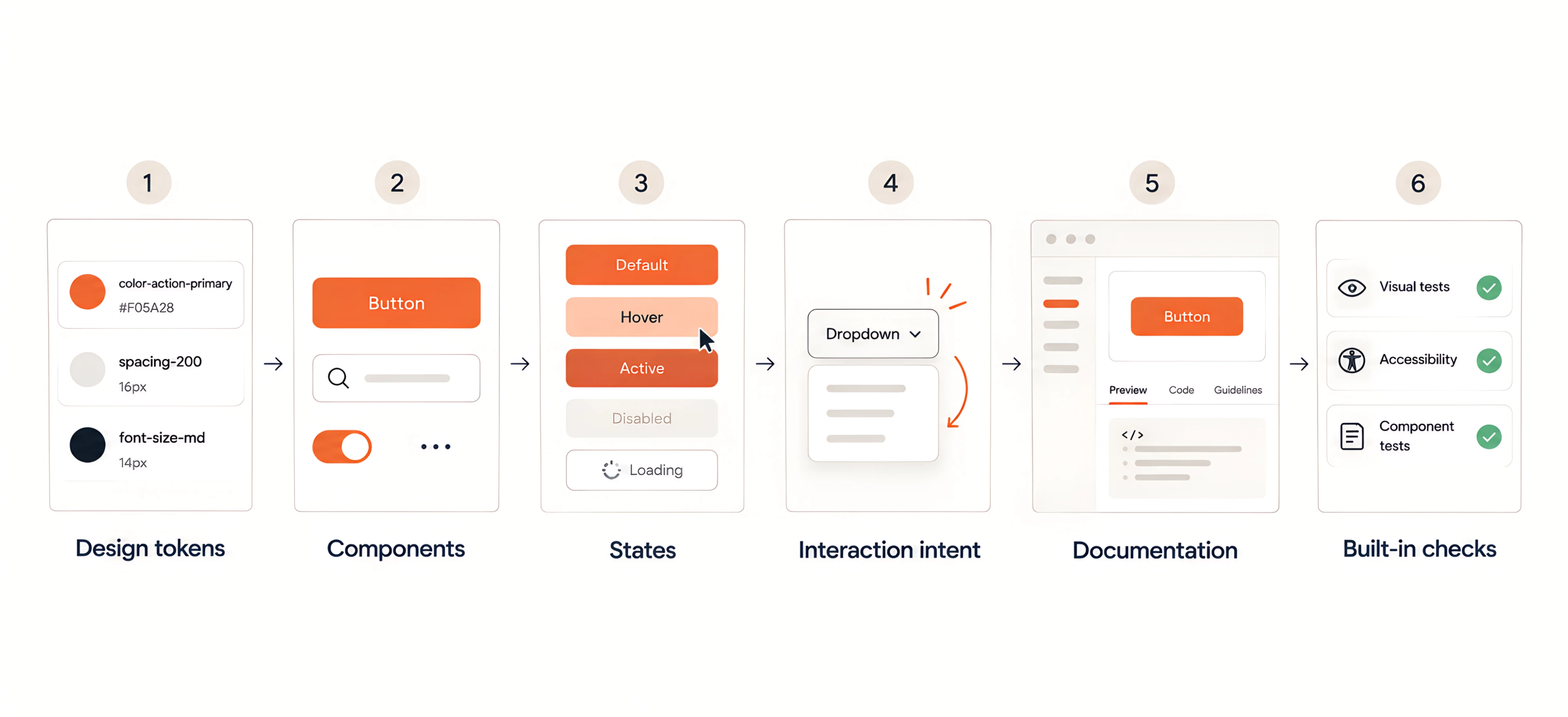
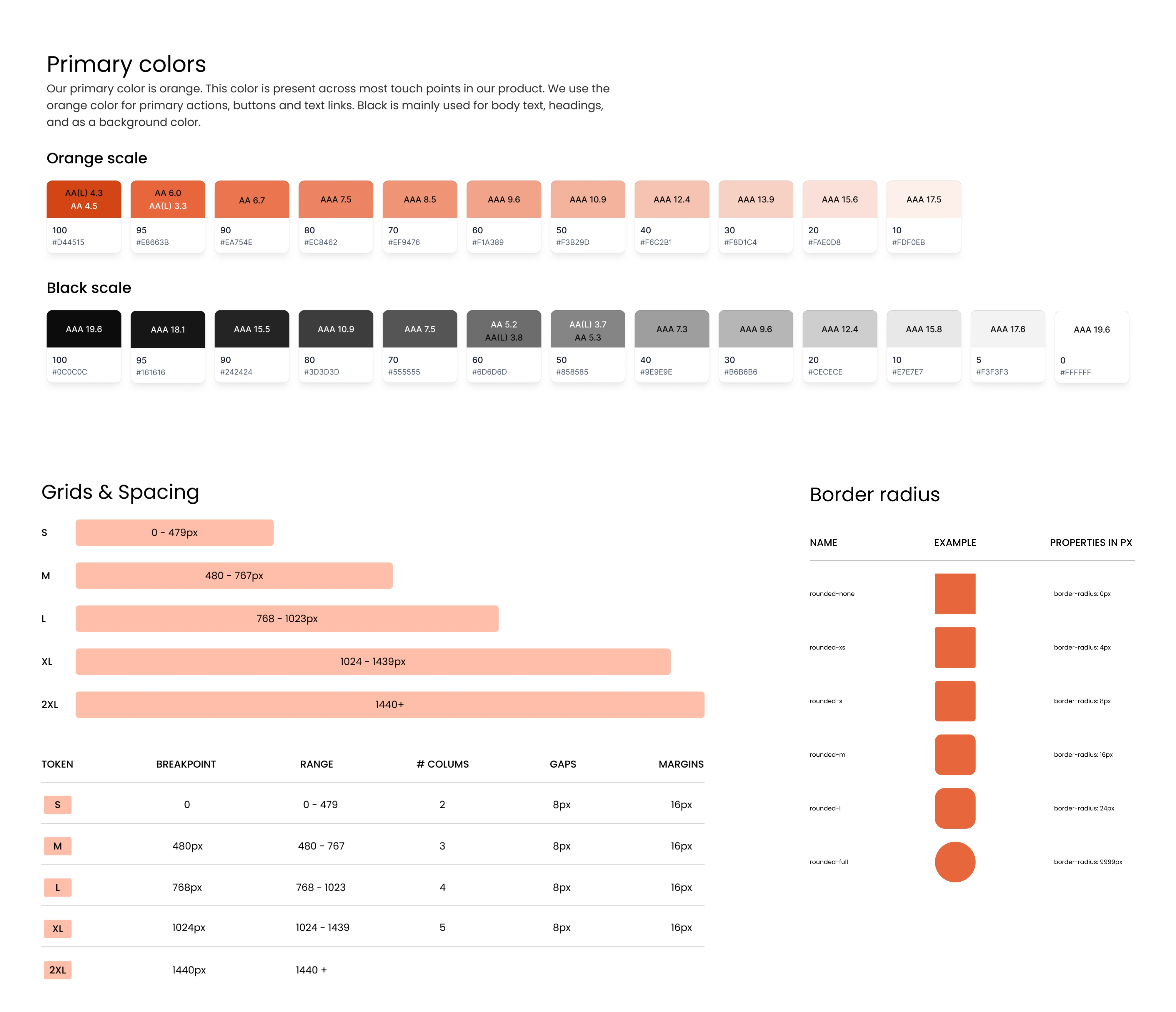
1. Design tokens. Tokens are named values for the smallest design decisions, such as a color, font size, spacing step, or border radius. Mature systems usually organize them in three tiers:
- Primitive tokens store raw values, such as blue-600.
- Semantic tokens give those values a purpose.
- Component tokens connect them to a specific element.
The semantic tier is what keeps the system flexible. As one Reddit user advised:
Be very explicit with specific tokens for your design system. I highly suggest naming your colors based on intent with a semantic name.
When a color is named for what it does rather than how it looks, you can update the brand palette in one place instead of hunting through every component.
2. Components. These are the reusable UI components built from tokens. Many teams structure them with atomic design. Small elements such as labels and icons combine into larger ones such as search fields. These, in turn, become parts of full sections like navigation bars. Each component also has defined props and variants for things like size, type, or emphasis.
3. States. A component needs to cover every condition it can appear in, including default, hover, focused, active, disabled, loading, and error. These states are easy to miss when working screen by screen, so the coded system makes them part of the component itself.
4. Interaction intent. The system can also define how components move and respond. A dropdown's opening animation, a button's pressed feedback, or the timing of a tooltip is set once and reused. The behavior is built into the component and stays consistent wherever it is used.
5. Documentation. Storybook is a common place to bring all of this together. In a Storybook design system, each component gets its own page with live examples of its states and variants, along with usage guidelines and code snippets. Designers and developers can see how interactive components behave in the browser, not only how it looks in a design file.
6. Built-in checks. Finally, automated tests help keep the system reliable as components change. Visual regression tests catch unintended visual changes, while accessibility checks cover things like color contrast, keyboard navigation, and focus states against WCAG standards.
Figma-only vs. UI kit vs. coded system
Teams usually arrive at a coded system gradually, moving through three common approaches. Each one solves some problems while creating others.
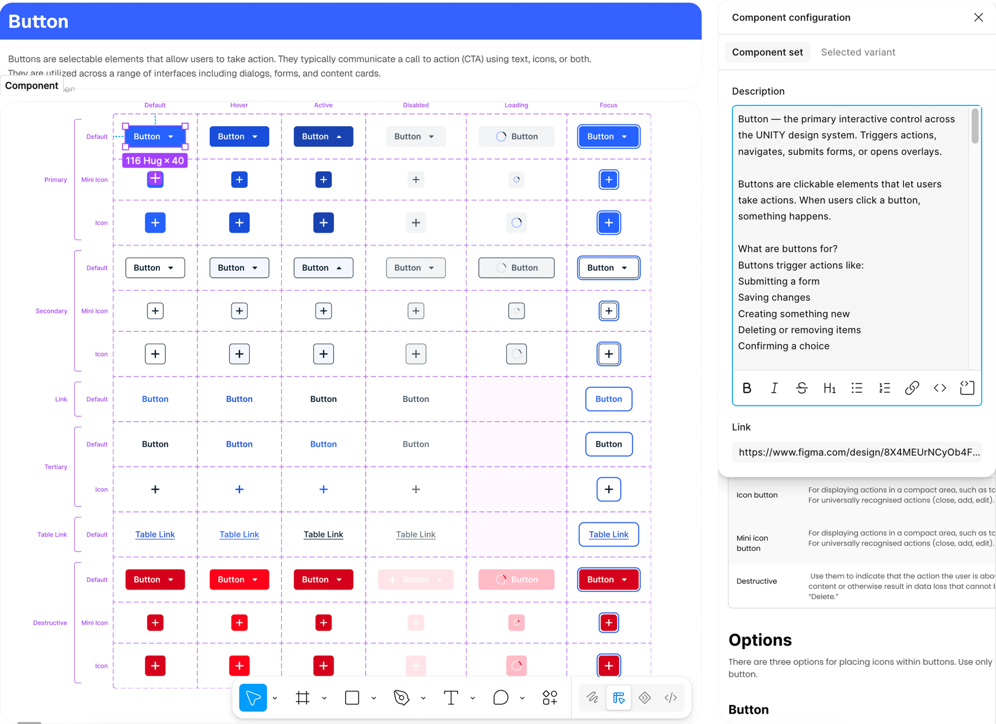
A Figma-only design system is where many teams begin. Designers build a component library with variables and styles, following Figma design system best practices, and developers implement it by reading the specs. This works well while the team is small. If you try to run a design system from Figma alone, developers lose visibility into what's been implemented.
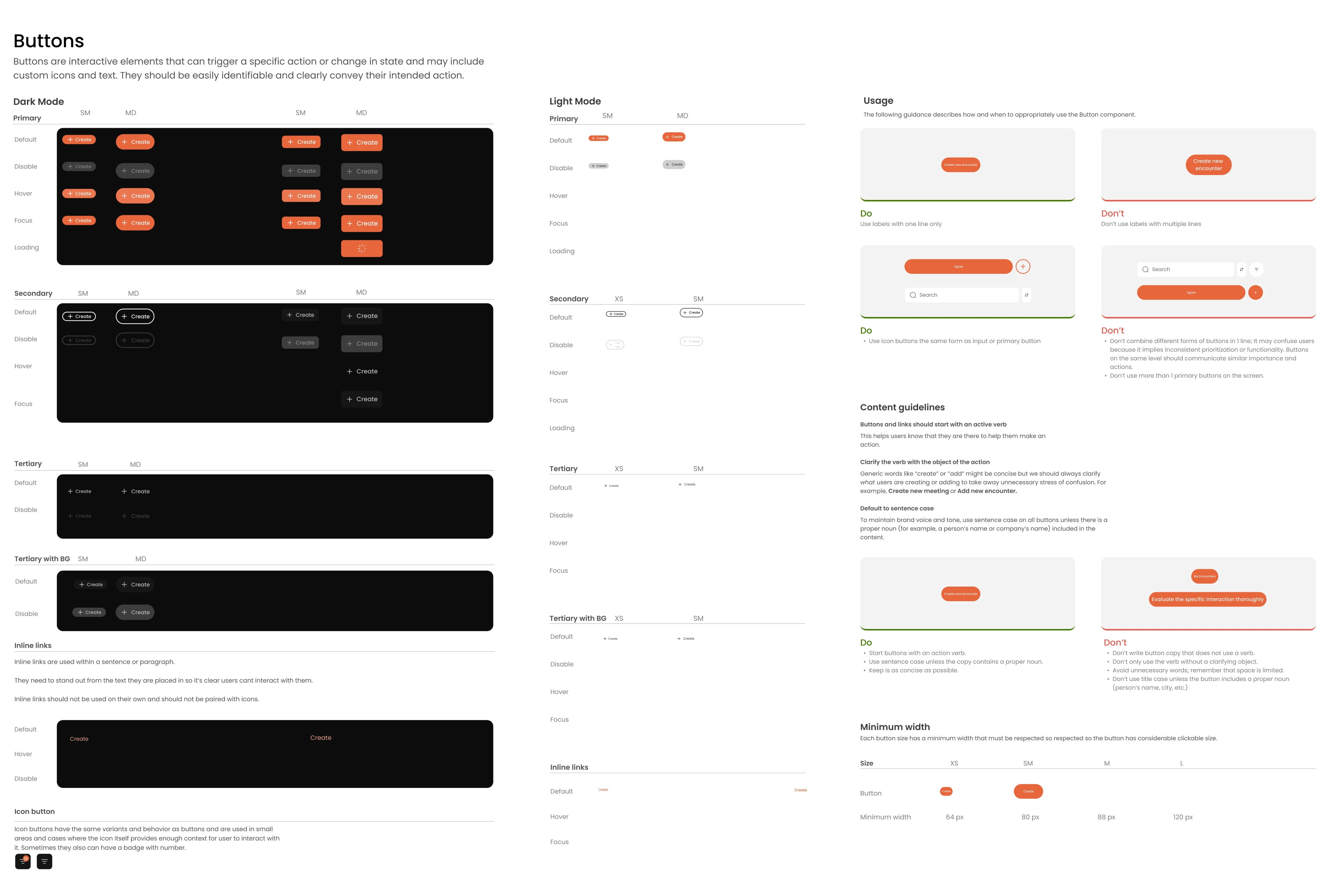
A UI kit, usually a React component library such as MUI, Chakra UI, Ant Design, or shadcn/ui, gives developers ready-made components. In the beginning, startups often rely on open-source libraries, and with small teams, design systems grow organically.
The catch comes later. These libraries guide you toward a specific design language, which can sometimes limit your ability to create a truly unique look, and a kit provides parts without your product's own rules for using them.
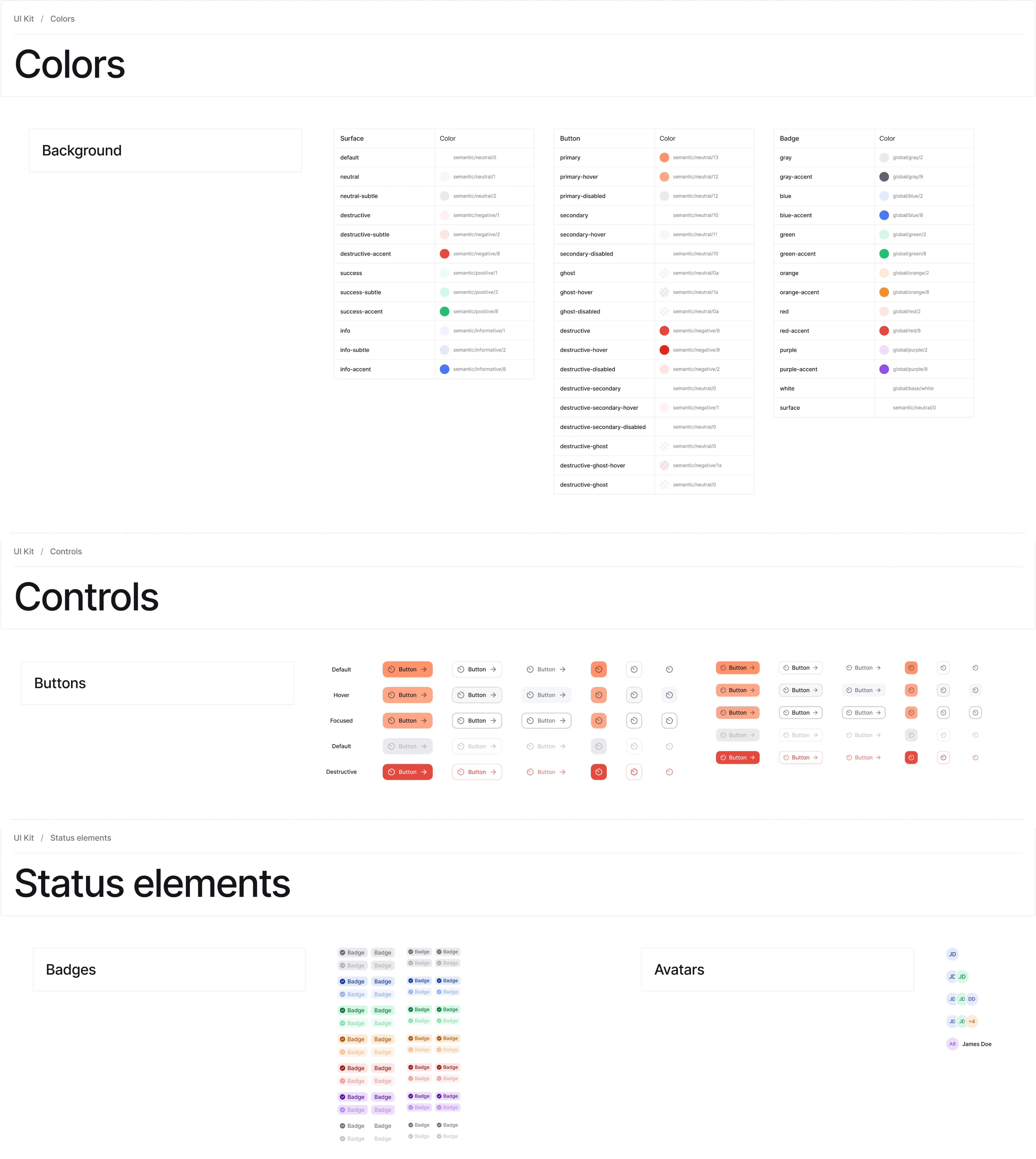
A coded design system is usually built on top of one of these kits. The team adds its own tokens, variants, states, and usage guidelines, and documents everything in Storybook. It takes more effort to set up, but it's the only option where design decisions and production code are the same thing.
At Eleken, this is how we build design systems today, because it removes the handoff where most rework happens. Developers spend less time rebuilding what was already designed, and new features reach production faster.
Each approach has its place, and the right choice often depends on your team's size and how complex your product has become. But as more designers and developers get involved, the differences become more noticeable. Let's compare how each approach handles everyday work and where its limitations start to show.
It’s important to note that these approaches aren't rivals. A team often starts with Figma and a kit, then moves toward a coded system once more people touch the product. Figma stays in the workflow either way.
Where Figma-only systems break down
Problems rarely show up all at once. They build up quietly with each release, until the team spends more time fixing the interface than improving it. Here's where it usually starts.
Details get lost in the handoff. A Figma file shows what a screen looks like, but not everything about how it works. Interaction states, spacing logic, and the intent behind a component often don't survive the translation into code. Each developer fills the gaps with their own judgment, and over time the same component exists in several slightly different versions.
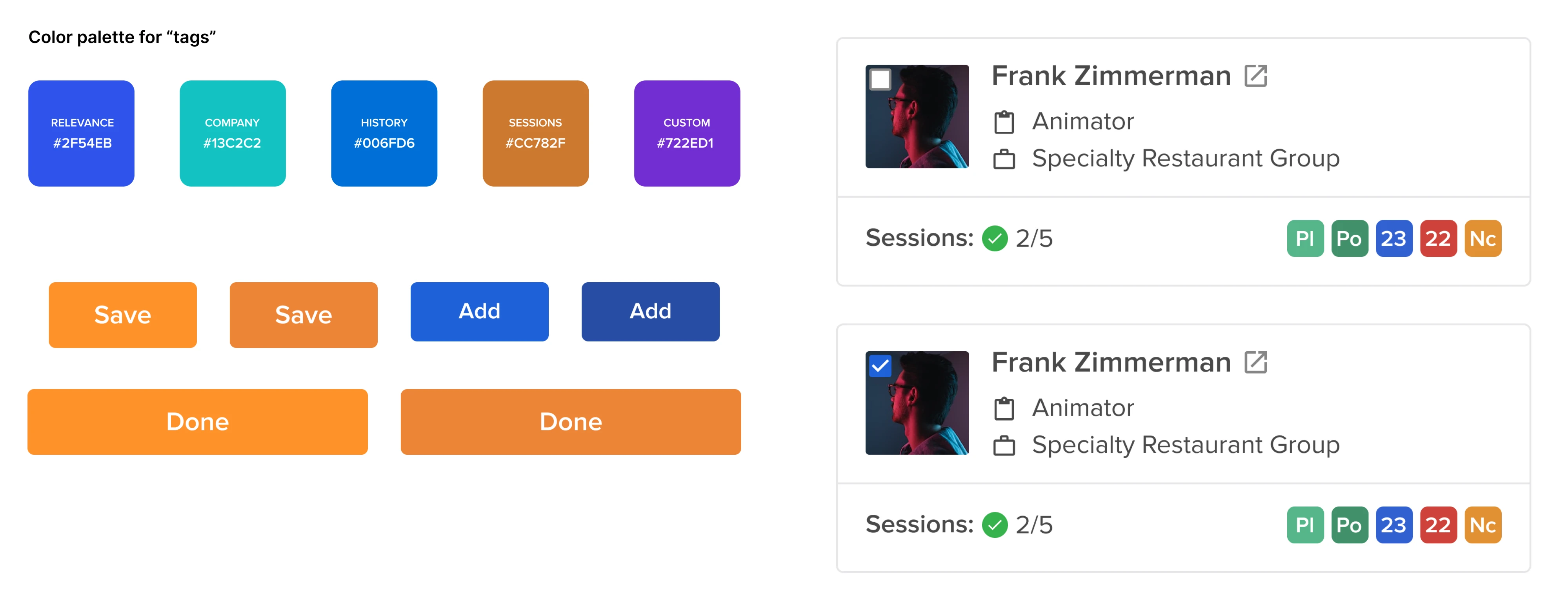
We saw this with Sessionboard, an event content management platform. When the team came to Eleken, the same components looked different in design files, in production, and across Figma versions. Before building new features, our designer had to audit every variation, align with the PM to choose the right styles, and rebuild each component with consistent logic and proper settings.
AI tools speed up the drift. Tools like v0, Lovable, and Figma Make produce screens that look convincing. But without a real component foundation to read from, they guess. The result is plausible UI with wrong tokens, missing states, and variants nobody tracks. Teams end up in “prompt and pray” mode: generating, checking, and fixing.
Knowledge leaves with people. When a system exists only in Figma, much of its logic lives in the designer's head. Once that person leaves, the next designer inherits files without tokens, component documentation, or state coverage, and has to reverse-engineer every decision from what's left.
The product starts to feel patched together. Eventually, these gaps become visible to everyone. One of our clients described their product this way:
"This is all patched together. There's no good logic behind it."
It's a pattern we see often in fast-growing SaaS products. Features get added faster than the team can turn them into reusable UI patterns. Every new screen becomes a small compromise, and those compromises add up to an interface that users find harder to trust and teams find harder to change.
Signs your team needs a coded design system now
A design system in code is an investment, and not every product needs one on day one. These signals usually mean the right moment has come:
- Design QA turns into pixel-pushing. Every release ends with a round of fixes for spacing, colors, and alignment.
- The same element exists in several versions. You can find three kinds of inputs or dropdowns across the product.
- Developers rebuild components that already exist. It's often faster to create a new button from scratch than to find and adapt the existing one.
- AI-generated UI passes the first look but fails in use. Screens look fine in a demo, then break on empty states, long text, errors, or smaller screens.
- Design reviews turn into debates. Instead of discussing the user problem, the team argues about which version of a component is the "real" one.
- New team members take weeks to get up to speed. A new designer or developer has to ask around to understand the interface.
- Rebranding or adding a dark mode feels like a redesign. A change that should take days requires touching every screen by hand.
If two or three of these sound familiar, the cost of not having a coded system is probably already higher than the cost of building one.
It's just as important to know when you can wait. An early-stage product with one designer, a handful of screens, and a direction that still changes every month rarely benefits from an extensive component library.
Building too much too early is a real risk. In one widely shared example, a Series B startup spent $180K and 8 months on a complex multi-brand system, and its teams stopped using it after six weeks. For early-stage products, a well-organized Figma library and an off-the-shelf kit are enough. The coded system can grow later, once the product and team need it.
How to implement and maintain a design system in code
There's no single correct approach to design system implementation. The right path depends on what you already have, how big the team is, and how closely design and engineering work together. Below are the main phases, with the approach we use at Eleken and the alternatives other teams choose.
Start from what you already have
Very few teams start from a blank page. Most already have a Figma library, a UI kit, or a set of components scattered across the codebase. When clients come to us, they usually tell us the same thing:
"We have a design system in Figma, and it's not the worst you've ever seen, but not the best. It just needs updating and maybe just reorganization."
That's why we begin with an audit, often using a design system checklist to see what's covered and what's missing. We collect every variation of every component in design files and in production, then decide together with the product team which version becomes the standard.
Other teams take a different route and borrow the structure from mature public design system examples. On Reddit, one designer shared that they copied the structure of IBM's Carbon design system and worked from there, which was much easier than doing everything from scratch. Another user summed up this approach:
Adopt someone else's, then style it well enough; then decide what meaningful patterns you actually want as your standards and why they are your standard and different from the base system.
Both approaches work. Borrowing is a faster way to start your own system for a new product, while an audit makes more sense when an existing product already has users and patterns that shouldn't break.
Agree on tokens before you automate anything
Tokens are the foundation, so they need to be agreed on by designers and developers before any sync or automation is set up. When that step is skipped, automation creates new problems instead of solving old ones.
At Eleken, we define the token structure together with the client's engineers, covering primitive, semantic, and component tiers, along with naming rules both sides understand.
With Newton360, this groundwork included foundation tokens and dark and light variable modes. As a result, the product could switch themes in one click without redesigning every screen.
Build components alongside the product
A common mistake in design system development is trying to build the entire library before shipping anything. Many experienced designers recommend growing the system as the product needs it. As one Reddit user described their process:
Need a button? Add it to the system, use it and continue your design.
The same user added that creating a design system in code works best for them because it already covers the frontend, enables rapid prototyping, and makes handover to engineers faster.
We follow the same approach and, where the client's setup allows it, build components in their codebase using their existing tokens and frontend architecture. Each component gets a Storybook story covering its variants and states.
A typical stack for a frontend design system is a framework like Next.js or Vue, a styling layer like Tailwind or Chakra UI, Storybook for documentation, and GitHub for version control. The exact tools matter less than keeping them consistent.
Keep Figma and code connected
Once components live in code, Figma and the codebase need to stay aligned. Teams handle this from two directions:
- Design-to-code. Some teams annotate components with tokens, states, and interaction details, then use Figma MCP with an AI coding environment such as Claude Code or Cursor to generate TypeScript, CSS, and Storybook stories that go through review before merging.
- Code-to-design. Others treat Storybook as the starting point and pull components back into Figma. Plugins like story.to.design import Storybook components as Figma components and flag when the design system code has changed.
We use the design-to-code direction for new components and review the output before it reaches the codebase. Either way, the goal is that designers and developers never have to guess which version is current.
Plan for adoption and maintenance
A coded system only works if people actually use it. As one Reddit user pointed out, going from zero to one takes more than business buy-in:
You need adoption by eng and design. So talk to your system users to get needs.
It also needs clear rules for change. Who can add a new component? How does a one-off design become part of the system? How are updates versioned and communicated? These rules should keep the system consistent without slowing teams down. Designers should still be free to explore, with reusable components contributed back into the system.
For many teams, this systemization approach takes some getting used to, but it quickly pays off.
What makes a design system AI-ready
AI tools don't invent a product's interface from nothing. They read whatever context they're given, including component names, props, tokens, and documentation. When that context is vague, they fill the gaps with guesses.
An AI-ready design system removes the guesswork, so AI tools can use the system the same way an experienced developer would.
Four things make the difference.
- Clear, predictable naming. AI tools rely on names to understand what something is for. A token called color-action-primary tells the tool when to use it. A token called blue-2 doesn't. The same applies to components, variants, and props.
- Explicit rules and limits. Showing AI what exists is only half the job. It also needs to know which variants are allowed, which props belong to a component, and when each one should be used. Clear constraints keep AI from inventing new patterns when the pattern library already has an answer.
- Documented behavior. The interaction layer of a system only helps AI if it's written down. When hover, focus, error, and loading behavior is documented next to each component, AI can reproduce how the interface works.
- Review built into the workflow. AI can produce code using real tokens and components, but that output still needs human review. In our projects, dev QA, visual QA, and interaction QA are separate checks, with accessibility included in the review process. Our design QA checklist shows what we look at in each of them.
The result is AI that speeds up the work without creating a new round of cleanup.
How to tell your existing design system is working
Many teams build a design system and then struggle to prove it was worth it.
I feel like most people don't really know how a design system provides value or how to measure it.
The good news is that a production design system is easier to measure than a Figma library, because its usage is visible in the codebase. It helps to look at two levels.
Is the system being used? These signals show whether the team relies on the system or works around it:
- Component coverage. The share of the interface built from design system components rather than one-off code. Tools like Omlet scan the codebase and show which components are used, where, and how often.
- Detached instances in Figma. Figma's library analytics show how often designers detach components. A high detach rate usually means a component doesn't cover real use cases.
- Hard-coded values. Raw hex colors or pixel values in the code are a sign that tokens are being bypassed. Linting rules can flag them automatically.
- Design QA issues per release. If the system is working, fewer UI bugs should reach review with each cycle.
Is it making the team faster? The main payoff is time. One Reddit user described what changed after their team adopted a system:
Really opens up our time to focus on the problem-solving and research phases. We spend very little time designing screens because we can get them stood up so fast.
You can track this through the time it takes to ship a new feature, how quickly new designers and developers become productive, and how many rounds of back-and-forth happen between design and engineering.
At Eleken, we also look at the product itself. A design system doesn't move business metrics on its own, but it shapes the experience that does. That's why we evaluate our work through task completion, feature adoption, and support volume. When the design is consistent, users make fewer errors and need less help, and the team can spend its time improving the product.
Where to start
A design system in code rarely starts as a big project. It usually begins with the part of the product that causes the most friction, like a flow users struggle with or a component that exists in too many versions, and grows from there.
This matters more now than it did a few years ago. As AI makes screens cheaper to produce, the teams that move fastest won't be the ones generating the most screens. They'll be the ones whose screens all follow the same rules.
At Eleken, we help SaaS teams build that foundation across Figma, Storybook, and their codebase, starting with one product problem and taking it all the way to production. If you want to see how this could work for your product, get in touch and start with a free 3-day trial with one of our designers.


.webp)


.webp)

.webp)
.webp)