/
Design process

Bring Your Design Mess to Control With UX Design System

0

mins to read

You can’t innovate on products without first innovating the way you build them,” — says Alex Schleifer, VP of Design at Airbnb. 

As a UI/UX agency, we at Eleken can say it’s more than true for product design. However, it is not always obvious that it’s time to innovate the way you work. 

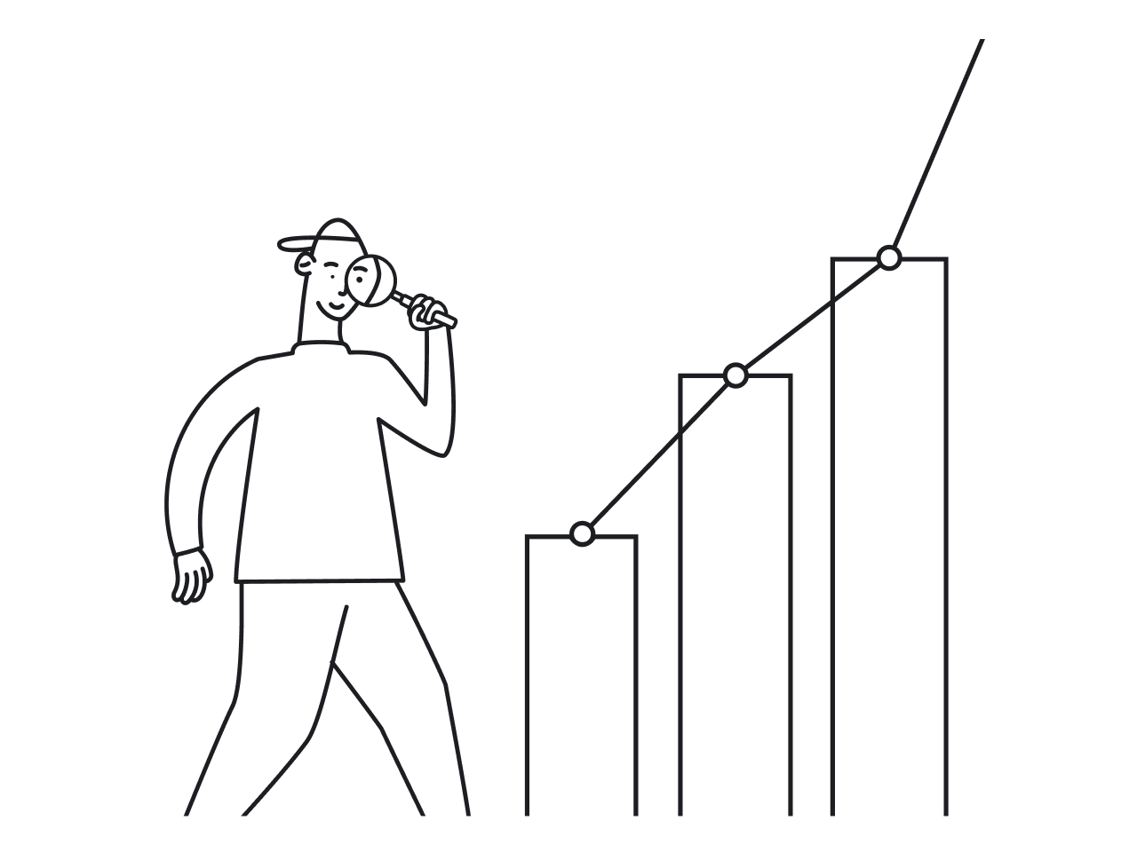
You can see some indirect signs, though.

Image source: product.hubspot.com

Signs, like this conversation from above between Hubspot team members. Looks like some degree of chaos holds their design back, right?

Hubspot thought so too and conducted a design audit

The audit revealed a ton of junk in their attic. For example, Hubspot had 16 different styles of modals, 6 different primary buttons, and 100+ shades of the color gray in their app. 

Gray color shades

To break through their operational ceiling, Hubspot created a design system called HubSpot Canvas. 

What is a design system?

A UX design system is a collection of standards to manage scaling companies’ design. The design system reduces redundancy by creating a shared visual language across different pages and channels. A design system includes any or all of the following design system components depicted by Audrey Hacq:

Design System — UX & UI. Image credit: Audrey Hacq for uxdesign.cc

Why build a design system?

Design systems offer two major advantages that are worth your efforts. Those are velocity and quality

First, building a design system, you get a unique opportunity to solve each design challenge once (instead of every time it comes up) and make the solution available to anyone in the team. Danny Forst from American Express says that a design system had facilitated and accelerated their product design process. It enabled them to jump from traditional wireframing to immediate high-fidelity design. 

Second, a pattern library that a design system possess enables a better user experience — especially for large companies. Usability and learnability improve when similar interface components look and function in a similar way.

When is the right time to start building a design system?

In theory, the sooner the better.  It’s “in theory” because no one ever started a design system until they tripped over their 100 shades of gray.

As a startup scales, so do design teams, as well as the amount of code, and the number of features. Designers start to solve already solved problems, create redundant entities, and, most importantly, decrease user experience for people who have to get through those dozens of different fonts and buttons.

Chaos emerges and builds up, starting to create roadblocks for a design process and affect the performance of digital products. Finally comes a moment when the pain from chaotic design is stronger than a wish to preserve the status quo. Companies realize it’s time to bring order to the chaos before their business gets ruined under the chaos’ weight. 

Chaos graph

When we say “ruin”, we are not being metaphorical. Science says 14% of startups fail due to bad organization, and 9% more fail due to problems with scaling. 

A design system becomes steel greed that supports the piling product from collapse.

Now, how to create a design system?

Start by running a design audit, like Hubspot. Explore and codify what you already have designed. If you found ten different buttons being used alongside, choose one and document it as a standard design component.

To design system architecture for UX, we recommend using Brad Frost’s atomic design methodology. It offers us to approach the design system elements in five stages, moving from the simplest reusable UI components to complex design system patterns:  

  • Atoms. In interface design, it’s the smallest building blocks like labels, inputs, or buttons.
  • Molecules. Here we speak about groups of UI elements that work together as a unit. For instance, an input plus a button make up a search form molecule.
  • Organisms. Those are more complex design structures that consist of atoms and molecules. Like, a website header that includes our search form, plus brand identifier and navigation links.
  • Templates. Here we come to page-level objects that incorporate all the previous levels into a skeletal layout, for example, a wireframe of a homepage.
  • Pages. Pages add some meat to the bones of interface templates. In the case of a homepage, it can be text and images added into a template to look at the real content in action. Pages can be used to test them or to align ideas with stakeholders, for instance. 
Image credit: atomicdesign.bradfrost.com

When you have your UI visual language library ready, you probably want to make it collaborative and code-connected, so that it is useful for both design and development.

Sounds complicated, doesn’t it? Design systems are in no way a piece of cake, and they fail more often than succeed. Let’s figure out how to escape from failure. 

How to run a design system?

Once Una Kravets asked on Twitter why design systems become unused, and dozens of her subscribers shared their negative experiences. In summary, it all comes down to three reasons: 

  • A design system fails to gain widespread adoption. Design systems work only if everyone in a product team knows how to use them. But when a lot of busy people have to spend a lot of time reading a lot of boring docs, we end up with a product team that ignores (or isn’t aware of) their design patterns.
  • Employees don't take design systems seriously, especially if they feel like the system gets in the way instead of making things easier. People avoid friction in their processes, and attempts to introduce a new way of doing things instead of the old one is the very definition of “friction”.
  • Static documentation of a dynamic process is doomed to fail. Organizations often lack a commitment to update and maintain their systems, so they quickly become outdated.

The solution is to run a design system as a product, not a project. That means when you’re yelling “We did it! We launched a style guide, mission accomplished,” your mission is in the very beginning, actually. 

Business doesn’t fill any value from your design system yet. The value will emerge after a product team will start shipping features using design components from the system, which means you've got some more work to do.

Your newborn design guide needs a team to manage and upgrade it. It needs a roadmap and backlog. It needs promotion and training for existing staff and onboarding plans for new staff.

Create your own design system now

Startups are meant to feel slightly chaotic. But as the startup grows, the degree of chaos increases. The more design decisions you put off, the longer you delay bringing mess to order, the more expensive it becomes. 

Check out some popular design systems examples to inspire you. Then codify what you already have, make sure someone is responsible for your system. Check if your system is built with a solid structure from the start and will be carefully maintained all the way long. 

And if you’re shorthanded out there, remember there’s Eleken agency full of product design experts. Call us if you need help with fighting design chaos. 


Dana Yatsenko

Author

Table of contents

Top Stories

Design process
/
0
min read

7 Design Systems Examples for Your Inspiration

When you had a team of five people, you more likely didn’t think about a design system. You could communicate style direction to everybody on your team, making sure you were all on the same page. But when your business scaled, it became next to impossible to instruct every new member how to adhere to a company’s design principles and coding standards to keep a high level of product consistency. 

If this is the case, then the UI design system is what you should consider, develop, and gradually establish. Here at Eleken our skilled designers are ready to apply their in-depth expertise and help you with creating your unique design system.

Why do companies create design systems?

In a nutshell, they want to make their life easier. The design system became an omniscient source of truth and the primary reference for everyone who works on the product. As a result of the designers, programmers, engineers, and product managers' joint work appear a holistic system made up of many reusable components - guides, patterns, and elements.

When designers need to create a new web page, all visual design components are ready to be used. Programmers can reuse a code snippet just by copy and pasting. Overall, the design system helps the product team be more efficient and reach a higher product consistency level. 

Creating the design system requires a lot of work, being a long iterative process. However, it also brings multiple benefits, which recoup all the efforts. 

Eventually, you will get and make the most out of:

  • Faster design process
  • Better cross-department collaboration
  • Higher product quality
  • Clear brand guidelines

The design system being a reusable components collection is not equal to a style guide or a pattern library.

Design system, pattern library and style guide- what’s the difference?

First and foremost, the design system is a brand’s philosophy embodiment. The system has structure and concept behind it and the elements subordinated to the main idea. However, most of the design systems can look like really just the patterns libraries with hundreds of components, which, without holistic vision, can be assembled in limitless ways yet not making a unified user experience.

With a clear guide on properly using the design system elements, all the UI components will adhere to a company’s standards.  

To give you a bit of inspiration for creating your design system, we assembled the best design systems examples you can learn from.

1. Atlassian design language

atlassian design system page image


Atlassian is a famous Australian enterprise software company known for its product - an issue & project tracking application Jira. The company’s focus is on agile tools development to help agile teams track their progress from product planning to delivery.

Atlassian’s mission is to “unleash the potential in every team.”

The Atlassian design system consists of several sections:

  • Brand - covers the company’s mission, personality, promise, and values
  • Foundations - the visual elements for creating an engaging end-to-end user experience. This section includes iconography, typography, layout, structure, accessibility elements, logos, and illustrations
  • Content - the content guidance covers voice and tone, vocabulary, grammar, and style
  • Components - the reusable design system blocks. Each of them meets the specific UI need and work together to create assembled patterns
  • Patterns - the reusable combinations of components to help users achieve their goals and ensure user experience consistency
  • Resources - the tools, kits, and plugins collection that includes color palettes, fonts, illustration and logo library, and templates

Overall, the Atlassian design system is very detailed, with clear reasoning behind each element’s choice.

2. Uber design system

uber design system image


Uber is an American technology company providing ride-hailing, food delivery (Uber Eats), package delivery, freight transportation services, and a micro-mobility system with electric bikes and scooters.

Uber’s mission and philosophy are “about moving people to where they want to be. In their day, in their lives, in the moment.”

Here is what Uber says about its design platform

We need tools that help designers stay in sync, common design libraries that provide them with our growing body of learnings and the means to recognize and apply our patterns to a diversity of user experiences. By grounding design at its basic level, we built a flexible system that empowers designers with the freedom to explore while keeping consistency and quality at the core.

Uber style guide where all design system elements are assembled includes:

  • Logo
  • Brand Architecture
  • Color
  • Composition
  • Iconography
  • Illustration
  • Motion
  • Photography
  • Tone of voice
  • Typography

Besides design elements, in its style guide, Uber showcases the examples of branding in different points of contact with potential customers starting from printed materials to digital billboards and posters. 

3. Polaris design system by Shopify

polaris design system image


Shopify is a cloud-based SaaS shopping cart solution that allows businesses to set up an online store. The company offers its proprietary platform for online stores and retail POS systems. Polaris design system aims to help both Shopify and the Shopify merchants to establish a better user experience.

Shopify builds “products, tools, and services for people to start, manage, and scale their businesses.” 

The company’s values underlie the user experience Shopify builds:

  1. Considerate - we show care for the people who use our tools and products
  2. Empowering - we want people to feel like they can accomplish whatever they’re trying to do.
  3. Crafted - Shopify experiences should feel like they were created with the highest level of craftsmanship
  4. Efficient - Shopify experiences should help people achieve their goals quickly, accurately, and with less effort
  5. Trustworthy - we constantly work to recharge our users’ trust batteries.
  6. Familiar - we want people to feel comfortable using our products, whether it’s their first time using them or their hundredth

Polaris design system serves as an extensive guide for designing your online shop based on Shopify’s platform. It provides inspiration and various visual elements and UI components to create a better user experience for ecommerce projects.

Design system elements:

  • Colors
  • Accessibility
  • Resources
  • Typography
  • Illustrations
  • Sounds
  • Icons
  • Interaction states
  • Spacing
  • Data visualizations

4. Helpscout design system

helpscout design system image

Help Scout is a pure-play SaaS help desk solution that helps small businesses manage their customer relationships. The solution allows users to create multiple mailboxes for each shared email address, enabling them to work across departments or manage several products from a single account.

Help Scout aims to follow its brand values being:

  • Helpful
  • Trustworthy
  • Human & Organic
  • Energetic
  • Curious

Design system elements:

Helpscout design system is one of the most compact yet nicely designed systems. 

It consists of 3 sections:

  • Visual Elements
  • Content Style
  • Product Design

These sections contain everything you need to design your help desk, ticketing system, knowledgebase, or the support forum.

5. Canvas design system by Hubspot

canvas hubspot design system image


HubSpot is a cloud-based CRM and inbound sales & marketing software that provides tools to help companies with blogging, SEO, social media, email, landing pages, marketing automation, and web analytics.

Here is what Hubspot says about Canvas, their design system: “This library is a window into how we build our products here at HubSpot and what it’s like to build the HubSpot product. We’re sharing it because we’re proud of the time and effort we’ve put into creating our design system and optimizing it for developers and designers so that we can keep it evergreen.”

The system elements:

  • Components
  • Graphs
  • Patterns
  • Styles
  • Editor

Canvas design system is a comprehensive library of the building blocks that Hubspot uses to build its products. It’s a set of various elements and styles, starting from “colors and typography to React-based components and data visualization tools.”

6. Mailchimp design system

mailchimp design system image


Mailchimp, an email and marketing automation platform, developed their design system long before other brands started establishing design libraries. 

“One main goal of this new brand identity is to provide a consistent structure to our design language. We have a lot of creative people with unique voices under one roof, which can be inspiring — and messy. To keep the system from feeling disjointed, we have introduced a framework of core components, so that the elements existing inside of it can be as free and expressive as we want.”
mailchimp design library image


Mailchimp’s design system is simple yet robust and easy to use, including only two sections - Foundations and Components.

7. Zendesk design system

zendesk design system image


Zendesk, is a SaaS help desk solution offering support, sales, and customer engagement software and serving as an API platform and marketplace for various apps.

Zendesk claims their design system Garden is “The source of truth for tools, standards, and best practices when building products at Zendesk.”

They also consider Garden as “an evolving library of shared knowledge that intentionally blurs the line between design, content strategy, and engineering to reinforce a cohesive user experience throughout Zendesk’s product suite.”

Design system elements:

  • Content - voice and tone, grammar, punctuation, and word list
  • Design - colors and icons
  • Components - theming, buttons, dropdowns, forms, loaders, notifications, typography

And now, when you saw the most popular design systems examples, you may have already started considering how to establish yours.

Here are the key steps to building a design system:

How to create the design system 

  1. Think over your design language.

Your visual design language consists of four main categories you should consider:

  • color - one to three colors that represent your brand
  • typography - usually, one font is used for headings and one for a body copy
  • sizing and spacing - it looks best when you have visual rhythm and balance
  • imagery - set guidelines for illustrations and icons
  1. Create a pattern library. 

You should collect all the UI elements you currently have in production, merge them, and remove what doesn’t match your brand design concept.

  1. Document where to use each component.

Documentation and standards differ a well-established design system from a pattern library or a style guide.

You may also find it interesting to learn about the product design process and how to build a successful product.

Design process
/
0
min read

7 Useful Tools to Help with Your UX Audit

Did you decide to conduct the UX audit? Congratulations! You’re really serious about your business. Many SaaS entrepreneurs realize the importance of a seamless user experience for business growth. However, significant time and money spent make most of them keep this thought laying on the shelf.

I wouldn’t say that the UX audit, if being appropriately done, is a no-brainer. The good news is there are a few online UX testing tools you can use during your audit and benefit from them. In this article, we’ve prepared a list of UX tracking and analytics tools that proved to be helpful and insightful.

1. Google Analytics

Google Analytics logo


Using Google Analytics for the UX audit may seem a bit of an unexpected solution. This tool typically comes to mind when we’re talking about market research and the digital marketing area. Yet Google Analytics can efficiently serve as a UX analytics tool, providing you with valuable insights regarding your website visitors, which you can utilize for user experience improvement. 

Conversion is the most important indicator of website performance, and it’s not a secret that a great user experience has the power to make people take expected actions - leave their contact data, subscribe for a newsletter, or purchase. Based on various metrics, you will be able to better understand your audience’s behavior from the first minute they land on your website. For example, Google Analytics data will tell you where your potential customers come from and how long they usually stay on your landing page. 

Behavior reports help you answer the questions:

  • How many unique visitors visited your website?
  • What were those CTAs customers reacted to?
  • Which page performed the best in terms of customer engagement?

Data like demographics, interests, locations, languages, and devices let you adjust your user flow, CTAs, and overall UI. Our designers know that even the smallest detail in a page design can be a turning point leading either to checkout or to leaving a site. 

By understanding users’ behavior, you can enhance a customer journey and ultimately lead more people to conversion.

As for mobile devices, Google offers mobile app analytics for Firebase that provides insights on mobile application use and customer engagement, being a good tool for UX audit.

2. Mixpanel

Mixpanel app opened on PC, tablet, and smartphone
Image credit: Mixpanel


Unlike Google Analytics that tracks website visitors and is great to have a general understanding of traffic, Mixpanel is focused on actions users take on your webpage. This tool helps receive answers to questions like “how many users pushed the CTA button from the pricing page,” for example. The results may hit designers upon an idea of what needs to be changed in UX to improve conversion.

However, Mixpanel insights may be too one-sided, being based mostly on UX researchers’ assumptions. Thus, it would be more effective to compare Mixpanel with other analytical tools data to reach unbiased conclusions.

3. Kissmetrics

Kissmetrics landing page image

Kissmetrics is one of the most expensive web analytics tools, but it is definitely worth every penny. The tool offers robust analytics and customer behavior reports that help UX designers better understand customers and improve user experience. 

The Kissmetrics functionality allows to:

  • Find out what features customers use the most
  • See key business metrics (churn rate, MRR, subscriptions, new trial starts)
  • Identify the most viewed webpages
  • Track the best customers and cohorts behavior
  • Discover weak points in the onboarding funnel

Being not as detailed as Mixpanel but undoubtedly more profound than Google Analytics, Kissmetrics provides an effective mix of raw and interpreted data. Just press the “Analyze customers behavior” button and get insights helpful for your design audit.

4. HotJar

If you want to understand what people are doing on your website and what elements and information attract them the most, you can have a sneaky peek at their behavior. Nothing illegal, just a smart digital tool! Hotjar creates interactive heat maps of users’ clicks, scrolls, and moves to give you an idea of how users interact with your website. 

Hotjar’s line-up consists of four products: heat maps, session recordings, surveys, and real-time feedback pools. However, heat maps are the product Hotjar is mainly associated with. The “heat” is a color scale highlighting the most popular “hot” webpage areas with red color and the least interacted or “cold” - with blue color. 

Click maps show which CTAs users click the most. Also, you can find out that some non-CTA UI elements attract more attention and draw users away from taking expected actions. Being aware of these nuances, you’d probably decide to rearrange important buttons to improve user experience and increase conversion.

Hotjar main page's heatmap demonstrates how the app works

Scroll maps show how deep to the bottom of the page your website visitors usually go. If users don’t scroll down, it means they can miss some information you want them to know. 

Hotjar scroll map's demonstration

Move maps track mouse movements without clicking or scrolling. It can tell us what information a user finds interesting to check on your webpage.

Hotjar has a decent competitor with even more robust functionality to facilitate the UX audit.

5. Crazy Egg

Crazy Egg offers five reports analyzing users’ behavior from different sides. There are no chances something will remain hidden after Crazy Egg’s behavioral analysis. 

Heatmap report highlights with different colors the most and least popular areas of your webpage. You can track whether the area where you place your CTA button falls into users’ attention.

Scrollmap report shows how far to the page bottom your website visitors go. If you think about putting your important CTA button somewhere close to a footer, you’d probably change your mind looking at the report’s results.

A lovely Confetti report displays each user’s clicks instead of a total number of clicks. You can create 22 customer profiles to have deeper insights into how each customer segment is performing.

Crazy Egg's confetti report demonstration

Overlay report filters clicks by various criteria like new and returning visitors, device type, UTM campaign.

List report shows you the percentage of users who clicked on each clickable element on the webpage. 

With the help of CrazyEgg UX testing, you can get a comprehensive picture of users’ interaction with your website and think about customer journey enhancement.

6. UXCam

“UXCam is the market leader in app experience analytics, empowering mobile teams with fast, contextual, and high-fidelity insights,” - states UXCam on the official website, and we have nothing to object to. This tool does have excellent capabilities for app analytics. Session recordings, heat maps, crash logs, and even integration with Firebase, a Google platform for creating mobile and web applications, makes UXCam a great addition to your UX audit toolkit.

Here is what UXCam can help you with: 

Heatmap on UXCam's main page demonstrating how the app works


  • Record, analyze, and share sessions and events to identify if there are any users’ behavior patterns
  • Track screen flow to overview how users interact with your app and what frictions they have
  • Create heat maps to find out whether users encounter complication while using an app
  • Log app crashes and UI bugs to communicate the issues to the product team to make necessary adjustments for the next app releases

The last tool in our list seems to be the greatest one as not figures, but real people tell you the truth.

7. UserTesting

UserTesting is not a conventional review site. It’s a platform where you can get prompt customer feedback on websites, mobile apps, and prototypes user experience.

UserTesting landing page offering to see demo or watch explanatory video


You receive audio and video messages from your target audience once they will test your product and accomplish another task you assigned to them. Also, it’s possible to schedule live conversations, put questions, and get insightful answers with the help of which you can:

  • Сheck market feedback on your design decisions before the product development stage
  • Detect the bottleneck in user experience that causes frictions when using your product
  • Make clear your customers’ needs

Small startups and large enterprises like Facebook and Grammarly are among UserTesting clients, so you can be sure it’s worth trying this tool for your UX audit.

A final word

UX audit can be a complex and time-consuming process, but with the right tools, it will reinforce the manual job your team or a third-party consultant does. However, it’s crucial to choose the tool that will serve the best to your project and accomplish the correct interpretation of findings. 

We at Eleken have profound experience in doing UX audits for our clients working with various tools. Drop us a line if you ever need our assistance. Also, learn how to conduct a UX audit in our next article.

Don't want to miss anything?

Get weekly updates on the newest design stories, case studies and tips right in your mailbox.

Success!

Your email has been submitted successfully. Check your email for first article we’ve sent you.

Oops! Something went wrong while submitting the form.
Don't want to miss anything?

Get weekly updates on the newest design stories, case studies and tips right in your mailbox.

Success!

Your email has been submitted successfully. Check your email for first article we’ve sent you.

Oops! Something went wrong while submitting the form.