

Most teams build a Figma design system to move faster. As products evolve, new designers join, and features accumulate, keeping that system consistent becomes much harder. Components multiply, documentation falls behind, and small inconsistencies gradually turn into design debt.
This is a common challenge. One designer on r/FigmaDesign described a design system as something that "...requires buy-in and adoption from multiple stakeholders across an org. It takes time to get going and requires maintenance…"

A design system requires buy in and adoption from multiple stakeholders across an org. It takes time to get going and requires maintenance. Like others mentioned, a design system is required for scalability, especially if you have multiple products.

The shift toward AI-assisted development makes design systems even more important. AI generates UI based on the patterns, components, and tokens it finds. A well-structured system produces predictable, consistent results, while a poorly maintained one spreads inconsistencies just as efficiently.
In this guide, we'll show how to build a Figma design system that scales with your product. Drawing on our experience designing SaaS products at Eleken, we'll explain when you need a design system, what to build first, how to structure scalable foundations and components, and how to keep the system maintainable over time.
But first, let's start with the distinction that trips up almost everyone.
UI kit vs. design system: knowing which one you need
People use these two terms like they mean the same thing. They don't, and the gap between them is where a lot of wasted effort hides.
A UI kit is a collection of reusable components and styles. Buttons, inputs, cards, color and type styles, all sitting in a Figma file ready to drag in. It's useful, but it is not a design system.
A design system is the UI kit plus everything that makes it usable at scale: documentation, governance, naming rules, contribution guidelines, and ideally code that mirrors the design.
Here's what a full system includes:
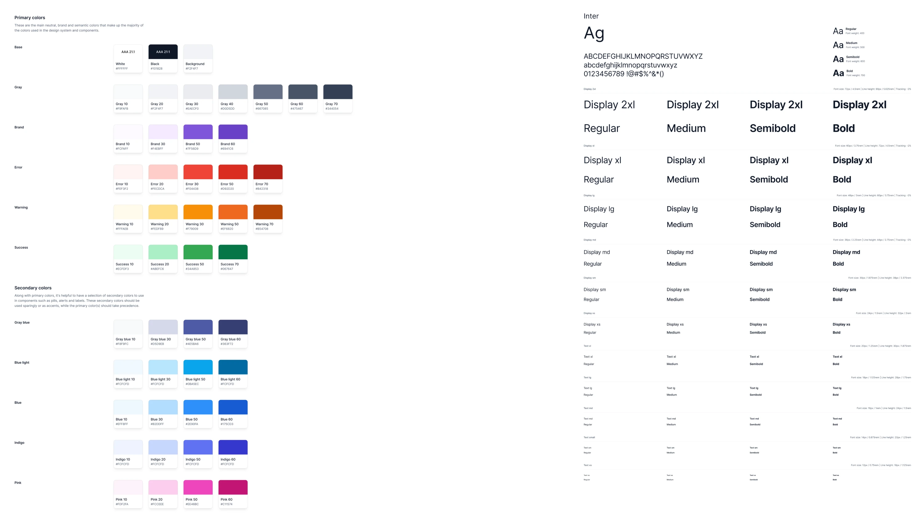
- Color styles and variables;
- Type styles and a typographic scale;
- A spacing system;
- Icons and assets;
- Shadows, blurs, and effects;
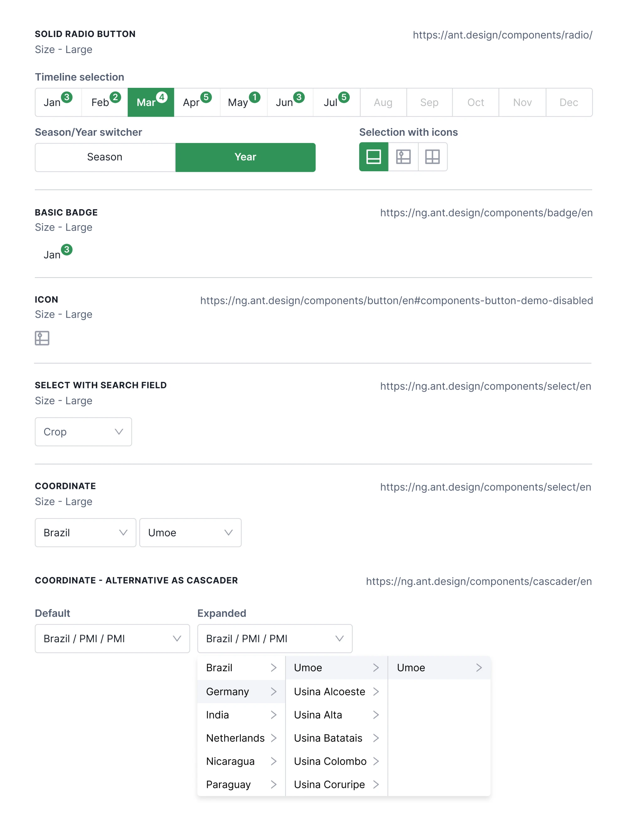
- Components with variants and properties;
- Patterns (how components combine into real interfaces);
- Documentation that explains the why, not just the what.
That's a lot. So the question is whether you need all of it yet.
When do you need a design system?
Not every product needs a full design system. If you're working on an early-stage product with a small team, a well-organized UI kit is usually enough. Creating governance, contribution rules, and extensive documentation too early adds maintenance work without delivering much value.
If you want to learn more about how a design system can improve your product, watch the video below:
A design system becomes worthwhile when consistency is no longer something one designer can manage alone. That usually happens as the product grows, multiple designers contribute simultaneously, new platforms are added, or development teams need a shared source of truth.
The transition is often triggered by a larger change. A company launches a mobile app alongside its web product. An internal tool becomes a commercial SaaS platform. A rebrand touches hundreds of screens. A new design leader inherits years of inconsistent UI decisions. These moments expose the cost of not having a system.
Most teams also aren't starting from scratch. They already have components, styles, and patterns scattered across different files or products.
One client described them as separate "kingdoms" that evolved independently over time. In situations like these, the goal isn't to build another design system. It's to consolidate what already exists into one consistent foundation.
If none of these problems sound familiar yet, resist the temptation to over-engineer. A clean UI kit, shared styles, and a few reusable components will take you surprisingly far.
Design tokens, explained simply
Design tokens are the foundation of every modern design system. They're named values for colors, typography, spacing, border radius, and other design decisions that both designers and developers reference instead of hard-coding styles.
For example, instead of assigning a button the color #2563EB, you assign it color/brand/500. The token stores the value, while the component references the token. If your brand color changes, you update the token once, and every component using it updates automatically.
We followed this approach when designing the system for Newton360, an EMS workforce management platform. To make implementation straightforward, our designers gave every token a clear, descriptive name, such as "Orange 100" or "Primary Color", so developers never had to guess what a value represented or where it should be used.
That shared naming system is what makes design systems scalable. It keeps designers and developers aligned, reduces implementation errors, and makes large-scale updates possible without manually editing hundreds of screens.
Our walkthrough on how to create a design system goes deeper on that build-vs-wait decision, and our piece on the ux design system covers the user-facing side of getting it right.
How to Create a Figma Design System
Here's a practical sequence that helps you build a system that's easy to maintain and scale.
Set up a color palette that doesn't fight you later
A good palette has structure, not just nice hues. We organize ours in layers:
- Primary/brand: your core identity color.
- Neutral: grays for text, borders, backgrounds (you'll use these more than anything else).
- Accent: secondary colors for emphasis and variety.
- Feedback: success, warning, error, and info states.
Each of those needs a range of shades, not a single value. We recommend 8 to 12 shades per color, mapped to a numeric scale from 25 to 950. The number is the brightness: 25 is the lightest tint, 500 is your base, 950 is the darkest shade.
The scale isn't decorative. Each range has a job:
- 25–100: page and surface backgrounds.
- 200–300: borders and dividers.
- 400–700: interactive UI states (default, hover, active).
- 900–950: text.
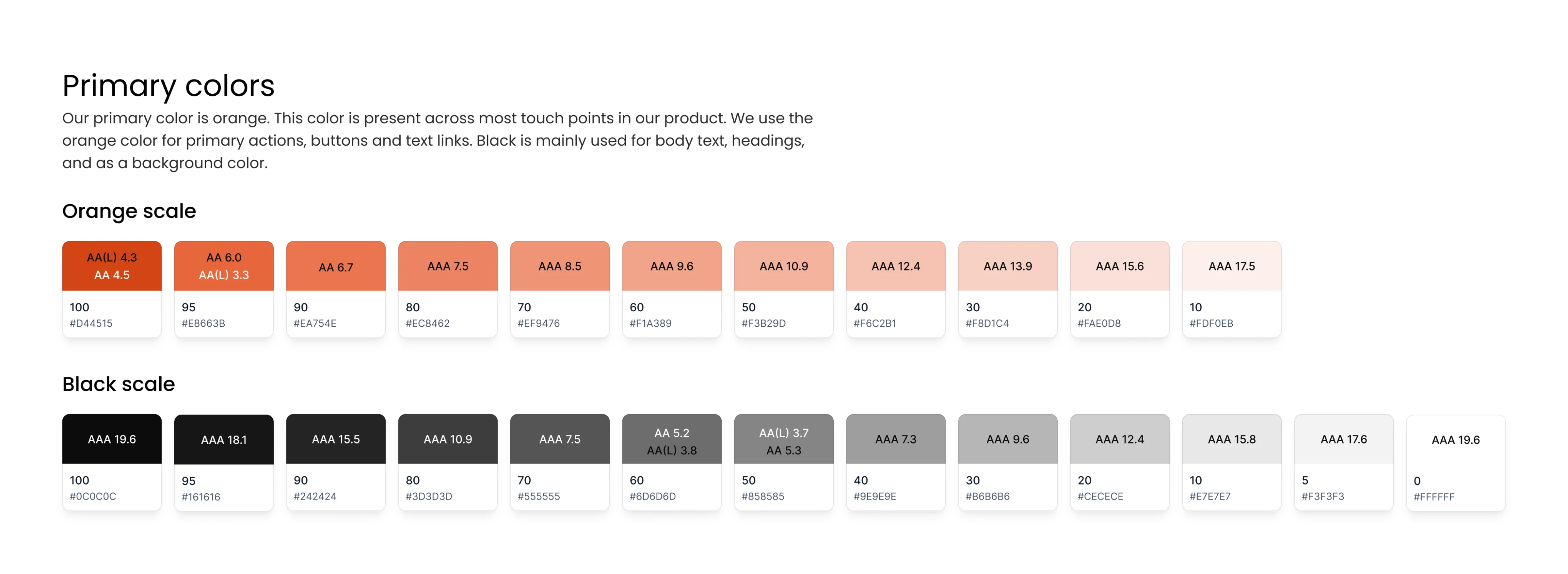
Once you assign jobs to ranges, picking colors stops being guesswork. You're not asking "which gray for this border?" You already know: gray/200 or gray/300.
Create consistent color shades
There are two reliable methods, and they suit different goals:
- The HSL method gives you the most control. You take your base color, keep the hue mostly fixed, and adjust saturation and lightness in steady steps to generate each shade. Lighter shades get a touch more saturation pulled down; darker shades get more depth. It takes longer, but the palette feels intentional, and the contrast stays clean.
- The black-and-white overlay method is faster. You layer transparent black over your base to make darker shades, and transparent white to make lighter ones. Quick, consistent, and good enough for early-stage products. The tradeoff is that shades can drift slightly muddy at the extremes, so check them against real text.
Most teams don't need to do this by hand. Tools like uicolors.app, tints.dev, tailwindshades.com, and coolors.co generate a full ramp from one base color in seconds.

Inside Figma, the Supa Palette plugin handles it without leaving your file. Use them. There's no prize for suffering.
Organize colors with variables
Use both, for different things.
Color styles are great for applying a fixed color quickly. Color variables are what unlock theming, because a variable can hold different values in different modes. One variable, light value and dark value, switched by mode. That single capability is the difference between supporting dark mode and rebuilding every screen for it.
A quick example of why this matters. We built a token-based color system for Newton360 with light and dark variable modes. The result wasn't subtle: instead of redesigning every screen for each theme, the team could switch the entire interface with one click. That's the payoff of getting color right at the variable level early, rather than bolting it on later.
Switching the entire product from dark to light was a single click.
Whatever you choose, name it consistently: brand/500, gray/100, success/200. Predictable names are what let the rest of your team find colors without asking you.
Color is one pillar. A system stands on a few more, and they all need to be in place before you build a single button.
Define your design foundations
Before you design a single component, define the rules everything else will follow. A solid foundation keeps your library consistent, reduces rework, and makes every new component easier to build.
Start with these essentials:
- Color variables with support for light and dark themes.
- Typography including H1–H6, body, captions, and consistent line-height rules.
- Spacing tokens based on an 8-point scale (4, 8, 12, 16, 24, 32, 48).
- Border radius values.
- Shadows and blur tokens for elevation.
- Responsive layout grids, such as a 12-column grid.
- Icons and shared assets, including logos and product-specific icon sets.
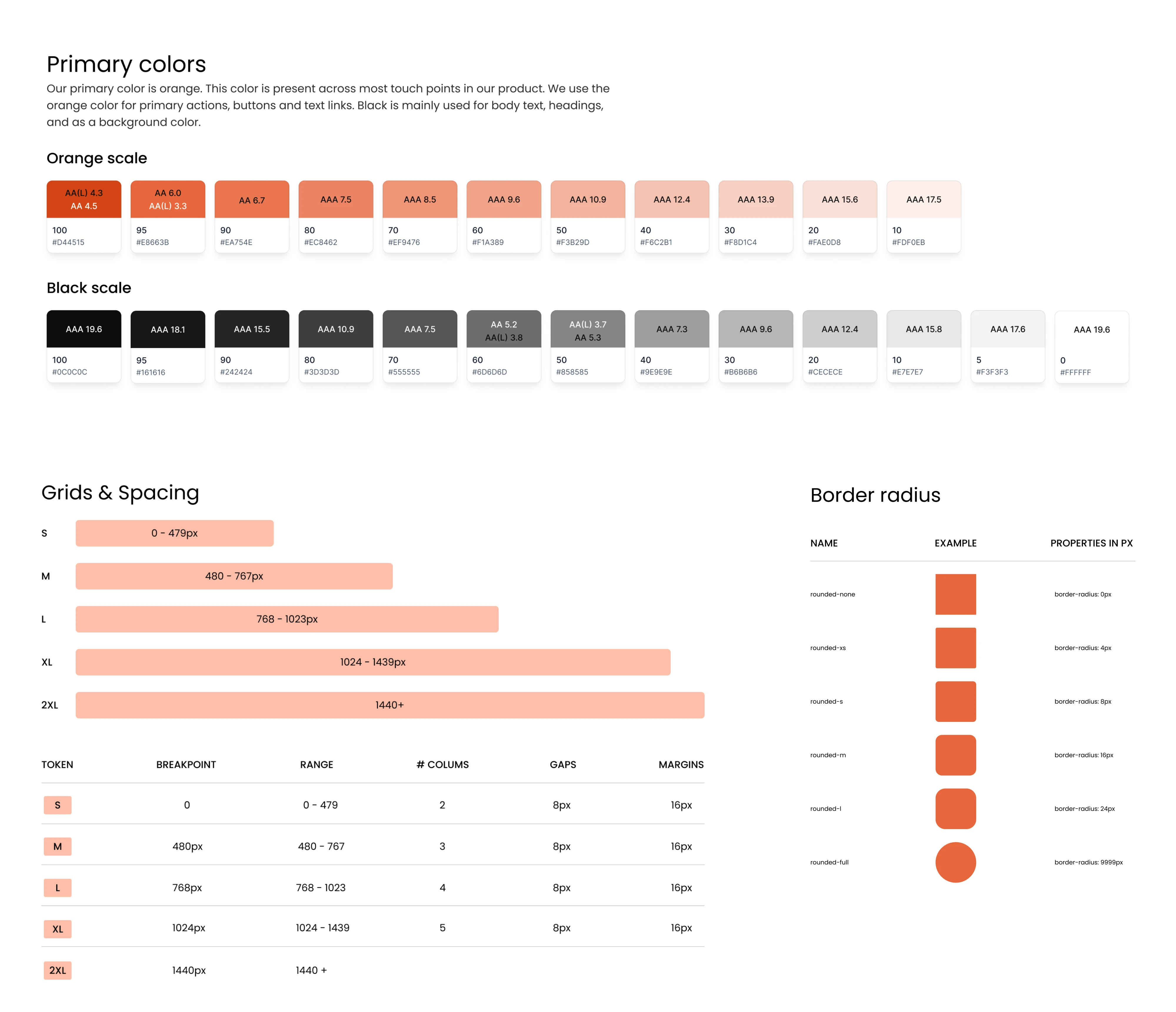
One designer on r/FigmaDesign summed it up well after building a Tailwind-based SaaS design system: foundations like color, spacing, and typography tokens solve a huge class of consistency problems before they reach individual components: “...If your new component doesn’t meet at least those basic requirements, it isn’t useable. That also gets the other members of the team into a pattern and sustainable structure early on.”
Have you setup a foundational system for spacings, typo, color tokens etc? That helps maintain alot of issues at a top level. If your new component doesn’t meet atleast those basic requirements, it isn’t useable. That also gets the other members of the team into a pattern and sustainable structure early on!
That's exactly how scalable design systems stay healthy. Instead of checking every screen for inconsistencies, you establish shared rules once and let every component inherit them.
With foundations locked, components stop being one-offs and start being a system. Here's how to build ones that survive growth.
Build components that scale
A reusable component should work across dozens of screens, not just one. The easiest way to achieve that is to build from simple pieces upward.
Atomic design is a useful framework. Start with atoms (buttons, icons, inputs), combine them into molecules (search bars, form fields), and then into organisms (navigation, forms, tables). When a foundational component changes, every larger pattern built from it updates automatically.
As you build, take advantage of Figma's Auto Layout, variants, and component properties. Auto Layout makes components adapt to different content and screen sizes, while variants and properties let one component handle multiple sizes, states, and configurations instead of creating dozens of separate versions.
Resist the temptation to build every possible component upfront. Start with the elements every SaaS product relies on: buttons, inputs, dropdowns, modals, tables, tabs, alerts, and empty states.
As one designer on r/FigmaDesign advised: “... Pick out the top 20% of that would be used 80% of the time…”, then expand the system based on real product needs.
Write out 100 system pieces you’re thinking you need. Pick out the top 20 that would be used 80% of the time in building something new. Build those. Repeat infinitely.
A scalable component system can influence business metrics, not just design quality. When redesigning MyInterview, we rebuilt the component system and aligned UI states with the user journey, helping resolve a 90% onboarding drop-off that had been hurting activation.
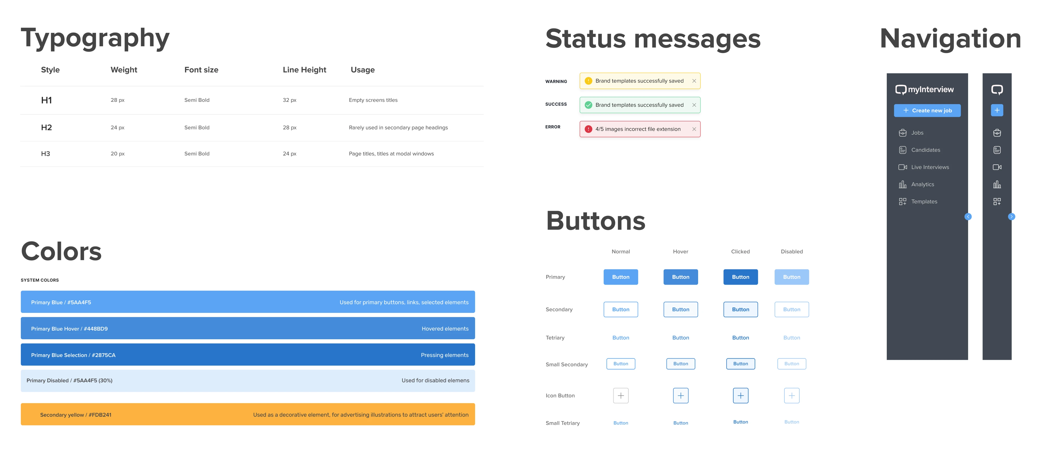
Scalable components are only useful if everyone can actually use them, which is where accessibility stops being optional.
Design for accessibility from the start
Accessibility shouldn't be a final design QA checklist. It should be part of your design system from the beginning. When accessible colors, typography, spacing, and components become the default, every screen built from them is more accessible by design.
On Newton360, we treated that literally. Every component's documentation carried its own WCAG contrast notes for each color combination it used, so accessibility was part of the spec a developer read while building. When the rules live next to the component, "is this accessible?" stops being a question anyone has to ask.
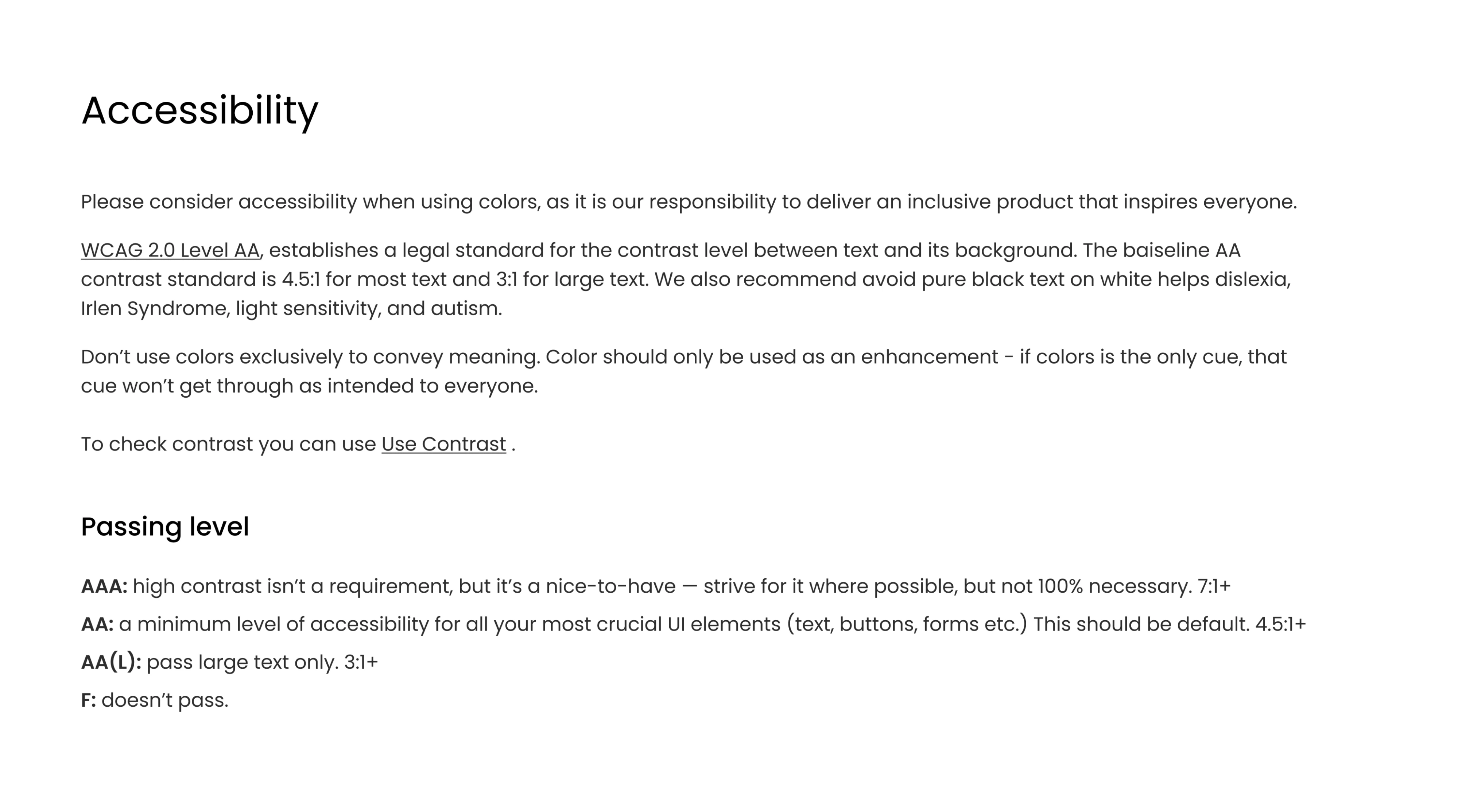
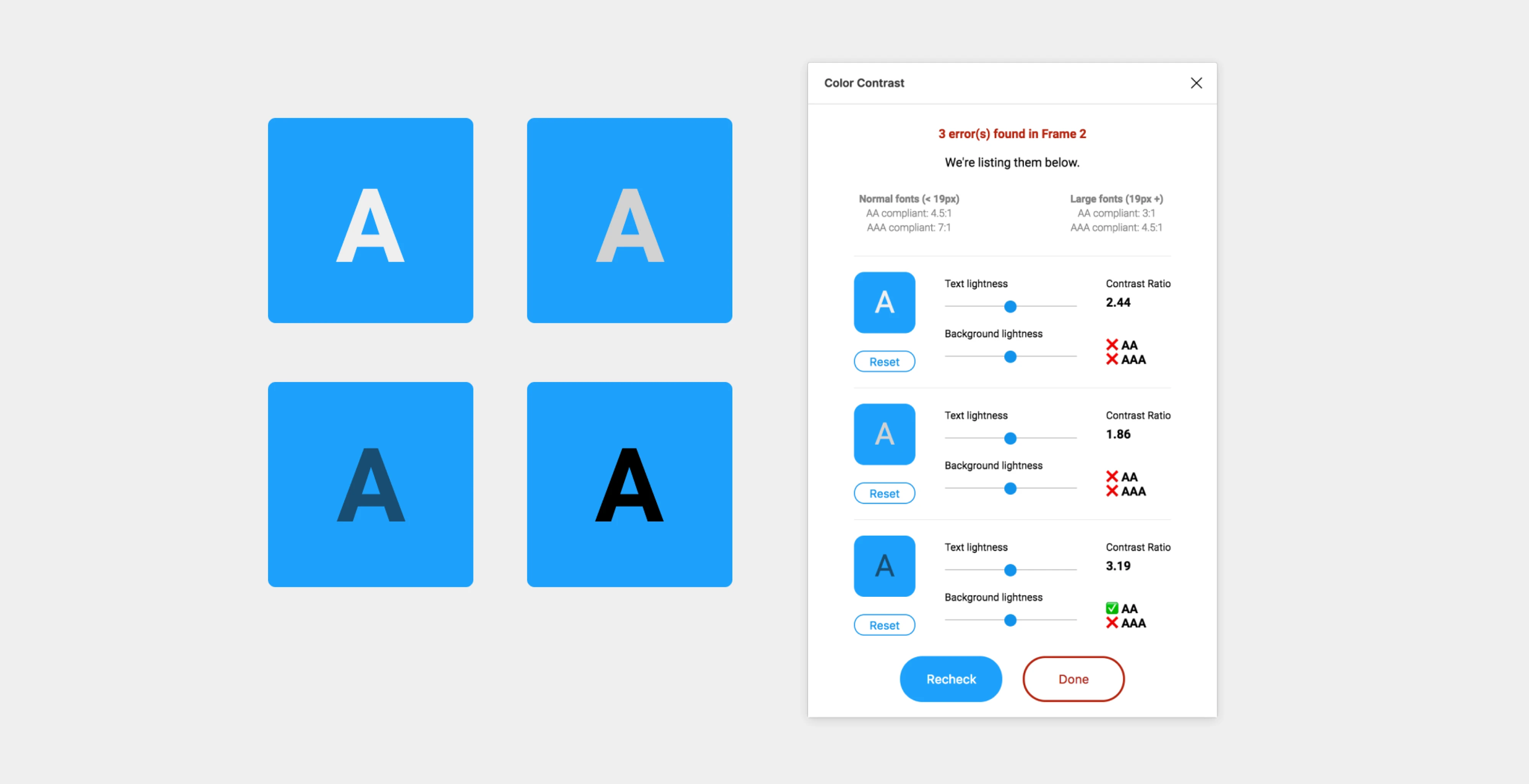
For most products, WCAG 2.1 Level AA is the right target. It provides good readability and usability without the stricter requirements of Level AAA.
When building your system in Figma, check:
- Color contrast for text and UI elements.
- Buttons, links, and controls in every state (hover, focus, disabled, error).
- Form fields and validation messages.
- Keyboard focus indicators.
- Touch targets large enough for mobile devices.
- Readable type sizes and consistent spacing.
You don't have to do this manually. Plugins like A11y – Color Contrast Checker and Color Contrast can validate your designs directly in Figma, while WebAIM Contrast Checker is a reliable option for additional testing.
Not every team builds all of this from scratch, and they shouldn't have to. Sometimes the smart move is starting from someone else's system.
Figma design system best practices 2026
Building the system is only half the work. These best practices will help you keep it consistent, maintainable, and useful as your product grows.
Using UI kits and third-party systems without regret
For a lot of teams, especially early ones, buying a well-made kit is the most sensible decision they'll make all quarter.
The pros:
- Reusable, organized, and ready immediately.
- A single source of truth from day one.
- A faster workflow while you focus on your actual product.
- A learning resource: reverse-engineering a great kit teaches you how systems are built.
The cons:
- Generic kits may not match native iOS or Android patterns.
- Some are over-stylized and need taming.
- You'll still customize, so it's a head start, not a finish line.
If you're shopping, here's the current landscape:
- Untitled UI: massive and well-loved, with 2,200+ reviews and 320,000+ designers using it. Fully built on Auto Layout 5.0 and variables. The PRO LITE option is around 55% lighter for better file performance.
- Frames X: 5,500+ components, starting from $129.
- Cabana: 1,000+ components, starting from $79.
- Flowbite: Tailwind CSS–based, $169–$299, great if your developers already use Tailwind.
- Daisy: budget-friendly at around €48 for 500+ components.
Even if you plan to build your own design system, learn from the best before starting. Many experienced designers recommend studying public systems from companies like Uber, Spotify, Atlassian, and IBM on designsystems.surf to understand how they organize tokens, components, documentation, and naming conventions.
If you want to dig deeper, tools like CSS Scan, VisBug, and Figma inspection plugins let you examine how websites are built and recreate patterns for learning. Just use them as inspiration rather than copying designs directly. The goal is to understand the thinking behind a system and adapt those ideas to your own product.
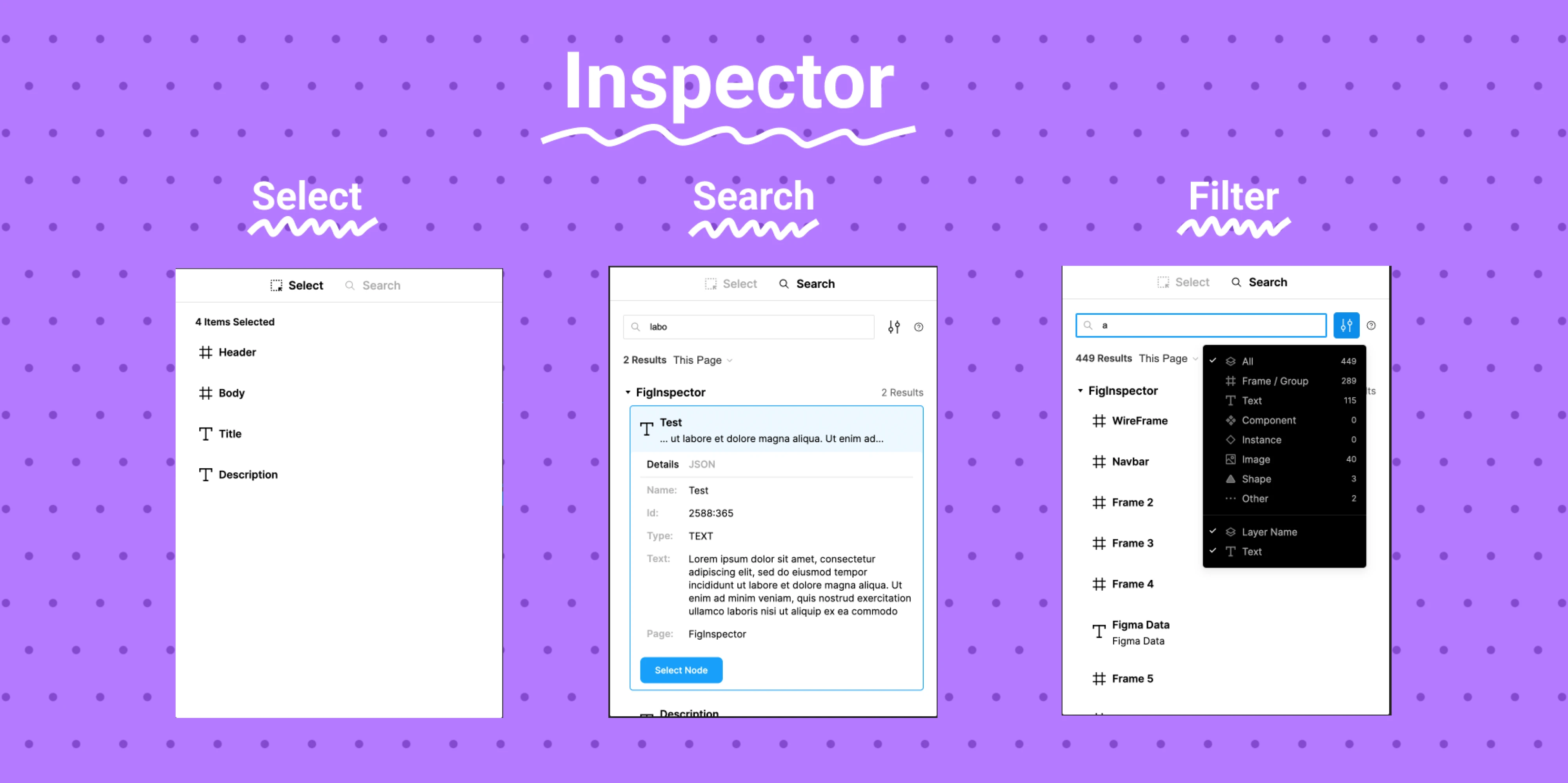
This Redditor advises: “If you want to reverse-engineer a brand's design system from a URL, try tools like CSS Scan or VisBug. They let you check out styles directly on any webpage. You could also use Figma's plugins to break down and recreate design elements. Just watch out for any legal or ethical issues with copying someone's design. It's great to learn and get inspired, but try to add your own twist to it.”
If you want to reverse-engineer a brand's design system from a URL, try tools like CSS Scan or VisBug. They let you check out styles directly on any webpage. You could also use Figma's plugins to break down and recreate design elements. Just watch out for any legal or ethical issues with copying someone's design. It's great to learn and get inspired, but try to add your own twist to it.
For a wider view of the tools that fit around a kit in a real workflow, our guide to the product designer's toolbox covers what pairs well with what.
Whether you build or borrow, the system rots without rules. Governance is what keeps it alive.
Creating lightweight governance
A design system doesn't stay consistent on its own. Someone needs to review changes, maintain components, and remove outdated patterns. For most SaaS companies, a lightweight process is enough:
- Version control and changelogs so people know what changed and when.
- Component ownership so every part of the system has someone responsible for it.
- Contribution rules so additions follow a standard instead of sneaking in.
Document it all inside Figma. A handful of dedicated pages does the job: foundations, components, patterns, examples, and a changelog. The Figma design system documentation best practices explain the reasoning, not just the rules, so new team members understand why decisions were made.
And track whether any of it is working. A few KPIs worth watching:
- Component reuse rate: are people using the system or rebuilding around it?
- Design-to-dev time: is handoff getting faster?
- UI inconsistency count: how many off-system elements slip through?
- Handoff issues: how often do devs come back confused?
If governance is the gap you're feeling most, our design system services page explains how we approach it, and our take on design thinking vs. agile covers how that maintenance rhythm fits into how teams ship.
Keeping designers and developers on the same page
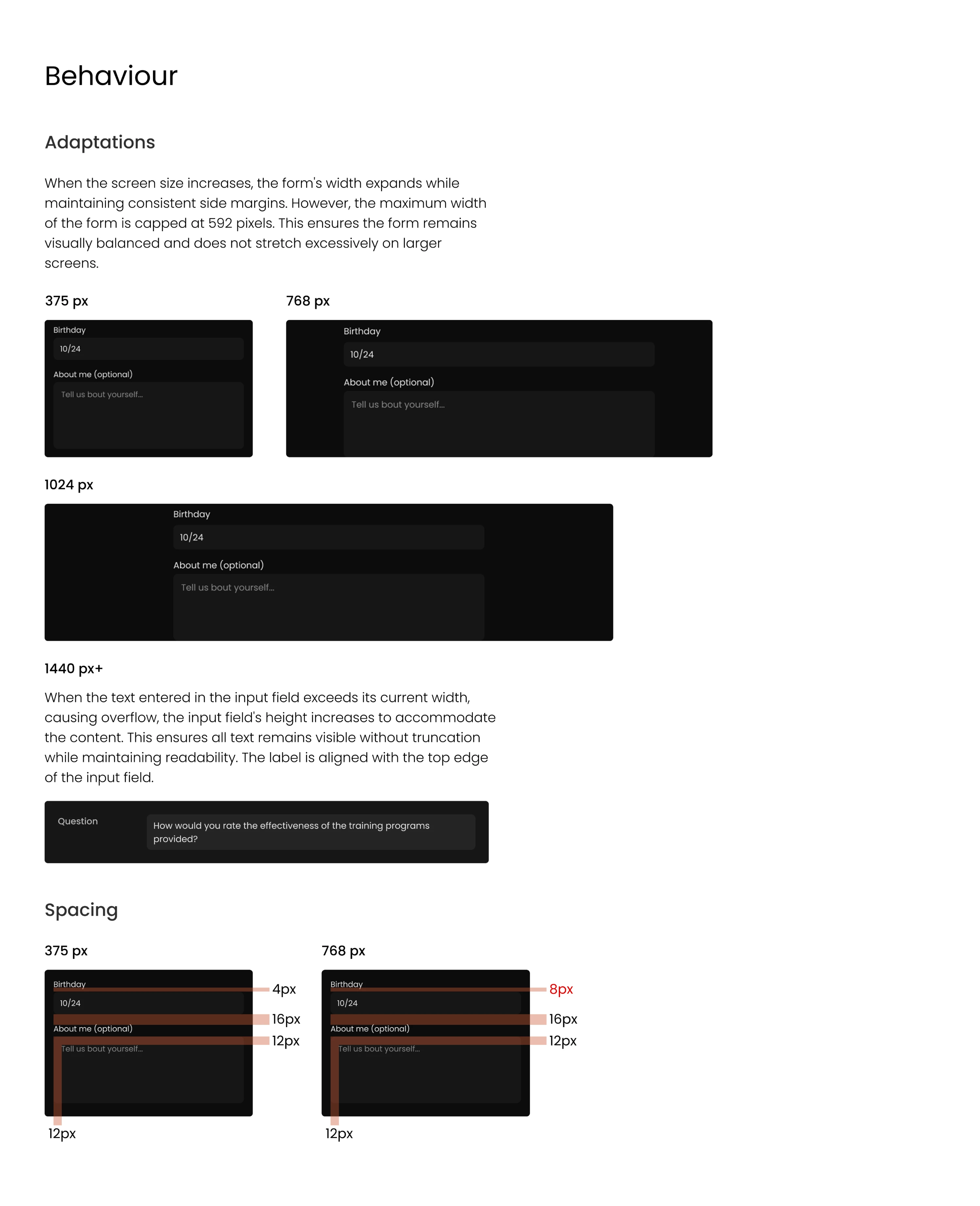
Figma's Dev Mode closed a lot of this gap. Developers can inspect spacing, grab values, see component properties, and pull tokens without bugging a designer. Shared libraries keep everyone on the same source. Comments and annotations carry the context that the visuals can't.
The tooling around it matters too, depending on your setup:
- Tokens Studio for syncing design tokens to code.
- Storybook for the developer-side component library.
- Zeroheight for hosted, readable documentation.
- Notion or Jira for process, tickets, and decisions.
Document every state and edge case: what happens on error, when empty, while loading, when disabled. Those are the moments developers guess at when they're undocumented, and guessing is where inconsistency is born.
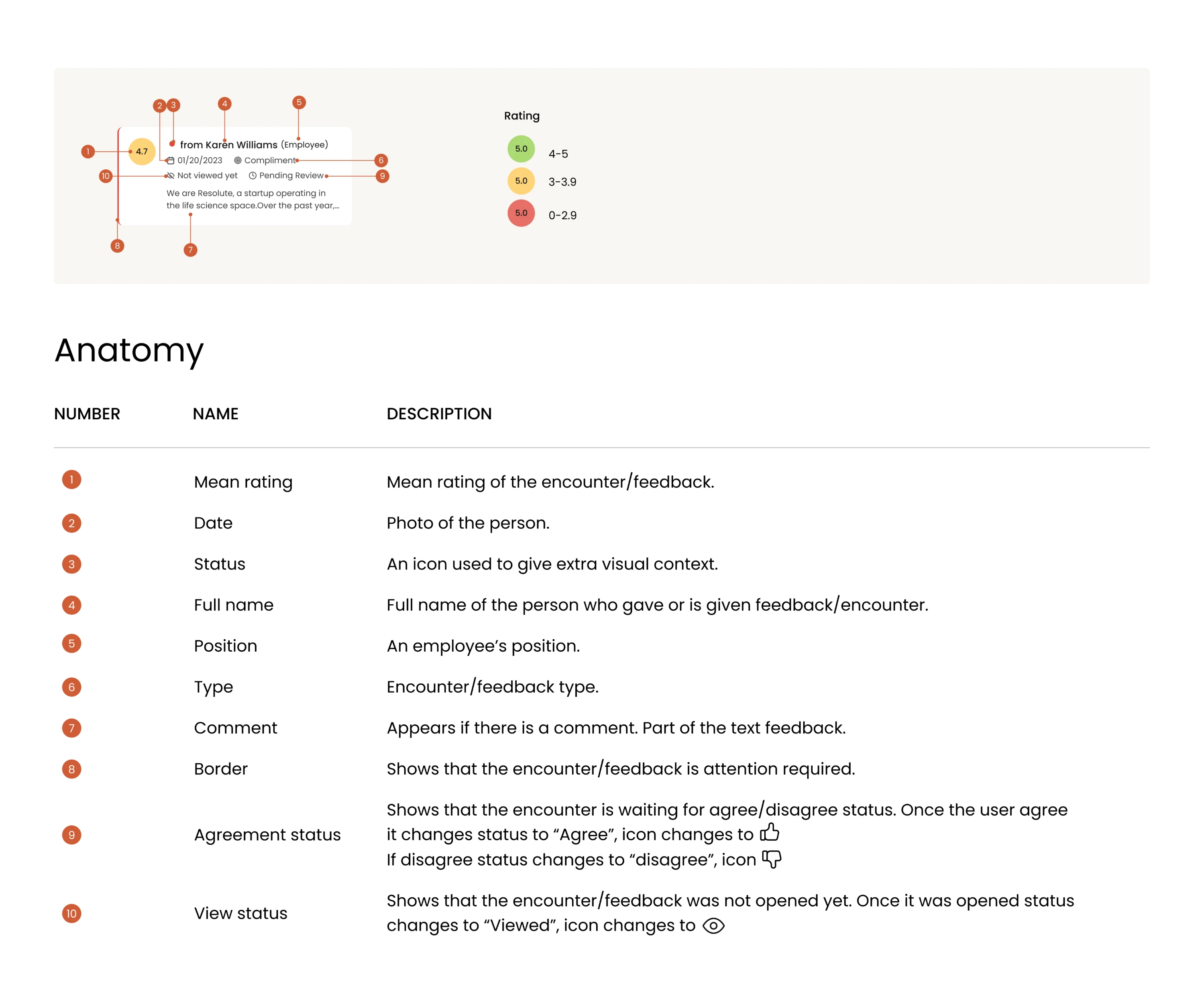
For example, our designer documented every component for Newton360, namely its anatomy, where to use it and where not to, do's and don'ts with explanations, naming conventions, and how it behaved across states and content lengths, and wrote it for both audiences, so a developer implementing a component and a stakeholder reviewing a decision could each just read it and move on. The result across the entire project: developers never once had to stop and ask her how something was meant to work.
For more on getting this part right, our deep dive on Figma developer handoff walks through our actual process, and our roundup of design collaboration tools helps you pick what fits your stack.
That's a lot of ground. If you're staring at all of it wondering where to even start, here's the order that works.
Where to start
If you're building a design system from scratch, keep the process simple:
- Define the foundations: design tokens, colors, typography, spacing, and grids.
- Build reusable components: start with the UI elements your team uses every day.
- Create patterns: combine components into common user flows and layouts.
- Establish governance: document the system, review changes, and keep it up to date.
Each step builds on the previous one. Strong foundations make components easier to maintain, reusable components make interfaces consistent, and governance keeps the entire system from drifting over time.
Remember that a design system isn't a one-time project. As your product evolves, your system should evolve with it. Review it regularly, refine components based on real usage, and remove anything your team no longer needs.
Whether you start with an existing UI kit or build everything from scratch, the goal is the same: create a system that helps designers and developers ship faster without sacrificing consistency.
If you're planning a new design system or untangling one that's become difficult to maintain, we can help. At Eleken, we design scalable Figma design systems for SaaS products that are easy for both designers and developers to use, maintain, and grow.



.webp)