The line between love and hate in the design is thin. Hours spent on approving concepts, preparing mood boards, color palettes, and brand collateral lists don’t guarantee the client will be satisfied with the result. Tiny imperfections and concealed bugs may result in the end-product looking unfinished and not worth paying for. For teams who want to get rid of headaches during the design handoff (not to say to stay motivated), the design QA checklist should become a near-at-hand tool.
If you’ve started to search in Google “what is a QA checklist?” – stop. Because in this article, Eleken has drawn up everything one needs to know about a checklist in testing designs and how to adhere to it. We’ve also prepared a ready-to-use checklist design team can download and use in its day-to-day work. So, enjoy!
The most common UI/UX design problems
Designers face loads of stumbling stones on their way to creating a seamless website landing page or application interface. A truly skilled UI/UX designer is a ninja in matching client requirements, personal design preferences, and common UI/UX design principles.
However, even experienced designers have to polish the final results before presenting them to clients. Below we grouped some of the most common concerns.
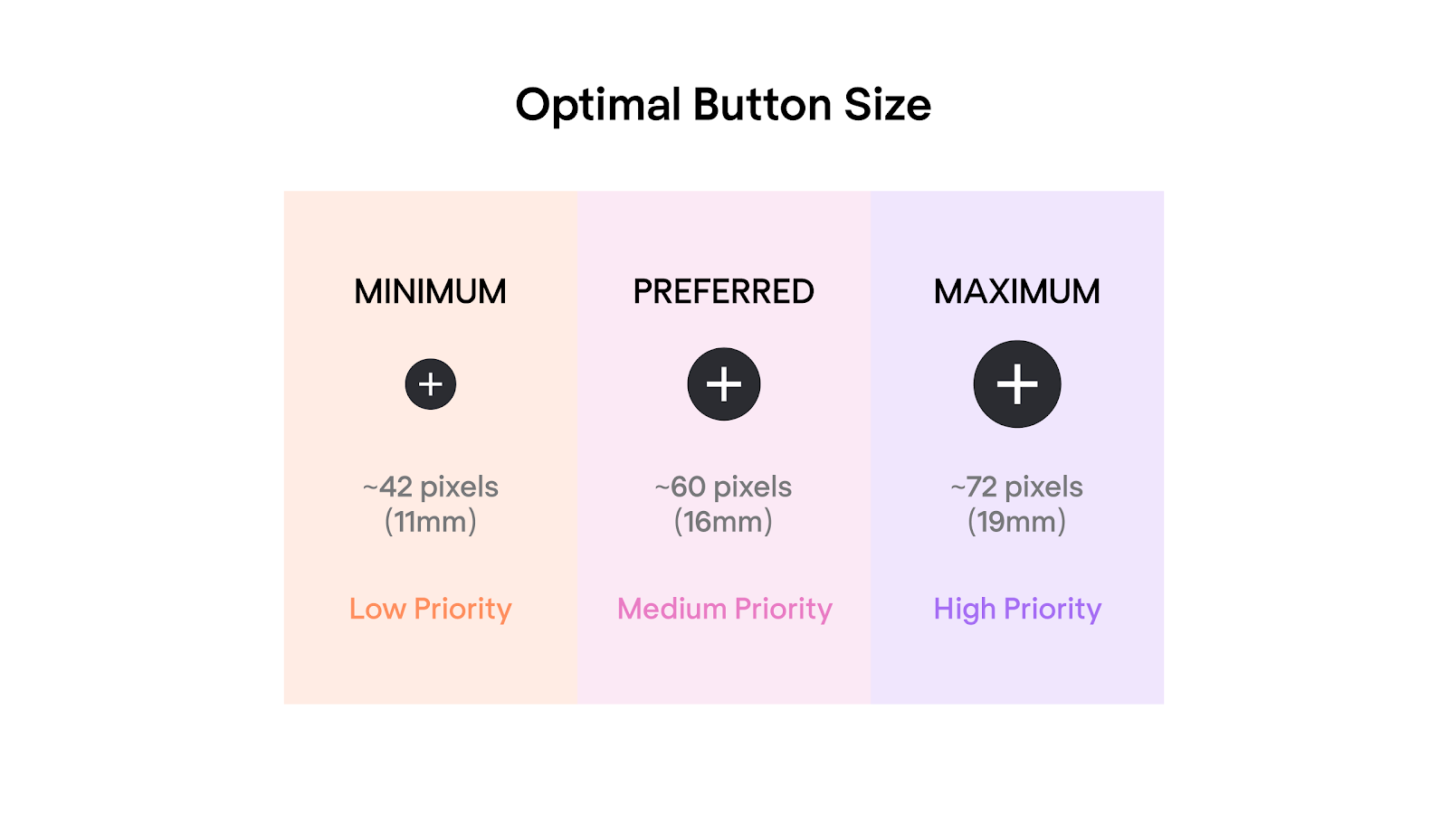
CTA buttons are too small
The graphics and color intensity may be so strong that interactive elements, for example, buttons, can fade. The same might happen if there’s not enough padding inside the button or if it looks too unusual, for example, has a weird shape.
If buttons are too small, CTAs become less clear and noticeable. As a result, they fade on the page and don't lead to user conversions.
Messy overlapping
Managing overlaps and collages is a tough task. Opened menus, popups, and sticky elements complicate across-site navigation and make the page look cluttered.
Poor navigation
“Go back” arrows, and scrollable carousels make UX much easier. If the elements mentioned aren’t visible or don’t work properly, users may leave the website or app without browsing it and deepening the content. As a result, the average session duration will decrease dramatically. Ensuring navigation is intuitive is a top priority on any UX audit checklist.
No hover over buttons, links, or form fields
When you move a mouse cursor over an interactive object, you want to have that feeling that you can click on it, right? In design, this effect comes through hovering (highlighting) clickable objects: buttons, links, menu items, and so on. A hover focuses user attention and encourages taking actions, for instance, clicking on a button or filling in the subscription form. During remote usability testing, observing whether users hesitate over non-reactive elements can reveal significant friction points.
Text that looks like a link (and vice versa)
Underlined words deceive users because they look like hyperlinks. It’s better not to misuse them, as misleading cues are common reasons users fail tasks. When you get insights from usability tests, you'll often find that "click mimics" are a major source of user frustration.
Neglecting white space
There should be enough “air” or blank space (not necessarily white) between elements. If not, the layout won’t look balanced and users will feel overwhelmed with the information and visuals they see.
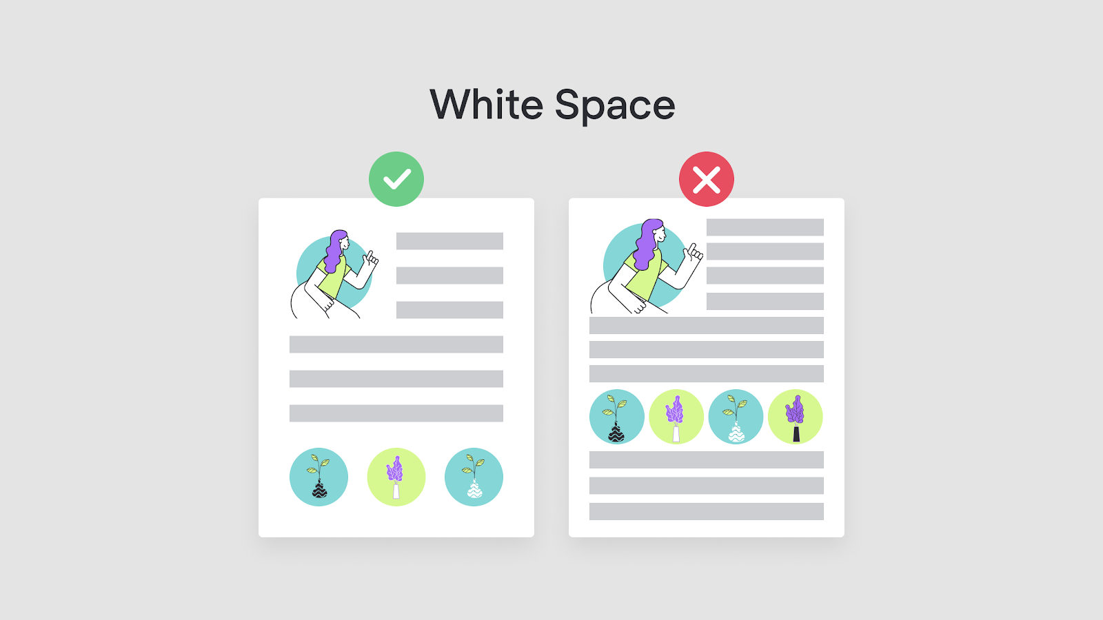
Proper spacing isn't just an aesthetic choice; it directly impacts usability metrics like readability and task completion speed by reducing cognitive load.
Insufficient color contrast
Text contrast against the background isn’t just a matter of personal design preferences. Low-contrast content is one of the major website accessibility issues that Google suggests fixing. Moreover, because around 5% of people suffer from color blindness, it’s important that you stick to the 1.4.3 contrast minimum.

Broken text alignment on mobile
Centered content can be not as accessible on mobile, as it is on desktop. And for users, it’s neither easy to skim through text canvases of left-aligned content. A way out may be - to apply justified text alignment.
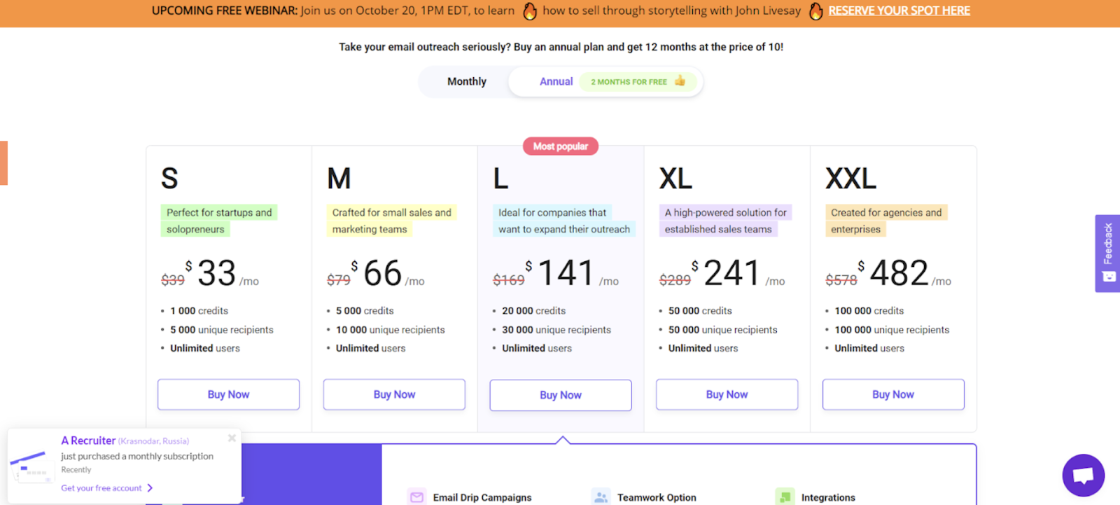
Important information isn’t highlighted enough
In the attempt to carry out creative ideas, it may be difficult to focus on what’s first of all noteworthy on the webpage. For example, if you create a “Pricing” landing page for a SaaS company, subscription plans names and prices should be clear-cut. Other on-page elements, like pop-ups or banners, shouldn’t distract users’ attention from the “Buy now” buttons.
Disregarded core web vitals
Although Google webmaster guidelines aren’t something a UX designer should be proficient with, keep in mind that the faster content elements render while the page loads, the better the website’s overall “quality score” will be. Speed is a critical factor during various types of usability testing, as technical lag can often frustrate users and skew the results of your interface evaluation.
Poor design versatility
The client may want to impose changes, so you should be able to adjust the prototype effortlessly - at any given moment, even after the release. Modern usability testing tools allow for these quick iterations, ensuring that your design remains flexible as you gather and implement feedback.
Design QA process with a quality control checklist
So, what is a checklist in testing? Simply put, this is a sequence of stages to assess the accuracy of the software. Quite the opposite to ad hoc testing checklists allow structuring and systematizing the quality assurance process. They prevent excessive testing and help teams find UX issues before they reach the final development stage.
In design, the QA should cover all 5 quality dimensions of design outcomes. Understanding the distinction between user testing vs usability testing is essential here: while QA ensures the build matches the design, usability testing confirms the design actually works for the human at the other end. We’ve prepared a full quality assurance checklist that will come in handy for pretty any design team.
First we review the consistency:
1. Review overall layout
Balanced pages are more pleasing to the eye, so always double-check whether design elements, including margins, paddings, and borders, look aligned. Choose a single focal point within a grid to deem other elements’ positions. Make sure there’s enough whitespace between objects and re-use motifs, where possible.

2. Check content
Dip into on-page content styling. If there are several similar text containers on a single webpage, their formatting (font and background colors, font size, text alignment) should be the same.
To combine several fonts, choose complementary yet not too similar ones. Also, maintain visual hierarchy and use contrasting font sizes - to distinguish them better.
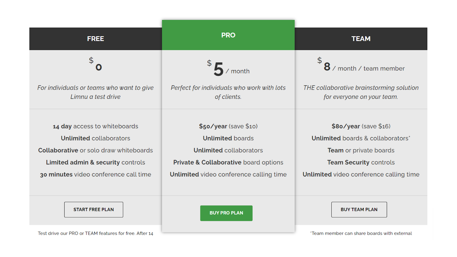
3. Look at visual elements
Use the same UX design patterns for buttons, forms, and drop-down menus all over the website or app, and align them correspondingly. Also, make sure related elements look coherently. For example, a “Buy PRO plan” button should be more highlighted than its “Start free plan” alternative.
Then we move on to functionality:
4. Make a trial run of navigation
Navigation tests imply developing scenarios or use cases. For example:
- “start with the homepage → try to find contact option as soon as possible”
- or “proceed to the checkout page → go back to the online shopping cart → edit the order”.
In these tests, users have to click certain navigational “hitzones” (the parts of the interface that can be clicked). If, for some reason, users don’t click on one of the expected hitzones, they’re asked to provide feedback on what went wrong. These user testing questions are vital for pinpointing exactly where the flow breaks down. After, you can adjust the initial UX flow diagram and improve navigation. This iterative process highlights the significant user testing impact in SaaS redesigns, where complex navigation can often be the biggest barrier to adoption.
5. Check submenus
Submenus may be a bottleneck in Ecommerce website and app design due to that space in the header is quite limited. To smooth the UI, you can add hover and wavy transitions. If you design an Ecommerce app for a big retailer, it’s reasonable to use multi-level submenus. For booking websites or apps – use popup filtering bars and icons instead of text. During web usability testing, pay close attention to whether users struggle with "hover tunnels" or disappearing menus.
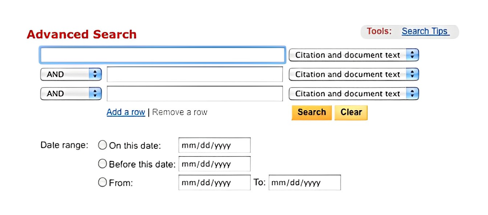
6. Try using the search box (if any)
There are 3 common issues with search boxes to avoid:
- they’re hardly noticeable
- their input fields are too short
- the “Submit” button is styled the same as the input field.
Also, try not to create too advanced search boxes because they usually confuse users and make them want to back off search attempts at all. Testing these elements through unmoderated usability testing is often the most efficient way to see if a diverse range of users can find what they need without a facilitator's guidance.
7. Test drop-down lists
Although SEO managers don’t like drop-downs, these lists still have their place in web design. The only thing is - not to overuse them.
Ask yourself whether you can replace a drop-down list with toggle switches, checkboxes, steppers, or radio buttons. If the answer is “No”, then make sure an opened drop-down list doesn’t end up going off the screen. In case the list is too detailed, for example, contains more than 5 options, enhance it with multiple select options.
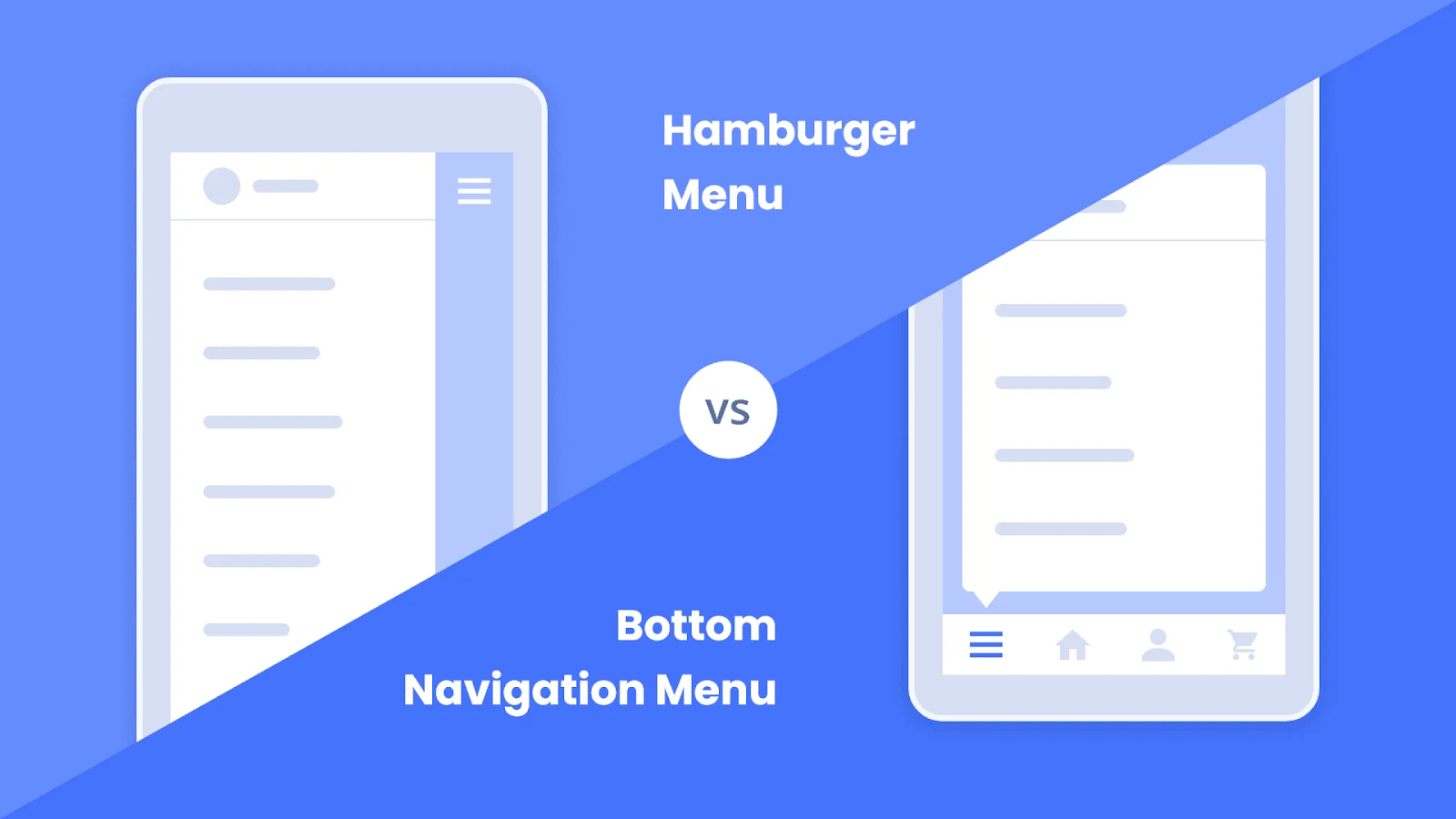
8. Check the design of the hamburger menu
Some say that it’s better to replace hamburgers with tab bars or toggle menus because of better UX. But it’s still a matter of preferences. If you do implement a hamburger menu in the design, make it noticeable and self-evident. The menu should give users an idea about what they can access on the website or app. Perhaps, in some cases, it’s good to list the most important elements and leave hamburgers for less relevant stuff (the way Facebook does in its app).
Now it's turn to check the responsiveness:
9. Check appearance on different screen sizes
Lack of responsiveness usually results in inconvenient scrolling and zooming, so make sure users will be able to browse the website from any device with no losses in functionality. To test responsiveness, you can use emulating tools, like BrowserStack or others.
10. Check appearance in different browsers
Chrome, Safari, Internet Explorer, and other browsers have distinct layout engines and interpret code languages differently. There’s nothing bad with it - it’s just about double-checking if the text and graphics still display correctly.
Then, check the interactive elements:
11. Try filling in forms
Whether you use a subscription form, a downloadable lead magnet, or embed Calendly on the website, try out how these work. Enhance forms with popups, like “Thank you!” or “Processing...” messages. And don’t forget that every form should be integrated with a CRM.
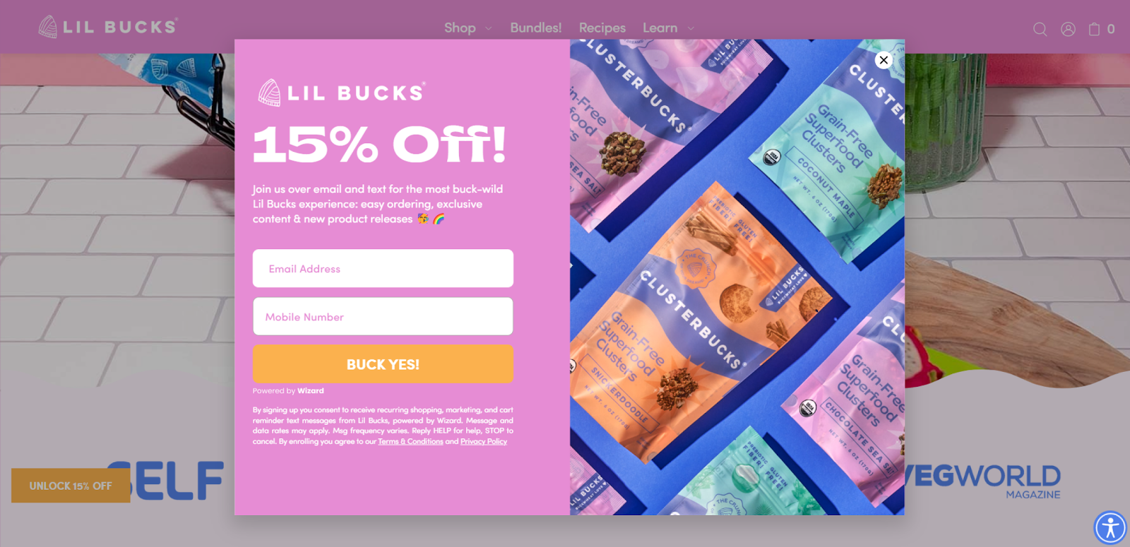
12. Test popups
Cookie notification messages and overlay banners should match page colors yet be well-marked and eye-catching. Use a color block to highlight the popup even more and make the text easier to read. And don’t forget to add a button with a CTA and a close icon.
13. Ask yourself if it’s possible to implement the design (with a considerable probability)
Design and development are closely linked. Even if you’re a graphic designer, try to foresee cases with UX and bottlenecks during the software development. For example, a 4k video placeholder looks good in Figma but turns out to be a heavy load for the server. A good thing is to think up 1 or 2 alternatives for potentially disputable design elements - just in case. Preparing these variants early makes it much easier to conduct A/B testing SaaS features to see which technical compromise users actually prefer.
14. Ask yourself whether design elements ease user experience
Before putting the prototype to a release, make sure there’s nothing more you can add to improve the user experience. Are navigation icons self-explanatory? Did you get rid of links’ redundancies? Have you styled the “Terms of Service”, “Cookie Policy”, and other legal pages? Every small detail may have a huge impact on UX. Once you find beta testers for your final pre-launch phase, these are the types of "quality of life" details that will determine if your product feels polished or amateur.
And finally, ensure your design aligns with JTBD:
15. Make sure the design outcome meets the given job story
Try to consider clients’ possible motivations, not just technical requirements and wants. “When [I perform some action], I want to [something happens], so I can [do something or proceed further]” - include this job story to the UI testing checklist - to see requirements in a slightly different light and understand how to implement them fittingly.
Engage real users:
16. Ask your team to test the prototype
Invite colleagues or mates to participate in the quality assurance (QA) first impression test. Let them see a design prototype for a couple of minutes and after - ask them to share their feelings about it and how they would describe it. You may share the UI checklist template with them so they can suggest enhancements, as well.
17. Use focus groups
Complex projects require thorough QA UI testing. Focus groups for UX research don’t differ much from ordinary ones. They consist of 5-10 participants and a moderator who watches the process. Provide participants with prototypes and ask them to assess them upon certain criteria. These may be overall visual appearance, accessibility, and others. Focus groups help detect bugs and better understand user preferences and needs.
Wrapping up
In the dynamic realm of design, where the fine line between success and dissatisfaction is often navigated, a careful Quality Assurance process guides designers towards excellence. This comprehensive design QA checklist serves as an indispensable tool for design teams, ensuring that every pixel aligns with perfection before the handoff. By addressing common UI/UX pitfalls such as small CTA buttons, messy overlapping, and neglected core web vitals, designers can elevate their creations to meet not only aesthetic expectations but also functional excellence. Your users will surely appreciate it.
If you need a design partner who knows how to make sure each design piece is perfect, don't look any further. We at Eleken excel at creating – and assuring the quality – of our design. Contact us today for product design or redesign to see how it can boost your game!


