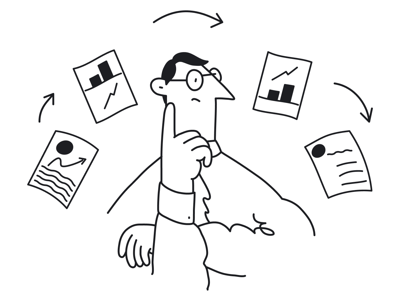

Modern SaaS products are not static ‘artifacts’ but continuously evolving systems — where each feature release creates a new adoption cycle and iterative updates keep the product fresh and relevant.
Product lifecycle management splits the product development process into four phases:
- Introduction — the point when you get the business off the ground
- Growth — climbing up the curve challenge
- Maturity — a battle for maintaining your position
- Decline — time to innovate or die

As products grow, design tends to drift. Buttons start to look slightly different across pages. Spacing becomes inconsistent. Similar components get rebuilt instead of reused. Over time, this slows teams down and makes the product harder to maintain.
In such an environment of constant change, a design system becomes essential infrastructure, ensuring visual consistency and coherence. It creates a shared language for designers and developers, standardizes reusable components, and makes it easier to scale both design and development without constant rework.
At Eleken, a UI/UX design agency specializing in SaaS products, we often see how the absence of a structured design system leads to duplicated work, inconsistent interfaces, and slower product growth.
The good news is that building a design system from scratch doesn’t have to be overwhelming. With the right approach, you can turn scattered UI decisions into a scalable, well-documented custom design system that supports both design and development. A strong design system initiative also helps teams collaborate more efficiently as products evolve.
In this guide, we’ll walk through how to create a design system from scratch—starting with a UI audit, defining tokens, building components, and rolling a it out in a way that teams can adopt in real workflows.
Step 1: Start the design system process with an audit of your product
Most design systems don’t start from scratch—they grow out of what already exists.
That’s why the first step isn’t designing components. It’s understanding what you already have.
Start with a simple UI audit. Go through your product and capture key screens. Look for repeated elements across flows:
- buttons
- inputs
- navigation patterns
- cards
- tables
- modals
You’re not trying to judge quality yet. The goal is to see patterns.
Once you collect examples, group similar elements together and compare them. This is where inconsistencies become obvious—slightly different paddings, multiple versions of the same button, or similar components behaving differently.
To make the audit useful, focus on a few key questions:
- Which components appear most often?
- Where do styles vary without a clear reason?
- Which patterns create friction or confusion?
- Which components are hardest to implement consistently in code?
Auditing these repeated design elements helps define what should become standardized. This step defines what your design system actually needs.
In many cases, the first version of a design system isn’t about inventing anything new. It’s about standardizing what already exists and removing unnecessary variation.
Step 2: Decide the scope of your first version
One of the most common mistakes teams make is trying to build a complete design system from day one.
In reality, design systems evolve. Trying to define every component, state, and guideline upfront usually slows things down—and often leads to a system nobody uses.
Instead, treat your first version as a design system MVP. The goal isn’t completeness. It’s usefulness. Think of it as the foundation for your own design system that can grow alongside the product.
Start by focusing on what your product needs most right now. In most cases, that includes:
- core design tokens (colors, typography, spacing)
- the most frequently used components
- basic interaction states (hover, focus, disabled)
- lightweight documentation
A practical approach is to anchor the system around a real product flow.
For example, instead of designing every possible component, standardize the elements used in one key area—like onboarding, dashboard navigation, or a core feature. This keeps the scope manageable and ensures the system is grounded in real usage, not assumptions.
As other parts of the product adopt these components, the system expands naturally.
Design systems that grow this way tend to stick. They’re not imposed—they’re adopted because they solve real problems.
Step 3: Build your foundations with design tokens
Once the scope is clear, the next step in building a design system is defining its foundations. This stage establishes the core design principles that will guide future decisions.
This is where design tokens come in.
Design tokens are the smallest building blocks of your design system. They define the core visual values used across your product, such as:
- colors
- typography
- spacing
- border radius
- shadows
Instead of hardcoding these values into components, you define them once and reuse them everywhere. This is what allows teams to maintain consistency and scale without constant rework.
3.1 Define primitives
Primitives are the foundational tokens of your design system—the basic building blocks everything else is made from. This is the only place where values are defined manually.
Common examples include:
- color palette (e.g., blue-500, gray-100)
- spacing scale (e.g., 4px, 8px, 16px)
- radius values
- typography tokens (font family, weight, size, line height, letter spacing)
- icon tokens (size, weight)
Together, these foundations create a scalable pattern library for the entire product.
These are just examples—your system may include additional primitives depending on its needs.
Unlike color or spacing, typography is usually defined as a combination of multiple values that work together rather than a single value.
As we’ve already said, these are your foundational elements. They don’t carry meaning yet — they just define the available values.
Create a group called "Primitive" and inside it, create a subgroup called "Color". This is where the entire color palette of the project is collected, divided into color groups (red, blue, green, etc.)

✔ An optimal approach is to create a gradation from 50 to 950 — this provides enough variations without the need to rely on transparency.
✔ write names in lowercase (color/blue/900), as this is more convenient for developers.
✔ Don't forget to check WCAG against the main background color, as the rules around this have become stricter. Contrast must meet a minimum of AA.

Within the "Primitive" group, create a subgroup called "System". This is where the system states are defined (destructive, warning, success, informative). Each state is linked to a color from the "Color" group above. Mind that colors are not hardcoded directly here.

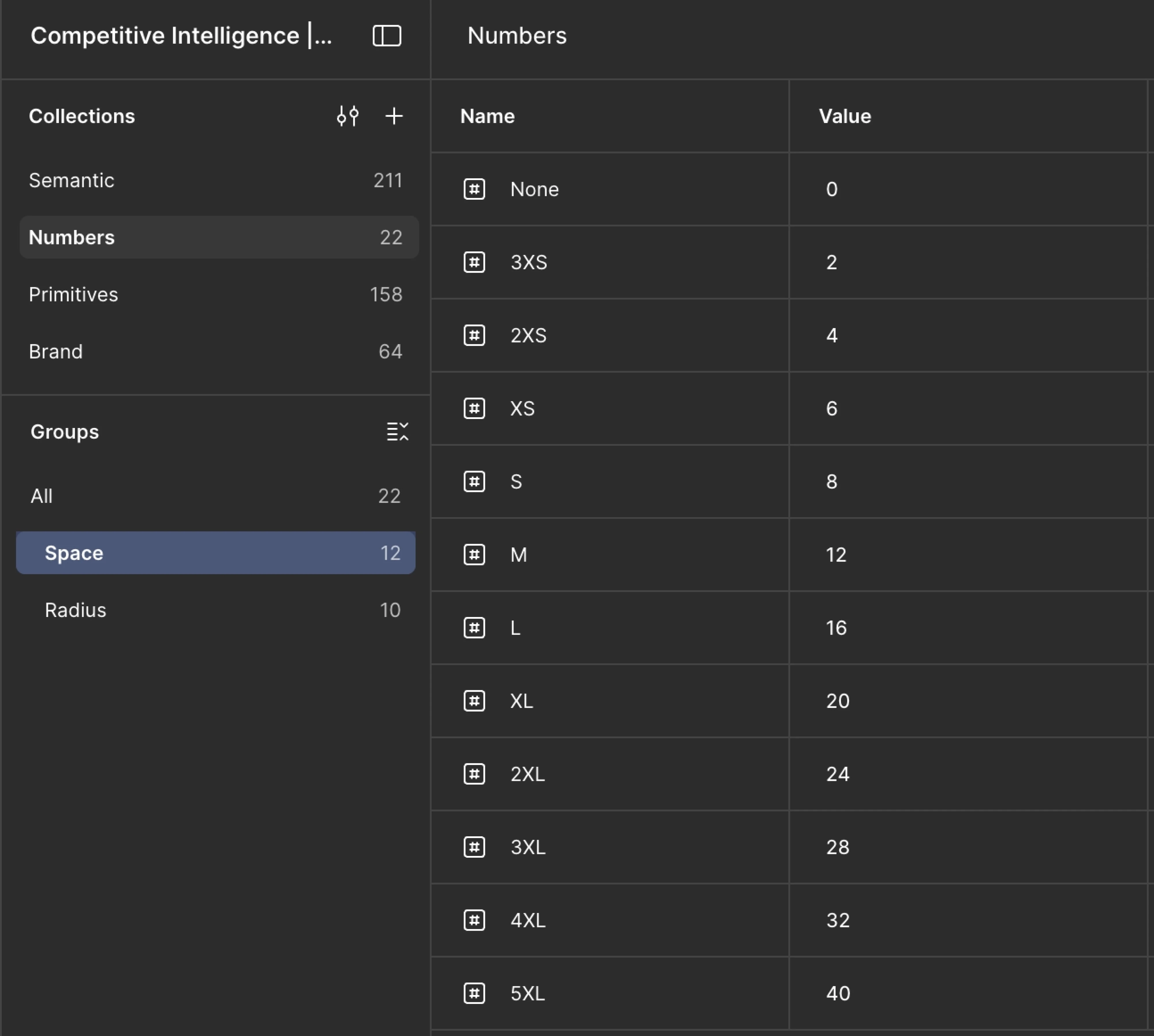
Within the " Primitive" group, add a subgroup called "Space".
Start with none (0px) and then assign letter-based labels: XS, S, M, L, XL, 2XL. This is essential for convenient scaling down the line — once you start building modes, you'll thank your past self for this decision for consistent spacing:)
Then, add a subgroup called "Radius", which holds numerical values ranging from none (0) to Full (100000).
Assign values using letter labels (XS, M, 2XL, etc.); the letter labels can mirror those used in spacing, so there's no risk of confusion. For example, if spaces/3XS has a value of 2px, then radius/3XS will also carry a value of 2px.
In the example below, "numbers" is shown as a separate, standalone group. This is not by mistake, simply a workflow preference at the time. This approach is equally valid.

3.2 Pro tip on text
Figma currently lacks convenient text settings, so use styles instead. And don't forget to write documentation in the description field.
The recommended naming convention for text styles is: Level (H1, H2, body, etc.) / Weight (Bold, Medium, etc.) — resulting in something like H1/Bold, which will automatically create a group H1 with Bold nested inside. From there, simply duplicate Bold, change the weight, and update the name accordingly. This structure makes it easier to manage font sizes and maintain hierarchy across screens.
Gradients and effects are also currently style-only. These follow the naming convention: component_placement and/or behaviour_what (e.g., card_hover; column_left_shadow).
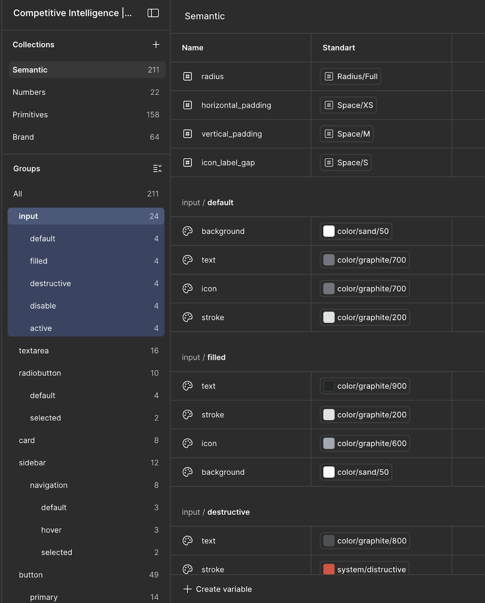
3.3 Create semantic tokens
Primitives alone aren’t enough. To make the system scalable, you need a layer that connects values to real UI meaning.
That’s where semantic tokens come in. Instead of referencing a color directly, components reference a role:
- semantic/button/primary/background
- semantic/input/default/border
- semantic/surface/main
This abstraction is what makes design system development flexible. For example, if your primary color changes, you update one token instead of editing dozens of components. It also creates a more comprehensive design system that is easier to maintain long term.
This is also what helps designers and developers share a unified language—everyone refers to meaning, not raw values.
So, let’s get done to work:
- Create a separate Semantic group. Without creating a nested group, add tokens main_surface and secondary_surface directly inside it, linked to colors from primitive/color.
- If there's potential for many of these, they can be placed into a Surface subgroup. These represent the background colors of your layouts and will be used as the background for component sets.
After creating the tokens, click on the variable settings and navigate to the Scope tab:
- Here, define what this token will be used for — in this case, Frame and Shape. This simplifies the workflow when assigning colors to components, as the token will only appear when clicking on a fill.
- Then navigate to the Details tab and write full documentation (What is this? How and when should this token be used? When should it not be used? Any additional notes).
3.4 Define system states
UI elements rarely exist in a single form—they change based on user interaction and context. However, states should not be defined globally upfront. Instead, they should be specified at the component level, once we clearly understand how that component behaves.
Different components may support different states (e.g., some may have hover or focus states, while others may not). Common examples include:
- hover
- focus
- disabled
- error
- success
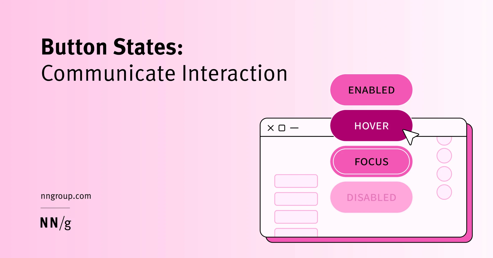
These states should still be defined through tokens rather than styled each time manually — but only for the states that are relevant to a given component.
For example:
- semantic/button/primary/hover
- semantic/input/error/border
This approach ensures that reusable UI components remain consistent across the product, while also staying flexible and context-aware.
Step 4: Build Components Around Real Use Cases
Once your foundations are in place, the next step in creating a design system is building components. If tokens define the rules, components are how those rules show up in the product.
4.1 Anchor work in real product usage
But instead of starting from a blank canvas, anchor your work in real product usage. Design systems work best when they grow out of actual needs—not abstract ideas of what might be useful later.
A good starting point is to pick a component that appears frequently across your product, such as an input field, button, or card.
From there, build it properly. Each component should include:
- a default state
- interaction states (hover, focus, disabled)

- clear structure (labels, icons, helper text)
- configurable properties (size, variants)

This is how reusable components become reliable building blocks instead of one-off designs. So, here’s how we proceed:
- First, add each component to a separate subgroup within Semantic, and then break down each component group by the states of that component.
- Then, define the individual parts of the component within each state.
- The resulting path would look something like semantic/input/default/stroke — and it is to this stroke token that a color from primitives will be connected.
4.2 Build with tokens, not hardcoded values
Every component should be connected to your token system. For example:
- text color → semantic token
- spacing → spacing token
- border radius → radius token
Avoid hardcoding values directly into components. Otherwise, changes to your design system won’t scale.
This is what turns a UI library into a component library that can evolve over time.
Also, mind the following things:
✔ The more granularly a component is broken down, the more flexible the system becomes. For an input, the recommended parts are: background, text, icon, stroke, and label.
✔ If certain values are shared across all states — such as radius — you can place them directly at the component group level (e.g., input) rather than within individual states.
✔ place spacing values for such components preferably at the component level, since they typically don't vary from state to state.
✔ use underscores ( _ ) as the separator for token naming; two words like horizontalPadding are still readable, but once it becomes iconLabelGap, things usually start to get pretty painful.
Make sure spacing tokens have the following naming convention: placement_what. For example, horizontal_padding or label_text_gap (the gap between the label and the text).
Once the color is connected, head over to the Scope tab to define the token's intended usage. And from there, switch to the Details tab and document it thoroughly — what it is, when to reach for it, and when to avoid it.
With the tokens in place, it's time to wire them up to the component. Stroke maps to stroke, background to background — keep it straightforward.
To introduce a new component state — say, disabled — duplicate the existing state group, rename the copy accordingly, and work through the connection process again from the top.
4.3 Start small, then expand
You don’t need to build every component at once. Focus on what your team uses most:
- buttons
- inputs

- dropdowns

- modals
- tables
As new needs appear, you can introduce new components gradually. This keeps your design system creating process grounded in real usage instead of speculation.
4.4 Document while you build
Even at this stage, add basic context to each component:
- What it’s used for
- When to use it
- available states and variants
This doesn’t need to be perfect yet. But even lightweight documentation helps your design team and developers stay aligned.
Step 5: Document everything
Documentation in design system development is what turns a collection of components into a usable system. Without it, teams fall back into old habits—rebuilding patterns, making inconsistent decisions, and slowly drifting away from the system.

If you want your design system to be used by the entire team, the design guidelines needs to explain not just what exists but also how and why it should be used. At a minimum, every component should answer a few basic questions:
- What is this component for?
- When should it be used?
- When should it not be used?
- What states and variants does it support?
This is where many teams fall short of design system best practices. They focus on building components, but skip writing clear guidelines.
5.1 Keep documentation close to the work
Documentation works best when it’s easy to access. Writing documentation directly in Figma means any designer or developer can access it right there in context, without having to jump over to Notion or wherever else it might live.
It's a small habit that pays off quickly — especially for components, where the description is just a click away.
Tokens are a different story, though: their documentation is buried inside the variable settings, making it far less discoverable during everyday work. That's why in-Figma descriptions, as useful as they are, don't replace a dedicated doc space — they're a convenient first line of reference, not the full picture.
5.2 Write for people who weren’t there
When documenting design system guidelines, assume the reader has no prior context.
A new designer joining the team—or a developer picking up a component for the first time—should be able to understand:
- What the component does
- How it fits into the design language
- What decisions were made and why
This is especially important for maintaining design quality over time.
5.3 Use examples, not just rules
Rules alone aren’t enough. People need to see how things look in practice.
Include:
- visual examples of correct usage
- examples of incorrect usage
- edge cases where the component might break

This helps teams stay aligned and ensures visual elements are applied consistently.
Step 6: Align the system with development
A design system only becomes truly effective when it exists in both design and code.
If designers and developers don’t cooperate tightly, the design system breaks down quickly — components get rebuilt differently, inconsistencies creep back in, and the handoff slows everything down.
But with alignment, it becomes a shared system that both designers and developers rely on. Building and maintaining a system is always a team effort that requires alignment across disciplines. And this reduces development time, improves consistency, and keeps the product easier to maintain as it scales.
That’s why alignment with development should start early, not after the system is “finished,” so your devs know how to build a design system accurately.
6.1 Agree on structure, not just visuals
Start by aligning on how the system is structured:
- token naming conventions
- component structure and variants
- interaction states
- accessibility requirements
This ensures that what’s defined in design can be translated directly into production code.
For example, if your design tokens follow a clear naming system, developers can map them to CSS variables or code tokens without reinterpretation.
6.2 Connect design tokens to code snippets
Design tokens shouldn’t stay inside design files.
They need to exist in code as well—often as variables that developers can reuse across the product.
This is where collaboration becomes critical. Designers and developers should agree on:
- naming conventions
- token hierarchy
- how tokens are applied in components
When done well, this reduces duplication and speeds up implementation across the product team.
6.3 Standardize components across design and code
Your UI components in design should have direct equivalents in code.
This includes:
- the same structure
- the same states
- the same behavior
If a button has three variants in design but five in code, the system starts to drift.
Keeping both sides aligned ensures that components behave consistently in real ui design and implementation.
6.4 Make the handoff predictable
A strong design system simplifies the handoff process.
Instead of explaining each screen from scratch, designers can reference existing components and patterns. Developers already know how those components behave, which reduces back-and-forth.
This is especially useful as teams grow and more people contribute to the product.
Step 7: Roll out the system gradually
Creating a design system and launching it across an entire product at once might sound efficient—but in practice, it rarely works. Too many changes at once create friction: teams struggle to adopt new patterns, and the system starts to feel like extra work instead of a useful tool.
A more effective approach is to roll it out gradually to reduce risk. This way, you allow the system to evolve with the product, instead of forcing the product to adapt to an unfinished system.
And most importantly, it ensures the system becomes part of the team’s everyday workflow—not something separate from it.
7.1 Start with a real feature
Pick one product area and apply the system there first. This could be a new feature, a redesign of an existing flow or a high-impact part of the product.
The goal is to test your design system process in real conditions. This helps you:
- validate your components
- identify gaps
- refine naming and structure
7.2 Let adoption follow usefulness
How to make a design system succeed? In practice, design systems don’t succeed because they’re enforced. They succeed because they make work easier.
When teams see that using the system saves time and reduces confusion, they naturally start adopting it in other areas of the product.
This is especially important for getting buy-in from both designers and developers.
7.3 Expand based on real needs
As more teams use the system, new requirements will appear: missing components, edge cases, or new patterns.
But instead of trying to predict everything upfront, treat expansion as part of an ongoing process. This keeps the system relevant and prevents it from becoming outdated.
7.4 Show value early
To encourage adoption, demonstrate impact early. For example:
- reduced time to design new screens
- fewer inconsistencies
- smoother collaboration between designers and developers
Over time, this leads to real cost savings—not just in design work, but across the entire development cycle.
Treat the Design System Like a Product
Design systems are not one-time projects. They need ongoing attention to stay useful and aligned with the product. In practice, that means:
- reviewing new component requests
- updating tokens as the visual language evolves
- maintaining documentation
- ensuring accessibility standards remain intact
Without this, even a well-built design system quickly becomes outdated or inconsistent.
Clear ownership makes a big difference. Most teams assign responsibility to a small group that maintains the system, reviews changes, and keeps it aligned with real product needs. In practice, a good design process ensures the system continues evolving instead of becoming outdated.
If you’re building a design system in Figma or scaling an existing one and need extra support, working with a team like Eleken can help. An experienced designer can step in, structure the system, and support your team without long hiring cycles — so you can focus on improving the product digital experiences, not managing inconsistencies.

