

Figma's data science team ran a simple experiment. Designers built the same screens twice: once using a relevant design system and once without one.
With a design system, they finished the work 34% faster. For a seven-person design team, that's roughly the same productivity boost as adding 3.5 more designers without hiring anyone. The time wasn't saved through shortcuts. It came from not redesigning what already existed.
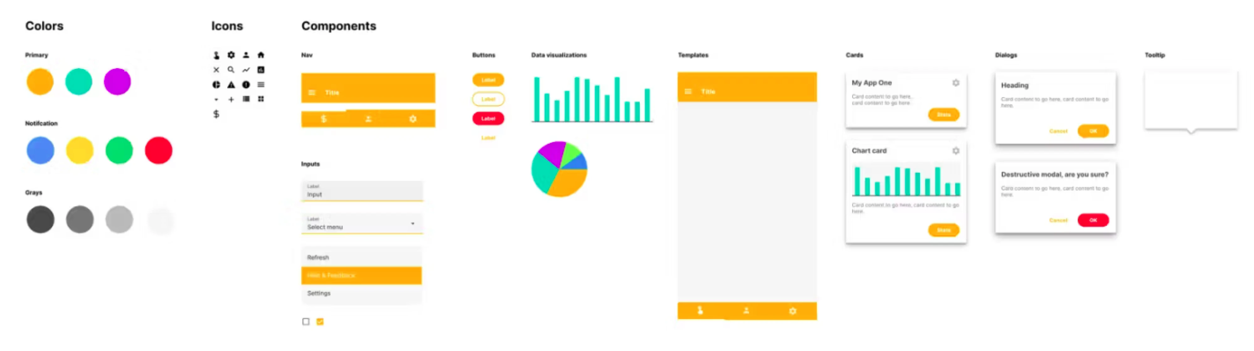
That finding matters even more today. AI tools like Claude and Lovable can generate interfaces in minutes, but they can't keep a growing product consistent. Without a design system, AI simply creates inconsistency faster.
We've seen this firsthand at Eleken. Since 2015, SaaS teams have come to us with the same problem. Some have no design system at all, while others have what one client called a "Frankenstein design system", something that worked at first but slowly filled up with duplicate components, outdated patterns, and nobody quite knew what to use anymore.
In this guide, we'll show you examples worth borrowing, explain what makes a design system work, and walk through a practical framework for building one that scales with your product instead of slowing it down.
What a design system for SaaS is
A SaaS design system is a shared library of reusable design elements, standards, and documentation that helps teams build consistent product interfaces faster. It serves as a single source of truth for designers and developers, ensuring the product evolves without becoming inconsistent.
A design system is not a brand guidelines PDF sitting in a shared drive or "every screen we've ever designed, dumped into one Figma file." A real design system is a connected set of parts that work together:
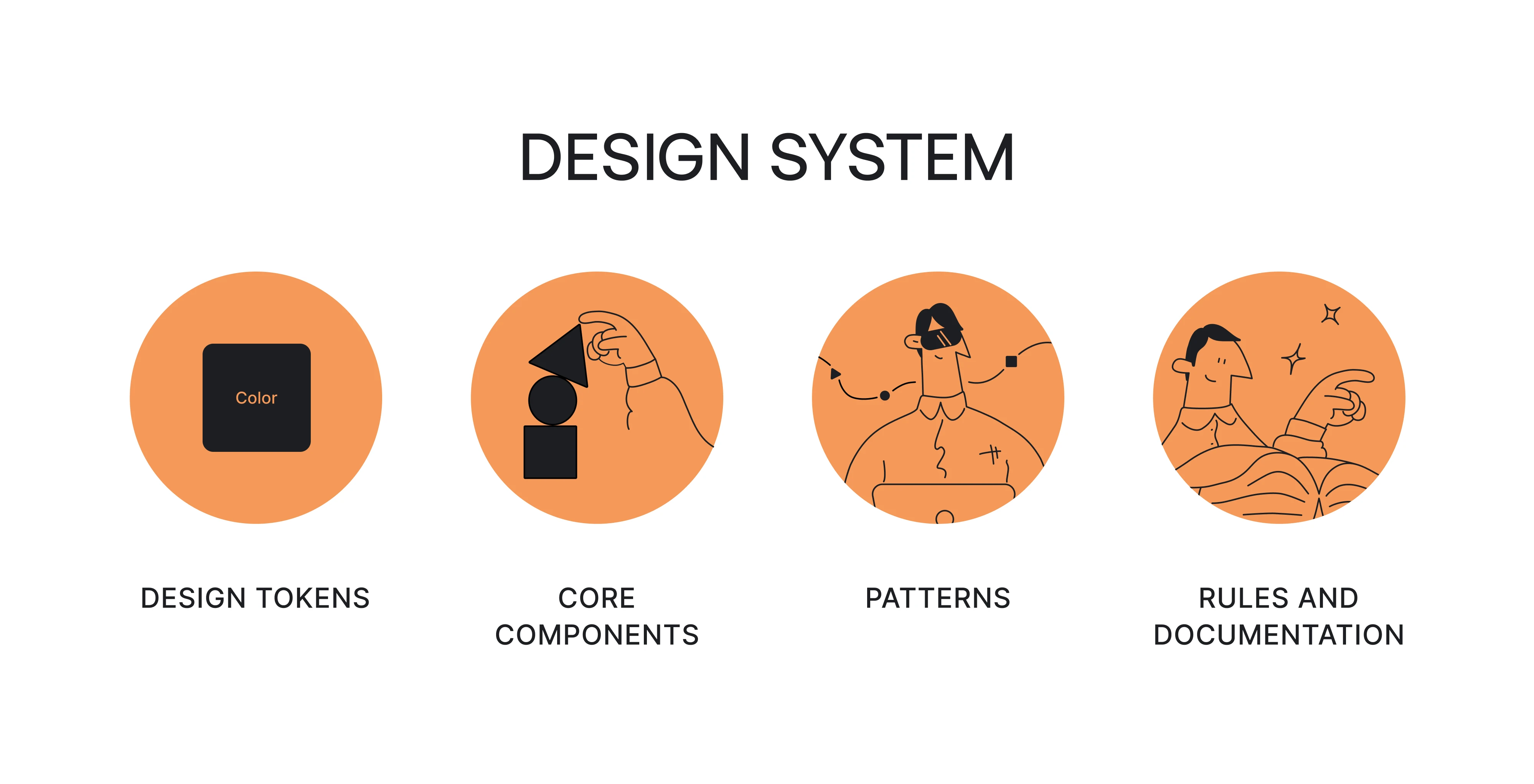
- Design tokens: your named values for color, spacing, and type. Change the token, and every component using it updates at once.
- Core components: the reusable buttons, inputs, cards, and modals your product is actually built from.
- Patterns: how those components combine to solve recurring problems, like a form layout or an empty state.
- Rules and documentation: when to use what, and why. The part everyone skips and later regrets.
Together, these give everyone a common foundation for designing and building the product, reducing duplicate work and conflicting UI decisions.
Its goal is to solve the most cases with the fewest, most flexible pieces. A well-run system of 50 components beats a sprawling library of 500 every time.
When we built the UX design system for Datawisp, a data-heavy analytics product, we didn't stop at defining colors and typography. We documented how navigation, filters, cards, and other patterns should work across the product. That's the difference between a style guide and a design system: one defines how the interface looks, the other defines how it works.
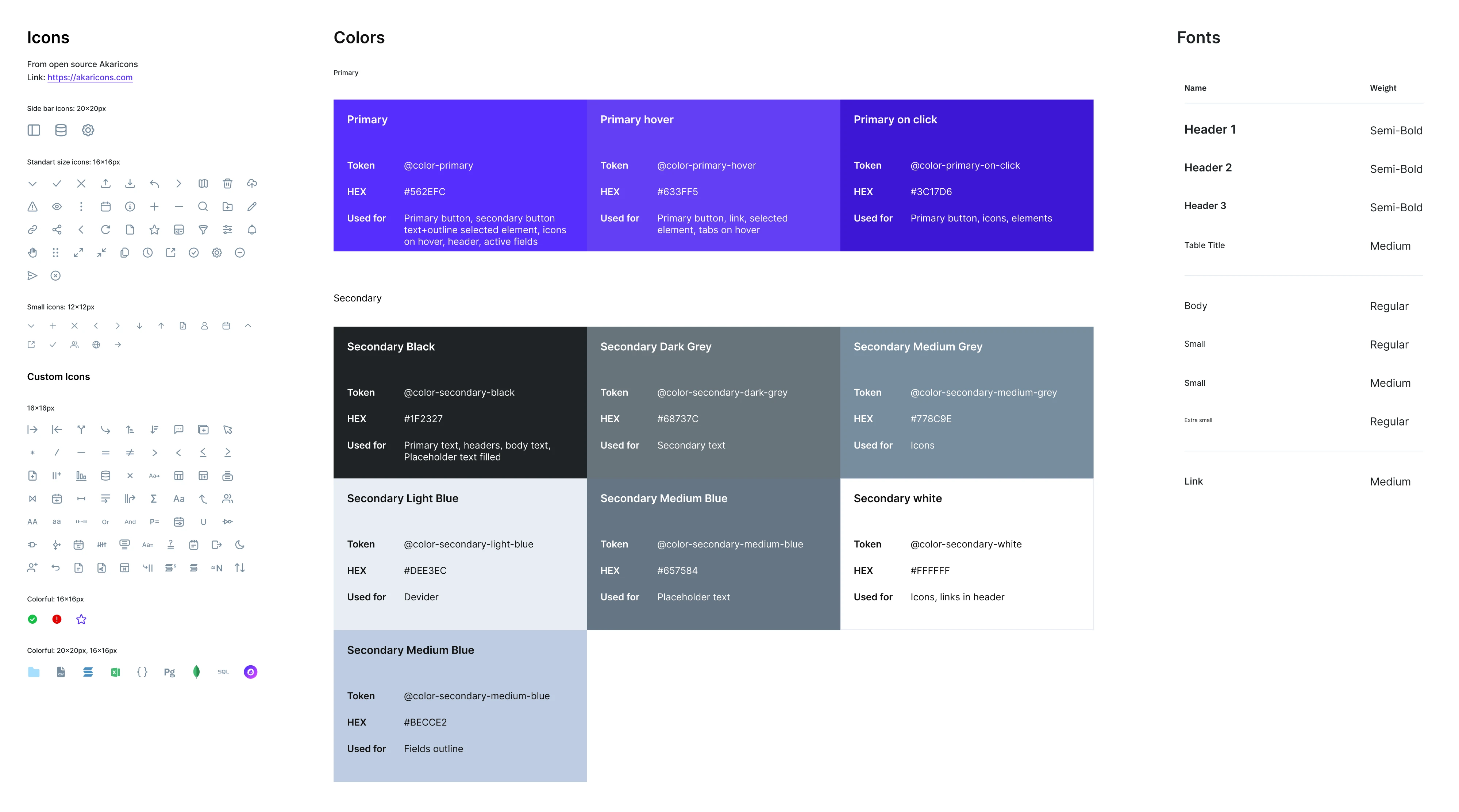
However, having a design system doesn't guarantee any of this. One product lead we talked to summed it up perfectly during a walkthrough of his own Figma library: "It's amazing how you can have a design system and still have variability."
Components alone don't create consistency. The rules behind them do, which is exactly why the "when to use what, and why" layer above isn't optional. Which raises the obvious question: does your product need one yet?
When does a SaaS need one?
For most SaaS products, a design system becomes necessary as soon as more than one person is changing the UI. Before that, it's often more overhead than value.
If you're a solo founder still searching for product-market fit, skip the full design system for now. Your product will change constantly, making it hard to justify weeks spent defining tokens, building components, and writing documentation. At this stage, a simple component library and one designer or developer maintaining consistency are usually all you need.
The real need appears as your team grows. More people mean more opportunities for duplicate components, inconsistent UI, and different interpretations of the same patterns.
As one experienced designer put it: "The toughest part with design systems is usually keeping everything up-to-date and consistent as the team grows. Documentation can get stale quickly, and if it's not clear or easy to find, people might start going off-script. Getting developers to fully adopt the system can be tricky too, especially if it's not well integrated into their workflow. It really takes ongoing effort and good communication to keep everyone aligned."
So skip it early, but don't skip it forever, and don't leave zero structure behind either. There's a smart middle move: set up a few basics such as tokens, sensible naming, and a Tailwind config, so that cleaning up later isn't a nightmare. It costs almost nothing now and saves you a painful refactor down the road.
Then watch for the signs that you've crossed the line. You probably need a real system when:
- You keep rebuilding the same button, card, or modal because nobody can find the last one.
- More than one person now touches the UI, and their work is starting to diverge.
- The same screen looks different depending on who designed it, or when.
- Your brand direction is stable enough to be worth codifying.
- AI tools let you move faster than your design process can keep up. Teams tell us the same thing again and again: "We build faster than we can design things," and the result is a product where "product cards look different, font sizes are different, font weights are different." Speed without a system just manufactures inconsistency faster.
If a few of those are nodding their heads at you, it's time. The need rarely creeps up quietly. It usually arrives with a specific trigger, a moment that forces the question. The most common ones we see:
- A tech migration you're doing anyway. A front-end rebuild (say, a framework version jump or moving off legacy PHP) is the cheapest time you'll ever get to fix the foundation, because you're touching everything regardless.
- Commercializing an internal tool. Software built "very rapidly by data scientists without any real design considerations" is fine for internal users and falls apart the moment you try to sell it.
- A new leader inheriting the mess. A design or product lead a few weeks into the job, staring at a UI nobody can explain, is one of the most common buy moments there is.
- A rebrand cascading into the app. Once the brand changes, the gaps in your component library ("things that are missing like toggles or checkboxes") suddenly become blocking.
And here's the reframe that catches most teams off guard: the problem is rarely "we have no design system." It's "we have a half-finished one nobody documented." We routinely walk into products carrying three attempted design systems at once- what one client called "kingdoms": all these different things you jump between, or an internal v1 that stalled, or a system a previous agency started and abandoned when the budget ran out. The goal usually isn't "build one from scratch." It's "finish the one you have, document it, and make it survive whoever built it."
And if you want to learn how a design system can improve your product, watch a video below:
For context on how common this has become at scale: Figma found that three-quarters of its enterprise customers now use design systems across their entire organization. Once a product gets big enough, a system for B2B SaaS design stops being a nice-to-have and becomes the only way to stay consistent.
The next section is about starting at the right moment, the right way: small.
SaaS design system examples you can use
Six public design systems below are worth studying before you build your own. Most large SaaS companies publish theirs. You can browse the components, read the rules, and in many cases copy the whole thing into your own Figma file.
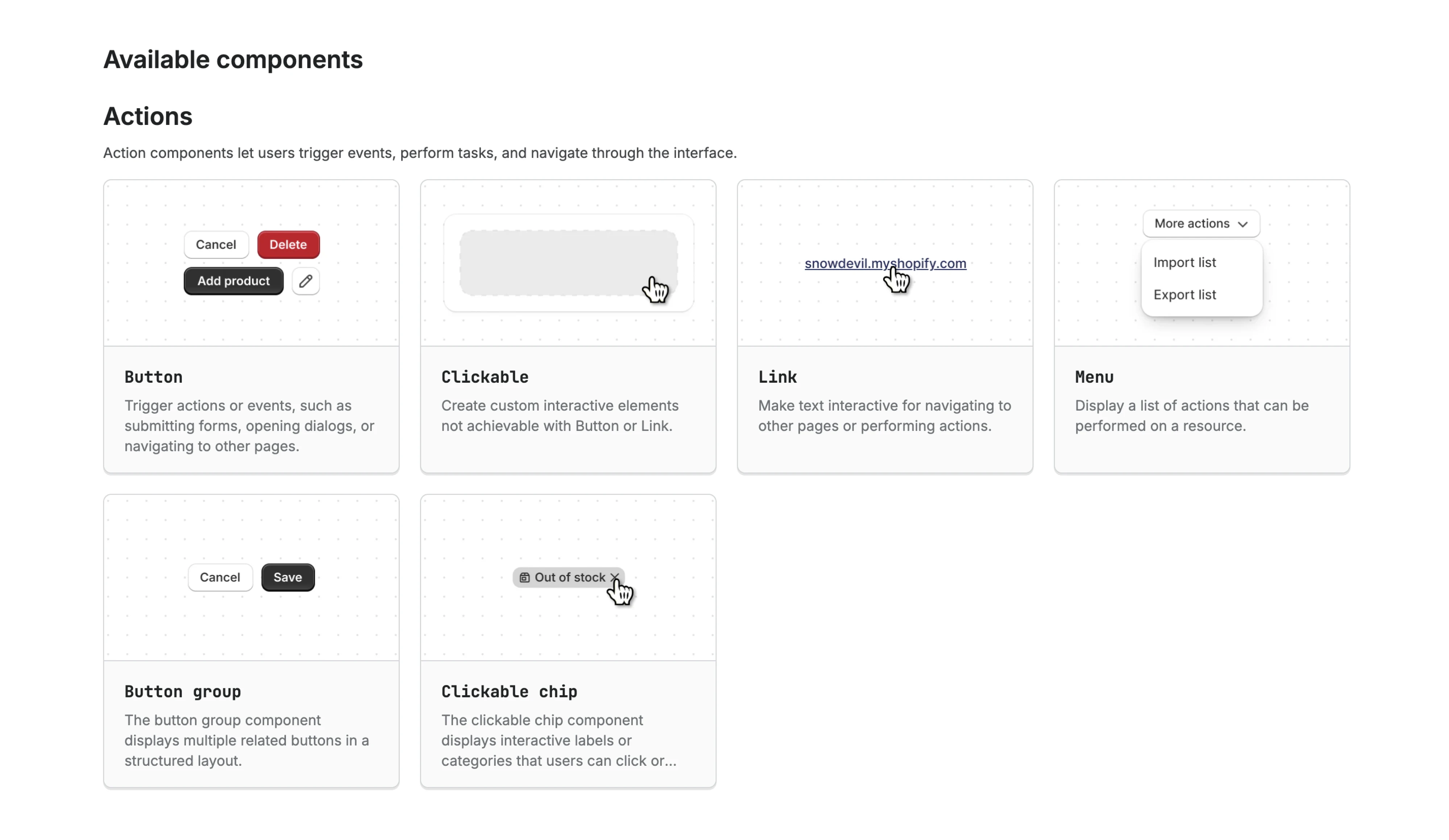
- Shopify Polaris is built for dense, data-heavy admin interfaces, exactly the kind of screen most SaaS products live in. Its real standout is the content guidelines. Polaris documents how to write button labels, error messages, and empty states, down to the tone. If your product is full of tables, settings, and forms, this is the one to learn from.
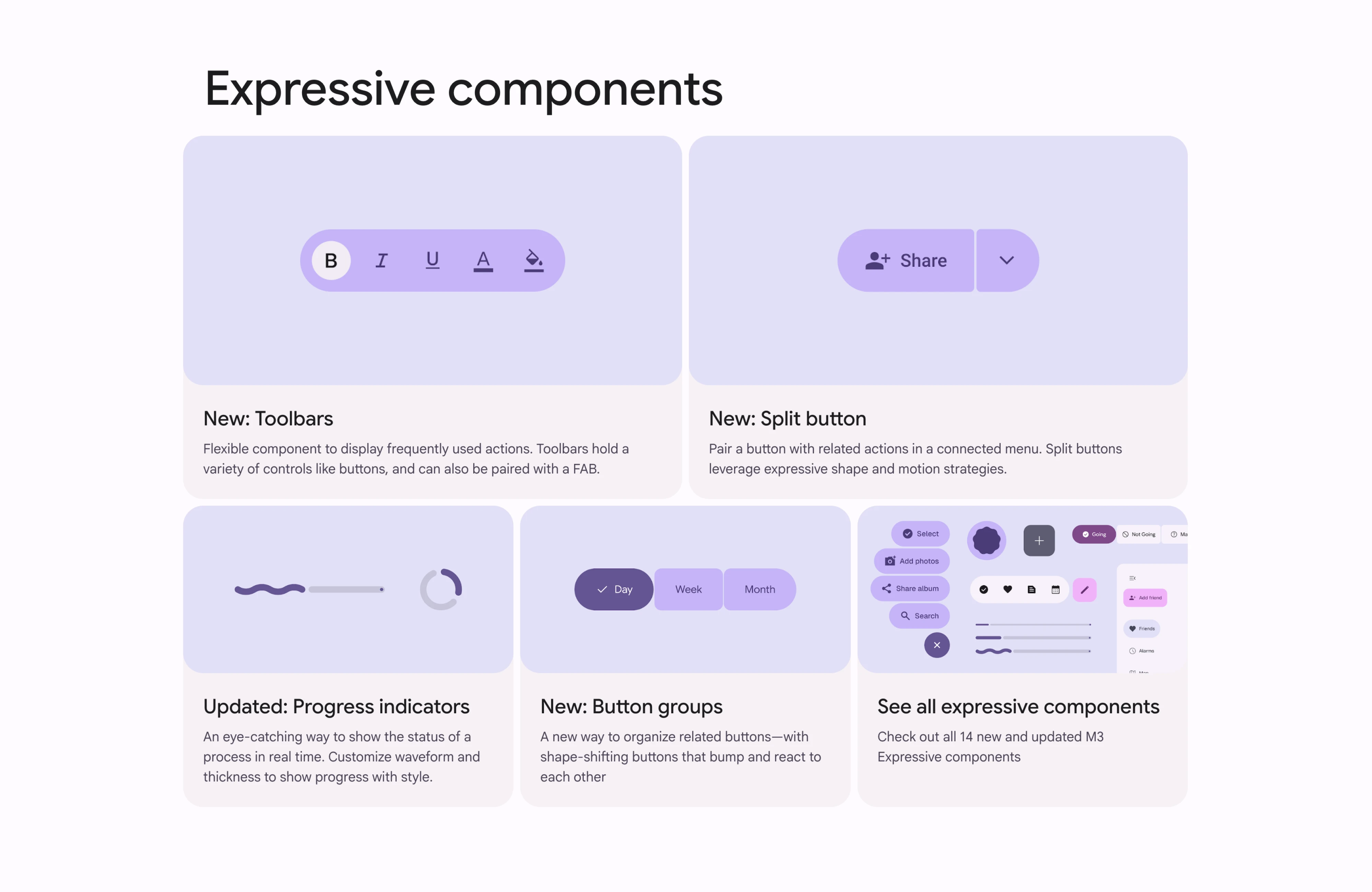
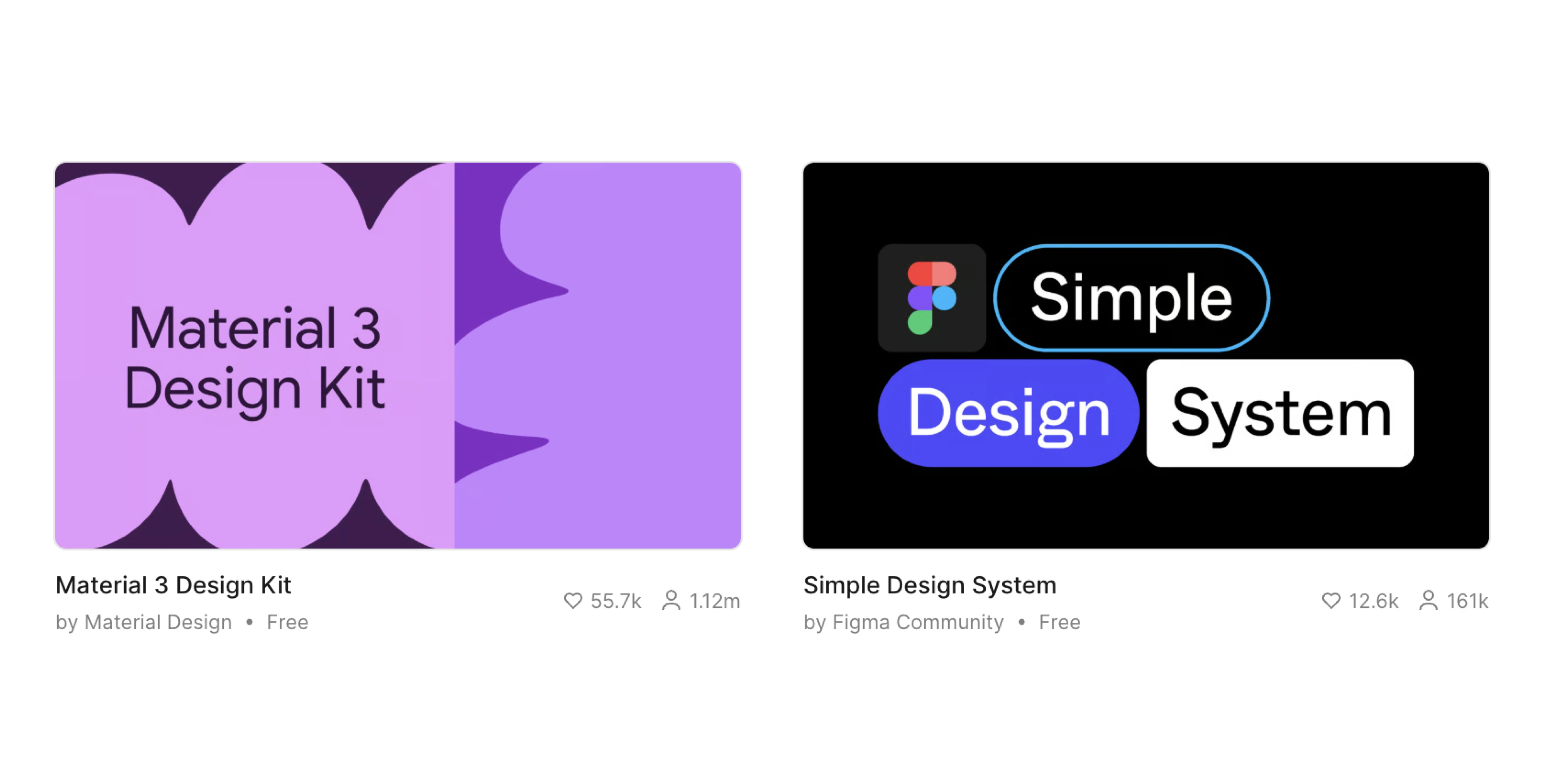
- Google Material Design is the most complete free starting point on the internet. It comes with a mature token structure, a theming engine, and an official Figma kit you can pull in today. Steal its approach to tokens and theming. Just watch the trap: Material is so recognizable that products built straight out of the box all start to look like Google. Use it as a foundation, then make it yours.
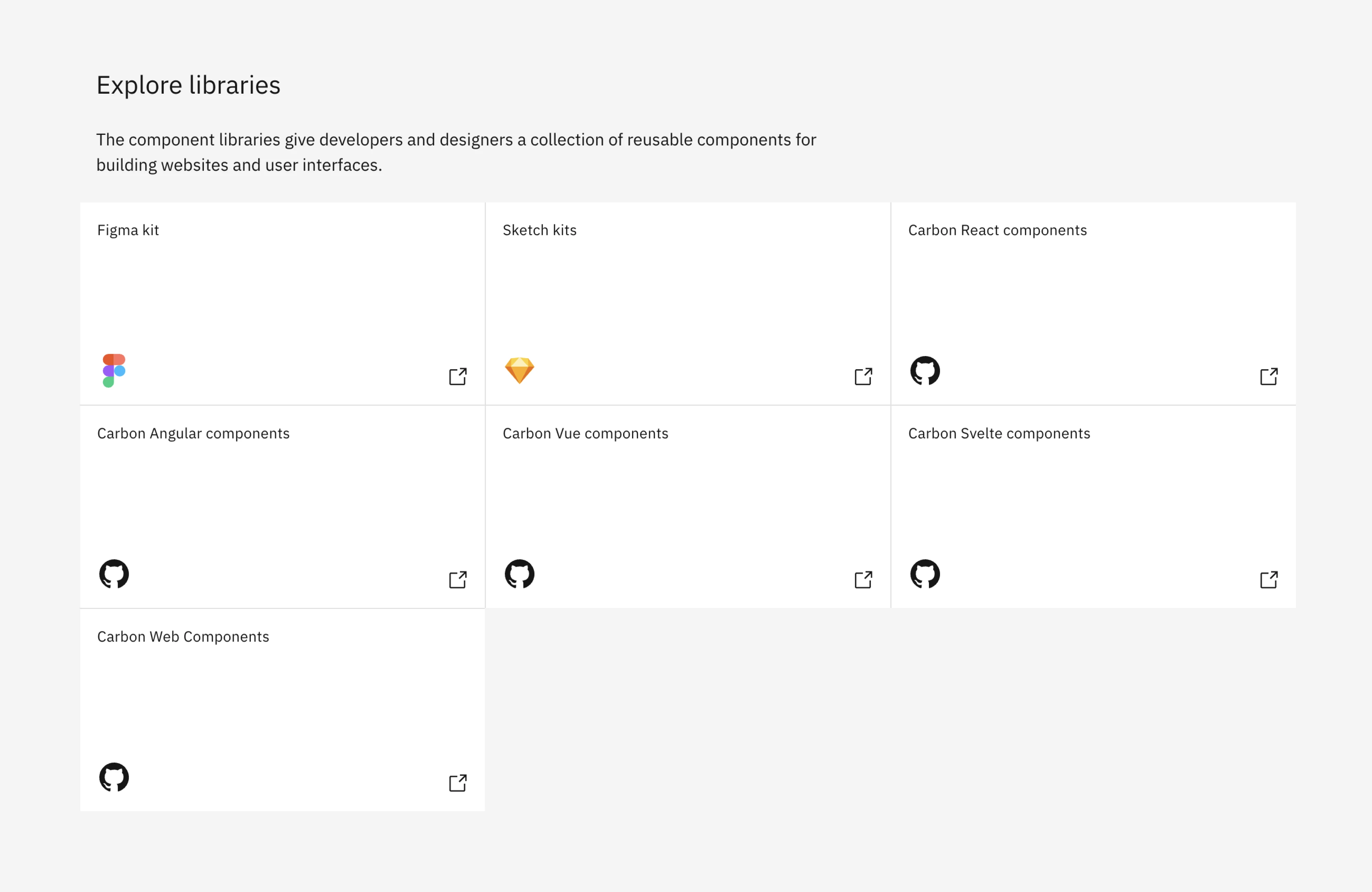
- IBM Carbon is open source, and unusually, it ships with real production code, not just design files. Two things to borrow here. First, its data visualization patterns are excellent, rare, and valuable if your product does charts. Second, its governance model is documented in the open, so you can see exactly how a large team decides what gets into the system and what doesn't. (Remember, this is the system IBM built to wrangle 130-plus teams.)
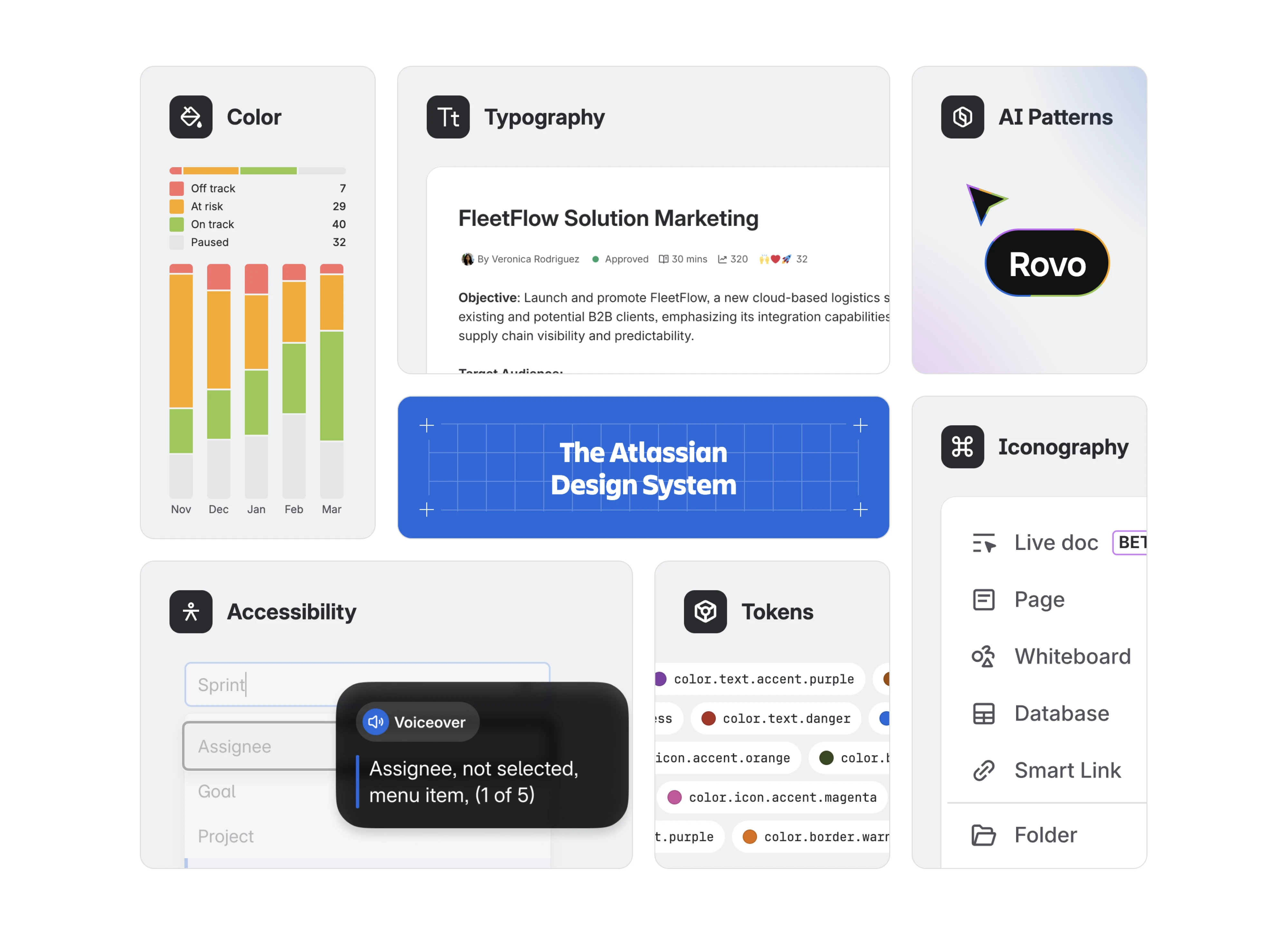
- Atlassian Design System is the one to study if you're building a suite, not a single app. It powers Jira, Confluence, and the rest, so it's a masterclass in keeping many products feeling like one family. If "multiple products under one brand" is on your roadmap, start here.
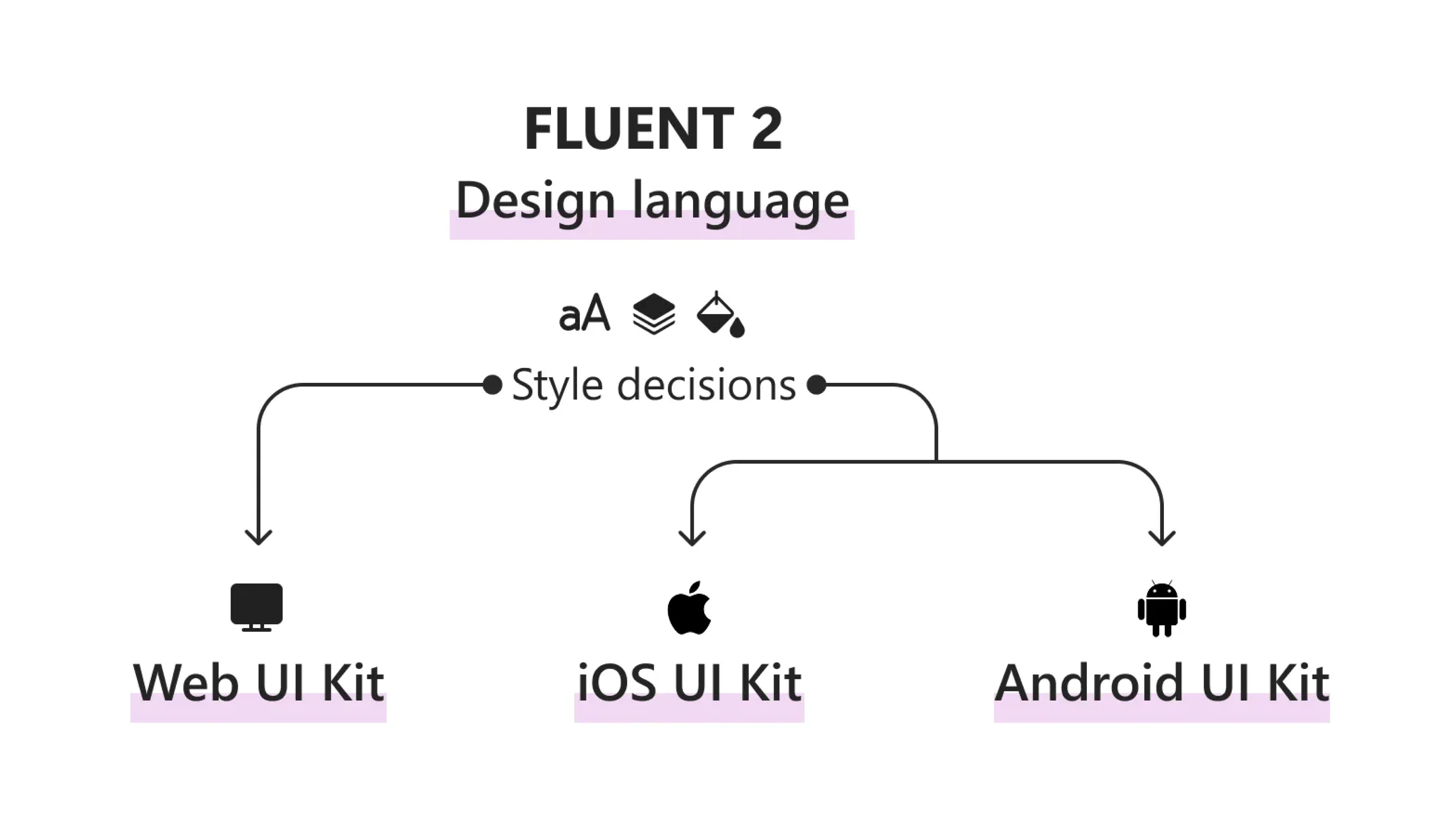
- Microsoft Fluent solves for consistency across platforms: web, desktop, mobile. If your product lives in more than one place and needs to feel the same everywhere, Fluent is the reference.
- Figma community UI kits are the answer to what a lot of people are searching for: a ready-made file I can duplicate right now. Kits like Untitled UI give you hundreds of polished components and a full token setup in one download. They're a great head start. One warning, though: they hand you more than you need. Treat a UI kit as raw material to prune down, not a finished system to adopt whole. Otherwise you've just imported someone else's junk drawer.
If you want a wider catalog to compare against, component.gallery collects components across dozens of public systems, so you can see what "standard" looks like before deciding what your product needs.
And if you're chasing a specific look, our roundup of B2B SaaS design trends is a good place to gut-check your visual direction.
Now, notice what all these systems have in common. Not one of them is a pile of two thousand components. Each is a disciplined core, a manageable set of well-made parts, plus clear rules for using them. That's the thing to copy. Not the specific buttons, but the restraint.
So how do you get there for your own product, without spending six months building scaffolding? Here's how.
How to build a SaaS design system that scales
Start small, use it in real work, and expand it as your product grows. Here's how to create a design system that scales.
1. Audit what you already have
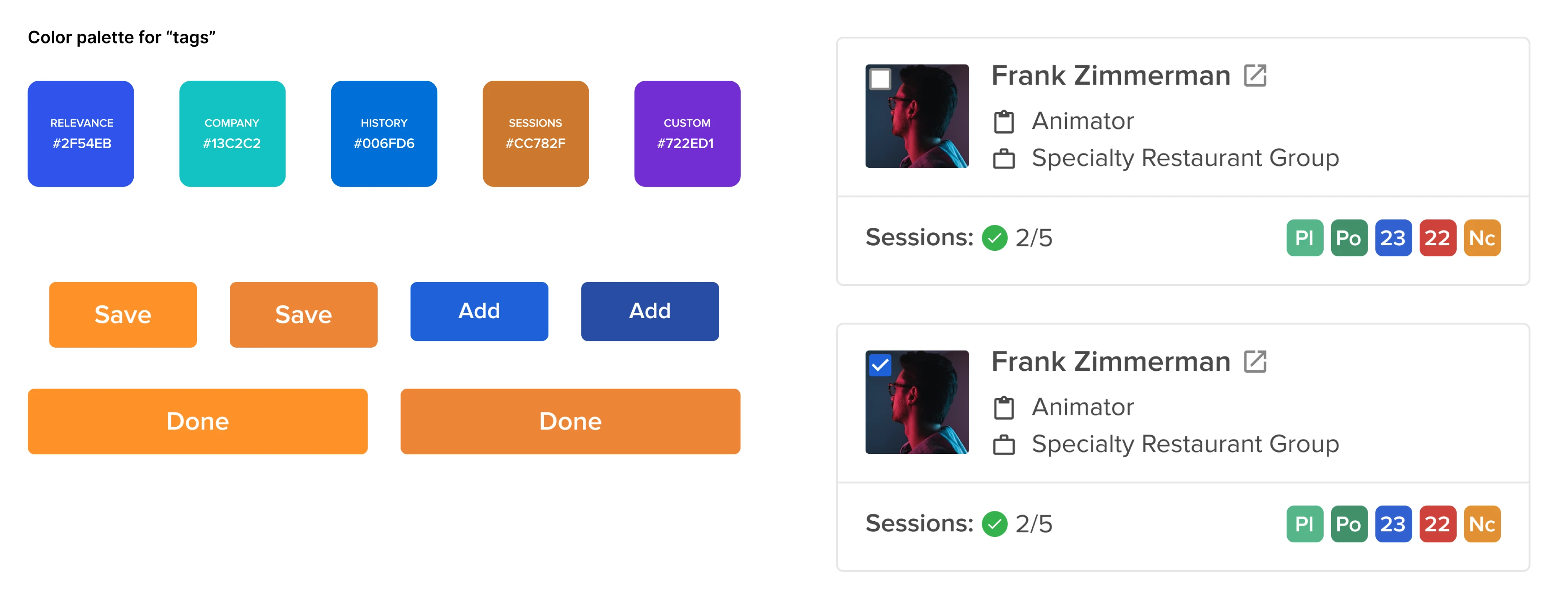
Before you design a single new thing, take inventory of what's already in the product. You'll almost always find the same button in four slightly different flavors and three blues pretending to be one. This step is unglamorous, and it's the most important one.
Remember IBM's Carbon team, wrangling 130-plus teams? They didn't start by designing. They started by auditing existing patterns and componentizing them into a scalable system.
This is exactly how we approached Sessionboard, an event-management platform that had inherited a messy UI from an older product. Instead of jumping straight into a redesign, our designer audited every variation, aligned with the PM to choose the most appropriate styles, and rebuilt each component with consistent logic. The audit is what turns a pile of screens into a plan.
Quick tip: if you want data instead of vibes, run your live site through a free CSS analyzer like Project Wallace. It'll show you exactly how many colors, font sizes, and spacing values you're actually shipping. The number is usually horrifying, in a useful way.
2. Start with tokens
Tokens are your named values like colors, type, spacing, and they're the cheapest, highest-leverage place to begin. Get these right, and theming, dark mode, and even multi-brand support get dramatically easier later. Atlassian, which ships tokens across Jira, Confluence, and the rest, This is why tokens come first. On Newton360, an EMS workforce management app where we built the design system from scratch, our designer gave every token a plain, logical name, such as "Orange 100" or "Primary Color", so neither designers nor developers ever had to guess what a value was or where it was used.
The full set was exported as a JSON file that plugged straight into code, so a change happened once instead of screen by screen. That groundwork paid off when the client later asked for a light theme on top of the dark default: instead of redoing every screen, our designer set up variable modes and switched the whole product to light in a single click.
Video: switching the entire product from dark to light was a single click.
puts it plainly: with tokens, changes can be made once across the system and apps, with no more finding and replacing hard-coded values everywhere.
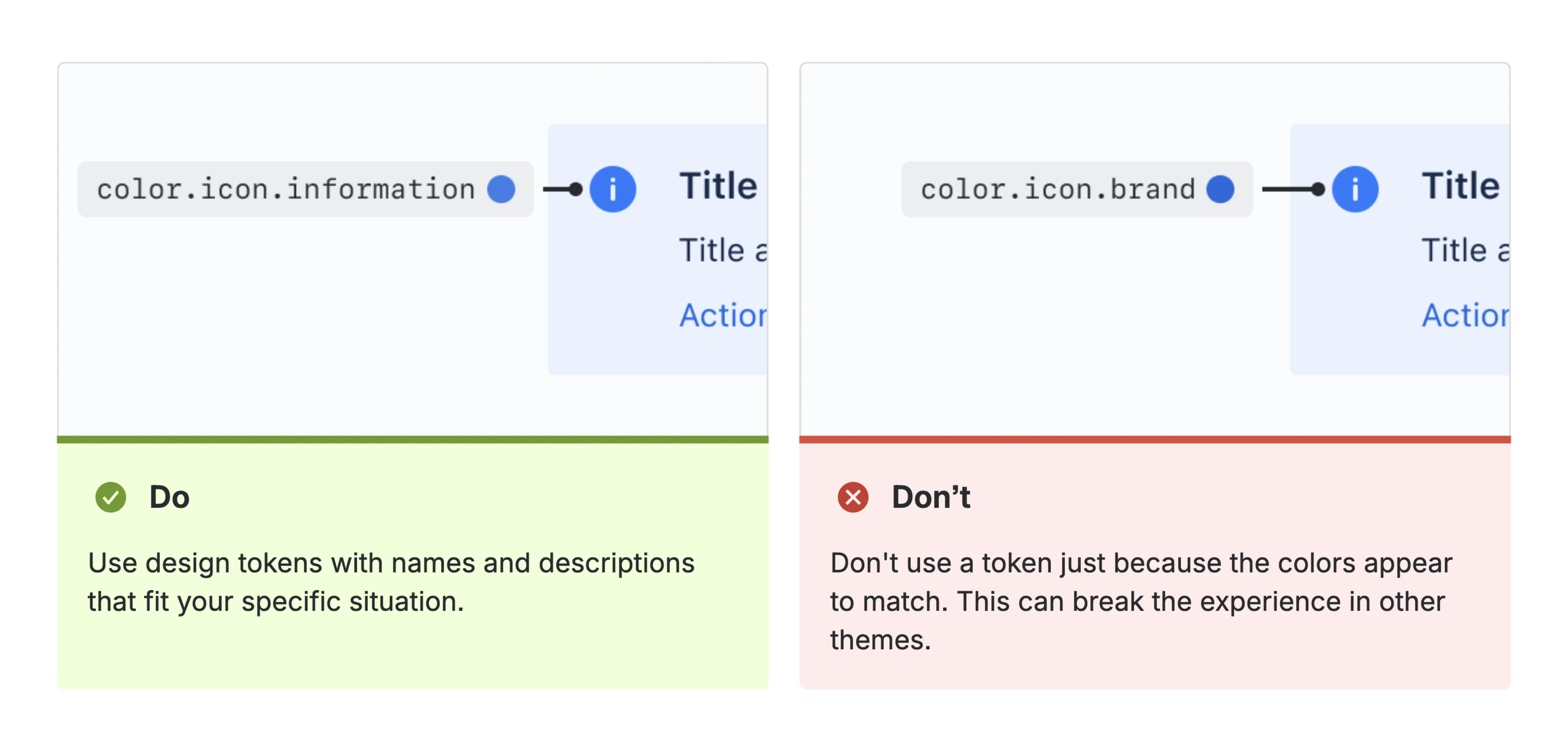
This is why tokens come first. On Newton360, an EMS workforce management app where we built the design system from scratch, our designer gave every token a plain, logical name, such as "Orange 100" or "Primary Color", so neither designers nor developers ever had to guess what a value was or where it was used.
The full set was exported as a JSON file that plugged straight into code, so a change happened once instead of screen by screen. That groundwork paid off when the client later asked for a light theme on top of the dark default: instead of redoing every screen, our designer set up variable modes and switched the whole product to light in a single click.
Get them wrong, and you'll redo everything. We've seen teams add tokens with no logic behind them, then spend a year unwinding the mess. If you're on Tailwind, you can define most of this in your theme config and start today.
3. Build a small core of components
Not hundreds. A few dozen. The buttons, inputs, cards, modals, and navigation your product relies on. For a sense of scale: Shopify Polaris, the system behind the entire Shopify admin, runs on 60-plus pre-built components covering navigation, forms, and data display.
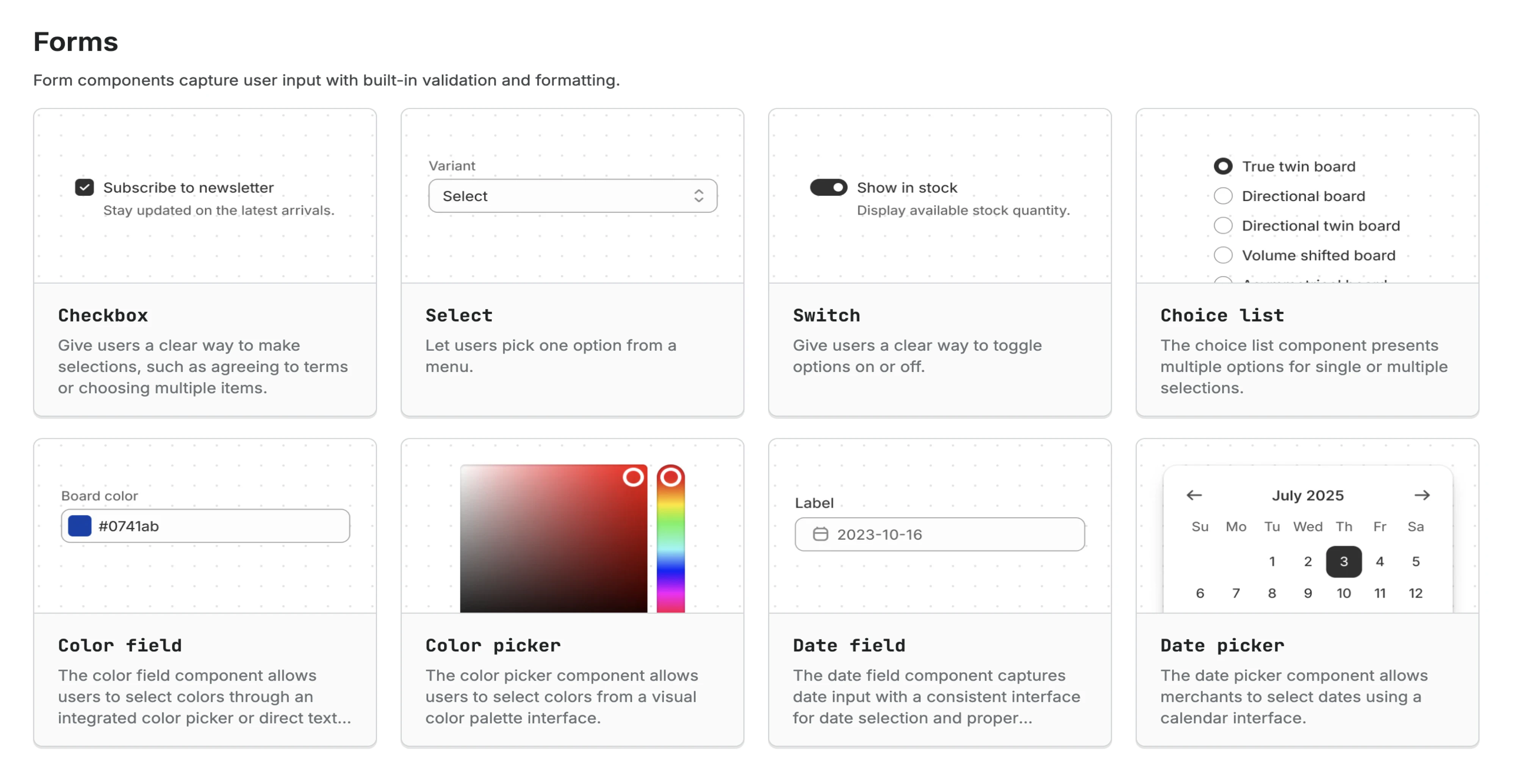
If a platform that size can operate on that count, your product almost certainly can too. Aim for the fewest components that cover the most situations. Every component you add is something someone has to maintain, document, and remember exists, so make each one earn its place.
4. Write the rules, not just the parts
A component without guidance gets misused. For each core piece, document when to use it, when not to, and what states it has. Add do/don't examples and code snippets where you can.
This is the step that separates a UI design system for SaaS people adopt from a library they quietly work around. And adoption is the whole game, as one design systems writer put it; teams don't use a system because it exists; they use it because it makes their work easier and reduces the cognitive load of working on a complex product at scale.
If your docs are thin, silent on the real questions, or a pain to search, people will decide it's faster to build their own. Good documentation is what tips that decision the other way.
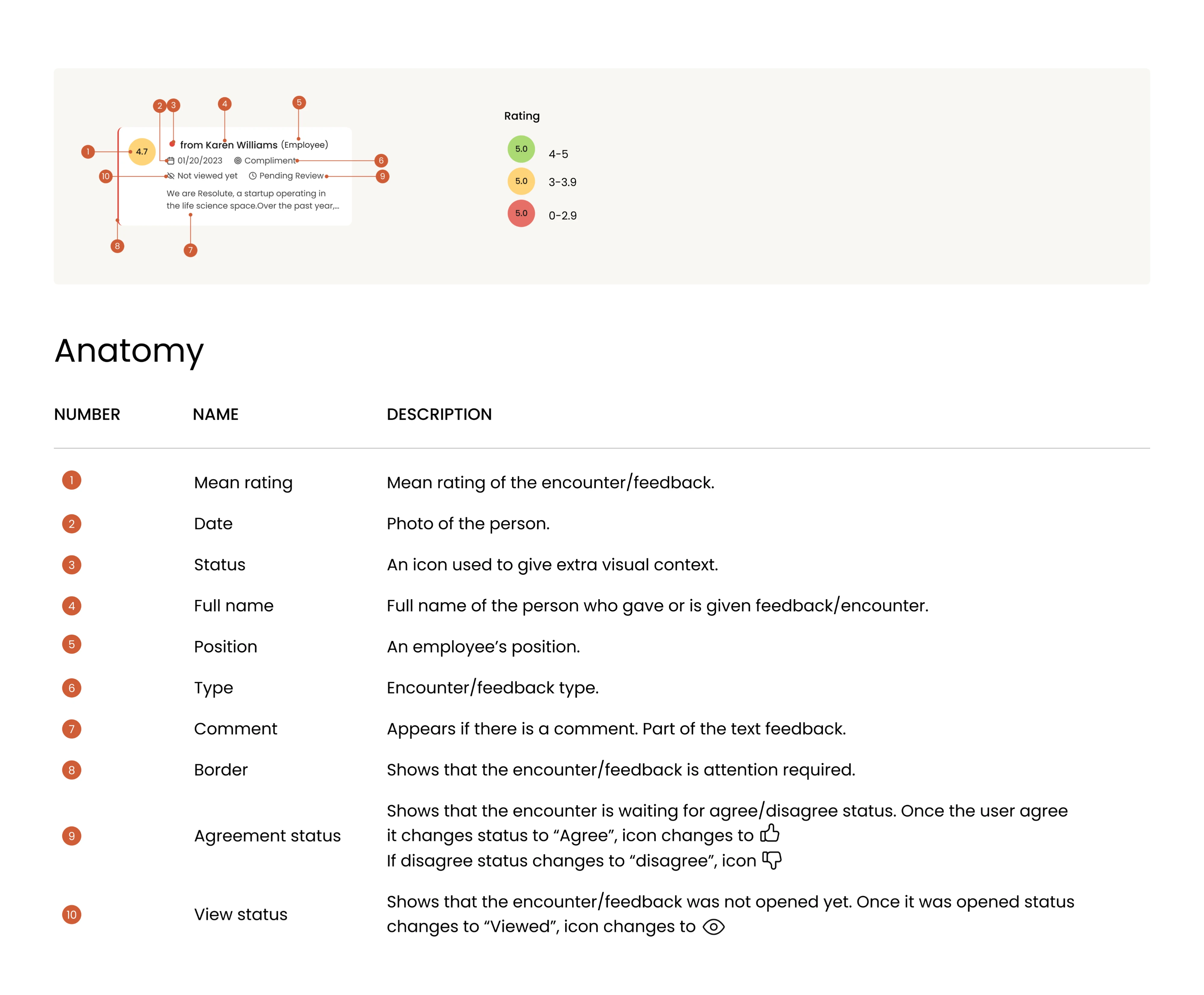
On Newton360, that meant writing a full breakdown for every component, what it looked like, and how it worked: its anatomy, where to use it and where not to, do's and don'ts with explanations, naming conventions, how it behaved across different states and content lengths, and WCAG contrast notes for every color pairing.
All of it in plain language, so a developer implementing a component and a stakeholder reviewing a decision could both just read it and move on. The payoff was concrete: across the entire project, developers never once had to stop and ask our designer how something was meant to work.
5. Let it grow with a simple rule
New needs will come up; that's healthy. The trick is deciding what earns a spot in the system. A useful test making the rounds among design system folks: see it once, it's a snowflake. See it twice, it's a coincidence. See it three times, it's a pattern; now it belongs in the system. Until then, document one-offs somewhere separate so people reach for a real component first. For scaling in a structured way, Nathan Curtis's writing on tiered design systems (core to mature) is the best map I know of.
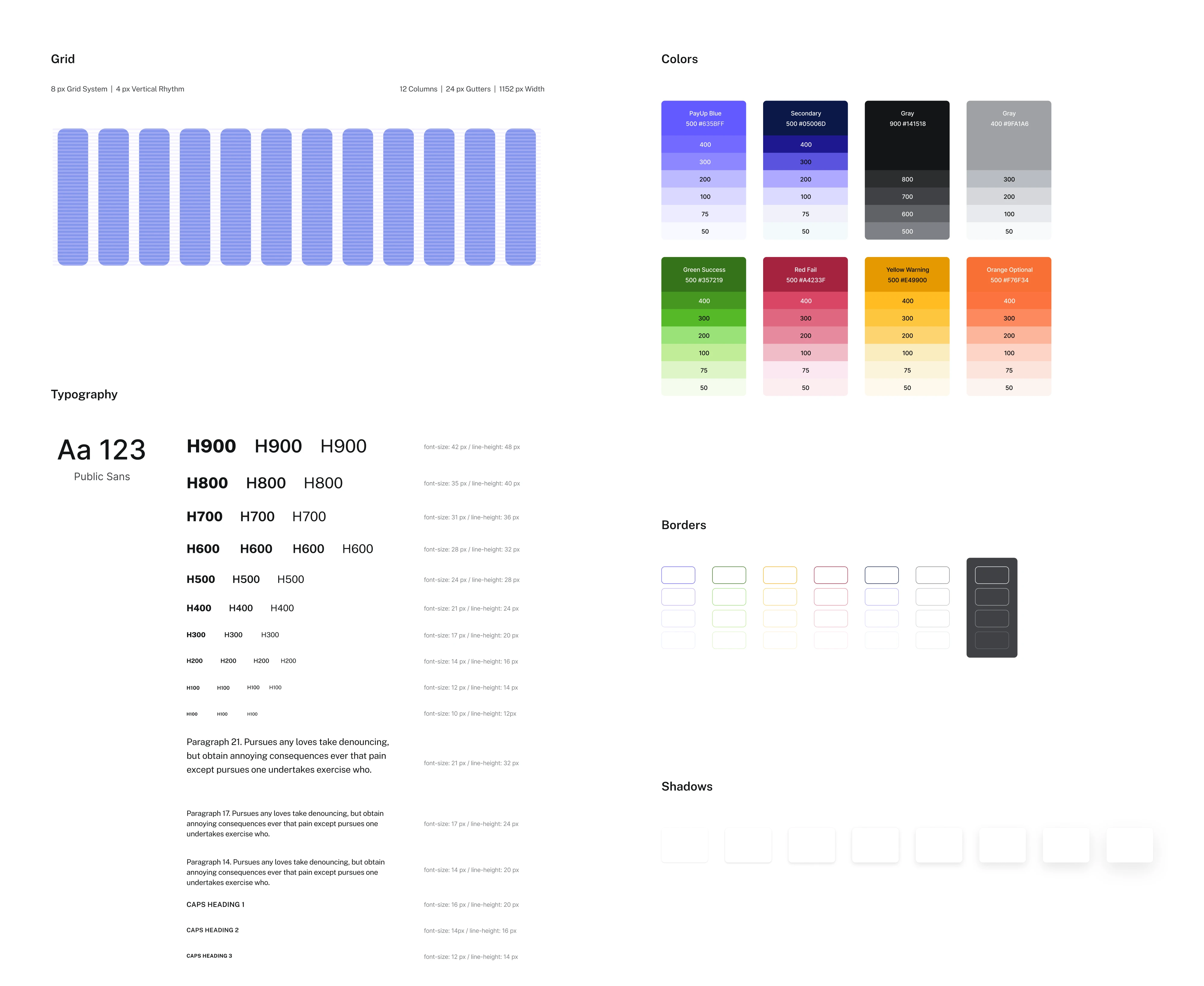
This is how a system stays alive instead of ossifying. When we built the design system for PayUp, a fintech product scaling fast on a tiny team, it wasn't a one-time deliverable. We were continually updating the UI kit with new components as the product grew. The system kept pace with the product instead of blocking it.
One more thing worth naming, since it's suddenly everywhere: a design system is now a useful set of guardrails for AI-assisted coding. If your team is shipping with AI tools, a clear system of tokens and components gives them the constraints they need to produce consistent output instead of inventing a new button every prompt. More on that in our piece on AI and design systems.
Build in this order, and you're never blocked. You always have something usable, and it gets better every week. Which brings up the question nobody likes to ask, but everyone should: once it exists, who owns the thing?
Who owns it? Keeping the system from rotting
Most design systems don't die at birth. They die slowly, from neglect, a year or two in. According to the 2025 Design Systems Survey, only about 40% of design systems are still active 18 months after launch. The other 60% quietly rot on a shelf.
The reason is almost always ownership. A design system is a product, and products need someone responsible for them. When it belongs to everyone, it belongs to no one. New components get added without review, duplicates creep back in, the docs go stale, and slowly the thing becomes the junk drawer it was meant to prevent.
Start by assigning an owner. On a small team, that might be a design lead. On a larger team, it's often DesignOps or a dedicated working group. Someone needs the authority to review new components and occasionally say, "We already have something that solves this."
The system also needs simplicity. Anyone can propose a new component, but every addition should answer one question: Does an existing component already solve this problem? That single review step is what keeps a 50-component library from growing into 500.
The harder challenge, though, is getting people to use it.
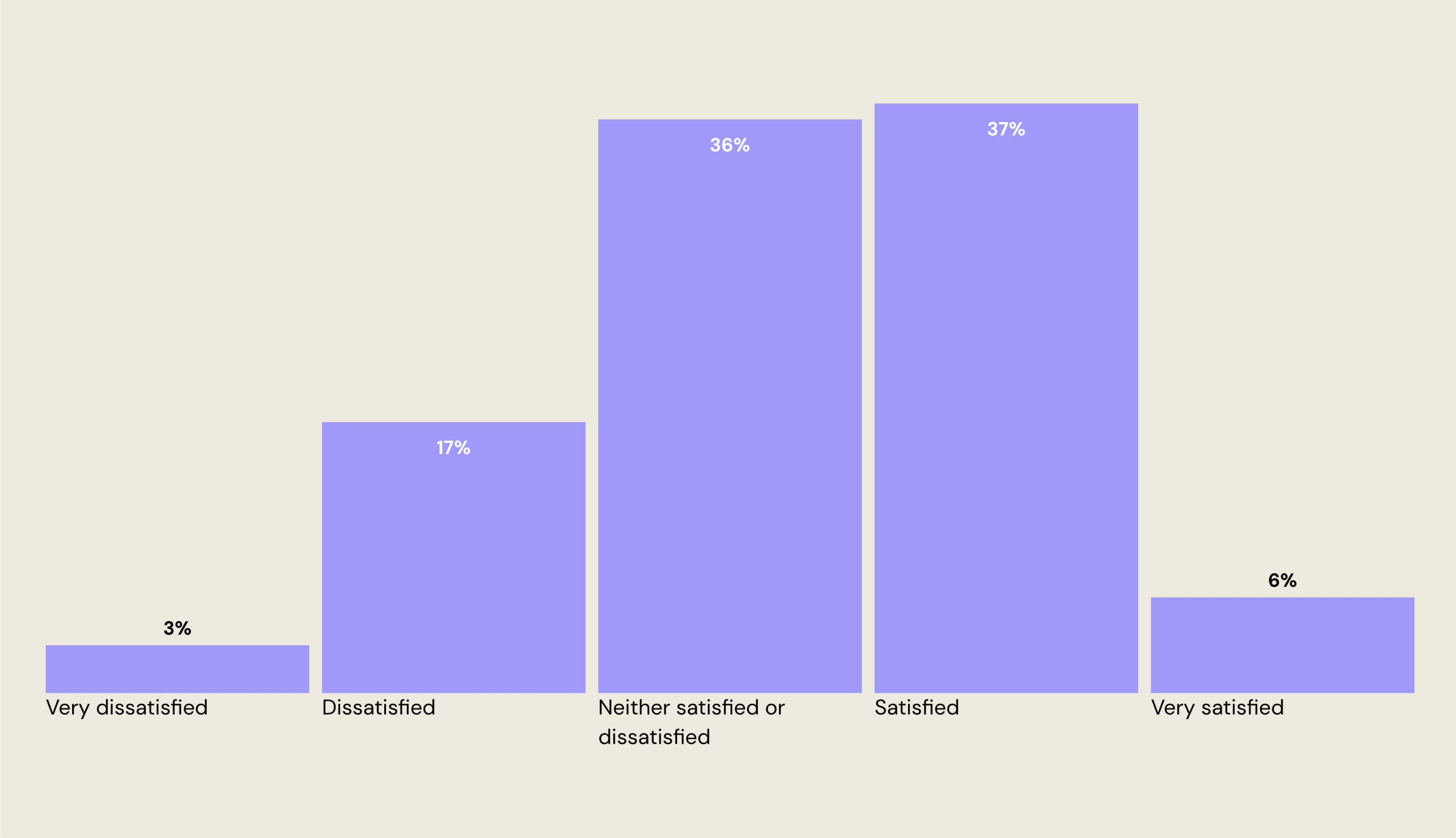
The 2025 Design Systems Survey found that communication is one of the biggest pain points in design system adoption, even though relatively few teams explicitly identify themselves as dissatisfied with communication. In other words, many organizations underestimate how much adoption depends on clear communication, not just good components.
Winning adoption is less about Figma and more about people. A few practices consistently help:
- Show how the system speeds up delivery instead of telling people to follow new rules.
- Connect it to outcomes leadership already cares about: faster releases, fewer bugs, and less rework.
- Roll it out gradually, solving real problems instead of launching everything at once.
Even companies with world-famous design systems still struggle with adoption. The technology is the easy part. Building habits around it is what makes a design system for SaaS last.
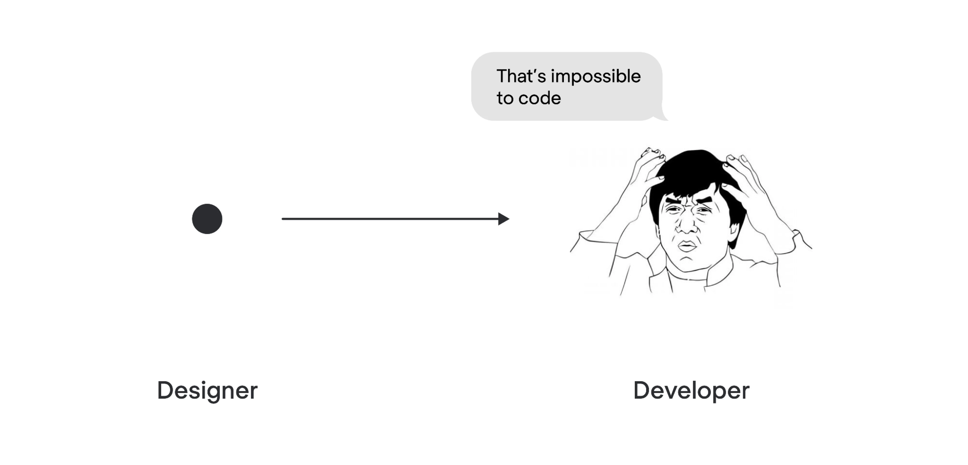
If your rollout feels messy, you're doing the normal, unglamorous work of getting people to change how they work. Handoff between designers and developers is a big part of that, and it's worth investing in deliberately. (We wrote more about smoothing that specific friction in our piece on designer–developer collaboration.)
Get an owner and a growth process in place, and your system stays lean and alive. Skip them, and no amount of beautiful components will save it. Which brings us to the failure modes worth watching for.
Why design systems become junk drawers
By now you can probably see the pattern. Design systems often fail in a handful of predictable ways, and every one of them is avoidable if you know to watch for it:
- Chasing component count. The instinct to add "just one more component" is how you end up with two thousand of them and no way to find anything. More components means more to maintain. This Reddit user put it well: “Maintaining storybook in a large, shared, fast-moving codebase. It's a nightmare.”

Fix: treat every addition as a cost, and use the see-it-three-times rule before promoting anything.
- Design and code drifting apart. A design system only works if designers and developers are building from the same source of truth. When Figma components no longer match what's implemented in code, inconsistencies appear, handoff slows down, and trust in the system disappears.
As one Reddit designer explained: "Bridging design and code—especially when Figma's out of sync with dev components or there's no source of truth beyond docs…"
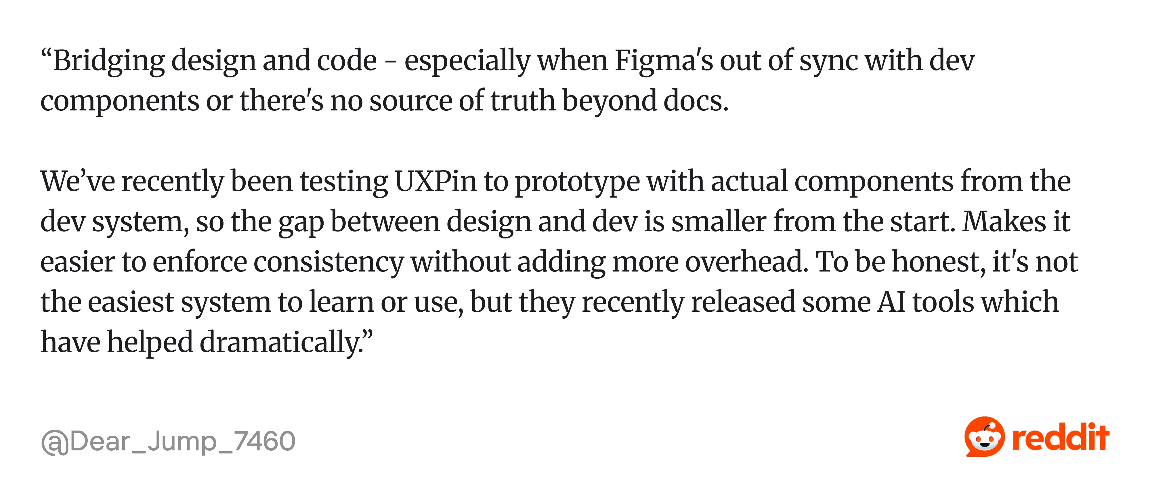
Fix: keep design and code synchronized. Whether you use design tokens, Storybook, UXPin Merge, or another approach, the goal is the same: designers should work with components that closely match what's shipped.
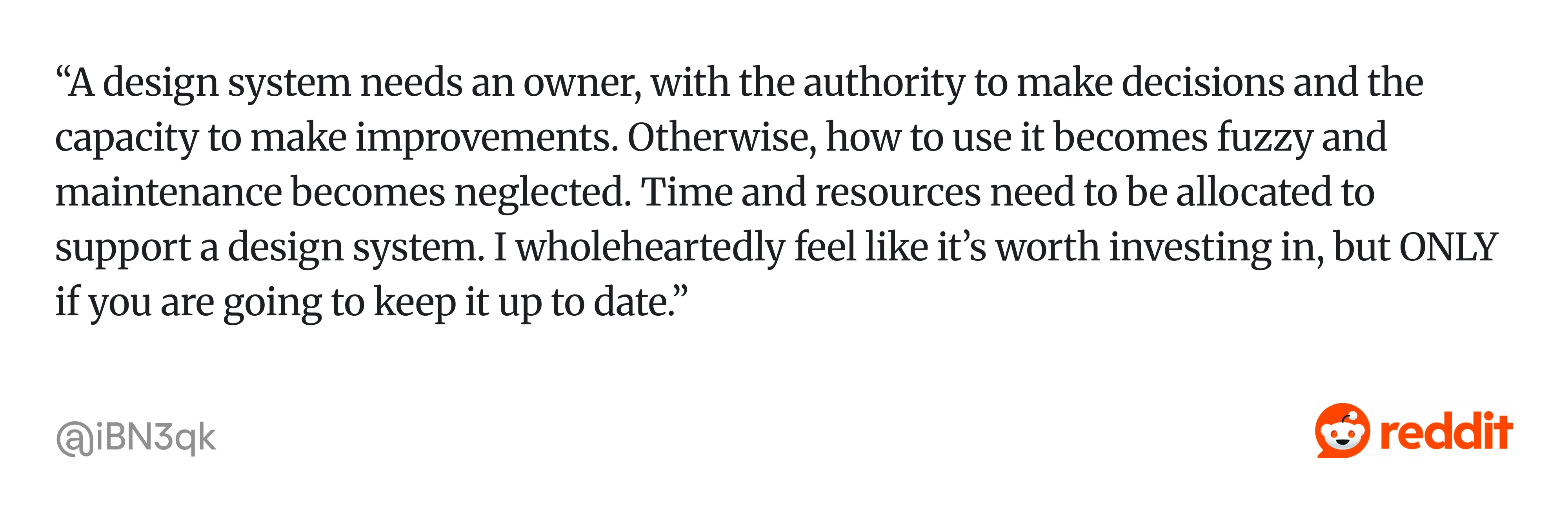
- No owner. Without someone who can say "we already have that," duplicates creep back, and the docs go stale.
Fix: name a person or a small group with the authority to decide what gets in. As one Redditor summed it up: “A design system needs an owner, with the authority to make decisions and the capacity to make improvements. Otherwise, how to use it becomes fuzzy and maintenance becomes neglected…”
- Documentation that's too thin or too dense. A component with no guidance gets misused. A component buried under ten paragraphs gets ignored. As one designer shared: “...Documentation can get stale quickly, and if it’s not clear or easy to find, people might start going off-script…”
Fix: short, practical docs: when to use it, when not to, and a code snippet.
Poor team onboarding. A design system doesn't become valuable just because it exists. It only works when designers, developers, product managers, and leadership all understand why it exists and use it consistently.
As one Reddit contributor put it: "...Design system success can be attributed the most to how proficient the design system team is in onboarding the whole organization... A design system isn't optional, nice to have, it has to become a standard..."
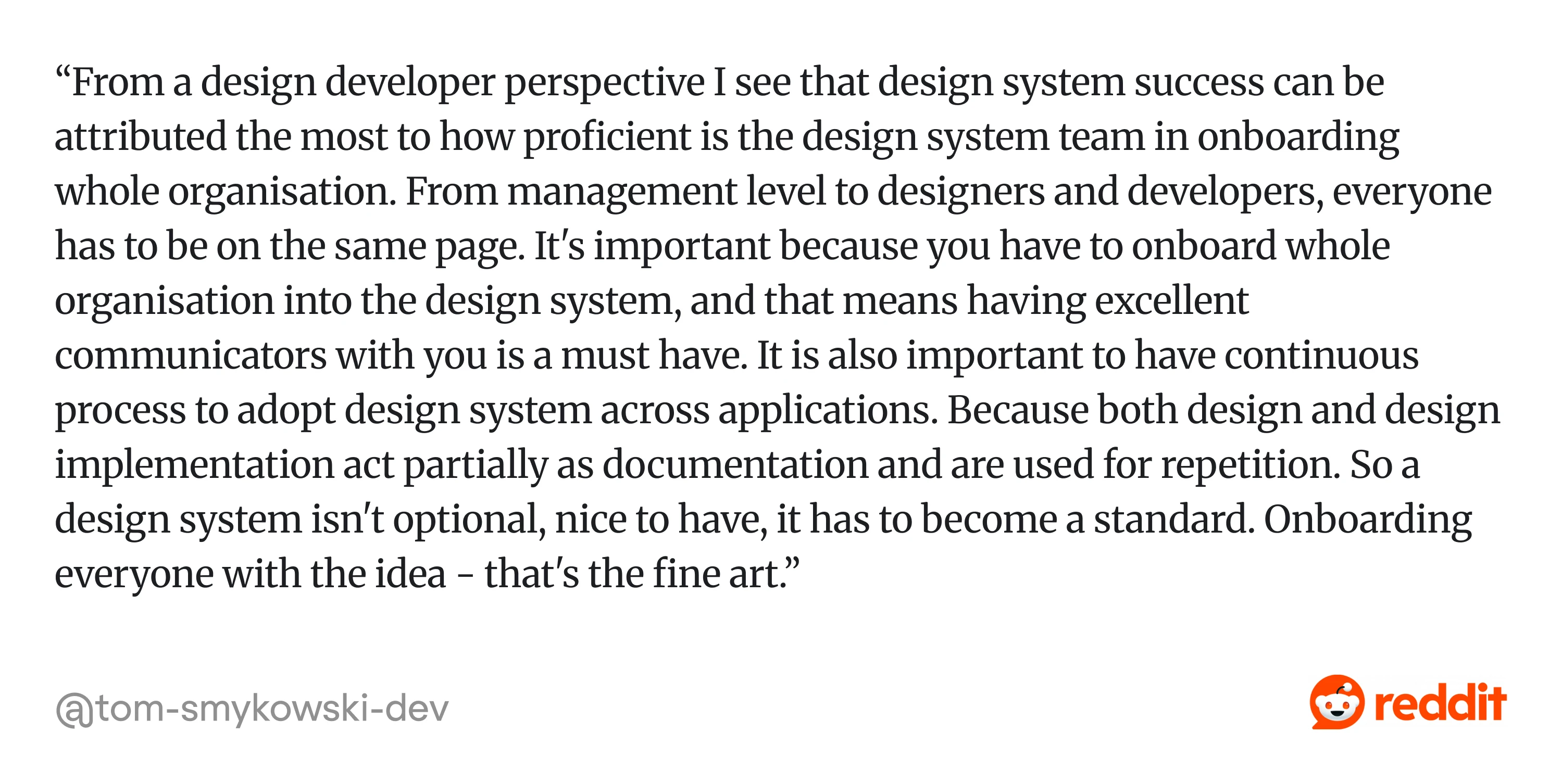
Fix: Treat onboarding as part of the design system itself. Explain the "why," not just the "how." Provide training, documentation, and simple examples, then reinforce the system through reviews and day-to-day work until using it becomes the default.
They're the default outcome: what happens when a system grows without anyone tending it. Avoiding them is about a little restraint and a clear owner, applied consistently.
So if you're staring at a messy UI wondering whether to start, here's the bottom line.
Build it now, or pay for it later
A design system is infrastructure like your database, your CI/CD pipeline, your authentication layer. You don't build it because it's interesting, but because the alternative is quietly accumulating a debt that eventually makes everything harder.
The SaaS products that scale well- the ones where shipping a new feature doesn't require a week of archaeology, where a brand refresh doesn't mean six months of manual work, where new engineers can be productive in days rather than months- are almost always the ones with a coherent design system underneath them.
The key is to build only what you need today, keep design and development aligned, and give someone ownership as the system grows.
If your product already feels inconsistent or your team is rebuilding the same UI over and over, start with a design system audit. It will quickly show what's worth standardizing first.
At Eleken, our design system services help SaaS teams audit existing products, create scalable component libraries, and build systems that designers and developers use.
If you're ready to create a design system that grows with your product, not against it, we'd love to help.


