
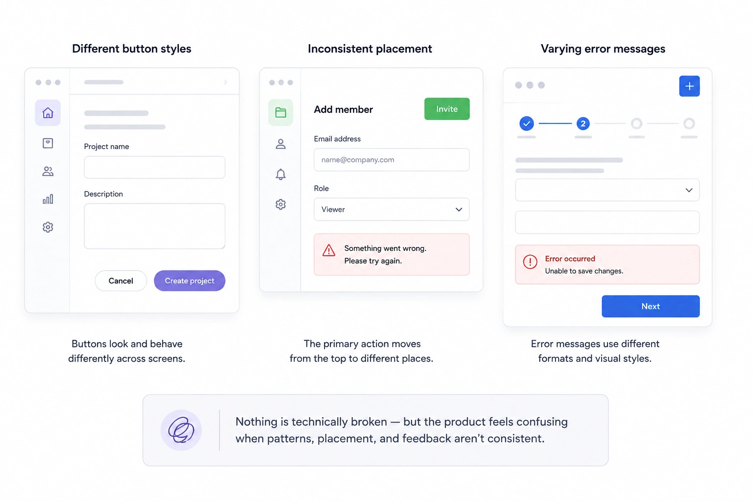
One screen uses rounded buttons. Another uses square ones. The primary action moves from the top right to the bottom of the page. Error messages look different in every workflow. Nothing is technically broken — but the product feels confusing.
This is what happens when consistency in UI design breaks down.
Design consistency is more than using the same colors or fonts across a product. Consistent design is a system of shared visual, functional, and content patterns that helps users navigate your interface without having to relearn it on every screen creating a consistent experience from one interaction to the next. When interfaces behave predictably, users complete tasks faster, trust the product more, and spend less time figuring out how things work.
Fast-growing SaaS products are especially vulnerable. As new features are added and different teams contribute over time, interfaces can turn into a "Frankenstein UI" — a collection of mismatched components, patterns, and interactions that feel patched together. In this guide, we'll explore what consistency in user interface design really means, why it matters, and how to build systems that keep your product clear and scalable as it grows.
What is design consistency?
Design consistency is the practice of creating a product that feels familiar wherever users go. It goes beyond matching colors or typography—it's about applying the same logic, patterns, and behaviors across every part of the experience.
When buttons, navigation, layouts, and interactions work the same way from one screen to the next, users can focus on their tasks instead of figuring out the interface.
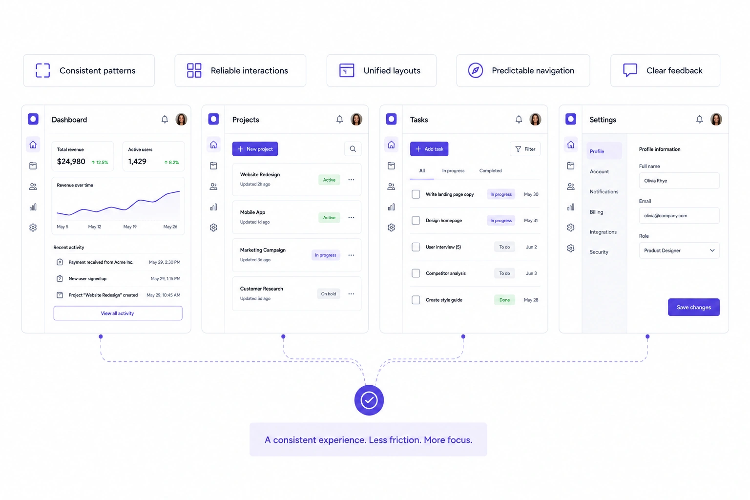
Good design consistency spans multiple layers of a product, including:
- Visual consistency: colors, typography, spacing, icons, and component styles.
- Functional consistency: similar actions produce the same results, with predictable navigation, feedback, and interactions.
- Content consistency: labels, terminology, button text, and messaging follow the same language throughout the product.
- Layout consistency: grids, page structure, and information hierarchy remain familiar across screens.
- Motion consistency: animations, transitions, and microinteractions reinforce the same interaction patterns.
Together, these elements reduce cognitive load by allowing users to transfer what they've already learned to new parts of the product. They don't need to stop and wonder whether a button behaves differently or where to find a familiar feature—they already know what to expect.
The opposite is what many SaaS teams experience after years of rapid growth. Different designers, developers, and priorities introduce new patterns with every release until the interface starts feeling patched together. Users may not be able to explain what's wrong, but they'll notice the inconsistency through hesitation, confusion, and extra effort.
A simple way to think about design consistency is this: users should never have to relearn your interface when they open a new page or feature. That's what turns a collection of screens into a cohesive product.
Why does design consistency matter strategically?
Design consistency isn't just a UX principle — it's infrastructure for growth. As products evolve, new features are added, teams expand, and release cycles speed up, consistency becomes the glue that holds the experience together. Without it, every update risks introducing another pattern, another component, or another exception for users to learn.
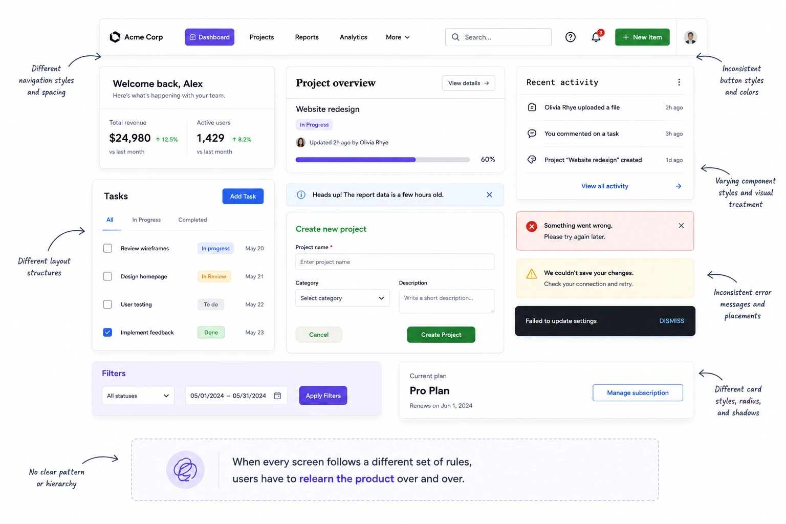
The result is what many teams call a "Frankenstein UI." Buttons look different from one screen to the next, navigation changes unexpectedly, forms follow different validation rules, and similar actions produce different outcomes. None of these issues seem critical on their own, but together they create friction that slows users down and erodes confidence in the product.
Inconsistency affects internal teams, too:
- Designers spend time debating patterns that should already be defined.
- Developers recreate components instead of reusing them.
- Product managers struggle to keep new features aligned with older ones.
As the product grows, small inconsistencies compound into more rework, slower releases, and fragmented user experiences.
The business impact is equally real. A confusing interface can increase support requests, slow user onboarding, reduce activation rates, and make customers less confident in the product. These are metrics product teams already track, which is why consistency should be treated as a business investment—not just a visual improvement.
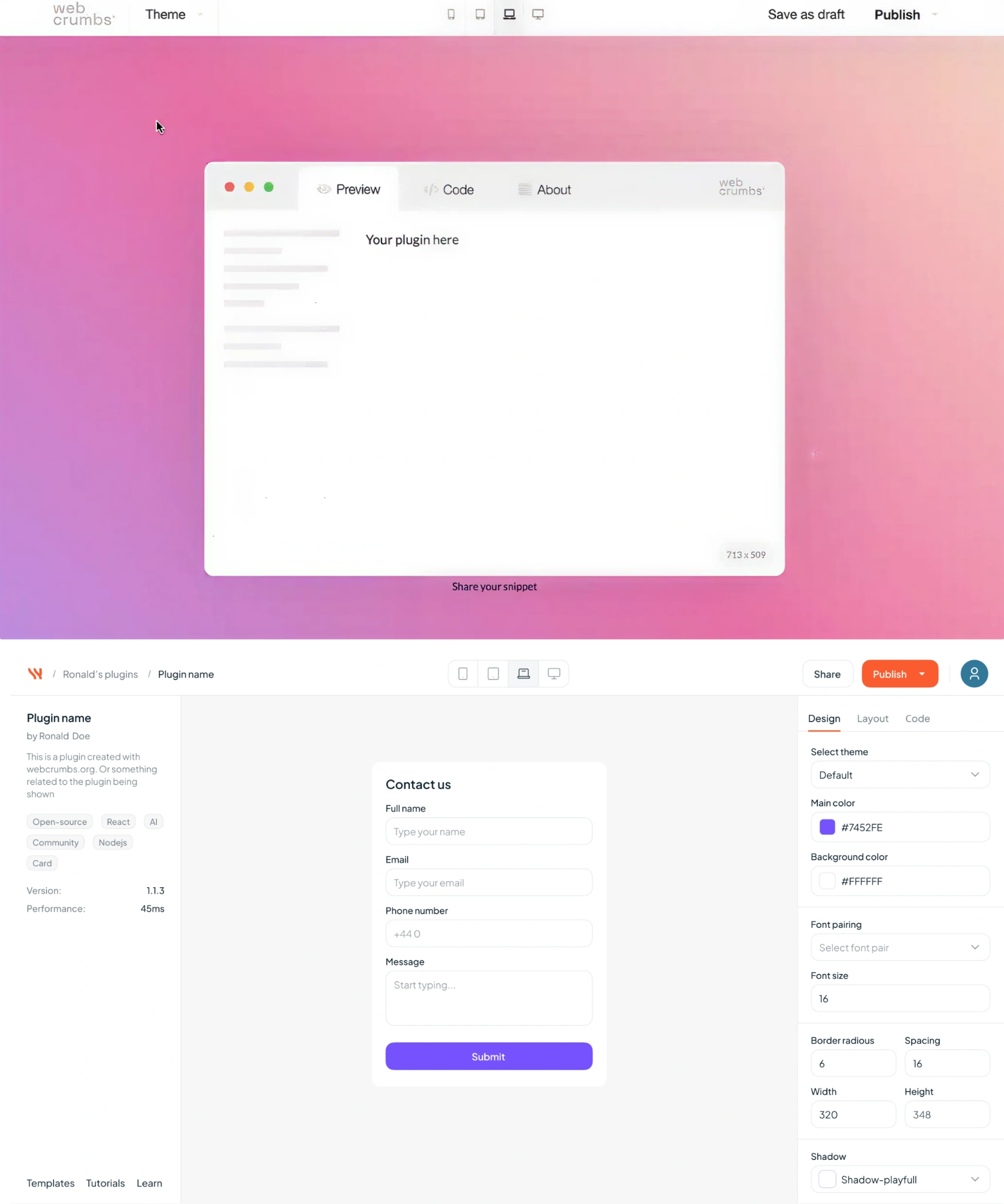
At Eleken we have seen this firsthand. When our designers helped Frontend AI (Webcrumbs) unify its visual identity across its website, GitHub presence, and browser plugin, the product presented a much stronger and more cohesive brand, helping it earn Product Hunt's Product of the Day, Product of the Week, and more than 1,200 organic upvotes without paid promotion.
Likewise, for a Bering Lab our designers replaced an inconsistent, clone-like interface with a cohesive design system, contributing to improved engagement, stronger retention, and a successful $2.3 million pre-Series A round.
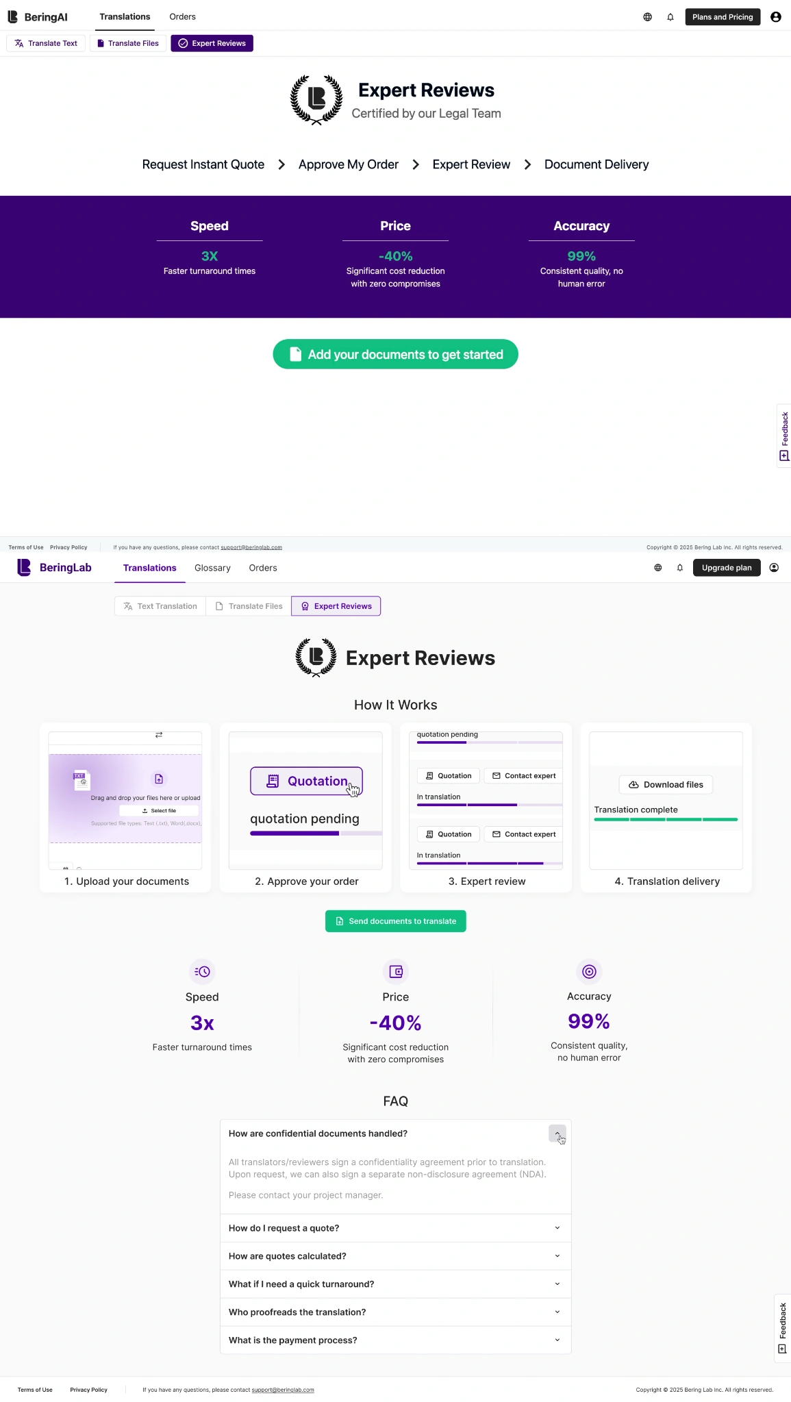
These examples show that consistency isn't just about making products look polished—it's about building trust with both users and the market.
What are the types of design consistency?
Visual design principles consistency is a combination of systems working together. A product can have a polished visual style but still feel confusing if interactions are unpredictable or terminology changes from one screen to the next. That's why consistency needs to be considered across every layer of the user experience.
Visual consistency
Visual consistency ensures that similar elements look the same wherever they appear. It includes visual elements such as your color palette, typography, spacing, iconography, corner radius, button styles, and image treatment.
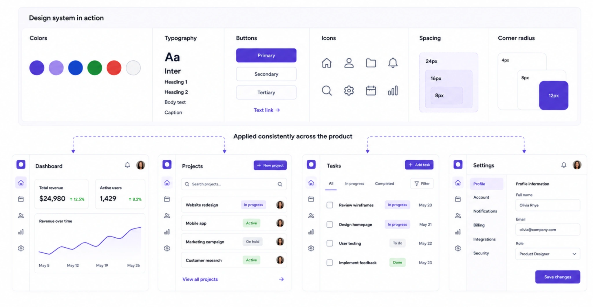
For example, primary buttons should always look like primary buttons, and headings should follow the same hierarchy across every page. When visual patterns remain consistent, users spend less time interpreting the interface and more time completing their tasks.
Functional consistency
Functional consistency means similar actions produce similar outcomes. Meeting user expectations across different screens reduces hesitation and makes interactions feel intuitive. Navigation stays in the same place, forms validate information the same way, and success or error messages appear consistently throughout the product.
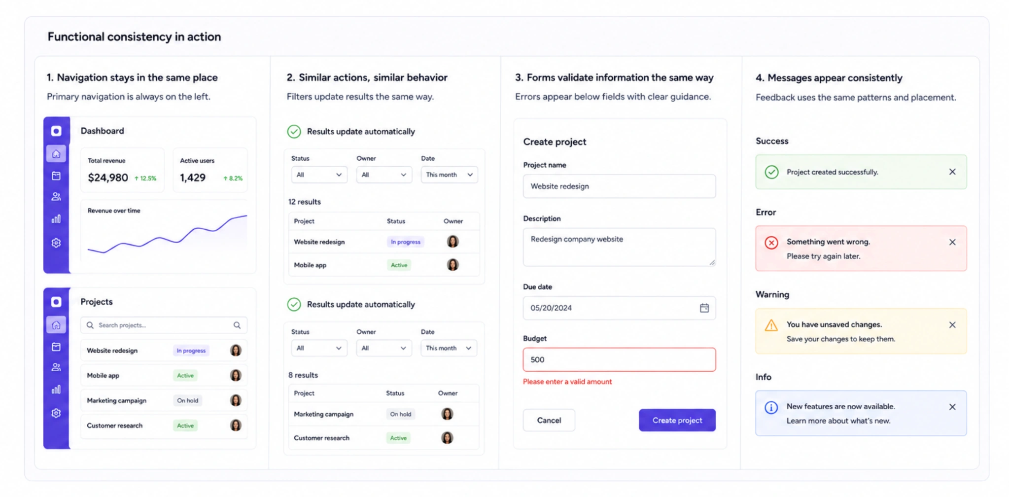
Imagine a filter that updates results automatically on one page but requires clicking Apply on another. Small differences like these force users to stop and rethink interactions they thought they had already learned.
Content consistency
The words you use are just as important as the visuals. Labels, navigation items, button text, error messages, and calls to action should follow the same terminology and tone throughout the product.
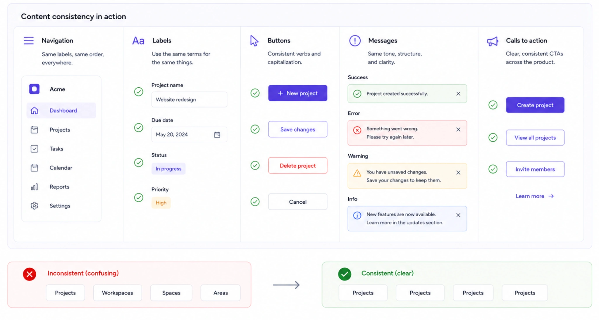
For example, switching between "Projects," "Workspaces," and "Spaces" to describe the same concept creates unnecessary confusion, even if the interface itself looks polished.
Layout consistency
Consistent layouts help users know where to find information. Reusing the same grid system, spacing rhythm, navigation structure, and information hierarchy across different screens makes the product easier to scan and learn.
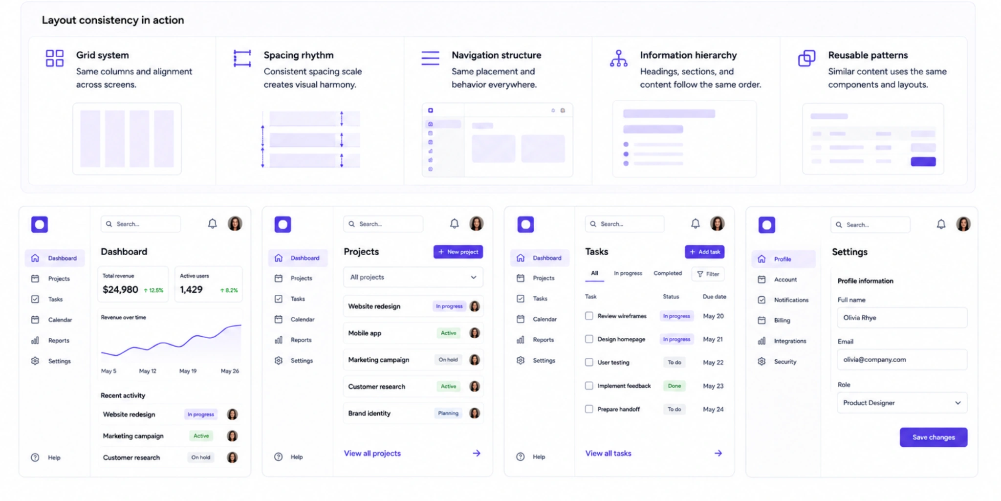
While individual pages may serve different purposes, they should still feel like they belong to the same product.
Motion consistency
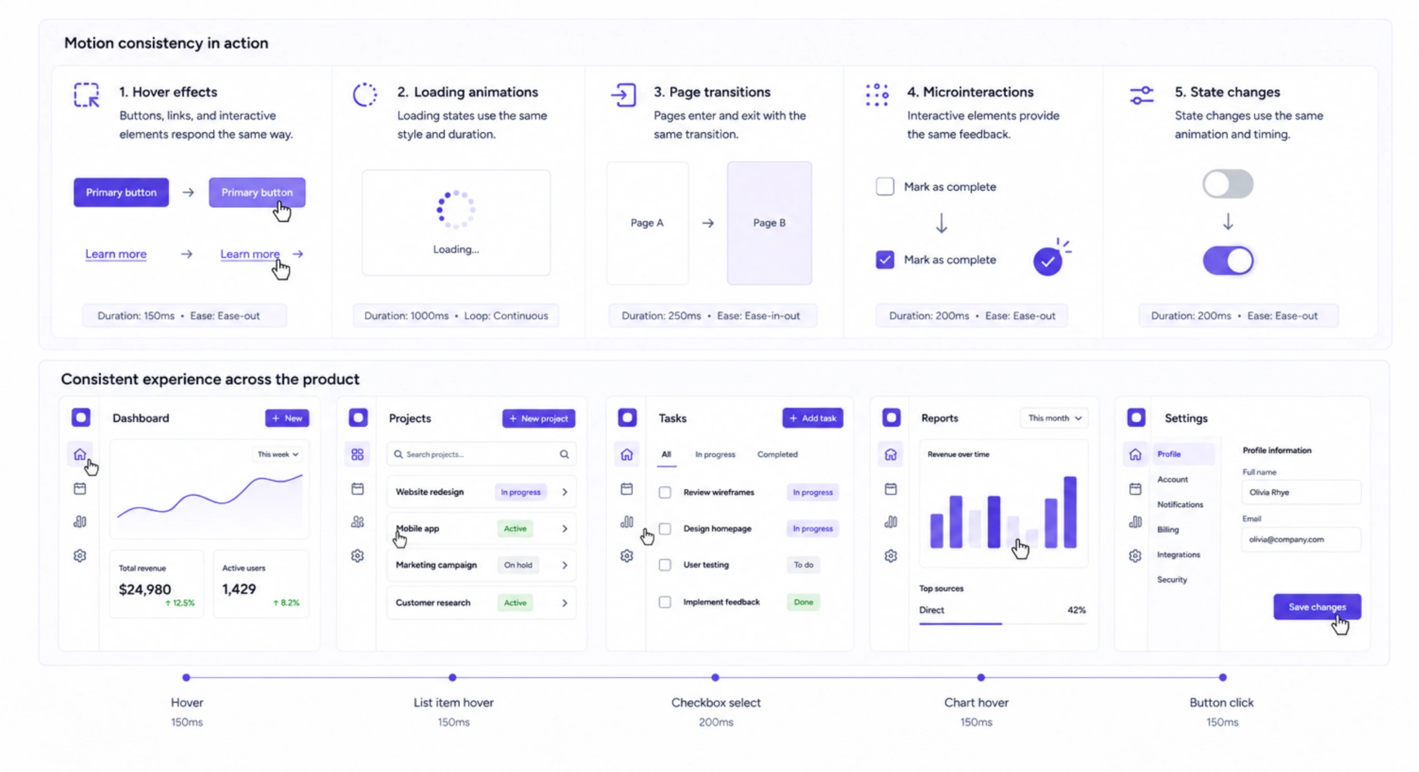
Animations and transitions also communicate meaning. Hover effects, loading animations, page transitions, and microinteractions should follow consistent timing and behavior so users receive the same feedback throughout the experience.
As one UX professional on Reddit put it:
"Things that do the same thing should be consistent with each other. It causes discomfort to your user when you ask them to do two similar things in two different ways."
A good example of these principles in practice is our work with Datawisp. Before working with Eleken, the product's interface felt dated and inconsistent.

Through a UX audit, visual redesign, and the introduction of a design system, our team created a more cohesive experience — one that users described as significantly simpler and easier to use.

How do design systems make consistency scalable?
It's one thing to create a consistent interface. It's another to keep it consistent as your product grows.
That's where design system consistency comes in. Instead of relying on every designer and developer to make the same decisions repeatedly, a design system provides a shared set of rules, reusable components, design patterns, and documentation that keeps everyone working from the same source of truth.
Start with design tokens
Design tokens are the building blocks of a UX design system. They define foundational properties such as colors, typography, spacing, border radius, and elevation, ensuring these values remain consistent across every screen.
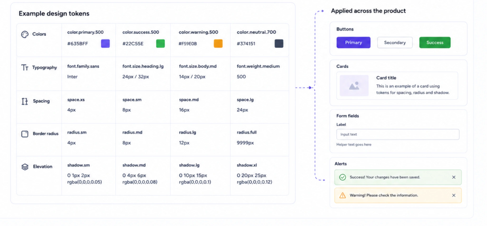
Rather than manually selecting styles for each new feature, teams reuse the same tokens throughout the product. Updating a token automatically updates every component that depends on it, making large-scale design changes faster and more reliable.
Build reusable component libraries
On top of tokens sit reusable UI components—buttons, inputs, tables, badges, cards, modals, navigation, and more.
A strong component library also defines how these elements behave in different states, including:
- default,
- hover,
- active,
- disabled,
- loading,
- error,
- and empty states.
This prevents teams from reinventing common interface elements and encourages the same patterns to be reused throughout the product.
Document the system
A design system isn't complete without documentation.
Clear usage guidelines help designers and developers understand when to use each component, what variations are available, and which patterns to avoid. Including version history, "do and don't" examples, and update rules helps the system evolve without introducing new inconsistencies.
Common tools that support this workflow include Figma for component libraries and variables, Storybook for documenting implemented UI components, Zeplin for developer handoff, and CSS variables for translating design tokens into code.
Make consistency UI design easier for developers
One of the biggest benefits of a design system is that it reduces development effort. Instead of building new components from scratch—or debating which button style to use—developers can reuse tested, documented components with confidence. This speeds up implementation while reducing visual and functional inconsistencies across the product.
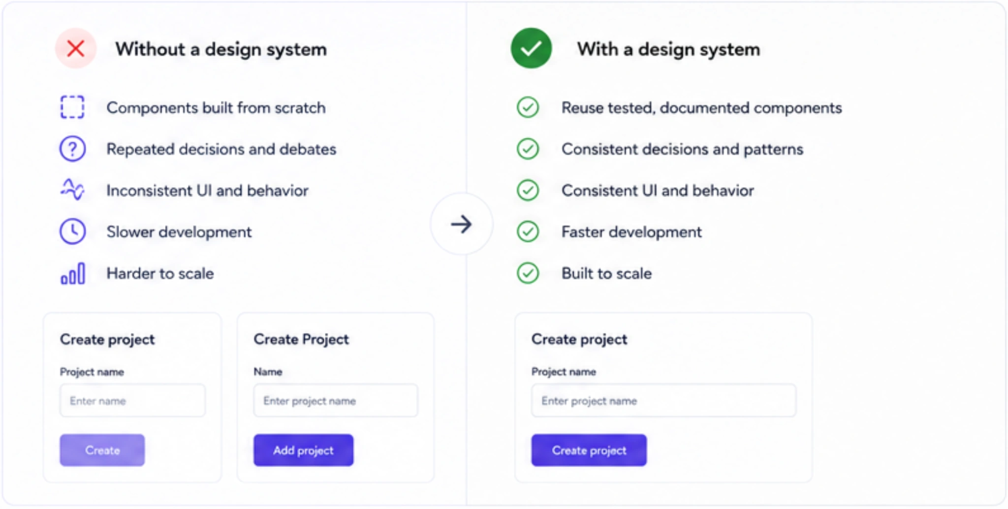
At Eleken, we follow this approach when creating design systems for SaaS products. Rather than documenting only colors and buttons, we built a complete UI kit — including navigation, forms, tables, charts, badges, icons, and design tokens—annotated for smooth React handoff. The goal isn't just consistency today, but a system that helps products remain consistent as new features and teams are added over time.
How do you build consistency visual design in practice?
Building visual consistency doesn't require redesigning your entire product. In most cases, it's about establishing a small set of rules and applying them consistently as the product evolves. The goal is to create a visual language that users can recognize instantly, regardless of which screen they're on.
Start with a few core rules
A consistent interface is built on repeatable decisions, not endless variations. As a starting point, define:
- One primary font family with a clear heading and body text hierarchy.
- A limited color palette, using one primary brand color and two or three accent colors.
- A spacing system, such as an 8px grid, to keep layouts balanced and predictable.
- Consistent button styles that clearly distinguish primary, secondary, and destructive actions.
When these foundations are established early, new screens naturally feel like part of the same product.
Know what you need: style guide, UI kit, or design system
These terms are often used interchangeably, but they serve different purposes:
- A style guide defines visual rules like colors, typography, and brand assets.
- A UI kit provides reusable interface components, such as buttons, inputs, cards, and navigation elements.
- A design system combines both, adding documentation, usage guidelines, design tokens, and governance to keep the product consistent as it scales.
Small teams may start with a style guide or UI kit, while growing SaaS products usually benefit from a full design system.
Lock your hierarchy early
Consistency depends on clear visual priorities. Define heading levels, icon sizes, spacing rules, and button hierarchy before expanding into new features. When every designer follows the same hierarchy, users always know where to look first.
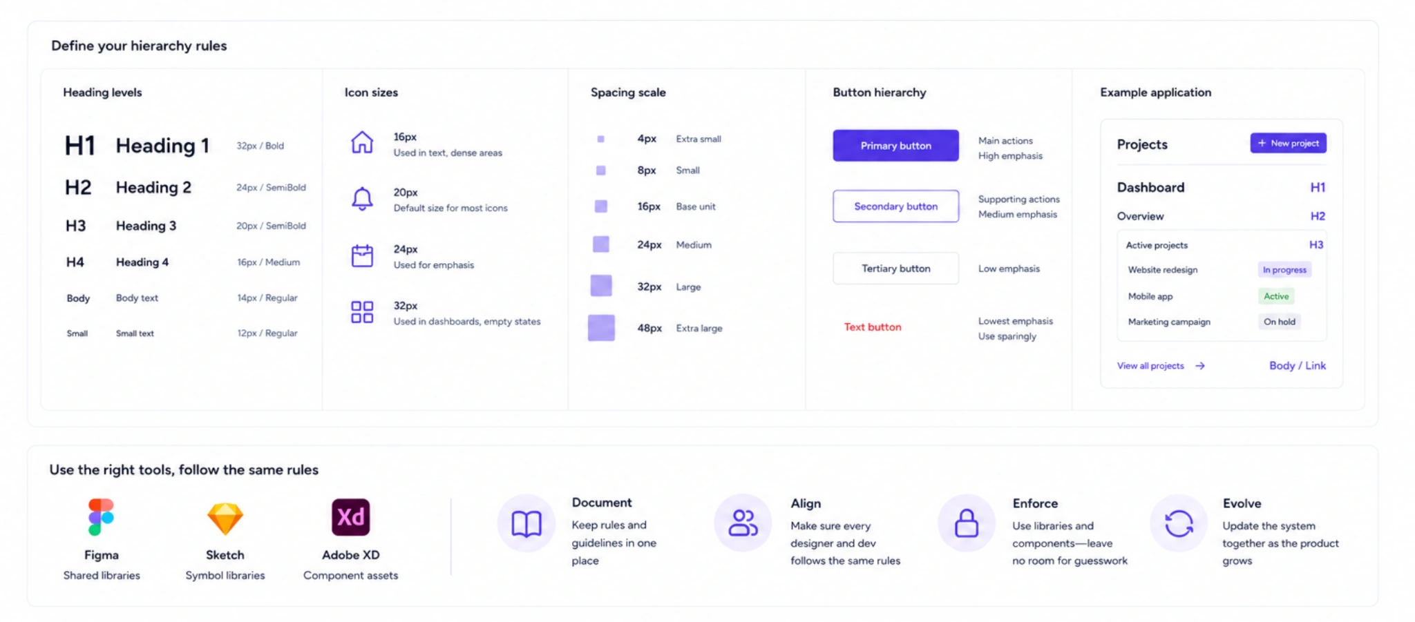
Tools like Figma, Sketch, and Adobe XD make it easier to maintain shared libraries, but consistency ultimately comes from agreed-upon rules—not the software itself.
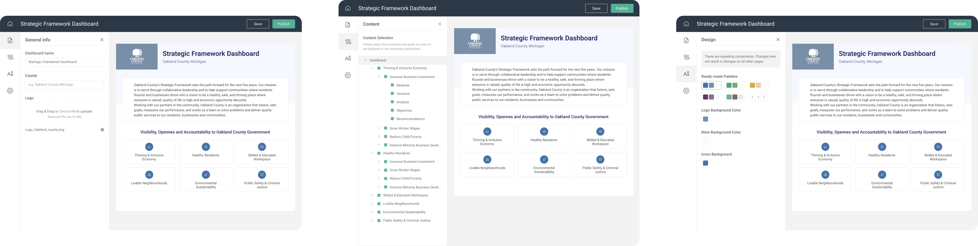
At Eleken, we usually start by exploring a few visual directions for the product's key screens before choosing one to develop into a master screen. It becomes the foundation for the rest of the interface, helping the product stay consistent as new features are introduced.
We used the same approach when redesigning ClearPoint Strategy, creating unified dashboard templates and a more cohesive visual language that helped improve usability across the platform.
How do you audit and maintain consistency over time?
Building a consistent product is one challenge. Keeping it consistent as new features, designers, and developers join the project is another. Without a clear maintenance process, even the best interfaces gradually drift away from their original design language.
Start with a consistency audit
The first step is understanding where inconsistencies already exist. Rather than reviewing screens individually, audit the product as a system by looking for repeated patterns and exceptions.
A typical audit includes:
- reviewing the component library for duplicates,
- checking page layouts and navigation patterns,
- identifying outdated buttons, forms, and templates,
- comparing typography, spacing, and visual hierarchy,
- flagging places where similar interactions behave differently.
This creates a clear picture of where the product has drifted and which issues have the biggest impact on usability.
Improve incrementally
Consistency doesn't require a full redesign. In fact, many teams make faster progress by introducing one improvement per sprint—for example, standardizing typography first, then navigation, then form components.
To decide what to tackle first, use the ICE framework:
- Impact: How much will this improve the user experience?
- Confidence: How certain are you that it's the right solution?
- Ease: How much effort will implementation require?
This helps teams prioritize high-value improvements instead of trying to fix everything at once.
Build consistency into your workflow
The easiest inconsistencies to fix are the ones that never reach production.
Before shipping a feature, review questions such as:
- Does it reuse existing components?
- Does it introduce a new pattern unnecessarily?
- Does it follow the established visual hierarchy?
- Is the language consistent with the rest of the product?
Adding these checks to design reviews, user story acceptance criteria, or pull requests helps maintain consistent patterns as the product evolves, even as new features and teams are introduced.
Give the system an owner
A design system needs ongoing ownership. Someone should be responsible for updating documentation, reviewing new components, communicating changes, and ensuring teams continue working from the same source of truth.
A lightweight visual QA before code reaches production is equally valuable. Reviewing the implemented interface—not just the design files—helps catch inconsistent spacing, incorrect component usage, and interaction differences before users see them.
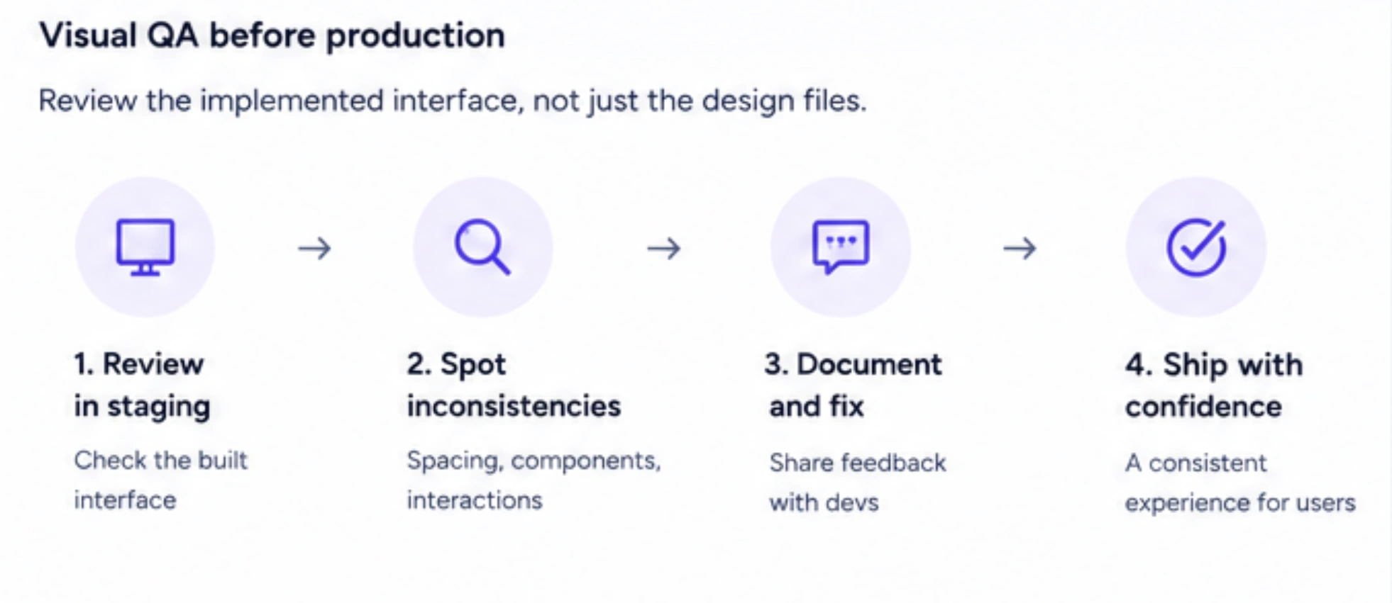
At Eleken, we recommend treating consistency as an ongoing practice rather than a one-time project. Small, continuous improvements, combined with regular audits and a visual QA process, help teams avoid costly redesigns and keep products cohesive as they grow.

What's the human outcome of a consistent product?
The biggest benefit of the consistency within a design isn't a cleaner interface—it's a better experience. When products behave predictably, users spend less time figuring out the interface and more time completing their tasks. That predictability builds trust, helps users develop confidence, reduces friction, and allows them to move through workflows more efficiently.
Consistency design also drives business results. Familiar patterns, interactions, and visual patterns lead to smoother user flows, fewer drop-offs, and higher completion rates. It's often what separates a polished product from one that feels patched together.
Consistency in design isn't about perfection—it's about disciplined repetition that compounds over time. At Eleken, we often work with SaaS teams whose products have grown quickly and lost that sense of cohesion. Instead of starting over, we help them introduce structure through reusable patterns and design systems. With a 3-day free trial, you can see how that approach works on 1–2 real product screens before committing.


.png)
.png)