


A dashboard is the first screen a user sees after signing in. It’s like a compressed quintessence of all the app’s pages or an overview of a product that should allow you, as a user, to instantly scan the essential information, understand the current state of your business at a glance, and give you fast access to the needed app functions.
Well, that’s what a good dashboard should be like, but how to design a dashboard that promotes quick decision-making?
As we at Eleken provide UI/UX design services for SaaS products, we had a chance to create more than a dozen of dashboards for a variety of different industries. We know that designing a nice dashboard may be challenging, so we've compiled a list of practical recommendations for you, based on our experience. You will undoubtedly find something useful here.
The way we start our dashboard design
Dashboard is an important analytical tool and to make it useful, you have to display only the most essential data to viewers. So, despite the desire to jump straight into the design, at Eleken we always take some time to understand why we are creating a dashboard, who is going to use it, and what information we need to put there. And that’s what we recommend before opening a design tool when creating dashboards.
So, below are four essential steps to create a dashboard.
Step 1. Define how the dashboard is going to be used
First of all, identify what your customers need a dashboard for (its purpose), and how they will use it.
Depending on the goal, there are three main types of dashboards: analytical, strategic, and operational.
Analytical
Using analytical dashboards the viewer may examine large volumes of data and identify trends. These dashboards often consist of complex charts that help find data insights. Analytical dashboards can be used to make forecasts, find answers to “why” and “what if” questions, highlight how trends change over time, and the like.
We can choose this type of dashboard to track the progress of ad campaigns, monitor a product's income throughout its lifespan, or see the country's population patterns over time.
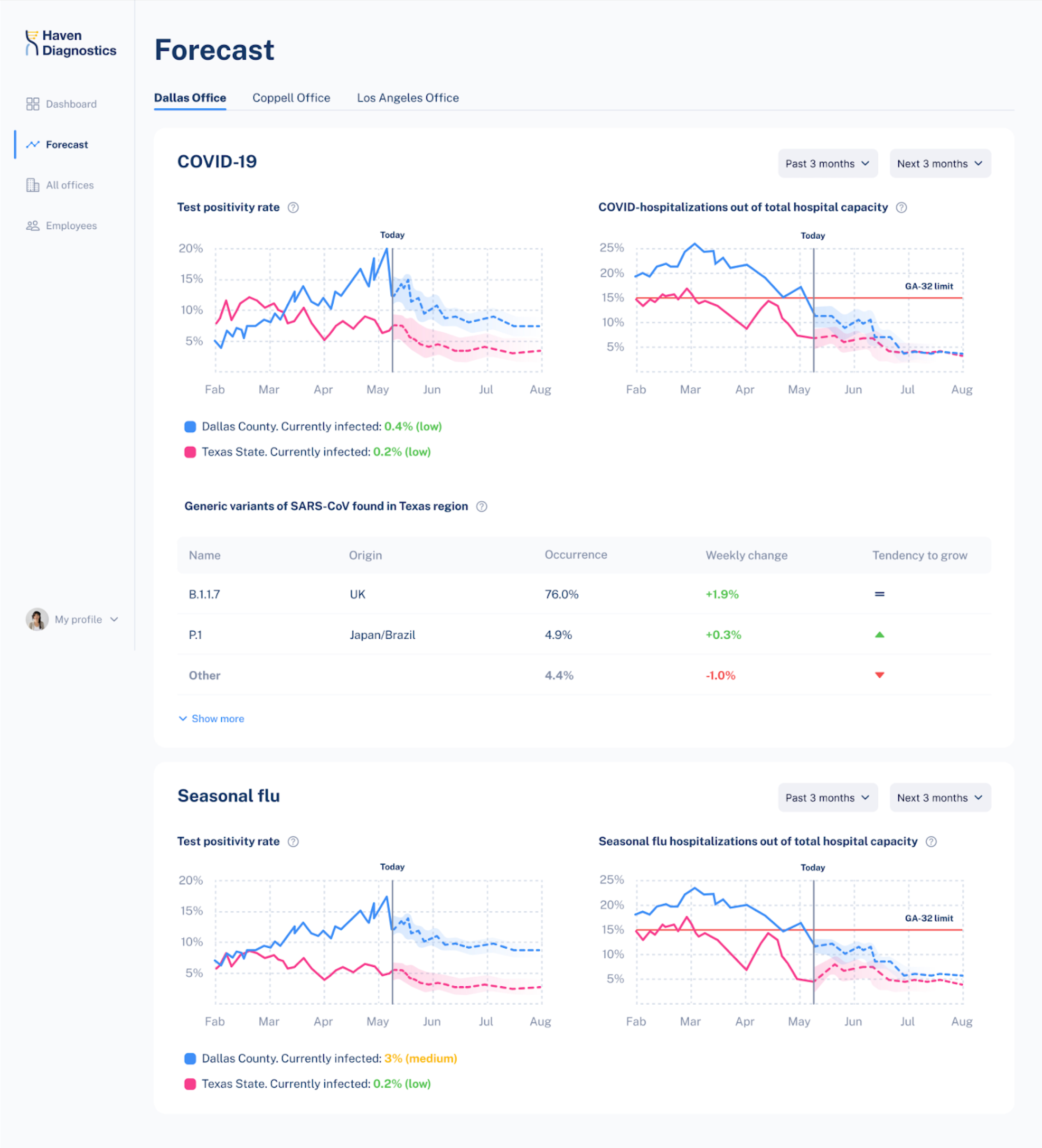
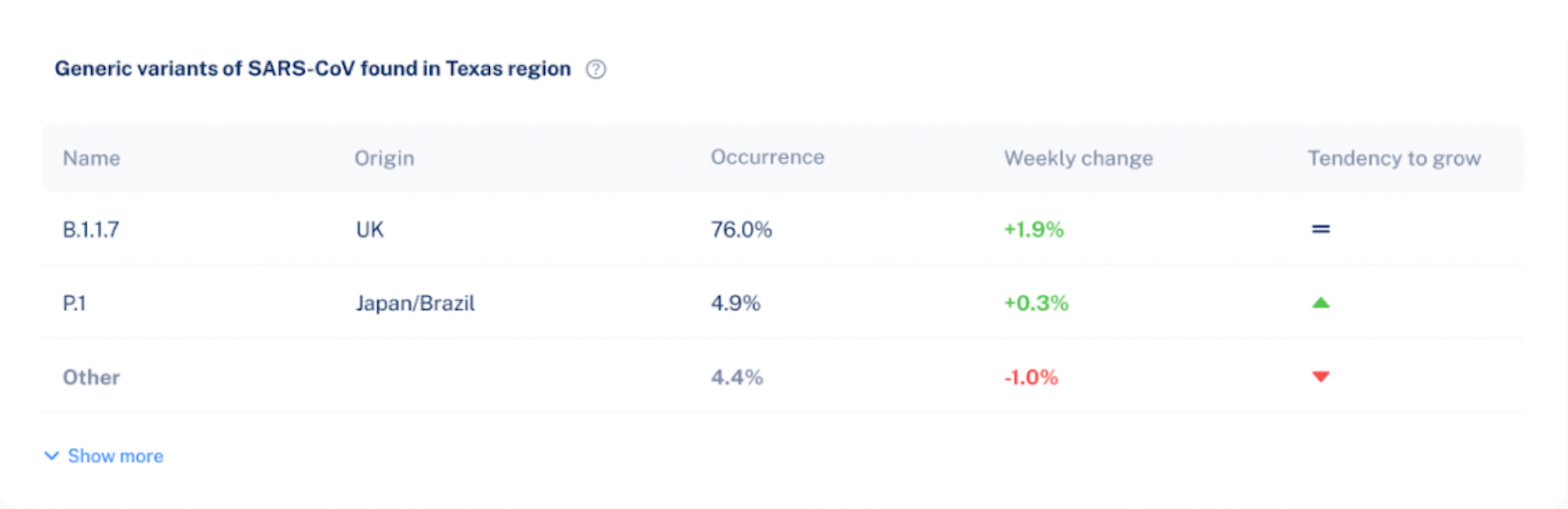
Below is an example of an analytical dashboard we designed for Haven Diagnostics. It depicts contagion graphs with future projections and allows making forecasts.
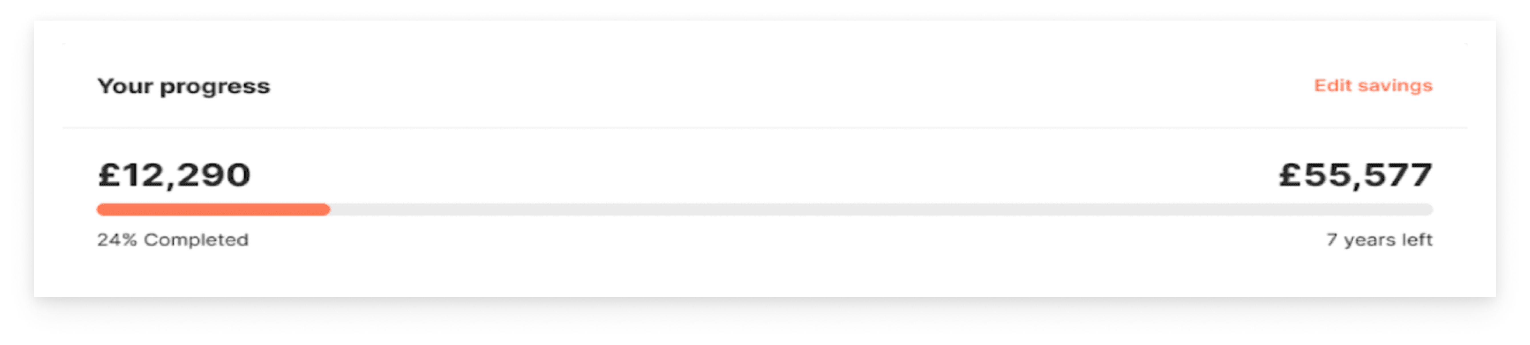
Strategic
Strategic dashboards help executives to check the progress of KPIs. Data on these boards allows making long-term decisions.
Strategic dashboards frequently provide a timeline of performance (month, quarter, year).
Operational
Operational dashboards usually help to carry out tasks connected to monitoring. They often include current data presented in several simple graphics. This type of dashboard updates very often and is mostly used to monitor the progress and performance of a system in real-time.
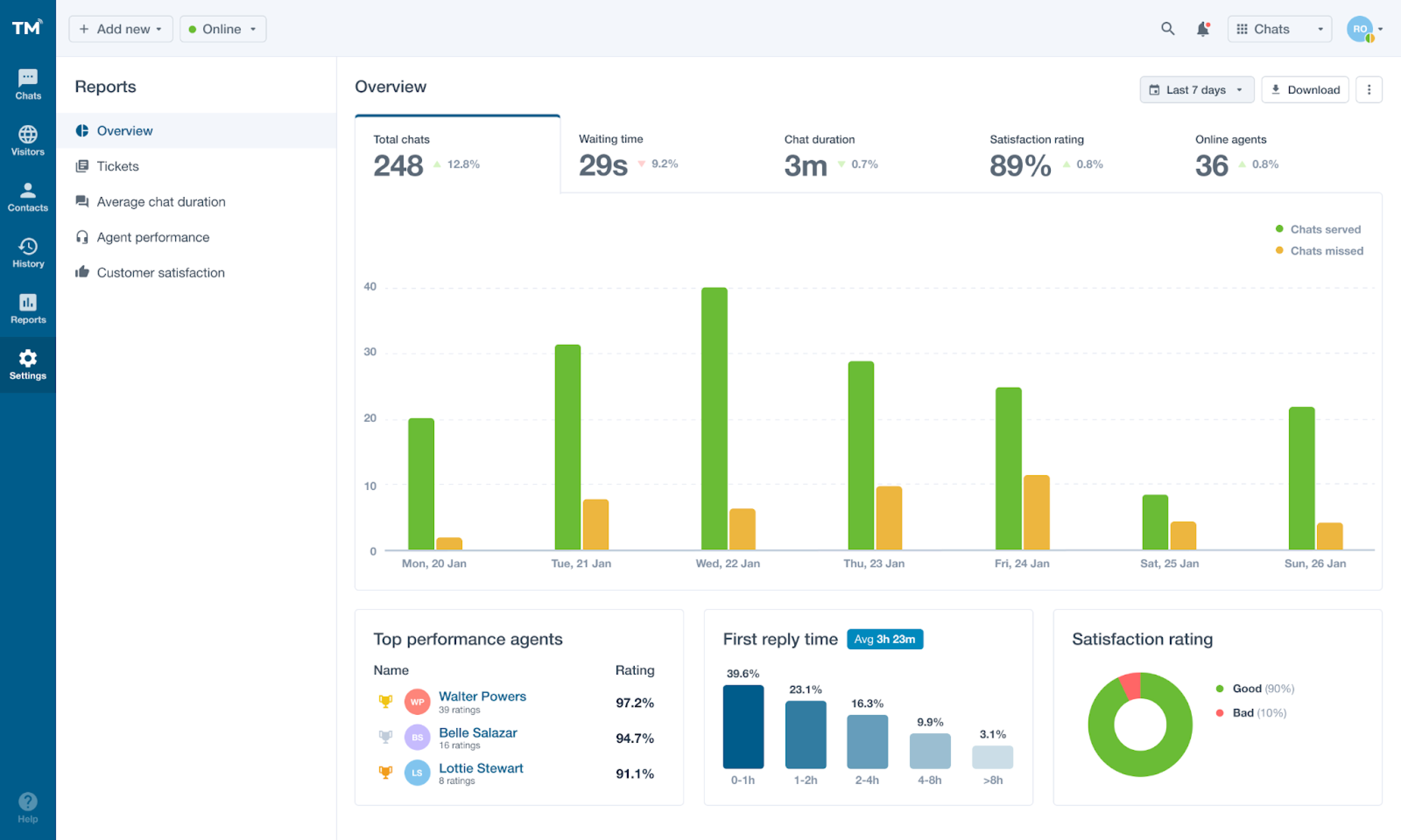
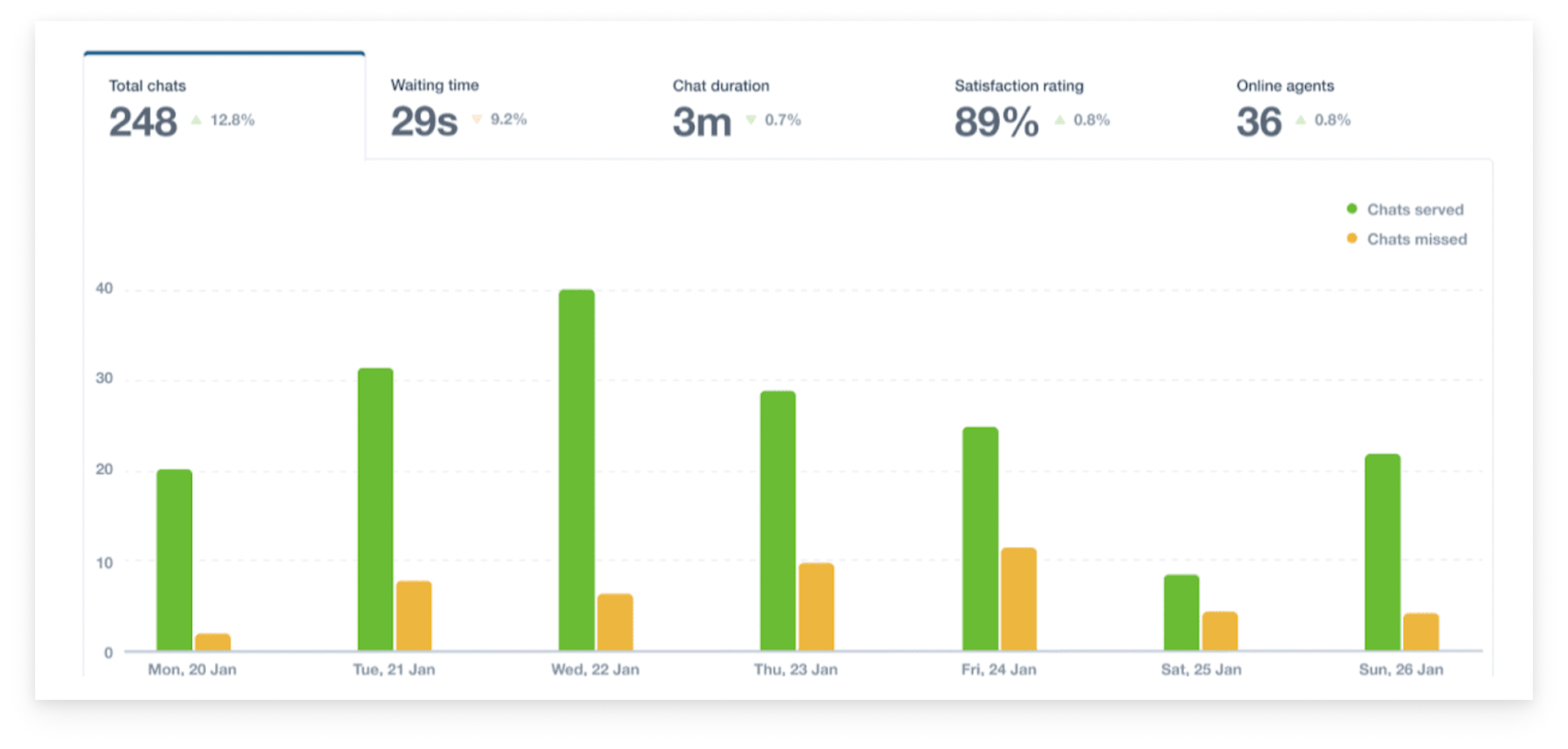
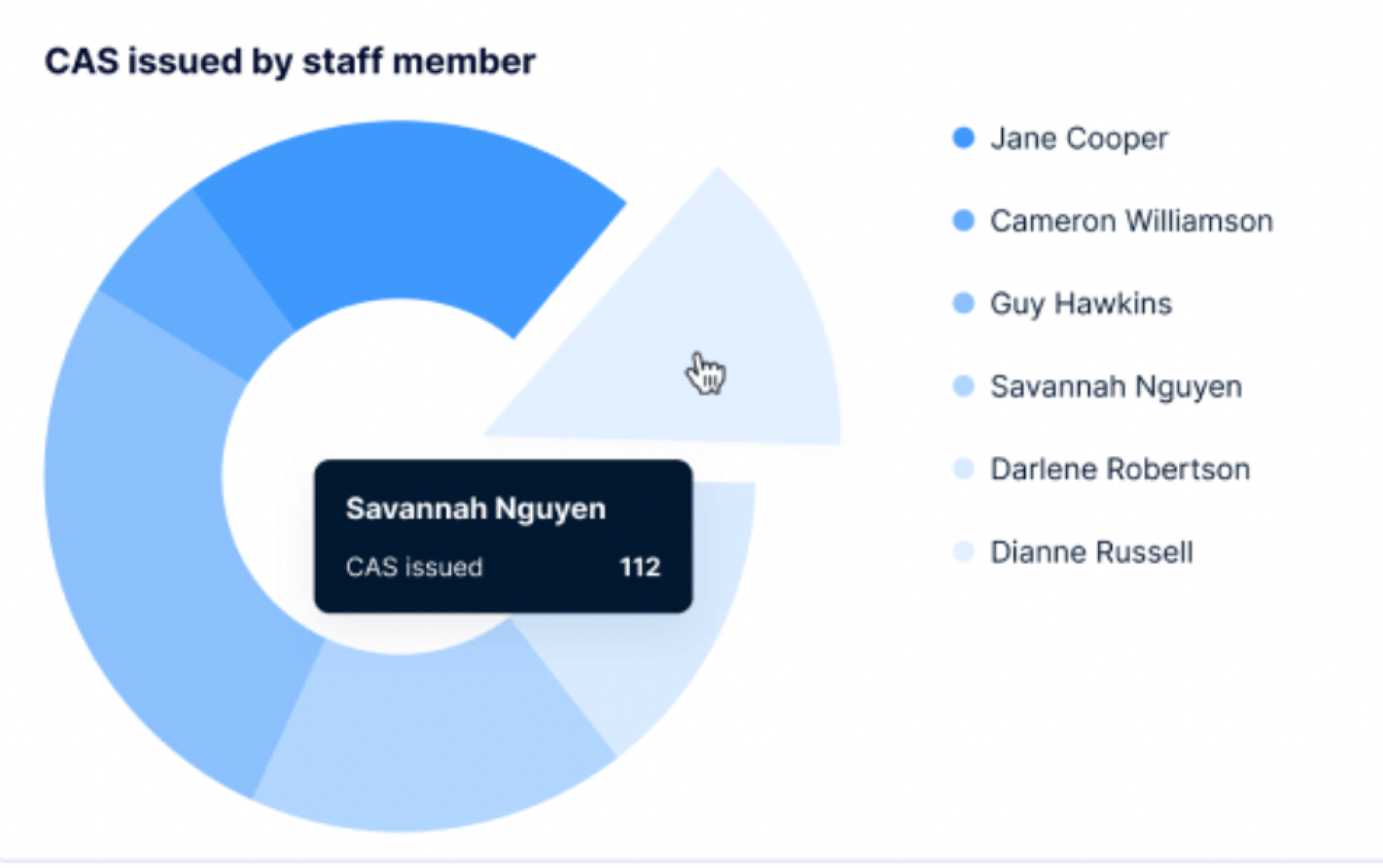
Here’s an operational dashboard with real-time information that we created for a customer experience platform. Its purpose is to help managers analyze chat performance and customer satisfaction.
To sum up
- Use analytical dashboards for analysts and executives to identify weekly performance issues, spot trends, establish analytics targets and gain an in-depth understanding of key processes.
- Use strategic dashboards for executives to analyze organizational KPIs, track monthly performance, and meet KPI objectives.
- Use operational dashboards for managers and their teams to track daily performance, and raise employee awareness and goal-tracking.
Step 2. Consider the users
In fact, this step is tightly connected with the previous one, but we decided to put it separately to emphasize its importance.
Whatever the purpose of your dashboard is, it should encourage the viewer to take action. So you need to know who your audience is to make them turn to your dashboard for insights.
Answer the following questions:
- Who are the people that will view my dashboard?
- What data do they need to make decisions?
- What are their existing understandings of the metrics?
- Do they have experience working with data?
- What misconceptions may they have about visuals and color?
Keep in mind that the way you perceive your data is different from the way your audience does. Try to explore what your users are seeking for, and put their goals first.
Step 3. Define what metrics to monitor
Effective dashboards help users make better decisions by providing the right data and context. That’s why, if you learn what decisions they need to make, you’ll know what metrics to include.
- Interview direct dashboard users to learn what decisions they want to be more informed on.
- Learn how they currently inform themselves on these decisions, so that you can understand users' goals and motivation.
- Taking into account users' goals, think of all the decisions they need to make to reach them, and then single out those that need to be supported with data.
- Talk with the user to pinpoint the metrics that will inform their decisions and provide answers to their concerns.
Step 4. Choose the proper visualization for each metric
A chart makes it far simpler for a user to identify trends than countless spreadsheets do. To create a useful dashboard, you need to know which chart to use to depict a certain dataset.
Here’s a short dashboard guide that we use at Eleken to choose one chart over another.
Displaying a single value
- Single value chart to show a highly significant metric and help the audience quickly notice it.
- Single value with an indicator to show a highly significant metric that’s changed.
- Bullet chart to show a highly significant indicator in comparison to a goal.
Displaying several datasets
- Table to showcase two-dimensional data sets that may be categorized or break up big data sets that have a natural drill path. Include no more than ten rows in your table.
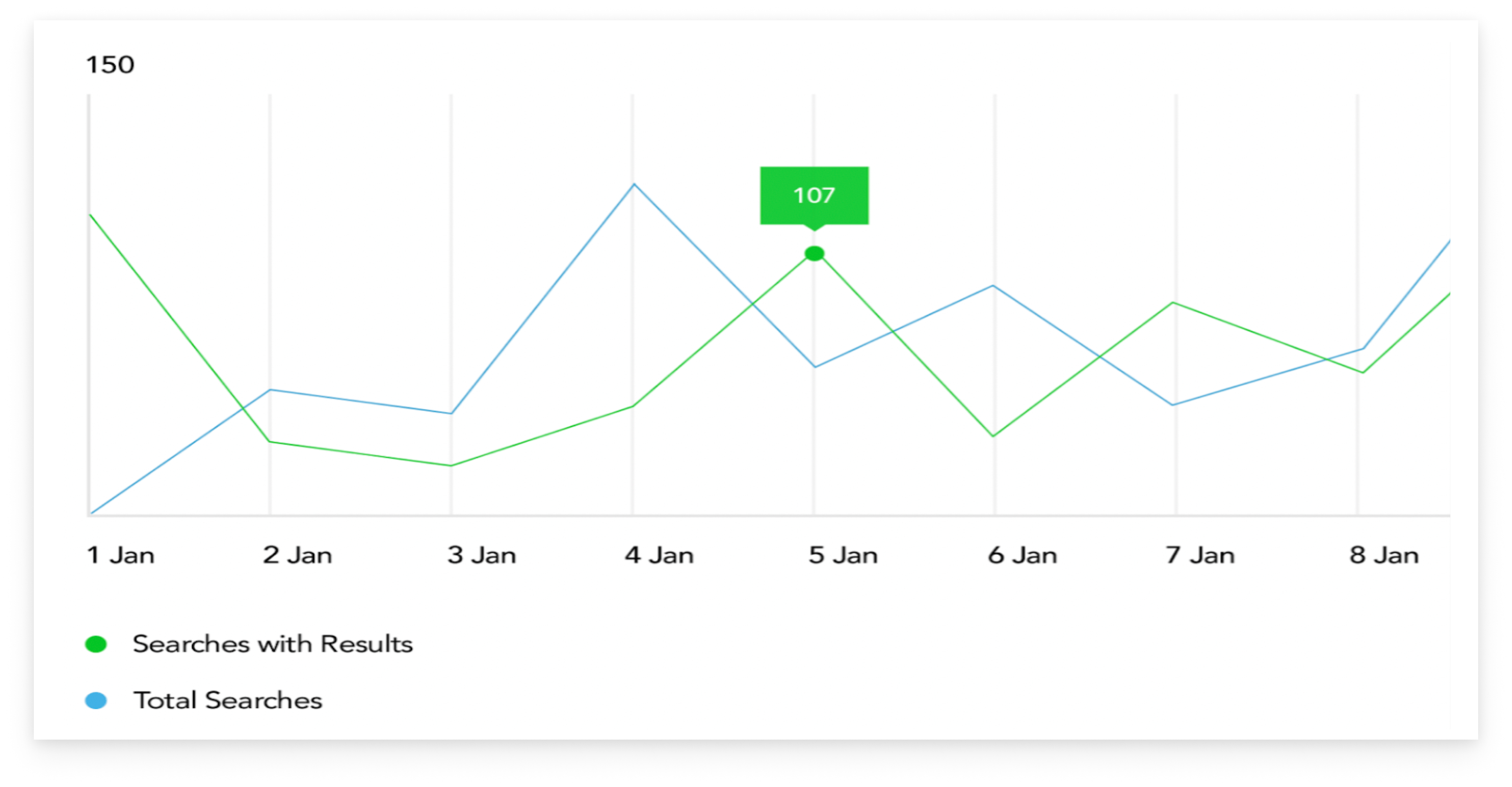
- Line chart to express continuous data, identify general trends and patterns, compare how they change over time, or make forecasts. Don’t compare more than four values on your line chart.
- Bar/column chart to show change over time, compare values that fall in the same category and express how partial values relate to a whole value. The starting value on the y-axis should always be zero.
- Pie/donut chart to provide information quickly and in digestible chunks. Beware that users usually find it difficult to compare sections, so use this chart type for a small number of slices. Also, show more detailed info about each segment as the user hovers over each slice with the mouse.
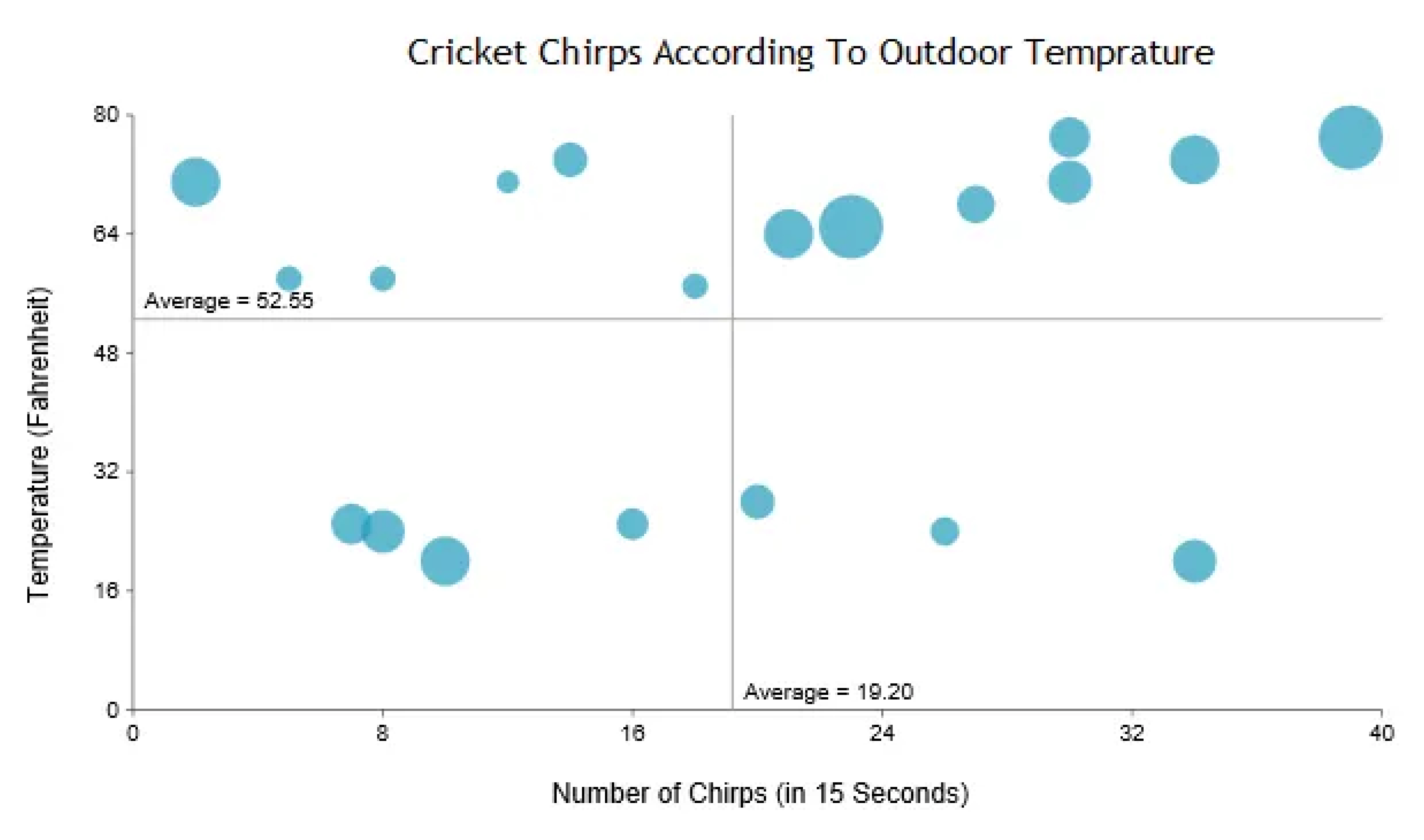
- Scatter plot/bubble chart to show how several quantitative variables relate to each other. Choose this chart for your dashboard if you have no other options, because they demand a lot of mental effort to process, even when the depicted information is simple and has additional context.
Step 5. Organize the dashboard
Now, with all metrics defined, your task is to properly locate them on a screen. Here are several dashboard design tips on how you can do it.
- Start creating your dashboard prototype with paper sketches or using low-fidelity tools. Firstly try to visualize individual metrics, then try to group multiple charts together.
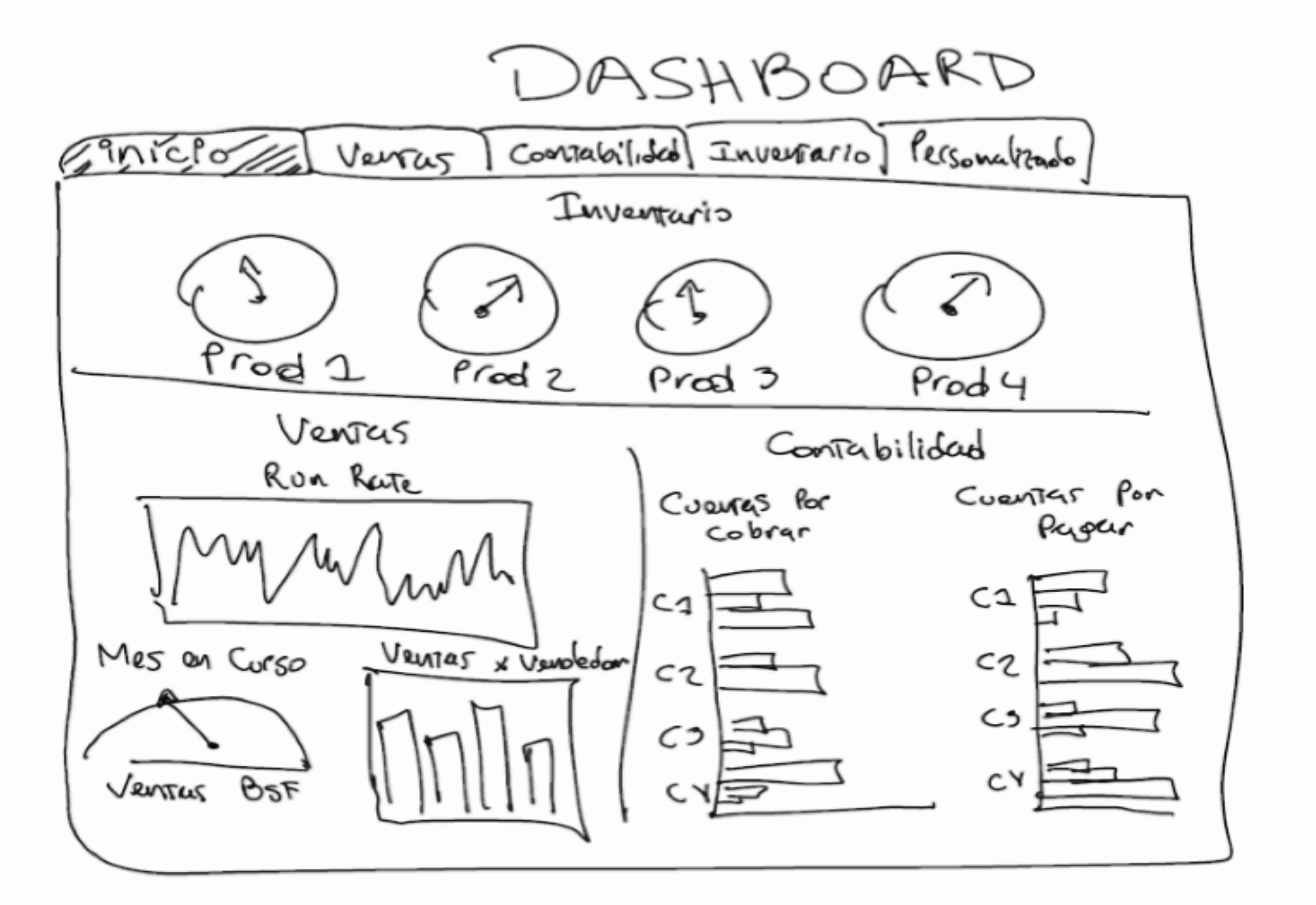
- To arrange charts together, try to start with a grid that will help you create a basic structure for your dashboard.
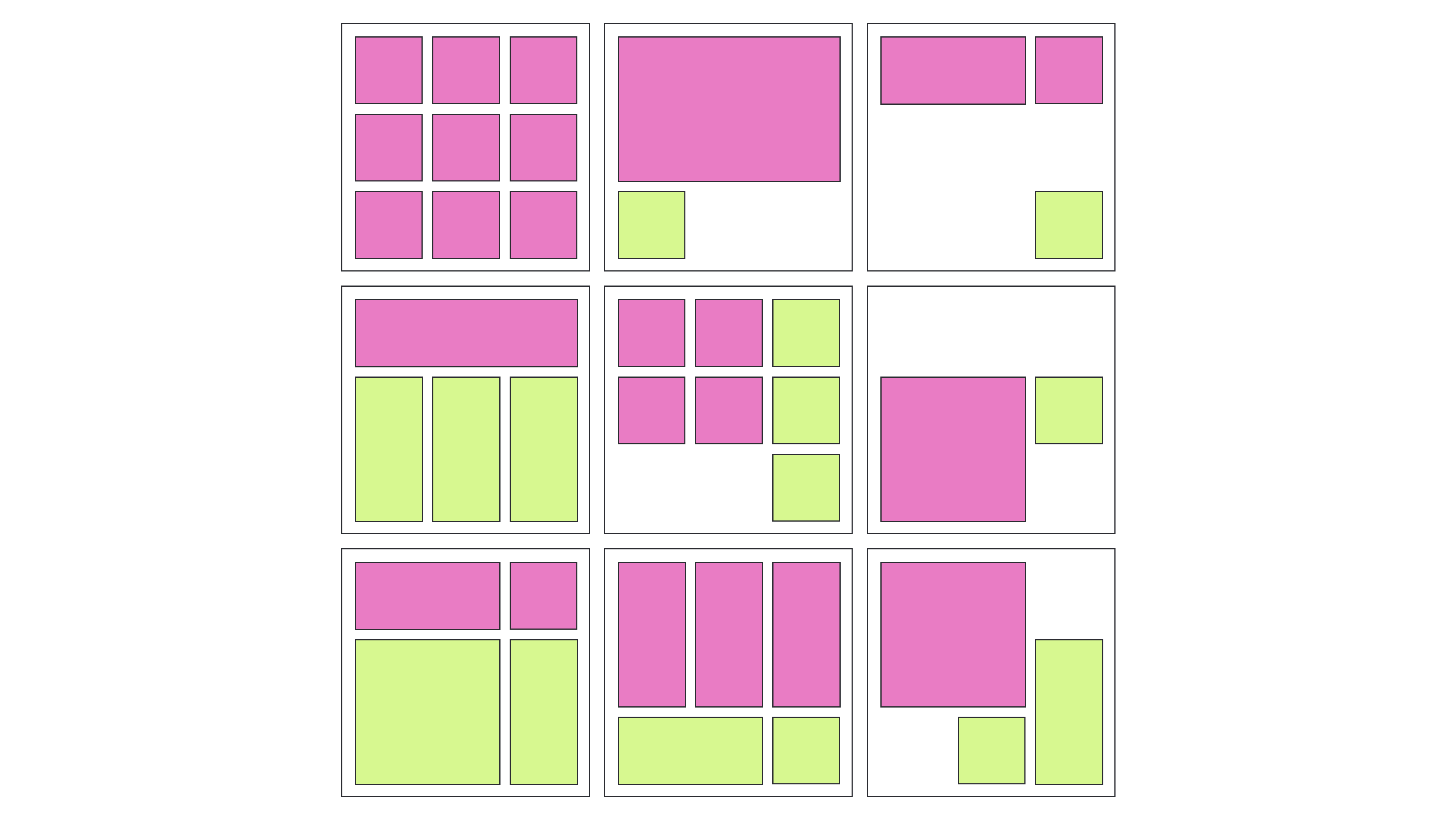
Image credit: designer-daily.com
- Place the most important indicators in the top left corner (as most people read from left to right).
- Make sure related metrics are grouped together so that users don’t have to search them across your dashboard.
- Mind the way you use the white space (the area between elements on your dashboard) - there should be enough of it to make the design light and not cluttered, but not so much that it becomes difficult to understand which charts belong together.
- To keep the dashboard consistent, reuse design elements in different charts over your dashboard.
The way we make dashboards simple
At Eleken, we’re the supporters of minimalistic dashboards. We believe it’s not a place where you can distract users with graphics, so everything has to be clean and clear (you can make sure it’s true by looking at some of our dashboard examples). And we know, you can make data easier to grasp at a glance with the help of the right use of color, typography, and layout.
Here are several rules to keep the design simple.
Choose colors wisely
- Remember about consistency. If you chose a certain color scheme, use it for every chart on your dashboard. As a result, it’ll be easier to find relationships between data in graphs, tables, and charts.
- To prevent one set of colors from standing out too much from other groups, keep all of the colors in the same range of lightness and saturation.
- Use up to six colors in the layout, as using too many in one chart can hinder the user’s focus.
- To generate contrast and emphasize some data, use color accents for the information you want to draw attention to, and neutral colors for other data.
- To show amounts or numbers of continuous data, it's better to use various saturations of one color, not different colors.
- Keep in mind that certain colors can evoke strong associations (like green for positive changes and red for problem areas), so don’t flip their meaning.
- Use additional visual clues, such as icons or labels, to further explain the significance of the chart colors.
Mind labels and typography
- Choose the appropriate fonts (Roboto, Inter, or SF Pro can be your safe choice).
- You can show how important certain information on your dashboard is with the help of headings and font weight. Yet, select a few typographic styles.
- Add a description or a formula to metrics that may be difficult to understand - this will help viewers correctly interpret a chart.
- Don’t use icons alone, accompany them with a label to clearly represent key information.
- To keep the chart legible, avoid over-stuffing it with axis labels.
- To make the labels on the chart easier to read, they should be positioned horizontally. Don’t rotate or put labels vertically.
- Put a legend under a chart on a desktop, and above the chart on mobile to keep it visible.
Put the information in hierarchical order with the help of layout
- Divide all charts you want to include in the dashboard into three groups depending on the importance and arrange them in descending order. Put the most critical data first, then trends that explain the previous insights, and then add details that help comprehend the issue better. This will make the board easier to read.

- Focus the viewer's attention on important indicators with the help of color, size, and visual weight.
- To make it possible for users to compare charts, make sure they don’t have to scroll through the dashboard. If there is some data below the bottom of the screen, your dashboard probably contains too much information and you should consider removing irrelevant charts.
- Eliminate anything that doesn’t communicate data.
Final recommendations
As with everything in your app, the dashboard should change and evolve over time to continue being useful for the audience.
- Gather user feedback to keep the dashboard up-to-date and find faults more rapidly.
- Schedule time to analyze the feedback so that you can identify trends and set work priorities.
- Check the dashboard's functionality frequently to determine if people still use it, if the data is still correct, and if there is a need for improvement.
And if you feel like your journey to a perfect dashboard will be much easier with a dedicated UI/UX designer in your team, we specialize in creating SaaS dashboards.
Schedule a call to learn more about how we work.


.webp)

.png)

.png)


