Badge UI components are among the tiniest elements in any interface, yet they carry a lot of responsibility. A small dot on a nav icon tells you something changed. A number on a cart icon tells you how many items are waiting. A "New" label on a feature tells you where to look first.
Simple stuff but easy to get wrong. A stale count erodes trust. Too many badges at once and users stop noticing them entirely. And without accessibility in mind, some users won't get that information at all.
Most resources on badges are also oddly incomplete — designers get inspiration galleries with no rationale, developers get API docs with no design context, and nobody agrees on whether the thing they're looking at is a badge, a tag, a chip, or a pill.
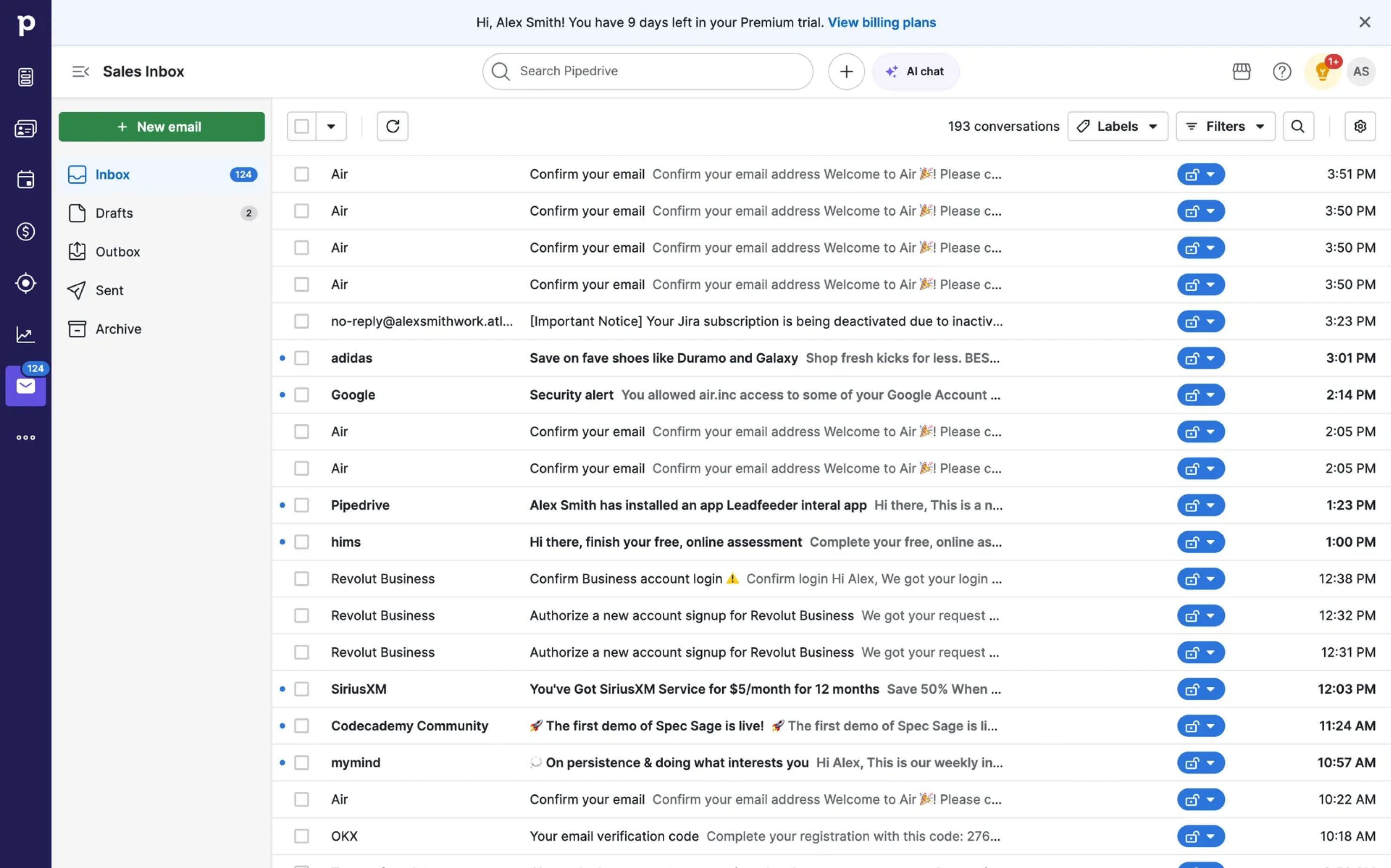
After a decade of designing SaaS products at Eleken, we've built badge systems more times than we can count — and the same questions come up every time:
- What badges are
- How they differ from similar components
- When to use them
- How to design them well.
In this guide, we will try to cover all of it (with a lot of real examples, of course).
What is a UI badge?
A badge is a small, non-interactive visual indicator attached to a parent element — an icon, a button, a list item, a navigation label. Its job is to signal that something is there without interrupting whatever the user is doing.

Here are some things to remember about badges:
- They don't ask for action
- They don't open a dialog or trigger a flow.
- They just sit there and say "hey, something changed — go check when you're ready."
To sum up, most badges do one of two things: inform (something happened) or quantify (here's how much). A dot on a chat icon informs. A number on that same icon quantifies. Both are badges — just different levels of detail.

Anatomy of a badge
At its core, a badge has three parts:
- Container — the shape that holds everything (circle, pill, rounded rectangle)
- Label — text, number, or icon inside it; sometimes absent entirely (dot badge)
- Position — always anchored to a parent element, never floating standalone

One thing badges can't do
Badges surface information, but they can't carry context. A badge showing "5" tells you there are five somethings — it can't tell you who sent them, why they matter, or what to do about them. When the context is that important, a badge alone isn't enough.
The difference between badge vs. tag vs. chip
If you've ever argued with a teammate about whether something is a badge or a tag, you're not alone. Different design systems use these terms differently — Material Design, Tailwind, Shadcn, and Dell Design System don't fully agree on the naming. So let's settle it with one simple rule:
Badges UI isn’t always static and non-interactive. The moment a user can click it, filter with it, or remove it — it's a chip or a tag.
Here's how the four components break down:
A few practical distinctions worth knowing:
Tag — labels content or categorizes it. Usually static. "In Progress", "Beta", "New" on a feature announcement. The user reads it, doesn't touch it.
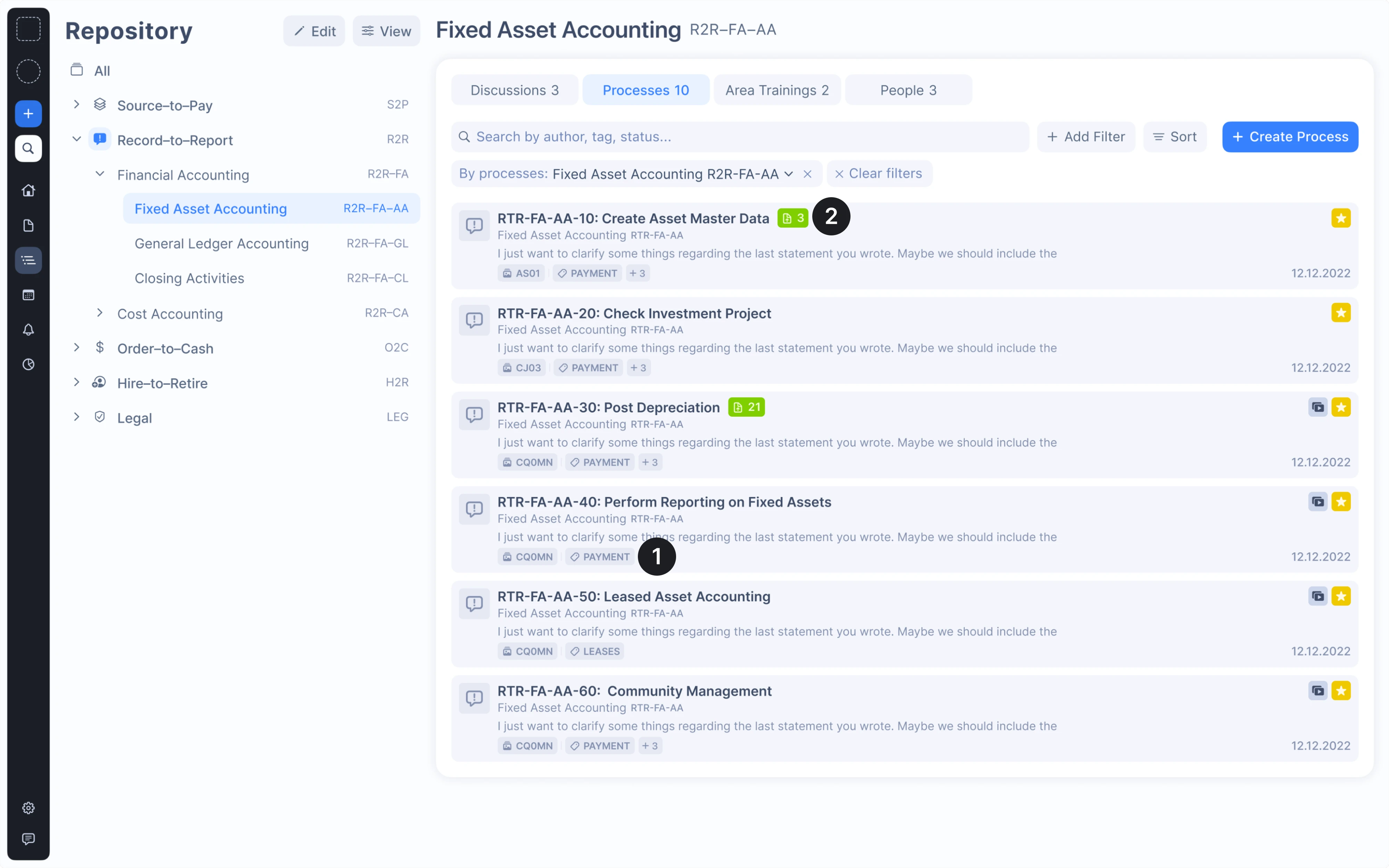
Chip — looks similar to a tag but responds to user interaction. Users can click to filter, select, or remove it. If it has an ✕ on it, it's a chip.

Taking into account the confusion between the terms, name your components explicitly in your design system. Calling everything a "badge" because it looks small and rounded is how you end up with inconsistent behavior across your product.
Types of badges with visual examples
Badges come in more shapes than most people realize. The red dot on an app icon and the "Beta" label on a nav item are both badges — but they work very differently. Here's a breakdown of the main types, organized by what they contain and where they sit.
UI badges by content
The most fundamental way to categorize badges is by what's inside them. Each content type serves a different communication job, and choosing the wrong one is usually how badge clutter starts.
Numeric badge
What it is: a badge that displays a count — unread messages, cart items, pending tasks.
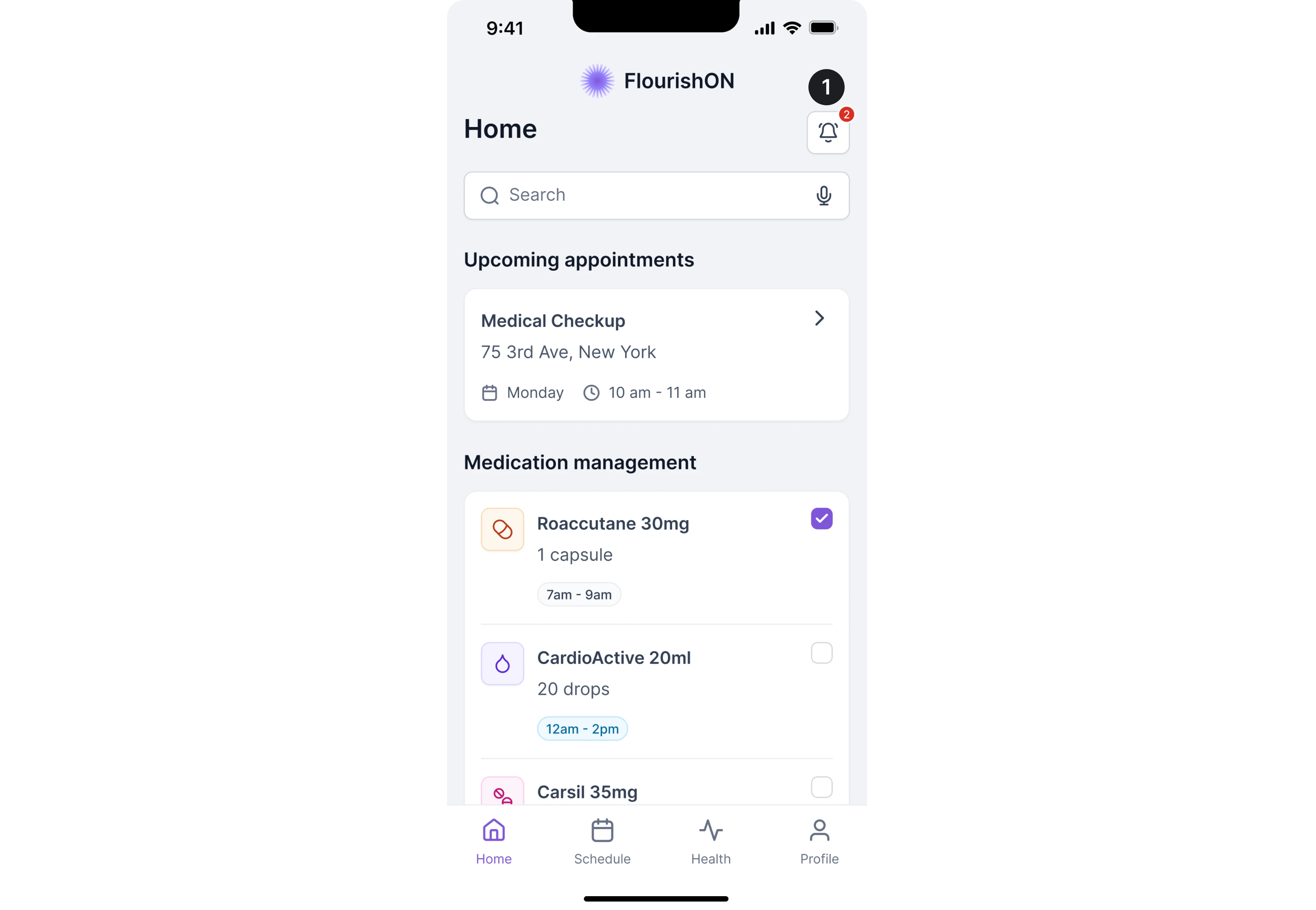
When to use it: when the quantity itself helps the user triage. The difference between 1 notification and 84 notifications changes how urgently someone acts.
Best practice: decide your truncation threshold early and design for it. "99+" and "999+" are both valid — the right choice depends on context. A chat app and an e-commerce cart have very different scales. Also, never let the badge overflow your layout, design for the longest possible string from day one.
Dot badge (boolean badge)
What it is: no number, just a colored dot. Signals that something happened without quantifying it.

When to use it: When the count doesn't matter — a new feature announcement, an unread thread, an online status indicator. It's also a valid fallback when querying for an exact count is expensive.
Best practice: Don't mix dot badges and numeric badges designs on the same navigation bar, it creates visual inconsistency and confuses the signal. Pick one system and stick to it.
Text/label badge
What it is: a short text label — "New", "Beta", "Live", "Sale" — used to categorize content or announce a feature state.
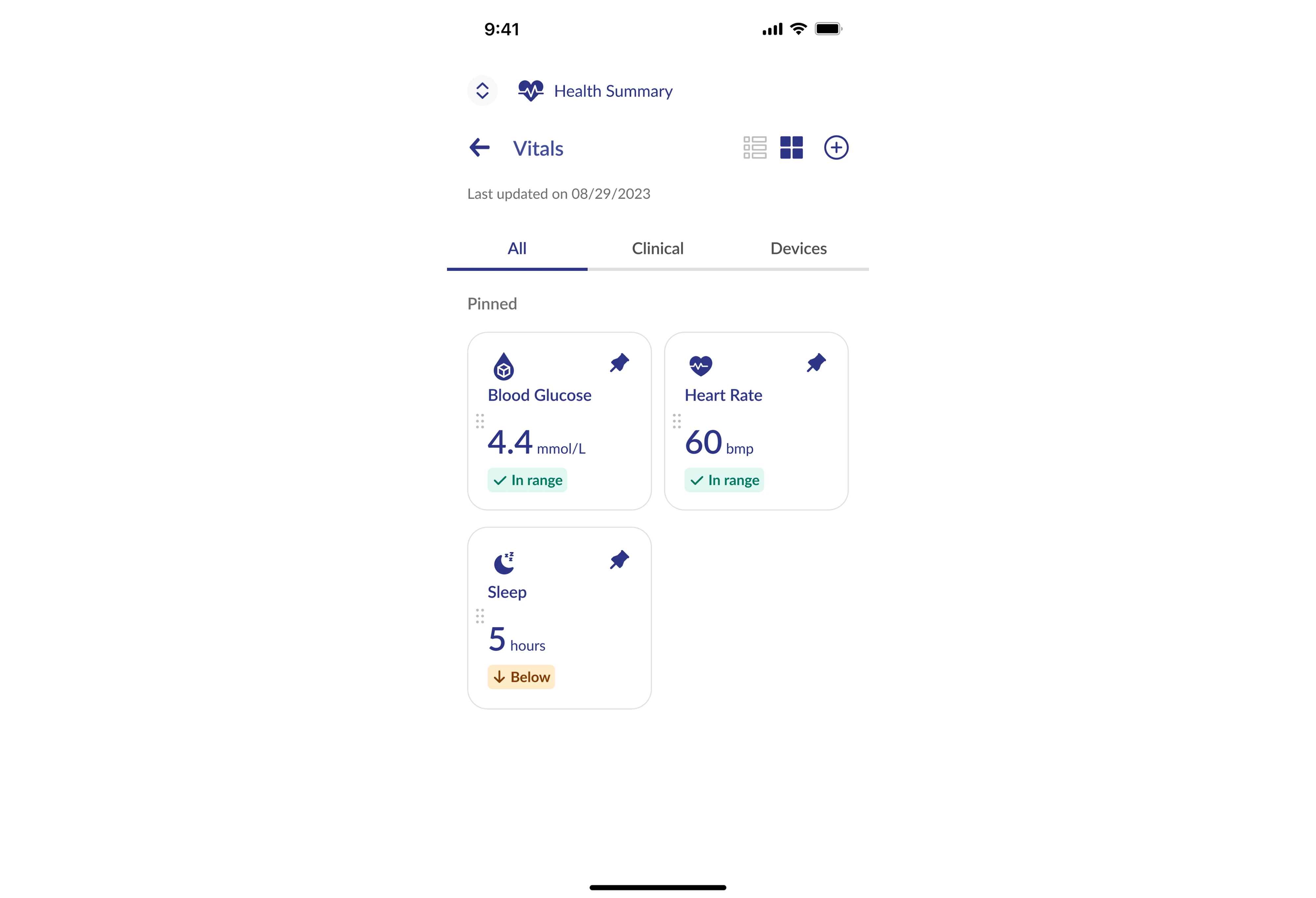
When to use it: when you need to describe something rather than count it. Feature flags, content categories, release stages.
Best practice: keep it to one or two words maximum. If it needs more than that, it's not a badge — it's a tooltip or a description. Also, don't use text badges as a permanent fixture; "New" should disappear after a reasonable time or it loses meaning entirely.
Icon badge
What it is: a symbol instead of text — a checkmark for verified, a lock for secure, a warning triangle for an alert.
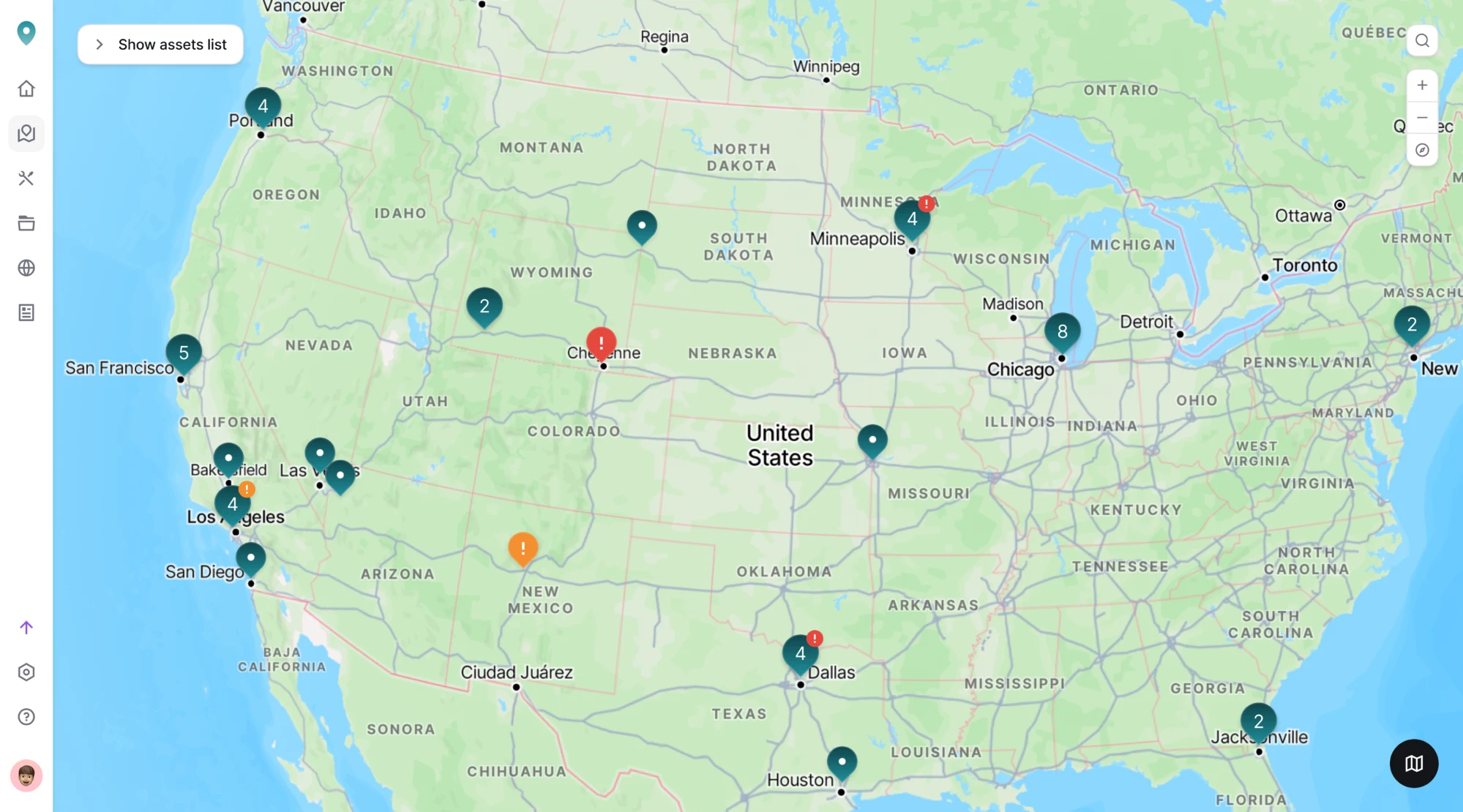
When to use it: when the icon's meaning is universally understood and adding text would clutter the UI.
Best practice: Stick to conventions. A checkmark means verified, a warning triangle means caution — don't reinvent these. And always pair an icon badge with a text alternative for accessibility (we will cover more on that in Section 6).
UI badges by position
Position doesn't change what a badge is — it changes where it lives relative to its parent element.
Corner-overlaid
Corner-overlaid badges sits on top of an icon, top-right corner by default. The classic notification badge. Think the red dot on an app icon or an inbox count on a mail tab.
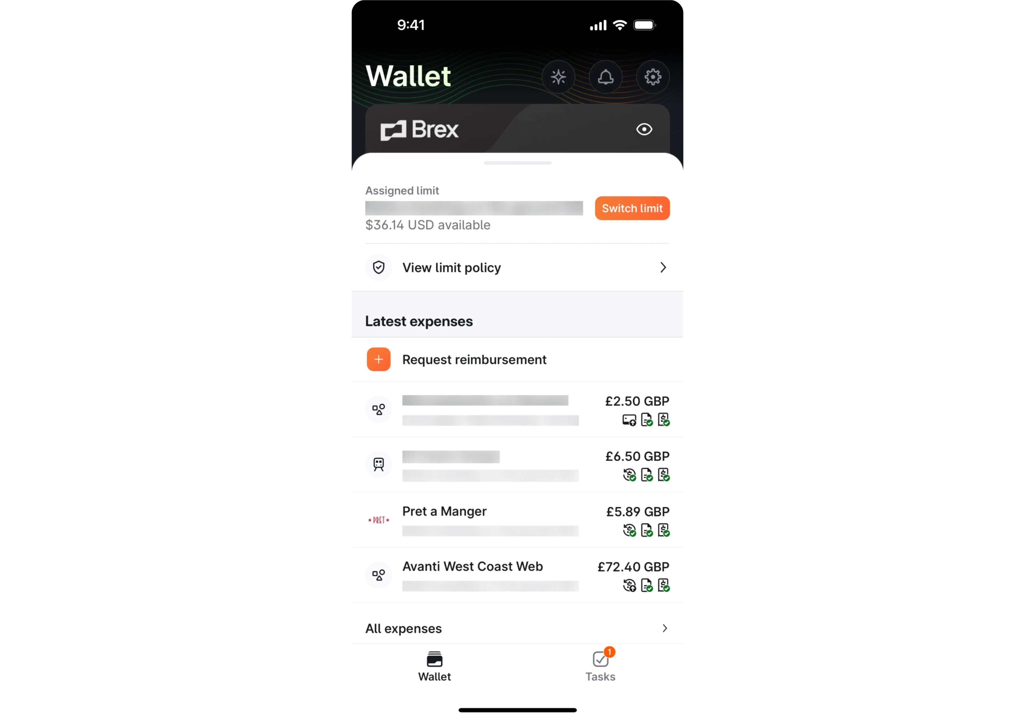
Inline
This type of UI badge appears next to a list item, nav label, or table row. Common in dashboards UI and order management systems where status needs to be scannable across multiple rows at once.

Embedded
Lives inside another component, like a filter count inside a button ("Filters · 3") or a status label inside a card UI. Useful when the badge is part of an interactive element but still needs to communicate secondary information passively.
When to use a badge
Badges are easy to add, perhaps that’s why they can be easy to overuse as well. Before reaching for one, it's worth asking a simple question: does the user actually need to know this right now, without being interrupted?
If yes, a badge is probably the right tool. If not, you might be adding noise.
Use badges when:
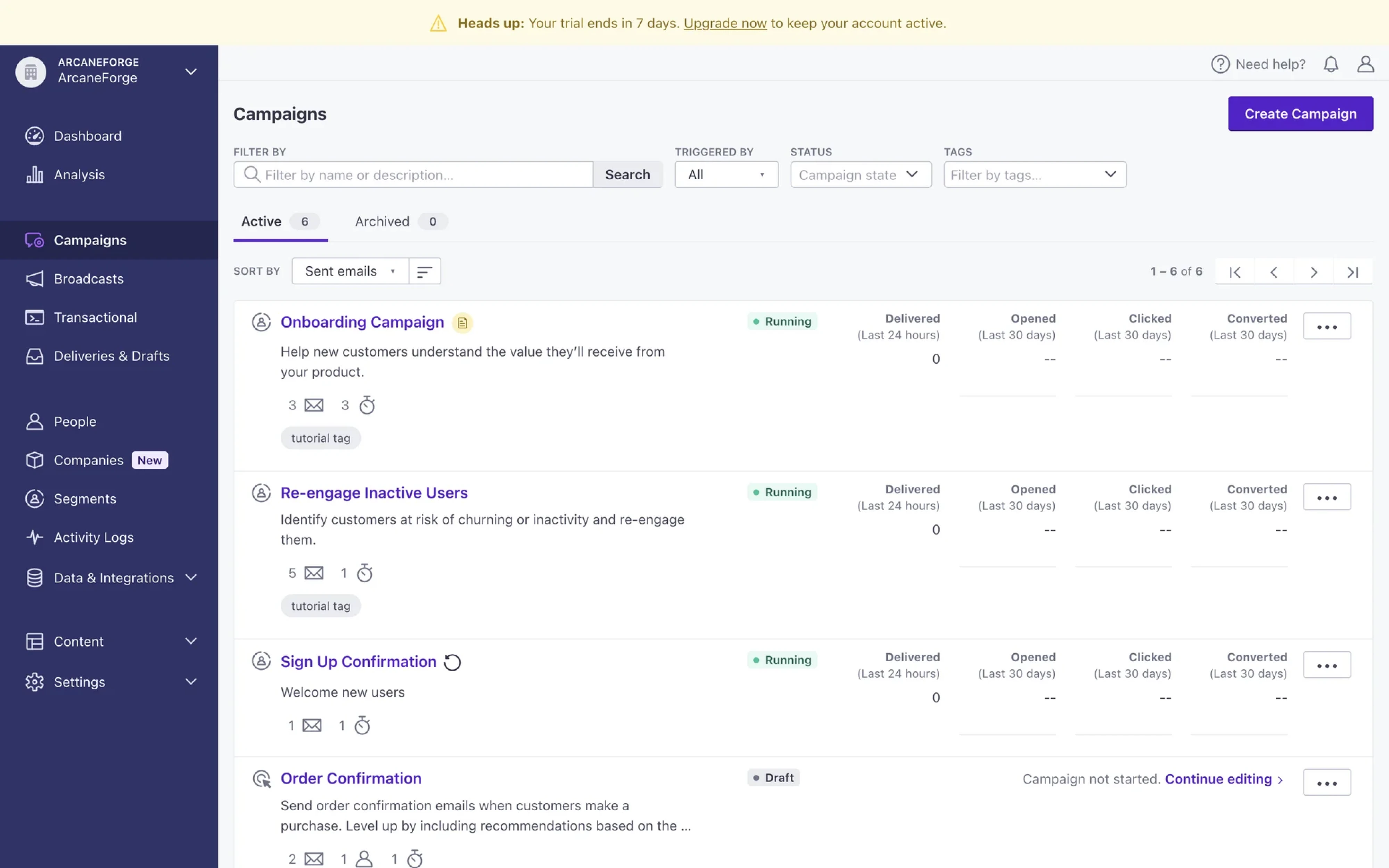
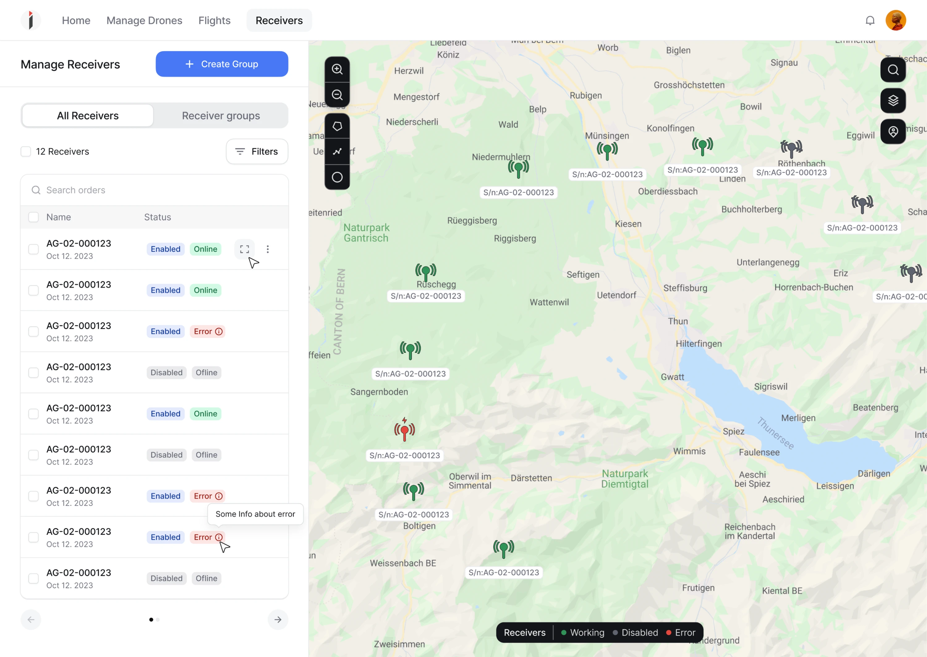
- The information changes dynamically. Badges earn their place when the count or status updates in real time — unread messages, pending approvals, new activity. A badge that never changes is just a label.
Below is an example of dynamically changing badges designed by Eleken for a drone management platform Involi.
- The quantity helps the user triage. There's a meaningful difference between 1 unread notification and 47. When the number changes what the user decides to do next, show it.
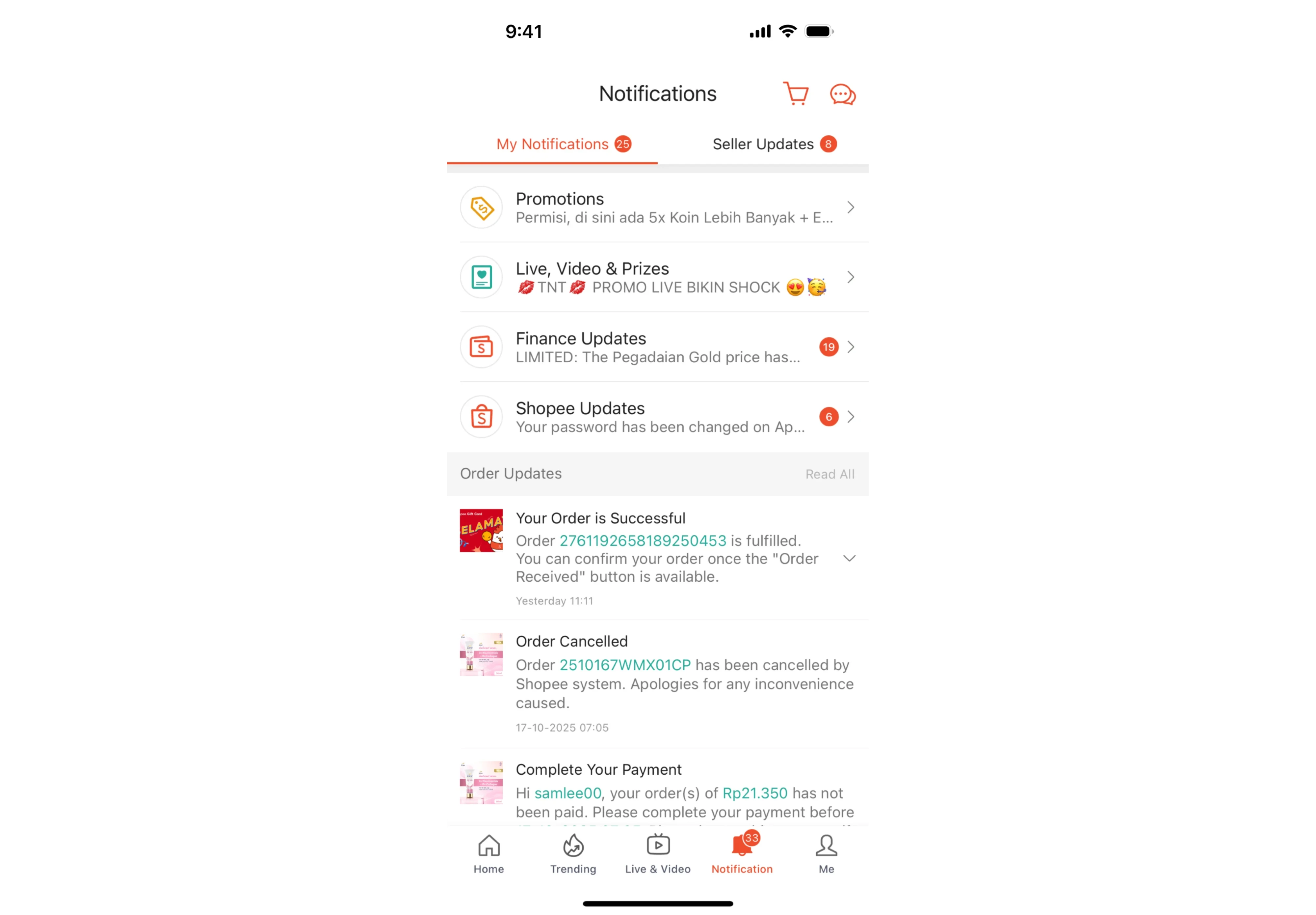
- A feature or content is genuinely new. A "New" label directs attention to something the user would otherwise miss. It's a one-time signal — useful on arrival, noise if it overstays.

Don't use badges when:
- The count is stale or unreliable. A badge showing the wrong number is worse than no badge at all. It breaks trust immediately — and trust, once broken by a UI element, is hard to rebuild. If you can't keep the count accurate, use a dot badge or remove it entirely.
- Everything has one. Badge inflation is real. When every nav item, every card, and every button has a badge, none of them mean anything. The signal disappears into the noise. A good rule of thumb: if you're adding a fourth badge to the same screen, stop and reconsider.
- The information needs context. Badges are blunt instruments. A badge showing "3" can't tell the user who sent the incoming messages, how urgent they are, or whether any action is required. When context is what the user needs, a badge isn't enough — consider a notification panel or an inline summary instead.
- A simpler indicator would do. Sometimes a color change on an icon or a subtle state change communicates the same thing without the visual weight of a badge. Ask whether the badge is adding information or just adding decoration.
- The "too many states" problem. One of the most common mistakes in complex SaaS products is designing a badge system with too many distinct states. Eight different status labels with eight different colors isn't a badge system — it's a legend that users have to learn and remember.
To sum up, a badge is a promise to the user that something is worth their attention — the design work is making sure that promise is always true.
Visual and UX guidelines on designing badges
Getting a badge to function well across breakpoints, dark mode, edge cases, and a full design system may be a thought task. Below, we will provide you with main UI/UX design principles on designing badges.
Shape and size
Three shapes dominate badge design:
- the circle (standard for numeric notification badges)
- the pill (most common for text and status labels)
- the rounded rectangle (common in table and list contexts).
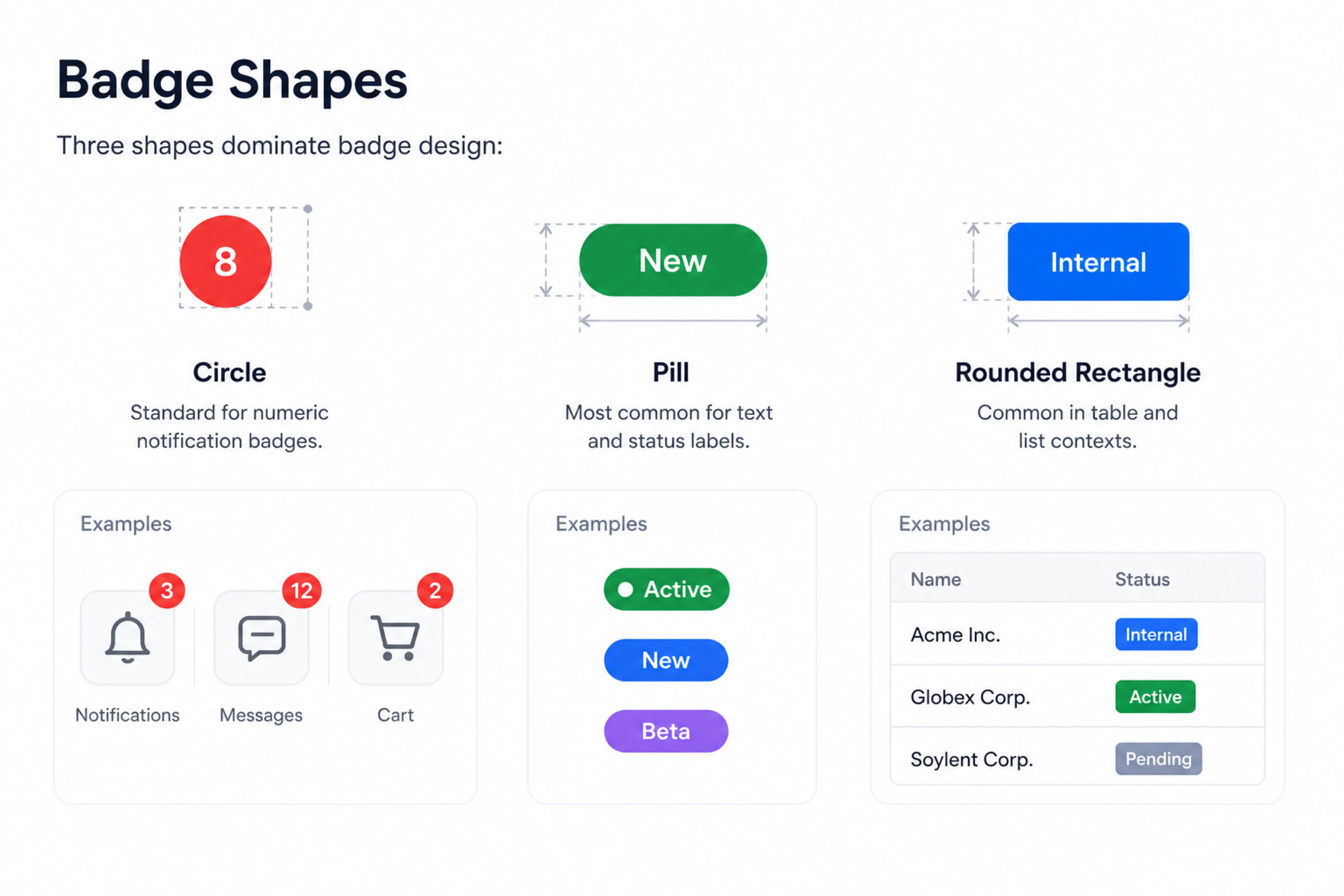
A standard badge container starts at 16–20px height. But more important than the starting size is designing for your worst case. A badge that looks fine showing "5" can break your layout at "1,284". Define your truncation threshold early — "99+" or "999+" depending on context — and build for it before you need it.
Color: semantic vs. brand
The universal system most users already understand:
- red for errors or alerts
- green for success or active states
- yellow/orange for warnings
- blue for informational
- gray for neutral or inactive
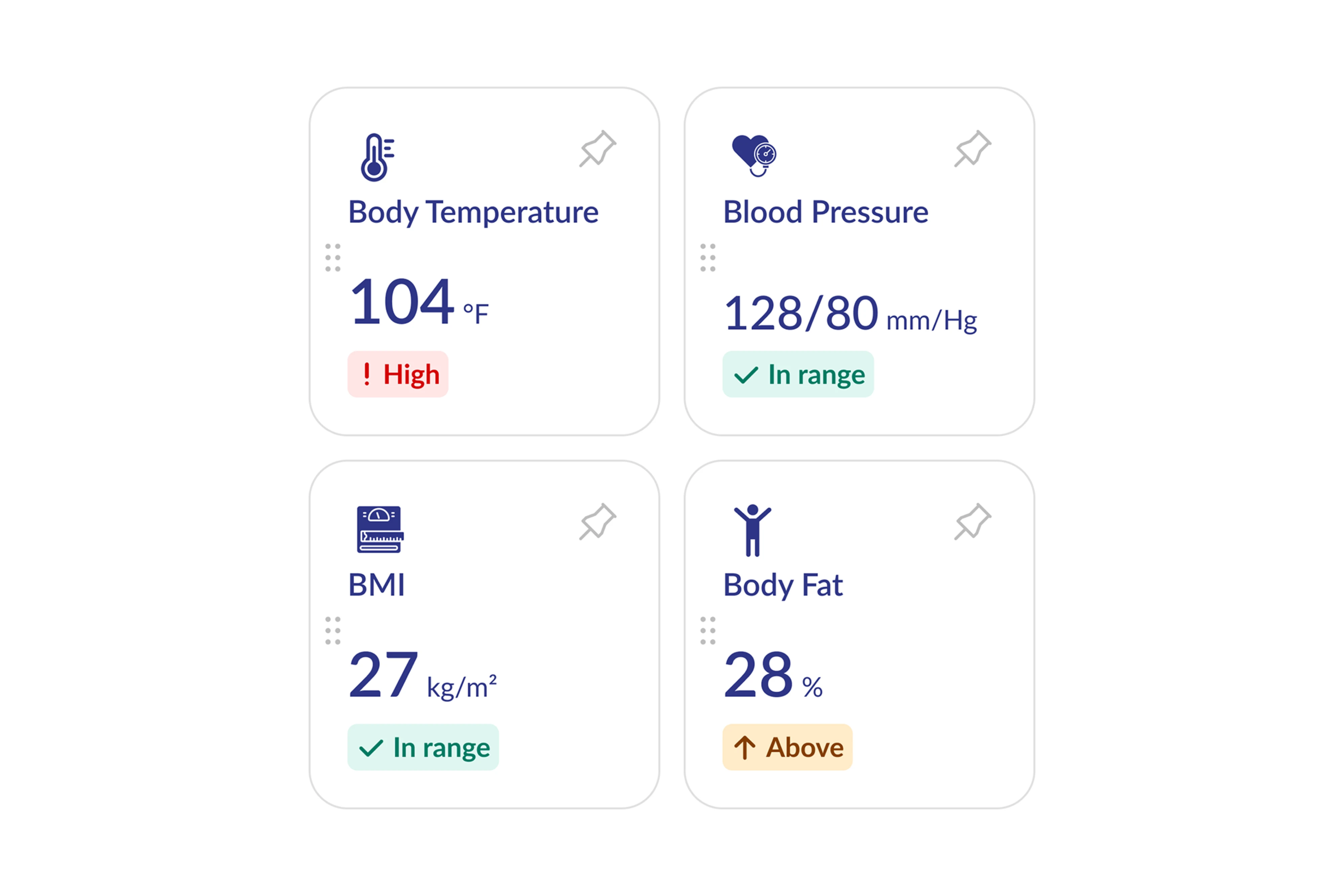
The problem designers actually face is when brand colors conflict with this system. A brand built around red, for example, creates immediate confusion when red also means "error". When this happens, the practical solution is to treat your status colors as a separate information design palette — one that complements your brand but isn't overridden by it.
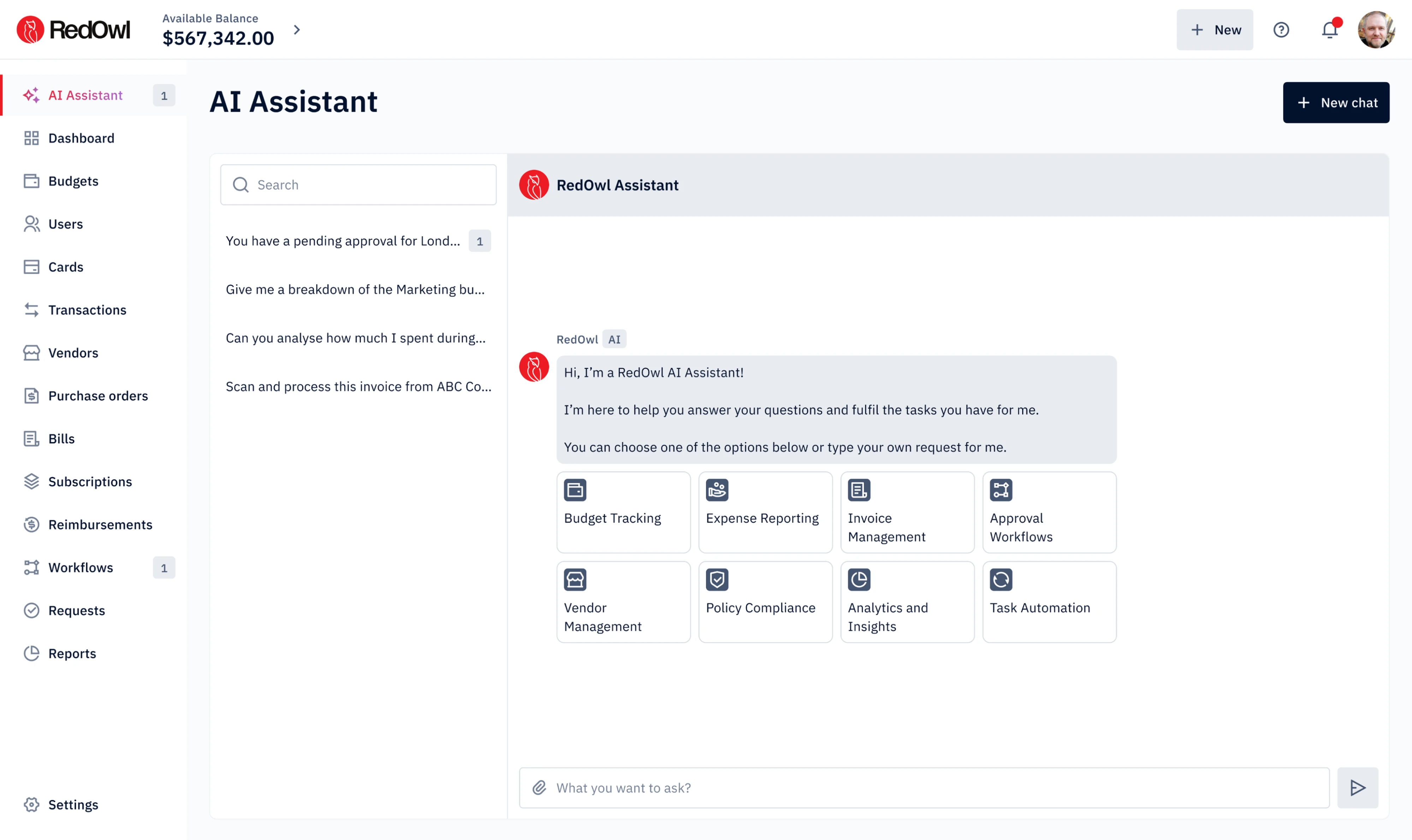
In RedOwl's fintech dashboard that we created UI/UX design for, red serves as the brand's primary color — but it's also the natural color for alerts and errors. The design team kept brand red confined to the logo and navigation, using neutral tones for primary actions to protect the status color system.
So, here’re a few approaches when you're stuck:
- Collapse your states into three tiers — fewer colors needed overall
- Use text as the primary indicator and color as a secondary reinforcement
- Use a left-border accent to bring in brand color without overriding semantic fill
- Invert text color (white on dark, dark on light) to maintain contrast across a gradient
And one rule that's non-negotiable: never rely on color alone. Always pair color with text or an icon. This matters for accessibility, but also for users who simply skim — text and icons are parsed faster than color in peripheral vision.
Want to know more on how to cope with UI issues? Check out our YouTube video on how to fix confusing interfaces.
Content rules
Keep badge labels as short as possible, no detailed information needed. "New" not "New Feature Available". "Beta" not "Currently in Beta Testing".

For numeric badges, truncate at a defined threshold and be consistent about it across your product. A chat module that shows "99+" while a notification panel shows "999+" creates unnecessary inconsistency.
Keep in mind, don't truncate text badges. If a text badge needs truncation, it's too long to be a badge. Shorten the label or reconsider whether a badge is the right component at all.
Positioning
Corner-overlaid badges default to the top-right — this is the M3 standard and the most widely recognized convention. For RTL (right-to-left) layouts, flip to top-left.

When a badge sits on a colorful or busy surface, use a cutout border — a thin ring of background color between the badge and its parent. It creates visual separation and stops the badge from blending into whatever is behind it.

For inline badges in list or table views, right-align them in a dedicated column. It makes the entire list scannable in a single eye pass rather than forcing the user to hunt across each row.
Accessibility: The Part Most Designers Skip
Badge accessibility is one of the most consistently underleveraged areas in UI design. Most teams get the visuals right and stop there. But a badge that looks correct can be completely invisible to a user relying on a screen reader — or meaningless to someone with color vision deficiency. Here's what actually needs to happen.
- Color contrast
Meet WCAG AA as a baseline — a minimum contrast ratio of 4.5:1 for text. But contrast ratio alone isn't enough. A red badge on a white background can pass contrast checks and still be unreadable to someone with red-green color blindness. Which brings us to the next rule.
- Never convey meaning through color alone
Screen readers don't announce color. A red badge and a green badge look identical to assistive technology. Always pair color with text or an icon — not as a nice-to-have, but as a hard requirement. This is also why Eleken's approach on B.well and Involi — pairing every status color with a unique icon — is the right call even beyond the medical context.
- The numeric badge problem
A badge showing "5" reads as "5" to a screen reader. That's not useful. It should read "5 unread messages" or "5 pending approvals" — enough context to understand what the number refers to.
- Dot badges
A dot conveys nothing to assistive technology on its own. Any element with a dot badge needs a descriptive aria-label on its parent — something like aria-label="Notifications, new activity".
- Badges should never receive keyboard focus
Badges are non-interactive by definition. They should never appear in the tab order. Don't add tabindex to a badge element — if it's not in the DOM as a focusable element, it won't be. If you've wrapped a badge in a <button> or <a> tag for any reason, reconsider the structure.
- Motion
Animated badges — a bounce, a pulse, a count increment — must respect prefers-reduced-motion. Users who have enabled reduced motion in their OS settings should see a static badge, not an animation.
Before you add that badge
Badges are small, but the decisions behind them aren't. The type you choose, the color you pick, where you place it, and whether a screen reader can interpret it — each of these details shapes whether the badge does its job or quietly erodes the experience.
The framework is straightforward:
- Match the badge type to what you're communicating (existence, quantity, category, or status)
- Use color and icons together rather than either alone
- Keep the label short enough to scan in under a second
- Make sure the information is accurate enough to trust.
Most importantly — a badge is a promise to the user that something is worth their attention. Break that promise through a stale count, badge inflation, or a signal that's invisible to assistive technology, and you break something harder to fix than a component.
Lastly, if you're building a consistent badge system, you'll need more than good intentions — a solid UI kit is where that consistency actually lives.




.webp)