

If you go searching for admin dashboard UI inspiration, you’ll find no shortage of it. Dribbble alone shows 7,400+ admin dashboard designs, signaling strong market demand. But not every design you find actually works.
From a UI perspective, it might look stunning. From the UX side, buttons are buried, functionality is missing, and what should be intuitive simply doesn’t make sense.
We see the results of that at Eleken. Clients come to us saying their dashboard is jumbled and unclear to anyone operating it. That the product does everything it should, but it’s too complicated for anyone to self-serve. Or, most often, that the whole thing is patched together with no good logic behind it.
In this article, we’ll look at admin dashboard UI examples that hold up under daily use, the visual styles shaping dashboards, and the UX principles we follow to keep those complaints from showing up in the first place.
What is an admin dashboard UI?
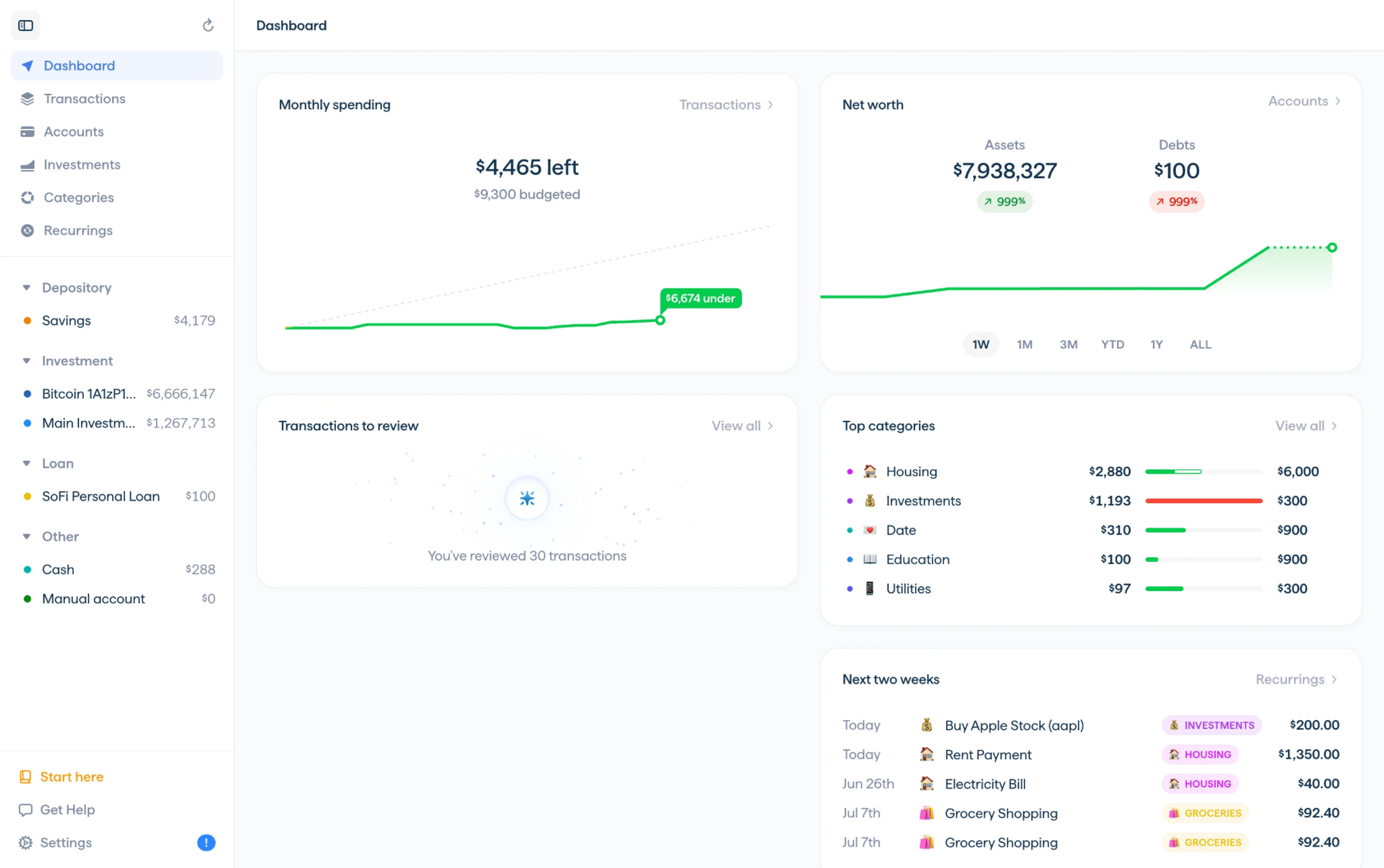
An admin dashboard UI is the interface a team uses to monitor, manage, and analyze what’s happening inside a product.
The important distinction is who it’s for.
A customer-facing analytics dashboard is a feature, something users pay for and evaluate. An admin dashboard is infrastructure. It’s the admin panel dashboard UI behind the application, used by employees, and that changes the design brief entirely. Nobody is going to be impressed by it. They’re going to use it forty times a day, and the only thing that matters is whether it makes their work faster or slower.

A dashboard is only as good as the data being visualized. Remember its purpose is to be functional, informative, explanatory.

That pattern repeats across almost every category of software. Fintech teams review flagged transactions and risk exposure. HR platforms track headcount and attrition. Healthcare tools surface patient status and alerts. E-commerce operators manage inventory and refunds. CRM, logistics, and project management tools all have a small group of people who need to see the system state and change it.
There are two ways to build one, and they suit different situations.
- Pre-built templates and UI kits, which give you a layout, a component set, and a working front end.
- Custom design from scratch, which costs more time but shapes the interface around how your team works.
Neither is automatically the right call. Templates solve the visual problem quickly but leave the information architecture up to you, which is usually where the real trouble lives. We’ll come back to both later in the article, with a closer look at when a template is genuinely the faster path and what to check before committing to one.
Dashboard UI examples from real SaaS products
The admin dashboard UI design examples below come from products we’ve designed at Eleken, so we can explain the reasoning behind each decision. For SaaS dashboard, we’ll cover what it’s best for, what makes the design work, and the lesson worth carrying into your own dashboard.
VLI Tech, healthcare dashboard UI
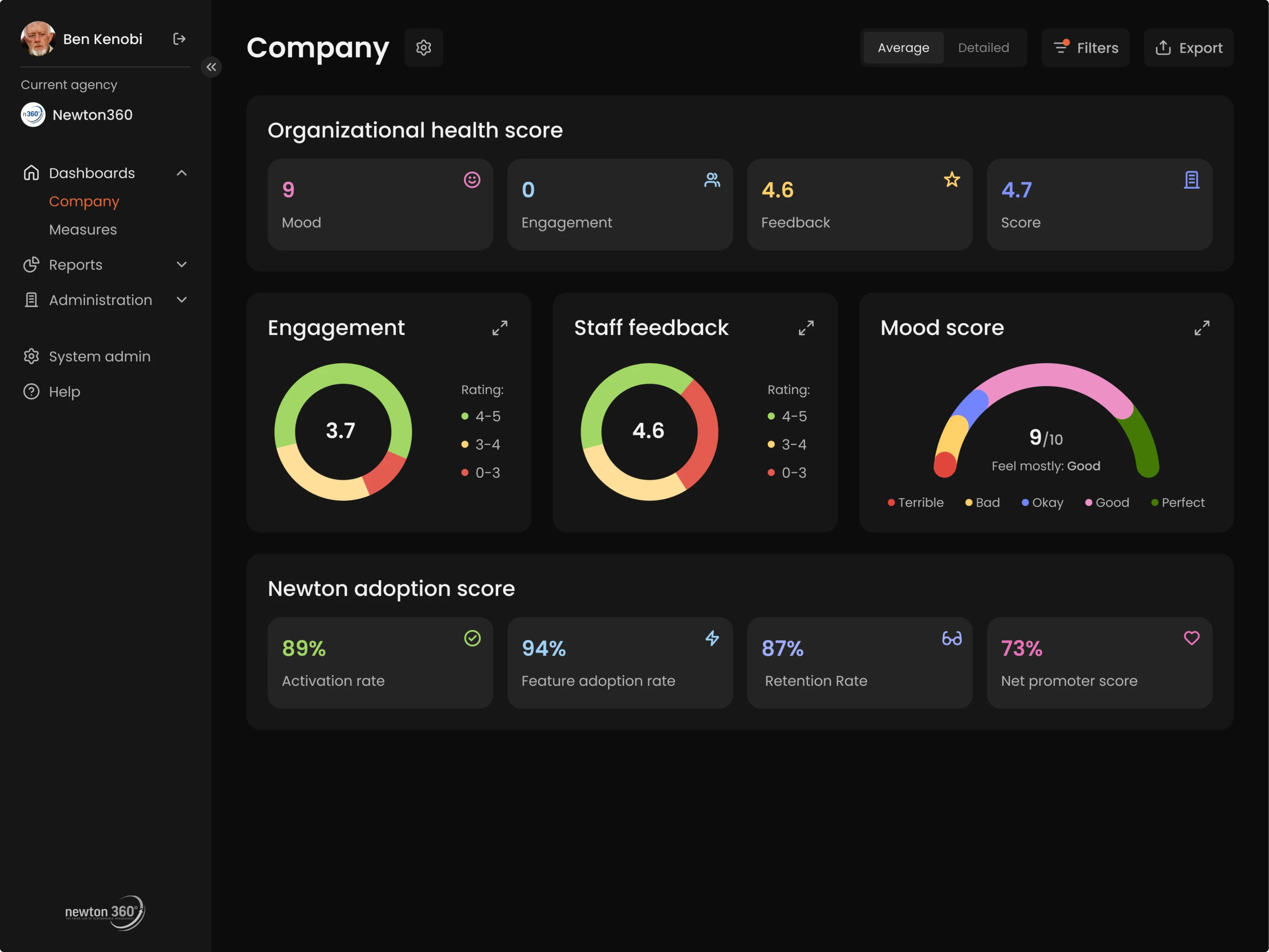
VLI Tech acquired Newton360, a workforce management tool for ambulance crews and their supervisors. The backend was solid, but there was no UX expertise in-house, and the mobile and web experiences had drifted apart.
The structural decision came early. Newton360 runs on two workflows: a mobile app used in the field and a desktop administrative system, and the admin panel defines how the mobile app behaves. Once that relationship is explicit, the design question becomes “what should an admin be able to change?”
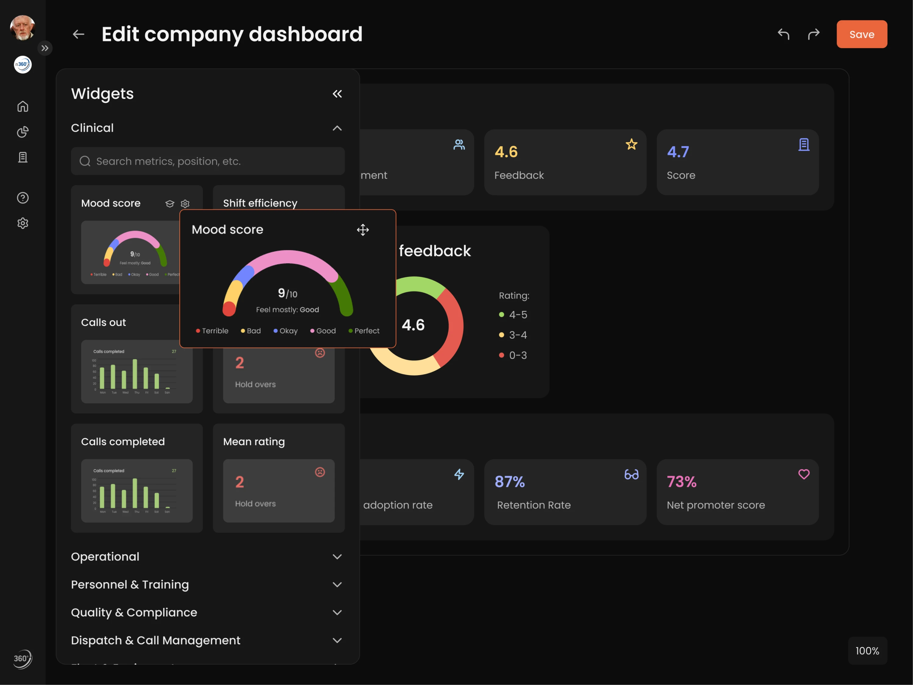
That reframing shaped what we built. Starting with the dashboard, we gave managers detailed statistic breakdowns, filtering, and customizable widgets, so organizations with different operational realities could shape the layout to fit.
From there, we worked through the rest of the admin system:
- Question library. Newton360 structures employee evaluations around a question system, and users were creating near-duplicate entries. We added reusable templates, contextual metadata, usage indicators showing which questions people pick, and the ability to favorite the common ones.
- Interactions builder. Admins needed to create surveys, check-ins, and training flows. We designed it so they could start from scratch, duplicate an existing interaction, or pull from a template, and we defined which content types could be combined so the flexibility never turned into guesswork.
- Schedule builder. While researching the field, we noticed EMS runs on rotating patterns like two days on, two days off. We built the scheduler around that reality, letting admins set unique schedules per employee or group.
RedOwl, finance dashboard UI
RedOwl came to us with no product and no defined UX. They had a corporate spend management concept and a plan to raise on it. Fintech made the constraint tighter, since KYC restrictions meant we couldn’t get inside competitor platforms and had to build our understanding from open-source material and user reviews.
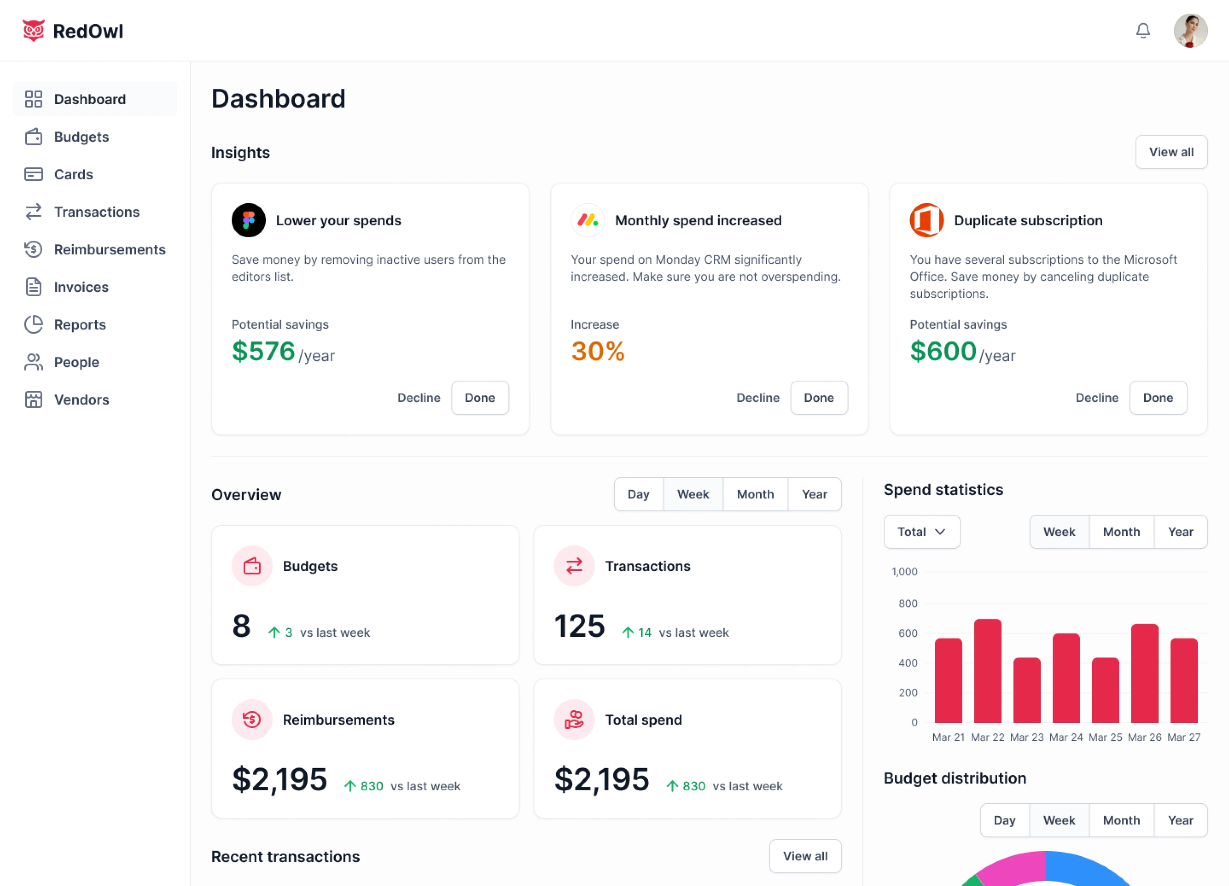
Those reviews turned out to be a useful input. A recurring complaint was that competitor tools allowed only one payment card per person, which breaks down fast for anyone working across several teams or projects. We designed RedOwl around multiple cards per user from the start.
Then we worked through the admin side:
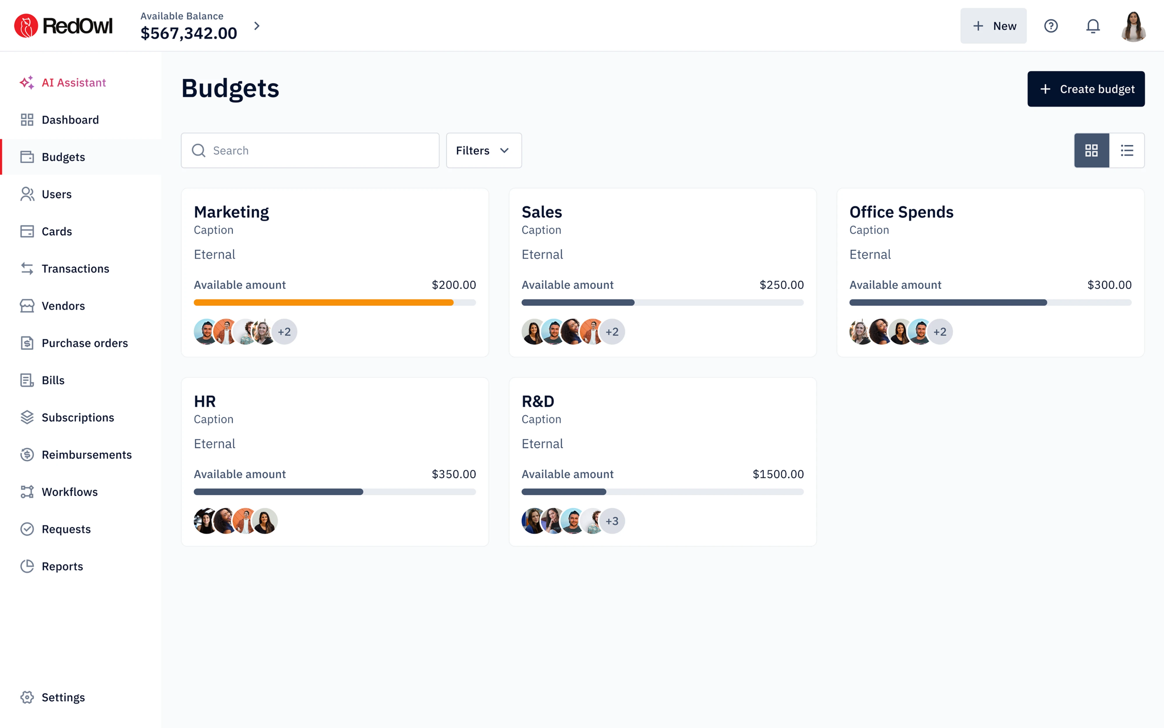
- Budget cards per department. Each one shows allocated funds, spent to date, and remaining balance upfront, with progress indicators and clearly labeled controls for adjusting limits and team members. An admin can fine-tune a budget without descending three layers into the UI.
- A dedicated Subscriptions tab. Companies quietly pay for several tools that do the same job. We gave admins one place to see every subscription, with a progress bar visualizing usage rate so underused apps stand out on sight and the consolidate-or-cancel call becomes easy.
- A budget approval queue. Requests arrive as visual cards and stay active until they’re approved, edited, or rejected, so nothing sits in an ambiguous state. Admins can handle a request in the AI assistant or in the dedicated tab, whichever fits what they’re already doing.
There was also a color problem worth mentioning. The client wanted red as the primary brand color, which in a financial product reads as a warning. We used it sparingly and kept key actions in neutral tones, so the interface didn’t spend its most urgent visual signal on ordinary navigation.
Every screen went into RedOwl’s investor deck. The company raised $1M in seed funding and was the only company from Australia and the wider APAC region selected for Mastercard’s Start Path Small Business Program.
Polaris, security dashboard UI
Polaris is a code security app that finds vulnerabilities before they reach production. Security tools in this space tend to trade usability for technical depth, and the founders didn’t want to make that trade. They asked us for a prototype to show investors, which meant designing the most important screens in one month.
What’s more, we needed to make complicated technical data readable to someone seeing it for the first time.
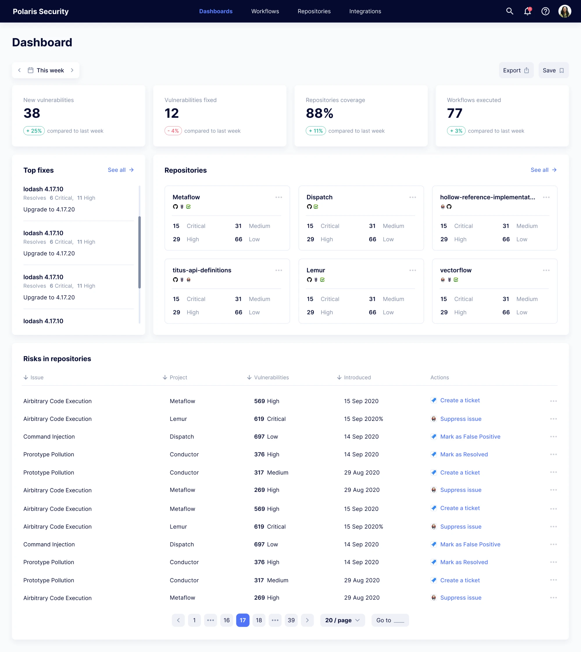
The structural decision came first. We built the dashboard in two versions with full access for admins and limited access for the rest of the team, where each developer sees only the repositories they work on. That isn’t a permissions setting bolted onto one layout. The two views answer different questions.
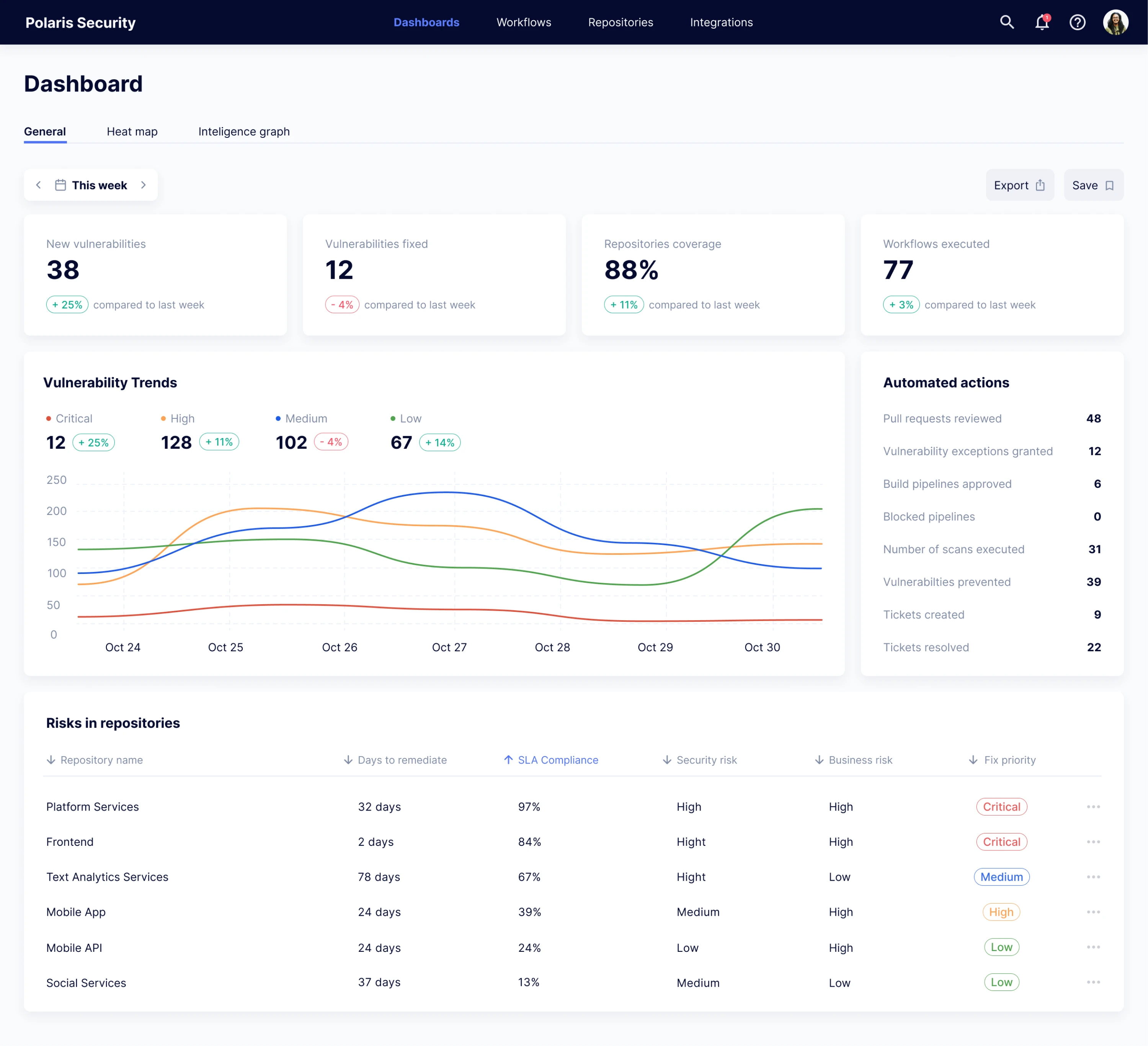
Here’s how that played out:
- The general dashboard reports. For a selected time period, it shows new vulnerabilities, fixed ones, executed workflows, repository coverage, and automated actions, with a graph tracking how vulnerability counts moved by danger level and a sortable table of repositories underneath.
- The full-access dashboard acts. Admins get the same picture plus the tools to do something about it, creating tickets, changing assignments, and resolving issues without leaving the view.
- A heatmap sits above the table. A full vulnerability list is a table, and on a large project that table becomes unnavigable. We added a set of tiles representing projects, repositories, or teams, colored by risk level with red reserved for the hottest areas, and the colors shift as things get fixed.
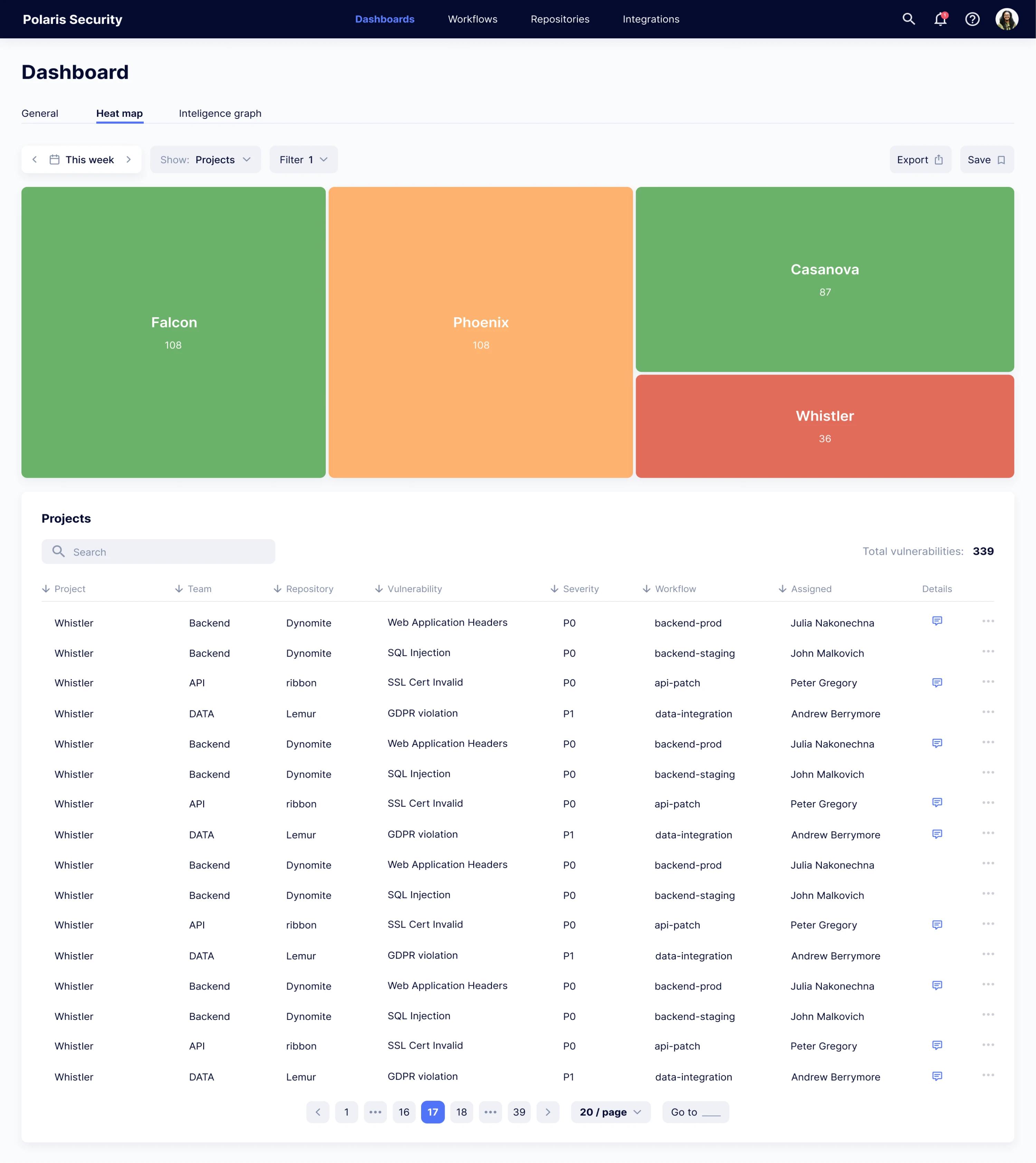
- Filtering does the heavy lifting. With that volume of data, we invested in filtering options that let admins narrow a search as specifically as they need rather than hunting through everything.
We also built the workflow editor, where admins define triggers and the actions that follow them, split flows into paths with their own rules, and connect external tools like Jira, Jenkins, and Slack. We kept every integration option on the same screen, so setting up an action never means opening a separate app page.
The prototype covered all the main functions and was delivered in a month.
Modia, content dashboard UI
Modia was an in-house tool that helped editorial teams turn interviews and source material into article drafts with AI. It worked well enough internally that the founders decided to spin it out as a standalone product. That’s when the problems surfaced, because the MVP had been prototyped and built without a designer.
The symptoms were familiar. Unclear icons, ambiguous buttons, too many actions on one screen, and a non-linear flow with no obvious next step. Nothing was broken. It just assumed you already knew how it worked.
The admin side had gone furthest.
Admins at Modia manage company accounts, build custom content templates for each client company, and review system logs, all of it living in overloaded tables. In some places, an admin could open a table inside another table. That’s not a design choice anyone makes deliberately. It’s what accumulates when a screen only ever gets seen by people who already know where things are.
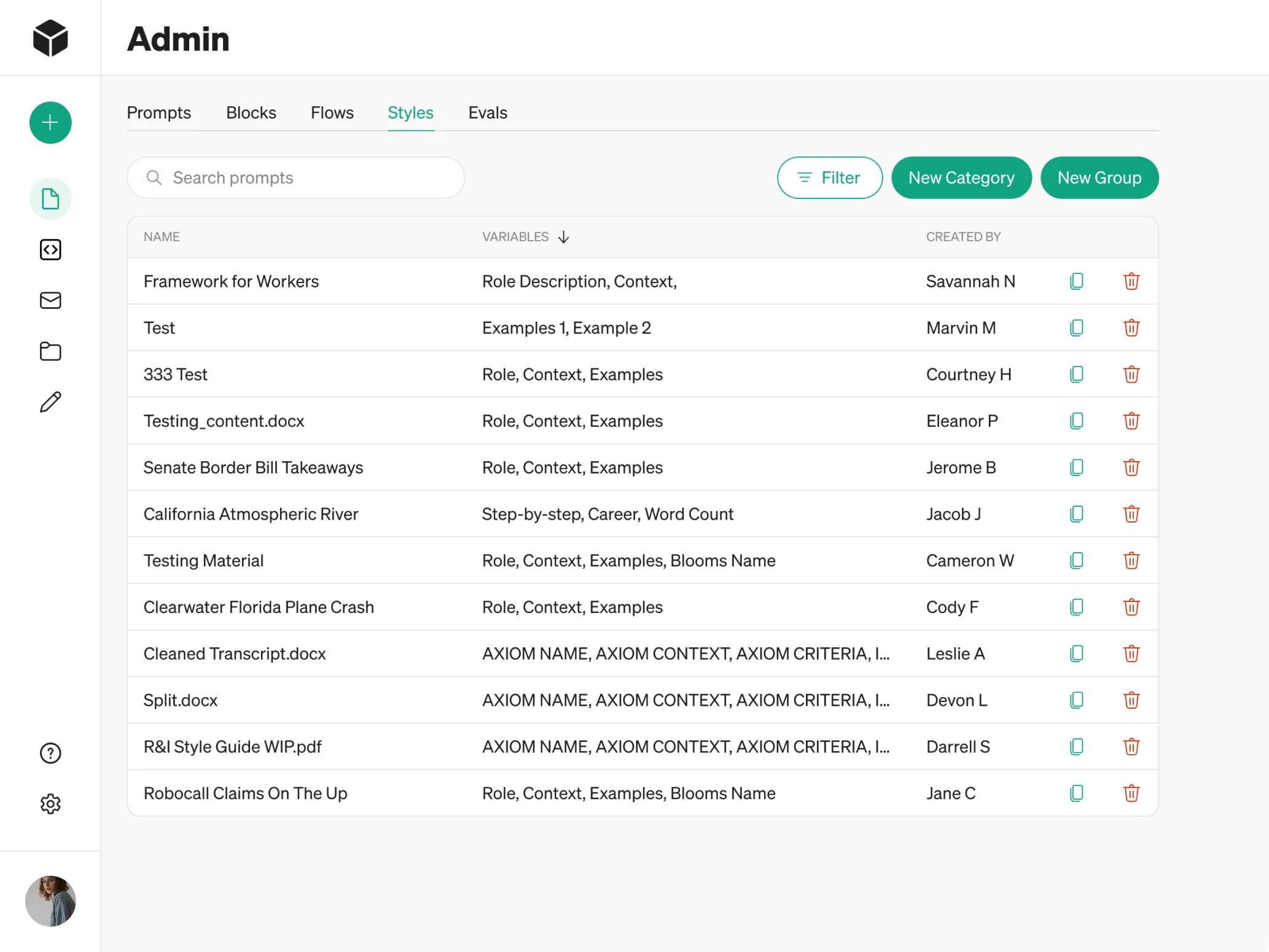
Here’s what we did:
- Reorganized the admin tables with a clearer hierarchy, better viewing options, and inline editing, so admins could change a value without opening a new layer to do it.
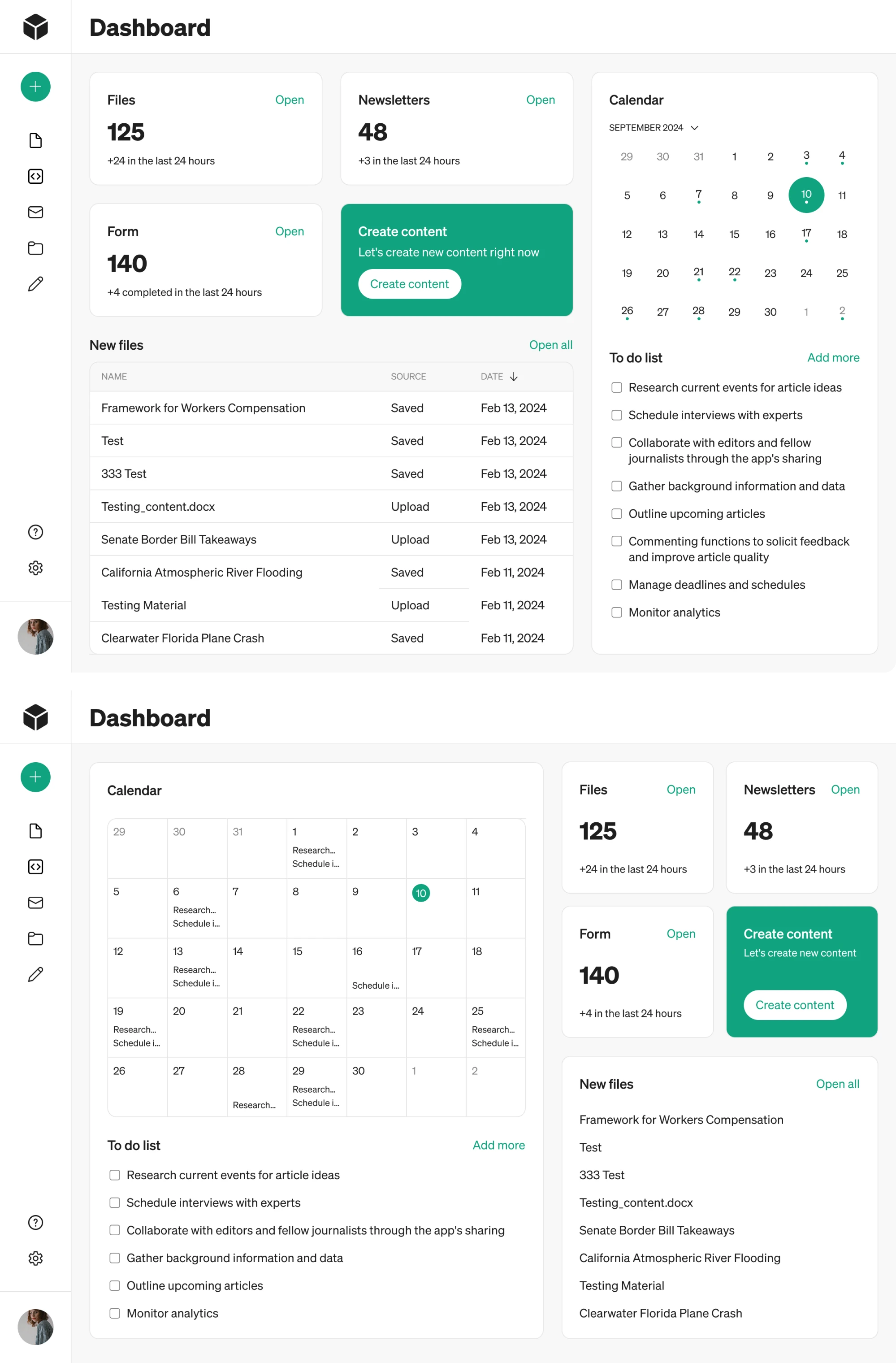
- Rebuilt the sidebar around a “Create content” button, with a plus icon in the collapsed state, because first-time users were opening the app and not knowing where to begin.
- Built a dashboard from nothing. Users landed straight on the Content tab with no overview of their work. We designed a landing view around key platform metrics, recently used files and forms, one clear primary action, and a calendar paired with a to-do list.
Optiflow, logistics dashboard UI
OptiFlow is a platform for building and simulating supply chain models on real data. It ran for years as an internal tool, used daily by their own teams, and after recognition from Gartner, the company decided to take it to market. The interface offered plenty of functions. What it didn’t do was tell a new user what any of them were for.
Before touching screens, we ran a UX audit. It surfaced a list worth reading closely, including unclear user guidance, broken breadcrumb logic, overloaded action panels, and overwhelming data input. We documented all of it in a structured report so the client could see the scale of the problem before deciding what to fix first.
Here’s what we did:
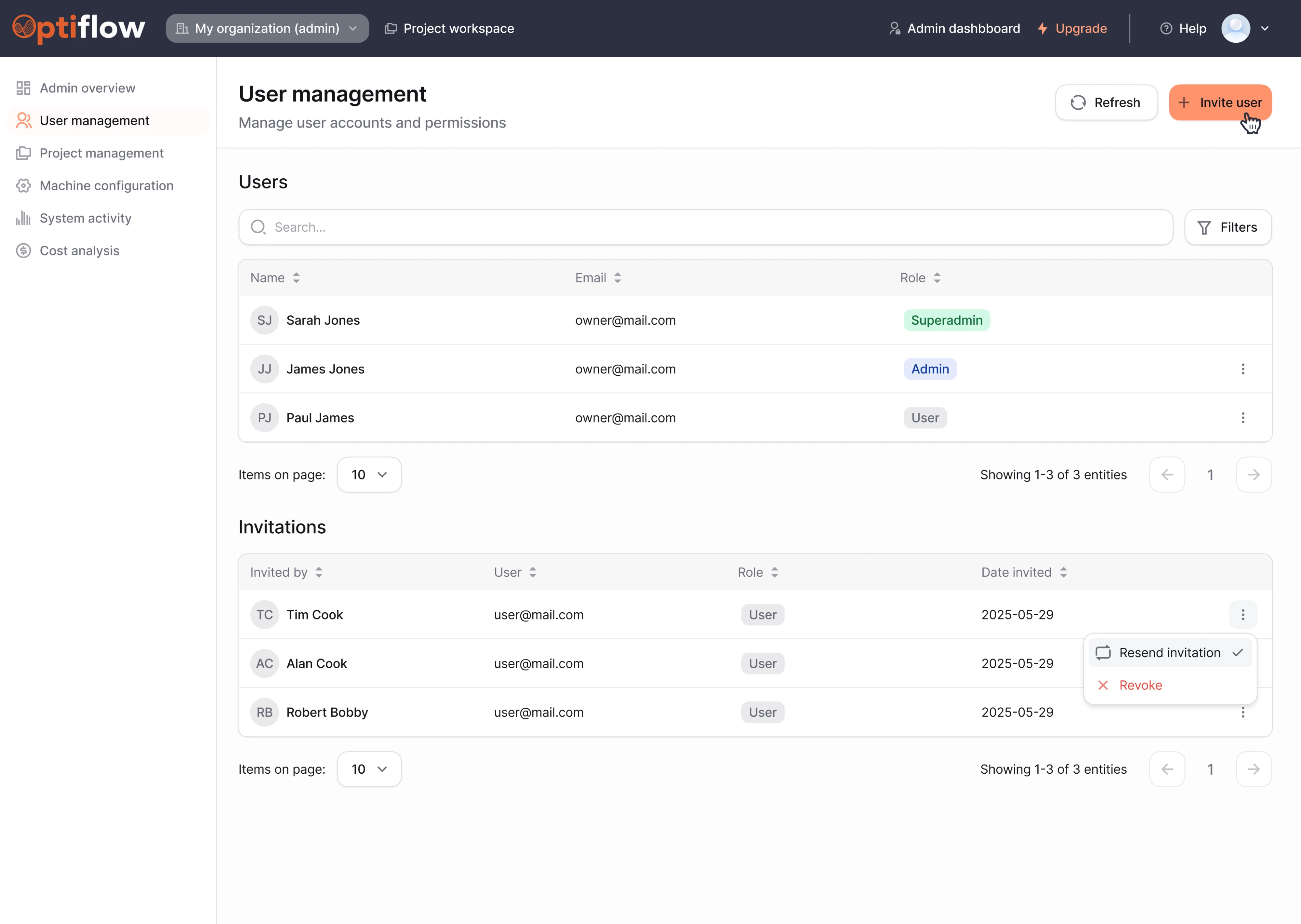
- Built a dedicated admin dashboard UI design for organization owners and team leads. They view and manage organization details, see every user and their permission level, send invitations and assign roles, and manage available machines and their configurations.
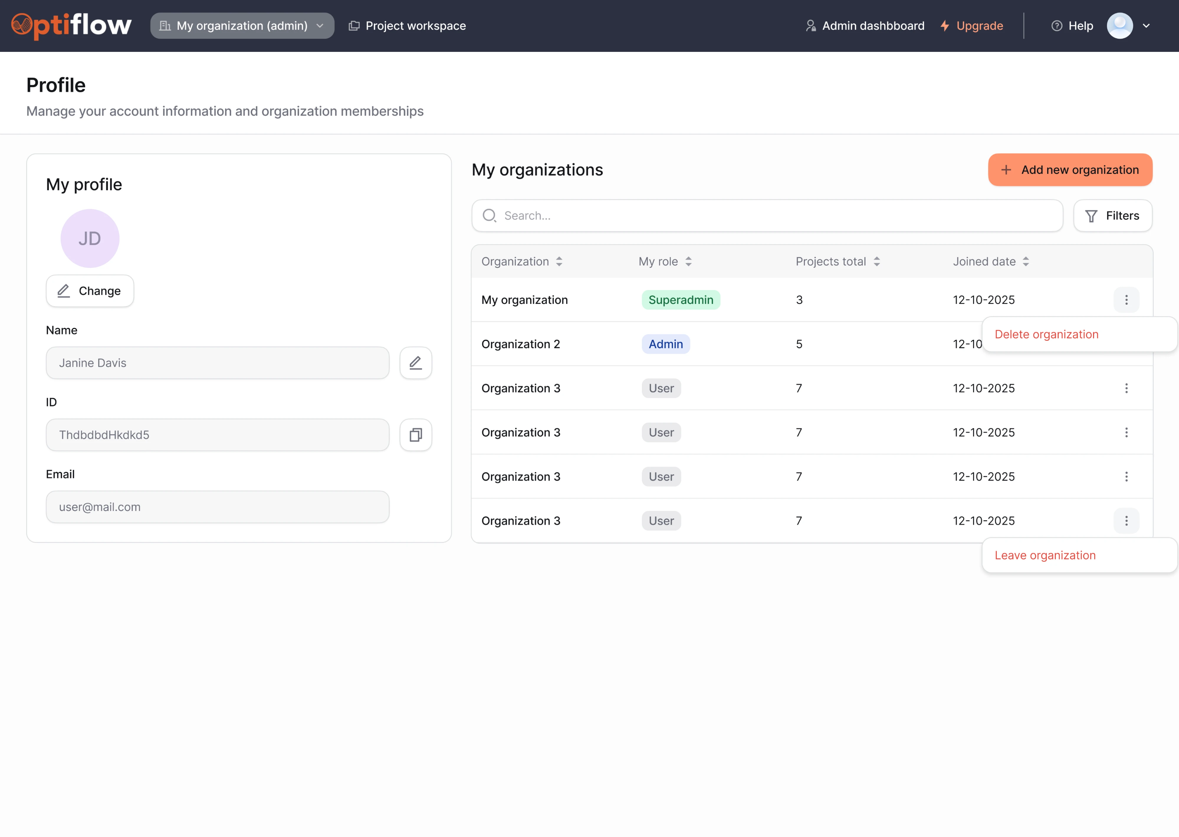
- Used progressive disclosure for everyone else. Regular users get a profile card, a clear view of their role within each project, and the ability to leave or delete their organization.
- Cleaned up the map screen. The functionality worked, and users were comfortable with it, so we made the map fully visible with a collapsible sidebar, reorganized settings into tabs with filter logic, and added a “5 selected” counter so people could see the state of their own selections.
The whole platform was redesigned in two months, with most screens approved on the first pass.
ClearPoint Strategy, reporting dashboard UI
ClearPoint Strategy is a reporting tool used by Fortune 500 companies, government agencies, banks, and universities to automate strategy reporting. One part of it lets customers publish community and public-facing dashboards, and that part had two problems. Building a dashboard took real time and effort, and the results came out in inconsistent styles that weren’t easy to read.
The constraint made the project interesting. The client wanted a consistent look across every dashboard, but without taking away the customization option. Those pull against each other, and the usual failure is to solve it by adding more settings.
Here’s what we did:
- Split the template into four sections. General settings for name, logo, and whether the dashboard is public or private. Visual settings for palette, icons, and font, each selectable in one click. Content choice drawing from the scorecards, measures, and graphs already in the customer’s HTML exports. Scheduling for when the dashboard updates or publishes.
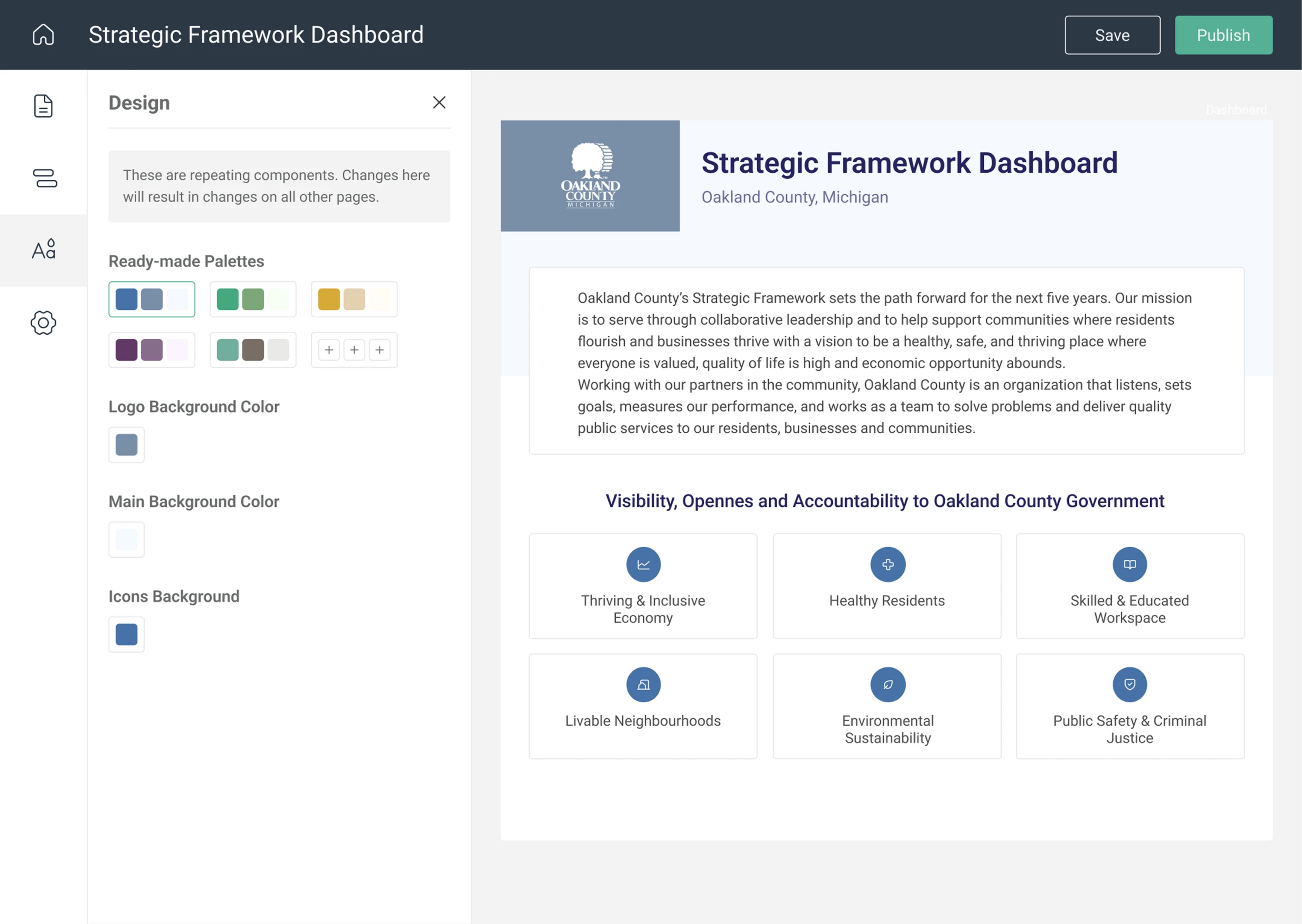
- Added a live preview. Users see the effect of a change as they make it, with the dashboard scaled to fit while editing and a toggle to check both desktop and mobile before publishing.
- Built a first-run guide that walks through each tab and what can be done there, so the first dashboard someone creates isn’t the one they learn on by trial and error.
ClearPoint has since won G2’s Users Love Us badge in categories including Best Usability, Easiest Setup, and Highest User Adoption, along with a Silver Stevie Award for Rebrand Experience of the Year.
Modern admin dashboard UI design trends
The dashboard examples above were shaped by constraints. This section is about the aesthetic layer that moves with the industry, because knowing what looks current is genuinely useful when you’re deciding how a product should feel.
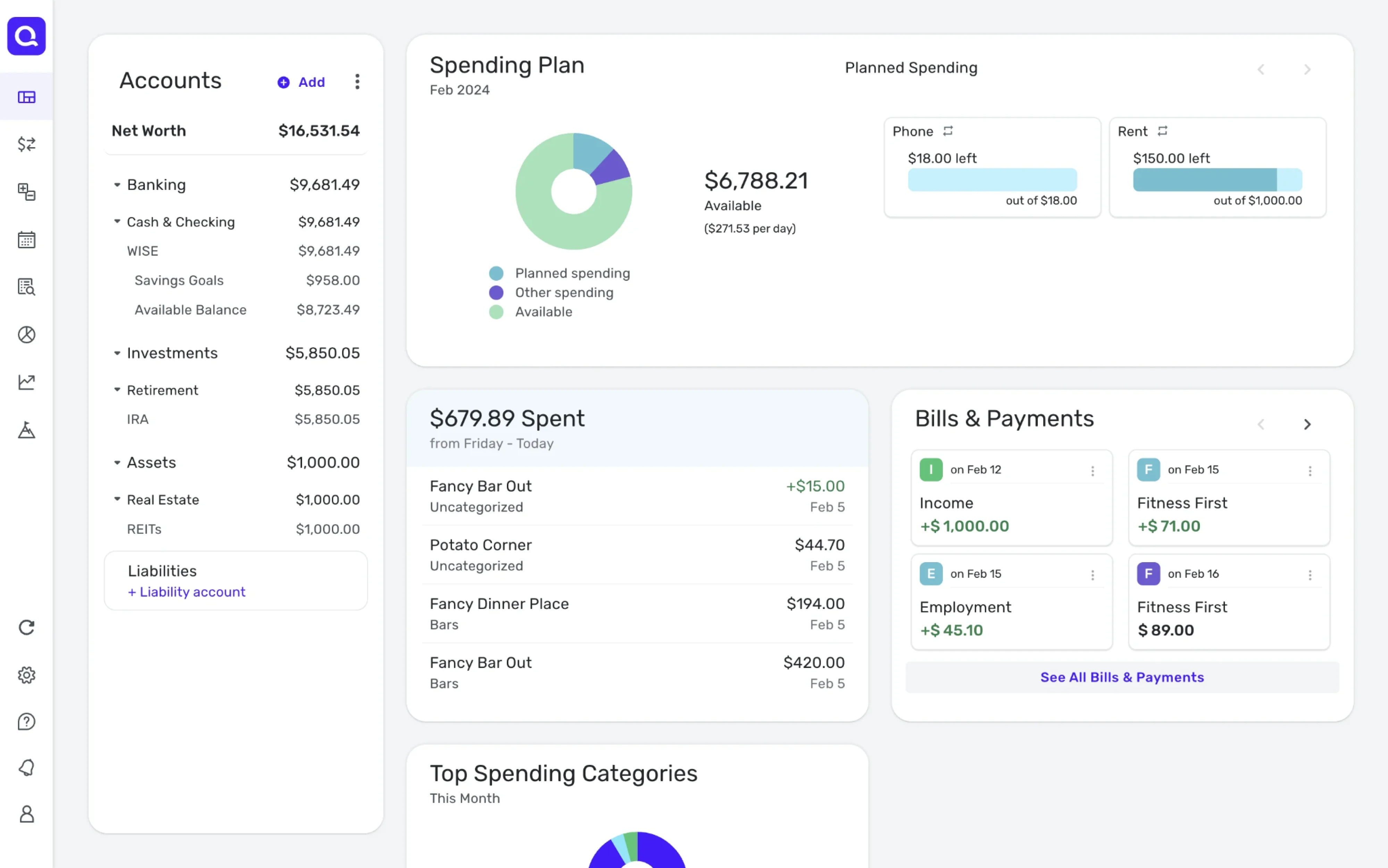
Dark mode has become an expectation. It reduces glare during long sessions, and it makes charts and status colors pop against a neutral field. Two of our clients ended up here, since we presented a dark variation among other directions on VLI Tech and Modia, and in both cases the client liked it enough to make it the default theme.
Minimalism continues to dominate, though the version that works for admin tools is more restrained than the gallery version. Generous white space, muted palettes, and one accent color used sparingly. The intent is to let the data carry the visual weight.
Beyond that, a few styles show up repeatedly in current work:
- Glassmorphism, with frosted, semi-transparent panels layered over soft backgrounds.
- Gradient accents, used to differentiate a primary action or a highlighted card.
- AI-first layouts, where a prompt field or assistant panel is a fixed part of the interface.
- Data-heavy cards, packing a metric, a trend line, and a comparison into one tile.
Worth naming the catch. Most admin dashboard UI design inspiration is optimized for the thumbnail. A dashboard shot succeeds if it reads well at 400 pixels wide with invented data, which rewards big numbers, generous spacing, and restraint about how much appears on screen.
An actual admin dashboard succeeds if someone can complete a task quickly with a thousand real records loaded, which often rewards the opposite.
So treat this section as a palette. The visual direction is worth borrowing. The density, the hierarchy, and the layout should come from the work your people are doing, which is what the next section is about.
Common UX problems and admin dashboard UI design best practices
Analyzing our clients’ problems, Reddit threads, and the audits we run on live products, we’ve gathered the complaints people voice about the dashboards they’re stuck with. In this section, we’ll cover a few of them, explaining why each one happens and what to do instead.
No obvious starting point
The complaint. You open the dashboard, and nothing tells you what matters, so every visit begins with a few seconds of scanning to reconstruct where to look.
Why it happens. Symmetry is easy to reach for and hard to argue against. A grid of identical cards looks orderly, while ranking metrics means deciding what matters most. The result is a dashboard that’s technically balanced and practically useless, because when everything is emphasized, nothing is.
The other version of this problem is having no landing view at all. Users open the product straight into whatever screen happens to be first, with no overview and no sense of what state things are in.
The fix. Decide what question the dashboard answers on an average day, put that answer in the top left where reading patterns start, and let it be visually bigger. Secondary metrics stay secondary in size and color. If different roles need different answers, that’s a signal to build different views rather than one view that hedges.
A useful check is to show the screen to someone for three seconds and ask what stood out. If the answers vary, the hierarchy isn’t doing its job yet.
Too much white space, not enough data
The complaint. A dashboard arrives looking clean, and then the person who uses it every day finds they’re scrolling three screens to see what used to fit in one.
Why it happens. White space helps first-time visitors, who need the interface to feel approachable and need help spotting where one group of information ends and the next begins. But dashboard users are power users who want data, and after a week nobody on your team is a first-time visitor anymore.
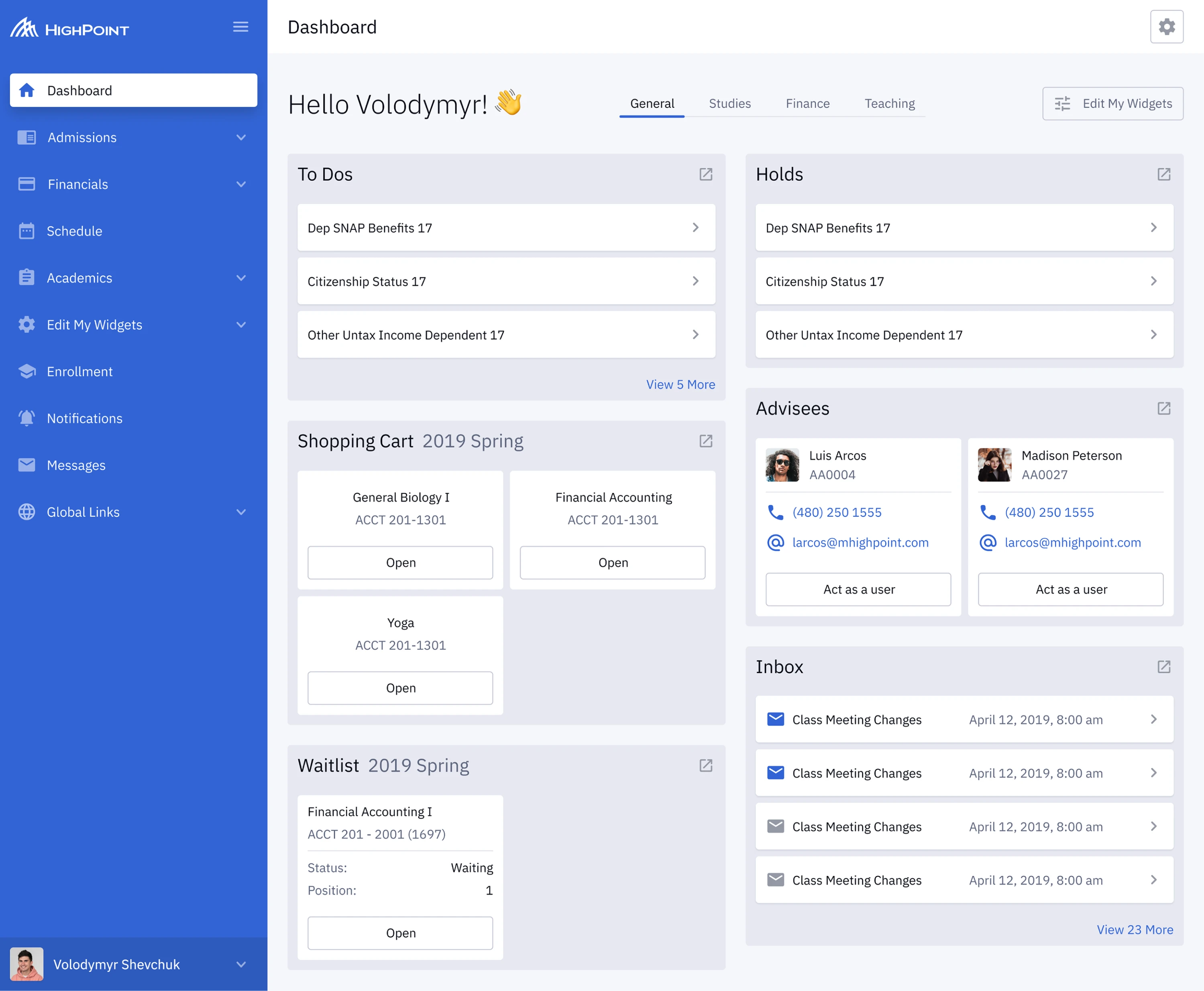
The fix. Separation doesn’t have to come from empty space. On Highpoint, a university management system with a genuinely large amount to fit on screen, we used shades of grey to divide blocks of information and card design to group related content, which meant exams, schedules, and grades could sit on one screen.
Numbers with nothing to compare them to
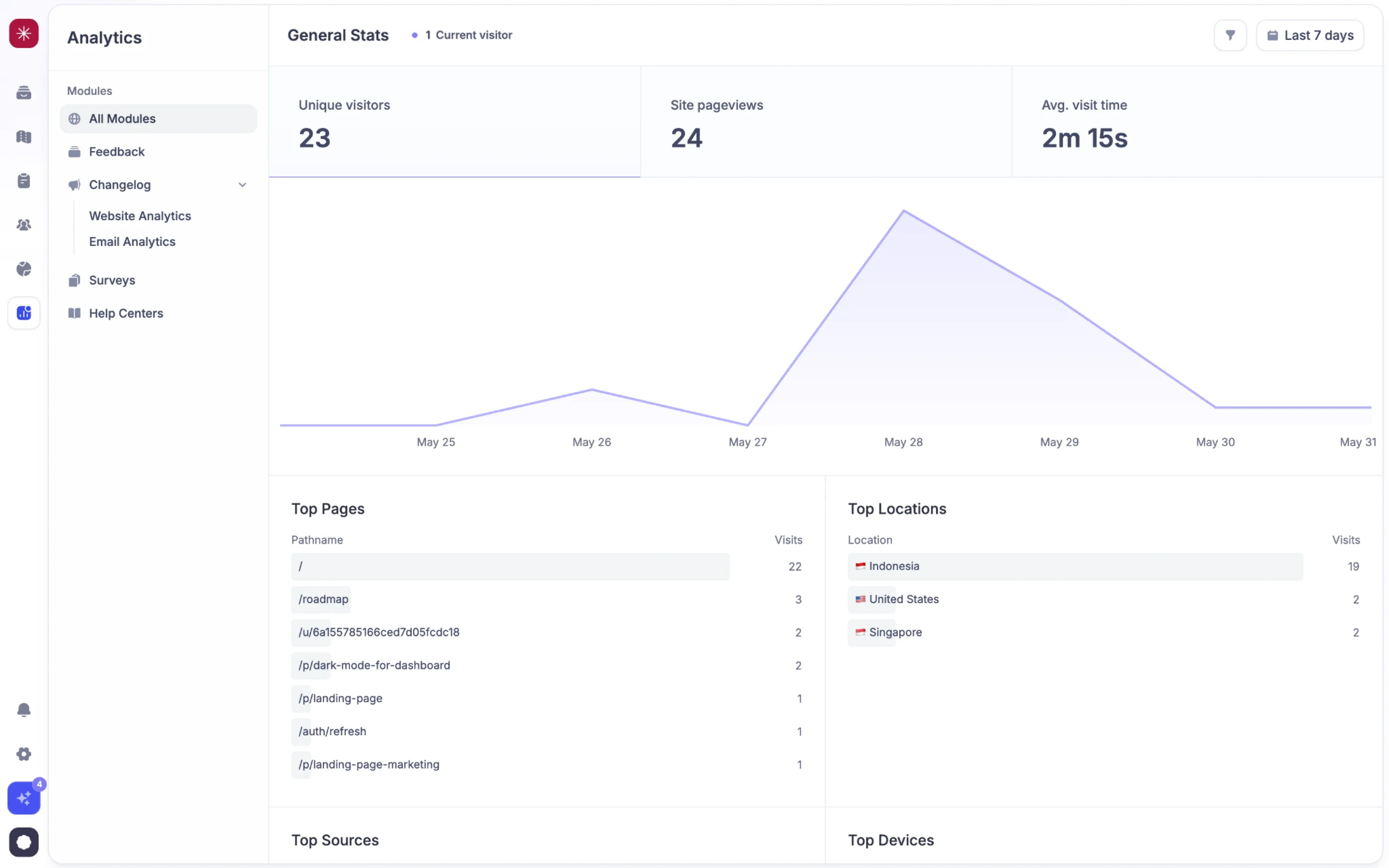
The complaint. A card says 1,284 active users. Is that good? Nobody knows. It’s a number sitting on its own, and the person reading it has to open another tool, or remember last month’s figure, to make it mean anything.
Why it happens. The metric is what the API returns, so it’s what ends up on the card. Adding a comparison means deciding what to compare against, which requires knowing what the team is trying to move. That’s a product decision, and it’s easier to display the raw value and let people work it out.
The fix. Every metric needs a reference point. That’s usually the previous period, a target, or both, shown as a delta with direction and a percentage.
Where a target exists, show progress against it, since that’s the form the decision actually takes. And be consistent about the comparison window across the dashboard, because a card comparing week over week sitting next to one comparing year over year invites a misread that’s hard to spot.
Visual inconsistency across sections
The complaint. Arrows use different styles, card padding shifts between pages, and icons don’t quite match. Each inconsistency is minor. Together, they make the product feel unfinished and turn meaningless differences into visual signals.
Why it happens. This is design debt in its purest form. A feature ships, the developer needs an icon, the nearest available library has one, and it goes in. Six months and four features later, there’s no single source of truth to check against, and nobody notices because everyone learned the interface incrementally as it grew.
The fix. What actually solves it is a design system with a defined set of components and documented rules for when to use each, covering color, spacing scale, border radius, and one icon library. Developers implement from the same place, and new features inherit consistency instead of negotiating it.
Icons that fail contrast on dark backgrounds
The complaint. Dark mode looks sharp until you need to read it. Thin grey icons disappear on dark panels, while distinct status indicators become hard to tell apart. People squint, lean in, or click to find out what something was.
Why it happens. Dark mode usually arrives as an inversion rather than a design. Colors that passed contrast on a light background get flipped, and the values that worked at one polarity don’t at the other. Thin icon strokes are the first casualty, since a 1px line has very little surface area to carry contrast in the first place.
The fix. Check your dashboard design against WCAG. Non-text elements like icons and interface controls need a contrast ratio of at least 3:1 against their background, and text needs 4.5:1 at normal sizes.
Practically, that means increasing stroke weight for dark mode, and lifting greys further than feels necessary. Status colors need re-picking too, since saturated reds and greens that read well on white tend to lose distinction against dark panels.
Dashboards that show but don’t let you act
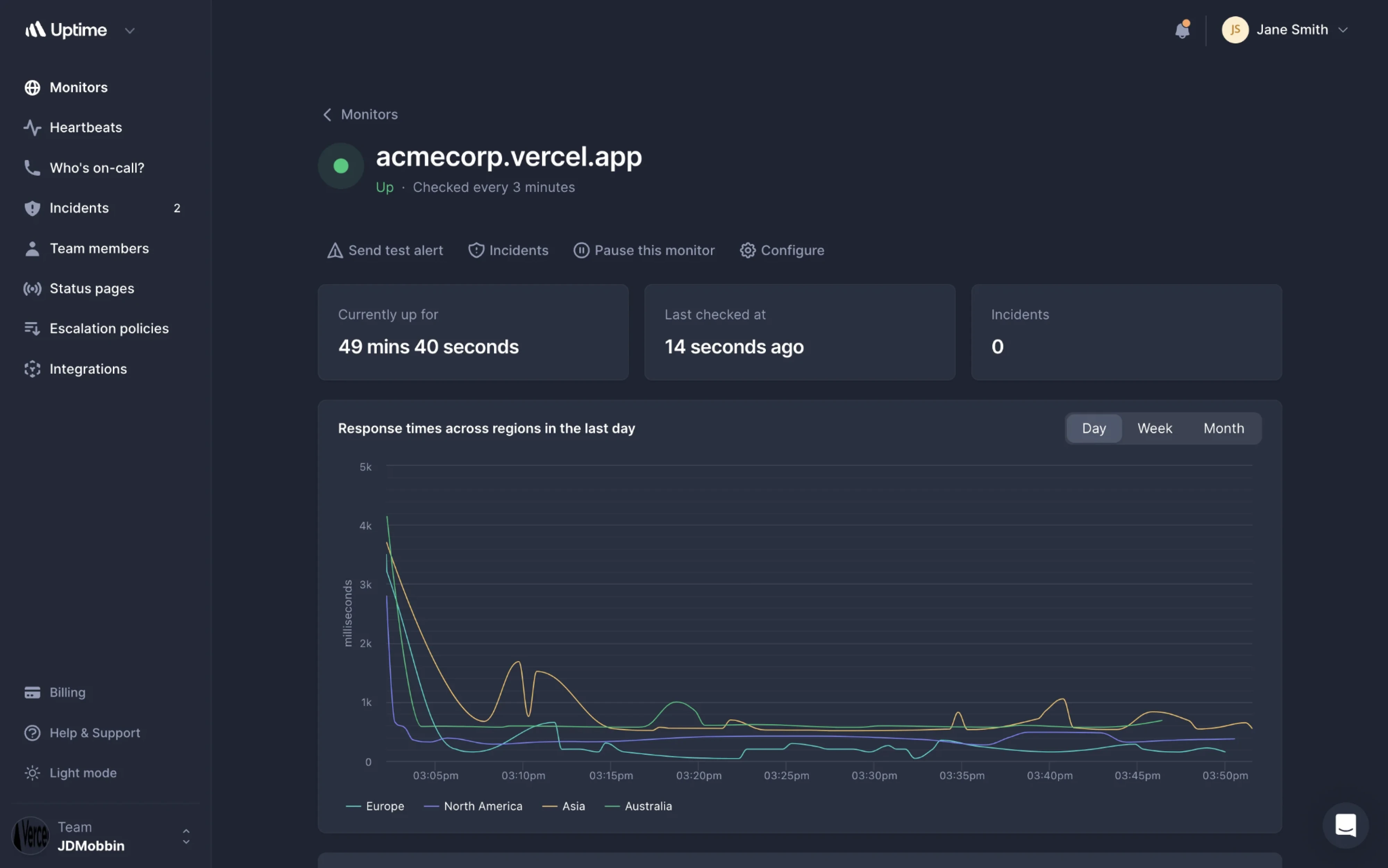
The complaint. You spot the problem on the dashboard. You see it, then navigate to another section, find the same record again, and act there. The dashboard told you something was wrong and then made you go somewhere else to fix it.
Why it happens. Dashboards get treated as reporting surfaces, because that’s the inherited mental model from business intelligence tools. Reports show, applications do. But an admin dashboard is a place of work, and the people using it aren’t reviewing performance once a quarter. They’re handling things as they come up.
There’s also a build reason. Adding an action to a card means wiring up permissions, confirmation states, and error handling for that action in a new context.
The fix. For each element on the dashboard, ask what someone does after reading it. If there’s an obvious next step, put it there. That means inline actions on rows and cards, approve and reject directly in a queue, and status changes without a page transition. Destructive actions still need confirmation, and anything irreversible probably belongs on a detail view.
Why use a pre-built template instead of building from scratch?
At some point in most projects, someone asks whether all this needs designing at all. It’s a fair question. Admin dashboards share a skeleton. Sidebar, top bar, a strip of metrics, a table. If the structure is that predictable, buying a pre-built template makes obvious sense.
For a lot of situations, it is the right call. A template gives you a working front end in days, a component set that’s already been tested across browsers, responsive behavior you don’t have to think about, and ready-made pages.
Prices run from free to a couple of hundred dollars, which, next to a design and build cycle, is nothing. For an early-stage product that needs something in front of users, or an internal tool nobody outside the company will ever see, that trade is easy.
The customization question is where expectations usually go wrong. Templates are built to be adapted, and most ship with theme variables, documented components, and enough structure to swap in your own branding.
What they can’t adapt is your information architecture. The template decides that six cards go across the top. It has no opinion about which six, or whether your admins would rather see a queue there than a metric.
If you decide to use a template, here’s what to check before committing:
- Stack compatibility. Tailwind, Bootstrap, Bulma, and jQuery templates all exist, and retrofitting the wrong one costs more than buying twice.
- Plugins included. Flatpickr, Dropzone, Quill, TinyMCE, and FullCalendar are common inclusions worth confirming.
- Code quality and documentation. Consistent spacing values and a documented component API tell you more about what maintenance will feel like than any screenshot.
- Accessibility at component level, since the contrast and consistency problems from the previous section are inherited from whatever you start with. Fixing them later means editing someone else’s code.
Google for “admin dashboard UI templates” and you’ll find hundreds of options out there. Below, we’ve gathered six open-source ones that are worth starting with.
When building from scratch is the better investment
Templates solve the visual problem. They don’t solve the structural one, and there are situations where the structural problem is the whole problem.
The clearest signal is a workflow your product owns, and nobody else has. If your admins do something specific to your business, and doing it well is part of why customers stay, a template will fight you the entire way. You’ll spend more time bending it than you would have spent designing the screen properly.
The second signal is roles that genuinely diverge. As we saw earlier, permission tiers are an information architecture decision, and templates ship with one layout. Building two real views from a template means substantially rewriting it.
The third is when the interface is what you’re selling. An internal tool can be adequate. A product where the dashboard is the daily experience can’t.
The Reddit thread has good advice for anyone in that position:
What I’d highly recommend is start by features first plan out the experience of the journey then move onto the next one.
Closing thoughts
The gap between a dashboard that photographs well and one that works is mostly a question of who you designed it for. Inspiration galleries answer to a viewer, and the people in your admin panel are not viewing. They’re finishing something before their next meeting, and the interface either helps with that or quietly gets in the way.
Most of the fixes in this article are small on their own. What makes them hard is that they need someone to own the whole picture, and admin screens are usually the part of a product nobody owns. That’s the work, and it’s rarely a rebuild.
If your dashboard already works but nobody enjoys using it, that’s the situation we handle most often at Eleken. Get in touch, and we’ll take a look at what’s slowing your team down.




.webp)