
Great products constantly communicate with users — but the best ones do it without interrupting them.
That’s harder than it sounds. Too many notifications create noise. Too many confirmations slow people down. And overly aggressive feedback patterns quickly turn helpful interfaces into frustrating ones that drag too much attention.
Small communication decisions often determine the overall user experience, making an interface feel responsive and trustworthy—or noisy and frustrating. Snackbar UI solves a very specific UX problem: how to provide feedback quickly and contextually without breaking users' flow.
Unlike modals or alerts, snackbars communicate quietly in the background — confirming actions, surfacing lightweight updates, or offering simple recovery options like Undo or Retry.
At Eleken UI/UX design agency, we’ve seen how much lightweight feedback patterns shape the overall product experience. In complex SaaS products, especially, small communication decisions often determine whether an interface feels responsive and trustworthy — or noisy and frustrating.
In this guide, we’ll break down what the snackbar component actually is, when it works well, how it compares to toasts, and which design patterns help products communicate clearly without overwhelming users.
What is a snackbar in UI design?
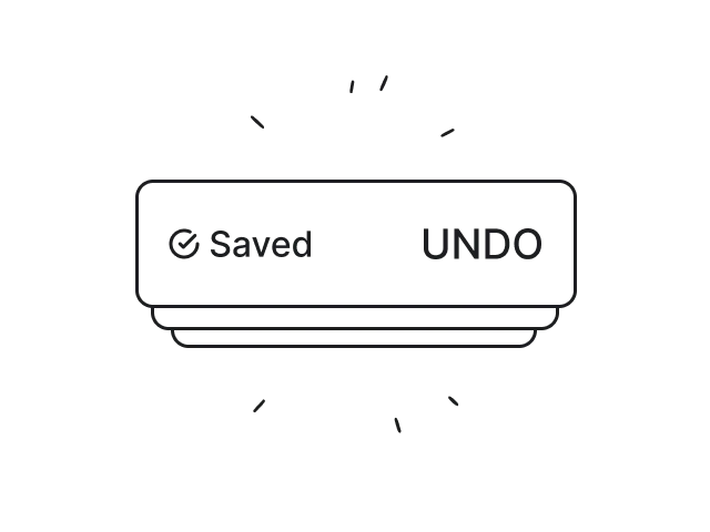
A snackbar is a lightweight, temporary UI message that appears briefly to communicate system feedback without interrupting user interaction or the user's workflow.
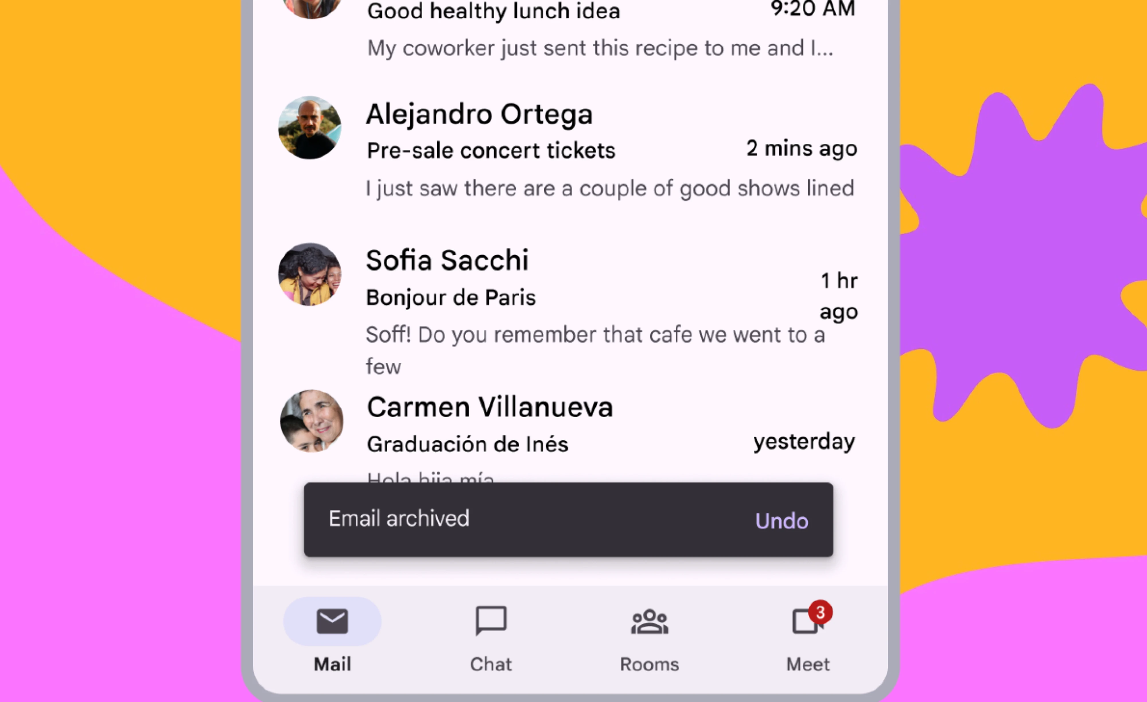
Most snackbars typically appear near the bottom of the screen and disappear automatically after a short period. (usually a few seconds). They’re commonly displayed to confirm actions, surface lightweight updates, or offer simple recovery options like:
- Undo,
- Retry,
- or View.
Unlike modals or alerts, snackbar notification UIs are non-blocking. Users can continue interacting with the interface while the message remains visible.
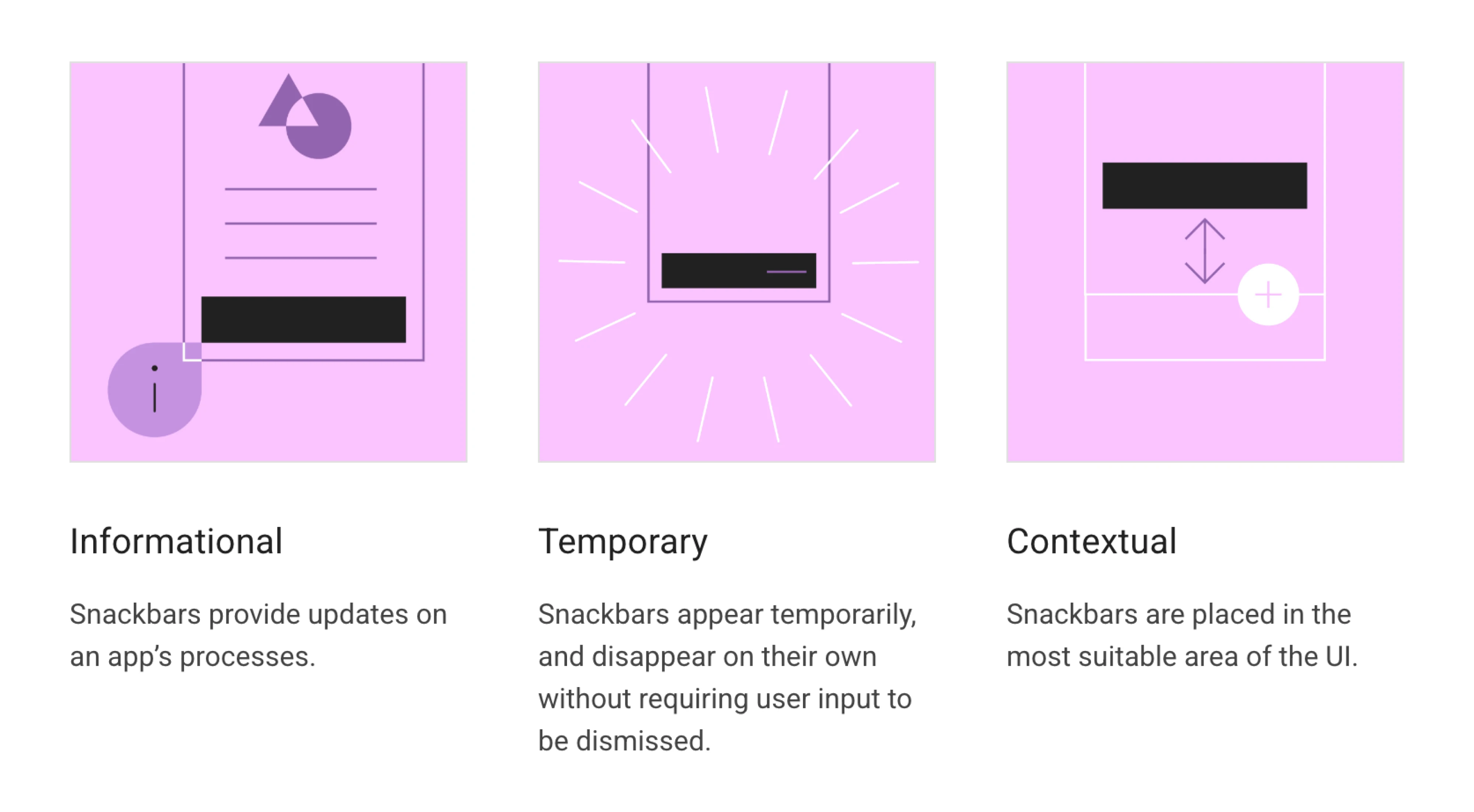
You’ll find snackbar UI patterns across many ecosystems:
Apple ecosystems use similar patterns too, although the terminology is often less standardized and overlaps with toast notifications.
At their core, snackbars are designed for one thing: communicating useful feedback while preserving user flow.
What is the anatomy of a snackbar design?
Despite being a small UI component, a snackbar has a very deliberate structure. Every element exists to communicate feedback quickly without pulling users away from what they’re doing.
Good snackbar UX feels almost effortless: users notice the message, understand it instantly, and continue their workflow without friction.
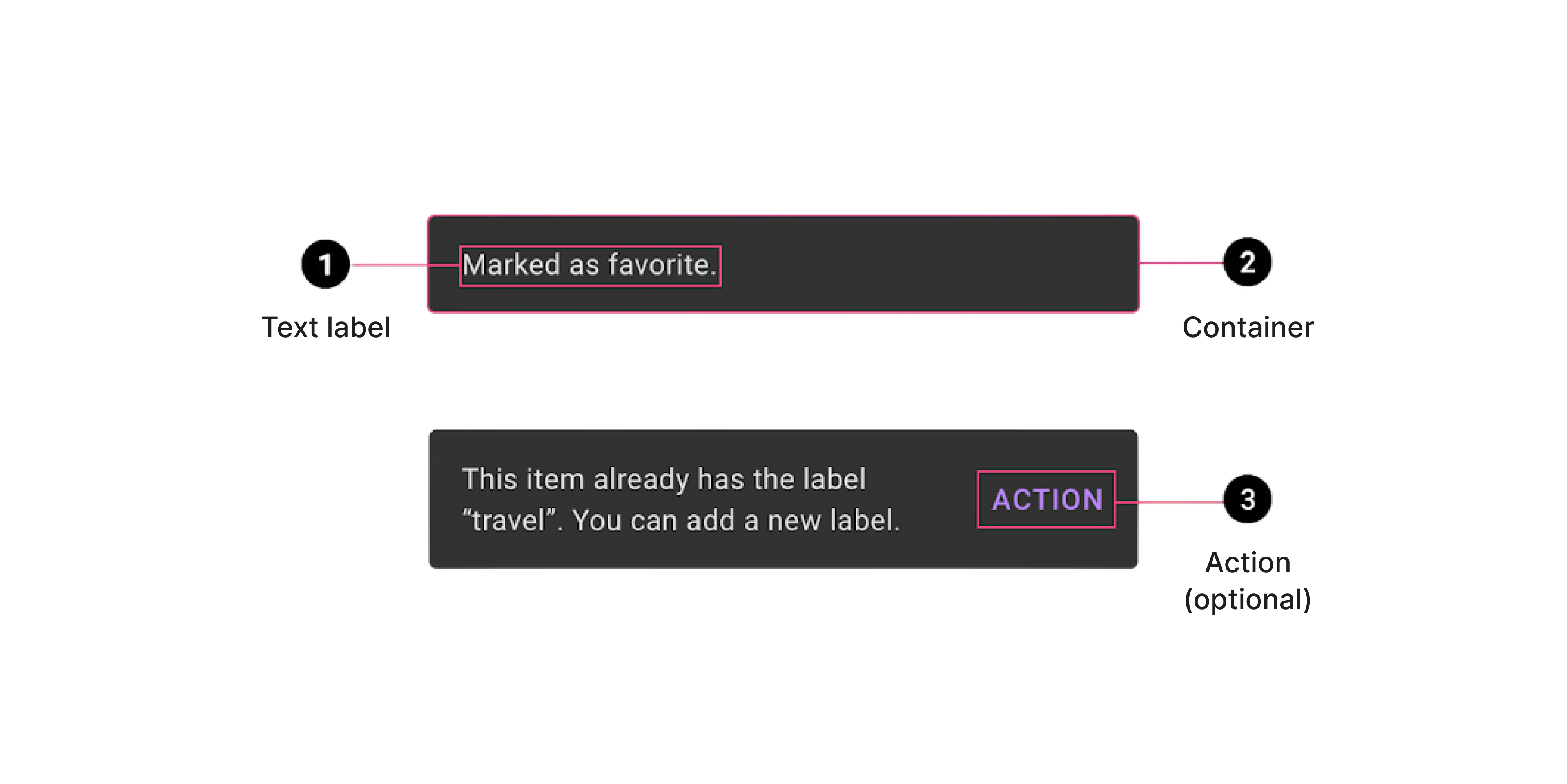
Message
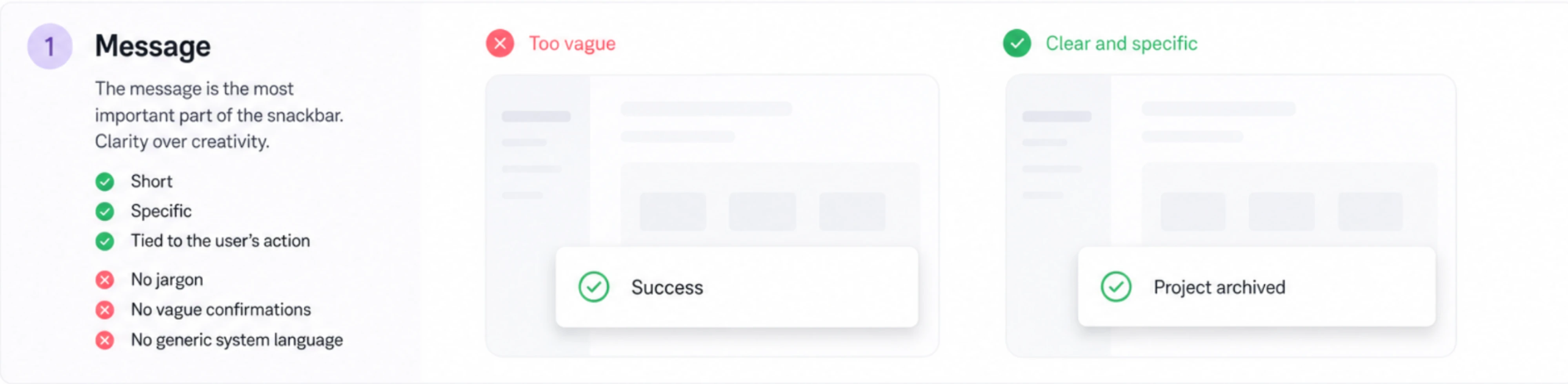
The message is the most important part of the snackbar, so clarity matters far more than creativity.
Good snackbar copy is:
- concise,
- specific,
- and directly tied to the user’s action and context.
For example:
❌ “Success”
✅ “Project archived”
The second version removes ambiguity because users immediately understand what changed in the system. This becomes especially important in complex products where multiple actions may happen in sequence.
Strong snackbar messages also avoid:
- technical jargon,
- vague confirmations,
- and overly generic system language.
The goal isn’t to sound clever — it’s to reduce cognitive effort.
Container
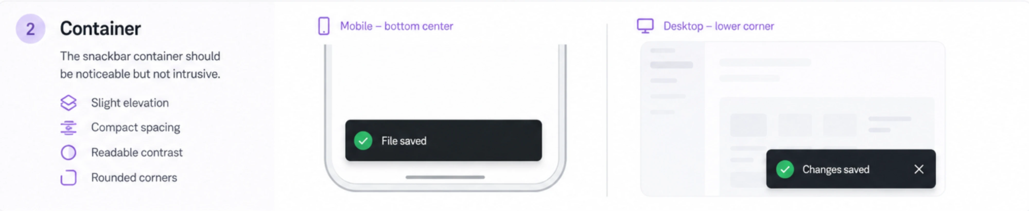
The snackbar container should feel visible enough to catch attention, but subtle enough to preserve flow.
Most snackbar designs rely on:
- slight elevation,
- compact spacing,
- readable contrast,
- and rounded corners.
Visually, the component layout should feel connected to the interface instead of floating aggressively above it like a modal or alert dialog.
Placement matters too. On mobile, snackbars usually appear near the bottom of the screen where they’re easy to notice without blocking content and causing tapping difficulties. Desktop products often position them in lower corners to minimize disruption while keeping feedback visible.
Action
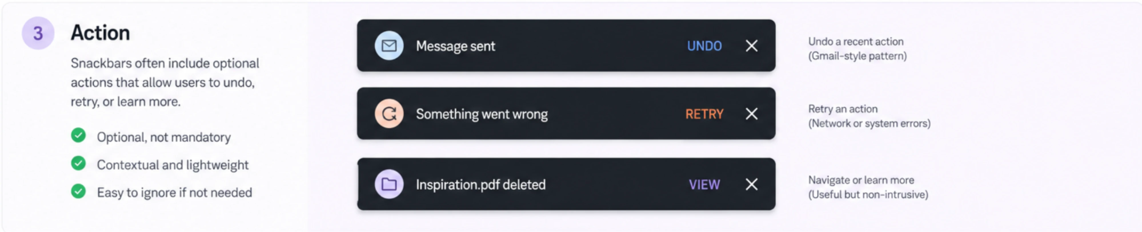
Many of these lightweight notifications include a subtle snackbar action button, such as:
- Undo,
- Retry,
- View,
- or Dismiss.
This is one of the reasons snackbar UI works so well in modern products: instead of interrupting users with confirmation dialogs upfront, the interface allows the action first and offers recovery afterward.
That’s the thinking behind patterns like Gmail’s “Undo Send” or archive snackbars in productivity tools.
But snackbars work best when actions remain optional, not mandatory.
If users must respond before continuing, a snackbar is usually the wrong pattern. In those cases, modals, dialogs, or inline validation provide stronger visibility and clearer decision-making.
The best snackbar actions feel lightweight, contextual, and easy to ignore when unnecessary.
Why snackbar UI works so well
Snackbars reassure users that the app's processes are continuing normally in the background. They became popular because they solve a very modern UX problem: users need constant feedback, but they don’t want constant interruption.
Snackbars preserve user flow
Unlike modals or confirmation dialogs, snackbars don’t force users to stop what they’re doing.
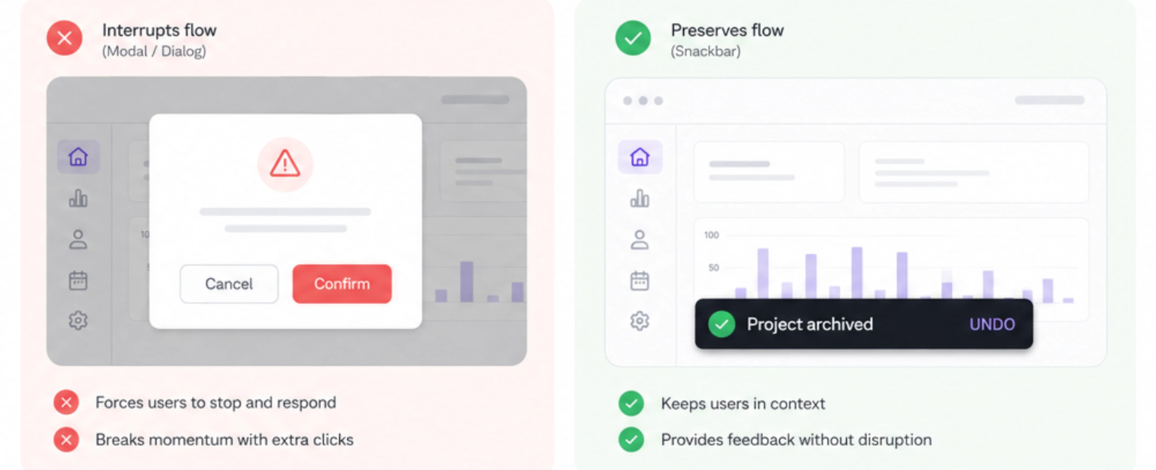
That small difference has a huge impact on usability. Instead of breaking momentum with extra clicks and confirmations, snackbars let users continue their workflow while still staying informed about:
- completed actions,
- background updates,
- or lightweight system events.
This reduces cognitive friction because users don’t need to repeatedly pause, process, and dismiss interface interruptions.
In fast-moving products — especially SaaS dashboards, admin panels, and mobile apps — preserving flow often matters more than maximizing visibility.
The psychology of lightweight feedback
Good interfaces constantly reassure users that the system is responding.

Snackbars help create that feeling of responsiveness by:
- confirming actions quickly,
- reducing uncertainty,
- and making the interface feel “alive.”
Even very small feedback moments matter psychologically. When users archive a file, save changes, or complete an action, they want subtle confirmation that the system understood them correctly.
Without that feedback, interfaces can feel unreliable or unresponsive — especially in products where many actions happen rapidly.
Why modern products prefer non-blocking feedback
Older interfaces often relied heavily on:
- modal confirmations,
- aggressive alerts,
- and interruptive warnings.
But over time, many products realized this created:
- notification fatigue,
- confirmation blindness,
- and slower workflows.
Users eventually stop reading dialogs entirely because they’re conditioned to dismiss interruptions as quickly as possible.
Modern UX increasingly favors:
- contextual communication,
- reversible actions,
- and lightweight feedback patterns instead.
That’s why snackbar UI works especially well in products designed around speed and continuity. Instead of constantly asking users: “Are you sure?” the interface quietly allows the action — then offers a lightweight way to recover if needed.
When should you use a snackbar?
Snackbars work best when users need lightweight feedback — not interruption.
They’re ideal for situations where the system should acknowledge a single action, communicate status, or offer a simple recovery path without pulling users out of their workflow.
Best use cases for snackbar UI
Snackbars are especially effective for:
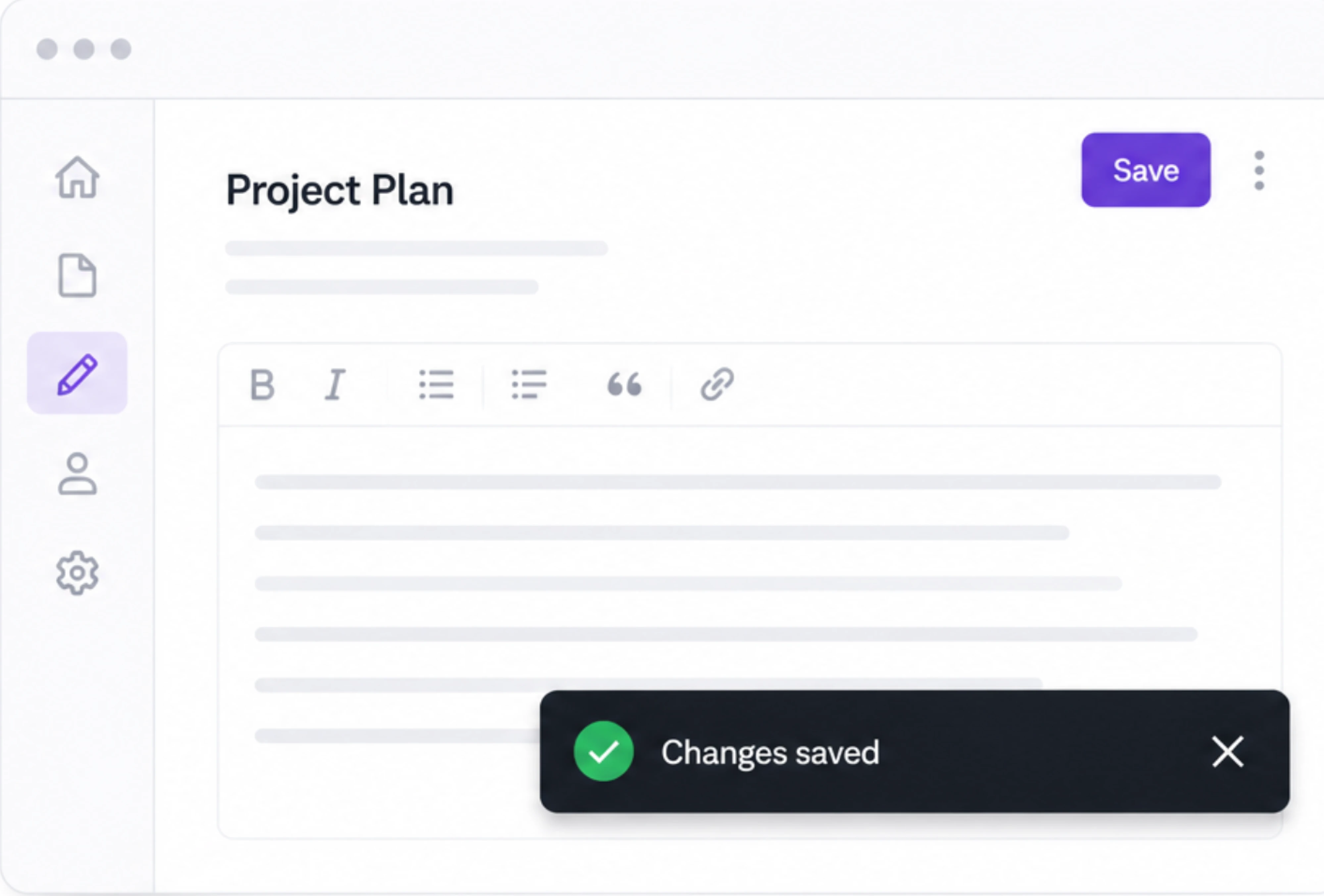
- save confirmations,
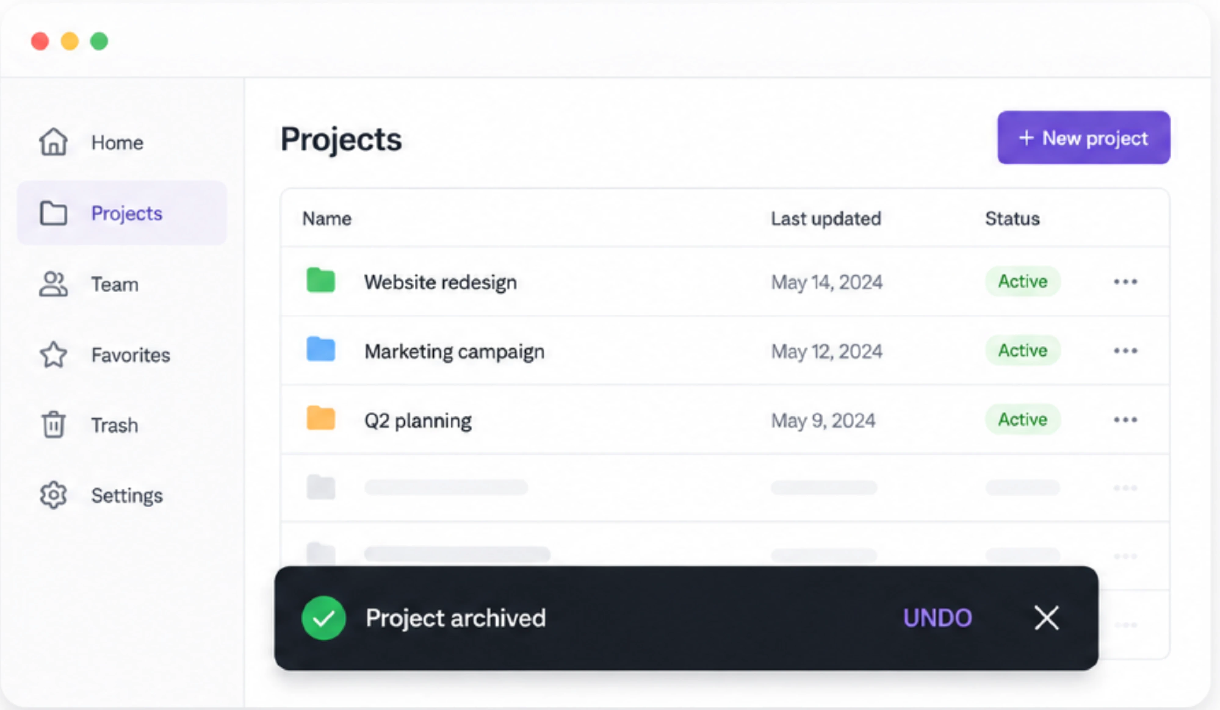
- archived or deleted items,
- upload completion,
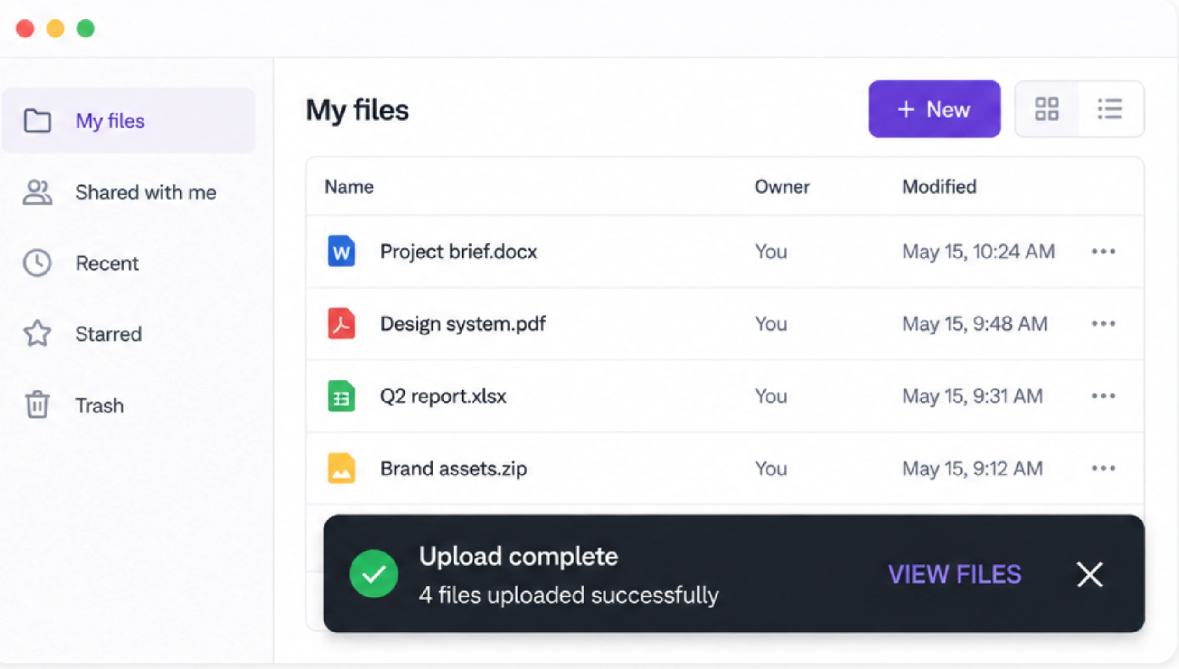
- background sync updates,
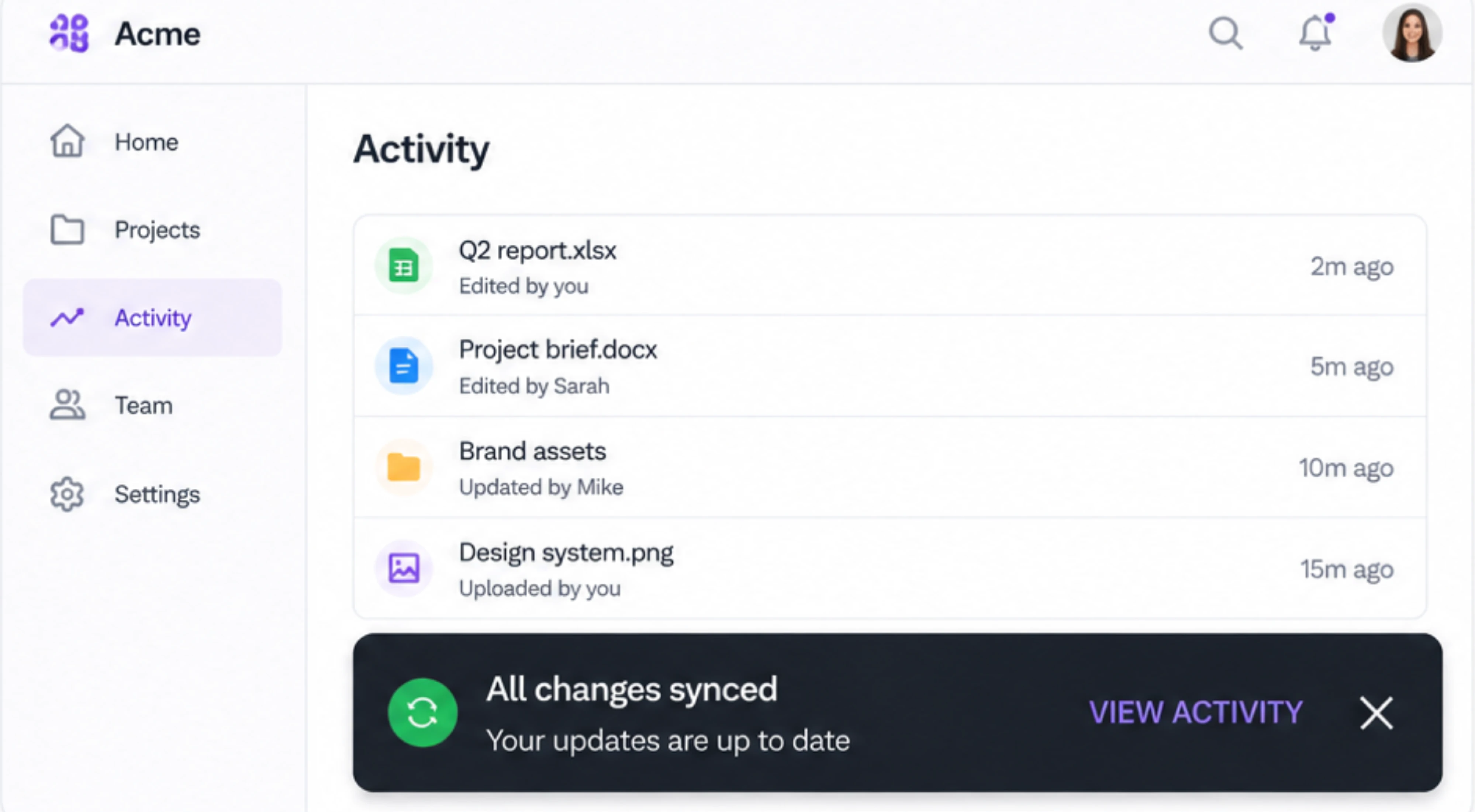
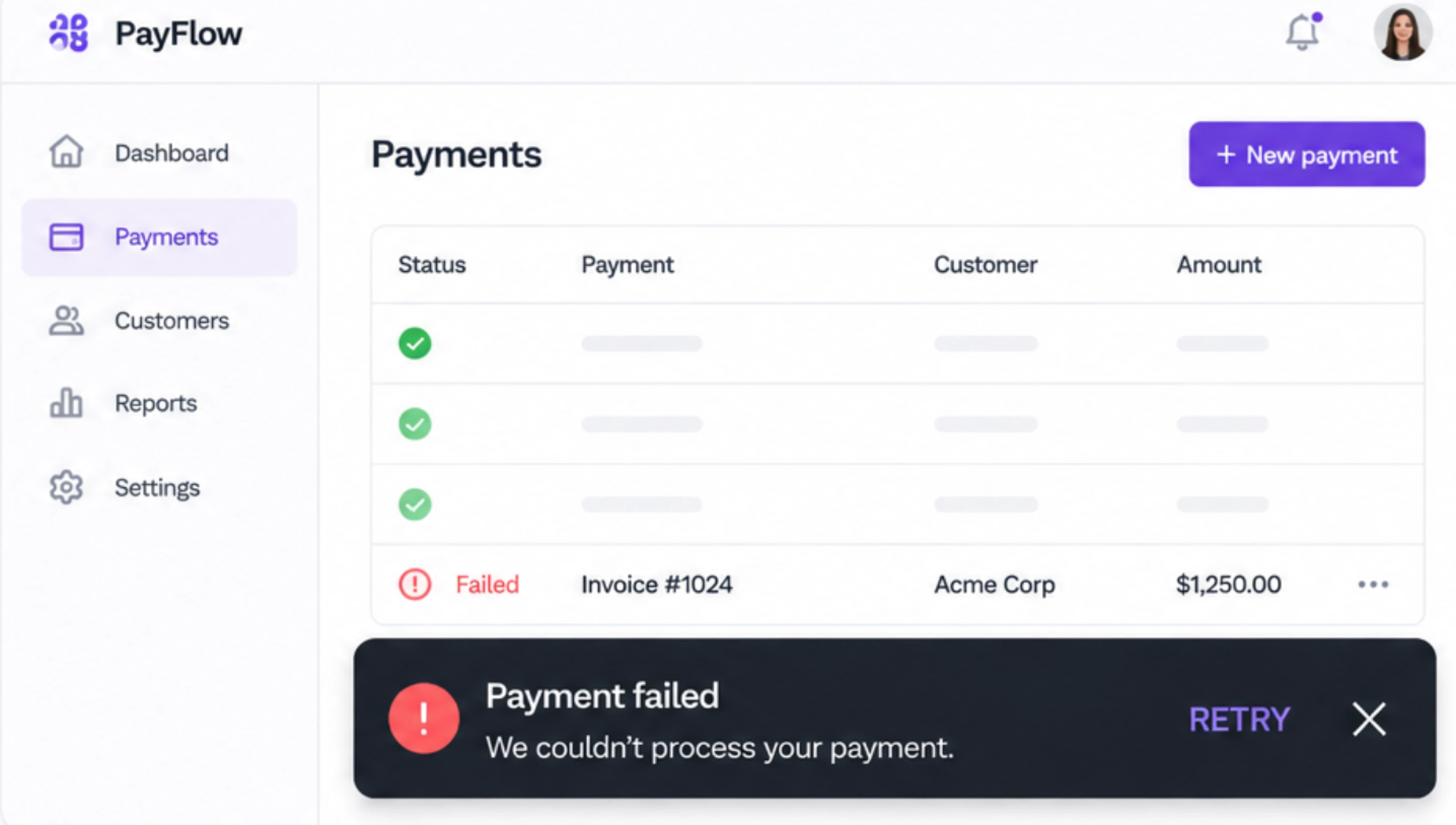
- retrying failed actions,
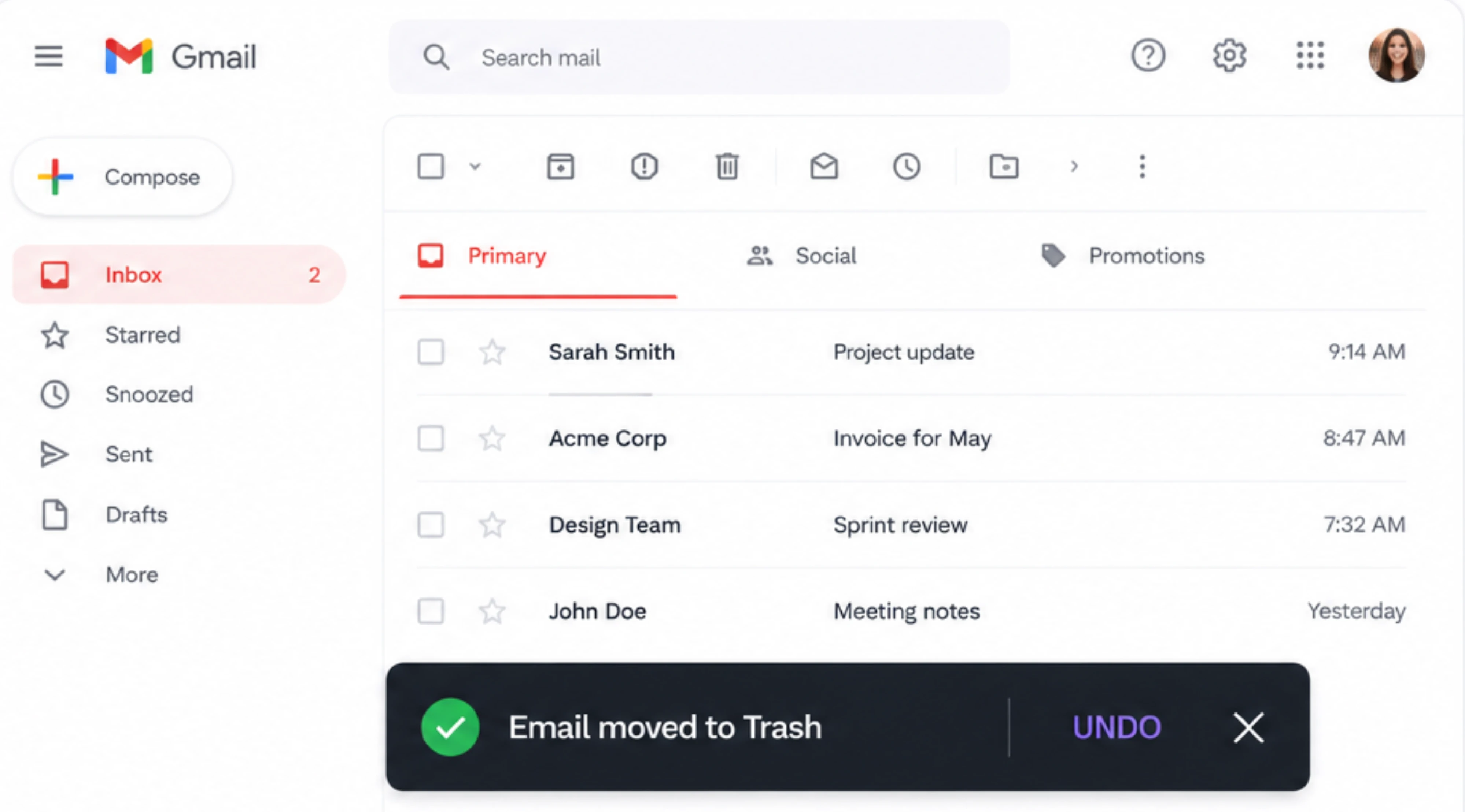
- and reversible actions.
These are all moments where users benefit from feedback, but don’t necessarily need to stop and make a decision immediately.
For example:
- “File uploaded”
- “Project archived”
- “Changes saved”
- “Message sent”
The interaction stays lightweight because the message supports the workflow instead of interrupting it.
Looking into real-world snackbar UI examples
Many modern products rely heavily on snackbar-style feedback patterns.
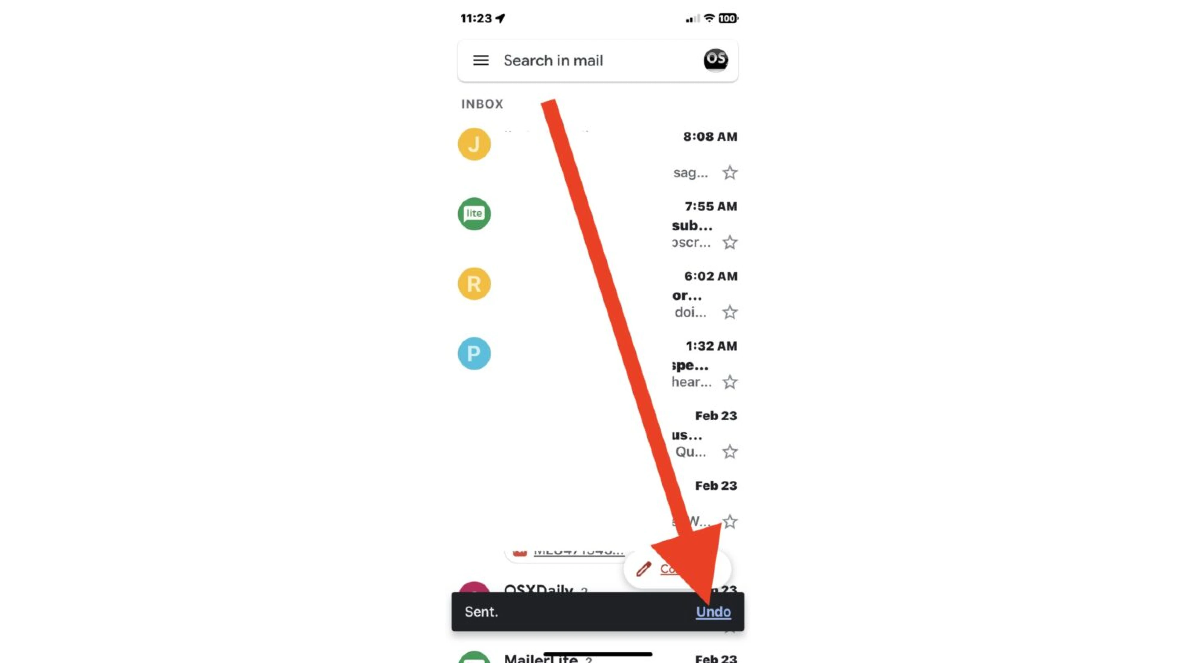
Gmail — Undo Send
One of the best-known examples. Instead of interrupting users with:
“Are you sure you want to send this email?”
For instance, Gmail sends the email immediately and briefly offers: “Undo”
This preserves flow while still giving users a safety net.
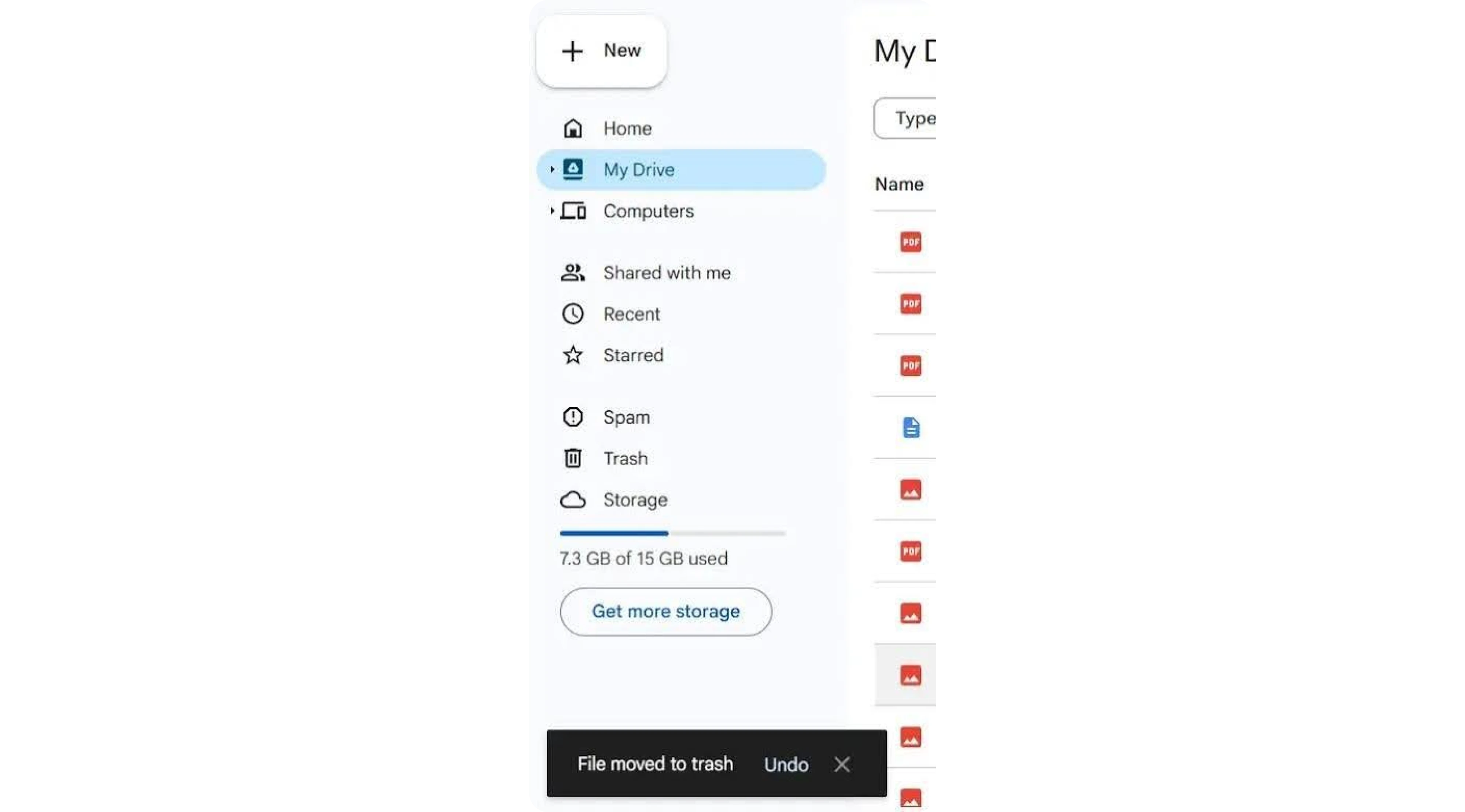
Google Drive — archive and delete actions
Google products frequently use snackbars after actions like archiving or deleting files. The feedback is immediate, contextual, and often paired with Undo.
Slack — lightweight workflow confirmations
Slack uses subtle notifications for actions like:
- channel changes,
- message updates,
- or preference changes.
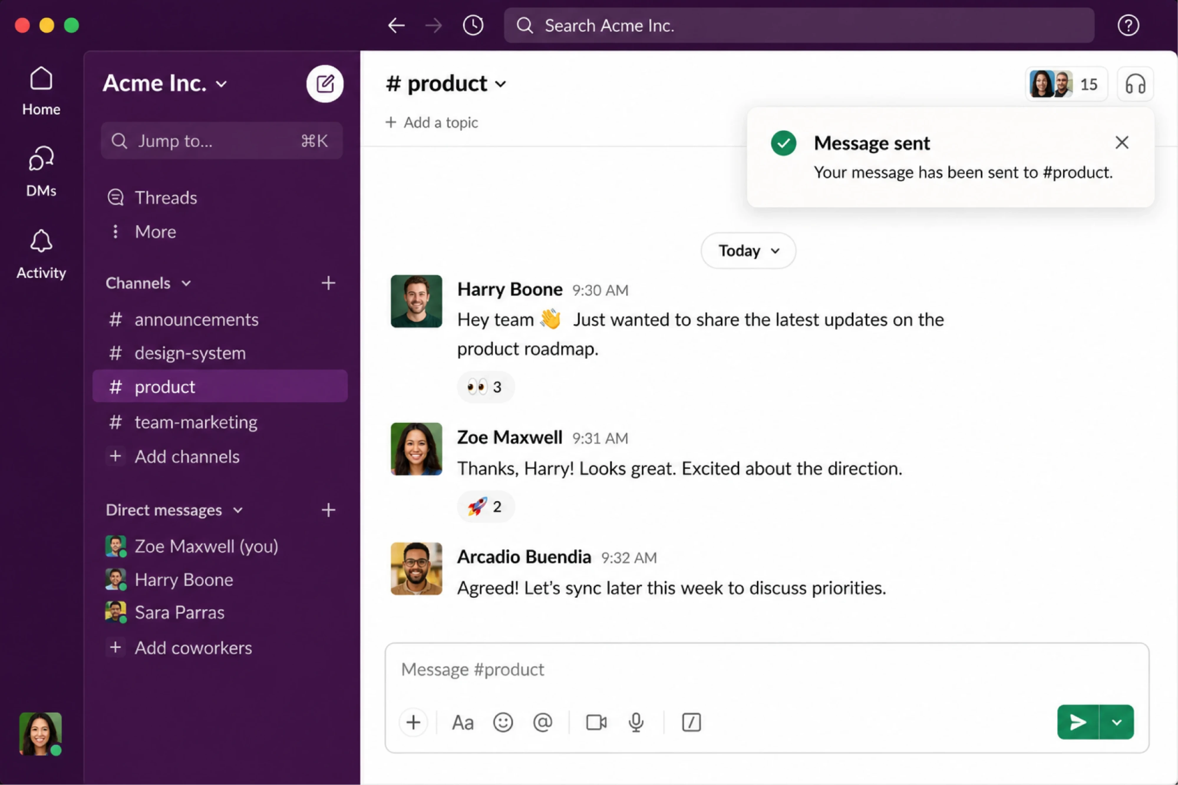
The feedback stays visible just long enough to reassure users without slowing communication down.
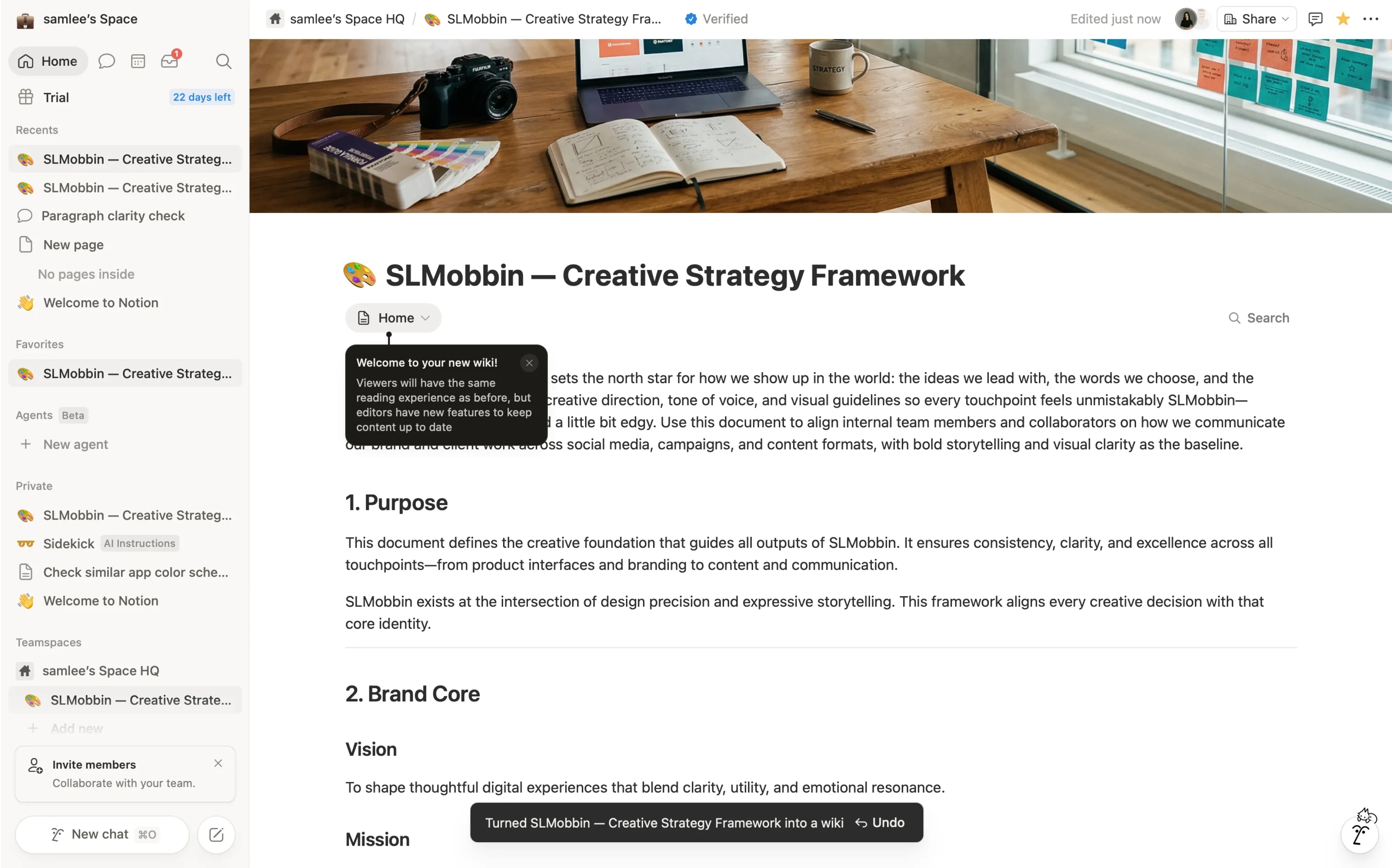
Notion — editing and collaboration feedback
Notion often relies on quiet system feedback for syncing, edits, and collaborative changes. The interface communicates status without constantly demanding attention.
Admin dashboards and SaaS products
Snackbars work especially well in dashboard-heavy interfaces where users perform many repetitive actions quickly. Instead of interrupting every task with confirmations, the system quietly acknowledges changes while preserving momentum.
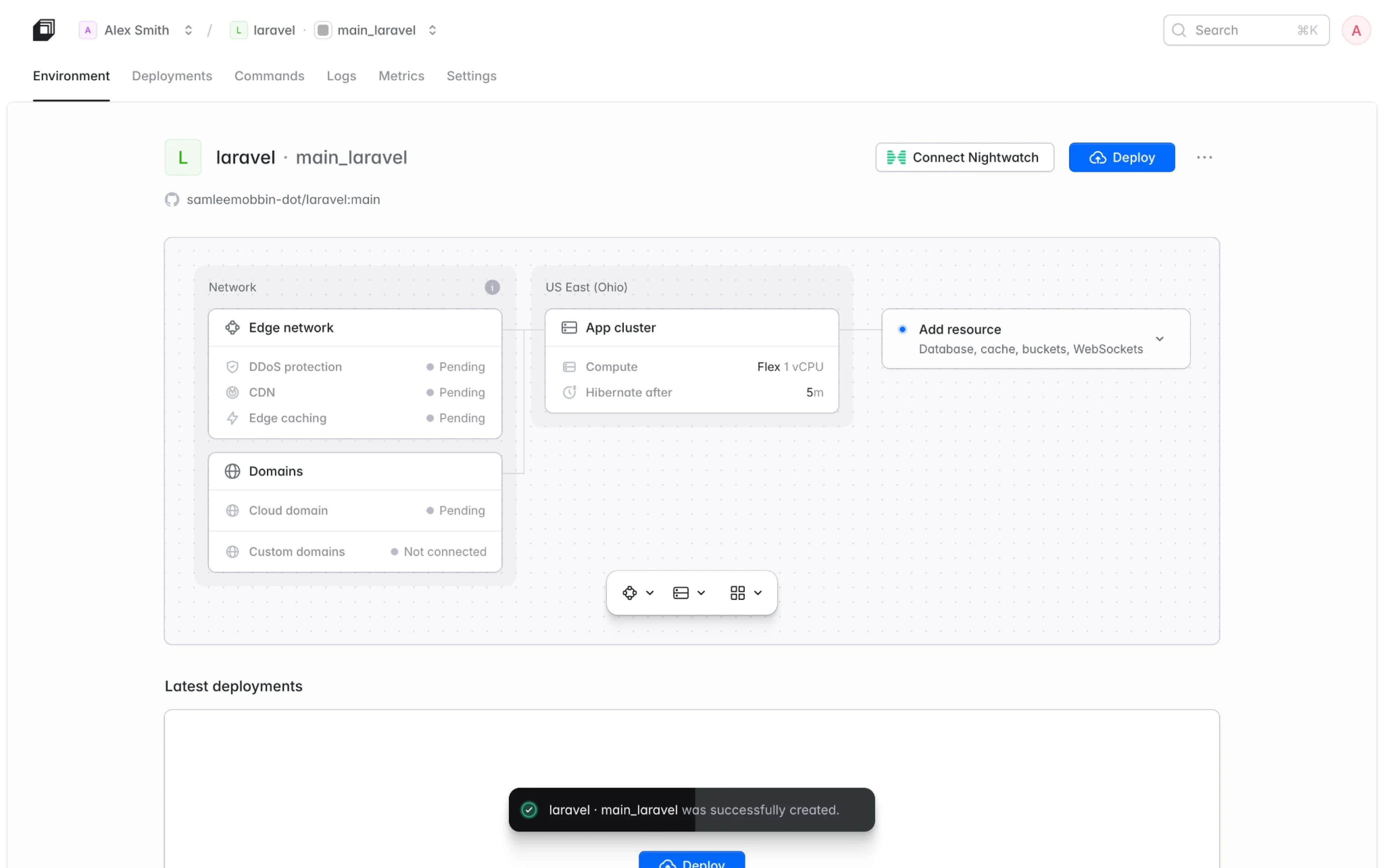
That balance is exactly why snackbar UI became such a common pattern in modern product design.
The “Undo” pattern: why it matters
One of the biggest reasons snackbar UI became so popular is the shift from preventing mistakes to recovering from them gracefully.
Traditional UX often relied on confirmation dialogs:
“Are you sure you want to delete this?”
But over time, products discovered a problem: users rarely read those dialogs carefully. Most people automatically confirm them just to continue their workflow.
That’s why many modern interfaces now prefer:
action first → recovery second.
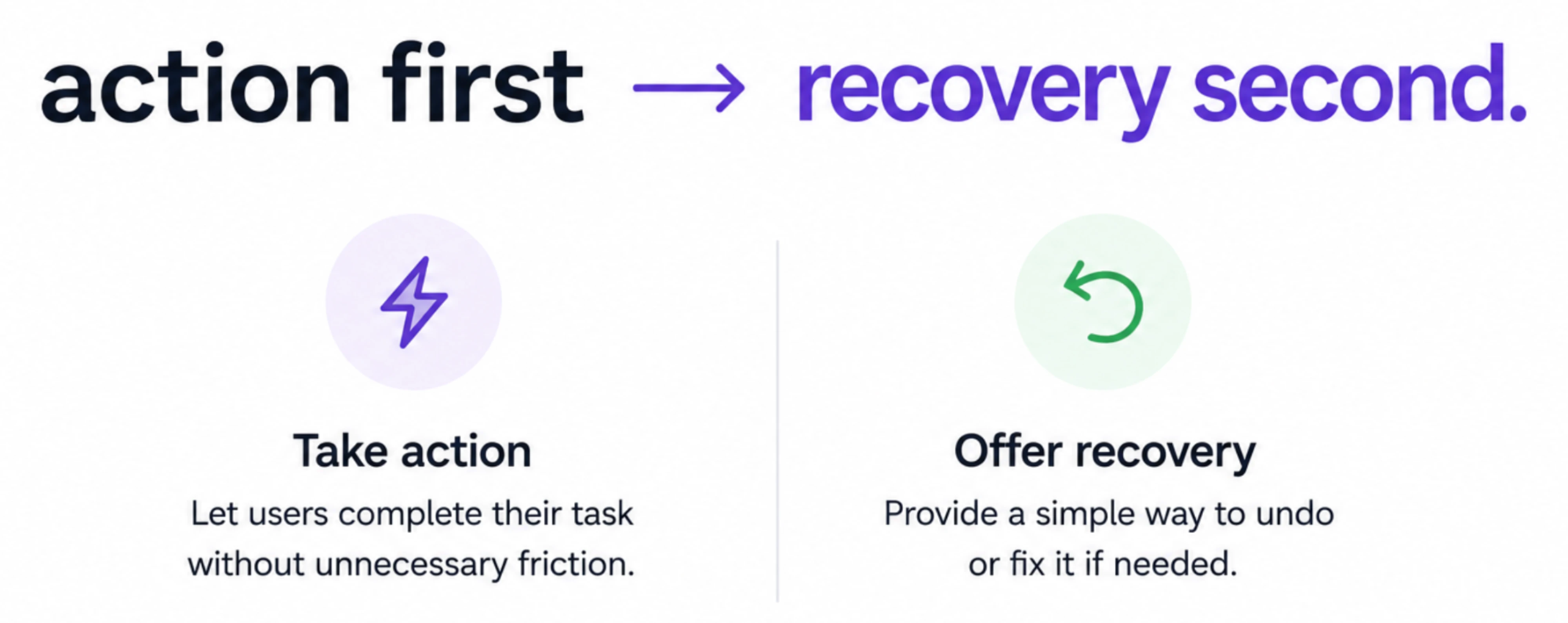
Instead of interrupting users upfront, the system allows the action and briefly offers an Undo option afterward through a snackbar.
Gmail’s Undo Send is probably the most famous example of this pattern. The experience feels faster and less frustrating because users aren’t forced into unnecessary confirmation steps every time they act.
This approach works especially well for:
- archive actions,
- deletions,
- task completion,
- list management,
- and other reversible interactions.
But the pattern only works when recovery is genuinely possible. If an action is irreversible, high-risk, or security-sensitive, relying solely on Undo can create dangerous UX.
The deeper principle here is important:
good products don’t just prevent errors — they design safe ways to recover from them without adding unnecessary friction.
When NOT to use a snackbar
Snackbars are useful precisely because they stay lightweight. But that also means they’re the wrong choice for situations that require strong visibility, focused attention, or complex decision-making.
Critical system failures
Critical alerts belong to a different category of feedback and shouldn't disrupt users through disappearing notifications—they require stronger UI patterns.
Security issues, payment failures, data loss, or system outages need stronger communication patterns like:
- alerts,
- banners,
- inline warnings,
- or modals.
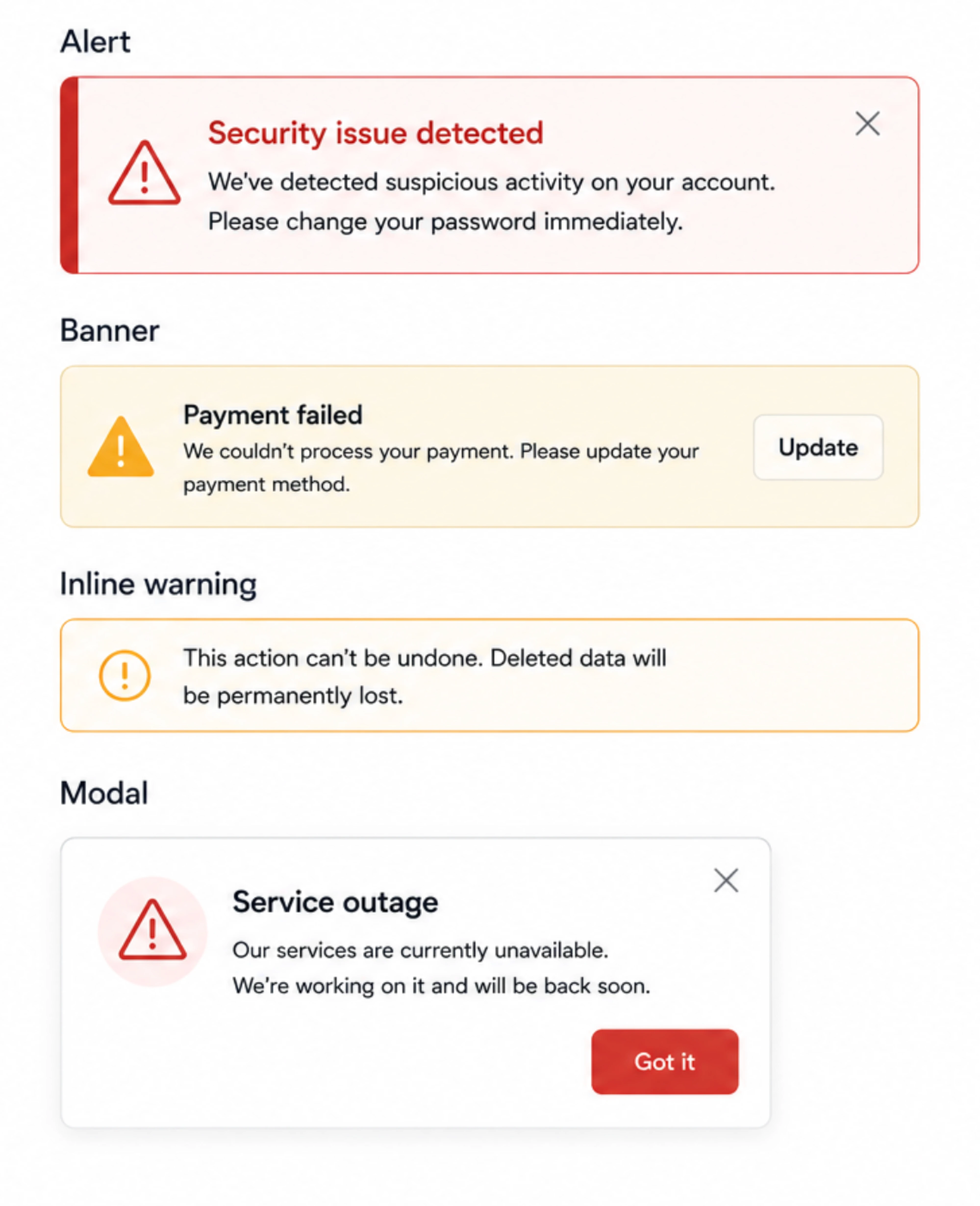
If users can miss the message entirely, a snackbar is probably too subtle.
Destructive irreversible actions
The Undo pattern works well only when recovery is actually possible.
For irreversible actions — like permanently deleting records, removing accounts, or triggering sensitive workflows — relying on a temporary snackbar creates unnecessary risk.
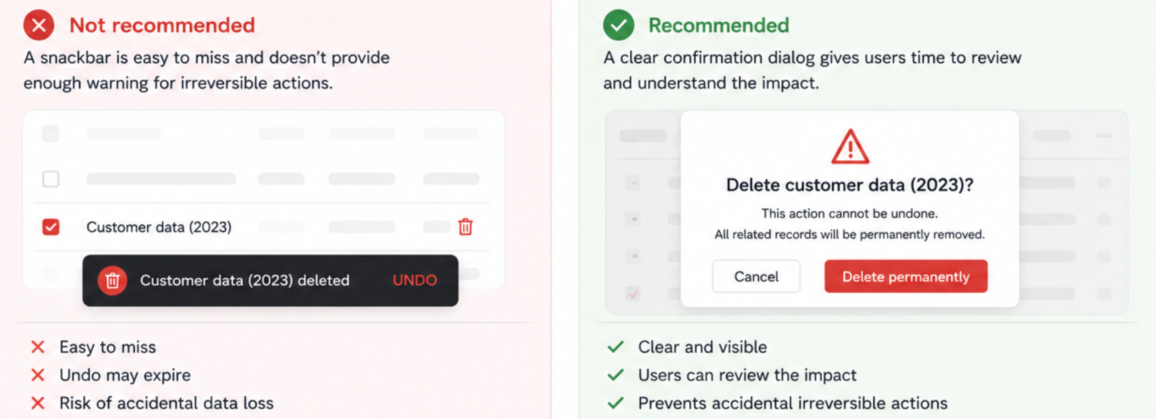
In these cases, users need stronger confirmation and clearer visibility before the action happens.
Long explanations
Snackbars are designed for quick scanning, not detailed communication.
If users need:
- instructions,
- troubleshooting guidance,
- or multiple decisions,
the content probably belongs in:
- a modal,
- dedicated screen,
- inline messaging,
- or support flow instead.
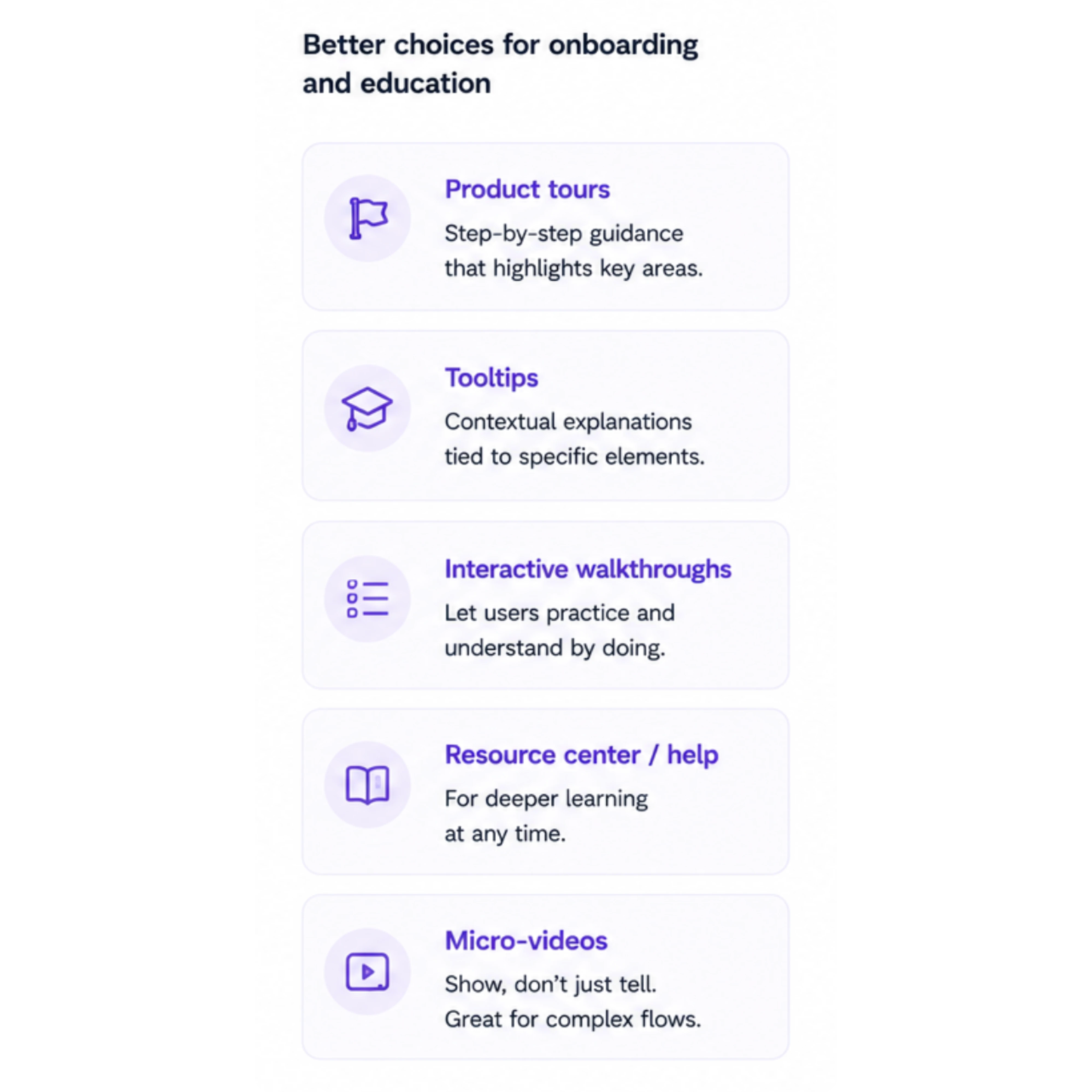
Onboarding and education
Snackbars disappear quickly, which makes them poor teaching tools.
If the goal is helping users learn:
- a feature,
- a workflow,
- or a new interaction pattern,
persistent onboarding UI works much better than temporary notifications users may miss entirely.
Multi-step workflows
Complex flows often require sustained visibility and state awareness.
Temporary snackbars can become confusing when users are already navigating:
- forms,
- setup processes,
- operational approvals,
- or configuration steps.
In those cases, inline progress indicators or persistent status components usually create a clearer experience.
The important nuance is this:
not every notification deserves a snackbar.
Choosing the right feedback pattern is really about matching visibility, urgency, and interruption level to the situation itself.
How should a snackbar behave?
Even small feedback components need clear behavioral rules. A poorly timed or badly placed snackbar can quickly become distracting, frustrating, or easy to miss entirely.
Timing and auto-dismiss
Snackbars are meant to feel temporary, but timing matters more than many teams realize.
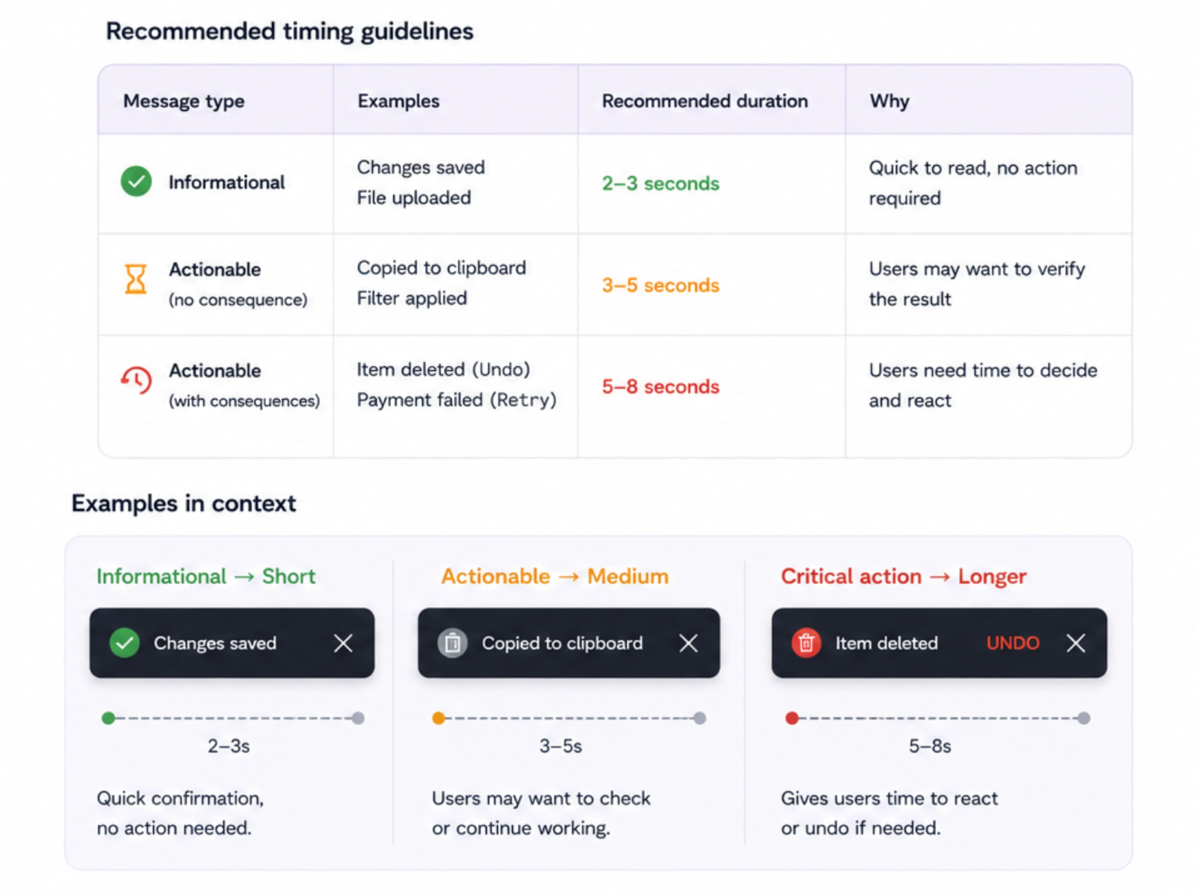
Simple informational messages can disappear relatively quickly:
- “Changes saved”
- “File uploaded”
But actionable snackbars — especially ones with Undo or Retry — should stay visible longer so users have enough time to react.
This becomes even more important for accessibility. Users read at different speeds, and short timeouts can make important actions impossible to catch or use comfortably.
The goal is to make snackbars feel lightweight without making them stressful.
Placement and layering
Placement should also adapt to the device, since mobile and desktop users interact differently with the interface.
On mobile, snackbars usually appear near the bottom of the screen because:
- they’re easy to notice,
- close to thumb reach,
- and less disruptive to content.
Desktop products often place them in lower corners to preserve workflow continuity while keeping feedback visible.
Good snackbar placement also avoids overlapping:
- navigation,
- floating buttons,
- input fields,
- or important controls.
Motion and transitions
Snackbar animations should feel subtle and quick.
Overly dramatic motion makes lightweight feedback feel heavier than necessary. Most products use small slide or fade transitions that help the snackbar appear naturally without demanding attention.
It’s also important to support reduced motion preferences for users sensitive to animation.
Queueing and stacking
This is where many products fail. As a general rule, only one snackbar should be visible at a time. Additional messages should be queued or replace older ones.
When multiple snackbars appear at once, interfaces quickly become chaotic:
- stacked messages compete for attention,
- important feedback gets buried,
- and users stop reading notifications altogether.
Strong feedback systems usually:
- limit simultaneous snackbars,
- replace stale messages,
- or queue notifications intelligently.
Because once feedback starts competing with itself, it stops being helpful.
Snackbar best practices [accessibility edition]
Because snackbars are temporary and non-blocking, snackbar accessibility becomes especially important. Users should be able to notice, understand, and interact with feedback without feeling rushed or losing control of the interface.
Don’t steal focus
One of the biggest strengths of snackbar UI is that it preserves flow.
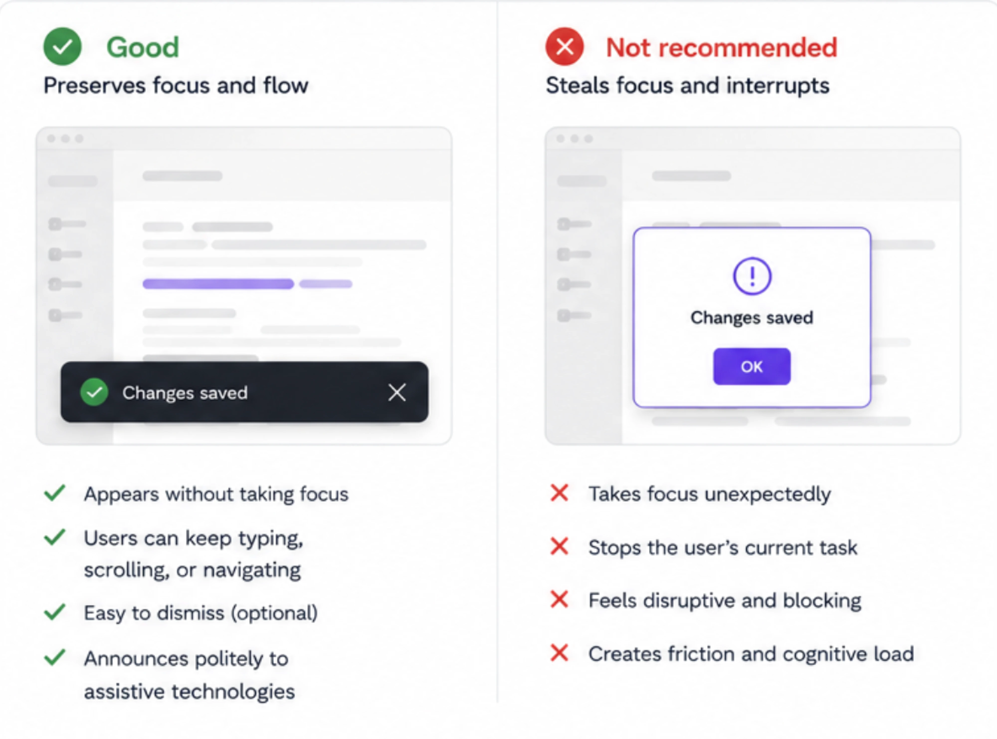
That means snackbars generally shouldn’t:
- grab keyboard focus,
- interrupt screen navigation,
- or suddenly pull users away from their current task.
Unlike modals, snackbars work best as background communication rather than forced interaction.
Support keyboard navigation
If a snackbar includes an action like Undo or Retry, keyboard users should still be able to reach it easily.
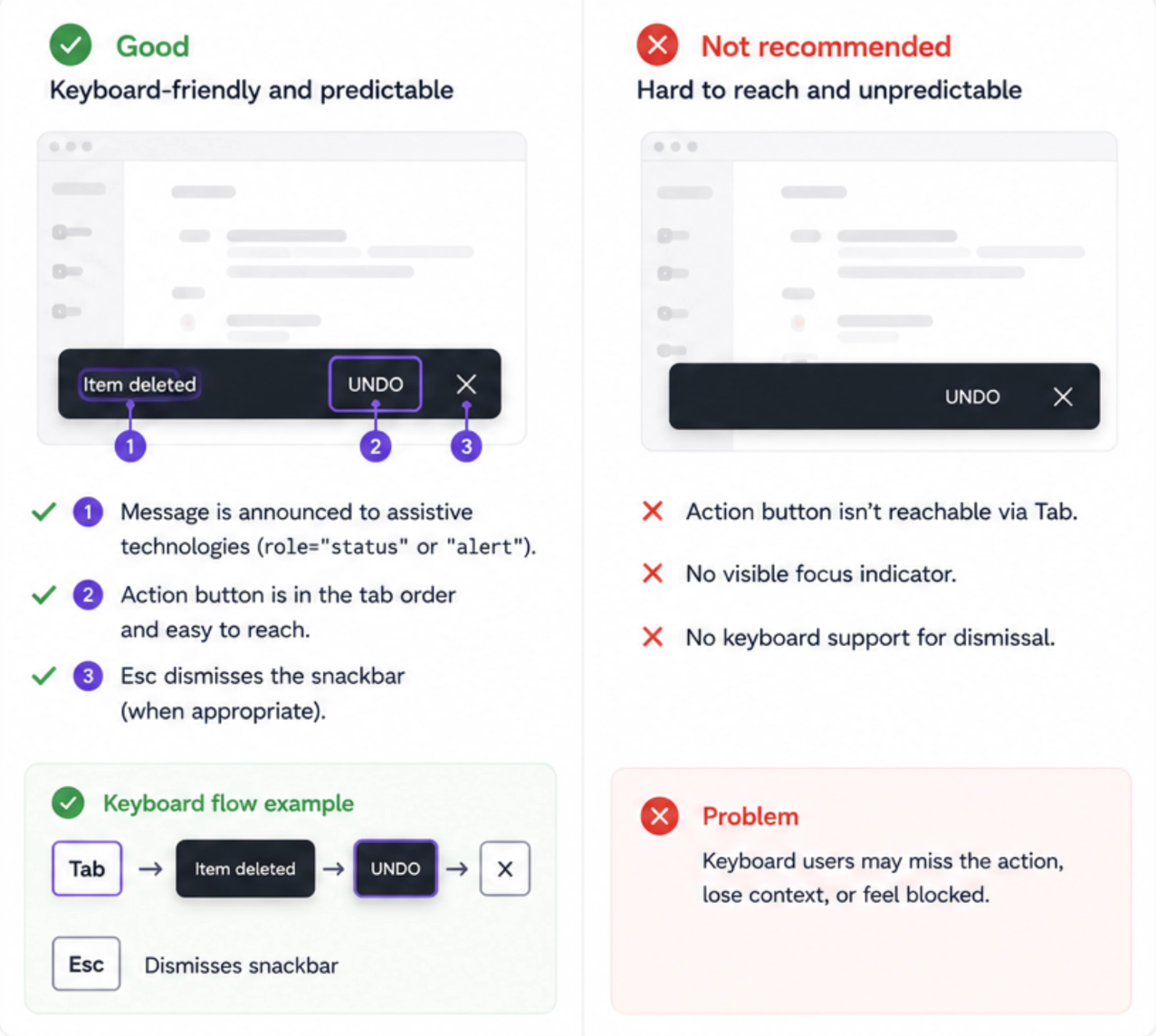
That means supporting:
- logical tab order,
- visible focus states,
- and Escape key dismissal where appropriate.
Actionable snackbars should feel accessible without becoming disruptive.
Use readable timing
Short auto-dismiss durations can create serious usability problems.
Users:
- read at different speeds,
- may rely on assistive technology,
- or simply need more time to react.
That’s why actionable snackbars should remain visible longer than passive informational ones. In some cases, allowing users to dismiss the message manually creates a safer experience.
Support screen readers
Snackbar messages should be announced properly through ARIA live regions so screen reader users receive feedback without needing to search for it manually.
Most snackbar patterns use:
- polite announcements for informational updates,
- and more assertive behavior only when urgency genuinely requires it.
The goal is visibility without unnecessary interruption.
Maintain contrast and readability
Because snackbars often appear temporarily over existing UI, readability matters a lot.
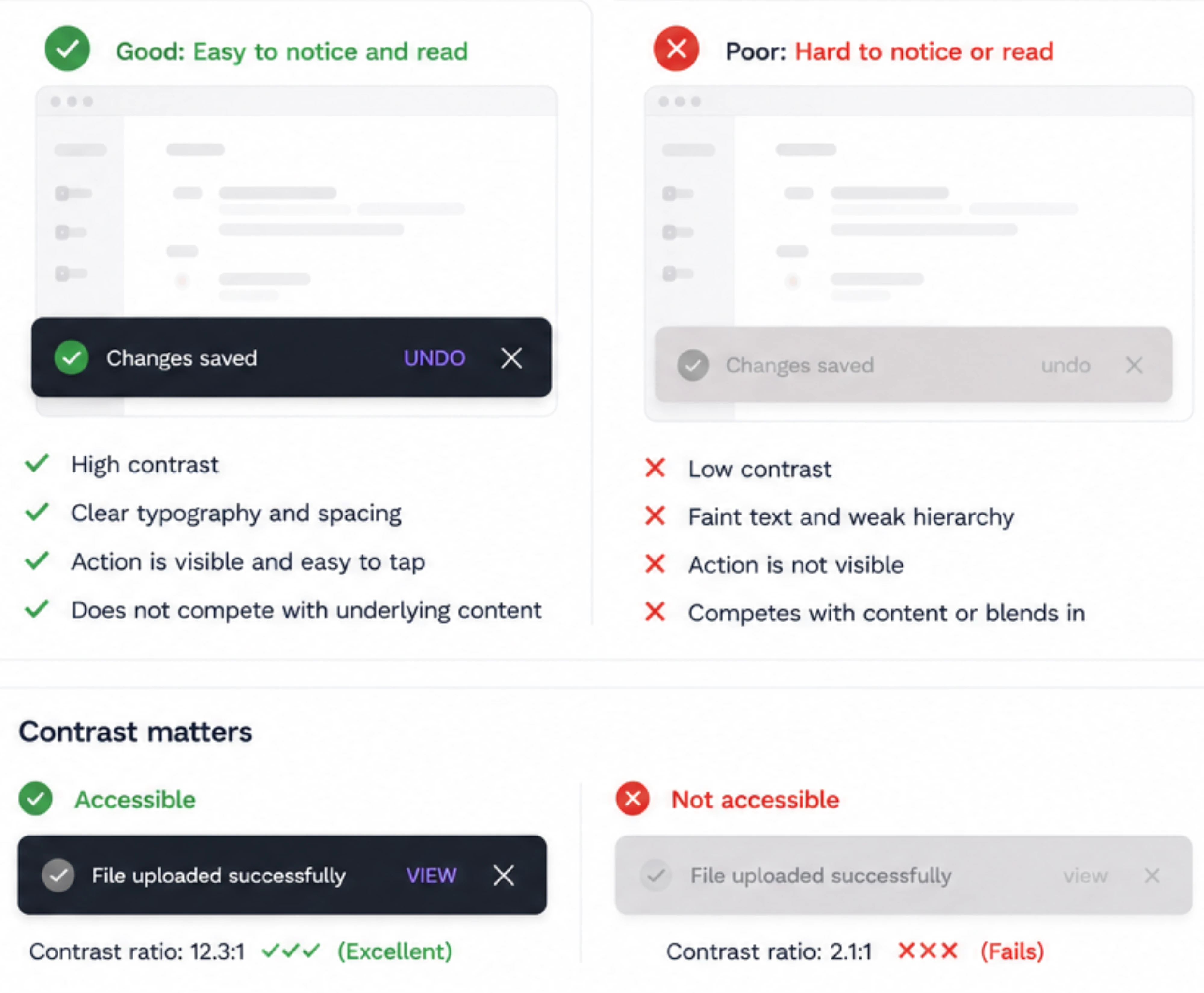
Good snackbar accessibility relies on:
- strong contrast,
- clear typography,
- readable spacing,
- and visible action buttons.
If users need to struggle to notice or read the message, the feedback fails its purpose entirely.
Ultimately, accessible snackbar UX is really about respecting user attention and different interaction needs — not just following technical guidelines.
Common snackbar UX mistakes
Snackbar UI seems simple, but small mistakes can quickly turn lightweight feedback into distraction or confusion.
Disappearing too fast
One of the most common issues is timing that feels rushed.
If users can’t read the message or react to an Undo action comfortably, the snackbar stops being helpful and starts creating anxiety instead.
Showing too many snackbars
Too much feedback creates notification fatigue.
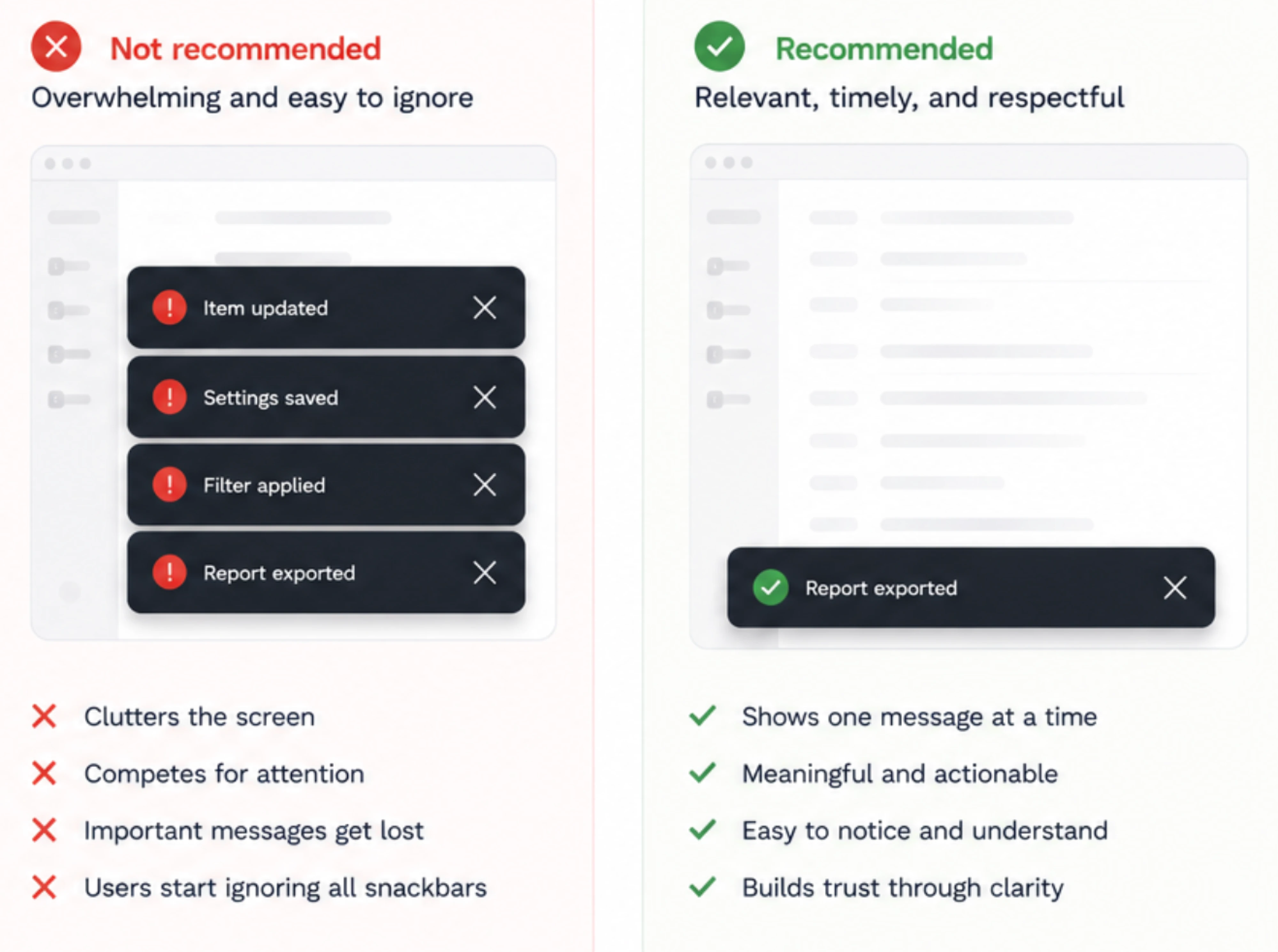
When products constantly stack snackbars for every small action, users eventually stop noticing them altogether. Good feedback systems prioritize signal over noise.
Using snackbars for critical alerts
Temporary, low-visibility messaging should never carry high-stakes information.
Security warnings, payment failures, or destructive irreversible actions need stronger UI patterns with higher visibility and persistence.
Writing vague copy
Messages like:
- “Success”
- “Something went wrong”
- “Action failed”
don’t tell users anything meaningful.
Strong snackbar copy explains clearly:
- what happened,
- and sometimes what users can do next.
Making Undo the only recovery path
Undo patterns work well, but they shouldn’t become the only safety mechanism in the product.
If users miss the snackbar entirely and there’s no alternative recovery flow, the UX becomes fragile very quickly.
Confirming every action unnecessarily
Some products overcorrect by combining confirmations and snackbars for everything.
That usually creates slower workflows without improving trust. If an action is low-risk and reversible, lightweight feedback is often enough on its own.
Final thoughts: good feedback should feel effortless
The best snackbar UI patterns do something deceptively difficult: they communicate clearly without becoming disruptive.
That’s why snackbars work so well in modern products. They preserve flow, reduce unnecessary confirmations, and give users lightweight reassurance that the system is responding as expected. When paired with thoughtful patterns like pressing Undo, they can even make products feel faster and safer at the same time.
But snackbars only work when they’re used intentionally. Too many notifications create noise. Poor timing creates frustration. And using snackbars for the wrong kind of feedback weakens trust instead of improving it.
At the end of the day, snackbar UX is really about attention management — deciding what deserves interruption, what should stay lightweight, and how products can communicate without overwhelming users.
The best snackbar is the one users notice immediately and forget seconds later.
At Eleken, we help SaaS teams apply strong UI UX design principles across complex products — creating customized interfaces that feel clear, responsive, and easy to trust at every interaction point user takes. If you’re aiming to make your product experience feel more intuitive and less noisy, you know where to find us.


.webp)