

Ask a designer what they're building, and they'll say "a design system." Ask a developer, and they might say "a component library." They often mean the same thing, but they shouldn't.
From our experience at Eleken, that confusion is expensive. Some teams spend months building a full design system when a component library would have solved the problem. Others stop at a component library, only to watch it break down as the product, team, and codebase grow.
Teams often treat these terms as interchangeable. They aren't, and choosing the wrong approach can waste months of work or create years of design debt.
Here's the difference:
- Component library: packages that define the language into reusable UI components.
- Design system: combines both with documentation, standards, and governance so multiple teams can build consistently.
- Style guide: defines the visual language.
Let's look at each one in more detail.
What a component library is
A component library is a collection of reusable UI components that designers and developers use to build interfaces faster. Think buttons, inputs, cards, tables, modals, dropdowns, tabs, tooltips, and other interface building blocks.
Its purpose is simple: reuse rather than rebuild. Instead of creating a button from scratch for every feature, teams build it once and use the same component everywhere. That improves consistency, reduces duplicate work, and makes updates much easier. Change the primary button in one place, and every screen using it stays in sync.
A component library follows design decisions; it doesn't make them. It implements your colors, typography, spacing, and interaction patterns, but it doesn't define those standards or explain when they should change.
That's also its biggest limitation. A component library is only one part of a design system. It doesn't include design principles, documentation, governance, accessibility guidelines, or the processes that keep components evolving as the product grows. Without those, even the best library eventually diverges as teams add variations, duplicate components, and inconsistent design patterns.
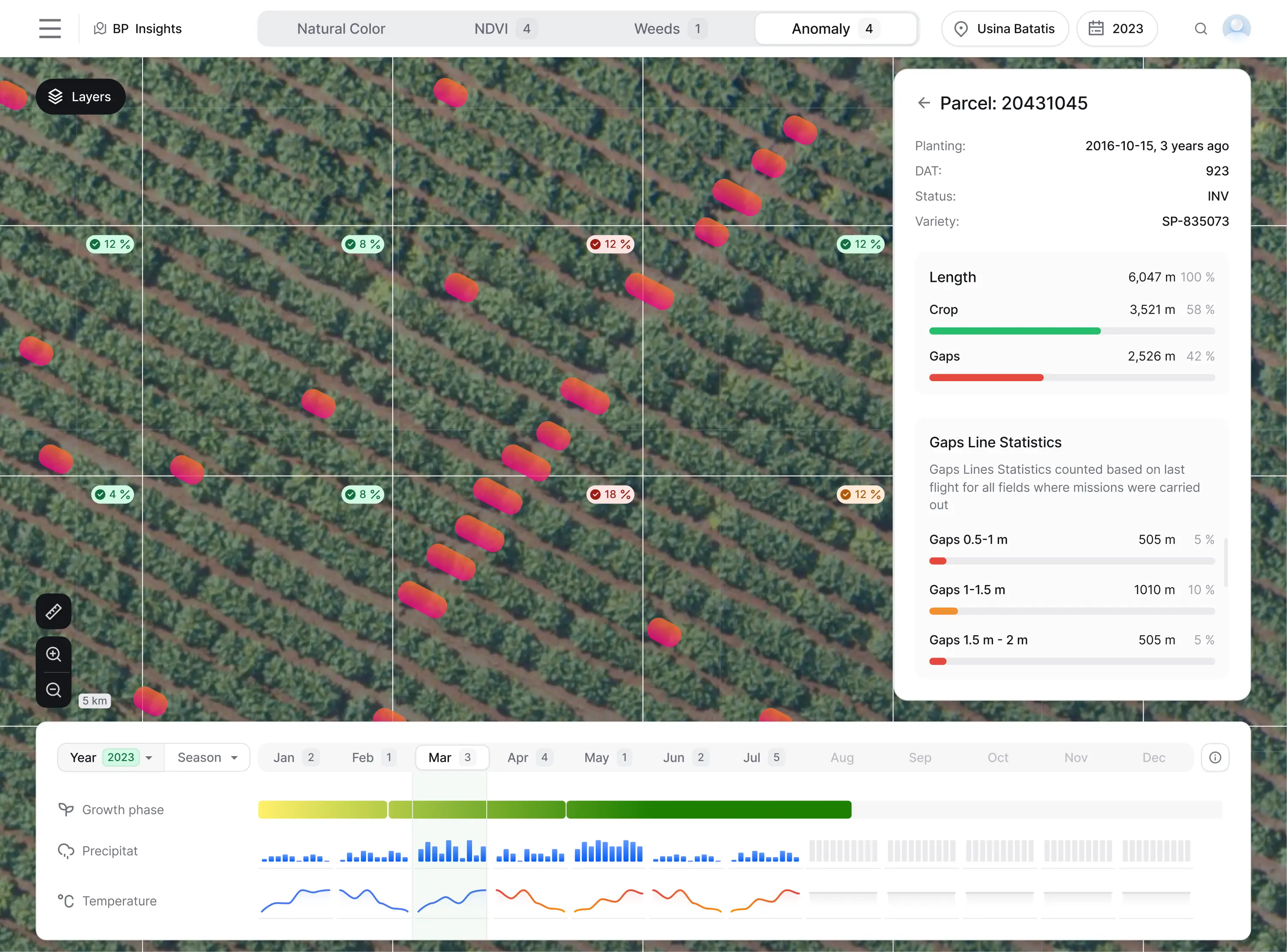
Gamaya is a good example. The product was built with React and used Ant Design, a popular component library. Instead of designing custom UI that developers would have to recreate from scratch, Eleken adapted the designs to Ant Design's existing components wherever possible. We also created a matching UI kit, documented how each design mapped to Ant Design, and walked the engineering team through implementing more complex components. The result was faster development, less custom frontend work, and a more consistent interface.
If you want the deeper version of this layer, here's what a UI kit is and how it fits.
What a design system is
A design system is a shared framework for designing and building products consistently at scale. It includes everything the entire design team needs to create and maintain interfaces: design principles, design tokens, UI components, interaction patterns, documentation, accessibility standards, and the governance that keeps them up to date.
Unlike a component library, a design system doesn't just provide reusable UI. It defines how and why those components should be used. It gives designers and developers a shared source of truth, making it easier for multiple teams to build consistent experiences across products and platforms.
Just as importantly, a design system is never finished. As products evolve, teams add new components, refine existing ones, and update documentation. Without ongoing maintenance, even the best-designed system quickly becomes outdated.
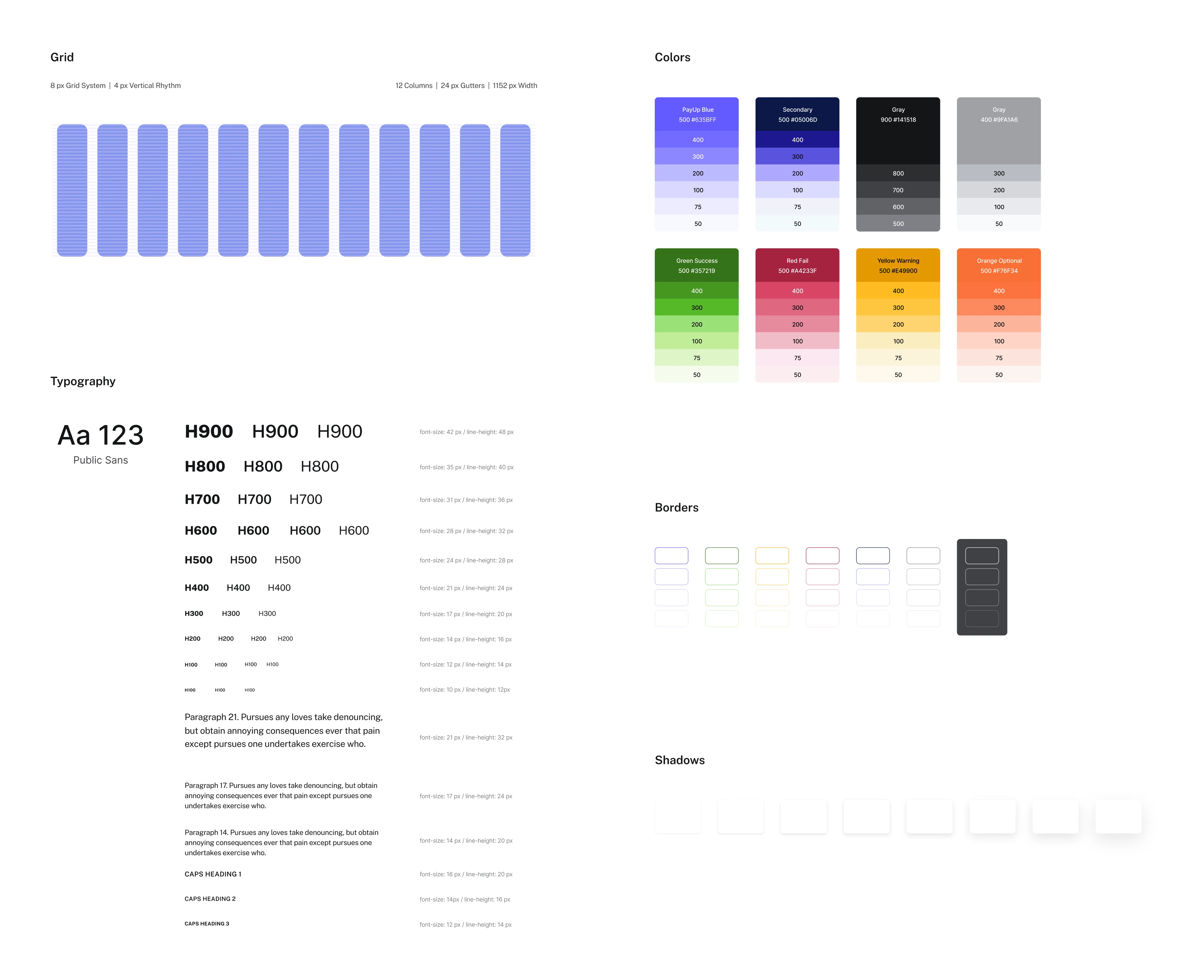
PayUp is a good example. One of the client's goals was to make the product easy to scale, so we built a design system that could evolve alongside it.
Rather than treating the UI kit as a one-time deliverable, we continuously expanded it with new components throughout the project. That made updates faster, reduced implementation errors, and gave both designers and developers a consistent foundation for future features.
One common misconception is that a design system has to be coded. It doesn't. While many mature systems include production-ready components, the real value comes from the shared standards, documentation, and governance that keep design and engineering aligned.
If you want to learn more about design systems, watch the video below:
For a broader take, here's how we think about design systems and the UX side of a design system.
What is a style guide?
A style guide is the visual foundation of your product. It defines how your brand should look, not how it should be built.
A typical style guide includes:
- colors
- typography
- spacing
- iconography
- imagery
- illustrations
- logo usage
- brand voice
- accessibility basics
Unlike a component library, it doesn't contain reusable UI components. And unlike a design system, it doesn't define interaction patterns, documentation, or governance.
Think of it as the first layer. A style guide tells you what your product should look like.
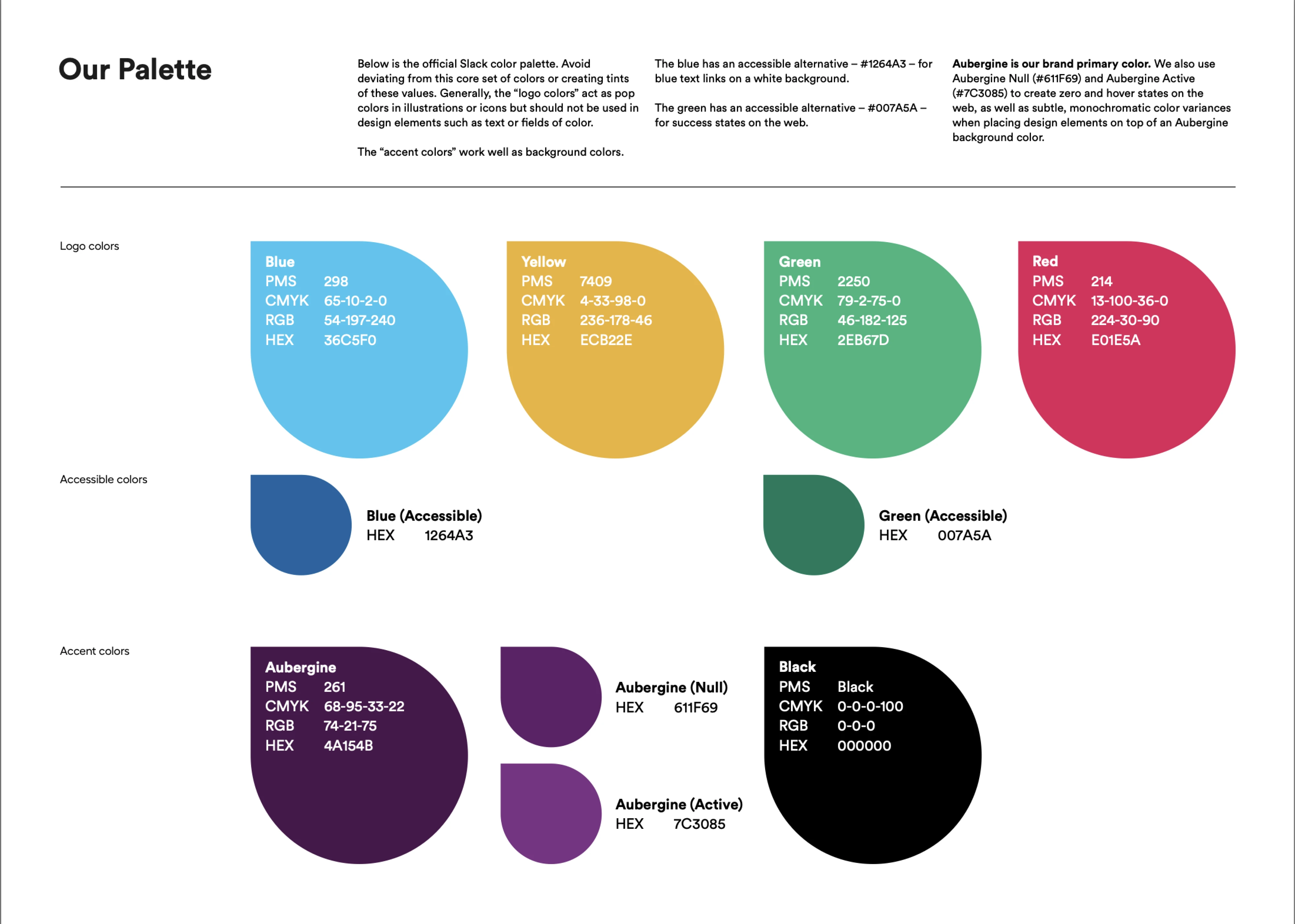
For example, Slack public brand guidelines define how the company's visual identity should be used, covering colors, typography, logo usage, illustrations, and voice and tone. Those guidelines ensure that every product screen, marketing page, and customer touchpoint looks and sounds like Slack, even before a single UI component is created.
Design system vs. component library: the differences that matter
Both help teams build consistent products, but they solve different problems. Here is component library vs design system difference:
- A component library helps you build interfaces faster. It gives designers and developers reusable UI components instead of rebuilding the same button, modal, or table over and over.
- A design system helps your entire organization build consistently. It defines the standards behind those components, documents how they should be used, and establishes the process for evolving them as your product grows.
The easiest way to think about it is this: a component library is one of the building blocks of a design system, not a replacement for it.
Here's how they compare:
The distinction matters because it changes what you should invest in. If your goal is shipping features faster, a component library may be all you need. If you're supporting multiple teams, products, or brands, a design system becomes the better long-term investment.
The next question is the one most teams struggle with: when is a component library enough, and when is it time to build a design system?
Worth noting: this is also where designer–developer collaboration either holds up or quietly breaks.
Why component libraries drift, and design systems don't
A component library can start perfectly organized. Every button, input, and modal follows the same patterns. But visual consistency isn't something you build once; it's something you maintain.
Here's how drift begins. A team needs a small exception, so they duplicate a component instead of updating the original. Another team changes the spacing to solve a one-off problem. Someone creates a second "primary button" because it's faster than proposing a new variant. Repeat that dozens of times, and the library slowly fills with near-identical components that all solve the same problem differently.
A design system exists to prevent that.
It defines who owns components, how changes are reviewed, when new variants should be added, and how updates are documented. Design tokens ensure colors, spacing, typography, and other foundations stay synchronized across every component. Instead of everyone creating their own solution, the system provides one shared source of truth.
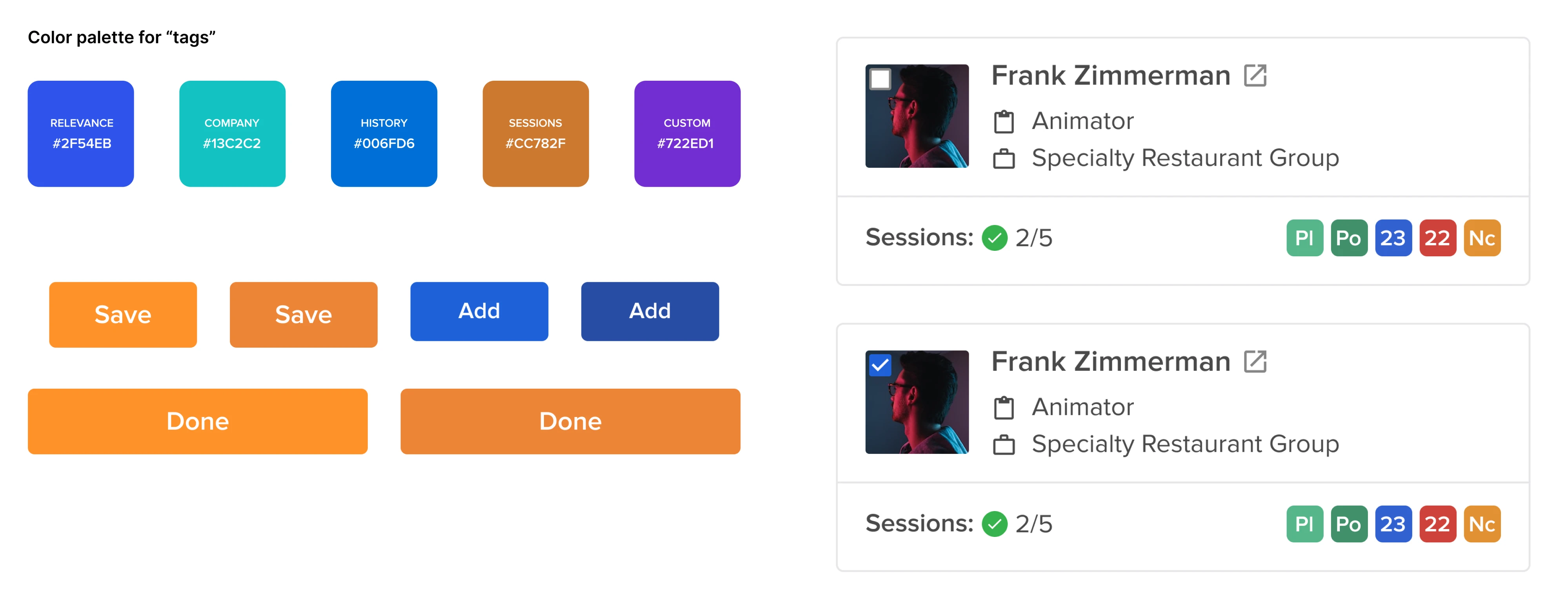
Sessionboard illustrates what happens without those guardrails. Before Eleken redesigned the product, there was no design system in place. Components and visual styles had evolved independently over time, leaving similar screens with different patterns and inconsistent interactions. We established shared foundations, standardized reusable components, and documented them for both designers and developers, turning a growing collection of UI design elements into a coherent system.
Clean Figma-to-developer handoff helps, but handoff alone won't stop drift without ownership behind it.
That's the real difference between a component library and a design system. A component library gives teams reusable components. A design system gives those components a process for staying consistent as the product evolves.
In other words, components don't drift on their own. Teams drift. A design system keeps everyone moving in the same direction.
When is a component library enough?
Not every product needs a design system. In fact, building one too early can slow your team down without delivering much value.
A component library is usually enough if:
- You're building a single product with one design and engineering team.
- Your UI is relatively stable, with no plans for multiple brands or platforms.
- Your priority is shipping features quickly, not standardizing processes across teams.
- A lightweight set of reusable components solves most consistency problems.
This is often the right approach for early-stage SaaS startups, MVPs, and internal tools. You get the biggest benefit, such as faster design and development, without the overhead of governance, extensive documentation, or maintaining a full system.
A good rule of thumb is to ask one question: Will this product outgrow the library in the next year? If the answer is no, don't build a design system yet. Build a solid component library instead. You can always evolve it later as your product, team, and design needs become more complex.
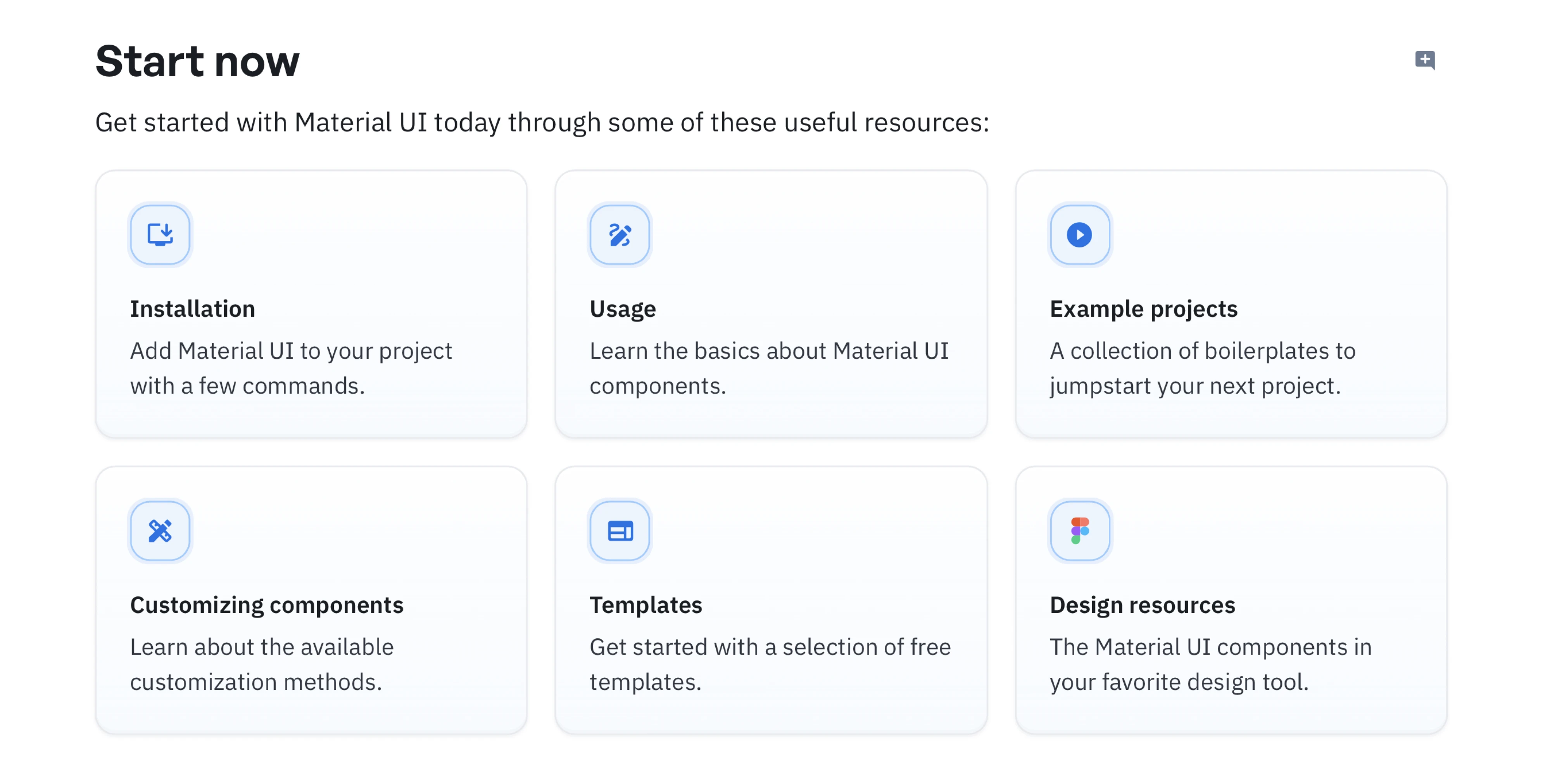
In its early growth stage, Zip, the procurement SaaS company, focused on building a robust internal component library instead of investing in a full design system. The engineering team standardized on Material UI, wrapped only the components they needed, and reused them more than 1,000 times across the product. This gave them the consistency and development speed they needed without the overhead of creating and maintaining a comprehensive design system. Only as the product, team, and codebase grew did broader design system concerns become a priority.
When do you need a design system?
A component library gets you far, but eventually you outgrow it.
The biggest trigger is organizational scale. If multiple designers and developers are building across different products, teams, or platforms, reusable components alone won't keep the experience consistent. You need shared standards for colors, typography, spacing, accessibility, interactions, and documentation so everyone builds the same way.
Another sign is recurring design debt. If you keep asking questions like:
- Which button variant should we use?
- Why do these two products solve the same problem differently?
- Why does every new feature introduce another UI pattern?
...you're no longer missing components. You're missing a system.
A design system also becomes a worthwhile investment when you're planning to:
- launch multiple products or brands;
- support web, mobile, and other platforms;
- onboard new designers and developers regularly;
- scale the product without redesigning the same UI over and over.
Let’s take Datawisp as an example. As Eleken redesigned the product, we built a design system that standardized the interface and made complex workflows feel much simpler. User feedback shifted from "this looks complicated" to "this looks easy." Instead of solving the same design problems feature after feature, the team could focus on improving the product itself.
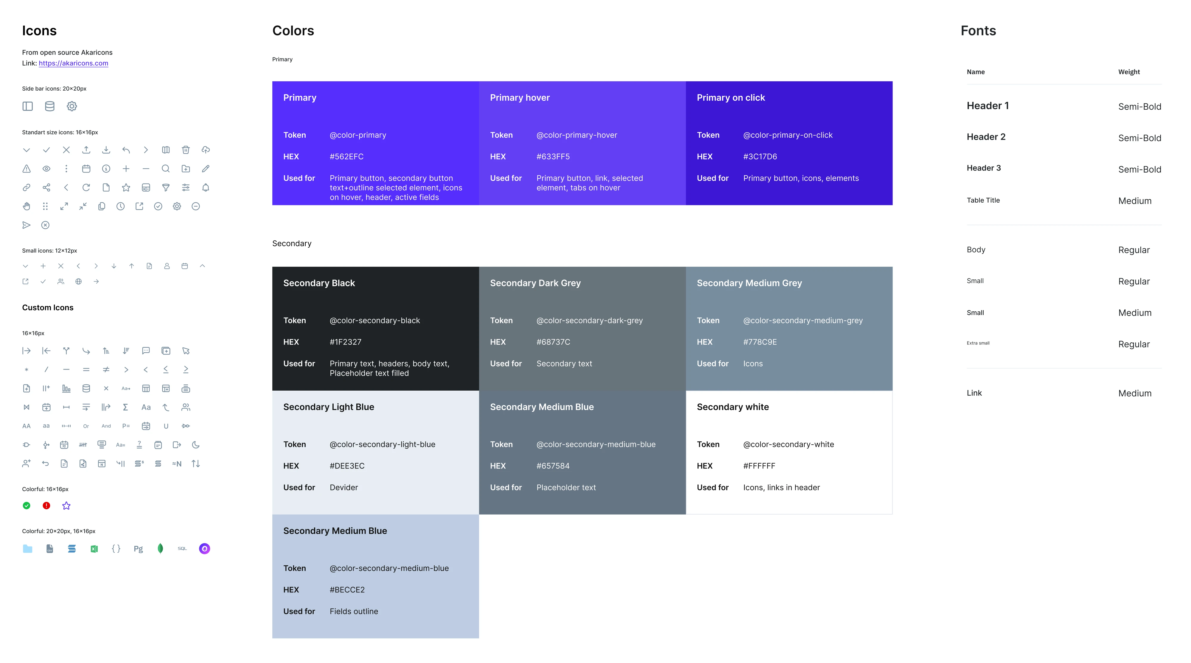
That's the real return on a design system. It makes every future feature faster to design, build, and maintain.
Want a deeper look at how systems pay off for complex products? This is a solid primer: Design Systems: The Secret Weapon for Complex Products.
If scale, multi-brand needs, or mounting design debt describe your situation, a system is overdue, and it's worth understanding what design system services cover before you commit.
What comes with a design system?
Building a design system isn't just creating more components. It's committing to maintaining a shared product that your entire team relies on.
A mature design system typically includes:
- Design foundations: colors, typography, spacing, icons, motion, and accessibility standards.
- Design tokens: reusable values that keep design and code synchronized.
- A component library: reusable UI components for designers and developers.
- Reusable patterns and usage guidelines: recommendations for solving common UX problems consistently.
- Documentation: clear guidance on when and how to use every part of the system.
- Governance: defined ownership, review processes, versioning, and a roadmap for future changes.
You don't need all of this on day one. In fact, trying to build everything upfront is one of the fastest ways to stall a design system. Start with the foundations and the components your team uses most often. As your product and organization grow, expand the system alongside them.
From what we see, the hardest part is getting people to use it. That requires clear ownership, regular maintenance, documentation that stays up to date, and a feedback process that lets teams propose improvements instead of creating one-off solutions.
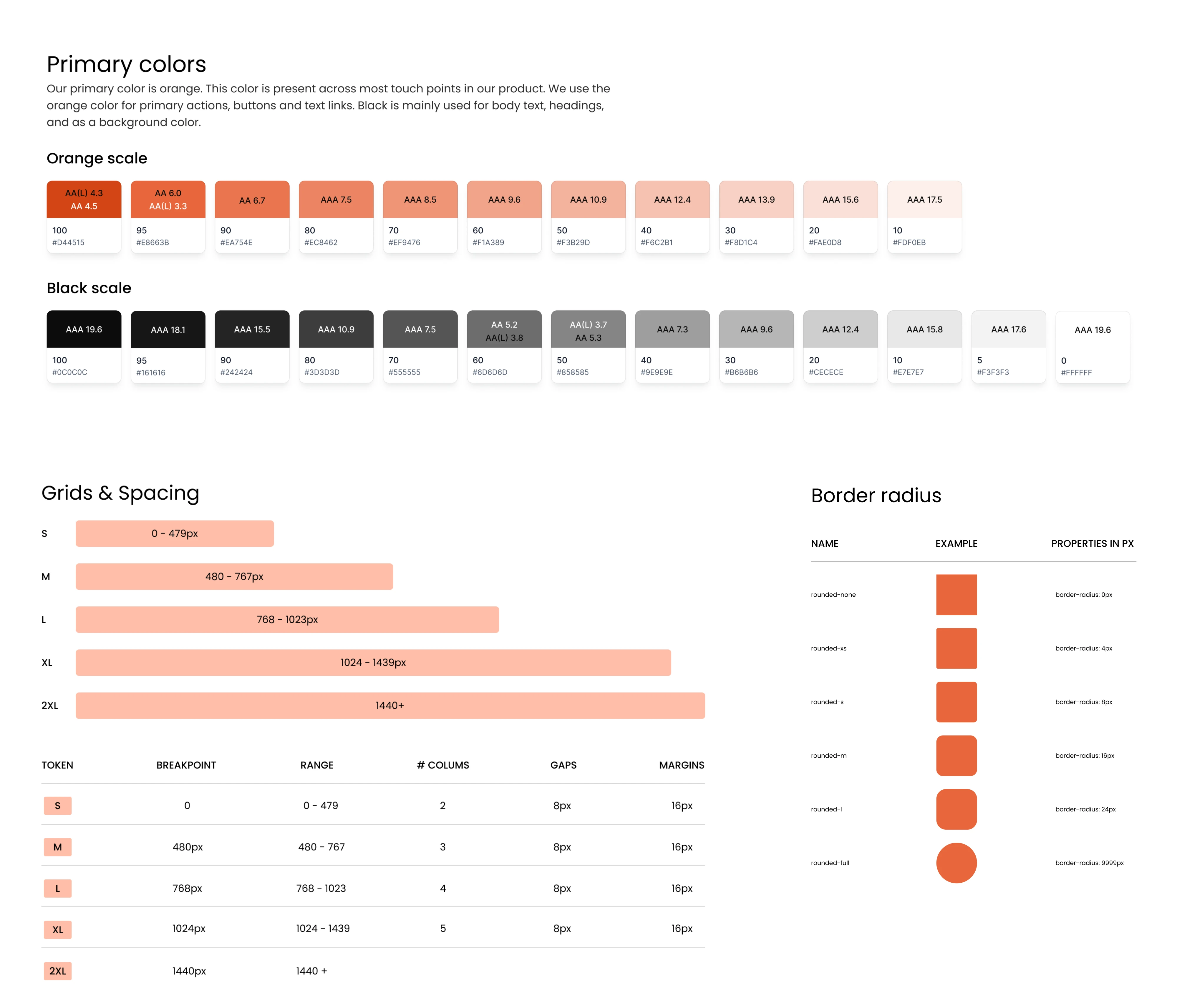
Newton360 shows what a mature design system looks like in practice. When Eleken joined the project, there was no design system at all. We built one from the ground up, starting with the foundations, such as colors, typography, spacing, and tokens, before expanding it with reusable components, light and dark themes, accessibility guidelines, and detailed documentation.
Every component referenced shared design tokens, so a single update to a color or border radius automatically propagated across the product. Developers could export the same tokens into code, while comprehensive documentation covered anatomy, behavior, use cases, naming conventions, and WCAG requirements. Instead of redesigning and reimplementing the same UI repeatedly, the team had a shared foundation that made both design and development faster as the product evolved.
If you're at this stage, it helps to know how to create a design system and which design collaboration tools keep the whole thing moving.
So, which one does your product need?
The answer depends less on your company size than on your product's complexity.
If you're building a single product with one team, a well-structured component library will probably take you a long way. If you're scaling across products, platforms, or teams, you'll eventually need the governance, documentation, and shared standards that only a design system provides.
The important thing is to build only what solves today's problems. Start with reusable components. Add design tokens, documentation, and governance when your product outgrows them. That's how most successful design systems evolve.
One thing hasn't changed, even in the age of AI. Claude, v0, Lovable, and other AI tools can generate interfaces in minutes. They can't guarantee those interfaces stay consistent as your product grows. The faster teams ship, the more valuable a shared system becomes.
If you're not sure where your product falls, that's what we help with at Eleken. We've designed and scaled design systems for SaaS products ranging from early-stage startups to enterprise platforms. Whether you need a lean component library or a complete design system, we'll help you build only what's necessary, without overengineering the solution.



.webp)