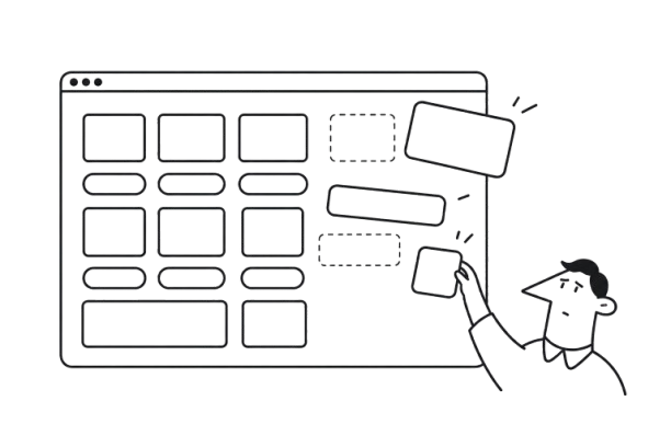


A feature can pass QA and still feel off when you open it on staging. The spacing is tighter than in Figma, a button has a different border radius, or a familiar component behaves differently on another page. Everything works, but the interface has lost some of the consistency of the approved design.
With a release approaching, these differences are easy to leave for later. A hardcoded color or a local styling fix may seem like a reasonable compromise, especially when it doesn’t prevent anyone from completing a task. Over successive sprints, though, new work builds on those compromises.
This is design drift: small gaps between design intention and implementation that accumulate over time. As they spread, a functional product can start to feel patched together, less predictable, and harder to trust.
The causes extend beyond how closely developers follow Figma. Design-to-development gaps, missing component states, local overrides, and unclear ownership can all create room for inconsistencies—even when everyone is making reasonable decisions under deadline pressure.
In this article, we’ll explore how design drift develops, which warning signs to look for, and how design systems, design QA, clearer ownership, and automated checks can help teams catch inconsistencies before they spread across the product.
What is design drift?
Design drift is the gradual, unplanned gap between how a product is intended to look and behave and what actually gets implemented and shipped. It rarely happens all at once. Instead, small deviations accumulate sprint after sprint until the interface no longer fully follows the system the team originally designed.
A single deviation might seem harmless:
- 8px spacing becomes 12px;
- a button gets a slightly different border radius;
- the wrong font weight is used;
- a design token is replaced with a hardcoded hex value;
- a developer creates a new component variant instead of reusing an existing one.
One exception won’t ruin a product. The problem starts when that exception gets copied into the next feature, another team introduces its own variation, and nobody goes back to reconcile them.
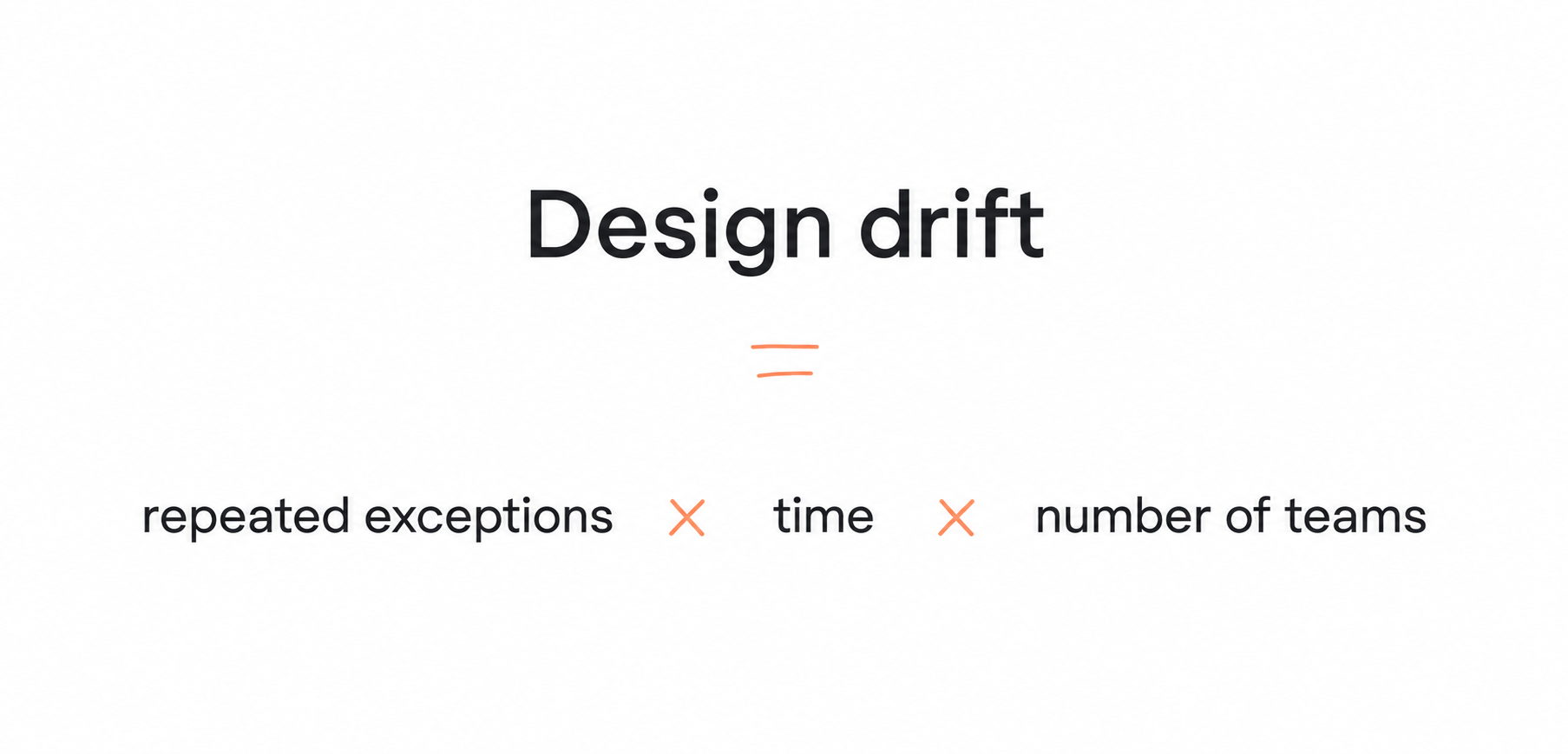
A simple way to think about it is: Design drift = repeated exceptions × time × number of teams.
As these inconsistencies accumulate, they create design system debt: differences the team will eventually need to document, prioritize, and resolve. One Reddit commenter puts the practical response this way:
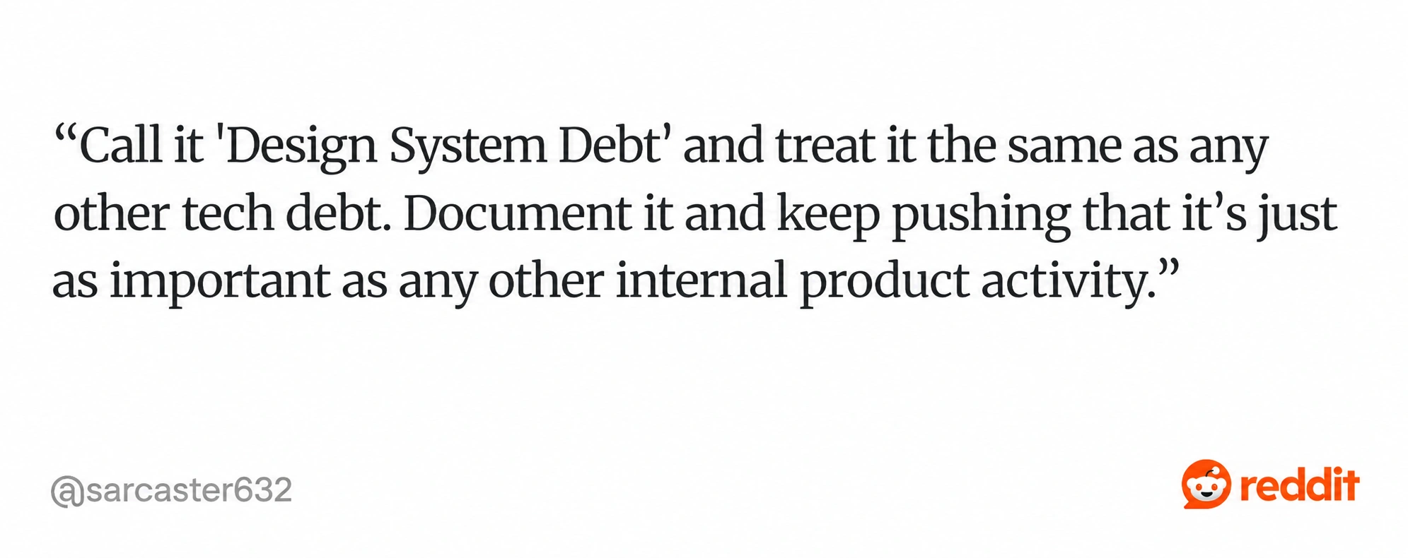
The point is to give these inconsistencies a place in the team’s backlog. If they remain minor visual issues that someone will fix “later,” they can keep spreading while new features take priority.
Design drift often develops unnoticed. Technical debt can be an intentional compromise: the team knowingly chooses a faster technical solution and plans to improve it later. With design drift, nobody decides that the product should become inconsistent; small implementation differences simply become part of the product before anyone notices the pattern.
Eventually, the result is familiar: the software works, but somehow it feels patched together. Individual inconsistencies may be difficult for users to name, yet together they weaken the sense that they're interacting with one coherent product.
Sessionboard is a good example of how this can happen in a real SaaS product. The platform had inherited UI from its legacy tool, Lend, but didn't have a unified design system to hold everything together. As a result, styles and components varied from page to page.
Instead of treating those differences as isolated visual fixes, at Eleken we focused on stabilizing the underlying design foundation.
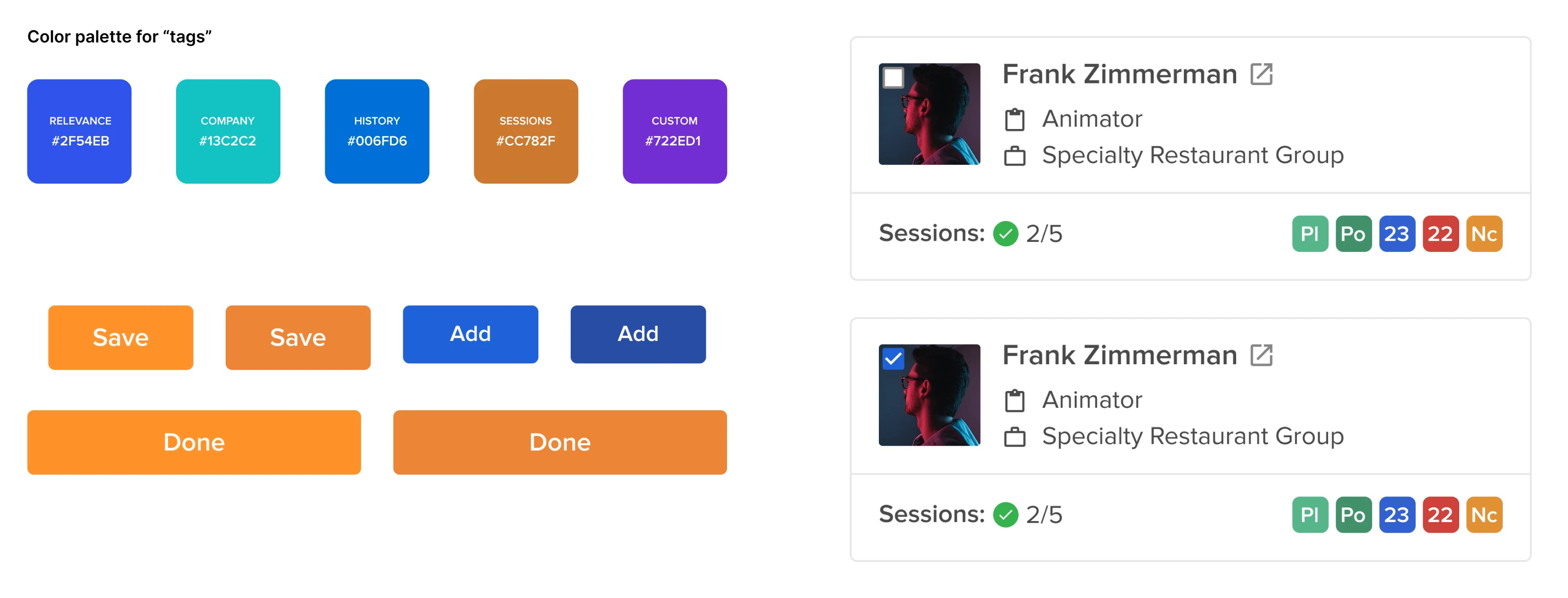
This gave the team a consistent base to build on without requiring an immediate full-product redesign.
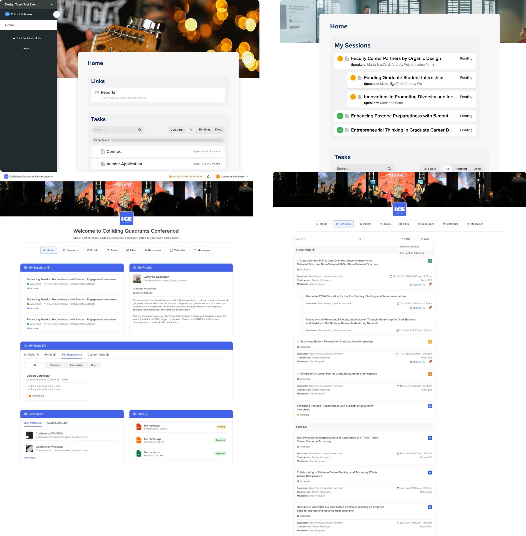
And usually, that drift starts much earlier than teams realize — somewhere between design, handoff, implementation, and approval.
How does UI design drift actually happen?
Design drift usually doesn't begin with someone deliberately ignoring the design system. It starts with a small interpretation or compromise somewhere between the design process and production.
Imagine a typical feature moving through the team:
Designer specifies → developer approximates → PM checks functionality → QA tests functionality → visual mismatch ships → future work copies it
The developer might approximate a value because the specification isn't clear. The PM sees that the feature works and approves it. QA verifies the expected behavior but doesn't compare every visual detail with Figma. The difference reaches production.
Then it stops looking like a mistake; it becomes precedent.
A developer working on the next feature may reuse that implementation because it's already in the codebase. What started as one slightly incorrect component can gradually become the pattern other screens follow.
Handoff creates the first opportunity for drift
Moving ideas from Figma into production-ready code requires interpretation. If responsive behavior, component states, spacing rules, or tokens aren't clearly defined, developers have to fill in the gaps themselves.
This transition is where the design implementation gap often begins: the design communicates the intended result, but the code has to account for all the states and constraints required to make that result work in a real product.
Production adds another layer
Even a careful initial implementation doesn't stay untouched. After launch, teams introduce:
- hotfixes;
- A/B test variations;
- responsive adjustments;
- inline styles and local overrides;
- hardcoded spacing or colors;
- new component variants and forks.
Each decision may be reasonable in isolation. The problem appears when those exceptions aren't brought back into the design system.
Over time, the source of truth becomes unclear. Figma says one thing, the component library another, and production contains several variations of both.
Sometimes these warning signs show up in surprisingly small details. Aampe, an AI-powered customer engagement platform, had inconsistent menu icon styles, while some section names didn't clearly match the content users found inside.
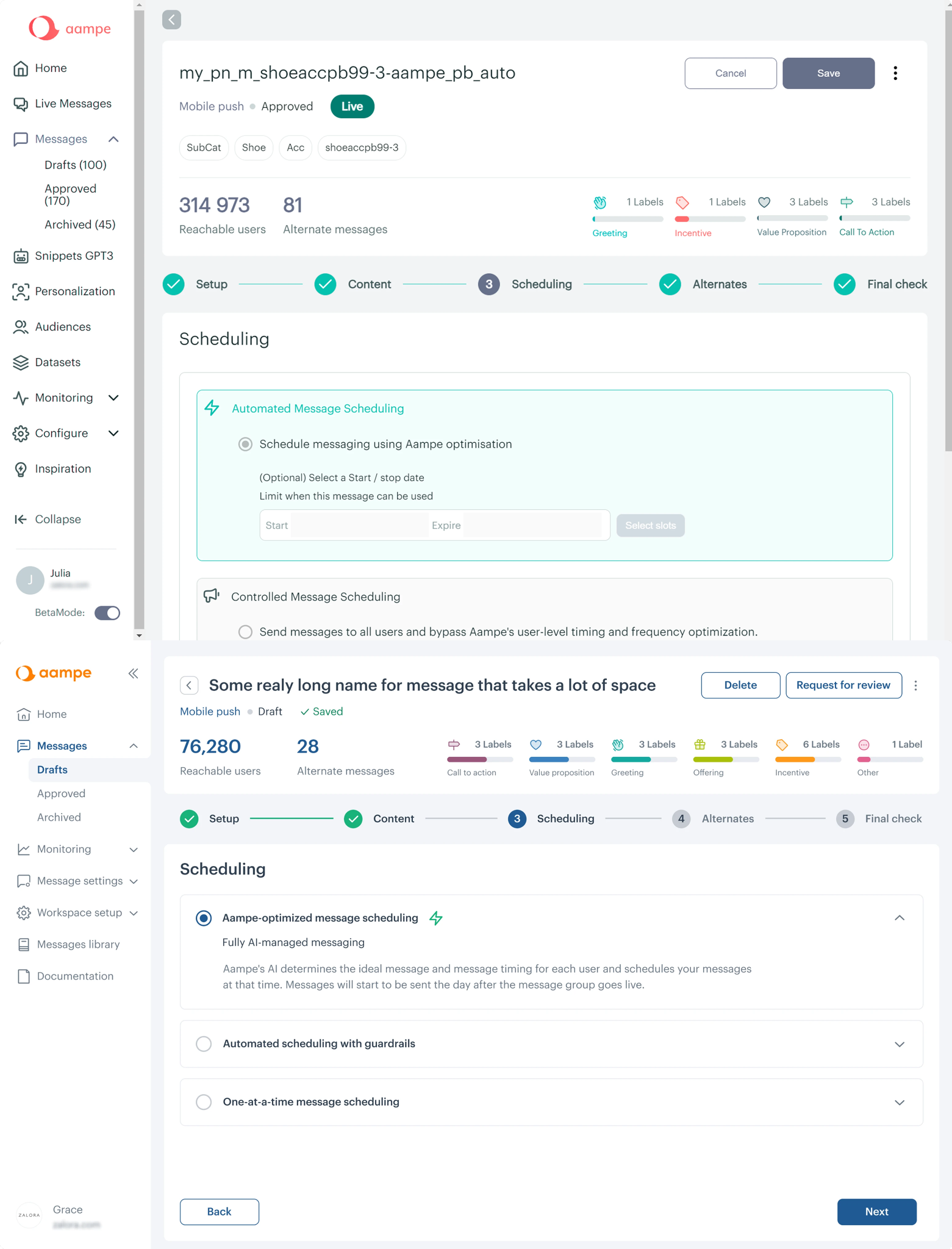
Eleken standardized the icons with a uniform set and reworked the menu hierarchy so navigation communicated the product structure more clearly. The value went beyond visual cleanup: users got more predictable navigation, while the team gained a more consistent pattern to follow as the interface evolved.
That's why design drift is rarely one person's mistake. It's usually the result of small decisions moving through a workflow without a feedback loop to bring them back into alignment.
What does design drift cost the business?
Design drift can look like a visual-polish problem, but its effects don't stay inside the design team. As inconsistencies accumulate, they create more implementation work, longer review cycles, and a product experience that's harder for users to trust.
More development and rework
Every unnecessary component variant adds something else the team has to maintain. Developers spend time deciding which version to reuse, fixing duplicate patterns, and working around local overrides that shouldn't exist in the first place.
Instead of building the next feature, part of each sprint goes toward correcting decisions inherited from previous ones, leaving less time for new product work.
Slower QA and delivery
An inconsistent interface also creates more things to check. When similar components behave differently across the product, QA has more edge cases to account for, while designers and developers can end up in repeated cycles of visual fixes.
The result is a frustrating paradox: shortcuts taken to ship faster can make future releases slower.
A less trustworthy product experience
Users don't need to understand your design system to notice when it isn't working.
If navigation patterns change between pages, similar actions look different, or familiar components behave unpredictably, users have to relearn parts of the interface as they move through the product. The software may still function, but it can feel less polished and coherent.
This is why accumulated UI inconsistency shouldn't be dismissed as cosmetic debt. The cost eventually appears elsewhere: in rework, QA effort, support issues, slower onboarding, and weaker confidence in the product.
The good news is that teams don't have to wait for a redesign to discover the problem. Design drift usually leaves recognizable warning signs long before it reaches that point.
What are the warning signs of design drift?
Design drift becomes much easier to control when you catch it before inconsistencies spread across dozens of screens. The challenge is that teams often get used to small differences and stop seeing them as symptoms of a larger problem.
A few warning signs are especially revealing:
- “It looks different on staging” keeps coming up. Visual differences between the design and implementation have become routine rather than exceptional.
- The same visual bug appears in multiple places. Fixing one instance doesn't solve the underlying component or token problem.
- Designers stop reviewing builds. The gap has become large enough that reviewing every mismatch feels impractical.
- Figma says one thing and the CSS says another. Nobody is sure which implementation represents the current source of truth.
- Similar components have multiple variants. Buttons, inputs, tables, or menus look almost identical but use slightly different styles.
- The interface works but feels unpolished. Individual screens may be acceptable, yet the product as a whole lacks continuity.
Turn “something feels wrong” into something measurable
At a smaller scale, a visual review may be enough to uncover UI design drift. As the product grows, teams need clearer signals to manage inconsistencies before they spread.
You can start tracking metrics such as token compliance rate, number of component variants, percentage of pages that are off-spec, component reuse, and hours spent each sprint correcting visual issues.
These measurements change the conversation. Instead of saying, “The UI feels inconsistent,” a team can identify where the design inconsistency is concentrated and how much effort it creates.
BookPeep shows why looking for patterns matters. As the product gained features, its navigation became harder to follow, content was duplicated on the home screen, and some dropdowns diverged from established Material conventions.
Rather than treating the experience as vaguely “inconsistent,” Eleken could identify concrete places where the interface had lost coherence and address those patterns directly.
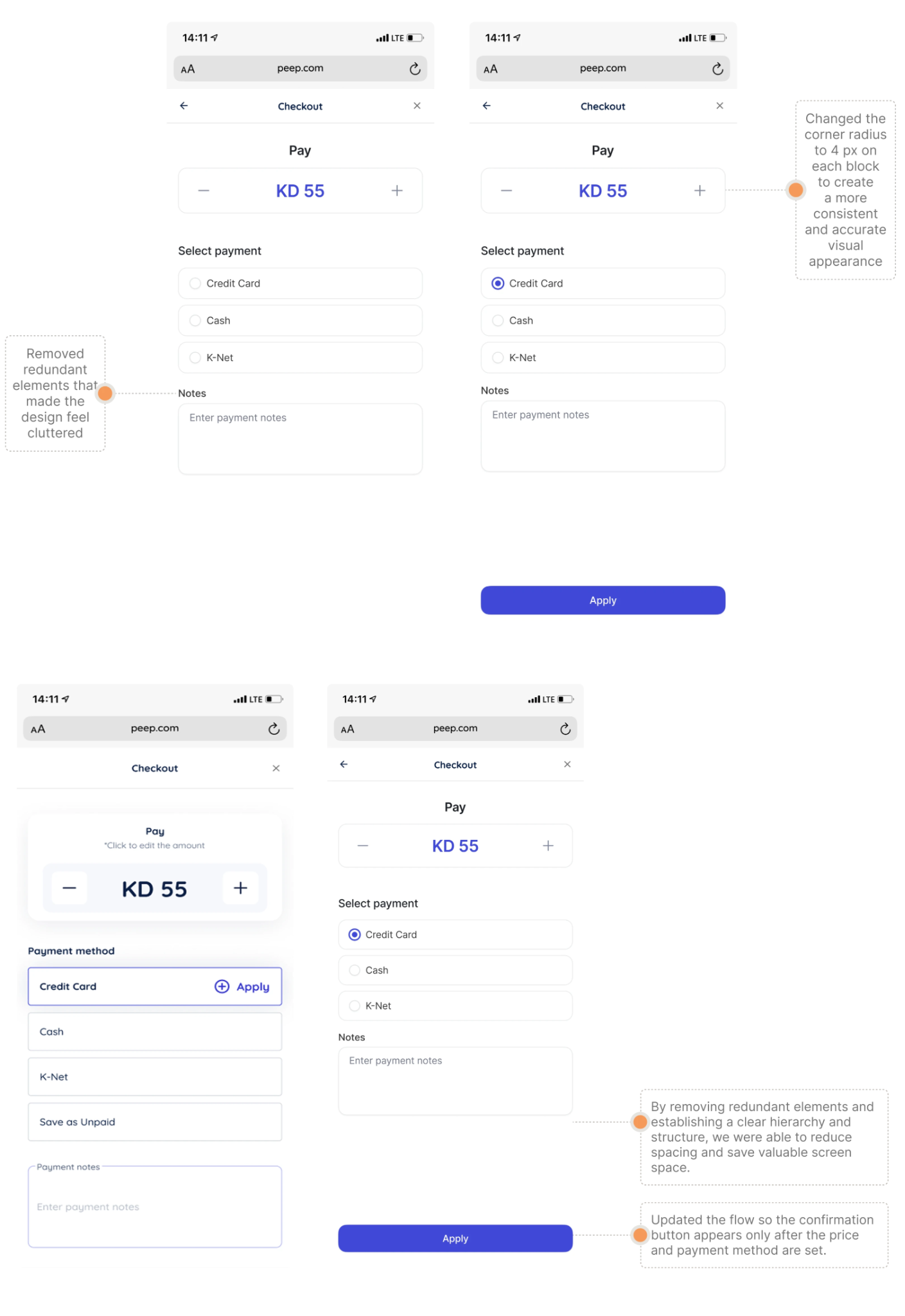
The result is a much more actionable starting point than assuming an entire product needs to be redesigned.
And once drift becomes measurable, the next question is how to keep it from accumulating in the first place. That's where a well-maintained design system becomes particularly valuable.
How do design systems prevent drift?
A design system is the first line of defense against design drift because it reduces the number of decisions teams have to make from scratch.
Instead of deciding how every button, input, table, or notification should look each time it appears, designers and developers work from shared components, tokens, and patterns. The fewer opportunities there are for interpretation, the fewer opportunities there are for inconsistency.
But having a component library isn't enough. A design system needs several layers working together:
- Design tokens define values such as colors, spacing, typography, and radius.
- Components use those values to shape reusable interface elements
- Pattern libraries explain how components work together in common flows.
- Governance determines how components change and when new variants are justified.
- Documentation gives designers and developers the same reference point.
Build consistency into the token structure
One useful approach is a three-layer token model: Primitive tokens → semantic tokens → component tokens
Primitive tokens contain raw values. Semantic tokens describe their purpose. Component tokens apply those decisions to specific interface elements.
That structure makes changes easier to control. Instead of finding every screen where a particular hex value was hardcoded, a team can update the relevant token and propagate the change through the system.
The same principle can extend across web, iOS, Android, and other product touchpoints: teams use one shared foundation instead of recreating styling decisions for every platform.
Make the system easier to follow than to bypass
Tools such as Figma, Storybook, shadcn, and token scanners can help connect design decisions with implementation. Versioning and approved component variants also make it clearer which patterns developers should use.
But tools only support design system consistency when teams actually maintain the relationship between them. If Figma contains the latest component while production uses an older one, or developers regularly bypass tokens with local overrides, the system itself starts drifting.
The goal isn't to prevent every exception. It's to make approved patterns obvious and exceptions visible.
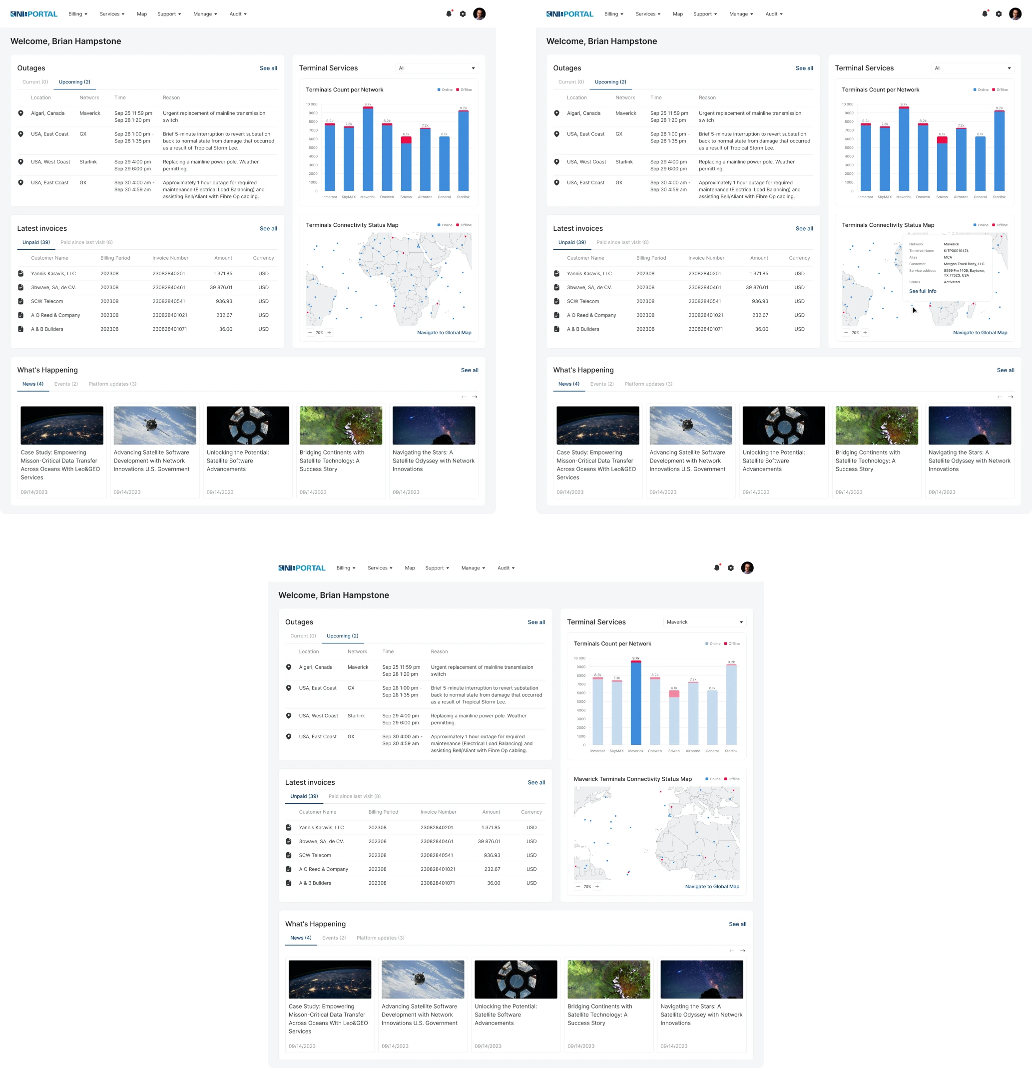
A similar approach helped Network Innovations, a legacy software platform with UI patterns reused across multiple modules. Elements such as tables appeared throughout the product, but they lacked the consistency and polish needed to make those modules feel like parts of the same system.
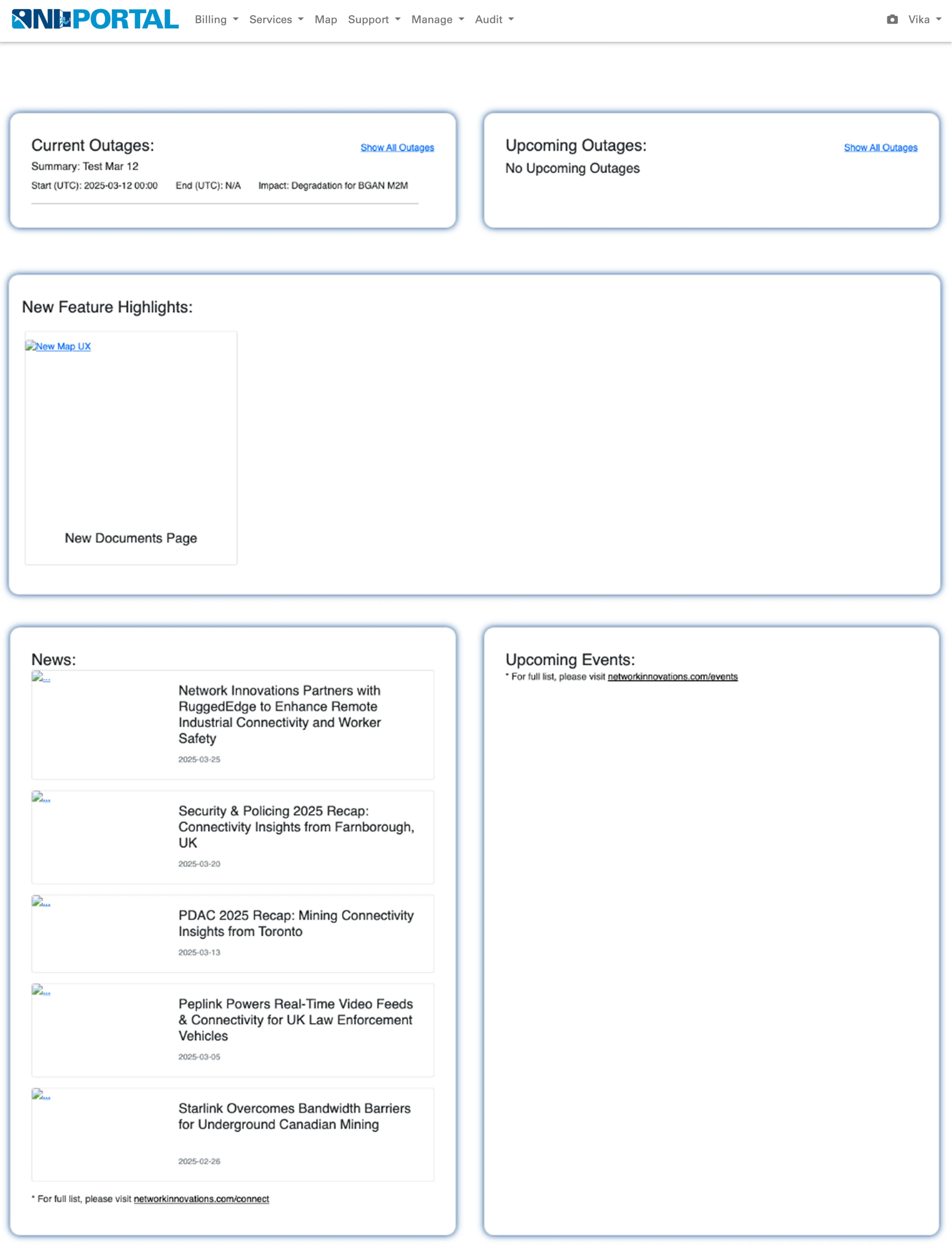
Eleken designers first tested a more systematic design approach on a single page. That work demonstrated how shared patterns could scale beyond one screen, giving the team a foundation for improving consistency across the wider platform rather than repeatedly solving the same UI problems module by module.
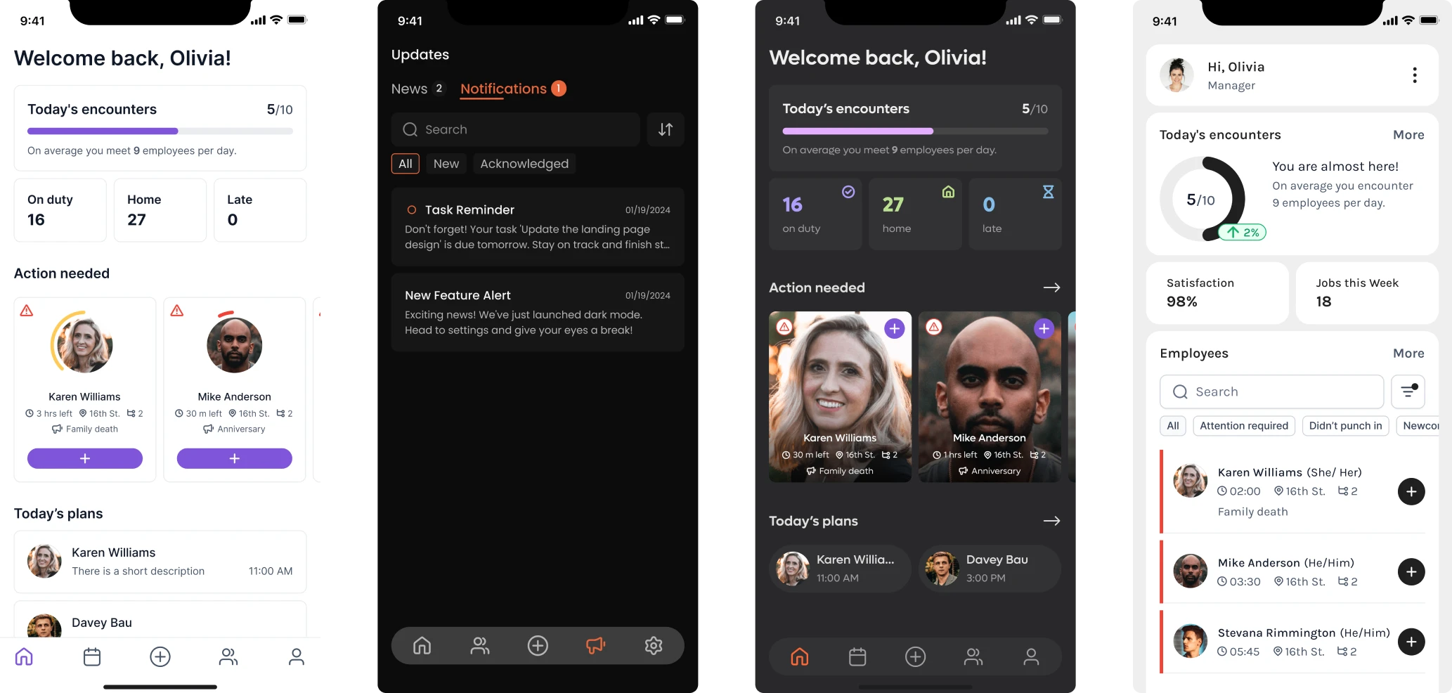
And Newton360 shows what that scalability looks like in practice. For the SaaS product, Eleken created a design system built around foundation tokens and variable modes for light and dark themes.
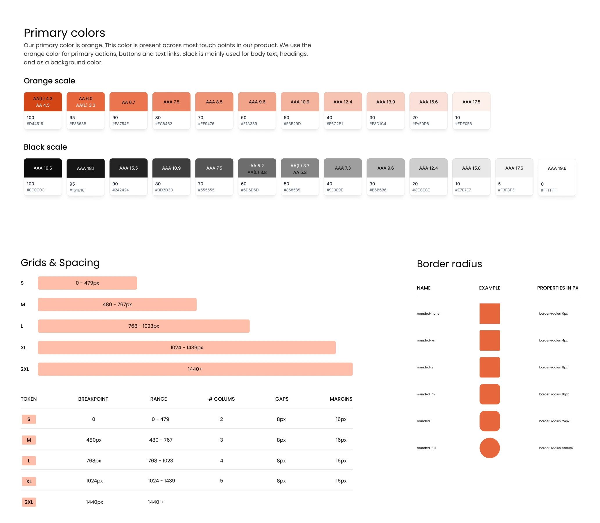
Instead of maintaining separate styling decisions screen by screen, the system allowed theme changes to be managed centrally and applied consistently throughout the interface. The value wasn't only a more coherent UI: future visual changes became easier to propagate without redesigning individual screens or introducing another layer of one-off variations.
A strong design system therefore does more than make a product look consistent. It creates constraints that make drift harder to introduce and easier to detect.
And detection becomes increasingly important once a product is too large to review screen by screen.
How do you fix and prevent design drift?
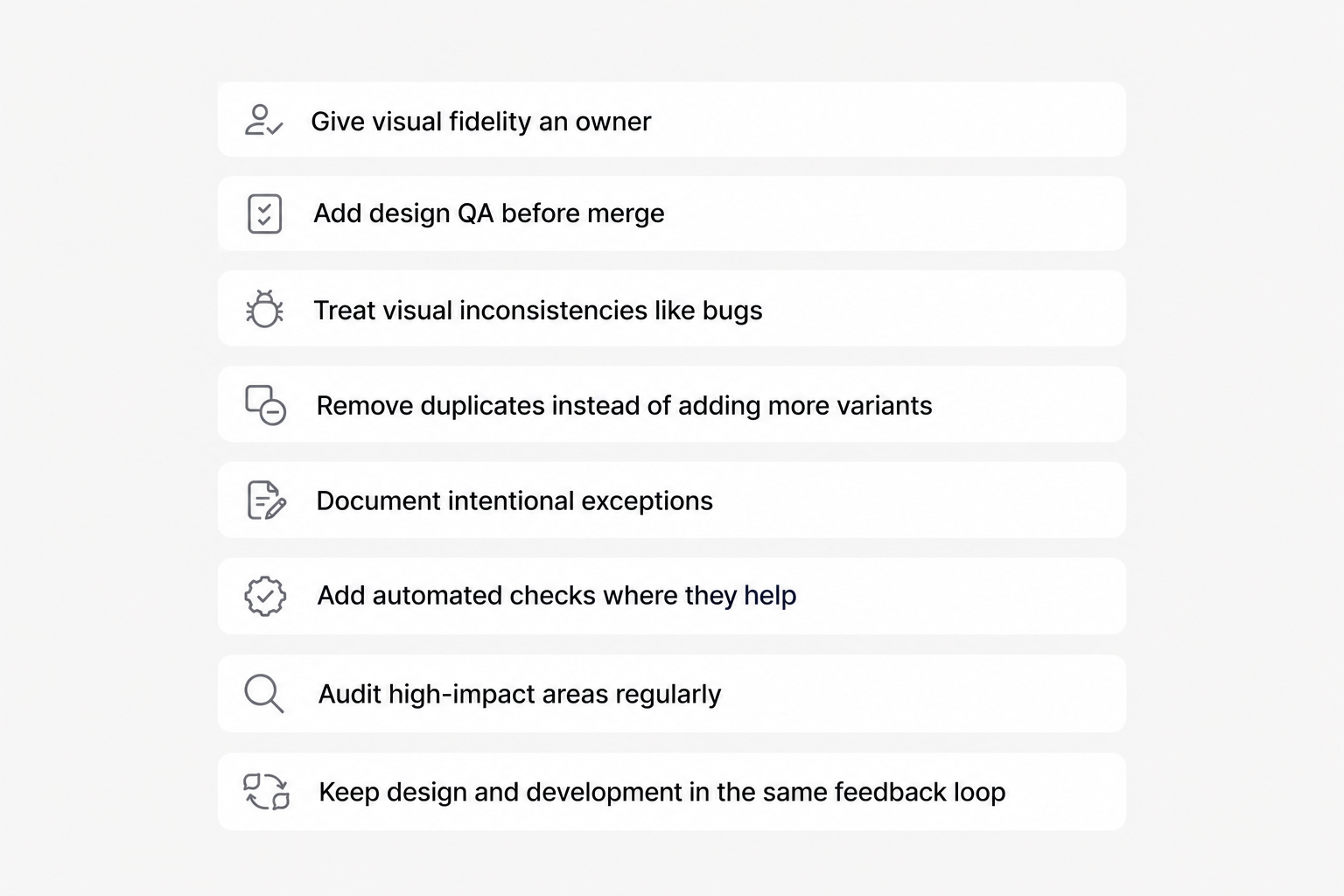
Finding design drift is useful only if the team changes the conditions that created it. Fixing individual buttons or spacing values may clean up today's interface, but without changes to the workflow, the same inconsistencies will return.
The goal is to make product design consistency part of delivery, not a cleanup task saved for later.
Give visual fidelity an owner
Start by making someone explicitly responsible for checking the gap between design and implementation.
That doesn't mean one person must fix every inconsistency. Developers still own implementation, designers own design decisions, and QA owns testing. But someone needs to follow the feature through to production and ask: Does what we're shipping still reflect what we intended to build?
Without that responsibility, visual fidelity sits between roles and is easy to overlook.
Add design QA before merge
Don't wait until a feature reaches production to compare it with the design. Include design QA in the development cycle before the work is considered complete.
The review can cover:
- spacing and layout;
- typography;
- colors and tokens;
- component variants;
- responsive behavior;
- interaction states;
- errors and edge cases.
The point isn't pixel perfection for its own sake. It's catching implementation mismatches while the feature is still fresh and inexpensive to correct.
Treat visual inconsistencies like bugs
When teams notice drift but don't record it, fixes depend on someone remembering to return later.
Instead, put visual issues into the same workflow as other product problems. Create tasks in Jira, Linear, or whichever system the team already uses. Prioritize them according to their reach and impact.
This also prevents the familiar situation where everyone knows the UI has become inconsistent but nobody can say exactly what needs fixing.
Remove duplicates instead of adding more variants
If an audit reveals six versions of essentially the same component, avoid creating a seventh to solve the next use case.
Determine which variants are genuinely necessary. Merge overlapping ones, remove obsolete implementations, and define which versions are approved.
The same applies to tokens. Replacing hardcoded spacing, colors, and other values with shared tokens reduces the number of places where future drift can begin.
Document intentional exceptions
Sometimes breaking the existing pattern is the correct decision.
A component might not support a new requirement. Technical feasibility may also require the team to adjust an interaction that can't be implemented exactly as originally designed. A new use case may expose a limitation in the current system.
In those situations, the exception should be deliberate and documented. Decide whether it remains a one-off case or whether the design system itself needs to evolve.
Otherwise, today's reasonable workaround becomes tomorrow's unexplained inconsistency.
Add automated checks where they help
Visual regression tools such as Chromatic or Percy can compare builds and flag unexpected changes before they reach production. Lint rules and token scanners can catch certain hardcoded values and other departures from established conventions.
Automation won't decide whether every visual change is correct. What it can do is make deviations visible early enough for a human to make that decision.
Audit high-impact areas regularly
Not every screen requires the same level of attention. Periodic audits can focus on high-traffic workflows, frequently changed areas, and components reused throughout the product.
When drift is discovered, create a remediation backlog rather than trying to repair everything in one massive cleanup. Small, deliberate corrections are easier to fit into normal product development and less likely to introduce another wave of inconsistency.
Keep design and development in the same feedback loop
Ultimately, prevention depends on shortening the distance between the people designing an experience and those implementing it.
This is also where Eleken's embedded designer model can help SaaS teams. A dedicated designer works inside the client's existing product process, joins the team's regular collaboration, and iterates alongside development rather than delivering a large design package and disappearing.
That creates more opportunities to catch a design development mismatch during the sprint, when it can still be resolved quickly, instead of discovering months later that dozens of screens have drifted apart.
The principle is simple: every exception should either be corrected or consciously absorbed into the system.
Once that feedback loop exists, new tools — including AI — can make maintaining UI consistency significantly faster. But without it, they can make drift faster too.
Design drift is an ownership problem
Design drift rarely starts with a dramatic mistake. It starts with the button that's slightly off, the spacing value someone hardcodes for one edge case, or the component variant created because the existing one doesn't quite work.
Each decision seems harmless. The damage comes when those decisions become permanent without being reviewed, documented, or brought back into the system.
That's why design drift is more than a cosmetic problem. It compounds into rework, slower delivery, inconsistent interactions, harder QA, and a product that can feel less coherent even when everything technically works.
A strong design system matters as it reduces that risk. Automated testing improves the team's ability to expose mismatches, while AI can help detect and correct deviations faster. Regular audits can show where the biggest gaps have appeared.
But none of those measures solves the underlying problem on its own.
Someone has to own the gap between design intention and what actually ships.
That means keeping designers and developers in a continuous feedback loop, treating visual inconsistencies as real product issues, documenting intentional exceptions, and updating the system when the product legitimately needs to evolve.
The objective isn't to freeze the interface or eliminate every exception. Products change, and design systems should change with them. The objective is to make that change intentional rather than accidental.
When teams establish that ownership, small UI gaps stop quietly multiplying from sprint to sprint. Instead, they become visible decisions that can be corrected, accepted, or incorporated into the system before they turn into another layer of drift.
For SaaS teams that need that continuous design involvement, Eleken's embedded designers work alongside product and development teams throughout the sprint rather than treating design as a separate handoff.
Stop design drift before it slows you down — work with Eleken to keep your SaaS project consistent as it grows.


.webp)