

There's a growing challenge in SaaS design: functional interfaces are becoming easier to build than ever.
AI can generate screens, design systems make layouts predictable, and most products already follow established UX patterns. As a result, many SaaS tools now solve the same problems in remarkably similar ways.
Yet users can still tell the difference between a product that merely works and one that feels thoughtfully designed.
That difference often comes down to microinteractions, the small moments that guide, reassure, and reward users as they move through a product.
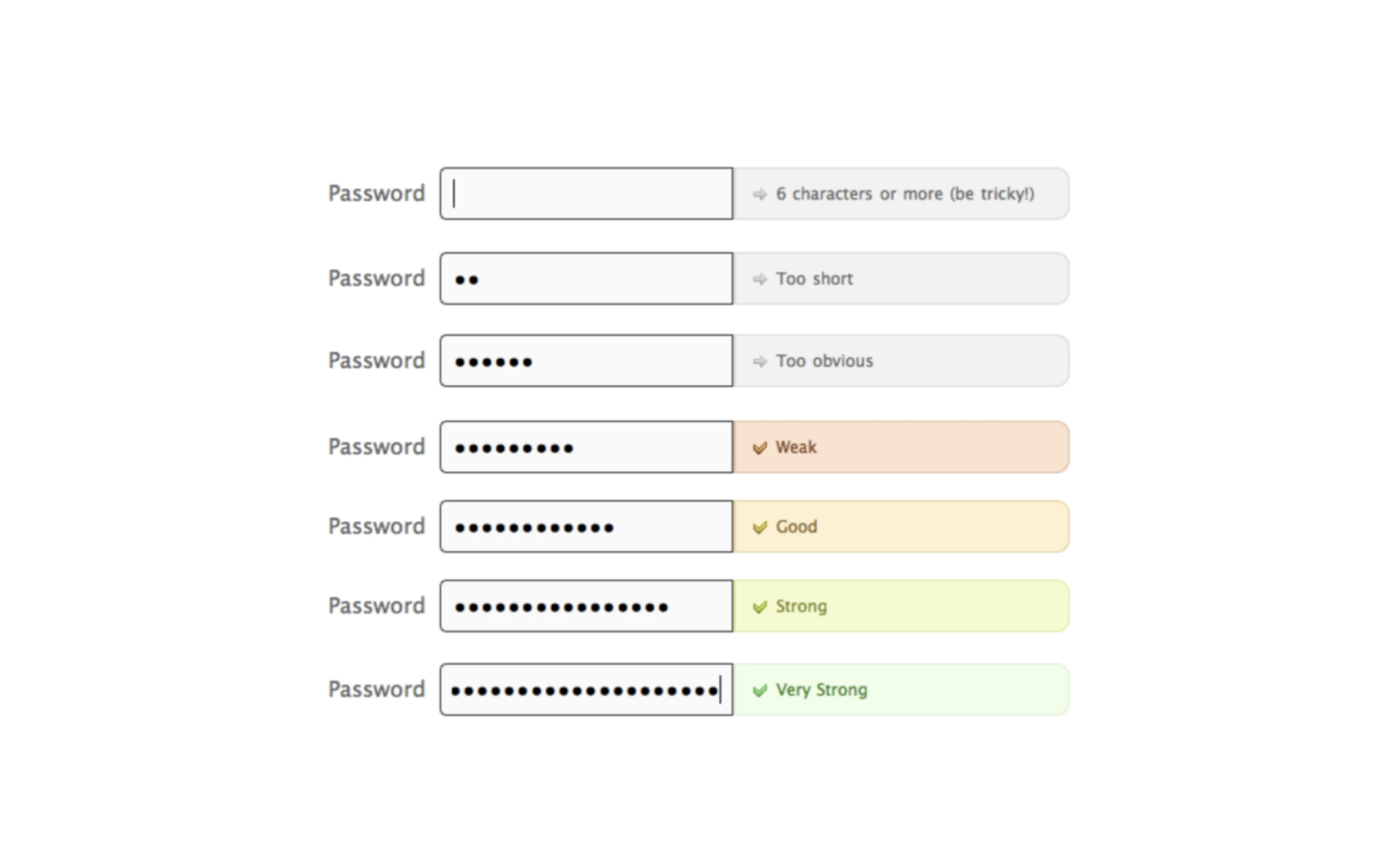
Individually, these details seem insignificant. Together, they shape how polished, trustworthy, and easy to use a product feels.
At Eleken, we've designed SaaS products across industries, from data analytics platforms and CRMs to edtech and Web3 tools. Along the way, we've seen how seemingly minor interaction details can improve usability, reduce friction, and create experiences users enjoy.
In this article, we'll look at what microinteractions are, why they matter, and look at SaaS examples that show how they enhance user experience.
What are micro interactions?
Dan Saffer coined the classic framework: every micro interaction has four parts: a trigger, a rule, feedback, and loops/modes.
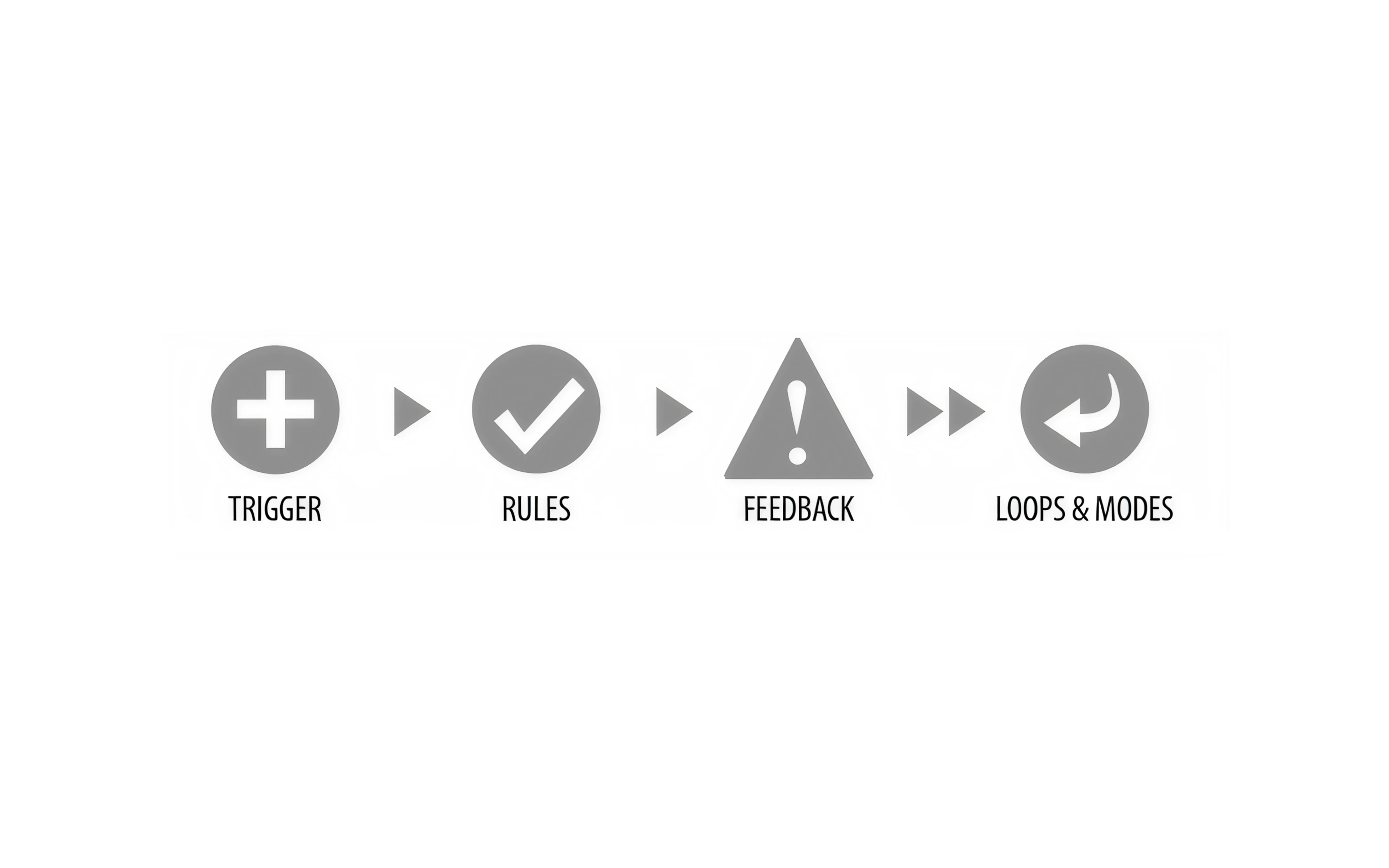
The trigger starts it (a user action or a system-initiated trigger event). The rule defines what happens. The feedback communicates it. And loops and modes determine how it behaves over time.
But the definition gets muddier in practice. One Reddit commenter called the term "word magic," with no clear line between a "micro" interaction and a regular one.

I think this is a case of meaningless labeling, which is something I see all the time in UX design articles. My professor in uni used to called it "word magic" (crudely translated) where people would get hung up on labels and definitions when in reality it's a non-issue. You could read up on the do-s and don't-s of "microinteractions" according to the author, and apply it to your product, but at the end of the day you'd have to conduct user testing of said product to know for sure. When it comes to such a small feature like a toggle-switch I think common sense would take you most of the way to a good implementation. So, if you were to do user testing with a product that turns out to be unusable, it's most likely not going to be at fault of just the microinteractions.

It’s a fair point. So here's a more useful way to think about it: a micro interaction is single-purpose, contextual feedback tied to one specific action. That's the principle that matters, regardless of what you call it.
Also, there are two things many people get wrong here:
- Not every animation is a micro interaction. A looping hero animation on a landing page isn't one.
- Not every micro interaction involves animation at all, a tooltip, an inline validation message, or a disabled button state. These are all micro interactions. Motion is just one possible form of feedback.
Why micro interactions matter and when they don't
The standard case for micro interactions in UX covers system status, error prevention, and delight. All true. But let's go deeper.
- System status keeps users from panicking. LinkedIn's pull-to-refresh indicator, Google’s four-dot loading micro animations; these tell users "something is happening, hold on." Without them, silence reads as failure.

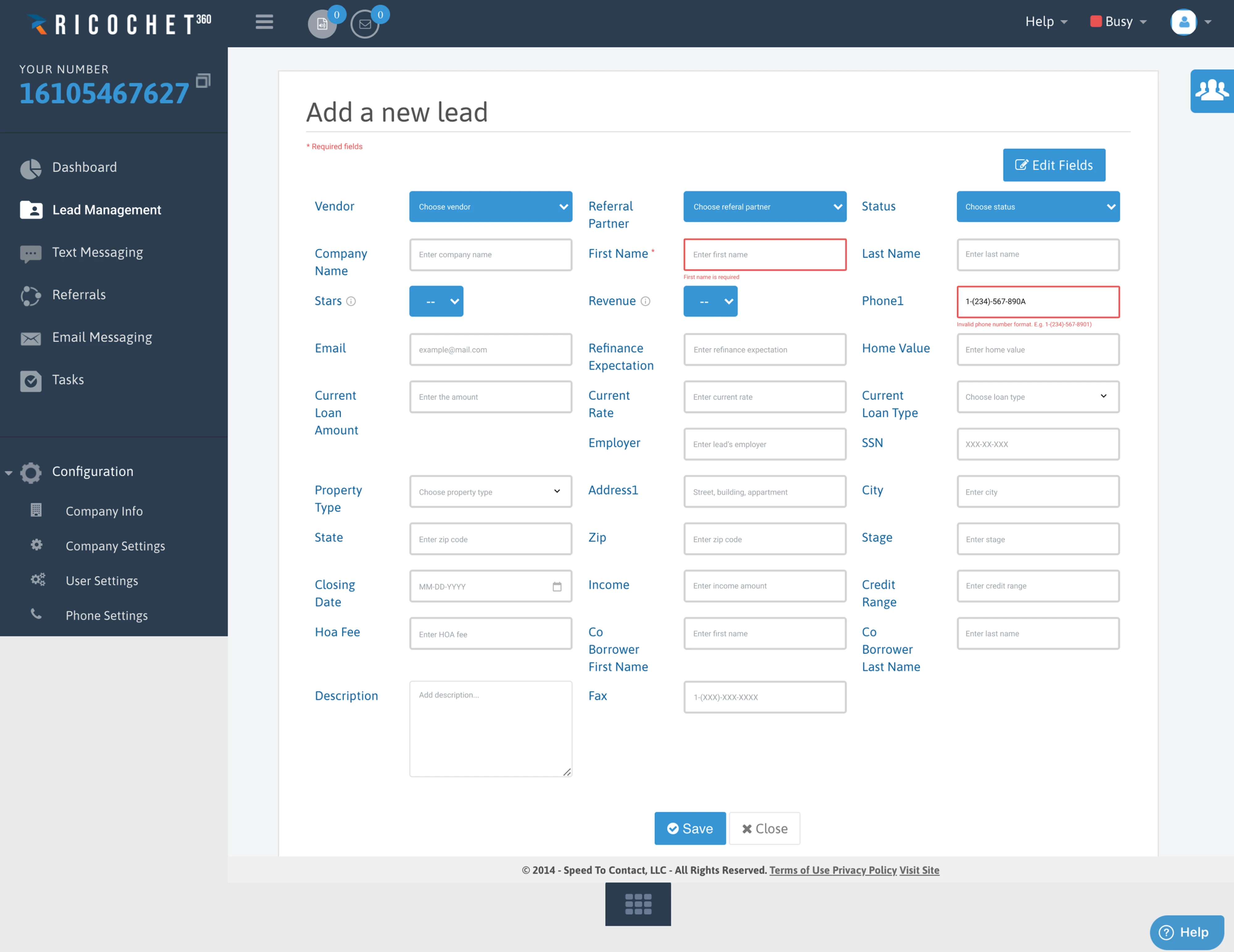
- Error prevention has a real business cost attached to it. When we redesigned the onboarding flow for Ricochet360, a CRM with a notoriously steep learning curve, we added per-field tooltips and inline phone number validation. A two-hour design fix. The result: reduced onboarding time and an immediate drop in churn. That's what tooltip UI done right looks like.
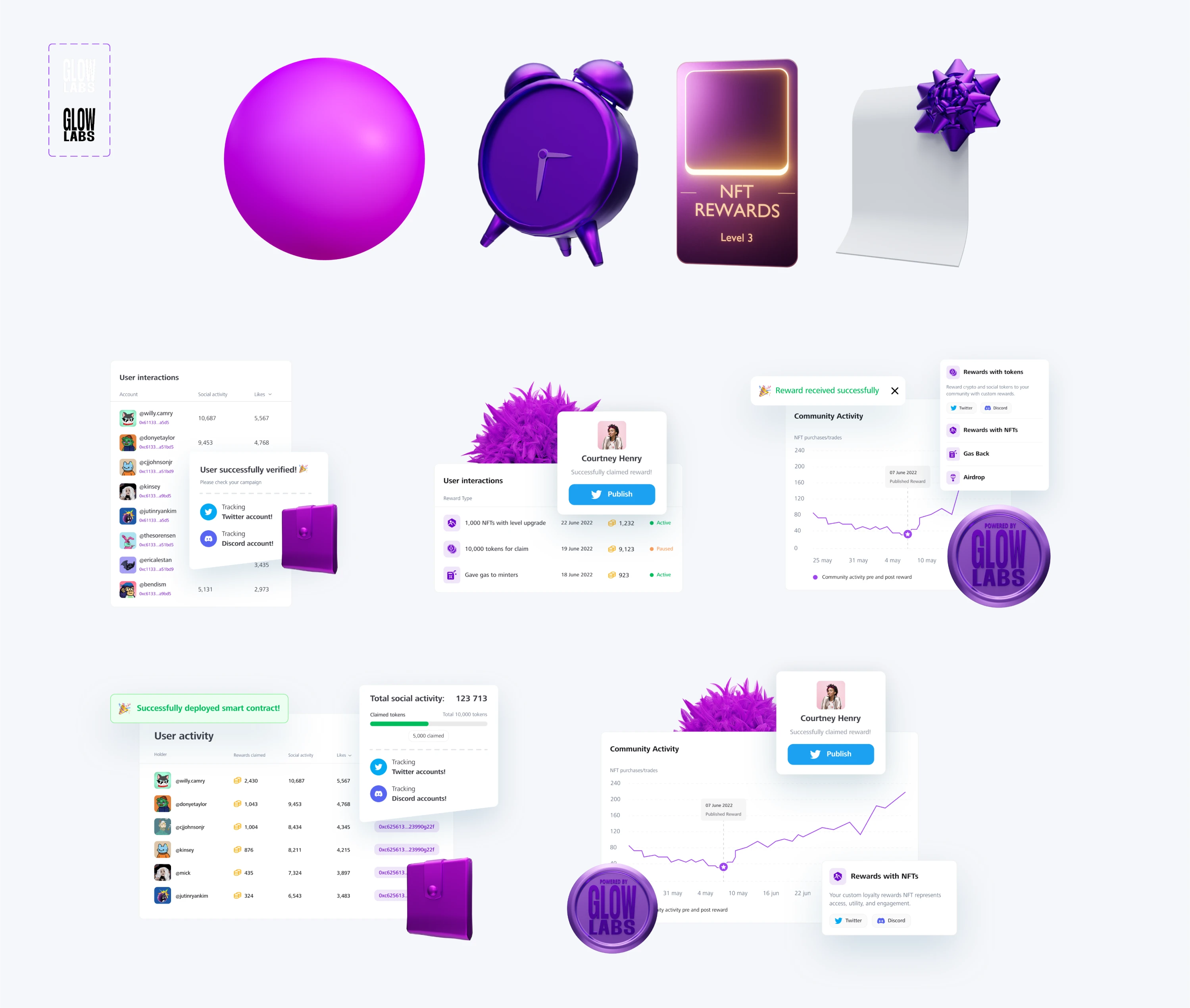
- Emotional connection is real, but context-dependent. Glow Labs used emoji-based feedback messages as a deliberate brand voice decision for a young web3 audience, not a usability call, a personality call. It works because they match the product's tone and the user's moment.
But here's the nuance most articles skip entirely:
- Context is everything. In consumer apps, delight matters. But in internal enterprise tools, every unnecessary animation wastes an employee's second, multiplied across thousands of daily repetitions.
One designer in a Reddit thread put it plainly: "...In my line of work (internal tools), there is little/no appetite for microinteractions that aren't strictly necessary..."
This is where user input is critical. I fucking hate the same thing you love. In my line of work (internal tools) there is little/no appetite for microinteractions that aren’t strictly necessary. Everything else wastes precious seconds of an employee’s time, and precious story points in the dev pipeline. I am likely the outlier for consumer products (maybe I’ve been in complex enterprise tools for too long), but I also despise anything that breaks my flow or is extraneous to me getting the thing done. Almost any type of animation is high on my list of “stop wasting my time “
- No single micro interaction transforms a product. It's the accumulation. Dozens of well-placed, purposeful feedback moments add up to something that breathes.
As one designer put it, the combination of small, deliberate interactions can "breathe real life into a digital experience." Remove any one of them, and nothing collapses. Add them all together, and something shifts.
The combination of dozens of little delightful micro interactions can breath real life into a digital experience!
- The AI era argument. AI can generate a functional interface quickly. What it can't do, yet, is make it feel designed. Micro interactions in design are precisely that layer. They're where human judgment, taste, and context-awareness still matter.
As Senior UI/UX Designer and mentor at Eleken, Darina Silchenko notes, "AI will generate more and more interfaces. Designers need enough taste to recognize when the result feels generic."
Now that we've covered why microinteractions matter, let's explore examples.
Micro interactions examples that teach you something
Good examples are design lessons you can steal. Here's a selection, each one paired with why it works and the principle behind it.
Functional system feedback
The most common microinteractions provide feedback, giving users clear signals about what's happening in the interface.
eBay's password requirements
As you type, a dynamic checklist updates in real time. It prevents the most frustrating form failure imaginable: filling everything out, hitting submit, and being told to start over.
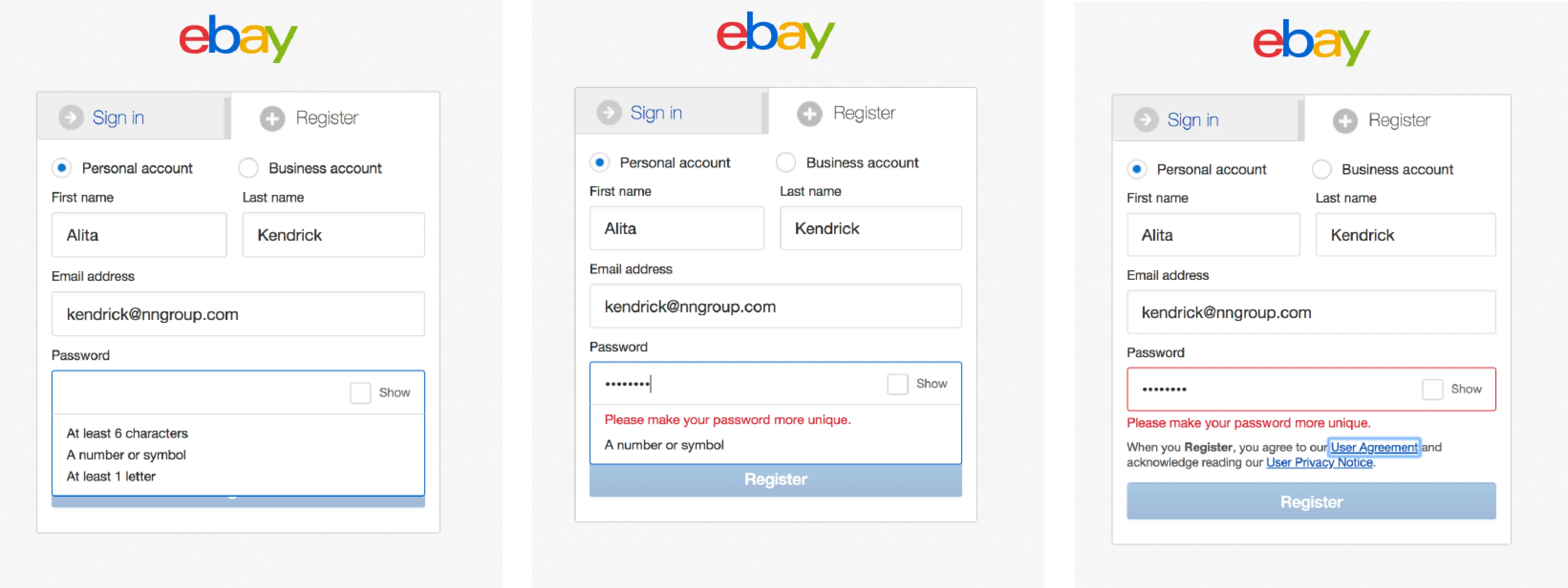
The principle: real-time feedback beats post-submission errors every time.
Slack's empty huddle message
When you leave a huddle that nobody else joined, Slack doesn't just report what happened. It adds personality: "You were in the huddle by yourself for 0m. A nice, meditative session." The message turns what could feel awkward or disappointing into a small moment of delight.
This was cited on Reddit's r/UXDesign as a standout example of restraint in interaction design.
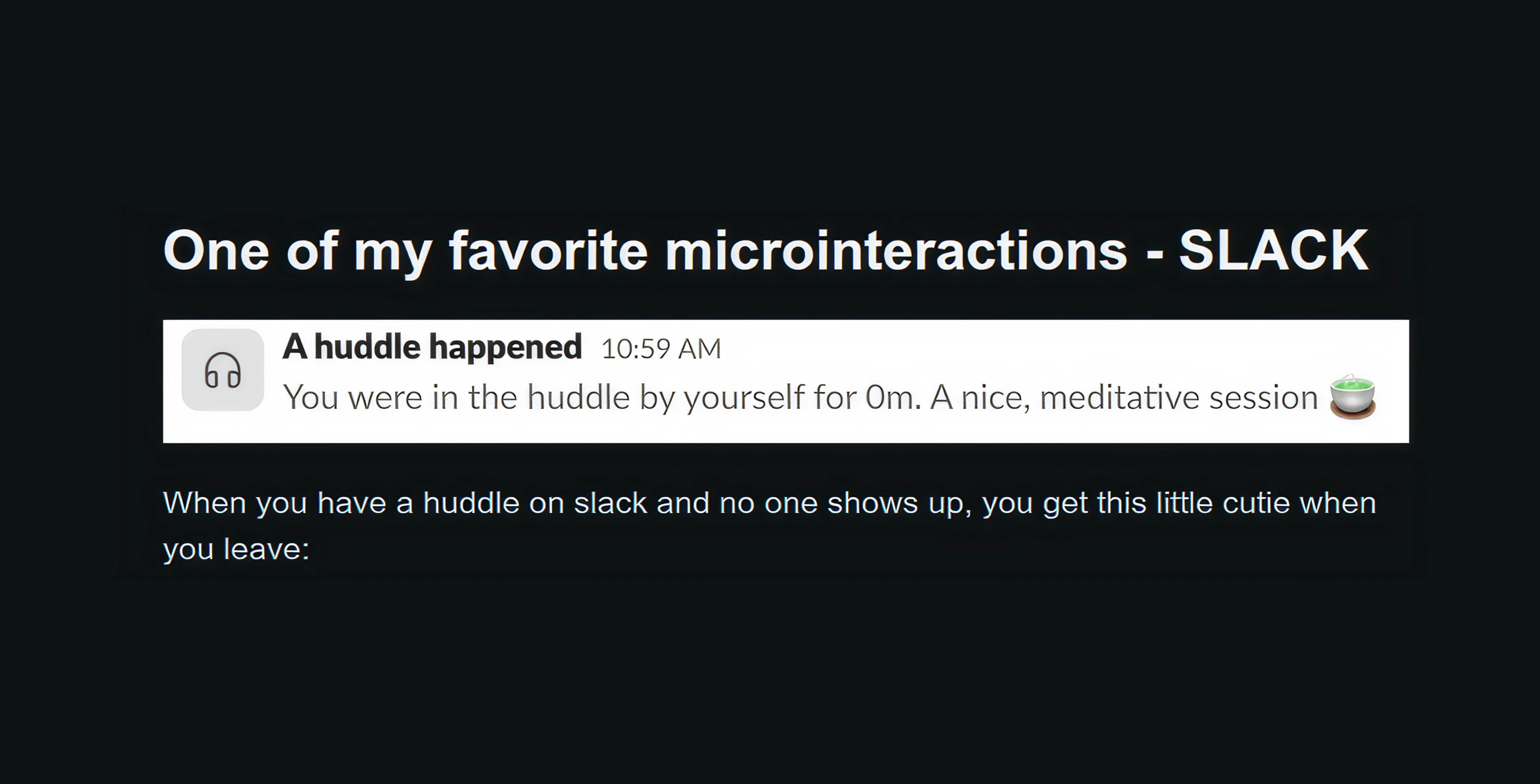
The principle: feedback doesn't have to be purely functional. A touch of personality can make routine interactions more memorable and human.
HubSpot's typing indicator
Three bouncing dots appear while the chatbot "thinks." It's purely cosmetic: the bot isn't typing. But it humanises the experience and prevents the feeling of a broken interface.
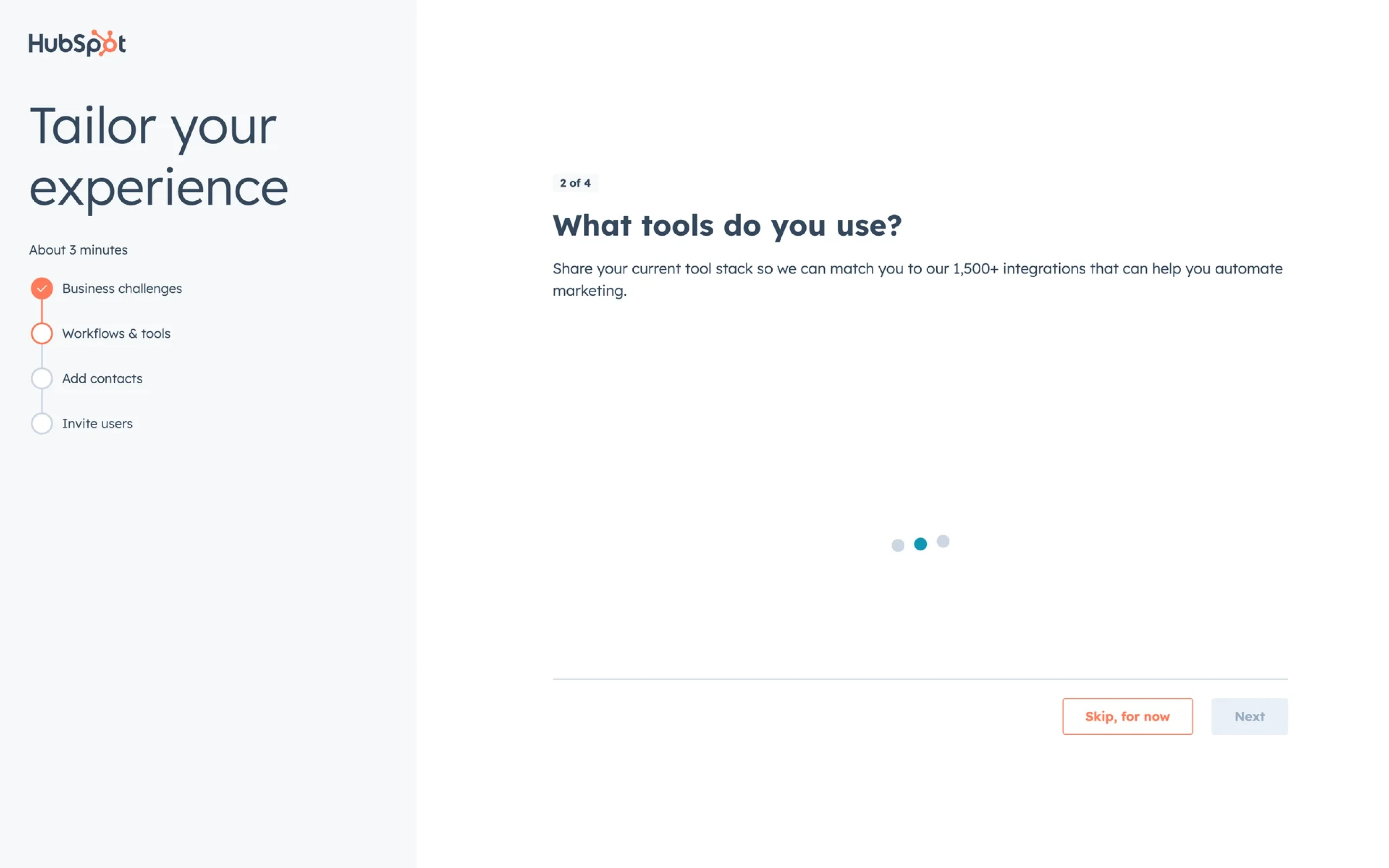
The principle: system standby states reduce anxiety.
Emotional and brand
These microinteractions add personality to digital products, turning routine actions into memorable experiences.
Mailchimp's "Rock on!" confirmation
After scheduling an email, Mailchimp doesn't stop at a generic success message. Instead, it rewards users with a playful illustration and a cheerful "Rock On!" confirmation. The task is complete, but the interaction leaves users feeling accomplished rather than simply informed.

Principle: successful actions deserve acknowledgment. Small moments of celebration can make routine tasks feel rewarding and strengthen users' emotional connection to the product.
Asana's celebration creatures
Both celebrate meaningful milestones, not every save. That restraint matters.

The principle: reward completion at real moments, not constantly.
Duolingo's streak flame micro animation
When users reach a streak milestone, the Duolingo app celebrates the achievement with animated mascots, vibrant visuals, and a sense of progression that grows with the streak itself. What could have been a simple statistic becomes a moment of pride and accomplishment.

The principle: rewarding important milestones makes progress indicators feel tangible. The more effort users invest, the more meaningful the acknowledgment should be.
Navigation and state to prevent errors
These microinteractions help users stay in control of their journey.
Reform's data transformation actions (by Eleken)
We designed micro interactions for merge, rename, group, and filter actions on a Reform data transformation tool. No reference designs existed for these patterns. We had to invent them.
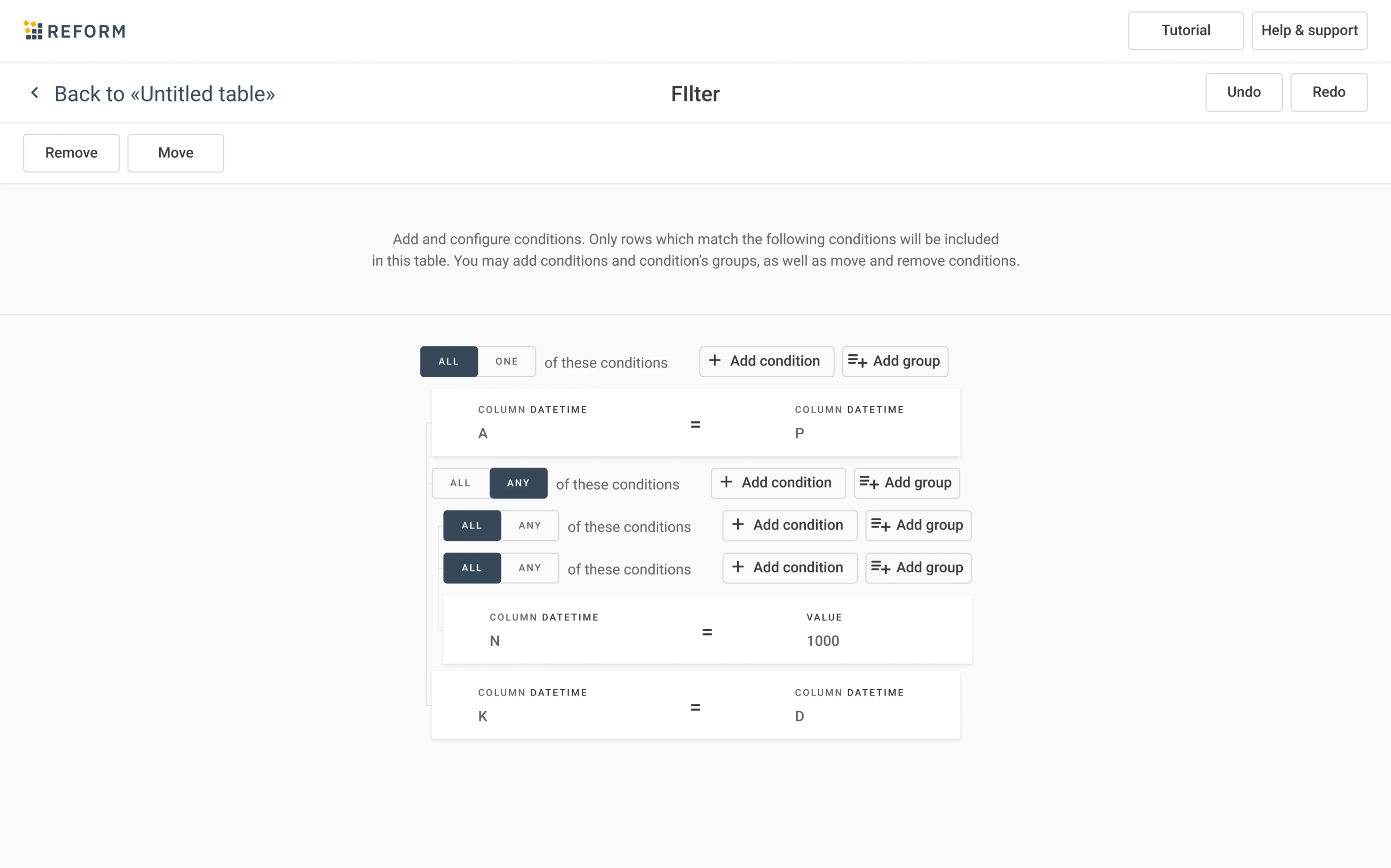
The principle: in novel products, micro interactions work when conventions can't.
Gmail's send confirmation flow
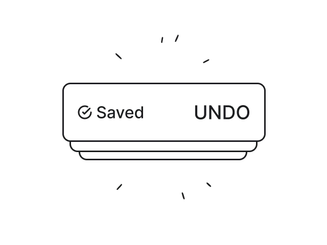
After users click Send, Gmail immediately acknowledges the action. The button transitions through a loading state, a success confirmation appears, and an Undo option gives users a chance to recover from mistakes. Instead of leaving users wondering whether the email was sent, Gmail communicates exactly what's happening at every stage.
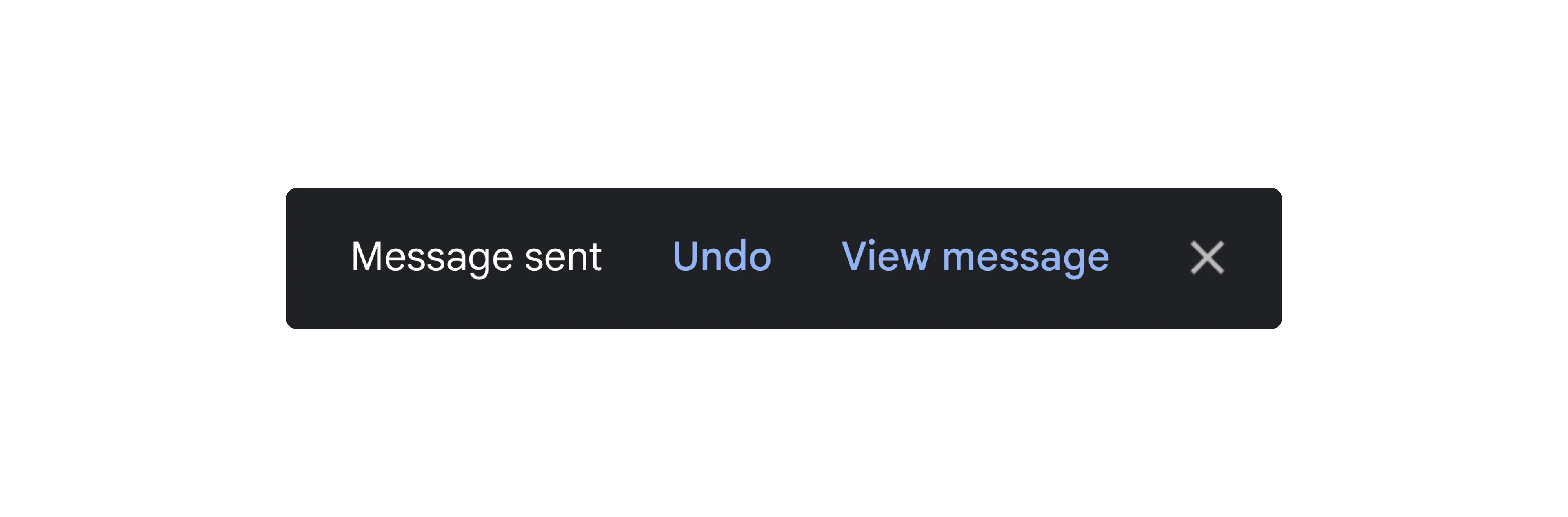
The principle: great microinteractions combine feedback with reassurance. Users should know both that their action succeeded and that they can recover if it didn't go as planned.
iOS wiggle mode
When you hold down an app icon, everything starts jiggling. It's not random. It communicates "the system is waiting for more input."
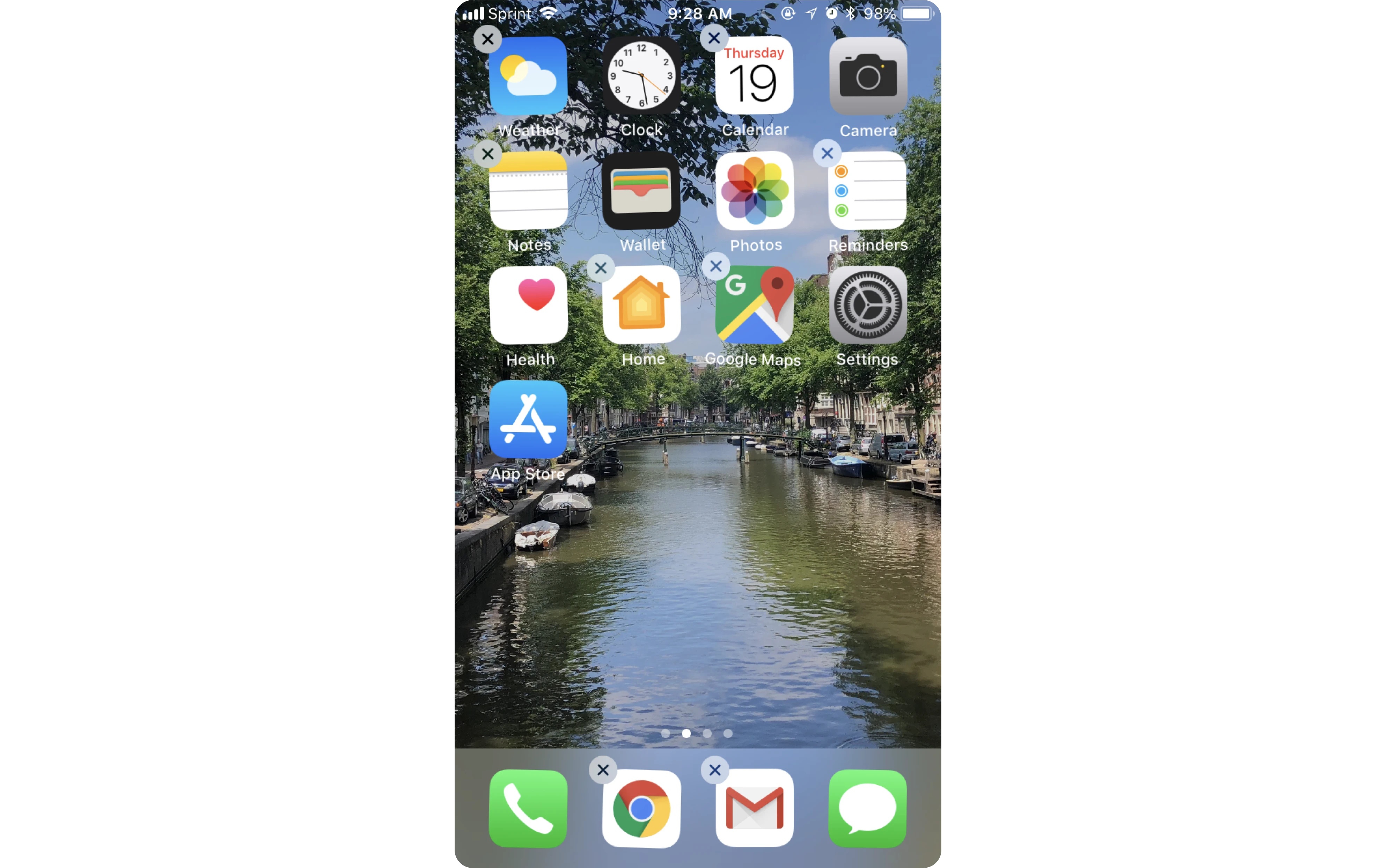
The principle: motion can signal an input state without a single word.
Facebook's tap-and-hold reactions
The full Facebook reaction picker is hidden by default. A longer press reveals it.

The principle: progressive disclosure via gesture rewards exploration without cluttering the default UI.
What bad examples teach us
Bad microinteractions reveal common UX mistakes and show why clarity should always come before creativity.
Take the infamous moving login button, a design where the submit button dodged the user's cursor. Instead of improving the experience, it created confusion, violated accessibility, user expectations, and solved a problem that didn't exist in the first place.
Poorly implemented microinteractions can also be frustrating when attached to critical user actions.
As one Reddit user instantly put it: "Improper microinteractions are also pain in the arse on critically functioning UI elements of the applications; be considerate with timing of the transitions or animations and better if they are shorter than longer (~100 ms is usually better than 300ms interaction, and 0ms interaction is usually the best on heavily used function)."
Improper microinteractions are also pain in the arse on critically functioning UI elements of the applications; be considerate with timing of the transitions or animations and better if they are shorter than longer (~100 ms is usually better than 300ms interaction, and 0ms interaction is usually the best on heavily used function)
Let's look at a few examples of micro interactions and what happens when they don't.
Zoom's overlapping tooltips
Hovering over certain controls can trigger multiple tooltips at once, causing them to overlap and obscure one another. Instead of helping users understand the interface, the prompts compete for attention and create unnecessary visual noise.
Users have noticed the problem. As one Reddit commenter put it, "idk why they couldn't just shrink the rest of the screen and put the toolbar on its own island. it's insane."
idk why they couldn't just shrink the rest of the screen and put the toolbar on its own island. it's insane.
The frustration comes from the same issue: interface design elements competing for attention instead of working together.
The principle: microinteractions should guide users, not fight for their attention. When multiple cues appear at once, clarity quickly turns into clutter and negative user feedback.
Outlook
Outlook's email delete animation blocks rapid action. When you delete dozens of emails, the animations feel like a wall and confuse users. Deleting an email should feel instant. Deleting an email should feel instant.
One frustrated Reddit user summed it up: "...I don't need an animated pop-up to give me an undo option for every one of the 20–50 emails I delete every day of my life…"
As an aside, Microsoft, if you are watching this subreddit. I think the entire world has been using email for enough decades now that we know the deleted items can be recovered from trash. I don't need an animated pop-up to give me an undo option for ever one of the 20-50 emails I delete every day of my life, for the rest of my life using your software. *sigh* Who comes up with these crap ideas?
The principle: microinteractions should respect the pace of the task. A subtle animation that delights once can become frustrating when repeated hundreds of times.
If you want to learn more about how to fix confusing UI, consider watching this video:
How to design micro interactions that don't feel gimmicky
Here's how to create microinteractions in design that enhance the user experience without becoming a distraction.
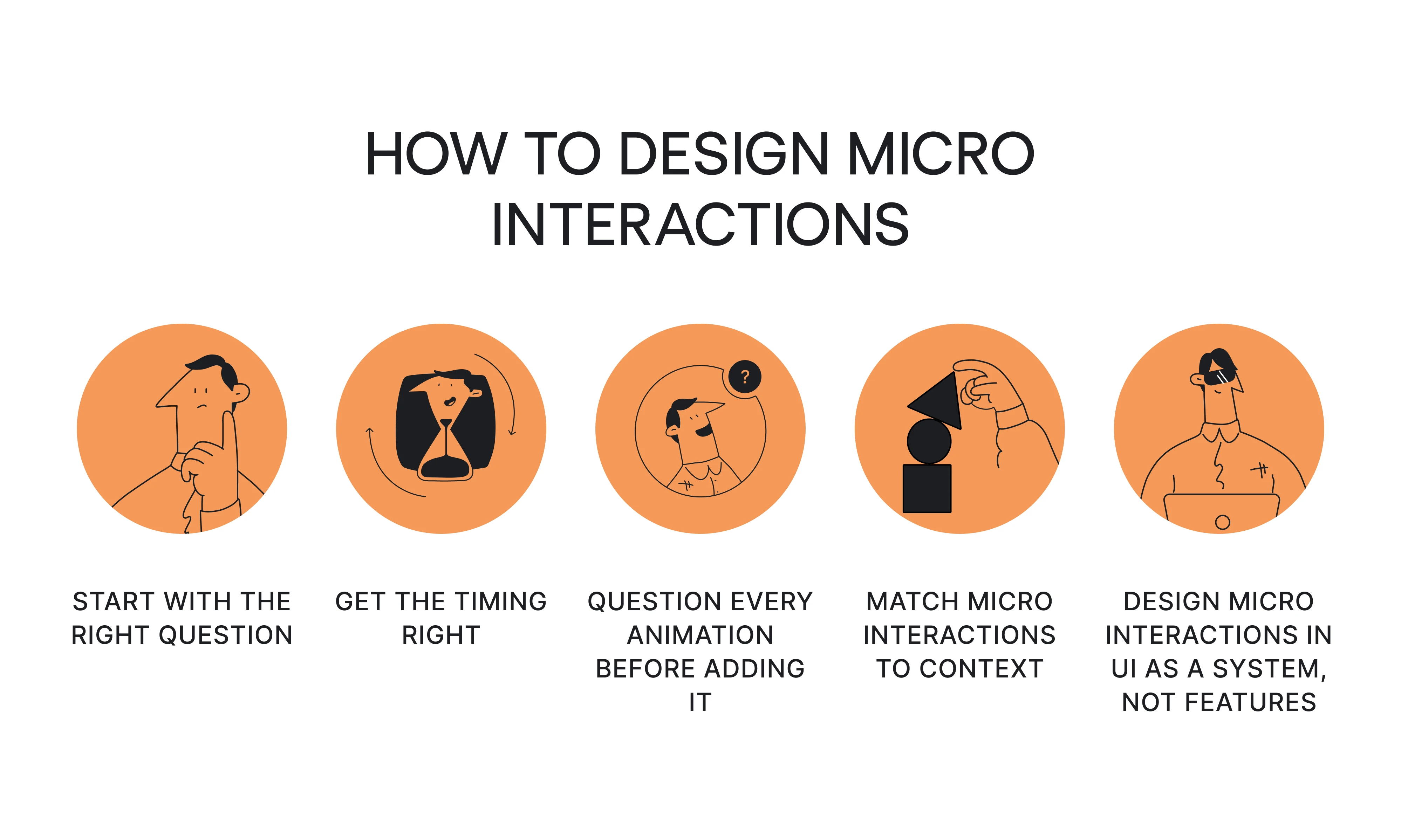
- Start with the right question.
Not "what should I animate?" but "what needs to be explained?" Motion should communicate a state change, a direction, or a result. If removing the animation makes nothing confusing, you don't need it. This is the remove test: the single clearest heuristic from the design community.
- Get the timing right.
Timing is the most important technical decision you'll make here:
- 150–250ms for core actions (button presses, confirmations).
- 300–400ms maximum for transitions and complex animations.
- Always use natural easing curves, not linear.
- Core actions must feel instant; never let animation delay the primary function.
- Ask three questions before you animate anything:
- Does this motion explain something: a state, a direction, a change?
- Does it serve the brand language consistently?
- Does it block or delay a user action?
If the answer to #1 or #2 is no, or #3 is yes, don't do it.
- Match micro interactions to context.
These factors matter most:
- Brand tone. A playful loader in a banking app is a mismatch. Glow Labs' emoji visual feedback worked because the brand is young and expressive. The same pattern in a B2B analytics tool would be jarring.
- User context. High-frequency actions (deleting emails, saving files) need invisible feedback. Low-frequency milestones (completing the onboarding process, making a first purchase) can afford a moment of celebration.
- Consumer vs. enterprise. What delights a consumer can frustrate an enterprise user who performs the same action 200 times a day. Know who you're designing for.
- Design micro interactions in UI as a system, not features.
This is the My Video Spot lesson. When our design team worked on that platform, tooltips, warning states, system feedback elements, and interaction states were built together as a unified visual language, not added individually.
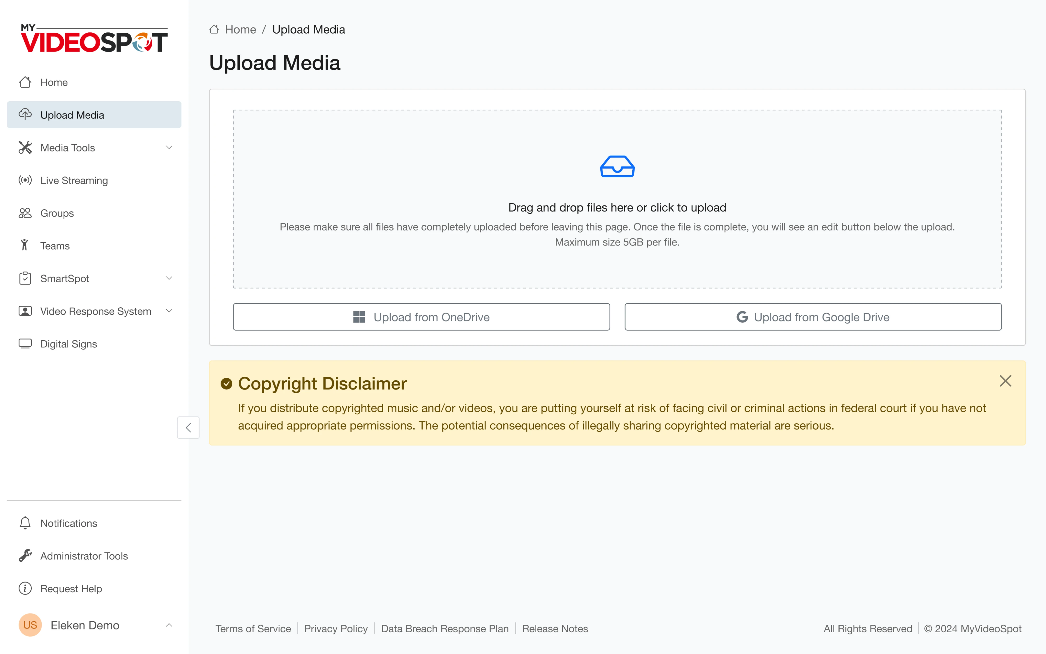
As a result, there were no help docs needed. Users just understood.
The principle: UI micro interactions need to speak the same language as the rest of your design system. If your UX design patterns are inconsistent, your micro interactions will be too.
The micro interaction mindset
The gap between an interface that works and one that feels designed is often invisible in isolation. It's the aggregate of dozens of small, purposeful feedback moments.
And in a world where AI tools can generate the structure and layout of an interface in seconds, the micro interaction layer is increasingly where human design judgment lives.
Eleken’s senior UI/UX designer, Roman Kalinin, put it well: "AI often gives you something that works, but not something that feels designed. That's where the designer's role becomes critical."
Not every product needs a flying unicorn. But every product needs a designer who understands when motion explains, when it reassures, and when it just gets in the way.
Want to go deeper? Explore how UX micro interactions connect to broader UX flow, visual hierarchy, and UX navigation design, or see how popover UX, modal UX, and empty state UX handle their own micro interaction moments.
And if you're building a SaaS product and want it to feel as good as it functions, Eleken's designers can help.


.webp)