RedOwl
How our UX design helped a fintech startup raise $1M in funding
RedOwl started with an ambitious idea to reinvent the fintech space.
As financial transactions become more complex and streamlined processes are in high demand, the founders identified a pressing need for a solution that could help businesses manage their corporate spending more efficiently.
At the time they reached out to Eleken, RedOwl had no product, no brand identity, and no defined UX. What they had was a vision, a shortlist of competitors, and a mission to build a solid concept that could attract early-stage investment.
Since the product operates in the fintech space, it also came with regulatory hurdles. That’s why the initial version was limited to B2B use within the Australian market.
Our Eleken team joined to help RedOwl:
- Design the product experience from the ground up.
- Tailor the interface to an AI-driven financial context.
- Create a foundation for early fundraising efforts.

A product idea came to life through a 3-day trial
As with every project we work on at Eleken, our collaboration began with a trial project, a chance for both sides to validate the fit.
With no direct access to competitor platforms due to KYC restrictions, our research relied heavily on open-source materials. We gathered visual references, studied user pain points from reviews, and defined a direction that could differentiate RedOwl.
From there, we designed a dashboard concept in four different styles to demonstrate how the platform might function.
One early design challenge involved color usage. The client wanted to make a shade of red their primary color, but in the context of a fintech product, it’s often linked to warnings. So we used it sparingly, while keeping key actions in neutral tones.


We analyzed competitor tools to spot friction
During our research, we saw that many users were frustrated by competitor platforms that only allowed one payment card per person. For people working across multiple teams or projects, this created limits and slowed down expense management.
To solve this, we designed RedOwl to support multiple payment cards per user.
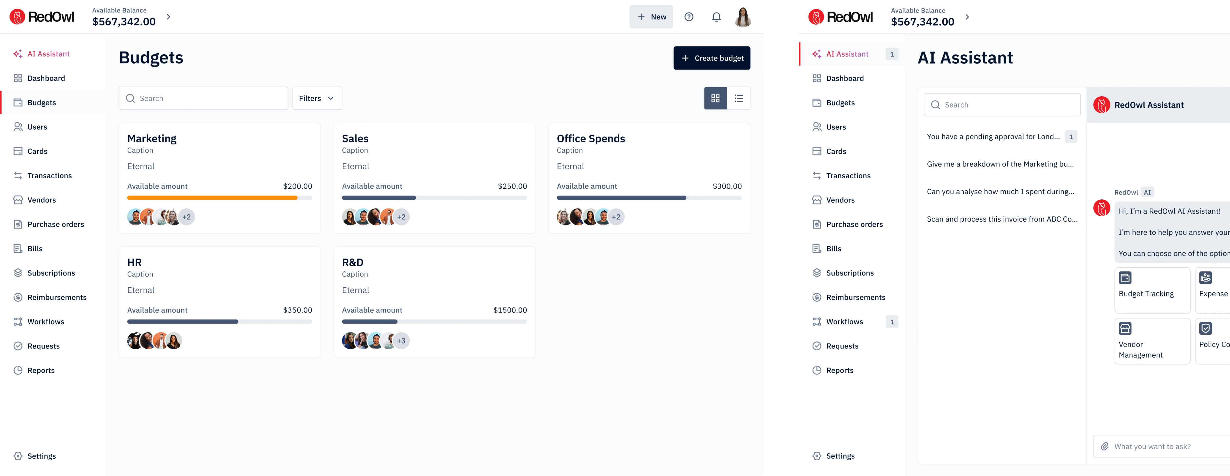
Tailored budget workflows for admins
For admins, we created interfaces that offered full control and clear visibility. Each department had its own budget card, displaying key data upfront, like total allocated funds, amount spent to date, and remaining balance.


With intuitive controls like progress indicators and clearly labeled actions for managing limits and team members, admins could fine-tune team budgets, set spending caps, and monitor individual usage, without getting lost in layers of UI.

A dedicated Subscriptions tab for full control
Many companies end up paying for multiple tools that serve the same purpose. It often happens because different teams adopt different platforms. Over time, this creates silent budget waste, and finance teams are usually the last to notice it.
To address this, we introduced a dedicated Subscriptions tab where admins could finally see everything in one place.

A progress bar visualized usage rates, making it easy to spot underused apps and decide whether to consolidate or cancel them. The goal was to make budgeting decisions obvious, and we achieved that by focusing on thoughtful UX design.

A Gmail plugin to track expenses faster
Building on the subscriptions concept, the client proposed a Gmail plugin that could automatically detect subscription-related emails and extract invoice data. This would help users surface hidden expenses and sync them directly with RedOwl.
While the idea showed strong UX potential, it remained in the design stage during our collaboration, serving as a proof of concept for future development.

Building an AI Assistant to create a better budget approval flow
To help RedOwl stand out in a crowded fintech space, we introduced an AI Assistant. But rather than just adding AI for the sake of buzz, we focused on making the interaction familiar and controllable for users.
"“Eleken’s work played a crucial role in bringing our AI-powered payment platform to life, setting the foundation for a market-ready product.” — Niruban Satchi, Head of Product at RedOwl"
When users open the assistant, they’re greeted with a clear overview of what it can help with, inspired by the design patterns of existing AI tools. This way, we avoided introducing a steep learning curve and allowed people to engage naturally.

For example, when a user asks to plan a budget for an upcoming event, the assistant analyzes past spending patterns and proposes a tailored budget.
But one of our core UX principles was to maintain user control. So right in the flow, we added action buttons like “Edit Budget” and “Send for Approval”, ensuring the AI suggestion was never a final decision, and employees could easily refine it.
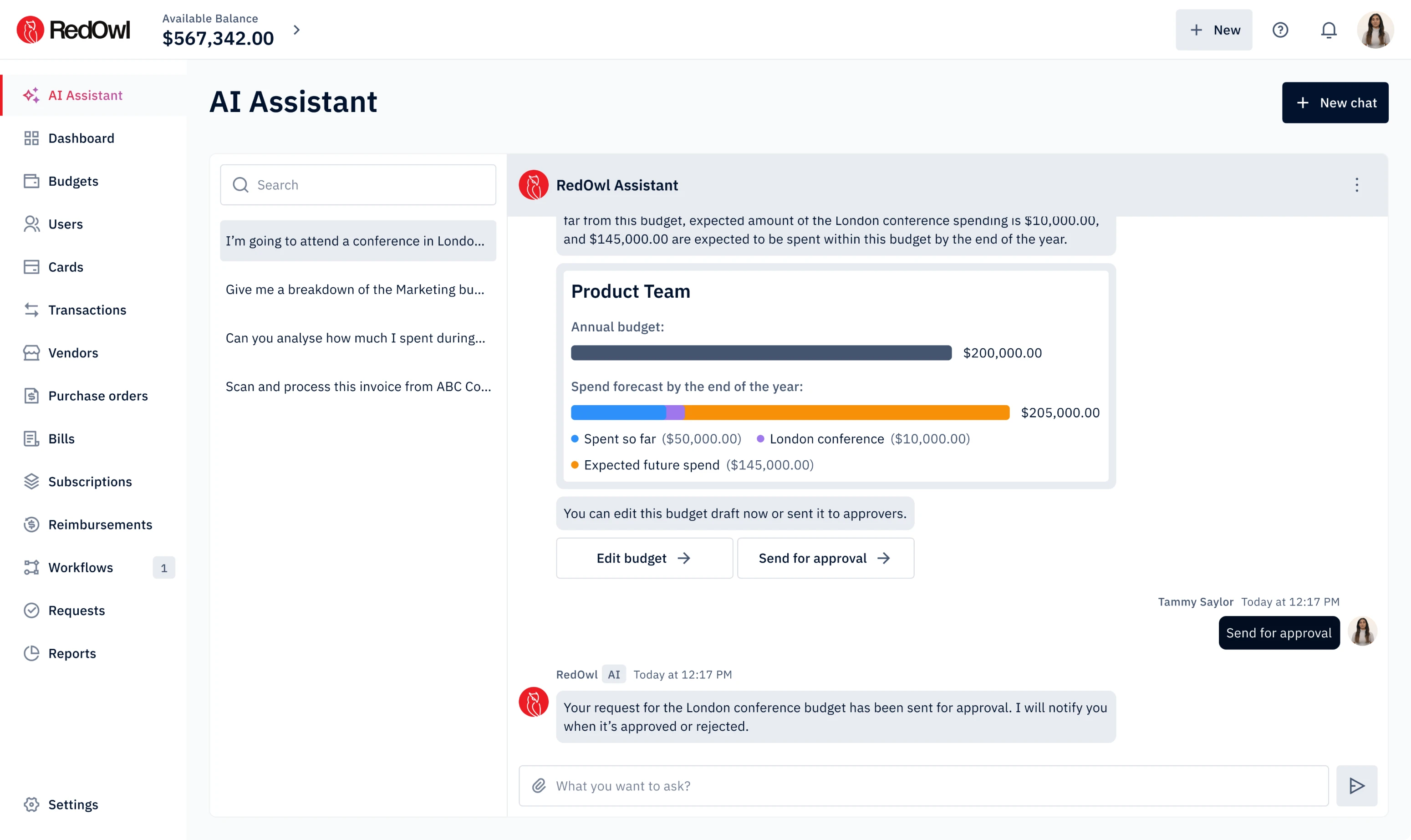
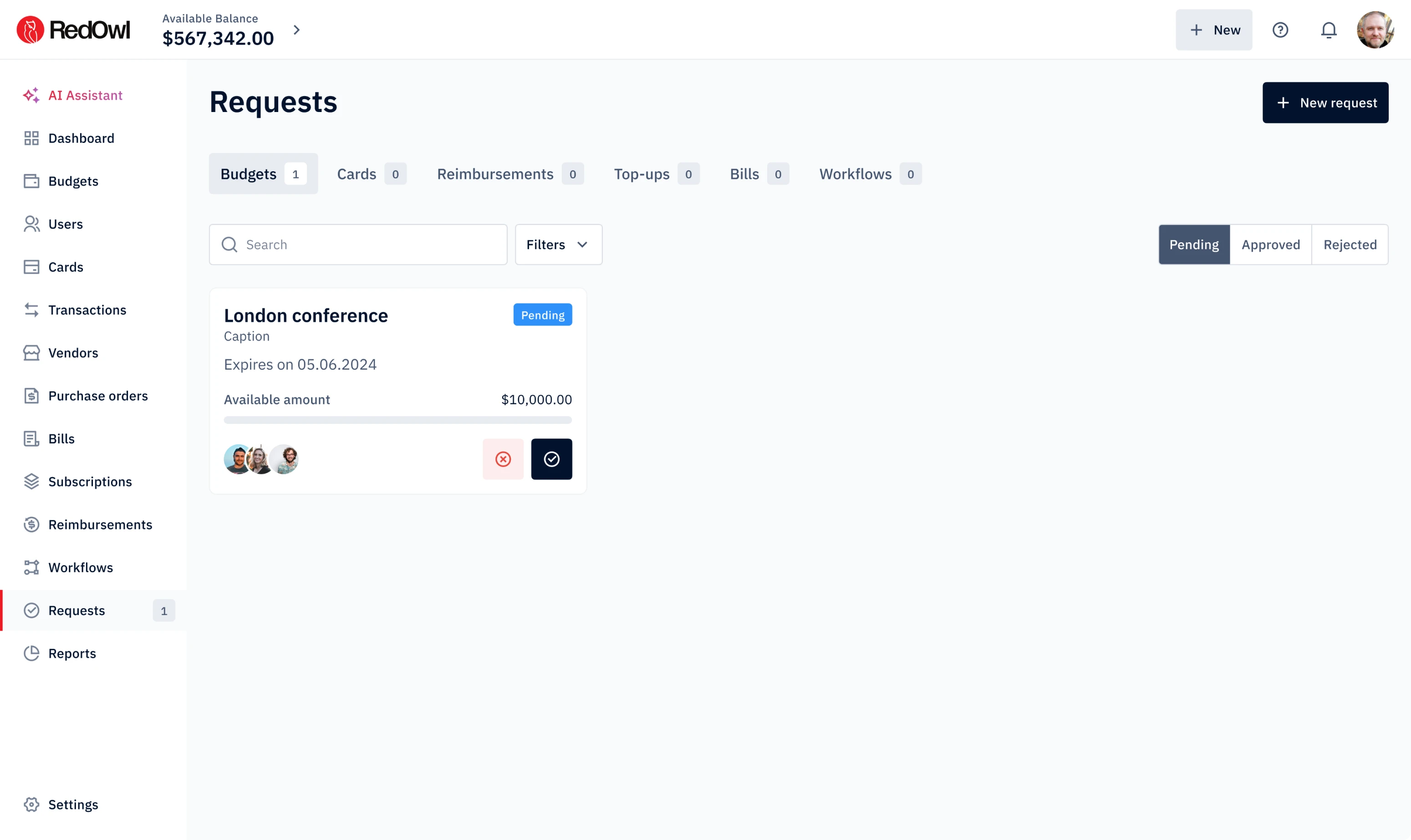
Once sent, the request is passed to an admin. They can review it directly in the assistant or manage it in a dedicated tab, where incoming budgets are organized via visual cards. Each request remains active until it’s approved, edited, or rejected.

All of this contributes to a fast approval workflow, something many users of fintech apps have said is often missing in the tools they use.
Smart controls for a multi-layered budget allocation
In real use cases, when teams attend a conference or any type of event, they might need a dedicated digital card for the group. On top of that, each attendee may also require an individual card with a specific spending limit. Together, these needs create complex budgeting flows that are difficult to manage without a clear interface.
We focused on building layered views that made it easy to:
- Navigate between team and individual cards.
- Instantly see available funds.
- Receive warnings when a spending limit is reached.
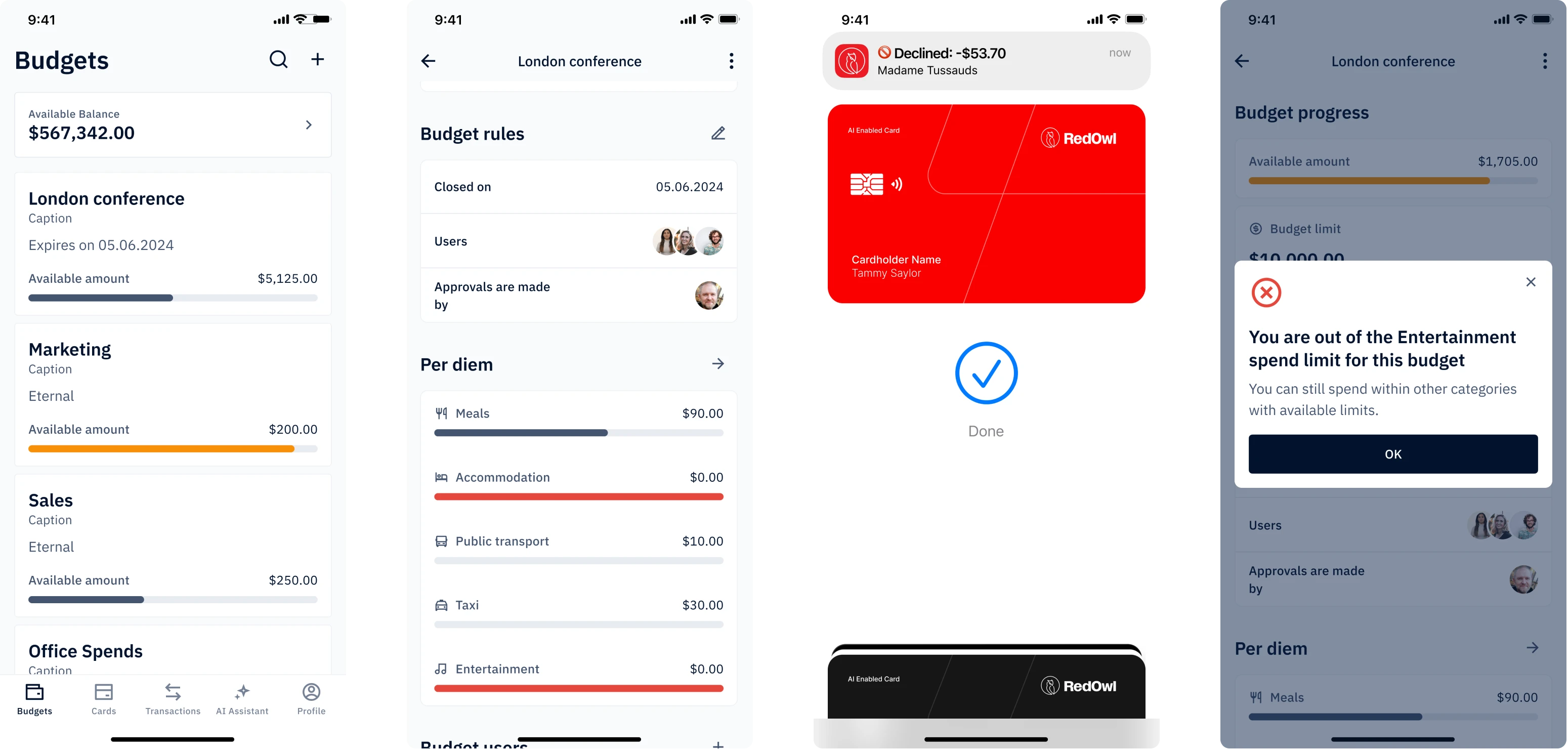
Rather than creating chaos, this structure simplified budget management by making the flow predictable, transparent, and easy to track.
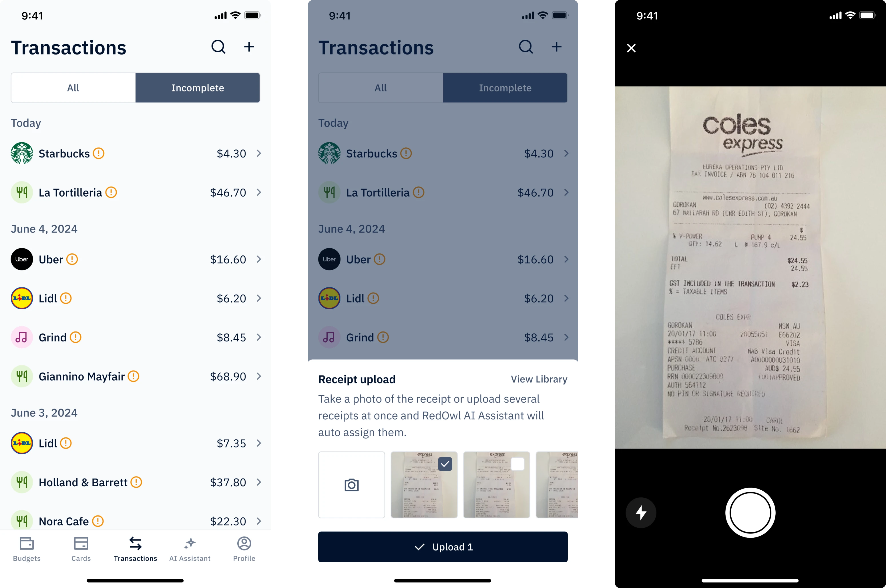
We also designed a frictionless solution for cases where employees needed to use cash during business travel. Instead of forcing them into manual reporting, we allowed them to simply snap a photo of the receipt and upload it directly to the app.
We designed KYC and KYB flows to meet industry standards
Since RedOwl is a fintech product, we designed what most financial platforms build around — KYC (Know Your Customer) and KYB (Know Your Business).
Instead of front-loading too many inputs, we broke the onboarding into four clear steps. Our designer added breadcrumbs to show users where they were in the journey, and included checkmarks to reinforce a sense of completion.


The design library that keeps the product consistent
Since the client came to us with no existing design system, we created a full design library from scratch. It included foundational components that played a key role in the handoff process and laid the groundwork for product consistency.
A robust, scalable design system was developed specifically for our AI agentic platform, ensuring consistency, efficiency, and adaptability as the product evolves.” — Niruban Satchi, Head of Product at RedOwl

Our collaboration with RedOwl led to a $1M-funded, globally recognized product
What started as a rough concept evolved into a fully designed fintech platform. Every screen we created was used in investor presentations, helping RedOwl secure $1M in seed funding. But the recognition didn’t stop there.
RedOwl was also selected as the only company from Australia and the entire APAC region to join Mastercard’s Start Path Small Business Program. We at Eleken are proud to have been part of that journey. For us, it was a chance to tackle real-world UX challenges in fintech and bring a bold new idea to life.
They showcased perfect time and project management. They integrated themselves as a team member on our platform and worked accordingly