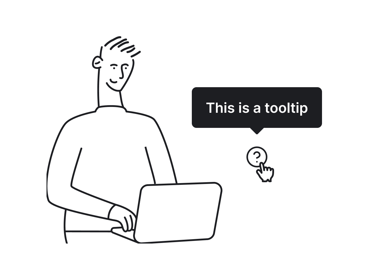

Tooltips are everywhere. Hover over an icon, click a tiny question mark, focus on a field, and there it is — a little box trying to explain what’s going on.
If you’re working on a project and wondering whether to use tooltips or not, the answer is usually yes. Sure, there are situations where tooltips aren’t the best fit (and we’ll cover those too), but most of the time, they help users more than they hurt.
To help you understand when and how tooltips actually work, we’ve prepared this guide. We’ll cover the fundamentals, explore practical design rules, and walk through patterns from real products, so you can make tooltips a helpful part of your interface.
What is a tooltip?
A tooltip is a small pop-up UI element that displays additional information when a user interacts with an element. It usually appears as a text bubble or box near the target and disappears when the user moves the pointer away.
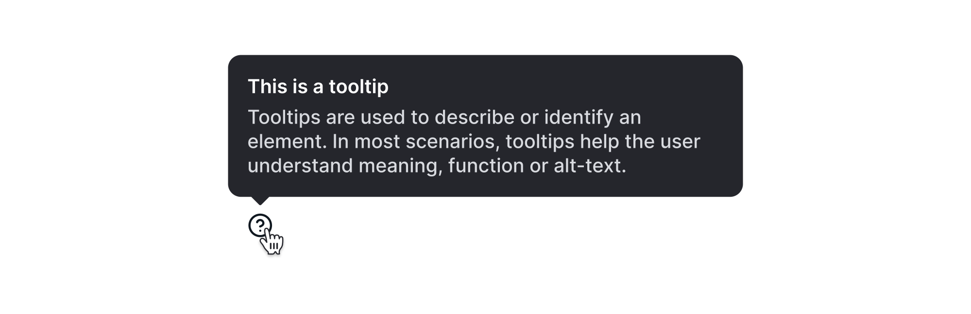
Tooltips are always tied to a specific UI element, like an icon, button, or label. They’re typically used to clarify the function, meaning, or current state of an interface component without permanently taking up screen space.
There are two main types of tooltips:
- Plain tooltips — the classic kind. These are short, text-only hints like the word “Copy” appearing when you hover over a copy icon.
- Rich tooltips — advanced ones. These might include formatting, links, images, or buttons, and are often triggered by clicking or tapping.
What are tooltips used for?
In real products, tooltips show up in all kinds of places and help users move through the interface more confidently. But like any UI pattern, they can be overused. That’s why it’s worth taking a look at the most common ways tooltips are applied.
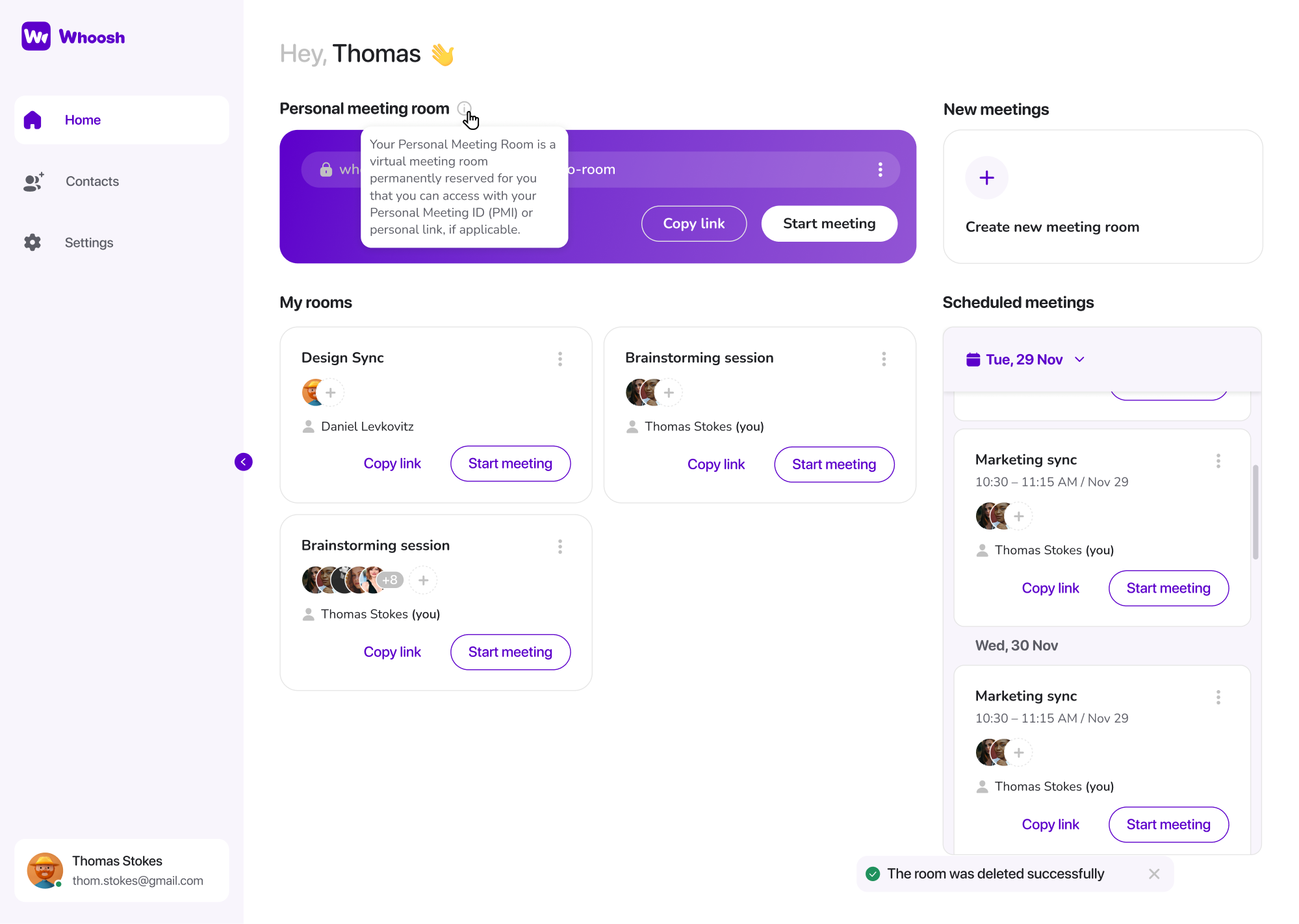
Clarifying ambiguous icons
Tooltips are essential when you’re working with icons that are potentially unclear on their own. These could be a pencil (edit), a box with an arrow (export), or any other common symbol that can be interpreted differently depending on the context.
.webp)
According to Material Design guidelines, tooltips should be used with icon buttons that do not include a visible label, especially when space is limited. They recommend including a short, descriptive tooltip that clearly communicates the action.
But even if an icon seems familiar to you, that doesn’t mean your users will see it the same way. For example, a gear icon typically means “Settings,” but in a data table, it might open a row-level options menu.
From a first-time user’s perspective, this kind of ambiguity is confusing and can lead to hesitation, mistakes, or even abandonment.
Labeling control states
The tooltips UI can display definitions or explanations for buttons or icons at the point of need. This helps users understand them without leaving the page.
For example, imagine a bell icon that toggles notifications on or off.
The icon might change appearance slightly, but that’s not always enough to communicate the current setting. A tooltip like “Turn off notifications” gives users feedback on what state they’re in and what will happen if they click.
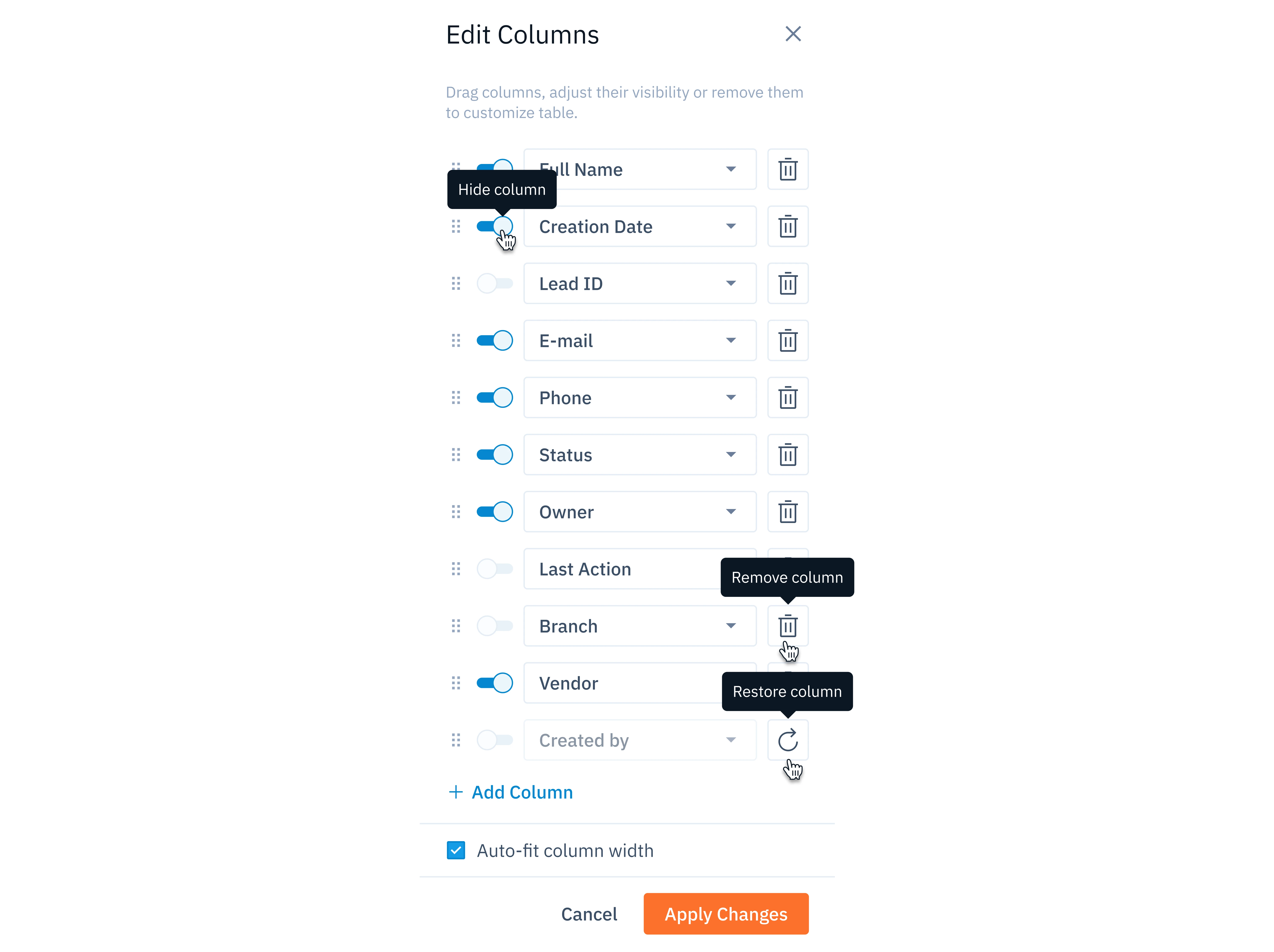
Labeling states with tooltips also improves accessibility, particularly for keyboard users or those navigating with screen readers. When paired with proper ARIA attributes, a tooltip can convey both the control’s label and its current state.
Explaining advanced features
There are moments when your interface looks clean, and no one seems to get lost. But then comes the launch of a new feature, and suddenly, users start to drop off. The reason might be simpler than you think: the new feature isn't clear.
When you introduce something new, users need to understand what it is and how to use it. Tooltips are a simple way to support that moment.
A clear tooltip message can guide experienced users without distracting everyone else. To further support their journey, you can place lightweight hints across the interface, giving customers just enough direction to stay on track.
Tooltips also work well for edge-case buttons or hidden features. For instance, a small icon next to a report might allow data export in a specific format. Most users won’t notice it, but a tooltip ensures the option is discoverable for those who need it.
Communicating restrictions
One of the most frustrating UX moments is when a button is disabled, or an action is blocked, and there’s no explanation why.
Using tooltips, you can communicate restrictions, rules, or requirements directly in context. If a “Download report” button is grayed out, adding a tooltip like “Reports are only available after setup is complete” helps users understand what’s going on.
At Eleken, we’ve learned that tooltips are very helpful in permission-based SaaS interfaces. When certain actions are only available to admins or users on higher-tier plans, our designers can use tooltips to gently explain the limitation.
Done well, these tooltips reduce friction, prevent drop-off, and build trust by being transparent about how the interface works.
Providing additional context
Sometimes, users need a little more information to understand what they’re looking at. This is where tooltips can quietly support the experience.
In data-heavy interfaces, for example, you might show a shortened status label like “Syncing” or “Outdated.” A tooltip can expand on that: “Data syncing in progress. Last synced 4 minutes ago.” That added detail helps users feel more in control.
Tooltips also work well for displaying metadata, such as who last edited a file, when a record was created, or what a specific number represents. Rather than stuffing all that into the main layout, you can surface it on hover only when users need it.
These supporting tooltips aren’t always necessary, but they can make a big difference in complex or high-density UIs.
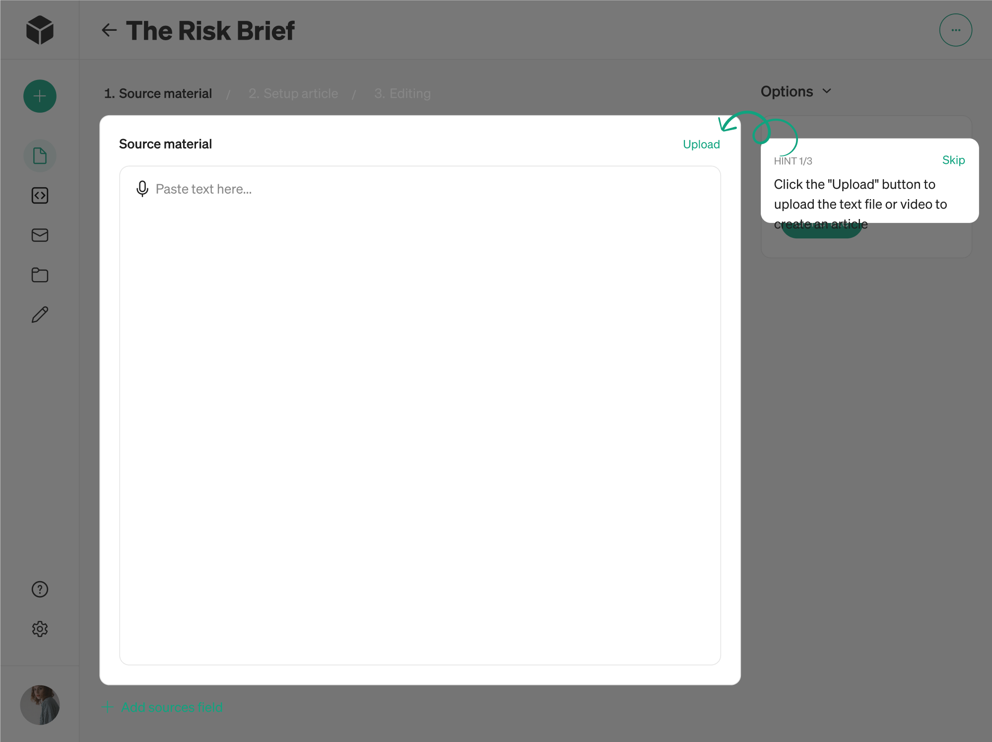
Guiding onboarding flows
In many cases, tooltips are used to support onboarding. You can break things down into manageable hints like “Click here to create your first project,” or “Set up notifications to stay on track,” and help users reduce anxiety.
That said, not every onboarding tooltip is a tooltip in the strict sense.
Many flows use coachmarks, hotspots, or step-by-step overlays that look the same but behave differently. The contrast is that onboarding tooltips are usually persistent, interactive, and sequential, whereas standard tooltips are transient and passive.
If you're designing a tooltip for onboarding purposes, make sure it behaves appropriately. Don’t rely on hover triggers, make it dismissible, and ensure it's fully accessible on all devices.
Tooltip design guidelines that hold up in real products
Designing effective tooltips requires careful attention to when they appear, where they appear, what they say, and how they behave. Below are key best practices in tooltip design, covering placement, timing, content, and more.
Avoid using tooltips for critical information
Tooltips are best used to clarify an unusual request or explain a technical term. But when it comes to actions that affect user decisions or system behavior, tooltips shouldn’t carry that responsibility alone.
They disappear the moment a user moves the cursor or shifts focus, which makes them unreliable for delivering important instructions or requirements.
This UI pattern works best as supporting content. If removing the tooltip would leave the user lost, that’s a sign the information should be placed somewhere.
Tips to keep in mind:
- Include information that’s helpful, not essential.
- Use tooltips to support visible instructions.
- The UI should still work without the tooltip.
Keep tooltip content short and useful
If a tooltip takes more than a second or two to read, it’s probably doing too much. Users aren’t expecting long explanations in a pop-up bubble. They’re looking for a quick confirmation or clarification.
A good UI tooltip typically follows the same rules as a good button label: short, specific, and action-oriented. That’s why you should focus on a single idea.
Also, avoid repeating obvious information. If a button already says “Delete,” a tooltip that also says “Delete” adds nothing. But “Delete permanently” or “Delete (can’t be undone)” might give that little bit of extra clarity a user needs.
Tips to keep in mind:
- Focus on a single action or idea.
- Avoid full sentences or paragraphs.
- Skip it if the tooltip just repeats what’s already visible.
Set appropriate trigger delay and duration
A tooltip might be small, but the timing of how it appears and disappears plays a big role in how usable it feels. If it pops up too quickly, it can feel jumpy or accidental. If it vanishes too soon, users won’t have enough time to read it.
For desktop users, the best practice is to trigger tooltips on hover with a short delay of around 300–500 milliseconds. This gives users time to move their cursor across the screen without accidentally triggering a flood of tooltips.
Also, only one tooltip should be visible at a time. When a new tooltip is triggered, the previous one should disappear to prevent overlapping.
Tips to keep in mind:
- Keep the tooltip visible while hovered or focused.
- Add a short grace period (~1.5 seconds) before hiding.
- Only show one tooltip at a time.
Use tooltip styling with proper contrast
Tooltips are small by design, so their visibility relies heavily on clear styling. If the text is too light or blends into the background, users can easily miss the message.
This is especially important for people with visual impairments. For example, placing light-grey text inside a tooltip on a white or light background often fails contrast checks and becomes nearly invisible for many users.
To keep tooltips usable and inclusive, follow the WCAG (Web Content Accessibility Guidelines) contrast standard. Text should have a contrast ratio of at least 4.5:1 against its background to ensure readability for every potential user.
Tips to keep in mind:
- Ensure tooltip text meets the minimum contrast ratio (4.5:1).
- Avoid light-grey text on light backgrounds.
- Add a subtle shadow or border to separate the tooltip.
Make tooltips accessible via keyboard and mouse
If you're building for accessibility (and you should be), tooltips UX must also support keyboard users, screen readers, and touch interfaces.
At a minimum, tooltips should appear on focus as well as on hover. This allows users who navigate with a keyboard shortcut to access contextual help. If a tooltip is only visible on hover, a portion of your users could miss important information.
For screen reader support, make sure tooltips are announced using appropriate ARIA attributes. This links the tooltip content to the control it describes, so assistive tech users hear the information when they focus on the element.
Tips to keep in mind:
- Use aria-describedby to make tooltip content accessible.
- Ensure tooltips don’t trap focus or block navigation.
- Avoid critical content in tooltips on touch interfaces.
Position tooltips so they don’t block important UI
A common issue is when tooltips display directly over a button or label, forcing the user to move their mouse just to read what they were originally trying to understand.
This creates a frustrating loop of hover → read → tooltip blocks content → move away → re-hover — and repeat.
To avoid this, always test tooltip positioning in the actual UI context. Make sure the tooltip doesn't obscure the element it's describing or any related inputs or form labels. What works in a controlled component may break down in a real layout.
Tips to keep in mind:
- Avoid placing tooltips over other elements.
- Use auto-positioning or collision detection when available.
- Always test tooltip behavior in the actual layout.
Apply tooltips consistently
Since tooltips often don’t have visible triggers, they’re easy to overlook. That’s why, if users see a tooltip in one part of the interface, they’ll expect similar elements to behave the same way elsewhere. And you should deliver on that expectation.
That doesn’t mean you need to add tooltips to everything. Instead, use a consistent logic to ensure similar components offer similar levels of support. Following clear rules within your design system will help you apply tooltips intentionally.
If only a few elements truly require extra explanation, you might consider using visible helper text or popup hints instead.
Tips to keep in mind:
- Apply tooltips based on repeatable logic.
- Treat similar components the same way.
- Use alternative patterns when only a few elements need help.
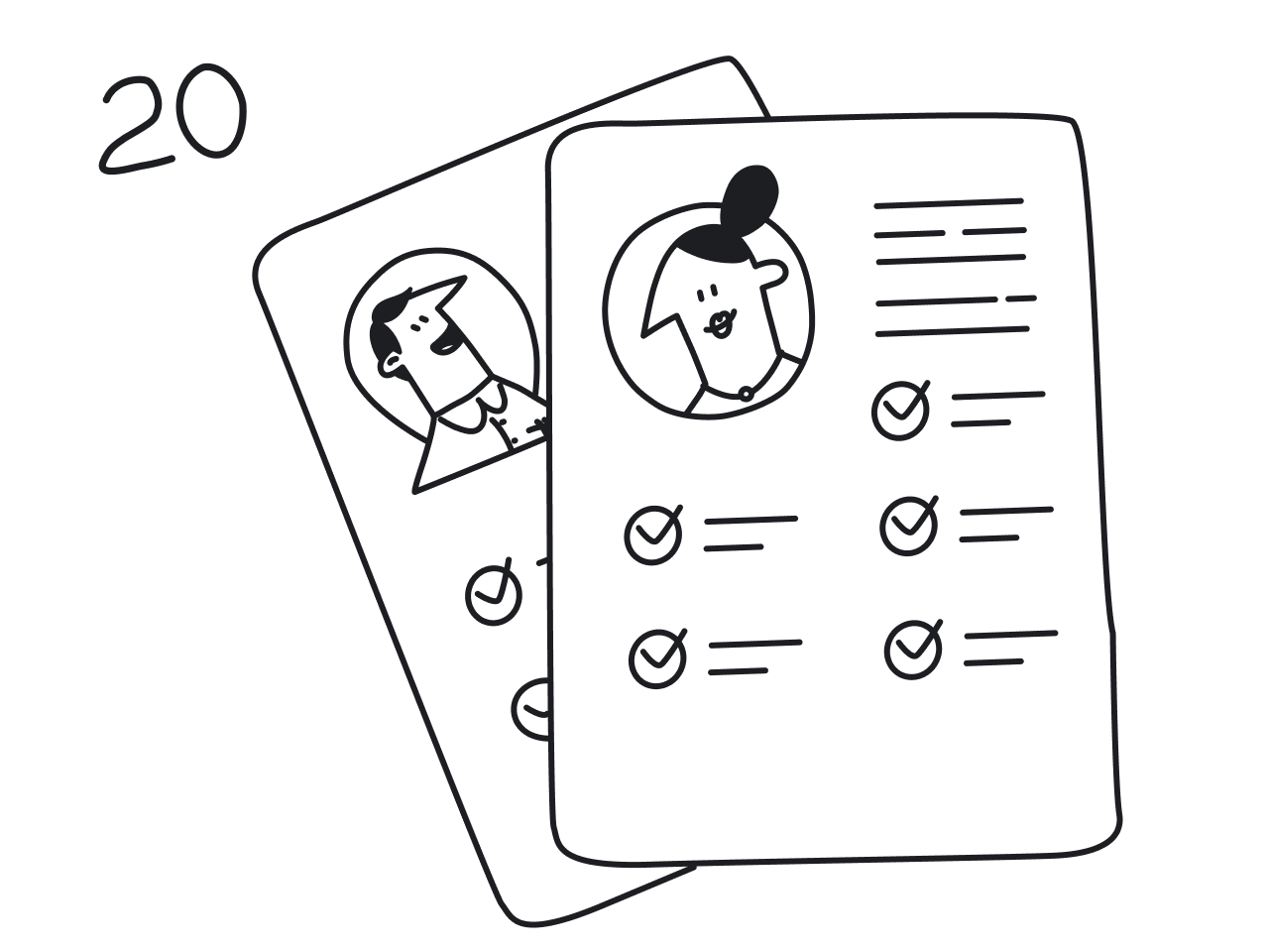
20 effective tooltip UI design examples
The best way to understand what makes a tooltip actually useful is to look at how real products implement them. For this reason, we’ve prepared a few examples of effective tooltips in popular apps as well as in our own SaaS projects.
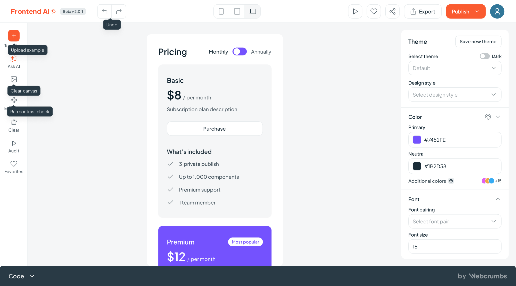
1. Frontend AI
When Webcrumbs approached us to design Frontend AI, an open-source developer tool, we knew clarity was key. To support that, our designers used tooltips sparingly. They appear on hover, offering helpful hints that don’t break the coding flow.
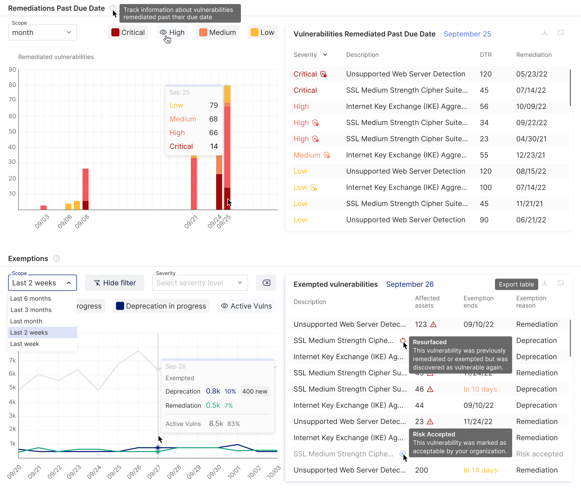
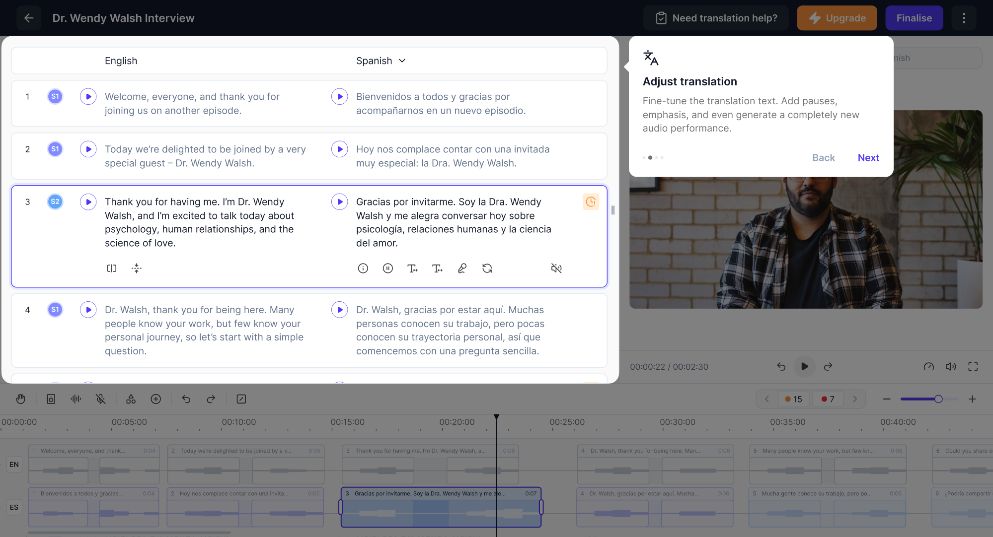
2. Vector0
DarkWave from Vector0 is a platform that provides complete Attack Surface Management capabilities and presents a wide range of vulnerability data. Considering the product’s complexity, our team at Eleken used tooltips to explain key metrics and help users quickly understand what they were looking at.
3. Datawisp
Datawisp is a no-code data analysis platform that came to us for a redesign. The previous interface lacked UX tooltips, which made it harder to navigate. In our redesign, we introduced this pattern to make the experience more functional.
.webp)
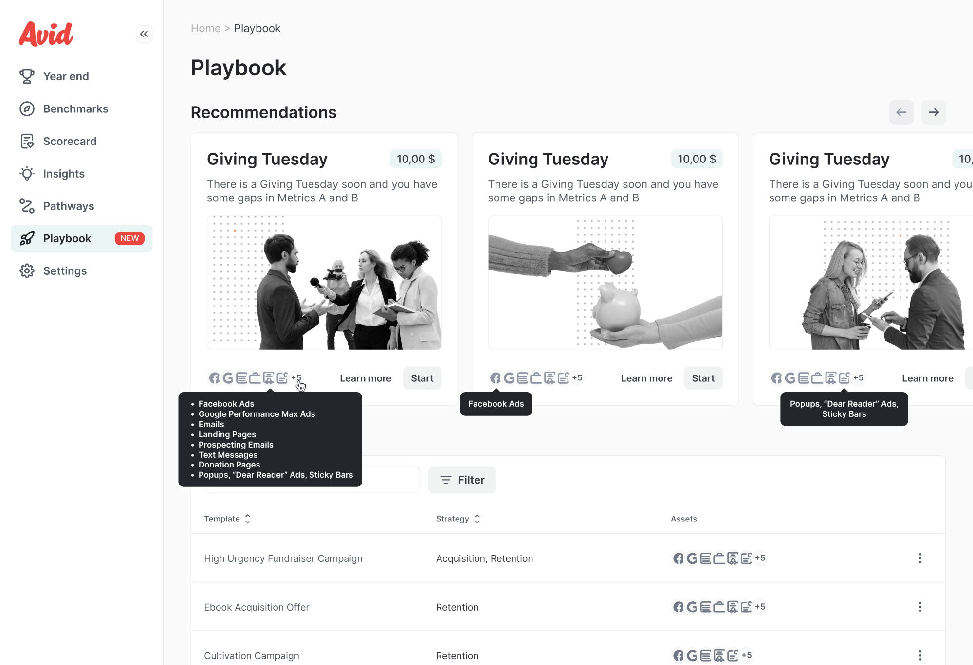
4. Avid
Avid is a fundraising tool that turned to Eleken to help expand their platform with AI. We designed a new AI-powered feature from scratch, and to support user adoption, we added tooltips that provide helpful context throughout the experience.
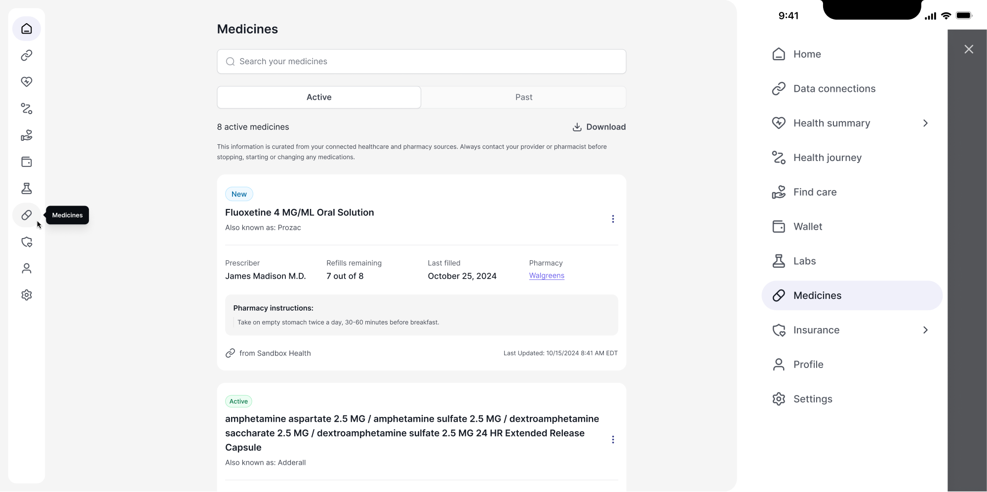
5. b.well
As part of our work on b.well’s product extension, we focused on both desktop and mobile experiences. On desktop, we added tooltips to the collapsible sidebar to help users navigate icon-only tabs. On mobile, where tooltips aren’t practical, we used an expandable menu with clearly labeled items instead.
6. Modia
For Modia, we did a complete product redesign. After we restructured the core screen, the new workflow still came with a learning curve. Since the product introduced a fresh approach to working with AI-generated content, our designer added guided tooltips to walk users through the process.
7. Panjaya
When working on Panjaya, an AI-powered dubbing platform, we needed to show users the new AI workflow. To help them get started, we designed tooltips that highlight the core areas of the interface and explain what they can interact with.
8. Hubble Network
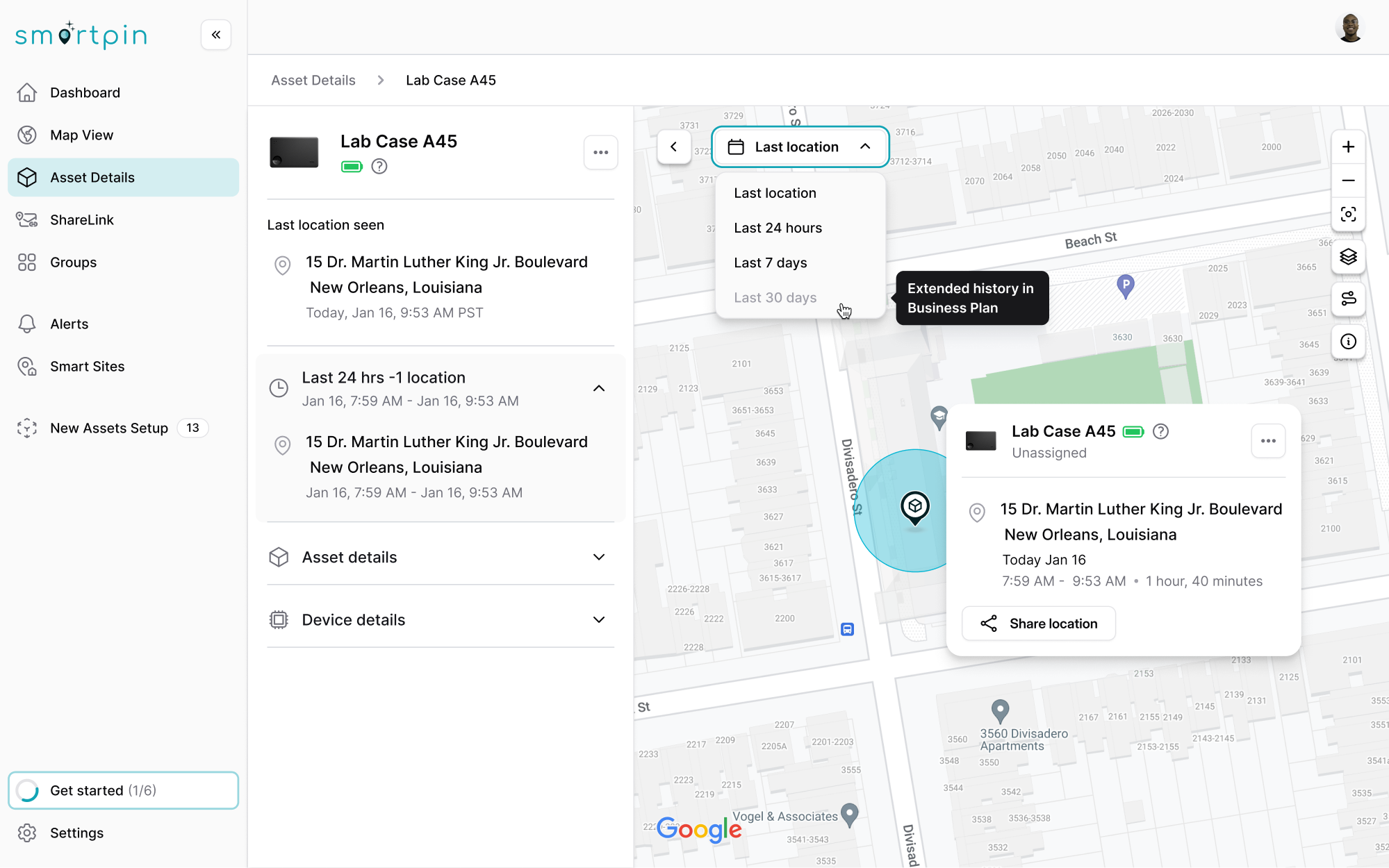
During our work with Hubble Network on Smartpin, their geospatial SaaS platform, we used tooltips thoughtfully to support user clarity. In places where buttons or fields were grayed out, we added tooltips to explain why they couldn’t be used.

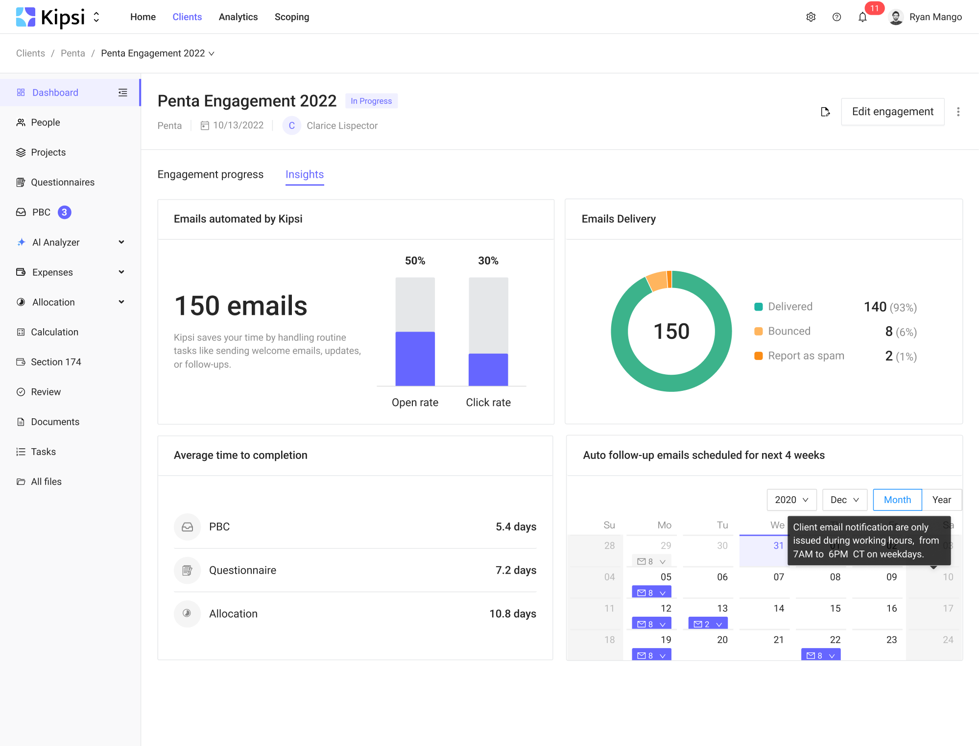
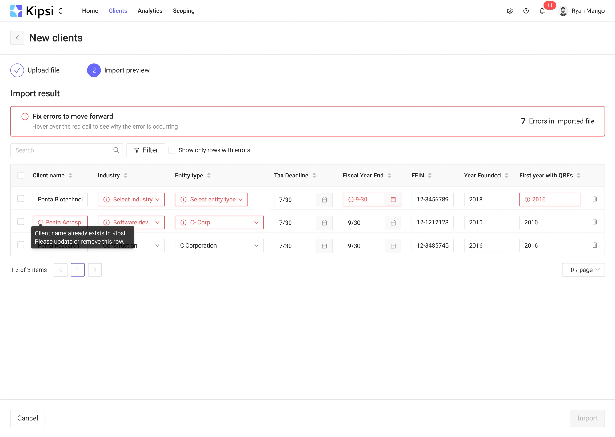
9. Kipsi
Kipsi is a platform for accounting, consulting, and legal firms offering R&D tax credit services. When they reached out to us, we knew the platform would need to handle complex data. On screens where users had to enter information, we used tooltips to clearly explain what went wrong and how to fix it.
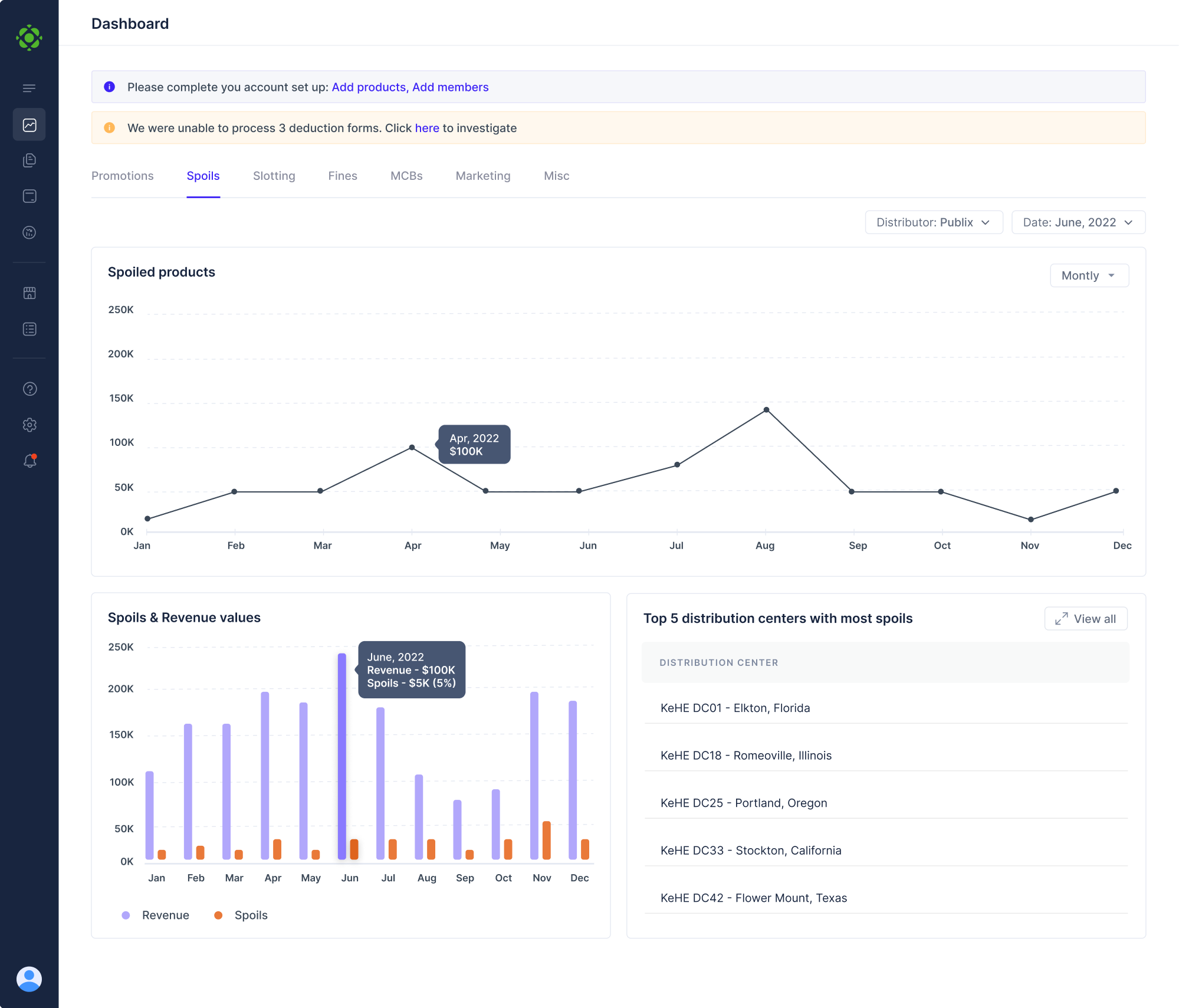
10. Floret
Floret is a platform that helps foodtech companies manage all their transaction records in one place. The main challenge was presenting complex data in a way that felt simple and digestible. As a solution, we added tooltips so users could quickly see details like exact dates and revenue without overwhelming the layout.
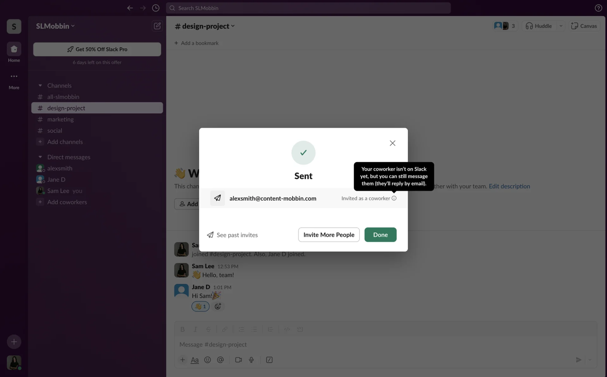
11. Slack
Slack uses tooltips to clearly communicate what different buttons and features do, helping users feel more confident. Tooltips explain icons, reinforce the outcome of certain actions, and reduce hesitation by making the interface more transparent.
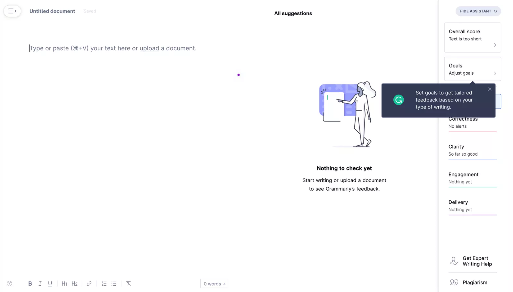
12. Grammarly
Grammarly uses tooltips to guide users beyond the basics and help them discover more advanced features, like customizing their writing style. The tooltips are simple, consistent with the brand, and even include the Grammarly logo, adding a thoughtful touch to an otherwise minimal interface.
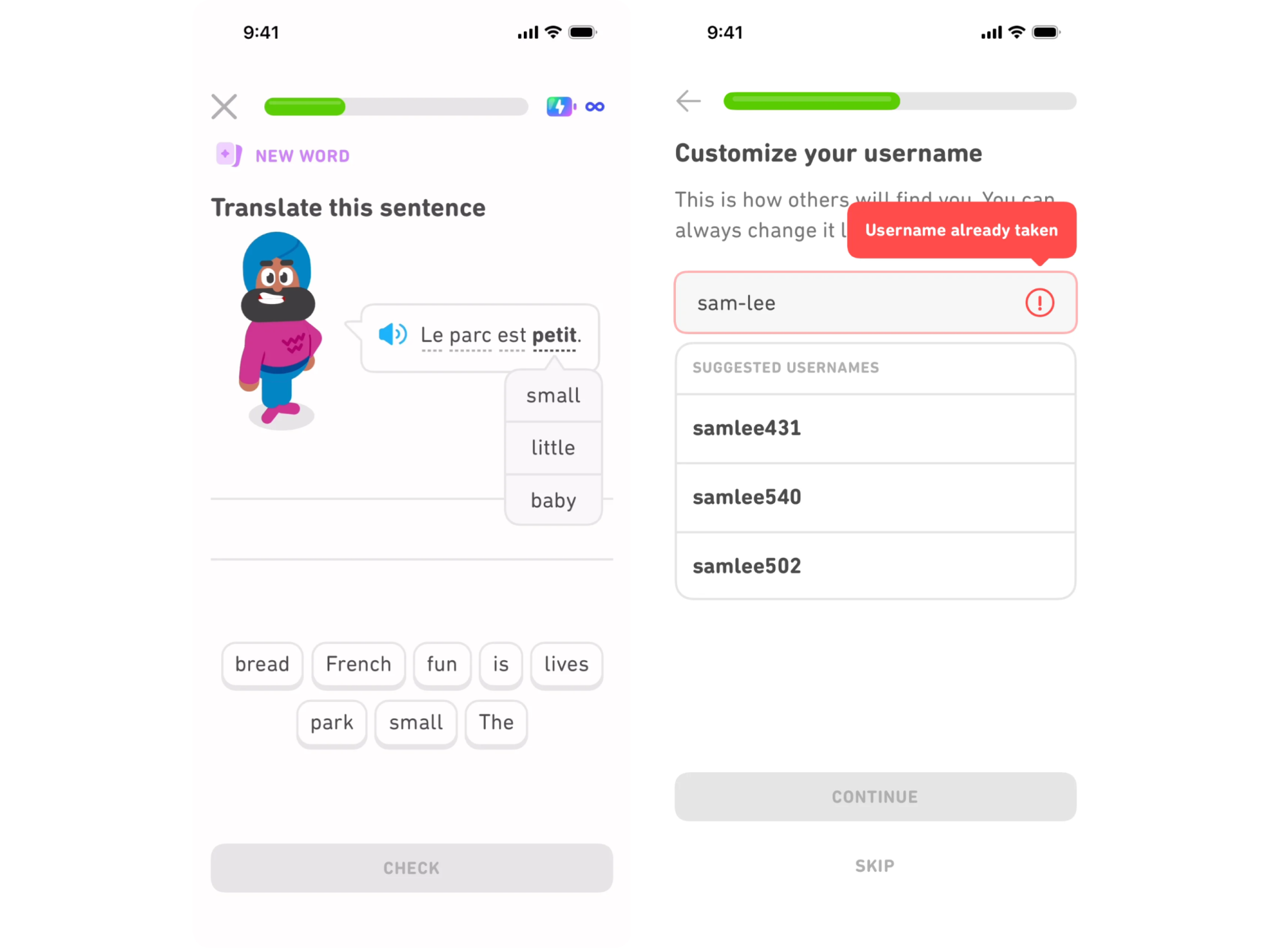
13. Duolingo
Duolingo uses tooltips in its mobile app to clarify common moments of confusion. When a user enters a taken username, a red tooltip appears automatically to explain the issue. This pattern also shows up during lessons to explain word meanings in the user’s native language, making learning more intuitive.
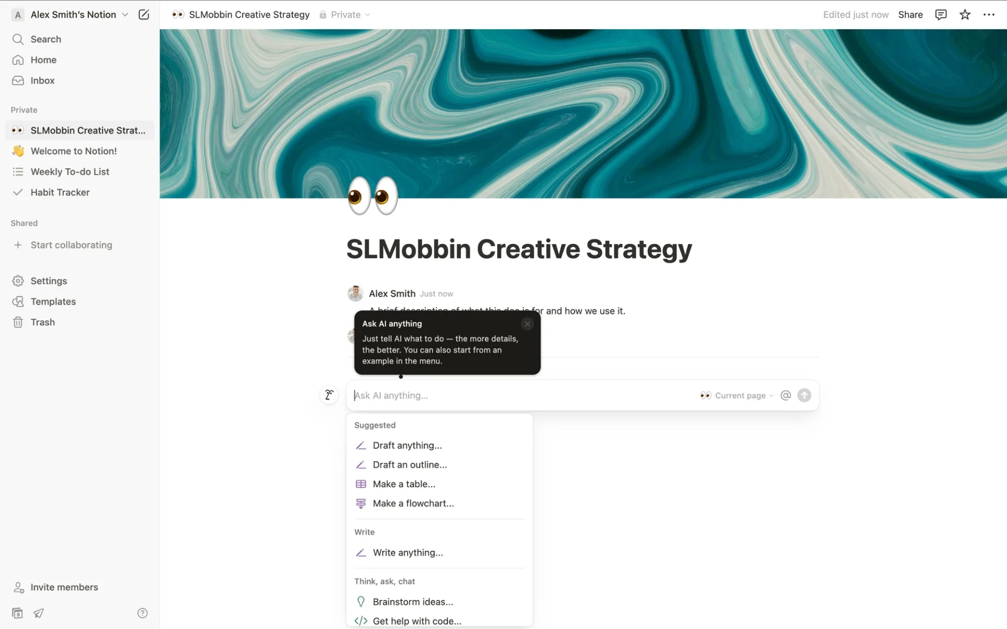
14. Notion
Notion uses tooltips to make its flexible interface feel more approachable. They clarify icon actions, guide users through features, provide formatting tips, and help users feel more confident as they explore the product.
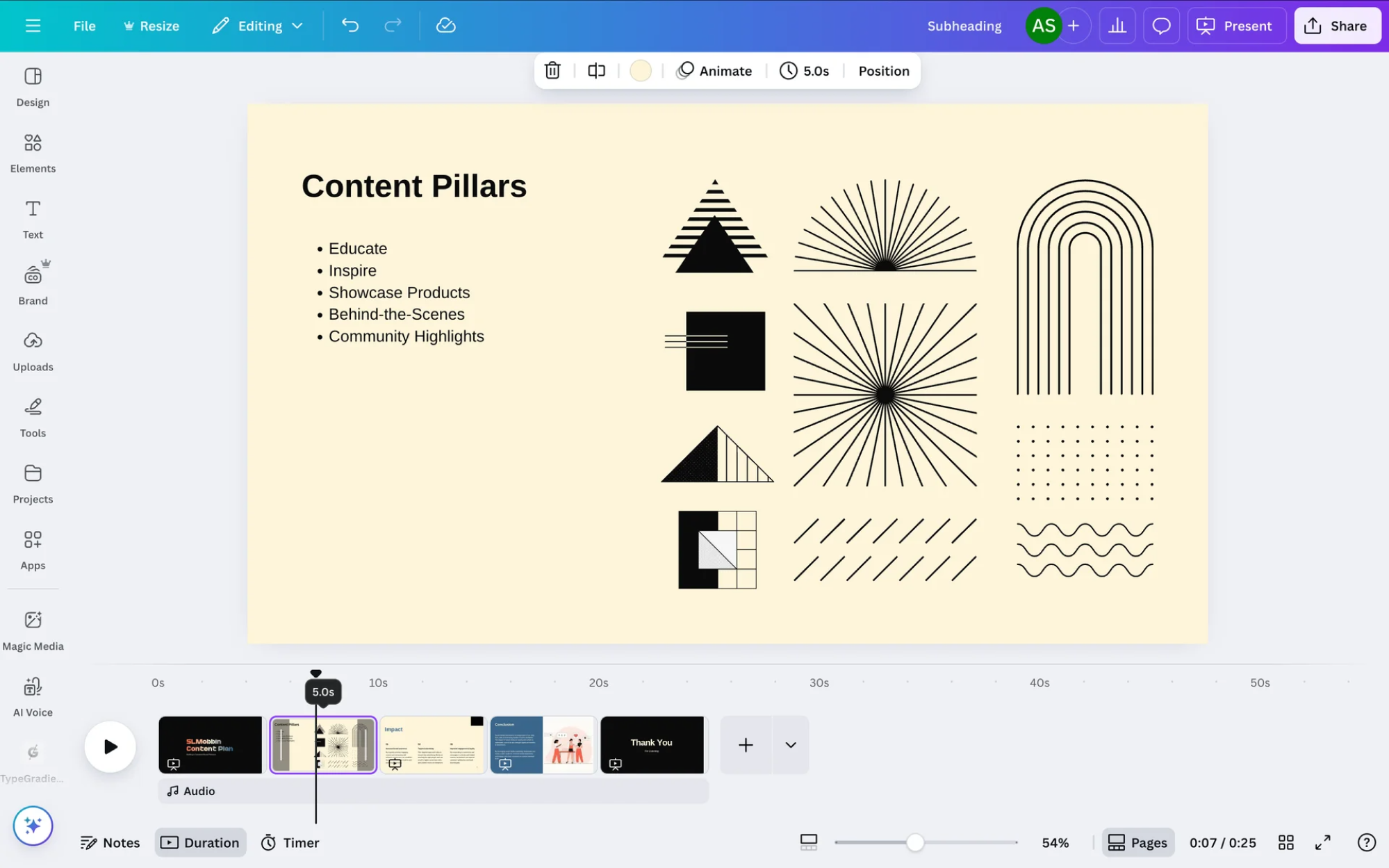
15. Canva
Canva, being a visual editor, uses text labels for many of its interface elements. But where space is limited, or text isn’t an option, it relies on tooltips to clarify icons that might be unclear at first. When editing, users also see tooltips showing slide duration, helping them make precise adjustments while staying in the flow.
16. OpenAI
OpenAI uses tooltips in its interface to provide extra context for its users. They help clarify advanced options, explain less obvious controls, and make the product feel more accessible, especially for those who aren’t familiar with AI tools.
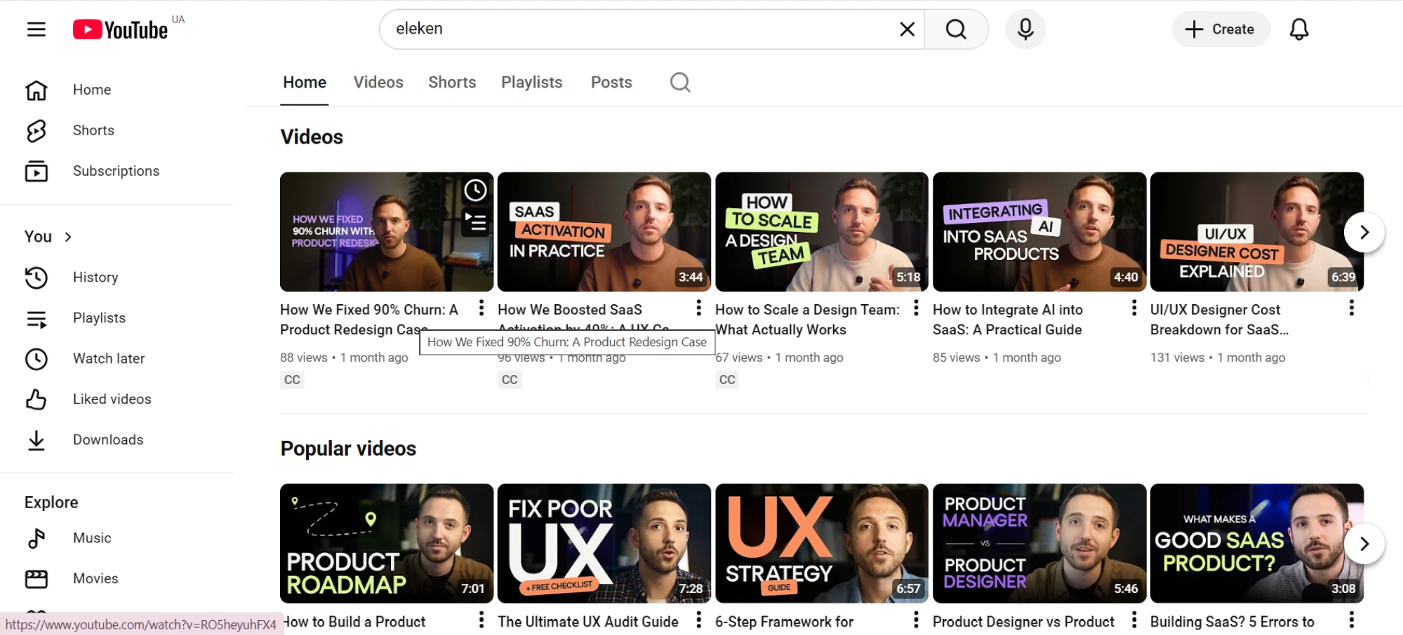
17. YouTube
YouTube uses tooltips to reveal the full title of a video when it's cut off, so users can view it without clicking. Beyond that, tooltips appear throughout the platform to explain icons, settings, and actions.
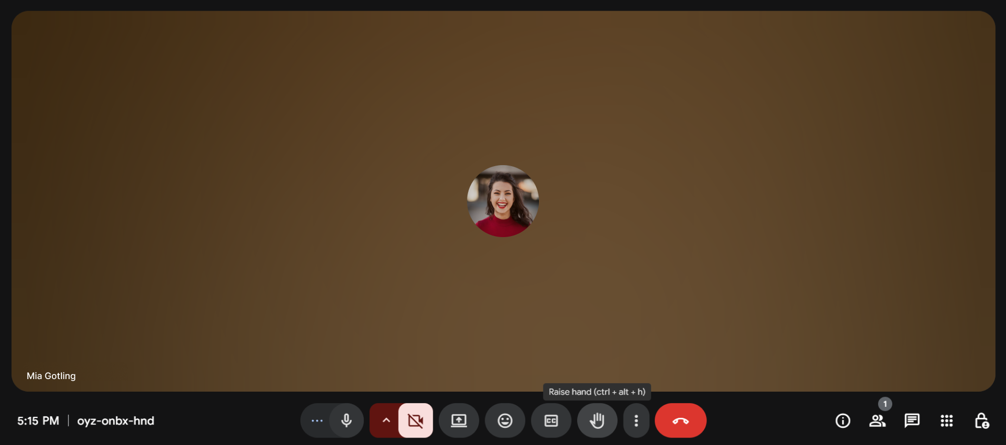
18. Google Meet
Google Meet keeps its interface minimal during calls to avoid distracting elements. To support usability, it applies tooltips that appear when users hover, offering quick explanations for controls that might not be immediately familiar.
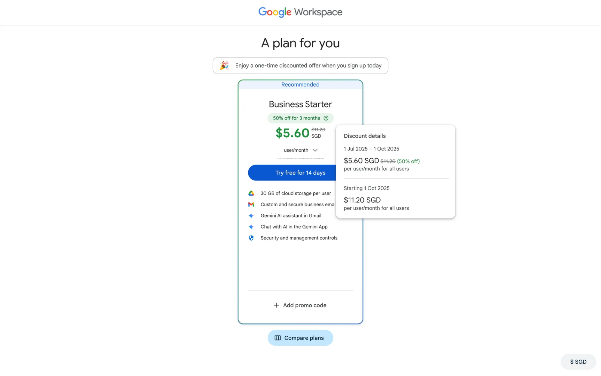
19. Google Workspace
When users select a plan in Google Workspace, a small tooltip provides additional details about payment terms. This subtle hint helps clarify what's included in each option and avoids confusion during the checkout process.
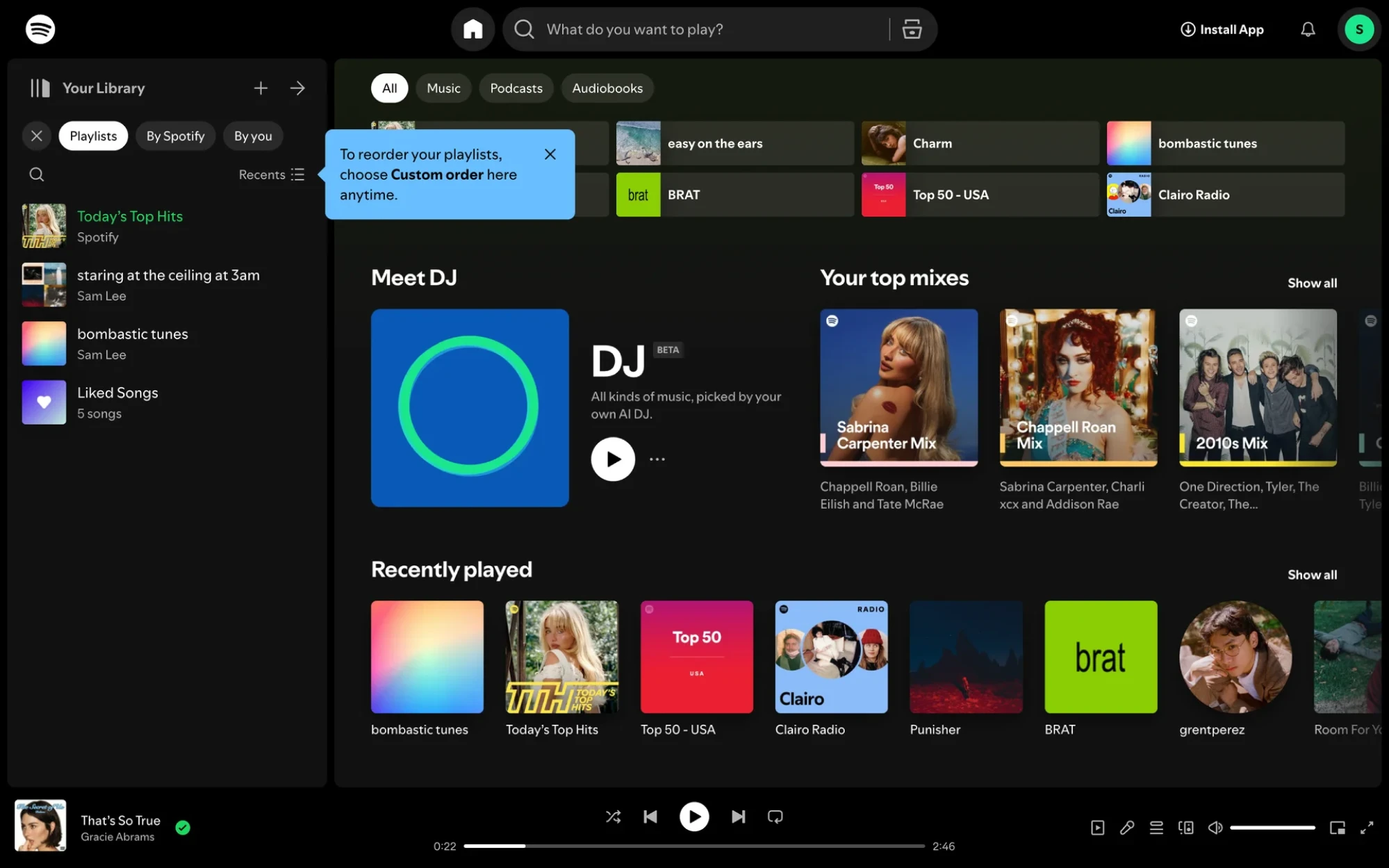
20. Spotify
Spotify uses tooltips across its app to improve navigation and personalization. Hovering over a truncated playlist name or album title reveals the full text, helping users find what they’re looking for without guessing. Tooltips also offer subtle hints that help listeners adjust the interface to fit their needs.
End of the flow
In real SaaS products, tooltips create momentum. A quick explanation at the right time can be the difference between “Wait, what is this?” and “Got it.” And while they’re not the answer to every UX problem, when used intentionally, they make interfaces feel lighter, clearer, and more respectful of the user's time.
So next time you’re tempted to skip the tooltip, pause for a second. Sometimes, a single line of informative text is all it takes to make a product feel smarter.
And if you ever need design help, the Eleken team is just a few lines away. We’ve been designing SaaS products for over 10 years and know what it takes to build usable interfaces. Fill out the form, and let’s start building something great together.


.webp)

.png)
