

When you’re designing a login page, it’s tempting to focus on what looks good. And sure, fancy UI can help. But when users land on your login screen, they’re not there to admire your aesthetics. They just want to get in.
As a UI/UX design agency for SaaS, we’ve designed login screens for most of the 200+ products we’ve worked on. So by now, we have extensive insights to share.
In this article, we’ve gathered 50 login page examples to inspire your next design. We’ll also explain why these pages work, based on patterns we’ve tested and seen succeed in real products. Let’s begin.
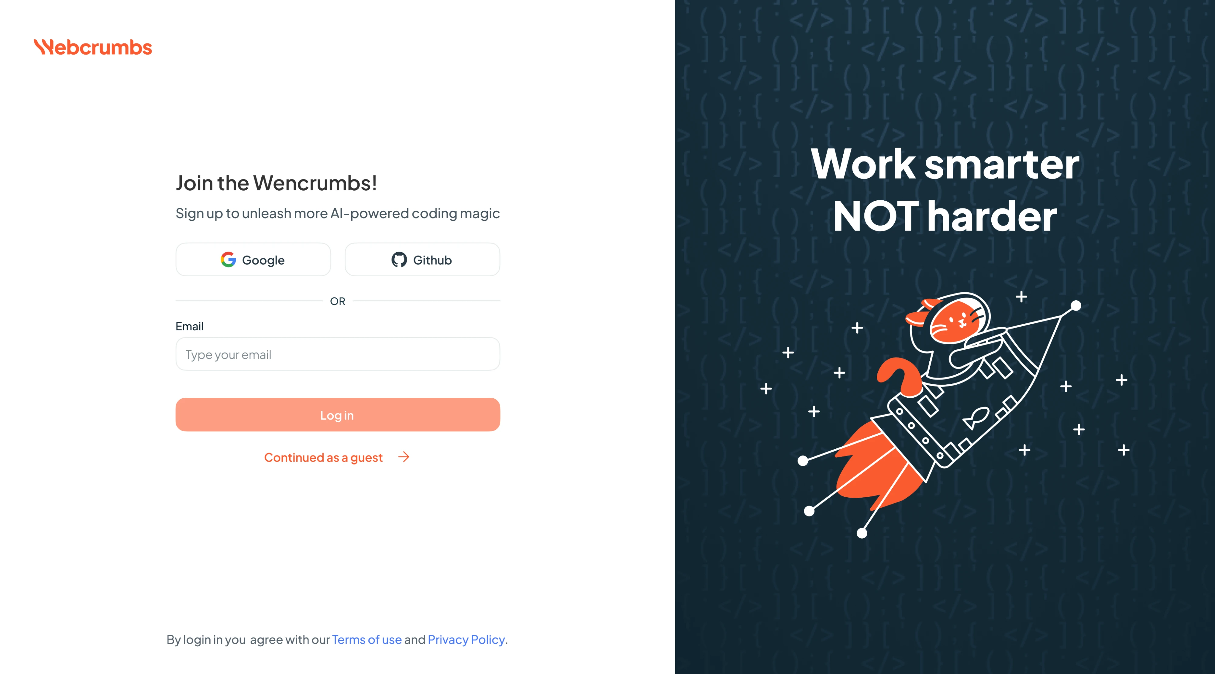
1. Frontend AI
When working on Frontend AI, we took a focused approach to onboarding with a split-screen layout. On the left, the login form offers OAuth options, an email-based login, and a “Continue as guest” shortcut. On the right, a coding-themed illustration reinforces the brand’s AI-for-developers positioning and adds visual interest.
Why it works:
- Two-split layout keeps a clear visual hierarchy.
- Multiple login options reduce friction.
- Brand-aligned experience speaks to the target audience.
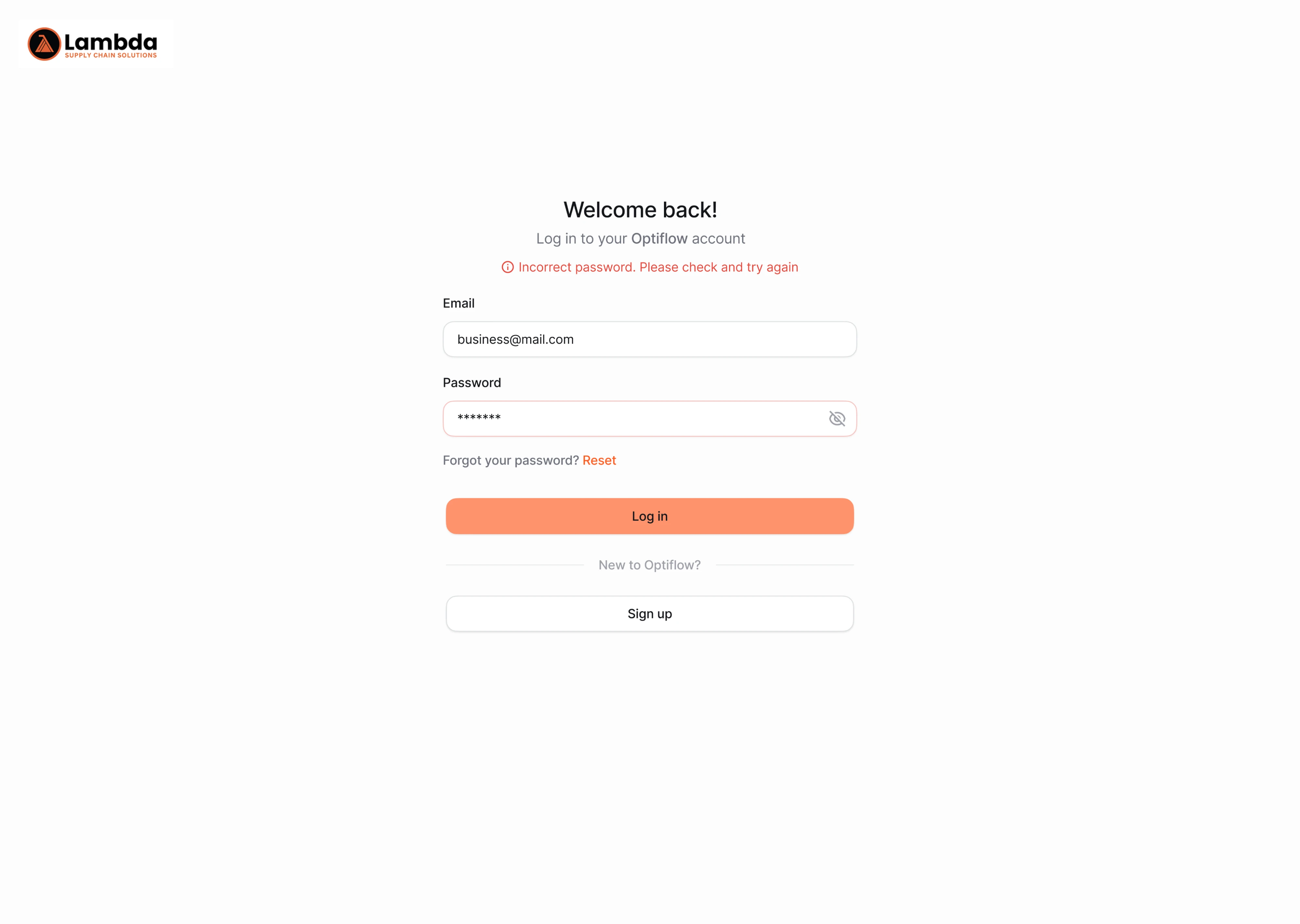
2. OptiFlow
For the Optiflow project, our designer made the login experience simple and focused. We used a single-column layout with centered alignment to keep attention on the task at hand. And because mistakes happen, we took care of error handling by adding inline hints right above the input fields when something goes wrong.
Why it works:
- Linear layout keeps focus on login.
- Inline error messaging improves usability.
- Balanced use of color draws attention to key actions.
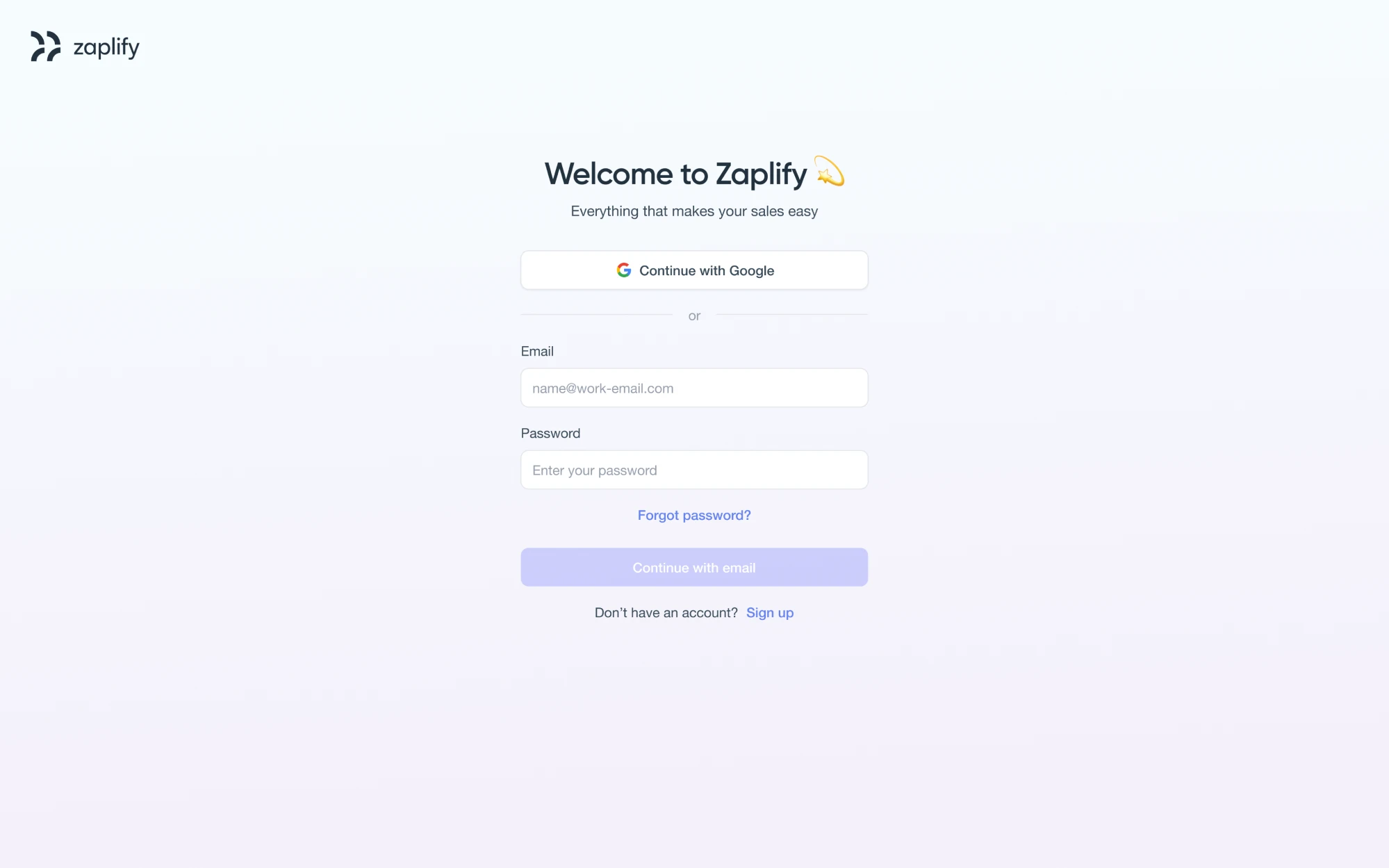
3. Zaplify
During our collaboration with Zaplify, the goal was to make logging in feel effortless. To achieve this, we used a minimal layout with Google sign-in featured at the top for convenience, followed by traditional email and password fields. Clear call-to-actions, subtle separators, and helpful microcopy keep the experience friendly.
Why it works:
- Distraction-free layout supports quick access.
- Prioritized Google login for fast entry.
- Visual tone matches the product’s professional brand.
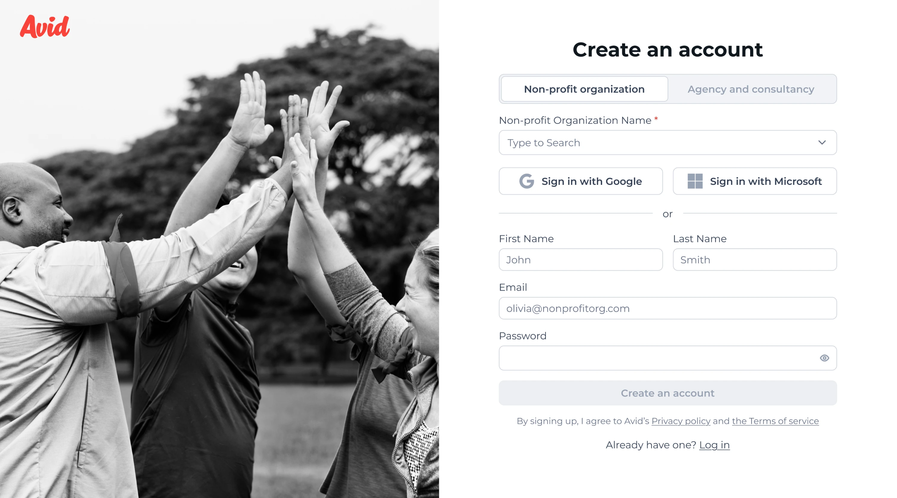
4. Avid
Originally, Avid’s product featured a four-step login process that was slowing users down. We reduced it to two steps and placed everything on a single page to avoid friction and speed up entry. Our designer reworked the UX logic, introduced tailored paths for nonprofits and agencies, and refreshed the visual style.
Why it works:
- Two-step, single-page flow minimizes friction.
- Segmented paths tailor the experience to user type.
- Visuals and copy create a welcoming environment.
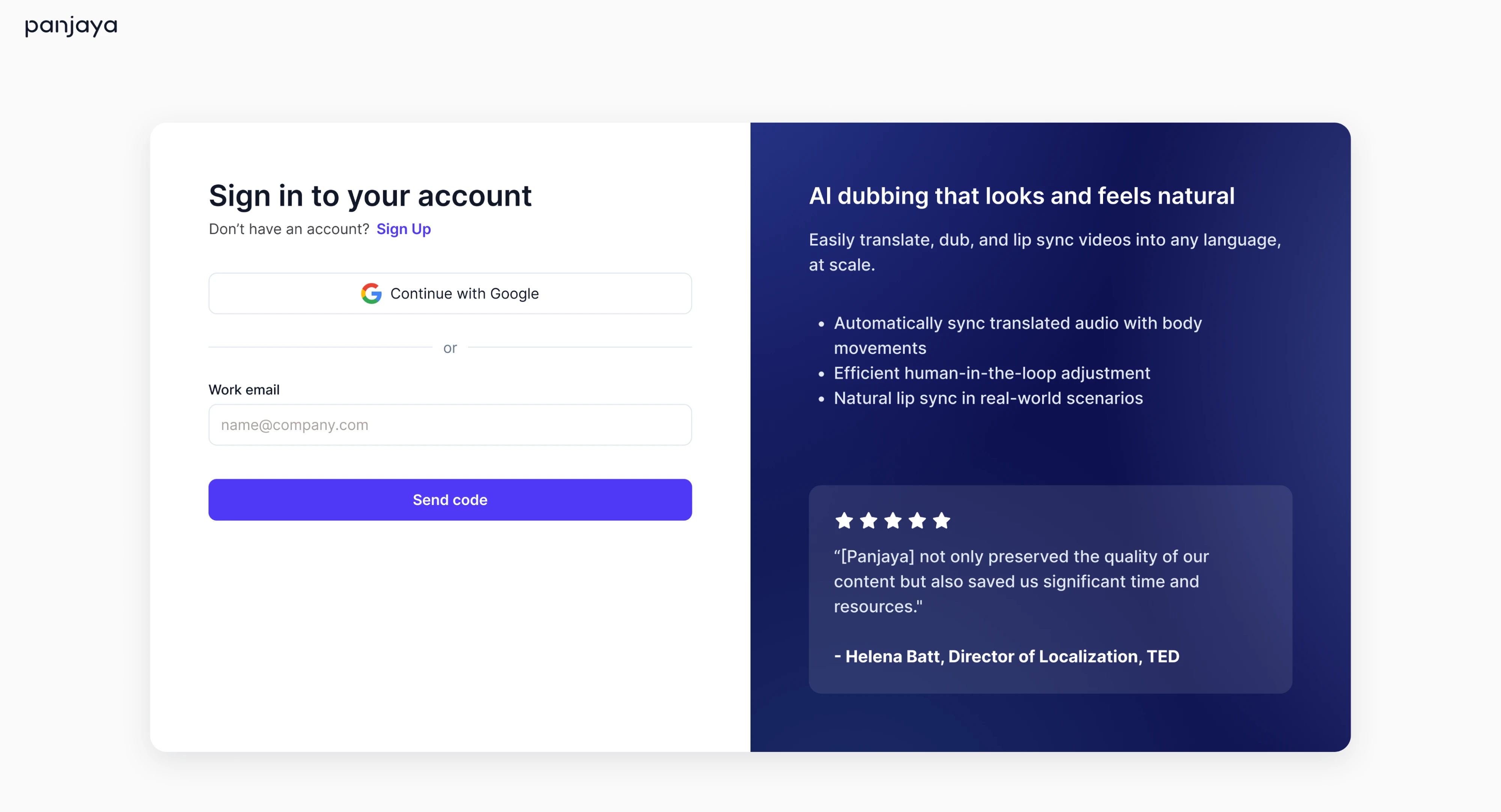
5. Panjaya
The Panjaya login screen needed to deliver on functionality, and our Eleken team made sure it did. We split the layout into two parts: one side offers quick login options, while the other presents the product’s value prop. This dual-pane design gets users in smoothly, reinforcing what the product does and why it matters.
Why it works:
- Passwordless login reduces friction for existing users.
- Dual-pane layout blends utility with value communication.
- Testimonials add trust and relevance.
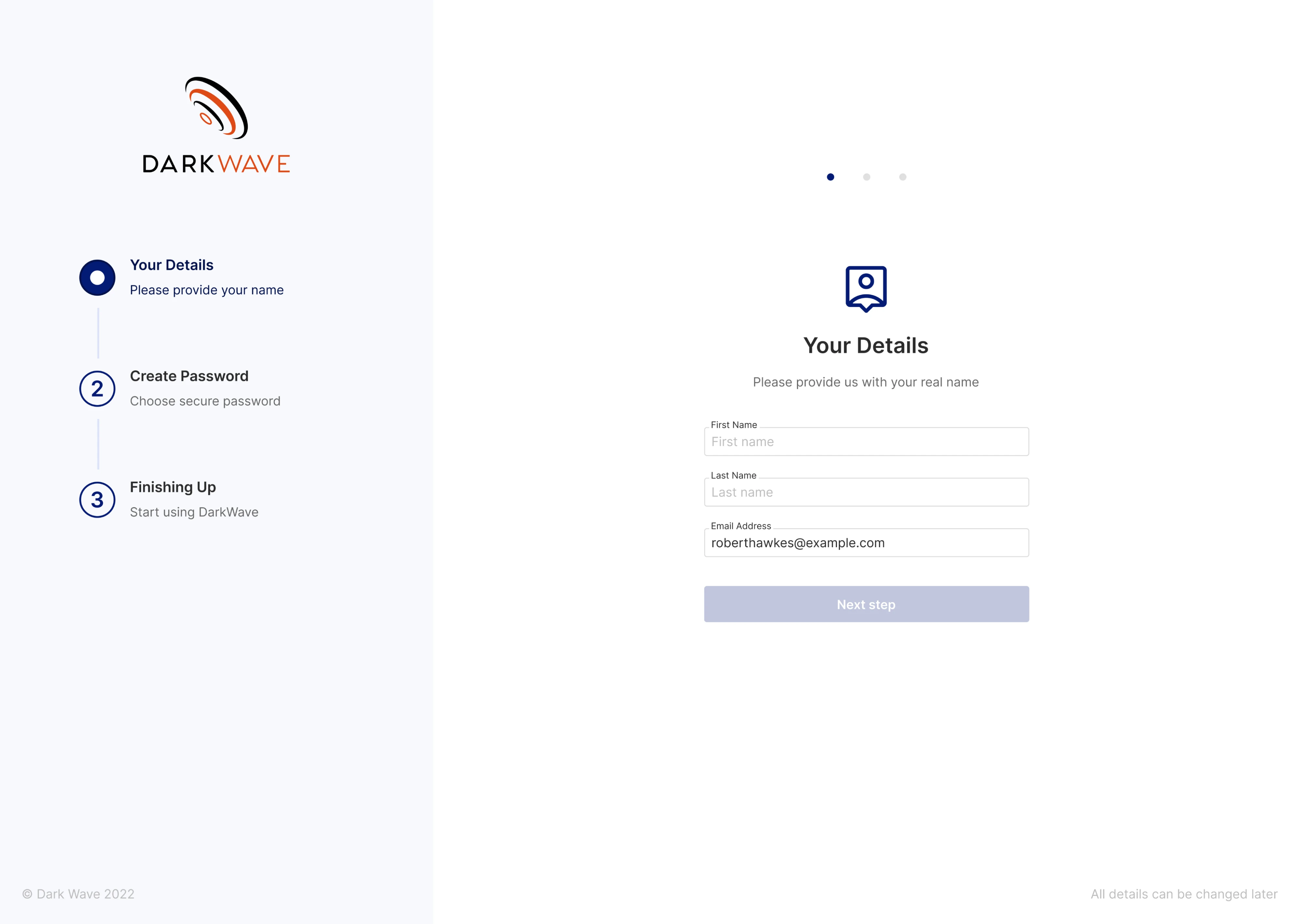
6. Vector0
Vector0 came to Eleken to create UI/UX for the DarkWave project, where the sign-in flow had to be designed specifically for invited users. We added three steps and a vertical progress indicator to give people a sense of orientation. Each screen collects only what’s necessary, using relevant labels and microcopy.
Why it works:
- Step-by-step layout reduces cognitive load.
- The vertical progress indicator provides clarity.
- Language and pacing feel calm.
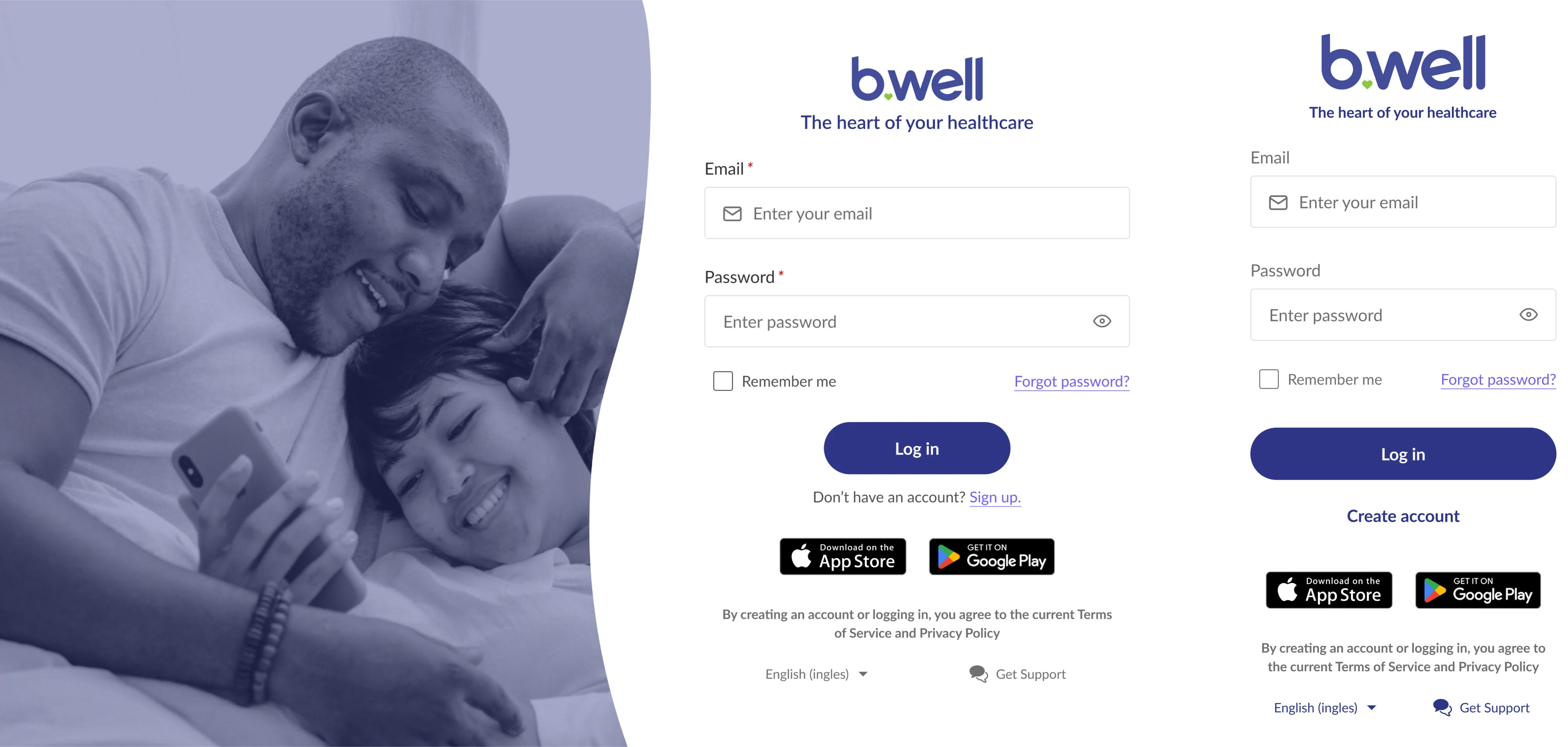
7. b.well
For the b.well login, we included supportive touches like a “Remember me” checkbox, a help link, and app store buttons for cross-platform access. A warm lifestyle image reinforces the human side of the brand, while the mobile version keeps the same layout logic, simply removing the image for space efficiency.
Why it works:
- Calm visual tone suits the healthcare space.
- Responsive design keeps the structure consistent.
- Visual elements reinforce brand trust.
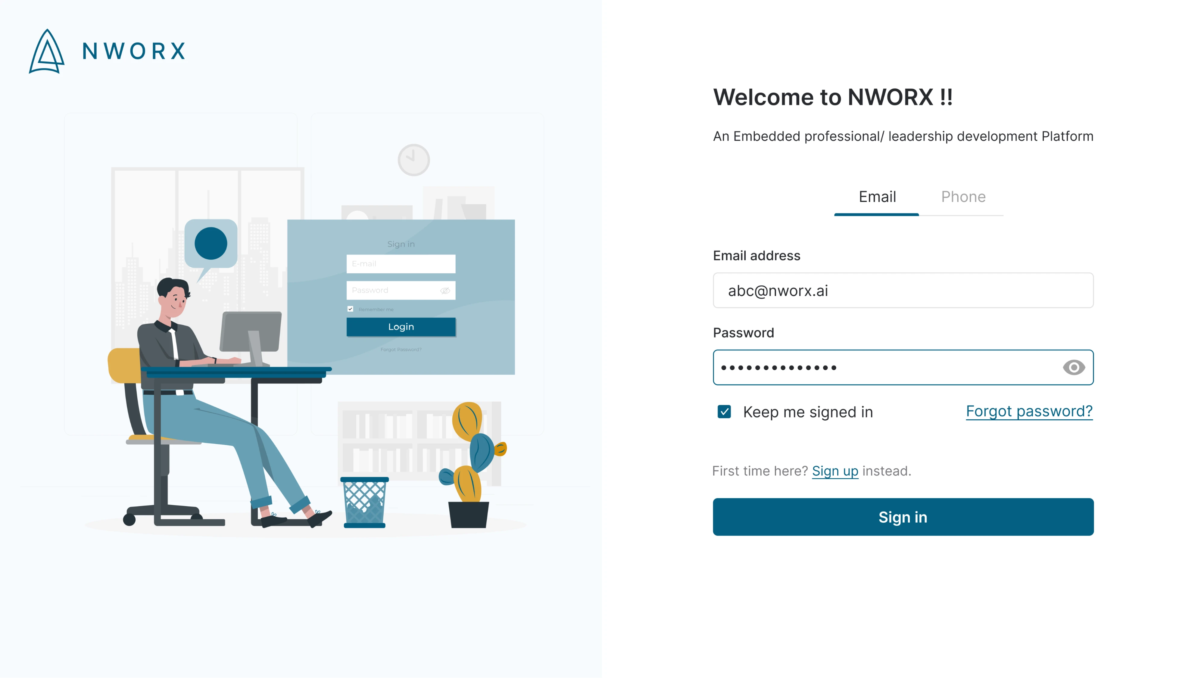
8. NWORX
When working on the NWORX login screen, we used a clean two-panel layout, placing the form on the right and an illustrated image on the left. The interface includes both email and phone tabs, along with thoughtful extras like a “Keep me signed in” checkbox and support links for new users or password recovery.
Why it works:
- Tabbed login options offer flexibility without clutter.
- Illustration adds warmth while keeping the brand professional.
- Form layout is clean and direct, with clear support paths.
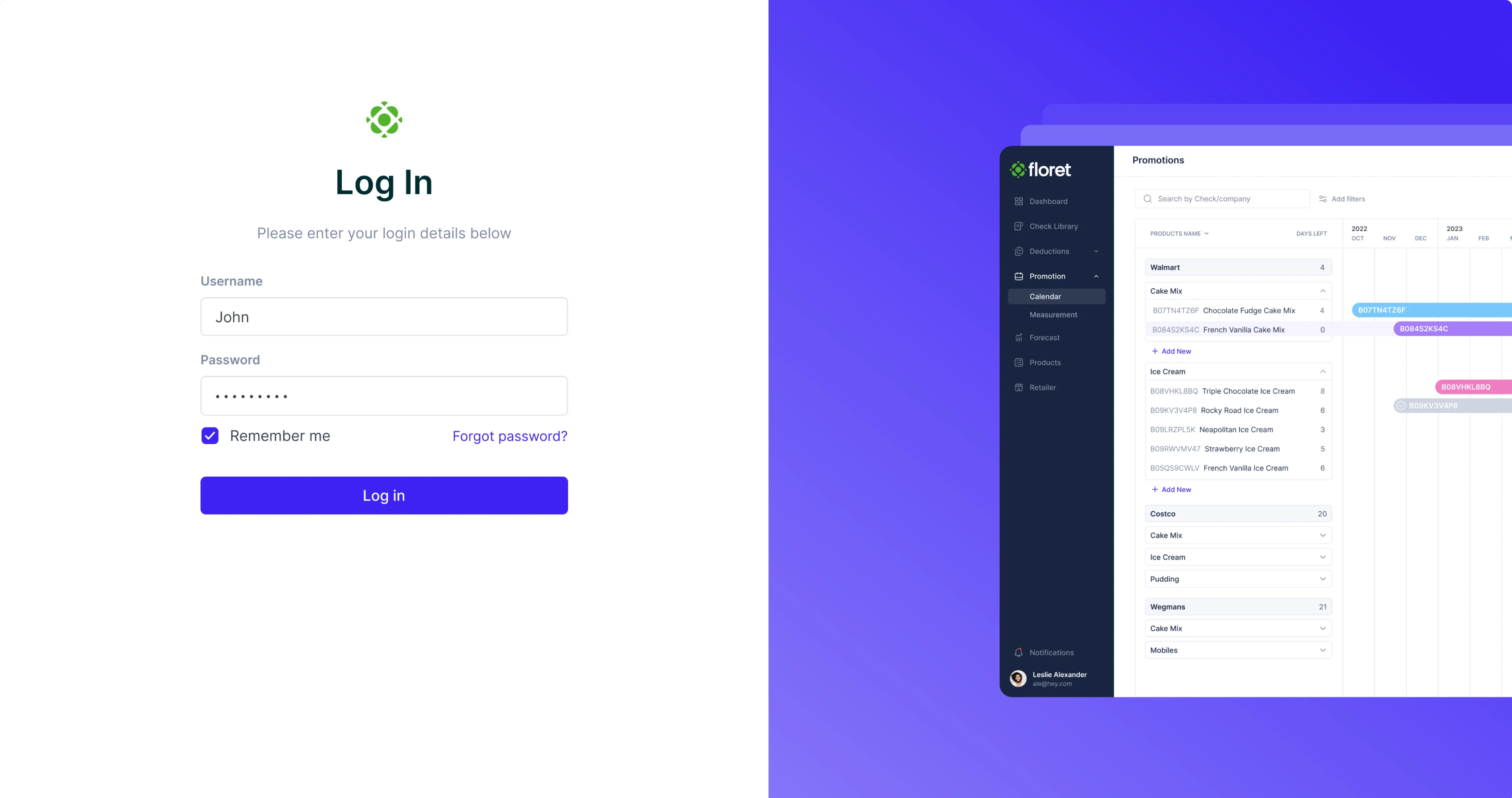
9. Floret
Our Eleken team designed Floret’s login screen around clarity and contrast. We used a classic split-screen layout, adding a product preview as a quick visual cue for users. Input fields are cleanly stacked with generous spacing, the primary CTA is visually prominent, and secondary actions remain accessible.
Why it works:
- Clear visual hierarchy guides the user’s attention.
- Split-screen layout keeps the balance.
- High-contrast interface ensures accessibility.
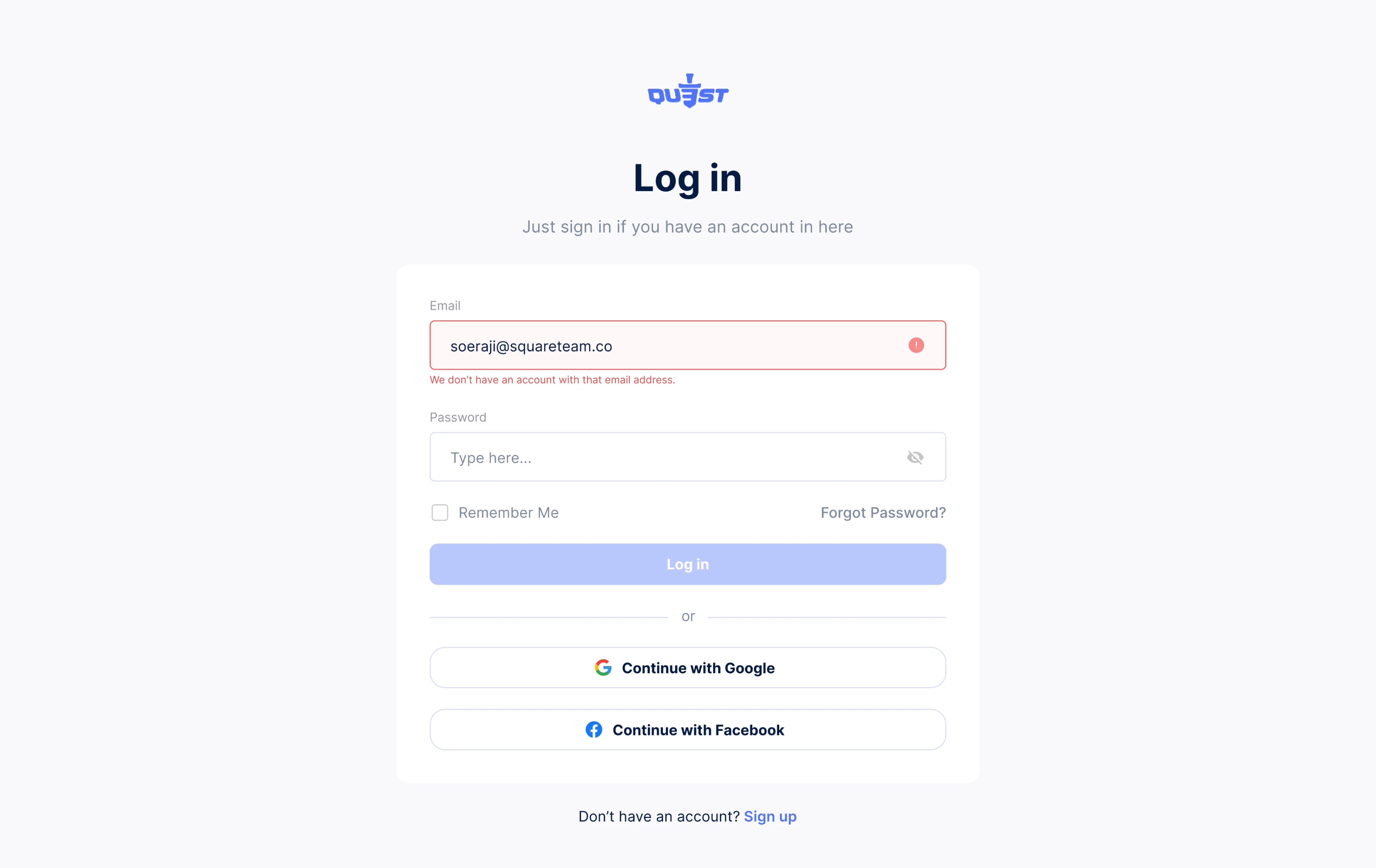
10. QU3ST
For the QU3ST login screen, we created a distraction-free interface. The layout is minimal, with inline error handling that gives users instant feedback when something goes wrong. Below the standard fields, users can also choose to log in via Google or Facebook, offering flexibility without adding visual clutter.
Why it works:
- Inline validation reduces user frustration.
- A clear hierarchy keeps actions and errors easy to scan.
- Social login options offer alternative paths.
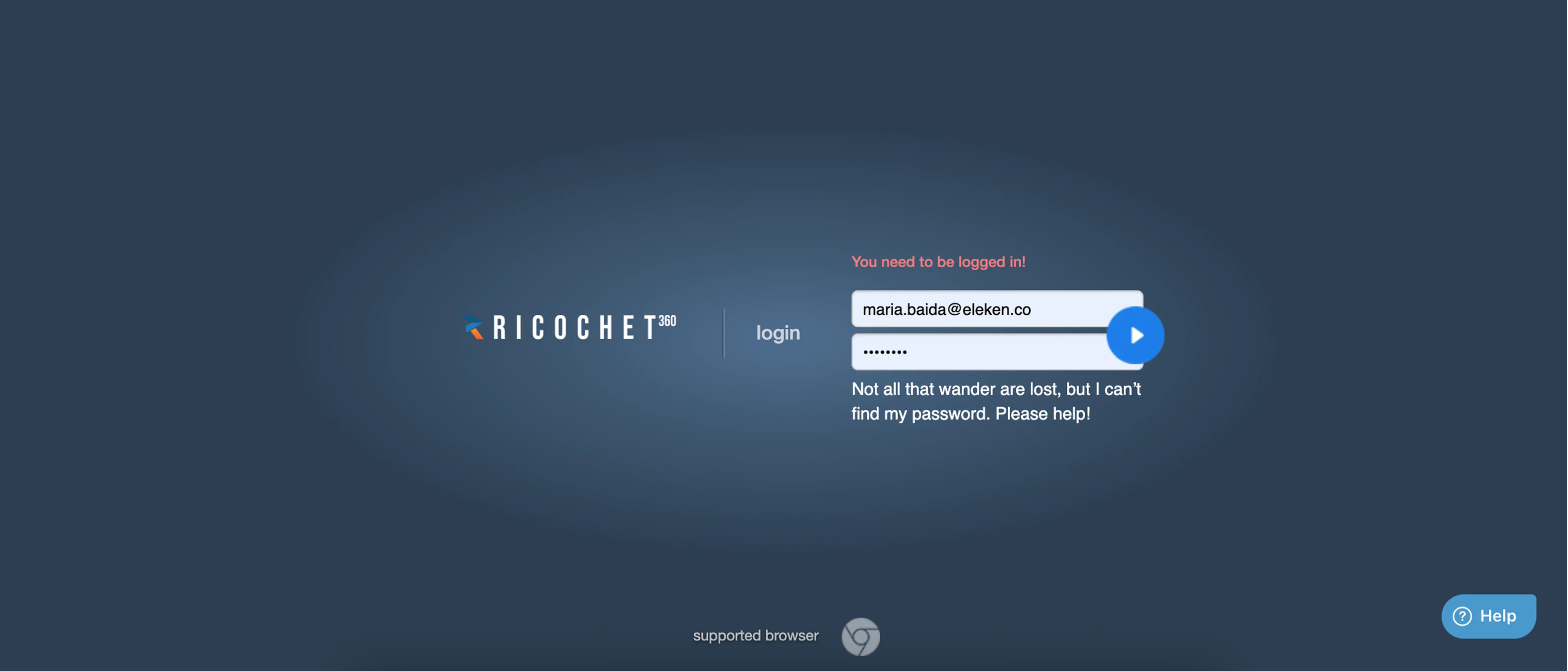
11. Ricochet360
When Ricochet360 contacted Eleken, we didn’t need to design from scratch. We worked with the existing login page template and focused on small improvements. Our designer kept the full-screen layout with a bold brand presence, introduced a floating button, and added error messages with a touch of personality.
Why it works:
- Dark theme emphasizes form fields and CTA.
- Icon-style submission creates a unique interaction.
- Friendly microcopy makes error handling feel less frustrating.
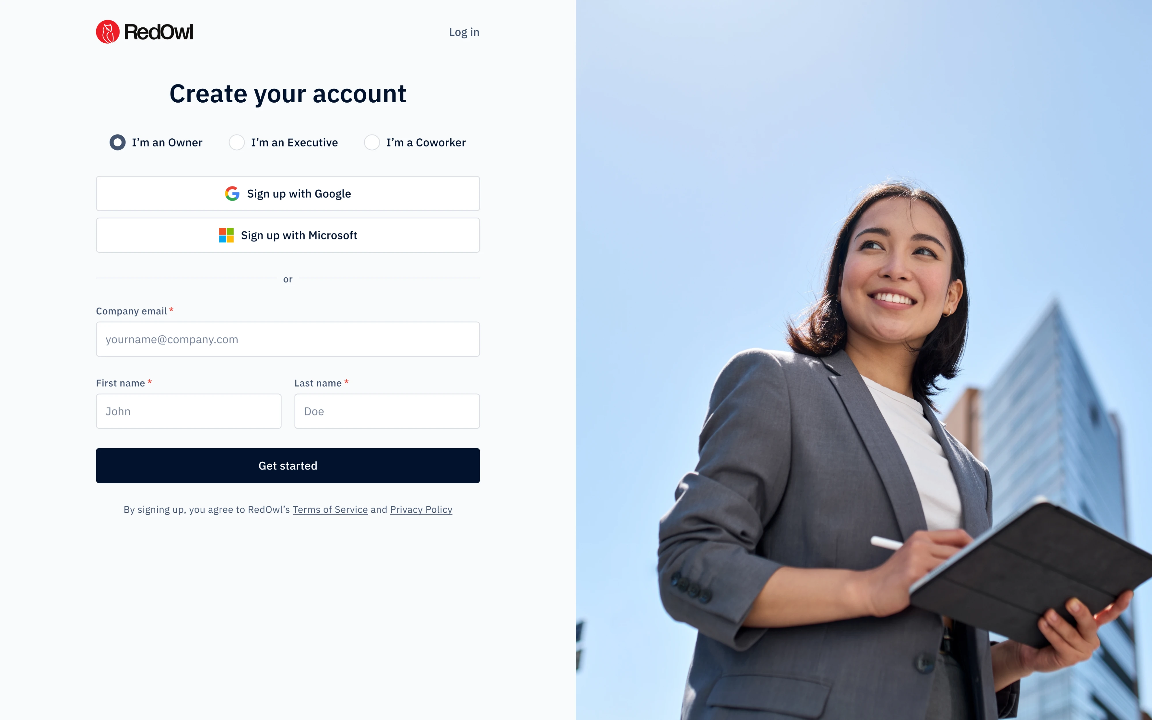
12. RedOwl
Working on the RedOwl login form page, we focused on guiding users through a personalized experience. Right at the top, a segmented control lets people identify their role, which helps tailor the platform’s next steps. The layout is minimal, clean, and structured for quick completion.
Why it works:
- Role-based segmentation adds personalization.
- OAuth options support frictionless sign-up.
- Bold imagery encourages visual interest.
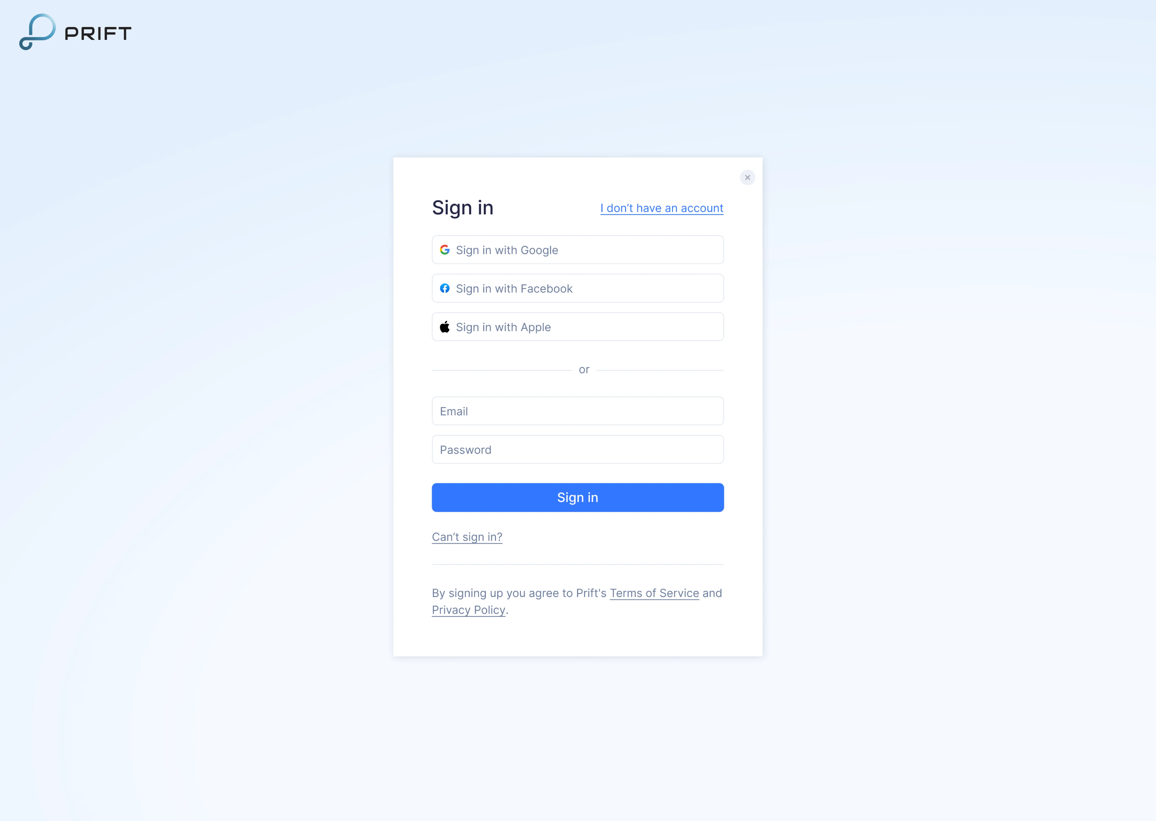
13. Prift
During our work on Prift, we focused on MVP design for a personal finance platform, and the sign-in screen was part of that scope. We placed the form inside a compact modal-style card with soft shadows, helping it stand out clearly. Links to account recovery and sign-up are included but styled subtly to avoid clutter.
Why it works:
- Modal-style card keeps focus centered.
- Multiple sign-in options increase accessibility.
- Clean layout supports quick login.
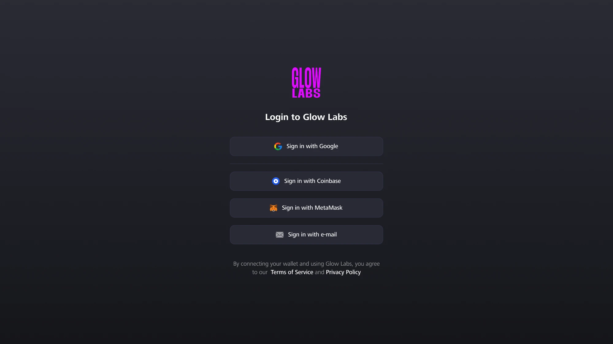
14. GlowLabs
Glow Labs works with Web3 companies, and when they reached out to Eleken, they wanted a modern login page that would reflect that identity. Our designer leaned into a dark theme with glowing accents to evoke the feel of blockchain products. The layout includes nothing but stacked login options to help users get in quickly.
Why it works:
- Dark aesthetic aligns with Web3 product trends.
- Wallet-based login options support the use case.
- Minimal interface reduces distractions and builds clarity.
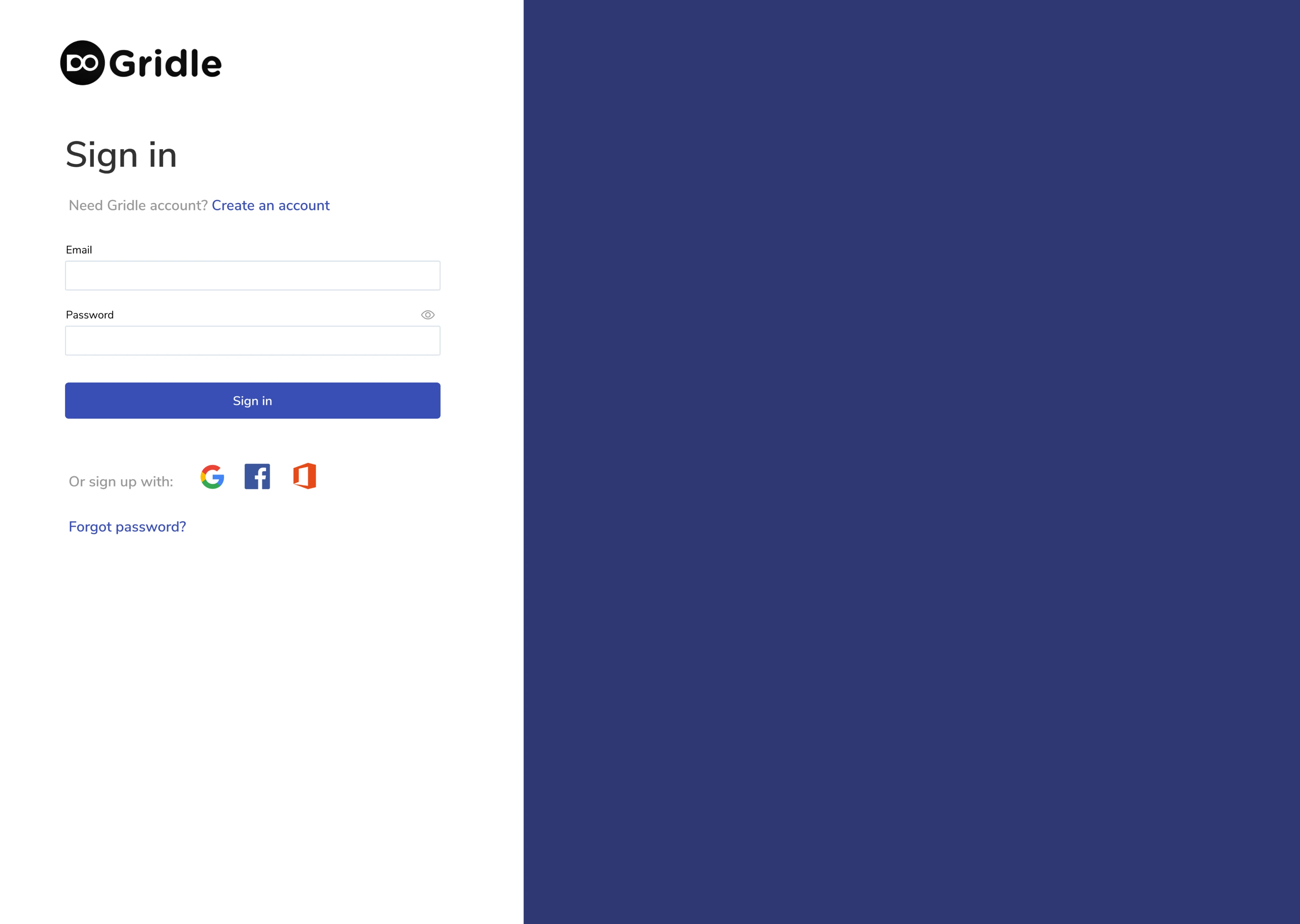
15. Gridle
By the time Gridle contacted Eleken, they already had an app, but its user interface needed improvements. To keep things simple, we started with the login page and designed the form using familiar patterns, like clear titles, helpful text, input fields, buttons, and links. All elements are well-spaced and intentionally minimal.
Why it works:
- Familiar login options support quick access.
- OAuth options appeal to enterprise teams.
- White space and alignment improve scannability.
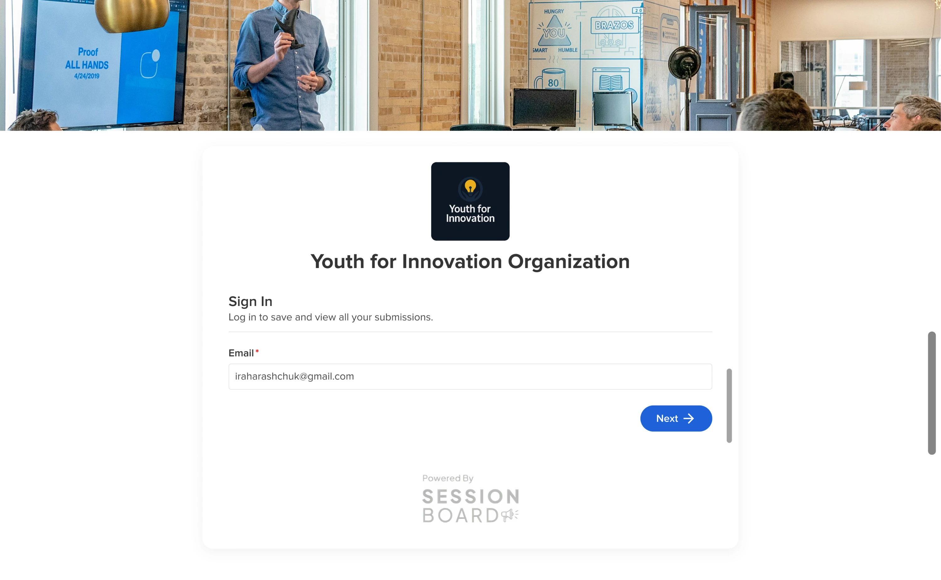
16. Sessionboard
Sessionboard users were arriving through invitation links, and we needed to keep that in mind when designing the login flow. Here, we included just a single email input field, a short description, and one action button. This approach removed distractions and helped users move forward more quickly.
Why it works:
- Single-field layout reduces cognitive load.
- Focused design improves conversion for invited users.
- Clean visual hierarchy with supportive microcopy.
17. VLI Tech
By the time VLI Tech contacted Eleken, they already had an app for EMS teams, and our task was to redesign it. As part of that process, we worked on the login screen, designing it in dark mode as the default for the mobile experience. Input fields are clearly labeled and support both email and phone number formats.
Why it works:
- Dark mode aligns with the working conditions of EMS teams.
- Flexible input accommodates user preferences.
- Labels and placeholder text clearly communicate input expectations.
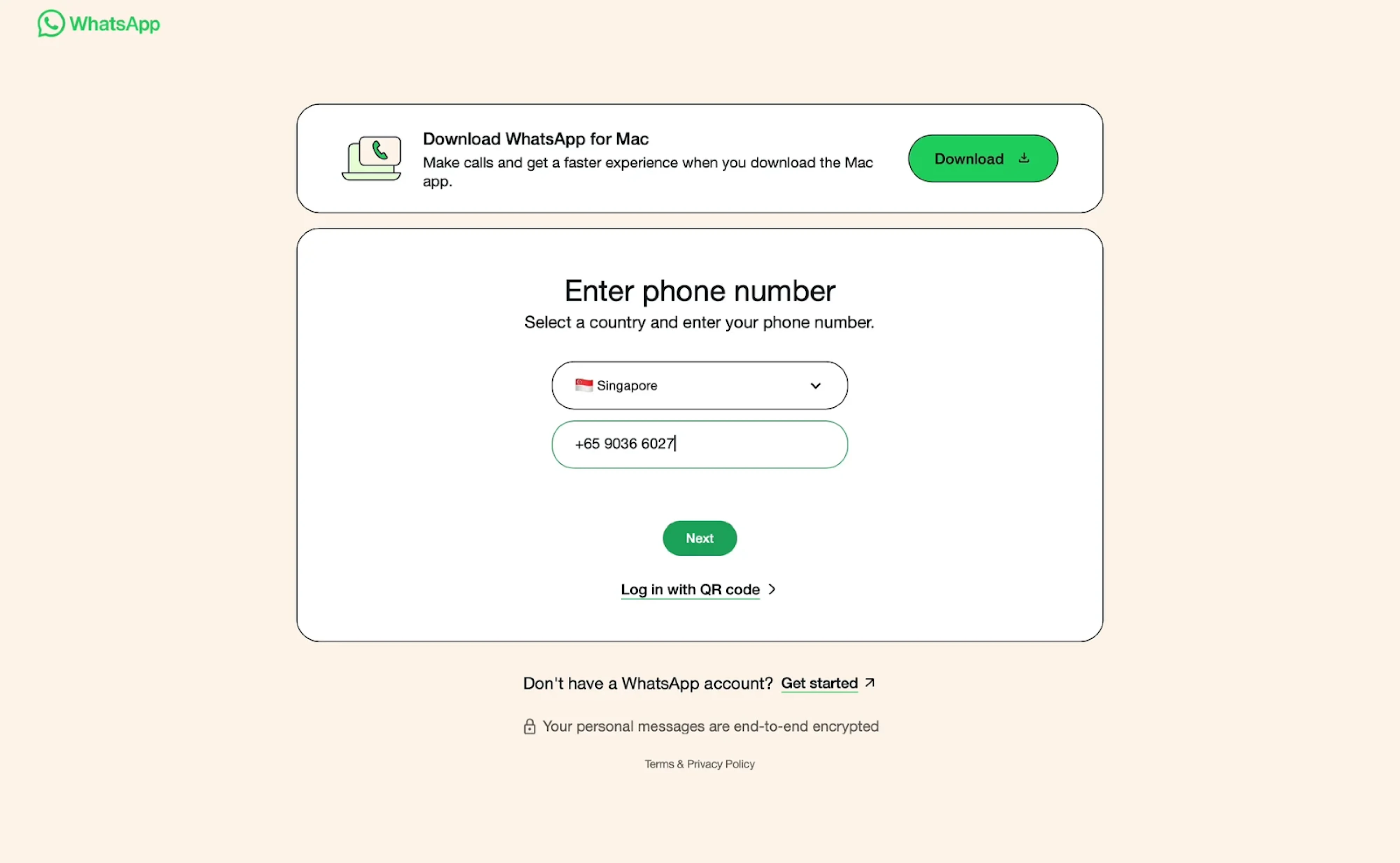
18. WhatsApp
WhatsApp keeps its onboarding simple and secure with a mobile-first approach. There are no traditional email-password combinations. Instead, users are asked to enter their phone number. The UI reflects the brand identity, featuring a focused card layout, an intuitive country selector, and minimal distractions.
Why it works:
- Prioritizes mobile-native behavior with phone number login.
- Streamlined UI reduces friction for returning users.
- Clear visual hierarchy and minimal distractions.
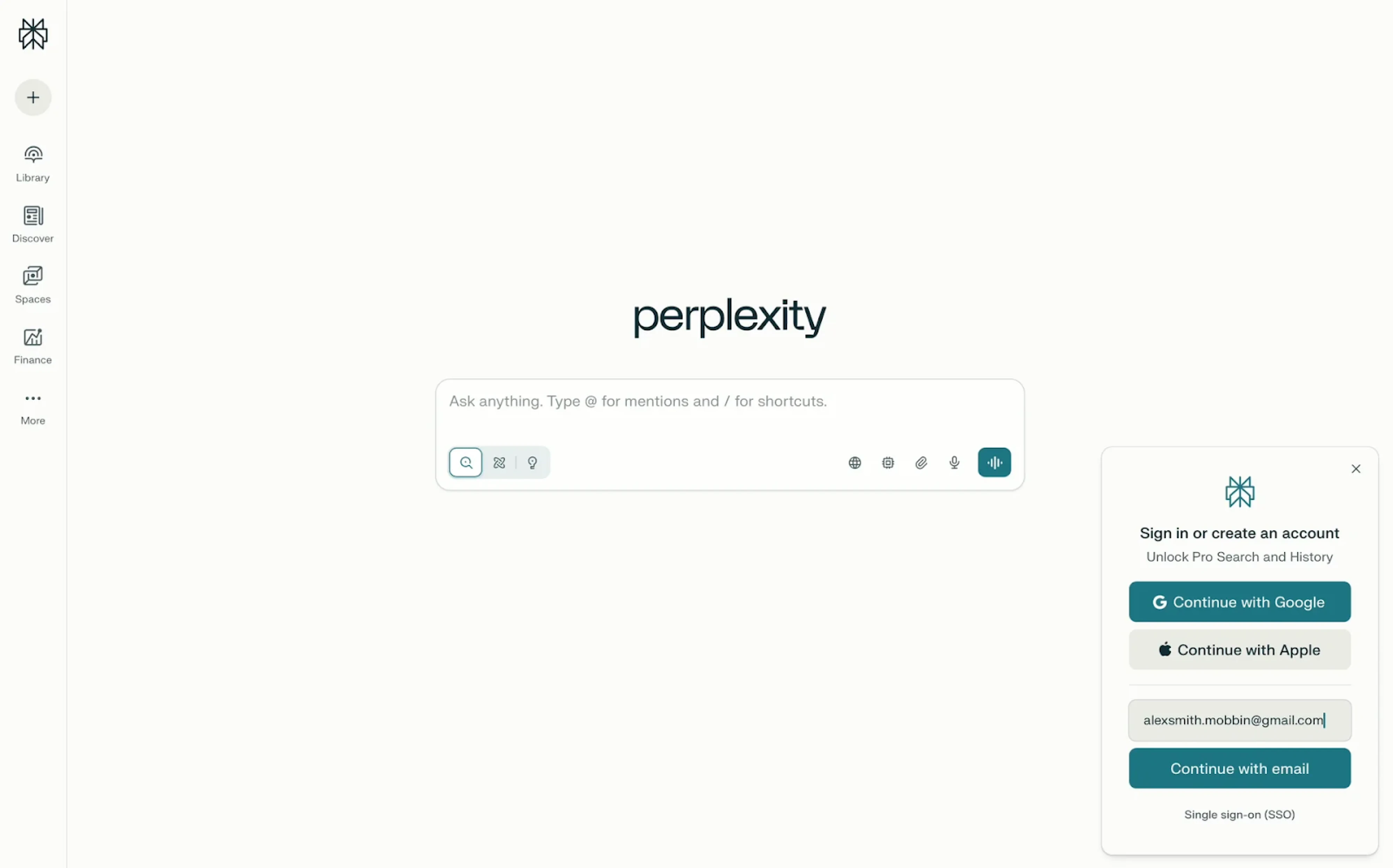
19. Perplexity
Perplexity takes a non-intrusive approach to login. To keep the experience seamless, the platform shows a compact modal in the bottom-right corner, skipping a standard sign-in page design. This subtle UX choice keeps the interface distraction-free and allows users to explore the platform freely before deciding to log in.
Why it works:
- Modal login keeps the core experience uninterrupted.
- Encourages exploration before commitment.
- Clean UI with clear sign-in paths.
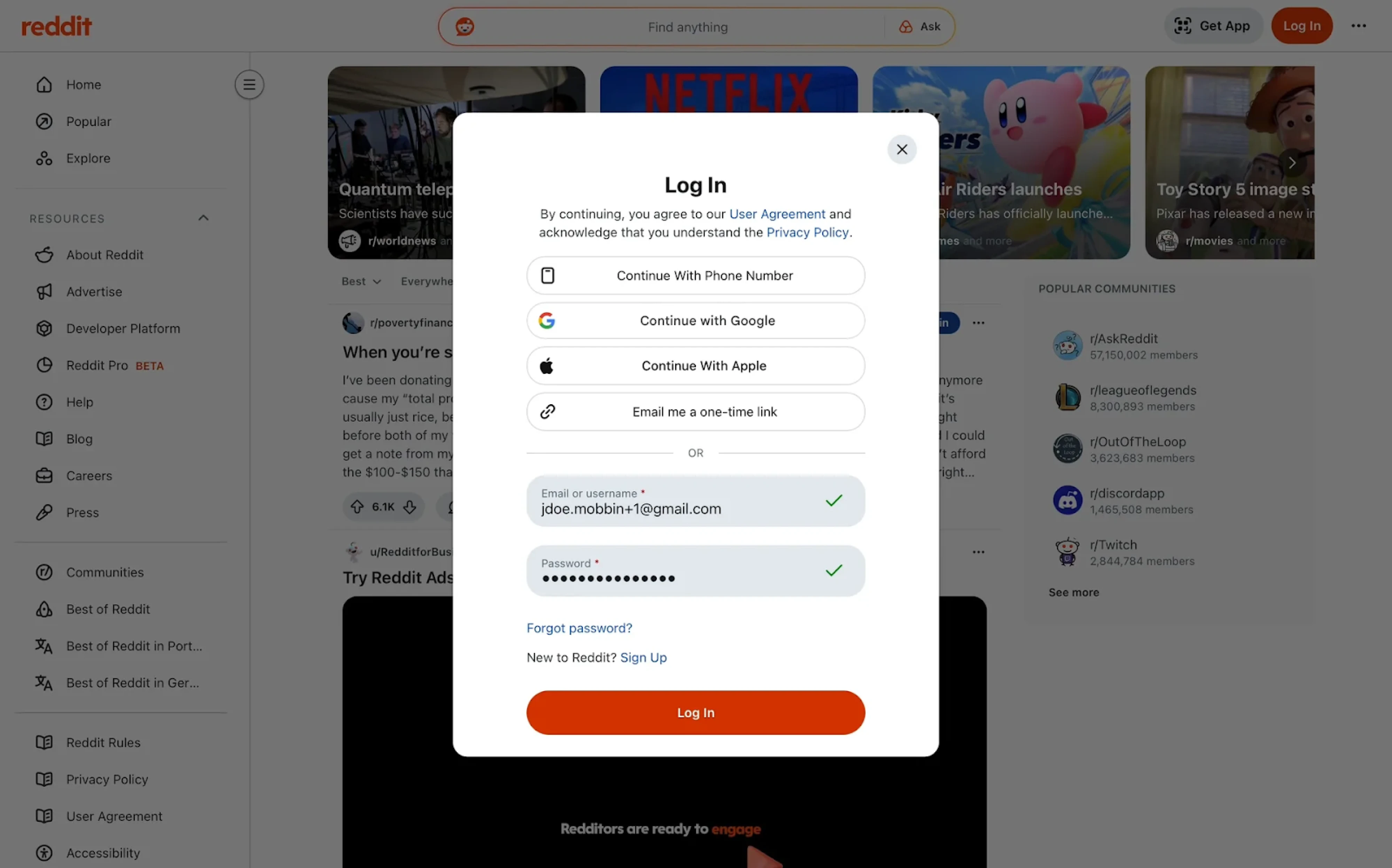
20. Reddit
Reddit’s login UI uses a modal overlay that keeps users anchored in context while minimizing friction. Sign-in options are stacked at the top, followed by a form with real-time validation. Clear dividers, consistent alignment, and a prominent CTA button enhance both clarity and usability.
Why it works:
- The modal approach keeps users grounded in the experience.
- Multiple sign-in paths support flexibility.
- Strong layout structure with clear feedback mechanisms.
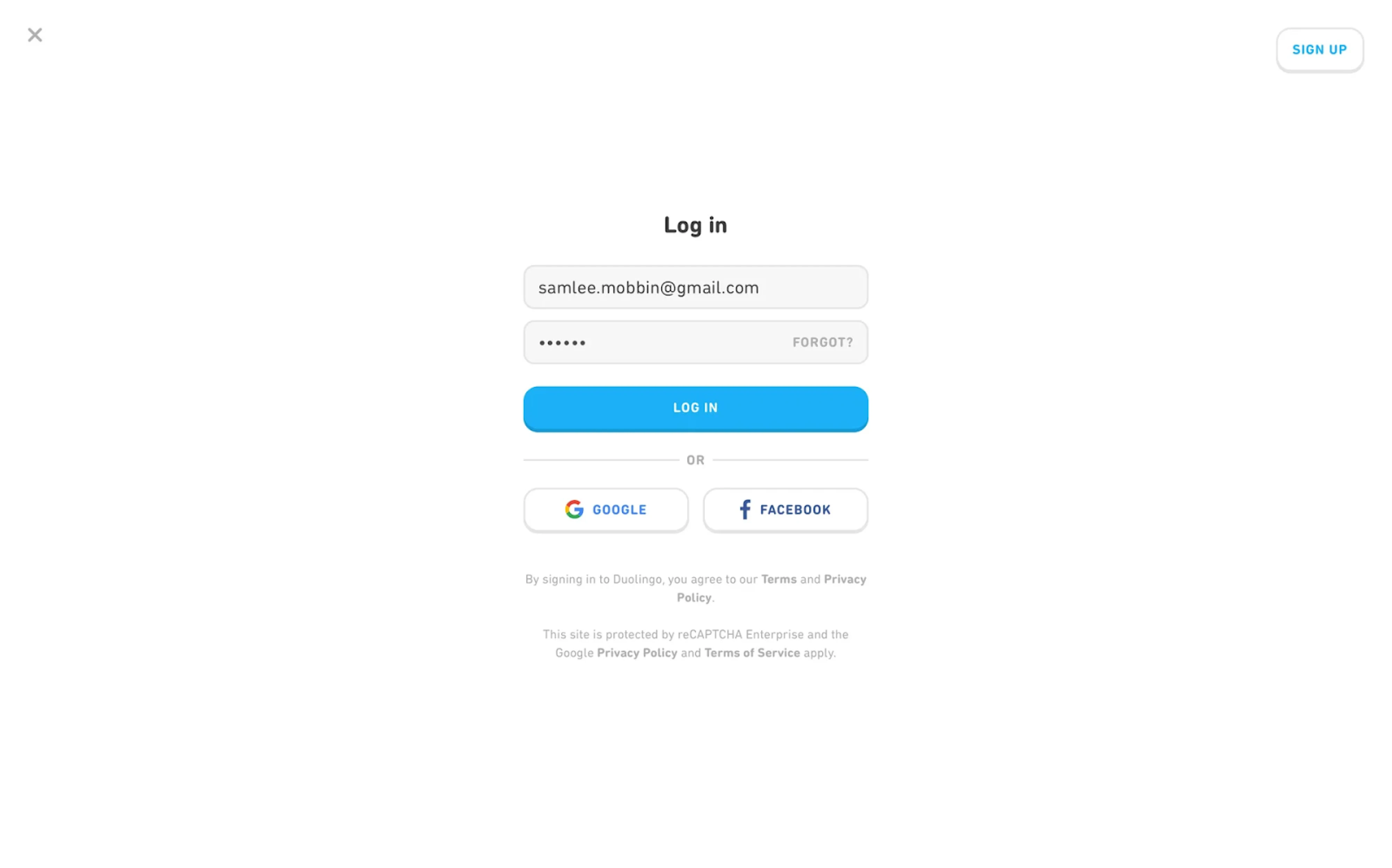
21. Duolingo
The login experience at Duolingo is stripped down to the essentials. The modal layout is clean and vertically centered, placing focus on the form elements. Primary and secondary actions are differentiated by color and weight. The form prioritizes clarity, with generous spacing and visual balance across login methods.
Why it works:
- Lightweight modal keeps attention on the task.
- Clear hierarchy between standard and social sign-in.
- Minimalist aesthetic aligned with the broader brand experience.
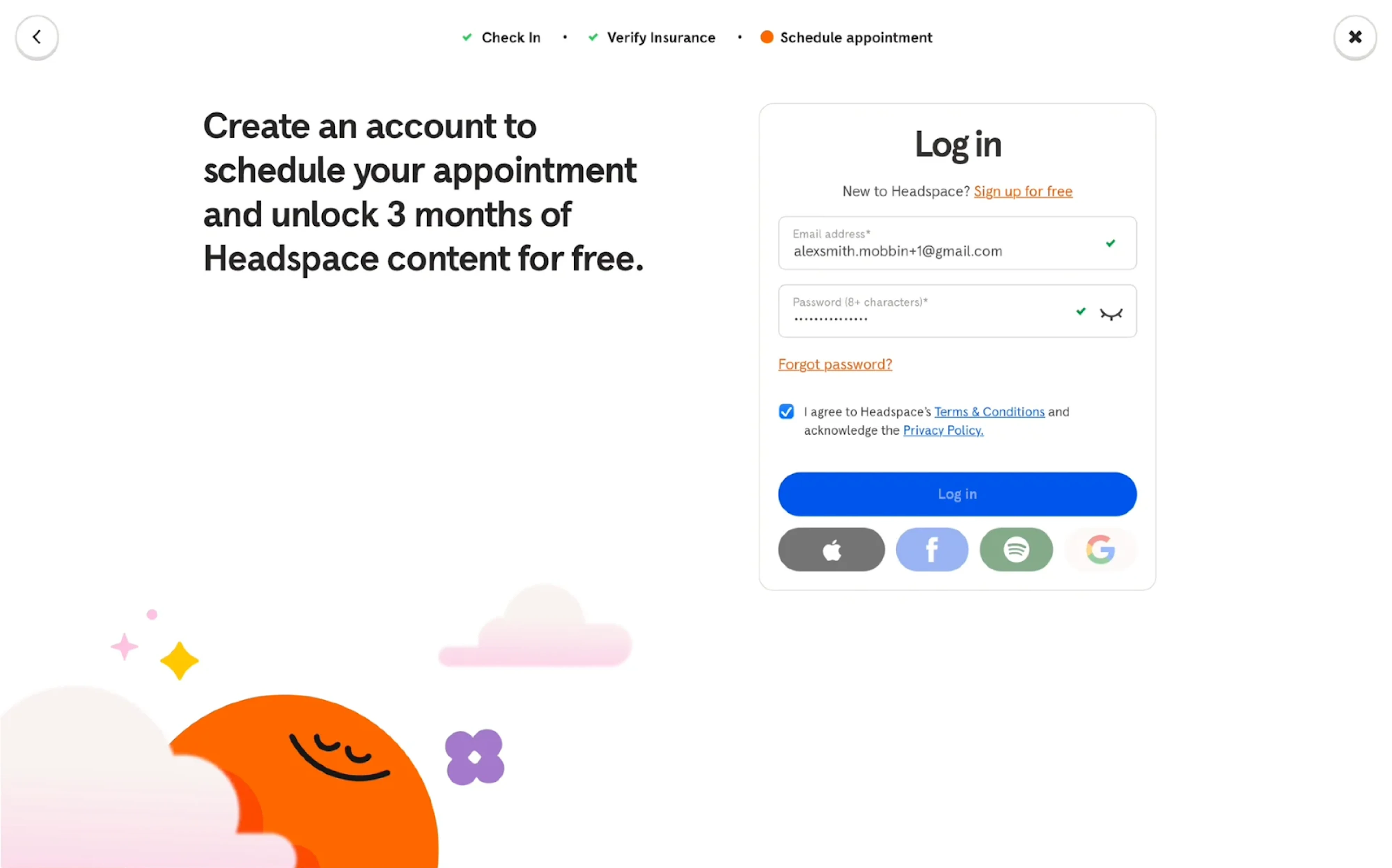
22. Headspace
Headspace blends utility with calm, using a modern login page design. The split-screen layout reinforces product value with a friendly message on the left, while the login form sits inside a rounded container on the right. Microcopy is empathetic, while icon-based social logins offer variety without visual noise.
Why it works:
- Split-screen layout balances marketing and function.
- Rounded input fields and clear feedback support a stress-free UX.
- Visual language aligns with the brand’s calming tone.
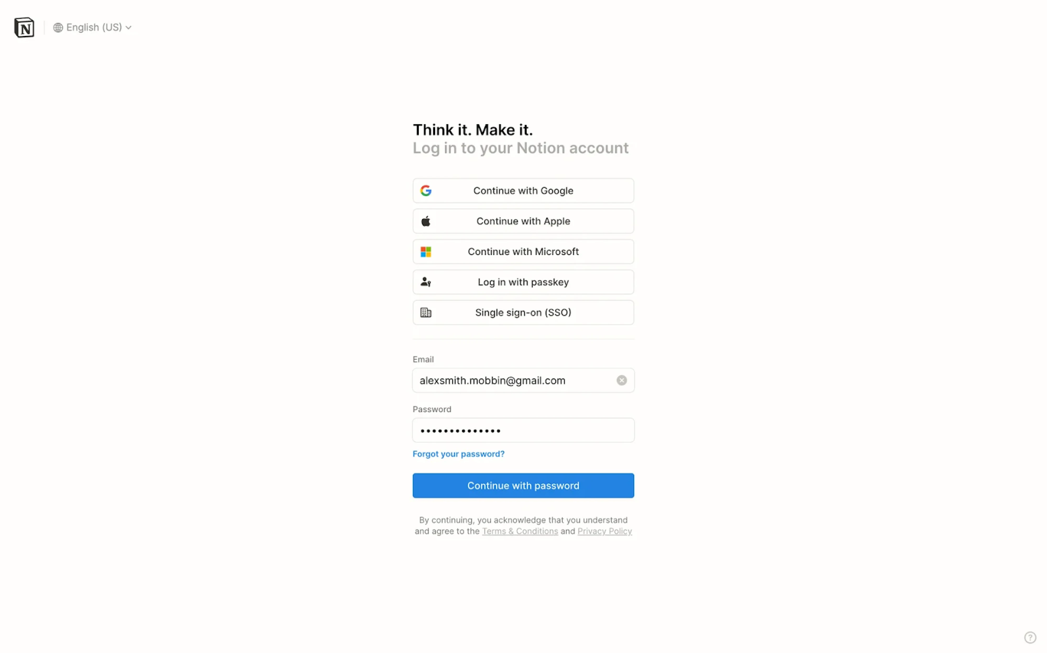
23. Notion
Notion’s login screen reflects the brand’s minimalist philosophy, using a centered card layout with generous white space and sharp typographic hierarchy. The interface offers multiple authentication methods upfront, prioritizing flexibility while keeping the layout clean and scannable.
Why it works:
- Visual hierarchy directs users through login options.
- Monochrome styling reinforces the product’s aesthetic.
- Dense functionality delivered through a lightweight interface.
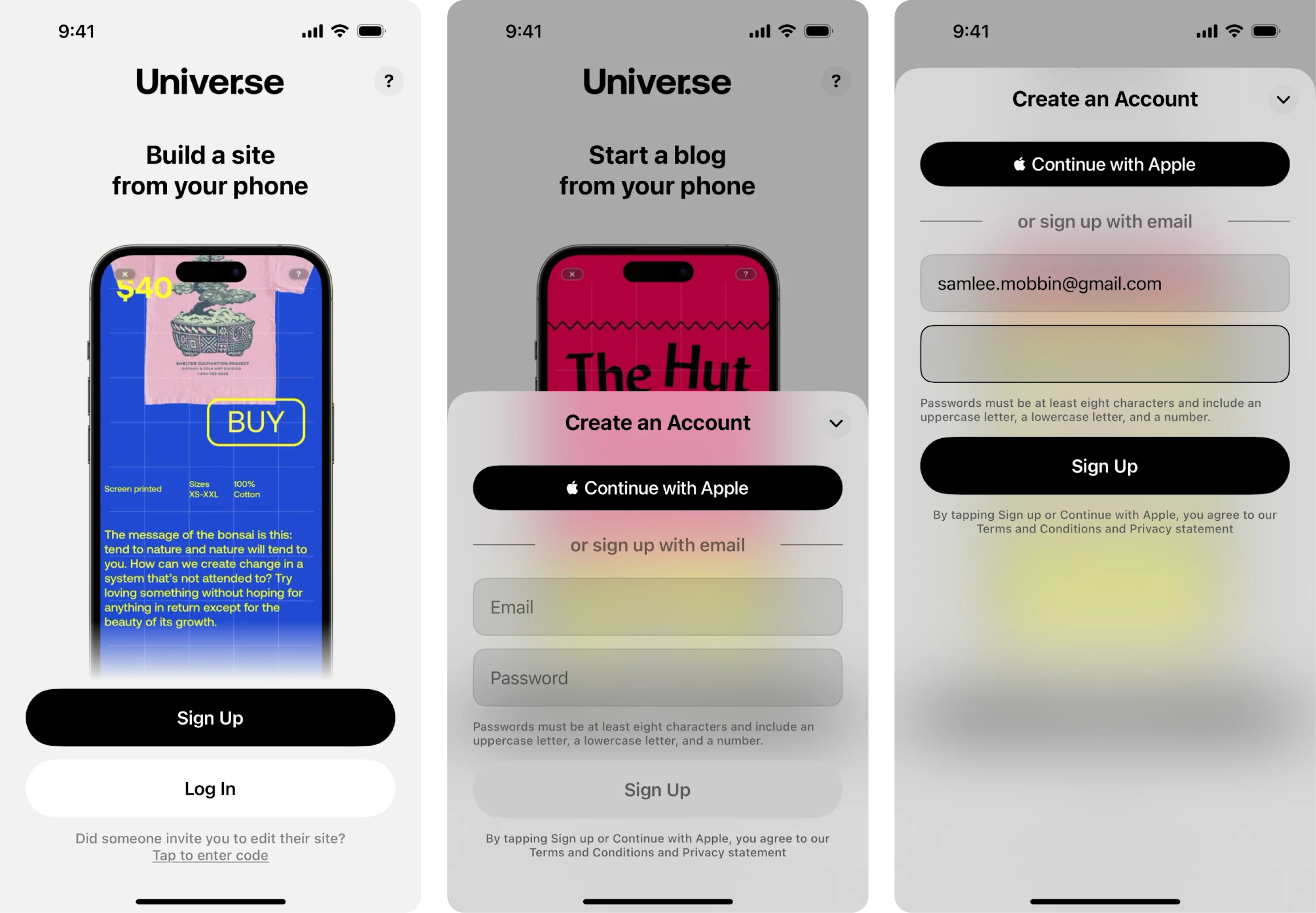
24. Universe
On mobile, Universe presents a login screen with a frosted glass effect that subtly separates the form from the background. The Apple login button is styled as the primary action, while the email option remains accessible just below. The minimalist design supports a mobile-first experience that feels fast and intuitive.
Why it works:
- Frosted layer adds focus without losing context.
- Apple account sign-in is visually prioritized for iOS users.
- Soft gradients and rounded inputs feel native to mobile.
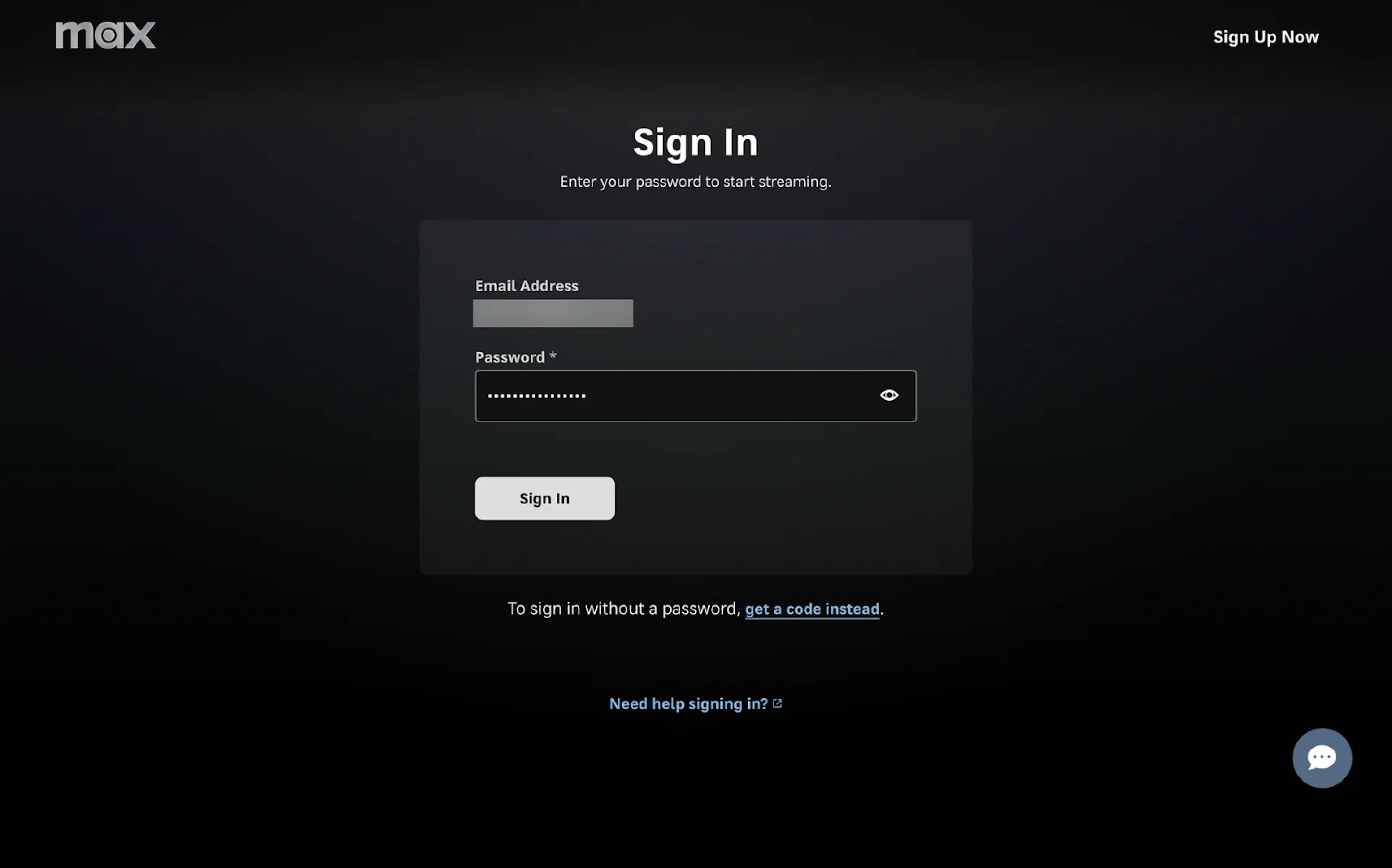
25. HBO Max
A dark UI paired with a centered login card creates a cinematic feel that aligns with HBO Max’s content-first brand. The form is stripped down to just two fields, making the interaction fast and frictionless. Users also have the option to receive a one-time code, minimizing barriers for those who hit the forgot password flow.
Why it works:
- Visual hierarchy guides focus to the form.
- High-contrast elements ensure legibility across TV and desktop.
- Alternative login methods reduce drop-off for returning users.
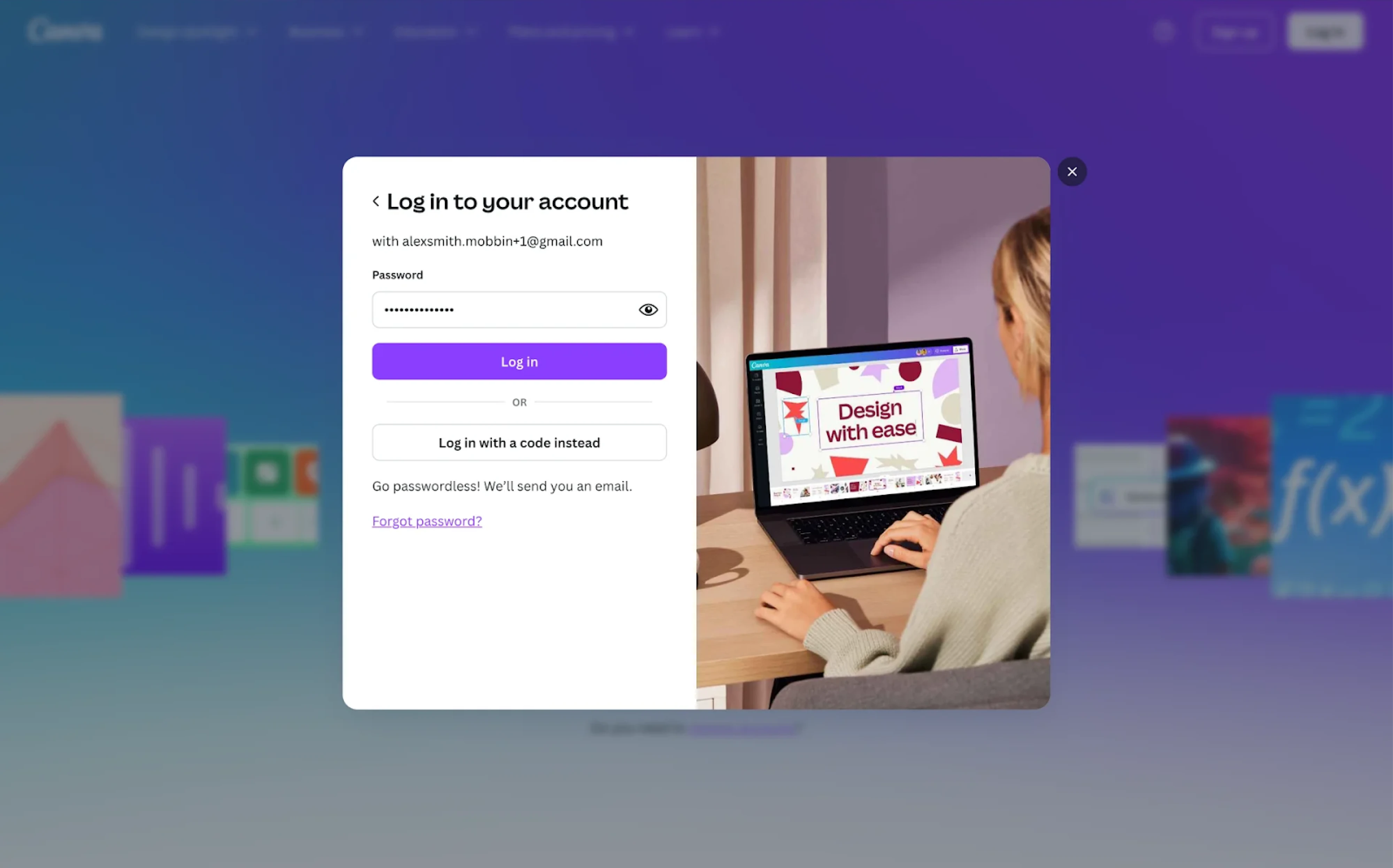
26. Canva
With Canva, the login experience feels like a natural extension of the product. The modal layout is visually split — form on the left, lifestyle photo on the right. Users are offered two sign-in methods: standard password entry or a code-based alternative, all wrapped in Canva’s signature visual language.
Why it works:
- Visual storytelling supports brand identity.
- Optional passwordless login lowers friction for users.
- Focused modal reduces page load disruption.
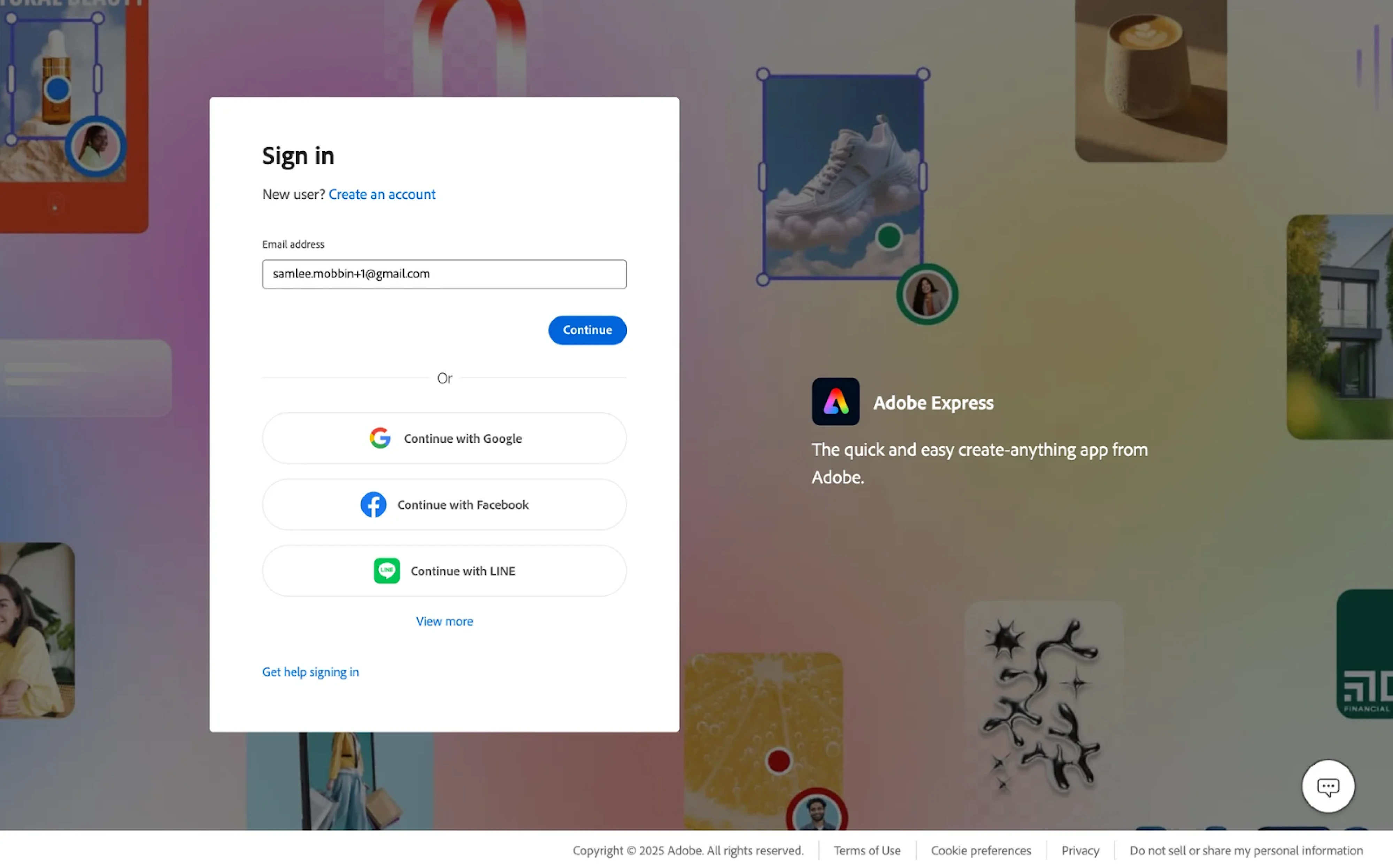
27. Adobe Express
The Adobe Express login experience prioritizes familiarity and speed. A centered modal invites users to start with just their email, while third-party login options like Google, Facebook, and LINE are styled as secondary CTAs. The layout balances the form with product visuals, reinforcing brand identity.
Why it works:
- Progressive disclosure keeps the interface clean.
- Clear hierarchy highlights preferred login methods.
- Brand visuals provide context and maintain user engagement.
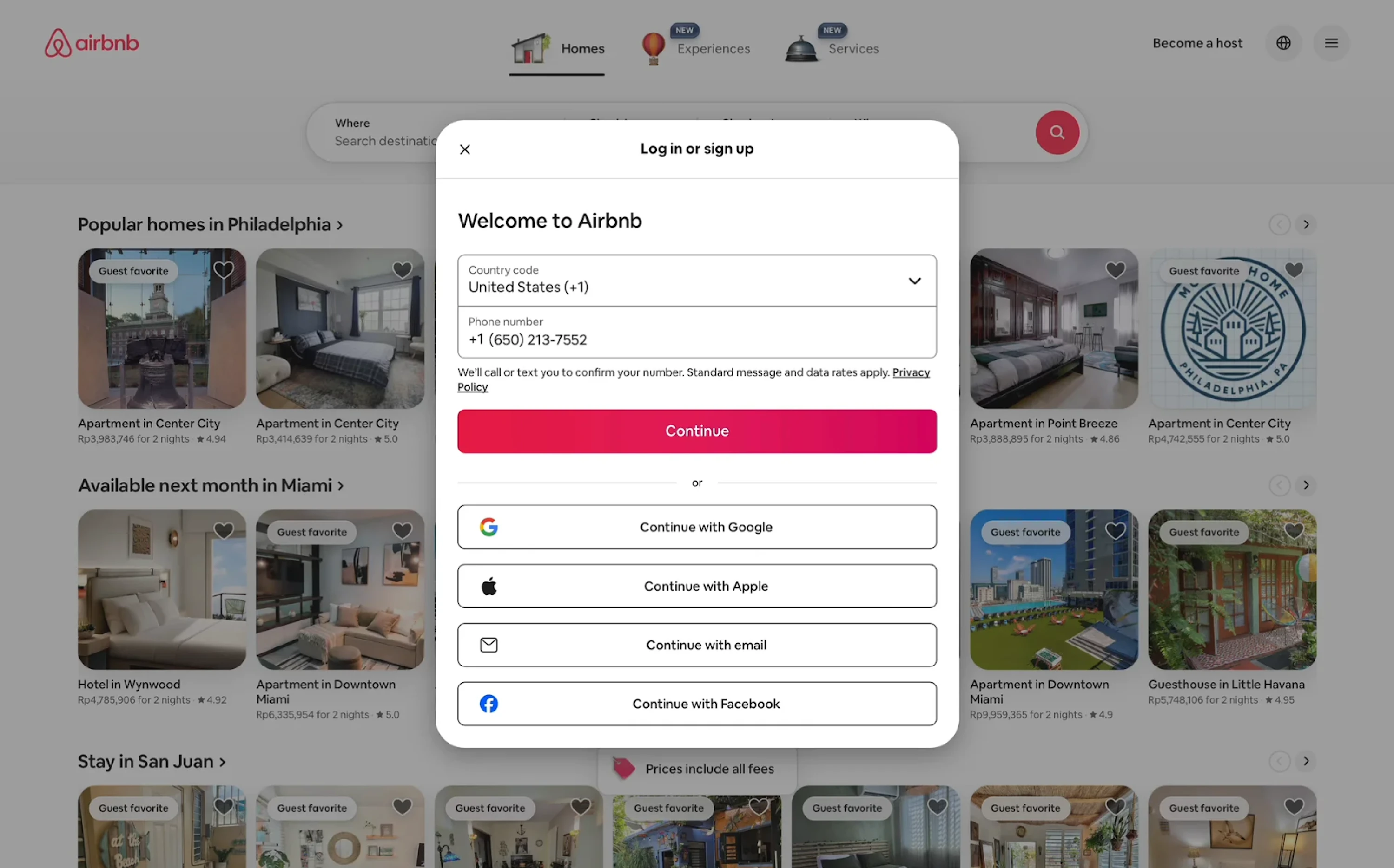
28. Airbnb
Airbnb welcomes users with a centralized login modal that supports sign-in and sign-up forms. The design prioritizes mobile-first authentication, asking for a phone number before offering alternative methods. The structure is vertically stacked, with ample spacing and a bold primary CTA that drives the flow forward.
Why it works:
- Unified modal simplifies the experience.
- Phone-first approach reduces entry barriers.
- Multiple auth options accommodate different user preferences.
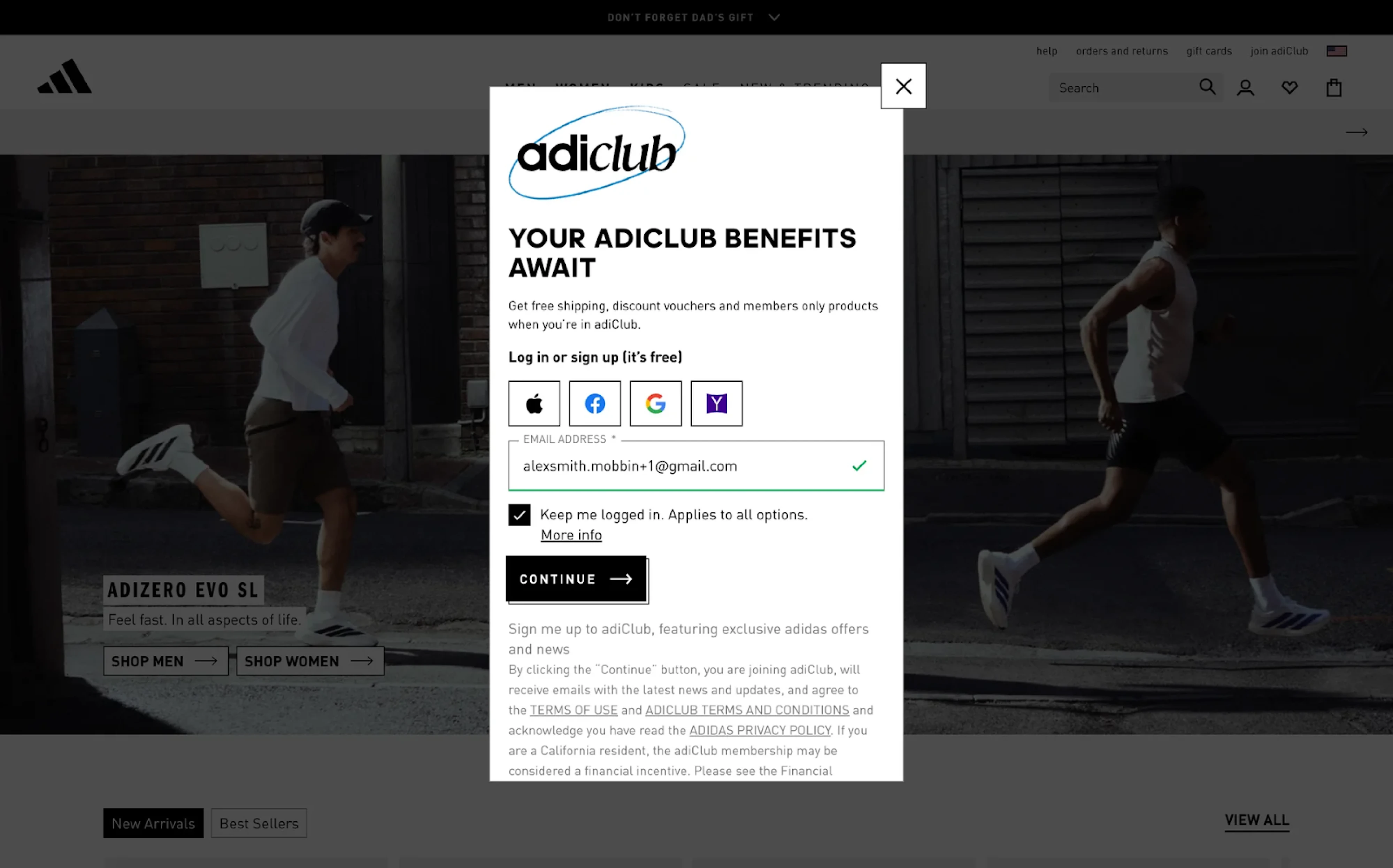
29. Adidas
Joining adiClub starts with a vertically stacked modal that highlights benefits before asking for credentials. The messaging communicates free shipping, discounts, and members-only access. Users can choose from multiple social logins or enter their email directly. The “Keep me logged in” option is subtly integrated.
Why it works:
- A clear incentive upfront builds motivation before login.
- Compact layout keeps users focused.
- Social login icons make options easy to scan.
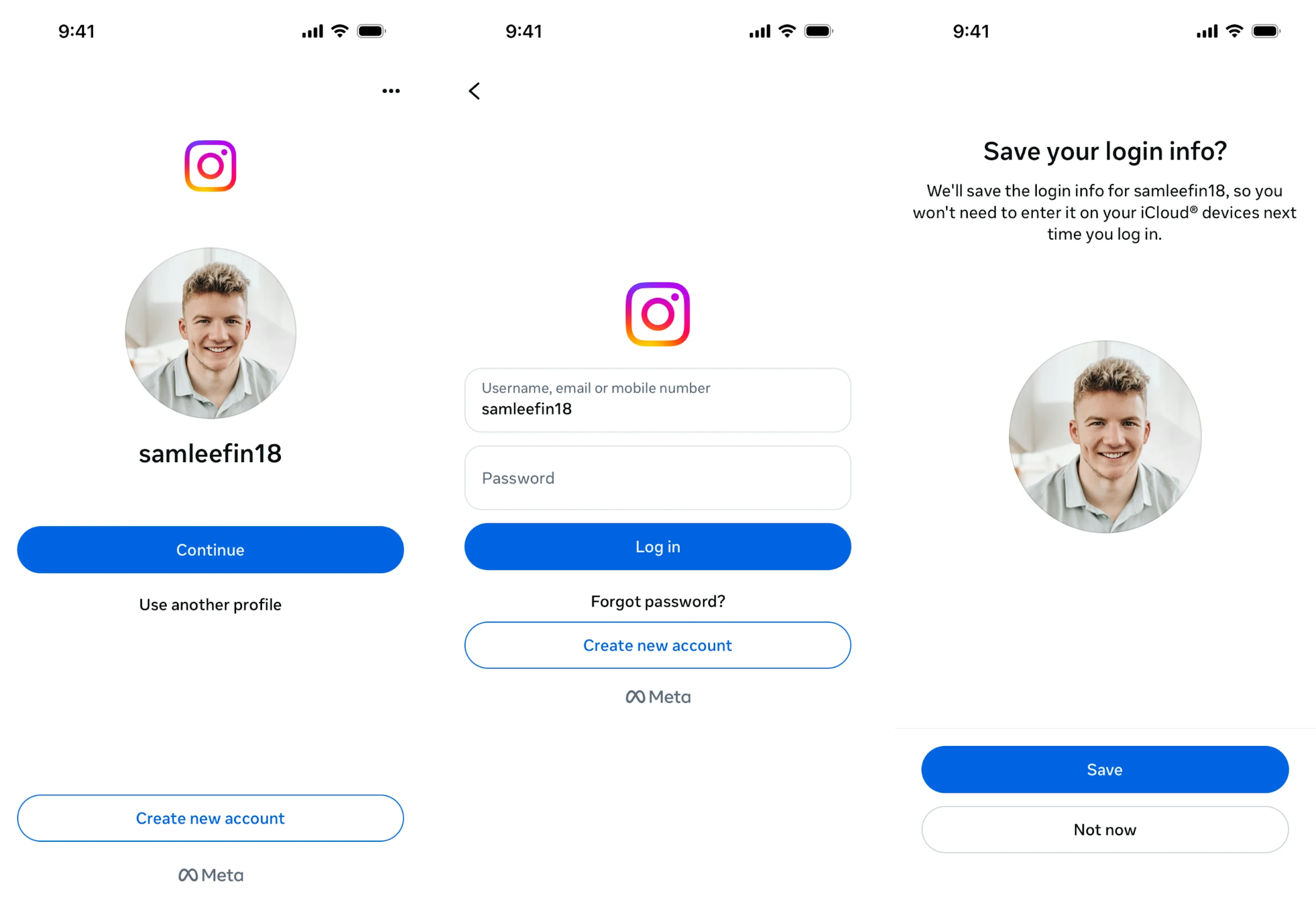
30. Instagram
Considering Instagram is primarily used on mobile, its login experience is tailored accordingly. The initial screen supports username, email, or phone number with minimal friction. Returning users benefit from a personalized login option, where tapping "Continue" with their profile photo makes sign-in effortless.
Why it works:
- Personalized login reduces cognitive load for returning users.
- Large, high-contrast CTA supports accessibility.
- Profile photo adds familiarity and trust.
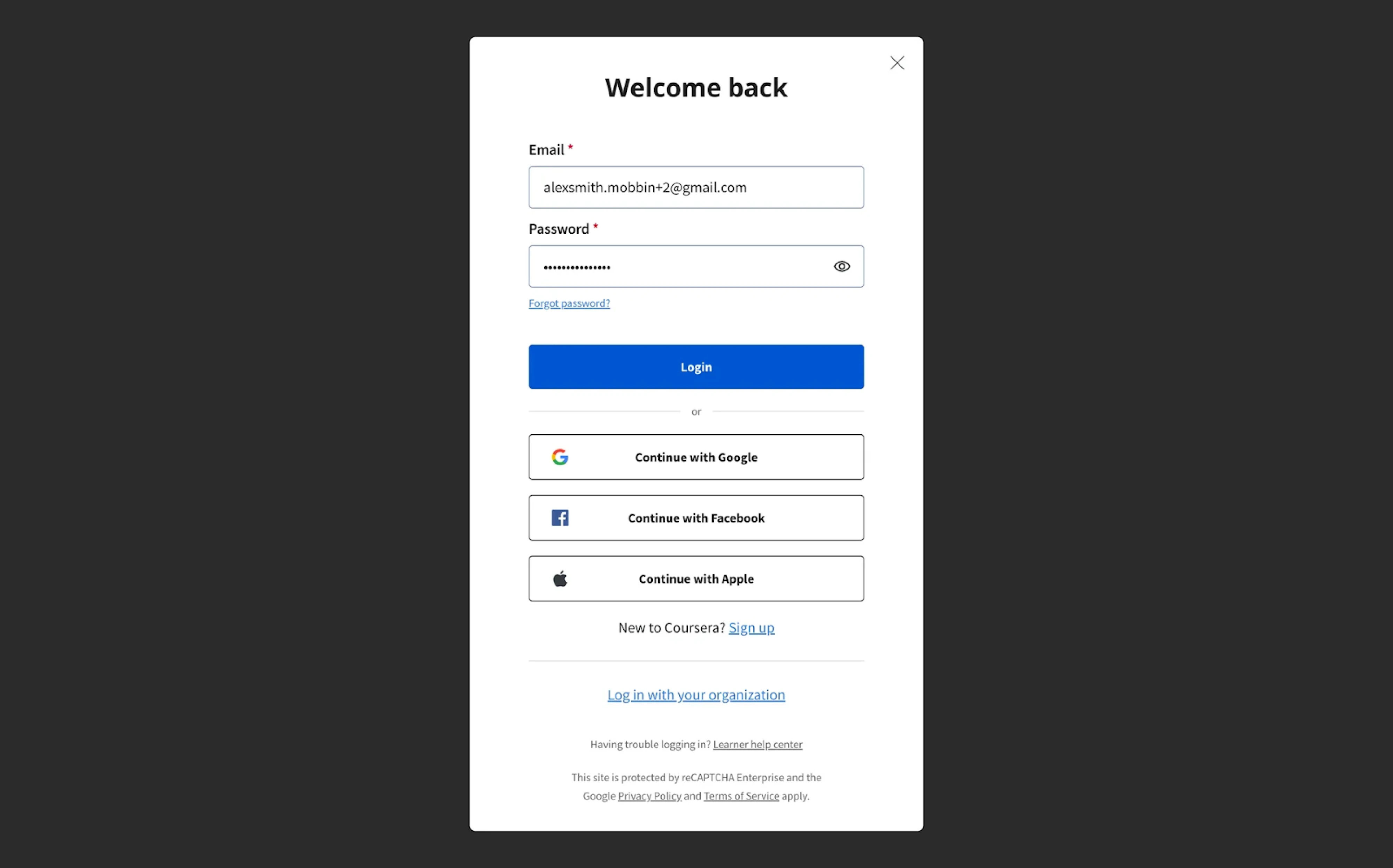
31. Coursera
For its login screen, Coursera applies a modal with a strong “Welcome back” headline. The layout prioritizes email login but supports multiple sign-in providers, with equally weighted buttons to avoid cognitive bias. Helpful links are styled to stay accessible without distracting from the primary user journey.
Why it works:
- Balanced visual weight between login options.
- Prioritizes core flows while keeping alternatives accessible.
- Neutral modal background helps the form stand out.
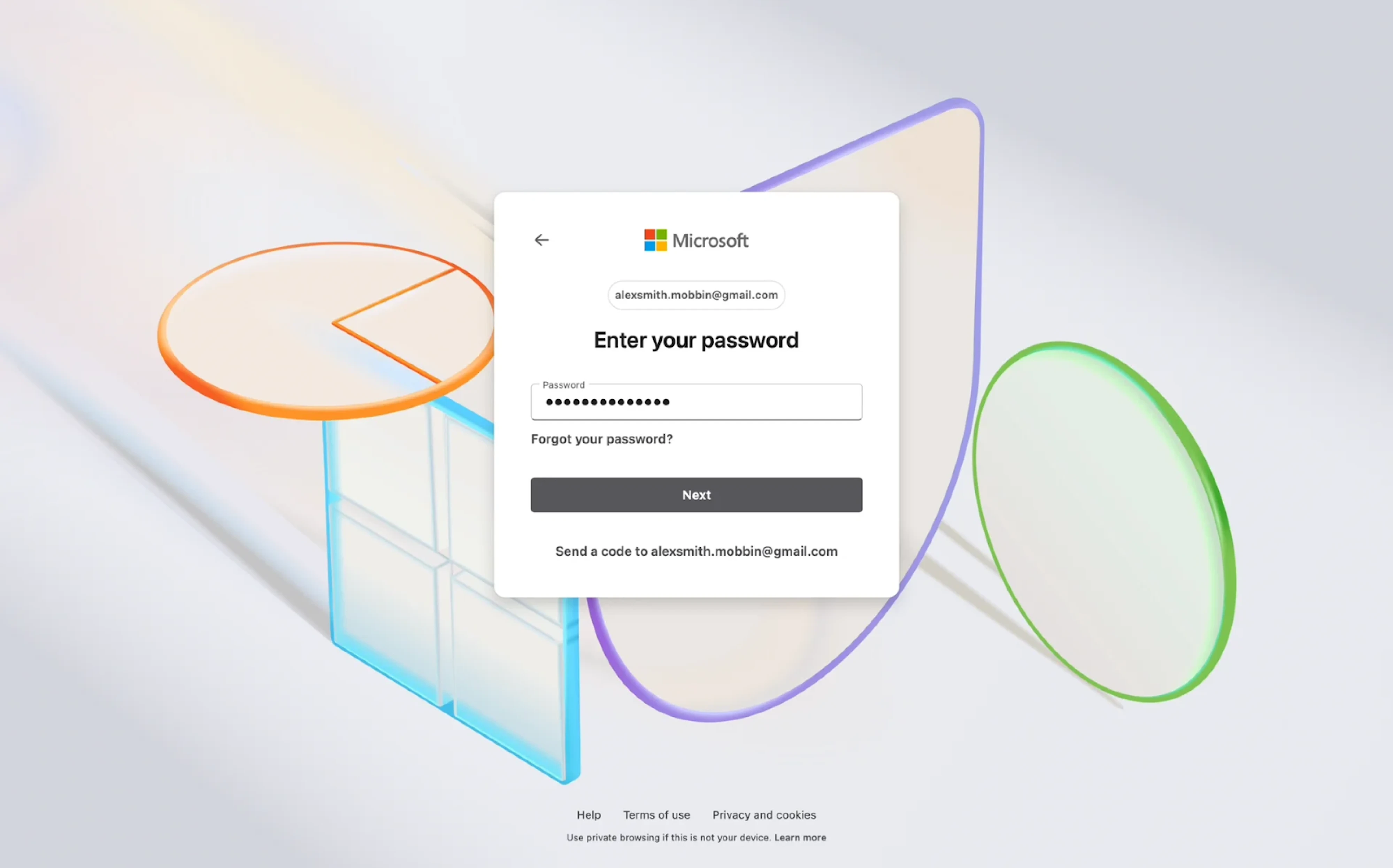
32. Microsoft Copilot
At Microsoft Copilot, a login card layout is placed against an engaging background, creating a sense of clarity and focus. The password input is the only visible field, with the user’s email address already confirmed in the previous step. Subtle prompts for password recovery or alternative login keep the interface tidy.
Why it works:
- Focused step-by-step flow reduces cognitive load.
- Clear typographic hierarchy improves readability.
- Neutral tones and light visual motion reinforce calmness.
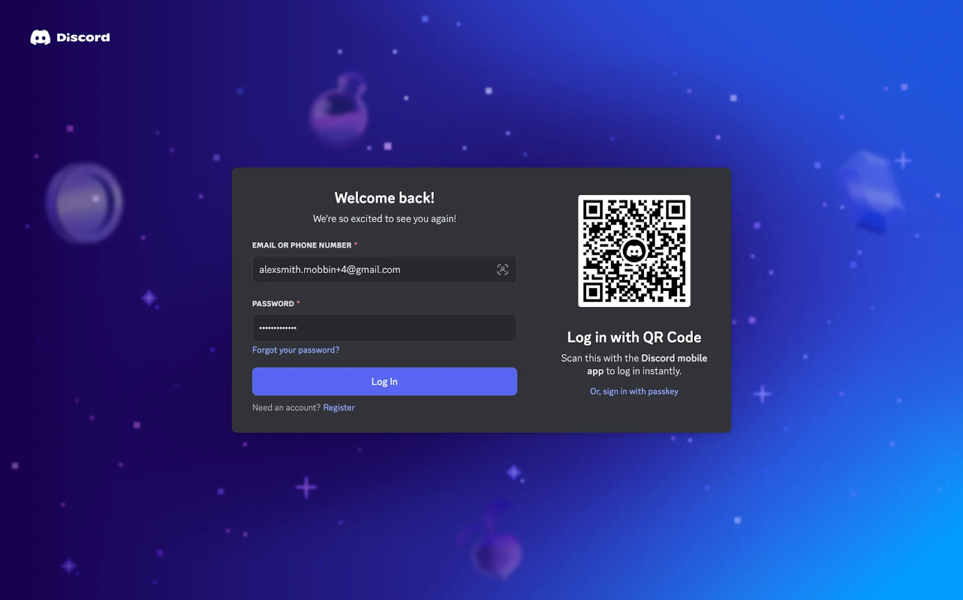
33. Discord
Discord keeps things playful but practical with a well-designed login page that offers traditional form entry and a fast QR code scan. The dark theme aligns with the brand’s identity, while the “Welcome back!” headline keeps the tone friendly. A passkey option is included as a subtle nod to authentication trends.
Why it works:
- QR login supports fast access for mobile-first users.
- Microcopy and tone match Discord’s brand voice.
- Password, recovery, and sign-in paths are clearly available.
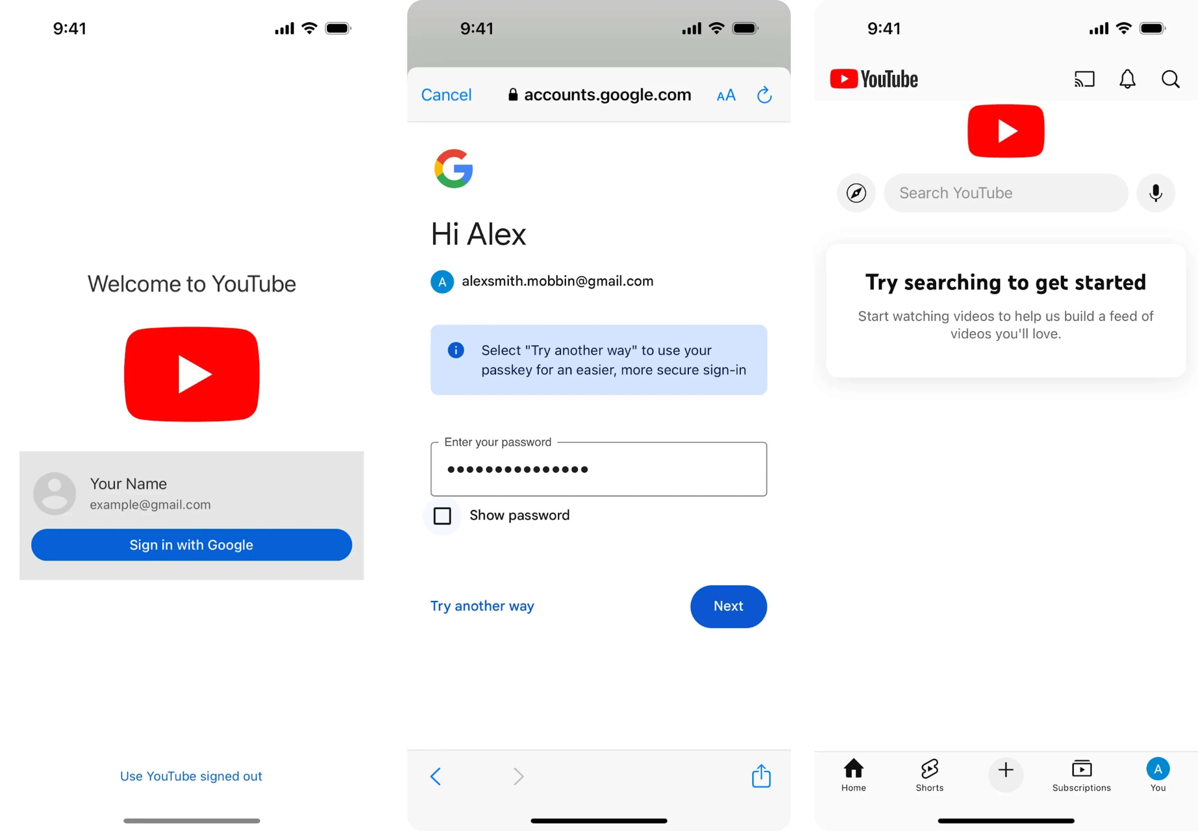
34. YouTube
Designed with simplicity in mind, YouTube’s mobile login page keeps the focus on a single sign-in method. If you’ve previously signed in, your profile is pre-filled, reducing the steps to just one tap. The white background and minimal layout keep the interface calm, clear, and approachable.
Why it works:
- Recognizes returning users for frictionless access.
- Minimal design reduces cognitive load.
- Large, tappable buttons optimized for mobile.
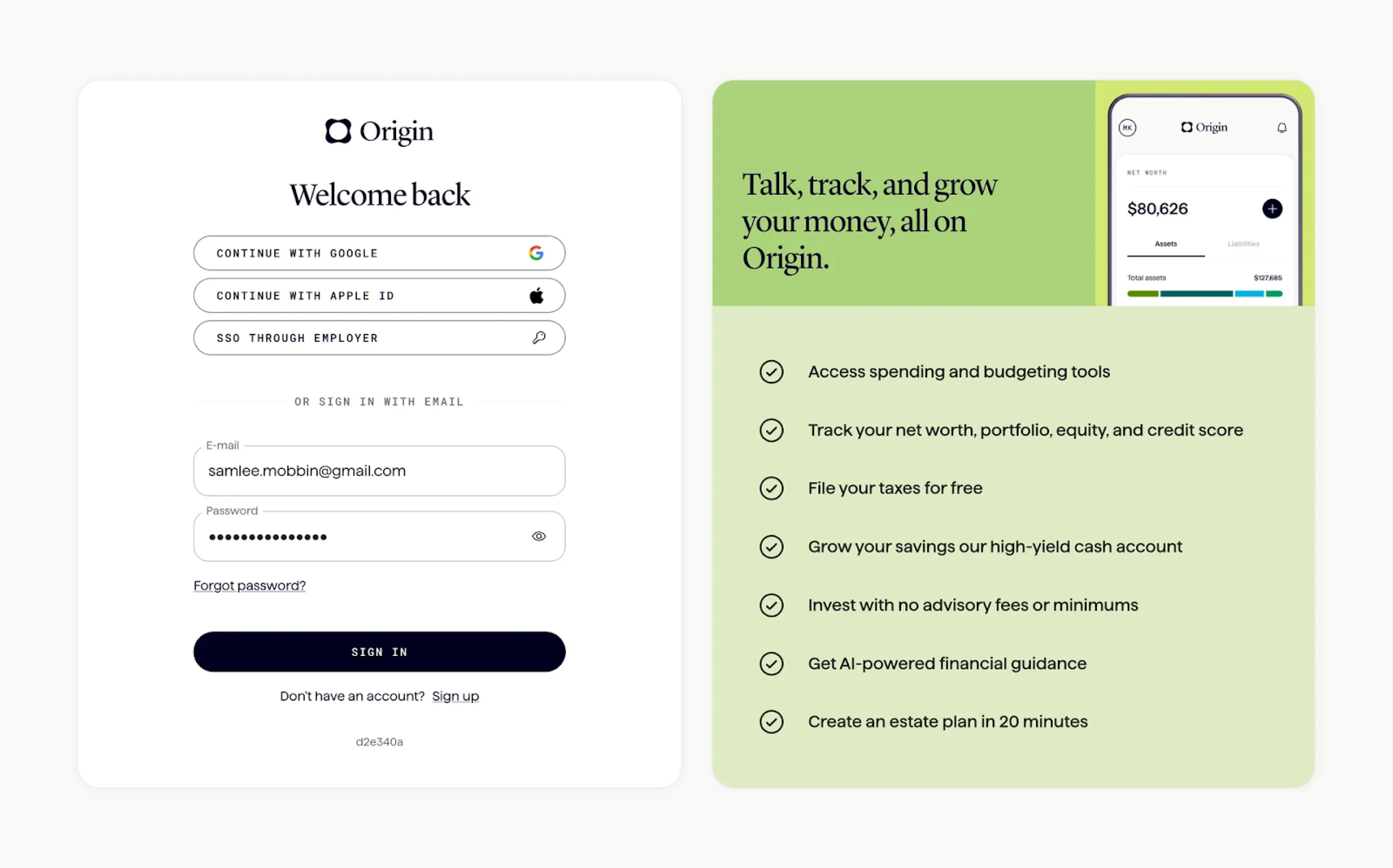
35. Origin
Like many login screen examples we’ve already covered, Origin uses a split layout with two clear sections. The platform pairs the login form with a benefits panel that reminds users why they’re signing in. Primary login methods are visually prioritized, while the email option remains accessible right below.
Why it works:
- Split layout reinforces the product’s value.
- A clear hierarchy of sign-in methods supports fast decision-making.
- Typography and subtle form styling convey professionalism.
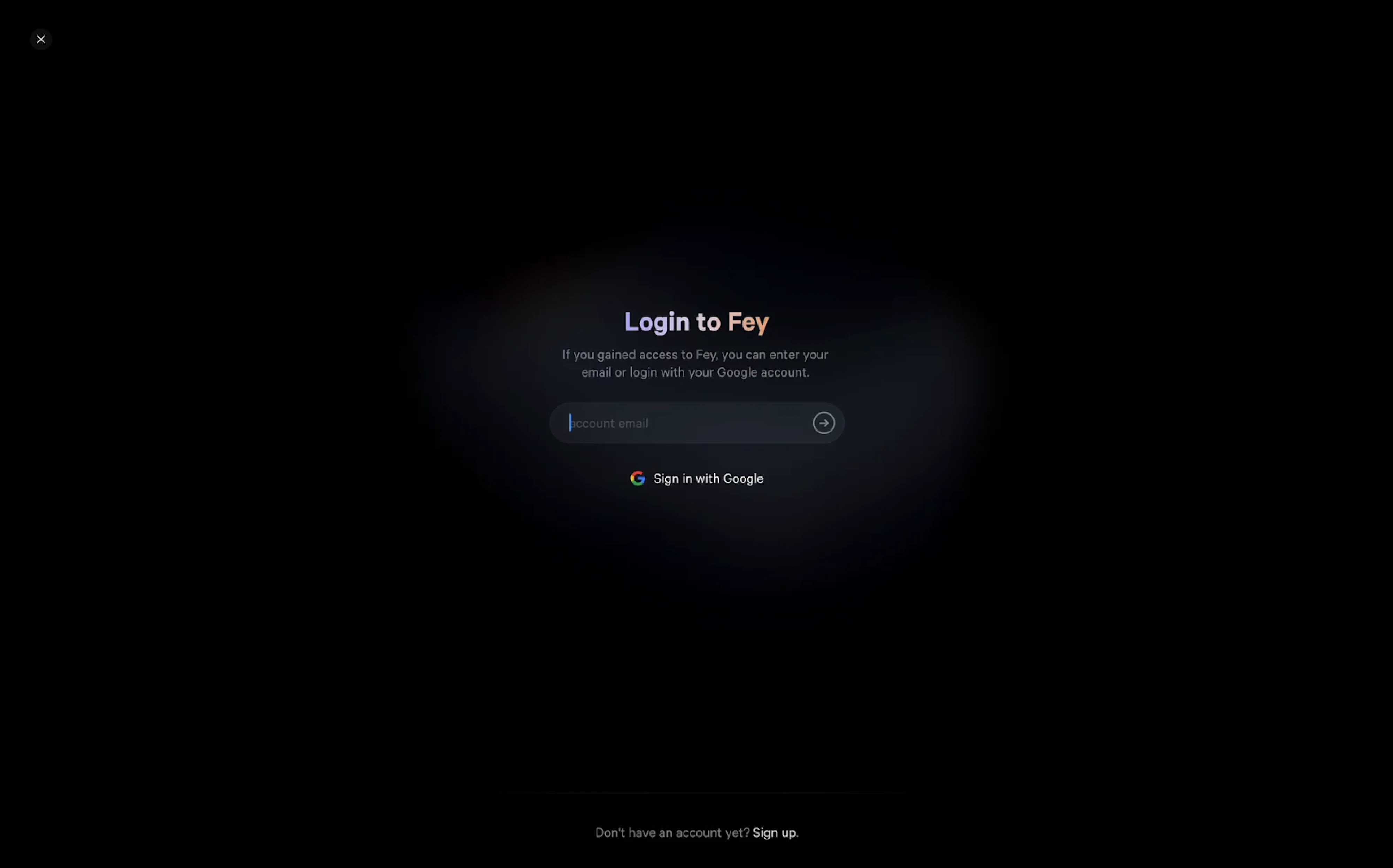
36. Fey
A minimalist login screen at Fey places full focus on the input field and core action. The dark background with a subtle light gradient draws attention to the center, guiding the user toward a simple choice: enter an email or continue with Google. The absence of distractions reinforces the exclusivity of the platform.
Why it works:
- Focused UI with a single clear task.
- Ambient visual treatment supports the brand’s tone.
- Smart use of lighting and contrast to guide attention.
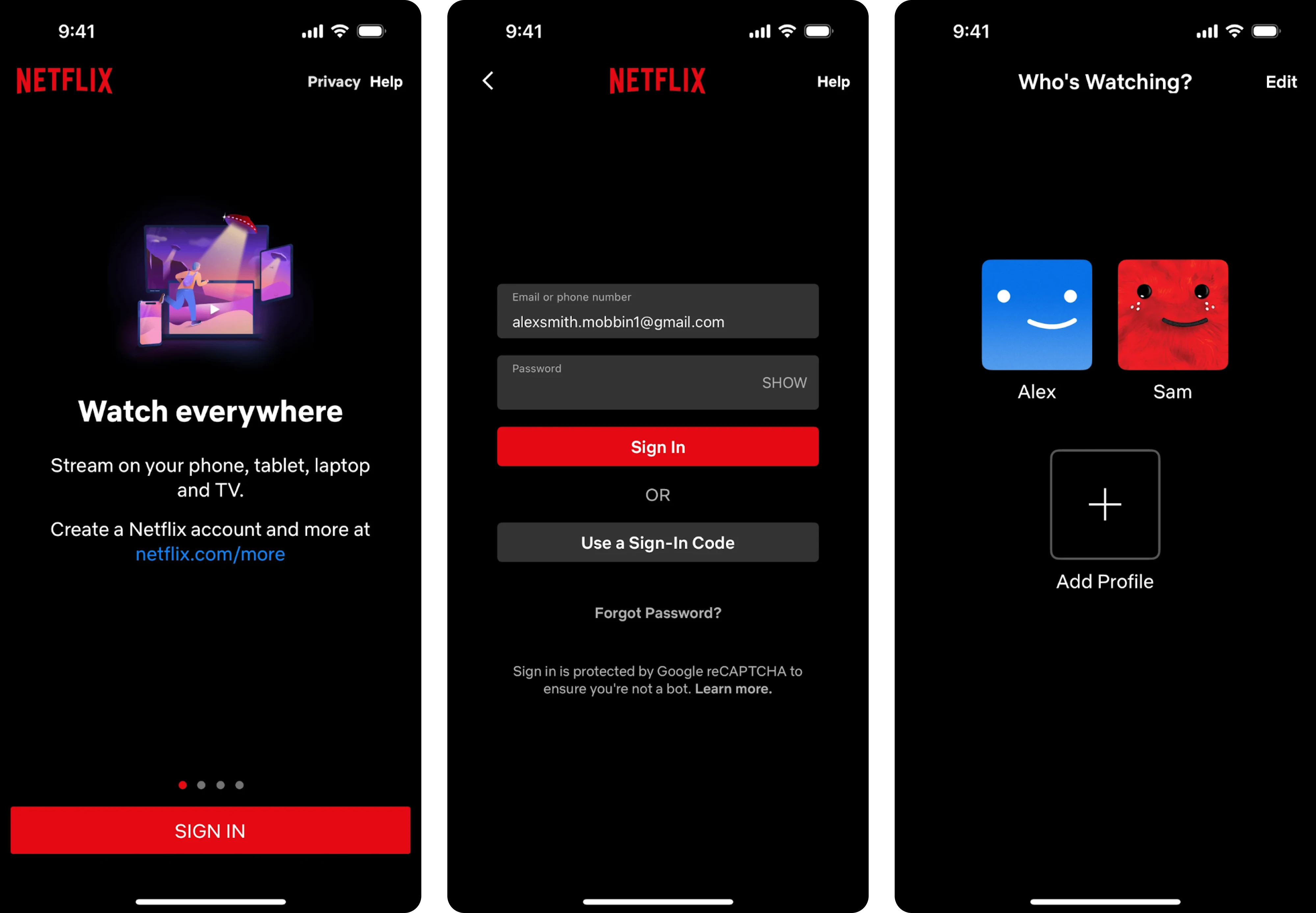
37. Netflix
The mobile login experience on Netflix opens with a familiar dark theme that matches the brand’s identity. Clear input fields support email or phone number login, and an alternative sign-in code option reduces password friction. Once signed in, users are greeted with a lightweight profile picker.
Why it works:
- Strong brand presence through color, typography, and tone.
- Multiple login methods reduce friction.
- Profile selection screen speeds up the experience.
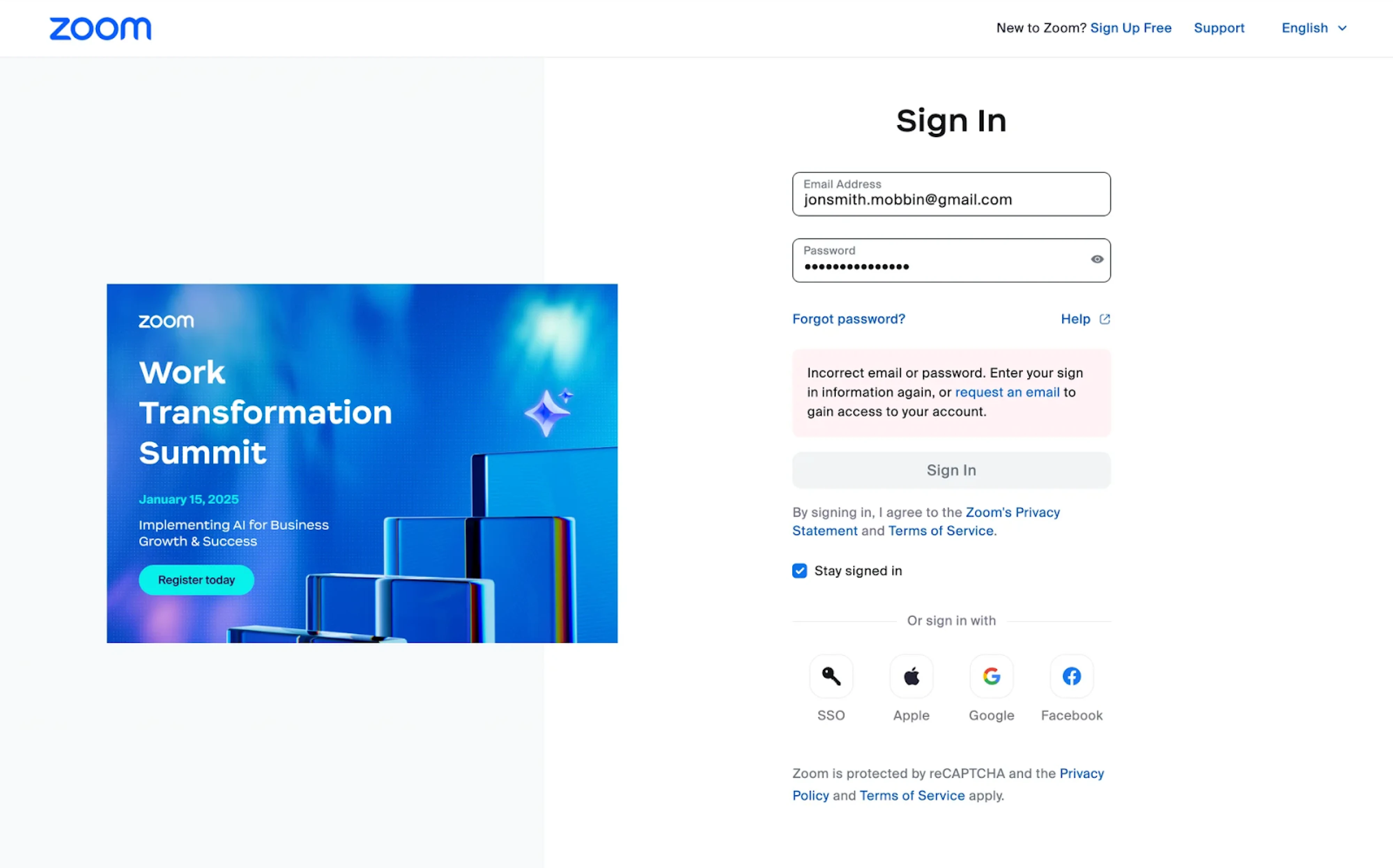
38. Zoom
Zoom’s login screen uses a clean split layout, combining sign-in with a branded promotional banner. The form is clearly structured, with a password visibility toggle, helpful links, and immediate error feedback. Users can choose between several sign-in methods, with visual icons aiding quick recognition.
Why it works:
- Split layout reinforces brand and promotes upcoming events.
- Helpful error message improves recovery from failed login attempts.
- Multiple sign-in options support flexibility and ease of access.
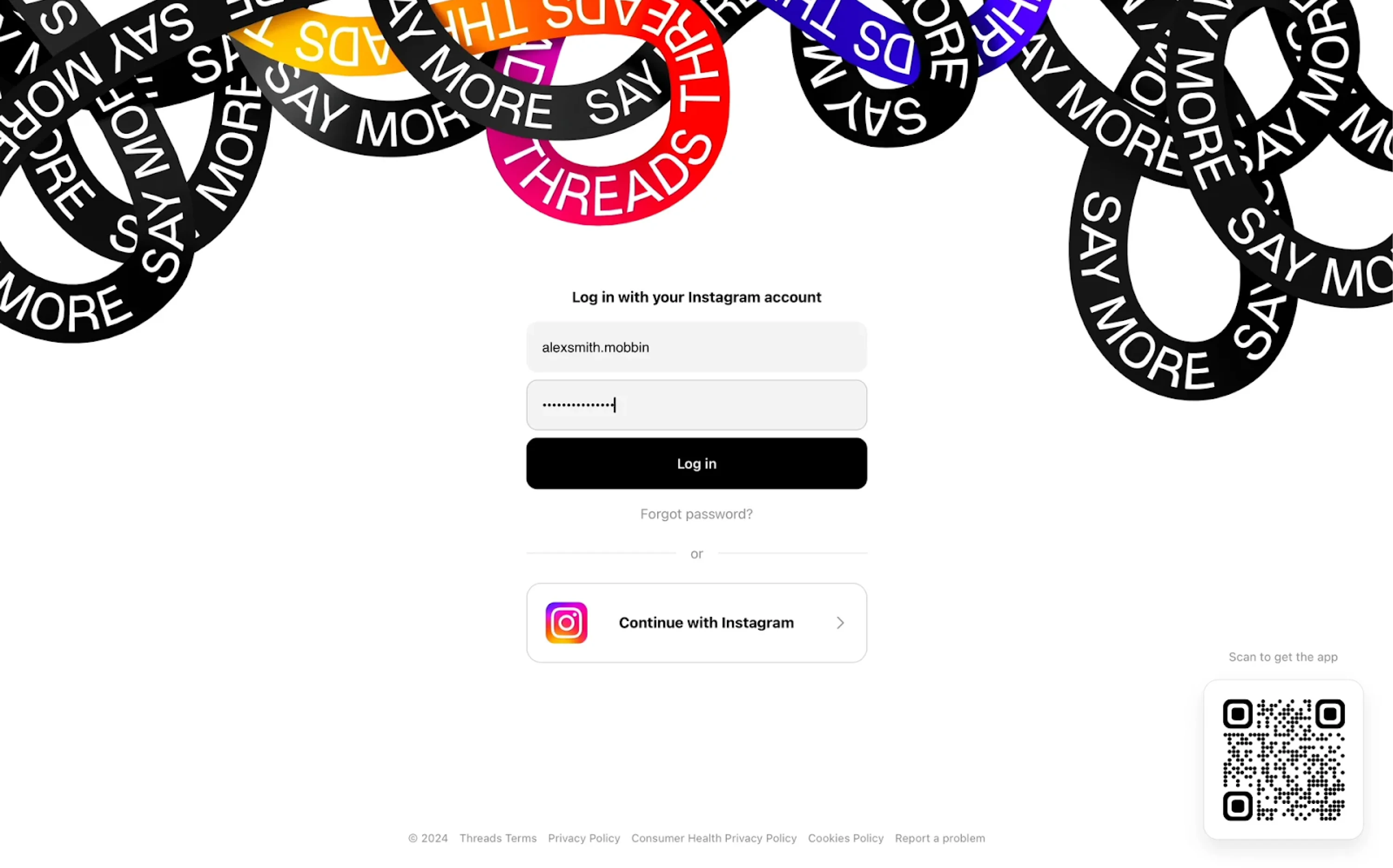
39. Threads
The Threads login experience is tightly integrated with Instagram, reflecting the app’s ecosystem. Users are prompted to enter their Instagram credentials or simply continue with a single tap via Instagram authentication. A bold visual header adds brand personality, while the rest of the layout stays minimal.
Why it works:
- Integrates seamlessly with Instagram to reduce friction.
- Prioritizes the single sign-on option for faster login.
- Strong visual branding at the top builds recognition and identity.
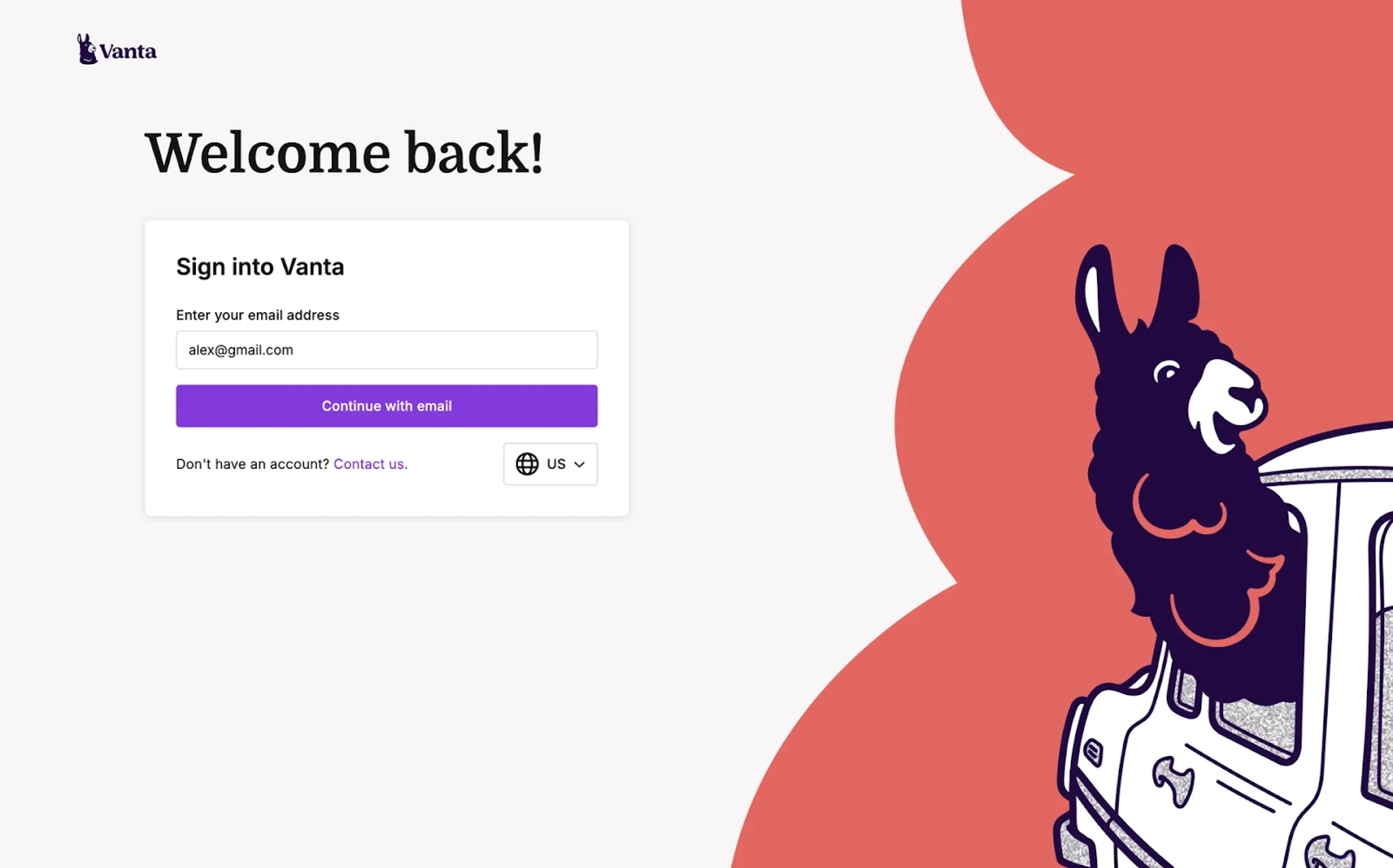
40. Vanta
Looking at Vanta’s login page design, the first things that catch the eye are the playful illustration and bold “Welcome back” headline. The interface is minimal, focusing on email as the primary login method. The form is centered and clearly labeled, with a strong CTA button that reinforces the brand color.
Why it works:
- Eye-catching visuals add personality.
- Email-only flow keeps the experience simple and focused.
- Large headline and centered layout guide user attention intuitively.
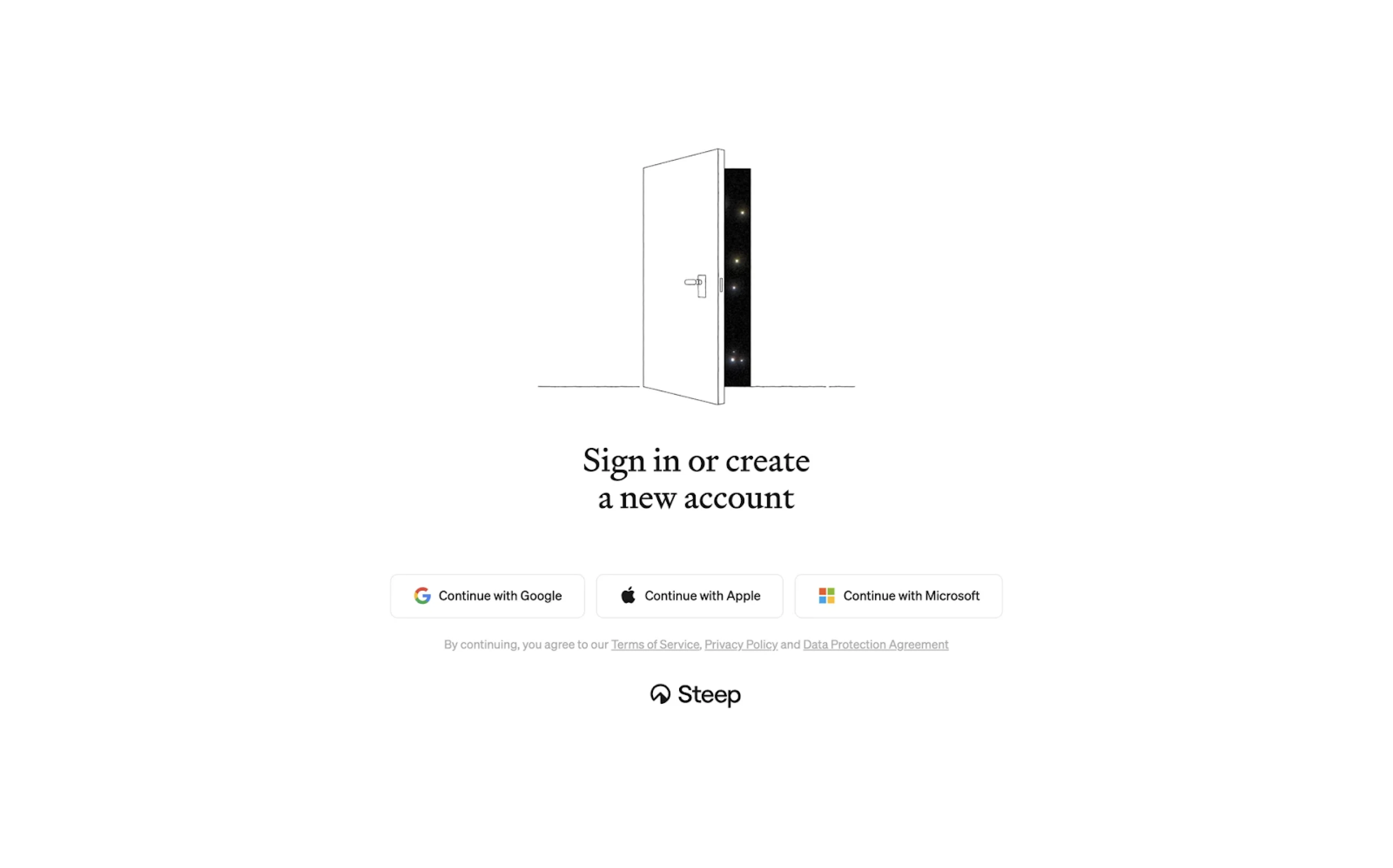
41. Steep
The login experience at Steep is minimal yet expressive. A central illustration sets a welcoming tone, paired with a clear call to action: sign in or create a new account. Users can choose a provider — Google, Apple, or Microsoft — and are smoothly guided to select a workspace and connect, all without needing a password.
Why it works:
- Clean layout supports users with only essential actions.
- Friendly illustration adds personality.
- Passwordless flow keeps things fast and modern.
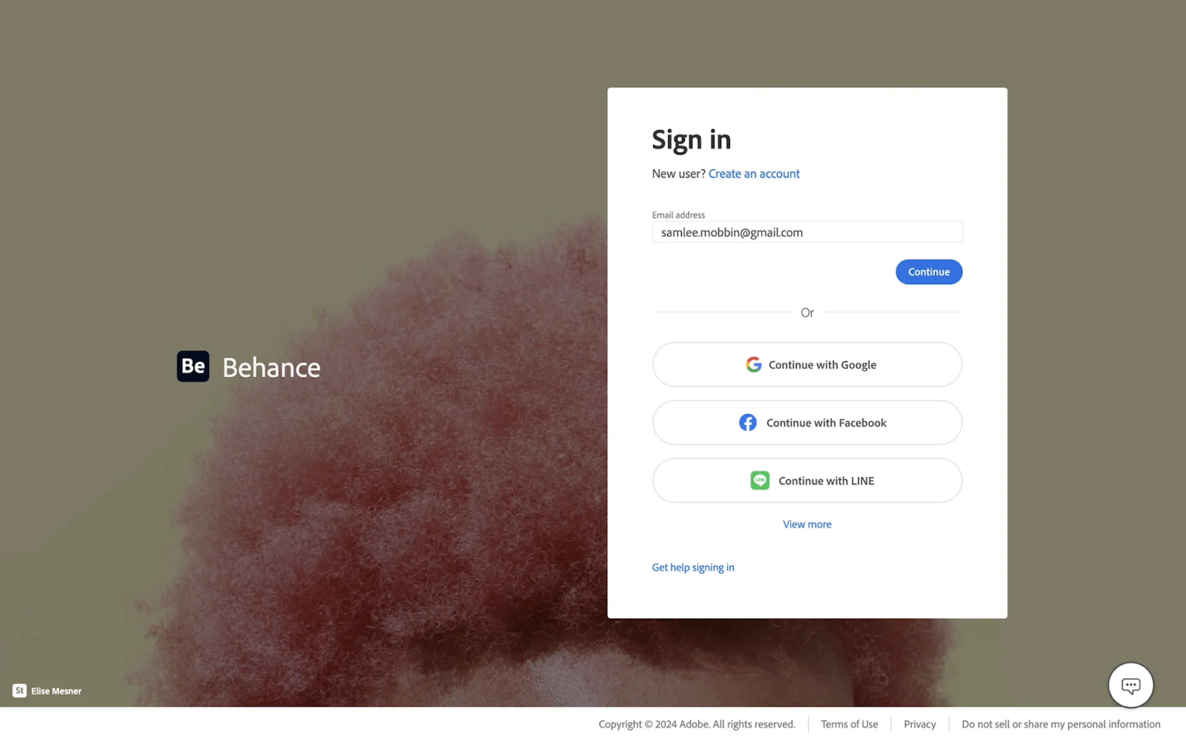
42. Behance
Behance follows a consistent design language on its login page, using a clean, centered modal against a creative background. Users are prompted to enter their email or choose from multiple sign-in options. The form is minimal, letting the action buttons stand out clearly without overwhelming the user.
Why it works:
- Multiple login methods cater to diverse user preferences.
- Clean design keeps focus on action without visual noise.
- Background image adds creative context to the experience.
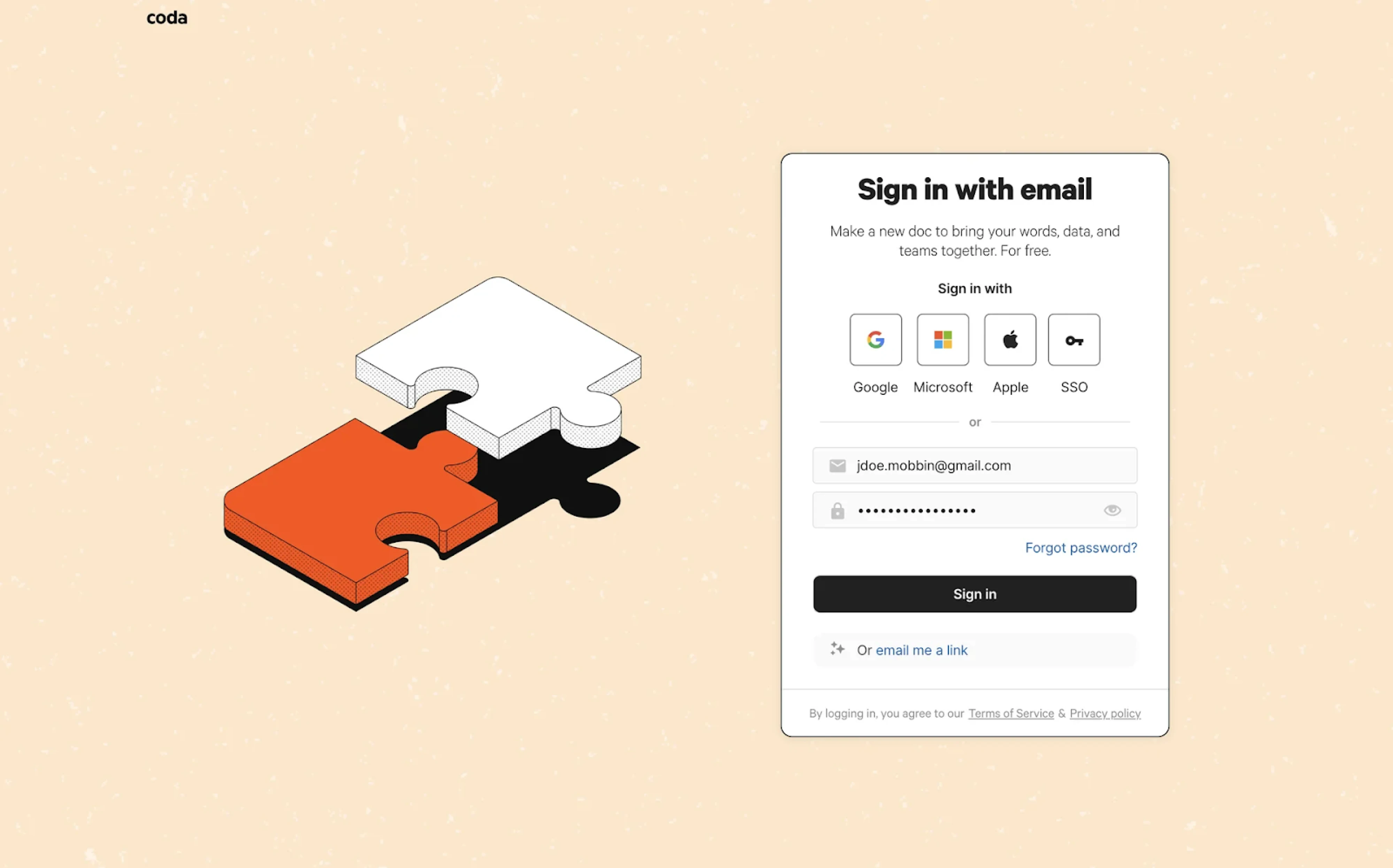
43. Coda
Among sign-in page examples, Coda balances simplicity with flexibility. Users can sign in with popular providers like Google or Microsoft, or use their email and password. A clean illustration on the left adds a friendly tone to the user experience. The “email me a link” option introduces a frictionless path for returning users.
Why it works:
- Email magic link reduces friction for frequent users.
- Friendly illustration adds visual warmth without clutter.
- Clean layout keeps focus on the login form.
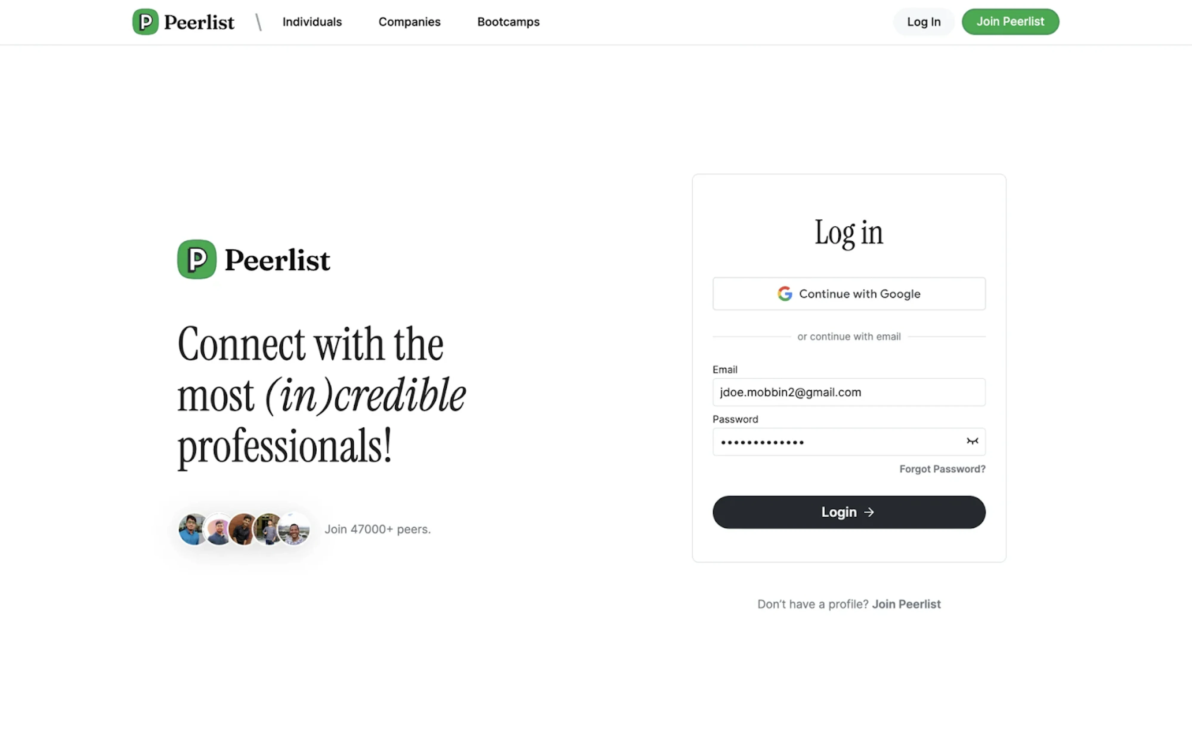
44. Peerlist
Peerlist combines a social message with a clean login interface. The left side encourages connection and credibility through playful copy and real user avatars, while the right side keeps the login flow simple. Users can sign in with Google or email, through form fields and a focused CTA.
Why it works:
- Balanced split layout pairs branding with function.
- Social proof builds trust with new users.
- The simple login form supports quick access.
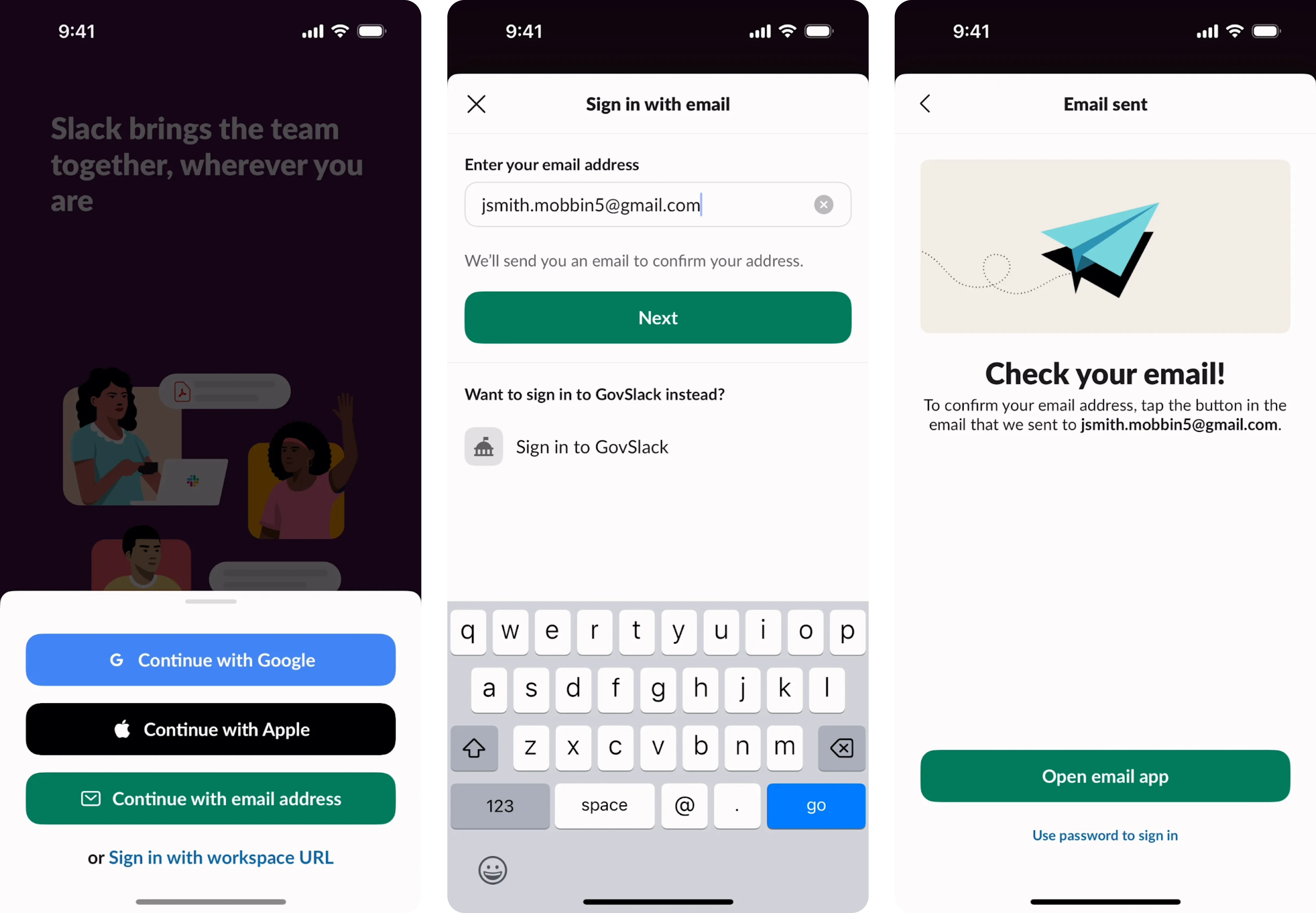
45. Slack
Slack’s mobile login page example puts clarity first. It starts by asking users for just their email address, then sends a verification link to confirm identity. Once the email is confirmed, users are instantly redirected to the necessary Slack channel. This makes the whole experience feel simple, focused, and secure.
Why it works:
- Email-only login streamlines the sign-in process.
- Magic link removes the need to remember passwords.
- Clear step-by-step flow feels intuitive on mobile.
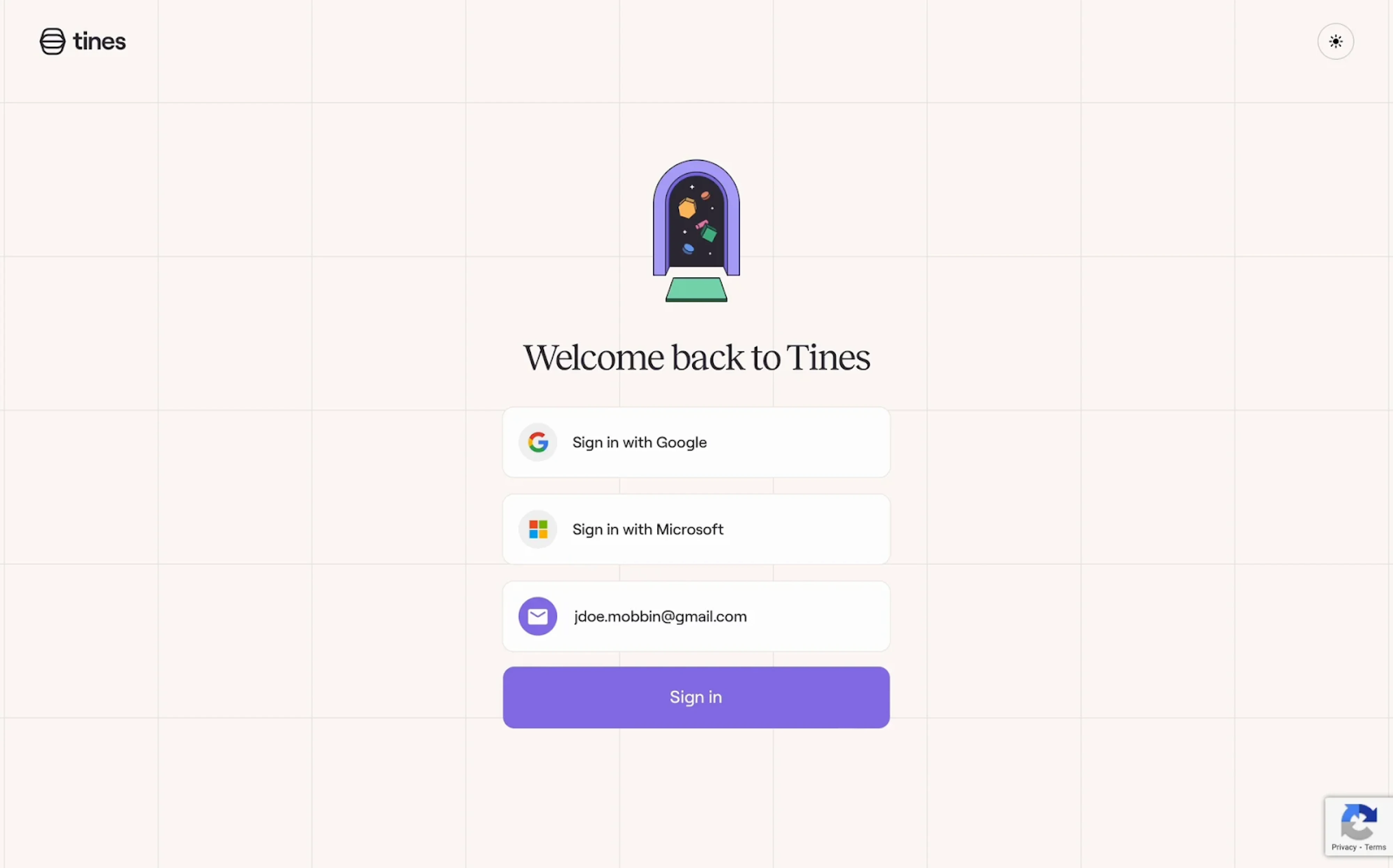
46. Tines
Tines uses generous whitespace and a soft grid background to create a welcoming feel. Sign-in options are displayed in a vertical stack, with Google and Microsoft buttons prioritized for quick access. What sets it apart from other examples is a light/dark mode toggle that adds a thoughtful touch for user comfort.
Why it works:
- Stacked authentication options make scanning effortless.
- Minimal visual noise keeps attention on the core action.
- Accent color CTA provides a strong focal point.
47. Rive
When visiting Rive, a full-screen animated character grabs immediate attention, acting as both branding and visual engagement. The login form on the right remains minimal, using soft shadows, toggle tabs, and subtle states to separate "Log in" from "Sign up." Social login options are placed at the top for quick access.
Why it works:
- Animation adds brand personality.
- A clear visual hierarchy helps users choose login methods.
- Tabbed layout simplifies the experience for users.
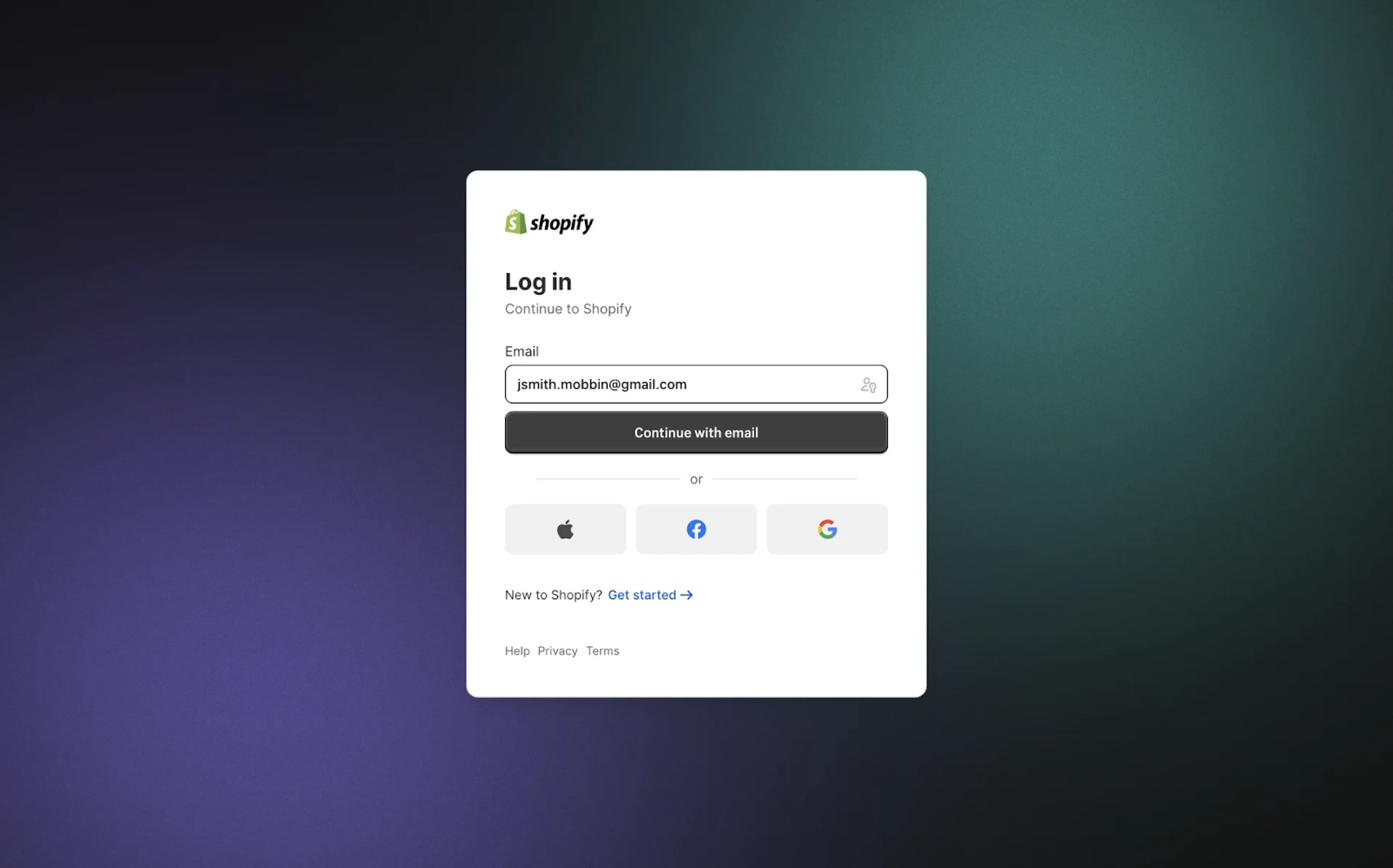
48. Shopify
Shopify’s login modal sits over a gradient backdrop, using progressive disclosure to guide the user. It begins with an email input, followed by a prominent “Continue with email” button that anchors the form. Alternative sign-in options are placed below a subtle divider, reducing decision fatigue at the entry point.
Why it works:
- Progressive login flow reduces cognitive load.
- High-contrast CTA ensures clarity and actionability.
- Neutral background keeps the modal front and center.
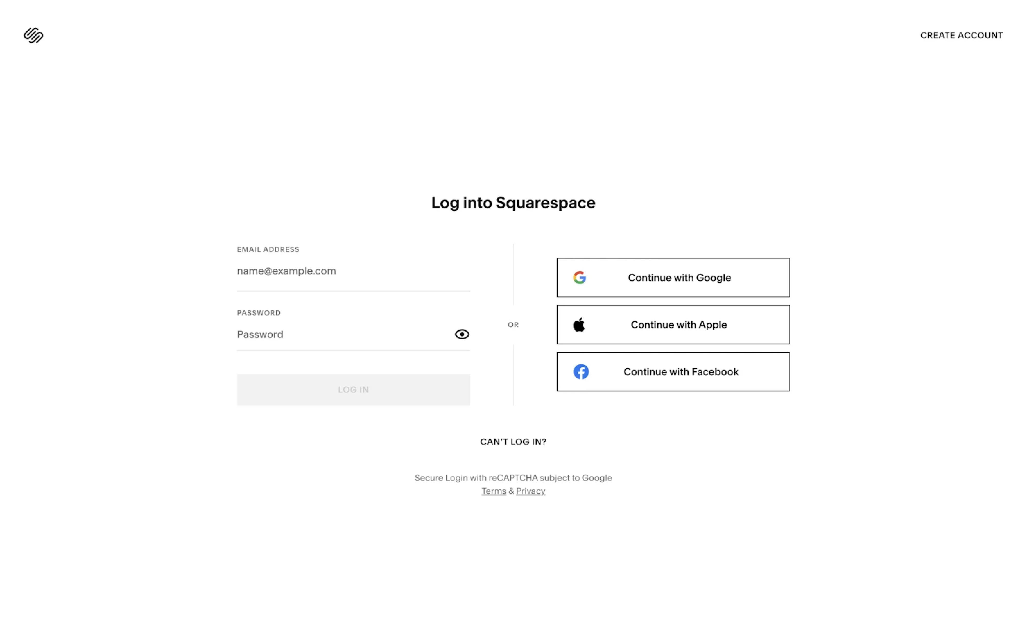
49. Squarespace
A side-by-side layout splits Squarespace’s login screen into two clear paths: email login and third-party options. The social buttons use sharp borders and logos for quick recognition, while the minimalist design echoes the brand’s identity. Sparse use of color and plenty of whitespace contribute to a distraction-free experience.
Why it works:
- Split layout separates login methods for clarity.
- Border styling reinforces the button affordance without clutter.
- Brand-consistent minimalism enhances trust and focus.
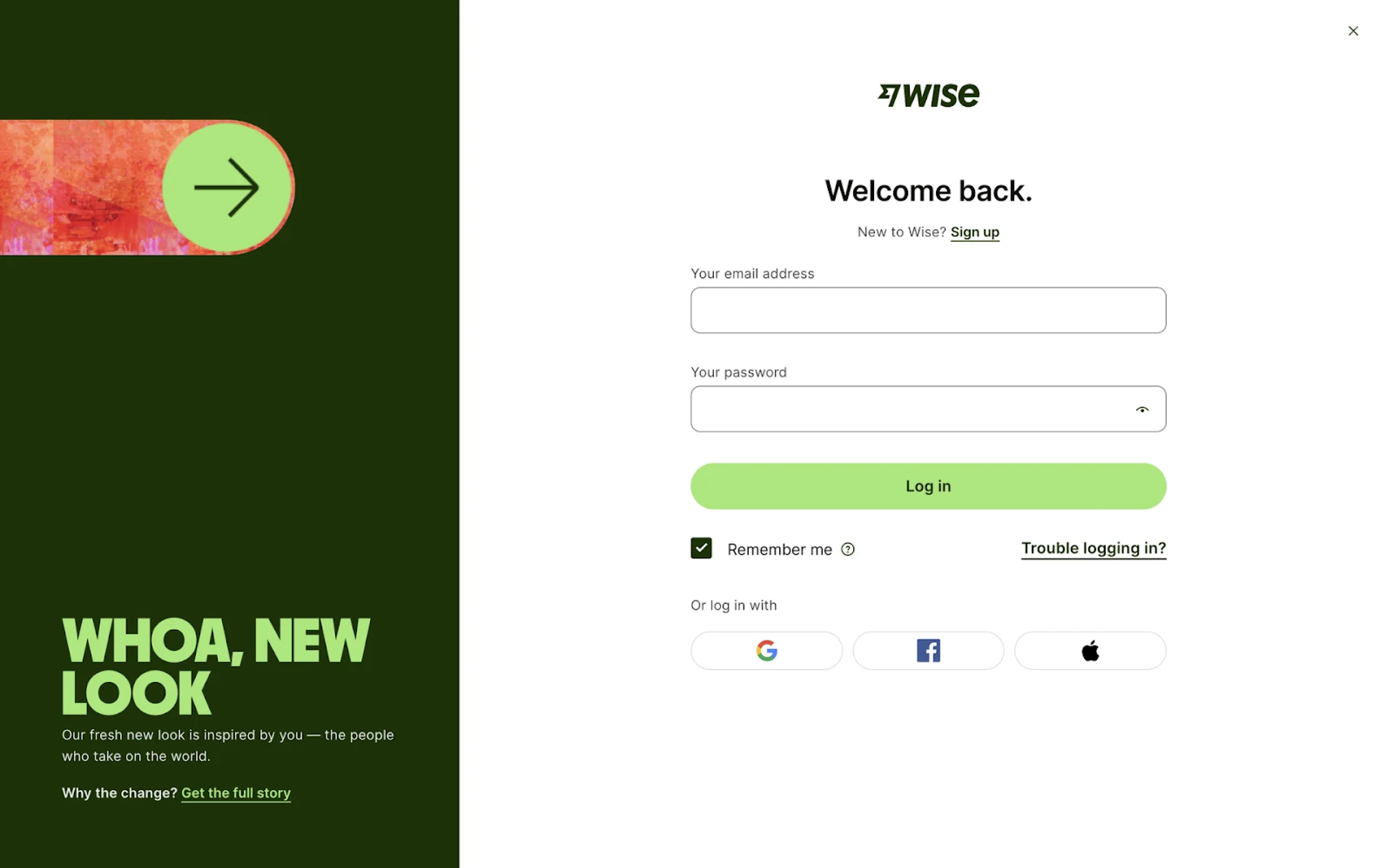
50. Wise
A bold rebrand takes center stage on Wise’s login screen, where the left side is dedicated to an announcement block. The login form stays conventional: email and password fields, a soft green CTA, and clear pathways to sign up or recover access. Third-party login options are styled as pill buttons beneath the form.
Why it works:
- Split-screen layout balances brand messaging and function.
- Distinctive color palette reinforces the updated identity.
- Familiar structure keeps login frictionless.
End of the flow
Whoa, what a journey that was! Fifty login page templates later, we hope you’ve found something that sparked an idea or made you pause.
As you might’ve noticed, certain patterns show up again and again: split layouts, headlines, clean input fields, login options, helpful links, and error messages. The trick is knowing what your product needs and making each part count.
As designers, we get how challenging it can be to balance clarity and creativity. So if you ever need a fresh perspective or a design partner who knows the space, we’re here to help bring your vision to life. For pricing details, turn to our page.


.webp)

.png)


.png)