/
SaaS business

How To Make Users Love Your Product: 11 User Engagement Strategies

0

mins to read

Have you ever heard about the phenomenon of a shrinking attention span? People are now overwhelmed with information. They use dozens of products and services, flopping over from one to another, honoring some products with daily usage yet not giving others a chance. 

If you want to ensure your SaaS growth, be ready to combat for users’ attention. Your marketing strategy should aim to educate and entertain the users to increase the retention rate. Eventually, you want your users to interact with your service every single day, making it an integral part of their lives. In a nutshell, your ultimate goal is to make your product sticky.

“Once people start using your product, SaaS companies need to focus on making that product as sticky as possible. Your customers need to be using it in their day-to-day workflows,” - Paul Schmidt, a senior consultant at SmartBug Media.

By the way, here in Eleken, we know that one secret of product stickiness is a customer-centered design.

In this article, we will talk about actionable and efficient user engagement strategies you can start implementing straight away.

Ready to go? To have a whole picture made up in your head, let’s answer the fundamental question first.


Why is user engagement important?

First and foremost, engaged users are a company’s biggest asset. The satisfied customers are loyal brand advocates. They help the company survive in the competitive market, increase sales and profit, and ensure growth. Eventually, all the SaaS companies work for people. They want the users to make the most out of the product or service, become happy, and stay with the business as long as possible, ensuring recurring revenue.

Effective user engagement strategy helps the business to:

  • Grow customer loyalty, which leads to long-lasting relationships between the users and the company
  • Increase revenue and, what is even more critical, make the revenue predictable
  • Stand out from the competition by providing an excellent customer experience and building a positive image in clients’ minds

 User engagement is sometimes referred to as customer engagement. While their definitions are very close, there is a slight difference between these two concepts.

SaaS user engagement vs. SaaS customer engagement


The term “customer engagement” typically implies a high-touch relationship model, whereas “user engagement” is used by companies that employ a low-touch relationship model

The customer engagement approach focuses more on in-person product training. 

User engagement invests more in the in-product user onboarding experience.

Simply put, the high-touch relationship model can be defined as the “one-to-one” approach and usually implies regular assistance from a dedicated customer success manager and is used for high-value customers and complex products.

The low-touch or so-called tech-touch model uses a “one-to-many” customer interaction approach and focuses on digital engagement for free or lower contract value customers.

To sum up:

Customer engagement model

  • High-touch relationship model
  • Greater contract value per account
  • More complex product
  • Paid service subscription 

User engagement model

  • Low-touch relationship model
  • Lower contract value per account
  • Less complicated product
  • Free product usage

The engagement strategies we will discuss in this article can be applied to both user engagement and customer engagement models. Strictly speaking, user engagement can be considered an essential component of customer engagement and forms the firm foundation for the latter. 

Now, let’s find out how to engage your users and provide them the best customer experience.

1. Employ personalized approach

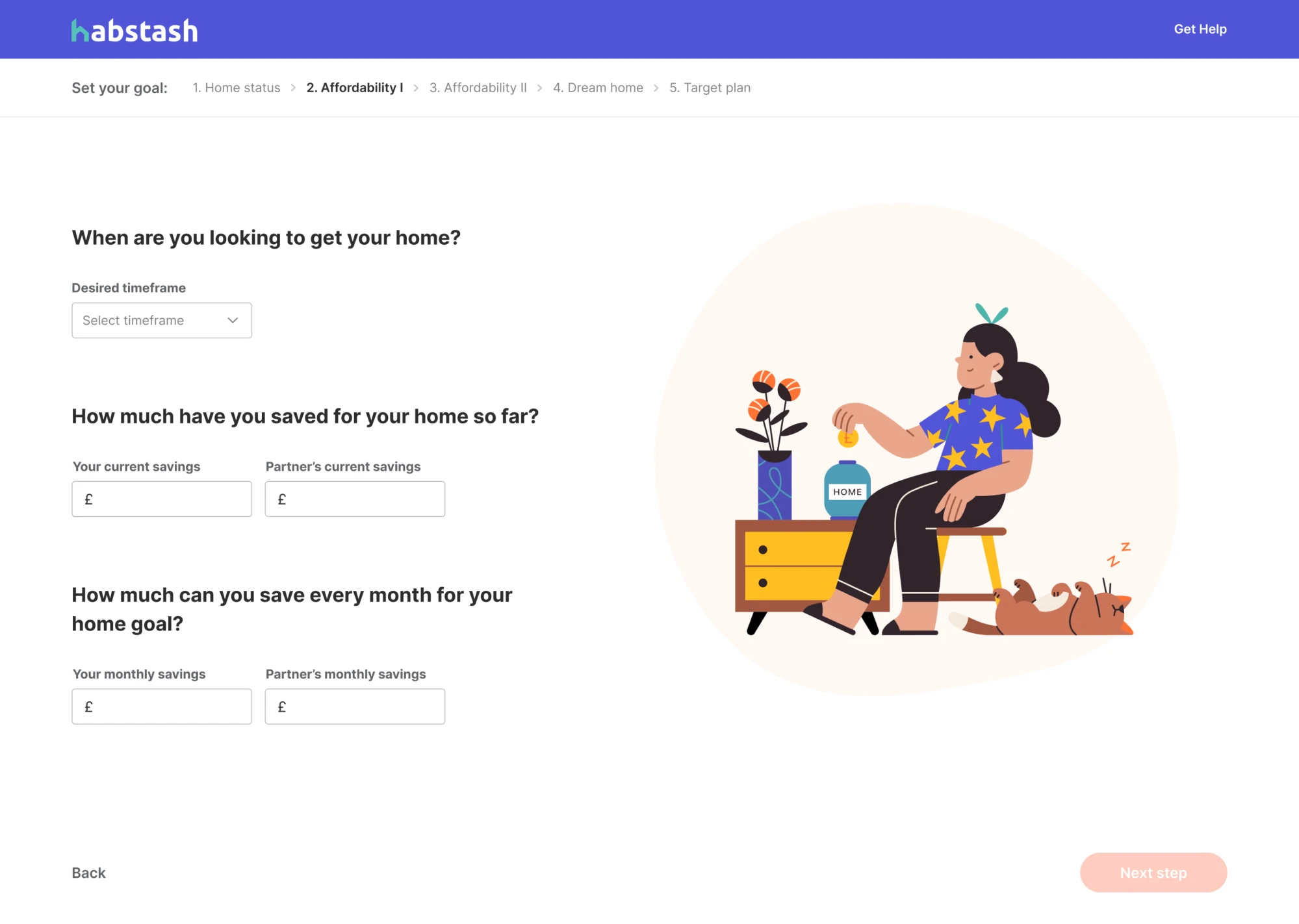
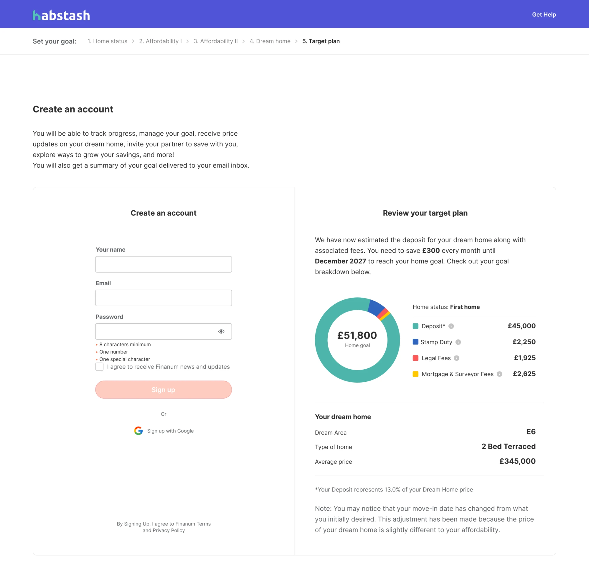
We used to understand a tailored customer approach as adding a user’s first name in the email. However, except for this dynamic content, the second personalization type works even more effectively in terms of user engagement. It is event-driven automation or personalized onboarding. The best apps use this tactic to create a customized user experience within the app and build a unique customer journey. 

For example, Duolingo, a language learning app, guide new users through the personalized onboarding funnel according to different jobs-to-be-done, making the app a perfect match for multiple users. The choices users make at each funnel’s stage influence their in-app journey.


Image credit: neilpatel.com

2. Know your users

To refine your customer engagement strategy, you should determine who your users are, what needs they want to satisfy, and how often they interact with your product. The SaaS product is typically used by several types of users. 

  1. The clients who are regularly using your product. They are the most engaged users, loyal and active. You should treat them accordingly, not promoting features they’ve already used or products they’ve already purchased.
  1. The users who haven’t used your product for a certain amount of time. These users should be handled carefully. You need to focus on what your product can do for them, what value you can offer, and why they should give you a second chance.

You may also have free users and those who pay for the service, and both segments definitely demand different approaches. The more thorough customer analysis you will undertake, the better you can refine your marketing tactics to increase user engagement.

3. Send triggered messages

I believe you’re already emailing your users welcome messages, newsletters, and thank you notes. However, it’s possible to send more relevant emails triggered by an automatically set event. Activated messaging creates a more personalized experience depending on the action the users take on your website or within your app.

The email below I received after I had downloaded an ebook. The message unobtrusively involves me in communication, pursuing a goal to understand my needs better and present the services ProfitWell can offer me.


4. Provide omnichannel experience

The omnichannel value is seamless communication with a user throughout all channels, no matter how and where they reach out. The omnichannel breaks the barriers between product and marketing. 

Of course, this is easier said than done, especially in large companies. However, providing customers a truly omnichannel experience will significantly improve user engagement and increase retention rates. 

5. Interact by in-app chat

In-app chat is an efficient tool to help your customers resolve any issue they may have using your product. It’s an opportunity for the business to reveal what features users find difficult and decide how to facilitate their user journey and improve customer experience.


6. Grab attention with videos

What educational materials do you provide to your users? Guides, eBooks, and blog posts are the most common educational resources used by SaaS companies. However, the textual content is not always effective. Firstly, it usually takes more effort to consume a written word than visual materials. And it is undoubtedly more time-consuming. Video tutorials can be an excellent option to replace textual content. They are visually appealing and convey a message faster. 

Besides, videos are an irreplaceable tool to build an emotional connection with your audience. Skilled storytelling holds users’ attention and makes a strong impression.

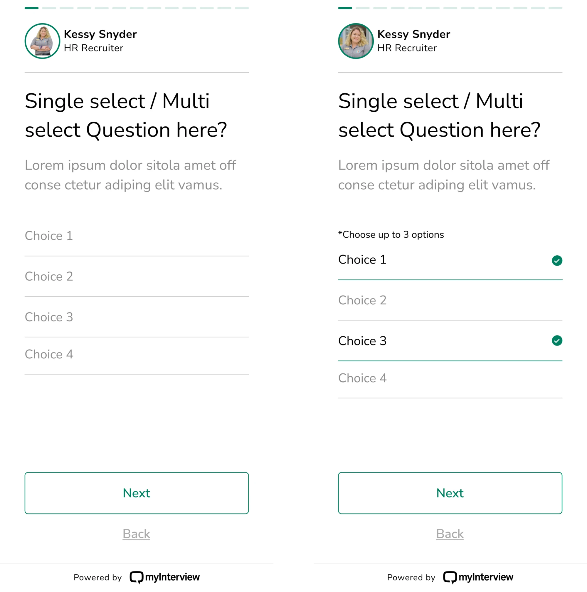
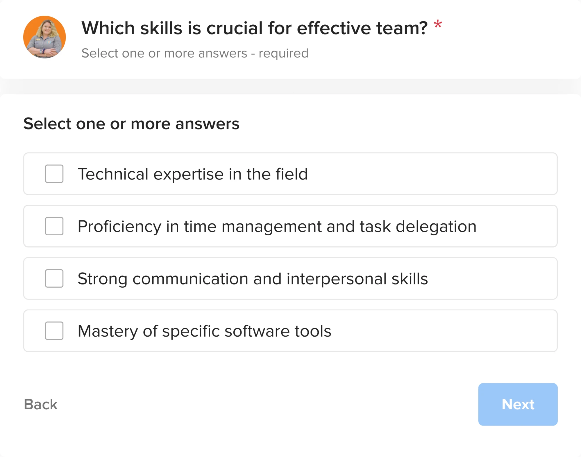
7. Gather feedback with in-app surveys

If you can embed customer surveys in your app - do it. CES, CSAT, and NPS surveys are inexhaustible resources of precious insights. The surveys inbuilt into your product allow you to target the right person at the right time and increase the chances to gather proper customer feedback.

Image credit: Appcues

In surveys, the segmentation based on user personas can help target the specific audience and not ask the same customers the same questions. 

8. Utilize gamification

The gamification concept is not new. However, to fight the low user engagement, the SaaS companies are actively incorporating this technique into their marketing strategy. 

What can be an example of the SaaS gamification? Let’s say you can arrange loyalty badges and encourage users to promote your content. The customers can earn free credits and use them to get discounts for their monthly payment, for example, or add-ons purchase.

9. Engage your loyal users

Loyal users are a gift for the company. Nurture them properly, and you will benefit from your business-customer relationships. How? Your brand advocates will be the first to spread the word about your new product with their reviews, quotes, and testimonials. They can also be beta-testers and early adopters, providing valuable feedback regarding the capabilities of the product. 

Encourage high customer engagement with special promotions and motivational gifts. Let them be first to know about new features release or company updates. Love your customers, and they will pay you back.

10. Focus on upselling existing users

It’s more cost-effective to upsell existing customers than invest in acquiring new ones. The revenue expansion can help fight customer churn, which is an inevitable process for all SaaS companies. 

The expansion revenue is crucial for sustainable SaaS growth. ProfitWell claims that for healthy SaaS business growth, at least 30% of your income should come from expansion.

11. Encourage all-round support

Many SaaS companies are implementing a specific customer support approach involving all employees, from developers to managers, to support customers. 

According to Zapier, “effective all-hands support focuses on making life better for your customers. But it can also cause a shift in how you and your team think about and build your company”.

This approach doesn’t actually mean that the customer support team will lose their job. On the contrary, they own the customer support domain, whereas the rest of the employees contribute to the process.

How to build an effective user engagement strategy

  1. Know your audience and create a personalized approach to each users’ segment
  2. Track users behavior with the help of analytics to better understand the roadblocks users face while interacting with your product
  3. Elaborate personalized customer journey by creating user personas and using the jobs-to-be-done approach
  4. Gather customer feedback with in-app surveys and utilize the insights to refine your user engagement strategy
  5. Interact with users by in-app chat to provide quick support
  6. Use video content and gamification to catch users attention and increase motivation
  7. Encourage loyal users to keep a high level of customer engagement
  8. Initiate all-round customer support to make user experience truly joyful
  9. Make all your business user-focused
  10. Be creative in the search for new ways to engage your customers

Do you need more advice on how to boost your business growth? Learn about six strategies to reduce customer churn.

Natalia Borysko

Author

Table of contents

Top Stories

SaaS business
/
0
min read

Best SaaS Web Design: Unveiling the Secrets of Impressive Websites

The SaaS industry has become one of the fastest-growing ones in recent years. Just imagine, in the USA alone, there are about 17,000 SaaS companies serving up to 59 billion customers across the world. So it’s no wonder that many SaaS startups seek ways to survive and thrive in such a competitive environment. But what can help them stand out? 

As a SaaS design company, Eleken has worked on numerous SaaS projects, from agriculture to data analytics, and gained a lot of valuable experience. From our standpoint, it is a well-thought-out SaaS web design that can help young startups gain a competitive edge. In one of our recent videos, Ilya Dmytruk, the founder and CEO at Eleken, shares some insights into what is so special about SaaS UX design that requires a narrow specialist.

When some of our clients come to us, they request to “make it like Stripe” or some other popular SaaS solution. But creating an impressive SaaS web design is not about mimicking the best companies and copycatting their user interface. It is, first and foremost, about creating simple, easy-to-navigate, and user-friendly designs that combine functionality and aesthetics. Still, we can always learn from the best, so let’s see what helps successful SaaS businesses deliver exceptional web designs launch after launch.

What tactics do reputable SaaS websites employ?

In the recent McKinsey report, researchers uncovered that design-driven companies outperform industry benchmark growth by as much as two to one. The report highlights that user-centric design provides businesses with more opportunities than ever today. Leading companies appear to excel in these four areas: 

  • More than a product: embrace the power of user experience.
  • More than a feeling: employ design metrics.
  • More than a phase: follow an iterative process. 
  • More than a department: hire cross-functional talent.
McKinsey.com

Eleken designers agree that the above four clusters of design actions work well and are ready to share some SaaS web design practices to help every business become a top performer.

More than a product: embrace the power of user experience 

SaaS websites' goal is to sell software to the user. Therefore, the designer's task here is to present the product in the most favorable light, namely to showcase all the advantages, highlight all the features, and show that your application is better than competitors. 

As we mentioned, many of our clients are asking us to make their solution look like Stripe. But why do so many SaaS businesses look up to Stripe? The answer is clear: Stripe has a good combination of a user-friendly interface with consistent design elements like color schemes, font styles, and layouts across all solutions, as well as a professional team that promotes customer feedback. 

Stripe’s main page
Stripe’s main page

In one of the interviews, Michael Siliski, the Business Lead at Stripe, said that one of the major principles in their design process is that they “really, really care” about user experience and put customers' needs first. This user-first approach encourages their team to search for the right balance between function, craft, and joy. One of Stripe’s designers shares an example of how everybody is involved with the product at all levels. The designer mentioned the case when the CEO didn’t like the result and wrote the needed code by himself.

Yes, most SaaS companies do acknowledge the value of user experience, but just like Stripe, it’s also important to know how you differentiate yourself through your UX.

Eleken use cases

Our UI/UX designer Dasha notes that the first step to differentiating yourself through UX is to maintain the same style across all visual components of the company. This means that the design of both your website and the SaaS product should be created by the same designer or agency. Such practice ensures that everything looks, feels, and sounds the same. As an example, let’s look at the case of SEOcrawl

Aside from doing the platform overhaul, our designers helped the SEOcrawl team to create designs for various marketing campaigns aimed at attracting audiences.

When talking about designs for marketing purposes, we believe that they should not only include authentic visuals but also convey brand identity, emotion, persuasion, and, most importantly - trust. Let’s look at a sign-up landing page. It has it all: a contrasting headline, relevant visuals, social proof, as well as a clearly visible call-to-action button. 

SEOcrawl landing page

It’s great if designs for social media with headers and icons align with the overall style, so we did for SEOcrawl:

Twitter header
Twitter header

Also, we designed numerous easy-to-read email notifications and newsletters for different purposes, including a free trial activation newsletter or new comment notification.

SEOcrawl notifications and newsletters

Tamara, another designer at Eleken, also shared her insights with us. When she was designing Кірsi’s platform for accounting, consulting, and specialty law firms, she also created marketing materials for participating in the exhibition and creating a pitch deck. 

Marketing materials
Marketing materials

The standard colors used in the accounting and financial fields are dark, restrained colors, usually blue shades. But Kipsi is a dynamic and young startup that is developing rapidly and introducing innovative ideas. To stand out from competitors, the client wanted to express this freshness in their style visually. So we used bright, vibrant, and youthful color palettes, such as fresh blue and purple. Here are some post examples Tamara created for LinkedIn:

LinkedIn posts with and without text

This ensured consistency of the project's visual style in all communications, making a positive impression.  

More than a feeling: employ design metrics 

Successful SaaS companies don’t rely on opinions and personal preferences. The design is more than a feeling for them. They implement design metrics and measure the design in the same way as cost, quality, or time. 

Design-driven companies link design to value, considering the entire customer journey and using the UX design metrics, like satisfaction ratings, usability assessments, field studies, A/B testing, and so on, to understand their user needs better.

Stripe is a master in user testing, empowering every employee to connect with users. For example, the company recommends following the “Make surveys about users, not about you” principle. This means UX researchers should avoid general requests, asking to help users to take the survey. Instead, it is better to explain to people why their answers will benefit them. For example, it will help fix a bug, improve the quality of service, or make the page more useful. Stripe offers this example of Rocket Rides, a demo for Stripe Connect, to illustrate this point: 

Stripe
Stripe.com

As Eleken designers always want to remain user-focused, we constantly monitor user behavior and conduct usability testing. For example, while working on Kipsi, we measured the time users spend on the platform (Time on task metrics) and tracked the functions and tasks they use most often (Success Score). As a result of our effort, we extended functionality, adding a Product Tour function that helped new users navigate the interface.

Kipsi’s navigation
Kipsi’s navigation

Design metrics play an important role when talking about product redesign. For example, our clients from Refera, a web platform that allows doctors to create and send referrals, came to us to redesign a product’s landing page. They wanted to convey the feeling of trust and confidence, urging leads to leave an email address and book a demo. To achieve this goal, we conducted the user research. We found out that users have more trust when they see people with whom they will interact. So we placed a real doctor’s picture instead of illustrations to evoke trust. Our designer also suggested changing the blue color, often overused in medical design, to a calm green palette, as well as replacing outdated flat-style illustrations with more classical 3D images. 

Refera landing page (before/after)

More than a phase: follow an iterative process

Many companies still consider the design phase as just one of the product development stages. Yet, design works best in environments that encourage learning, testing, and iterating with users. This is especially true for SaaS projects. When companies rely too much on one iteration, this can result in losing the customer's voice. 

The Stripe designers follow a rapid iterative loop when they start their work by analyzing actual users’ needs and understanding their problems, and then designing the right product to solve them. The company calls this process “product shaping”, which means building “a rough solution to a concrete user problem” when it is strictly planned what to build and why.  

At Eleken, we follow a similar process. Ilya, our CEO, explains that design is a process, not an event. Users’ needs and market expectations often change, so adjusting to the time and changing design is important. 

For Eleken, the iterative process is quite effective because of its simplicity. The team follows a series of repetitive steps, improving and refining the product with each new cycle. Here are three stages of Eleken’s design process: 

 Iterative process at Eleken
  • Creation: Once the initial observation, research, and requirements have been gathered, Eleken designers analyze the first screens and discuss how they may work. Then, we create raw mockups and send them to the clients for approval.
  • Testing: The clients share their ideas about what they like and what could be improved. Eleken designers gather the feedback and make the needed changes.
  • Evaluation: We think of ways how to improve the mockups. Once the first iteration ends, the second starts. This process repeats until we get the result that satisfies everyone.

Let’s look at Kipsi’s design of documentation requests. The section navigation is simple and intuitive. But before it evolved to the version you see, it went through a number of approval cycles. 

Kipsi PBC
Kipsi PBC

The first iteration of the flow for document requests did not include the ability to indicate that the request is not relevant or the document does not exist. During this iteration, we collected our client’s feedback and understood that this option was necessary. The second iteration already included this functionality. 

More than a department: hire cross-functional talent

In a truly collaborative environment, there are no departments, titles, or assigned offices. Instead, there are cross-functional teams that work in tandem. All of them are focused on making a great product together to meet users’ needs.

Even though Stripe early invested in design, they were not immune to scaling up. In the beginning, they had a product-focused team. But for efficient scaling, they needed more cross-functional specialists to assist Stripe with storytelling, design research, content strategists, and so on. To address these challenges, Stripe built five teams with over 100 designers that focus on cohesion across all design disciplines, product design, operations of UX research, and many more.  

In the current space, setting up central design departments or smaller independent design teams is no longer effective. McKinsey researchers found that the distributed teams are much more successful, as they have a clearer focus on their customers and can build better cross-functional partnerships. As a result, they are 10% faster to launch a product and have a 30% higher success rate when getting concepts to market.

But sometimes, companies struggle with having the right talent on board. TextMagic, a Nasdaq-listed SaaS company, managed to overcome this challenge by extending its team with our designers. They hired Eleken to design a platform, including designing marketing campaigns, CRM, and desk services functionality.

Eleken designers were always in touch with the TextMagic team. We had video calls with the product manager every other day and arranged demos to present the results of our work every one or two weeks as if our designers were in-house employees. Here is what Irene Avdus, PM at TextMagic, shared on Clutch

Clutch review

The takeaway

Delivering excellent web designs has never been an easy task for SaaS companies. It remains especially difficult for companies that raise the bar on consumer expectations like Stripe. 

But no matter the case, having a design team who deeply understands your product and the target customers is important. Eleken can provide you with the right SaaS design talent for your product, even if you have a narrowly-focused project that requires niche expertise. Jamie Conklin, VP of Product at Astraea, commented, “It is unusual to find a designer who has experience building applications with geospatial data - especially imagery data. We found that in Eleken.

So if you want to develop your SaaS web design with a team who enjoys solving problems and has a high degree of autonomy, drop us a line

SaaS business
/
0
min read

UX ROI Case Studies: How Effective Design Can Boost Your Business Performance

Having a robust and efficient solution doesn't always mean customers will choose it over competitors. It is user experience (UX) design that ensures users seamlessly interact with your product, which, in turn, contributes to higher retention and engagement. 

Studies also prove the value of UX design. For example, according to McKinsey, companies prioritizing design have a 32% higher revenue growth and a 56% higher total return to shareholders than their competitors. Another research by Forrester revealed that UX design ROI is $100 for every invested $1. Overall, design unicorns (businesses that invest more in UX) usually see a significant 75% sales increase. In our recent article, you can find more UX statistics that prove the value of great design, from user engagement to conversions.

Being a design agency focused on SaaS products, our clients often ask us about the financial value of UX design. For them, user experience can seem like an elusive thing that is impossible to measure. But it is not so. There are UX metrics to evaluate the success of a design that also allow business owners to see how UX design can impact business results. And in this article, we are going to talk about them while also covering some real-life examples of companies for which investments in UX made a significant difference in their business.

So, let’s start with ways you can evaluate the success of your design.

Key UX metrics to measure the impact of UX design on your business

As UX designers, we are strong supporters of the idea that good design equals good business. And many companies tend to agree with us. Still, more than 50% of them don’t know how to assess the results of their design teams. So talking about a good old ROI would be great for starters.

The traditional ROI index shows the likelihood of a return on investment and is presented as a percentage. The ROI formula looks as follows:

ROI formula

For example, if you invest $300 and your sales go up by $600, your ROI is 100%, according to the formula: 

ROI formula

As for design projects, to assess the impact of UX design, you should focus on usability, satisfaction, and user engagement. Let’s take a closer look at them.

Usability

Most usability metrics are based on the data collected during usability testing. Through this type of testing, researchers observe the user behavior when they complete tasks trying to identify how easy it was to achieve a specific goal. As a rule, about 5 users have to participate in such tests to get clear results. 

Here are metrics to measure usability:

  • Task completion rate, or success score, shows the percentage of users who have successfully completed a specific task like creating an account, finding the right product from the list, or filling in the request form. To get your success score, you should calculate the number of completed tasks and divide it by the number of attempts.
Success score formula
  • Time on task lets you learn how much time (minutes, seconds, hours, days, or else) it takes a user to complete a task. As a rule, the shorter it takes, the better.
Task time forula
  • Error rate measures all wrong actions, such as slips (accidental behavior) and mistakes (incorrect non-accidental intentions) performed while completing a task. You may need to evaluate all of them, so you will need an error rate formula: 
Error rate formula

When focusing on one error, you have to find an error occurrence rate by calculating the total number of errors and dividing it by the number of attempts:

Error occurence rate formula

Engagement

User engagement metrics show how users will interact with a digital product helping to determine areas that need to be improved. Here are the key metrics:

  • Time spent on site measures the average amount of time users spend on specific product pages. To calculate the average time on a page, you should divide the total time users spend on a page by the total number of page views, then subtract the number of page exits. 
Average time on page

There are also a number of analytics tools like Google Analytics that can provide you with valuable numbers.

  • Pageviews show the number of pages the user has viewed over a period so that you can identify pages your users are interested in, and those that cause user friction. 
Pageviews
semrush.com

Satisfaction

User satisfaction is a crucial metric when you want to define the design's success. It shows how well your solution meets or exceeds users’ expectations and goals. This metric evaluates your users’ trust and loyalty. 

User satisfaction can be measured using the following metrics: 

  • Net Promoter Score (NPS) represents the percentage of users who would recommend your product. To determine the NPS, consider asking your existing customers how likely they are to recommend the solution to their friends and colleagues. Users should give a score of 1 to 10.  One means “not at all likely”, and ten - “very likely”. Based on the results, users are divided into three categories: 
Net Promoter Score

Now you can calculate the NPS by subtracting the percentage of detractors from promoters. 

Net Promoter Score

For example, if 70% of customers are promoters and 10% are detractors, then your NPS score is 60.

Net Promoter Score

Generally, the score is considered positive when it is above 0, meaning that you have more promoters than detractors. But leading companies often have an NPS score of 50 and above. For example, Apple has an NPS score of 68, while Amazon’s NPS is 51

  • Customer Satisfaction Score (CSAT) lets you understand ​​how users feel about your product or its specific functionality. You need to ask users to rate their satisfaction with your product from 1 (very unsatisfied) to 5 (very satisfied). 
Customer Satisfaction Score (CSAT)

To calculate a CSAT score, you’ll need to know the number of satisfied customers and the total number of received answers. You can use the following formula to identify a percentage score:

Customer Satisfaction Score (CSAT)
  • System Usability Scale (SUS). Here, your users will have to answer 10 questions, giving a score from 1, meaning “strongly disagree,” to 5, which stands for “strongly agree”. After gathering feedback, you add each score and multiply it by 2 to get from 0 to 100 points. If the score is 68 and above, for example, then everything is fine with the usability. If the score is lower than 68, then your product requires improvement.
System Usability Scale (SUS)
researchgate.net

So, as you can see, UX design is not just a superficial product or service aspect but an essential business driver. And with the list of UX metrics we shared in this article, you can easily evaluate the success of your design and its overall business value. 

But looking at specific examples where companies already did that and benefited from it is no less interesting, so let’s do it. 

UX ROI case studies that show why investing in design is worth it

Here are some examples to demonstrate how good design decisions can result in a great benefit for both your users and your business.

How changing one button led to a $300 million revenue boost 

For the book “Web Form Design: Filling in the Blanks”, Jared M. Spool shares how a small change in a form’s design let an e-commerce website increase its revenue by $300 million. 

The website was losing a significant amount of revenue due to a poorly designed checkout process. But the problem was, nobody on the team knew what the problem was.   

That’s why the company decided to conduct usability testing. After testing the website, the team discovered that customers resisted registering. Users just wanted to make a purchase and leave the website.

Registration redesign
Registration redesign resulted in an extra $300 million

The design team offered to replace the Register button with a Continue button. They also added a message informing users that they don’t have to create an account to make purchases on the website and just click Continue to proceed to checkout. 

The results of this simple change were impressive: the sales grew by 45% to an extra $15 million in the first month, leading to an overall revenue increase of $300 million.

How usability testing allowed HubSpot to improve user retention

When HubSpot was working on the record page redesign, the team discovered that excessive usage patterns were slowing down sales and support workflows. To improve usability, HubSpot decided to start by calculating user satisfaction metrics, such as CSAT and NPS scores, to then continue with usability testing.  

By testing nearly 40 activity types on the record timeline, the team identified significant issues, such as unresponsiveness and limited functionality, leading to an 11% decline in users. The team also measured the time it took to respond to an email after opening a record, which averaged around 8 minutes.

To decrease the time spent on email responding, HubSpot conducted live experiments and iterated based on user feedback, consistently prioritizing users’ needs. They eliminated unnecessary white space, reduced the load time by taking out unnecessary information, and simplified data scanning and actions on the record. 

Hubspot record page before and after redesign

When talking about numbers, the company managed to achieve great results. Their total revenue grew by 33% to $1.731 billion compared to 2021.

How SEOcrawl grew 2X after a complete UX redesign

SEOcrawl was looking to expand their existing platform to cover every aspect of the SEO needs. The company partnered with Eleken to redesign the product and improve its usability.   

We started the redesign with the competitor analysis and reviewed the existing visual design trends. Throughout the whole redesign process, each and every design decision was guided by user feedback. The SEOcrawl team shared new screens with its customers and asked them what improvements could be made. The entire redesign process was completed in under four months and then successfully implemented by developers.

As the redesign progressed, SEOcrawl's team recognized the growing expectations of their customers and decided to extend their product's functionality. To meet users’ needs, our team designed the Crawler tool for detailed SEO analysis of product web pages, and the SEO Monitor tool to detect and point out product problem areas. 

SEOcrawl's SEO Monitor tool
SEO Monitor tool to detect and point out product problem areas

After our fruitful collaboration, SEOcrawl fully revamped its solution and doubled its user base. What’s more, the new functionality allowed them to gain new paid customers, and the platform continues to grow.

Final thoughts

If you're still in doubt about whether to invest in UX, just remember that fixing UX design mistakes during development can cost 10X more, while a post-release fix can cost you up to 100X. And from the examples we covered, it’s easy to see that investing in user experience delivers a strong ROI and is definitely worth your attention.

And if you decide that excellent user experience will be your priority, hire Eleken UI/UX designers.

Don't want to miss anything?

Get weekly updates on the newest design stories, case studies and tips right in your mailbox.

Success!

Your email has been submitted successfully. Check your email for first article we’ve sent you.

Oops! Something went wrong while submitting the form.
Don't want to miss anything?

Get weekly updates on the newest design stories, case studies and tips right in your mailbox.

Success!

Your email has been submitted successfully. Check your email for first article we’ve sent you.

Oops! Something went wrong while submitting the form.