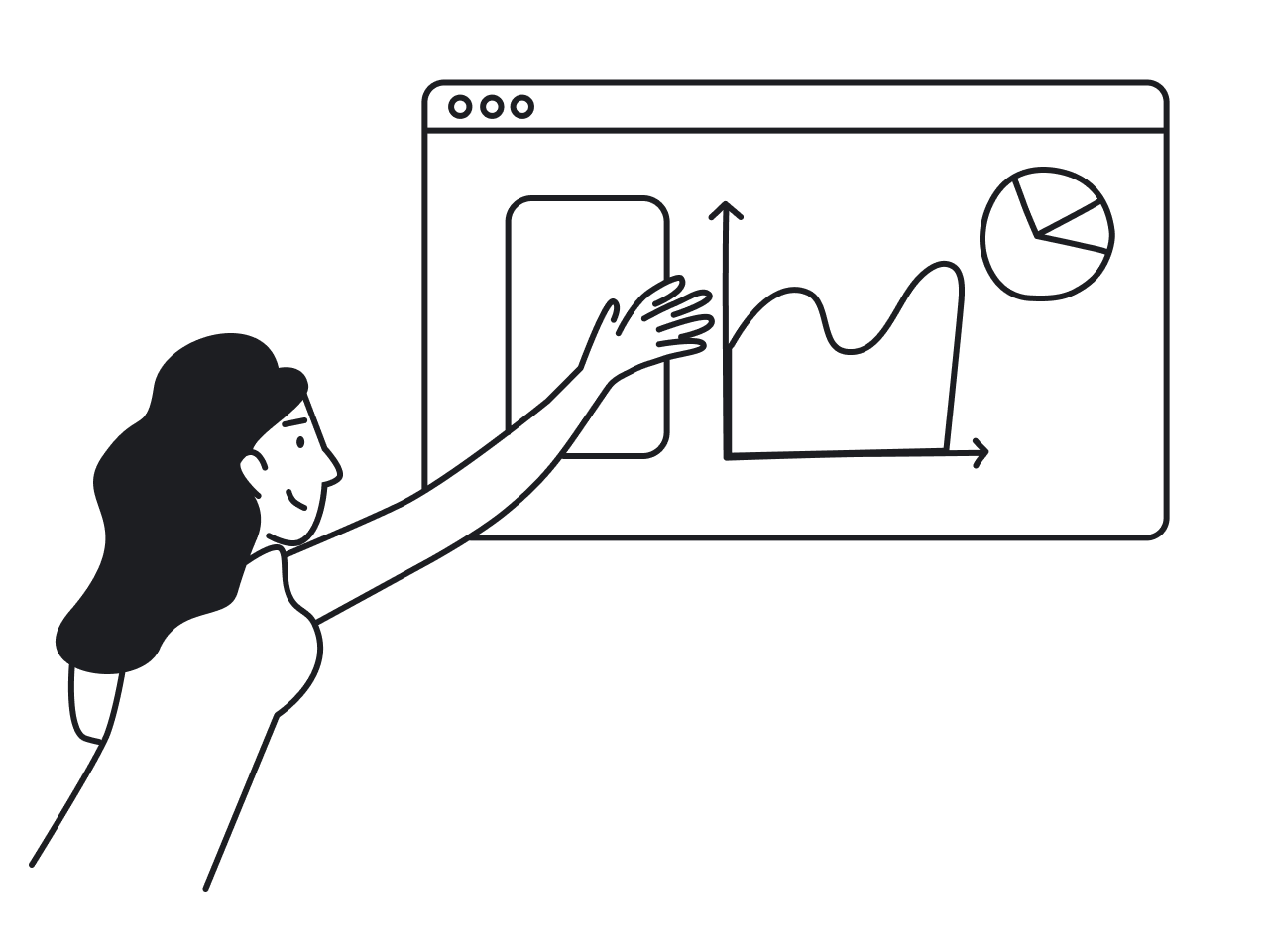

When users open a product they use every day, the first screen they see is usually a dashboard. It’s supposed to show what matters without overwhelming, confusing, or boring them. Sounds simple enough, until you actually try designing one.
You sit down to build something insightful. You add charts, filters, and KPIs. Then more filters. A trendline. Maybe a nice donut chart. Fast-forward a few weeks, and users are either exporting everything to Excel or ignoring the dashboard entirely.
At Eleken, we’ve worked on over 200 SaaS products, and nearly all of them included dashboard design. We’ve seen what works and what absolutely doesn't, and in this article, we’ll focus on why dashboards fail and what you can do about it.
Most dashboards die young
You might build the perfect data-driven design, yet in many organizations, even the best dashboards end up cold and ignored.

The numbers back this up.
While you hear claims like “85% of organisations have dashboards”, the actual adoption and value tell a different story.
In one industry paper, 70% of the development work for dashboards is wasted because they fail to be fully adopted by the business users. Another survey reports that poorly adopted dashboards struggle with just ~20% effective usage.
Why does all of this happen?
Because building a dashboard doesn’t guarantee it will be used. It might look great, but if it doesn’t align with how people work, or if it lacks clarity and purpose, it becomes shelfware.
Common reasons users ignore dashboards
When users struggle to find answers on a dashboard, they look elsewhere or give up. Over time, this loss of trust and usability means dashboards go unopened, while people return to methods they find simpler or more reliable.
There are many reasons for that, and to help you avoid falling into the same trap, let’s break them down in detail.
Too much information without enough clarity
It’s tempting to showcase every possible data point you have. After all, more information should lead to better decisions, right?
In reality, many dashboards collapse under their own weight. They try to do too much, showing charts, KPIs, filters, tabs, and visual gimmicks, and creating cognitive overload. Instead of finding answers, users get overwhelmed, distracted, or lost.
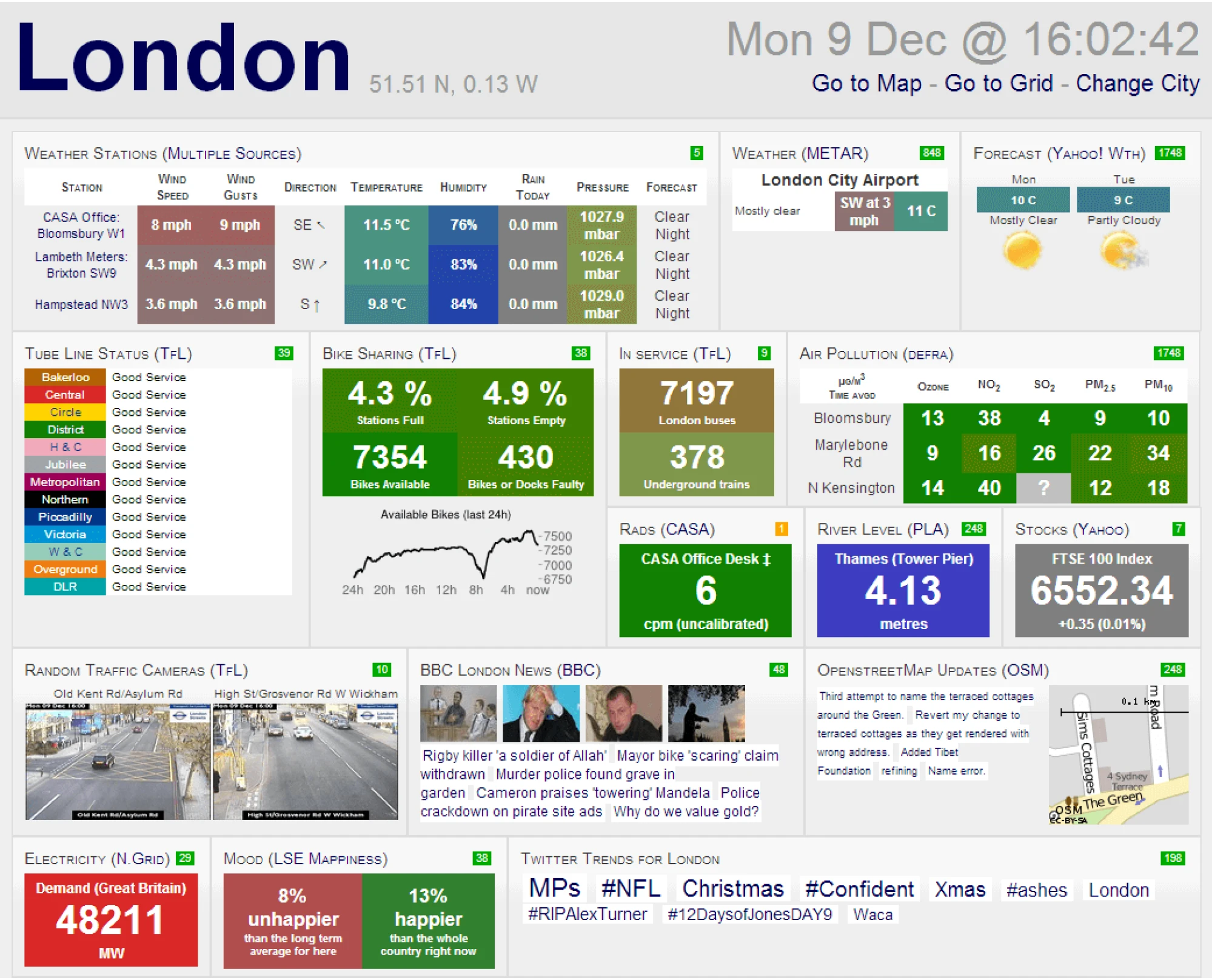
This “data dump” approach often stems from a fear of missing something important. As a result, everything gets added, and nothing gets prioritized. And if you want to see how it looks in action, the London City dashboard is worth taking a look at.
Doesn’t fit how people actually work
A one-size-fits-all dashboard rarely works for everyone. Different roles care about different metrics, so a generic design that mixes data will feel noisy. If a user doesn’t see how the information relates to their job or goals, they’ll disengage.
For instance, a CTO might need high-level uptime and cost metrics, whereas a front-end developer cares about system load times and error rates. Put all of that on one page, and each person will ignore the parts that aren’t relevant to their job.
Users quickly tune out dashboards that don’t speak to their specific needs.
Poor usability and unclear navigation
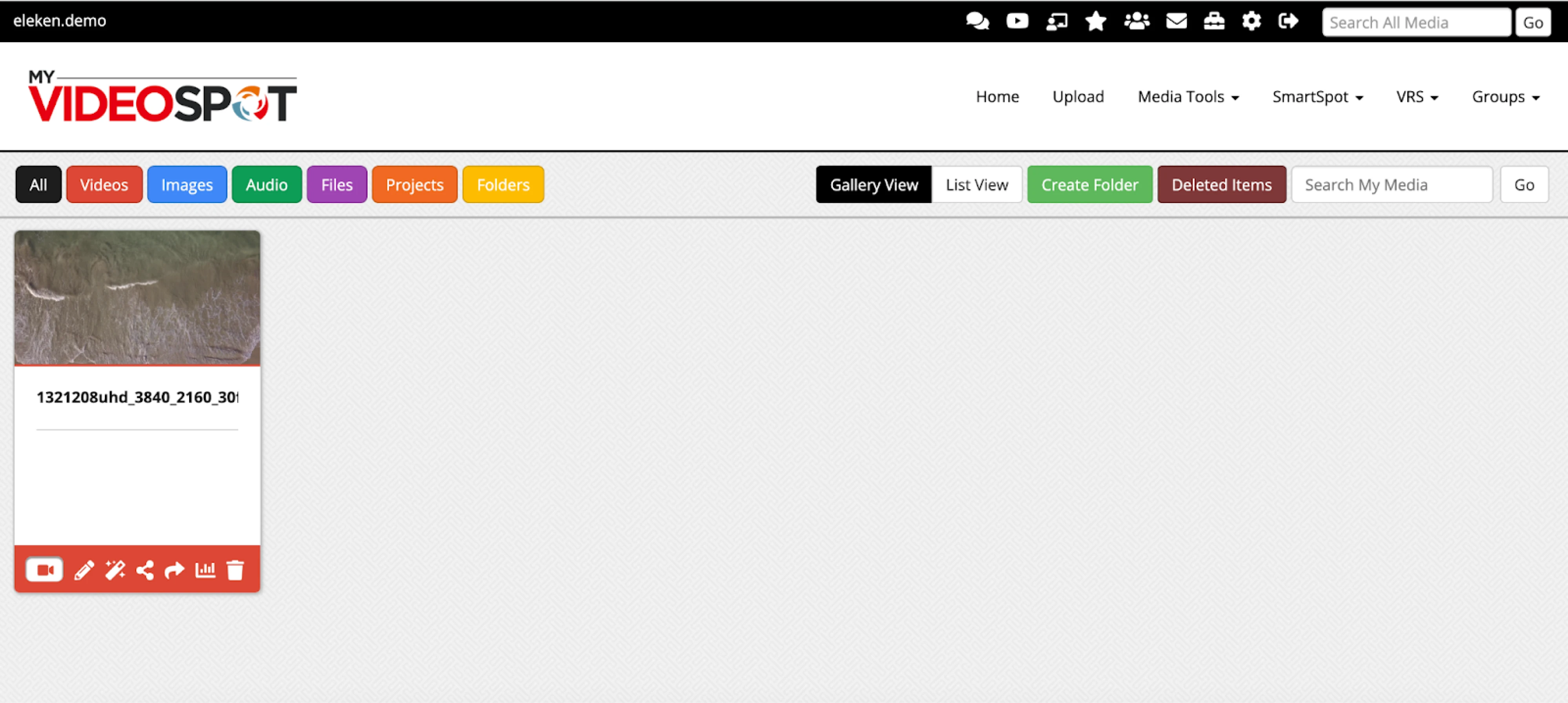
Even when the interface contains valuable data, poor usability and adoption cluttered dashboards can quickly make it irrelevant. Hard-to-read text, chaotic color schemes, or inconsistent navigation frustrate users and make interaction feel like a chore.
When MyVideoSpot came to Eleken, they were dealing with exactly this kind of usability friction, and we got to work fixing it.
Performance issues only make things worse. According to a survey, slow dashboards were the number one reason BI projects fail, as users get frustrated waiting for data to load and simply stop using the tool altogether.
Low trust in data quality or accuracy
Many users have been burned before by dashboards that looked good on the surface but were full of inconsistencies under the hood.
One wrong number is often all it takes to create low trust in dashboard data. When definitions are unclear or when updates lag behind reality, people start to question everything. And once that trust erodes, it’s hard to win back.
First impressions matter. If a user’s initial experience with a dashboard raises red flags, such as numbers that don’t match, missing context, or unexplained changes, they learn to distrust it. Over time, that doubt turns into disengagement.
No training or confidence to use it
Often, non-analysts don’t know where to start with a complex analytics tool, how to find the meaningful insight they need, or even what questions to ask of the data.
A steep learning curve or lack of onboarding support means users feel unsure if they’re “doing it right,” so they abandon the tool. In many organizations, weak documentation or poorly designed in-app help only makes things worse.
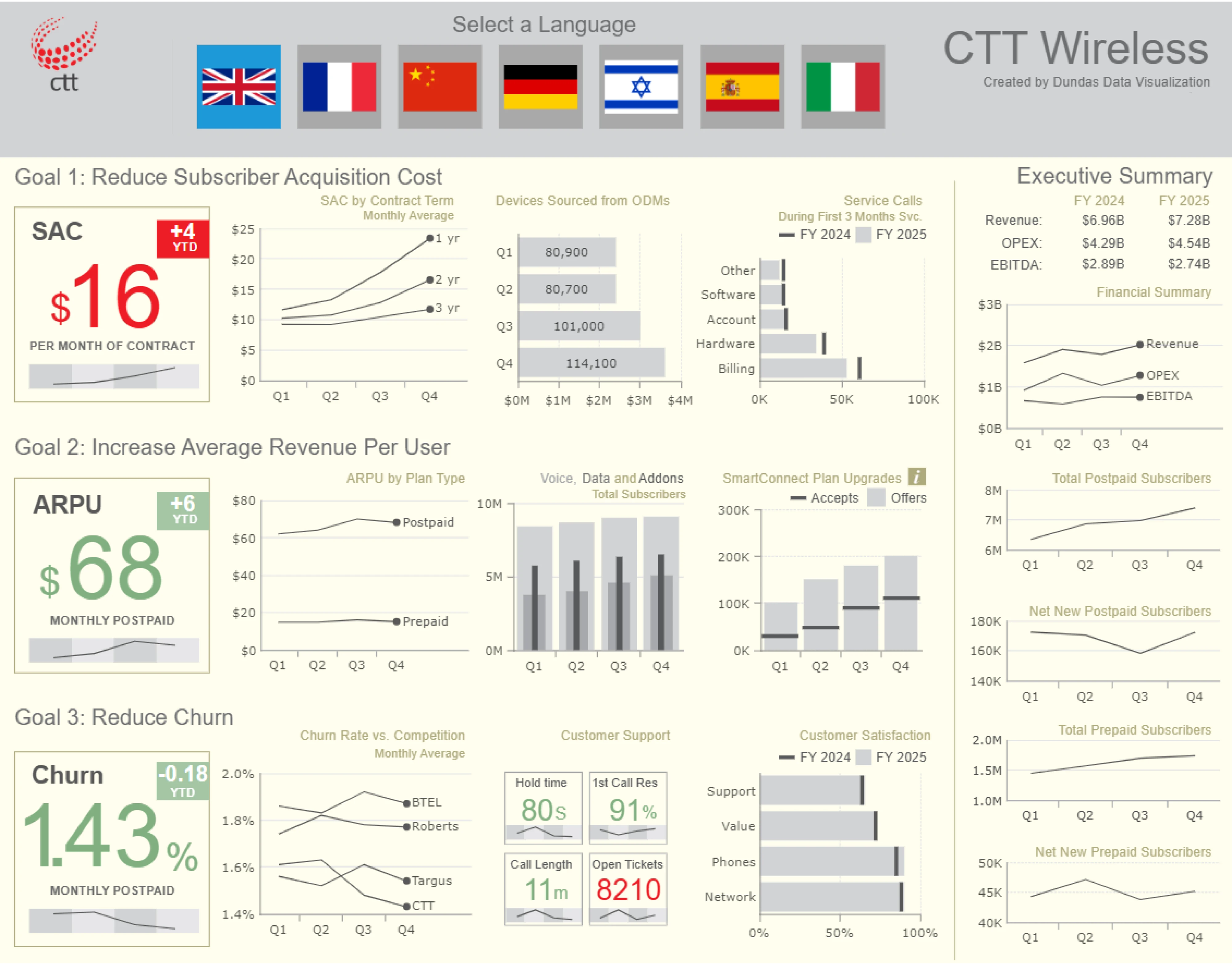
Long-term engagement only happens when people find the dashboard useful and feel confident enough to use it without second-guessing themselves. But most of the time, interfaces just feel overly complex, like the one designed for Dundas.
Strategies to improve dashboard engagement
You can’t blame users for ignoring a good dashboard that doesn’t work for them. What you can do is improve the design, rethink the logic behind it, and try again. When done right, dashboards become valuable tools people return to.
To help you get there, here are eight strategies that can boost dashboard engagement and turn passive views into active usage.
Simplify the interface and focus on what matters
When dashboards try to show everything, they often end up doing nothing useful. A valuable and time-tested heuristic here is the classic cognitive psychology rule known as Miller’s Law, or the “seven ± two” principle.
People can reliably hold about five to nine chunks of information in working memory at any given moment. So when a new dashboard displays 20 or 30 widgets, each decision point becomes harder, and users begin to tune out.
Recognizing this, it's essential to identify key metrics for your audience and make them the focal point. Fewer but more meaningful visuals drive better engagement.
Also, use a clear visual hierarchy and group related information together to reduce noise. Keep in mind that elements placed in the top-left and center naturally draw more attention, while the bottom-right tends to receive less.
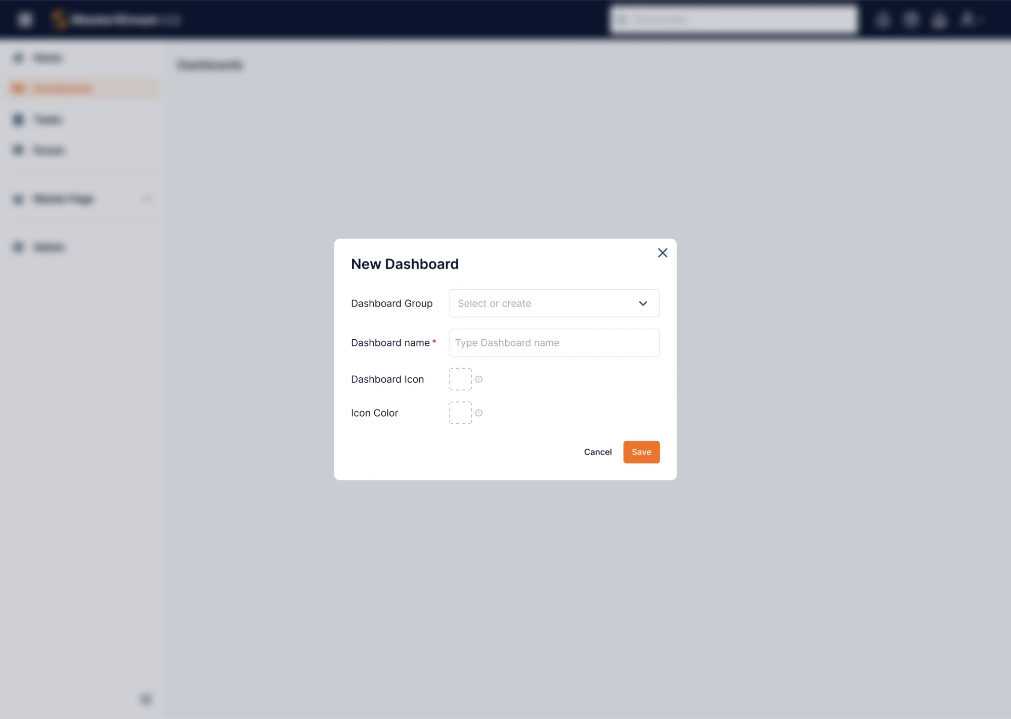
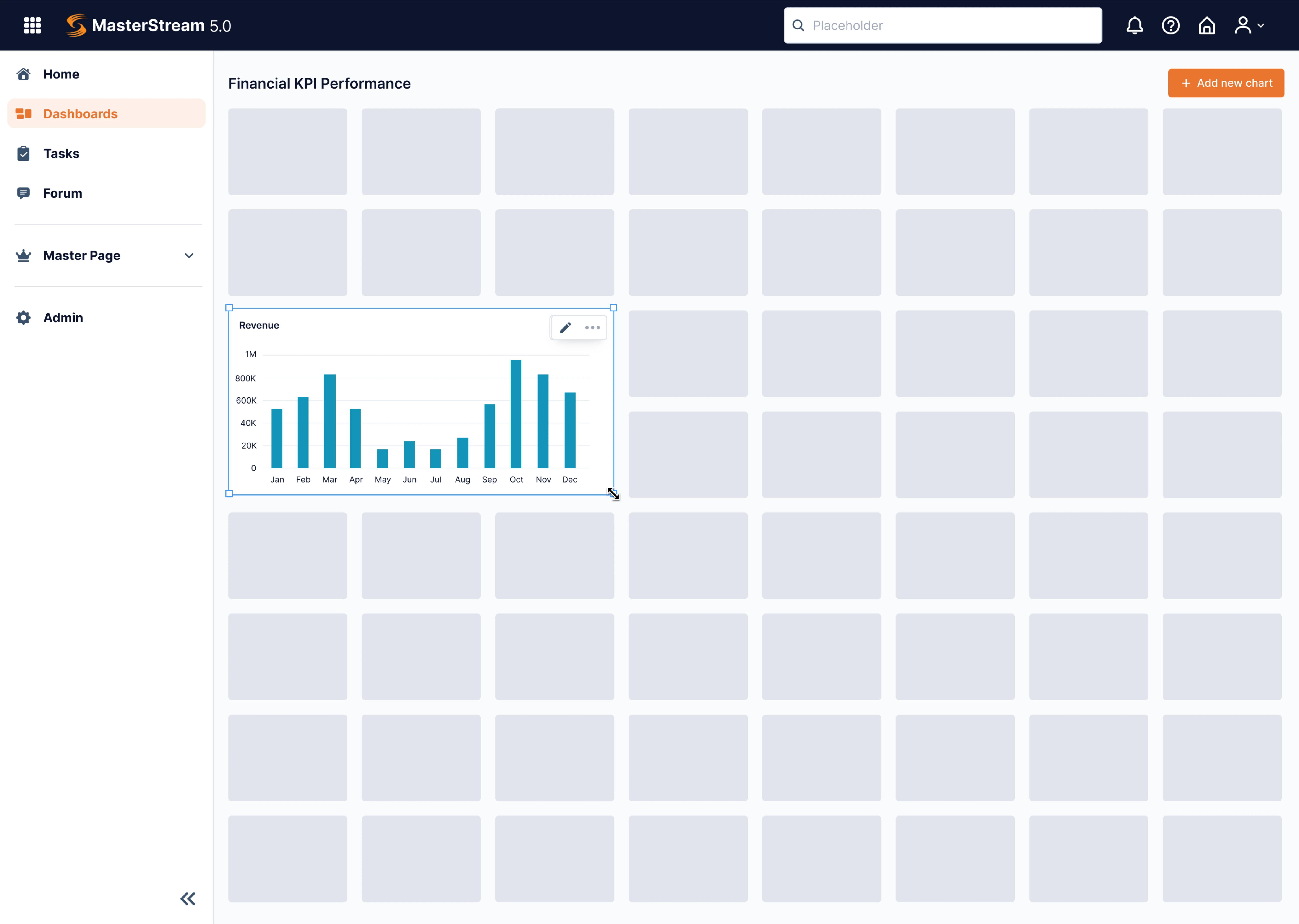
When Data Streams turned to Eleken, their dashboard overwhelmed users with endless parameters and no control over layout. The company was preparing to go global, and to do that, they needed a design with a strong UX flow.
Our designer introduced a drag-and-drop dashboard constructor, allowing users to choose a data visualization format and place it on a flexible grid. This stripped away irrelevant clutter and handed back control, giving users what matters when it matters.
Design for clarity and usability
A dashboard might have the right data, but if the design feels chaotic, unclear, or inconsistent, users will still bounce. Usability is the layer that transforms raw numbers into something people can actually work with.
Start with a strong data dashboard UX. Good layout follows a clear visual hierarchy, a principle rooted in how we scan information.
Users typically start at the top left of the screen and work their way across and down, just like reading a page. In this regard, put the most important information in this prime area, and use size, spacing, and typography to guide the viewer.
As well, rely on Jakob’s Law. It suggests that users expect your dashboard design to work like other tools they use. That means standard filters, familiar date selectors, and logical color usage reduce cognitive load and help users get oriented faster.
Having worked on different dashboards, we’ve noticed a few design patterns that consistently improve clarity. Here are some you might want to include:
- Progressive disclosure;
- Sticky filters or headers;
- Status cards over charts;
- Visual grouping;
- Color restraint;
- Understandable labels.
When building dashboards, remember that a user who understands the interface is a user who comes back.
Provide context and suggest next steps
To make dashboards valuable, you need to close two gaps: the knowledge gap (what does this number mean?) and the action gap (what should I do now?).
For this, accompany key figures with brief explanations and include trend icons or colour cues (green = good; red = bad) that help users interpret results.
If a user asks, “So what?” and your dashboard can’t answer, they’ll stop using it. That’s why it’s important to design from the user’s perspective, looking for those friction points and moments of uncertainty before they become adoption blockers.
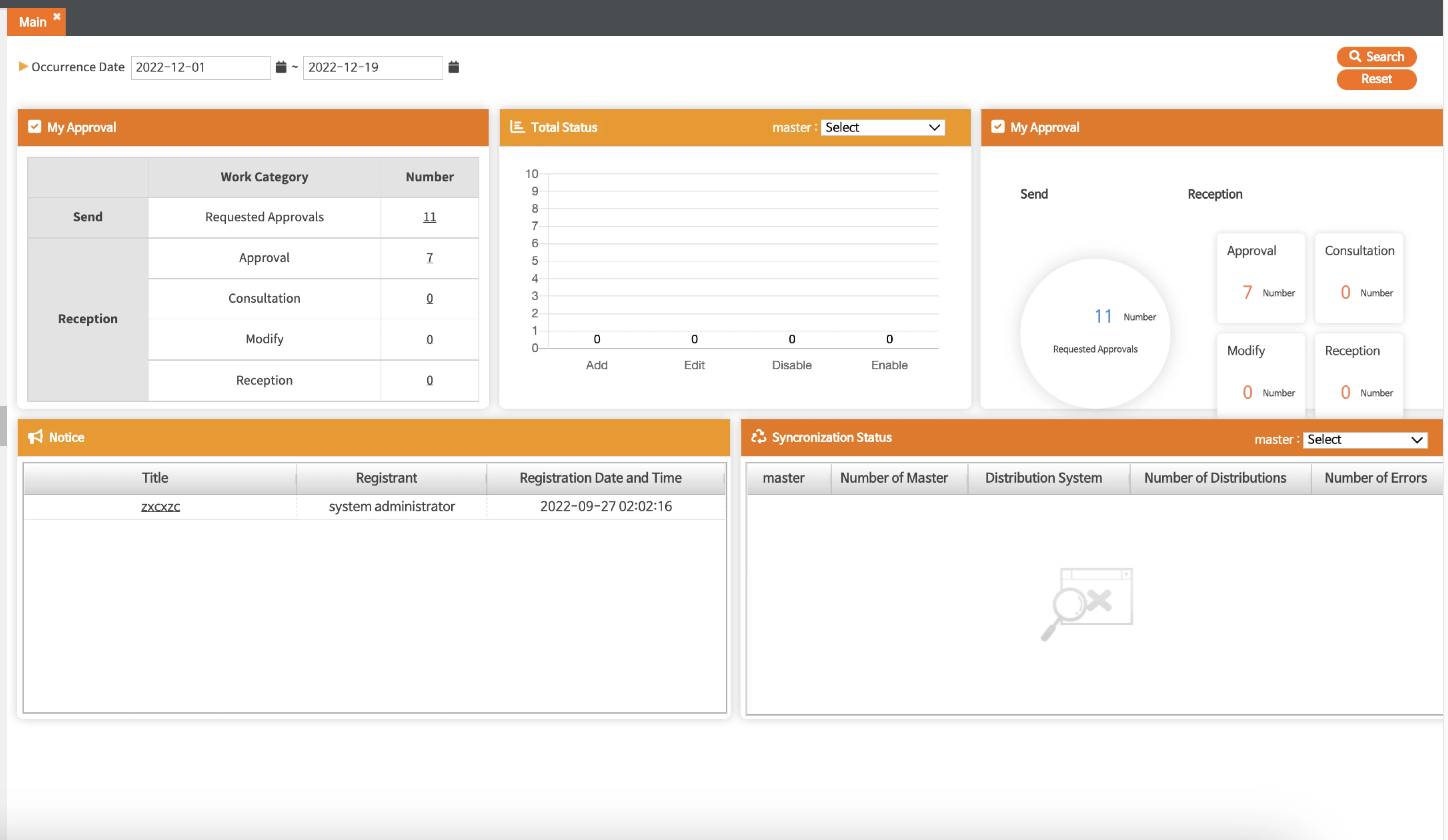
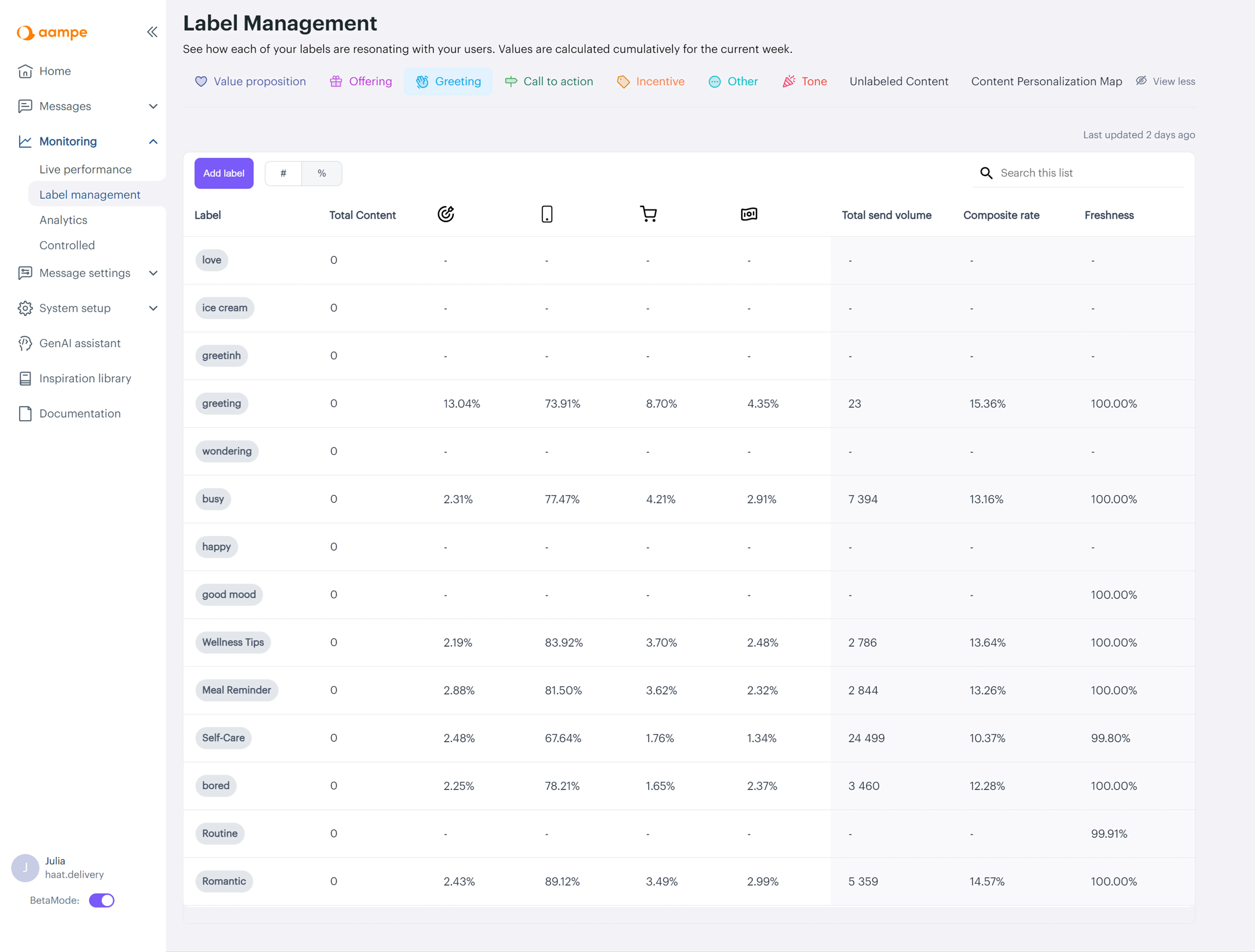
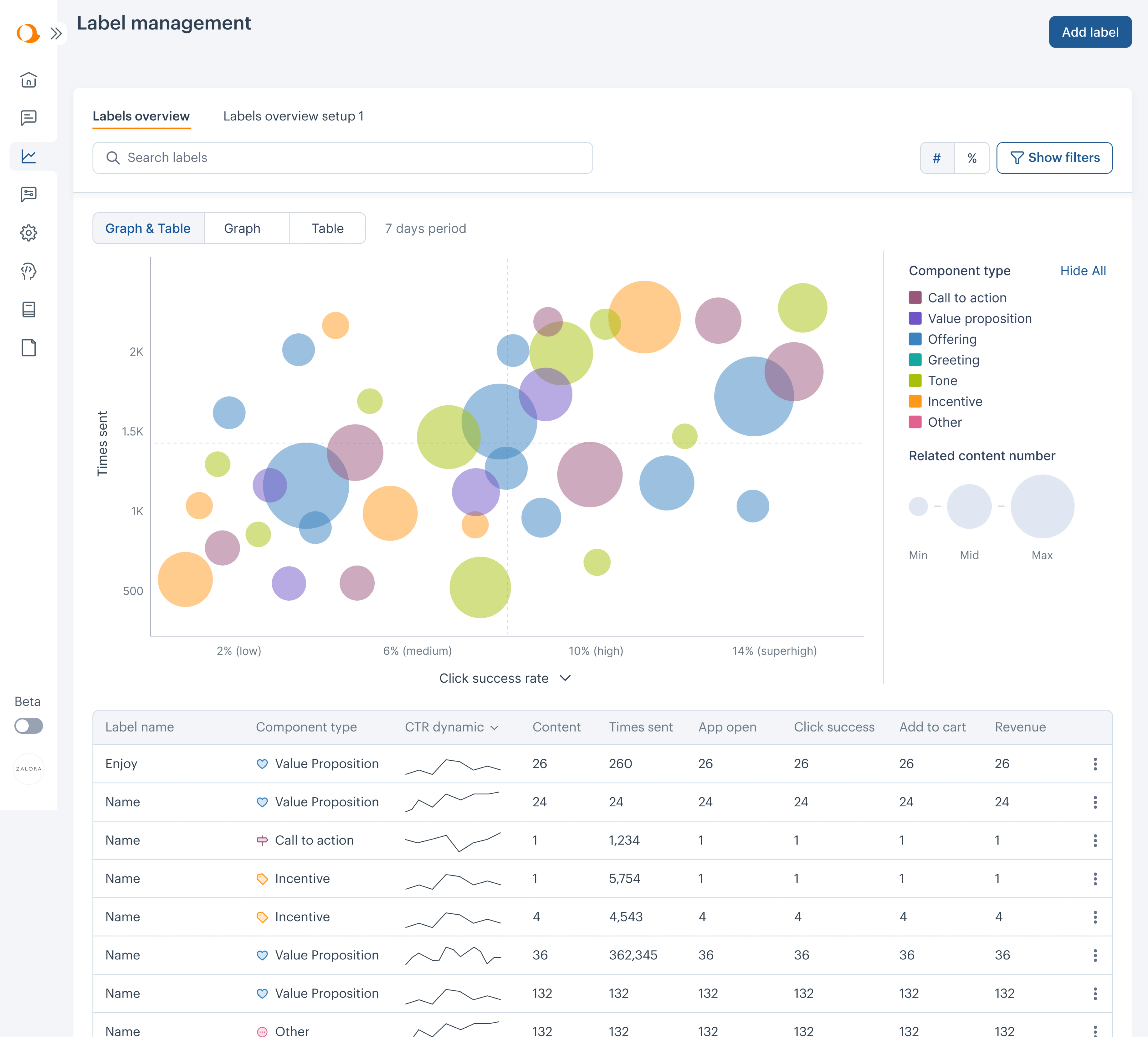
While working on Aampe, we partnered with the Customer Success and Data Science teams to understand how users interacted with data. The original dashboard was just a basic table, which was not enough for making strategic decisions.
What users needed was the ability to compare up to eight labels at once.
To provide context and make a dashboard actionable, we redesigned it using a bubble chart, where:
- Colours represent different types of labels.
- Bubble size displays associated content volume.
- Vertical position shows how often the content was sent.
- Horizontal position reflects success rate (click‑through).
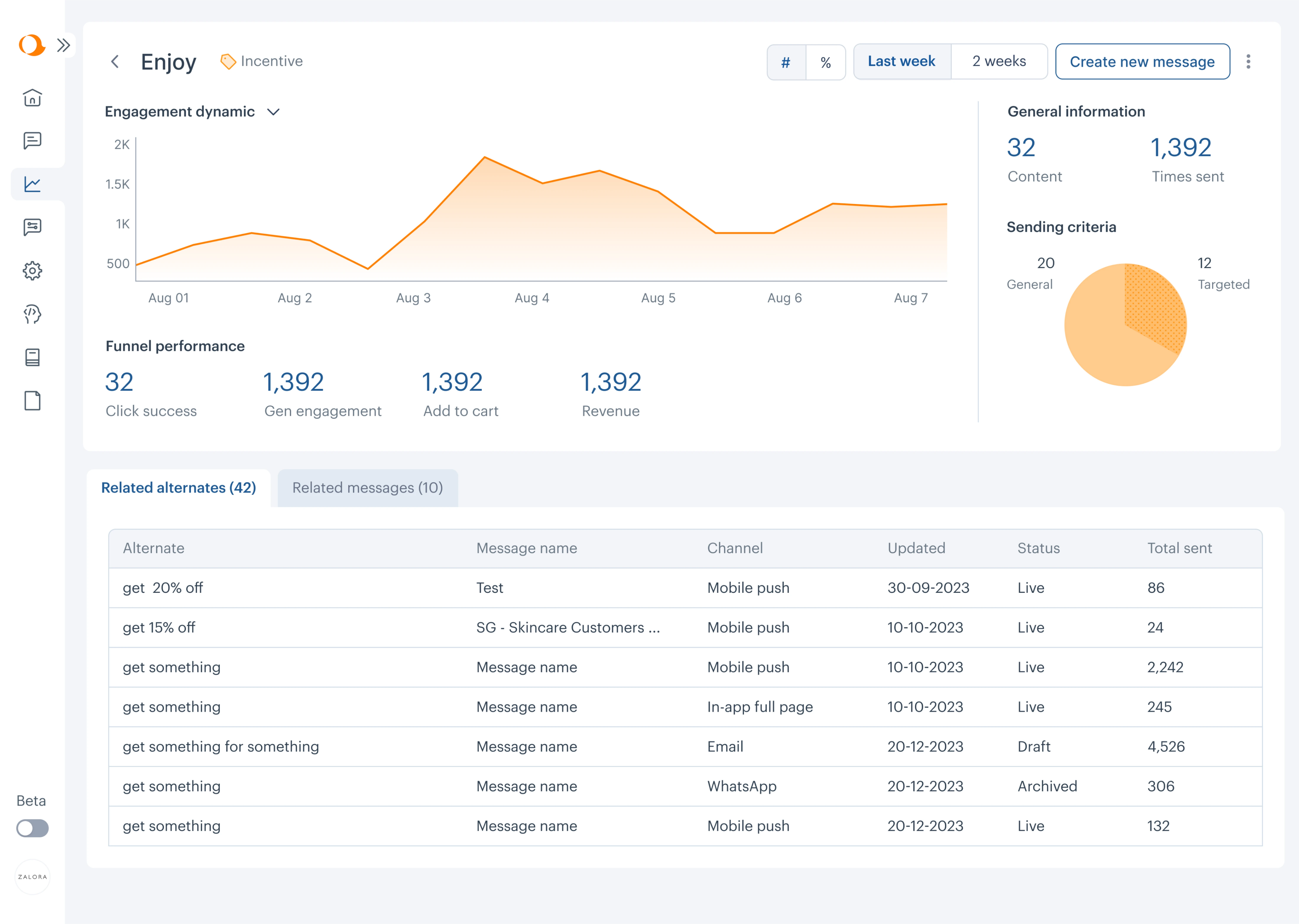
With this setup, users can instantly spot which labels are performing well (top right) and which need attention (bottom left). To explore trends over time, they can now view sparklines for click-through rates and drill into a detailed view for each label.
Tailor content to specific roles and use cases
No single dashboard can serve everyone well. When one interface tries to meet the needs of executives, marketers, product managers, and operations teams all at once, it ends up bloated and directionless.
That’s why audience-specific dashboards perform better. Each user group should see only what’s relevant to their role.
In some cases, this means splitting a “master” dashboard into smaller, role-based views. In others, it means making dashboards customizable with filters or toggles that let users adjust the data based on what they actually need.
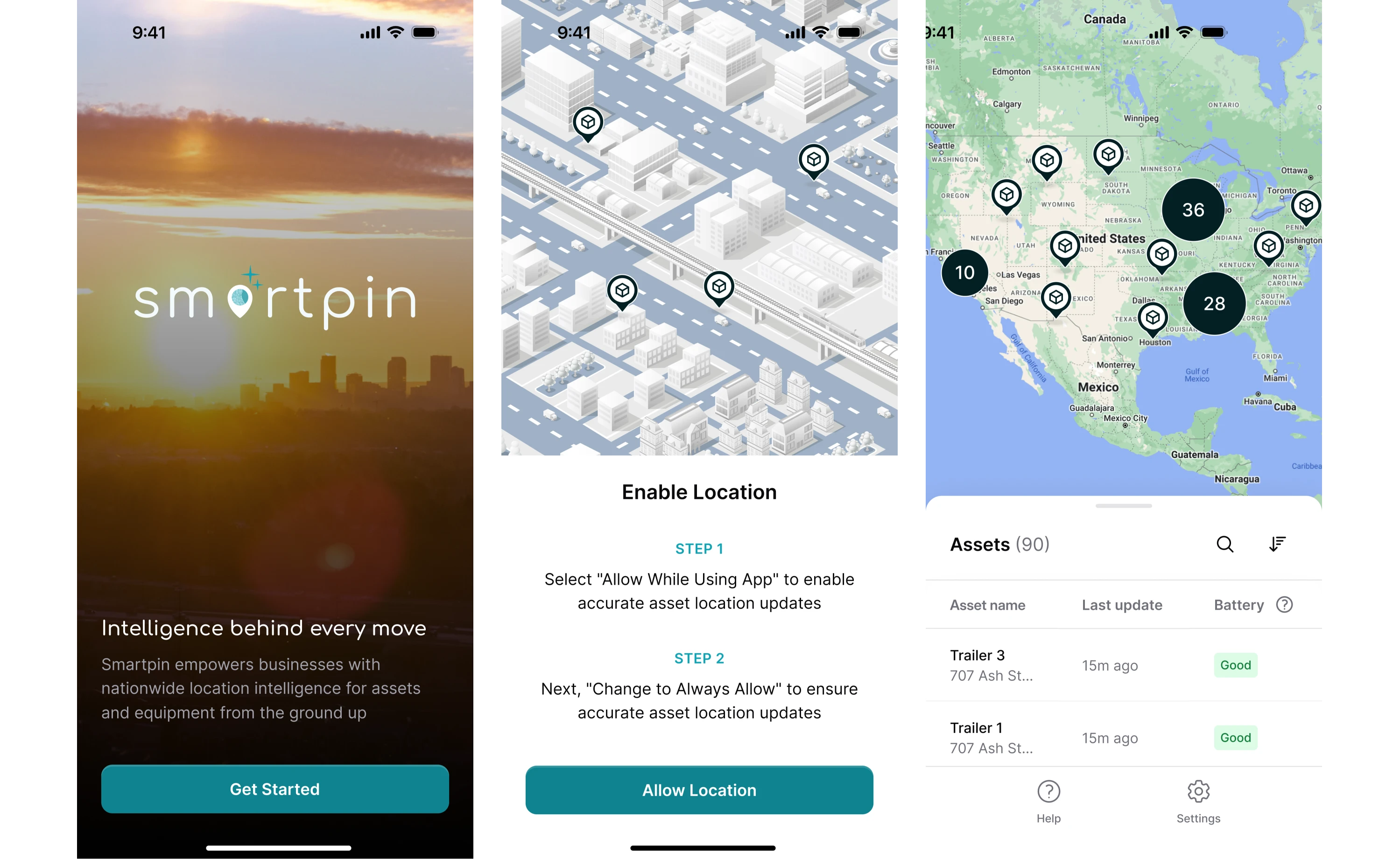
At Eleken, we applied this principle while working on HubbleNetwork, a geospatial platform. One of our key challenges was to maintain a consistent logic across screen sizes and adapt the interface to different user types.
We defined three main user types — Admin, User, and Field Worker — and designed their flows accordingly. Admins and Users, for example, could create, group, and manage the information relevant to their responsibilities.
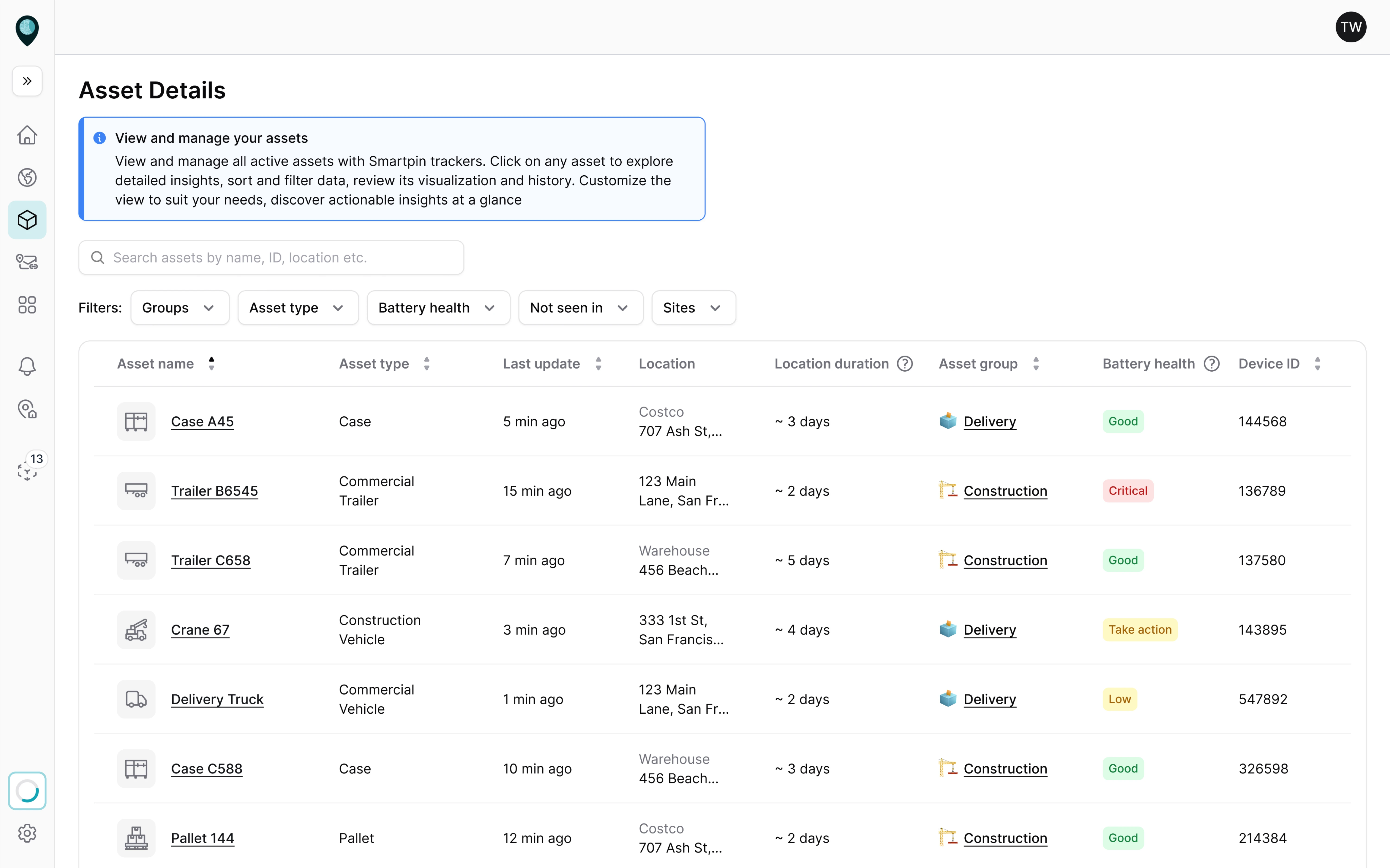
For Field Workers, who often operate outdoors without access to a laptop, we designed a mobile-first flow that prioritized scanning and assigning assets.
Embed dashboards into daily workflows
Don’t rely on busy employees to remember to manually check a dashboard. Instead, find ways to bring the data to them in their existing workflow.
This could mean:
- Automated email summaries of key metrics delivered every morning or week.
- Slack or Teams alerts when a metric crosses a critical threshold.
- Live dashboard reviews baked into weekly standups or team syncs.
- Dashboard widgets embedded in other tools.
One more smart design technique is to use micro-interactions to drive ongoing engagement. You might trigger a contextual tooltip or in-app message the first time a user hits a performance threshold in their workflow.
These moments don’t require deep integrations, but they do require teams to think beyond passive data visualization and toward moment-based delivery.
Build trust with transparent, credible data
No matter how clean the visuals or how advanced the features, if users don’t trust the data, they won’t use the dashboard.
Trust starts with the basics, like accuracy, consistency, and transparency. That means double-checking your calculations, aligning your metric definitions across teams, and clearly stating where the data comes from.
Even something as small as a visible “Last updated” timestamp can quietly reinforce reliability.
It’s also about language. Using overly technical or ambiguous terms can alienate users and create confusion. All you need to do is speak in business language that your audience understands, and explain any metric that could be misinterpreted.
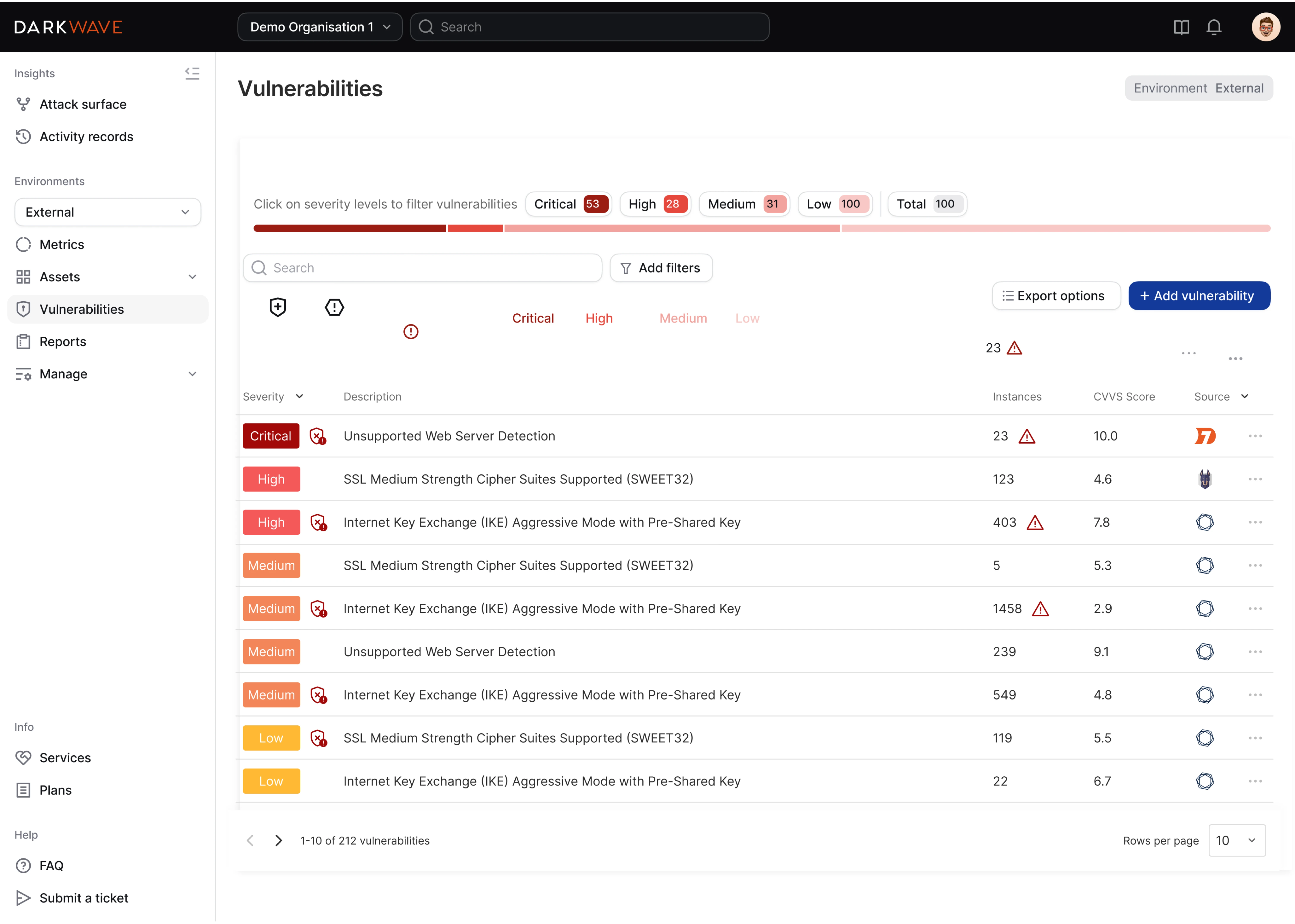
When we worked with Vector0’s cybersecurity platform, their original dashboard displayed vulnerabilities, but lacked filtering and clear explanations. Users could see there were issues, but didn’t know how serious they were.
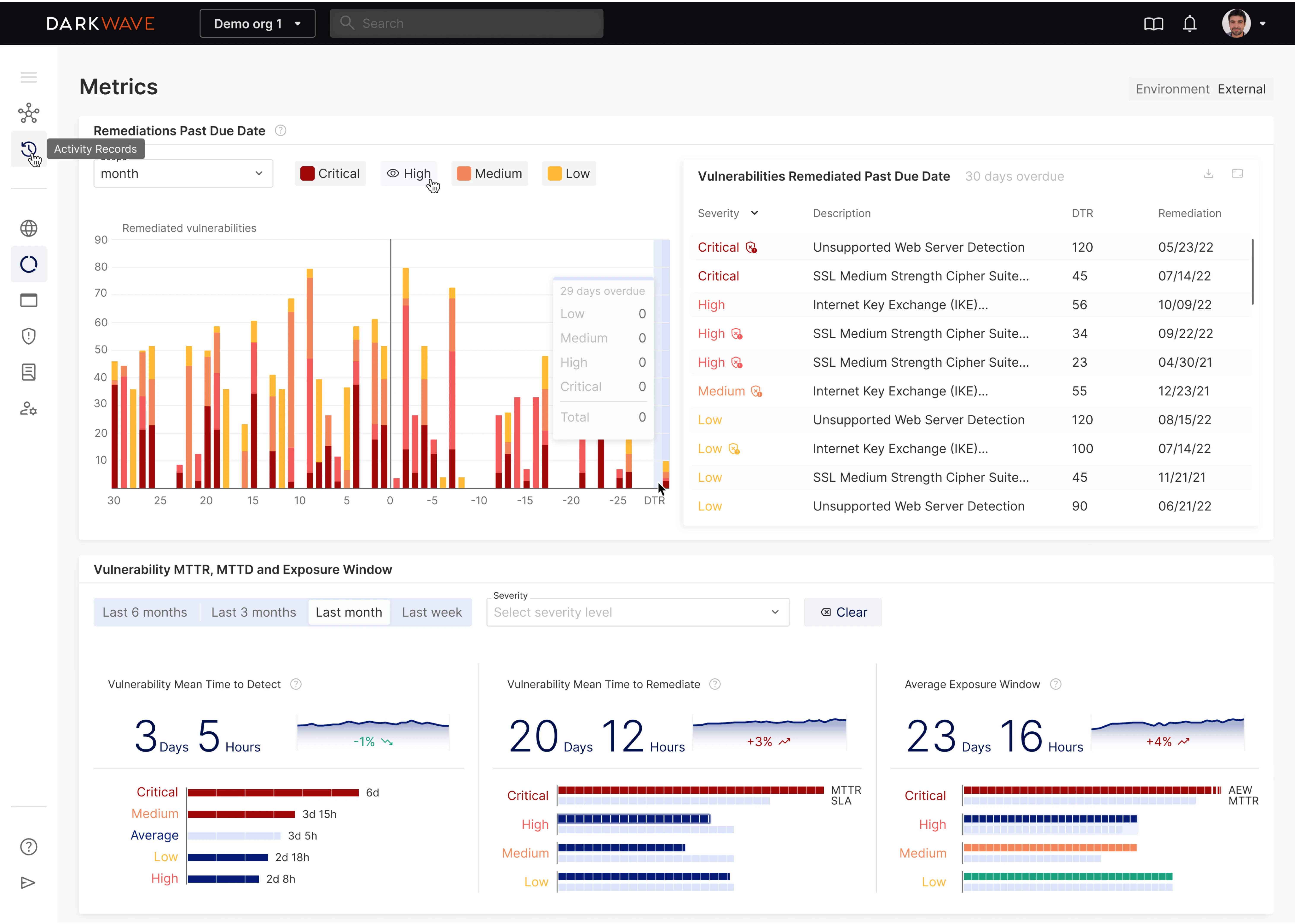
We redesigned the dashboard to categorize vulnerabilities by severity: Critical, High, Medium, and Low. Each level had its own color for instant recognition. The chart also showed which issues were past due, helping users assess risk level and urgency.
Co-create and iterate with users
Treat a dashboard as a living product, not a one-off deliverable. If no one is using it, that feedback is telling you something needs to change.
One of the most effective ways to improve dashboard adoption and usage is to involve the people who will use it. Ask them what decisions they need to make, what data they struggle to find, and what questions they bring into the dashboard.
Better yet, bring them into informal co-creation sessions or workshops where you sketch ideas together. These don’t need to be full-blown design sprints. A few conversations can go a long way toward surfacing blind spots.
Once the dashboard is live, treat it like a learning tool. Use analytics to track which views are used most, which ones get ignored, and where users drop off. If certain charts are never opened, dig deeper to find the reason.
And don’t be afraid to trim. A cluttered dashboard full of underused widgets erodes clarity and trust.
Support adoption with training and data literacy
Sometimes, the biggest barrier to dashboard adoption is the user’s confidence. They might not know what they’re looking at or be unsure what actions to take, and the right support can make all the difference.
Start with onboarding. Short video walkthroughs, simple cheat sheets, or live demos can go a long way toward making new users feel comfortable. Show them how to navigate the dashboard, interpret core metrics, and avoid common pitfalls.
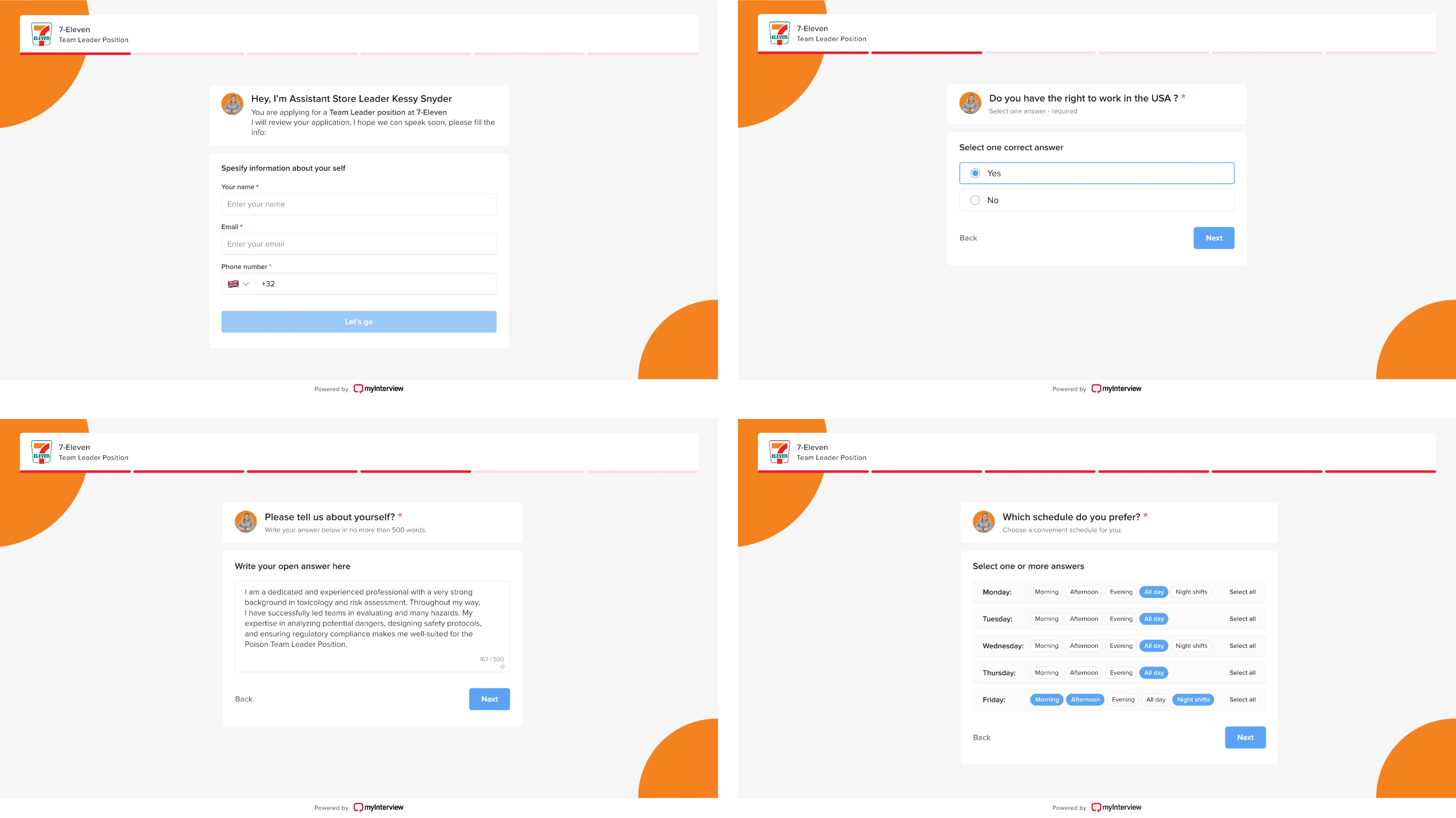
At Eleken, we took this idea to heart when redesigning the candidate experience for myInterview, a video interviewing platform. The goal was to improve conversion by streamlining the flow and making it understandable.
We improved each step by relying on common UI patterns:
- Clear, familiar checkboxes for multi-select options.
- Clickable areas extended across the entire input.
- Filled states that visually confirmed each selection.
These small interaction details may seem minor, but they add up, especially for users who aren’t technically inclined.
You can also establish “data champions,” people who understand the dashboard well and can coach their peers. Encouraging curiosity and open discussion around data helps build a culture where dashboards become usable tools.
What to do when dashboards aren’t the answer?
A dashboard isn’t always the ideal solution. Sometimes it doesn’t match how users work, or the problem at hand doesn’t require a live chart at all.
For example, if a metric rarely changes or only matters when it crosses a threshold, an automated alert or a periodic email report may be far more effective than a full real-time dashboard.
Similarly, when an executive requests a dashboard but actually needs a one-time analysis or a short slide deck highlighting key findings, the dashboard becomes obsolete as soon as the issue is resolved.
In cases like these, forcing a dashboard can waste time and effort.

Fortunately, there are alternatives worth considering:
- Scheduled email reports or PDF summaries for periodic updates.
- Automated alerts triggered when a key metric crosses a threshold (via Slack, Teams, or push).
- Narrative summaries or slide decks that focus on actionable insights and decisions.
- Conversational data analytics tools or natural-language query interfaces for quick, ad-hoc answers.
The key is to match the tool to the need, not the other way around. A dashboard built for the sake of dashboards is unlikely to drive value, whereas the right delivery of information in the right form at the right time may.
The last thing to remember
We’ve covered the common reasons dashboards go ignored, and what you can do to fix that. But here’s one more thing you shouldn’t overlook: dashboards age. Metrics change. Business needs evolve.
A dashboard that worked last year might not make sense today, and that’s okay. The best teams revisit and revise regularly, treating dashboards as living tools.
If you’re noticing that your dashboard isn’t getting the love it deserves, don’t assume the data is the problem. Look at the design. Look at the fit. And if you're not sure where to start, contact us for a good challenge.


