/
Design process

Principles of Design Examples: Boost Your Design Skills

0

mins to read

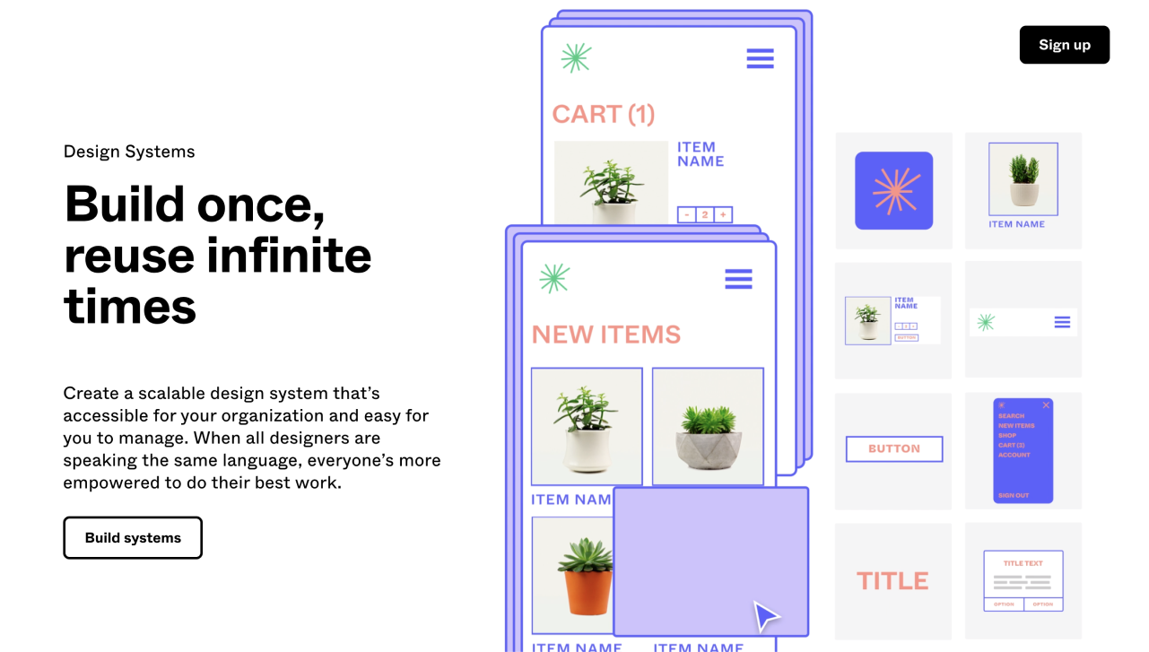
There are no universal solutions knowing which will automatically make your design beautiful and effective. Still, there are basic principles that can help you improve each of your creations.

For example, understanding the laws of color, the principle of unity, and the correct use of white space helped us to create a consistent and harmonious website for Handprinter, a unique project that prompts people to make positive impacts on the environment. (check out the case study).

It's difficult to define exactly how many web design principles there are and which of them are more important than others. The good news is that you don't need any special art education to understand them. Moreover, I guess you already know some of them and use them intuitively.

In this article, we are going to tell you about nine key principles of design. Each of them will be accompanied by principles of design examples to give you a clearer understanding. Let's start!

Hierarchy

The principle of hierarchy is achieved by putting elements on the page in the order of importance: elements that matter most are put first, less significant elements go after. As well, more important components are usually bigger, bolder, and sometimes brighter, so the viewer understands that it is something they should pay attention to.

Evernote

principles of design: example of hierarchy

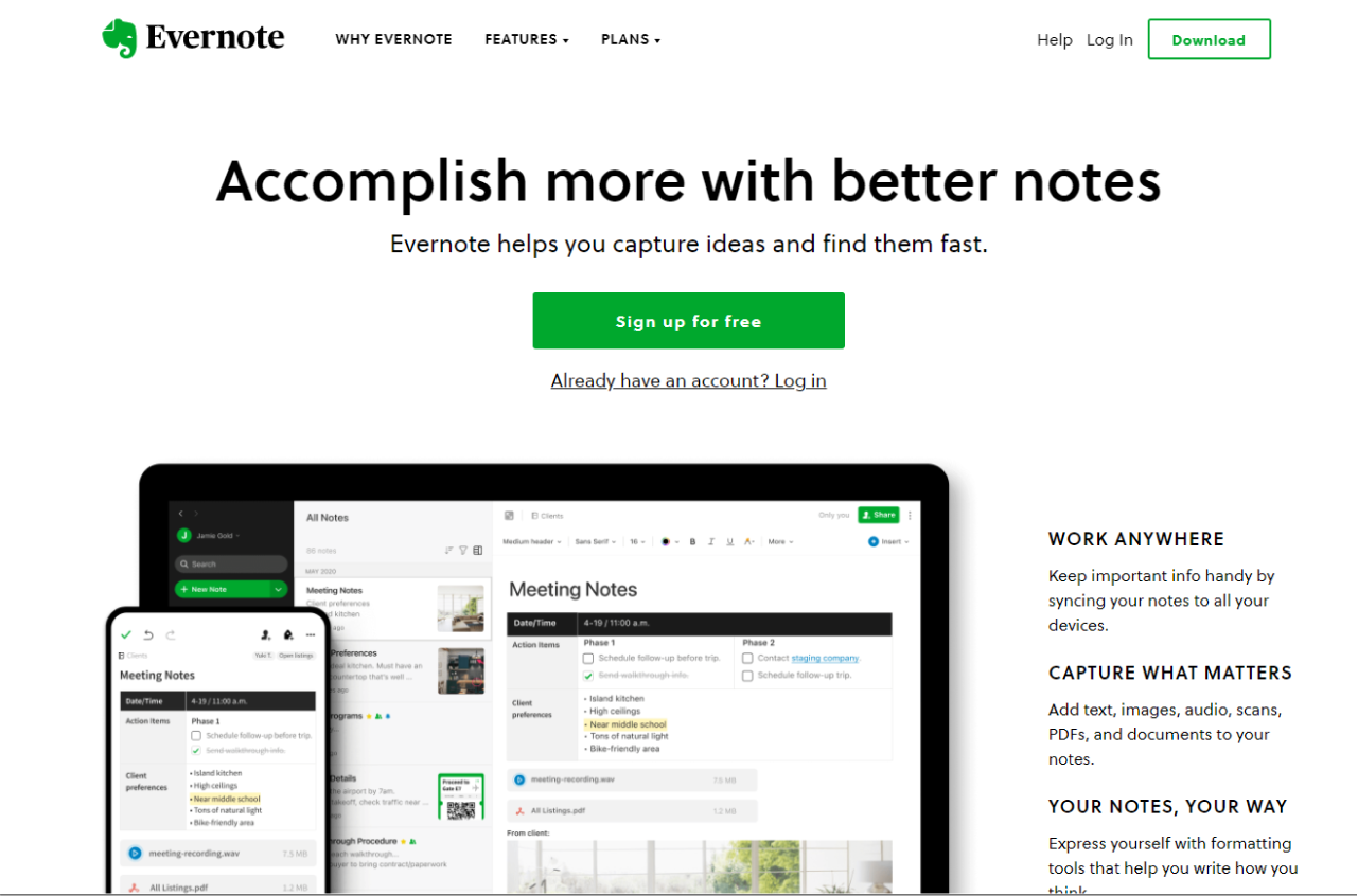
Evernote shows us an example of a hierarchy of a title, subtitle, and body copy. When we visit the website, we immediately understand that the title is more important in relation to the subtitle and the rest of the content on the page. In its turn, the subtitle is smaller but also stands out from the rest of the text. This way the hierarchy is created.

Apple

hierarchy in Apple's design

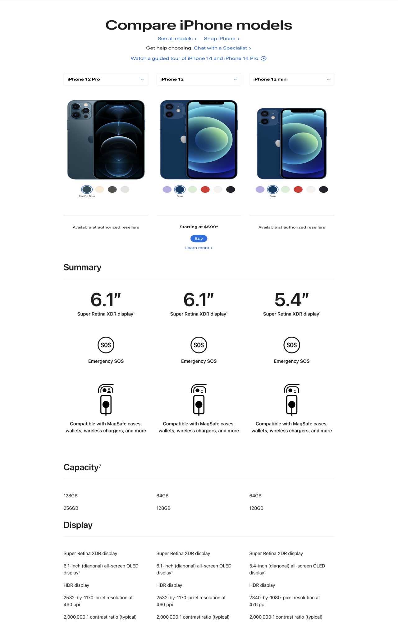
Apple's website shows a nice example of the principle of hierarchy in its "Compare iPhone" section. All the data about different iPhone models is placed in the order of importance. General information at the beginning is bigger, more contrasting, and has icons that support the text, while the copy of more detailed technical information is smaller and not so contrasting.

Contrast

Contrast allows you to attract the viewer's attention to the specific design element. To create contrast, you should put two completely different elements together. They can differ by color (classical black and white tones; bright and dull, etc.), size (small and large objects), font style (light and bold), etc. Contrast helps to properly organize the information on the webpage.

DocuSign

principles of web design: example of contrast

The first example of contrast in design is DocuSign. The white, bold headline on the DocuSign website contrast with the dark background, so that it becomes clearly visible and easy to read. As well the bright yellow CTA is impossible to miss because of the use of contrast.

Slack

use of contrast in Slack's design

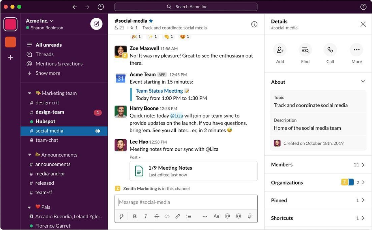
The whole design of this popular cloud-based messenger is bright and contrasting, we can even note it "pops" with color. According to Andrew Wilkinson, one of Slack's designers, "to get attention in a crowded market, we had to find a way to get people’s attention." And they did it by using a lot of contrasting elements in their application and website as well.

ClientJoy

example of contrast in web design

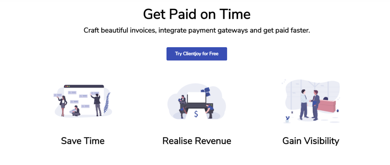
The ClientJoy (former Gridle) was designed by our team (check the case study).

Bright blue CTA on the white background is an example of how contrast helps to attract the reader's eyes to an important design element. As soon as the reader opens the website, they see the "Try Clientjoy for Free" button which stands out well.

Balance

Balance is the juxtaposition of elements that creates steadiness and harmony. The state of balance is intuitively comfortable for the viewer and makes the design look attractive and complete.

We can divide balance into symmetrical and asymmetrical.

Symmetrical means that the visual weight is equally distributed in all directions. You can imagine a vertical or horizontal line across an image or layout, and the visual balance still remains perfectly symmetrical.

Asymmetry is an intentional step towards creating a sense of movement in a design. It is usually expressed when different elements are unevenly distributed in the image or layout. And although one side outweighs the other, the viewer still has a sense of balance.

Hubspot

principles of design: example of balance

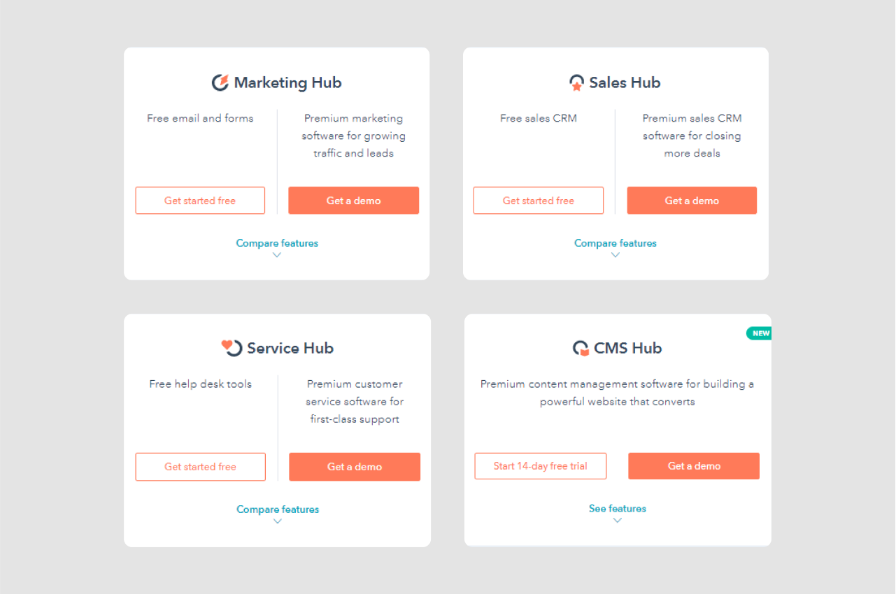
The elements on the left side and on the right side are mirroring each other. It is the simplest example of symmetrical balance. 

Intercom

example of symmetrical balance in web design

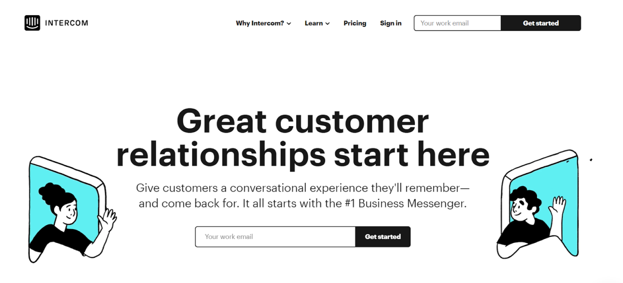
Illustrations on both sides of the layout are of equal visual weight which makes this part of the website layout a good example of symmetrical balance.

Appcues

example of asymmetrical balance in website design

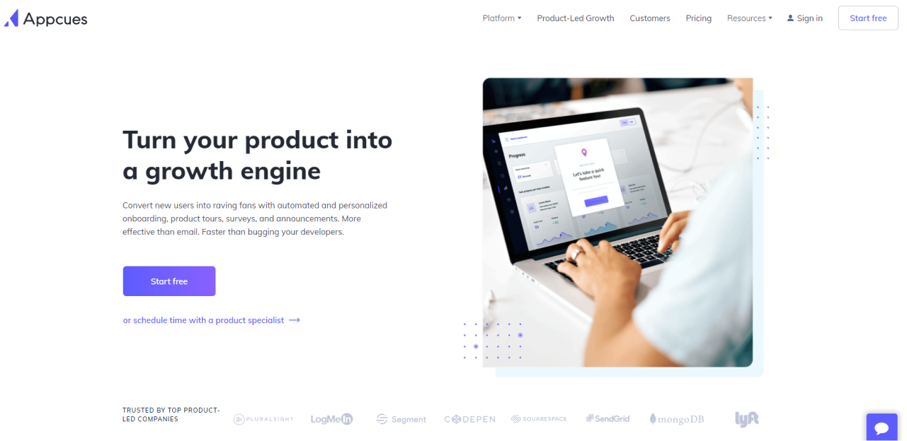
The big image on the right is balanced with the text of the title, subtitle, and the CTA on the left. It’s the classical way to create asymmetrical balance - one bigger object is opposed by several smaller objects.

Proof

asymmetrical balance example

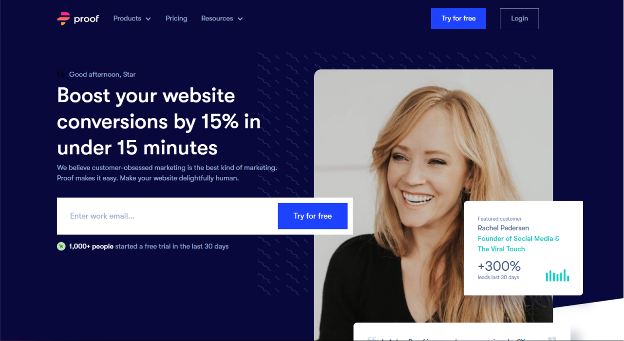
Different design elements are scattered through the whole layout and still together they create a balance.

Emphasis

The emphasis as a principle of design is put to enhance or decrease the importance of certain design elements. Contrast colors, size, space, lines, or shapes help to create emphasis.

DocuSign

principle of design: example of emphasis

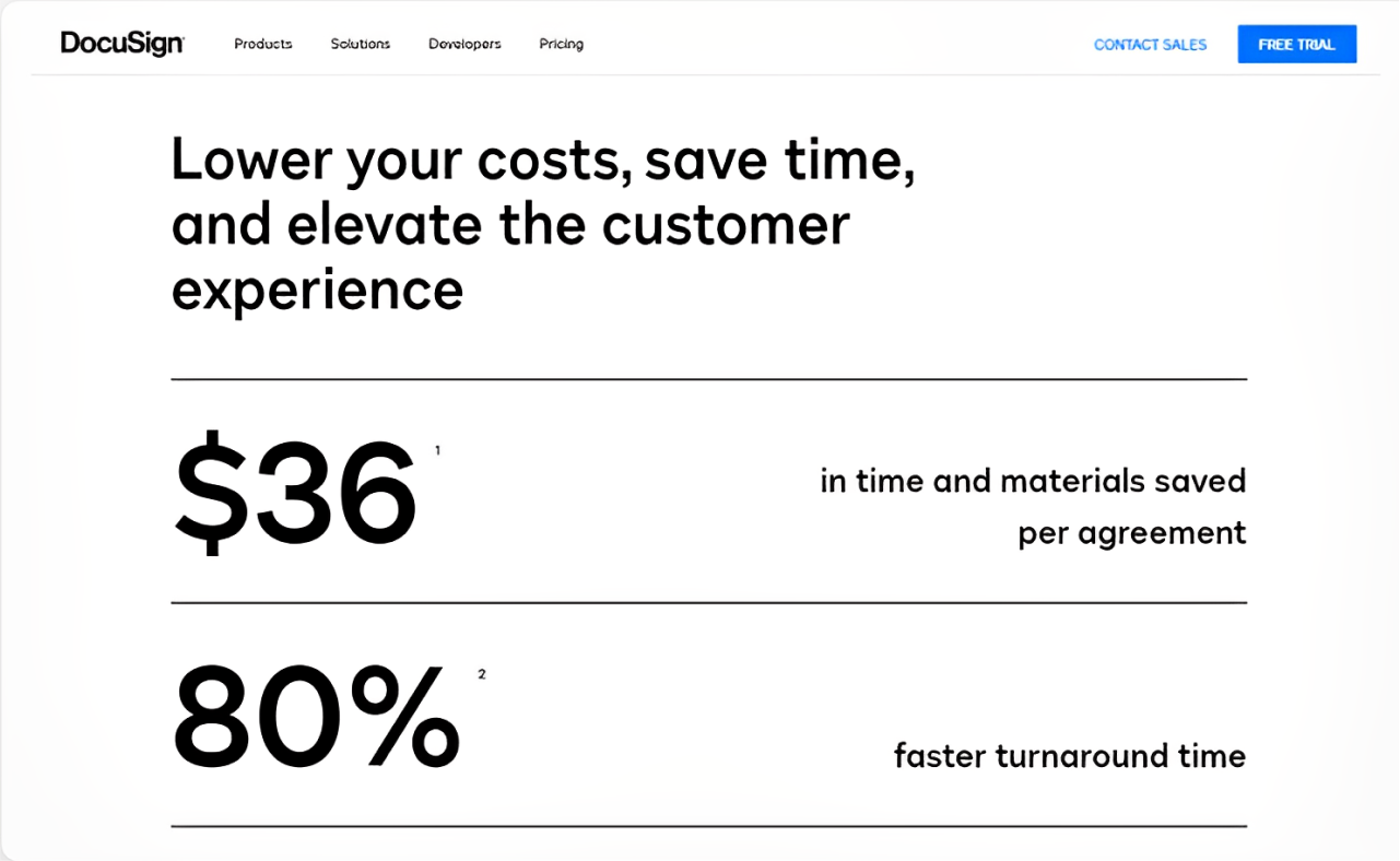
Here the emphasis is achieved with the help of size and contrast. The reader immediately pays attention to the numbers as they are big and bold.

Carmax

the principle of emphasis in web design

Carmax's website has an interesting example of emphasis put on the "Find your car" CTA. First of all, the button is of contrast yellow color that stands out well from the white background. As well, the lady in the car is watching in the direction of the CTA and is pointing her hand towards the button and this way increases the emphasis.

Repetition

Repetition enhances the design by uniting the separate elements. Repetition creates consistency in the design. It can be reached by things like color, shape, font, or even texture.

Precog

principle of design example of repetition

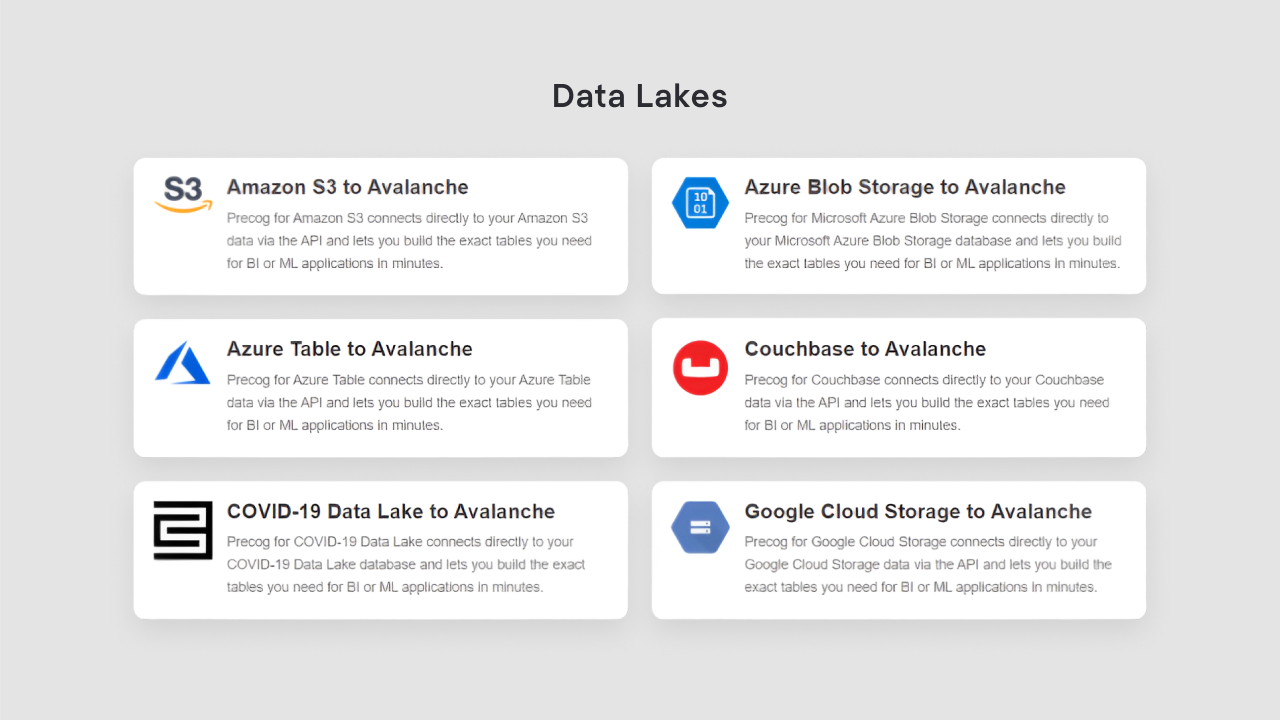
The above example shows the repetition of headings. Each of them has the same font, style, and color which helps to unite blocks of information and show the reader that they are of equal importance.

Figma

principle of design: example of repetition
examples of repetition in website design

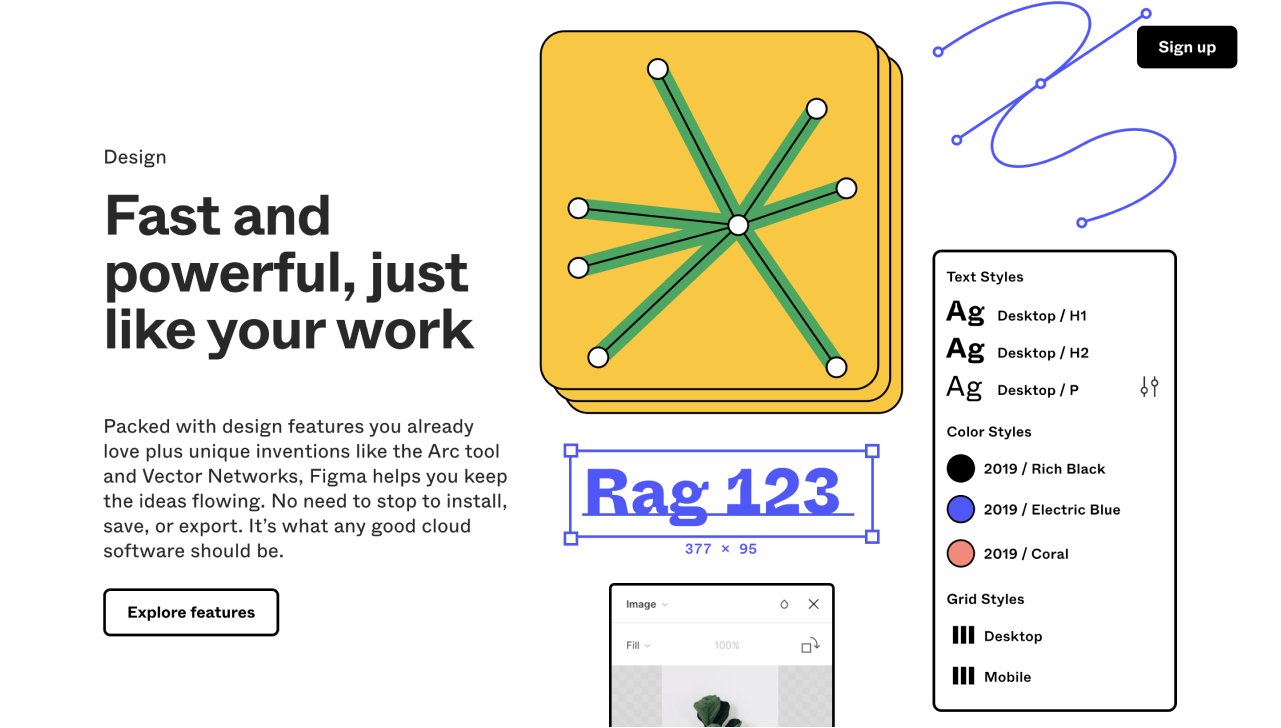
Here you can see the illustration of the repetition of the blocks in the layout. This example from Figma's website is interesting as it shows not just a repetition of images on the right side, but a mosaic made of several pictures. It creates complexity and makes the repetition not so obvious.

White space

When you try to put too many elements on one page, the design becomes cluttered, difficult to perceive and concentrate on. To avoid this we use the white space principle of design. White space is a zone of a design that is not loaded with any text or visuals. It helps to create a focus on a certain design element and contributes to creating a simple, minimalist design.

Adobe

white space in website design Adobe

A lot of white space on Adobe's website makes the design "light" and minimalistic, and all the information on it readable and easy to perceive.

Gamaya

the use of white space in web design

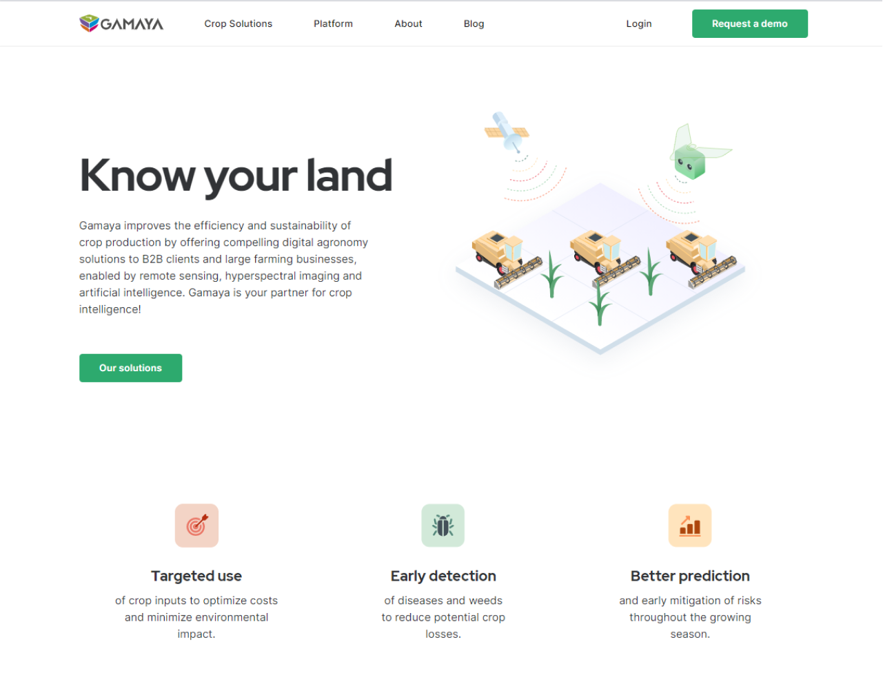
Another example of the use of white space is Gamaya's website, designed by Eleken. Thanks to this principle, each page on the website is clean and minimalistic, all the elements stand out and the page looks less cramped.

Unity

The next principle of design is unity - when each piece of design harmoniously match together.
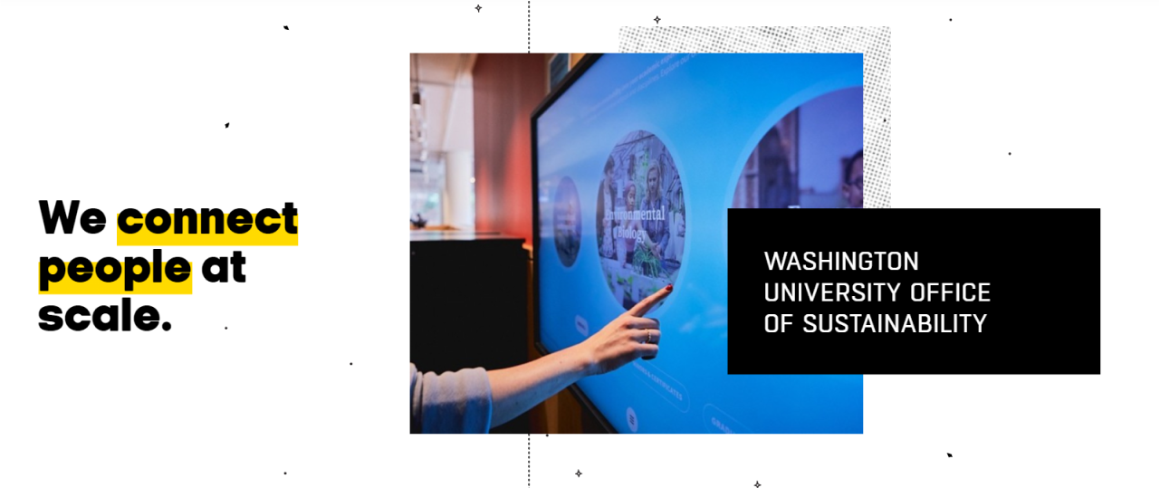
HandPrinter

example of unity in web design

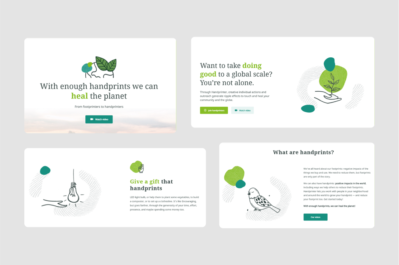
We've already mentioned Handprinter at the beginning of the article. It is a unique project designed by our team. Check the case study to learn more about it.

The color scheme, fonts, and illustrations across the whole Handprinter's website create a perfect example of unity that leads to harmonious and aesthetically pleasant design.

Pattern

We can explain the pattern in two different ways. First of all, the pattern is a principle of design when certain visual design elements like lines, shapes, or colors are repeated. The most common example of a pattern is wallpaper.

Secondly, we can call established design standards for certain elements a pattern. For example, we are used to the fact that navigation is placed in the header, and language settings are usually in the footer, and when you click on the logo in the header it will redirect you to the homepage. These are design patterns.

Brandalmanac

examples of pattern in web design

In the background of this website, we can see a pattern. It consists of small dots and stars floating around and it gives a reader the feeling of space. The logo of the website has a form of a planet, that's why the pattern on the wallpaper complements the overall website concept.

Movement

Movement is how design elements influence the direction of the viewer's eyes through the composition. This design principle helps to interest the reader and keep them engaged.

Memberstack

example of movement in web design

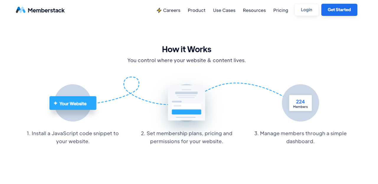
A dashed line that links three steps together prompts the reader to follow it and creates a movement in this design element.

Google

example of movement in web design

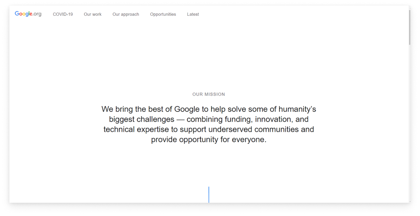
As you open Google’s website all you see is a copy on the white background. Designers decided to add a small blue line that hints to the viewer that there is something more here when you scroll down the page. This tiny object creates a principle of movement.

Conclusion

To some extent, the design is a matter of taste. However, it is also a skill that requires constant mastering. Design is full of principles, techniques, and rules understanding of which will come to you with practice.

But if you're a beginner in this field, keep these nine principles we've discussed today in mind. Every time you see a poster, a website homepage, a logo or some other piece of design try to analyze what principles the designer applied when creating them.

Still, state skeptical about each “rule” and only apply it where appropriate. Design is constantly evolving and changing, and each specific case is unique and requires its own design solutions.

Check some more of our articles that can inspire you on creating your own great pieces of design:

Human-Centered Design Examples for Better User Experience

Adobe XD Design Examples: Simple and Inspiring Ideas

20 Dashboard Design Examples That Catch the Eye

Kateryna Mayka

Author

Table of contents

Top Stories

Design process
/
0
min read

Adobe XD Design Examples: Simple and Inspiring Ideas

Adobe XD is a relatively new design tool that was introduced only a few years ago. At first, the general public was quite skeptical about this product but with more updates coming out, Adobe XD has won the hearts of many designers and developers.

But why did Adobe XD become one of the most popular design tools in the market so fast, especially with such strong competitors as Figma and Sketch? What makes this product stand out from the crowd? We will answer all these questions by discussing the best features and benefits of Adobe XD in this article. 

Adobe XD: a breakthrough in the design world

Adobe XD was first introduced in 2016 while Sketch and Figma had already been in the market since 2010 and 2012 accordingly. To tell the truth, the beta version of the new product did not impress the users. However, after Adobe XD introduced repeat grid and prototyping, designers could not stay indifferent.

The secret of such rapid and unexpected success is better functionality compared to other design tools. Adobe XD brings to the table features that designers needed for many years. For example, even though Figma also has a repeat grid, the same feature in Adobe XD is much better and easier to work with. That is why more and more designers shift to Adobe XD instead of sticking to older design software that offers no new solutions. 

Adobe XD design examples: best features

We’ve prepared a short overview of Adobe XD finest features for you to get familiar with what this design tool can offer. 

Artboards

Adobe XD offers a whole range of artboards to start your design process. These are the different design areas of any size and shape that can be adjusted according to your needs. For example, you can choose Adobe XD templates for Windows, Android, and IOS, depending on the product you are working on. 

It also means that you can create pages for a few platforms (web and mobile applications) in the same project in Adobe XD. 

Adobe XD Design Examples: Artboards

Free kits and tutorials

Adobe free resources, such as numerous video tutorials that overview most of the functions make this tool a learning platform for designers. You can watch a video on how to make the most of a certain feature and then, try it yourself. 

Free kits are a great opportunity to practice your design skills, especially if you are only a beginner in design. With such XD templates, you get access to various common pages and can improve them by adding your own details. 

For example, in the picture below, you can see Adobe XD UI kit for a workout mobile app with all the necessary pages such as the welcome page, progress page, and so on. 

Adobe XD Design Examples, free kits
Image credit: UIstore design

Another example is a free kit for a taxi-driver app, with such pages as creating an account, entering your personal information, and the interactive map with the cars available. By using these templates, you can learn more about how typical applications look like and what are the most common features that are needed for their users. 

Adobe XD Design Examples, free kits
Image credit: UIstore design

Icons

Icons make an essential element in designing any software product. These are the little images that signify the main features of the software and make the application easy and fun to use. In Adobe XD, you have many tools to create your own set of icons or redesign the already-existing templates. 

Adobe XD Design Examples, icons
Image credit: Behance

You can also make your icons more realistic and vivid by using 3d format, as in the next example. Consequently, the icon will remind users of real familiar objects that they can make associations with, instead of flat images that bear no meaning or emotional context. 

Adobe XD Design Examples, icons

In Adobe XD, you can create notification icons in different drawing styles. The following icons were designed for a social media application and show the most common notifications such as likes, comments, and new messages. 

Adobe XD Design Examples, icons
Image credit: Behance

3D transformations

3D icons definitely take UI and UX to a whole new level. However, 3D transformations make them even better. With movable 3D icons, using your SaaS product turns into an engaging and unforgettable experience even if it has to do with such mundane daily tasks as ordering food or simply creating a new list. 

Adobe XD Design Examples, 3d transformations
Image credit: Behance

3D transformations come in handy for any SaaS solution. With 3D transformation, even an ordinary list of features becomes more distinct and memorable, as shown in the picture below. You can apply this feature to some of the objects to make them more prominent or use 3D transformation for all the elements to add more depth to your design.

Adobe XD Design Examples, 3d transformations

Fonts

Even though fonts seem to be less important than colors or images, they add the finishing touches to the design of your software solution. Just like accurate navigation, fonts can both attract or put off the users because they define how your product looks like. 

Adobe XD is a tool, in which you can play and experiment with fonts and styles to match the idea of your solution. You can even create your own font if you did not find the style you need. As you can see, the following font is a great match for the website of a museum and art gallery in Amsterdam as it is classy, artsy, and even a little bit romantic. 

Adobe XD Design Examples, fonts

In our next example, the fonts were designed for the organic spices website. The design of the website and the fonts themselves are made in different shades of green and represent an idea of a healthy lifestyle. 

Adobe XD Design Examples, fonts
Image credit: Behance

Repeat grid

The repeat grid is the feature that has gained the most recognition from Adobe XD users. Compared to other design tools, Adobe XD proves to have the best functionality for managing and designing the repeat grid.

The repeat grid includes such repeated elements as photo galleries, lists, and menus. In Adobe XD, you do not have to insert all the pictures or text in it manually. You can simply drag both the images and text into a canvas and even adjust the spaces between them. 

Adobe XD Design Examples, repeat grid

Such functionality does not only make the process of designing a repeat grid much easier and faster but also makes repeated elements look better from an aesthetic point of view. 

Prototypes 

Probably the most useful feature of Adobe XD is creating prototypes of your products. With Adobe XD, it is much easier and faster than with other design tools. You do not have to export anything but just review your prototype in a new tab. You can even click anywhere on any page to see how the user journey will look like in your SaaS solution. 

Adobe XD Design Examples, creating prototypes
Image credit: Behance

With a prototype tool in Adobe XD, you can also connect your phone to the computer or laptop and check how the design of the mobile application will look like. Without a doubt, such functionality allows you to check and fix any flaws or mistakes immediately. 

Adobe XD Design Examples, creating prototypes

Conclusion

Adobe XD built a reputation for an excellent design tool during a short time. With new updates coming out, its potential is also growing. A set of such splendid features as repeat grid and prototyping offers many possibilities for designing simple but creative and exclusive UI and UX.

With rich experience in creating UI and UX for different products, Eleken helps not only with the design of SaaS solutions but also facilitates their success in the market by making sure that these applications are usable and functional. You can find our contacts for any additional information on SaaS UI/UX design and our services here.

Design process
/
0
min read

The Good, the Bad and the Ugly: A Story About Design and Friction

If you have been reading some materials on UX design, like this blog, you might have read that friction is something that needs to be eliminated, as theyslow the usage and annoy users and so on. So, less friction equals better design?

It may be contradictory but, when there are issues in UX, some of them can be solved by removing friction and others… by adding some friction.

As with most things in this world, UX design isn't black and white. Sometimes friction just slows down users, but in some cases, it plays an important function, for example, preventing errors. How? By making the process of committing errors longer and harder.

As a UI/UX design agency we consider it our mission to explain the difference between the good, the bad, and the ugly types of frictions. Let’s start from the beginning.

The story of UX friction

“UX friction” sounds like an advanced UX concept, but “good” friction has been around for a long time. The legendary "Are you sure you want to delete this file" is an example. Or the "agreement and conditions" message that doesn't let you click Agree without even taking a look (which is what we all do).

The friction effect is present in many situations outside of user interfaces. For example, the indie rock band, The Haven, which was popular in the 90s, wrote in  their rider that they needed a bag of M&M's before the show, but all the brown candies had to be taken out. If the condition wasn’t met, they could cancel the concert.

Why would they do it? Because they can, you would think. Rock stars can afford to be demanding and nasty, so why not? But there is a very practical reason to do such a pointless (at first glance) thing.

The objective of this weird demand on the rider was to detect event organizers who are not attentive and professional enough. The logic was as follows: if the organizers didn’t take care of M&Ms, chances are they also didn’t properly read the serious parts of the rider regarding the technical requirements. Such negligence could result in technical problems and even unsafe situations.

This is especially important for the design of dangerous objects, such as weapons or nuclear plants. Here, friction saves people from fatal errors.

For babies even kitchens are a dangerous space, that’s why these highly uncomfortable devices became very popular

This and other awesome stories are from the talk of marketing pro Mehmet Dogan, if you need more insights into the topic of friction in UX design

But let’s get back to the history of the term design friction, or UX friction. So, we can’t find who was the first one to use it, but we know who found a good name for it.

Joel Marsh is a UX designer, Founder at Peekerton and author of “UX for Beginners”. He was writing about Anti-UX in his book, and nobody bothered until he posted it on Twitter. People started commenting that anti-UX was not the best name and suggested calling it appropriate friction instead. He decided this name was less controversial, and we can agree with that.

According to Joel

UX friction is something that helps beginner UX designer to expand their minds when they start thinking of design as a way to lead people, or change behavior or create behavior rather than showing just visual stuff.

So let’s uncover how friction works in design and serves your needs.

Creating value by waiting

When you feel like spending thousands of dollars on a bag or a dinner, you have to… wait. For example, a dinner at a fancy restaurant in your area would cost you a hundred dollars and you can book a table instantly. However, to get a table at a top-starred Michelin restaurant in Modena, Italy, you can’t just come and book the place. You leave a request, then wait patiently until the restaurant decides whether they accept you or not, and then wait a few months more until there is a table available. 

Why do people who spend a thousand dollars have to wait for more than those who spend one hundred or ten dollars? Because they feel more special knowing that this experience was so exclusive and anticipated it. 

Although the results are very different, both luxury restaurants and not-so-luxurious digital products use the same effect: sometimes waiting time increases value.

In UX design, an artificial “waiting time” is added to create a labor illusion. This psychological effect is used to gain more trust from users. One of the first to use this trick was Kayak, a flight booking service. After entering all the data and clicking the “search” button, Kayak doesn’t show the results immediately. Instead, it shows a message that the website is in the process of checking many sources to find the best connection for you. Even though it didn’t need that much time, the message made users feel like there was a lot of “work done”. So, they valued the service more.

Many other booking services copied the idea, and now we are used to it.

design friction example: Loading circle on Skyscanner
Loading circle on Skyscanner

How to detect where design friction is needed?

For that, you need thorough UX research, of course. First of all, detect most common errors. UX research methods that will be helpful:

Next, think of the ways of complicating the user flow that leads to the error.

This might be:

  • Classical “Are you sure?” pop-up
  • Making the button of neutral grey color, not accent
  • Hiding the button
  • Hiding the button even further…

But of course, this list is not exhaustive. Who knows, maybe you will invent something new?

An alternative to UX friction can be the "cancel" option. This includes the "unsend" button and a good old trash bin that deletes files after 30 days (it’s such a basic thing in the OS, but not the default option in web apps, somehow).

cancel option as an example of a UX friction

Ok, error prevention is clear, but what about other types of design friction? Often, they are not "essential", and even if the problem is serious, it's not that easy to detect. 

Do users really need that "loading" sign on your website? I'm not sure. Even A/B testing won't always help. In most cases, it's about the UX designer's experience and knowledge of common patterns.

Appropriate friction vs inappropriate friction

Let’s define the main types of appropriate UX friction by objective:

  • Preventing errors 
  • Increasing perceived value

These two types of friction are more complex, as described above, but there are two other types we’d like to discuss more in detail.

  • Entertaining users while they have to wait

Entertaining users is a different kind of objective. It appears in the spots where the friction (waiting) is already present. It makes users learn something new or smile. At the same time, it may prolong the waiting time and distract them, but the overall user experience is improved due to positive emotions and the feeling of personal touch.

For example, Duolingo offers small witty quotes or interesting facts while loading the next lesson, so users feel they are entertained and do not notice the friction. 

Duolingo uses design friction
Image source: Duolingo 
  • Getting users familiar with the product

It includes all those pop-up tips and contextual onboarding that are very common nowadays. These tips draw attention, create friction, and experienced users might be annoyed by them. On the other side, people who open the app for the first time will benefit from such friction as it familiarises them with the product.

For example, for a data-science product MVP we designed a small onboarding in a form of a walkthrough that would get users started. We used pop-up messages that engage users. When you ask users to make an action instead of just showing how the app works, they learn faster.

design friction during SaaS user onboarding
Onboarding we designed for Great Power Influence

It is important to make the walkthrough as short as possible. Users often get frustrated by long onboarding sequences that can’t be skipped. That’s why we added numbers for each pop-up so that users know how far they are until the finish.

Each of these cases needs a certain amount of friction. Too much would ruin the user experience. So, when is friction bad?

  1. When friction appears at the main user goals, like registering, completing the purchase, and so on.
  2. The navigation/search/filtering is not designed properly so it takes forever to find some essential info, such as customer service or email.
  3. User flow is overcomplicated and causes too many errors.
  4. People spend more time than expected and get annoyed (e.g. loading bars and waiting circles that take way too much time and annoy users).
  5. When a product becomes too obnoxious trying to get user’s attention (pop-ups show up every time you open the page and the “unsubscribe” takes longer than blacklisting an email address).

And, to make things even more interesting, there are “ugly friction” cases when friction is “bad” from user’s view but helps to reach some business goals. For example, the websites that make it extremely hard to reach customer support officers. Users might hate it, but from the business point of view, it helps them minimize the number of support tickets (and the number of customers, in some cases…).

Our experience working with UX friction

At Eleken, we mostly deal with B2B SaaS products, where there is little space for sophisticated friction, as the products are typically complex. Still, appropriate friction is important in our work as it prevents users from making big errors.

Let’s take our client Ricochet360 as an example. We were hired to make a redesign for this marketing platform. The lead management screen had a flaw: after selecting items on the list, the accented red button was “Delete all”. It means that users were quite likely to press it accidentally. However, “Delete all” is not the most common command.

UX friction in user interface

To prevent them from making that error and stressing out later on, we hid the “delete” function behind the three dots menu. It would make the process a bit longer, as the user has to find it and then click twice instead of just once. This is appropriate friction.

What does design friction teach us?

Friction is not always good or bad. It can be appropriate, it can be annoying, it can be unnecessary, and can be essential. The situation is what makes friction good, bad, or ugly.

The main lesson is: users are not perfect, and when we design we have to keep that in mind. We can’t work with success only, we have to think of errors and imperfections. Because our design shouldn’t be “perfect” for designers, it has to be comfortable for users in the first place.

If you feel that your product doesn’t fit into common design patterns and could some expert help, contact us – we’ll be glad to help you.

Don't want to miss anything?

Get weekly updates on the newest design stories, case studies and tips right in your mailbox.

Success!

Your email has been submitted successfully. Check your email for first article we’ve sent you.

Oops! Something went wrong while submitting the form.
Don't want to miss anything?

Get weekly updates on the newest design stories, case studies and tips right in your mailbox.

Success!

Your email has been submitted successfully. Check your email for first article we’ve sent you.

Oops! Something went wrong while submitting the form.