Data Streams
How redesign helped data management product achieve global expansion
Data Streams is a product with numerous features for managing data in every possible way. Based in Seoul, South Korea, it was already dominating the local market. But just like in many cases, the company wanted to go worldwide.
Global data management market is very competitive, and Data Streams didn’t succeed initially. To win over the competitors, they needed a new design with strong UX.

Making redesign for global reach is an ambitious mission that requires extra help. So Data Streams was looking for designers who:
- Have experience working with SaaS products worldwide
- Know how to work with complex data products
- Can join the project immediately
That’s how they found Eleken. After seeing the product, our designers realized that it needed a serious revamp. Here’s what we did.
Feature selection and informational architecture development based on thorough competitor research
If you want to win in the red ocean, you have to study your rivals carefully. Our designer was constantly doing competitor research as the project was going on, finding which features were the most in-demand and how they could fit into Data Streams.
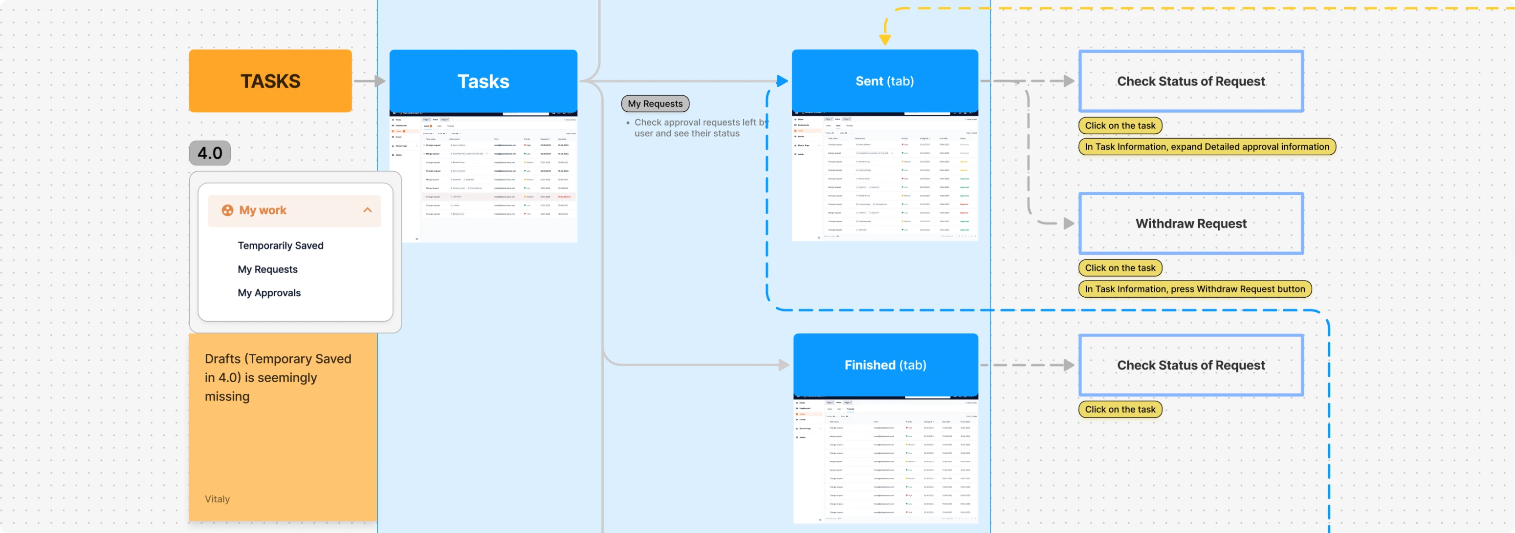
We started with common user scenarios to make the new informational architecture more user-focused. We built a user flow for each scenario and broke it down by pages. Based on this, we created the entire data flow from scratch.
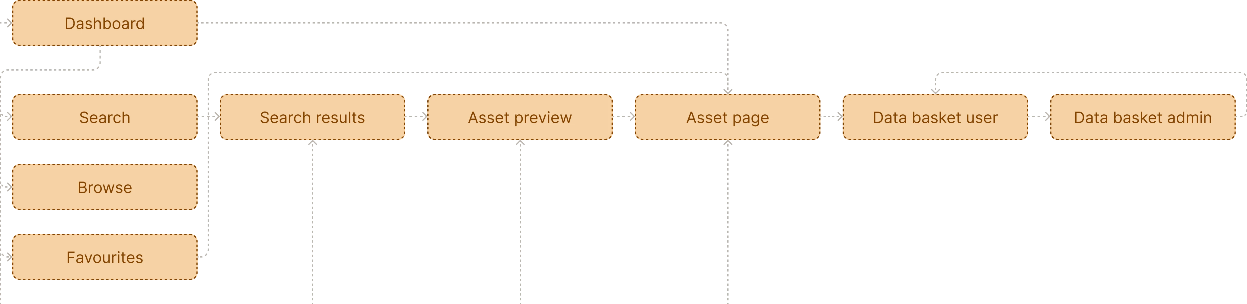
Informational architecture aims to simplify the redesign implementation for the developers. We think of it as a “guide” that makes moving from the previous design to the new one and the interim design (more on that below).
From research and discovery to visualization
We were lucky to team up with a product manager who understands the importance of a proper design process. Together, we went through the research, feature analysis and usability heuristics analysis to get to the discovery stage. When the basic informational architecture was done, we built wireframes, and once they got approved, we moved on with the visualization.

Visual style can be described as “a common SaaS” style. SaaS products normally benefit from a simple design, which users find simple to get and allows designers to focus on the content rather than the visuals. So to ensure such design for Data Streams, we limited the number of colors and avoided trendy flashy elements.
The primary color of the interface, traditional dark blue, is accented with contrasting orange — the brand colour of Data Streams.
Finding optimal layout and UX patterns
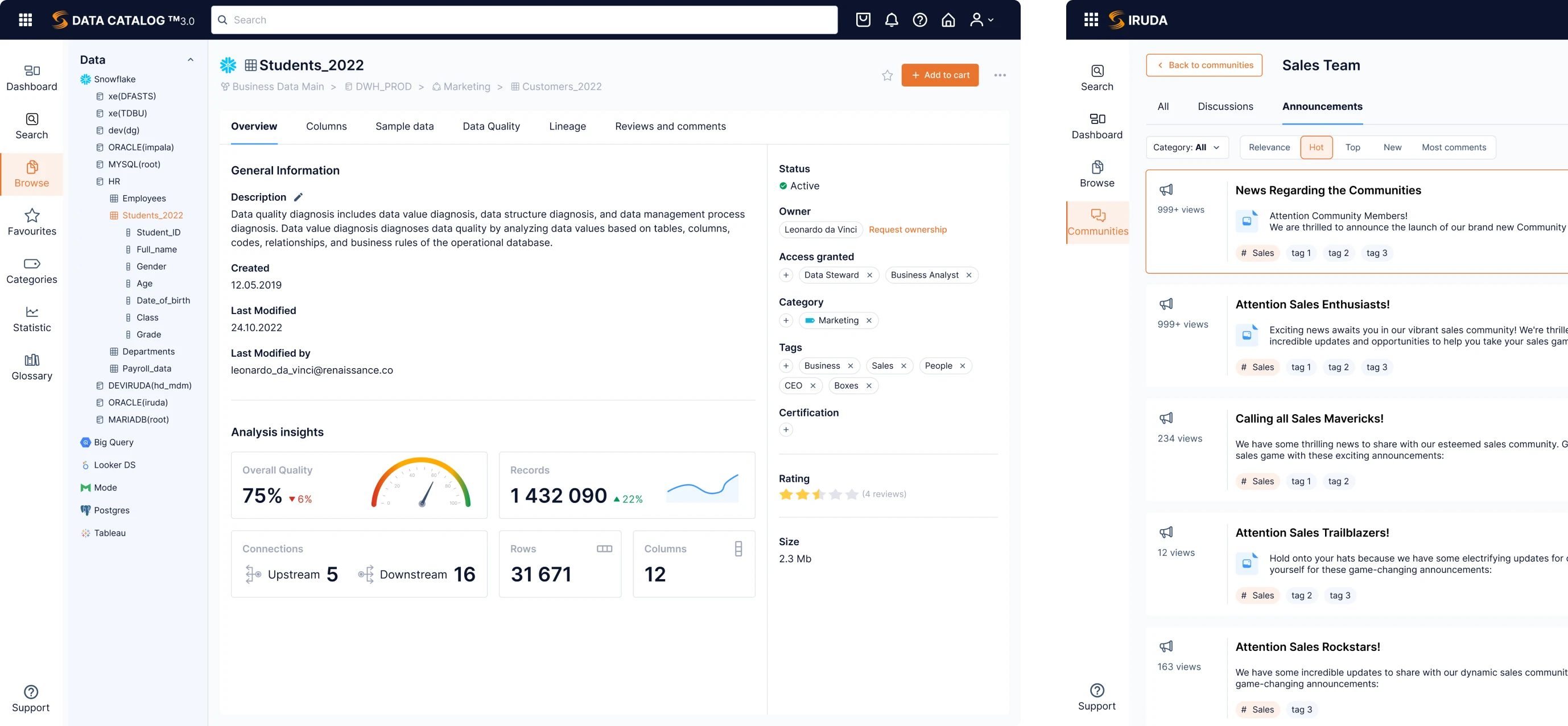
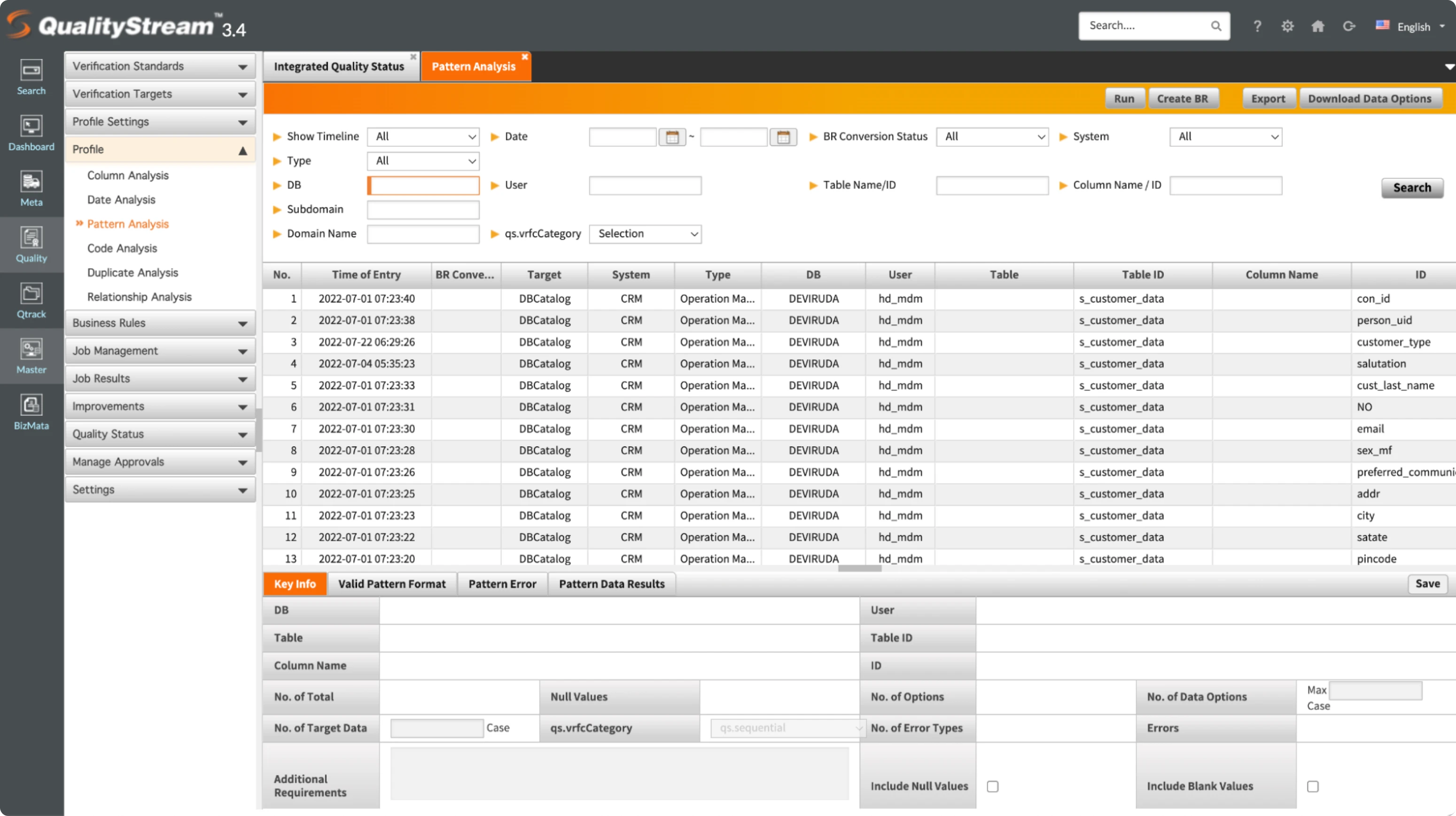
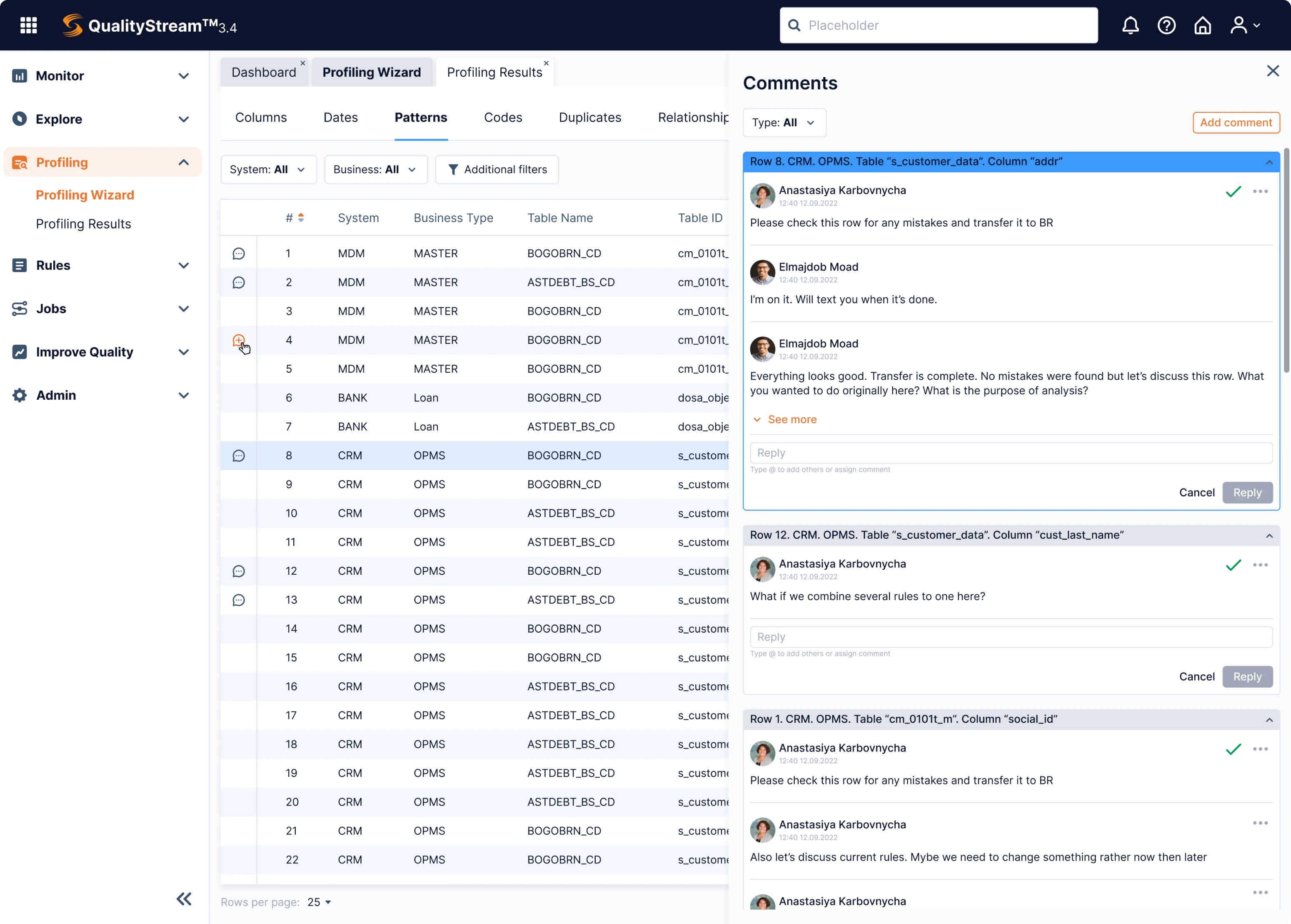
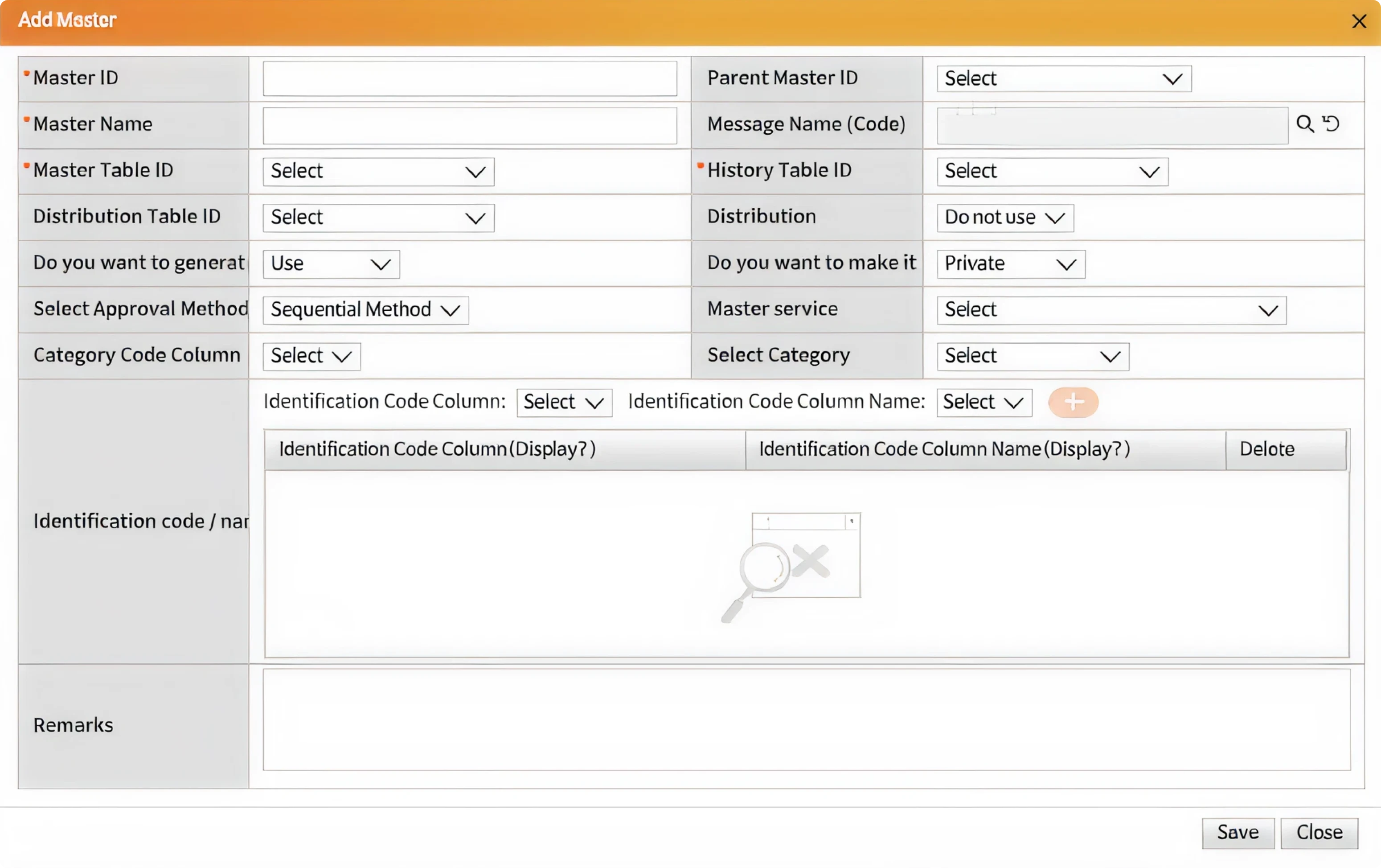
Data management products are made for professional users who are used to working with endless tables. Our task as UX designers is to make user’s job as easy as possible, even if the product is highly complex. The way to do it is by finding original UX patterns instead of omnipresent tables and forms. Here are a couple of examples.
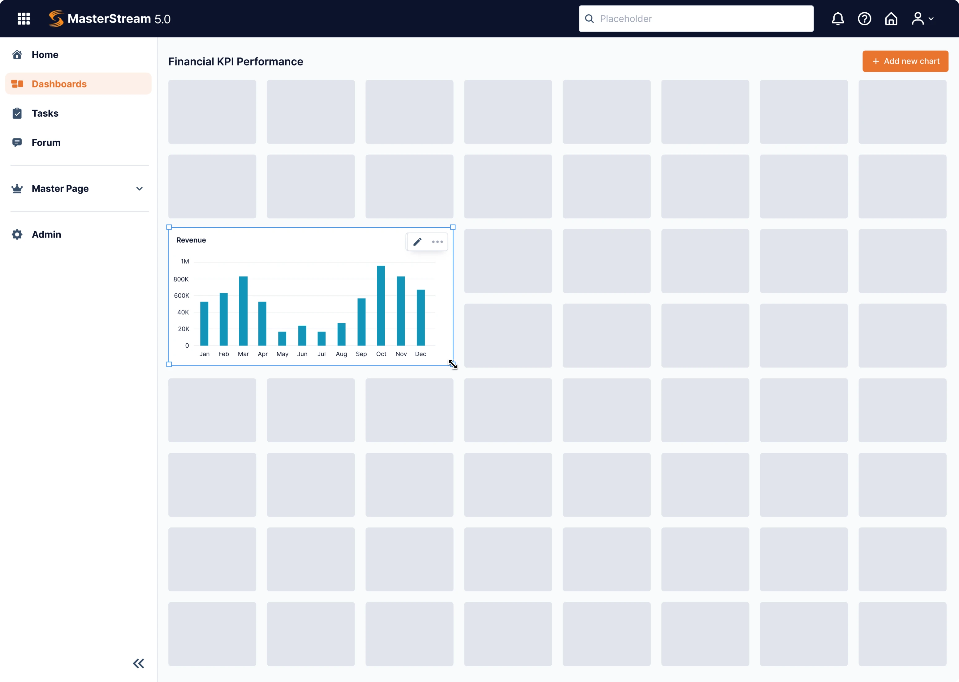
One of the key features of MasterStream, one of the Data Streams products, is a highly customizable dataset. With it, users can create their personal dashboard by choosing the datasets they want. In the existing design, they could select the data they needed but had no control over how it looks on the page. We decided to fix it.
Our designer created a customized dashboard organized as a drag-and-drop constructor. Instead of choosing from many parameters displayed in a row, users can now pick their preferred visualization form and place it on the grid as they like.
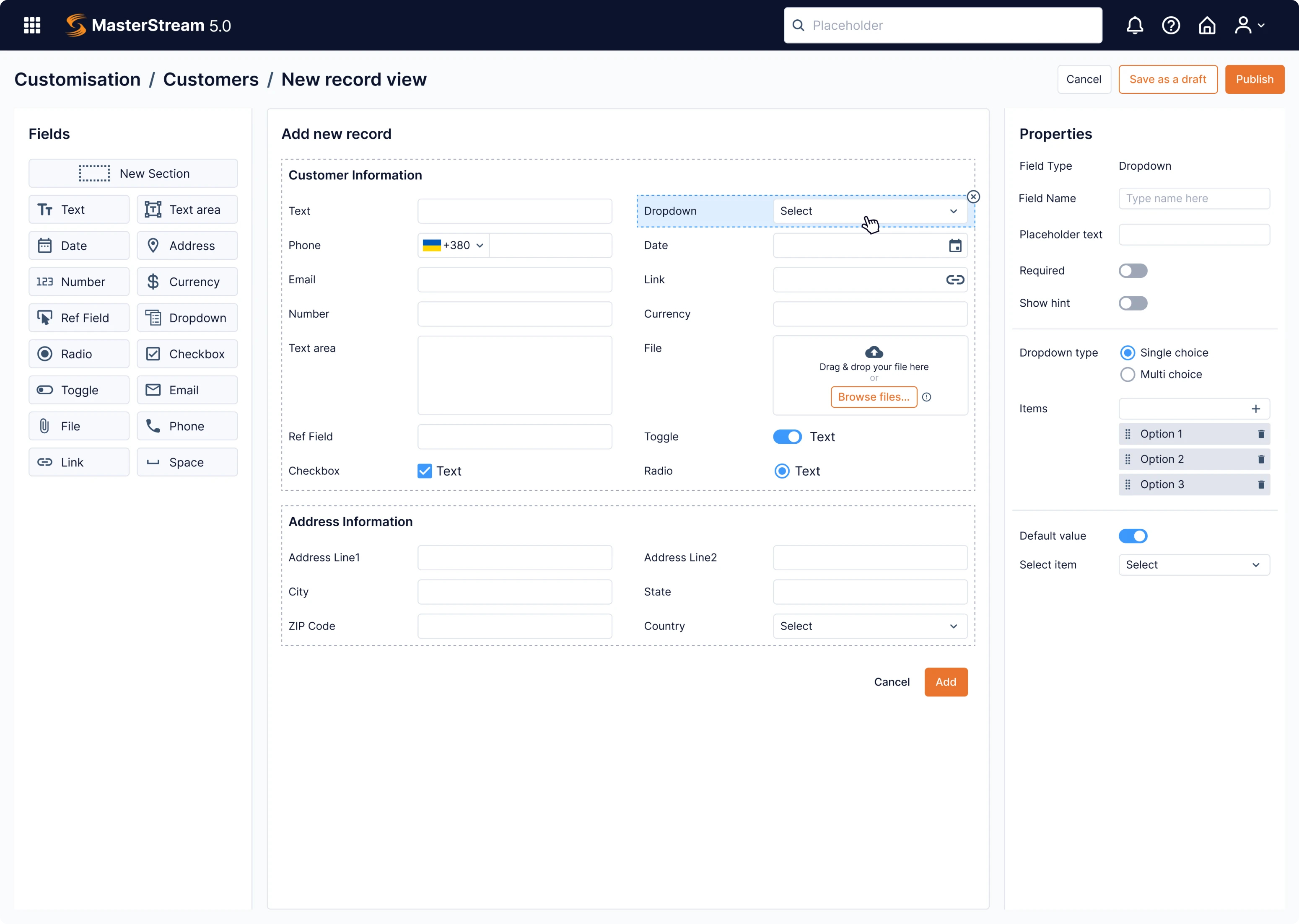
The new record page follows a similar pattern: on the left, there are various elements that can be dragged on the form to create your own layout. Left panel shows the properties of each element, and in the center you can see how it all looks.
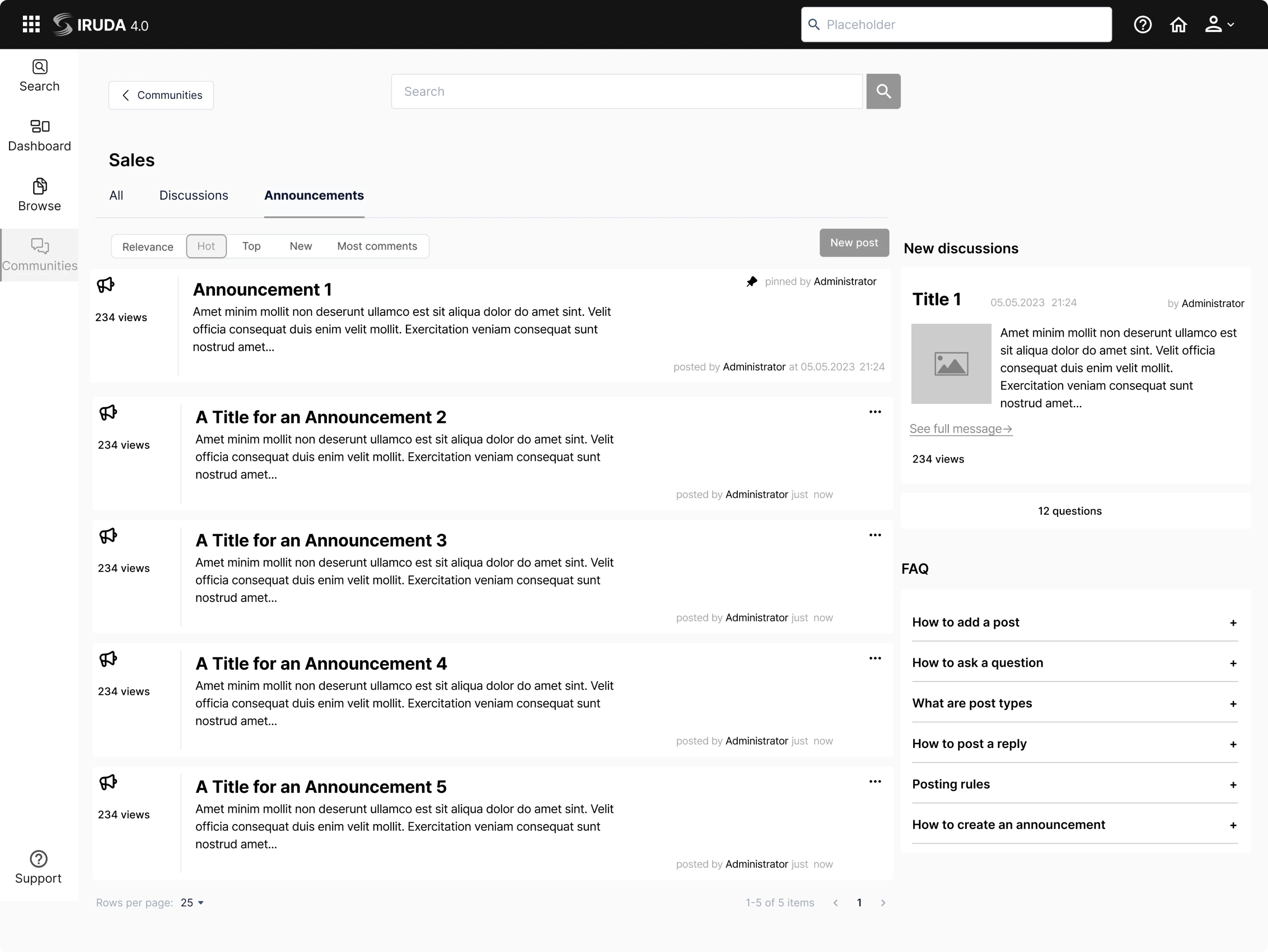
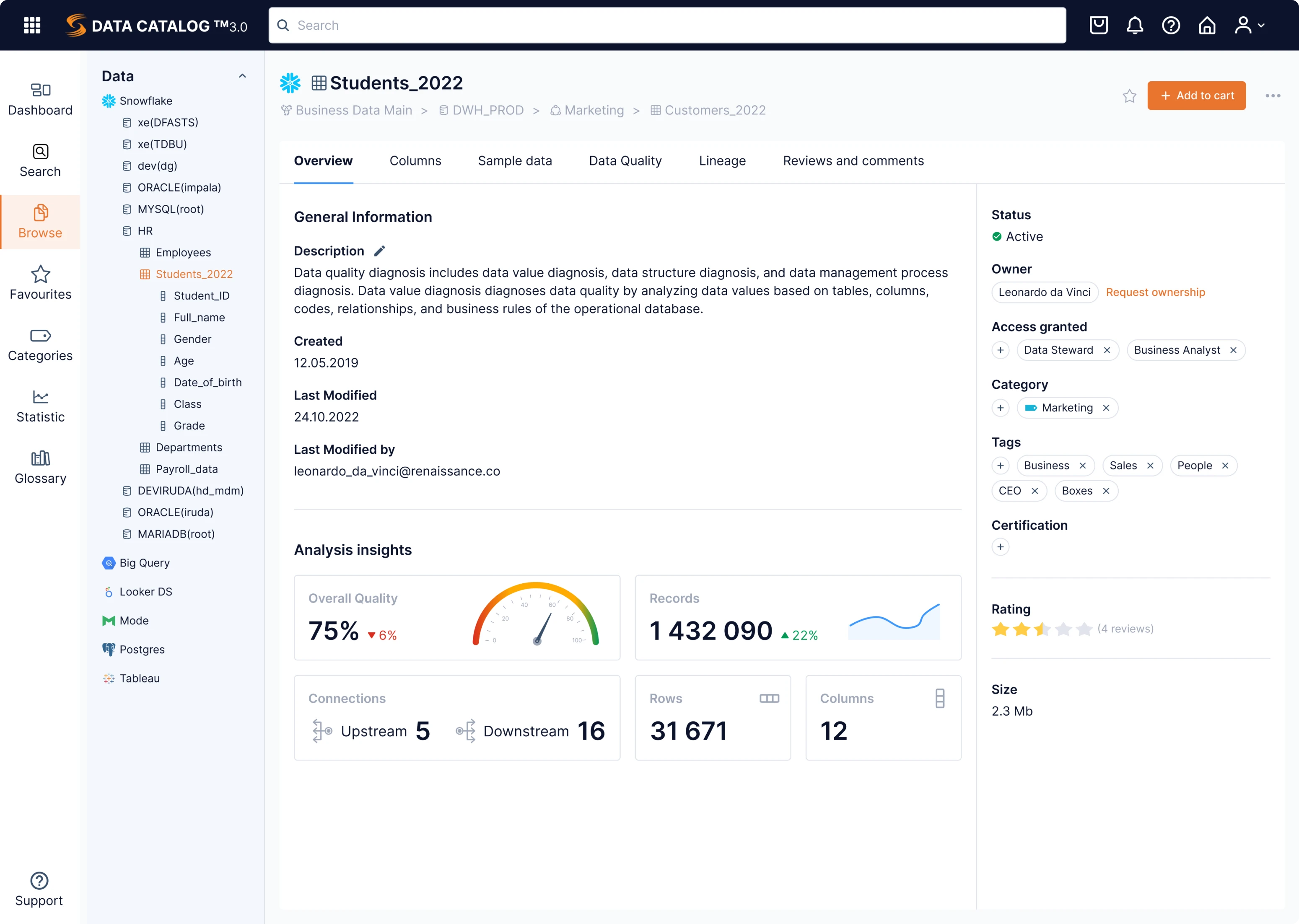
Another challenge that is common for data-heavy products is the need to fit lots of information on one screen. For Data Streams, we’ve used all our experience to organize data in the most efficient way.
Take a look at the Browse screen. There’s a navigation bar on the left, a vertical list of filters, and information about the selected object organized in several tabs. The most essential info is on the right side, while key data points are visualized with a big font below.
As a result, many different blocks of information are located on one page so that the user won’t have to switch between screens.
Our work included two redesigns: a fundamental data management platform overhaul and a fast interim UI revamp
In a fast-paced world of SaaS products, waiting long for a complete solution redesign can cost businesses lots of money. Being a pragmatic agency working in SaaS niche only, we chose the optimal way that brings maximum result in minimum time.
While working on a full-scale redesign, we also created an interim version of the redesign focused solely on revamping the user interface. Seeing a modern design sends users an immediate signal that the product is up-to-date and doesn't lose to the competitors. While the comprehensive redesign took several more months to implement, the interim version supported DataStream’s existing needs, reaching the global market sooner.
As a result, Data Streams could see the results of our work before the developers got to the complex process of fundamental redesign. Big shifts in user experience take time – but we know ways of bringing the results faster.