HealthStream Insights
How redesign helped HealthStream introduce users to customization of reports on employees’ development

Insights is a reporting tool from HealthStream, a big product company in healthcare business administration.
Their clients are healthcare enterprises with hundreds, and sometimes hundreds of thousands of employees. Companies need to look at these people from different angles, see their level of education, the state of their medical licenses, and so on.
The existing reports system hasn’t been renewed for about 15 years. And sure thing, it didn’t really meet the needs of modern users. To keep up with the competitors, HealthStream had to turn their heads to their customers and ask what they wanted to see in the product. And to make their product meet the needs of the customers, they needed experienced product designers. That’s how we met.

Research
The HealthStream team found out found that sometimes users have to go through a complicated process to get the dataset they needed. When standard reports did not include all the necessary info, they would just download two separate reports and copy-paste some data from one to another to get a complete report. Doesn’t sound like a good workflow, right?
HealthStream realized there was a problem and tried to solve it with a new product: Custom reports. It would allow customers to tailor the reports to their needs. Each detail could be changed to get a perfectly customized report.
The reality didn’t meet their expectations, though. After Eleken designers conducted user research, however, we proved those assumptions wrong. A few user interviews let us conclude that customers don't need such highly customized reports. All they wanted was a standard report with just a little customization.
That’s the power of UX research.
From research to design
First of all, Eleken designers analyzed the report's structure and talked to the HealthStream customer success team. Most of them are people who had been using the product as part of health enterprises for years, so they made a perfect reference point. We also validated our first concepts with them.
One of our main goals was to improve user flow
It starts with the very first screens, where users see all the templates with a basic explanation of what information each of them contains. The reports are grouped to make the navigation easier.

One of the most important changes in user experience was also one of the least noticeable in the interface. And those are filters. They help a lot when users have to navigate through large datasets.

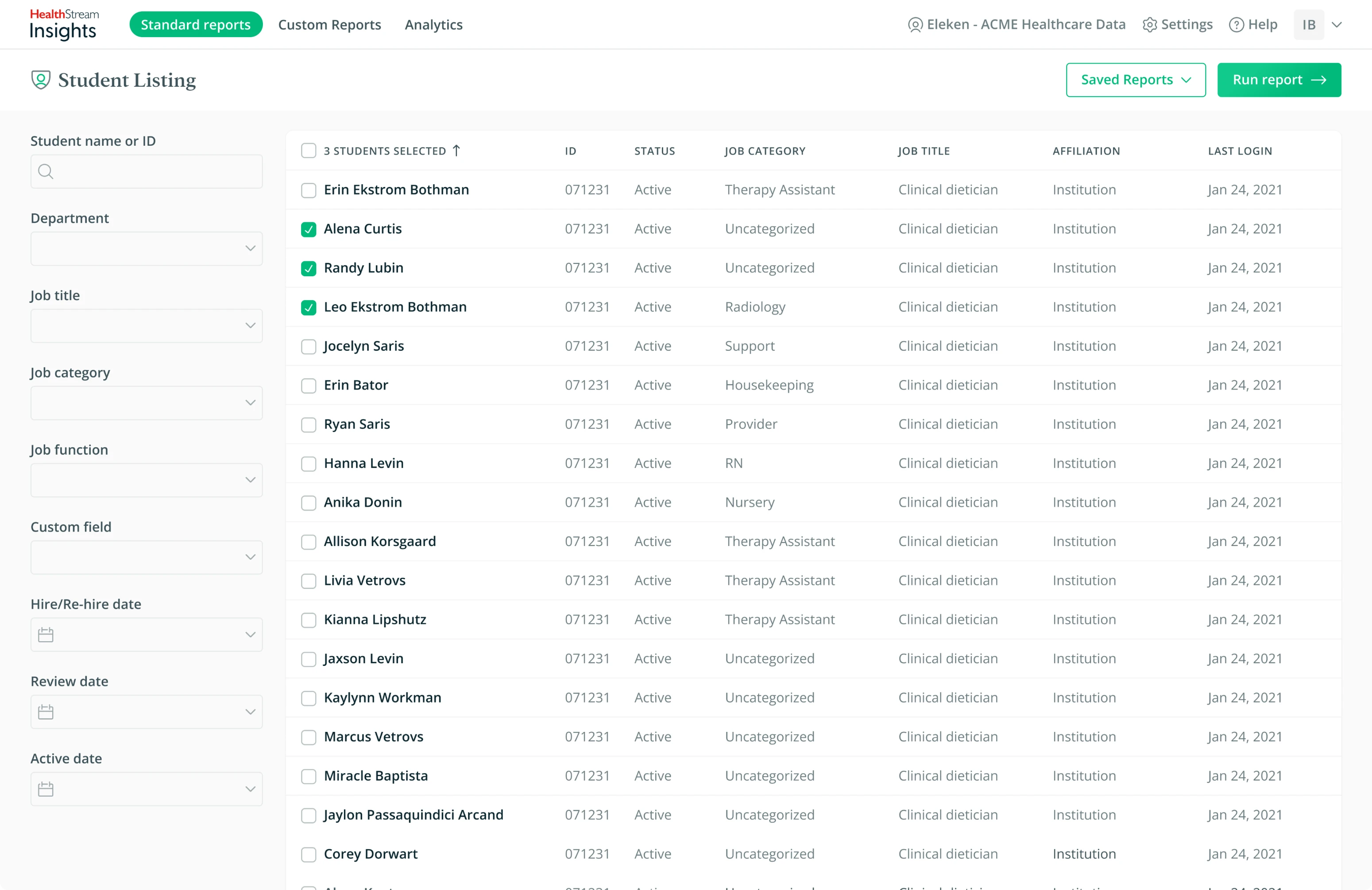
To make reports management easier, we added a page with saved templates. Each report template can be shared with another company employee, so that they both can edit it.

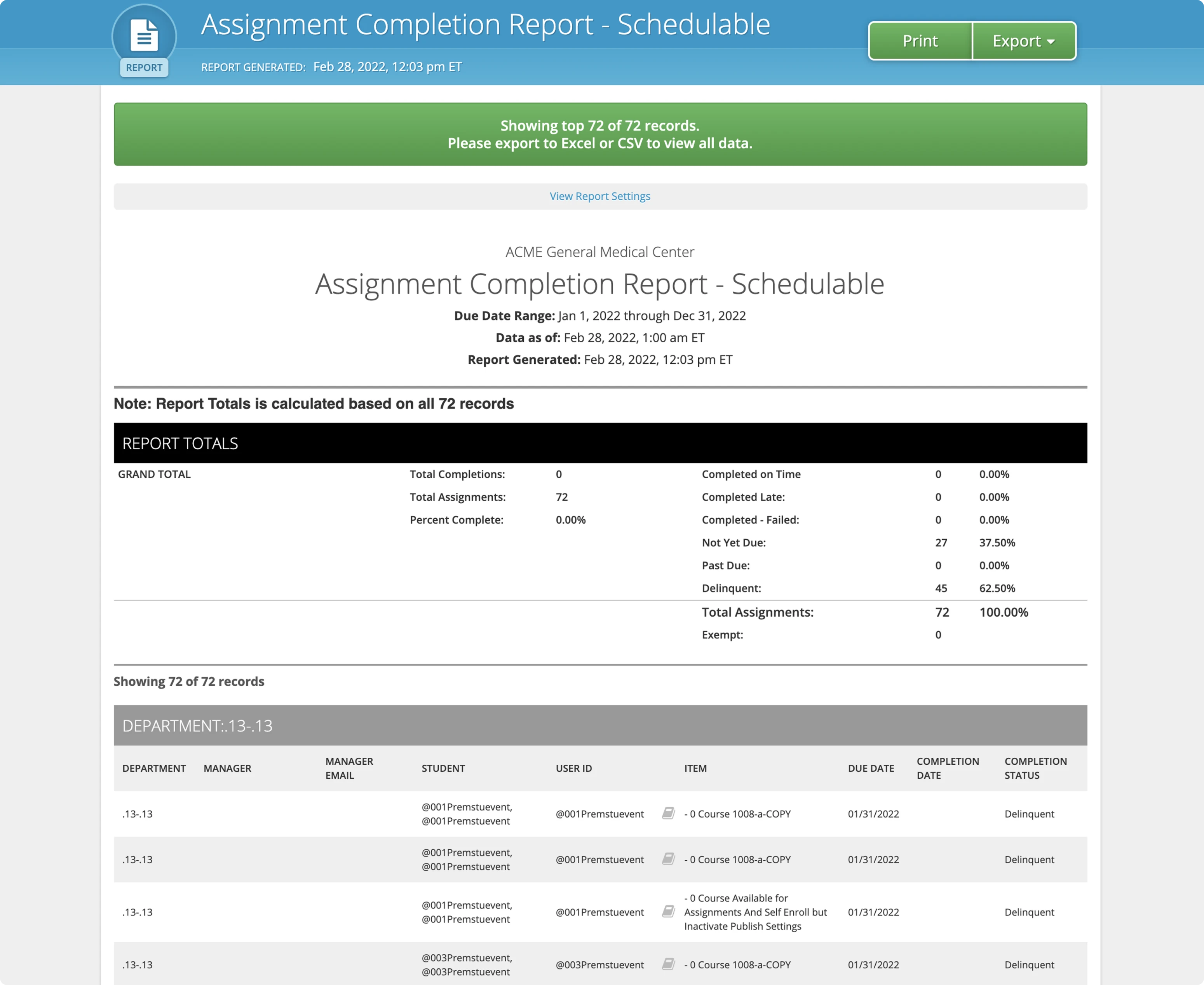
When working with analytics product, users have to deal with large tables containing loads of data. To make them easier to perceive, we brought up the key figures on top and made them big and bright to draw attention.

Creating a new report
The new design solves the initial problem: it has a necessary level of customization, while not overcomplicating the process for users who need to form a report fast without spending hours on configuration.
We split the fields into sections, added checkboxes and drop-downs to make the filling in data faster.

For users who want to deal with report customization as little as possible, there is a feature of report scheduling. Once they set all the details, they will receive the report directly in their inbox, without even entering the program.

HealthStream had its brand guidelines. However, most of their products didn’t have a universal style, so our designers were free to drive the visuals in a direction that would work best for the app interface. The fonts and color palette remained similar to what was provided by the guidelines.
Testing
When the prototype was ready, HealthStream product manager ran usability testing. The results proved our hypothesis and showed that the new flows are understandable and functional.

The design was ready for implementation. Two designers worked on it for seven months. The final result included a prototype and a UI documentation kit.
I appreciate the detailed and focused work you put into the project and the willingness to put in the extra mile to make sure our reporting enhancements will be impactful and well received.