


When you’re looking for design inspiration, chances are you’re scrolling through Dribbble or reading roundups like this one, scanning for patterns you could tweak or test in your own product. Totally normal. That’s literally why articles like this exist.
But after designing fintech products for 10+ years at Eleken, across projects lilike Prift, PayUp, Habstash, and others, we’ve learned that great UI isn’t enough. Trusted UI is what keeps users coming back.
That’s something worth pausing on. In this article, we’ll walk you through 15+ real examples (some of them from our own work), so you can borrow what works and build a product where users never have to ask, “Wait… what just happened?”

Top fintech app examples chosen by Eleken designers
Did you know that 96% of consumers report high satisfaction with fintech products and services? That number surprised us at first, but when you look at the best-designed apps out there, it starts to make sense.
So, we decided to put a list of trusted fintech UI examples that help explain why that number is so high. Some come from our work, others are products we admire, but each one is here to help you build better user experiences.
1. Wise
Wise is one of those trusted banking app UI examples that have put serious work into making complex things feel simple. International money transfers are high-stress by default. Wise knows this and designed the interface to dissolve that anxiety.

From the first tap, users see what they’re sending, what the recipient gets, when it arrives, and how much it’ll cost. There’s no “surprise” fees showing up later. Even currency conversions are displayed with real-time rates and transparent markup.
What we love about this fintech app design is that it doesn’t try too hard to impress. The interface is simple, even for first-time users. A subtle touch of gamification adds warmth, while the human-centered copy makes the whole experience trustworthy.
A few fintech design moves worth stealing:
- Progressive disclosure shows the basics first, then the full cost breakdown.
- Clear visual hierarchy makes final amounts, dates, and edit options stand out.
- Friendly but precise copy tells users exactly what they need to know.
2. Prift
Prift is a financial planning app for people who want to make smarter money decisions without getting a degree in finance. It works like a personal assistant that gives calm, focused guidance based on real goals.

When the client came to us, they already had an idea and solid user research. Their potential customers weren’t looking for flash animations or charts that do backflips. So, our job at Eleken was to turn that insight into a UI design that felt simple.
Given the target audience, we avoided gamification and focused on a restrained layout. The same approach our team applied when building the landing page, keeping the experience consistent from first touchpoint to daily use.
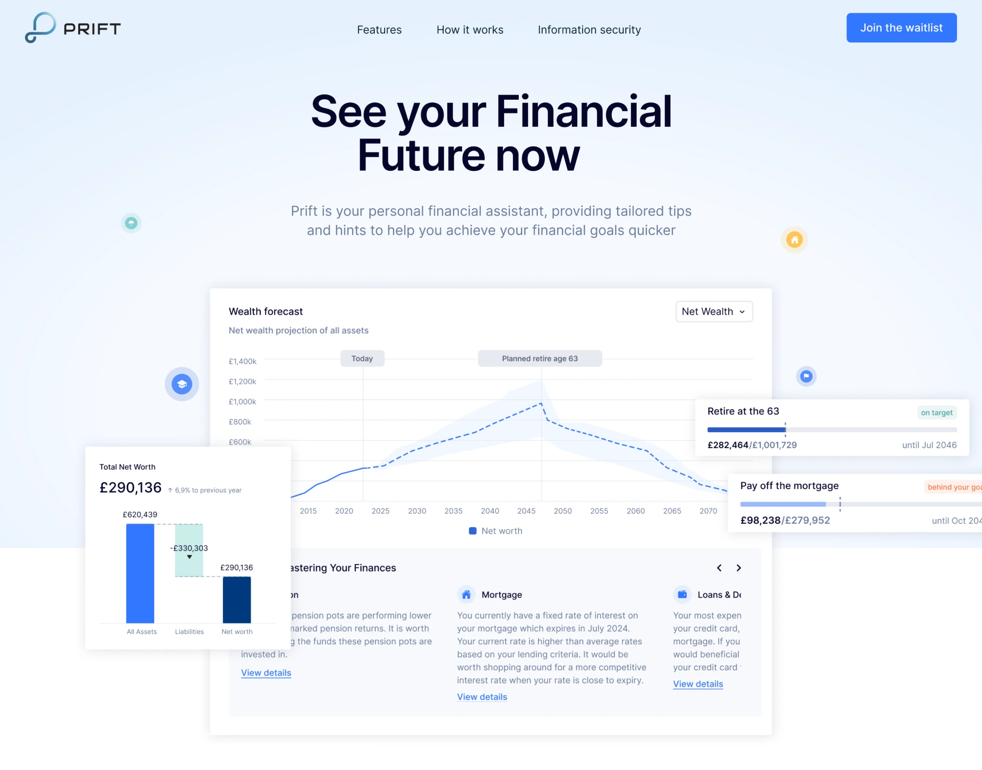
Design patterns that worked well:
- Personalized insights greet users by name and highlight meaningful stats.
- Decision support comes from clear flows that help compare savings options.
- A minimalist aesthetic avoids visual clutter while still being data-rich.
3. Altruist
Altruist reached unicorn status in May 2024, raising a $169 million Series E led by ICONIQ Growth, which valued the company at $1.5 billion, as reported by TechCrunch. The platform serves financial advisors and their clients, bringing together custody, portfolio management, reporting, and client tools into one interface.
When using the app, people don’t need to dig through layers of menus or deal with bad data visual styles. The navigation is completely simple. Dashboards show high‑level metrics up front, and from there, customers can explore the rest.
Visually, Altruist leans into bold typography, narrative‑rich graphics, and clean data presentation. It’s a confident design language that moves away from legacy finance clutter and helps users stay grounded in the product.
Here’s what makes the interface work:
- Task-centric navigation is grouped by meaningful workflows.
- Clean data visualization separates key metrics and performance graphs.
- Brand-driven clarity signals professionalism without being sterile.
4. Chime
Chime is a mobile banking app for iOS and Android that makes the experience accessible and friendly. According to reviews, its strong UI/UX helps create trust through real‑time alerts, intuitive navigation, and inclusive design features.

From the moment you open the app, you’re met with a clean home screen where your balance, recent activity, and goals are clearly visible. Chime has focused heavily on reducing friction, and users constantly praise it.
In our opinion, Chime strikes a great balance between simplicity and optimism. The interface offers just enough insight and control, while gently nudging users toward smarter financial habits through personalized features.
A few design details you could apply in your fintech product:
- Real-time notifications and updates reinforce action and awareness.
- A clean, minimal layout brings key info front and center.
- Inclusive language and design use less jargon and more plain-spoken clarity.
5. Invyzia Solutions
Invyzia Solutions was created by advisors, for advisors, to simplify day-to-day operations and make client conversations easier. The platform helps financial professionals generate proposals without having to wrestle with spreadsheets.

When Eleken joined the project, our goal was to make the platform visually calm and inviting. We refreshed the UI with a subtle monochrome palette, softened typography, generous white space, and just the right amount of contrast.
To guide users without overwhelming them, we used darker accent colors (blue and green) only in the left sidebar. This kind of fintech UI design is easier on the eyes and takes less cognitive effort to process the information.
Among smart UX decisions we applied:
- Tables help organize large amounts of complex financial data.
- A customizable dashboard lets users manage their customer base efficiently.
- A simple onboarding process requires just an email to get started or log in.
6. RightCapital
RightCapital is built primarily for financial advisors, but its polished UI makes it appealing to clients, too. Users highlight that the interface is intuitive and visually coherent, helping break down complicated financial plans into digestible steps.

One of the first things you’ll notice is that the dashboard offers a transparent view of net worth, budgets, and goals right away. It creates a sense of “I know where I am and what I’m doing,” which is exactly what a trusted fintech UI should deliver.
Just as important is the fintech website design. Honestly, we liked how the RightCapital brand presents itself. The site supports the product clearly and gives first-time visitors exactly what they need to see.
Things that make the app’s UI click:
- Intuitive dashboards put core metrics front and center.
- Scenario planning and interactive elements make complex stuff manageable.
- Custom branding options let advisors align the software with their own look.
7. Revolut
Revolut has grown from a travel‑card startup into a financial app offering digital banking, investing, crypto, multi‑currency accounts, and more. What stands out from a UI/UX perspective is how the app manages complexity.
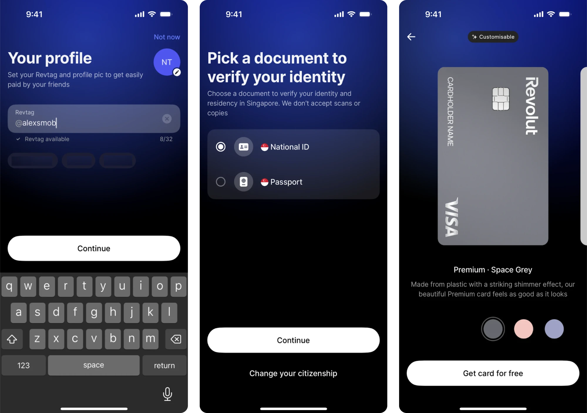
Once you open the app, you land on a clean home screen where your balance is front and center, key actions like “Add money” or “Send” are readily accessible, and features like budgeting tools, vaults, and crypto tabs are easy to find.
The use of vibrant accent colors paired with ample white space and a card‑based layout helps guide user attention. Onboarding is mobile‑first and introduces features gradually rather than dumping everything at once.
What’s worth borrowing for your fintech UI:
- Dashboard design surfaces the key metric first.
- Clear navigation and visual hierarchy reduce cognitive load.
- Onboarding and feature introduction use progressive disclosure.
8. PayUp
PayUp is a fintech platform built around the idea that people should be able to get paid on their own timeline. The app helps vendors access early payments, giving them more control over cash flow without the usual delays and stress.
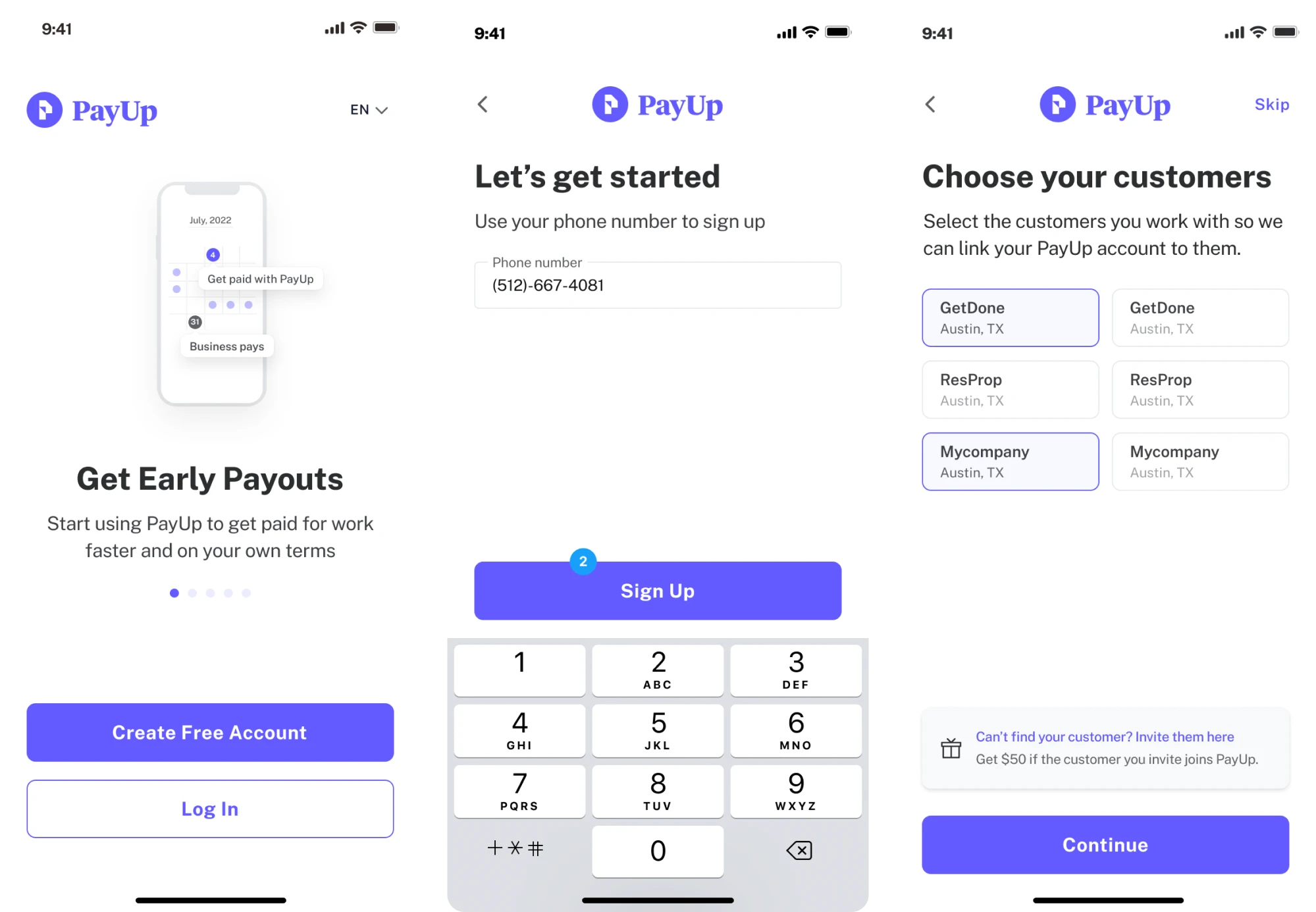
Because the core users are often busy, non-tech-savvy individuals, our goal at Eleken was to build an effortless interface. Everything had to be clear, fast, and friction-free, and our design decisions followed that principle.
To move fast and stay focused on real user needs, we took an iterative design thinking approach. That let us test ideas quickly, work collaboratively with the client, and create a digital product that functions well and feels intuitive.
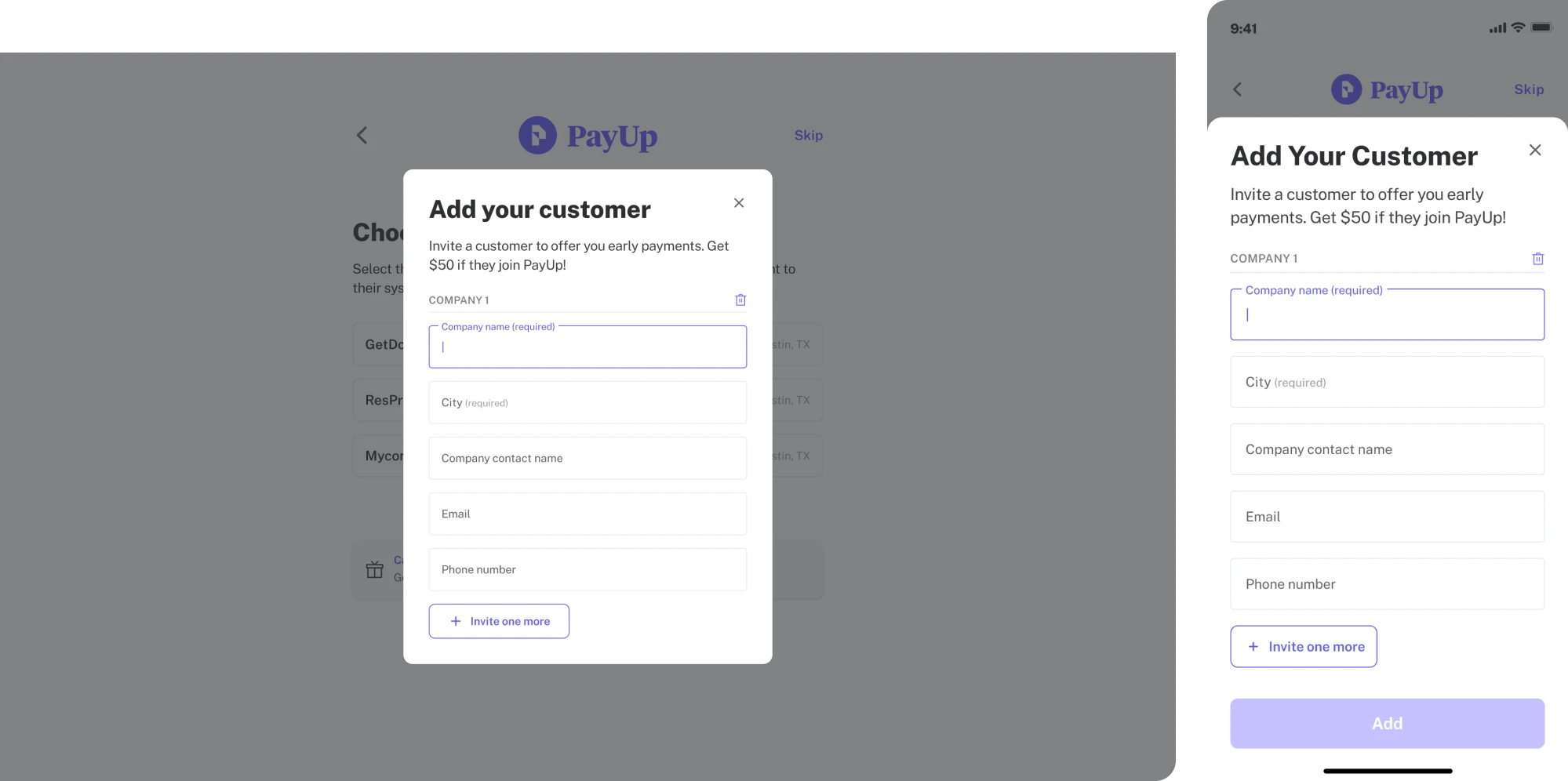
Smart design decisions that made the difference:
- An in-app Wallet provides a single place for financial management.
- The layout adapts seamlessly to mobile devices.
- Visual hierarchy helps final amounts, dates, and edit options stand out.
9. Income Lab
Income Lab is a retirement-income planning platform built for advisors. As you navigate the interface, you won’t find jargon or overused gamification. The platform relies on intuitive visuals, clear narratives, and meaningful interactions.

Among trustworthy fintech UI examples, this one uses interactive charts, scenario sliders, and clearly labeled flows that let advisors and clients explore “what-if” planning together. This kind of design gives users transparency.
The platform has also ramped up its sophistication with AI autonomy. It currently includes tools like an AI Plan Builder, AI Interviewer, and AI Assistant, all of which help turn raw inputs into actionable financial plans within minutes.
These are little decisions that go a long way:
- A single‑screen SaaS dashboard brings key info into view immediately.
- Interactive scenario tools let users manipulate variables and see the effects.
- A smooth mix of data depth and visual clarity.
10. Stripe
Stripe is a payment processor that helps millions of companies accept payments online and in person, embed financial services, power custom revenue models, and build more profitable businesses.
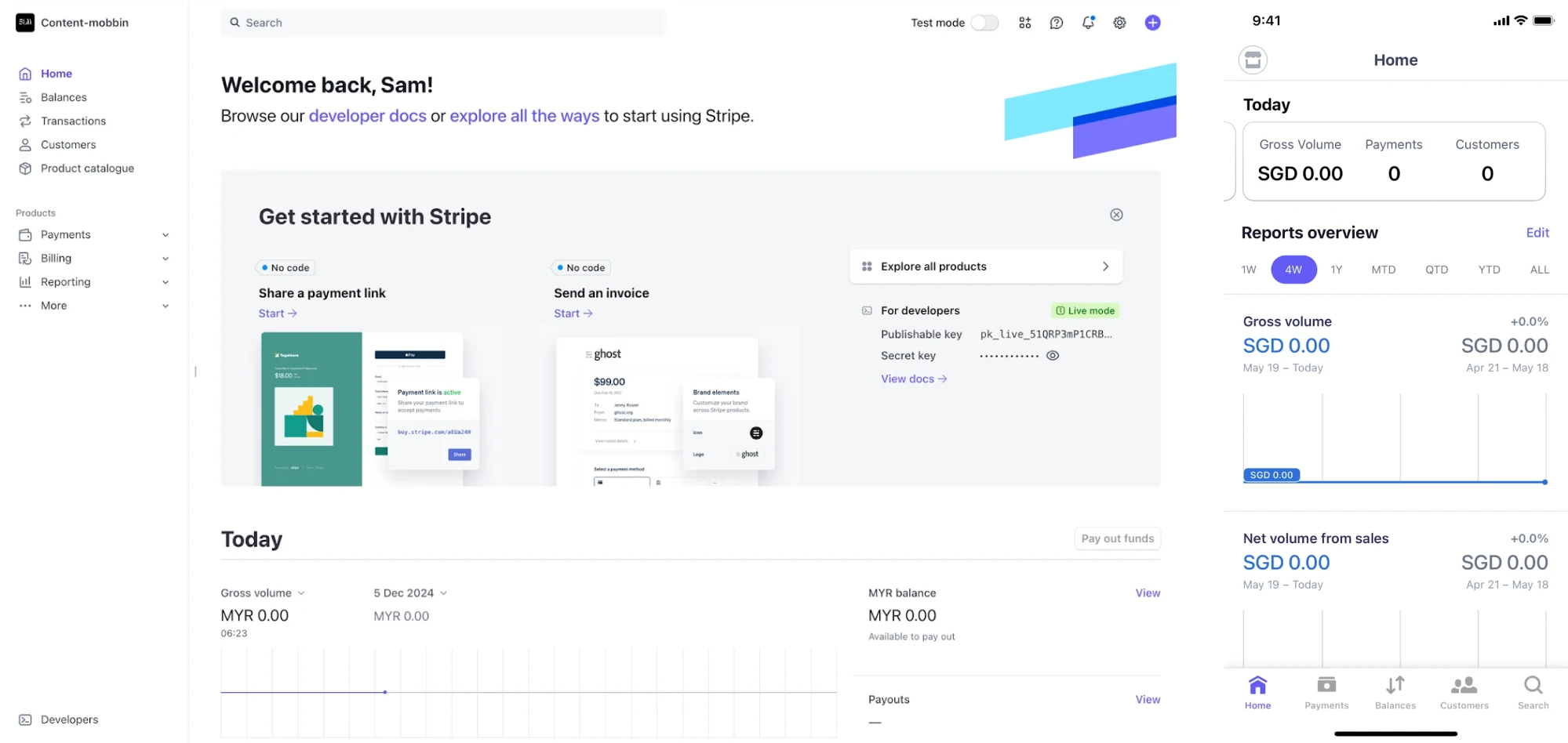
Like many other fintech UI examples, Stripe’s design places key metrics front and center so users instantly understand what they’re looking at. One small but effective touch we appreciate is the use of green to signal success and red to flag issues.
The interface is adapted for mobile and web users, and both rely on the same design language with white space, clean typography, and a logical layout. Even the fintech web design follows these usability principles.
Some details users actually notice:
- A dashboard surfaces the key metrics to keep users oriented.
- Navigation, visual hierarchy, and tooltips help guide users naturally.
- Modular UI components and patterns support consistency and scalability.
11. Habstash
Habstash was created to make homeownership in the UK possible, and more importantly, doable. The idea was to gather everything someone needs to plan and prepare for buying a home into one accessible platform.
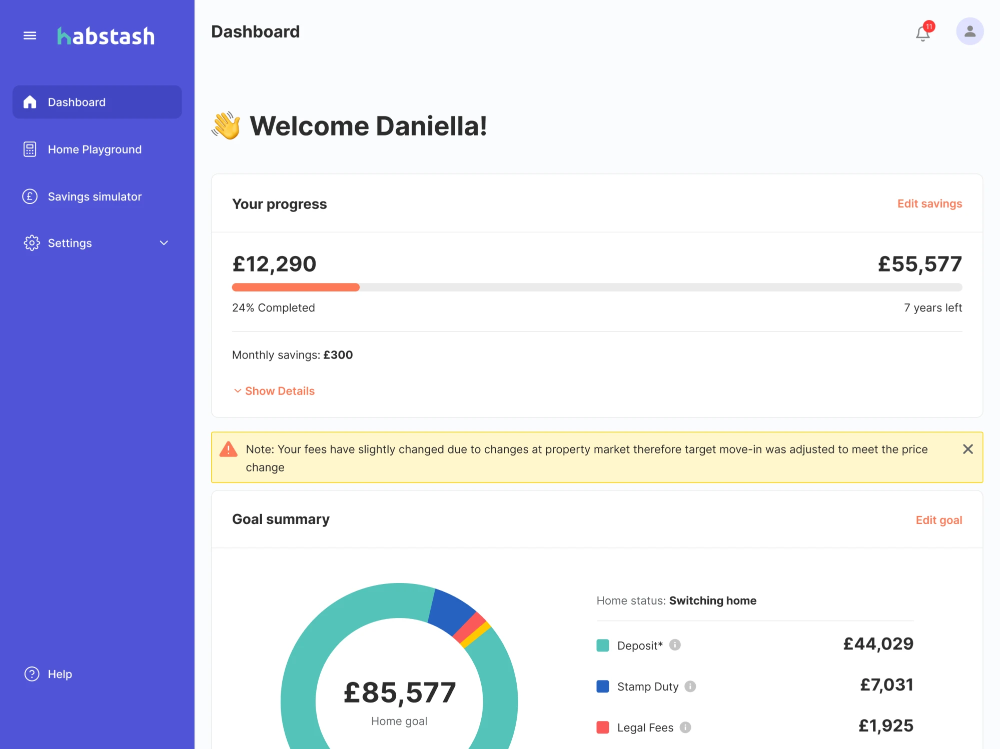
When we joined the project, our goal at Eleken was to support that mission through modern design. First and foremost, we used familiar patterns, like a left-hand sidebar with all the essentials: charts, editing options, settings, and progress tracking.
One of the platform’s key flows is onboarding, and we designed it using a wizard-style pattern. This way, users are guided through a step-by-step process, supported by illustrations and a strong brand identity.
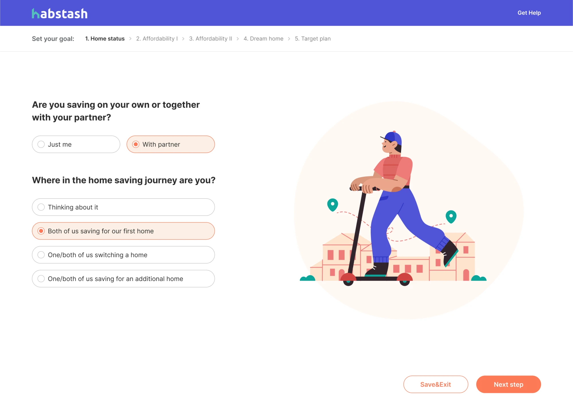
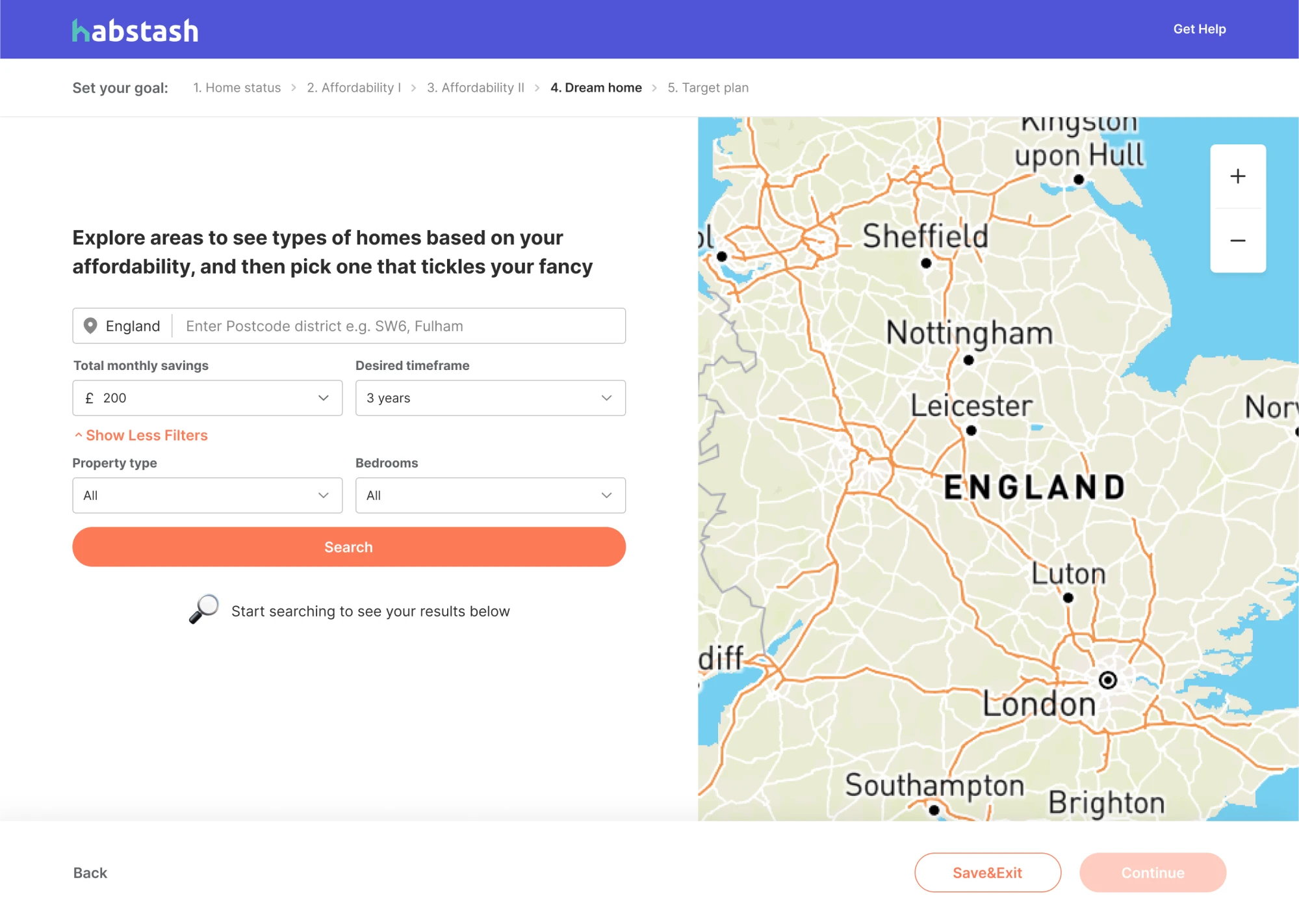
Little design decisions that built trust:
- A wizard-style signup flow reduces bounce and simplifies onboarding.
- A progress bar at the top of the dashboard.
- Thoughtful use of warning signs gently catches the user’s attention.
12. Monarch Money
Monarch Money presents itself as an all‑in‑one personal finance management app, and from a UI/UX side, it delivers exactly that. It excels at giving users a unified view of budgeting, investment tracking, goals, and net worth.
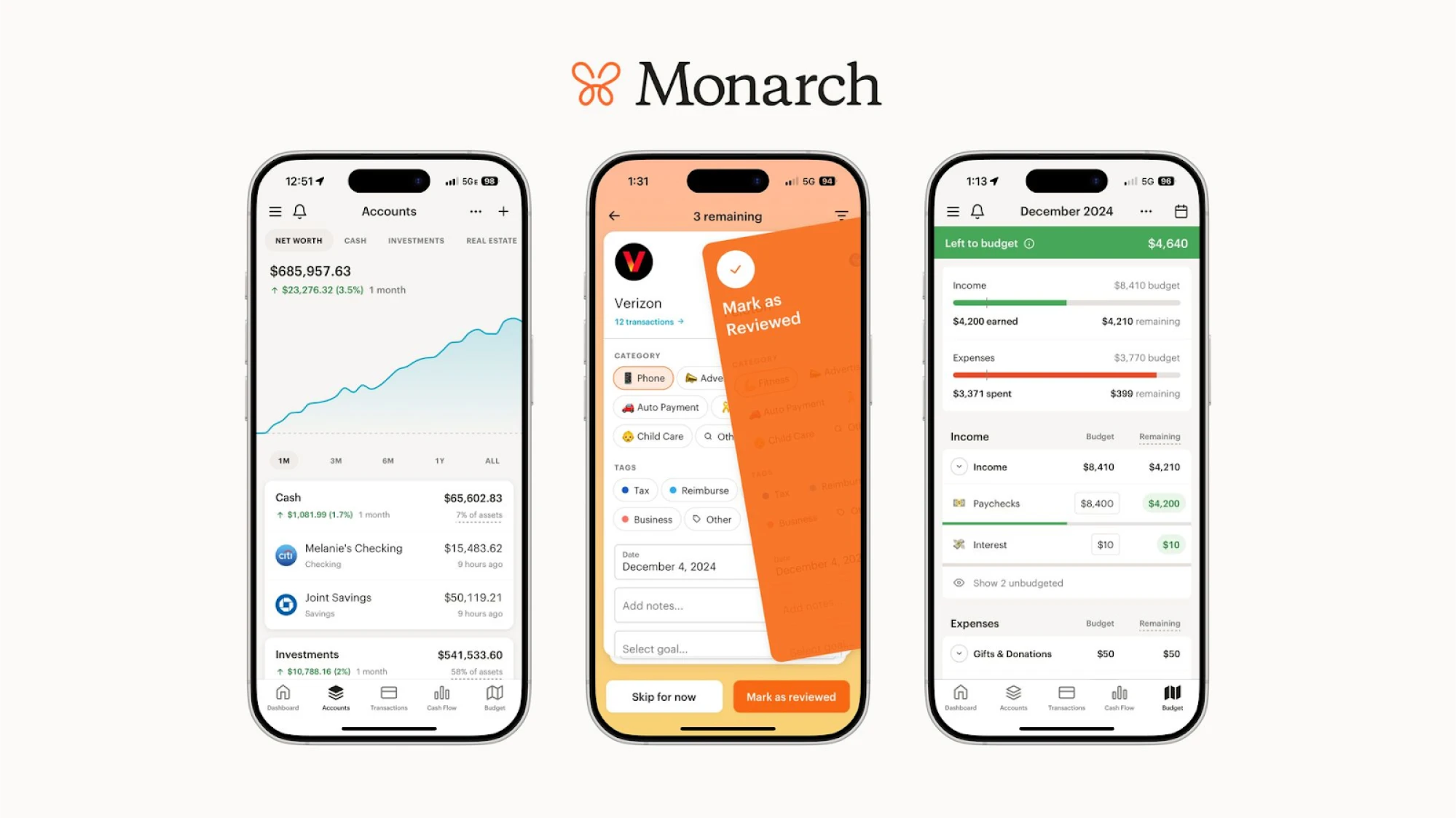
Users often highlight how flexible and well-rounded the app is in everyday use. It easily handles non-monthly transactions, custom budgets, savings goals, and more, making it a great match for people with varied financial habits.
The experience is also intuitive throughout. Navigation follows familiar patterns, and key design features are exactly where you’d expect to find them. It’s one of those tools that is easy to use without needing a learning curve.
A few design details worth using:
- A unified dashboard brings everything into view at once.
- Consistent design style across all touchpoints.
- Clean navigation and hierarchy make the interface approachable.
13. Uniswap
Uniswap is one of the most well-known decentralized exchanges (DEXs) in the crypto world. This platform is built on open‑source protocols and serves millions of users who swap tokens directly from their digital wallets.
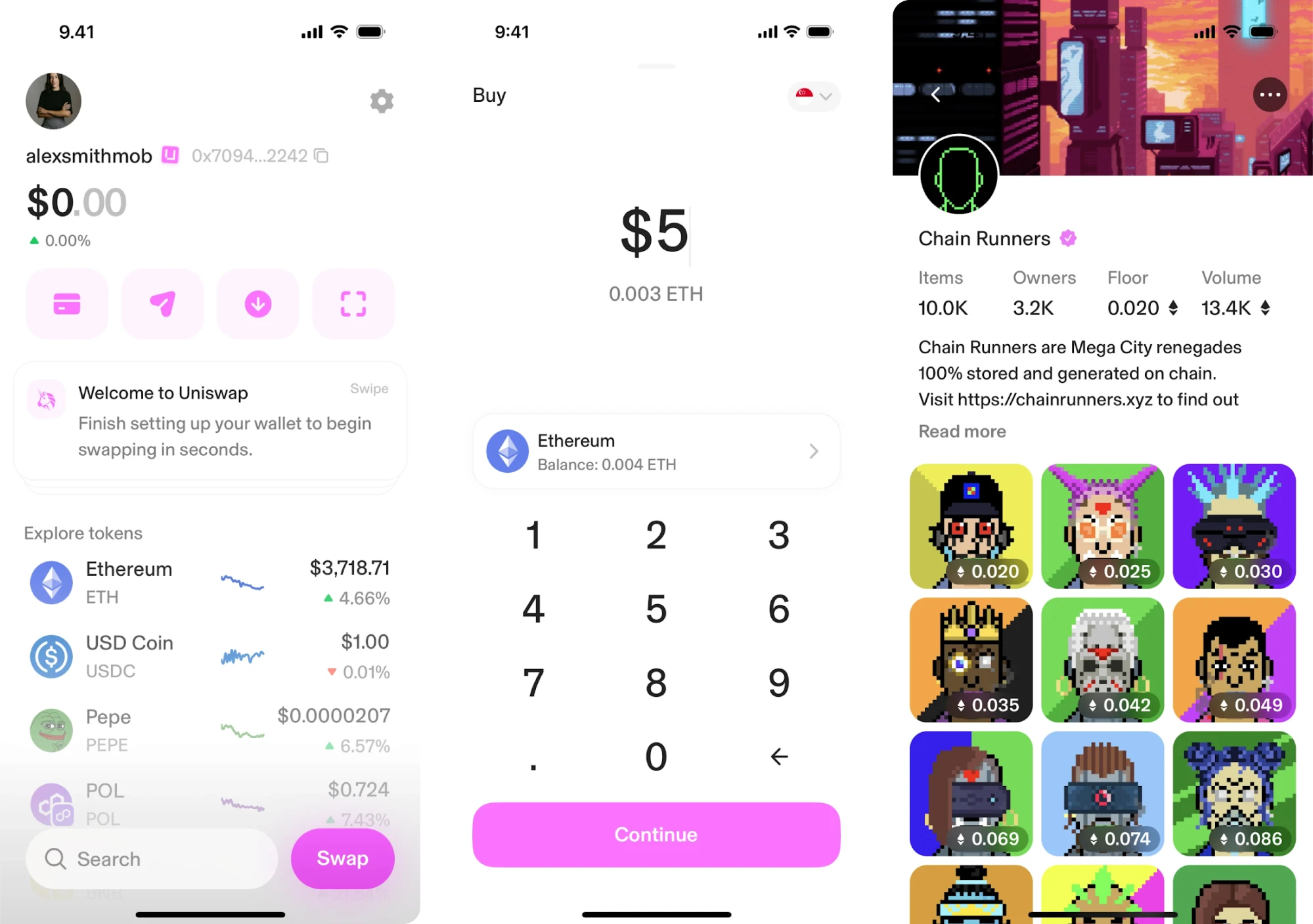
When it comes to design, Uniswap is always evolving. Their recent update focused on the swap interface. They reduced quote times, improved fee-on-transfer support, and added swap-protection features to protect users.
Among fintech UI/UX examples, this app features subtle motion, playful illustrations, and even emojis that make it friendly and modern. Navigation is placed horizontally at the top of the page, keeping the experience lightweight.
Design ideas you might want to bring in:
- Swap user-friendly interface places key actions front and center.
- Unified design language across web & wallet apps.
- Proactive UX improvements show attention to trust and safety.
14. Alture Funds
Alture Funds is a platform that gives retail investors access to fractional shares of institutional-grade alternative investments. It started as Elevate Money, a Gen Z-focused space, but our client saw an opportunity to reimagine it.
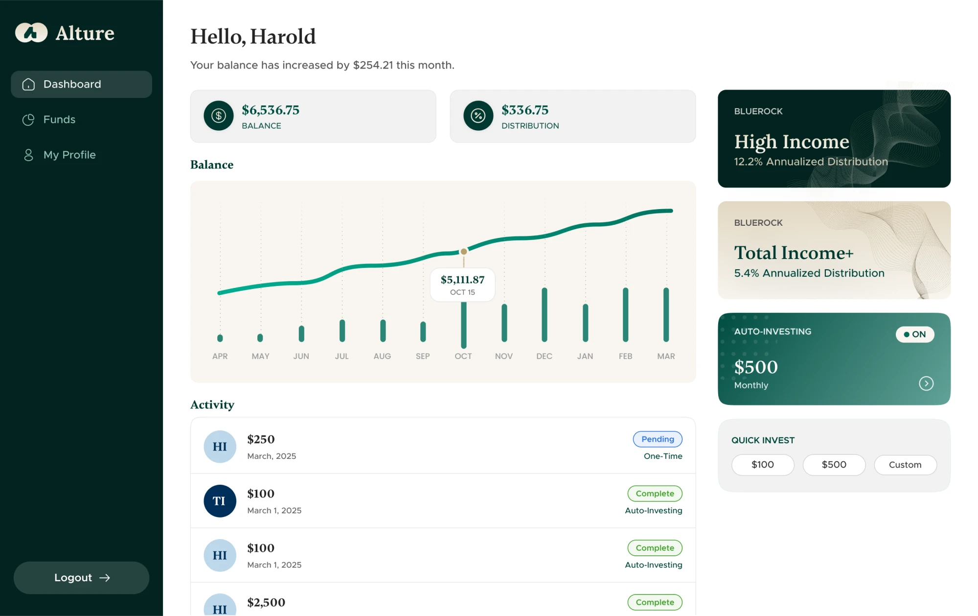
The new target users were experienced investors aged 35 to 40+, and the design had to reflect their needs. While the backend from Elevate Money remained, the frontend required a full transformation, and that’s where we came in.
We took a parallel design approach, building the mobile app and web platform side by side. The result was an interface grounded in deep green with accents of gold, supported by familiar design patterns that guide the user’s eye.
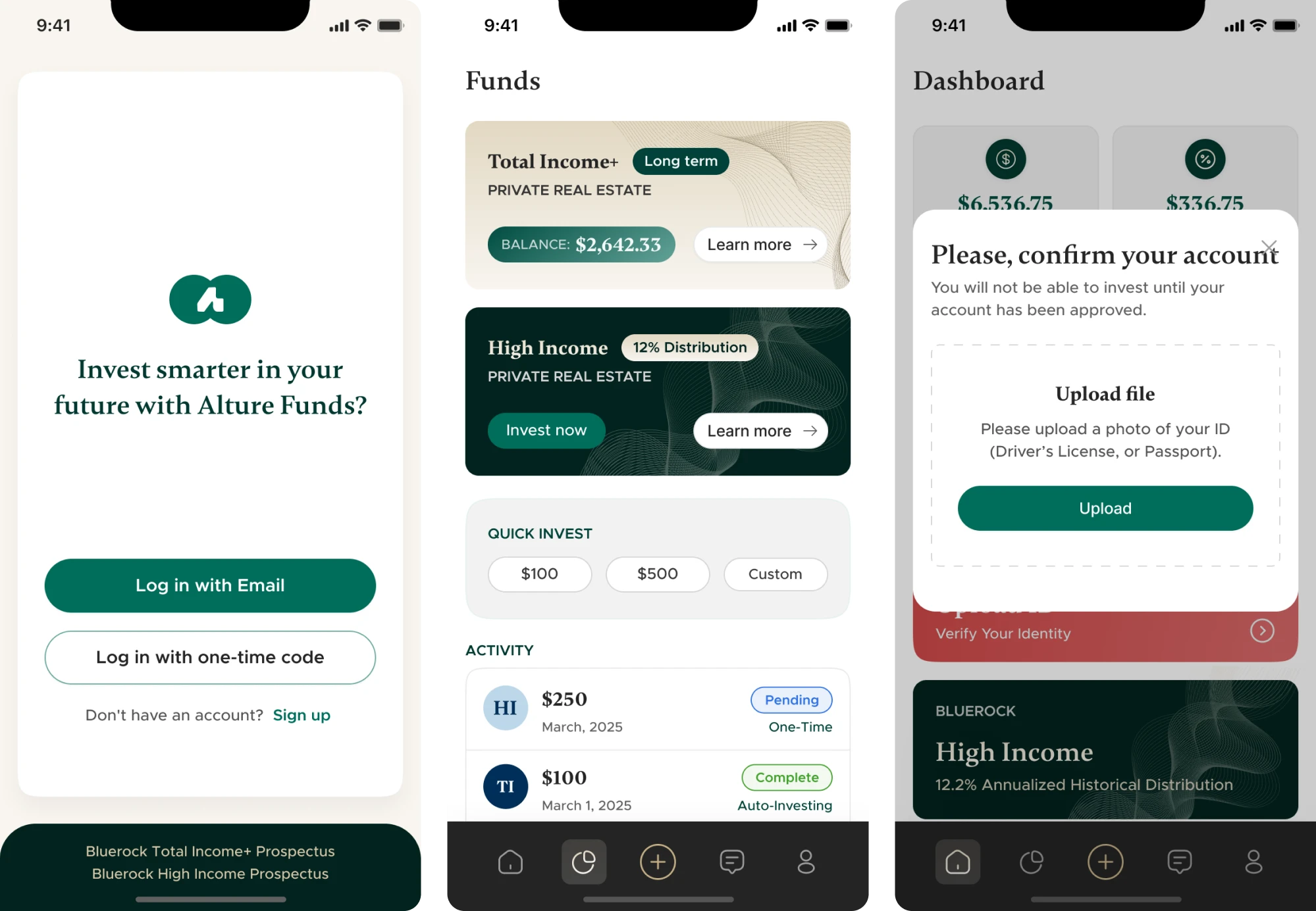
Design patterns that helped us shift the tone:
- A 4-step guided onboarding flow with micro-explanations.
- A light theme is the new default to improve clarity.
- Touch-friendly spacing that works across desktop and mobile.
15. Monobank
Monobank is a mobile-only bank that has become one of Ukraine’s most popular fintech apps, serving millions of users. The important thing is that it has recently achieved unicorn status with a valuation of over $1 billion.
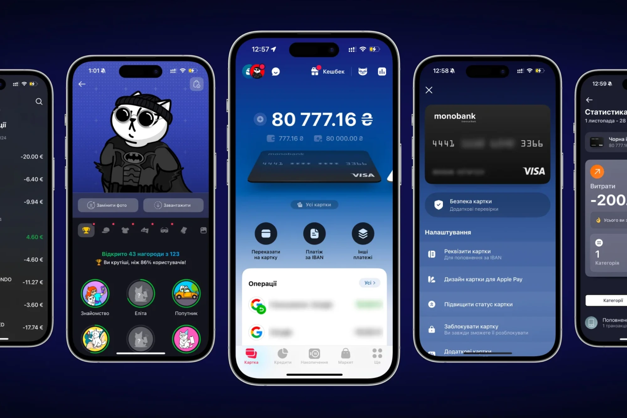
The app set out to make everyday banking simple, and it achieves that through thoughtful UI/UX design. With a cat mascot, witty microcopy, and playful use of emoji, Monobank makes banking feel casual, fun, and human.
Its UI includes swipable cards that keep navigation straightforward. There’s also a light touch of gamification. Users can earn achievements, customize their cat mascot, and enjoy a few surprises along the way.
Things that make the UI click:
- Thoughtful use of gamification to simplify a complex product.
- Dark/light theme mode preferences for accessibility and comfort.
- Customizable features give users more financial control.
The 5 trust-critical moments in fintech UI/UX
As you’ve seen in the fintech UI case studies above, these products vary a lot. And if you explore other design examples, you’ll likely notice even more differences.
But despite all the variation, certain patterns show up again and again, because they’re key to earning user confidence in financial products. In this next section, we’ll walk through five of those trust-critical moments and how to design for them.
Onboarding & KYC
In the financial industry, most onboarding flows break when users are most motivated to get started. They download your app with intent, but then hit multiple KYC steps, sensitive data requests, and a UI that suddenly stops being friendly.
If your onboarding doesn’t reassure, explain, and guide, users drop. To avoid that, here’s what you can rely on:
- Break the flow into small, scannable steps. Show progress early. Users are more likely to finish when they know where the finish line is.
- Use just-in-time education. Don’t drop a wall of legal text. Instead, explain why you need the data, when you need it, and what the user gets in return.
- Make uploading docs lightweight. Use drag-and-drop functionality, inline validation, clear error states, and instant feedback.
- Brand the KYC. White-labeling third-party KYC tools or matching them to your app’s style helps maintain consistency.
Bank connections & permissions
In the world of fintech, the moment a user hands over access to their bank account is one of the highest‑stakes interactions in your design. It’s where hope (of getting things done) collides with fear (of handing over too much).
Get this wrong, and you risk abandonment. Get it right, and you turn the product into a trusted partner. Here are some fintech best practices that help:
- Use clear permission screens that show exactly what data is shared and when. Users should never feel they’re blindly granting access.
- Offer one‑click bank connections (via APIs like Plaid, Tink, or TrueLayer) so users aren’t typing credentials or fumbling through forms.
- Use language that’s human and reassuring (“We’ll access only your balance”, “You can revoke this anytime”) rather than legal jargon.
- Reinforce trust visually with familiar bank logos, recognizable icons, and a layout that keeps users in control throughout the flow.
Payments, transfers & investments
Moving money is one of the most secure moments. Whether someone is sending a payment, transferring funds, or investing, this is when they start wondering, “Is this safe?” or “Did I just do something irreversible?”
To ease that tension, your interface needs to reassure and guide. Here are some design elements that help:
- Show interim states. Loading screens, confirmations, and transaction statuses must transition cleanly so the user is never “lost in limbo.”
- Surface key details early to reduce surprise costs. Show fees, conversion rates, and delivery times before the final “Confirm” tap.
- Offer reversal or “undo” actions. Even if a transfer can’t be reversed, the UI should offer cancel/freeze options or clear paths to support.
- Use feedback and micro‑interactions. Subtle animations, toast messages, or updated transaction cards help confirm actions in a human-friendly way.
Dashboards & reporting clarity
Reporting and dashboards are where user trust becomes visible. When a person lands on that first screen after onboarding, they’re asking themselves: “Am I in control? Do I understand what’s going on?”
If the dashboard is overwhelming, confusing, or inconsistent, that trust starts to crack. To avoid falling into that trap, here are some tips:
- Group related indicators visually. For example, pair balances with recent transactions, or investments with performance, to reduce cognitive load.
- Use consistent visual hierarchy. Emphasize key numbers with size or color; use lighter weight for secondary data.
- Make the interface dynamic. Real-time updates, interactive mini-charts, and responsive feedback ensure user engagement.
- Design for mobile & desktop from the start. Dashboards must adapt. Consistency across devices reinforces control.
Error recovery & dispute handling
When something goes wrong, users experience doubt. They worry they’ve lost money, and scramble to figure out what to do next. In fintech, designing for these moments can either reinforce trust or break it.
Here are specific moves that help you handle errors, refunds, and disputes gracefully and confidently:
- Lead with reassurance. Start the message by telling users their money/data is safe. Then explain what happened and what they can do next.
- Provide a clear next step. After acknowledging the error, offer one or two actionable options: “Try again”, “Contact support”, “View refund status”.
- Offer immediate feedback. Use visible transaction status updates, toast messages, or inline banners. It keeps users in control and avoids panic.
- Maintain consistent design language. Error messages, dispute flows, and refund statuses should look like a part of your digital product.
You’re all set
There’s no shortcut to creating a beautiful, trustworthy fintech product. You have to learn your users’ expectations, understand the rules you’re working within, and design with intention. It’s hard work, but it’s the kind that pays off.
At Eleken, we do that every day. We analyze the requirements, choose the right design solutions, and build products with UX at the core. If that sounds like your kind of fintech product, you know where to contact us.


.png)
.webp)
