

Have you ever thought about how many people left your website or app just because they couldn’t use it? Probably, they were unable to read the small-sized text, got puzzled with a complex site structure, or didn’t notice a low-contrast CTA button. The fact is that something frustrated your potential customers so that they decided to go elsewhere. These barriers not only frustrate users but also lead businesses to miss out on valuable engagement and, consequently, revenue.
According to the World Health Organization, approximately 15% of the global population lives with some form of disability. This statistic underlines the significance of designing digital products that are not only accessible but also cater to the needs of a diverse user base. Inclusive design transcends the traditional boundaries of accessibility to embrace human diversity in its entirety, creating multiple pathways for every individual to feel valued and included.
At Eleken, a design agency specializing in SaaS products, we have long championed the cause of inclusive design. Our approach is rooted in the belief that design should cater to the full spectrum of human diversity, ensuring that everyone, regardless of their abilities or circumstances, can have an enriching and positive experience with digital products. We help clients build products that accommodate a diverse range of users, making sure their solutions are usable by as many people as possible. By adopting inclusive design practices and focusing on inclusive product design from the outset, we enable businesses to create digital experiences that reduce barriers and foster greater inclusion. Through our work, we aim to illuminate the path for businesses to forge stronger, more inclusive connections with their audience.
In this article, we delve into the concept of inclusive design, distinguishing it from mere accessibility, and underscore its paramount importance in today’s business landscape. Let’s dive in!
Inclusive design vs. accessibility
First things first, let’s tackle our terminology.
The inclusive design process involves recognizing exclusion and using inclusive design patterns to approach design in a way that benefits all users.
What is inclusive design?
Inclusive design is a design philosophy that emphasizes creating products and digital experiences that are accessible and usable by as broad a range of people as possible, regardless of their abilities or circumstances. It goes beyond accessibility to include and learn from people with a range of perspectives, ensuring everyone feels included and can fully engage with the product. This is the bedrock of human-centered design: building with the user's diverse reality in mind from day one.
Microsoft, supporting the global inclusivity trend, states on a corporate website: “Inclusive Design is a methodology, born out of digital environments, that enables and draws on the full range of human diversity. Most importantly, this means including and learning from people with a range of perspectives.” In product design, the designer plays a crucial role in ensuring inclusive designs are developed to address the needs of diverse users from the earliest stages of the design process.
Maybe you’ve heard about universal design. So are the universal and inclusive design the same?
Comparing universal design vs. inclusive design, there will be a distinct difference in their key purpose. Whereas the universal design aims to create one way so that as many people as possible can use it, the inclusive design develops various solutions suitable for those who are usually excluded. An example of the inclusive design would be accessibility widgets on websites or custom responses on gender-related questions in typical data collection forms.
How does inclusive design differ from accessibility?
While both inclusive design and accessibility aim to make products usable by people with disabilities, inclusive design takes a broader approach by considering the full range of human diversity. Inclusive design aims to reduce barriers for a broad range of diverse groups, ensuring that products and experiences are accessible and welcoming to everyone. Accessibility typically focuses on technical standards to accommodate users with specific disabilities, whereas inclusive design seeks to create multiple ways for all users to participate.
Let’s see how famous products adhere to the principles of inclusive design.
1. Intercom Messenger
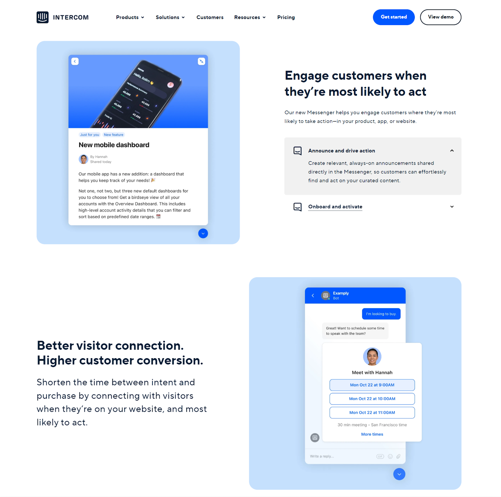
Intercom Messenger is accessible and fully complies with WCAG 2.0 guidelines.
The features that make the Messenger accessible are:
- Screen reader support
- Keyboard navigation
- Color contrast
Also, Intercom Messenger provides a possibility to include descriptions of images and captions of videos you share.
The company’s website has a clear and easy-to-follow structure. Text blocks alternate with images and make it easy to percept the information.
2. Zendesk

Though Zendesk is not fully WCAG compliant yet, they follow WCAG 2.0 guidelines to provide their customers the best possible experience. Zendesk demonstrates a strong commitment to accessible design by ensuring its digital products are usable by people with disabilities, incorporating principles such as providing text alternatives for images to enhance usability for users with visual impairments.
Zendesk products include these accessibility features:
- Clear navigation, page titles, and headings
- Keyboard shortcuts
- Image tagging and text alternatives
- Comprehensive links
- Color recognition
Here you can find the full features list for your reference.
3. Salesforce

Salesforce products meet WCAG 2.1 guidelines. They are accessible to all people, including those working with assistive devices such as speech recognition software and screen readers.
Depending on the product, the design features include but not limited to:
- Meaningful page titles
- Logical page layout
- Text magnification up to 150%
- Captions for videos
- Screen readers
- Keyboard navigation
- Images alternative text
- Color contrast
4. Userway

Userway is the world-leading provider of an automated website accessibility solution that can work on different platforms. Userway’s accessibility widget can easily activate multiple features that make the website design inclusivity-friendly. Users can also activate a new feature designed to improve accessibility for a broader range of needs.
The widget switches on:
- Keyboard navigation
- Screen reader
- Text magnification
- Special dyslexia font
- Dark and light modes
- Invert colors
- Color desaturation
Also, it can show the page structure, highlight links, and pause animations.
5. Headspace
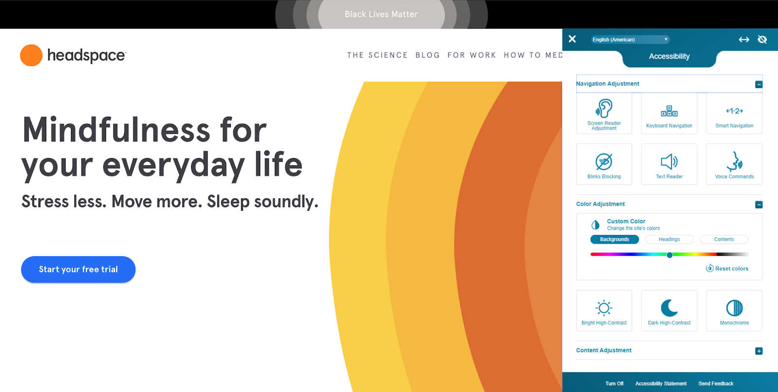
Headspace‘s website also has a customizable widget, giving the possibility to activate necessary features according to a particular user’s needs. These adjustments are especially helpful for older adults, as features like text magnifiers, readable fonts, and high-contrast modes enhance usability and foster independence for individuals with age-related needs.
The widget provides these kinds of adjustments:
- Navigation – screen and text reader, keyboard navigation, voice commands
- Color – background change, dark and bright high-contrast, monochrome
- Content – text magnifier, image descriptions, readable fonts
Apart from the widget, the Headspace website design has a clear layout, good color contrast, large buttons, and self-explanatory links.
6. Microsoft
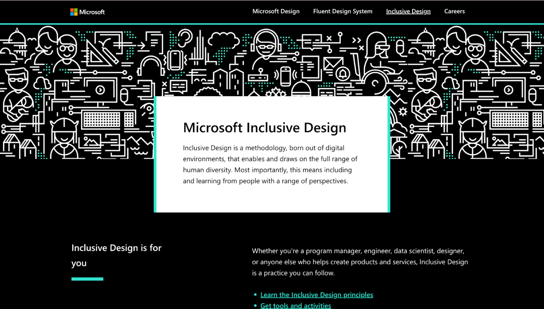
Microsoft champions inclusive digital experiences through both its products and its Inclusive Design Toolkit — a practical guide for teams looking to design with accessibility and diversity in mind. The toolkit provides frameworks to recognize exclusion and develop solutions that extend to the broadest range of users. This structured approach is especially effective when developing UX examples for seniors, as it addresses common barriers like reduced motor control or visual clarity.
Key accessibility and inclusion practices across Microsoft products include:
- Navigation – keyboard shortcuts, screen reader compatibility (VoiceOver, JAWS, NVDA), easy tabbing
- Visuals – high color contrast, resizable text, dark mode themes
- Content – plain language, alt text for images, captions for all videos
Microsoft embeds inclusive thinking early in the design process, helping product teams bake accessibility into every layer of the experience.
7. Apple (VoiceOver & AssistiveTouch)
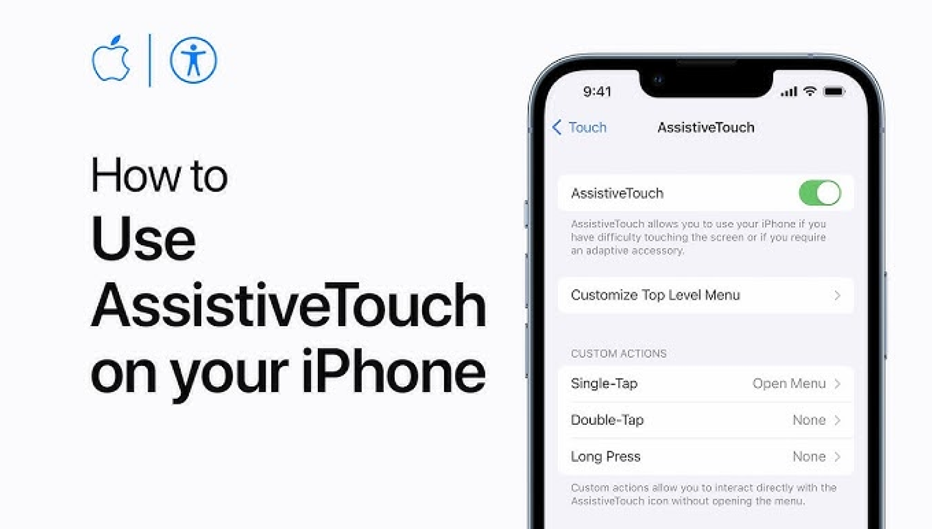
Apple integrates inclusive features deeply into its ecosystem, blending hardware and software to serve users with a variety of physical and sensory needs. These features are available by default on iPhones, iPads, Macs, and Apple Watches.
Accessibility tools include:
- Navigation – VoiceOver screen reader, Siri voice commands, touch accommodations
- Interaction – AssistiveTouch for users with limited mobility, switch control, haptic feedback
- Visuals – Magnifier tool, color filters, dynamic text scaling
Apple’s commitment to inclusive design helps ensure its devices are usable by the broadest possible audience—without requiring extra installs or extensions.
8. Nike (Go FlyEase Sneakers)

inclusive design system example
Nike’s Go FlyEase sneakers are a standout example of inclusive design applied to physical products. Originally intended for people with limited mobility, the hands-free shoes now serve a wide user base looking for comfort and convenience.
Design adjustments include:
- Functionality – no-laces, bi-stable hinge design for easy step-in/step-out use
- Usability – secure fit without manual fastening
- Inclusivity – accessibility benefits marketed without stigma
Nike’s approach shows how inclusive thinking leads to innovations that benefit not just a niche audience, but the masses.
9. BBC (GEL – Global Experience Language)

The BBC’s Global Experience Language (GEL) is a design system built with accessibility in mind. It ensures consistent, inclusive digital experiences across BBC platforms.
Inclusive features include:
- Keyboard and screen reader support
- High-contrast, responsive UI components
- Subtitles, transcripts, and audio descriptions for media
- Clear layout and scannable content structure
BBC also shares accessibility testing standards, helping teams build usable products for a wide range of users.
10. Figma

Figma is not just a collaborative design tool — it’s a platform that enables inclusive product design by supporting accessibility-first workflows and inclusive design thinking.
Key inclusive elements:
- Native support for screen reader navigation
- High color contrast across the UI for visually impaired users
- Keyboard-first navigation
- Plugins like Able and Contrast to check color accessibility and semantic structure within design files
- Community-led resources to help designers incorporate WCAG standards into their workflow
Figma empowers product teams to build accessible and inclusive digital products from the earliest design stages, making it a strong example of how inclusive tools drive inclusive outcomes.Now that you’ve seen how brands can tackle inclusivity and maybe got a bit of inspiration, let’s tackle some theoretical questions.
Why is inclusive design important?
If we omit the global value of inclusivity and consider it from a business perspective, the answer is pretty straightforward. The more people you reach, the more you increase your market share and pool of potential customers.
The inclusive design serves as a strong base for beneficial business-customer relationships and adds one more point to your company’s social responsibility score. Implementing inclusive design practices can also enhance your brand reputation by showing a commitment to all customers and employees, which builds public trust and long-term success. Also, being down to earth, making your website accessible can merely protect you against lawsuits. If many people can’t access your product, they can blame you for discrimination—this problem you likely want to avoid.
While the inclusive design is a mindset, accessibility remains its core objective. It’s never too late to make your website and products more accessible to ensure better business results.
Can inclusive design benefit users without disabilities?
The answer is also: absolutely. Inclusive design benefits everyone, not just those with disabilities. By addressing diverse needs, inclusive design ensures that digital experiences are accessible and equitable for users with a wide range of requirements, abilities, backgrounds, and preferences. For example, larger text and clear navigation can improve the experience for older users, while voice recognition technology can make multitasking easier for all users. The principles of inclusive design enhance the overall usability and satisfaction for a diverse user base, including those with temporary or situational limitations.
What does it mean for a website to be accessible?
As it’s been mentioned above, accessibility is one of the main goals of inclusive design. Every page on your website should be easy to understand, use, and navigate for all users, including those with permanent or temporary disabilities, either physical or mental. Disabilities that complicate or make it impossible using the web include vision impairment, visual impairments, hearing impairments, as well as auditory, cognitive, neurological, and speech impairments.
However, improved accessibility also benefits people with age-related disabilities who have poor sight and weak memory, as well as those with situational limitations like a broken leg, lost glasses, or working under too bright sunlight. This is particularly vital in UX design for children, where cognitive development and motor skills are still maturing, requiring simplified interfaces and clear, immediate feedback.
Web accessibility is regulated by guidelines that cover recommendations for making digital products more usable for people with special needs.
ADA compliance and WCAG guidelines
ADA stands for Americans with Disabilities Act and communicates a prohibition of discrimination on a disability basis. The ADA principles underlie Web Content Accessibility Guidelines (WCAG).
The Web Content Accessibility Guidelines require a website to be:
Perceivable: if a person can’t see, they can read written content by a screen reader. Audio content has captions for those who can’t hear
Operable: if a user is unable to use a mouse or touchpad, they can navigate by keyboard or voice commands
Understandable: if people click on a navigation menu or a form, it behaves in an expected way
Robust: the website or product is compatible with current assistive technology and has the capacity to extend to its future versions
Inclusive design patterns provide practical approaches to meet these WCAG guidelines by addressing the diverse needs of users and ensuring accessibility for all.
And now we’re getting closer to the design itself.
Inclusive design principles
Implementing inclusive design starts with a commitment to understanding and valuing human diversity. Businesses can begin by conducting user research to identify the needs of diverse users, including those with disabilities. Following best practices and guidelines, such as the Web Content Accessibility Guidelines (WCAG), is crucial. Adopting inclusive design practices and following an inclusive design process help reduce barriers for all users, ensuring products and services are accessible and usable by everyone.
If to translate accessibility in UX guidelines into the design language, they would be saying the following:
- Use distinct colors and good contrast
- Write in simple language and use bullet points
- Create the logical, easy-to-follow layout
- Break content with images and videos
- Design large buttons and make them distinctive
- Use readable font size and ensure text magnification
- Describe links comprehensibly
- Enable keyboard navigation
- Provide subtitles for video and transcripts for audio
- Add descriptive alt tags to images
This list doesn’t pretend to be extensive, including all the requirements of inclusive graphic design. I outlined those that would be great to focus on when working on your website accessibility improvement.
Let’s see how big and not that big brands build the inclusive UX design and learn what we can implement on our end.
A final word
The importance of inclusivity and web accessibility continues to grow.
Based on inclusive design principles, your digital products will provide a seamless user experience to all users, no matter whether they have a temporary or permanent disability.
Also, inclusive design implementation will make your website usable to a broader audience and attract more potential customers to your business.
Contact us at Eleken if you want to develop an inclusive design for your product. We specialize in creating a user-centered design for SaaS and always ready for new challenging projects.


