.webp)

As banks and fintechs race to make finance seamless, they largely remove friction. And for a reason.
Reality check: a whopping 70% of financial companies worldwide lose clients due to inefficient onboarding alone, up from 67% in 2024 and 48% in 2023.
But while users look for speed and instant access, they also demand absolute security. Given that a single misstep can trigger costly errors, a touch of friction isn’t the enemy of fintech customer experience – it’s a signal of care.
Indeed, if implemented smartly, friction feels invisible until it’s needed.
At Eleken, we call this friction-right design: a user experience that preserves security features while feeling seamless. In this article, we'll guide you through a fintech UX design framework for balancing friction, improving adoption, and boosting retention – all based on real user insights and backed by Eleken’s design expertise.
The anatomy of fintech friction
At Eleken, we break friction into three main types – each with its own causes and design ‘remedies’.
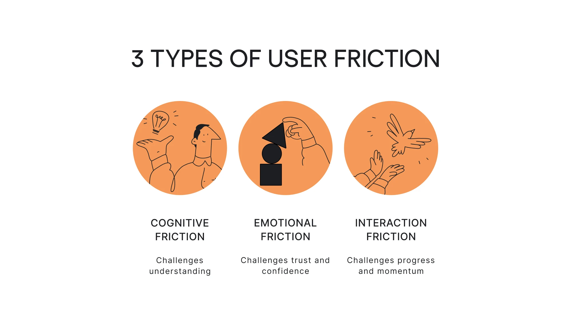
1. Cognitive friction
Cognitive friction occurs when users get confused and must think too hard to understand your financial app or navigate a process. This happens when cognitive load is too high – often due to designs that break user expectations, lack intuitiveness, or use jargon and unclear language.
Examples:
- Complicated navigation menus with unclear labels.
- Inconsistent design elements that make new customers guess what will happen next.
- Overly technical language or unfamiliar icons can complicate financial processes further.
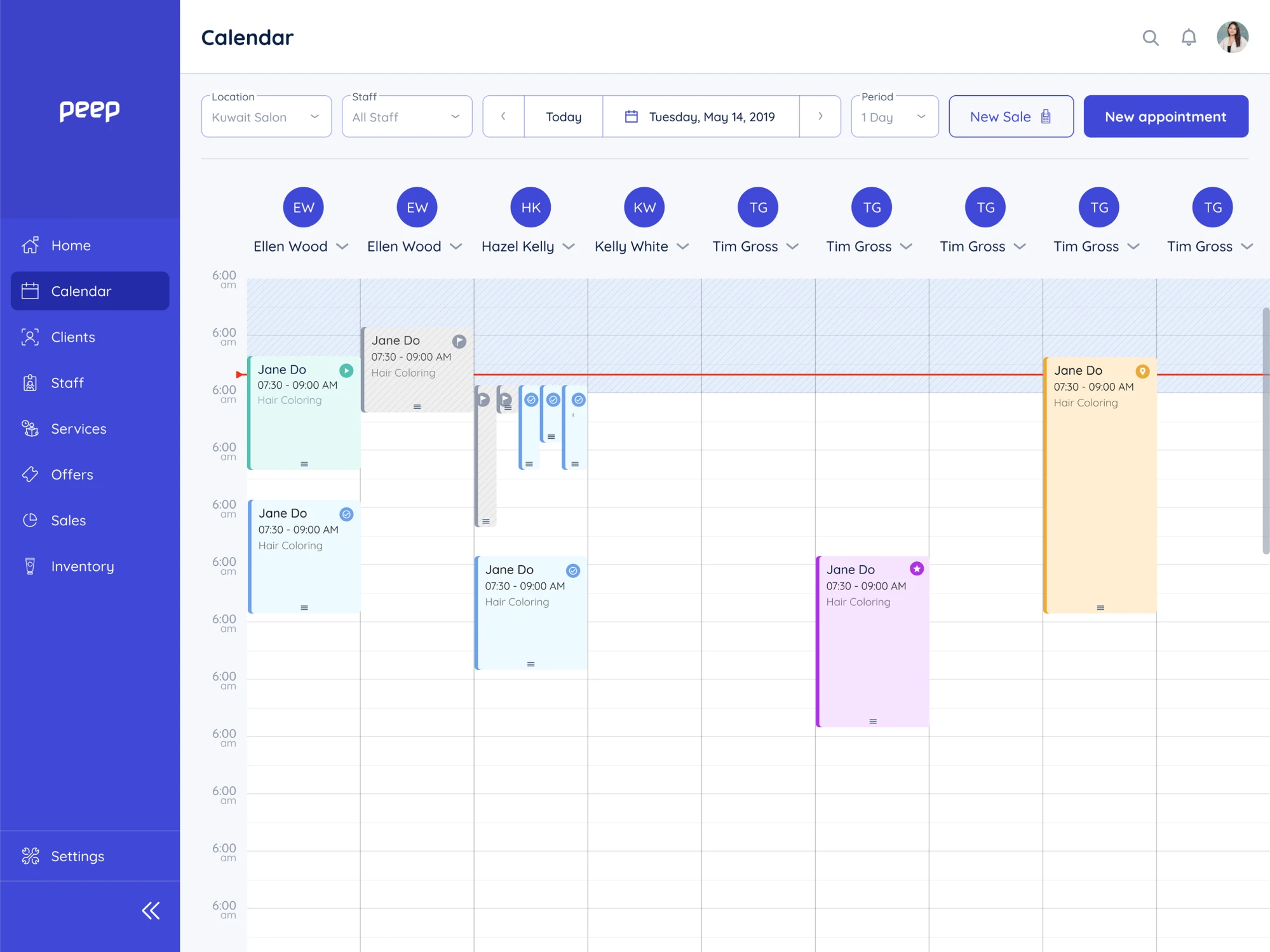
For instance, here’s a real example from our UX audit for BookPeep. The home screen overloaded users with too many appointment blocks, making it difficult to focus or understand what mattered at a glance – a classic case of cognitive friction.
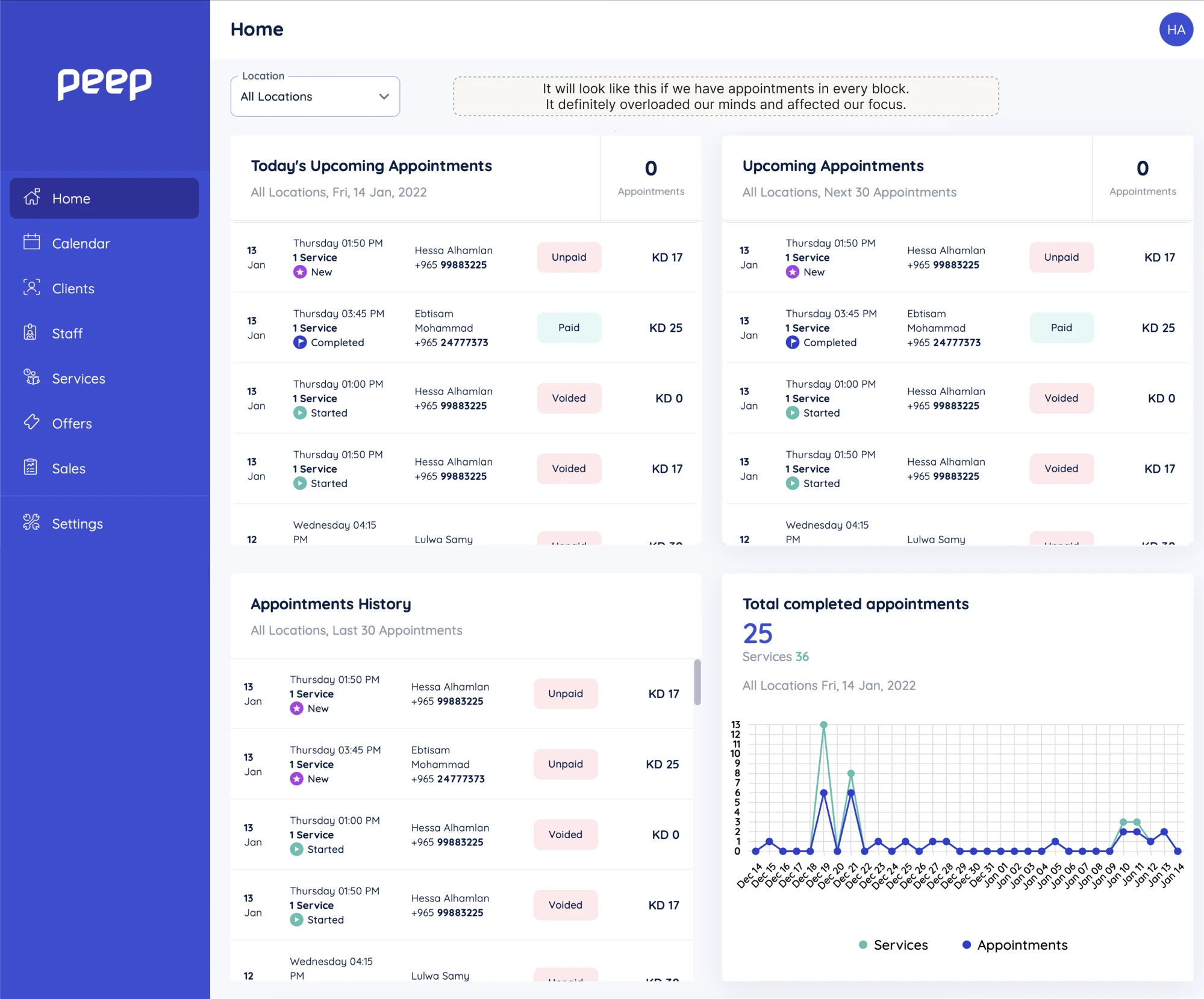
We recommended a cleaner, more concise layout to reduce cognitive load and help users quickly grasp upcoming, current, and past appointments without feeling overwhelmed.
2. Emotional friction
Emotional friction arises when users feel frustrated, distrustful, or hesitant while interacting with a product, often due to security concerns or privacy and reliability issues.
Examples:
- Being asked to share credit card details without clear security indicators.
- Pushy prompts or pop-ups that make many users feel pressured or uncomfortable.
- Lack of clear or clear feedback that leaves users uncertain about the outcome of their actions.
To show how emotional friction appears in real products, here’s an example from our redesign of a fintech startup PayUp. Users were asked to provide sensitive data during onboarding, but didn’t see strong cues that the process was private and secure, which created hesitation and distrust.
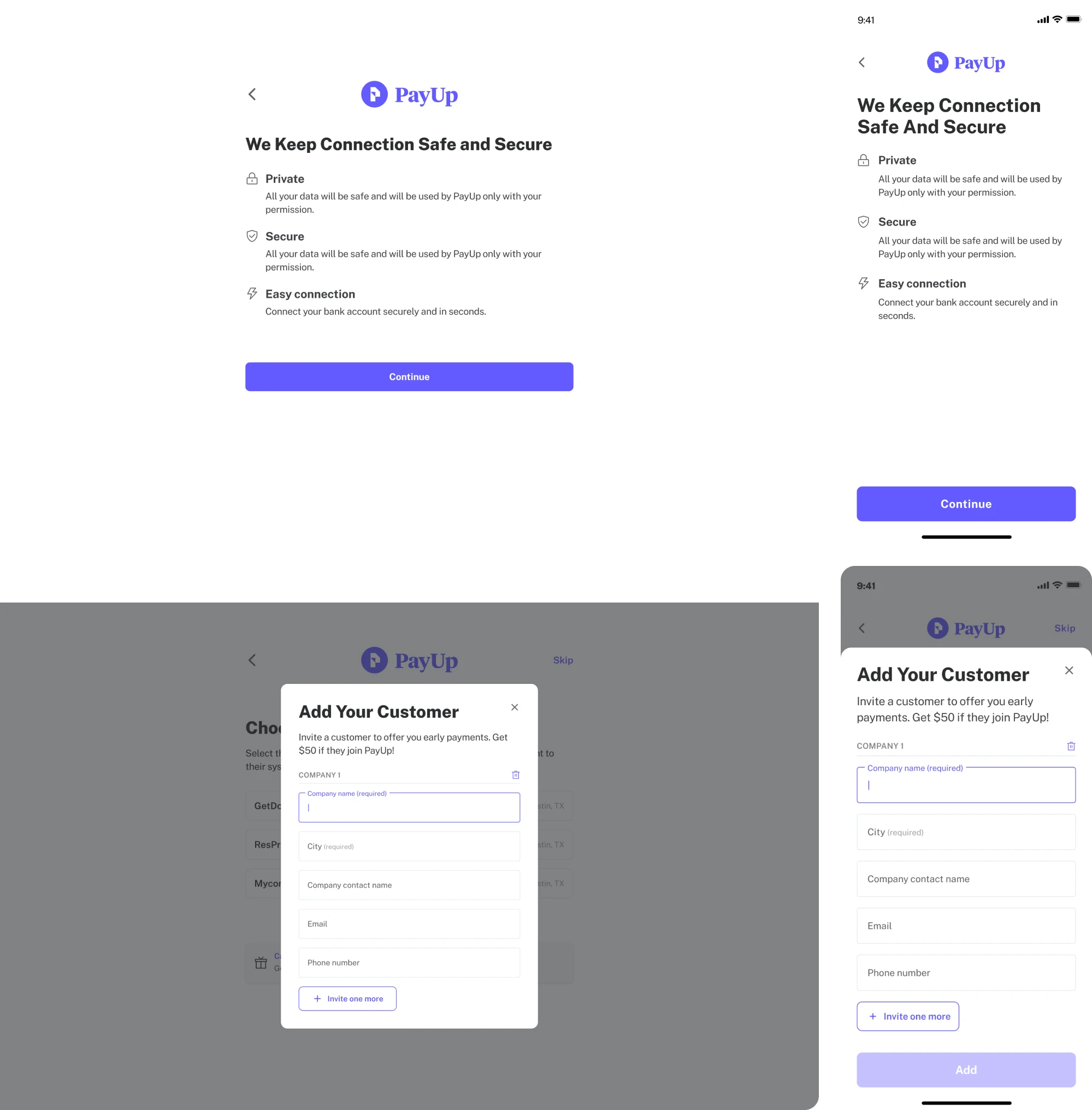
We designed the flow to break requests into small, reassuring steps and added clear explanations and security messaging. This way, we wanted to help users feel safe, informed, and confident during sign-up – critical for any fintech product handling sensitive information.
3. Interaction friction
Interaction friction happens when users face unnecessary steps, complex processes, or disjointed workflows that slow down progress and create user frustration – especially when they’re on mobile phones and expect instant results.
Examples:
- Lengthy sign-up or checkout processes with multiple redundant steps.
- Poor handoffs that force users to repeat information.
- Broken or delayed biometric authentication loops that prevent users from completing critical actions.
As these frictions are largely intertwined, financial apps typically contain all three sorts of UX friction to some extent.
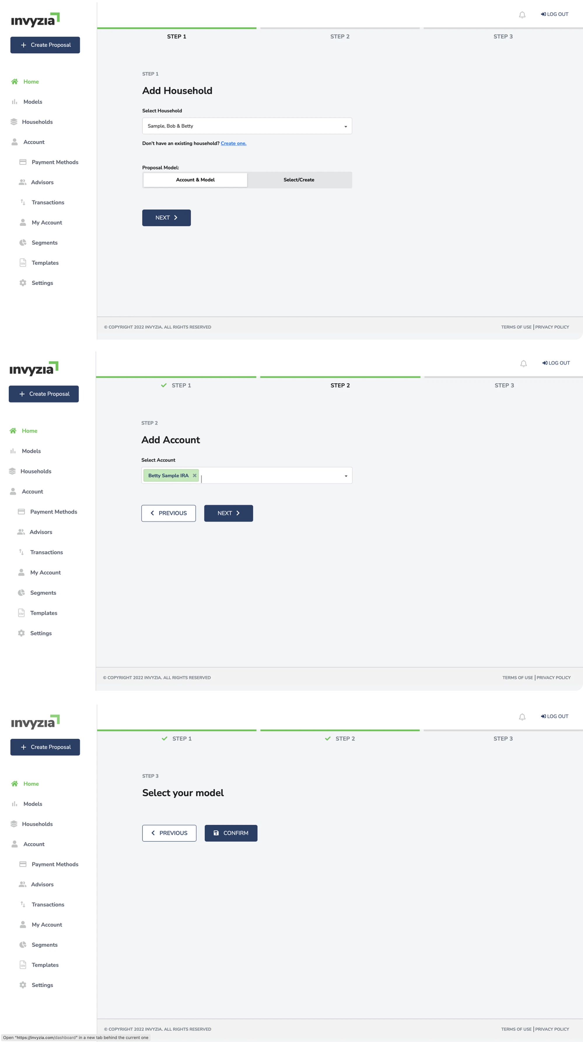
For instance, Invyzia Solutions, a niche platform for financial proposals, ran into many friction points, one of which was that their proposal-creation flow forced users through multiple sequential steps, creating unnecessary friction and slowing the process.
We simplified the experience by replacing a three-step process with a single, well-structured page where all proposal data is visible and editable at once. As a result, we reduced friction and brought simplicity in UI/UX design, turbocharging customer engagement and ensuring compliance.

Enhancing UX by reducing friction (without reducing trust)
Reducing friction in fintech UX design doesn't mean sacrificing security. In fact, mandatory steps can feel natural and build trust with new users if you approach and design them carefully.
Here are four ways to make it work:
1. Explain the “why” behind every ask
Make data sharing less overwhelming by adding an empathetic microcopy that explains not just what you're asking for, but why it matters to the user.
Consider the difference between a bare "Verify your identity" button and one accompanied by "We verify ID to protect your funds, not to market your data."
Feel the difference? The second version tackles the user's doubt upfront, before it makes them quit.
After working with 200+ SaaS companies and running countless UX audits, we’ve seen how much clearer users behave when every field offers an explicit benefit or reassurance. When people understand why information is needed, completion rates rise and hesitation drops.
2. Visualize progress & predict time
Following user onboarding UX patterns can make or break first impressions. Every second a new user spends wondering "how much longer?" is a second closer to abandonment.
Consider the following to add transparency and reduce onboarding drop off:
- Progress bars or step counters – to give users a sense of control and forward momentum.
- Estimated time of arrival (ETA) text – to increase the likelihood of finishing. (e.g.,“60 seconds left”)
- Microanimations – to provide positive reinforcement that keeps motivation high.
Such design choices have a huge impact on perception – users feel far less friction even when time stays the same.
3. Borrow trust through design
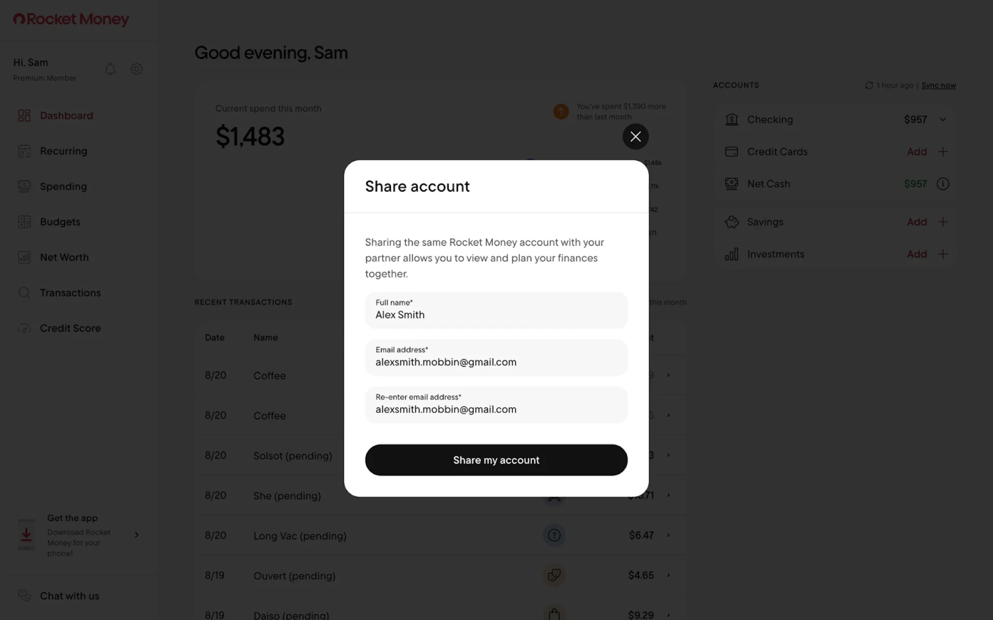
Leverage existing trust instead of building it from zero. Stop hiding security partnerships in footers.
Instead, integrate "Powered by Stripe/Plaid/Yodlee" badges directly into high-friction steps – financial accounts linking, payment screens – where users actually see them.
Remember: footer badges serve compliance; in-context badges serve conversion.
At Eleken, we call this Trust Transfer UX – a technique that leverages existing user confidence in established brands to maximize conversion and reduce fintech user friction during key decision points.

4. Offer a “try-before-you-trust” path
Users may stall at the start, and that’s okay. Provide a manual or demo data option to remove the initial barrier and showcase what your financial platform can do.
Here’s how such a flow works:
1. Sandbox: Users test the product safely with sample data.
2. Aha moment: They get to know its value – insights, visualizations, predictions, or useful automations.
3. Meaningful CTA: Frame account linking as the natural next step to unlock the full experience.
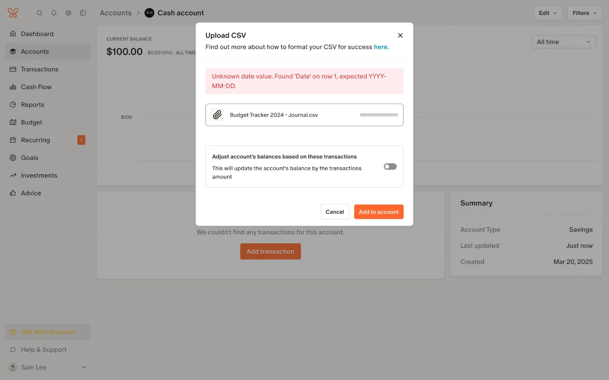
Reducing onboarding friction: progressive KYC in practice
Before users can access financial services, they need to pass KYC – Know Your Customer verification. Users have to submit personal details, documents, and sometimes a selfie to prove they are who they claim to be.
Yet there's a harsh reality floating around Reddit: "KYC is where intent dies."

While being true, verification doesn't have to be a conversion killer. In fact, progressive KYC design combats onboarding friction, helping you strike a balance between security and fintech user experience. Here's how to apply it:
1. Tiered KYC (progressive disclosure)
Instead of demanding everything upfront, break KYC into bite-sized steps – revealing verification requirements gradually.
Start with lightweight credentials like email and phone to unlock basic features.
As your users explore and show genuine interest, introduce full KYC requirements like PAN cards and selfie verification.

2. Guided & resumable verification
Don't dump all data requirements into the first screen. Rely on these tips to enhance conversion:
- Break verification into small, mobile-friendly steps that feel manageable rather than overwhelming.
- Implement auto-save functionality, allowing customers to pause without losing progress.
- Leverage one-click deep links to guide users seamlessly back into the flow.
- Deploy real-time validation to timely catch photo quality issues, form errors, and ID recognition problems before rejection kills momentum.
As you give customers the feeling of control, they're less likely to abandon the flow.
3. Trust-building design elements
When it comes to trust, even tiny details matter. Yep, the user sees it all.
Make sure to consider the following:
- Avoid legal jargon: explain in plain language why each document is needed to bring clarity and build trust.
- Display trust signals prominently: highlight your PCI DSS certifications, GDPR compliance badges, and encryption indicators.
- Friendly tone: design a warm, conversational messaging that both acknowledges the effort and helps reassure users.
All in all, users don't mind verification – they mind uncertainty.
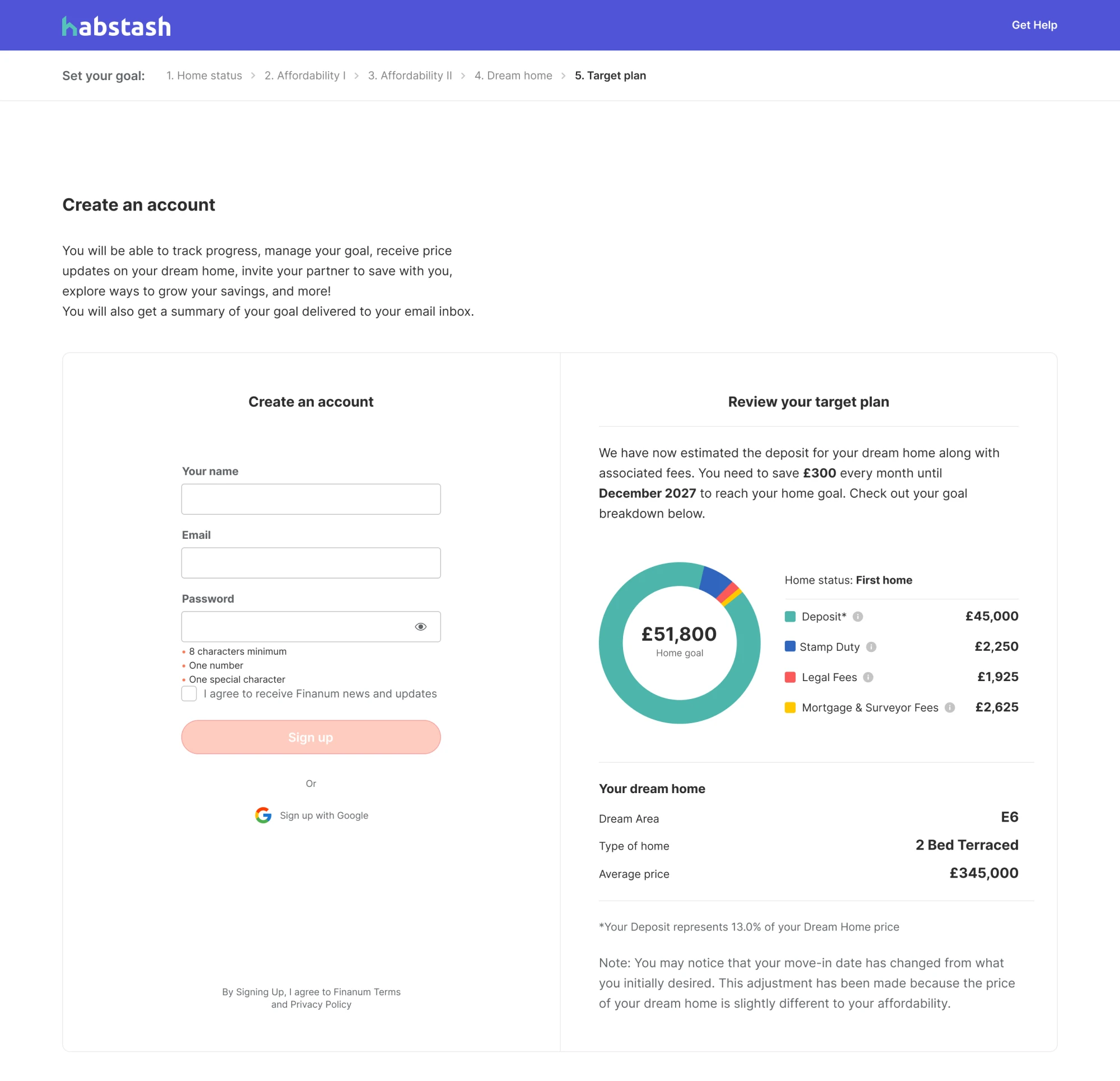
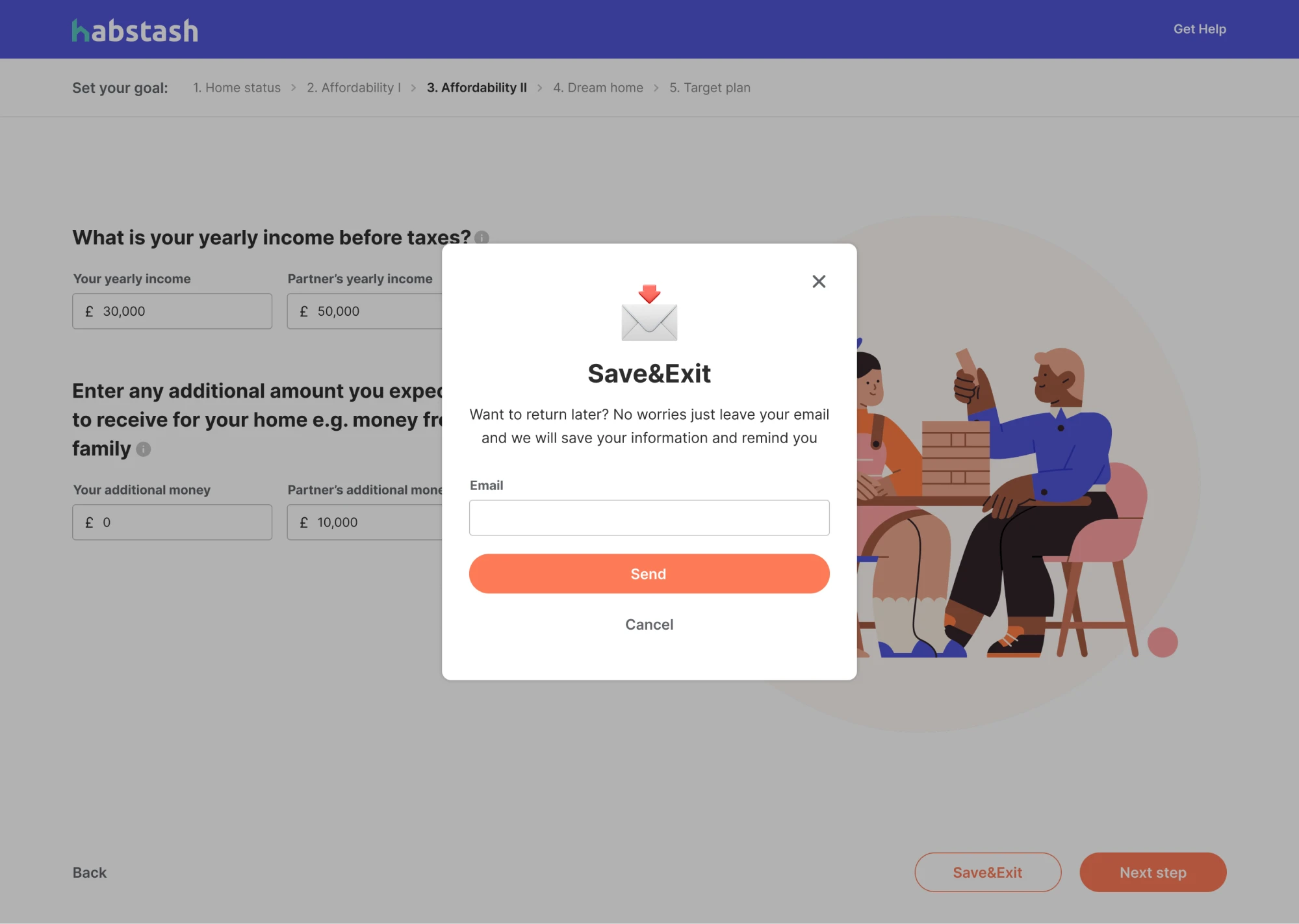
A good example comes from Habstash, a startup that helps users save for home ownership by turning financial planning into clarity. The Eleken team helped design a wizard-style customer onboarding flow that broke data collection into well-arranged bite-sized steps.
Such a solution made the process feel more manageable and kept users engaged.
Among other essential features, we also introduced real-time validation to catch input errors and employed a save-and-exit functionality, and email reminders to let users jump right back into the flow anytime later.
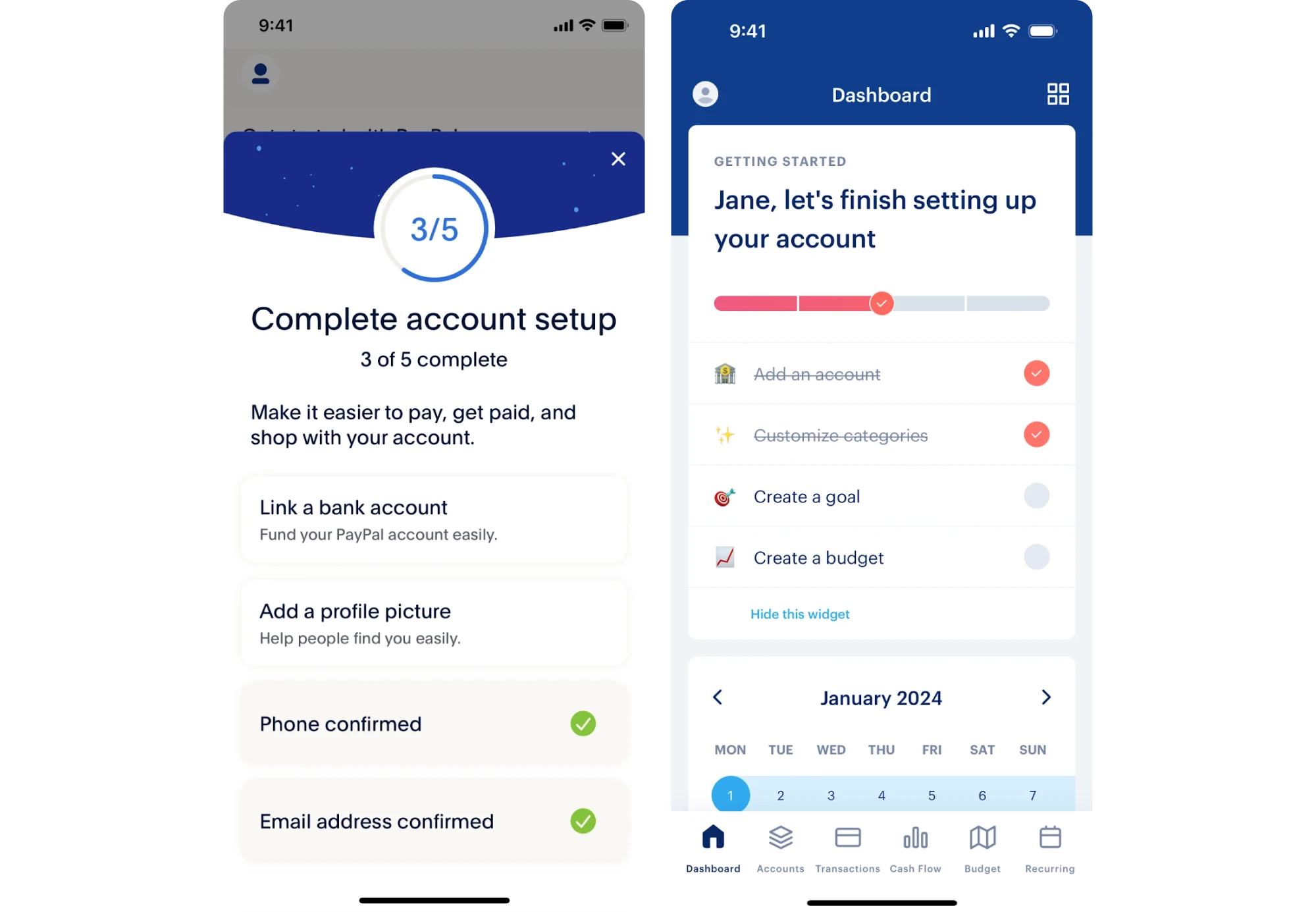
Improving adoption: from signup to “Aha” moment
The key to user adoption is turning first use into first win. The better impression you craft, the higher the chances of creating momentum that ultimately drives adoption.
Consider these points to facilitate a frictionless signup flow:
1. Design for instant value
Rather than overwhelming users with features, surface one meaningful insight that immediately proves the product’s worth during the fintech onboarding process.
Even a small but concrete insight like “You just saved $50 in fees” can validate the user’s decision to sign up.
Mind to prioritize feature hierarchy. Spotlight primary value first, and leave secondary options for later. A focused first impression is what converts curiosity into commitment.
2. Behavioral nudges
The post-onboarding phase is when enthusiasm meets reality – and without guidance, reality usually wins. Employ strategic nudges to transform passive accounts into active users by prompting a high-value user behavior: funding an account, setting up autopay, or hitting that first savings milestone.

Eleken's tip: generic "Did you know…" notifications train users to ignore your prompts. Shift to goal-based triggers that feel relevant rather than intrusive.
3. Social proof & transparency
In an industry where "trust us" has become a punchline, social proof and transparency become your hard currencies.
Showcase real testimonials, reference Trustpilot reviews, or deliver in-app stories from users who've hit meaningful milestones. Blur faces for privacy, but keep the details specific.

Simultaneously, build a transparency dashboard: a single, accessible screen that gathers everything most users worry about: data usage, fees, app permissions, and more.
After all, Reddit community wisdom has a point: trust isn’t claimed, it’s shown through clarity.
Retention & churn reduction through friction management
As customer acquisition costs go sky-high, fintech user retention stands as the goldmine that shouldn't be overlooked. Market stats prove it best: fintechs that reduce churn by 5% typically experience over 25% profit growth.
Sounds game-changing for a modest 5%, right?
But user churn often results from invisible friction – small issues that compound until users quit entirely.
Follow these four steps to minimize fintech user friction and boost customer lifetime value (CLV).
1. Measure and fix hidden friction
Combine analytics and session replay tools to map drop-off clusters. This way, you can see whether users are abandoning during ID upload retries, or maybe they're stalling at payment setup, etc.
A real example comes from our work with myInterview. Funnel analytics revealed a critical drop-off – over 90% of candidates abandoned the interview flow.
When we layered this data with qualitative insights from screen recordings and UI audits, it formed a clear friction heatmap: confusing input patterns, unclear multi-select behavior, missing feedback, and misleading UI metaphors. This helped us pinpoint where redesign efforts would have the greatest impact and ultimately reduce churn.

2. Add assistive UX for critical tasks
Maintain engagement during high-stakes moments. Deploy live chat and offer contextual help on every “risky” screen – from completing KYC to making sure money transfers land where they should.
Experiment with lightweight AI assistants leveraging machine learning to answer common “why” questions instantly, helping users feel guided step by step.
3. Enable proactive re-engagement
Friction management doesn’t end when users leave the screen. Win your users back with smart re-engagement: utilize automated reminders at strategic intervals (1h → 24h → 3d → 7d) to encourage completion of critical flows, especially in the middle of the funnel ( MOFU) stage.
Don't nag, rather motivate – create non-intrusive messaging that focuses on progress already made: “You’re just two steps away from activating your account”.

4. Reliability as UX
As 90% of users expect immediate help, quick support is a real currency. Show up for your users with clarity and speed before friction grows and trust depletes.
Besides, make sure to complement support with real-time status updates, clear SLAs, and expected latency for every critical process (e.g., “Identity verification – typically takes under 3 minutes.”).
UX design best practices: the Eleken toolkit
Throughout 10 years of hands-on design, the Eleken team developed its own practical systems and actionable frameworks.
Below, we’ll share some time-tested handy tips that help design a SaaS product with flying colors.
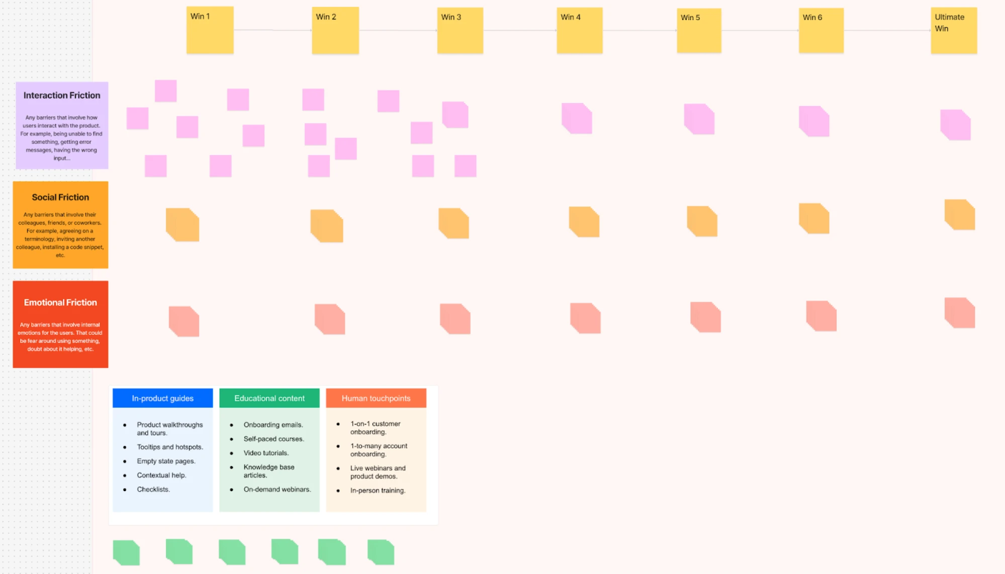
1. Friction map template
Embrace Friction Map Templates to plot the tension between what users want to accomplish, the verification required, and the actual risk involved. Share the result with stakeholders to justify every point of friction or eliminate it entirely.
Here’s a free Figma template with essential instructions and an editable layout, ready for you to use and adapt it right away:
2. Microcopy & tone kit
Every step of the user journey should be accompanied by clear and trustworthy messaging. Create a small library of short, user friendly messages and reassurance lines to support critical user flows like KYC, accounts linking, permissions, etc.
That’s how it could look for KYC verification:

3. Accessibility & inclusivity
Prioritize accessibility and inclusive design practices to reduce friction in fintech apps for all users, making digital banking more welcoming and practical. Focus on the following:
- Plain-language alternatives for legal or compliance copy.
- Haptic feedback and clear visual cues for confirmation states.
- Color-safe alerts and high-contrast error states to meet WCAG standards.
4. Experimentation framework
Take the guesswork out of optimization with an A/B testing matrix for systematic friction removal. Start with the copy, then step sequencing, then automation, and finally fallback experiences.

It’s never a piece of cake to design data-intensive applications. For Prift, a personal finance assistant platform, Eleken has designed several wireframe versions of key screens, such as the pension portfolio breakdown. The screens varied in their navigation and data visualization elements.

A/B testing revealed clear user preferences that directly shaped the final design. Most participants favored a version featuring a simplified portfolio breakdown instead of a diagram.
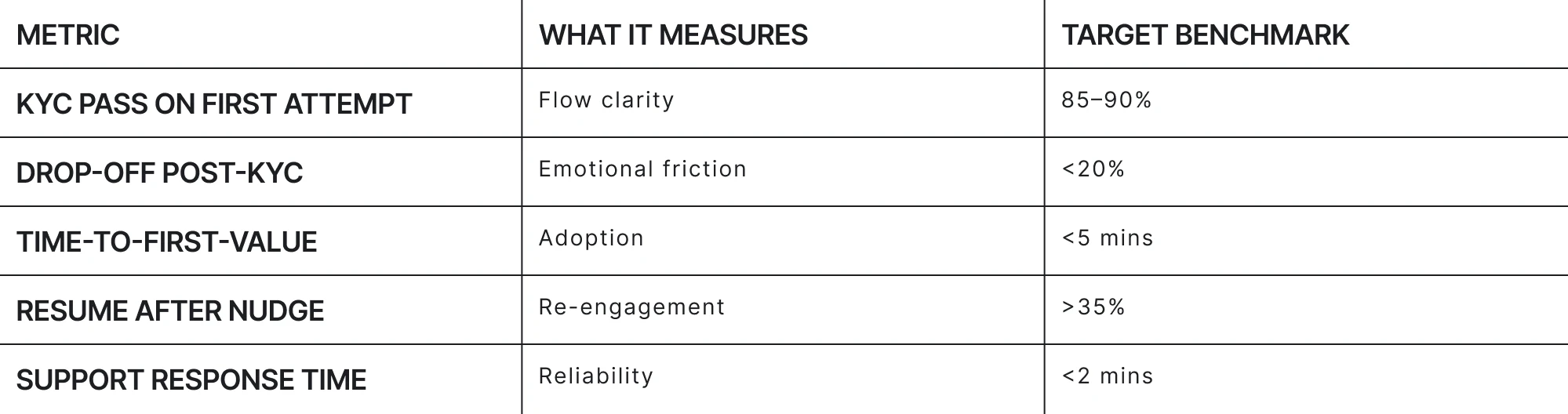
5. Fintech UX metrics dashboard
Up to this point, we’ve extensively covered friction management and churn reduction strategies. To wrap it up, here we’ve gathered relevant benchmarks for key fintech UX metrics to help your teams measure what truly matters.
Friction as a Design Choice
Yes, in the financial technology world, seamless design and friction must coexist. But as we’ve already said, not all friction is bad. Only the one that feels purposeless.
When users understand why they're being asked to wait, verify, or provide information, friction becomes a feature – not a bug.
Fintech app design can naturally embed regulatory compliance without disrupting flow. Seamlessly aligning anti–money laundering checks with familiar interactions or subtle cues in visual design is a fairly doable job. Real life examples above prove it quite well.
Just deploy the right security measures at the right moments, wrapped in the right messaging. That's the winning formula to turn first-time users into real customers.
At Eleken, we design trust into every click. From sign-up to retention, we've helped dozens of fintech companies turn their most friction-heavy moments into experiences that drive user satisfaction and increase customer retention.
If you’re building a fintech app and seeing drop-offs during onboarding or KYC, let’s map your friction together. With Eleken's UX team by your side, a path from confusion to user confidence is closer than you think.


.png)
