.png)

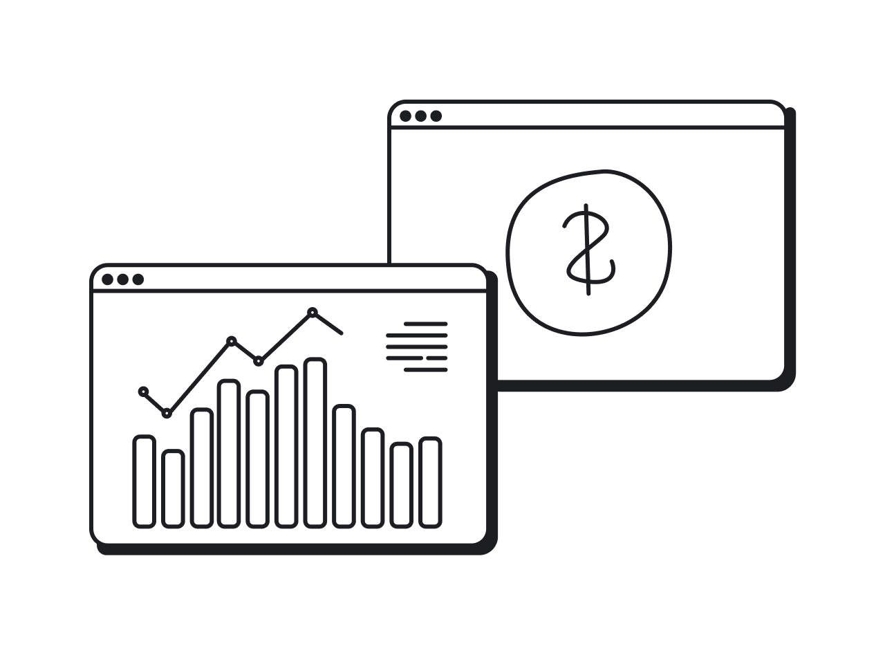
“Money? I don’t know where my money goes. On payday I have cash, then, one moment it’s just… gone.” That’s an endless circle of bad money habits, and it sounds familiar to most humans on planet Earth.
Just recently, a significant number of people decided they want to break the cycle.
.png)
The world-shaking pandemic made us seek security (which includes financial security). In a time so volatile and unpredictable, people want to get proactive about their financial futures. A third of Americans say they got better with money during the pandemic. 83% of respondents claim they either created, revisited, or adjusted their financial plan during the pandemic.
We want more control over our financial situation. And since a spreadsheet is not enough anymore to get financial stuff together, this demand means nothing else than a surge in the personal finance app market.
A while ago, Eleken UI/UX agency helped Habstash to jump on the bandwagon of the personal finance trend with its budget app. While the memories are fresh, we want to tell you about the nuances and challenges of building a user experience and user interface for a budget app.
Consider narrowing down your apps’ features
The budget software market is a pretty crowded red ocean — there are some superstars like Mint or YNAB and dozens of smaller apps. Entering such a space you probably want to beat them all with more innovative features and bite off a part of their audience. Working with a fintech design agency experienced in fintech app design can give you a competitive edge.
The experience of Pageonce shows, however, that less is more for an underdog.
Pageonce is a financial management app that in 2009 was one of the top 20 apps in the App Store. In 2012, Pageonce’s user growth plateaued with 1M due to fierce competition — Mint started dominating the space with its stronger brand and greater resources.
Pageonce had to do something, and the decision came in zeroing in on the one feature that Pageonce had that Mint didn’t: bill pay. Soon after the feature cut, Pageonce broke out of its growth plateau and hit 10M users.

Our client Habstash is using the same principle. It hasn’t got an ambition to become the best budgeting app — that sounds hardly possible with Mint still on the market. Habstash wants to become the best app focused on savings for house purchases. Eleken can help with that, but first things first.
Personal finance app design needs trust
When people use a budgeting app, from the first moment it bombards them with a number of personal questions, asking for sync with their bank accounts and various credit cards. Design is critical at this first step because no one is going to trust their sensitive information unless you convey your sparkling legitimacy.
Let’s see how Mint solves this design puzzle during its onboarding process. It all starts with a not-so-scary customization question followed by a nice little bit of trust-building copy that enhances the main value proposition.

The next screen prompts users to connect their bank account. A more scary step requests more trust-building copy, and Mint handles it:
- The three-step sequence in the picture below shows people where they are and where they can go. It helps them to feel solid ground under their feet.
- Reference to the Norton brand and security certification process helps to resolve common fears about account safety.
- Mentioning that over 300 million people use the app adds to social proof.

Track money in your money-saving budget app
After users have connected their bank accounts, the app can automatically track the income. But as for spending, there still can be some non-trackable transactions when people pay in cash or use unlinked bank accounts.
For such cases, a budget app should provide options for easy input of missed payments. Expensify, as shown in the picture below, allows users to take photos of their receipts. The app will transcribe all of the expenses, dates, and times so you don’t have to put any data manually.

Maintain simplicity and actionability
The financial industry likes to overcomplicate things. Just look at what the typical stock trading apps looked like.

First-time investors stayed away from such apps:
- The unknown scared people, and they didn’t want to risk their money.
- People wanted to feel educated so they would feel comfortable about investing money.
- They also wanted to start small with investing.
Robinhood created a clutter-free product that corresponded to user needs. Simplicity revolutionized stock trading and brought investing to an incredible number of people.

If you want to build a budget app, remember about simplicity. If your product can do a thing, even a useful and complex one, there’s no value in it until users don’t understand how to use it. They will just ignore it.
Speak the users’ language
Another aspect of simplicity is the ability to master the language. You should obviously decode financial terms that may confuse your customers. The one way to do it is to look at your terms and ask yourself: “How would we describe these things to someone we were sitting next to?”
That’s what the YNAB budget app has done recently, and with just a couple of wording changes, they helped users to understand the interface better.

However, it is not always possible to get rid of confusing words. When designing a budget app for Habstash we saw that money slang is inevitable evil in some cases.
In those situations, tooltips came to the rescue. We knew that four weird financial buzzwords in a row may paralyze people. So we added supporting explanations that may be requested in a single tap.

Features of budget app include setting goals
One of the budget apps key features is setting saving and spending goals. A goal-oriented approach keeps users focused on their goals rather than on how much money is being deducted from their accounts, which is good for long-term motivation. This principle is also central to effective fintech user experience.
For instance, Digit saving app encourages users to save for specific goals, such as “traveling to lands near or far” or “having an emergency cushion”.

With Qapital, you’re not even allowed to just “save” money in their mobile app; you must save toward a specific goal. Thus, there’s no way for users to lose track of what they want to save money for.

You can even create a budget app around a single goal, like in the case of Habstash. All its users are focused on saving for a house, and the mobile application provides them with all tools and information needed to achieve that goal.
Introduce shared goals
Big goals are something that you usually set with your partner or family. We have discovered this after another user research and suggested our clients add a “Save with your partner” feature to the Habstash budget app.
The team of Habstash liked the concept and now the first question in the sign-up process is “Are you saving on your own or together with your partner?” Saving with a partner is a hallmark of the app since most competitors focus on personal savings.

Visualize results
The human mind is exceptionally bad at interpreting large numbers. And finance is all about numbers, lots of numbers. A good way to reduce a cognitive load is to turn numbers into pictures.
Mobills budgeting tool is especially good in visualization. It represents all the account activity with categorized graphs and charts that provide at-a-glance insights about what is going on:
- Positive balances are displayed in green.
- Negative balances are displayed in red.
- Expenses categories are shown in an easy-to-understand pie chart.

Notice how Mobills saves users from information overload. On the dashboard, it doesn’t give you all the data at once — only those needed for headline takeaways. All the other information, like month-by-month spending comparisons, is also available, but in a few clicks away.
Now, how to create a budget app?
Let’s summarize what we’ve learned about the UI/UX of a budget app:
- Consider narrowing down your apps’ features. Examine your scope — chances are you don’t need all the budget features in the universe. Cutting your features list down can make you more competitive.
- Personal finance app design starts from building trust. Unlike most SaaS startups, budget apps require people to share their sensitive information already at the onboarding stage. It’s a designer’s job to raise the users' confidence and trust so that you don’t scare people away with such requests.
- Track where the money goes. Connection to bank accounts is responsible for automatic income tracking, but tracking expenses is more complicated than that. Think of how users will monitor non-trackable transactions.
- Maintain simplicity and actionability. Sweep all the clutter out of your app. Money itself is stressful enough. Don’t make things even more complicated with an overloaded user experience.
- Speak the users’ language. Every time you need to put a financial term into an interface, ask yourself: “How would I describe these things to someone I was sitting next to?”
- Help users set goals. Don’t let them lose track of what they want to save money for.
- Introduce shared goals. Allow users to share an account with partners or family members.
- Visualize results. Make your best in displaying abstract numbers with graphs and charts users can grasp at a glance.
There’s more information on developing a money management solution in our fintech UX design post, be sure to check it out, too.


.webp)
