

Apple revolutionized the computer industry. Uber changed transportation forever. Airbnb did the same for tourism. Yet nobody has fixed the bureaucratic thicket of finance. We instantly send messages overseas, but still can’t do the same with our money.
People struggle for financial services cheap and convenient, borderless and transparent, working as a one-stop shop for all consumers’ financial needs. There’s no way brick-and-mortar banks will provide humanity with stellar digital experiences. But why don’t tech giants fight for a chance to offer us such an opportunity?
Because finance is not for the faint of heart. Beneath the surface, it comes with a set of challenges that can trip up even the most ambitious companies. In this article, we break down eight of the most common fintech UX design challenges and how to tackle each one.

How fintech is disrupting traditional banks
If you can't beat them, join them. And fintech joined. This financial technology industry eats into banks' business while playing by the banks' rules.
Like, people wanted something cheaper and faster than SWIFT for international payments. But using intermediary banks to get your money from one country to another takes a ton of time and resources. So Wise (formerly TransferWise) found an elegant solution — they allow people to make international payments, but money never actually crosses any borders.
If you want to send money from the UK to a friend in France, you deposit the amount needed into Wise’s local UK account, and its local French account instantly sends money to your friend. Fees and delays are minimized.

That’s the way fintech companies bypass bureaucratic obstacles so they don’t affect user experience. And there are more fintech UI/UX issues you should be aware of when working on a fintech app.
Challenge 1: Designing Around Regulations
Even the most ambitious tech companies stumble at this fintech UX challenge.
For example, Facebook’s Libra, a new global payments system for low-fee worldwide exchange, never launched due to regulatory roadblocks in Europe. Telegram’s blockchain platform TON met a similar fate after running into legal trouble in the United States.
Financial regulations directly shape what your product can say, do, and offer, making compliance one of the most persistent digital banking UX challenges. Information architecture, terminology, and even the services you’re allowed to provide are all subject to rules that vary by country and change over time.
Ignoring them can result in heavy fines, forced shutdowns, or losing your operating license altogether. Revolut, for example, still can’t call itself a bank in the UK until it secures the required banking license in every other region it operates.

In UX design, this shows up as restricted feature access, mandatory disclaimers, or onboarding flows that differ depending on the user's location. These constraints, if handled poorly, create usability issues and inconsistent experiences.
To stay compliant without killing the UX:
- Bring compliance into the design process from the start.
- Build flows that can adapt to different regional rules without a full redesign.
- Keep disclaimers and disclosures short and human.
- Treat constraints as a brief and find elegant workarounds.
Challenge 2: Smoothing KYC & AML Onboarding
Just like traditional banks, fintech startups also struggle with the demands of know your customer (KYC) and anti-money laundering (AML) compliance. Those are the procedures that inevitably affect customer journeys, and user experience designers should know how to handle AML compliance UX while delighting user expectations.
Onboarding best practices say we have to remove all fintech onboarding friction between new customers and the app. KYC policy says, however, that you have to complete identity verification before letting them perform financial transactions. Now, how to combine those contradicting requirements in product design?

The key is breaking up the registration steps into small chunks, helping people to focus on one task at a time.
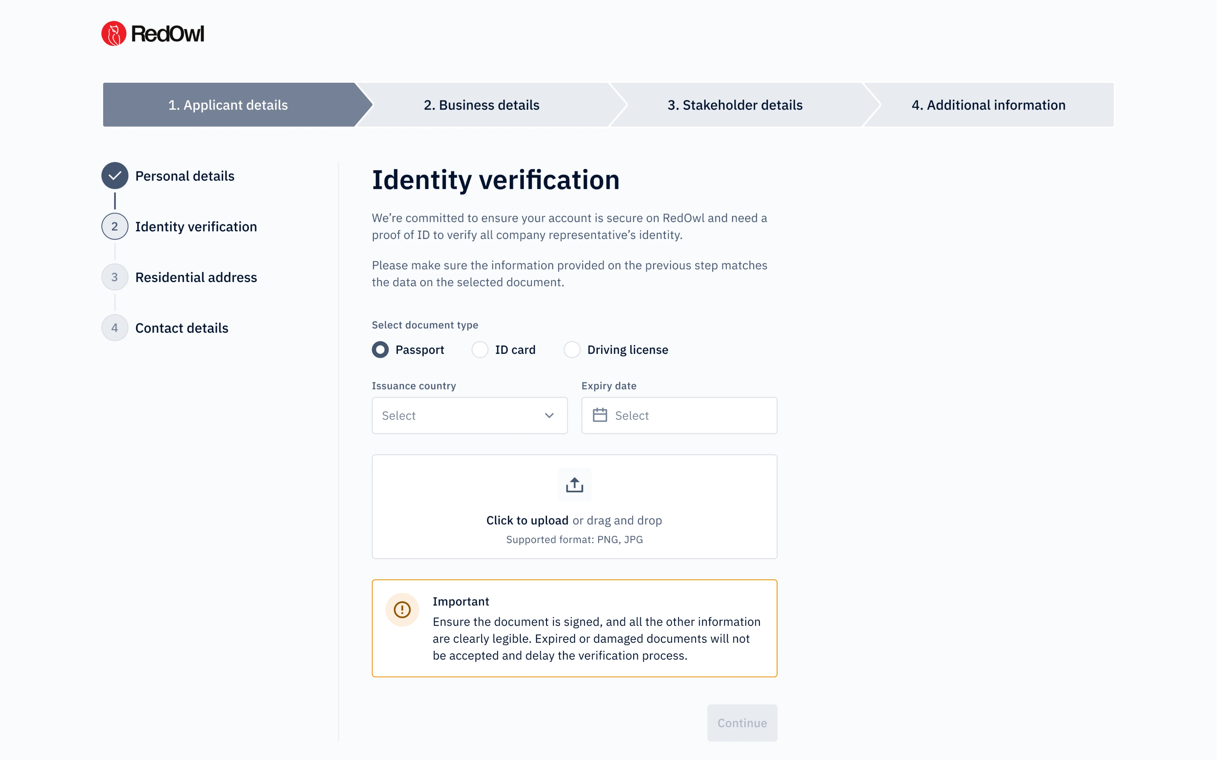
When we designed onboarding for RedOwl, a fintech startup, we applied a similar logic to their KYC and KYB flows. Instead of overwhelming users upfront, we broke the process into four clear steps, added breadcrumbs so users always knew where they were in the journey, and used checkmarks to reinforce a sense of progress and completion.
The Binance platform went even further, offering a tiered verification system. Basic identity checks unlock everyday features, while additional verification is only required for larger amounts and specific functionality. Most users only face friction when they actually need to.

Challenge 3: Balancing Security and Usability
Having a simple password is easier, right? Having one simple password for all accounts sounds even better. That’s probably why “123456” is still the most popular password on the web, and requires hackers only 25 microseconds to crack it.
In fintech design, this is exactly the kind of risky behaviour designers work hard to prevent across mobile apps and web platforms alike.
According to the Boston Consulting Group, financial companies are 300 times more likely than other institutions to suffer from cybercriminals. But what makes this challenge tricky is user behavior. The more complex the security requirements, the more creative fintech users get at working around them. As Don Norman, the godfather of UX, puts it: "Security poses major design issues. Is there a solution? No, not yet."

That doesn’t mean designers are helpless when it comes to security vs usability in fintech. The goal is to increase security without making the UI/UX design feel like an obstacle course. A few approaches that help:
- Biometric authentication — face ID and fingerprint login process reduce friction while keeping security tight.
- Progressive security — apply stricter checks only when the stakes are higher, like large transfers or new device logins.
- Real-time password checkers — instead of making users guess requirements, show them live feedback as they type, the way Mailchimp does.

Challenge 4: Simplifying Complex Financial Language
One study has found that the readability of most banking sites is worse than the readability of protomodern Herman Melville’s 1851 novel Moby-Dick, or, the Whale. For the record, it is the story of 19th-century whaling, full-packed by symbolism and literary references, with a lexicon of over 20k unique (partly coined by the author) words.
And that’s most banking sites that beat Moby-Dick. Some exceptional financial institutions seek to compete with “Ulysses” by James Joyce for the title of the world’s most difficult-to-read text, a problem that budget app design often aims to solve.

Communicating complicated concepts in human terms is one aspect in which fintech app design can easily top old-school banks. That’s what we’ve learned recently when designing a budget app for our client Habstash, and here are some pieces of wisdom we took away from this project:
- Disclose details progressively — surface the most essential information first and let users dig deeper when they’re ready.
- Explain things visually — data visualization through timelines, progress bars, and dashboards communicates financial progress far better than text alone. For Habstash, we designed a clean dashboard showing users exactly where they stood on their savings journey.
- Use real examples — abstract financial concepts land better when grounded in actual numbers and scenarios.
- Add tooltips for unavoidable terms — initially, Habstash used terms like “stamp duty” that many users weren’t familiar with. Small contextual tooltips resolved the confusion without cluttering the interface.

Challenge 5: Earning Trust From the First Screen
According to Pinwheel’s research, 73% of consumers are considering switching banks within the next 12 months. In financial apps, where one confusing screen can make someone question whether their money is safe, trust isn’t a nice-to-have. It’s the foundation of any good banking app user experience and a real competitive advantage for products that get it right.
The challenge is that trust can’t be designed in a single moment. It builds across every interaction, including the landing page, confirmation screen after a transaction, or the onboarding guidance throughout the interface. But the first screen sets the tone.
The best fintech apps consistently make the same design decisions to earn that trust:
- Be transparent about fees — Wise displays exchange rates and charges upfront before users commit to a transfer, removing any sense of hidden costs.
- Show security signals in context — lock icons, encryption notes, and compliance badges reassure users at high-stakes moments like login or payment confirmation.
- Write reassuring microcopy — small phrases like “Your data is encrypted” or “You can cancel anytime” do a lot of heavy lifting at moments of user hesitation.
- Confirm actions clearly — after a transfer or payment, users need closure. A clear “Transfer successful” with transaction details provides it.
- Keep the UI clean and consistent — Chime uses a minimal layout with real-time notifications and a clear visual hierarchy, making users feel in control.
Challenge 6: Addressing Financial Anxiety
It’s a common fact that many people feel anxious about managing their own finances, and that anxiety doesn’t disappear when they open a finance app. It follows users into every interaction. It arises from confusion, unpredictability, and the fear of making irreversible mistakes. When an interface obscures what’s happening, it makes things worse.
This is where digital tools like fintech products have a real opportunity to go beyond functionality and actually reduce stress. The goal is to design experiences that feel calm, clear, and in control.
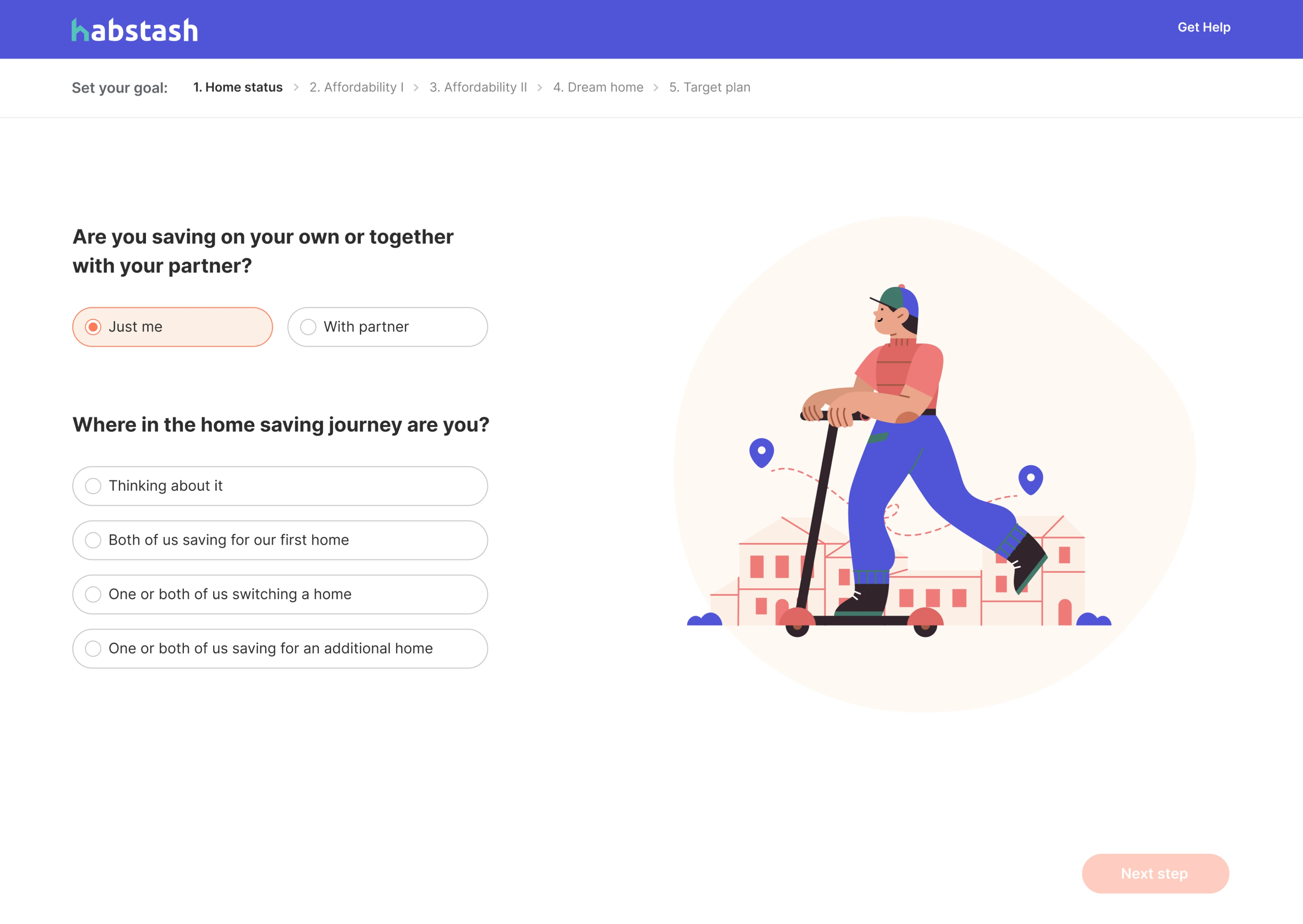
When we designed Habstash, addressing financial anxiety was central to the brief. Buying a home is one of the most stressful financial goals a person can work toward. Rather than confronting users with raw numbers and calculations, we built a step-by-step flow.
Our designer broke down savings targets, showing what homes users could realistically afford, and even added a “save with partner” option to make progress feel collaborative.
A few design approaches that help reduce financial anxiety:
- Visualize progress — showing users how far they’ve come is more reassuring than showing how far they have to go.
- Design calm error states — when something goes wrong, the tone of your error message matters as much as the information in it.
- Give users a sense of control — editable scenarios, adjustable goals, and clear undo options reduce the fear of making costly mistakes.
- Avoid information overload — surface only what's relevant at each step, keeping the user's attention focused and the experience manageable.
Challenge 7: Adapting to AI-Driven Workflows
AI is rapidly changing how fintech products work. But adding AI to a financial product introduces both technical and UX challenges. Users need to understand what the AI is doing, why it’s doing it, and crucially, feel like they’re still the ones in control.
The risk of getting this wrong is real. An AI that makes decisions users don’t understand erodes trust fast, especially when money is involved. The opposite extreme, burying AI capabilities under too many confirmation steps, defeats the purpose entirely.
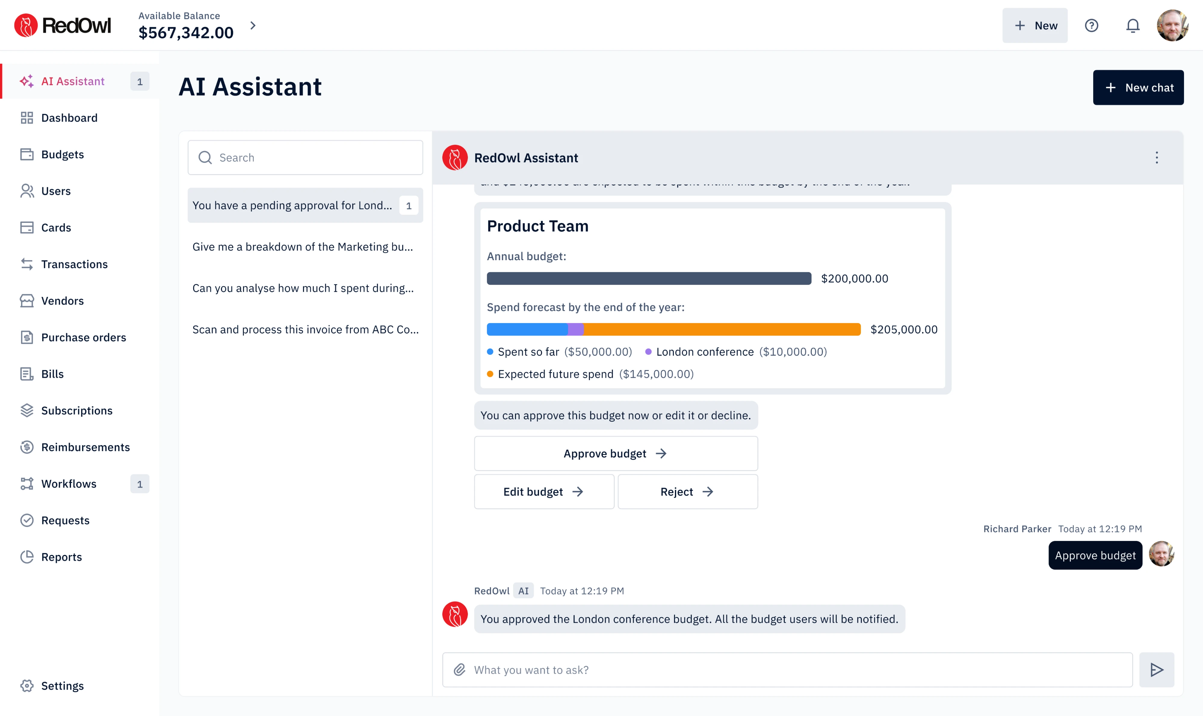
When we designed RedOwl, an AI-powered corporate spending platform, we built an AI Assistant to help users manage budget approvals. The design challenge was making the assistant feel familiar and non-threatening. To make this happen, we drew on existing AI tool patterns so users could engage naturally without a steep learning curve.
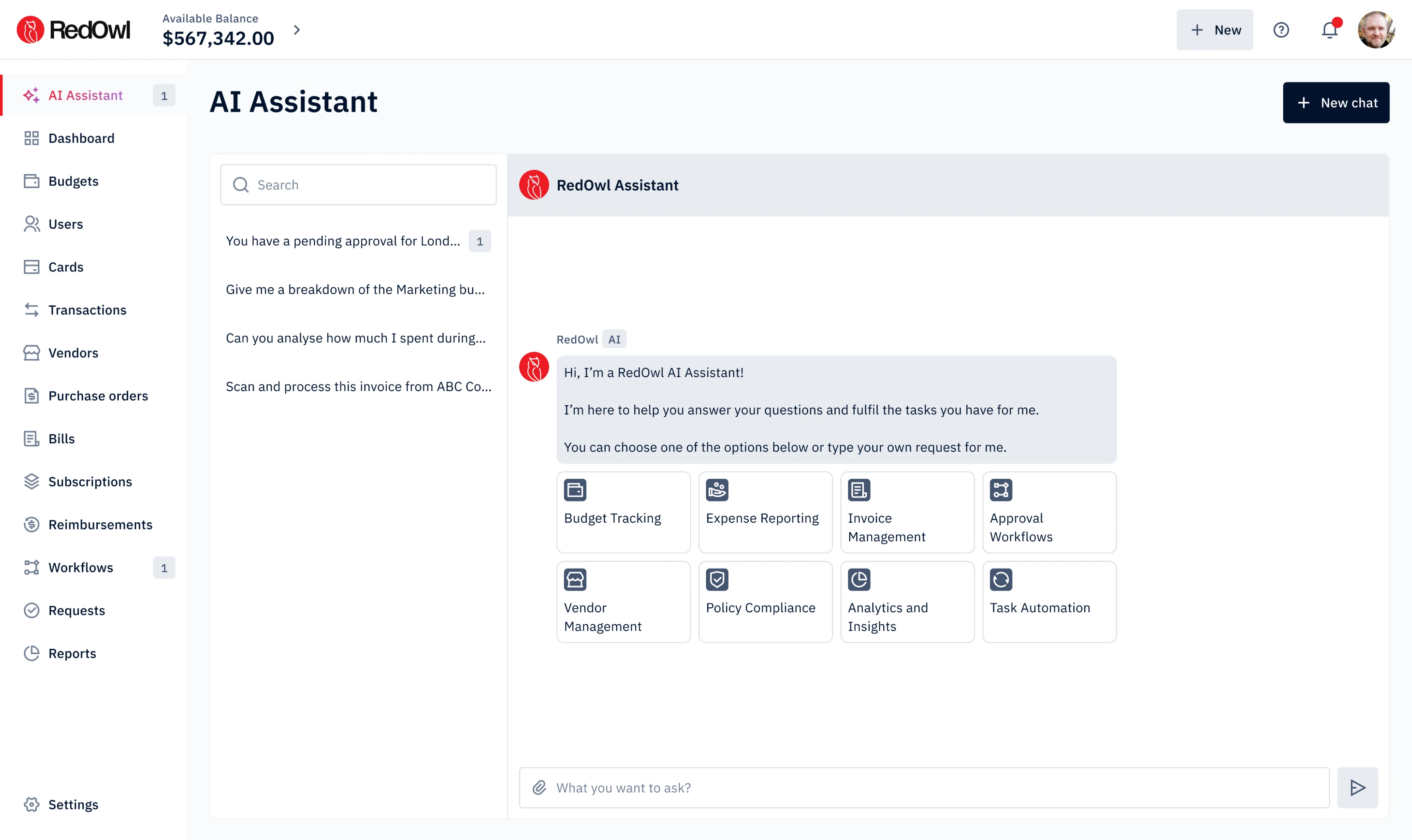
The key principle we kept coming back to was: AI suggests, the user decides. When the assistant proposed a budget based on past spending patterns, we placed “Edit Budget” and “Send for Approval” buttons directly in the flow. This makes it easy to refine, push back, or redirect the suggestion before anything is finalized.
Challenge 8: Improving Product Navigation
Poor navigation in fintech causes fintech usability problems that later on have a big impact on business. Users expect to find critical information fast, and getting lost in the interface is the last thing they'd like to encounter.
The problem is common in platforms that have grown organically over time. In these apps, the essential features might sit front and center while the rest are hidden in menus or buried under labels. After a few years on the market, product portfolios grow, but visibility doesn't keep up.
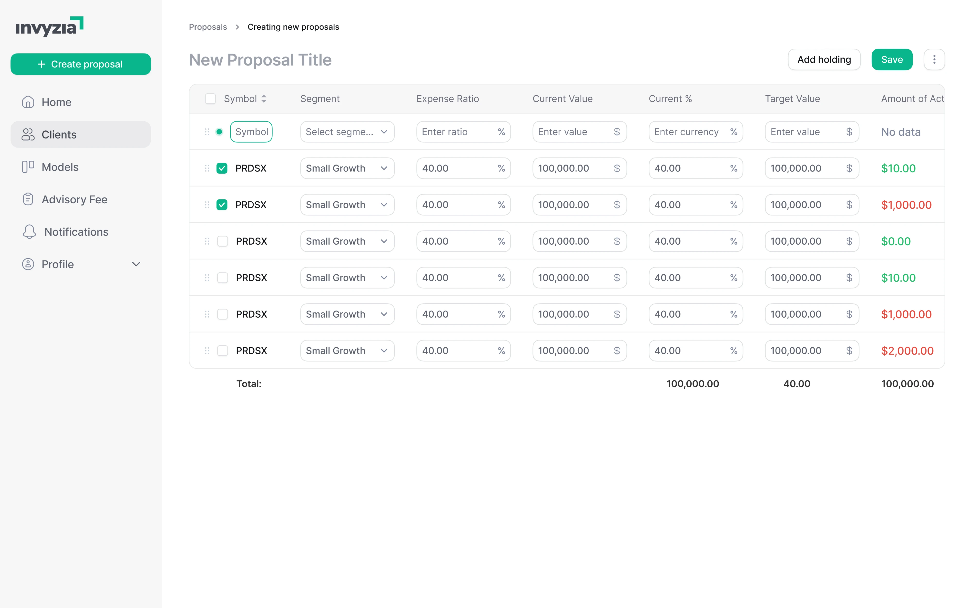
That’s exactly what we found when redesigning Invyzia Solutions, a platform for financial advisors that hadn’t been updated in years. Navigation was fragmented, proposal creation spanned three separate steps across multiple pages, and the overall structure lacked consistency.
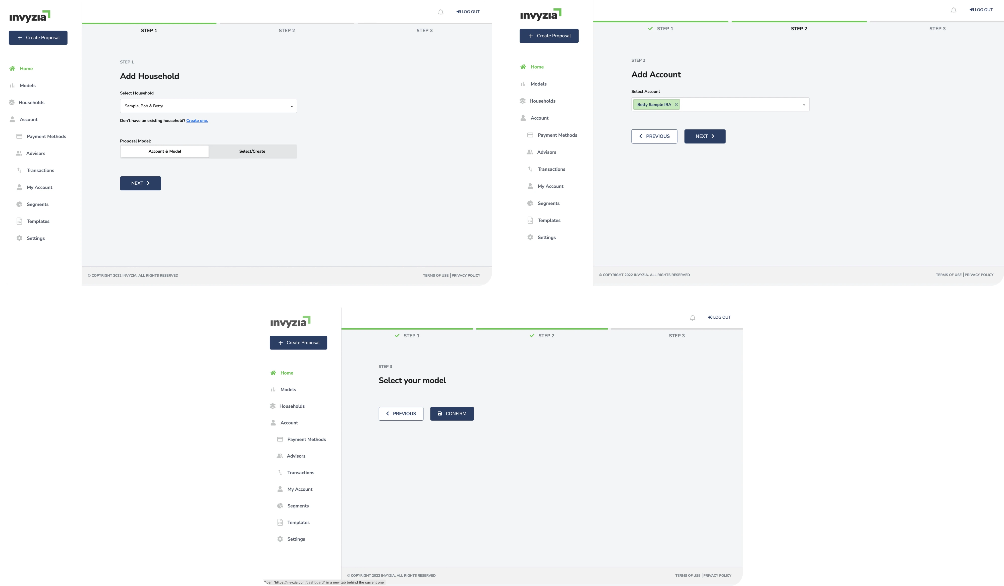
We simplified navigation using breadcrumbs to help users always know where they were, collapsed a multi-page proposal creation flow into a single page with all data in one place, and unified the table structure across all pages to reduce cognitive load.
The result was a user-friendly platform that felt familiar and predictable, which, in fintech, is exactly the goal.
As features accumulate gradually, a periodic UX audit — combining usability testing with user research — should be a regular part of maintaining a healthy fintech product. Revisiting your information architecture every few months helps you catch friction points early, before they start affecting customer satisfaction, retention, and ultimately customer acquisition.
Fintech is eating the world right now
Fintech is not for the faint of heart. It poses many hurdles for designers and developers. But still, this industry is booming and disrupting traditional banks in every aspect of their banking services. The challenges are real, but so is the opportunity.
We at Eleken love challenging fintech projects just because they are so challenging. That’s the spirit you’d expect from a fintech design agency. So if you’re building a financial product and need a UX design partner who understands the space, drop Eleken a line.


.png)
.webp)
