

Fintech is no longer a niche category. It’s how the world interacts with money.
Whether it’s a banking app design, investment dashboard, or budget app design, digital finance tools are now central to people’s financial lives. And users expect more than basic functionality. According to recent research, 89% of users would switch banks purely for a better fintech user experience. This makes UX one of the most powerful competitive levers in fintech.
A poorly designed screen or confusing flow doesn’t just annoy users. It shakes their confidence in the product. That’s especially critical when you’re dealing with sensitive data, real-time transactions, and emotionally charged decisions.
At Eleken, we’ve designed and scaled multiple fintech products from income management apps to personal finance platforms, and we’ve seen how thoughtful fintech ux design can turn complex financial systems into intuitive, trustworthy experiences.
This guide is built for designers who want to understand what makes designing for fintech different and how to get it right.
We’ll explore:
- Why UX fintech isn’t just “universal UX with numbers”
- How to design for trust, clarity, empowerment, and continuity
- Real-world challenges like regulation, integration friction, and user anxiety
- Case studies and examples from Revolut, PayPal, Robinhood, and others
- Trends shaping financial ux design through 2026 and beyond
At its core, great fintech design is about creating products that feel safe, transparent, and easy to understand, so users can focus on managing their money, not the interface.
What makes fintech UX different (when “UX is universal”)
You’ll often hear that “UX is universal.” And in many ways, that’s true. The fundamentals — research, accessibility, usability, clarity — apply across industries.
But in ux design financial services, those principles are pushed to their limits. The design still needs to be simple and intuitive. It also needs to earn trust, reduce risk, and guide users through complex and sometimes emotional decisions.
In this space, the cost of poor UX isn’t just frustration. It’s user loss, legal exposure, and broken confidence.
So what makes fintech UX feel different?

- Regulatory pressure
Designers don’t have full freedom to create any layout or flow they want. Compliance standards like KYC, AML, GAAP, and GDPR dictate how information is collected and displayed. These requirements affect everything from form fields to visual hierarchy, and skipping them isn’t an option. That’s where lessons from HIPAA-compliant design in healthcare UX can inspire better data transparency and privacy for fintech apps.
- Psychological weight
People don’t open fintech apps for fun. They’re often checking balances, making payments, or stressing over budgets. If the interface adds confusion or friction, users won’t just be annoyed. They’ll feel anxious, unsupported, and more likely to abandon the product.
- Data density
Financial tools work with layers of numerical data. Users want to see balances, categories, forecasts, and rates, but they don’t want to feel like they’re reading a spreadsheet. Fintech UI/UX design needs to simplify complexity without hiding what matters.
- High-stakes actions
A mistaken tap might mean transferring $5,000 to the wrong account. That’s why fintech products must include safeguards, clear confirmation steps, and intuitive error handling. Users need space to review, pause, and feel in control.
So while the principles of good UX remain constant, the context in fintech makes them harder to apply, and much more critical to get right.
Understanding what makes fintech UX unique is only the first step. The next is figuring out how to design for it — the principles and practical habits that turn trust and clarity into everyday user experiences.
The foundations of great fintech UX design: principles and practical playbook
Fintech design doesn’t reward cleverness; it rewards confidence. Users rarely notice when a financial product works perfectly, but they notice immediately when it doesn’t
Every successful fintech app rests on four connected principles — trust, clarity, empowerment, and continuity — and on the everyday UX design patterns that bring those principles to life.
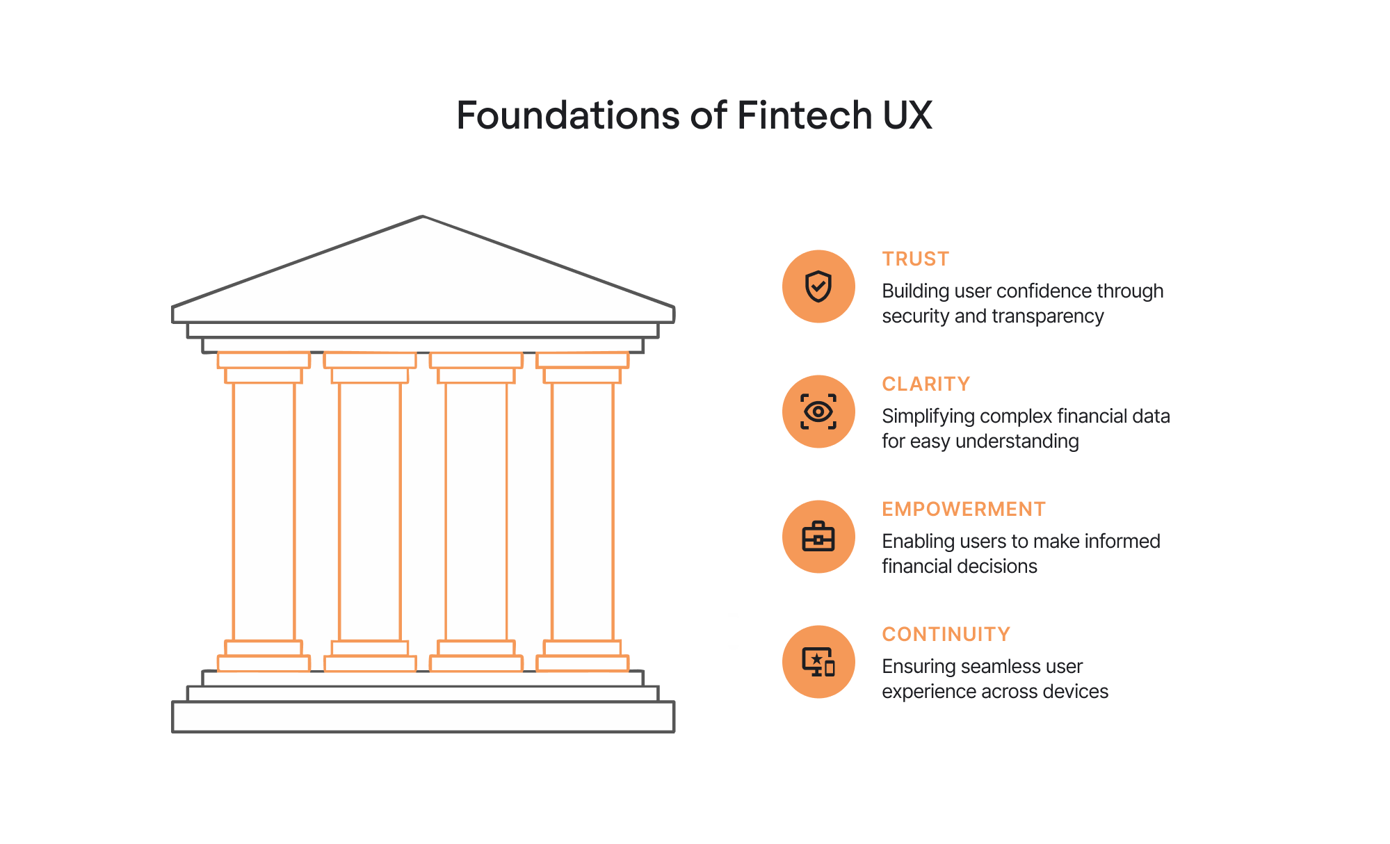
1. Trust
When users open a finance app, they’re not just checking a balance. They’re taking a leap of faith. If the interface looks shaky, unclear, or inconsistent, trust drops before the first transaction even happens.
How to design for trust:
- Show protection upfront. Use visual cues — biometric options, padlock icons, or reassuring microcopy like “Your data is encrypted end to end.” For more examples of how to strengthen user confidence, see our guide on security UX design.
- Be transparent about data use. If you’re asking for ID verification, explain why: “We ask for this to keep your account secure and meet KYC regulations.”
- Avoid dark patterns. Always make fees, risks, and permissions explicit. Hidden costs destroy credibility faster than bugs.
- Offer control. Give users undo windows, clear confirmation screens, and account safety settings they can manage themselves.
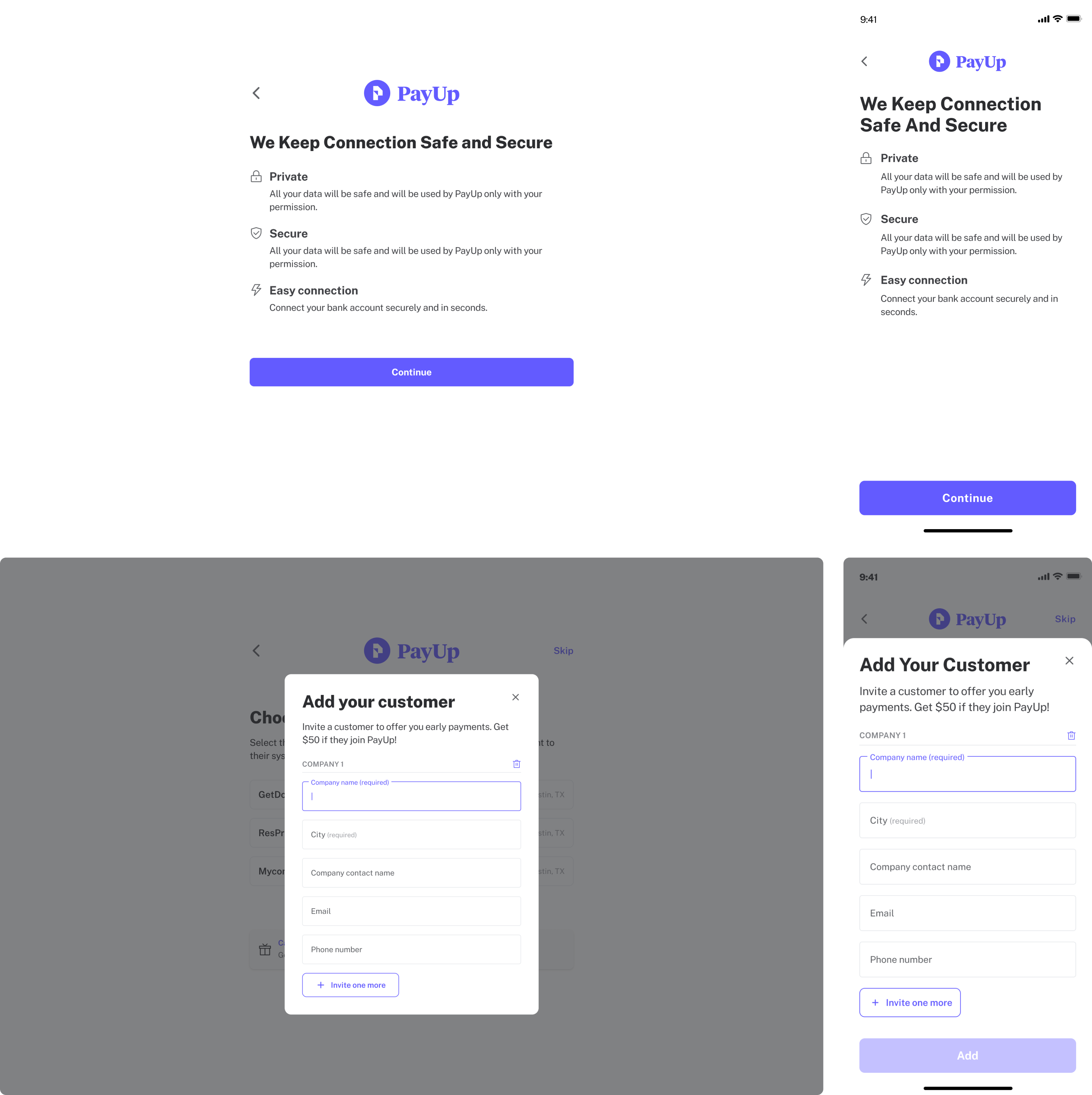
In PayUp, a financial startup we collaborated with, we redesigned the onboarding flow to help users feel safer sharing sensitive data. Breaking the process into smaller, better-explained steps helped increase clarity and reduce drop-offs.
Trust doesn’t just come from security features; it comes from visible care.
2. Clarity
Finance is complex enough without design adding friction. Clarity turns intimidating data into information people can actually use.
How to design for clarity:
- Simplify onboarding. Use AI document scanning or autofill where possible. Keep initial forms short and verify details later — an approach proven effective in user onboarding UX patterns.
- Show one primary value per screen. Whether it’s a balance, a loan rate, or an investment return, give it space to breathe.
- Use color-independent cues. Not everyone reads red and green the same way — pair color with icons or text labels.
- Apply progressive disclosure. Start simple, then let users dig deeper only if they choose.
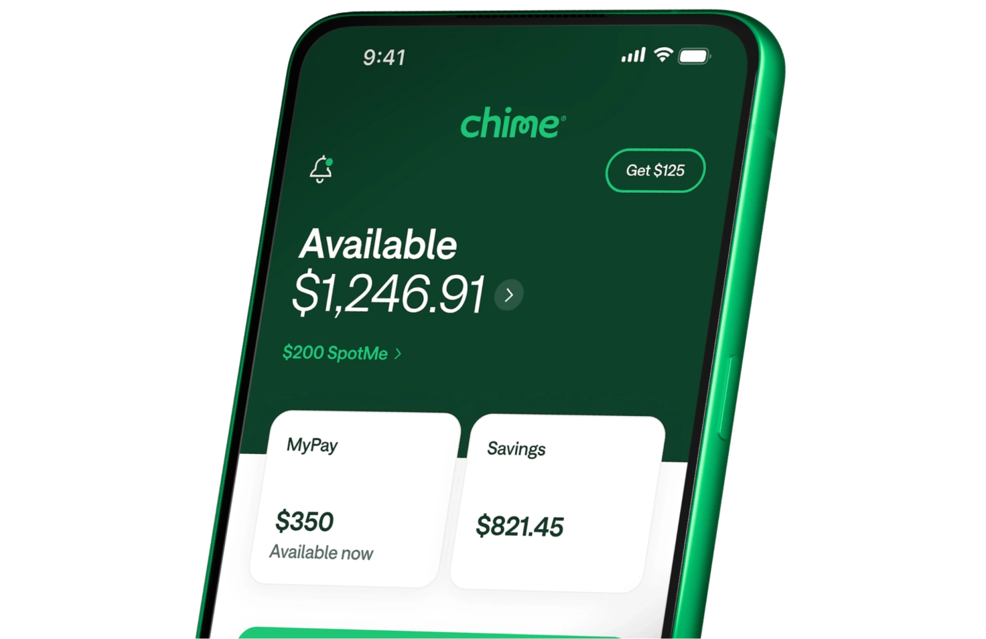
For example, Chime’s interface focuses on one number (your balance), while everything else tucks neatly under expandable menus. That restraint builds calm.
Clarity is not decoration. It’s a form of respect for users’ attention and emotional state.
3. Empowerment
Good fintech UX doesn’t just prevent mistakes — it helps users make better decisions. Empowerment means showing users progress, offering control, and framing complex tasks in ways that feel achievable.
How to design for empowerment:
- Personalize without overstepping. Use behavioral data to surface insights, not judgments (“You spent 20% more on travel this month” works better than “Stop overspending”).
- Make learning part of the experience. Use micro-tips, contextual definitions, or visual hints to teach financial concepts in real time. Many of these ideas come from SaaS product best practices, which apply equally well when designing fintech platforms.
- Add light gamification. Progress bars, badges, or savings milestones can turn dry financial chores into small wins.
- Support multiple input modes. Voice commands or chat interfaces can make tasks like transfers or budget tracking feel natural and inclusive.
For instance, CRED rewards users with points for paying credit card bills on time — a simple loop that reinforces positive habits.
Empowerment happens when fintech tools act as guides, not gatekeepers.
4. Continuity
Users move across devices constantly. They expect financial actions to follow them from phone to laptop to smartwatch without missing context or breaking flow.
How to design for continuity:
- Keep design consistent. Use one design system for all platforms. Familiar icons, terminology, and flows reduce friction — just like effective CRM system design helps maintain unity across enterprise software.
- Sync everything in real time. A user who starts a loan application on desktop should see it ready to complete on mobile.
- Preserve context. After switching devices, the app should open where the user left off.
- Design for interruption. Save progress automatically; show “resume where you left off” prompts.
Continuity makes users feel that the product remembers them, which, in finance, translates directly to trust.
When these four principles align, fintech design goes beyond pixels and patterns — it builds stability, clarity, and emotional reassurance that make users say, “I trust this app with my money.”
But knowing the principles is only half the work. Applying them in real products means navigating regulations, integrations, and the constant balance between simplicity and depth. Let’s look at how to do that effectively.
Common fintech design challenges and how to solve them
Designing fintech products can feel like working inside a maze. Every decision needs to satisfy three competing forces: user needs, business goals, and regulatory compliance. It’s rarely straightforward, but that’s what makes it interesting.
Here are the challenges most fintech teams face and how thoughtful UX can turn each one into an advantage.

1. Reaching real users in B2B2C setups
If you design for banks, payment processors, or white-label tools, you often can’t reach the end users directly. Interviews might involve executives or product owners who haven’t used the product in years — a challenge familiar to those working on designing tools for developers.
How to solve it:
- Use proxy research — talk to customer support, client success, or data teams.
- Analyze usage metrics and help-desk logs to spot recurring pain points.
- Test prototypes internally to simulate user journeys when external feedback isn’t available.
One designer on Reddit described this frustration perfectly:
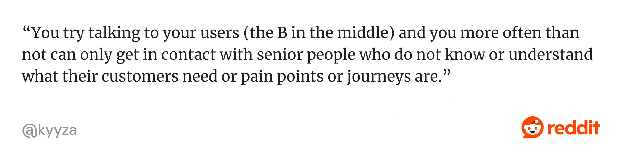
When direct access is blocked, research through data. Real behavior tells the story that interviews can’t.
2. Balancing simplicity and depth
Financial products handle complex logic — investments, taxes, credit scoring — yet users expect clean, intuitive experiences. The danger is over-simplifying until features disappear, or overloading users until they panic.
How to solve it:
- Start with progressive disclosure. Show the essentials first, then reveal more details only when needed.
- Use smart defaults and contextual tooltips to guide users gently.
- Avoid “expert bias” — test early with new users, not just your team.
In Prift, a personal finance platform, early A/B testing showed users preferred calmer, less cluttered layouts. We refined the visual hierarchy to make savings and investments easier to compare and understand. The result: less clutter, more confidence.
Simplicity isn’t about removing information — it’s about removing uncertainty.
3. Managing third-party integrations
Fintech relies on tools like Plaid, Stripe, and Jumio. They make the product work but can break the user experience if their flows feel disjointed.
How to solve it:
- Maintain visual continuity across branded and third-party screens.
- Add clear transition copy (“You’ll return to the app in a few seconds”).
- Follow up with a confirmation state once the user returns, so they feel anchored again.
As one Redditor put it,
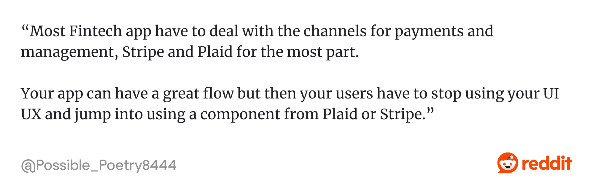
Even if you don’t control every screen, you control how users experience the handoff. Learn how to design integrations smoothly before you build them.
4. Designing for compliance without killing flow
Financial regulations are non-negotiable, but that doesn’t mean they have to feel painful. Long forms and dense disclaimers might satisfy auditors but alienate users.
How to solve it:
- Break legal disclosures into short, scannable steps.
- Use checkboxes, accordions, or progressive steps instead of long text blocks.
- Explain why you need certain data or actions. Transparency reduces friction.
Design check: If your compliance flow frustrates your QA testers, it will infuriate real users.
Great compliance design meets legal standards and keeps the experience humane.
5. Keeping UX alive after launch
Many fintech products start with strong design energy but lose momentum post-launch. Updates slow down, stakeholders change, and the original UX intent gets diluted.
How to solve it:
- Establish a living design system early, with documentation and governance.
- Connect UX improvements to measurable KPIs like lower support tickets or faster onboarding.
- Advocate for design reviews as part of every sprint, not just “when there’s time.”
Fintech UX isn’t a one-time project — it’s ongoing trust maintenance.
Each of these challenges reminds us that fintech design isn’t about perfection. It’s about persistence: continuously testing, refining, and finding creative ways to balance clarity, regulation, and emotion. The goal is always the same — keep users confident that they’re in good hands.
Fintech design never stands still. As technology and user expectations evolve, new trends are redefining what great UX looks like. Here’s what’s leading the way in 2026.
Fintech UX trends for 2026 and beyond
The fintech landscape is shifting quickly. AI and new regulations are rewriting how users interact with money, and design is the medium that makes it all understandable.
Here are the trends shaping fintech UX in 2026, and how to turn them into real improvements rather than passing buzzwords.
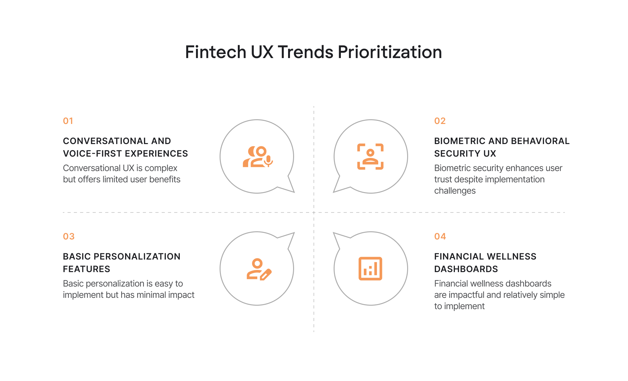
1. Hyper-personalization that respects boundaries
Fintech apps now use AI to make predictions, flag habits, and offer suggestions. The difference between a helpful assistant and a nosy algorithm is consent and clarity.
Why it matters: Users want insights, not intrusion. A spending alert that says, “You’re 15% above your grocery budget” feels empowering. A message like, “You eat out too much” feels judgmental.
How to apply it:
- Make personalization opt-in and adjustable. Let users choose what type of insights they want.
- Explain how recommendations are generated. Transparency creates trust.
- Allow one-tap controls to pause or reset personalization.
The best fintech products know where to draw the line between “smart” and “too personal.”
2. Conversational and voice-first experiences
Typing long queries feels outdated when you could just ask, “How much did I spend on groceries last week?”
Conversational UX — through chat or voice — is helping users manage money naturally.
Why it matters: It makes finance approachable and inclusive, especially for users who struggle with technical jargon or visual interfaces.
How to apply it:
- Start small: introduce guided chat flows for basic tasks like transfers or balance checks.
- Use friendly, plain language — avoid robotic phrasing.
- Always provide an escape route back to standard navigation or human support.
Conversational UX works best when it feels human but still precise — helpful, not chatty.
3. Biometric and behavioral security UX
Security can no longer live behind the scenes. Users expect strong protection and clear proof of it.
Biometric authentication — face, fingerprint, voice — has become the default for fintech products that want to signal both safety and ease.
Why it matters: Trust grows when users can see security working for them. Invisible protection often feels like no protection at all.
How to apply it:
- Combine biometrics with behavioral verification, such as recognizing familiar devices or patterns.
- Explain authentication choices in simple terms: “Face ID keeps your account secure, only you can log in.”
- Offer backup methods for inclusivity and accessibility.
When users understand security, they don’t just comply — they cooperate.
4. Financial wellness as a product differentiator
Fintech is moving from transactional tools to transformational ones. Modern apps don’t just help users spend or save — they help them understand their finances and feel less anxious about them.
Why it matters: Financial literacy is still a huge gap, and products that help close it earn deep loyalty.
How to apply it:
- Include simple goal trackers and “financial health” dashboards.
- Offer contextual learning, not long tutorials — micro tips, definitions, or gentle nudges.
- Frame education around empowerment, not guilt (“You could save $200 more” vs. “You spent too much”).
Financial wellness is becoming fintech’s emotional differentiator — the shift from “manage your money” to “feel good about your money.”
Each of these trends points in the same direction: empathy. In 2026, fintech UX will be judged less by how advanced it looks and more by how clearly it helps users feel informed, safe, and in control.
Let’s look at how leading companies, and Eleken’s own clients, bring these principles to life.
Fintech UX design case studies: leaders in action
Fintech UX isn’t just about best practices on paper. It’s about how those principles perform under real conditions: tight deadlines, complex data, skeptical users, and high stakes.
Let’s look at what some of the most successful products have done, and what lessons they offer to every designer in the field — insights that apply across fintech UX design and other digital industries.
1. Revolut: personalization and gamification at scale
Revolut built its reputation by making financial management feel effortless. Its strength lies in combining three things most banks struggle to offer: clarity, control, and a sense of reward.
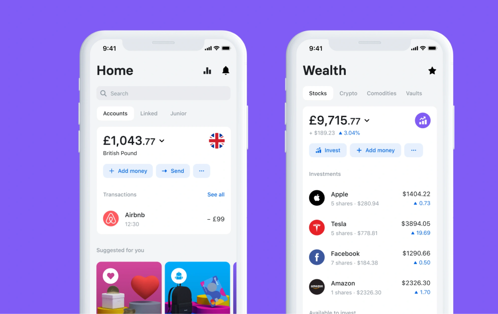
Users can track spending instantly, view categorized insights, and receive personalized notifications that make their habits visible without judgment. Subtle gamified touches, such as progress tracking in savings vaults, help users build better financial habits without adding friction.
Design takeaway: Personalization works when it feels empowering, not intrusive. Revolut helps users see their patterns clearly and act with confidence.
Potential pitfall: Too many notifications can turn helpful insights into noise, eroding trust.
2. Robinhood: frictionless onboarding, complicated ethics
Robinhood transformed how people start investing. Its onboarding flow, guided by microinteractions and clear progress cues, became a UX benchmark for simplicity.
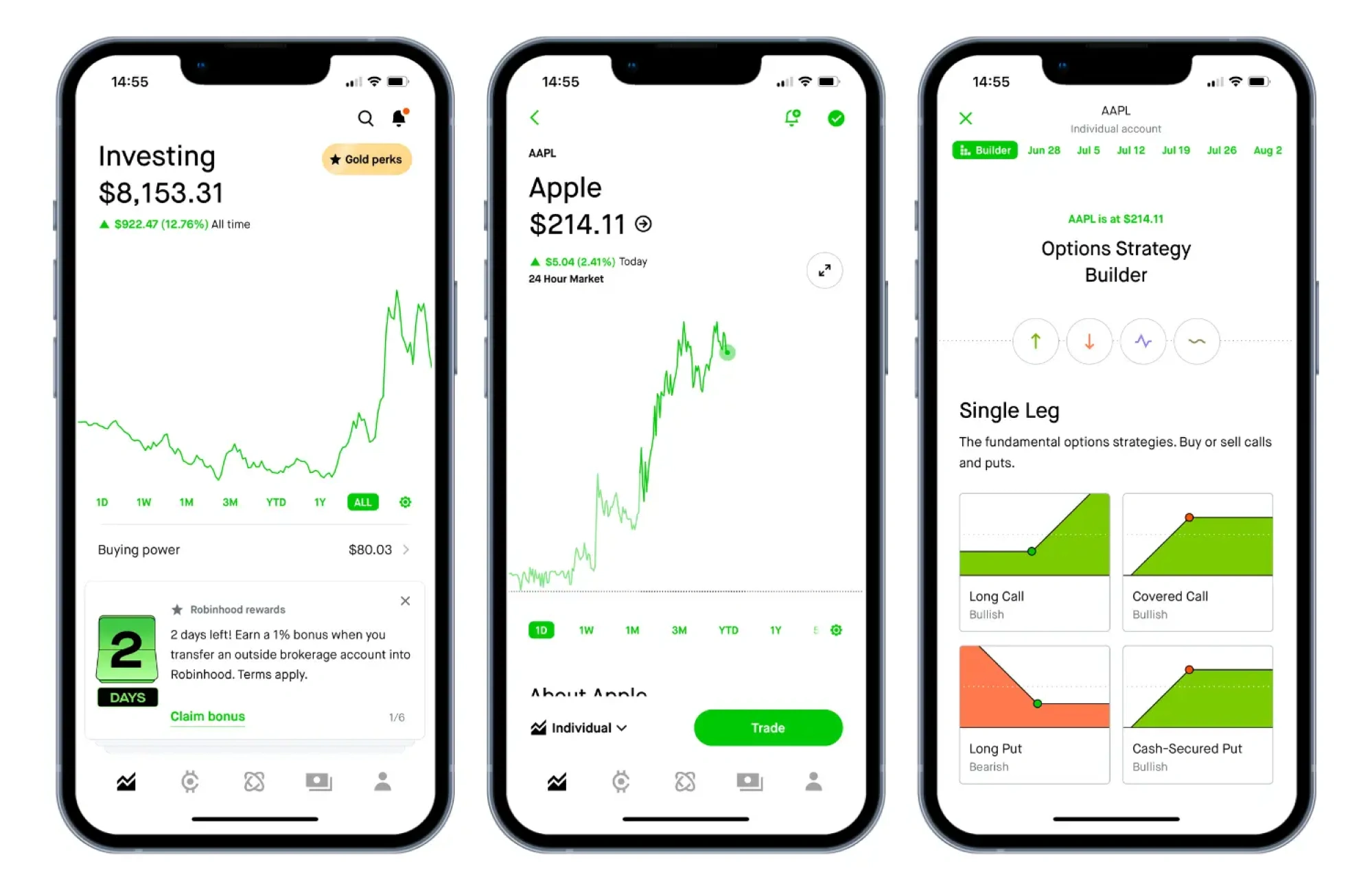
Clean visuals and real-time feedback make each step feel rewarding, lowering barriers for first-time investors.
Design takeaway: Reducing cognitive load early creates trust and momentum.
Potential pitfall: Frictionless UX can make risky actions feel too easy. Designers must balance simplicity with responsibility, especially when real money is involved.
3. PayPal: redesigning a legacy for clarity
After years of incremental updates, PayPal’s interface had become cluttered. Its latest redesign proved that simplicity can modernize trust.

Dashboards were consolidated, key actions like sending or receiving money were placed in the main navigation, and transparent language clarified fees and processing times.
Design takeaway: Modern fintech app design often means removing, not adding. Simplification is innovation when it helps users find what they need faster.
Potential pitfall: Over-simplifying legacy products can risk hiding tools that power users rely on.
4. From our work: PayUp — scaling fast with clarity and consistency
PayUp helps vendors get paid early on unpaid invoices. When the startup came to Eleken, they needed to scale from a mobile MVP to a full web app, quickly and without losing simplicity.
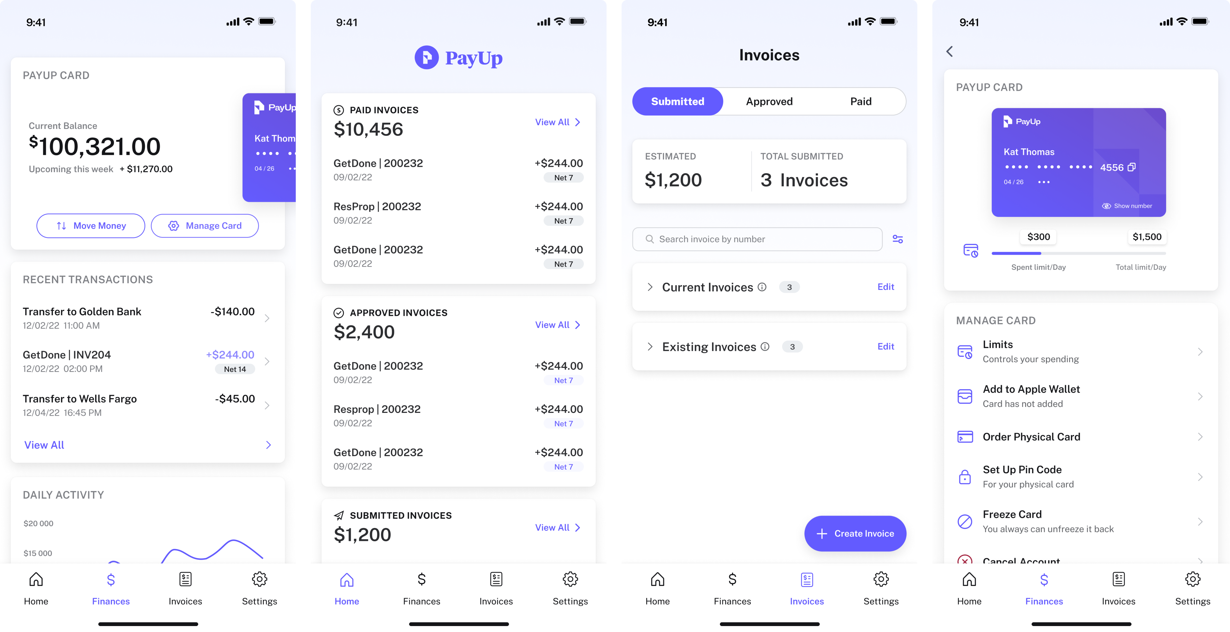
We began with a three-day trial, designing five variations of a new “Change Payment Terms” flow. That collaboration set the tone for the project: quick iterations, open communication, and design decisions rooted in clarity.
Because PayUp’s users are busy, non-technical professionals, we reduced onboarding friction, added tooltips for transparency, and built a scalable design system to maintain consistency as the product grew.
What it did right: Scaled a complex fintech product through clear UX and rapid iteration.
Potential pitfall: As PayUp expands, maintaining simplicity across new modules will require disciplined governance.
5. From our work: Prift: turning complex finances into confident decisions
Prift helps users forecast their long-term financial future, including mortgages, pensions, and investments. The founders came to Eleken with research and a concept but needed a design that made financial planning approachable.

Through competitor analysis and A/B testing, users favored calm, uncluttered layouts. We built on that insight with a minimalist dashboard, personalized advice, and goal tracking that turned complex data into actionable insights.
What it did right: Made long-term financial forecasting intuitive and visually calm.
Potential pitfall: As new features expand, maintaining simplicity will be key to sustaining user trust.
6. From our work: Habstash: helping first-time buyers reach financial goals
Habstash was created to help first-time homebuyers in the UK understand how much they need to save and how long it will take to afford a home. The challenge wasn’t just about numbers; it was about easing financial anxiety through thoughtful design.
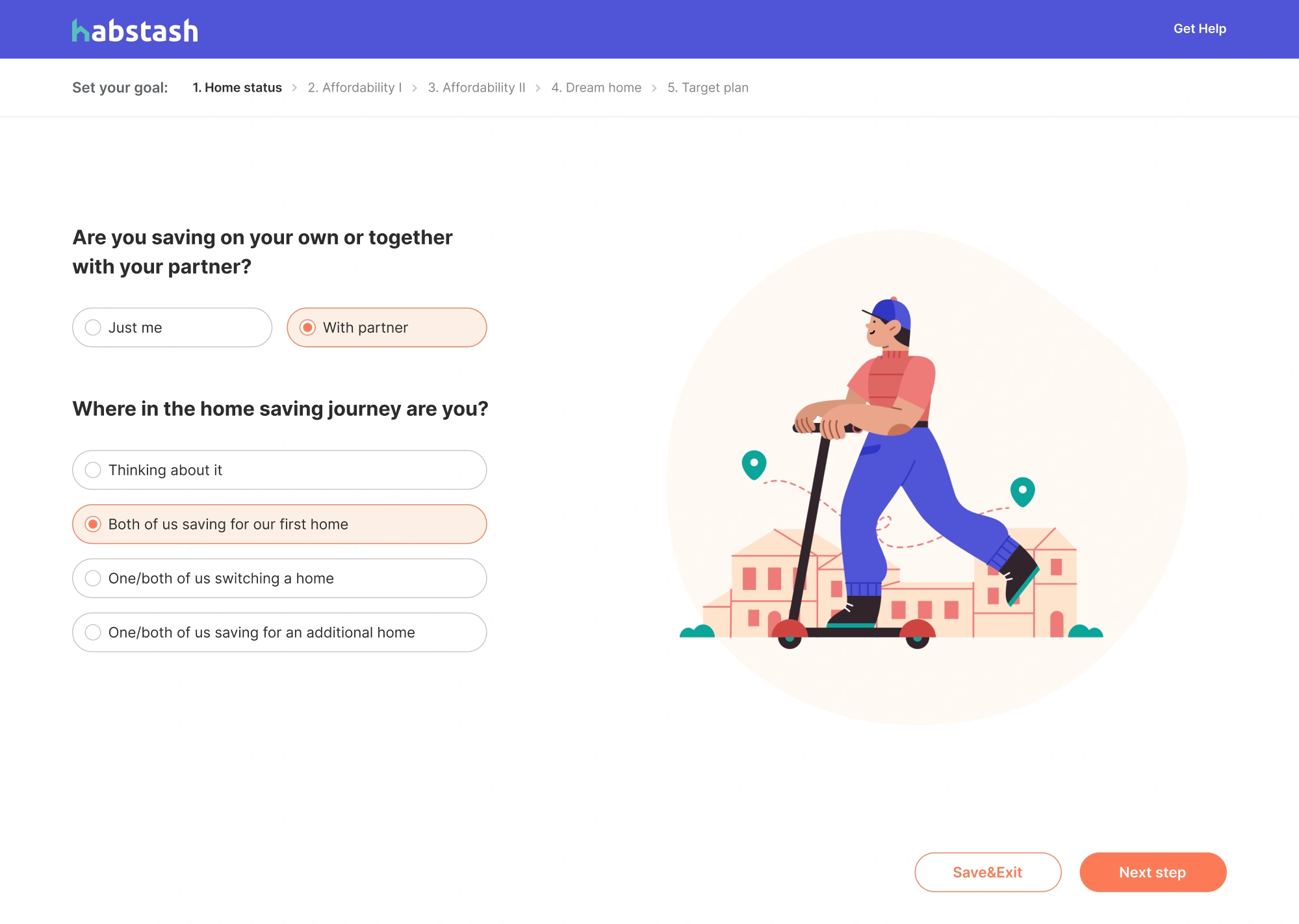
We simplified onboarding with a step-by-step flow that asked for only one piece of information per screen, added a “save with your partner” option to make progress feel collaborative, and used calm visualizations to show what homes users could afford in different scenarios.
What it did right: Turned complex savings data into a motivating, human experience.
Potential pitfall: Predictive features must stay realistic; overpromising affordability can quickly erode trust.
Each of these products reflects the same truth: successful fintech UX doesn’t mean inventing new patterns — it means refining familiar ones until they feel trustworthy, effortless, and emotionally intelligent.
These examples prove that great fintech UX isn’t about following trends but mastering fundamentals under real-world pressure. Together, they show how thoughtful design turns complex finance into confidence. Now, let’s bring it all together.
Conclusion: designing confidence into fintech user experience
Fintech UX isn’t just about screens and buttons. It’s about building trust and helping people feel confident every time they make a financial decision.
The best fintech products don’t overwhelm users with data or features. They make finance feel simple, safe, and empowering — something people understand, not fear.
At Eleken, we design fintech products that do exactly that — clear, scalable experiences backed by thoughtful UX strategy and ongoing iteration, just like our SaaS UX audit process ensures in other industries. Our goal is to turn complex systems into clear, intuitive experiences that users trust with their money.
The future of fintech belongs to those who design for understanding, not just transactions. If you’re ready to create a product that inspires confidence from the first tap, let’s talk.


.png)
.webp)