A few years ago, consumer decisions in fintech were much simpler. There were fewer digital products, and users had lower expectations. Today, it’s a different story. There are dozens of financial apps to choose from, all offering similar functionality.
So how do they decide?
More often than not, fintech app design makes the difference. When features overlap, users rely on interface clarity, branding, and the overall feel of the product to guide their choices. Given this shift, designing with users in mind isn’t optional anymore.
At Eleken, we’ve worked on a wide range of fintech products. In this fintech design guide, we’ll share the most valuable lessons from that experience so you can make confident decisions and build products users actually trust.
Financial app design and development guide
On average, the fintech app design and development process can take 5 to 11 months, depending on the scope, number of integrations, and compliance layers involved. Each stage builds on the last, and skipping or rushing can lead to major setbacks.
Step 1: Discovery and planning
Every app design starts with a deep understanding of what it solves, who it’s for, and what constraints it needs to respect. Teams begin by conducting user research and competitor analysis to identify market gaps and define a clear value proposition.
At this stage, founders and product teams must also document concrete goals, technical requirements, and business constraints to align all stakeholders early on.
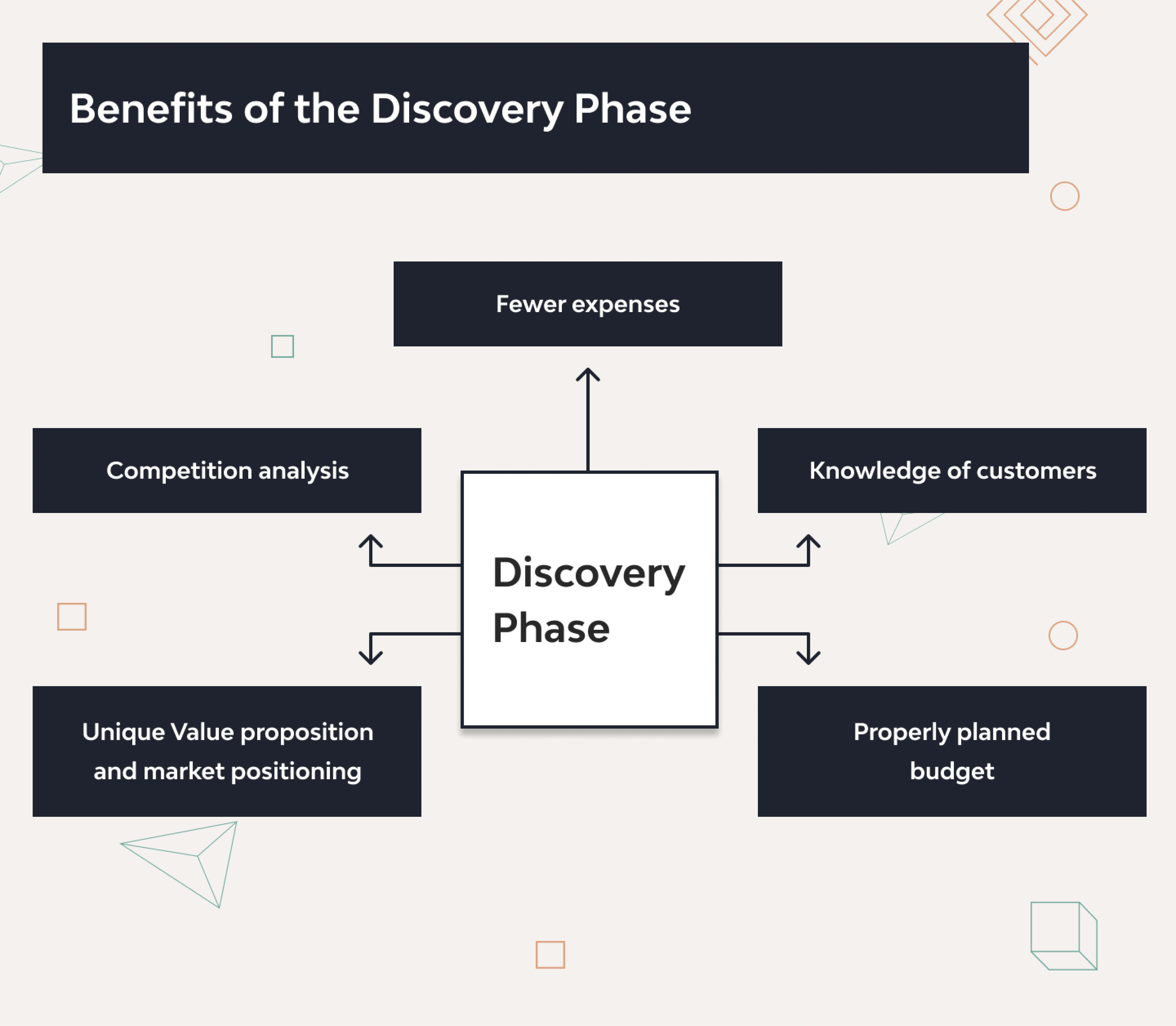
The most critical part is regulatory planning. During discovery, you should define compliance requirements as they will shape your UX, architecture, and even your tech stack. Ignore them early, and you’ll likely face redesigns or costly rework later.
Here’s a brief list of what to explore during discovery:
- User interviews and persona mapping;
- Competitor audits and feature comparisons;
- Regulatory requirements;
- Initial risk analysis and security planning;
- Platform decisions;
- Tech stack evaluation and feasibility.
Step 2: UX design and prototyping
In this phase, UI/UX designers map out user flows, create wireframes, and build interactive prototypes that reflect how users will move through the fintech app UI. The goal is to translate complex workflows into an effortless user interface design.
Designers establish a consistent visual language (colors, typography, iconography) and often create UI kits or style guides to maintain uniformity across the app.
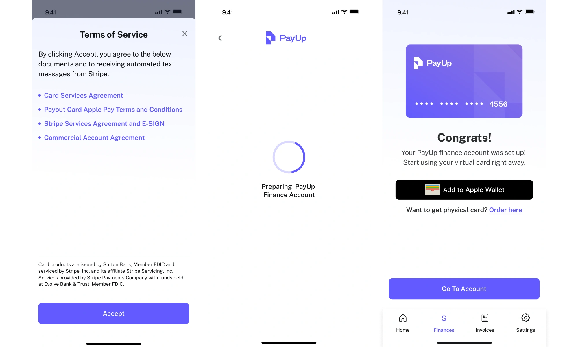
Even though prototypes aren’t always required, they help simulate real user interactions. They’re typically used in usability testing with actual users to validate core flows. If something is confusing or slow here, it’s far cheaper to fix now.
Step 3: Development (mention MVP vs MLP)
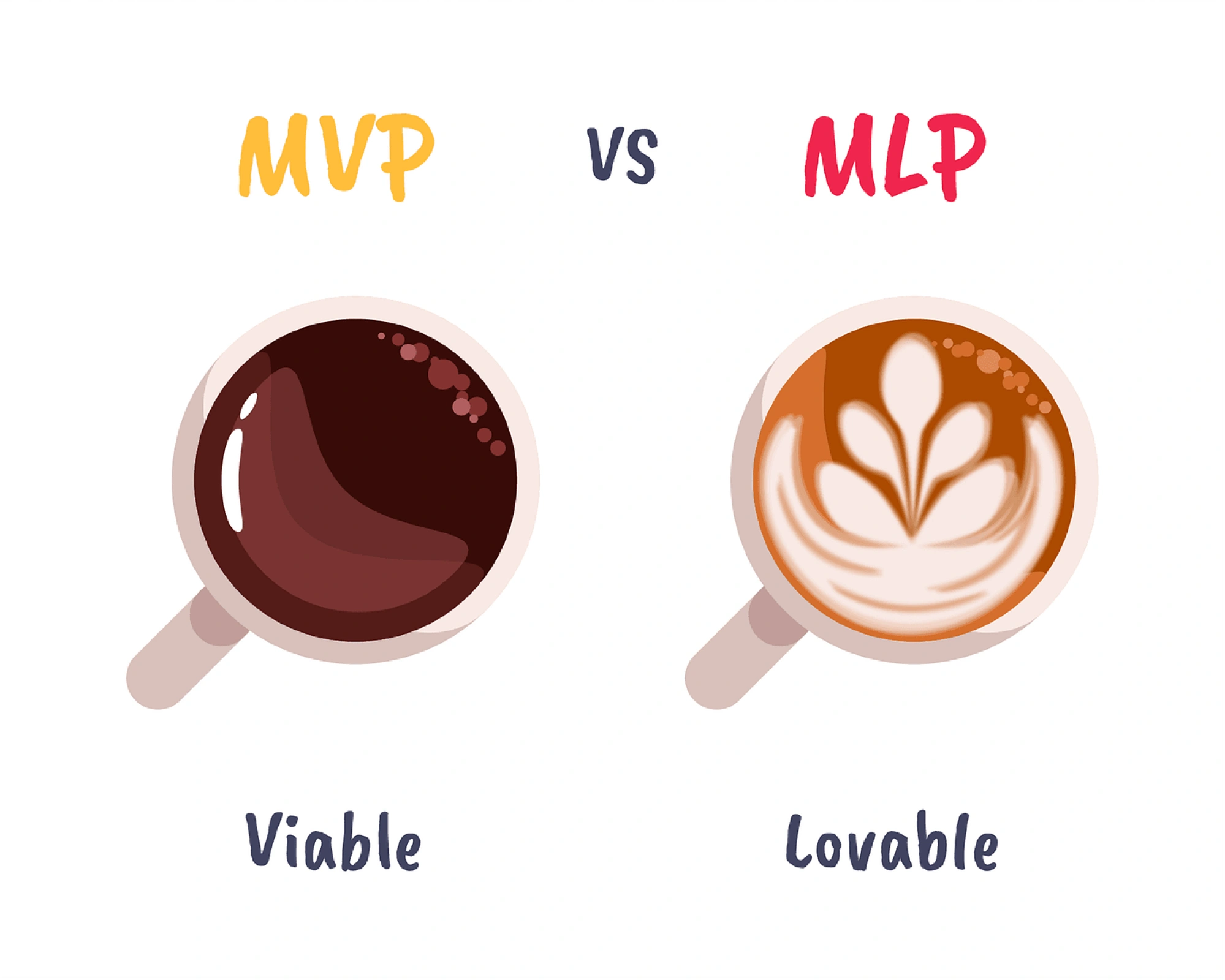
During development, specialists implement the front-end and back-end, turning approved mobile banking app designs into a working product. Most startups begin with an MVP, a version of the app focused on core functionality.
But in fintech, it's wiser to aim for a Minimum Lovable Product (MLP), a version of your app that feels trustworthy. This means including design details and interactions that simplify complex financial information and address user pain points.
Given the sensitive nature of fintech, data security is paramount at this stage. Strong encryption, fraud prevention, and secure APIs are integrated to build user trust.
Step 4: Testing and quality assurance
In fintech, there’s no room for “we’ll fix it later.” Before launch, your app must go through rigorous testing. Both automated and manual QA engineers help you verify that all functions work as intended under various scenarios.
Functional testing checks each feature (payments, account updates), while performance testing ensures the app is fast and can handle load.
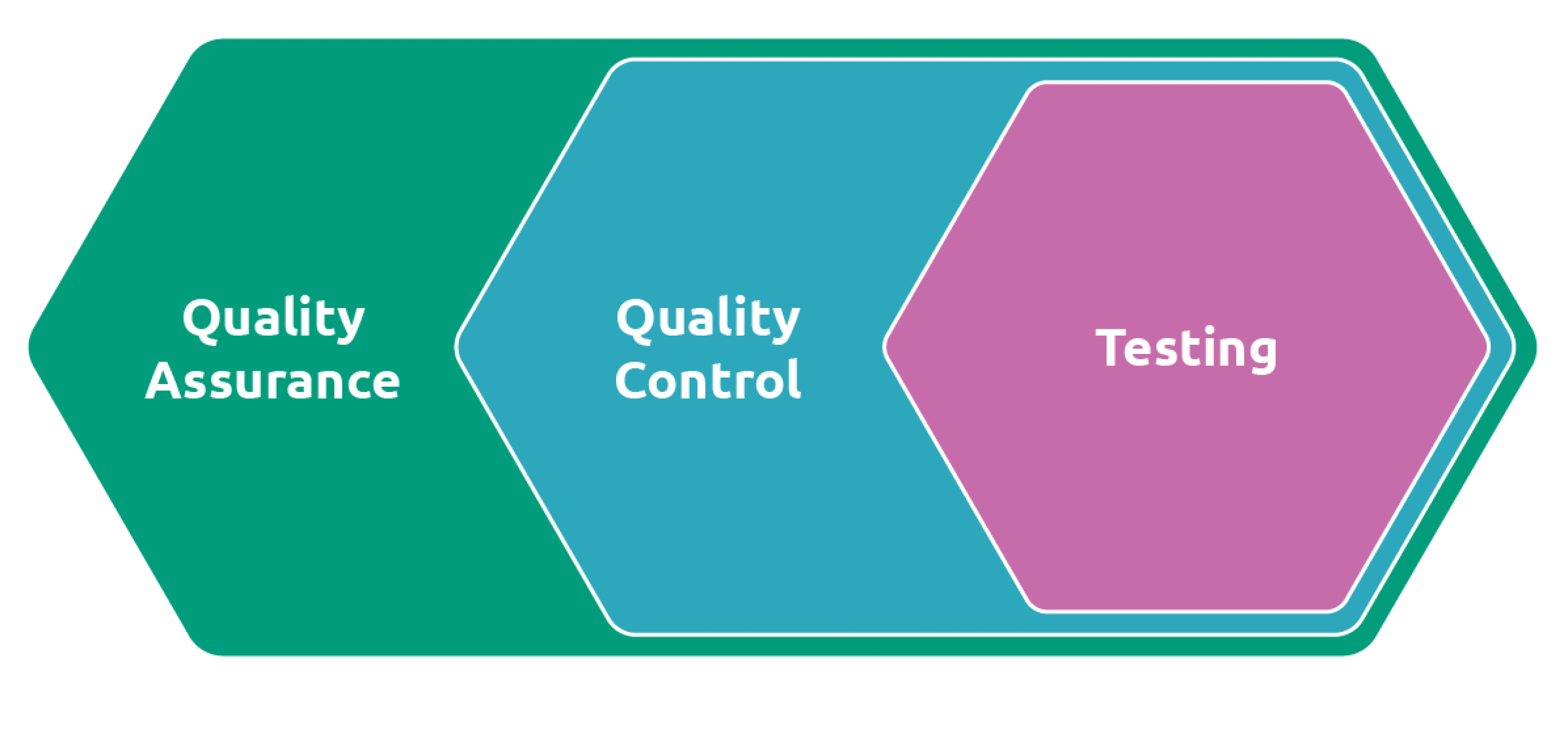
Security is a category of its own. Penetration testing, vulnerability scans, and secure code reviews help identify weaknesses that could lead to breaches, data leaks, or fraud. Any bugs, inconsistencies, or UX flow issues are addressed before release.
When testing a fintech app, these are the essentials:
- Functional testing (payments, KYC, data updates);
- Performance testing (load handling, latency);
- Security testing (pen tests, secure code reviews, auth flows);
- Usability testing;
- Regression testing before release cycles;
- Accessibility checks (especially WCAG compliance).
Step 5: Launch and post-launch growth
Releasing a fintech app involves publishing to app stores or deploying to the web, final compliance reviews, and setting up monitoring. This phase is typically quick and includes performance tracking and analytics to catch any live issues.

After launch, it will be good to track the following metrics:
- User behavior (onboarding drop-off, session duration, screen flow);
- Feature usage and user engagement metrics;
- Conversion rates and funnel performance;
- Customer support tickets and common complaints;
- App store ratings and reviews;
- Crash logs and bug reports;
- Compliance and uptime reporting;
- User retention metrics.
More importantly, this is when user feedback starts rolling in. Early adopters will flag usability problems, missing features, or edge cases. These insights are invaluable because how you respond to them can significantly enhance user engagement.
Post-launch, fintech teams should be prepared for ongoing updates, feature enhancements, and support cycles.
Fintech design best practices
In the fintech sector, how your product looks and sounds is just as important as how it works. When users trust you with their money, even the smallest misstep can trigger doubt. That’s why great fintech UX design should be trustworthy, and the best practices below will help you with that.
Write microcopy that builds confidence
In the fintech industry, what you say and how you say it matter most. While the clean dashboard design builds visual trust, it’s the tone of voice and microcopy that bring clarity, empathy, and personality to your product.
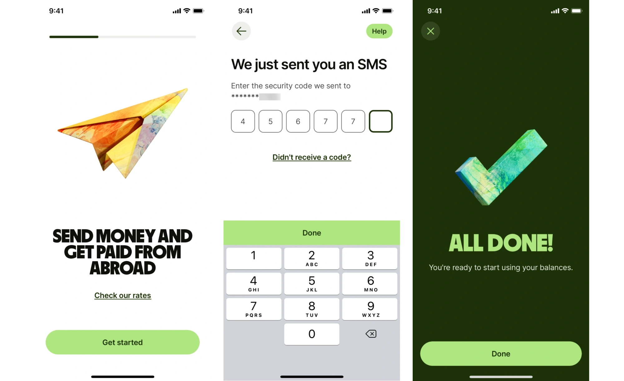
Users don’t want to feel like they’re talking to a bank. They want clarity without the legalese, reassurance without sugarcoating, and honesty above all. That’s why tone in fintech should aim to be human, transparent, and calm.
Every label, error message, tooltip, and confirmation screen is an opportunity to reinforce that you're on the user's side. A message like “We'll never access your funds without your permission” during a mobile banking UX flow can drastically improve confidence. A vague error like “Something went wrong” does the opposite.
To make microcopy work, consider the following:
- Use plain language for anything involving fees, permissions, or data usage.
- Avoid passive voice in high-stakes moments.
- Keep confirmation messages warm but brief.
- Be consistent with terminology across the product.
Apply motion with purpose
Flashy animations might work in consumer products, but financial app design requires purposeful motion. This could mean a loading animation, a screen transition, or a micro-interaction like a card “flipping” to reveal account details.
Motion also plays a crucial role in communicating cause and effect. When users tap a button, a quick animation confirms that the action was received. If something fails, animated error feedback helps users understand what went wrong.
When you decide to implement something catchy in your design, be careful. Done right, motion helps your banking app keep a trustworthy look, even in moments when users are waiting, verifying their identity, or navigating complex interactions.
Choose colors intentionally
Color does a lot of heavy lifting in fintech. It sets the emotional tone before a user reads a single word. That's why most established financial products gravitate toward blues (signals stability and reliability) and greens (carries associations with financial health).
But color choices go deeper than picking a palette. In fintech, color is also functional. It signals status (red for failed transactions, green for successful ones), highlights CTAs, and guides attention through complex screens.
So you can use it wisely, here are some points to consider:
- Reserve red exclusively for errors or warnings.
- Use neutral backgrounds to let data breathe and avoid visual noise.
- Avoid high-saturation palettes for primary screens.
- Test color contrast rigorously, especially for data-heavy views.
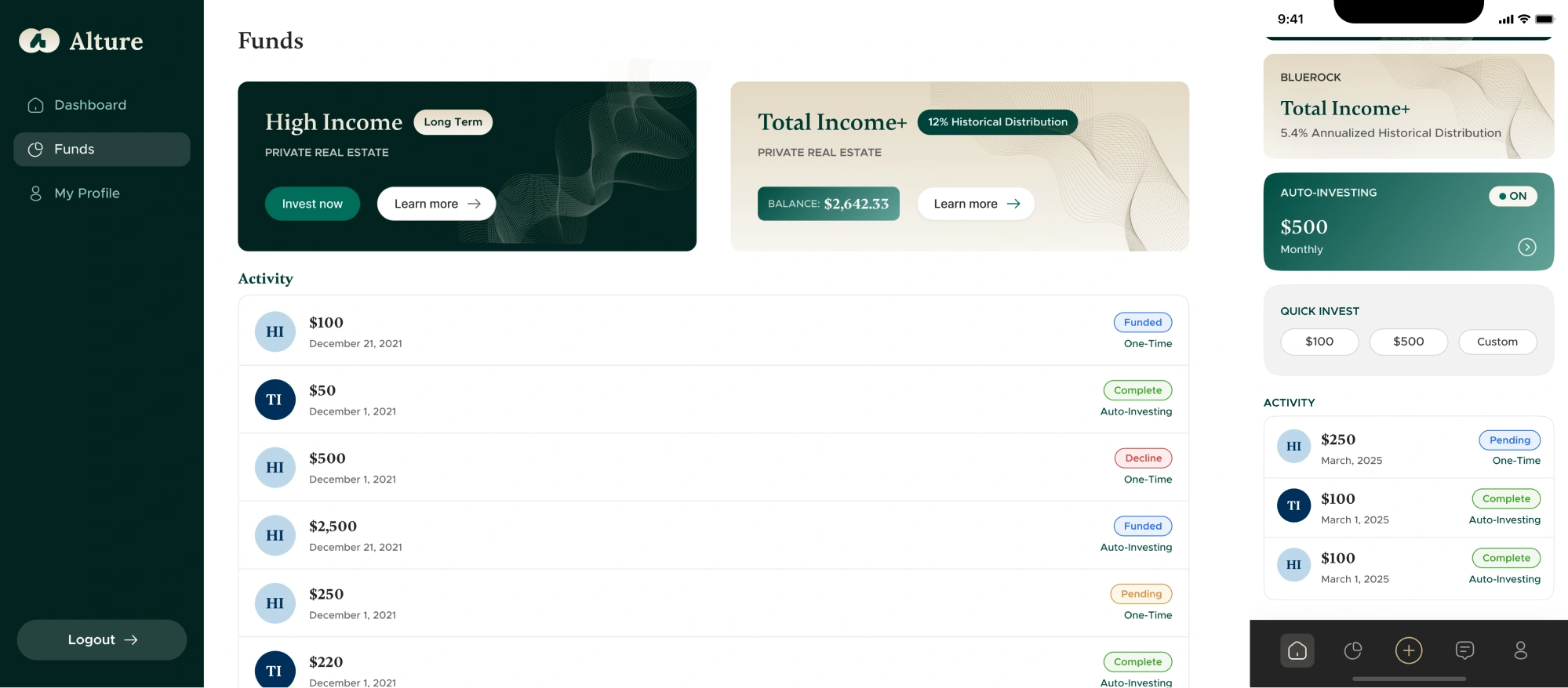
A great example is our work with Alture Funds. When the client came to Eleken, their existing fintech platform had a flashy, Gen Z-oriented look. But as their brand shifted focus to a more mature audience ( 35-40+), the product design needed to match.
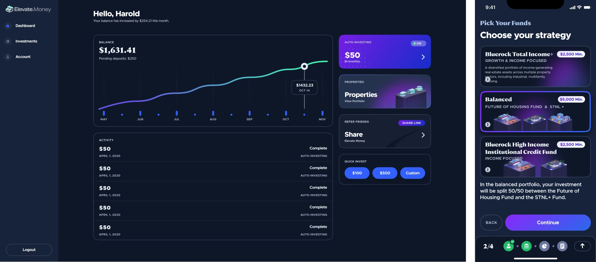
We replaced the high-energy aesthetic with a light theme as the new default. For color, we explored several directions and ultimately landed on deep green paired with gold accents to make the platform easier on the eyes.
Treat accessibility as a trust signal
Accessibility is often framed as a compliance checkbox. In fintech, it's better understood as a trust signal. A product that works well for users with visual impairments, motor limitations, or cognitive differences is a product that was carefully made, and users across the board pick up on that.
Beyond the ethical case, accessibility also has a direct business impact. WCAG-compliant products reach a broader audience, perform better in enterprise sales (where accessibility audits are often required), and are less exposed to legal risk.
Here are a few best practices:
- Build WCAG 2.1 AA compliance into your design system from the start.
- Ensure all interactive elements are reachable by keyboard and screen readers.
- Don't rely on color alone to convey meaning.
- Design tap targets of at least 44×44px for mobile.
- Test with real assistive technologies.
Support users with contextual help
Fintech products serve a wide range of users, including experienced ones and people opening their first savings account. The challenge is designing for both without patronizing one or overwhelming the other.
From our experience, the best solution is contextual education: small, well-placed explanations that appear exactly when a user needs them, and disappear when they don't. It could be a tooltip explaining a complex term in one sentence or an inline note clarifying why you're asking for a social security number.
These moments reduce anxiety, build confidence, and keep users moving forward instead of dropping off to Google something. The key is using plain language, benchmarked against a reading level that matches your audience.
Design for transparency
The mistake many products make is treating transparency just as a privacy policy page. Real transparency is a design decision. It means explaining what you're doing, why you're doing it, and what happens next, at the exact moment a user needs that context.
When you ask for camera access to scan an ID, tell users why. When a transaction takes longer than expected, explain what's happening in the background. When a fee applies, surface it clearly before the confirmation screen.
Moreover, when designing for fintech, avoid dark patterns or anything that could appear manipulative. Instead, emphasize transparency in pricing breakdowns, fees, and data usage to strengthen the brand’s integrity.
How to build a design system that scales
As fintech products grow, design decisions start to pile up.
One team builds a KYC form, another copies a transaction card from an old dashboard, and someone else designs a new button for a one-off feature. Before you know it, the financial services product feels fragmented, and users notice that.
In situations like this, a design system becomes a lifesaver. It gives teams shared data visualization patterns to create a cohesive structure.

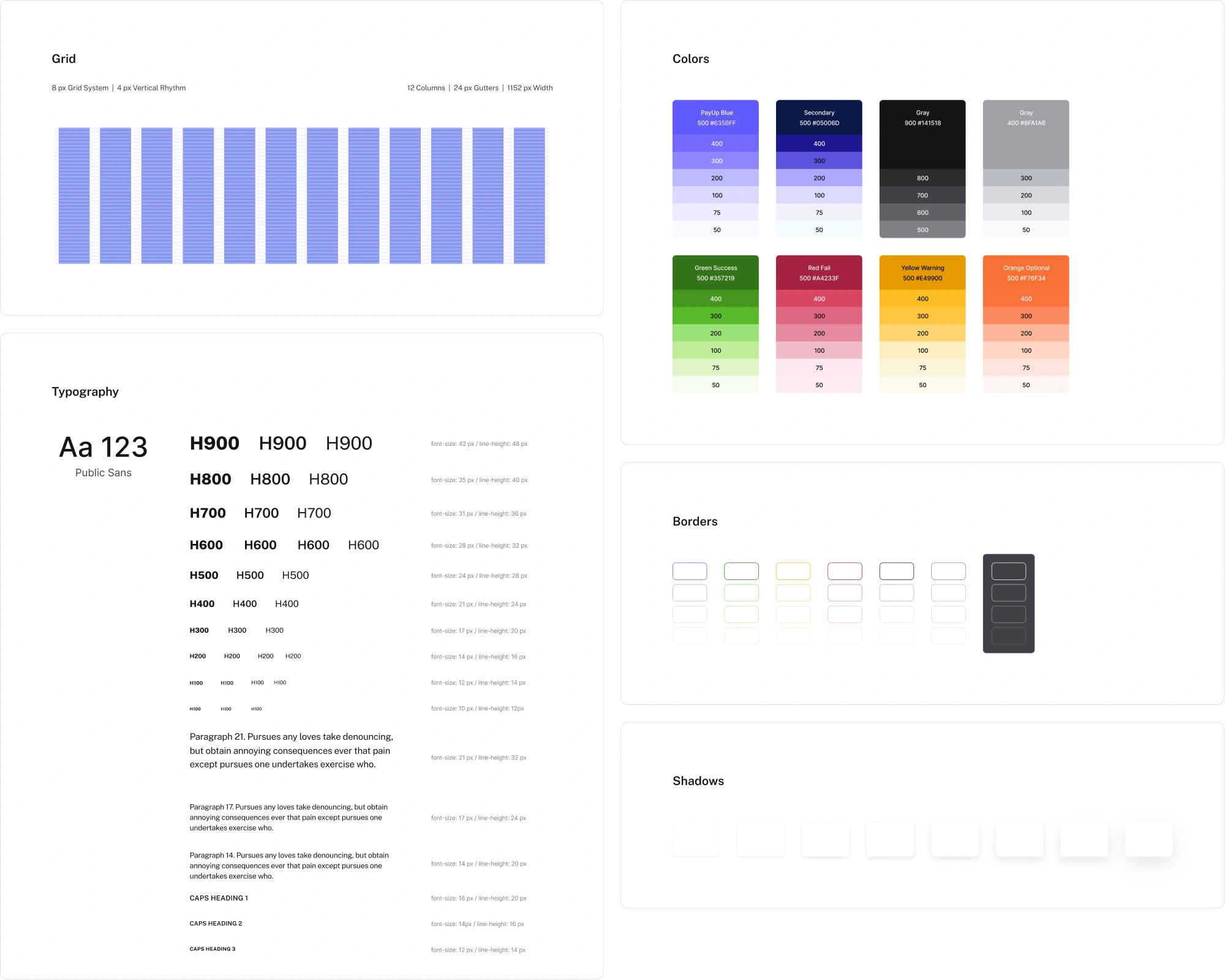
When we worked with PayUp, a financial platform, the need for a design system became clear quickly. The team was shipping new features rapidly, and we had to keep visual styles and components consistent to avoid design drift.
Alongside other tasks, Eleken’s designer built a design system that included:
- A core library of high-use components like buttons, containers, and more.
- Consistent design tokens for color, typography, spacing, and states.
- Lightweight documentation covering color usage and spacing rules.
- Components tailored for both mobile and desktop dashboards.
This gave the team reliable building blocks. Our designer could move faster, developers had fewer questions, and no one had to reinvent the wheel.
Moreover, the impact of a design system is measurable. Industry analysis shows that it can cut design time by 30–50% and reduce development time by around 30%.
Beyond that, a huge advantage for fintech is the ability to add industry requirements right into it. Teams can embed accessibility standards (WCAG) from the start so that color contrast, typography sizing, and interaction styles meet guidelines by default.
Simply put, consistency builds confidence. When users see the same patterns and behaviors across every screen, they feel that the product is carefully made. And in fintech, that consistency can make or break the user experience.
Reusable design patterns in fintech UX
While you're designing a fintech app, you don’t need to invent new solutions. Most products rely on a set of UX patterns that make the experience familiar. In the following sections, we’ll break them down in detail.
Intuitive navigation
Successful applications use consistent navigation patterns. Tab bars, side menus, and collapsible headers help organize key sections like financial accounts, payments, analytics, and settings.
That kind of structural consistency helps teams build a clear UX design for fintech, reducing friction and cognitive load.
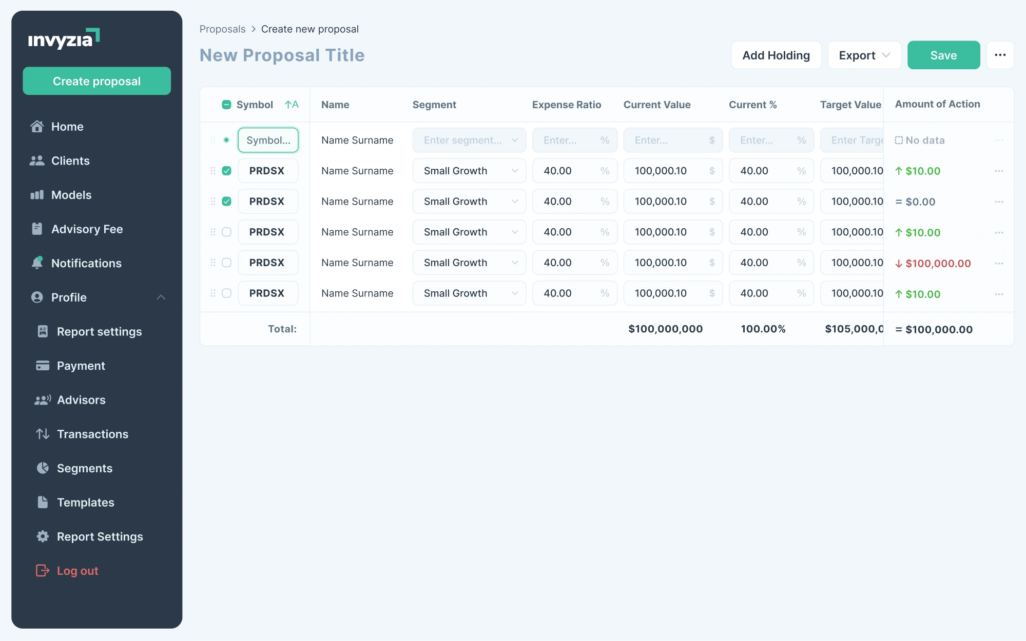
We applied this principle while working on Invyzia Solutions, a niche platform for building financial proposals. At first, the product had a multi-step flow with scattered pages and unclear transitions, making it hard for users to manage.

To solve that, our Eleken team proposed a simpler structure. We added breadcrumb-style navigation to show users exactly where they were in the process, and redesigned the proposal creation flow into a single page.
Clear visual hierarchy
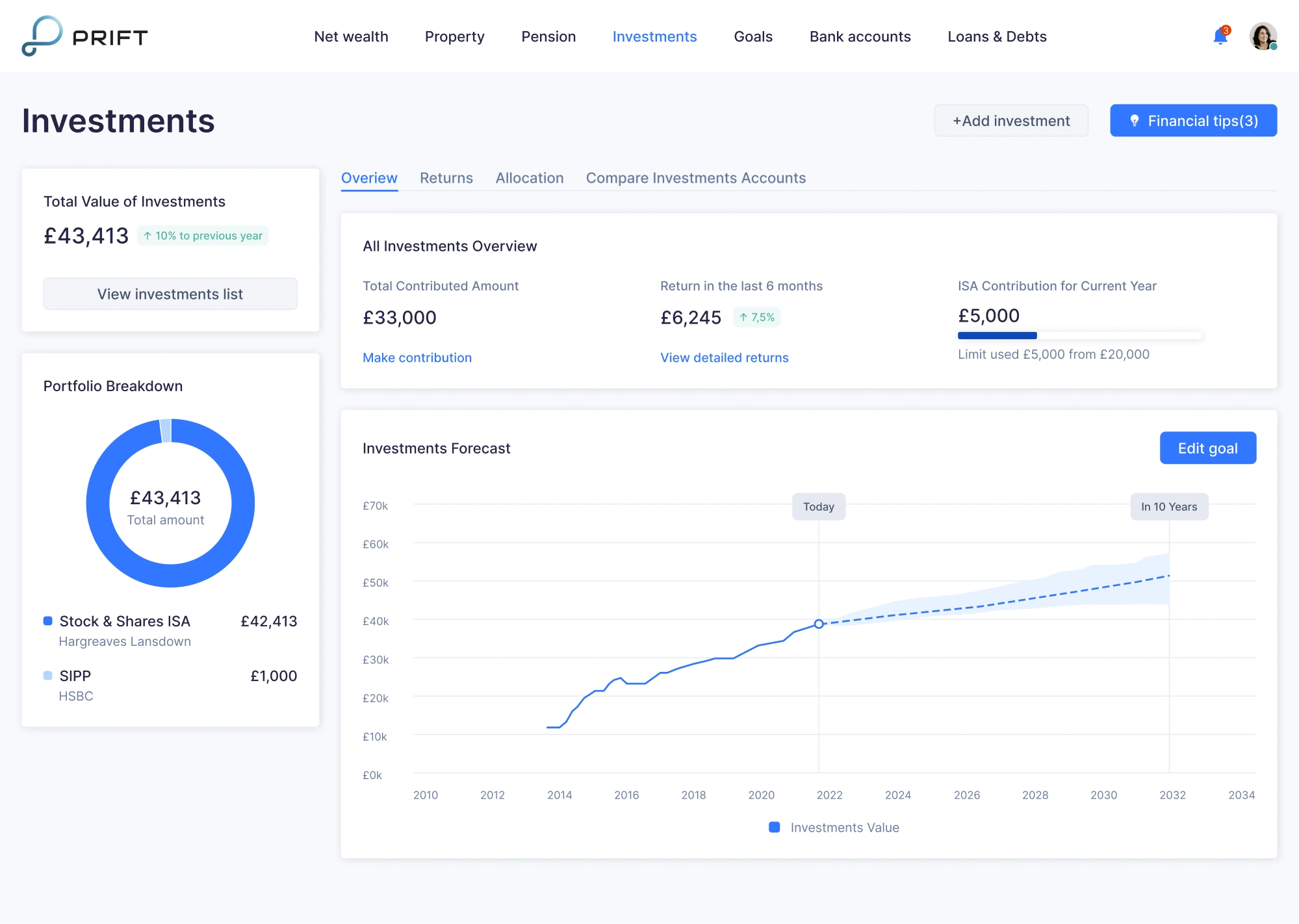
Strong hierarchy starts with the right combination of typography, spacing, and visual patterns, helping users instantly understand what matters most on the screen.
Important customer data, like current balance, portfolio value, or “Pay” button, should immediately draw the eye. Supporting details, such as account numbers or transaction descriptions, can take a back seat in smaller type or muted colors.
Visual hierarchy also plays a key role in financial data visualization. A table of numbers might technically show your spending, but a color-coded pie chart or trend line can communicate the same insight far more intuitively.
Feedback and confirmation
To communicate system status, fintech apps use a combination of loading indicators, progress animations, and confirmation messages. For example, after a user sends money, the app might show a loading screen, followed by a message like “Success!”.
If something goes wrong, clear error states are just as important. A message like “Payment failed — please check your card info” helps users recover quickly and keeps the experience from breaking or becoming confusing.
Even small microinteractions, like a soft bounce when setting a savings goal or a sound cue after completing a task, make the system come alive.
Streamlined forms and onboarding
In fintech, a common pattern is to replace long forms with a wizard-style onboarding process, breaking it into small steps with clear progress indicators. Instead of asking for everything at once, you must guide users screen by screen.
Inline validation and real-time feedback are also critical. When users see messages like “password strength: strong” or an error state guidelines next to an invalid input, they feel in control, and they’re far less likely to abandon the process.
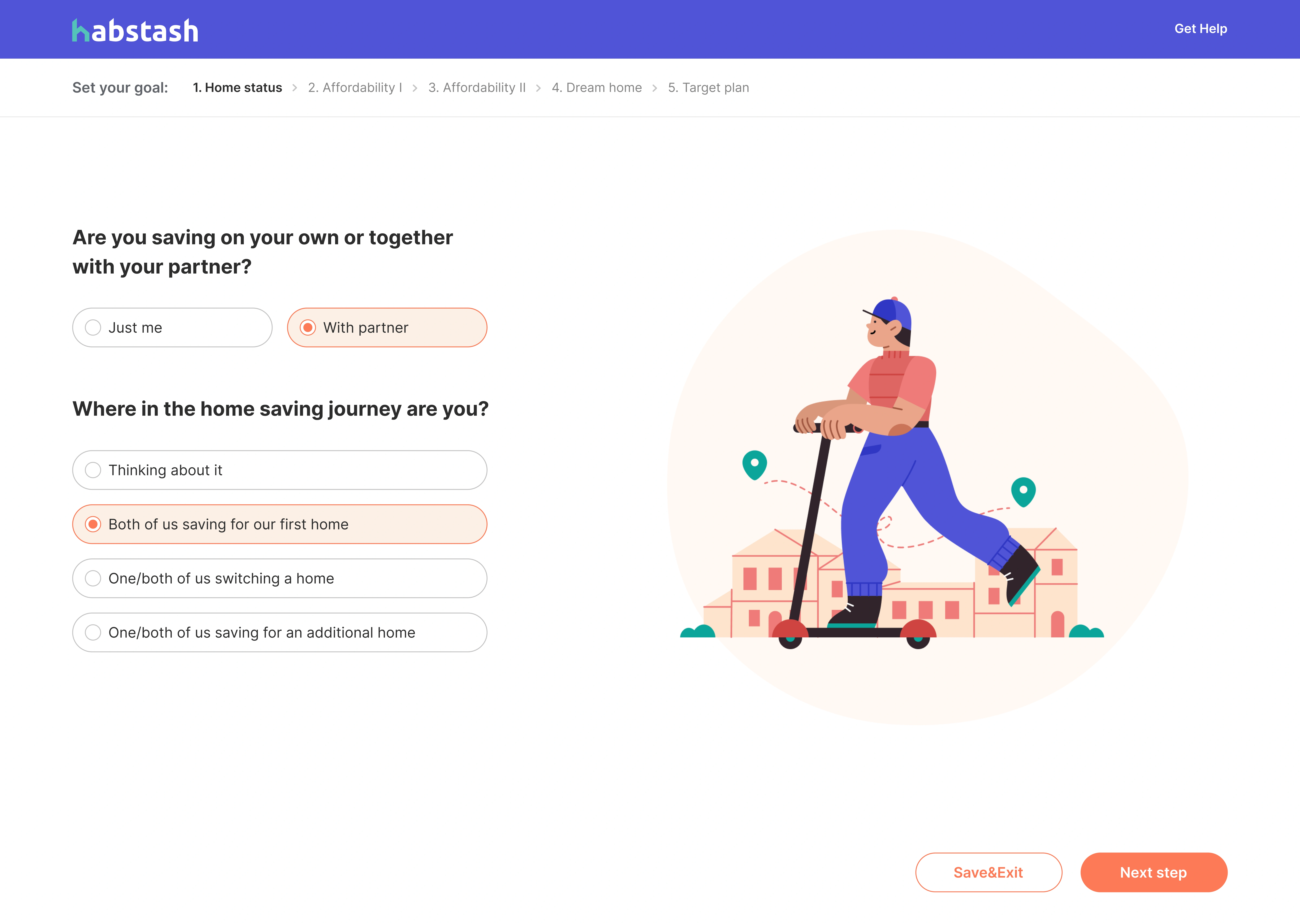
We put these ideas into practice while working on Habstash, a UK-based app that helps users plan their path to homeownership.
In the onboarding flow, we structured each step around a single question or input. And because we knew not everyone would finish the process in one sitting, we added a “save and exit” option early in the user journey.
Secure authentication and trust cues
Fintech apps often use biometric authentication or two-factor verification to secure logins and high-risk actions. These flows remove the need to type long passwords, creating a smoother user experience without compromising safety.
But security also needs to be visible. Trust and security cues like a padlock icon, a “Securely encrypted” label on the login screen, or badges like “FDIC-insured” send subtle but important signals that the app is built to protect the user.
Some apps also use progressive disclosure to protect sensitive details. For example, full account numbers or card PINs might be hidden by default, requiring a tap or verification step to reveal them.
Emerging fintech industry trends in 2026
As industry evolves, so do user expectations. To stay ahead, companies need to design for speed, intelligence, and trust. That’s why we’ve put together a list of emerging UX directions that will likely define the next wave.
Mobile-first and omnichannel experiences
Mobile is often the first point of interaction for fintech users. People expect to manage their finances from anywhere, whether they’re checking a balance on the go or completing a loan application during a coffee break.
But as users switch between devices, they also expect a seamless transition. In this case, omnichannel design becomes essential.

If someone starts a loan application on their phone, they should be able to finish it later on a laptop without friction. That requires consistent UI patterns, synced data, and adaptive layouts that look native across platforms.
Tips and patterns:
- Use a unified design system to maintain consistency across devices.
- Sync user sessions and actions in real time using cloud-based infrastructure.
- Make a responsive fintech UI that works across devices.
- Design for touch first, then adapt for mouse and keyboard.
Gamification of finance
Money can be stressful, and fintech companies are finding new ways to drive customer engagement. One of the most effective approaches is gamification.
By using key elements like progress bars, goal streaks, badges, and visual milestones, apps can motivate users to save more, pay down debt, or build better financial habits without turning it into a chore.
Gamification also improves retention. When users gain a sense of achievement or momentum, they’re more likely to return to the app. But it’s important to apply just the right amount of interactivity, so the experience doesn’t feel overwhelming.
Tips and patterns:
- Use streaks and reminders to reinforce habits.
- Visualize goals with progress indicators.
- Add milestone celebrations for key achievements.
- Use empty state design to motivate first-time actions.
Biometric security and passwordless login
Typing in passwords is quickly becoming a thing of the past. As users demand faster and secure access, fintech products are turning to biometric authentication UX, and passwordless login processes to make both happen at once.
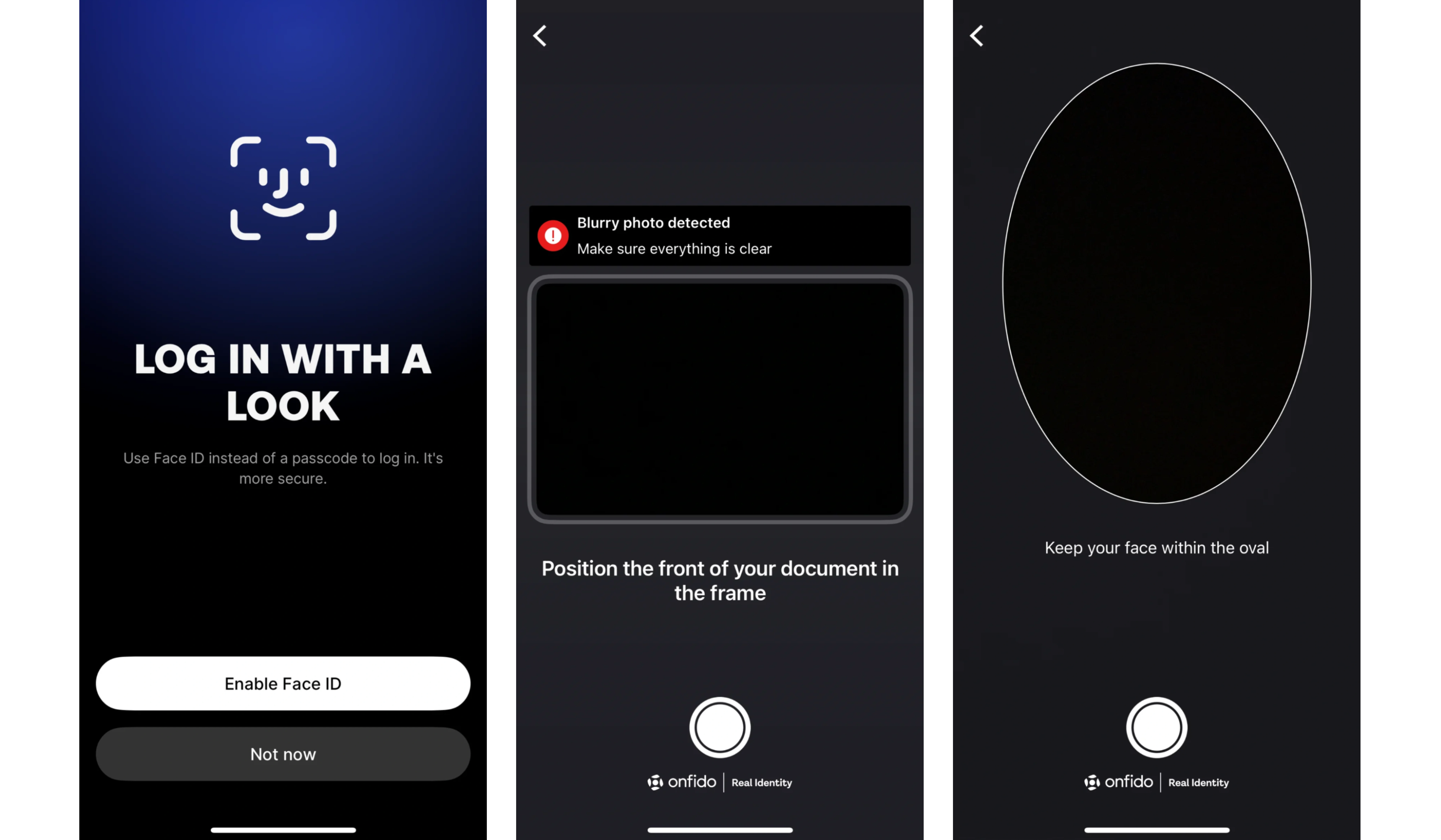
Face recognition, fingerprint scans, and device-based authentication are now widely used to protect sensitive user information. These methods are more secure than traditional passwords and far more convenient for users.
By reducing the number of steps while increasing the level of trust, these flows help users feel both safe and in control.
Tips and patterns:
- Implement biometric login using native device APIs.
- Combine biometrics with device-based 2FA for high-risk tasks.
- Give users clear control over biometric settings.
- Use visual trust cues at decision points.
Voice and conversational interfaces
Digital assistants like Siri, Alexa, and Google Assistant have made voice and chat-based interfaces familiar to users. Fintech businesses use them for tasks like bill payments, budget updates, or transaction searches as a faster alternative.
Conversational design also opens doors for personalized financial guidance. Chatbots can walk users through goal-setting, explain unfamiliar terms, or even flag unusual activity in a tone that is helpful rather than robotic.
That said, the key to success is trust. In fintech, users should always know what data is being accessed and why, and be able to opt out easily.
Tips and patterns:
- Use natural language flows with fallback options (like buttons or quick replies).
- Train bots to recognize financial terminology and user intent.
- Always display what data the bot is using or accessing.
- Use voice/AI interactions for assistive tasks, not high-risk actions.
One last thing
Fintech isn’t slowing down, and neither are the expectations that come with it. Users want clarity without friction, trust without hand-holding, and speed without compromise. That’s a tall order for any product team.
But that’s what makes this space exciting. Every design decision is a chance to earn trust, solve problems, and create something people actually want to use.
If you ever sit down to create a fintech app, rely on the UX patterns and tested principles we’ve shared above. And if you'd rather delegate that work to someone who's done it before, the Eleken team is just a few lines away.


.webp)

.png)
