.png)


(..and don’t make your users want to throw their phones out the window)
When designing a great Map UI, you need something clear, stylish, and functional, but also flexible enough to handle tons of data without turning into a chaotic mess.
We’ve been there. At Eleken, we’ve worked on some pretty complex geospatial apps for clients like ReVeal, Greenventory, Gamaya, Involi, and Astraea, platforms where the map is the product.
And we’ve learned the hard way: if your map UI fails, users notice it fast.
This Map UI Design guide will show you how to design maps that are good-looking, highly usable, scalable, and a joy to interact with.
Plus, we’ll share insider tips from our Head of Design, Maksym, who’s spent years obsessing over things like hover states and layer management (so you don’t have to).
By the end of it, you’ll know:
• What makes a great Map UI (spoiler: it’s not the default Google Maps view).
• How to solve the most common UI map design headaches.
• Which tools and real-world examples can inspire your next project.
If you’re building a geospatial product and need extra hands, we do this kind of thing for a living. Check out our work and see what we’re all about. Ready? Let’s dive in.
What is map UI?
Let's start with the basics. Map UI isn't just "a map on a screen"; it's the entire system that lets users navigate, understand, and interact with geographical data. Think of it as a special kind of interface that operates in a spatial dimension.
Unlike your standard app screens where everything stays in place, a map interface shifts and changes as users zoom, pan, and explore. It's like the difference between looking at a photo album versus walking through a city, one is static, the other is a dynamic experience.
Map interfaces typically serve three main purposes:
- Navigation: Helping users get from A to B, find specific locations, or understand "where things are".
- Visualization: Showing data in a geographical context (like heat maps, property listings, or delivery zones).
- Analysis: Letting users discover patterns and insights based on location data.

Why map UIs matter more than ever
Maps are everywhere, from fitness apps that track your morning runs to supply chain dashboards monitoring shipments halfway across the world. As the data gets heavier (think multiple layers, analytics, and real-time updates), the design has to do more heavy lifting without overwhelming the user.
Here’s why great Map UI Design makes all the difference:
- It helps users find what they’re looking for faster.
- It makes complex data easy to digest.
- It keeps things intuitive, even when the backend gets complicated.
- It makes your product look and feel more professional.
Styling for aesthetics: the first big challenge
The first hurdle most designers hit is aesthetic: default maps UI looks bland, generic, or completely clashes with your carefully crafted UI.

"Default maps often look unattractive", Maksym says. "If you're building a product around maps, you always need to style them. Adjust colors, simplify details, reduce clutter, whatever it takes to make the map feel like it belongs in your product."
Here’s how we approach styling at Eleken:
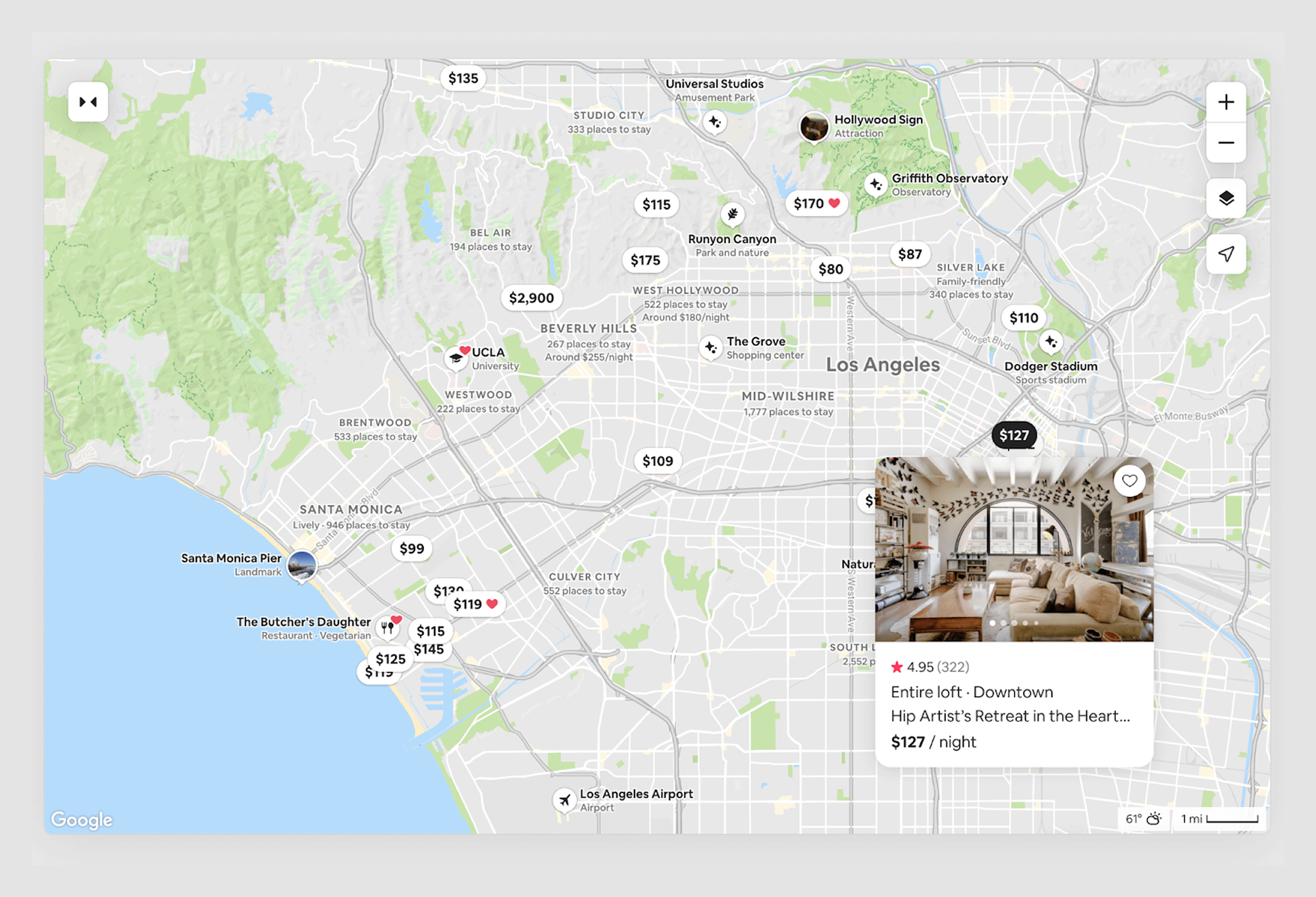
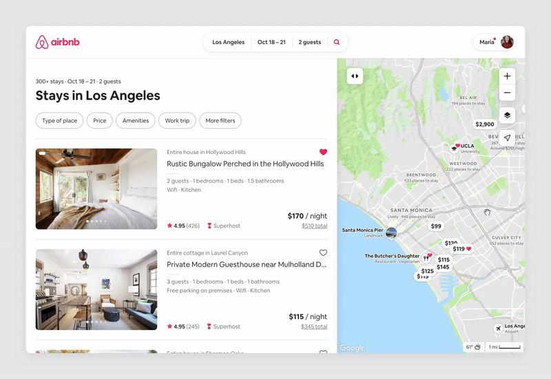
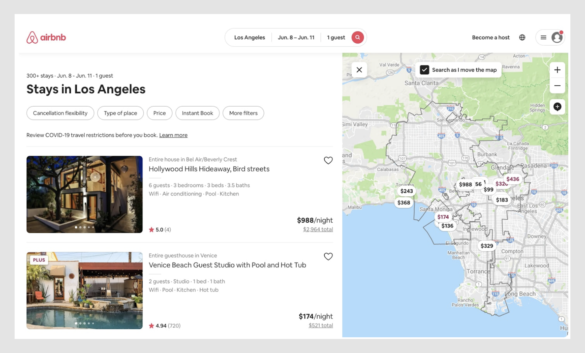
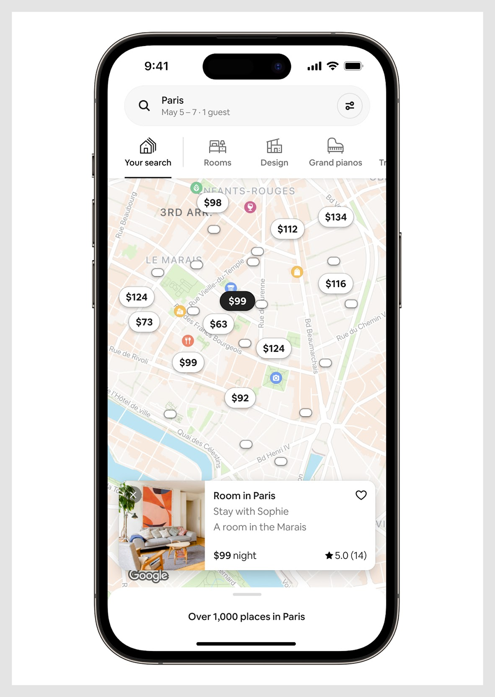
- Match your brand identity. Colors, fonts, and overall vibes should feel cohesive. Airbnb’s map UI is a great example with muted tones, clean lines, and no unnecessary clutter.
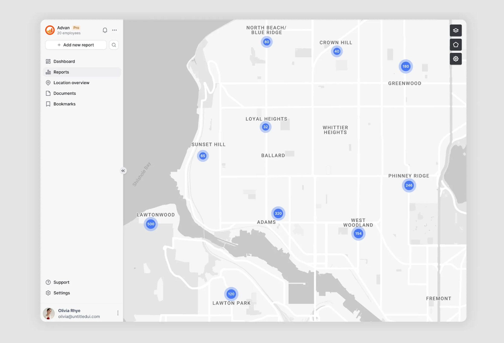
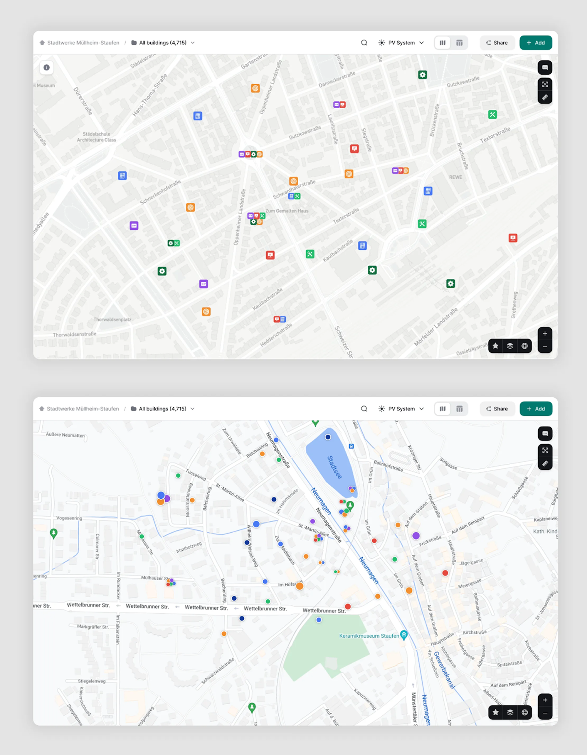
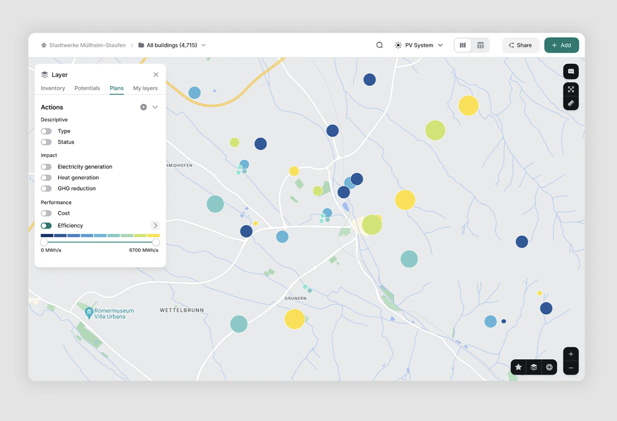
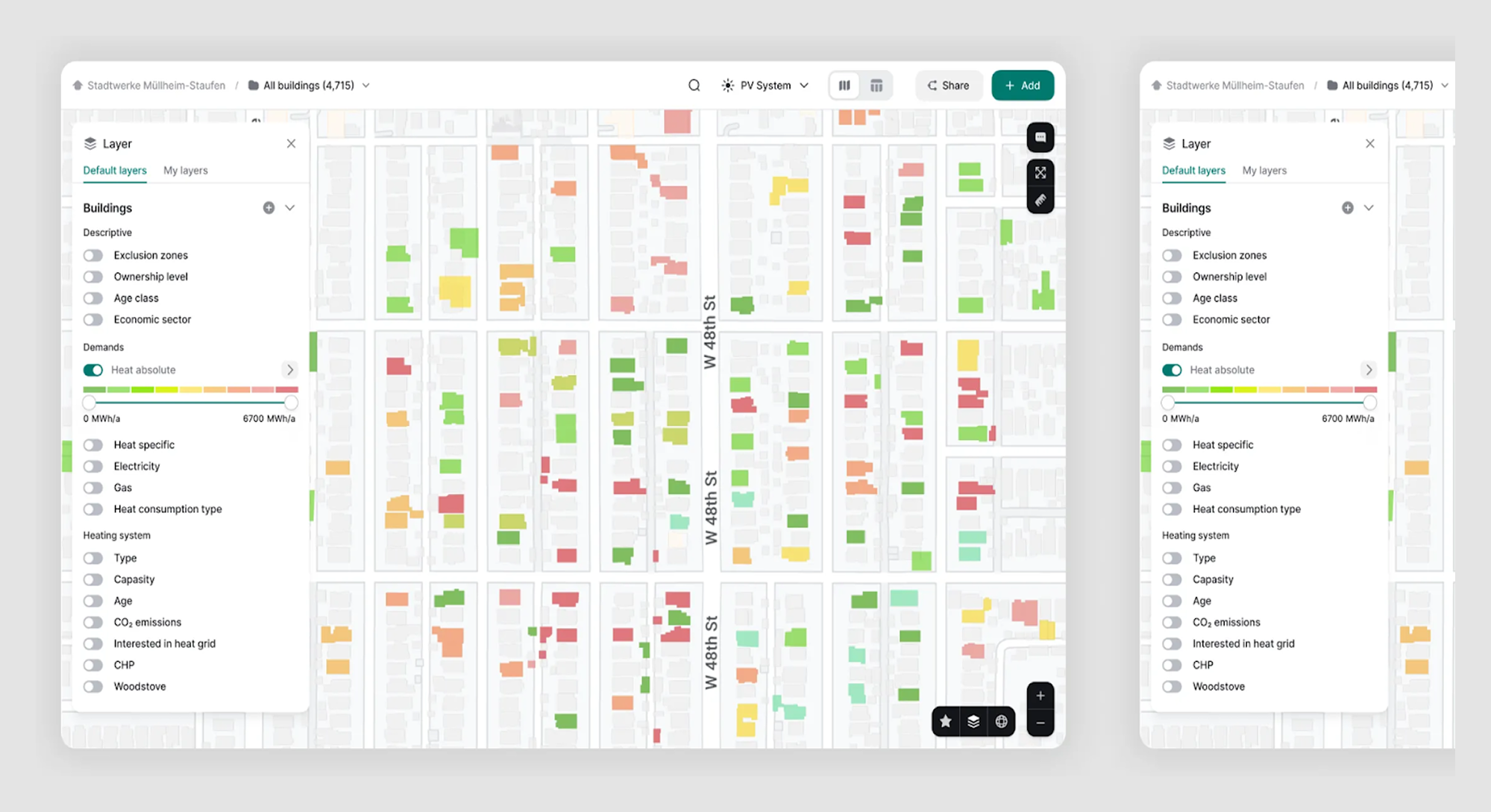
- Reduce cognitive load. Remove unnecessary labels, icons, and roads that don’t matter to your user’s goal. In our Greenventory project, we made it easy for users to switch between map layers and toggle them on or off. Clear visual indicators on the right ensured users always knew which layers were active, keeping the interface focused and intuitive.
- Prioritise visual hierarchy. Important points (destinations, routes, regions) should stand out, while secondary details stay subtle. In our Astraea project, we added the option to hide the side menu, allowing users to focus fully on the map. This simple but effective solution instantly reduced visual clutter and improved clarity.
If you want to dive deeper into how visual hierarchy can be applied in card elements, take a look at these card UI examples.
Key elements of effective map UI
A well-styled map isn't just prettier, it's more functional. When users can quickly distinguish what matters from what doesn't, they make better decisions faster. And when your map feels like a natural extension of your product rather than a bolted-on third-party element, users trust your design choices across the entire experience.
But a beautiful map is just the beginning. Once you've got the aesthetics right, you need to ensure users can actually use the thing. Let's look at the key elements that make map interfaces truly effective.
1. Navigation tools that help
Have you ever used a map where zooming feels janky or you constantly lose track of where you are? That's poor navigation design.
Good map navigation includes:
- Intuitive zoom controls: Clear +/- buttons or smooth pinch gestures.
- Sensible pan behavior: Drag that feels natural, not too fast or slow.
- Search that actually works: With smart suggestions and intuitive input field design.
- Filters: Ways to show just what you need without overwhelming.
- Orientation helpers: Simple indicators so users don't get lost in "map space".

For more tips on how to create effective filtering experiences, check out our guide on filter UX and UI. And if you're working on dynamic lists next to maps, our list UI design post might come in handy too.
2. Visual hierarchy that makes sense
Maps are information lasagna, layers upon layers of stuff. Without a clear visual hierarchy, users can't tell what's important.
The key layers in any map UI:
- Base map: Your foundation showing geography (roads, terrain, water).
- Data layers: The good stuff, your product's unique information.
- Interactive bits: The clickable, hoverable elements that users interact with.
- Controls and UI: The tools users need to manipulate the view.
For more layout inspiration and structure ideas, check out our article on grid layout design.
"The challenge is balancing information density with readability," Maksym explains. "You need to decide what information is essential at each zoom level and how to present it without overwhelming the user."
A great example of this in action is Airbnb. They nailed that balance.
3. User interaction design that feels natural
This is where things get complicated. Map interactions involve two modes that can conflict:
- Map navigation: Zooming, panning, exploring the space.
- Object interaction: Clicking on pins, selecting areas, viewing details.
Ever clicked a marker only to accidentally pan the map instead? Or did you try to zoom but activate some random feature? That's bad interaction design.
Good map interaction design includes:
- Clear selection states: Users should instantly know what's selected.
- Helpful hover states: Give users a preview of what they'll get when they click.
- Consistent click behaviors: If clicking a pin opens a popup here, it should do the same there.
- Context retention: Users shouldn't lose track of what they were looking at when navigating.
If you use toggles to control layers or content views, here's our go-to guide for better toggle UX.
"When designing map interactions, you need to think about both exploring the map itself and exploring objects on the map," says Maksym. "These are two different interaction patterns that need to coexist without fighting each other."
In our ReVeal project, the client worked with a large, fast-growing database. Loading hundreds of map objects at once was slowing things down. And we knew it would only get worse as the data grew.
Our solution was to group objects by location. Instead of showing every individual marker, we clustered them by neighborhood when zoomed out, limiting visual noise while keeping the map fast and usable, even at city scale.
Map UI examples
You know what's funny about map interfaces? Everyone thinks they need the fanciest, most interactive map with all the bells and whistles. But sometimes, a simple static map is all you need.
At Eleken, we've designed maps for everything, from drone tracking systems to agricultural analytics. And if there's one thing we've learned, choosing the right type of map is half the battle. Let's dig into some real-world examples, starting with the most basic decision you'll need to make.
If you're looking for general layout inspiration, you might also find some ideas in our screen design examples.
Static vs. interactive maps: knowing when to keep it simple
Think of static maps as a snapshot: they show specific information in a clear, unchanging way. They're your best friend when you need to display fixed locations, service areas, or simple routes. Plus, they load faster and work great in both digital and print formats (yes, people still print things in 2024!).
We often use static maps when building "Contact Us" pages or showing coverage areas. They're perfect for those "just show me where it is" moments, and you can still make them look stunning with tools like SnazzyMaps.
Interactive maps, on the other hand, let users explore, zoom, pan, and interact with different layers of information. You'll want one when your users need to:
- Explore and analyze data
- Track real-time changes
- Switch between different data layers
- Select areas or create custom routes
- Zoom in for detailed analysis
"The trick is to match the map type to your users' actual needs," Maksym says. "Sometimes the simplest solution is the best one, but when you need interactivity, go all in and make it count."
Speaking of going all in, let's look at some cases where we really pushed the boundaries of what maps can do..
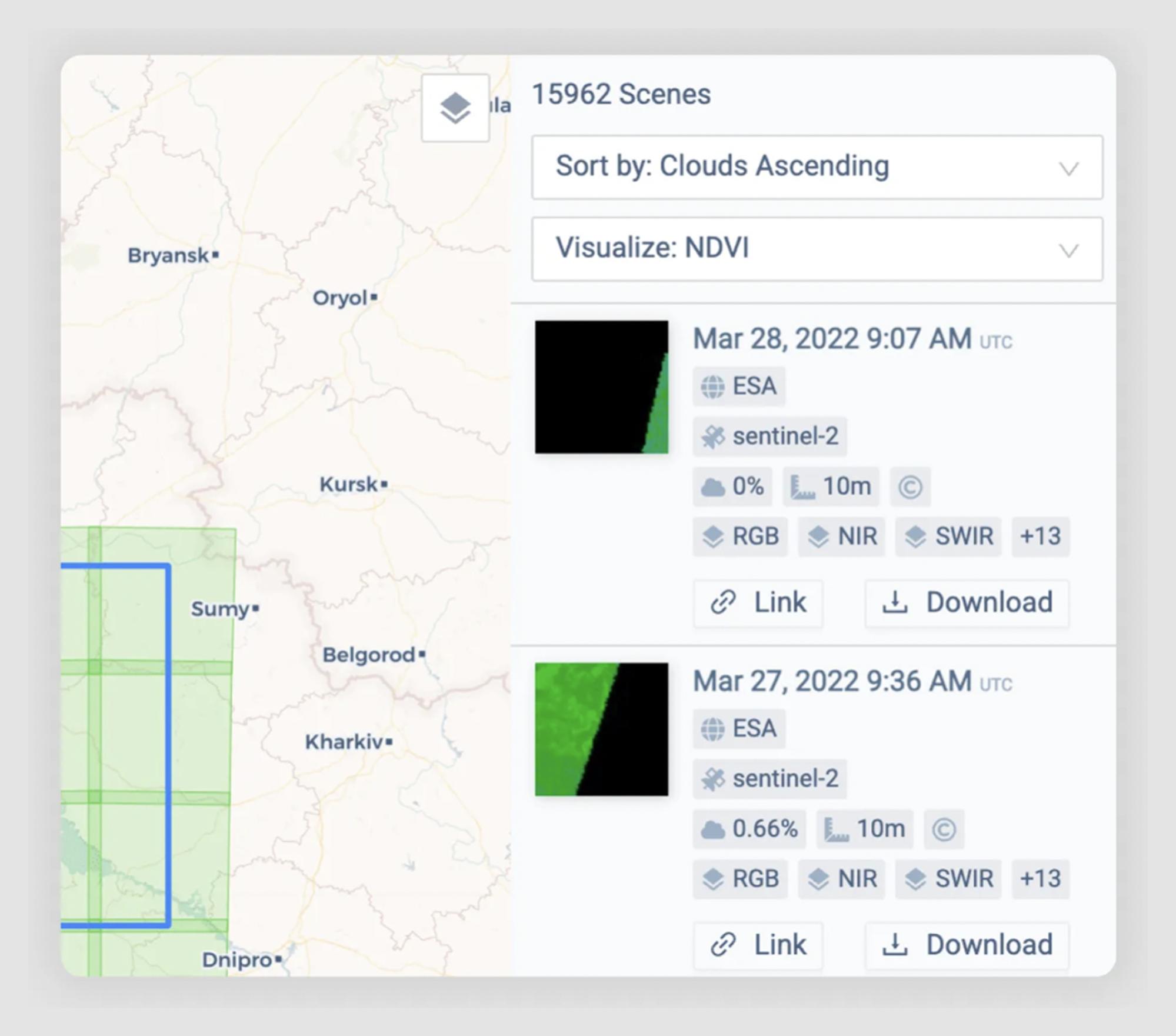
Real-time tracking maps: INVOLI’s case study
INVOLI helps keep the skies safe. Their software tracks everything that flies at low altitudes, from small drones to helicopters. Different people use their platform: drone pilots need to plan safe flights, property owners want to monitor their airspace, and aviation authorities need to watch for any problems.
Their biggest design challenge was pretty clear: how do you show lots of moving objects on a map without making it messy and confusing? Each user needs to track different things and quickly understand what's happening.
Here's what worked:
⟶ Clear status updates: We used simple colors everyone understands - green means everything's good, yellow shows what you're looking at, and red warns about problems.
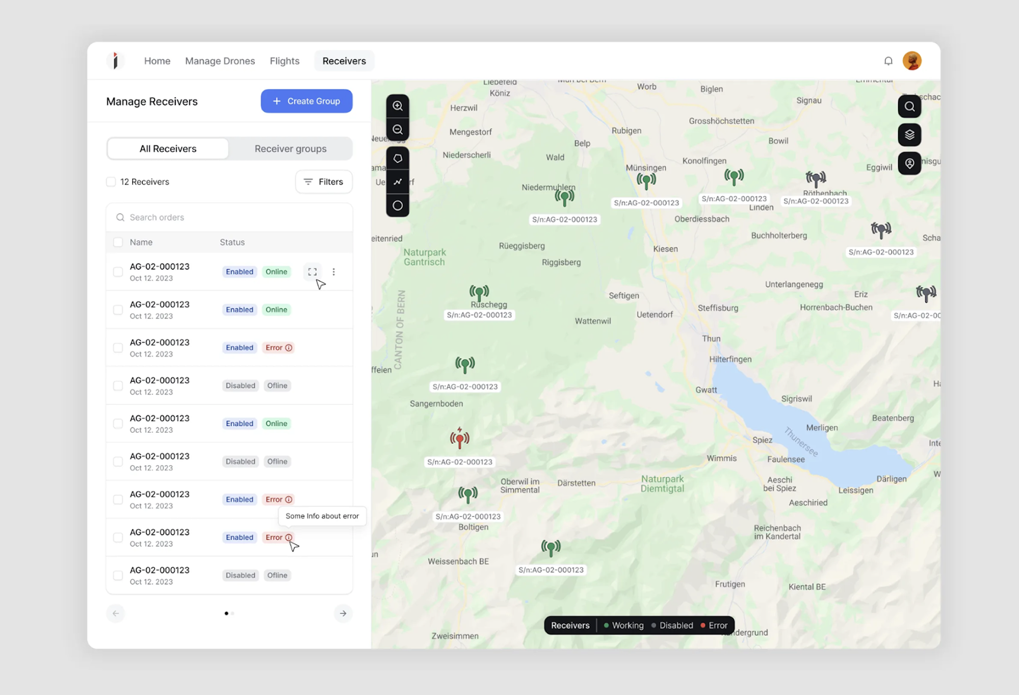
⟶ Smart grouping: When too many objects bunch up in one spot, we group them together so the map stays tidy.
⟶ Easy viewing options: Users can turn different map features on and off, like switching between seeing all air traffic or just their own devices.
⟶ Coverage maps: We added heat map-style overlays to show where tracking devices can and can't detect aircraft.
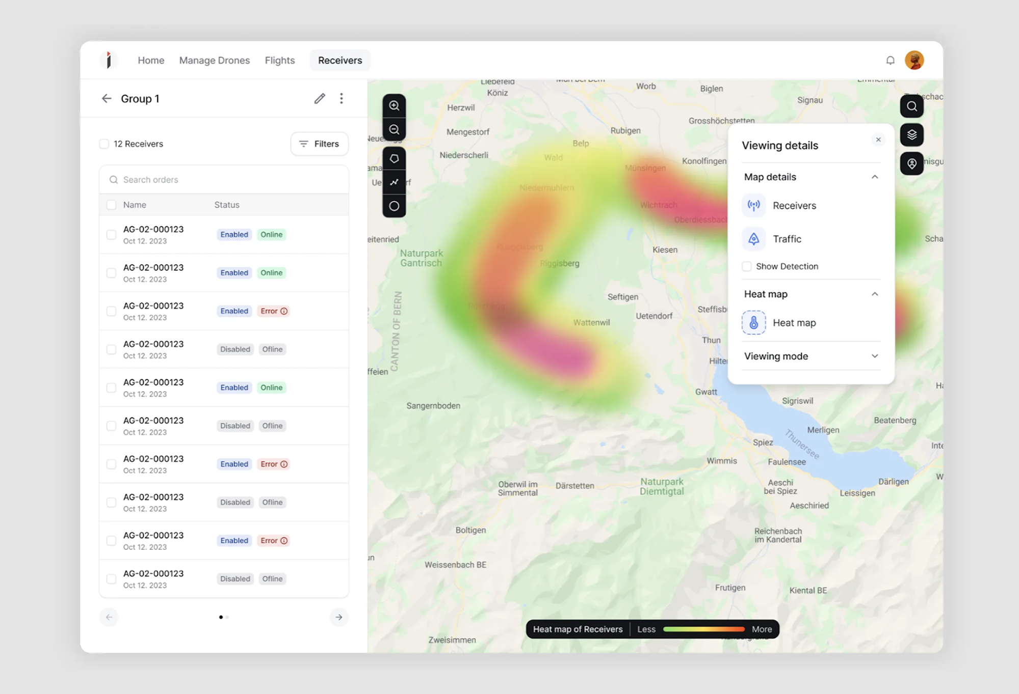
⟶ Detection zones: Users can click on any tracking device to see exactly which aircraft it's picking up.
⟶ Smooth updates: The map updates constantly but smoothly as things move around.
These changes made the map much easier to use. Now, whether you're tracking one drone or watching an entire city's airspace, you can see exactly what you need without getting lost in the details.
Analytical and data-heavy maps: making complex data easy to understand
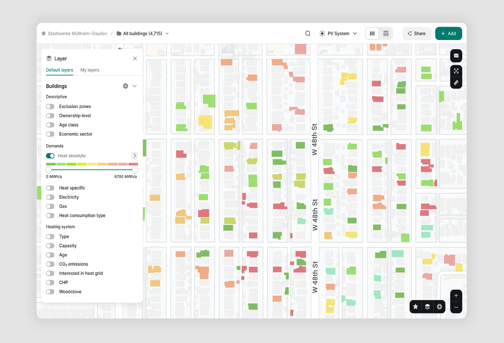
Sometimes you need more than just dots on a map. Both Greenventory and Gamaya came to us with a tricky task: show lots of detailed data on a map without making users' heads spin.
Greenventory helps cities plan their switch to green energy. They need to show things like where solar panels would work best, how much energy different areas use, and what the power grid looks like.
Gamaya helps farmers track crop health using data from satellites and drones. They need to show everything from plant growth stages to problem areas in the fields.
The big challenge? Both apps deal with layers upon layers of complex data. Users need to see patterns, compare different areas, and make decisions based on what they see.
Here's how to design a map and make it work:
⟶ Smart zooming: When you zoom out, we group similar things together to keep the map clean. Zoom in, and you see all the details.
⟶ Layer controls: Users can mix and match different data types, like toggling between soil types and crop health.
⟶ Clear filters: Simple filters help users focus on exactly what they need to see.
⟶ Color mapping: We used colors that make sense - like red for problem areas in crops, or brighter colors for better solar potential.
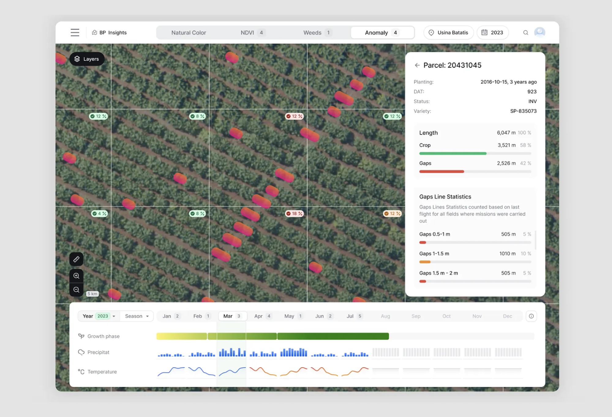
In Gamaya’s case, the images taken from drones show planting gaps (highlighted red)
⟶ Info on demand: Click any spot to get more details, without cluttering the main view.
⟶ Visual distinction: Each type of data gets its own clear visual style - so users can easily tell solar panels from wind turbines, or healthy crops from troubled ones.
These changes helped both companies make their complex data more useful. Now farmers can spot crop problems quickly, and city planners can make better decisions about green energy - all without needing a PhD in data science.
Customizable maps: one map, many views
Astraea took on an ambitious challenge to make satellite data analysis accessible to anyone who needs it. Their platform needed to work for a diverse audience, including businesses and NGOs, government institutions, and environmental initiatives.
As a startup, they faced a specific challenge: they needed a user interface that would make their complex AI-powered satellite analysis feel simple and approachable, while still being powerful enough for serious data work.
Here's how we approached the design:
⟶ Categorized navigation: We organized tools and features into clear categories, with icons on the right side of the screen.
⟶ Hidden complexity: Users can hide the side menu when they want to focus purely on the map.
⟶ Quick sorting: Added filters on the right for fast information sorting.
⟶ Clean interface: We kept the look minimal to help users focus on the data itself.
⟶ Timeline features: Users can add comments on the timeline to better navigate through information.
⟶ Clear pricing: Cost information is highlighted in orange so users can see map costs right away.

These real-world examples show there's no one-size-fits-all approach to map UI design. Whether you're tracking drones in real time like INVOLI, analyzing complex data like Greenventory and Gamaya, or making satellite data accessible like Astraea, the key is understanding your users' specific needs.
But across all these different cases, we found some common patterns. The most successful map interfaces:
- Keep things simple at first glance, but make advanced features easily available.
- Handle multiple data layers without overwhelming users.
- Load and display data efficiently, even when there's lots of it.
- Give users clear control over what they're seeing.
- Stay responsive and smooth, no matter how complex the data gets.
Of course, getting there isn't always easy. Let's look at some common challenges you might face when designing map interfaces, and how to solve them.
Common map UI challenges and how to solve them
Even the best designers run into roadblocks when working with maps. These issues, from visual clutter to clunky interactions, can make or break the user experience.
Here’s how to spot and fix the most common pitfalls before they frustrate your users.
When default maps look boring, what to do about it
Let's start with a problem every designer faces: default maps look like they were designed by someone who still uses Comic Sans unironically. They're generic, cluttered, and probably clash with your product's design.
Take Greenventory's case. When building their green energy planning platform, the default map was overloaded with unnecessary details. What users needed was a clear view of solar panel installations and wind turbine locations. To solve this, we used distinct colors for each: one for solar and another for wind, making it instantly easy to differentiate between the two data types at a glance.
Here's how to make your maps look less "default" and more "designed":
- Strip away the noise: Turn off labels and points of interest that aren't relevant to your users.
- Adjust your colors: Match your map colors to your brand's palette.
- Mind the contrast: Make sure important elements (like routes or markers) stand out against your map background.
- Keep useful details: Don't remove elements your users actually need, like major road names in a delivery app.
Your styling options will depend on which map service you're using:
- Google Maps + SnazzyMaps: The easiest way to style Google Maps. You can use ready-made themes or create your own.
- Mapbox: Offers the most control but needs more technical setup. Great if you need totally custom looks.
- OpenStreetMap: Basic styling options, but it's free and works well for simpler needs.
Remember: the goal isn't to make your map pretty just for the sake of it. Good map styling helps users focus on what matters by pushing the right information forward and letting the rest fade into the background.
When everything overlaps: handling multiple layers
Picture this: you've got a map showing buildings, roads, user markers, and three different types of data layers. Now your users are playing a frustrating game of "try to click the right thing" because everything's stacked on top of each other.
Here's how to fix it:
- Group nearby objects: When things get crowded, cluster similar objects together. We did this for INVOLI's air traffic map. Instead of showing 50 individual aircraft in a busy area, we group them and show a number.
- Add smart selection: If multiple things sit in the same spot, show a list so users can pick what they want.
- Use layers wisely: Let users turn different data layers on and off. But don't just dump twenty toggles on them - group related layers together.
- Think about zoom levels: Not everything needs to be visible at every zoom level. Show more detail as users zoom in.
The trick is finding the right balance between showing enough information and keeping things usable. Your map shouldn't feel like a game of Operation where users need surgeon-level precision to click the right thing.
Interaction and usability challenges
Have you ever clicked a map marker only to have the map pan away instead? Or zoomed in to look at something specific, only to completely lose track of where you were? Welcome to the fun world of map interaction problems.
The tricky part is that users need to do two different things at once: move around the map AND interact with stuff on it. It's like trying to catch a butterfly while riding a bike - you need to handle both tasks without falling over.
Here's how to make it work:
- Make clickable things look clickable: Your markers and interactive elements should scream "hey, click me!" through clear hover states and visual hints.
- Keep context while moving: When users pan or zoom, help them stay oriented. Keep selected items highlighted and visible.
- Add navigation helpers: A simple "return to selected" button can save users from endless scrolling when they get lost.
- Be consistent: If clicking a marker opens an info window in one place, it should do the same everywhere else.
Take a look at how Airbnb handles this. Their map updates the list of locations as you move around, keeps your selected property highlighted even when you zoom out, and makes it super clear which listings you've already looked at. It's smooth, predictable, and never leaves you wondering "wait, where was I?"
Remember that good interaction design feels invisible. Users shouldn't have to think about HOW to use your map - they should just be able to use it.
Working with different map backgrounds
Here's a fun one: you've designed the perfect map marker. It looks great on your standard map view. Then someone switches to satellite view and.. poof! Your bright green marker just vanished into the Amazon rainforest, literally.
Different map backgrounds come with different challenges. A satellite view can show anything from dark urban areas to bright desert landscapes. And what works on one background might be completely invisible on another.
Here's how to keep your UI elements visible no matter what:
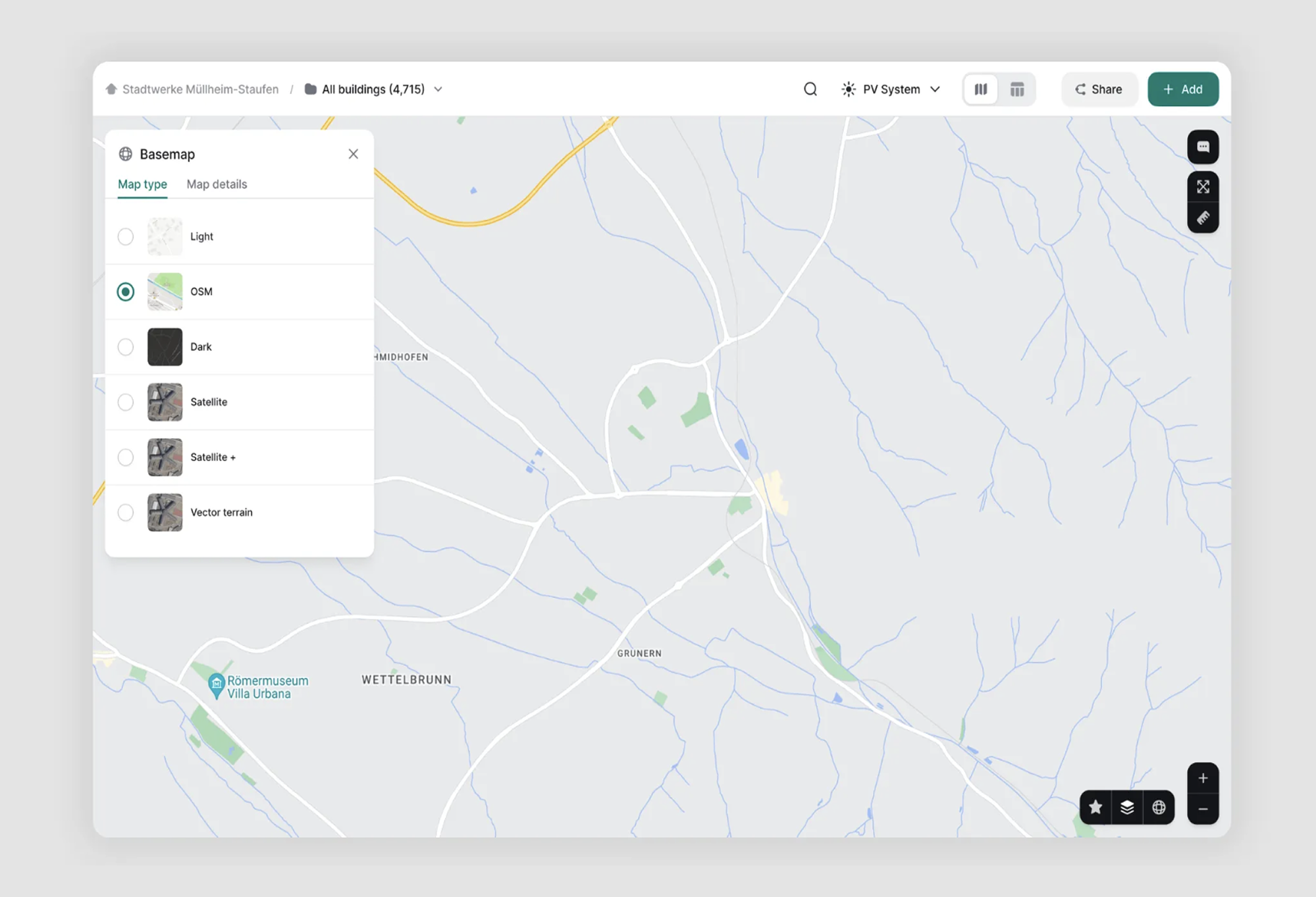
- Give users options: Let them switch between map styles (like standard and satellite views) to pick what works best for them.
- Use contrast tricks: Add outlines or shadows to make markers pop against any background.
- Think about adaptability: Your UI elements should adjust automatically based on what's behind them.
- Test extremes: Check how your design holds up against the darkest and brightest backgrounds you might encounter.
The key is ensuring your users can always find and use important elements, regardless of their preferred map style. It's like designing a sign that needs to be readable in both broad daylight and pitch darkness - you need to plan for all conditions.
When Maps Get Slow: Keeping Things Snappy
Remember when we talked about loading lots of data on maps? Well, there's a catch - the more stuff you add, the slower things get. And nothing ruins the user experience quite like a map that moves like it's stuck in digital molasses.
This is especially true when you're dealing with data-heavy maps. Trying to load thousands of points at once is like trying to eat a whole pizza in one bite - technically possible if you're a snake, but definitely not recommended for the rest of us.
So, how to keep your maps running smoothly?
- Load stuff gradually: Don't try to show everything at once. Load data as users need it, like when they pan to a new area or zoom in.
- Be smart about zoom levels: Show less detail when zoomed out, more when zoomed in. Nobody needs to see individual trees when looking at an entire forest.
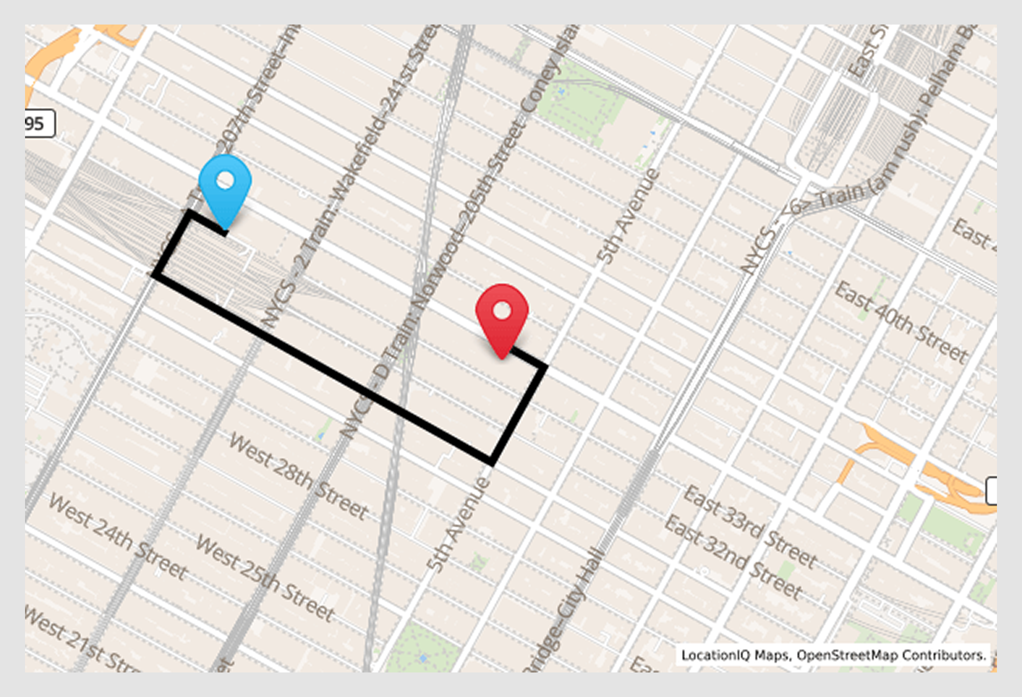
Example from ReVeal: Objects on the map are grouped by neighborhoods to improve
performance when viewing larger areas like New York City
- Group nearby objects: When showing large areas, group objects by neighborhoods or regions to reduce the number of elements on screen.
- Preload the important bits: If you know users always check certain areas, load that data ahead of time.
Think of it like a stage performance - you don't need to keep all the actors on stage at once. Bring them in when needed, and let them exit when they're not.
Remember, a beautiful map interface isn't worth much if it runs at the speed of cold honey. Performance isn't just a technical issue; it's a crucial part of good UX design.
Best tools and resources for map UI design
By now, you're probably thinking: "This all sounds great, but what do I actually use to build these amazing map interfaces?" Good question. In the map UI design world, each tool comes with its own superpowers and quirks. Whether you're a startup trying to keep costs down or a design team with a robust budget, there's a mapping solution out there for you.
Our Head of Design, Maksym, always says, "The right tool doesn't just draw a map; it tells a story."
So let's break down the most popular mapping tools, their strengths, and where they might fall short, so you can choose the perfect sidekick for your next map UI project.
Commonly used mapping tools and their limitations
Creating the perfect map is a bit like painting a masterpiece. Just as an artist chooses between watercolors, oils, and acrylics, map designers have their own set of tools, each with its own strengths, quirks, and special tricks. Our goal? Finding the right brush to bring your vision to life.
Google Maps API
Google Maps API is a set of tools that lets developers embed and customize interactive maps in their apps or websites. It supports features like geolocation, routing, markers, and map styling to build location-based experiences.
Mapbox
Mapbox is a flexible mapping platform that lets developers design and integrate custom maps into apps and websites. It offers advanced features like real-time data visualization, map styling, and location tracking, making it ideal for highly interactive, branded mapping experiences.

Leaflet
Leaflet is a lightweight, open-source JavaScript library for building interactive maps on the web. It’s easy to use, mobile-friendly, and supports features like markers, popups, and layers, perfect for simple, fast-loading maps without heavy dependencies.

OpenStreetMap
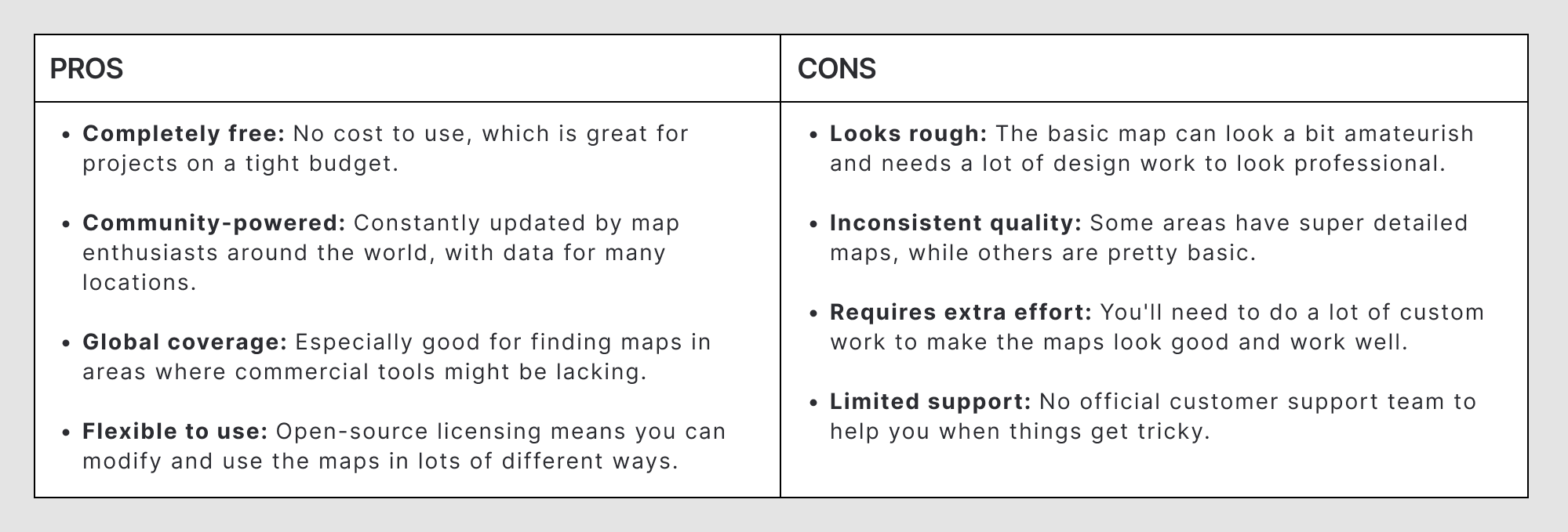
OpenStreetMap is a collaborative, open-source mapping project that provides free, editable geographic data. It’s often used as a base map for apps and services, offering detailed, community-driven maps of the world without licensing fees.
Choosing the right mapping tool is just one part of creating a successful map. For a complete guide on app design, check out our video below:
Top Figma plugins for map UI
These plugins make it easier to bring accurate, customizable maps into your designs without leaving Figma.
Figmap
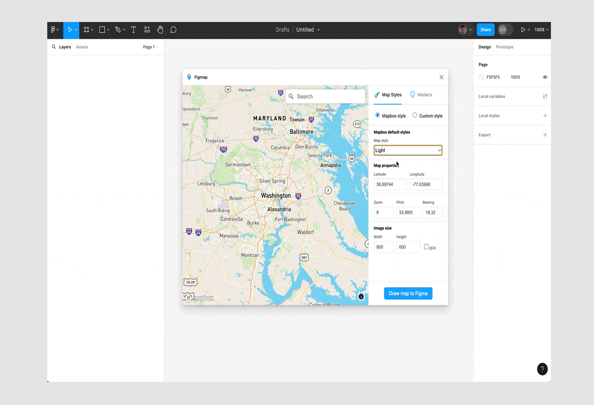
Figmap simplifies map embedding for designers. With just a few clicks, you can drop map images directly into your Figma design. The plugin supports multiple map styles, which means you can choose different views without complicated workarounds.
However, it's not a perfect solution. Figmap comes with some serious limitations. The design flexibility is pretty basic, and you're stuck with static images. If you're dreaming of interactive or deeply customized maps, you'll hit a wall pretty quickly.
Map Maker
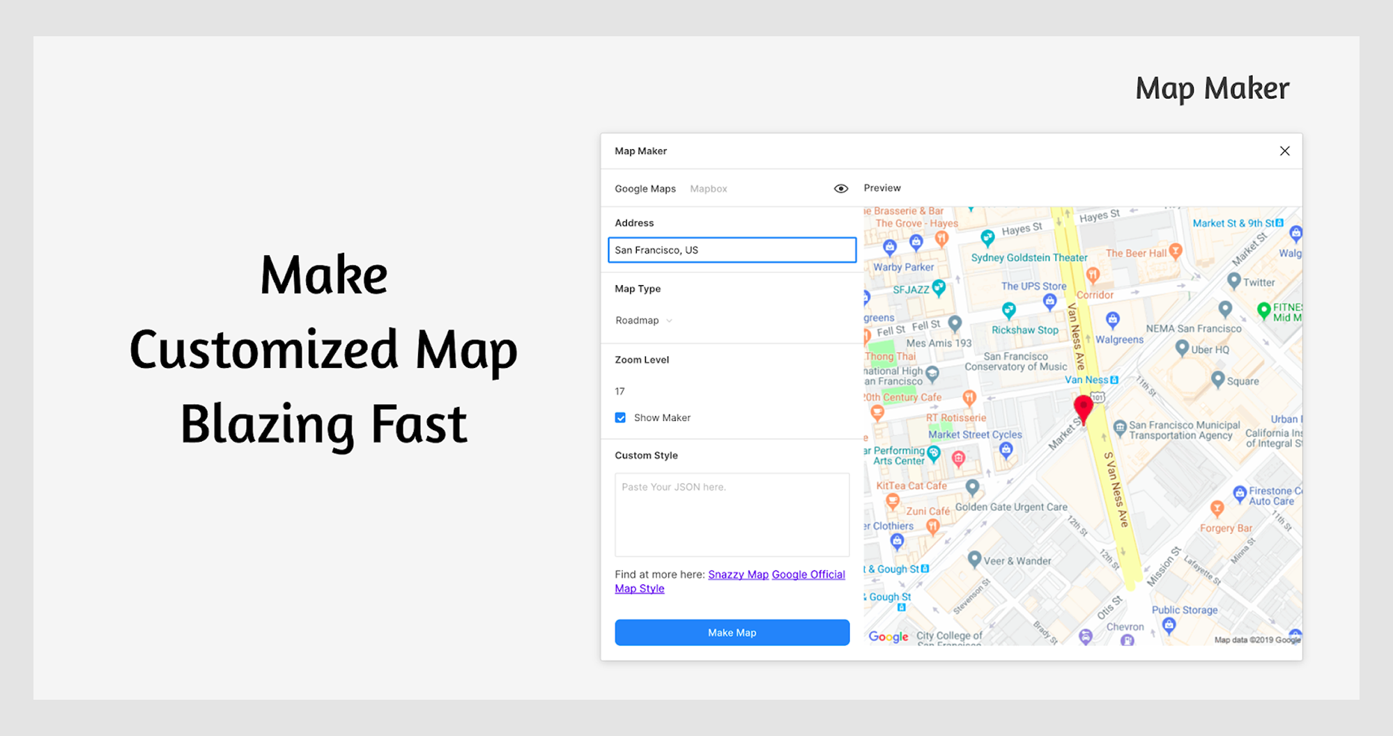
Map Maker helps you create quick map sketches in Figma. It's easy to use and lets you make simple changes to map looks. But it's more about getting a rough idea down fast, not creating a polished design. The plugin has limited ways to customize maps and won't work for complex projects.
Pro Tip: These Figma plugins are great for initial mockups and quick designs but are not replacements for full-featured mapping tools. They are your design sketching companions, not your final map solution. They'll help you rough out ideas, but you'll want to graduate to more robust tools when it comes to serious map UI design.
Wrapping It Up
Designing great map interfaces isn’t just about making things look good; it’s about making them work well for real people. Whether someone’s trying to book a ride, find an apartment, or explore a new city, a well-designed map should feel simple, helpful, and even a little delightful.
The tools and best practices we covered can help you get there, but in the end, it’s all about the user experience. Keep things clear, make interactions easy, and don’t be afraid to tweak and test until it feels just right.
If you’re working on other UX elements like forms or fields, these articles on form design and input field design could be useful too.
Because when a map UI is done well, users don’t think about the map at all; they just get what they have to do. Need help building yours? We’ve done it before and we’d love to help again.


.png)


