

A designer on Reddit asked a question that gets to the heart of the Figma-to-Storybook workflow: “Is the whole Storybook - Figma connection after all nothing more than just a live view of the design file?”

Is the whole Storybook <> Figma connection after all nothing more than just a live view of the design file?

It’s a fair question. Teams often expect that connecting the two means a component designed in Figma somehow becomes a production-ready React component in Storybook. In reality, it doesn’t work that way.
Figma defines how a component should look and behave from a design perspective. Storybook renders and documents the actual coded component. Connecting them can make design and code easier to compare, but it doesn’t remove the work of translating design decisions into production components.
And that translation is where teams often struggle.
At Eleken, we’ve increasingly moved closer to code to reduce that gap. Figma is still an important part of our workflow, especially when clients already have established Figma libraries. But when a team has coded components and a Storybook setup, we work with the real implementation instead of treating the Figma file as the final source of truth.
In this guide, we’ll show you how Figma and Storybook can work together, how to set up the workflow step by step, and where the connection stops being automatic. Most importantly, we’ll look at when maintaining both is worth it, and when working closer to code makes more sense.
What is Figma to Storybook, and why does it matter?
Figma to Storybook is a workflow that connects design system components in Figma with their coded versions in Storybook, helping designers and developers keep UI components consistent.
The workflow is simple: Figma design system → design tokens → code → Storybook → production.
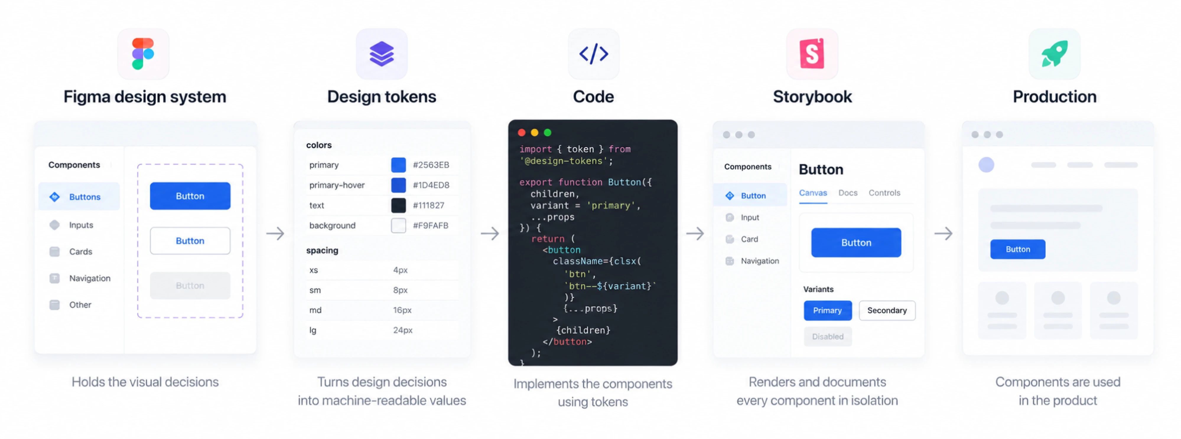
Each part has a specific role. Figma defines the visual system. Design tokens turn colors, spacing, typography, and other decisions into reusable values. Developers use those values to build components in code. Storybook then provides a place to view, test, and document the actual components before they reach production.
The main reason for connecting these steps is to prevent design drift — the gradual gap between what was designed and what gets shipped.
It rarely happens all at once. A developer adjusts padding to fix an issue. A designer changes a color in Figma, but the update never reaches code. A new component gets built slightly differently from the existing one. Six months later, Figma and the product no longer match.
More handoff meetings and annotations don't necessarily solve this. If design and development work from different sources of truth, the same inconsistencies keep coming back.
But connecting Figma and Storybook doesn't make synchronization automatic either. As one designer put it in the Reddit discussion, “there’s no real automatic solution.” Keeping design and code aligned still requires “careful curation, documentation and oversight.”
It feels like there's no real automatic solution, and to do this well will require careful curation, documentation and oversight of design docs and code libraries.
That means someone needs to own the tokens, components, documentation, and updates. The workflow simply makes that ownership easier by giving design and development a shared system instead of relying on repeated handoffs.
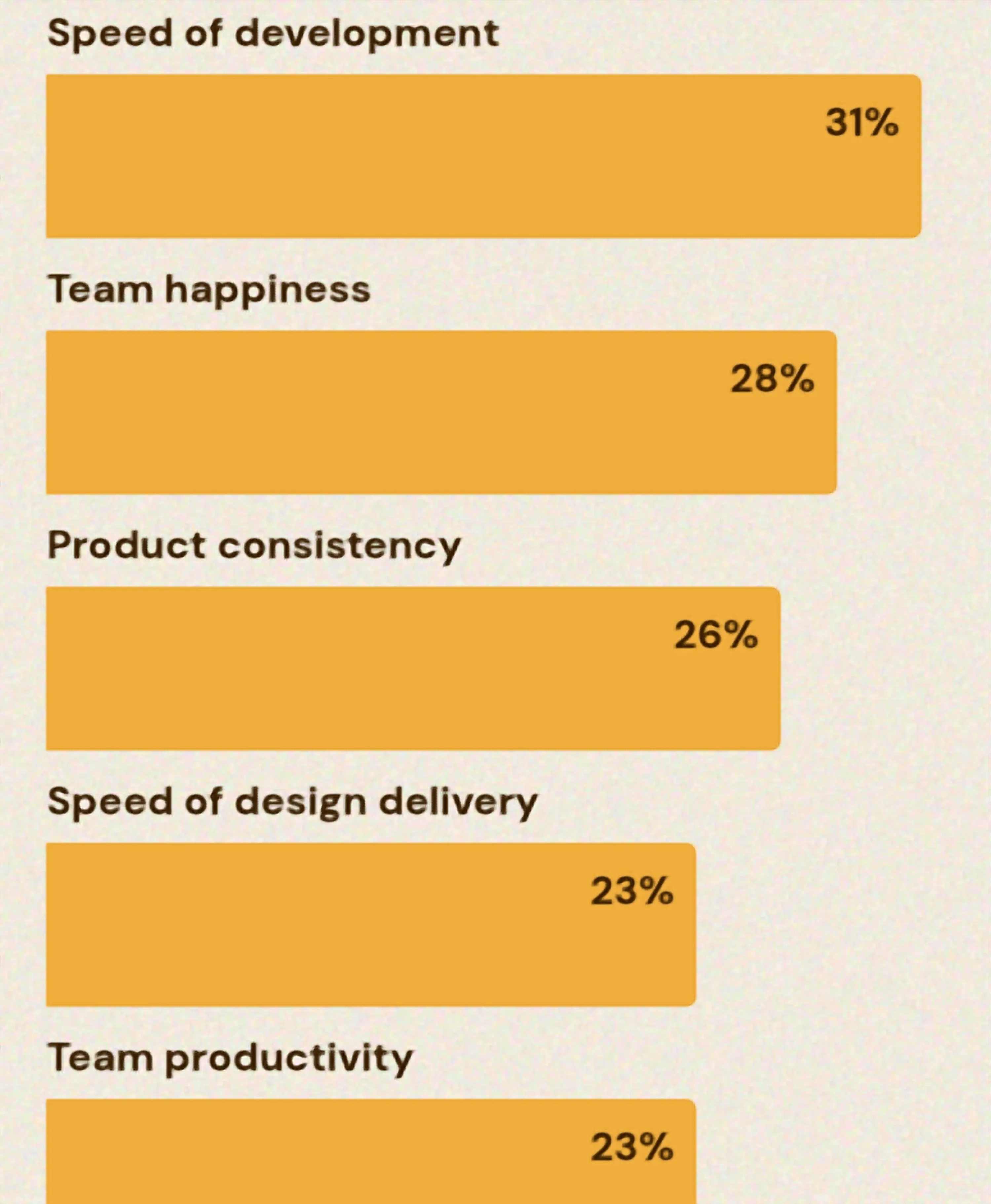
And these are exactly the outcomes design system teams care about. In zeroheight’s 2026 Design Systems Report, 31% of respondents track development speed, 26% product consistency, 23% design delivery speed, and 23% team productivity as measures of design system success. Yet only 5% track ROI directly.
So the value of Figma Storybook is reducing duplicate work, making components easier to reuse, and keeping what designers define closer to what users get.
If you're earlier than this and still deciding what your system should contain, our guide on what a design system is is a better starting point than this article.
Before fixing the handoff, it helps to know exactly where Figma runs out of road.
Need a cleaner Figma-to-Storybook handoff?
Where does Figma stop being enough?
Figma is excellent for exploring layouts, defining components, and testing flows. But it is not the browser.
That matters once you need to know how a design behaves under real conditions. A Figma prototype can simulate interactions. A coded component has to handle them.
That includes:
- Responsiveness. Not just desktop, tablet, and mobile frames, but what happens at every width between them.
- Real data. Long names, missing values, unexpected content, and changing data.
- Edge cases. Empty states, one result, 200 results, errors, and loading.
- Interactions. Keyboard navigation, focus states, validation, and transitions.
- Performance. A table can look perfect in Figma and still perform poorly with thousands of rows.
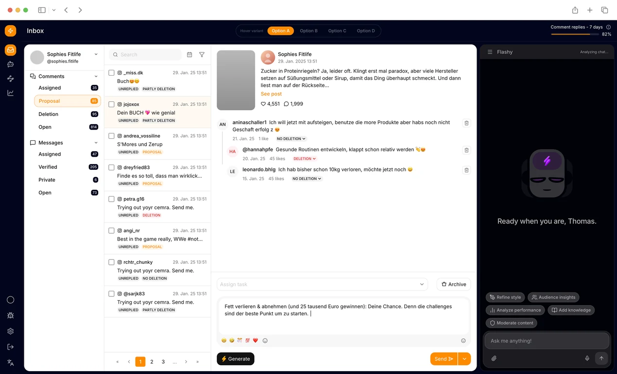
That's why Eleken designers increasingly prototype in code. For complex interactions, we create interactive prototypes like the one below to test how the experience actually behaves in the browser, not just how it looks in a Figma frame.
There are implementation differences too. Figma and CSS don’t use the same layout model, and a visual layer in Figma doesn’t inherently tell the developer whether it should become a button, input, link, or another semantic HTML element.
That leaves room for interpretation during handoff. The designer defines what the interface should do, while the developer translates that into browser behavior. Anything the design doesn’t specify has to be decided somewhere in between.
This is one reason Eleken increasingly works closer to code. Our design principles are simple: for complex interactions, design isn't fully validated until we see how it behaves in the browser.
Storybook becomes useful here. It renders the actual coded component in isolation, so designers and developers can inspect the same implementation across states such as default, hover, focus, disabled, loading, and error.
Instead of comparing a Figma representation with the finished product weeks later, the team can catch differences while the component is being built.
Our piece on designer-developer collaboration covers the human side of this. This article is about the plumbing.
Storybook shows behavior. But something has to carry the visual decisions across in the first place. That's tokens.
How do design tokens connect Figma to Storybook?
Design tokens are reusable values for things like colors, spacing, typography, and borders. They help Figma and code use the same design decisions.
There are three common levels:
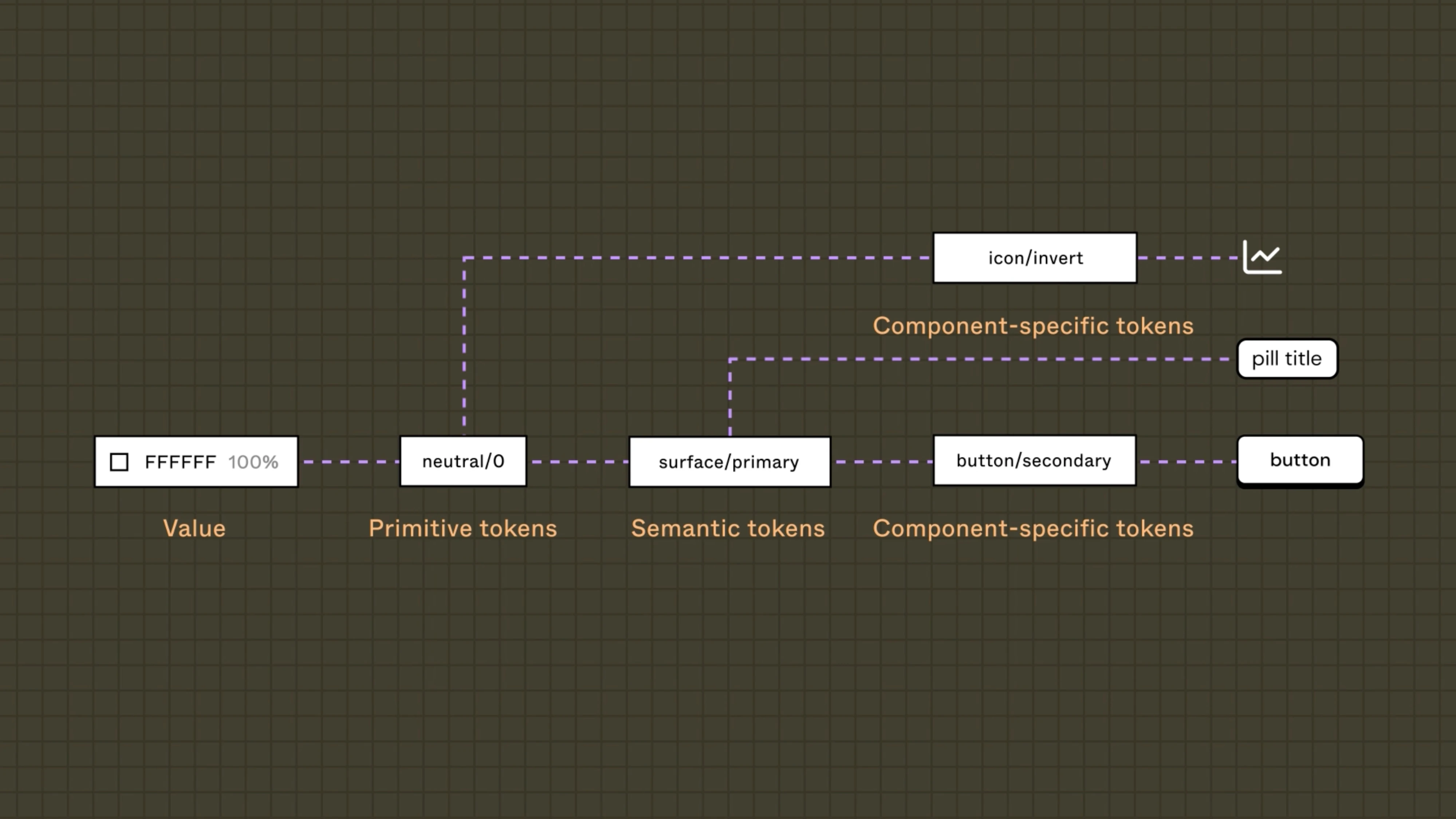
- Primitive tokens are raw values: blue-500, space-4, radius-md.
- Semantic tokens describe purpose: textPrimary, surfaceDanger, borderSubtle.
- Component tokens apply those values to specific components: button-primary-background, input-border-focus.
Semantic tokens are especially useful. Instead of telling developers to use blue-500 for links, you define interactiveText. If the link color changes later, you update that token once and every component using it follows.
A typical workflow might use Figma Variables → Tokens Studio → Style Dictionary → code.
The token created in Figma becomes a value the coded components in Storybook can use:
Update token in Figma → export JSON → transform tokens → generate CSS/code values → components update
This creates a shared foundation between design and development. The exact naming convention matters less than consistency: both sides need to understand what each token means and use it the same way.
At Eleken, we used this approach for Newton360, creating foundation tokens alongside component documentation.
One practical benefit was theme switching: instead of updating individual screens, the team could change the underlying tokens and apply the new theme across the system.
If you're building this from zero, how to create a design system covers the sequencing, and the design system checklist is a decent audit of what you might be missing.
Tokens sync the values. Linking a specific design to a specific story needs a different tool.
How does the Storybook Connect plugin work?
The tool is Storybook Connect, built by Chromatic in partnership with Figma. The exact name matters here, because there are several plugins in this space and they do different things.
Setup takes about a minute:
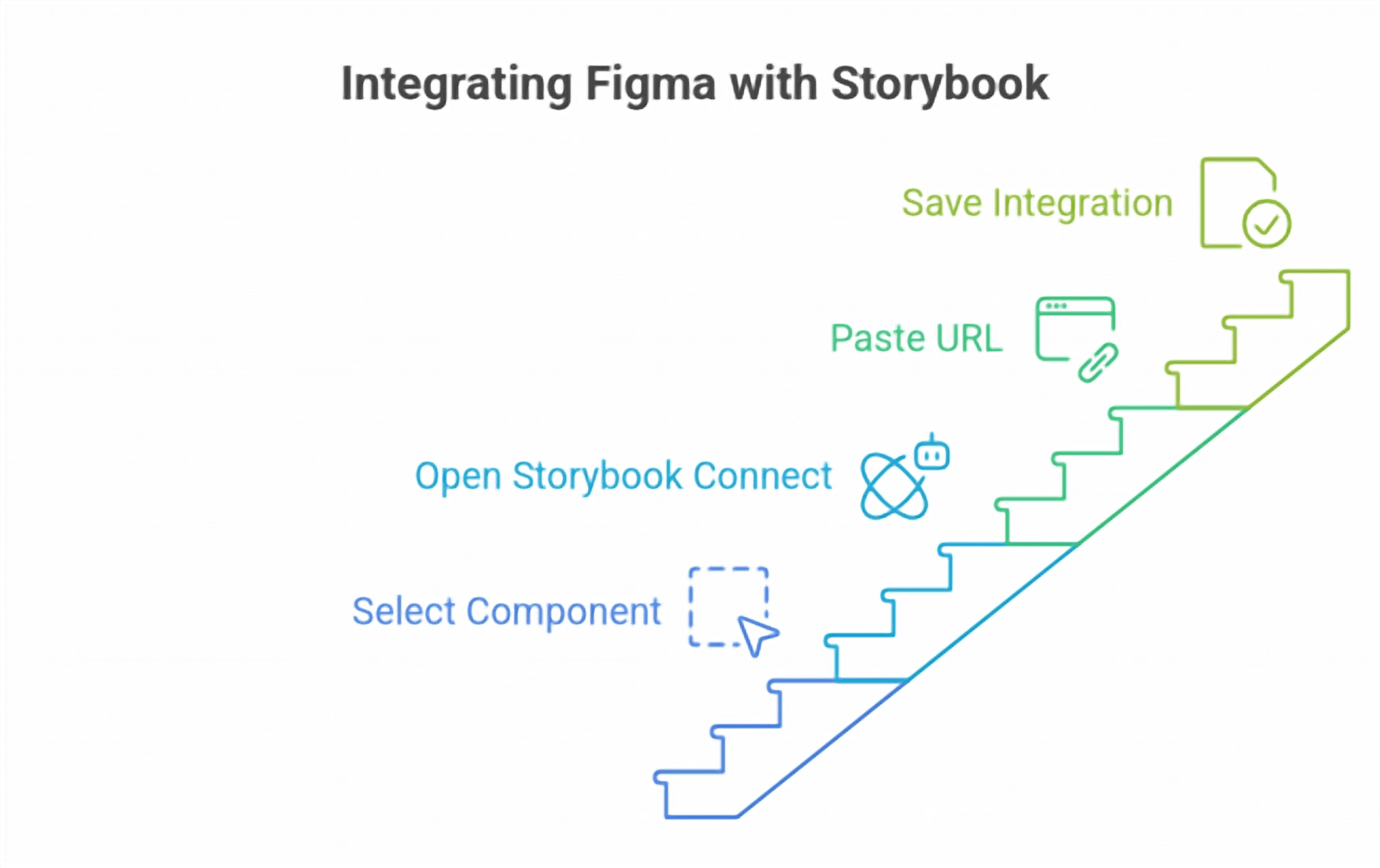
- Select a component or variant in Figma.
- Open Storybook Connect from the plugin menu.
- Paste the Chromatic story URL.
- Save.
The link now persists on that component. Anyone opening the file can jump straight to the live implementation.
Four things this buys you:
- Stories linked to specific variants, not just to a component in general.
- The ability to interact with the real implementation without leaving the design file.
- Visible signal about which components already exist in code, which cuts down on redesigning things that shipped months ago.
- A direct story-to-spec comparison during review.
Now the limit, because it trips up almost everyone: there is no way to sync a property in a code component to a property in a Figma component.
The link is visual, not structural. Change a prop name in code and the Figma component knows nothing about it.
Say that out loud before you pitch this internally. People hear "connect" and picture bidirectional sync. What they're getting is a very good hyperlink.
If your Storybook is self-hosted rather than on Chromatic, there's a lower-tech option worth knowing. Use the Documentation field on Figma components to Storybook to link out to the relevant Storybook examples.
A commenter on r/FigmaDesign recommended exactly this, and the reasoning holds up: it saves developers the work of mapping a design to the right part of the library.
...If your Storybook is hosted somewhere, say on an internal network, you could use the Documentation field of components in Figma to link out to the right examples in Storybook. This helps saves developers time when they’re in the process of mapping designs to the relevant parts of the component library.
For private projects, access control follows your Chromatic permissions. People who can't see the Storybook can't open the link.
The plugin only works well on top of files that were built for it, though.
How do you set up Figma and Storybook for clean handoff?
Clean handoff starts in Figma. The closer the design structure is to the code structure, the less developers have to interpret.
Start with consistent naming. A component like Button/Primary/Large/Default clearly describes its variant, size, and state. Names like Button copy 3 FINAL don’t.
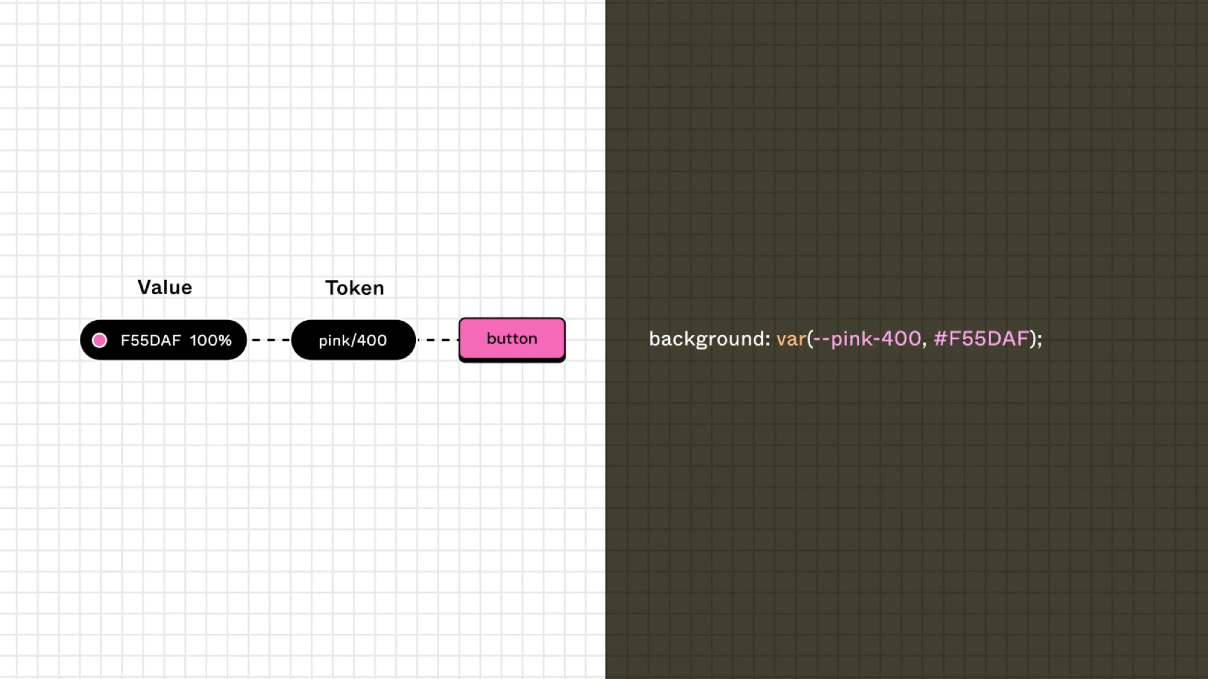
Organize the file just as clearly. Pages such as 01 Discovery, 02 Wireframes, 03 UI, and 04 Handoff make it obvious where developers should look.
Then structure components with development in mind:
- Auto Layout defines how elements resize and reflow.
- Component properties can map to props in code.
- Variants define options such as size or type.
- Boolean properties cover states such as hasIcon or isLoading.
- Instance swaps let you replace nested elements without creating another component.
The goal is simple: a developer should be able to understand how the component works by looking at its structure, not just its appearance.
The same logic carries into Storybook. Each coded Storybook component gets stories for the states and variants the team needs to build and test. Storybook can also generate documentation from those stories, keeping the implementation and its documentation close together.
For example, a button might have stories for primary and secondary variants, different sizes, loading, disabled, hover, and focus states. Designers can then review the actual component instead of waiting until it appears inside a finished screen.
At Eleken, we prepare handoff around components, behaviors, and states, not just finished screens. We document states such as default, hover, focus, disabled, error, and loading, and make the design logic clear enough to translate into component props.
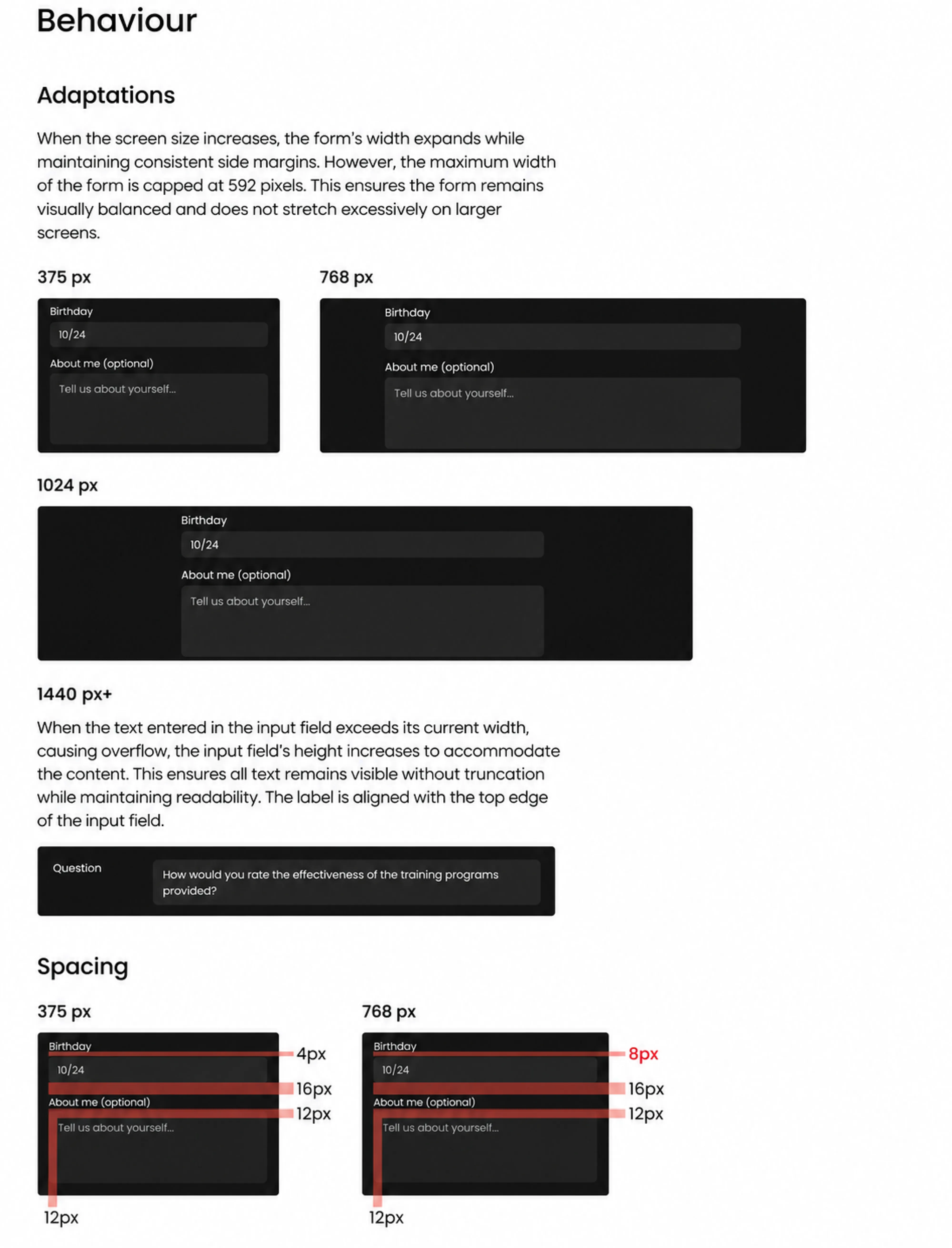
It takes more thought upfront, but reduces questions during development and makes it easier to keep Figma, Storybook, and the shipped product aligned.
More detail on that approach is in our Figma developer handoff guide, and if you're a designer trying to work better with engineers, this one is more practical than most advice on the subject.
And if you want to learn more about design-to-development handoff, watch the video below:
With the files clean, here's the actual sequence.
What does the Figma to Storybook workflow look like step by step?
The Storybook Figma integration is straightforward: move design decisions from Figma into reusable code, then verify the result in Storybook before it reaches the product.
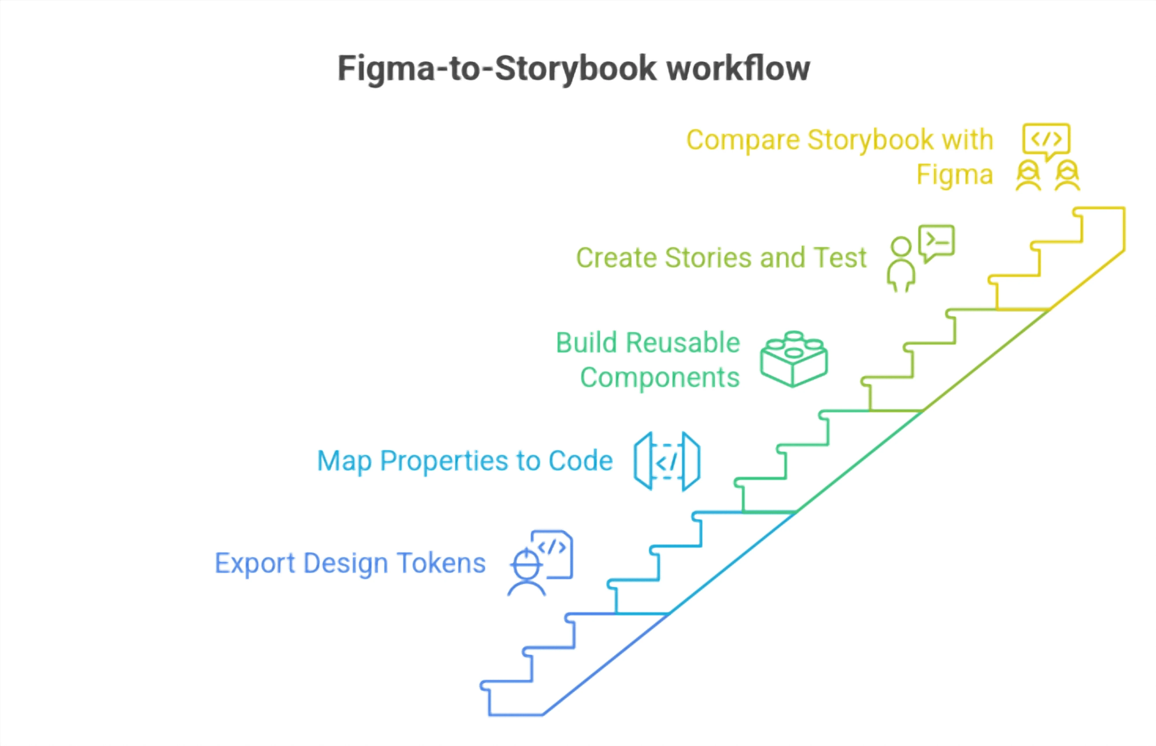
- Step 1: Export design tokens.
Start with Figma Variables and export tokens as JSON, for example, through Tokens Studio. Then use a tool such as Style Dictionary to turn them into CSS custom properties, theme files, or Tailwind values.
The important part is that the same tokens can be used in both design and code. Once the pipeline is set up, updates can flow through automatically instead of being copied by hand.
- Step 2: Map Figma properties to code props.
Take the component properties defined in Figma and translate them into a clear prop structure.
For example:
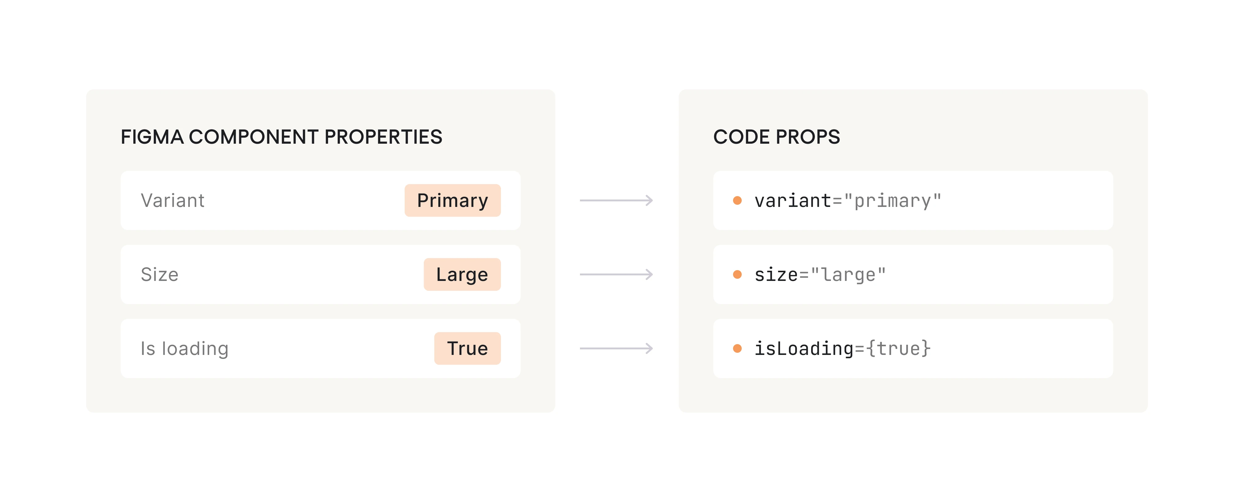
If a Figma variant is difficult to express as a prop, the component structure may need simplifying before development starts.
- Step 3: Build reusable UI components.
Keep presentation separate from product logic where possible.
A form component should be able to receive values, states, and callbacks through props instead of depending directly on an API or a specific page. That makes it easier to render loading, error, empty, disabled, and completed states independently.
This is what Storybook needs.
- Step 4: Create stories and test the component.
Before integrating the component into the full product, create stories for its important states and variants.
For a button, that might include:
- Primary and secondary
- Small and large
- Hover and focus
- Loading
- Disabled
This gives designers and developers a place to review the real implementation without running the entire application.
- Step 5: Compare Storybook with Figma.
Now review the coded component next to the Figma design.
Check spacing, typography, states, responsiveness, and behavior. This is where mismatches are easiest to catch, before they turn into QA issues later.
At Eleken, this review step is important because we don't treat handoff as the end of design. We compare the design intent with the real browser implementation and adjust where needed.
The tooling around this design system workflow can include Figma MCP for accessing design context, Figma Code Connect for linking components, Cursor or Claude Code for code assistance, and Storybook for implementation and review.
You also don't need to migrate an entire design system at once. Start with the components that are reused most often and create the most inconsistency when they drift, usually buttons, inputs, navigation, cards, and form elements.
Once that foundation is stable, move to more complex components. This keeps the migration manageable and starts delivering value earlier.
Our product designer's toolbox covers adjacent tooling if you're assembling a stack from scratch.
The story renders. Now prove it matches.
What add-ons help validate design in Storybook?
Storybook becomes much more useful when you add tools for checking spacing, accessibility, and visual changes.
Four are especially useful:
- Measure shows dimensions and spacing directly in the browser. It makes it easy to check whether the coded component matches the Figma spec.
- Outline draws boundaries around DOM elements, making alignment and layout problems easier to spot.
- Accessibility checks common accessibility issues, including color contrast, while you work on the component.
- Chromatic adds visual regression testing. It captures your stories and flags visual changes after new code is committed.
Visual regression testing matters once components share tokens and styles. A small CSS or token change may be intentional in one component but unexpectedly affect several others. Instead of finding those changes during QA, you can catch them when the component changes.
Before considering a component ready, check:
- Colors, spacing, and typography use the correct tokens.
- No unnecessary hardcoded values remain.
- Light and dark themes work, if supported.
- Responsive behavior works across key breakpoints.
- Default, hover, focus, disabled, loading, and error states are covered.
- Keyboard navigation and focus are clear.
- Visual regression tests show no unexpected changes.
At Eleken, we’ve seen why state coverage matters. While redesigning myInterview, we worked on an interview flow where candidate drop-off was close to 90%. The interface needed to make it clear what was happening at every point in the process. Defining states and behavior consistently helped us remove ambiguity from the experience.
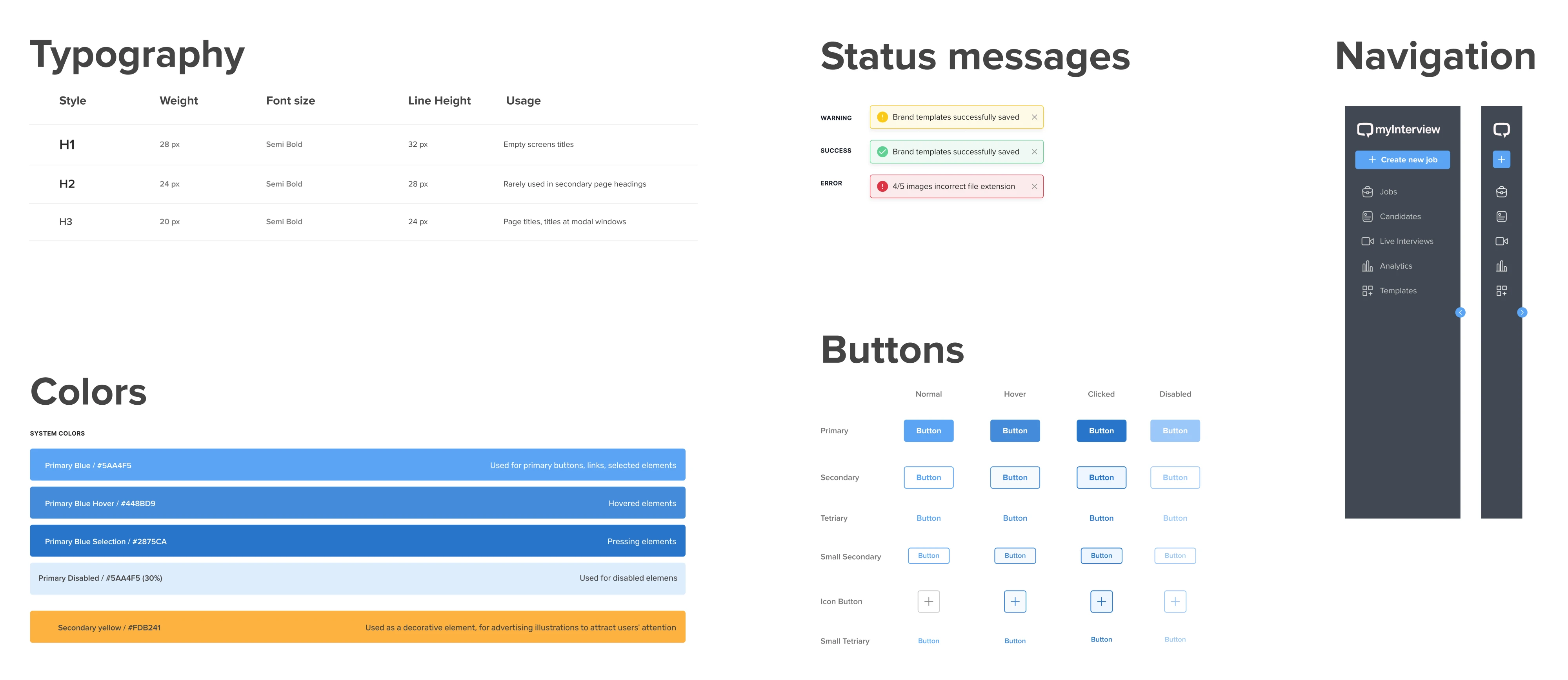
That’s the bigger benefit of validating components in Storybook: you’re checking whether it still works when the interface changes state, content, or screen size.
And increasingly, some of these checks can be automated rather than repeated manually.
How does AI fit into this workflow?
AI can speed up the move from design to code. Instead of recreating a Figma design from a screenshot, AI tools can now work with the structure behind it.
Figma MCP makes this possible by giving tools like Claude Code access to Figma context, including components, variables, and layout information. This gives the model a better understanding of how the design is structured, not just how it looks.
The workflow becomes:
Figma → MCP → AI-generated component → Storybook → review
For example, you can select a component in Figma and ask Claude Code to implement it using your existing design system. AI can create the initial component, apply tokens and variants, and generate Storybook stories for different states. Tools like Visual Copilot take a similar approach to turning Figma designs into front-end code.
At Eleken, we use AI to reduce the repetitive steps between a validated design and a working component. Tools like Claude Code and Cursor help us get to code faster, but the result is still reviewed in the browser.
Storybook stories are a good example. AI can generate stories for different props, states, and edge cases instead of writing each one manually. The goal isn't perfectly generated code. It's enough coverage to test the component and catch problems early.
But AI doesn't make the workflow automatic. Generated components still need review, complex interactions need additional context, and some companies restrict AI access to their design files.
The quality of the result also depends on the quality of the design system. Clear naming, reusable design to code components, defined variants, and consistent tokens give AI much better context than disconnected Figma frames.
What does this mean for design systems at scale?
The larger the product and team, the more valuable a shared design system becomes. A component defined once can be reused across hundreds of screens without designers and developers making the same decisions again.
But scale makes ownership just as important as tooling.
There are three common models:
- Centralized: one team owns the system. Consistency is high, but the team can become a bottleneck.
- Federated: designers and developers from different product teams contribute under shared standards. It moves faster but requires coordination.
- Hybrid: a core team maintains foundations like tokens and shared components, while product teams contribute new components as needed.
Whatever the model, someone needs to own the system: maintain tokens and Figma-coded components, review contributions, keep Figma and code aligned, and make sure accessibility standards are followed.
You also need to know whether people use it. Useful metrics include component adoption and reuse, UI bugs, and design and development time. A large component library Storybook means little if teams keep building their own versions.
We've seen this at Eleken. For Sessionboard, a maintainable design system reduced routine design work for the internal team, giving them more time to focus on product growth.
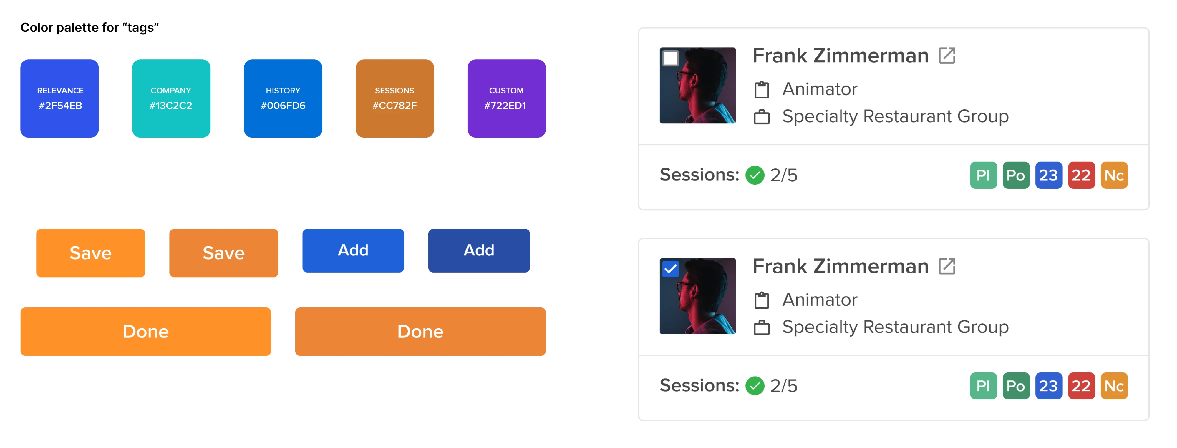
More on systemizing at SaaS scale in our design system for SaaS piece and UX design system guide.
Is this design development workflow right for your team?
Not every team needs the full Figma-to-Storybook setup.
It makes the most sense when components are reused across multiple products, teams, or projects. The more often the same design decisions are repeated, the more value you get from shared tokens, coded components, and Storybook.
For a small team working on one product, the full setup can create more maintenance than value. Consider three things:
- Setup. Existing components, tokens, and code need to be structured and connected.
- Ownership. Someone needs to maintain the system as the product evolves.
- Synchronization. If components change but stories and documentation don't, Storybook quickly becomes outdated.
That doesn't mean smaller teams should skip Storybook. Start with the reusable components: buttons, inputs, forms, navigation, and cards. Define their tokens and states, create stories, and add visual regression testing. Expand when the need for reuse grows.
A simple way to prioritize is to ask: How often is this component reused, and how costly is it when it becomes inconsistent? Start with the design components that score high on both.
And remember what Storybook can't do. It can document and test your component system, but it can't design one for you. If your product already has five versions of the same input, Storybook will expose the inconsistency, not solve it. Someone still needs to decide what the standard should be.
That's ultimately the point of this entire workflow. It's not about connecting Figma and Storybook. It's about making sure design decisions survive implementation.
At Eleken, we build that bridge with a structured Figma design system to Storybook, shared tokens, code-based prototypes, and browser validation. The exact stack depends on the product, but the goal stays the same: what gets shipped should work like what was designed.
Design looks right in Figma but falls apart in development? Try Eleken for 3 days on one or two real product screens and see how a cleaner design-to-code workflow changes the handoff.