

AI is getting better at generating content. But content alone isn’t always enough.
As tasks become more complex, users often end up with a wall of text, trying to extract what matters and decide what to do next. Generative UI addresses this by generating not just the answer, but the interface around it: cards, tables, dashboards, forms, visualizations, and workflows shaped around the user’s intent.
As Maksym, Head of Design at Eleken, puts it, “The real value is moving from static screens to experiences people can interact with, test, and understand”.
That’s why a generative user interface is different from AI-generated content. A summary or image is output. An interface that reorganizes itself around your query, adapts a form based on your inputs, or surfaces the right tools at the right moment is an interaction.
Traditional UI relies on predefined screens and workflows. Generative UI assembles interfaces dynamically around a user’s context, goals, and needs.
In this guide, we’ll explore what generative UI is, where it’s already being used, and what challenges still stand between the vision and reality.
How we got here: the evolution of interfaces
Generative UI didn't appear out of nowhere. For decades, interface design has been moving in one direction: from experiences that are identical for everyone toward experiences that adapt to individual users and contexts.
Each major shift in UX made interfaces a little more flexible: first adapting to devices, then to users, and eventually to behavior.
Generative UI is the latest stage in that evolution. Instead of changing what users see inside a fixed interface, it changes the interface itself. Teams building on this shift are already rethinking how AI fits into UX design at every layer, not just the surface.
Here's how we got here:
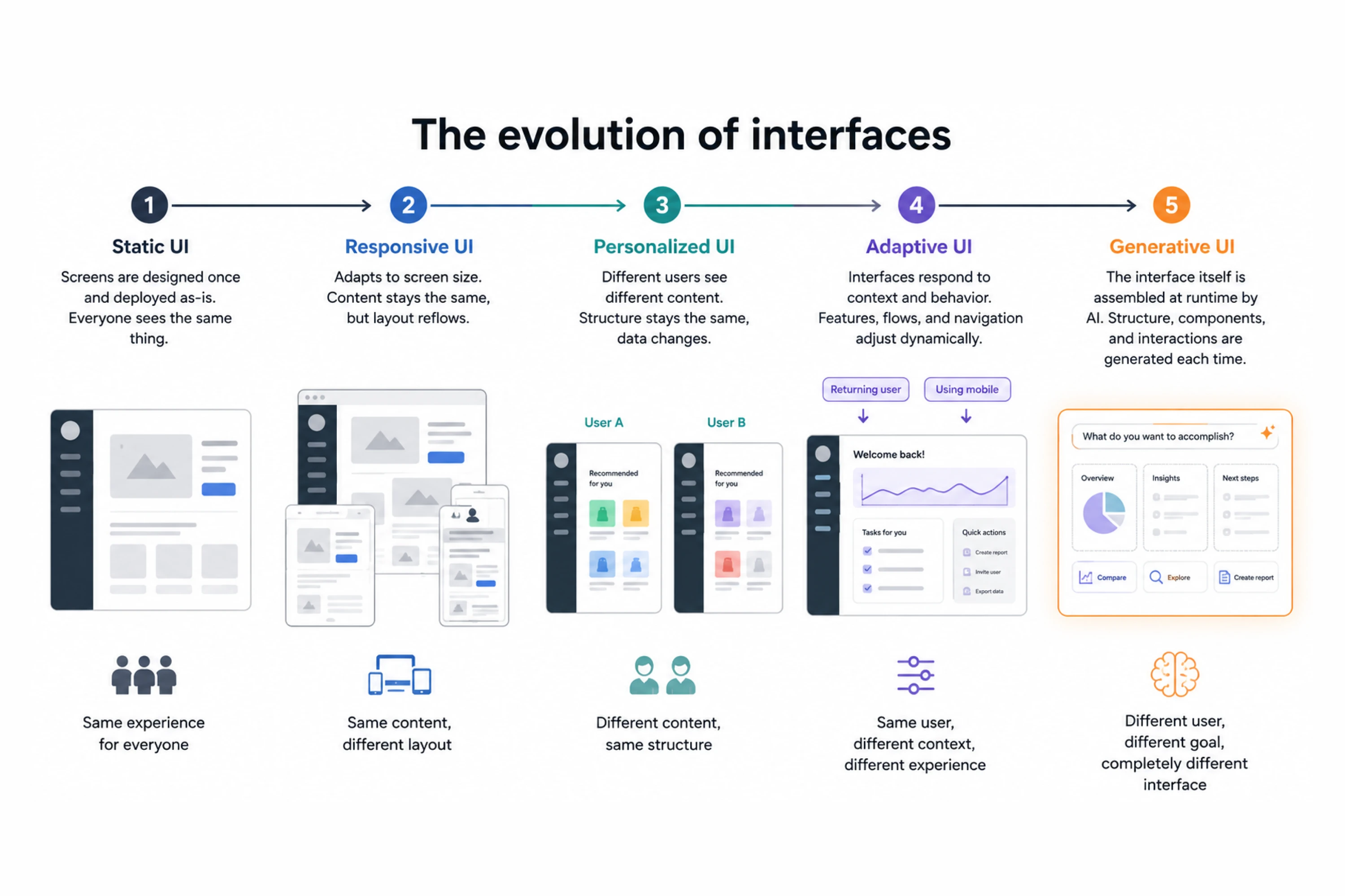
- Static UI was the starting point. Screens were designed once and deployed as-is. Everyone saw the same thing regardless of who they were or what they needed.
- Responsive UI adapted to screen size. The content stayed fixed, but the layout reflowed. A meaningful step, but still a structural change rather than a behavioral one.
- Personalized UI introduced the idea that different users could see different content: recommended products, customized feeds, and role-based dashboards. The underlying structure stayed fixed, but the data inside it changed.
- Adaptive UI went further. Interfaces began to respond to context and behavior, showing or hiding features, adjusting flows based on user segment or device, and reordering navigation based on usage patterns.
- Generative UI is the next step. The interface itself, its structure, components, and interaction patterns, is assembled at runtime by an AI system. It's not just serving different content in the same shell. It's building the shell differently each time.
Most products today are somewhere between personalized and adaptive. Generative UI is where a growing number of AI-native products are heading.
Okay, if generative UI is the next stage of interface evolution, is that what all those AI UI design tools like v0, Lovable, and Bolt are doing?
Generative UI vs. AI-assisted design: an important distinction
Before going further, it's worth separating two things that often get lumped together.
AI-powered UI design tools such as v0, Lovable, Cursor, Bolt, Galileo, UX Pilot, and Flowstep are accelerating how teams build interfaces.
As more SaaS teams adopt these tools, they're discovering that generating interfaces is no longer the difficult part. The challenge is deciding what should be generated, how different screens should relate to one another, and how to keep the experience consistent as products evolve. AI dramatically accelerates production, but without design rules and product thinking, it often accelerates inconsistency just as quickly.
Generative UI is what the end user encounters. The two aren't competing ideas. They're different layers of the same broader shift.
What makes generative UI different from traditional UX
The differences run deeper than "the UI changes." Three shifts stand out:
From navigation to intent
Traditional software is a navigation system. You learn where things live, build muscle memory, and follow the information architecture someone else designed. The better you know the app, the faster you move through it.
Generative UI flips this model. It's intent-driven. You describe what you want to accomplish, and the system figures out what to show you.
You don't navigate to a booking form. The form appears because you said you want to book something. This is prompt-based UI design in its clearest form: the user's input, whether typed, spoken, or inferred from behavior, becomes the specification the system builds from. The interface isn't retrieved. It's generated. That also changes the designer's role. Instead of defining every screen upfront, designers increasingly define the patterns, constraints, and interaction rules AI can compose from. The output becomes dynamic, but the underlying experience is still intentionally designed.
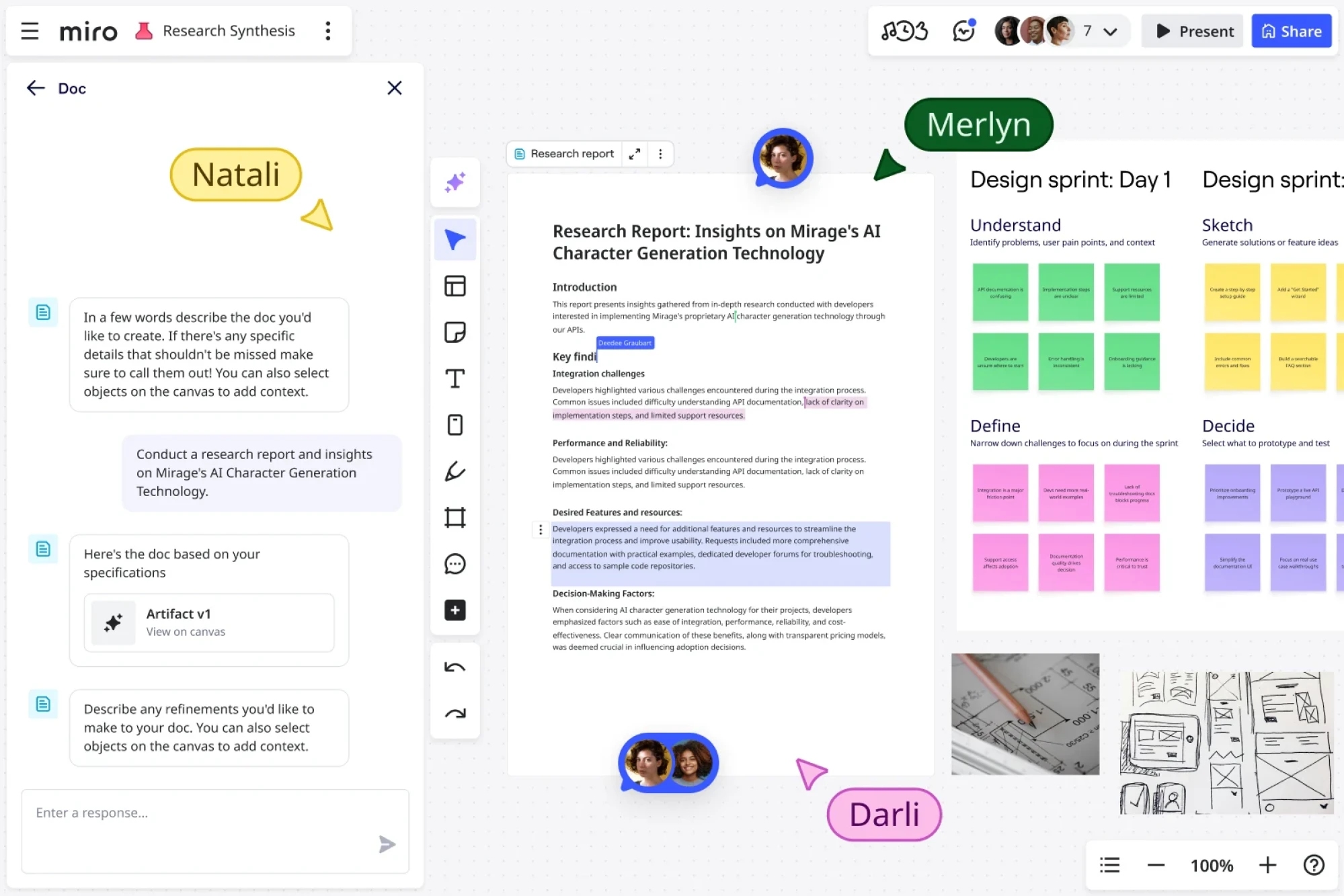
This is what makes generative UI feel different from personalization. Personalization customizes the content inside a fixed structure. Generative UX restructures the experience around what you're trying to do.
The shift is meaningful: from software that knows where things are, to software that understands what you need.
From presentation to exploration
Traditional UI presents information. Data lives in tables, charts, and dashboards: all designed ahead of time, for a general purpose. Building those dashboards well is already its own design discipline; AI dashboard design is pushing that further by making the structure itself responsive to queries rather than fixed at build time. You see what the designer decided you should see, in the order they decided you should see it.
Generative UI enables something closer to exploration. An interface can let you expand a summary, filter by attributes you care about, and drill into a specific dimension without leaving the view. A static report tells you what happened. A generative interface lets you interrogate it.
A useful takeaway from community discussions is this: summaries work, but interactive summaries work even better.
As one Reddit user put it: "Visual summaries win every time. Nobody has time for walls of text anymore."

The real opportunity goes beyond static visuals. Imagine a Zendesk comparison presented as an interactive table you can sort, filter, search, and expand for more details. Instead of passively consuming information, users explore it on their own terms.
Static summaries are good. Interactive summaries are even better, not because interaction is inherently superior, but because it lets people find the insights they need, rather than the ones someone assumed they would.
From interfaces to environments
AI outputs are evolving from text to spaces. ChatGPT Canvas is a collaborative workspace that changes shape depending on what you're doing.
Notion AI adapts the editing environment around your task. AI-native research tools generate explorable visual summaries rather than returning a wall of text.
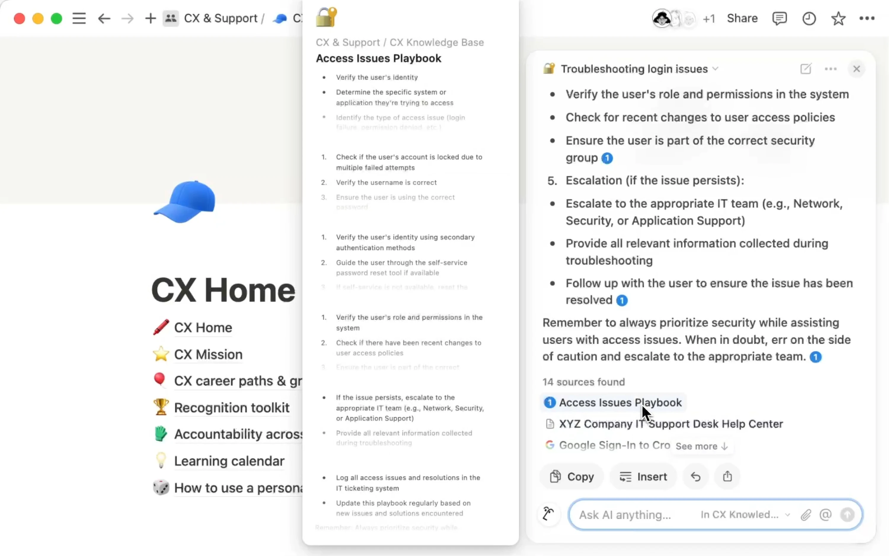
These are environments for thinking and decision-making, assembled around a specific task. They invite exploration rather than passive consumption.
Most of what we think of as "AI products" today are still essentially chat interfaces: text in, text out. Generative UI is what happens when AI starts understanding that the interface itself is part of the answer. The concept becomes much clearer when you see how it works in real products.
If you want to learn more about rules for better UI, consider watching the video below:
Real-world generative UI examples
Generative UI is still emerging, but its core idea is already visible in real products: interfaces that adapt to the task instead of forcing every user through the same fixed layout.
Here are a few examples:
SaaS product experiences
Dashboards that reorganize around what you use. Navigation that adapts to your role. Onboarding flows that restructure themselves based on who you are and what you do in the first session.
The underlying shift is from customization to configuration. For years, "personalization" in SaaS meant handing users settings and letting them arrange their own workspace. The expectation now is the reverse: people want the product to configure itself around them, without the manual labor. A design that treats every user identically frustrates everyone, and adaptive behavior has gone from a premium differentiator to a baseline expectation.
You can see this most clearly in onboarding. The lightest-feeling products have stopped asking a string of setup questions upfront and started inferring context from the user's behavior, existing data, and even the URL they arrived from.
Instead of routing everyone through one fixed wizard, a product can detect whether you're a technical or a business user within the first couple of interactions and serve a completely different experience, not just different copy but a restructured flow.
Technical users get API docs and sandbox access upfront; business users get something simpler and outcome-focused.
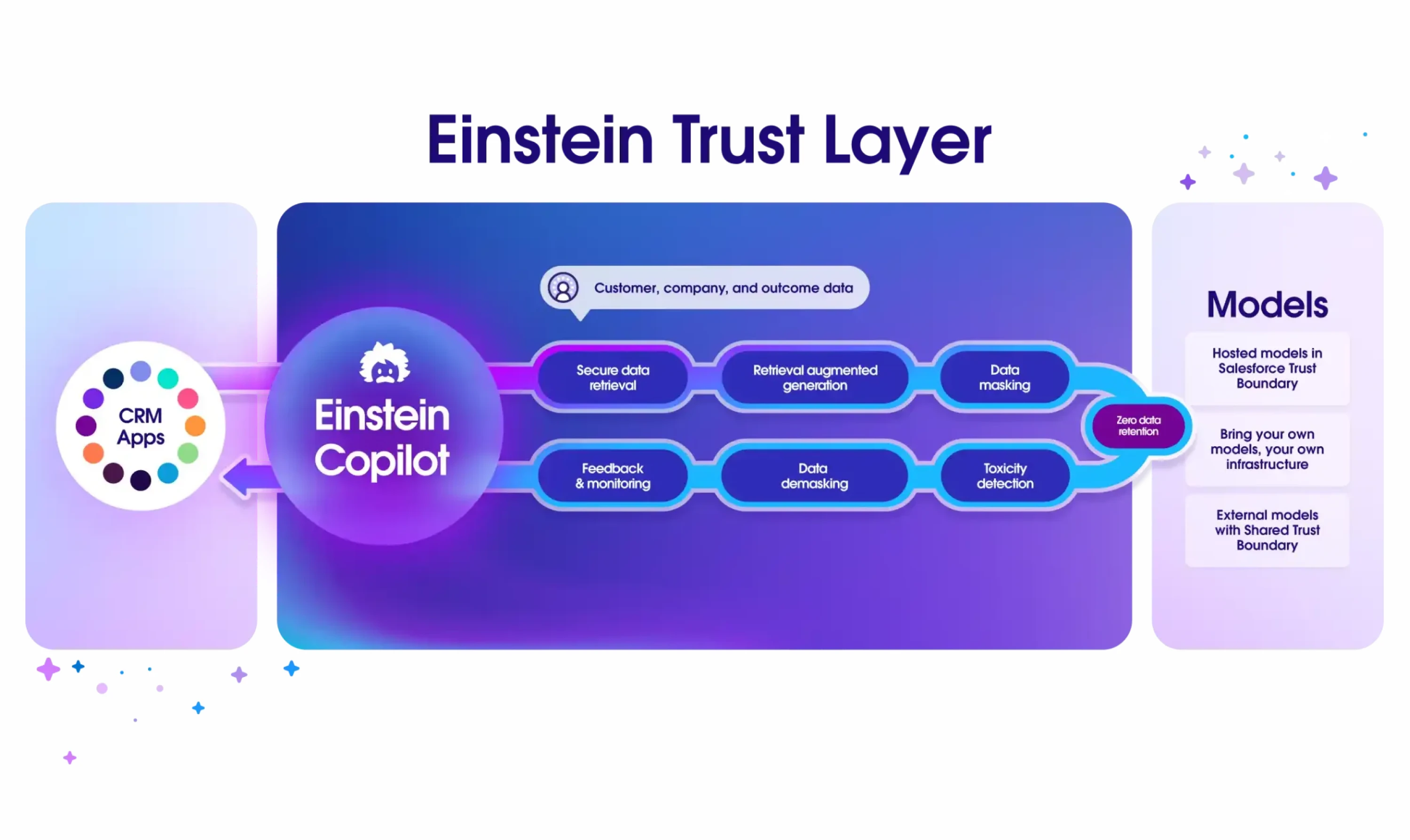
Salesforce's Einstein is a concrete, shipping example on the dashboard side: it adapts dashboard layouts to role and usage patterns, so a sales manager sees pipeline metrics front and center while an individual rep sees activity tracking first. The interface reorganizes to surface what's relevant to that person and quietly hides what isn't.
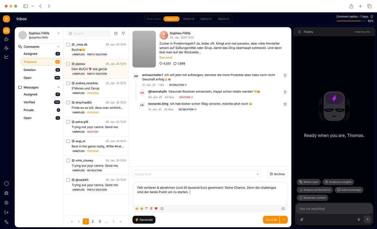
The prototype below, built by our Design Lead Maksym for a client project, shows the same principle inside a SaaS workspace: the layout and the AI assistant panel adapt to the user and the task in front of them, holding up across both light and dark contexts rather than assuming one fixed canvas.
AI-generated UI learning interfaces
Adaptive learning tools generate quizzes, explanations, and visual simulations based on what a learner already knows and where they're struggling. The interface isn't the same for every user; it's assembled based on current understanding and learning gaps. This is meaningfully different from a static curriculum, even one that branches.
Khanmigo, Khan Academy's AI tutor, is one of the clearest real-world examples. Rather than handing every student the same canned explanation, it adapts its tutoring to that student's state: it shifts its approach depending on whether they're meeting a skill for the first time or reviewing it, draws on what it knows about their mastery of a topic and its prerequisites, and will surface a review of foundational skills the moment it detects a gap. The prompts shown, the hints offered, and when it steps in are a function of where the student actually is, not a predetermined sequence.

Teams doing AI in UX research are increasingly using similar signals: behavioral data, task completion, generative UI patterns, and session context to inform how interfaces adapt in real time.
Information compression and visual summarization
When you ask an AI to summarize a long report, getting a paragraph back is useful. Getting back an interactive, explorable summary, one where you can expand specific sections, compare figures, and filter by category, is much more useful.
This kind of interface reduces cognitive overload by surfacing structure, not just content. Companies are starting to build reporting and analytics tools this way.
Google's generative UI, rolling out as "Dynamic View" in the Gemini app and in AI Mode in Search, turns a single prompt into a custom-built interactive interface, complete with expandable sections and interactive tools, instead of a wall of text.
Adaptive productivity interfaces
Project boards and dashboards that reorganize based on your current focus. Planning tools that adapt to your workflow. AI workspaces that surface contextually relevant information rather than requiring you to hunt for it. These are early, but they're real.
Motion automatically reshuffles your day as new tasks and meetings arrive, reorganizing priorities in real time instead of leaving you to re-plan.
Glean surfaces what you're likely to need next, documents, recent activity, and actions tied to your current projects, on its homepage, before you go looking for them.
Asana's Dash pulls your priorities together each morning from your meetings, emails, and tasks. The common thread is that the workspace reorganizes around your current focus instead of making you assemble the picture yourself.
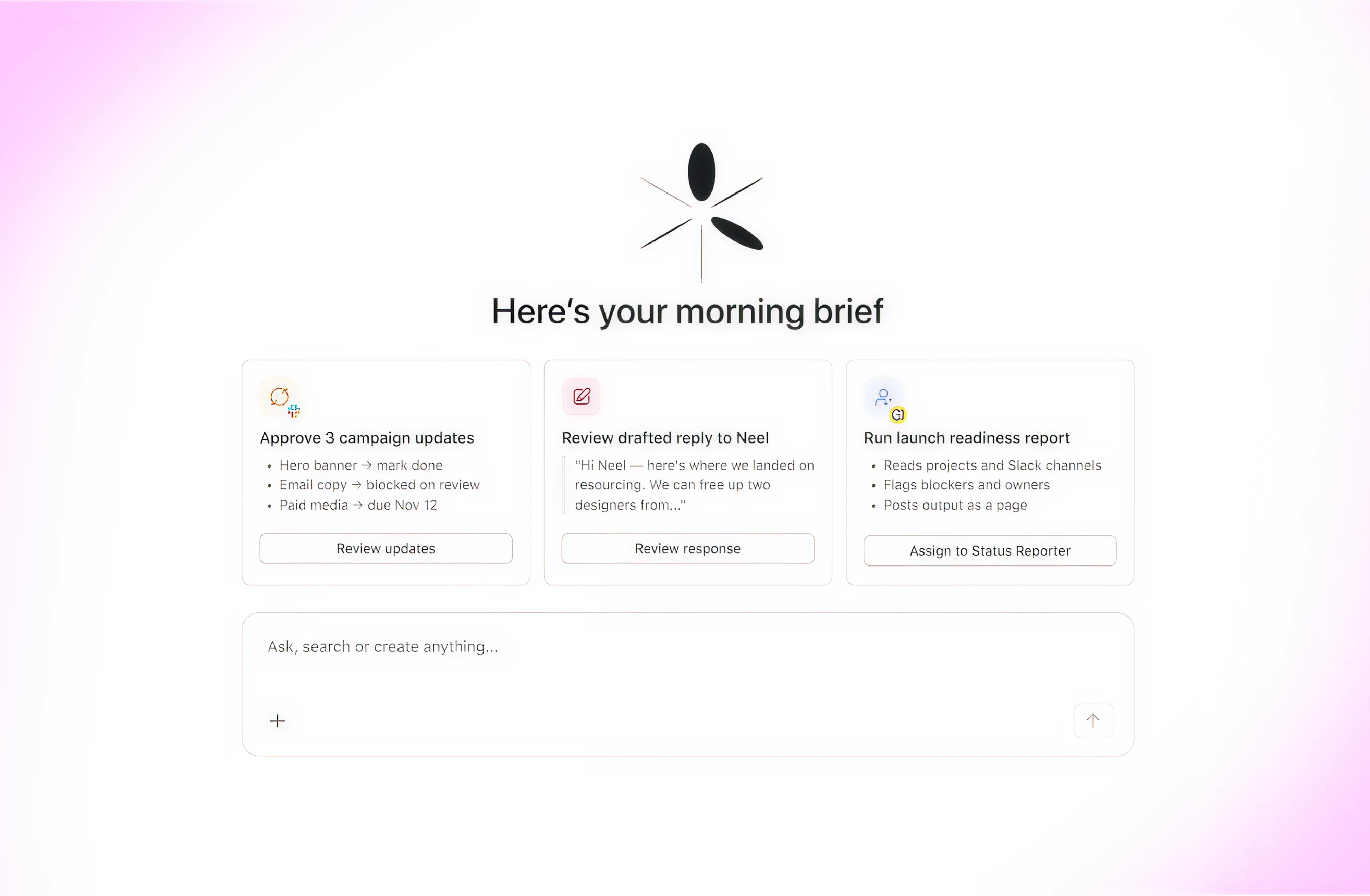
Some of Claude's integrated tools, like Claude in Excel and Claude in PowerPoint, point in the same direction, adapting what the AI does to the specific file and task in front of you.
AI copilots with generated interaction patterns
Cursor tailors what it surfaces, its suggestions, context, and proposed edits, to your codebase and the task at hand. Notion AI generates structured outputs that embed directly into your editing environment.
Google's A2UI, released in late 2025, lets AI agents generate UI widgets like forms, sliders, and charts inline within a conversation, rather than returning plain text.
Instead of an agent saying "please provide the date, time, and party size," it generates a form that collects exactly that information, exactly when it's needed.
These are the kinds of experiences that product design AI tools are now being evaluated against, not just "does it generate something," but "does the generative interface design serve the user's intent?"
The biggest UX challenge: predictability vs. personalization
These are the kinds of experiences product design AI tools are now being evaluated against.
Humans rely on interface stability
Users build mental models of software over time. They develop spatial memory, knowing where the settings button lives, where the search bar is, and where the export function hides. They develop muscle memory: flows they can execute almost without thinking. This familiarity is efficiency. It's the reason an experienced user of any complex tool can move dramatically faster than a new one.
Generative UI, if implemented without care, destroys this. An interface that looks different every time you open it requires constant relearning. The cognitive overhead of reorientation is real. What the system gains in theoretical personalization, it loses in practiced fluency.
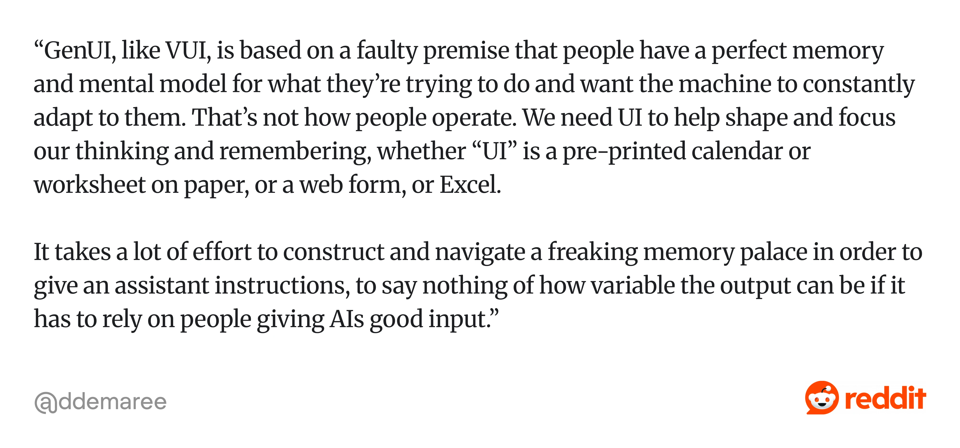
Reddit discussions around generative AI reveal a similar concern. As one UX practitioner on Reddit observed, people don't come to software with a perfect mental model of what they want to do. Instead, interfaces help shape their thinking, surface available actions, and reduce the burden of remembering every possible option.
How much adaptation is too much?
This is a design question that the field hasn't fully answered yet. When does personalization become disorienting? At what point does contextual adaptation make users feel like they can't trust the interface?
Part of the answer lies in AI transparency and AI usability principles; when users understand why an interface changed, they tolerate and even appreciate the adaptation. When it changes without explanation, they feel disoriented.
As one UX practitioner put it in a Reddit discussion, generative UI can leave users in a constant state of unpredictability and relearning because the same prompt doesn't always reproduce the same interface or workflow: “...Gen UI just like anything generative is also inconsistent…”
Those are two things users generally dislike, especially in products they use every day.

Current AI models compound the problem. Generative AI UX's well-documented tendency toward hallucination and inconsistency doesn't disappear when it's generating UI. An interface that randomly rearranges itself, or that generates slightly wrong component behavior, is worse than a predictable but imperfect static interface. Users can work around a known limitation. They can't adapt to unpredictability.
The likely future is hybrid UI
The most defensible prediction isn't fully generative interfaces. It's interfaces that use generative techniques selectively, within stable foundations.
This mirrors what many designers and product teams are converging on. In a recent Reddit discussion, one commenter envisioned a hybrid future where high-risk tasks continue to rely on familiar, predictable interfaces, while low-stakes or repetitive tasks become increasingly automated: “...I could see a hybrid world, where high-risk tasks are handled with a UI we’re used to today and inconsequential tasks are more or less never thought about. I think what we may be overlooking is that, for better or worse, product experiences enrich day to day life…”

They also noted that product experiences themselves matter: users often want to stay involved, not simply delegate everything to AI.
The navigation stays consistent. The global structure is predictable. But within that, specific regions, a workspace area, a content panel, and a contextual sidebar adapt dynamically based on what the user is doing. This is a design for AI adoption question: how do you introduce adaptive behavior without breaking the trust users have built with your product?
This is already how the best AI-native products work. Cursor doesn't reinvent its layout on every session. It maintains a consistent IDE shell while adapting the contextual AI panel to your current task. ChatGPT Canvas has a predictable frame with an adaptive working area inside it. The design insight is simple: anchor users with consistency, serve them with adaptation.
Where this leaves product teams
Generative UI is a design approach that requires rethinking how you build products.
The practical questions are concrete:
- Is your design system clean enough for an AI to compose from, or is it a collection of one-off components?
- Have you thought about which regions of your interface should stay stable and which can adapt?
- Do you have the data signals to personalize meaningfully, or are you personalizing based on guesswork?
These questions also shift the role of the AI product manager, from shipping features to defining the constraints, data signals, and trust boundaries that make adaptive interfaces work reliably at scale.
There's also the deeper question of how much the system should act on its own. Designing for AI autonomy means deciding when the interface should adapt without asking, and when it should surface choices and let the user lead. Get that balance wrong, and you either build something too rigid to feel intelligent or too unpredictable to feel trustworthy.
While working on AI-native products, we approach this as a constraints-first design problem, defining the stable foundation first, then identifying where generative techniques add real value. Not the other way around. The goal is interfaces that know when to change, and when to stay exactly where you left them.
Need help designing AI-native experiences users can trust and navigate? Let's talk.


.png)



.png)


