

Our client recently told us they tried plugging their Figma design into Claude and hit a problem almost immediately: “It wasn't tokenized... in a way that you can extract it.”
We hear versions of this problem often at Eleken. Teams have components, colors, text styles, and variables in Figma, but the system isn't structured well enough to move cleanly into code. Developers still use Figma as a reference, but they have to recreate changes manually, and even naming tokens and components becomes a source of confusion.
AI makes those gaps more obvious. Claude, Cursor, or Figma Make can generate code quickly, but they need a system they can understand. If spacing, colors, typography, and component rules aren't defined consistently, AI ends up interpreting the design instead of using its rules.
That’s where design tokens help.
In this guide, we’ll show how tokens move from Figma to code and production, how AI fits into the process, and where the design token workflow can break.
What "Figma to code" means for design tokens
Figma to code is the process of translating Figma designs into working code while preserving visual consistency. For design tokens, this means transferring shared design values, such as colors, typography, and spacing, from Figma into code.
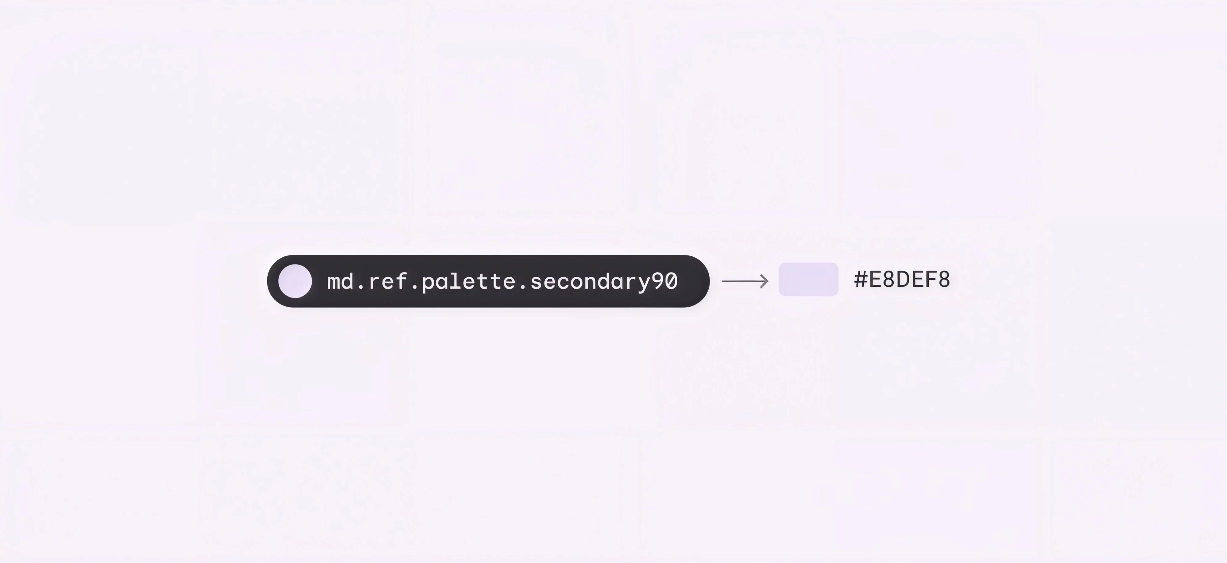
A design token is a named design decision. color/action/background is a token. #3B82F6 on its own is just a hex code someone copied.
That difference sounds pedantic until you've lived without it. Hard-coded values pile up across files and sprints. A margin gets copied, then tweaked, then copied again. Six months later, your design system has quietly split into three.
Tokens fix this with one rule: change a value once, and every reference updates. Web, mobile, and AI-generated UI all follow. That's the real promise behind design consistency, and it covers the whole design language: color, typography, spacing, radius, shadows, motion, elevation, and breakpoints.
How do you move design tokens from Figma to code?
The basic idea is simple: define design decisions once, then carry the same values from Figma into the components developers build.
The pipeline looks like this:
Figma Variables → token JSON → CSS/Tailwind → components → Storybook → production
The interchange format is now settled, too. The Design Tokens Community Group published its first stable spec (2025.10) in October 2025. If your tools speak it, they can talk to each other.
Throughout the process, we’ll follow one token: color/action/background. It’s #3B82F6 in light mode and #60A5FA in dark mode. That makes it easy to see what happens to the same design decision at every stage.
But before exporting anything, you need to structure the tokens correctly.
Step 1: Structure tokens in three tiers
Most token systems that work use three tiers. Each one references the tier below it.
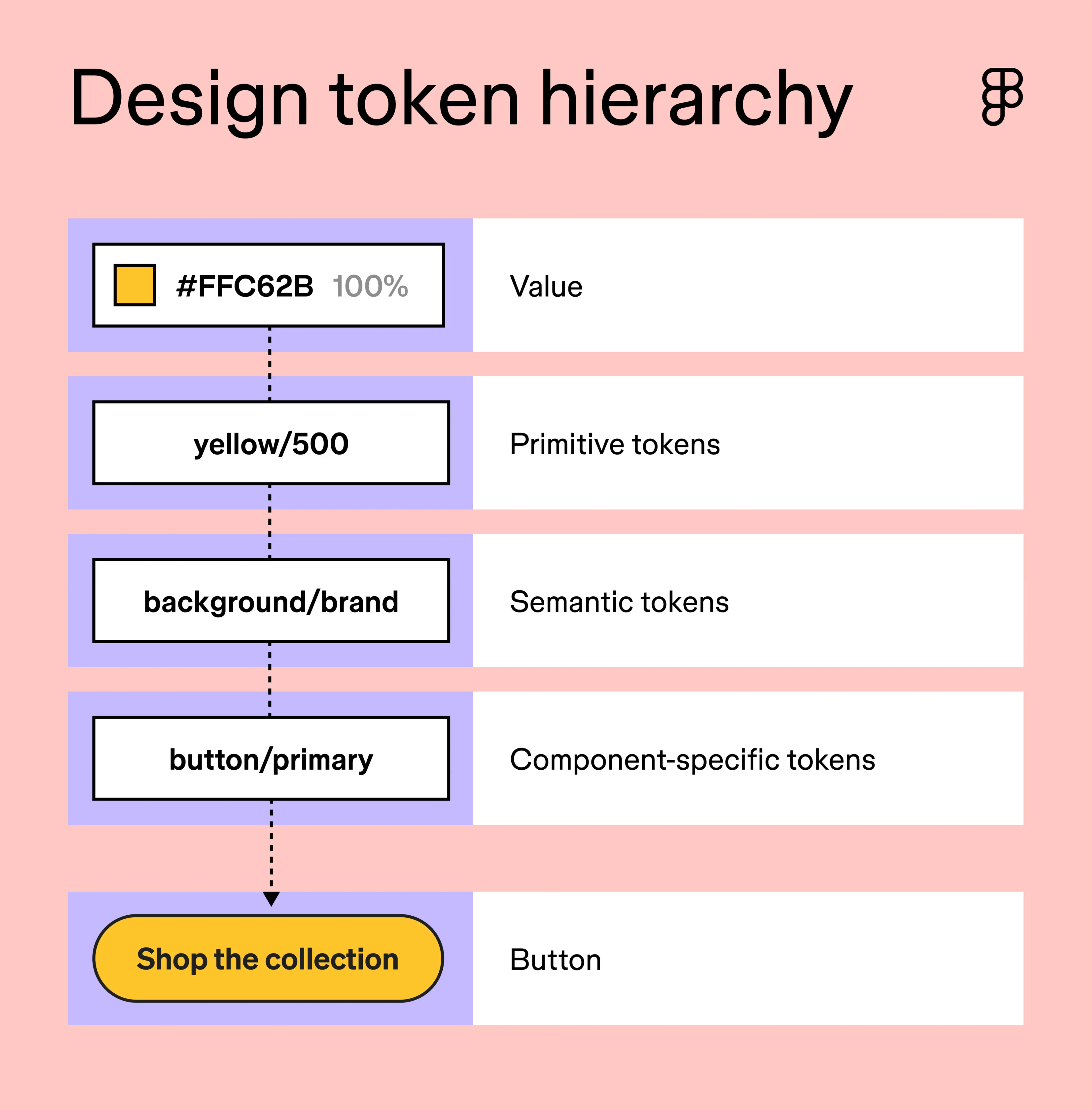
- Primitive tokens store raw values. blue-500 = #3B82F6.
- Semantic tokens express intent. color-action-background points to blue-500.
- Component tokens scope a value to one element. button-primary-bg points to color-action-background.
The semantic tier is where the magic happens. It's the swap layer. Point color-action-background at blue-400 instead, and every button, link, and toggle follows. That one alias change handles dark mode, a second brand, or a high-contrast override.
One Reddit commenter put the naming rule well: semantic tokens "should describe the meaning or intended use," not the color. Call it color-danger, not color-red. Red might not survive the next rebrand. Danger will.

Semantic tokens usually don’t describe the color, they should describe the meaning or intended use. For your current setup you could try to leverage the “swap library” action in Figma. IMO your setup sounds overly complicated so you may want to take a step back and review it first.

We saw this pay off on Newton360. Instead of redesigning every screen for a dark theme, we built foundation tokens with light and dark variable modes. Switching themes became one click.
This is the part that turns a rebrand from a design sprint into a config change. Tiers are a concept, though. Figma variables are where they become real.
Step 2: Map the tiers to Figma variables
Figma variables come in four types: color, number, string, and boolean. That's enough to cover nearly every token category. Spacing, radius, and sizes are numbers. Font families are strings. Feature toggles are booleans.
The mechanism that makes tiers work is aliasing. A semantic variable doesn't hold #3B82F6. It points to the primitive variable blue/500. Change the primitive, and the semantic follows.
Here's a setup we'd recommend for most teams:
- One collection for primitives. The raw palette, spacing scale, and radii.
- One collection for semantics. Aliases only, no raw values.
- Modes for themes. Light and dark live as modes inside the semantic collection, not as separate files.
- Slash naming. color/action/background groups neatly in Figma and maps cleanly to code.
For our running token, the semantic collection has one variable: color/action/background. In the light mode, it aliases blue/500. In the dark mode, it aliases blue/400.
The same logic scales to multiple brands. As one designer advised on Reddit, the best option is a single design system: "...You need to merge them into a single themes file so it can use mode switch..."
Automatically no. You could use plug-ins, but it's a manual work. You need to merge them into a single themes file so it can use mode switch.
Splitting primitives and semantics into two Figma files sounds tidy. In practice, it just adds a place for things to drift.
One more Reddit lesson: teams underestimate native variables. They reach for a plugin before they've hit a single limit. Try the native route first. You'll find more Figma design system best practices work out of the box than you'd expect.
Now the tokens are structured. Time to get them out of Figma.
Step 3: Export tokens to JSON
You now have two solid routes out of Figma:
- Native export. Figma can now export variable collections as DTCG JSON, one file per mode, without plugin needed. For a small team with one brand, this is often enough.
- Tokens Studio. The plugin is still the stronger choice when you need multi-file sync, Git integration, or token automation.
One Reddit user's advice for messy exports was simple: "Import variables into Token Studio and get JSON from there."
Import variables into Token Studio and get JSON from there.
Either way, the output looks the same. Each token gets a $value and a $type:
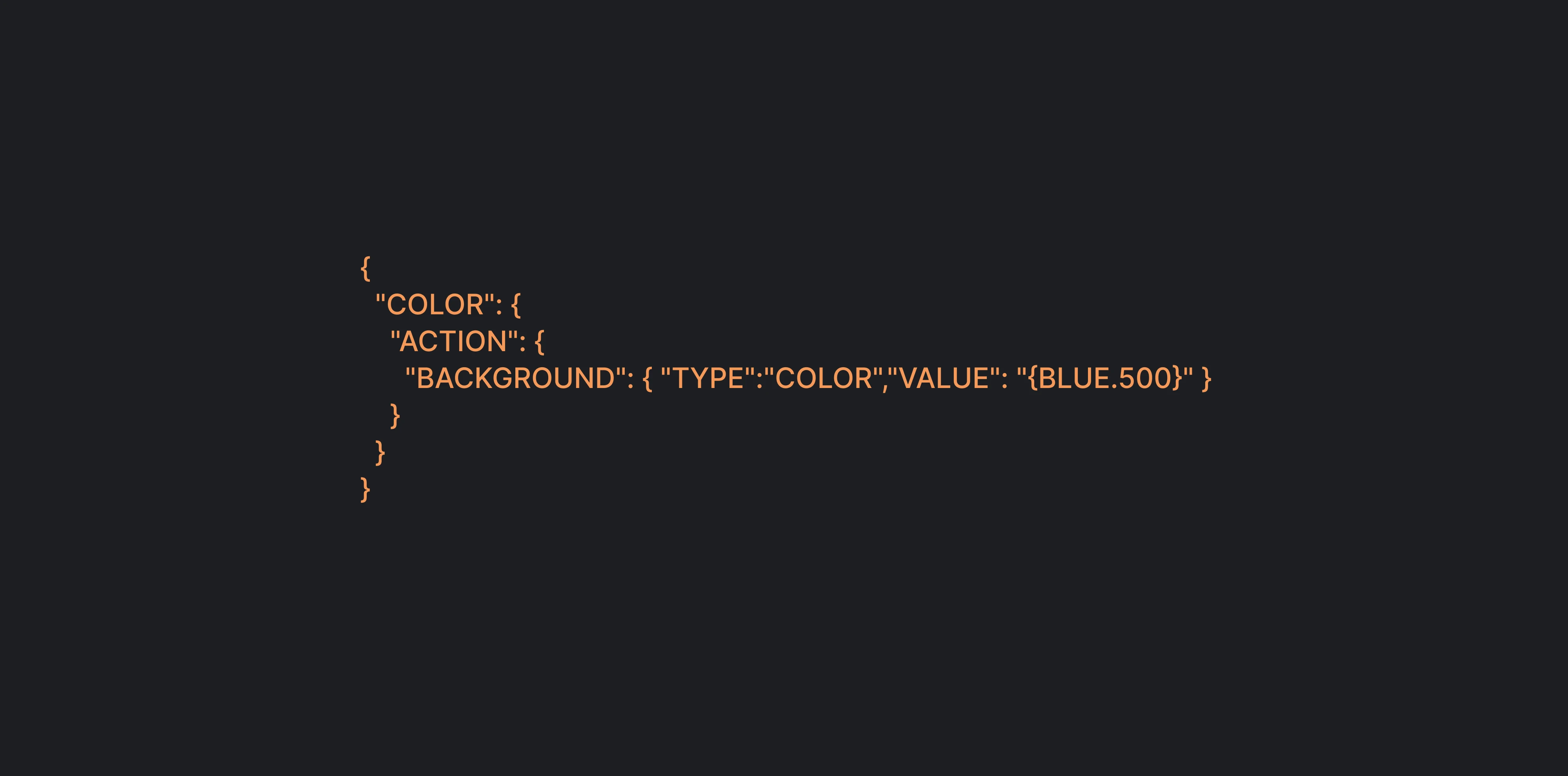
That JSON goes into GitHub. Token changes now show up as plain-text diffs in pull requests, reviewed like any other code. From this point on, the build never touches Figma again.
One thing to watch: Tokens Studio can become slower with large token sets and complex files. For many teams, it makes sense to start with native Figma Variables and add Tokens Studio when you need more advanced syncing or automation.
The bigger problem, though, is incomplete tokenization. A team exports colors but leaves spacing, sizing, radii, typography, and other values inside the Figma file. Developers then have to inspect frames and recreate those decisions manually.
At that point, you haven't really created a Figma-to-code pipeline. You've just made the color palette portable.
A complete handoff includes:
- Color, typography, spacing, radii, sizing, shadows, and elevation.
- Every component state: default, hover, active, disabled, error, and loading.
This is where Eleken's Figma developer handoff process focuses. We annotate every state in Figma, organize it by feature, and add React-compatible notes. Developers get a complete token set, not just a palette. If you'd rather run it yourself, our design handoff checklist covers the same ground.
And you can learn more about design-to-development handoff in this video:
The JSON is portable now. But browsers don't read JSON.
Step 4: Transform JSON into CSS and Tailwind
The standard tool here is Style Dictionary v5. It's open source, installs from npm, and reads the stable DTCG format. You point it at your token JSON, and it builds outputs for every platform you need.
For our running token, the CSS output looks like this:
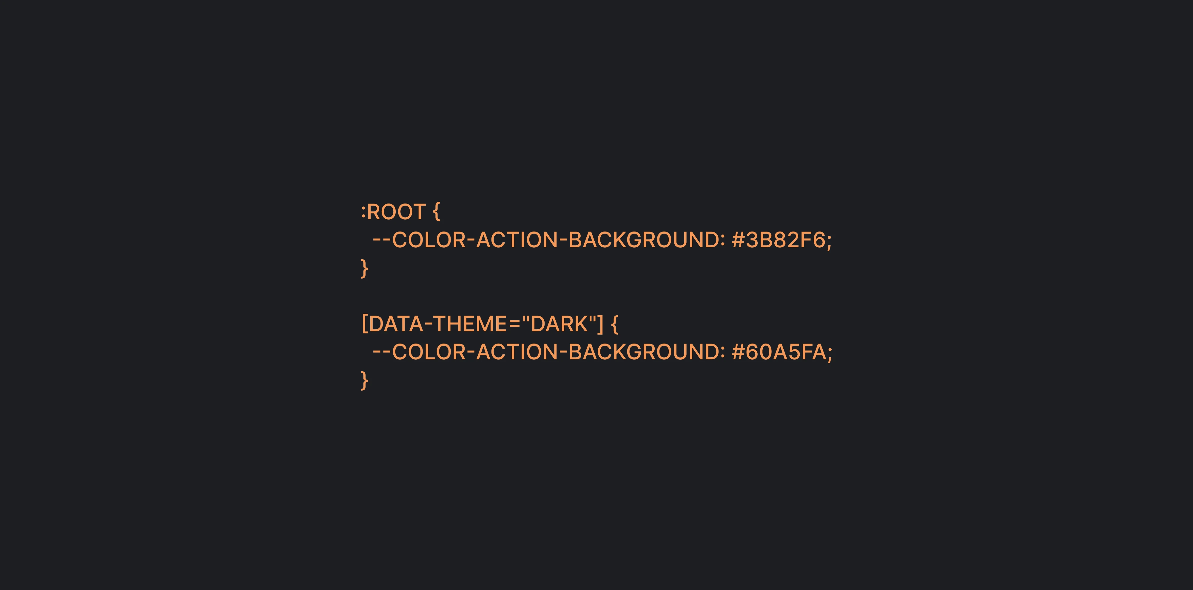
The same build step can generate a Tailwind theme that maps the token to a utility class, bg-action. One JSON source feeds both. No one keeps two files in sync by hand.
Then add CI. A GitHub Actions workflow (or similar) reruns the build on every merge. A designer changes blue/500 in Figma, the JSON diff gets approved, and fresh CSS ships. Nobody opens a stylesheet.
We'd argue this step delivers the biggest time savings in the whole pipeline. It's also the one teams postpone the longest.
Variables are plumbing, though. Users see components.
Step 5: Build and document components in Storybook
Tokens only pay off once components use them. Our button-primary-bg token finally gets a job: it colors a real button.
The core set most products need is familiar. Buttons, forms, modals, navigation, cards, tables, alerts, and empty and error states. The hard part isn't the list. It's the states.
Every component needs all of them: default, hover, focus, active, disabled, loading, error, and success. Skip one, and a developer will improvise it. Improvised states are how hex codes sneak back in.
The framework matters less than you'd think. The same tokens can power React, Next.js, Vue, Flutter, SwiftUI, or Compose.
Storybook is where all of this becomes visible. Each component lives there with its variants, props, do/don't examples, and accessibility notes. It doubles as a testbed for visual QA. When something looks off, you check Storybook before anyone argues about Figma.
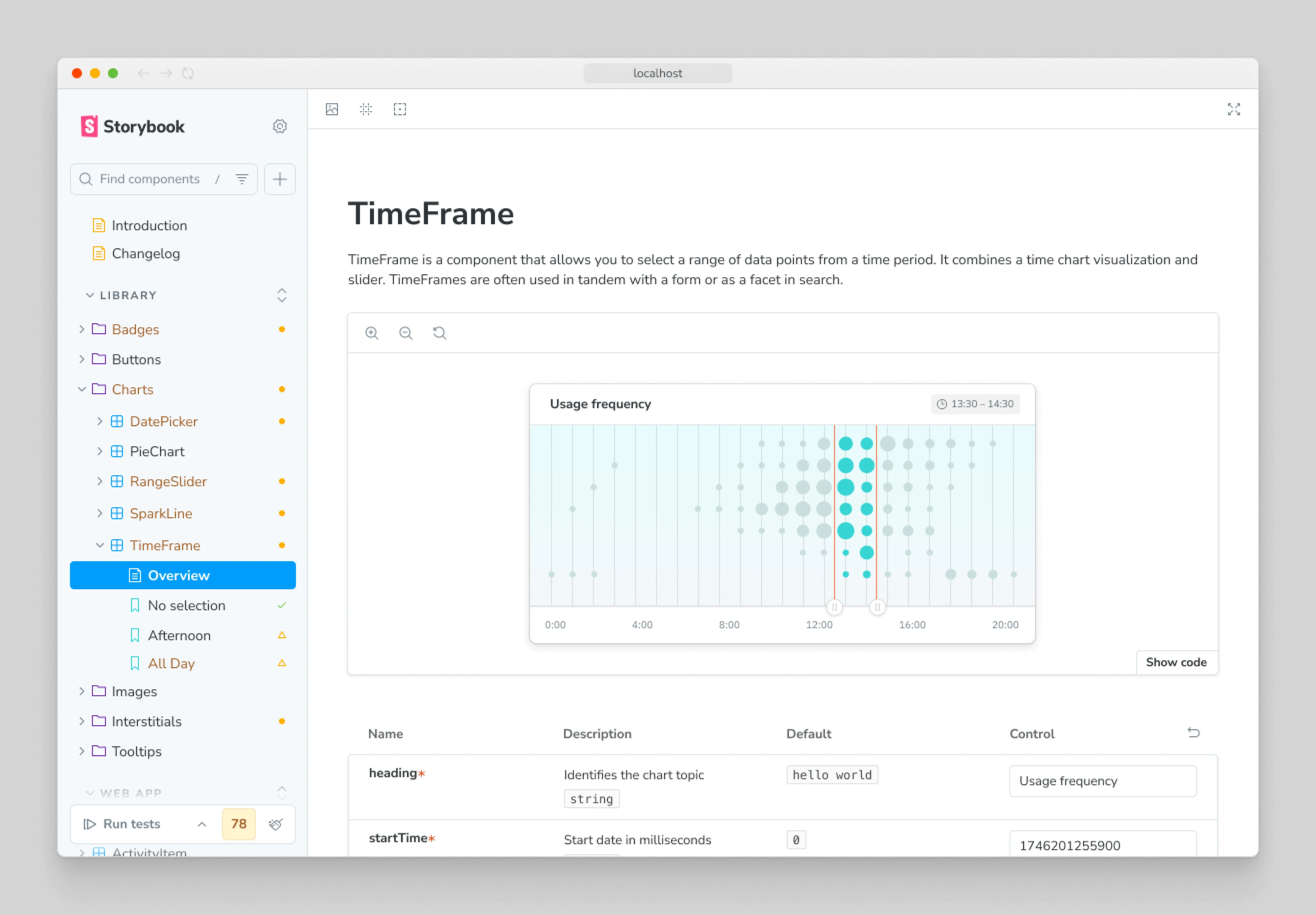
This is a big part of what Eleken delivers. Our component phase covers the full range: icons, buttons, badges, inputs, checkboxes, toggles, avatars, tooltips, progress bars, charts, tables, navigation, headers, and footers. Every state is documented in Storybook. That shared reference is what keeps designer-developer collaboration calm.
And developers aren't the only ones reading those docs anymore.
How AI tools use a token-driven design system
AI coding tools can generate UI quickly. Figma design tokens help make sure they generate UI that actually belongs in your product.
Through tools like Figma MCP, AI coding agents can access structured design context. They can also read token files and Storybook documentation directly from the codebase.
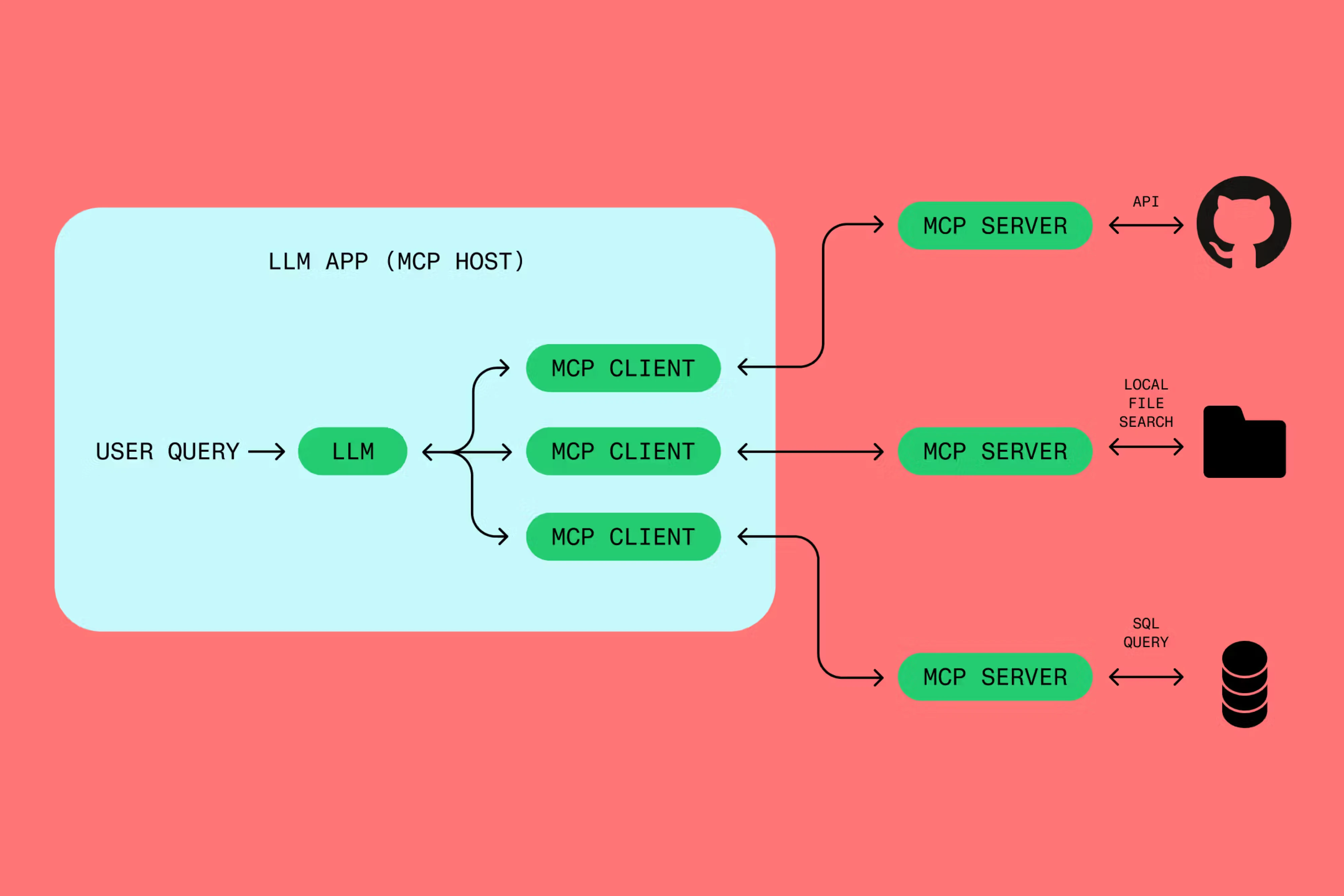
So when you ask Claude Code or Cursor to build a pricing card, it doesn't have to guess the colors, spacing, or radius. It can use the same tokens and components as the rest of the product.
That depends on the quality of the system, though. Tokens need clear names, current values, and predictable mappings between Figma and code. Storybook needs to reflect the components that actually exist.
Without that structure, AI fills in the gaps itself. You get hardcoded colors, slightly different spacing, and new component variants that don't belong in the system. AI doesn't remove design drift. Without clear constraints, it can create it faster.
A token-driven design system gives AI those constraints. The next question is how much tooling you need to maintain it.
Which design token setup fits your team?
The right setup depends on the complexity of your design system.
For many teams, native Figma Variables are a good place to start. Add Tokens Studio when you have a specific need for more advanced syncing, automation, or multi-brand management.
The tooling itself usually isn't the hardest part. Keeping the system complete is. Colors get tokenized, but spacing doesn't. New states appear in code but never make it into Figma. Storybook documentation falls behind the product.
That's where Eleken's approach goes beyond setting up tokens. We structure the design system around the real product, define component states, prepare it for development, and help keep the connection between Figma, code, Storybook, and AI tooling clear.
Whatever setup you choose, the real test isn't whether it works on day one. It's whether the same system is still being used six months later.
How to keep design and code in sync long-term
A token pipeline rarely breaks all at once. It drifts. A value gets changed directly in code. A new token is named differently in Figma. Documentation stops reflecting the real component.
A few rules prevent most of that:
- Avoid manual copy-paste. Token changes should flow through the pipeline rather than being recreated in code.
- Keep naming consistent. color/action/background in Figma should map predictably to --color-action-background in code.
- Automate builds. Regenerate token outputs whenever approved changes are merged.
- Assign ownership. Someone needs to review new tokens, remove duplicates, and keep the system consistent.
- Test accessibility early. Include contrast and other accessibility checks in the workflow instead of waiting for a final audit.
Our design system checklist covers the broader governance process in more detail.
But automation only solves part of the problem. Products keep changing. New features introduce new components, existing patterns evolve, and sometimes the design system itself needs restructuring. That’s why maintaining the connection between design tokens code is an ongoing process, not a one-time handoff.
At Eleken, we stay involved beyond the initial design system when needed — supporting new features, reviewing design token implementation, and helping teams extend the system without introducing inconsistencies.
And that brings us back to the problem from the beginning. Developers shouldn't have to guess whether a radius is 6px or 8px, which gray is correct, or whether a value in Figma is still current. With a well-structured token pipeline, those decisions already exist in the system.
The result is less guesswork, fewer design-code mismatches, and a design system that becomes easier to extend as the product grows.
If you're building the foundation yourself, our guides on how to create a design system and SaaS design systems are useful next steps.
Want the system built, not just documented? Work with Eleken to turn your Figma design system into a tokenized, developer-ready foundation that scales with your product.