


The basic job of a color picker sounds simple: let the user pick a color. In reality, though, color selection is rarely just one action. Users match colors to brand guidelines, convert between HEX and RGB, sample colors from images, preview them against real content, and reuse colors they picked days ago to keep designs consistent.
That’s where many color pickers fail. They handle the moment of selection well, but create friction everywhere around it.
A good color picker UI supports the entire workflow, not just choosing a hue.
In this article, we’ll look at color picker examples worth borrowing from, UX design patterns worth knowing, and a simple framework for choosing the right picker for your product.
Best color picker UI examples
Some color pickers solve real workflow problems better than others. The examples below show different approaches worth borrowing from.
1. Linear
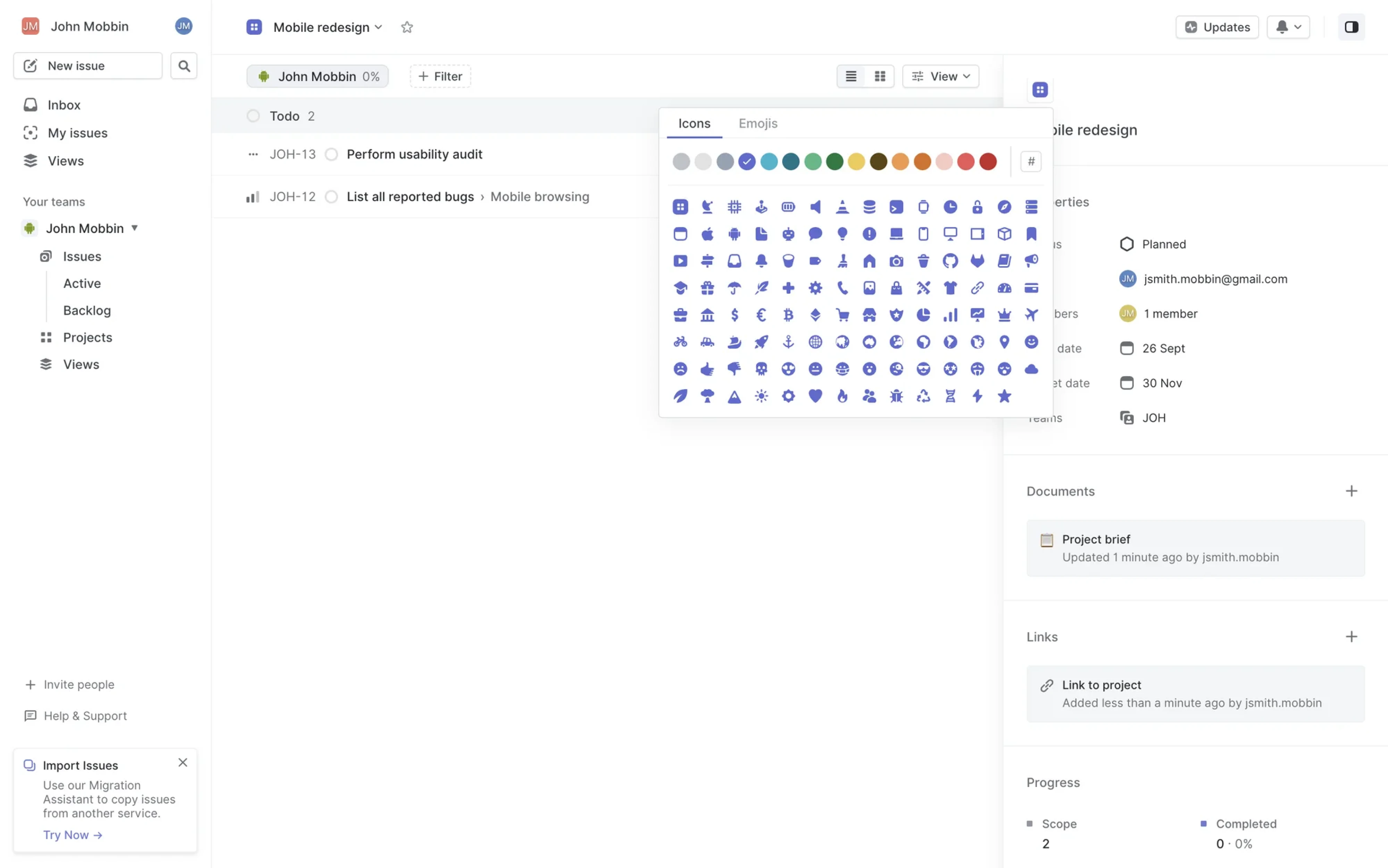
Linear keeps its project color picker intentionally minimal: a small set of curated swatches, but no HEX field, RGB controls, or eyedropper. And for its use case, that’s the right decision.
The lesson here is simple: when users don’t need precision, too many options only slow them down. By limiting choice, Linear makes selection faster, keeps the interface clean, and maintains visual consistency across projects and teams.
A color picker doesn’t always need more features. Sometimes the best UX comes from knowing what to leave out.
2. Notion
Notion takes the opposite approach from advanced design tools. Its color picker is built around simple, predefined options like gray text or yellow background without HEX values, RGB sliders, or custom palettes in sight.
That constraint is intentional. Most users aren’t trying to create a unique color system; they just want content that looks organized and consistent. By limiting customization, Notion keeps pages visually cohesive and makes decisions faster.
The UX takeaway: constraints often create a better experience than unlimited flexibility, especially in collaborative products where consistency matters more than precision.

3. Figma
Figma’s color picker is built for people who work with color constantly. HEX input, opacity controls, eyedropper, recent colors, team libraries, and document palettes are all available in one compact UI, because hiding them behind extra clicks would slow experts down.
To new users, the interface can feel dense. To designers, it feels efficient.
The takeaway: advanced workflows benefit from high information density. When users repeat the same actions dozens of times a day, speed matters more than simplicity.

4. Wise
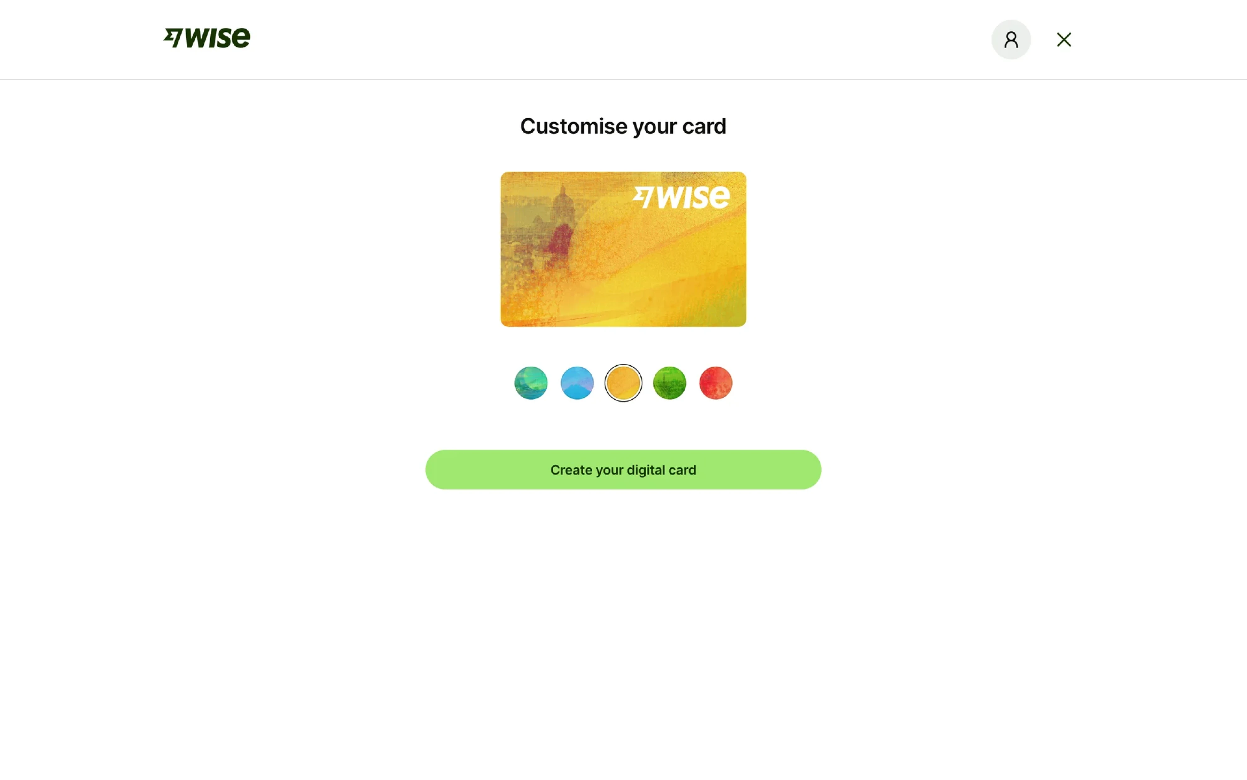
Wise turns color selection into a lightweight personalization step instead of a design task. Users choose from a few vibrant card styles presented directly on the preview, with no technical controls or customization settings involved.
That simplicity works because the goal is confidence. Users can instantly see how their card will look without thinking about color theory, accessibility in UX, or branding.
The UX lesson: when color is emotional rather than functional, previews matter more than control.
5. Whop
Whop strikes a balance between flexibility and simplicity. Instead of overwhelming users with full design-tool controls, it offers a curated palette of vibrant theme colors that instantly update the product page styling.
This approach gives users enough freedom to personalize their brand without risking broken visuals or inconsistent UI. The experience feels customizable, but still controlled.
The UX lesson: most products don’t need a fully featured color picker. A thoughtful set of preselected options is often enough to make customization feel personal while keeping the interface cohesive.

6. WhatsApp
WhatsApp keeps wallpaper customization extremely approachable. Instead of exposing advanced color controls, it offers a grid of ready-made background colors with instant preview on the chat screen.
The design works because the decision is visual, not technical. Users don’t need to think about HEX values or fine-tuning shades; they just pick the mood that feels right.
The UX lesson: for highly emotional or aesthetic choices, fast visual comparison beats precision controls every time.

7. HoneyBook
HoneyBook combines flexibility with guidance. Users get a full-featured picker with a spectrum field, HEX input, and saved brand colors, while seeing the result applied directly to invoice previews in real time.
That balance matters because branding is both emotional and functional. Users want enough control to match their identity, but they also need reassurance that the final UI will still look polished.
The UX lesson: when customization affects brand perception, live preview becomes just as important as the picker itself.

8. Binance
Binance’s chart color picker is built for precision. Traders can fine-tune indicator colors with gradients, sliders, opacity controls, and direct input, all inside a dense, information-heavy interface design built for constant use.
It’s not visually simple, but that’s intentional. In professional tools, customization speed and control matter more than minimalism. Users expect advanced options because color carries functional meaning: highlighting trends, separating indicators, and reducing visual noise in fast-moving charts.
The UX lesson: when color affects readability and decision-making, precision beats simplicity.

9. GitBook
GitBook’s color picker is designed for structured customization, not creative exploration. Users can adjust brand and semantic colors with precise controls while instantly previewing changes across the documentation layout.
What makes it work is context. The picker doesn’t exist in isolation. Every choice is tied to a real UI element like buttons, links, warnings, or code blocks. That makes customization feel safer and more intentional.
The UX lesson: color pickers become far more usable when users understand exactly where each color will appear and what role it plays in the interface.

10. Adobe Express
Adobe Express approaches color selection as part of a broader creative workflow. Instead of focusing on a single picker, it encourages users to explore ready-made color themes and palettes that instantly reshape the entire design.
That makes the experience feel less technical and more inspirational. Users can quickly try different visual directions and see the impact immediately.
The UX lesson: in creative tools, color pickers can work as discovery tools, not just input controls. Sometimes inspiration matters more than precision.

11. Mailchimp
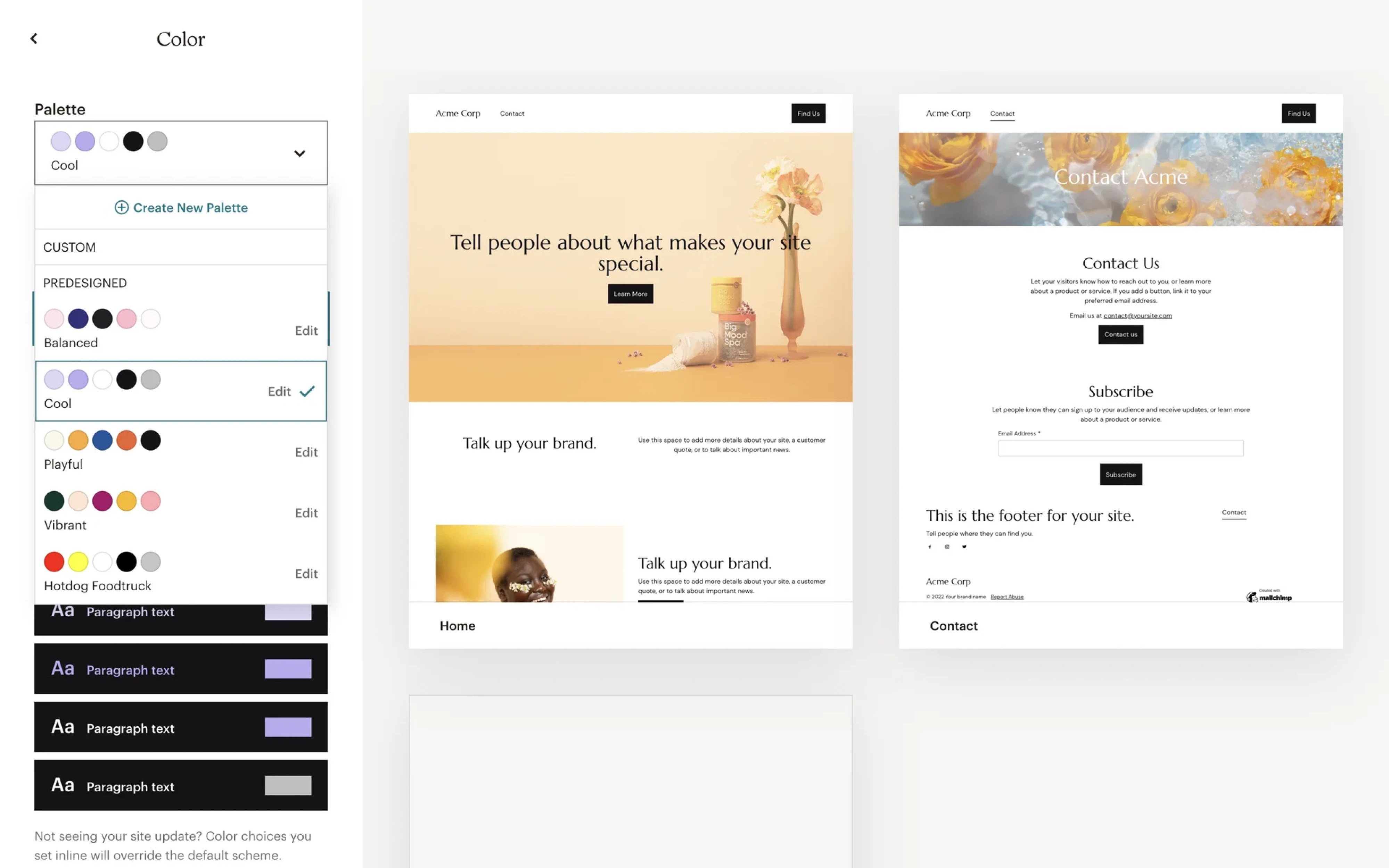
Mailchimp turns color selection into a guided branding exercise. Instead of asking users to build palettes manually, it offers curated combinations like Balanced, Playful, or Vibrant, while previewing the entire email design in real time.
What makes this approach effective is that users choose a visual direction, not individual colors. The system handles harmony, contrast, and accessibility behind the scenes.
The UX lesson: for non-designers, picking a palette is often easier than picking a color.
12. Apple's system picker
Apple treats color selection as a product choice, not a customization feature. Instead of exposing a traditional picker, users choose from a handful of carefully curated finishes shown directly on the product preview.
The experience works because every option is intentional. The limited selection keeps decision-making simple while ensuring every color aligns with the brand and looks good in marketing, packaging, and real-world use.
The UX lesson: when aesthetics are tightly controlled, curation creates a better experience than unlimited choice.

13. Salesforce
Salesforce’s color picker feels like a classic enterprise tool: functional, dense, and built for precision rather than delight. Users can select exact highlight colors through a grid-based spectrum alongside HEX values and previews.
It’s not the most modern interaction, but it serves a practical purpose. In complex enterprise workflows, consistency and control often matter more than visual polish.
The UX lesson: not every color picker needs to feel creative or playful. In productivity software, predictability and precision can be more valuable than aesthetics.

14. Discord
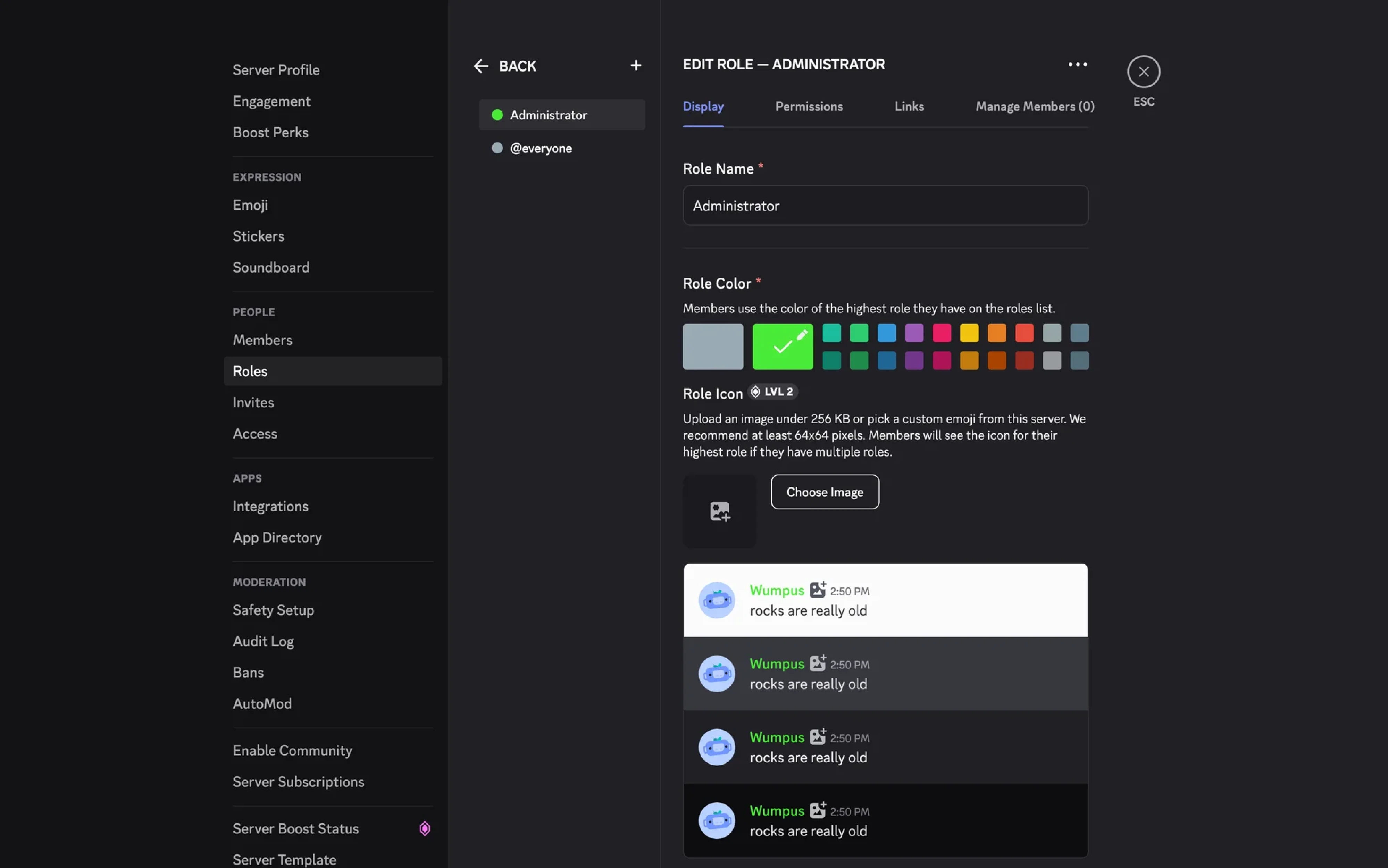
Discord’s role color picker is simple, but highly contextual. Server admins choose from a compact set of preset colors while instantly previewing how usernames will appear in chat.
That preview is the key detail. Role colors affect recognition, hierarchy, and readability across busy conversations. By showing the result directly in the interface, Discord helps admins make faster, more confident decisions.
The UX lesson: color choices become easier when users can see their real functional impact immediately.
15. Clockwise
Clockwise uses color as an organizational system rather than a personalization feature. Different meeting types — focus time, one-on-ones, team syncs, holidays — are automatically assigned colors so users can scan their calendars faster.
The interface itself is simple: small swatches mapped to clear categories. But the value comes from reducing cognitive load. Users don’t need to manually style events or remember labels — the system creates a visual structure automatically.
The UX lesson: color pickers can improve recognition and navigation, not just aesthetics.

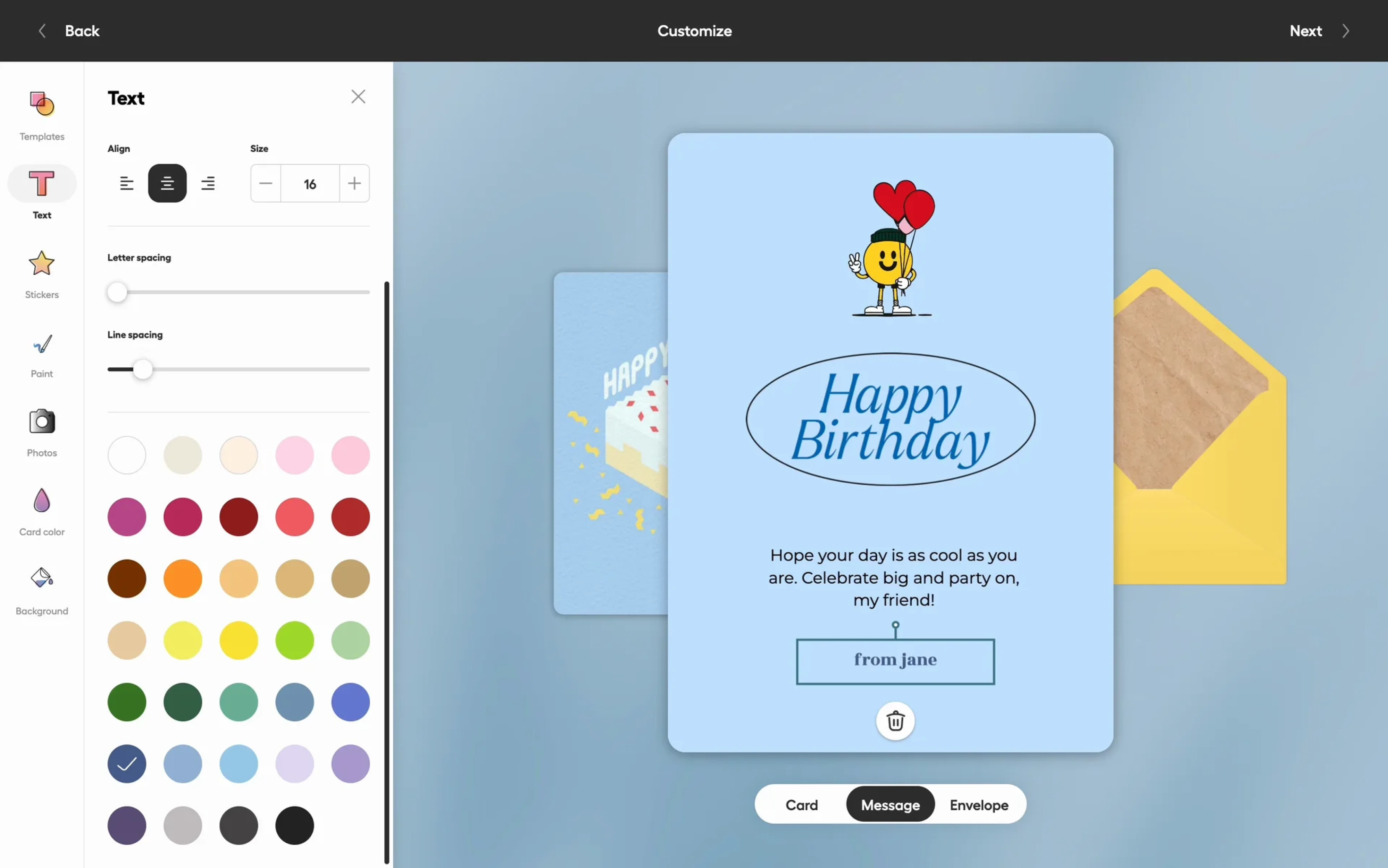
16. Givingli
Givingli’s color picker is designed around emotion and self-expression. Instead of technical controls, users get a large palette of playful, ready-to-use colors applied directly to cards and messages in real time.
The interface feels approachable because customization happens visually and instantly. Users aren’t “editing a design system” — they’re personalizing a moment.
The UX lesson: when the experience is emotional, color pickers should feel lightweight, fun, and low-pressure rather than precise or technical.
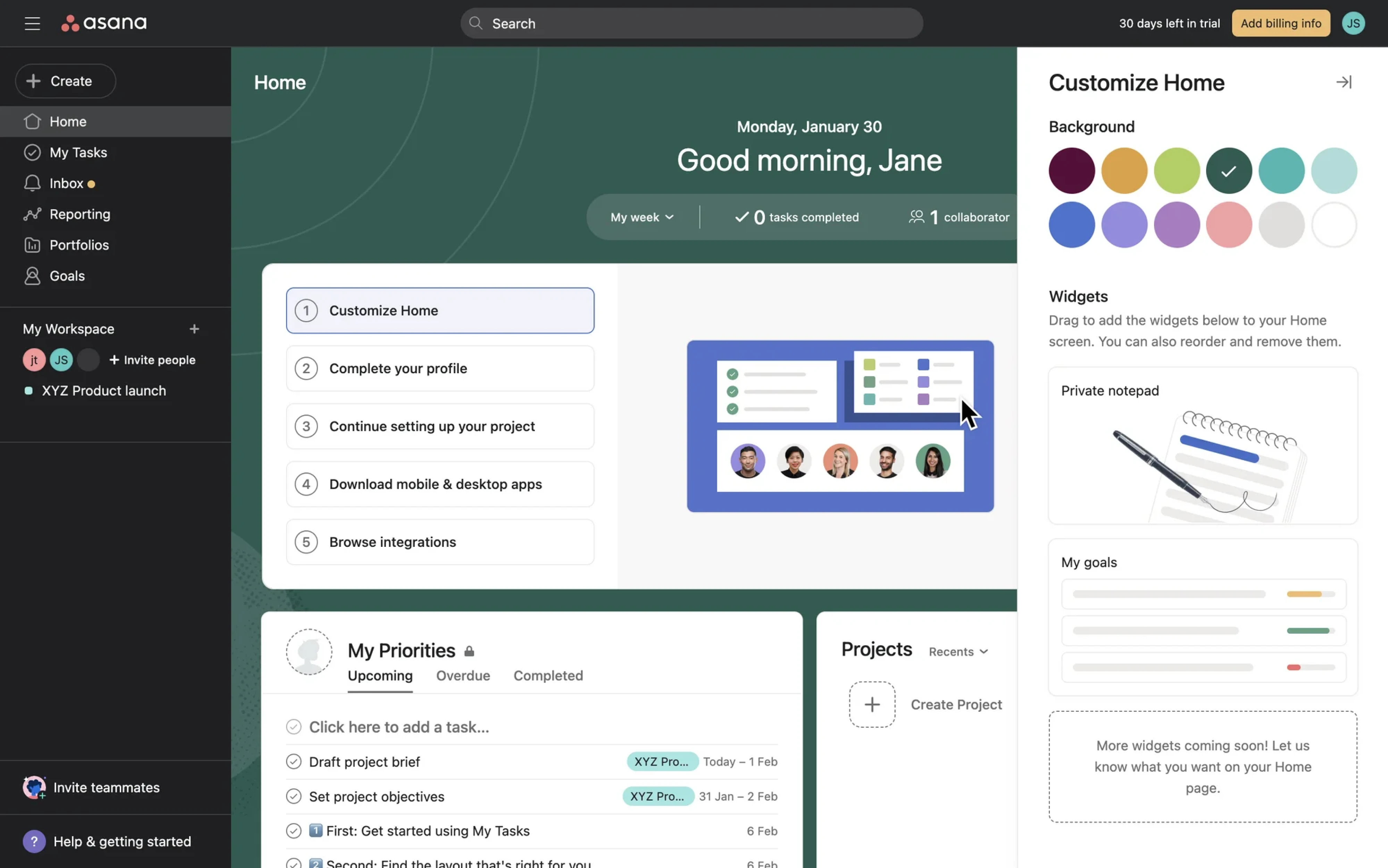
17. Asana
Asana uses color customization to make the workspace feel more personal without turning it into a design task. Users can quickly switch between a handful of background themes that instantly reshape the mood of the interface.
The experience stays lightweight because the choices are curated and low-risk. No fine-tuning, no advanced controls — just fast visual personalization that helps users feel ownership over their workspace.
The UX lesson: sometimes color pickers are less about function and more about creating an emotional connection with the product.
18. Lovable
Lovable treats color customization as part of identity building. Instead of picking individual colors one by one, users choose from complete themes that instantly transform the entire website preview.
That approach makes customization feel fast and safe. Users can explore different visual personalities without worrying about color harmony, accessibility, or breaking the design.
The UX lesson: for non-designers, choosing a theme is often easier and more satisfying than building a palette from scratch.

19. Airtable
Airtable uses color as a way to organize complex information at scale. In multi-select fields, each option gets its own color label, turning long datasets into something users can scan and understand instantly.
What’s smart about the design is that color is metadata. The interface prioritizes clarity, recognition, and categorization over creative freedom.
The UX lesson: in data-heavy products, color works best when it improves information hierarchy and scannability.

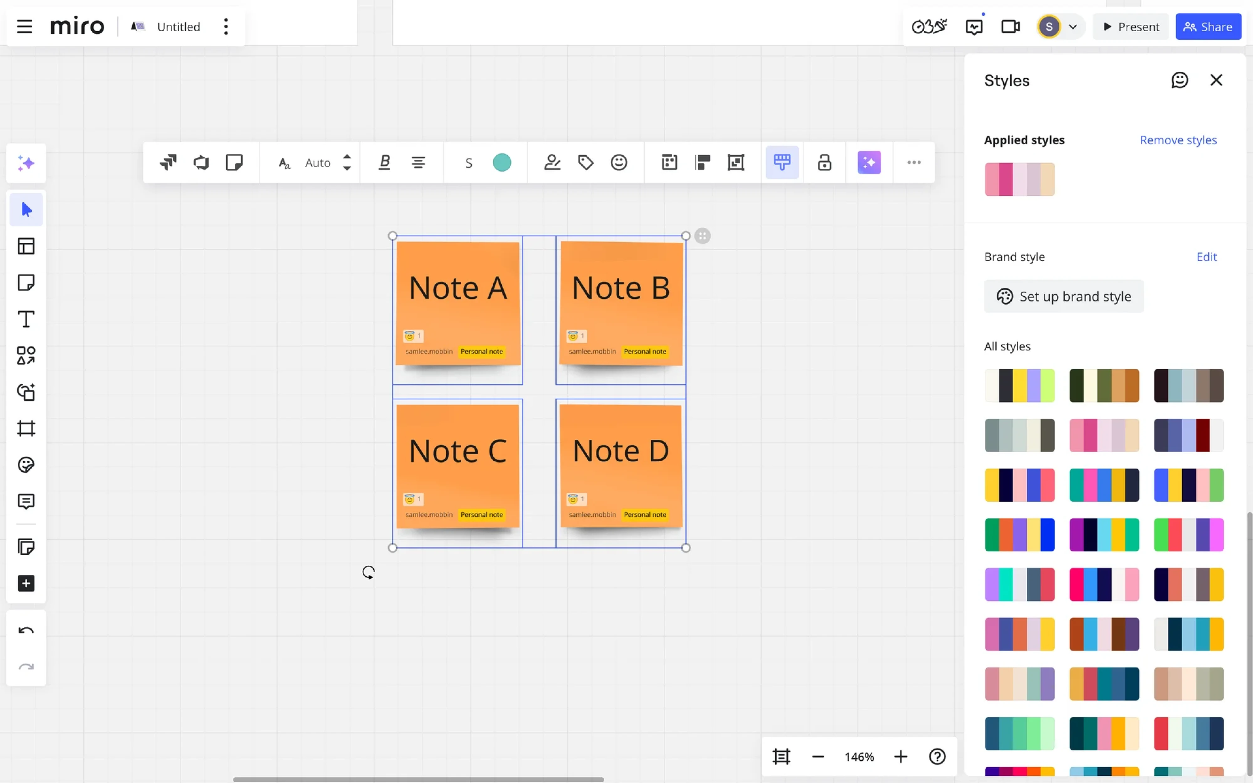
20. Miro
Miro approaches color as part of collaboration and visual structure. Instead of focusing on individual color selection, it offers reusable style palettes that can be applied across sticky notes, diagrams, and boards in just a few clicks.
That makes large canvases easier to organize and keeps team workshops visually consistent without slowing people down with design decisions.
The UX lesson: in collaborative tools, color systems scale better than standalone color pickers.
The pattern across these examples is simple: the best color pickers are designed around user workflows, not around what a UI color picker is “supposed” to look like.
Still, the strongest ones tend to share a few common qualities, and those are what we’ll focus on next.
What makes a good color picker UI: 5 qualities
The difference between a frustrating color picker and a great one usually comes down to a few small UX decisions. Here are five qualities the best color pickers consistently get right.
1. Speed.
A color picker is a high-frequency interaction. Every extra click adds up. The best pickers open instantly, expose their most-used controls without scrolling, and commit on the first action. Figma's recent colors are one click away. Canva takes a similar approach by surfacing ready-to-use colors directly in the editor, so users can apply and preview changes without opening a separate customization flow.

2. Familiarity.
Photoshop set the spectrum-square-plus-hue-slider standard in the early '90s. Most users have been trained on it for thirty years. Reinventing the control rarely wins. Borrow before you invent. If you want to go deeper into what shapes these instincts, UI UX books on cognitive design patterns are worth the read.
3. Precision.
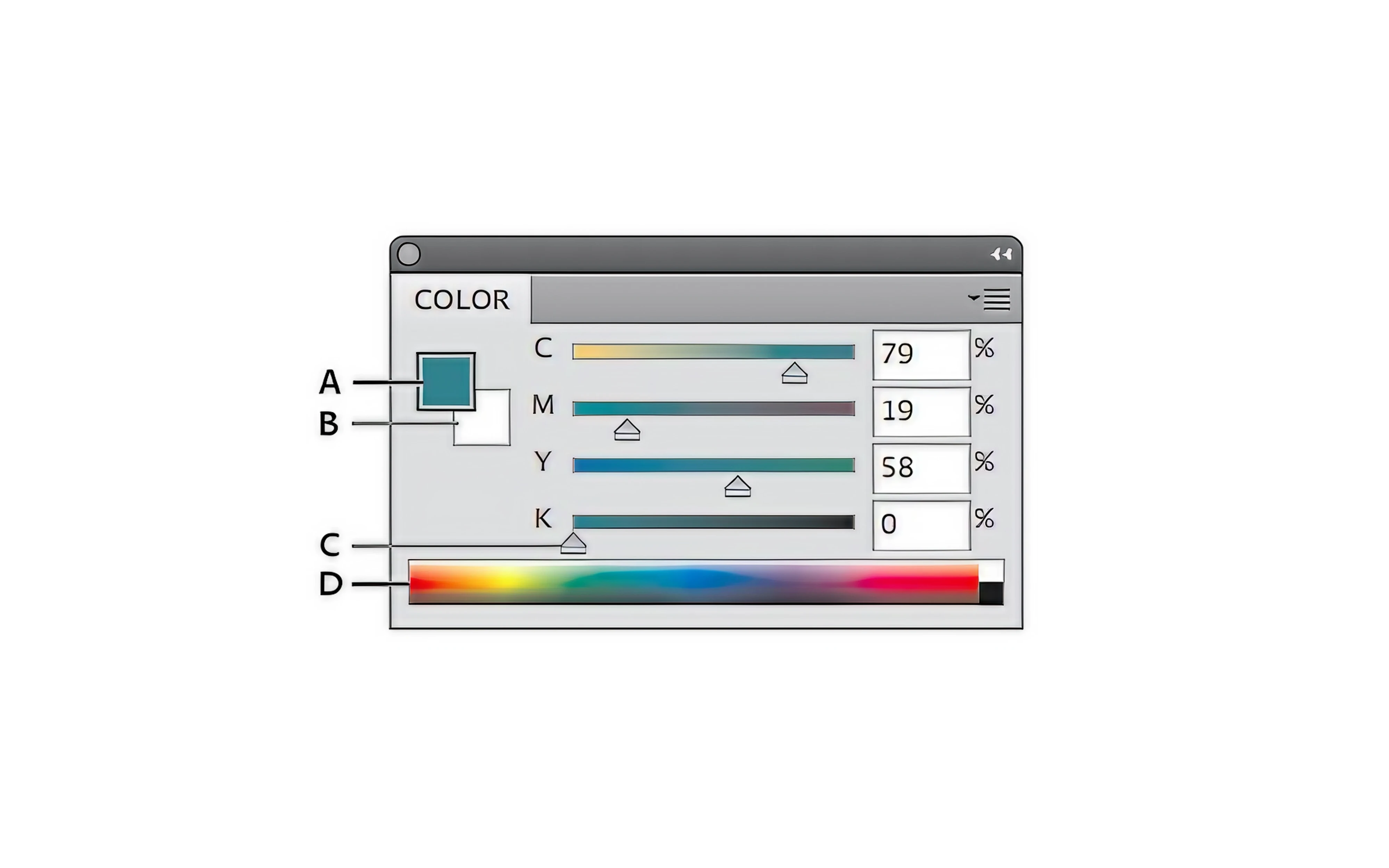
Designers want to type "#4C6EF5" and be done. Sliders alone aren't enough. Any picker for expert users needs editable hex/RGB/HSL fields, conversions between them, and a live preview in context. This ties into broader UI UX principles: give users control without overwhelming them.

4. Reversibility.
Closing the picker shouldn't lock in a mistake. Good pickers preview changes against the actual content, separate "draft" from "committed" state, and make undo obvious. The worst pickers are the ones in old SaaS settings where a misclick saves a hot pink button to production.

5. Context-awareness.
A beginner in a website builder needs a different picker than a brand designer in Figma. Beginners want presets and guided flows. Experts want dense controls and direct value input. Trying to serve both with one interface is how you end up with a picker nobody likes. This is a core challenge in UI redesign projects: identifying who you're actually designing for before touching the controls.

Types of color picker UI patterns
Most color pickers fall into a handful of common patterns, and each one solves a different UX problem. The right choice depends less on aesthetics and more on what users actually need to do with color. Here are the five patterns you’ll see most often.
- Swatch pickers are the most common form of flat UI color picker design: grids of preselected colors optimized for speed and consistency. Fast, consistent, limited. And limited is often the point. Use them when colors should map to brand palettes or semantic roles. Notion, Slack, and Airtable all do this well. The trade-off is creative control, which is exactly why they work for product UI: users can't accidentally introduce a 47th brand color. These fit naturally alongside other constrained components like checkbox UX and dropdown menu UI in design systems built for consistency.

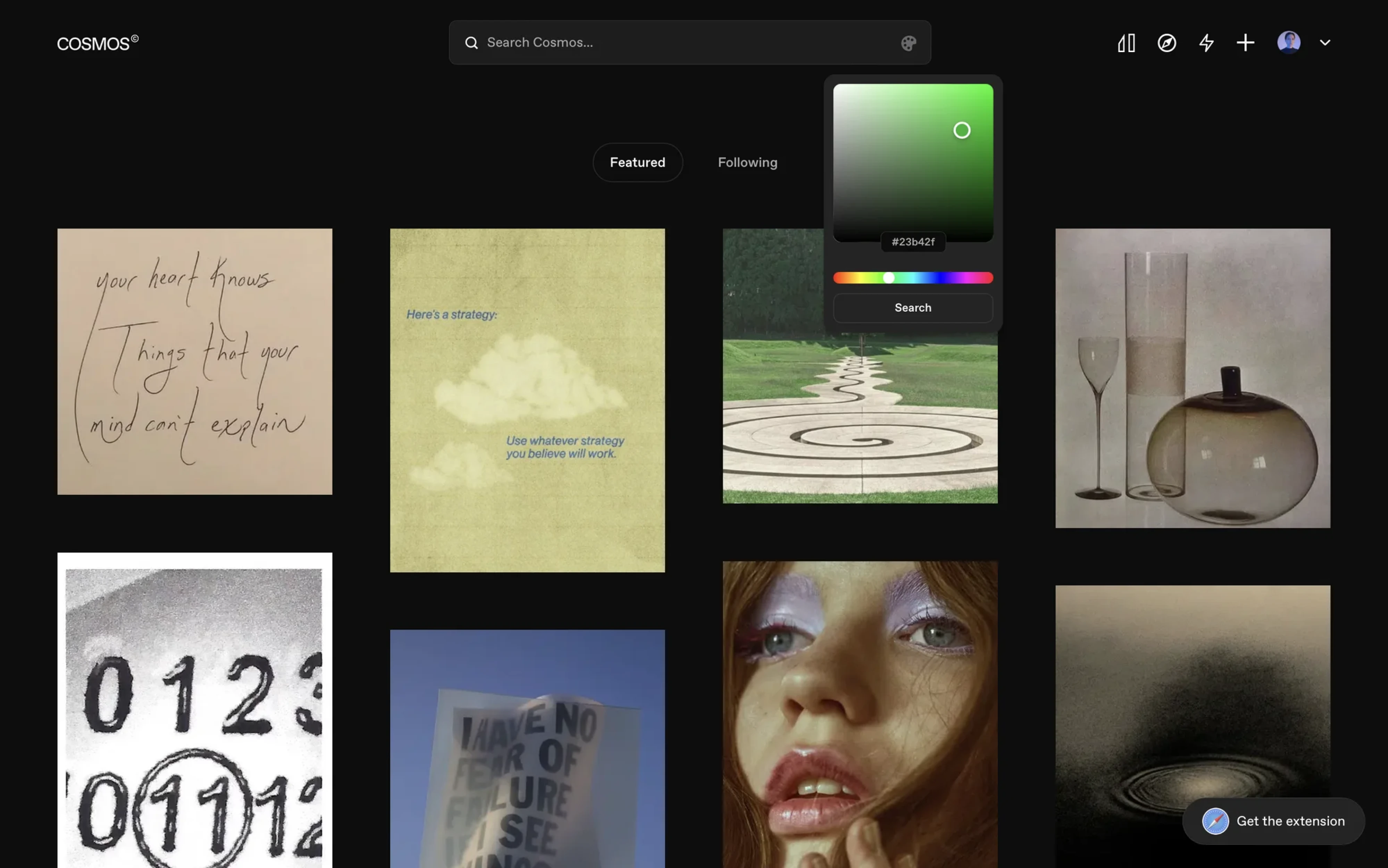
- Spectrum square pickers are the design tool standard. A 2D field for saturation and brightness, a hue slider beside it, and value fields below. Modern design tools often rely on a JavaScript color picker with rich UI controls, combining spectrum selection, sliders, HEX input, opacity, and live preview in a single interface. Photoshop, Figma, and Affinity all use this with minor variations. The reason it's standard is muscle memory. Designers know exactly where to click before the picker even renders. Don't reinvent this for design tools.

- Color wheel pickers look great in product screenshots and feel worse in practice. Polar coordinates are harder to navigate than Cartesian ones. Hitting an exact hue on a wheel is fiddly. Use them in illustration tools where exploration matters more than precision; avoid them anywhere users care about specific values.

- Slider-based pickers vary a lot in usability. HSL sliders match how people think about color — hue, then saturation, then lightness. RGB sliders fight that mental model. If you ship RGB-only sliders, expect users to complain that adjusting colors feels "weird." Pair them with a hex input as an escape hatch. If you're thinking through input field design more broadly, the same principle applies: the format of an input should match the user's mental model.

- Inline mini pickers are the small, contextual pickers that pop open next to whatever you're editing. Linear's status colors, Trello's label colors, and FigJam's stickies. They work best for lightweight customization where the user wants to change a color and keep moving without a modal, tab, or settings menu. Think of them the same way you'd think about a well-placed tooltip UI, present when needed, invisible when not.
- Fullscreen and mobile pickers are their own category. On mobile, the picker usually takes a bottom sheet or full screen. The constraints flip: precision matters less, thumb ergonomics matter more. Common patterns include bottom sheets with tabs, drawers, and full-screen modal editors. Whatever you pick, account for dismiss gestures and make every target finger-sized.

A practical note: most products only need two of these at most. Pick the one that matches the primary use case, then offer "Advanced…" as an escape for the edge cases.
How to choose the right picker for your product
There’s no universal “best” color picker. The right choice depends on your product, your users, and how color fits into the workflow.
When designing a color picker tool UI, start with the actual job users are trying to do. Do they need speed, precision, consistency, or creative freedom? If you're not sure, brushing up on UI UX terminology helps when scoping requirements with developers and stakeholders.
If you're starting from scratch, here’s a simple way to map product types to picker patterns:
Before you commit, ask a few questions:
- How often will users touch this picker — daily or once?
- Do users need freedom or consistency?
- Is this beginner software or expert software?
- Are colors semantic (success/error/warning) or arbitrary (any hex)?
- Is accessibility critical? Should contrast be enforced?
- Does the workflow require precision, or is "close enough" fine?
- Should changes preview instantly, or commit only on save?
- Do users need undo?
These questions connect directly to principles of design that apply well beyond color pickers. The answers usually point to the right picker pattern pretty quickly. And when color picker decisions sit inside larger flows like form design or filter UI, those adjacent patterns matter just as much as the picker itself.
And if you want to learn more about designing smarter SaaS interfaces, check out our video on UX patterns for SaaS products.
The friction test
A good color picker doesn’t draw attention to itself. It simply makes color decisions feel fast, clear, and effortless.
The strongest pickers aren’t necessarily the most advanced or visually impressive. They succeed because they match the workflow: quick presets for simple tasks, precise controls for expert work, and the right amount of complexity for the user in front of them.
That’s the real goal of color picker UX: reducing friction, not adding features. Keeping up with UI UX trends matters, but only when those trends serve the workflow rather than complicate it.
If your product still relies on confusing controls, overwhelming customization, or workflows that slow users down, the problem may not be the colors themselves, but the picker behind them. Good typography design and layout choices around the picker matter too; color rarely lives in isolation from everything else.
Eleken's designers build SaaS interfaces that feel intuitive, fast, and easy to use — down to the smallest UI interactions. If your product UX feels more complicated than it should, let’s fix it together.


.webp)
.webp)


.png)
.webp)

.webp)