


A contextual menu UI is one of the most useful patterns in interface design and, at the same time, one of the most invisible. When it works, nobody notices it. When it's missing, mouse-first users feel a friction they can't quite name. And when it's built badly, it quietly trains people to distrust right-clicking altogether.
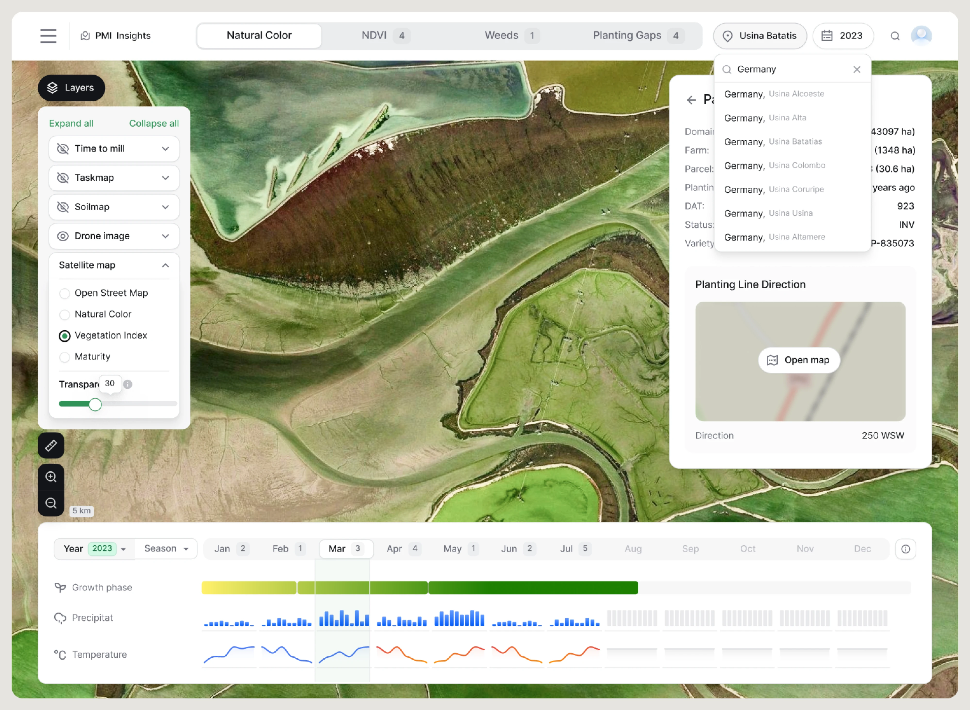
Despite being everywhere, from Figma and Linear to Slack and Discord, contextual menus are often confused with dropdowns, popovers, and tooltips. As a result, they're frequently misused or left out entirely, even when they'd make an interface faster and easier to use.
In this guide, you'll learn what a contextual menu is, when to use one, how it behaves across desktop and mobile, and the design principles behind effective implementations.
Along the way, we'll analyze real context menu examples from products and share practical lessons from the SaaS products we've designed at Eleken.
Let's start with the basics, because the naming alone trips people up.
What is a contextual menu UI?
A contextual menu UI is a menu that appears on demand and displays only the actions relevant to the item you're interacting with. Right-click a sticky note, and you'll see sticky-note actions. Right-click a user's name, and you'll get user-related actions. The menu appears when it's needed, helps you complete a task, and disappears just as quickly.
The key idea is in the name: contextual. The menu adapts to the situation instead of showing the same options every time. Its contents can change based on the selected object, the number of selected items, the current state of the interface, or even the user's permissions. That's what distinguishes a contextual menu from a traditional navigation or dropdown menu with a fixed set of options.
One quick terminology note: you'll see this pattern called a contextual menu, context menu, right-click menu UI, shortcut menu, or pop-up menu. In most cases, they're referring to the same UI pattern. "Shortcut menu" is Microsoft's traditional term, while "right-click menu" describes the most common desktop trigger rather than the component itself. In this guide, we'll use contextual menu UI because it best describes what the pattern does.
And if you want to learn more about how to fix confusing UI, watch our video below:
Understanding the definition is the easy part. The more interesting question is how a contextual menu should behave and what separates a good one from a frustrating one.
How contextual menus work: triggers and behavior
A contextual menu must be invoked. It doesn't sit on the screen waiting; it appears in response to a specific user interaction. There are three main triggers, and each one carries different baggage:
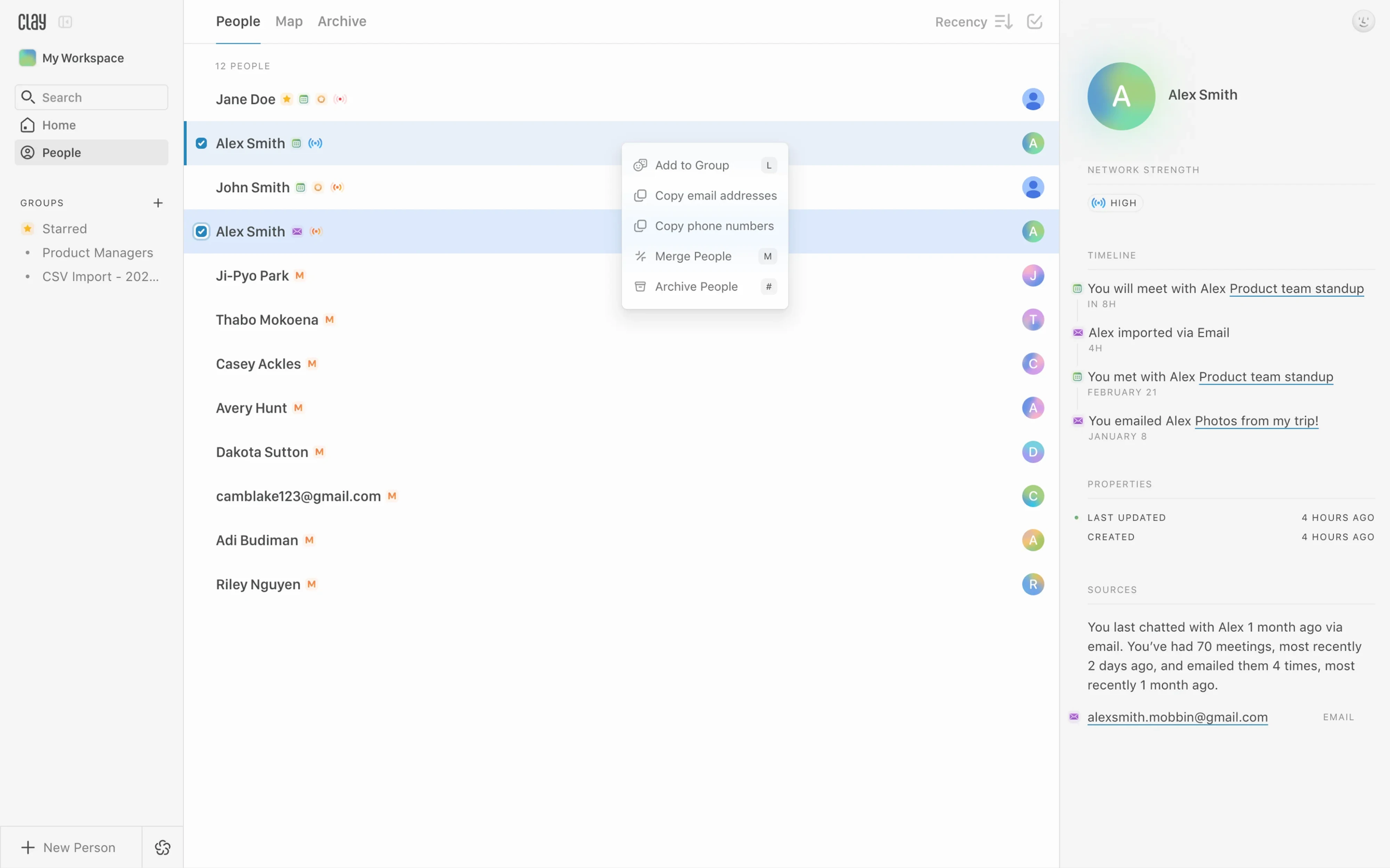
- The right-click, the classic desktop trigger: The user right-clicks an element, the menu appears, and the actions inside relate directly to that element. Some products pair this with the Control key on Mac (Control-click does the same job as right-click). This is the pattern most people have muscle memory for, which is exactly why it's so reliable on desktop.
- The long-press, the touch equivalent. On mobile, there's no mouse button to right-click with, so a sustained press on an element takes its place. Press and hold a message, get message actions. It works, but it's fragile in a way right-click isn't; more on that later.
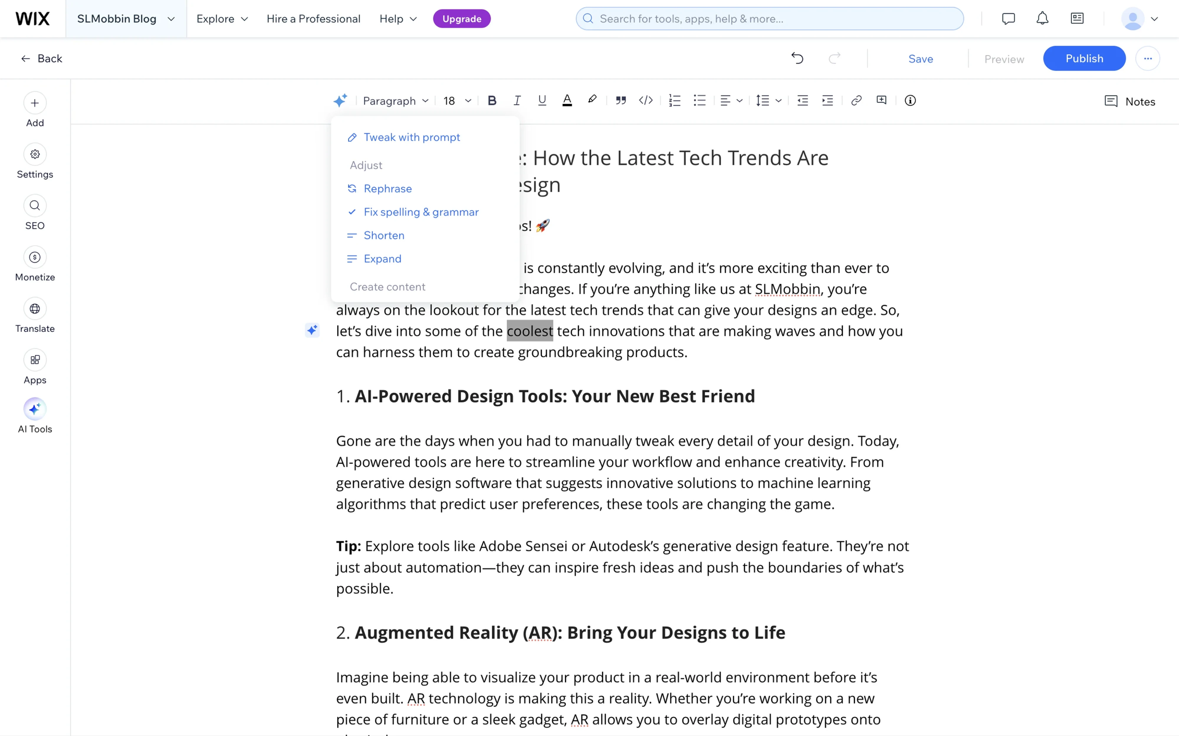
- The visible affordance, usually an ellipsis or "kebab" icon (three dots). Tap or click the icon, and the same menu of options appears. This one matters because it's the only trigger the user can see. The others are gestures you have to already know about.
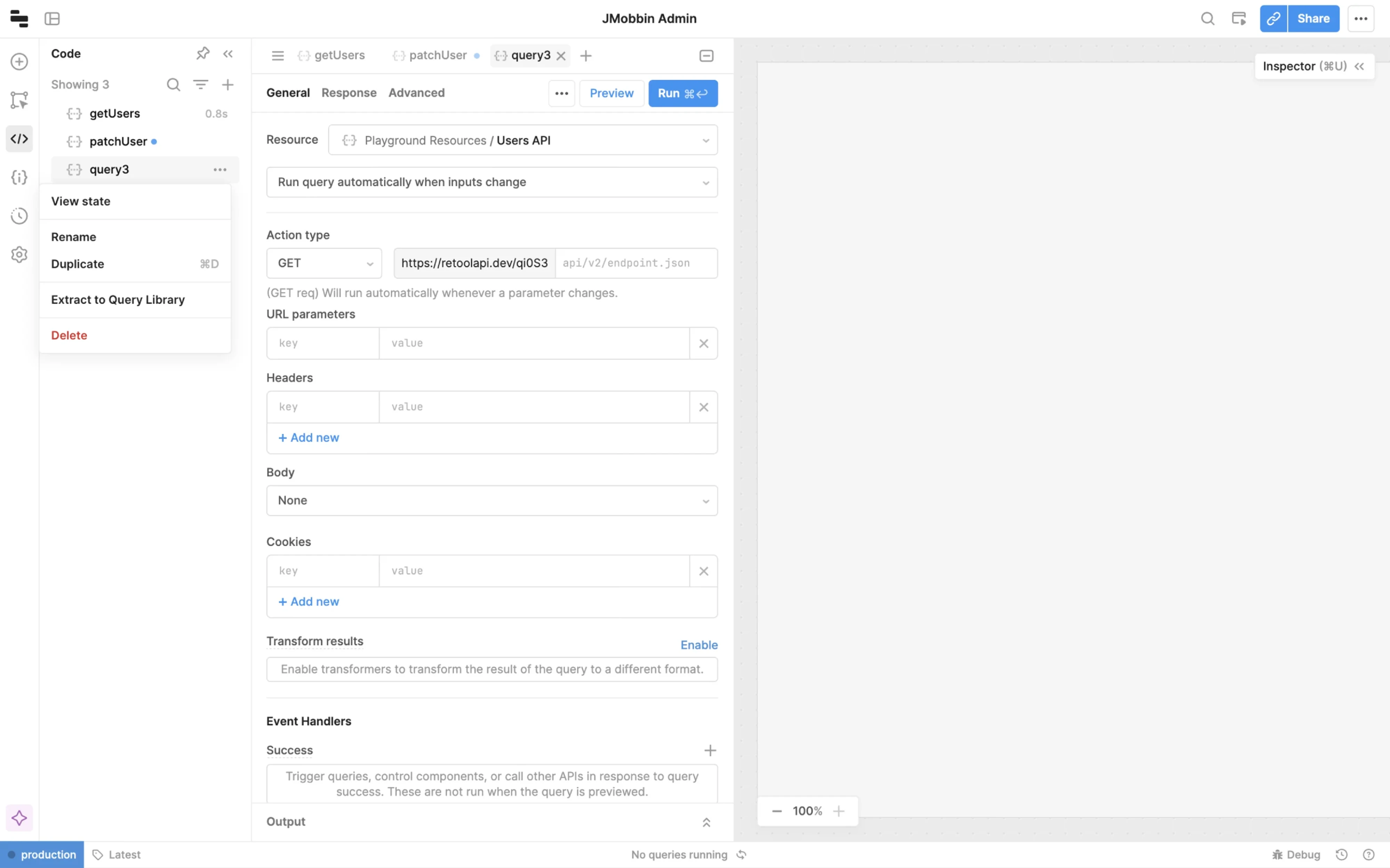
Where the menu appears matters just as much as what's inside it.
On desktop, a contextual menu usually opens at the cursor, putting the available actions exactly where the user expects them. On canvases, whiteboards, or design tools, it's often better to anchor the menu to the selected object instead.
Mural is a great example. When you select an object on the canvas, its contextual menu appears right next to it, showing only the contextual actions UI relevant to that object type. Users don't have to move their eyes or their cursor back to a distant toolbar.
That's the proximity principle in action: keeping controls close to what users are working on reduces both cognitive effort and mouse travel, making complex canvases feel much faster to navigate.
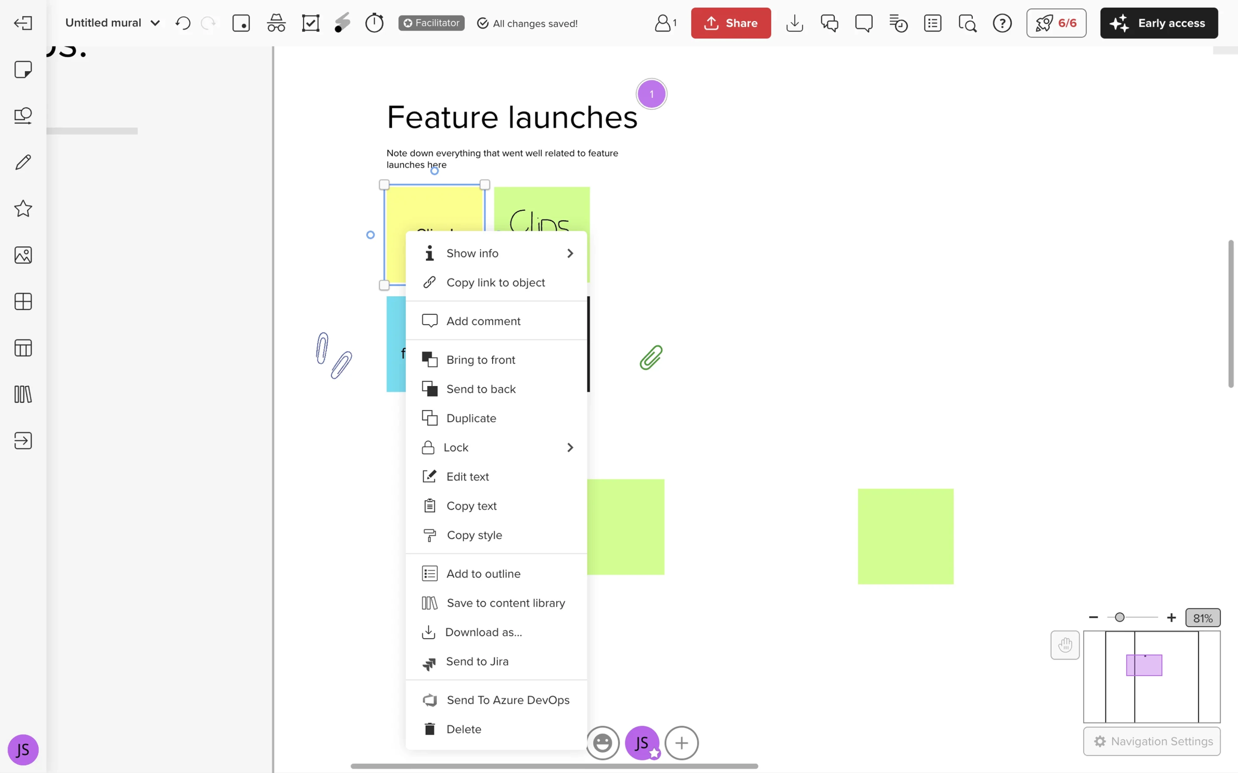
Behavior matters just as much as placement. A well-designed contextual menu should close when users click outside it or press Escape, and it should support full keyboard navigation for people who rely on shortcuts instead of a mouse.
When related actions need additional options, use submenus sparingly. Equals handles this well in its spreadsheet tab menu. Right-click a sheet tab, and you'll see actions like Rename and Tab Color. Choosing Tab Color opens a nested color picker instead of cluttering the main menu with every possible color. The submenu groups a single set of related options, making the menu easier to scan without adding unnecessary complexity.
Most importantly, remember what a contextual menu is meant to be: a shortcut, not the primary way to navigate your product. Users should never have to right-click to complete essential tasks.
Now the part you probably came for: how to design a contextual menu UX that people enjoy using.
Contextual menu UI design best practices
Here are the practices that separate the menus people love from the ones people fight, each anchored to a product that nails it.
Scope the menu tightly to its target
The fastest way to make a contextual menu useless is to fill it with actions that don't apply to what the user clicked. This is context bleed, and it's the cardinal sin of the pattern.
Linear handles this precisely. Right-click a notification in Linear, and you get notification-level actions, things like "Mark as unread." You don't get a pile of unrelated commands that happen to exist elsewhere in the app. The menu reads exactly one thing: what did you click, and what can you do to that? Every item in the menu should pass a simple test: is this action directly related to the object I right-clicked? If not, it doesn't belong.
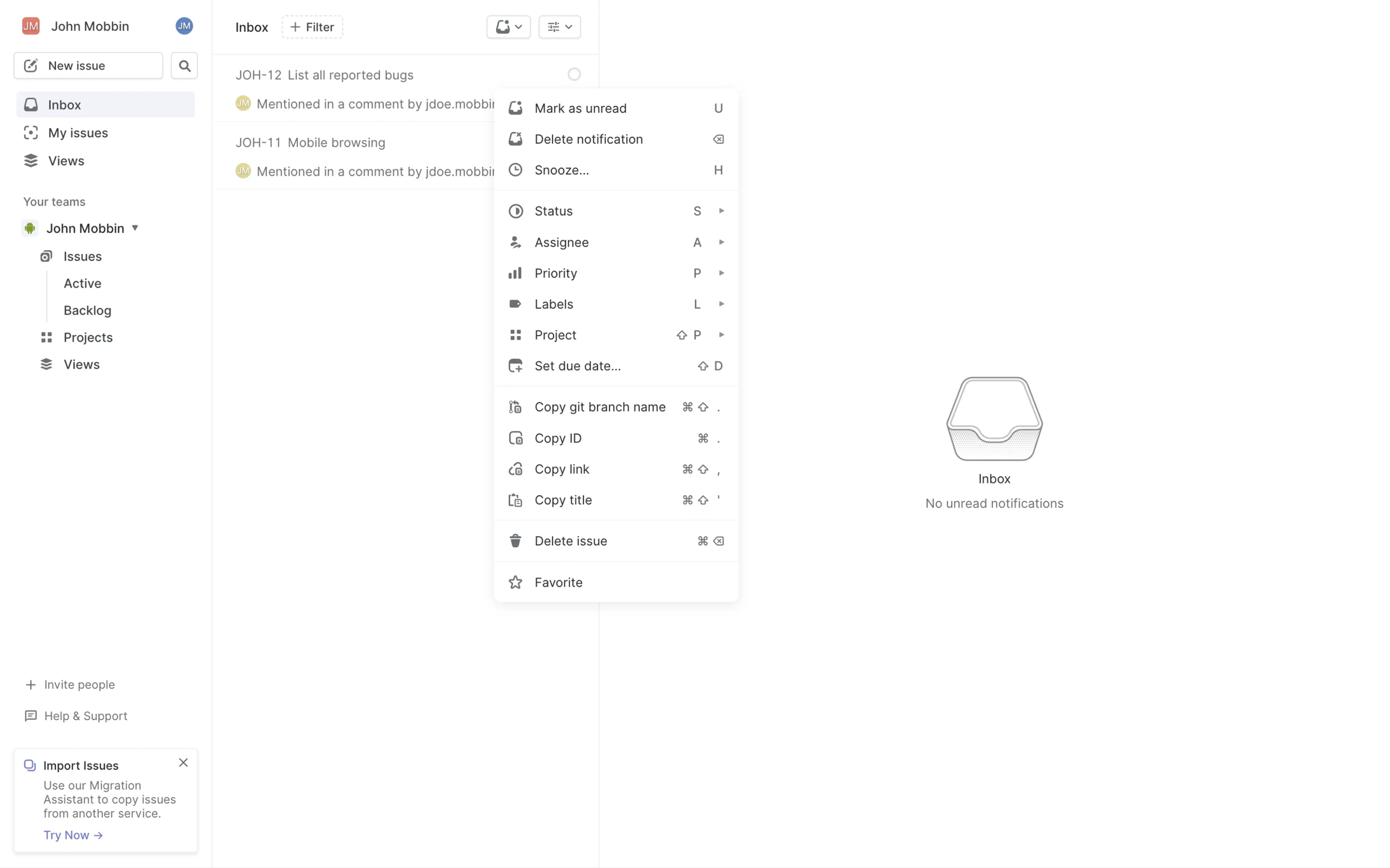
Tight scoping also keeps the menu short, which keeps it scannable, which makes it faster. Every irrelevant item you add is a tiny tax on every person who has to read past it.
Restructure the menu based on selection state
The best contextual menus adapt to what's selected, which is the whole point of the word "contextual."
Figma is the textbook example. Right-click on the Figma canvas and the menu reshapes itself depending on whether you've selected a single object, multiple objects, a component, or nothing but an empty canvas. Each state gets a menu tailored to it.
This is progressive disclosure done properly: you only ever see the actions that make sense for your current situation, so the list never balloons into an overwhelming wall of options.
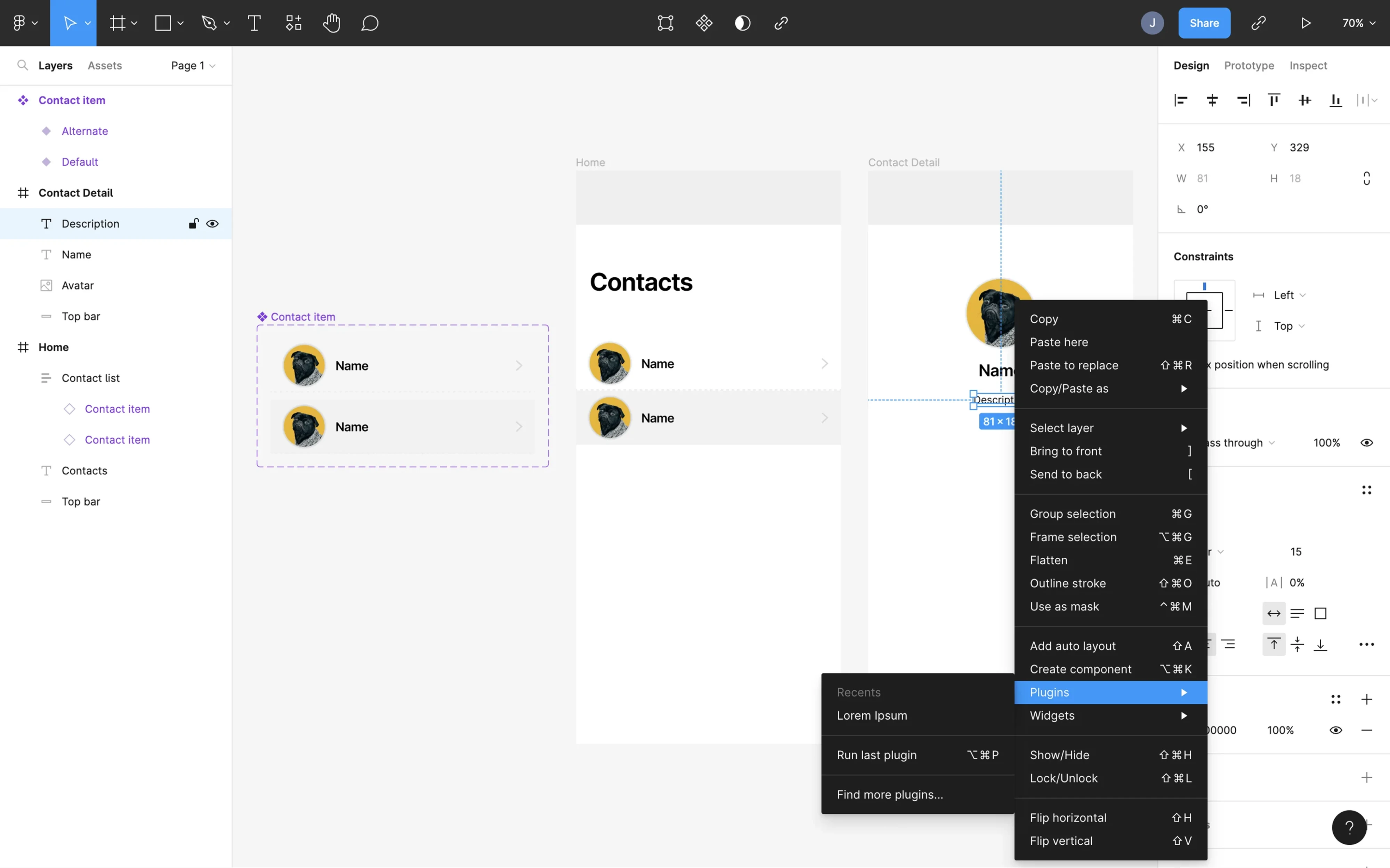
The same gesture, the same menu, four different action sets. The user doesn't have to think about it; the menu just always seems to know what they need. That's the feeling you're aiming for.
Group with dividers and lean on visual hierarchy
Once a menu has more than a handful of items, raw scannability starts to suffer. Grouping fixes it. Dividers and clear sections turn a long list into a set of digestible clusters.
Rive uses a horizontal divider to separate safe actions like Rename and Copy link from the destructive Delete. Delete sits at the bottom, below the divider, visually set apart from the everyday actions.
This is a structural solution to a danger-zone problem: you reduce accidental destructive clicks through layout rather than slapping a confirmation dialog on every single action. Fewer interruptions means fewer mistakes.
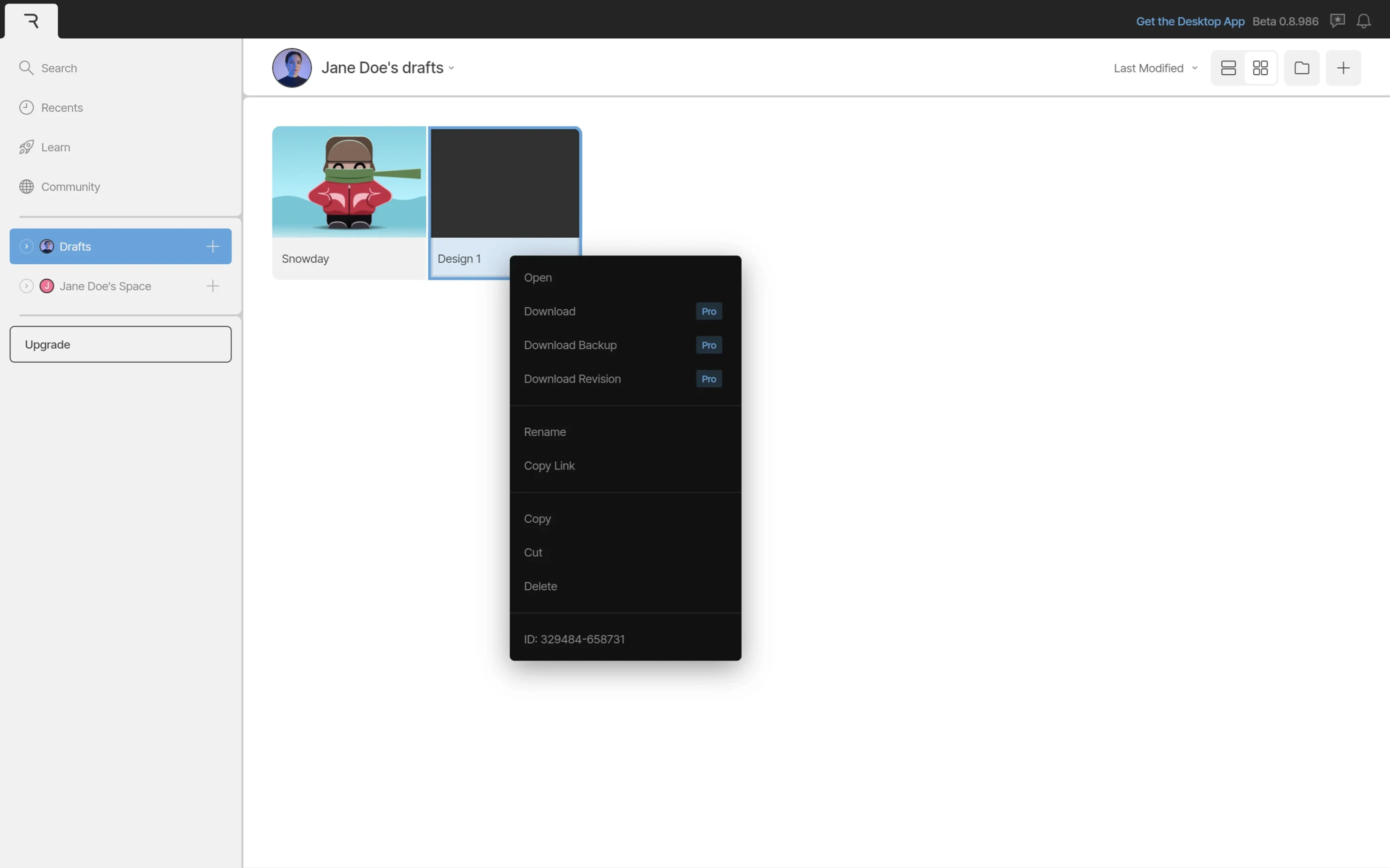
This is visual hierarchy doing quiet, load-bearing work. Placement, grouping, and color in a contextual menu are the primary way you communicate what's safe, what's common, and what deserves a second of caution.
Show keyboard shortcuts inline
If your product has power users, and most SaaS tools do, the contextual menu is a fantastic place to teach them keyboard shortcuts.
Linear context menu displays keyboard shortcut hints inline, right next to each action in the menu. This does two jobs at once. First, it lets mouse users complete the action immediately. Second, it quietly educates them: "next time, you could just press this."
Over weeks, this nudges people from clicking toward keyboarding, which makes them faster and makes your product feel like it respects their time.
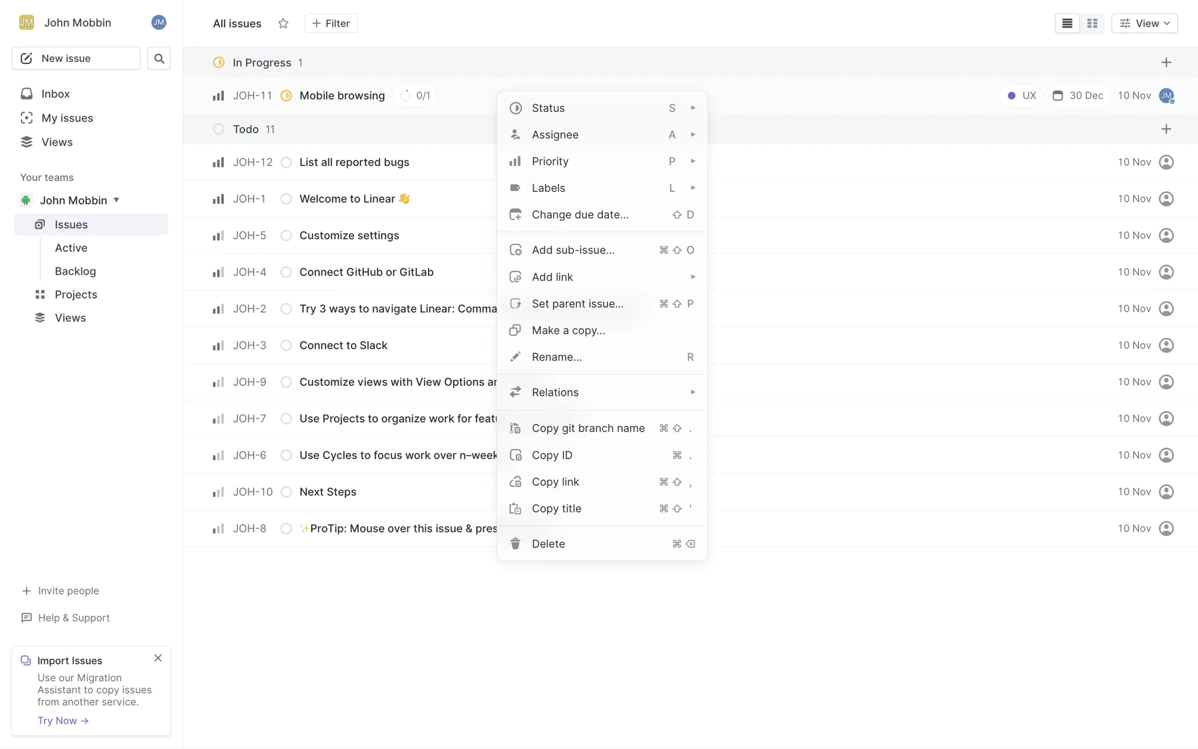
It's a small detail. Linear literally wrote a piece called "Invisible Details" about choices like this, because the invisible details are what make an interface feel considered. A right-aligned shortcut hint costs almost nothing and pays off every time an experienced user glances at it.
Respect permissions and roles
Not every user should see every action. A contextual menu that surfaces options the user can't use is just noise and sometimes worse than noise, because it advertises capabilities as if teasing them.
Discord's user context menu is permission-aware. Moderation actions like "Time Out" only appear for members whose server role allows moderation. A regular user right-clicks a username and never sees the admin machinery at all. The menu is cleaner for them, and the powerful actions stay reserved for the people meant to have them.
Also, Discord takes hierarchy even further. Its user context menu places social actions (Message, Mention) above administrative ones (Kick, Ban), and it colors the destructive actions red. The order communicates frequency and safety; the color communicates danger. A user's eye lands on the common, safe stuff first and has to travel deliberately to reach the actions that could cause harm.
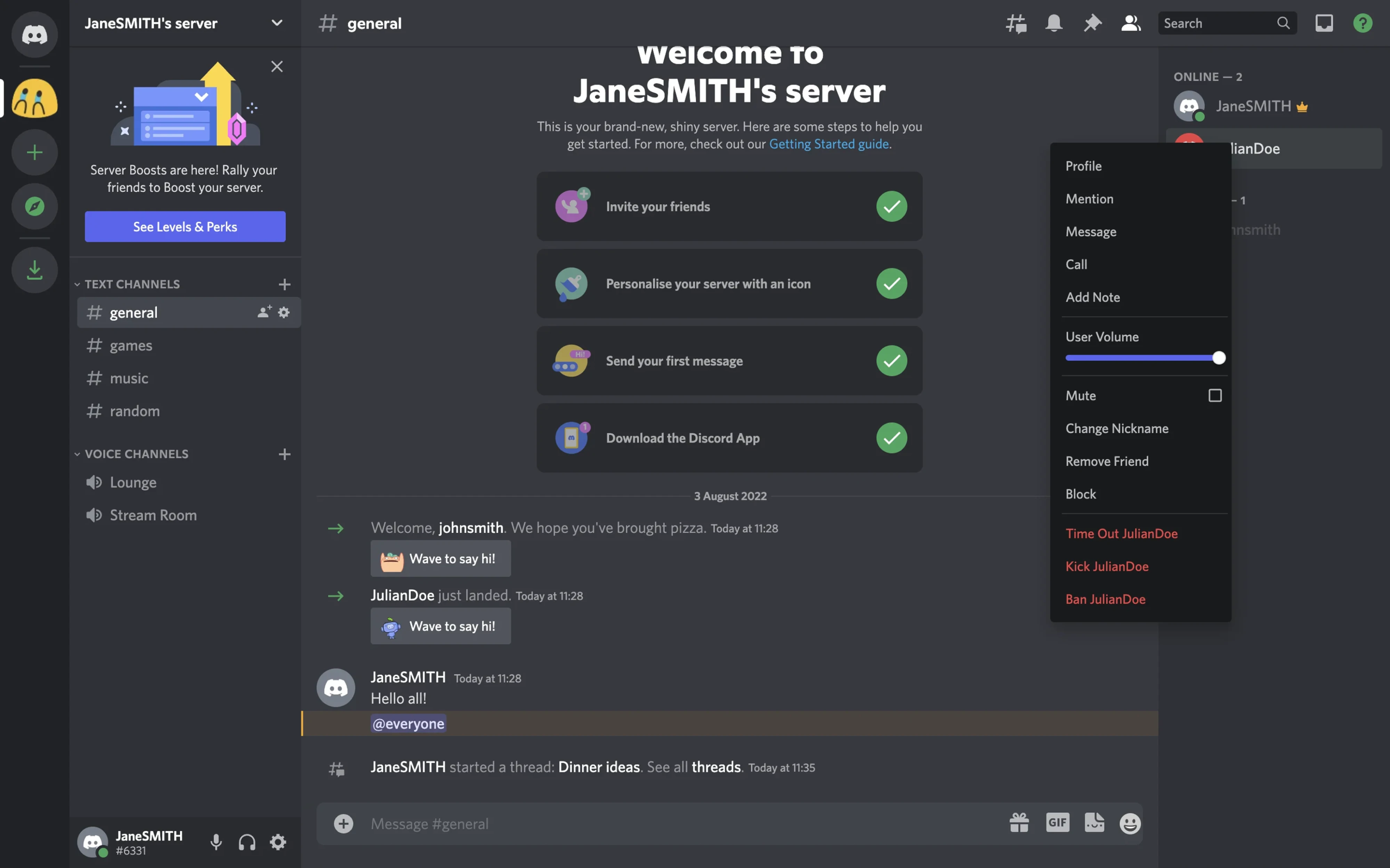
Bake this into your menu logic from the start. The menu should ask not only "what can be done to this object?" but "what can this user do to this object?" The intersection of those two questions is the correct list.
Prefer reversible actions as the default
Destructive actions in a fast, low-friction menu are a risk. One misclick and something's gone. Smart products lower the stakes by defaulting to reversible destruction.
Framer does this on its project dashboard. The context menu surfaces "Archive" rather than "Delete" as the primary destructive option.
Archive is recoverable: you can get the project back, so an accidental click causes a moment of mild annoyance instead of a genuine loss.
Permanent deletion still exists, but it's reserved for deeper, more deliberate confirmation flows. This is a thoughtful information-architecture choice: put the safe, reversible version in the quick-access menu, and gate the irreversible version behind more friction.
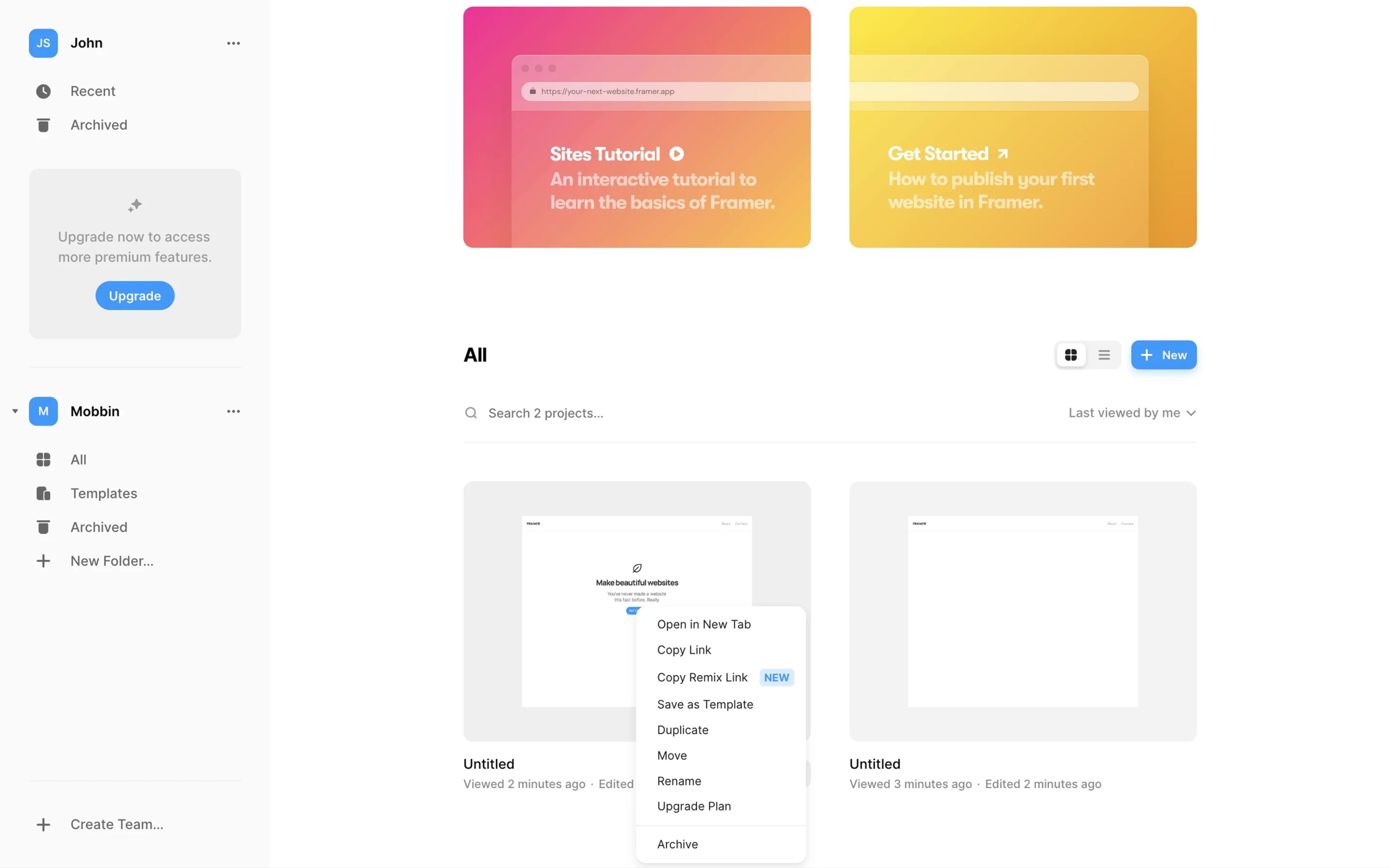
The principle generalizes. When an action lives in a contextual menu, ask whether its default form can be reversible. If it can, make it so. Your users' accidental clicks will thank you.
Keep labels short, scannable, and verb-first
A contextual menu is read fast, often in under a second. The labels have to support that speed. Lead with verbs, such as Rename, Hide, Duplicate, Delete, or Archive, so the user instantly knows what each item does. Keep them to a word or two. Avoid clever phrasing that makes people stop and parse.
Right-clicking a sheet tab in Equals opens a context menu with clear and super concise options including Rename and Tab Color, options that mirror familiar spreadsheet conventions (Excel, Google Sheets) while keeping the main toolbar clean.
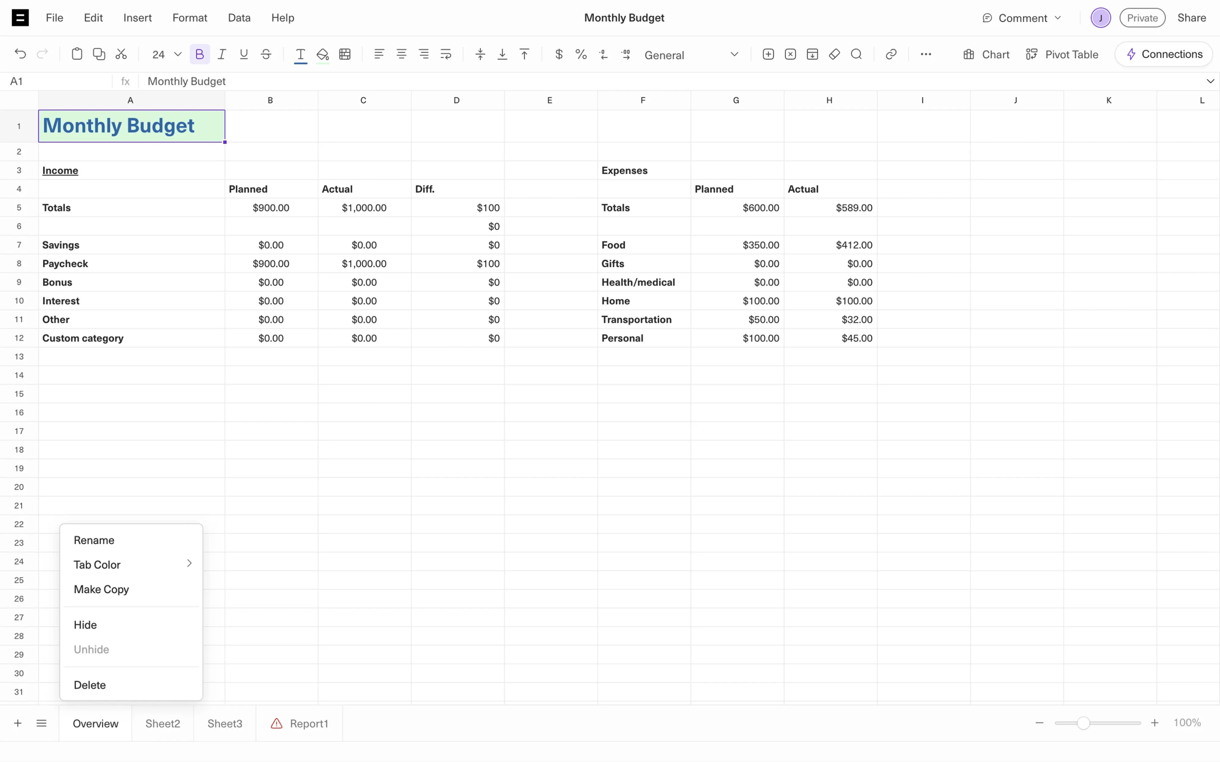
Icons can help, but only as reinforcement. A trash icon beside "Delete" speeds recognition; a decorative icon beside every item just adds visual clutter and slows the scan. Use icons where they clarify, skip them where they don't. The same discipline you'd apply to button UI design applies here: the label is a tiny action trigger, and clarity beats cleverness every time.
Solve the discoverability problem
The Nielsen Norman Group, in their guidelines on designing effective contextual menus, name the central tension directly: contextual menus reduce clutter and cut interaction cost, but they suffer from low information scent.
The problem is discoverability. Unless users already know they can right-click, nothing on the interface tells them those actions exist. You can spend hours designing the perfect contextual menu, only to have many users never open it once.
The solution is simple: give users a visible way in.
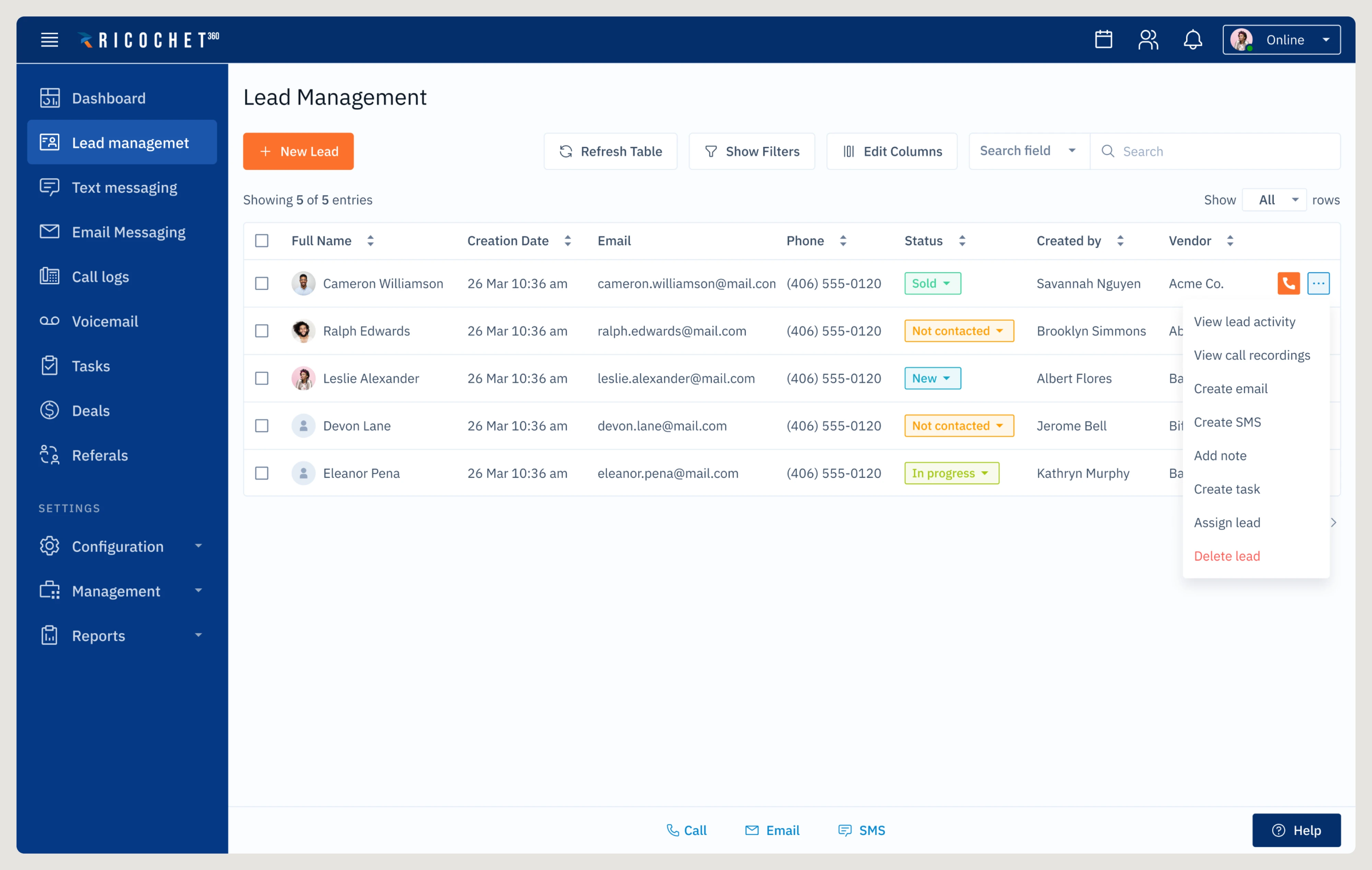
Ricochet360, a cloud phone system and CRM platform, does this in its lead management table. Every row includes a three-dot (kebab) button that opens the same contextual menu a right-click would reveal. Experienced desktop users can right-click out of habit, while everyone else has an obvious control to click. The functionality is identical; only the entry point changes.
This small addition solves one of the biggest usability problems with contextual menus. Users don't need to guess whether more actions exist because the interface tells them.
Many products take the idea even further by revealing the entry point only when it's needed. Slack is a great example. When you hover over a message, a compact action bar appears with common actions like reactions and replies, alongside a three-dot button for More actions. Clicking it opens the full contextual menu.
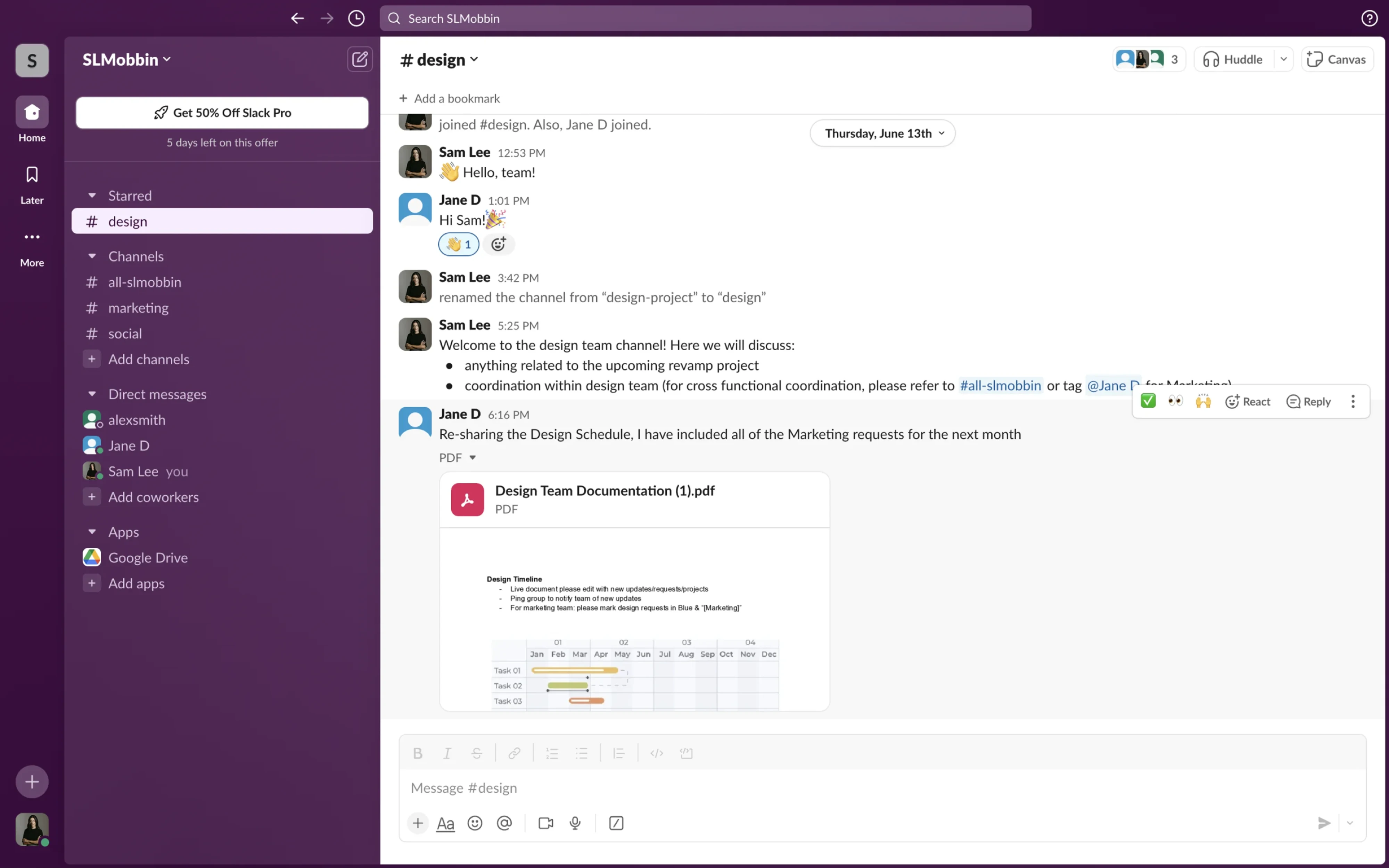
This pattern keeps the interface clean during normal browsing while making additional actions easy to discover the moment users interact with a message. The contextual menu stays hidden until it's relevant, but its entry point doesn't.
Whether the trigger is always visible, like in Ricochet360, or appears on hover, like in Slack, the principle is the same: every contextual menu should have at least one visible trigger.
Adapt the pattern for mobile
Mobile changes the rules. There's no mouse, no right-click, and no cursor to anchor the menu to. The interaction has to be rethought.
The most common trigger is a long press, but it's less discoverable than right-click. Many users don't know the gesture exists, and touch is inherently less precise than a mouse. That's why mobile contextual menu UI needs stronger visual feedback and larger tap targets to reduce mistakes.
Apple addresses this well in iOS. When users long-press certain items, the system first shows a live preview of the selected object before revealing the contextual menu. This extra step helps users confirm they're interacting with the right item before choosing an action, a simple detail that prevents costly mistakes on touch screens.
Another challenge is ergonomics. Desktop menus appear next to the cursor, but mobile interfaces have to consider thumb reach. Many apps solve this by replacing traditional contextual menus with bottom sheets that slide up from the bottom of the screen. The actions are the same, but they're much easier to reach with one hand.
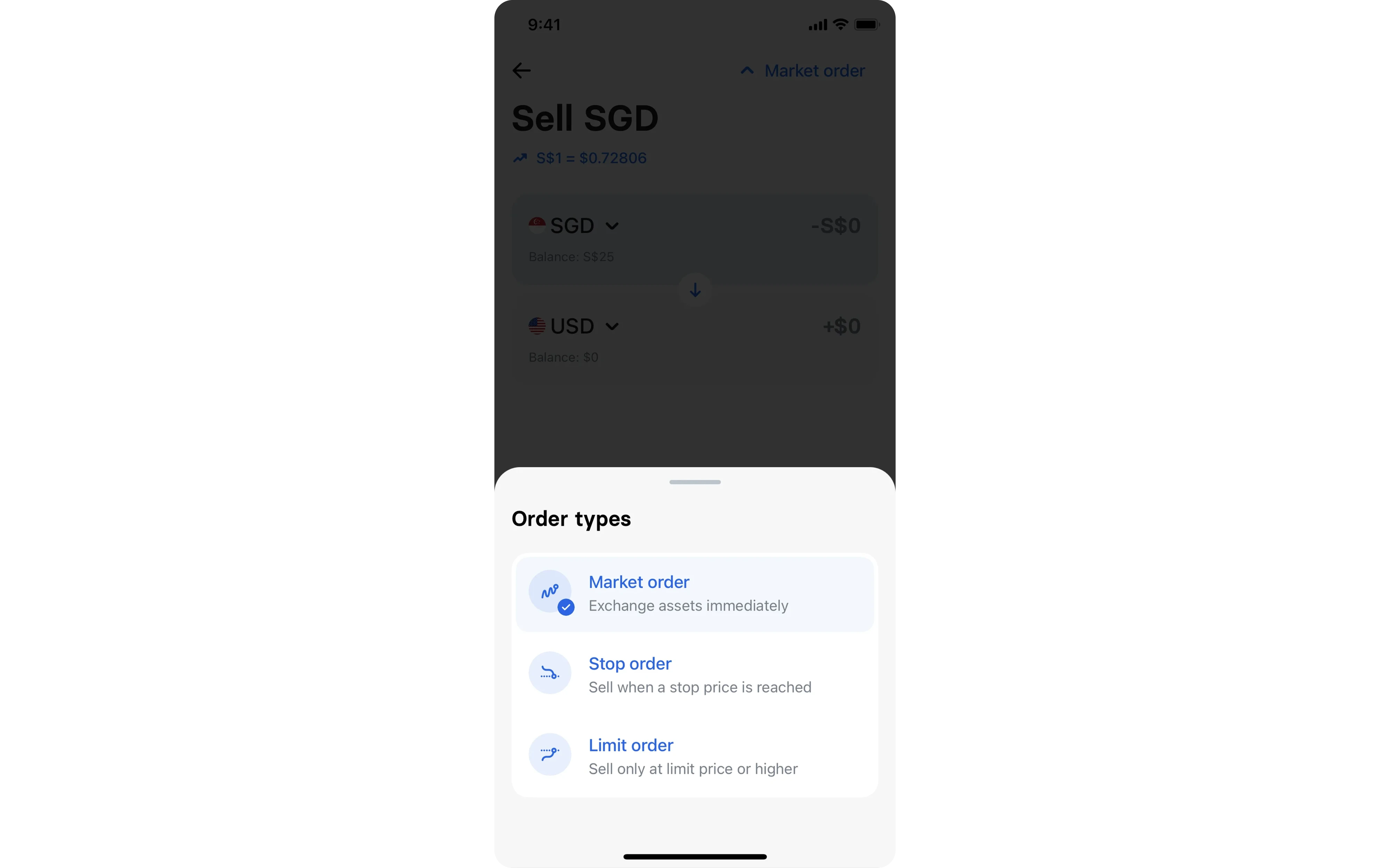
Most importantly, don't assume users will discover a hidden gesture. If an action matters and your users can't reliably discover a long-press, put it somewhere visible instead. A segmented control or a persistent action bar can expose the important choices directly, no hidden gesture required. Contextual menus work best as shortcuts, not as the only path to important functionality.
The same principle applies across platforms: hidden interactions should speed up experienced users, not block everyone else.
Get these practices right, and you've got a menu that's tight, adaptive, safe, and fast. But there's a deeper question: where do you go when you need to build one?
Where to find context menu UI components and references
By now, you don't need to design a contextual menu from scratch. Plenty of resources can help you understand what works before you start building.
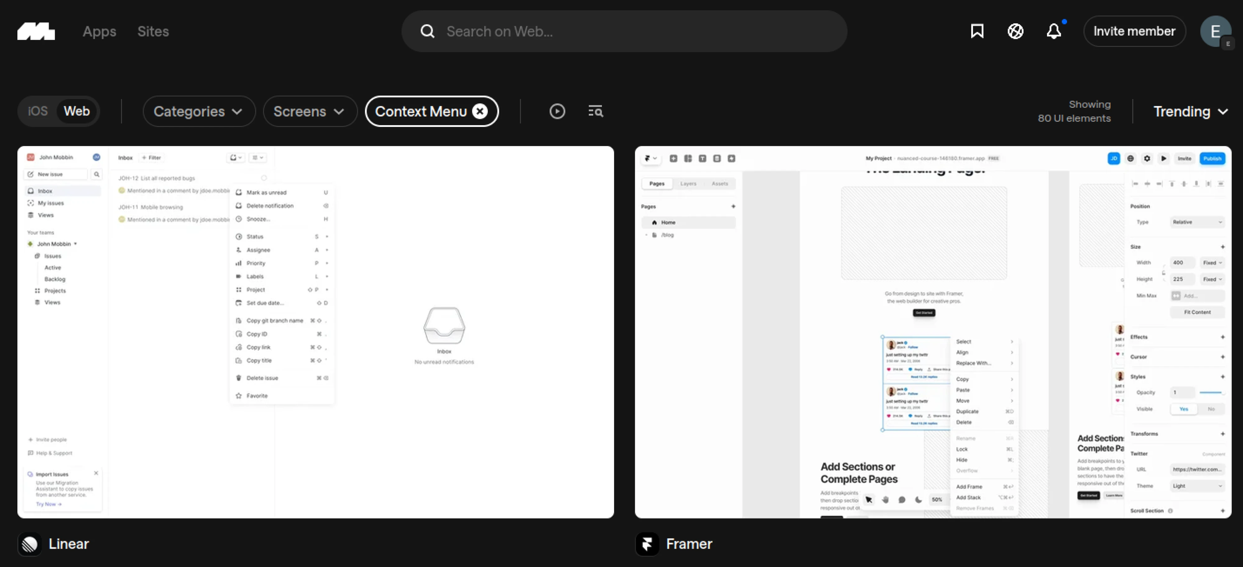
For real-world inspiration, Mobbin is one of the best places to study contextual menus in production. You can see how products like Figma, Slack, Discord, Linear, and Framer organize actions, handle destructive operations, and adapt the pattern across desktop and mobile.
If you're designing for Apple platforms, the Apple Human Interface Guidelines are essential reading. They explain when to use contextual menus, how they should behave, and why they should never be the only way to access an action.
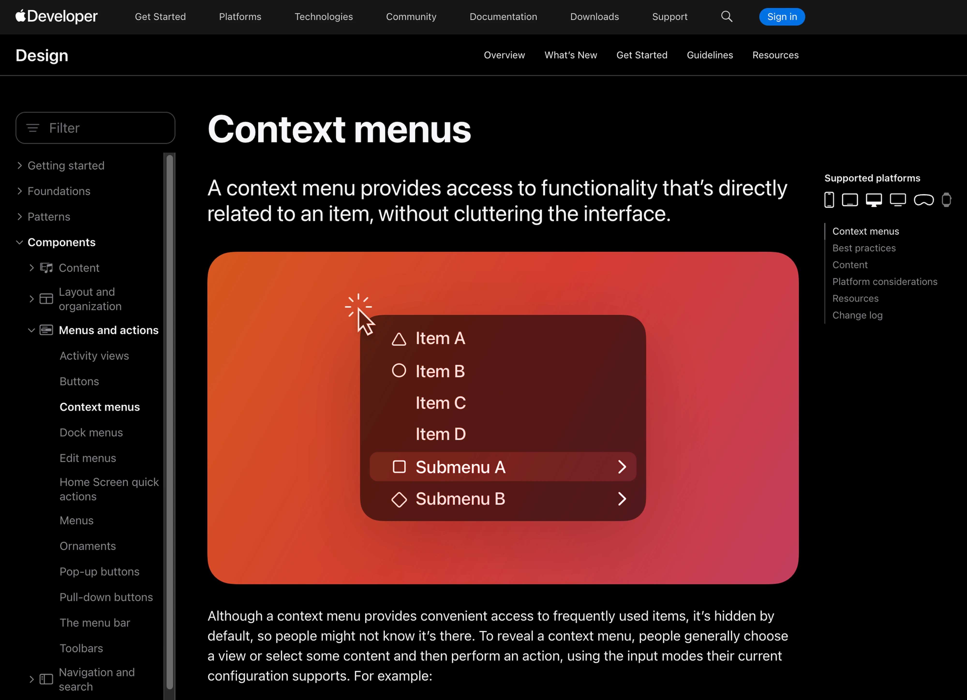
When it's time to build, most modern design systems already include contextual menu components with documented states, keyboard interactions, and context menu accessibility guidelines. You can also explore the Figma Community, where designers share menu components and UI kits that are useful starting points for your own designs.
Just don't mistake a component for a solution.
A UI kit can give you the container, spacing, icons, and hover states. It can't decide which actions belong in the menu, how to group them, which ones deserve shortcuts, or whether a contextual menu is the right pattern in the first place.
The contextual menu simply offers a faster path for people who already know what they want to do, which brings us to the question of when you should use one.
When to use a contextual menu and when not to
A contextual menu works best when users interact with many objects, each with its own set of actions. Think design canvases, data tables, file managers, spreadsheets, or long lists where every row can be edited, duplicated, shared, or deleted.
In these interfaces, exposing every action in a toolbar would quickly create visual clutter. A contextual menu keeps the interface clean by showing only the actions relevant to the selected object and only when the user asks for them.
That said, a contextual menu should never be the only way to perform an important action. Apple's Human Interface Guidelines recommend that contextual menu actions always be available elsewhere in the interface, and for good reason. Because the menu is hidden until users right-click or long-press, relying on it as the only access point makes functionality difficult or impossible to discover.
Think of a contextual menu design as a speed layer, not a place to hide features. It helps experienced users work faster, but your core workflow should remain visible and discoverable.
If you're designing interfaces with dense rows of data, it's also worth thinking about the surrounding experience. A contextual menu doesn't replace good list ui design; it complements it. The list should make information easy to scan, while the contextual menu keeps secondary actions close at hand without adding visual noise.
Next, let's clear up one of the biggest misconceptions about this pattern. Contextual menus are often confused with dropdowns, popovers, and tooltips, even though each solves a different UX problem.
Contextual menu vs. dropdown, popover, popup, and tooltip
These patterns overlap enough that people mix them up constantly:
- Dropdown menu is triggered by a visible, fixed control, a button or a field that sits in the interface and clearly signals "click me." A contextual menu is summoned on an element through a gesture like right-click or long-press. The dropdown announces itself. The contextual menu waits to be called. If you want to go deeper on the visible-control pattern, we've written a full breakdown of dropdown menu UI worth reading alongside this.
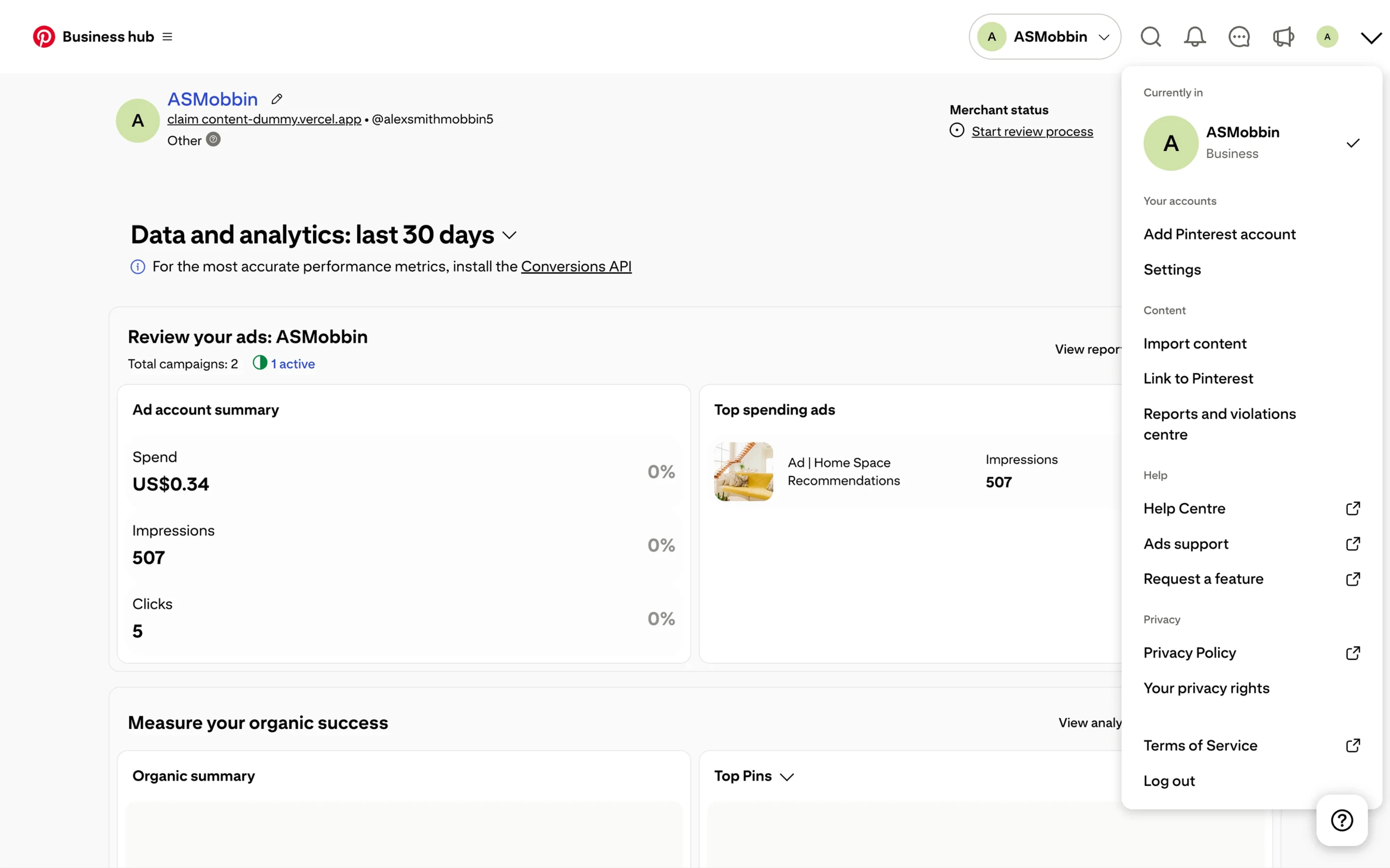
- Popovers are small floating containers that can hold richer content: text, form fields, controls, even little bits of interface. A contextual menu is almost always a simple list of actions. If your "menu" needs input fields and paragraphs, you probably want a popover, not a context menu design.

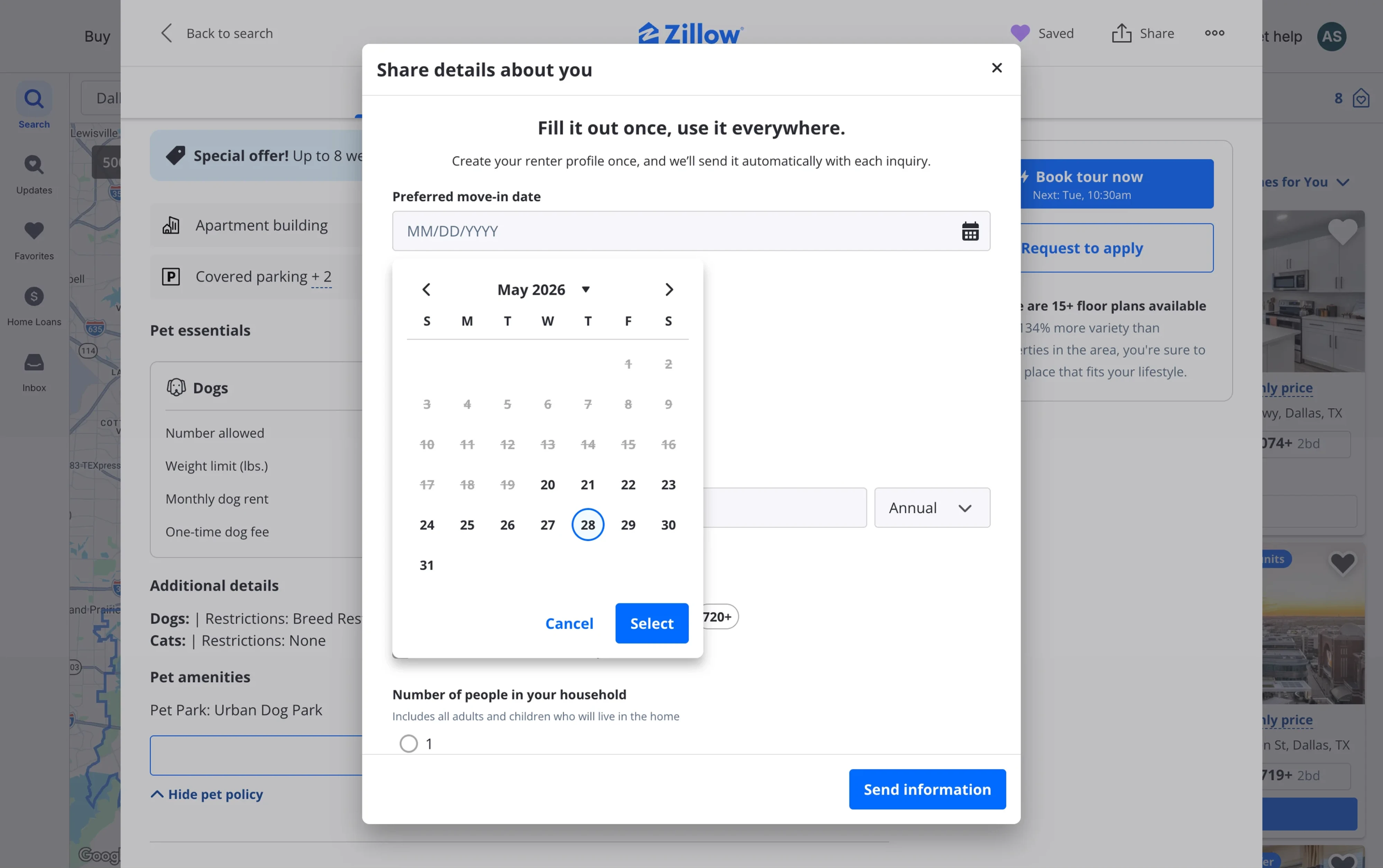
- A popup (or modal) interrupts. It appears center-screen, often dims the background, and demands a decision before you can continue. Contextual menus never interrupt. They appear beside your work and disappear the moment you look away. Interruption is the entire difference in personality here.
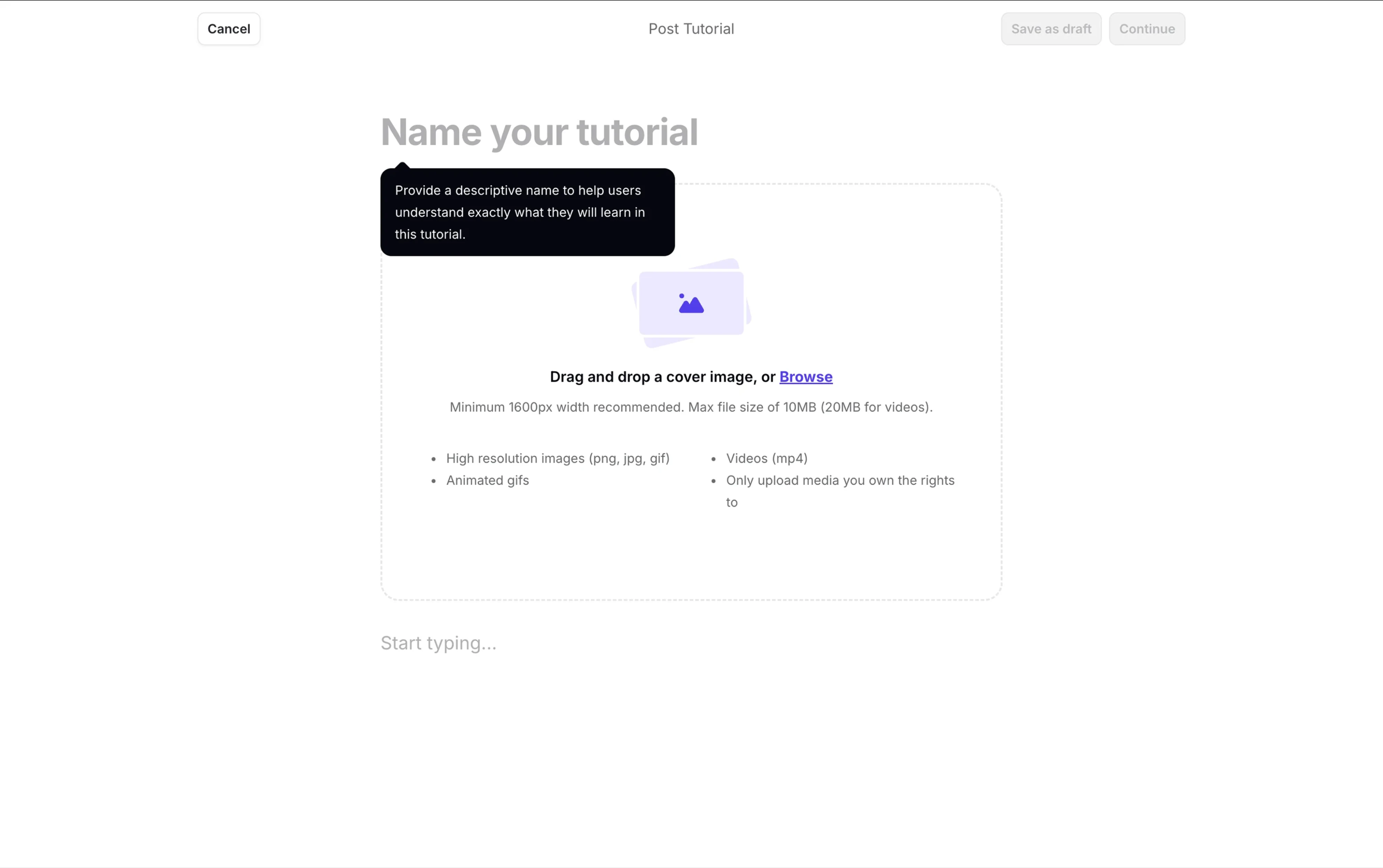
- A tooltip only informs. It shows a hint or a label on hover and offers no actions at all. If the user can't do anything, it's a tooltip. If they can, it's a menu.
- The accordion deserves a mention as the progressive-disclosure cousin. It hides and reveals content in place, on a persistent surface, rather than floating on demand.
Here's a compact comparison to keep them straight:
Wrapping up
Let's return to where we started. The best contextual menu UI is one users find precisely when they need it and never think about the rest of the time. It stays out of the way, adapts to what they're doing, and offers exactly the right actions without a scrap of extra noise.
Designing one well comes down to a few principles:
- Keep each menu tightly scoped to the selected object.
- Show only actions that are relevant in the current context.
- Group related actions and clearly separate destructive ones.
- Respect user roles and permissions.
- Prefer reversible actions whenever possible.
- Most importantly, make the menu discoverable with a visible trigger, and never make it the only way to complete an important task.
Get these decisions right, and a contextual menu becomes what it was always meant to be: a shortcut that helps experienced users work faster without making everyone else work harder.
The pattern itself isn't complicated. The challenge is deciding what belongs in the menu, when it should appear, and how it fits into the rest of your product. Those are product design decisions, not component decisions.
If your team is figuring out how these patterns fit your product, not just how they look, but when and why they should appear, that's exactly the kind of work we do at Eleken. We help SaaS teams design interfaces that make complex products easier, faster, and more intuitive to use.
If you're unsure whether your product's interactions are helping or slowing users down, get in touch. We'd be happy to review your UX and identify the biggest opportunities for improvement.




.webp)
.webp)

.png)