.webp)


If you've worked on a SaaS product for a while, you've probably watched its settings page UI slowly fall apart. It started small and made sense. Then every new feature added another toggle, another tab, another option that had nowhere obvious to go.
This is the page users open when they want to fix something or change how the product behaves. When they can't find what they need, they decide the product is sloppy, and user satisfaction quietly drops. For founders chasing bigger customers, a confusing settings page is often why a product still feels unfinished in a demo.
The fixes aren't complicated. This guide covers the sections most products need, examples worth borrowing, and how to handle layout, saving changes, and mobile so people can find their way around without thinking about it.
What is a settings page UI?
A settings page is where a user controls how a product works for them. It holds account details, preferences, privacy choices, notifications, billing, and any tools they've connected in one place.

Most of the time, people open settings for a reason. They want to change their password, turn off an email, update a payment card, or invite a teammate. The job of the page is to let them do that quickly and get back to what they were doing.
The sections every settings UI needs
Most settings pages are built from the same handful of sections. The names change from product to product, but the groups underneath tend to stay the same. Here are the ones you'll find in almost every product:
- General. Basic account and workspace details like name, email, language, timezone, and workspace name.
- Appearance. Visual preferences such as light or dark mode, accent colors, and text size.
- Security. Everything that keeps the account safe, including password, two-factor authentication, active sessions, and connected devices.
- Notifications. Controls for which emails, push alerts, and in-app messages a person wants to receive.
- Billing. Plan details, invoices, payment methods, and renewal dates.
- Integrations. Connected tools, API keys, permissions, and automated workflows.
- Team and admin. Members, roles, invitations, and permission levels for products used by more than one person.
- Privacy and data. Options to export data, delete an account, and manage consent.
In SaaS products, not every user sees all of these. What shows up often depends on the person's role. An admin might see team management, billing, and security settings that a regular member never touches.
It's worth mapping user roles before you start designing, so nobody wades through options that don't apply to them.
Settings page UI design inspiration
The best way to uncover design techniques is to look at real settings page UI design. The examples below come from products we designed at Eleken, each one starting from a different problem. Pay attention to the thinking behind them, since that's what you can borrow for your own product.
Aampe
Aampe is an AI marketing platform, and its settings lived in a Configure menu that had grown into a long list. Item names didn't always match what was inside them, and the icons were styled inconsistently, so people had to hunt for basic controls.
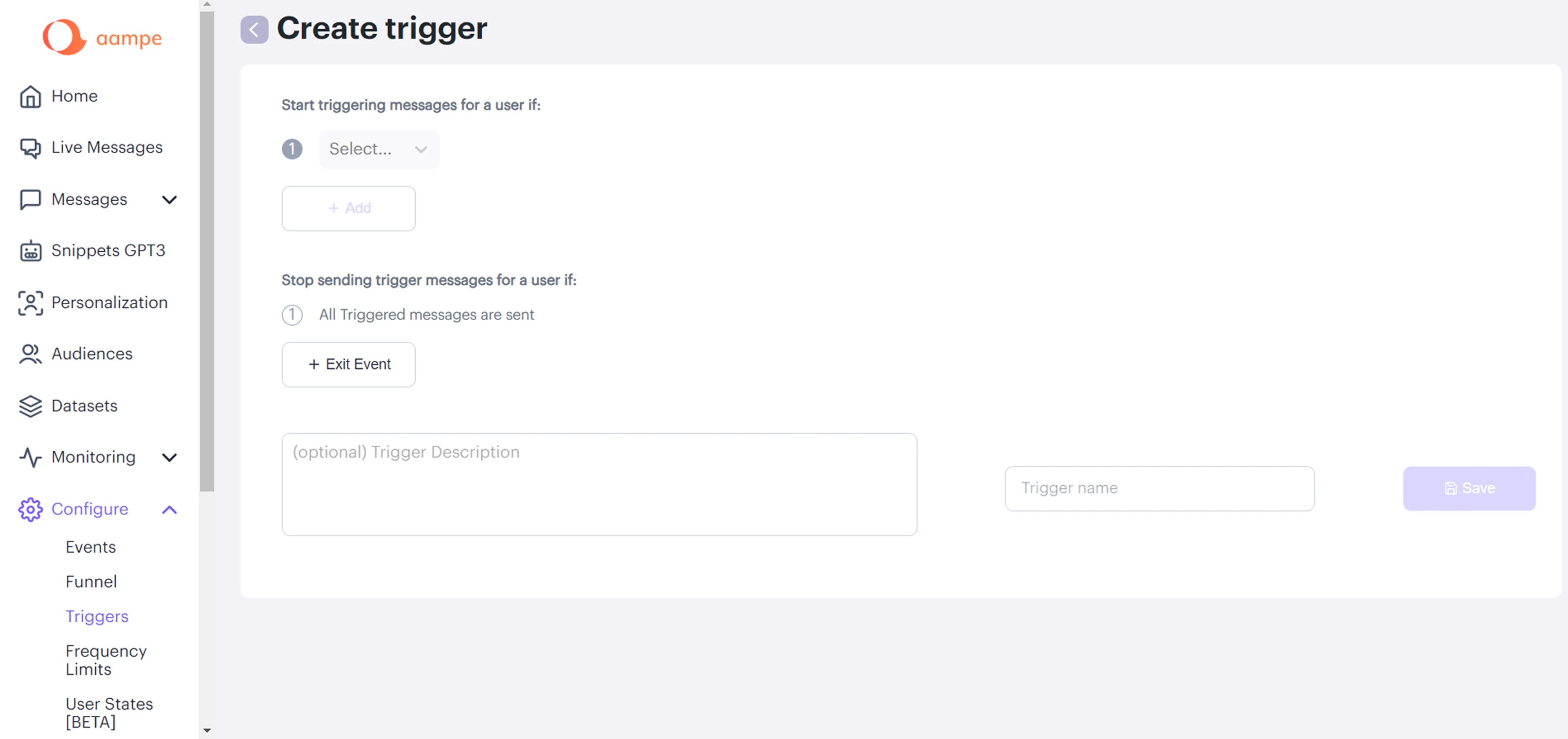
We reworked the structure around what users were trying to do. The settings page was split into clear areas, unclear labels were renamed, and all icons were unified. As our client put it, “The UI is much cleaner and more intuitive than it was before.”

A few things worth applying to your own product:
- Break one long menu into smaller sections named after the task.
- Rename anything a new user wouldn't understand on first read.
- Use one consistent icon style so the menu reads as a single system.
Photobooth supply
Photobooth Supply lets event businesses configure how their photo booth behaves, and its Event Settings page had grown messy. Everything sat in one long sidebar where settings for all events and settings for a single event were mixed together.
When redesigning, we grouped the options into labeled sections and split event-wide settings from the ones tied to a single event. Our designer reworked the navigation structure to make it consistent and readable across iPad and web versions.
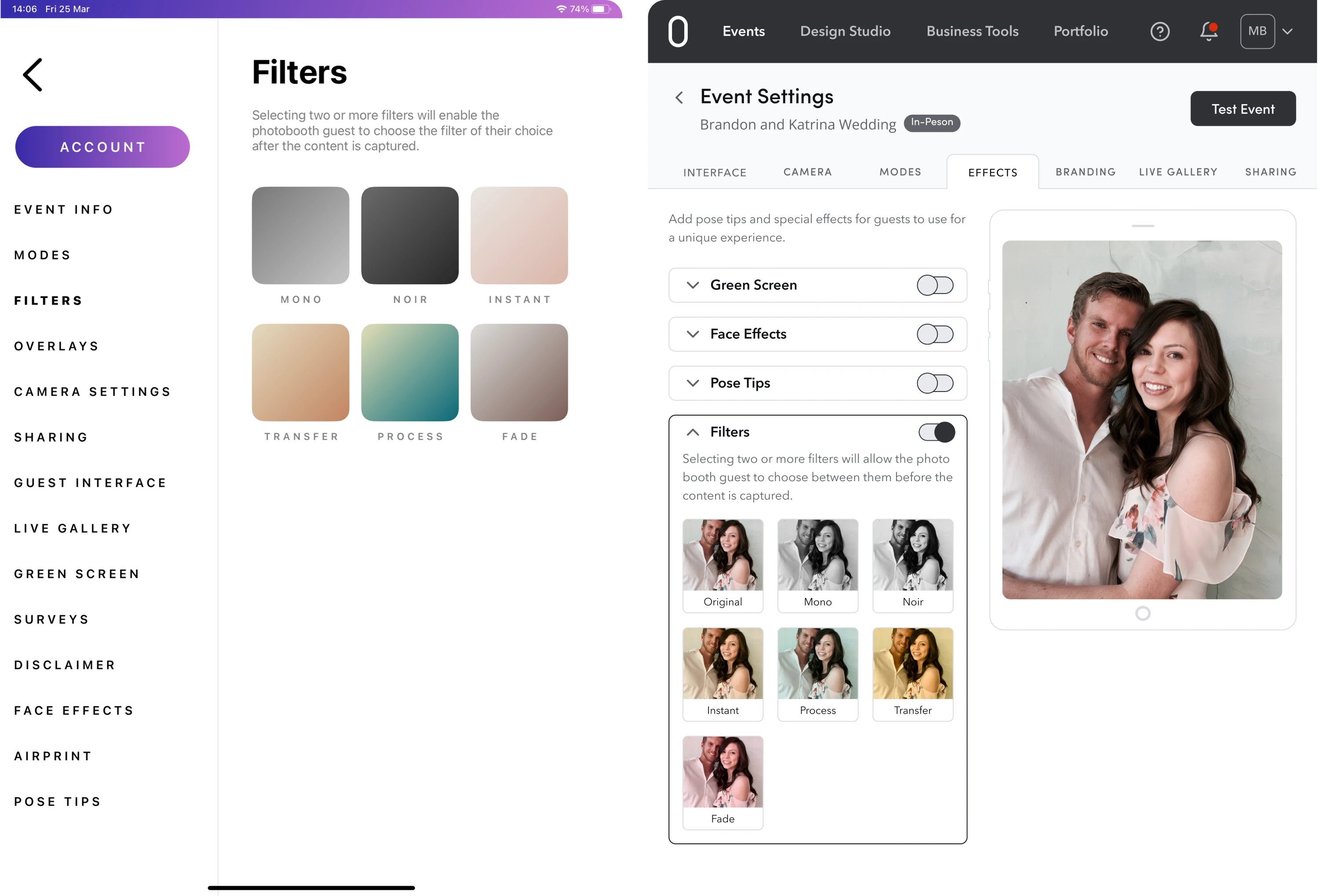
A few things worth applying to your own product:
- Keep global settings separate from the ones tied to a single item.
- Add a live preview so people can see visual changes before they commit.
- Mirror the same layout across devices to make switching familiar.
Ricochet360
Ricochet360 is a CRM platform whose configuration menu had drifted out of order. Closely related pages sat on opposite ends of the list, a few menu names didn't match the pages they opened, and several items didn't need to exist on their own.
The fix went in the opposite direction from simply splitting things up. We merged overlapping pages, placed related settings side by side, and shortened the menu. As a result, new customers require less time to learn how to use the software.

A few things worth applying to your own product:
- Merge thin or overlapping pages so the menu gets shorter.
- Hide rarely used fields and reveal them only when someone needs them.
- Add tooltips and inline validation so forms get filled correctly the first time.
Plantiful
Role-based access is a standard part of SaaS products, and Plantiful is a good example of handling it well. The app has three roles, Admin, Company User, and regular User, and each one uses the product for a different job.
Recognizing this, we designed settings so people see and edit only what their role needs. All of it lives in a clear permissions grid where each role runs down one side and each action across the top, so it stays easy to scan who can do what.
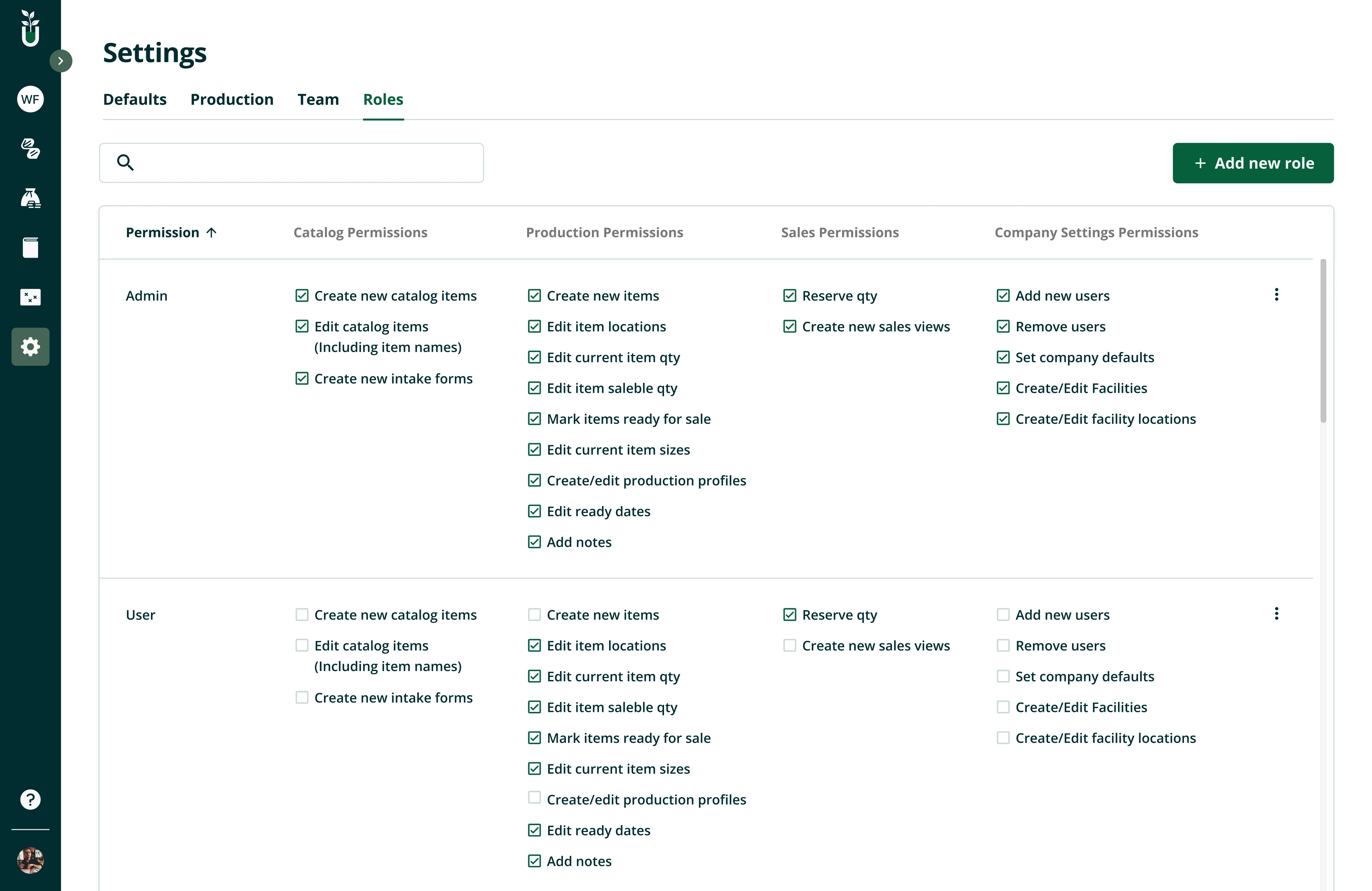
A few things worth applying to your own product:
- Show each role only the settings its users actually need.
- Give admins a single place to control what other roles can see and edit.
- Lay permissions out in a grid so who-can-do-what stays easy to scan.
Siena
Siena is an AI platform for customer experience teams, and before the redesign, its options and information were scattered. New AI features were being added, and some pages held so many settings they risked overwhelming people.
To keep everything organized, we designed the settings menu to expand into its sub-options. The sidebar sorts everything into labeled groups, while the main area uses clear input fields, headings, and a line of helper text under each setting.
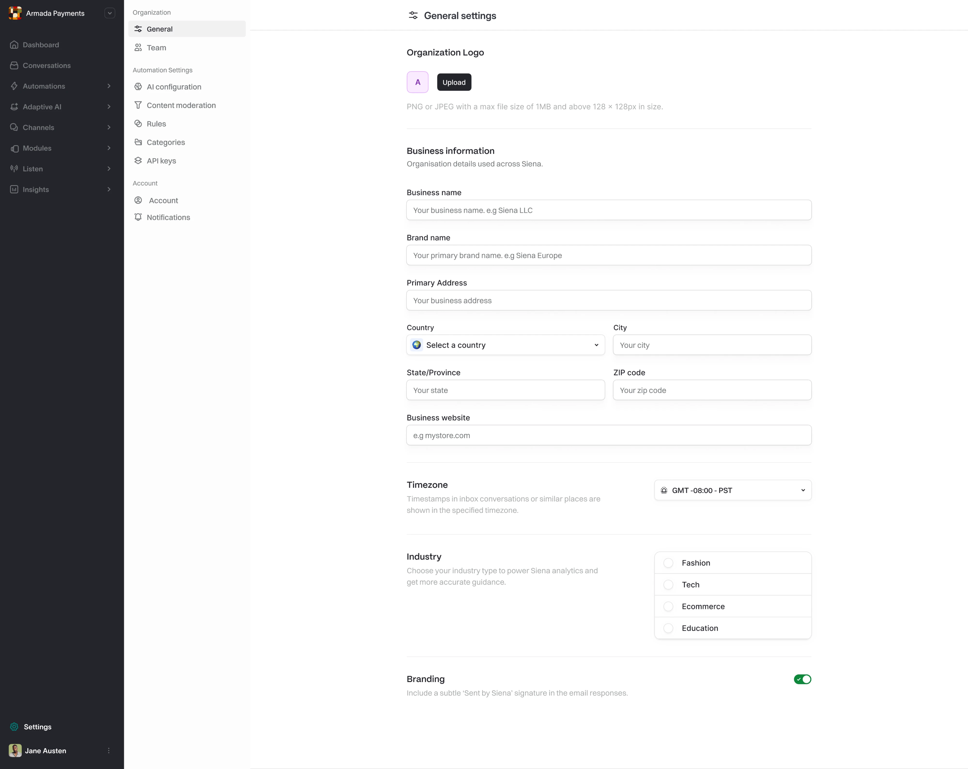
A few things worth applying to your own product:
- Add a short line of helper text under each setting so its purpose is clear.
- Make long option lists searchable so people aren't scrolling to find one item.
- When a page holds too many settings, split them across tabs.
Whoosh
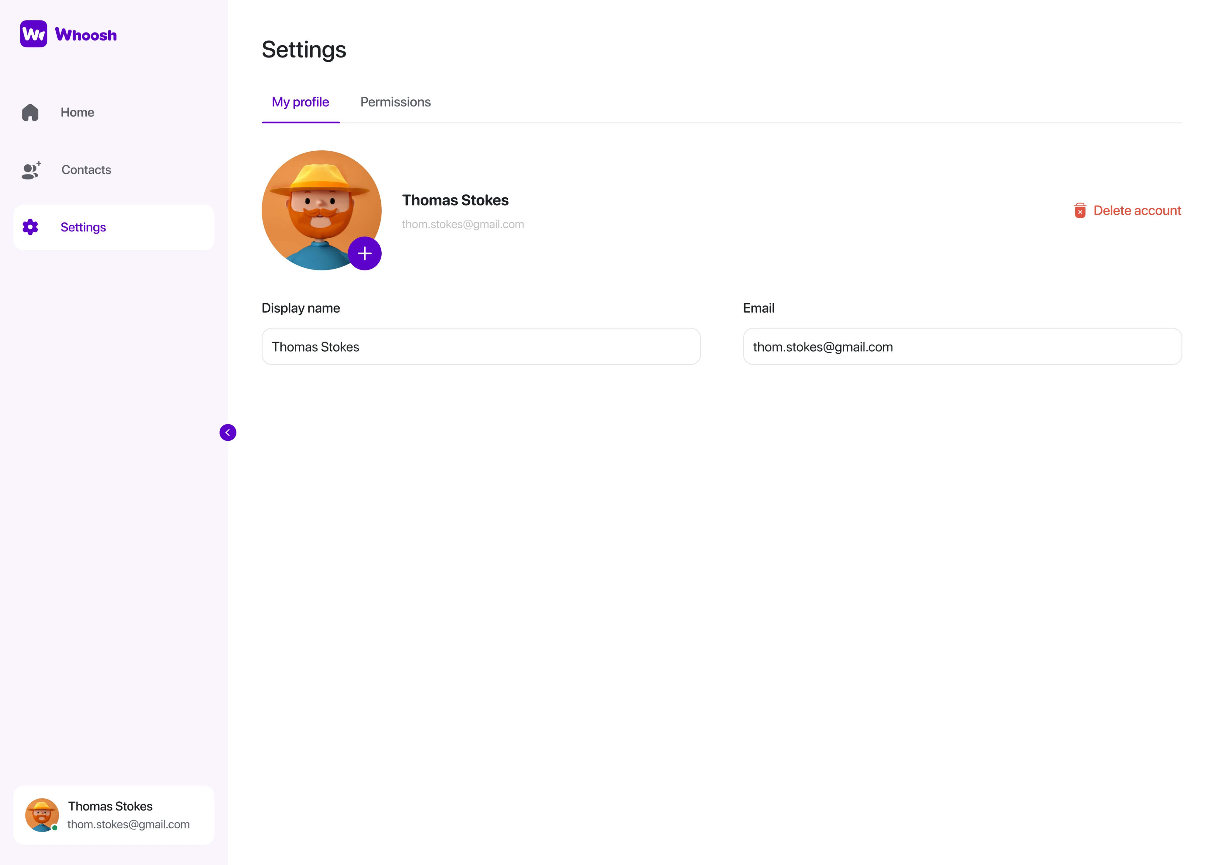
Whoosh is a video meeting app built for students, teachers, and older users who aren't tech-savvy. We gave the account settings page UI its own spot in the sidebar and open into just two tabs, one for managing your profile and one for permissions.
On the profile side, the risky action, deleting an account, is pulled away, so nobody wipes their account accidentally. The permission tab controls (microphone, camera, and notifications) come with a plain description of what each one does.

A few things worth applying to your own product:
- Keep the settings page to the essentials so it stays easy to scan.
- Write labels in plain language so people know what each control does.
- Set destructive actions apart so they aren't triggered by accident.
Zaplify
Zaplify, now AndSend, went product-led, so people had to set things up on their own. We built the settings to make that easy. There's a dedicated AI settings tab for effortless customization of tone, audience, and language.
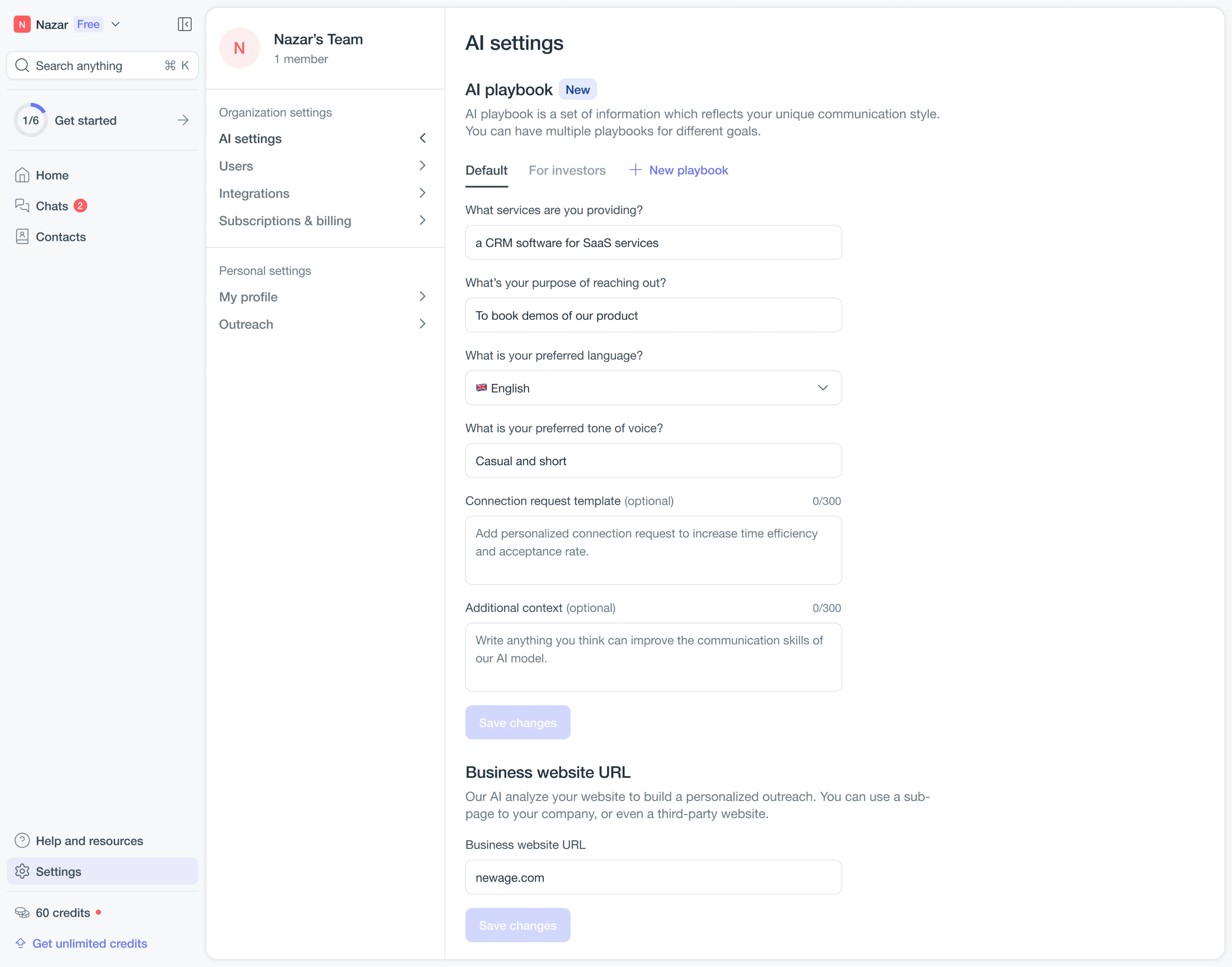
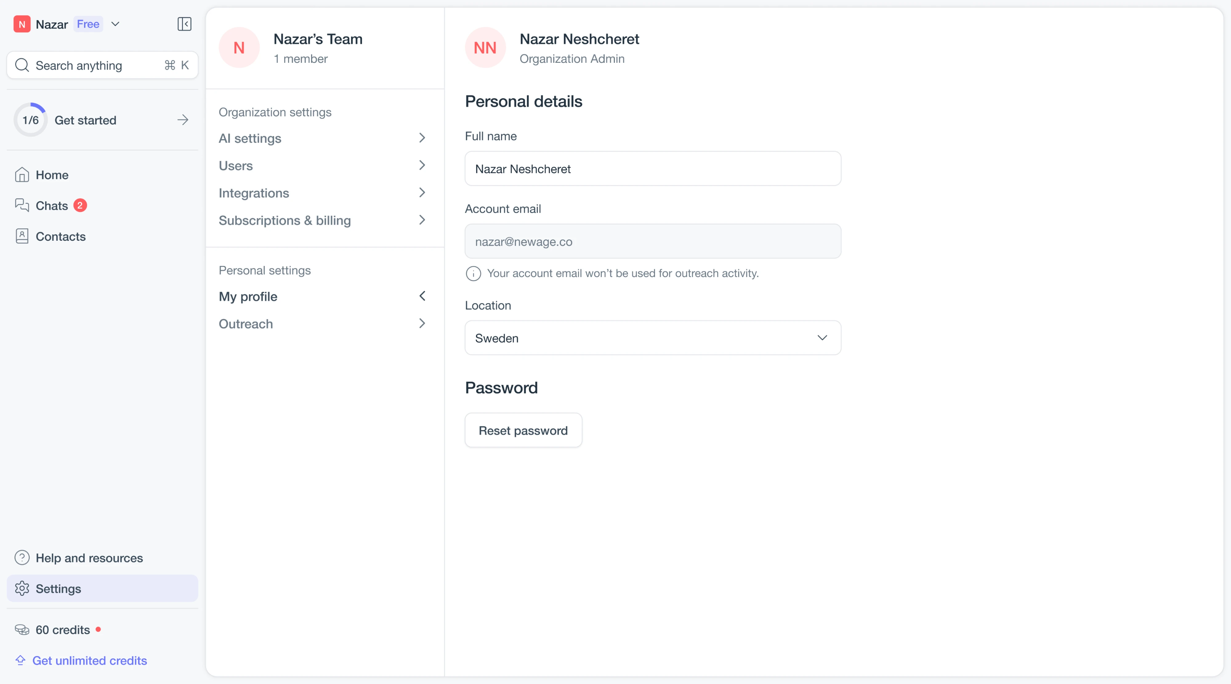
Settings also split cleanly into organization and personal, so people aren't digging through company options to edit their own profile. One Eleken designer worked through the project, and afterward more users reached their aha moment.
A few things worth applying to your own product:
- Let people save multiple named setups and switch between them.
- Split organization-level settings from personal ones so each is easy to find.
- Show each integration's on or off status plainly.
Modia
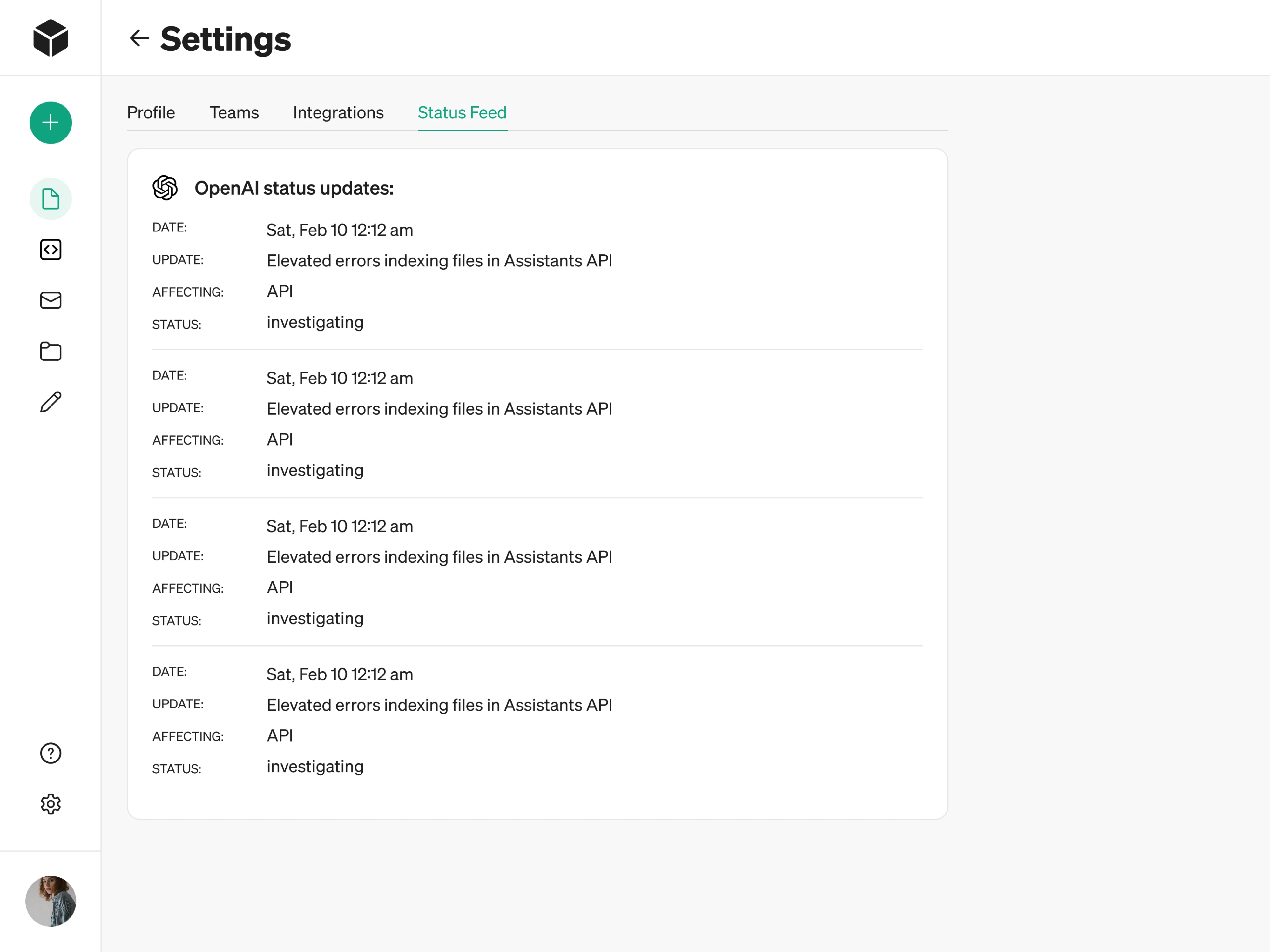
Modia is an AI content tool that grew into a full SaaS product, and its settings sit under a few clear tabs. The most useful one to borrow is Teams, where we allowed users to send an invite, see each member's role, and remove anyone easily.
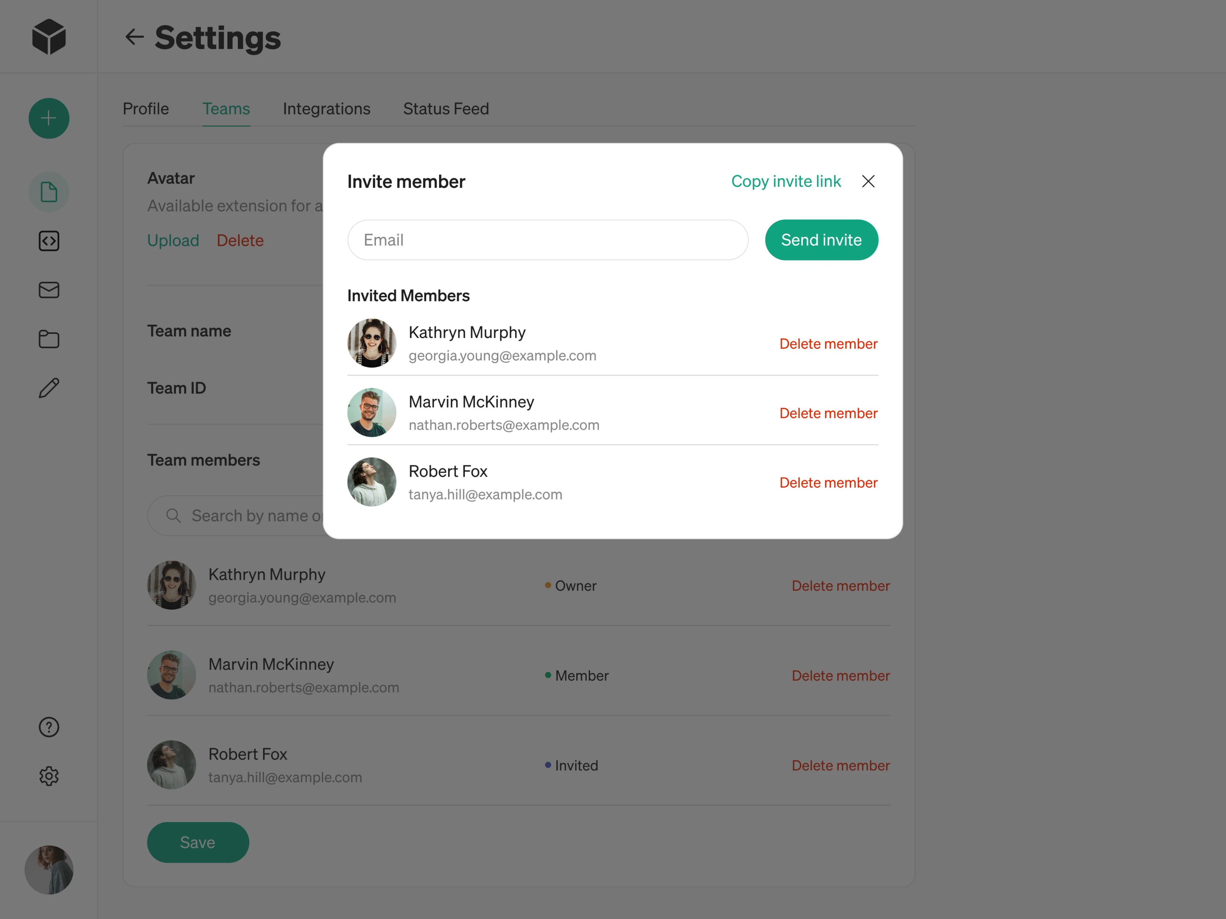
One nice touch is the Status Feed tab, which pulls in service status updates right inside settings, so when something feels off, people can check what's happening without leaving the product or hunting for a status page.
A few things worth applying to your own product:
- Keep team invites simple, by email or a shareable link.
- Show each member's role and an obvious way to remove them.
- Surface service status inside settings so people don't have to go looking for it.
What the best settings pages have in common
Looking across all examples, the same handful of design techniques keep showing up:
- Clear grouping and labels, so people can guess where a setting lives.
- Plain language with a line of helper text where it's needed.
- Sensible scoping, keeping personal, company, and role-based settings apart.
- Safe changes, with previews, save feedback, and risky actions set apart.
- Consistency across devices and across the product.
None of these are complicated, but together they're what separates a settings page people breeze through from one they dread opening.
The first few come down to organization. Good user settings page UI groups related options under labeled sections, and when there are a lot of them, they break them across tabs or tucks advanced ones out of the way.
Naming carries just as much weight. Labels are written in plain words, and a short line of helper text often sits underneath to explain what a setting does.
The next is respecting how each person works. Settings are scoped so personal preferences stay separate from company-wide or admin controls, and each role sees only what applies to it. That keeps everyone out of options they'll never touch.
The last is making changes feel safe. People can see the effect of a settings section before they commit. They know when something has saved, and risky actions like deleting an account are set apart so they're never triggered by accident.
Consistency ties it all together, since a page that looks and behaves the same everywhere is one people can actually learn.
How to design a settings page UI
Designing a settings page app UI comes down to a few practical decisions. They fall into four areas: how you organize the settings, which layout you use to display them, how you handle saving and feedback, and how it all holds up on mobile.
The sections below walk through each one.
Organize the information architecture
Organizing settings effectively starts with grouping. Related settings should belong together, because people come to the page thinking about a task they want to finish. For example, someone who wants to stop getting a certain email is looking for notifications, not for the module that happens to send it.
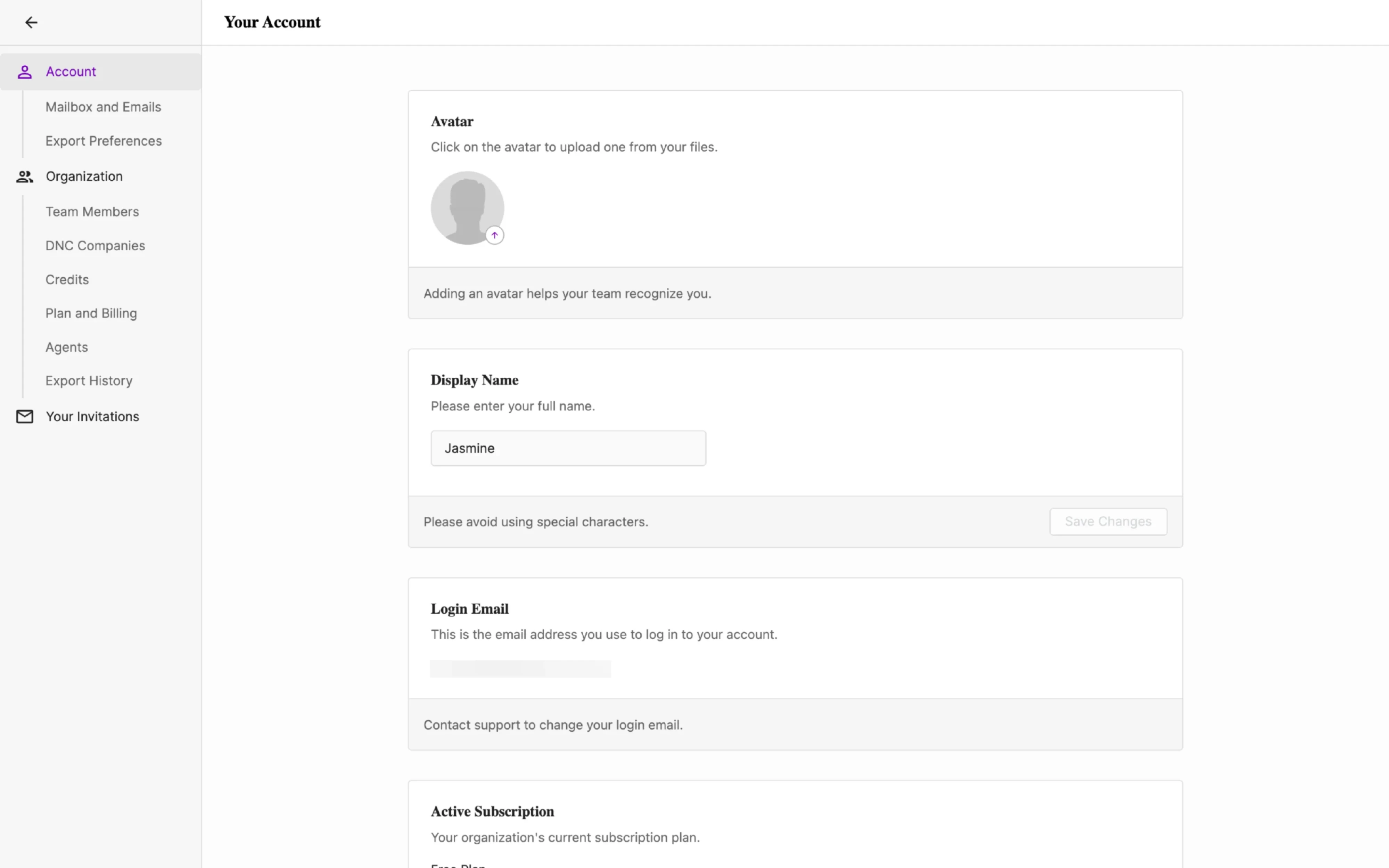
Once the groups are clear, the navigation should fit the number of settings you have. Common options each suit a different scope.
- Stacked sections work when there are only a few settings on a single page.
- Tabs suit a handful of distinct groups that people switch between.
- A sidebar handles many groups and larger settings areas.
- Accordions help with long lists, letting people collapse what they don't need.
Within any of these, progressive disclosure keeps things calm. Surface the settings people reach for often and tuck advanced or rarely used ones behind an “Advanced” section or an expandable panel, so the page never opens as a wall of options.
Search becomes important once a product grows large, though it works best as a fallback rather than a crutch. A well-organized page shouldn't force people to search for common things, and as one Reddit user put it:

I shouldn't have to search. I should be able to see the list in a nice compact view.

At the same time, once a settings list runs into the hundreds or thousands of items, another Reddit user pointed out that leaving out a search function and making people scroll manually every time is simply bad design.
The takeaway is to organize well enough that search isn't needed for everyday tasks, while still offering it for the long tail.
Choose the right layout types
Once the structure is settled, the layout is how it actually looks and feels on screen. A few patterns show up again and again because they work. Card-based sections give each group of settings a clear visual container, a left sidebar handles navigation for larger pages, and a sticky action bar keeps the Save button in view.
For navigation, there's a common debate between a grid of large category icons and a list or sidebar. The grid can look nicer, but the list tends to win on function.
I prefer list settings over grids.
I think the grid view looks nicer, but the sidebar view is far more functional.
Redditors note that a sidebar lets you click through categories quickly and glance at their contents, while a grid leaves you guessing which category a setting is filed under. For most products, a list or sidebar is the safer choice.
How people edit a setting matters too, and the right pattern depends on the stakes.
- Inline edits suit low-stakes changes, letting people update a field right where it sits.
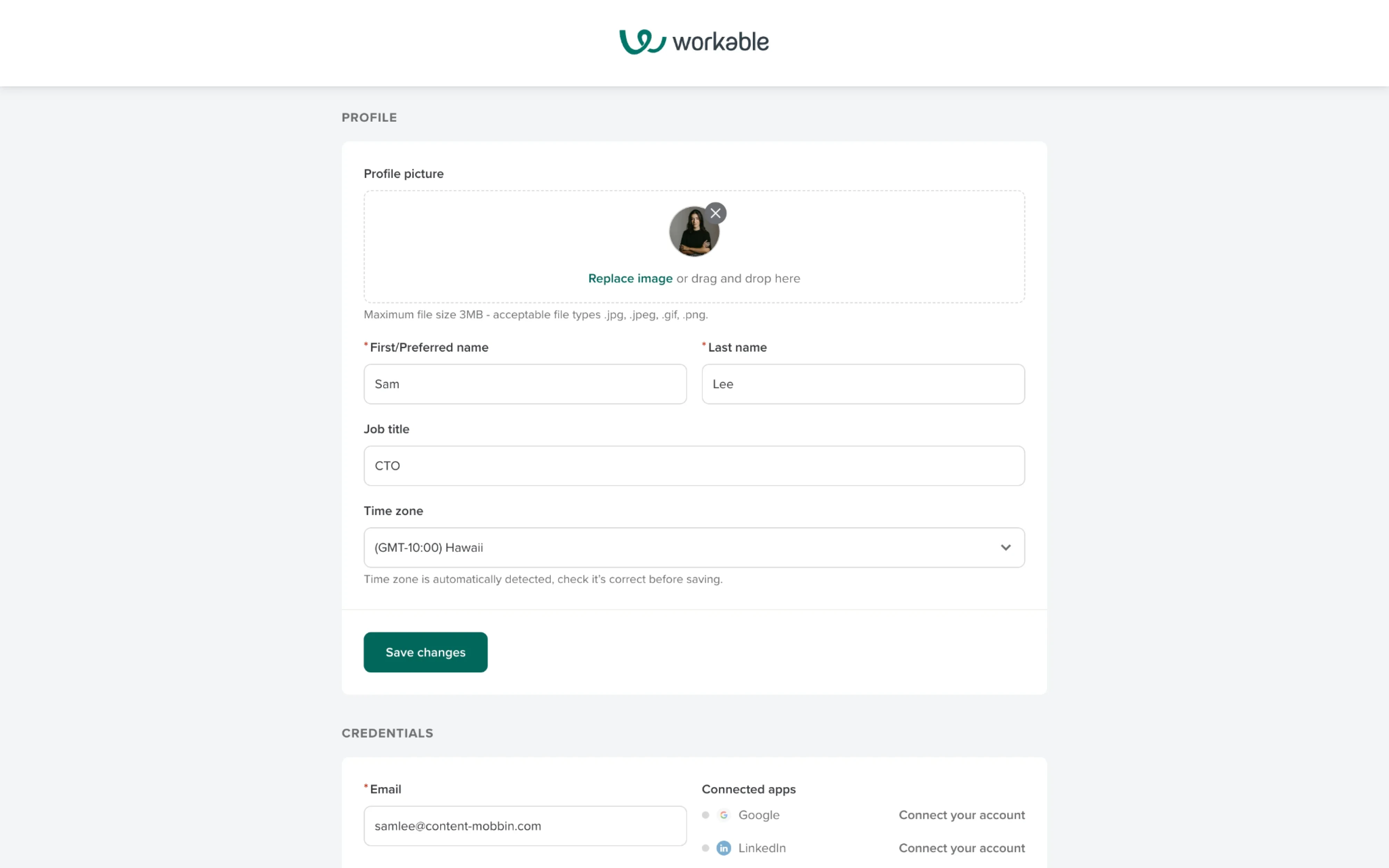
- Modal dialogs suit changes that deserve a moment of focus or a clear confirm step.
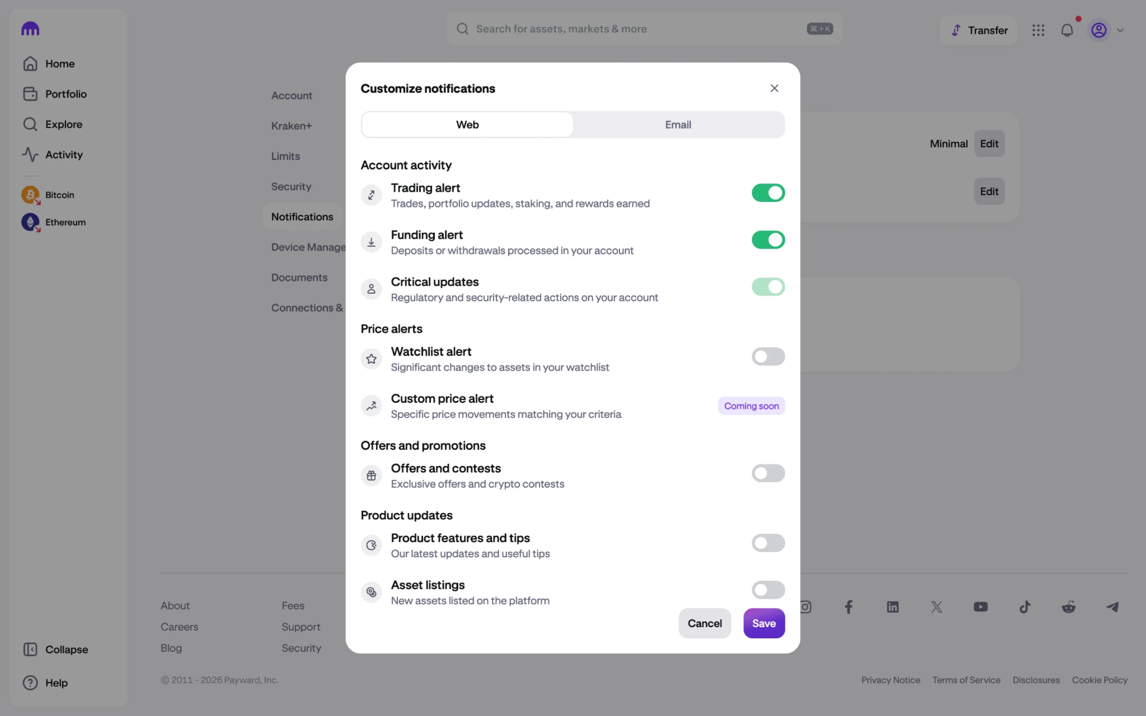
- Confirmation dialogs are worth the extra click for destructive actions, where an accidental tap would cause real damage.
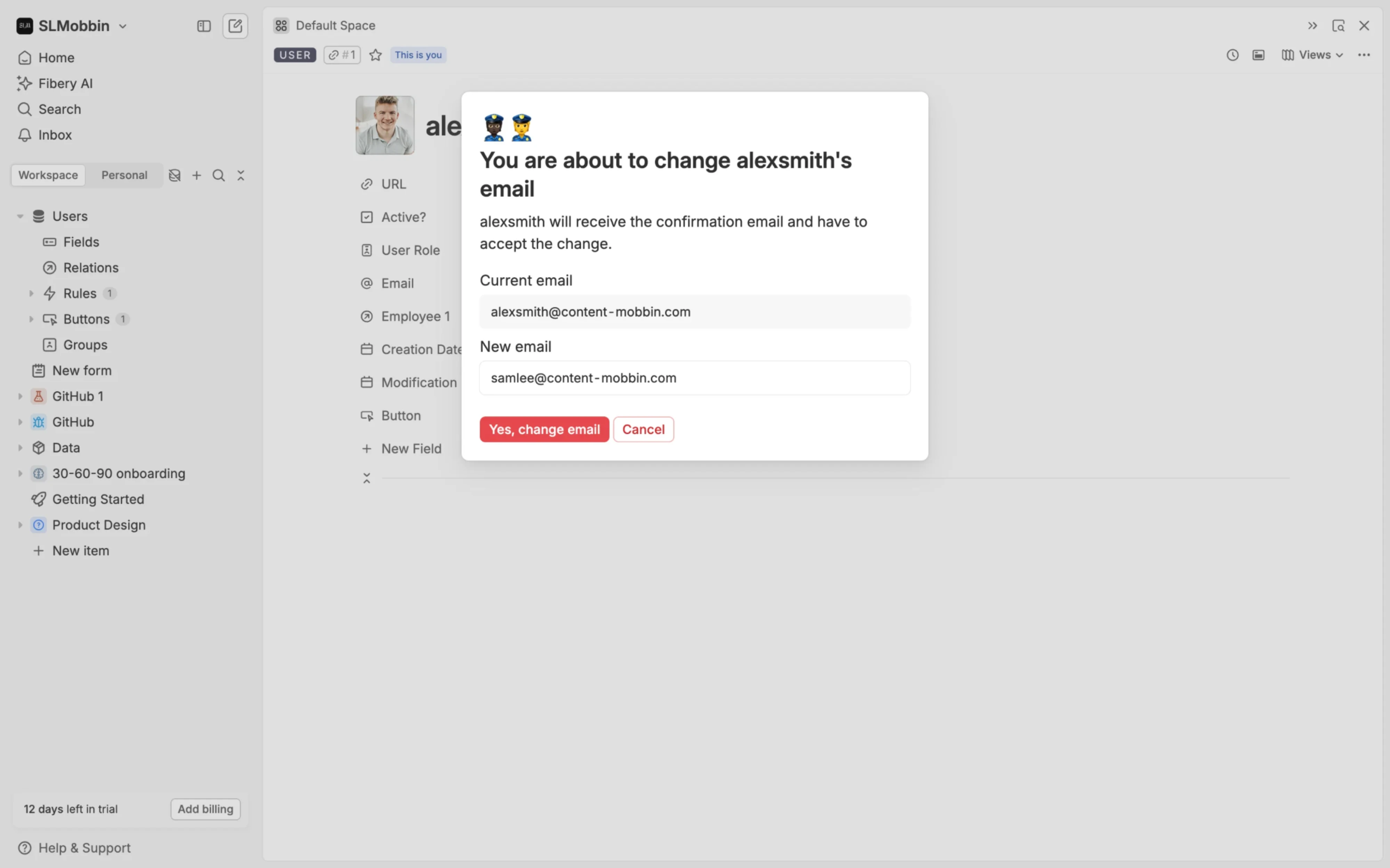
On the visual side, the current look leans toward rounded cards, soft shadows, neutral palettes, and a generally minimal style, which keeps a busy page feeling calm. The point isn't to follow a trend. Clean spacing and quiet styling make a dense settings page easier to read, and that's the real reason to reach for them.
Handle save states and feedback
Once someone changes a setting, they need to know what happened to it. The first decision is how saving works at all, and there are two main approaches that suit different situations.
- Auto-save writes changes the moment they're made. It's low friction and works well for toggles and appearance settings, where people expect the change to just take effect.
- Explicit save keeps a button that people press when they're ready. It's the better fit for complex forms, where someone might edit several fields and still want the option to cancel.
A sticky save bar bridges the two nicely. It stays hidden until there are unsaved changes and then slides into view, so the Save button is there exactly when it's needed without cluttering the page the rest of the time.
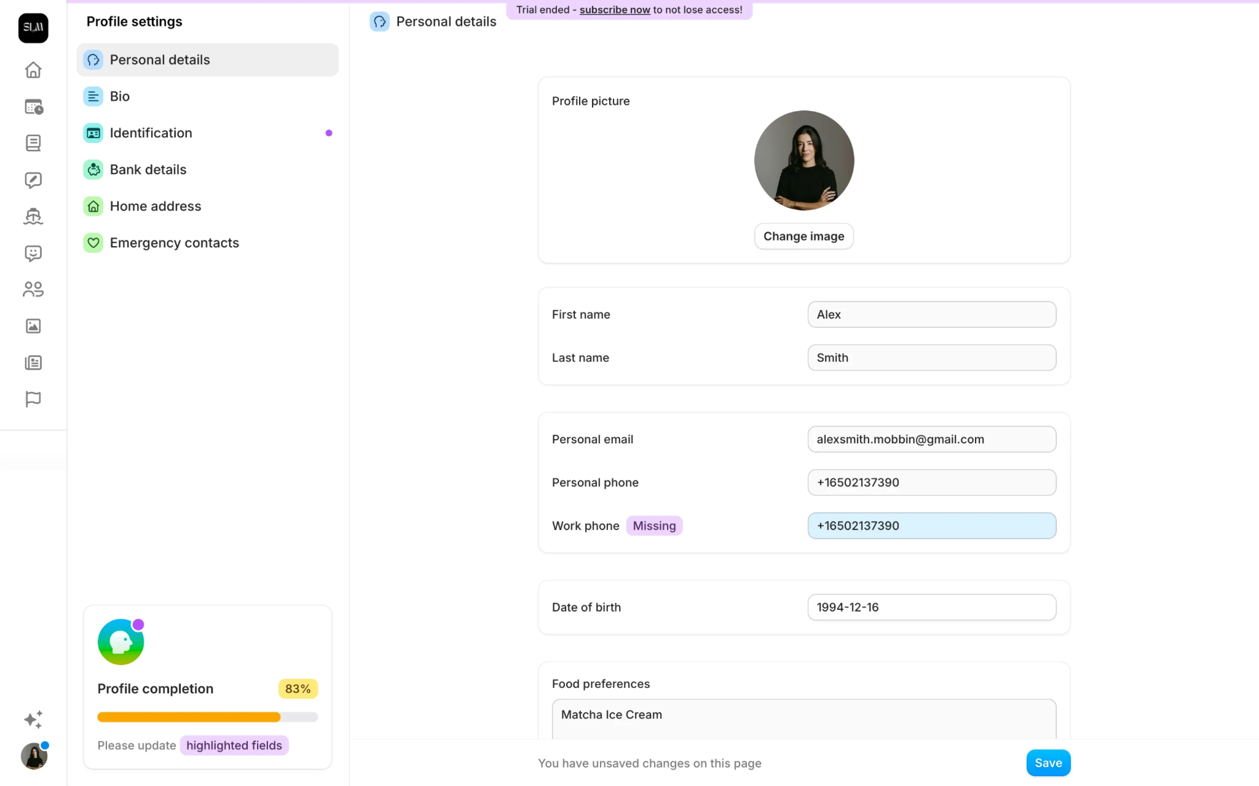
Some actions deserve a pause rather than instant execution.
Destructive ones like deleting an account or removing a team member should ask for confirmation first, since an accidental click there is expensive to undo. Where you can, offering an actual undo option is even kinder than a warning, because it lets people move quickly and still recover from a mistake.
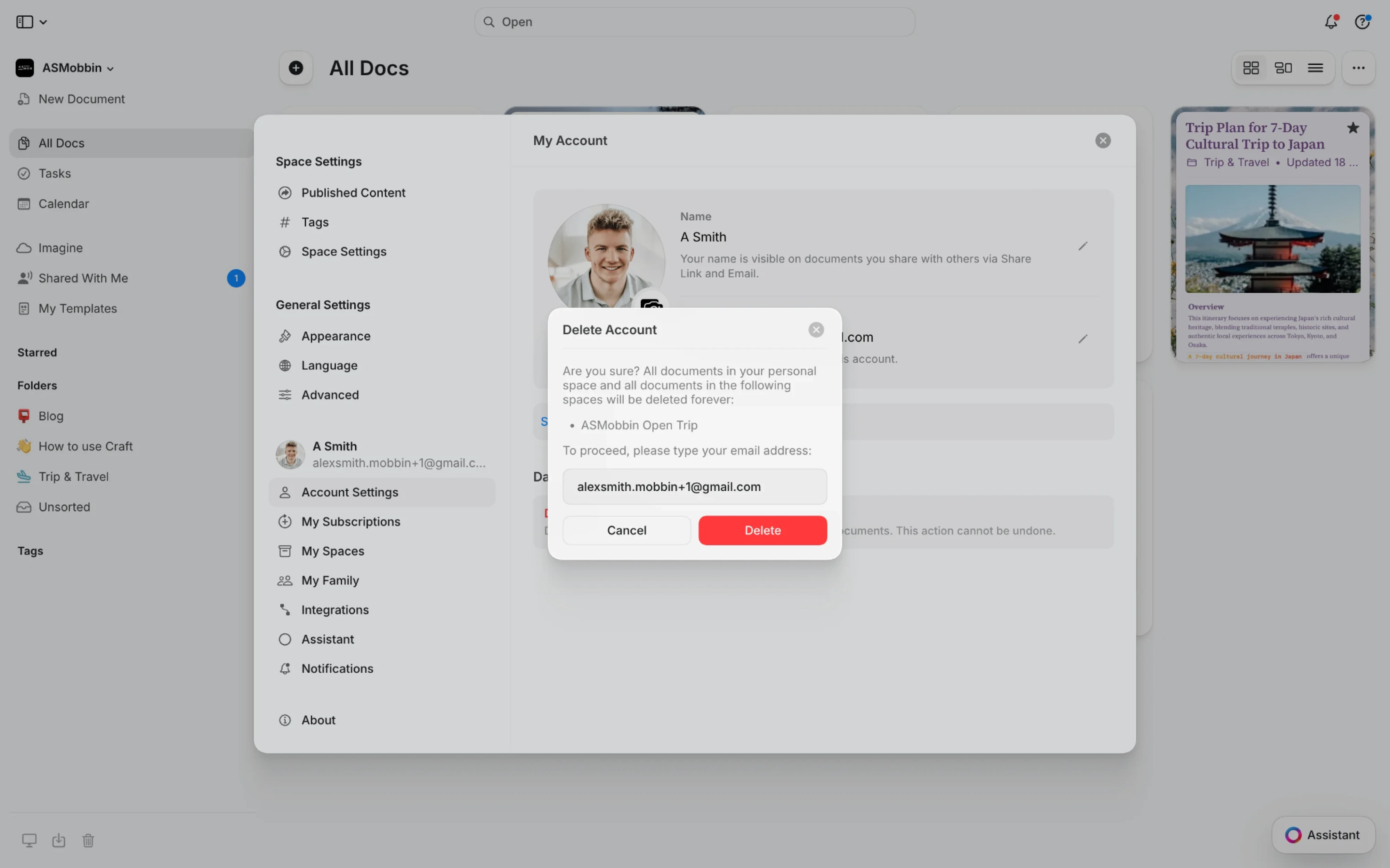
Whatever the approach, the feedback has to be immediate and visible. A quick toast notification, an inline success message, or a clear error when something fails all tell people their action registered.
Design for mobile
A page that works on desktop can fall apart on a small screen, so the settings page mobile UI deserves its own thinking.
The first thing to rework is navigation. A left sidebar has nowhere to go on a narrow screen, so collapsing each group into accordion sections works better, letting people expand only the part they care about and keeping everything else out of the way.
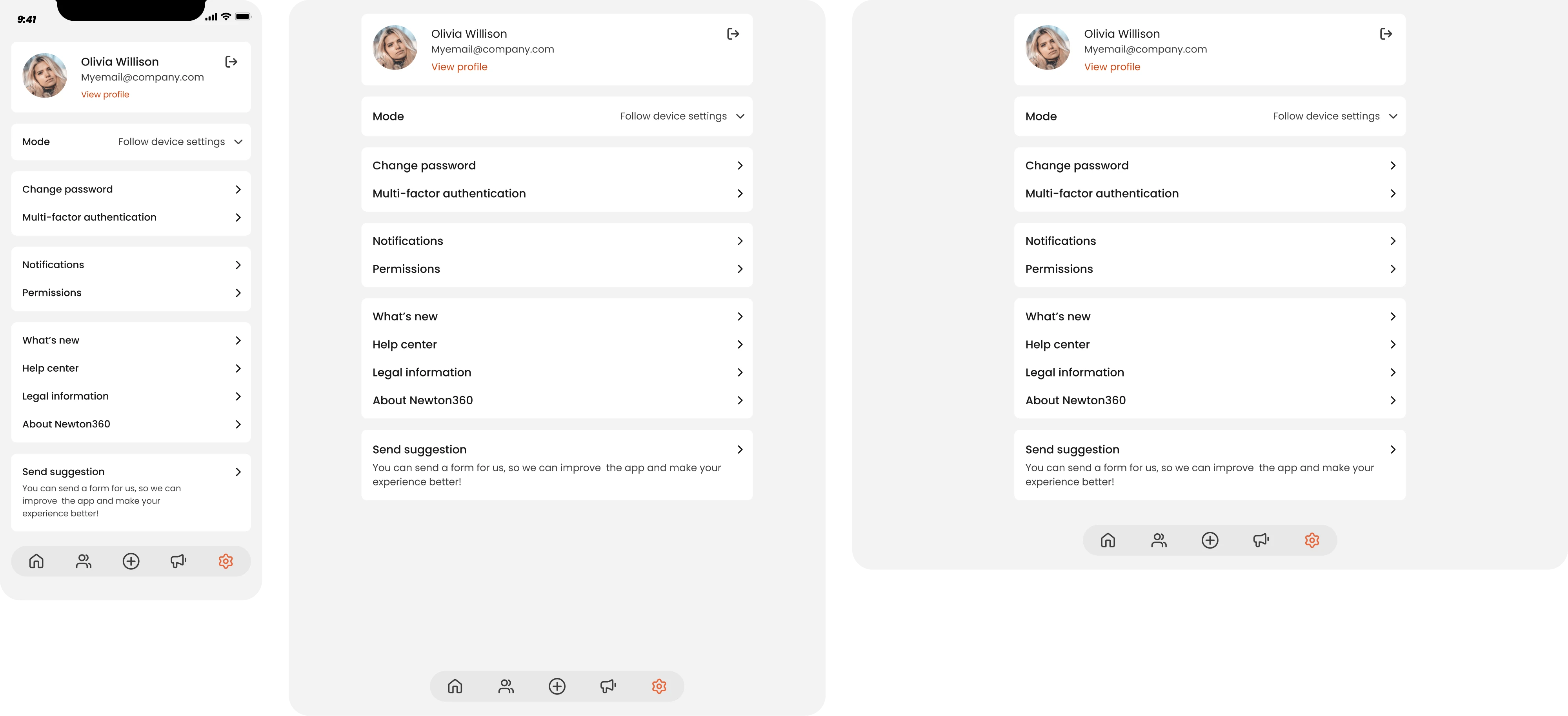
Editing needs adjusting too. Bottom sheets are a good fit for changing a single field, since they slide up over the current screen and let people edit without losing sight of where they were. More generally, mobile rewards showing fewer options at once and revealing the rest on tap, so no single screen feels crowded.
A few essential usability tips make the difference between usable and frustrating:
- Keep touch targets at least 44 by 44 pixels so controls are easy to tap accurately.
- Leave enough space between interactive elements so people don't hit the wrong one.
- Use readable type, since settings pages are text-heavy and small type scales poorly.
The underlying point is that mobile and responsive behavior has to be tested on real screens. Layout options that look fine in a desktop preview are exactly where scrolling problems and cramped controls tend to hide, and those only show up when someone actually uses the page on a phone.
The takeaway
The one thing most teams miss is that a settings page is never finished. It keeps absorbing new options, so the layout you ship today quietly fills up over the next year. The settings people search for or open tickets about are usually the ones in the wrong place, so it's worth checking in on the page every so often.
If you'd rather have a design partner handle that, it's the kind of work we do at Eleken. We've redesigned settings and full SaaS products for 200+ teams. Reach out to start your project, and we'll help turn a page people tolerate into one they trust.




.webp)

.png)