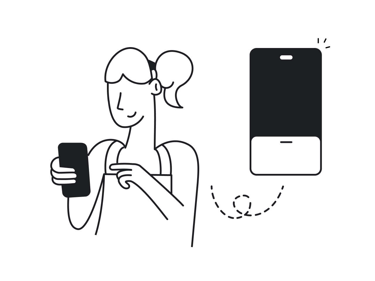


You've used a bottom sheet today, probably more than once. You pulled one up in Apple Maps, opened a sharing menu, or adjusted filters while shopping without ever leaving the page. The pattern is everywhere, even if most people don't know its name.
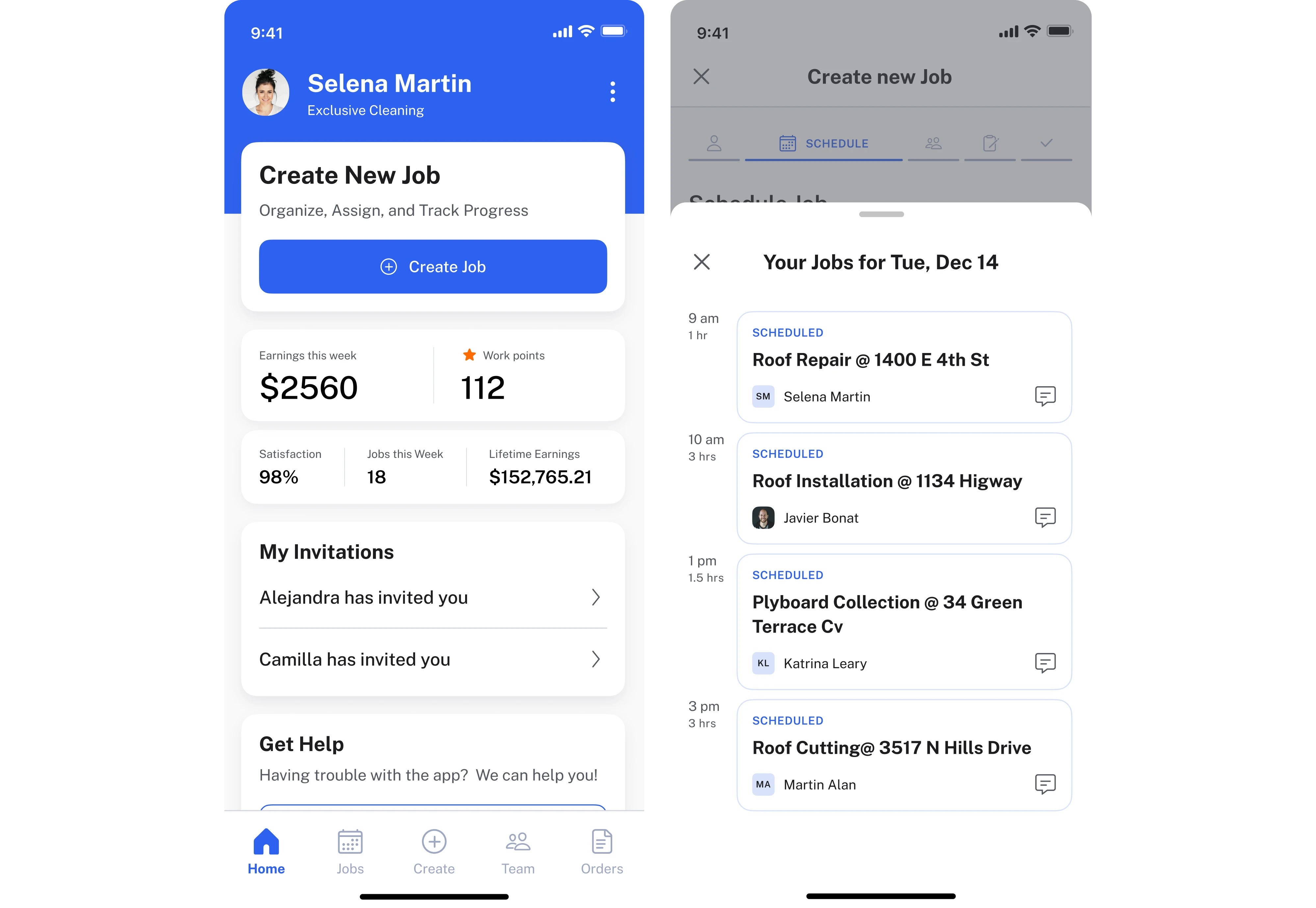
Knowing what a bottom sheet is is easy. Knowing when to use one instead of a modal, side drawer, or full-screen page is where good UX decisions happen. Get that choice wrong, and simple tasks suddenly feel slower, more confusing, or easier to dismiss by accident.
At Eleken, this is one of the most common UX decisions we help SaaS teams make during product audits. In this guide, you'll learn when bottom sheets are the right choice, the different types you'll encounter, how they should behave on iOS and Android, and the design mistakes that make them frustrating instead of useful.
What a bottom sheet is
A bottom sheet is a panel that slides up from the bottom of the screen without taking users away from what they're doing. Instead of opening a new page or blocking the entire interface, it presents additional information or actions while keeping the current screen visible.
That's what makes it different from most other UI patterns: it preserves context. Users can complete a task, view more details, or decide without losing their place.
You'll see the pattern referred to by different names. Apple calls it a sheet in its Human Interface Guidelines, while Material Design uses bottom sheet UI UX. Some teams also say bottom drawer or bottom modal. Although the terminology varies, they're generally describing the same interaction pattern.
Here's how it compares to other UI patterns:
- Bottom sheet keeps users in context while surfacing additional content or actions.
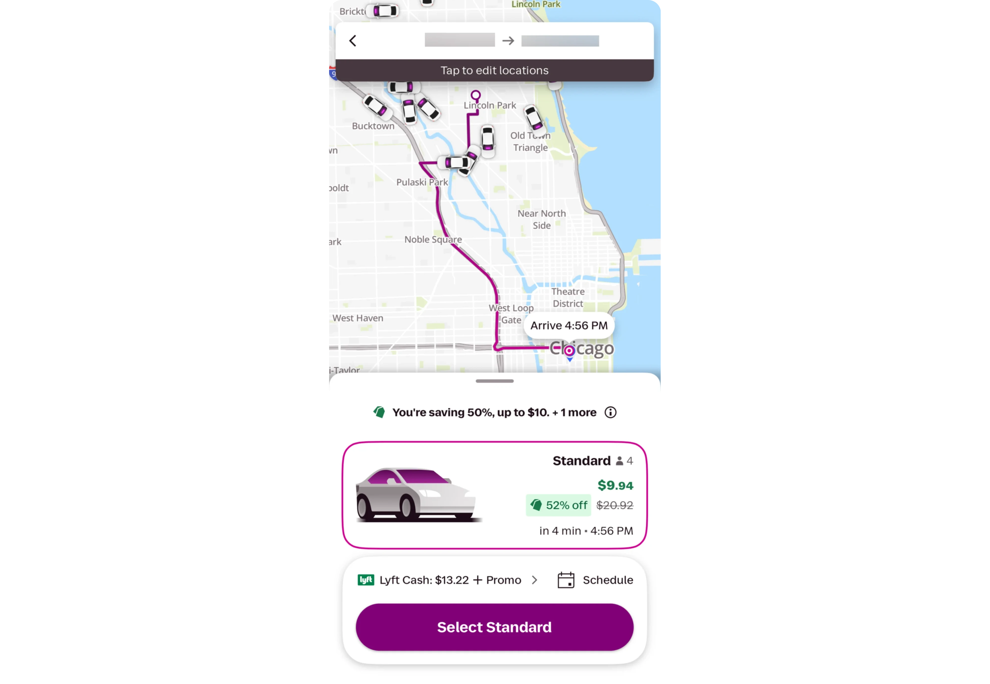
- Modal dialog blocks the rest of the interface until users respond.
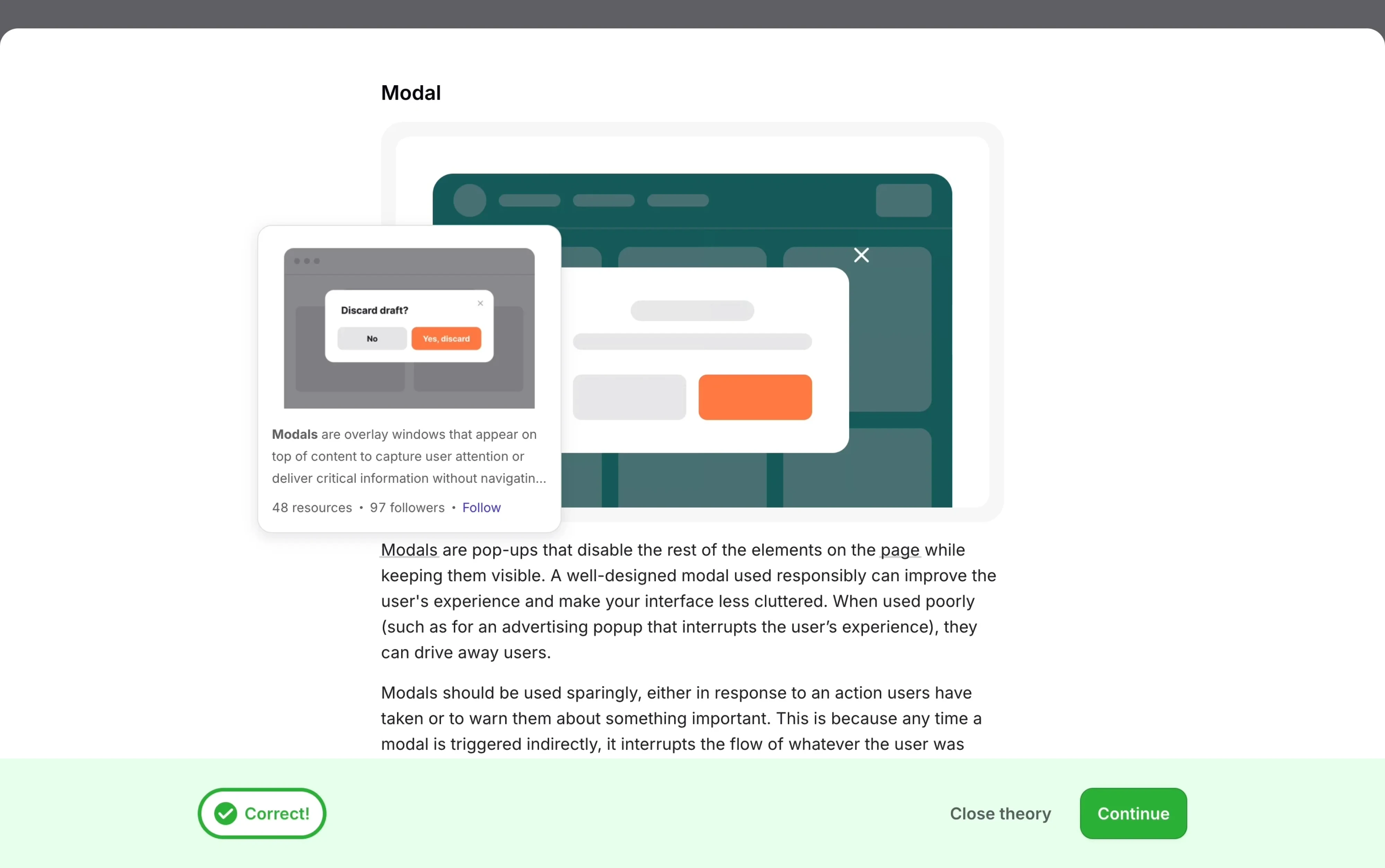
- Side drawer slides in from the edge, typically for navigation.
- Full-screen page replaces the current screen entirely.
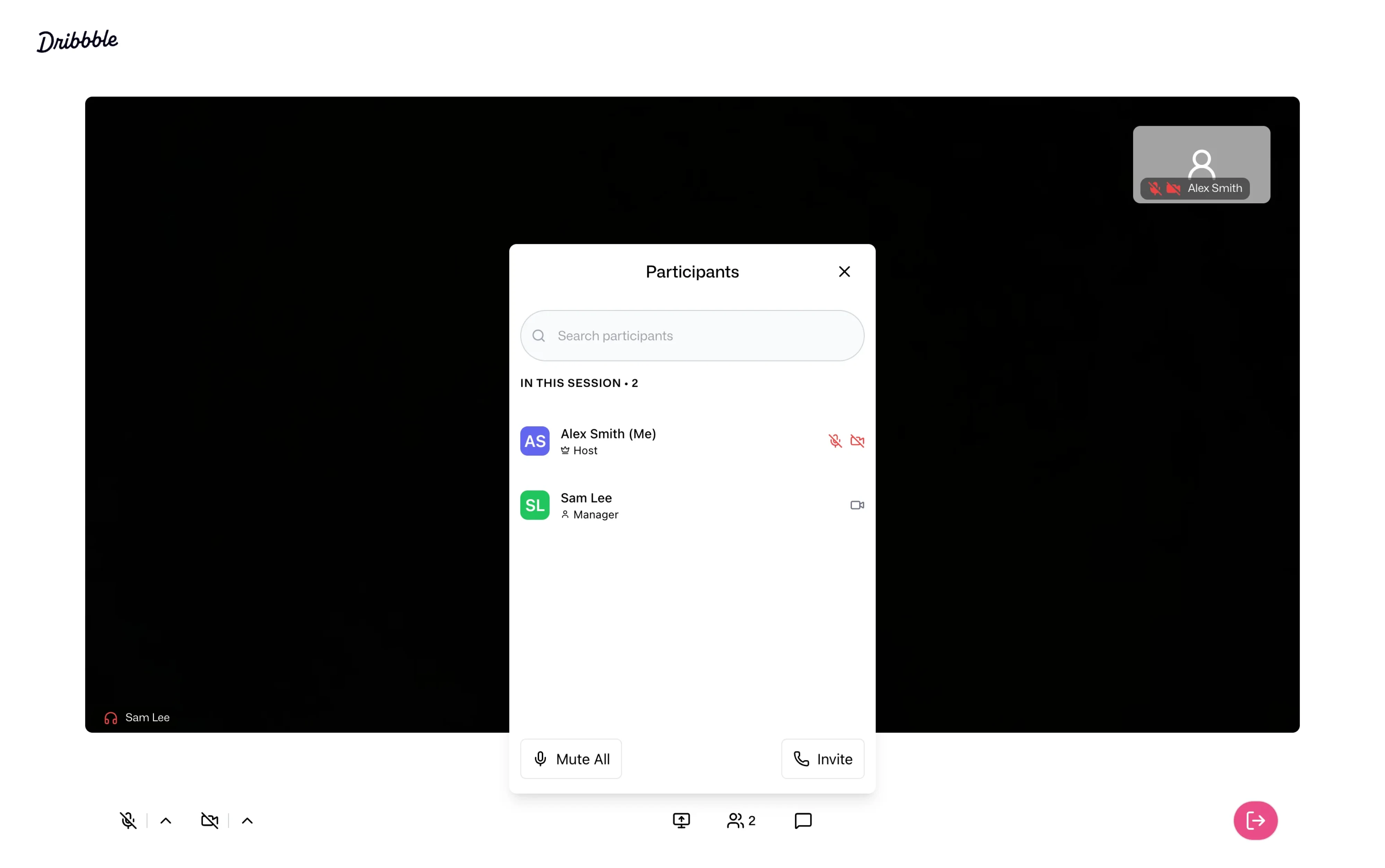
- Popup interrupts users with information or actions they weren't actively requesting.
The important distinction is the behavior. Two teams can both say "bottom sheet" and mean completely different interactions. That's why static specs are rarely enough. An interactive prototype removes ambiguity by showing exactly how the sheet opens, expands, dismisses, and behaves alongside the rest of the interface.
Modal vs. non-modal bottom sheets
Once you've decided a bottom sheet is the right pattern, there's one more choice to make: should users still be able to interact with the screen behind it?
That determines whether you need a modal or non-modal bottom sheet.
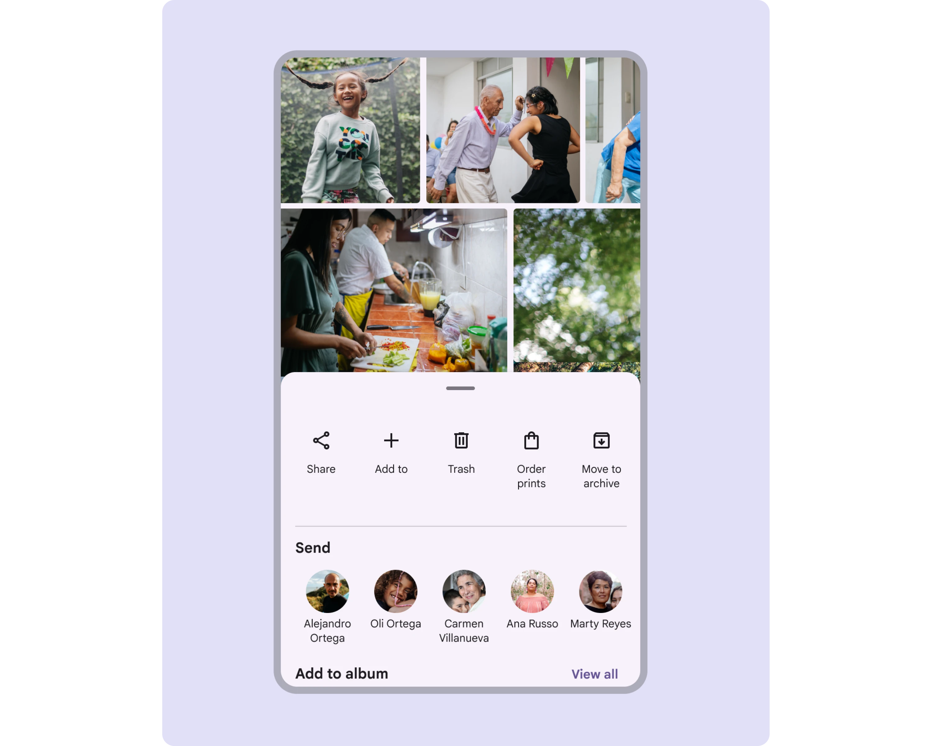
Modal bottom sheets
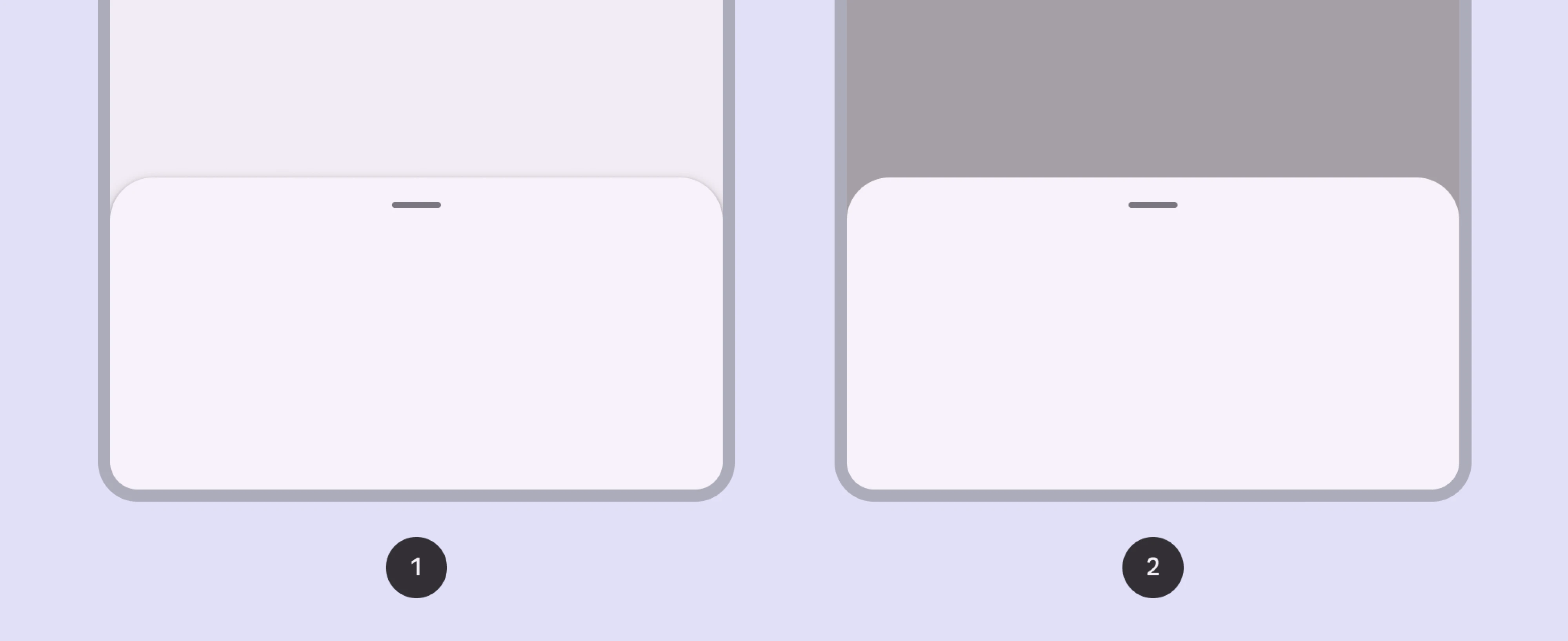
A modal bottom sheet UI temporarily takes focus. It appears over the interface, dims the background with a scrim, and prevents users from interacting with anything behind it until they complete or dismiss the sheet.
Use it for tasks that require immediate attention, such as:
- sharing content,
- selecting from a list of actions,
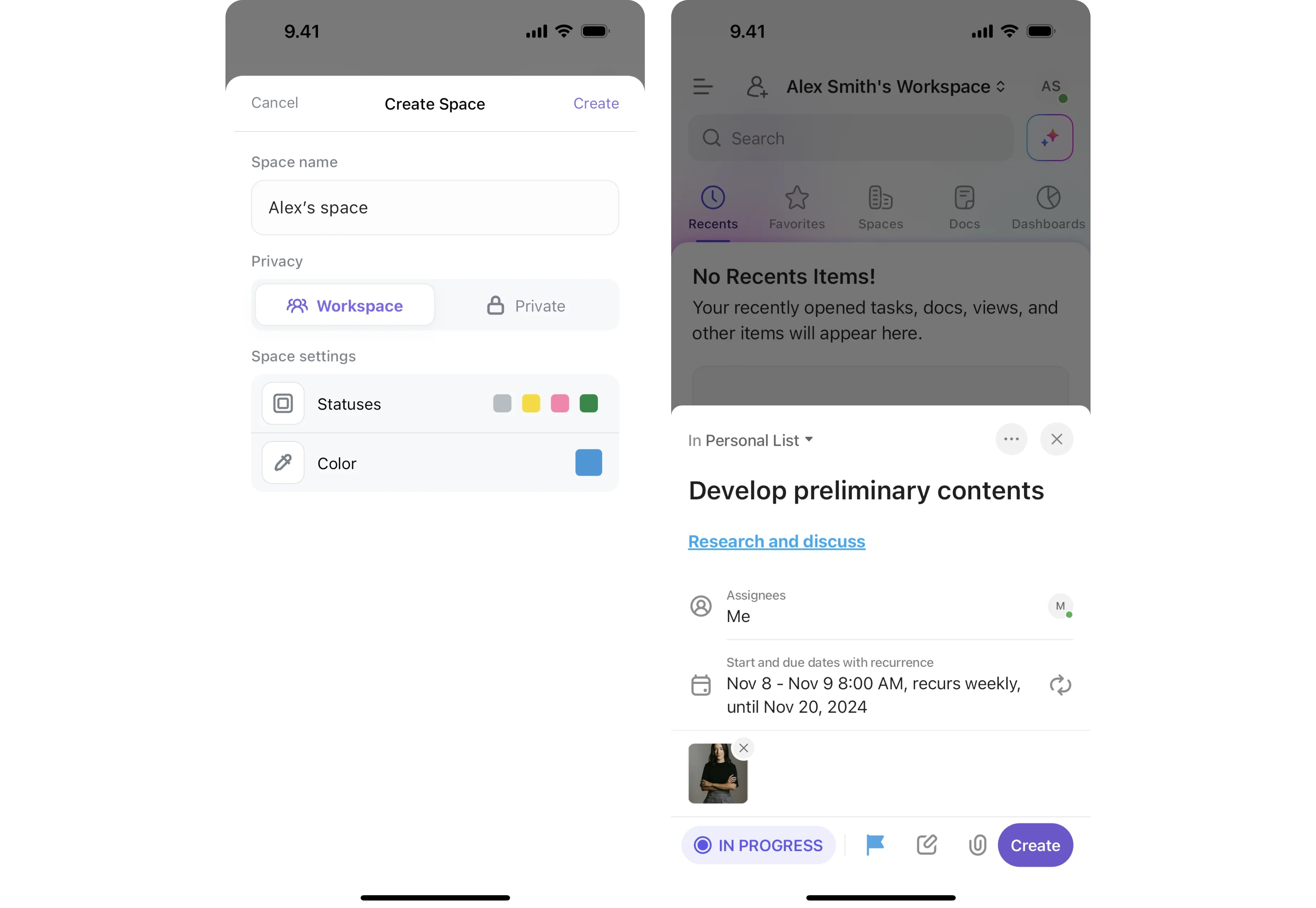
- filling out a short form,
- confirming an important action.
Think of it as a mobile-friendly alternative to a dialog.
Non-modal bottom sheets
A non-modal (or standard) bottom sheet stays on screen while leaving the rest of the interface interactive. Users can continue working with the underlying content without closing the sheet.
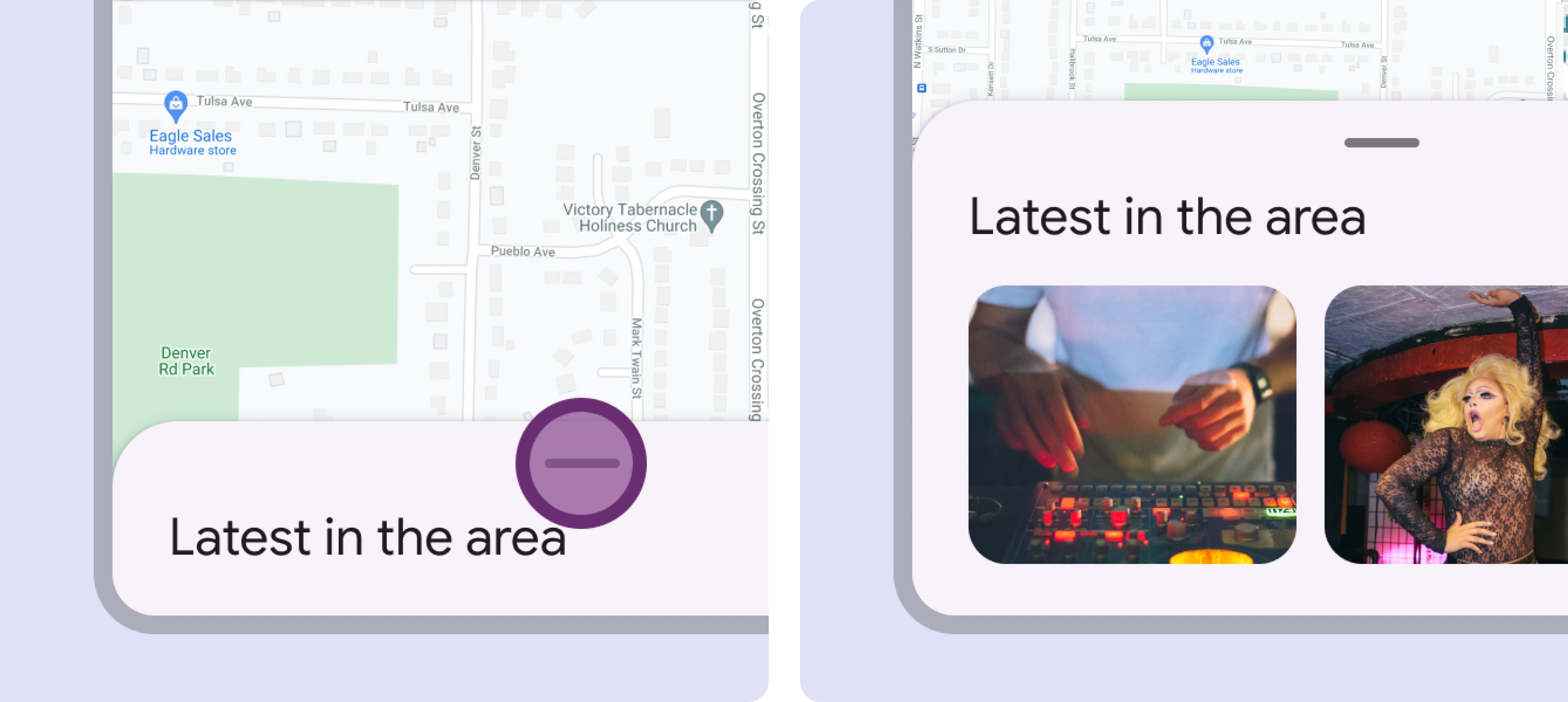
Maps are the classic example: you can read information about a location while still panning and zooming the map.
They're best for supporting content that complements the main task, such as:
- map details,
- music player controls,
- live filters,
- contextual information panels.
Material 3 also introduces an expanding bottom sheet, which starts collapsed and grows as users need more space. Rather than treating it as a separate pattern, it's helpful to think of it as a variation that combines the persistence of a non-modal sheet with the focus of a modal one.

A simple rule works almost every time:
- Users should keep interacting with the current screen → use a non-modal bottom sheet.
- Users should focus on the sheet before continuing → use a modal bottom sheet.
If you want to learn more about how to design smarter, watch the video below:
Bottom sheet UI examples worth stealing
Here are bottom sheets in real products, and the lesson each one teaches.
Apple Maps and Google Maps: the info sheet that keeps the map alive
Both map apps are built around a non-modal bottom sheet, and they are the reference example for good reason. You search, tap a result, and a sheet rises with details. Crucially, the map stays interactive the whole time.
The Apple Maps bottom sheet UI leans hard on snap points. It peeks with a search bar and a few nearby suggestions. Drag it up, and you get more. Drag it down, and it tucks away so the map takes over.
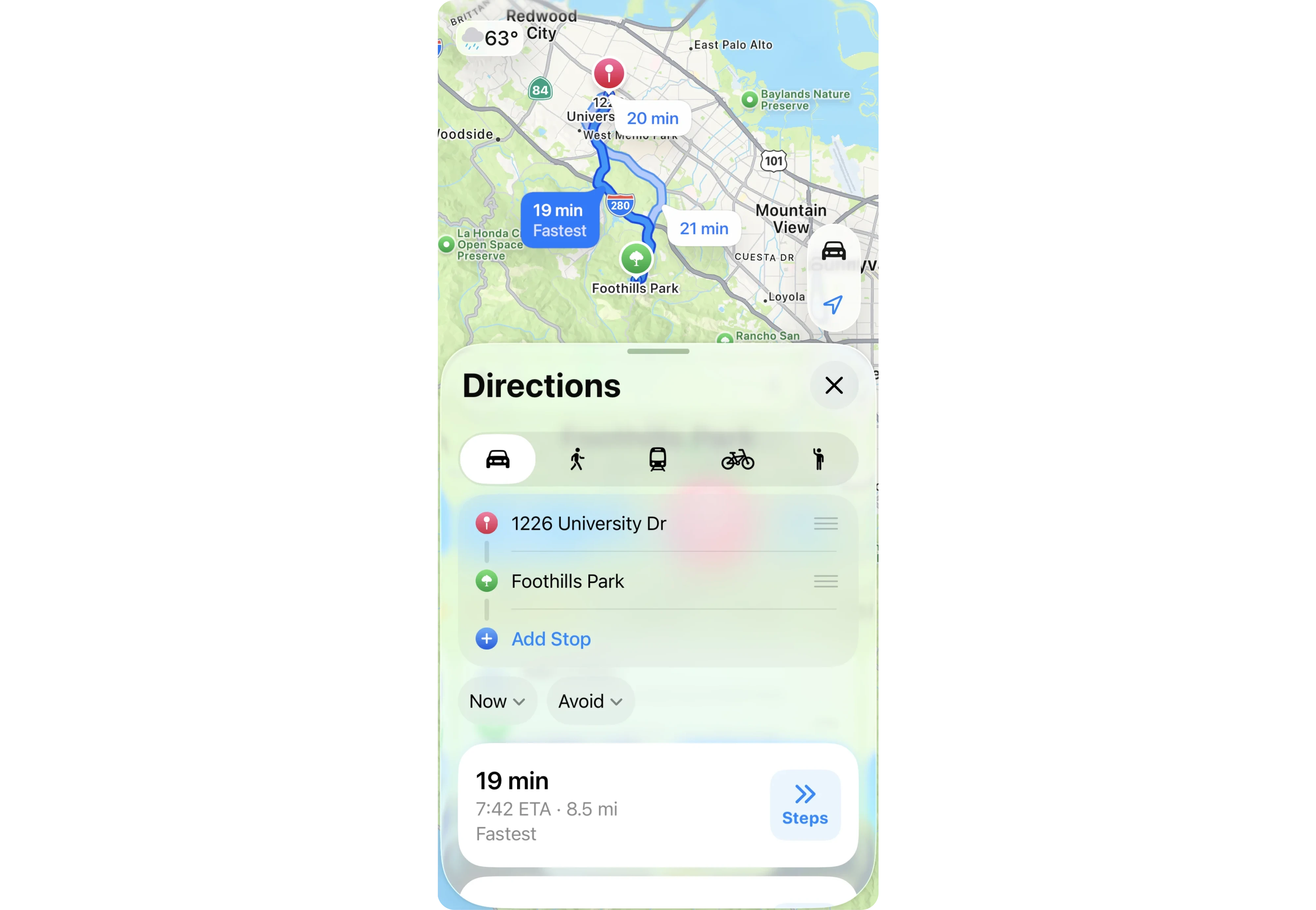
Google Maps does the same dance with slightly different content. The genius is that the sheet never fully hijacks the screen. You are always one small drag from the map you came for.
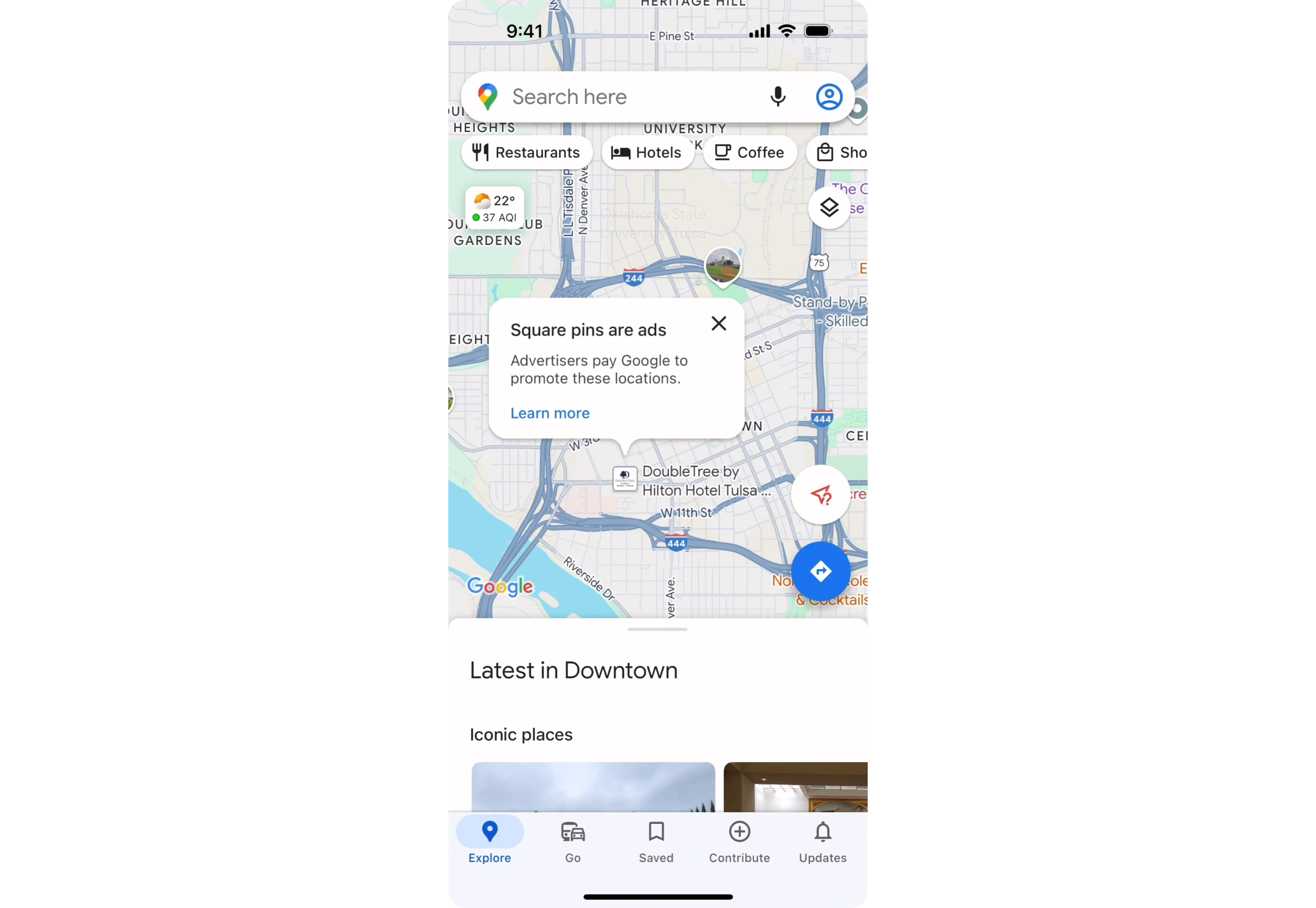
Notice something else about these apps. The sheet is also the search home. Before you have tapped anything, the low peek state holds the search bar and a few suggestions. That is a subtle, smart decision.
Instead of a separate search screen, the sheet is the search screen, the results screen, and the details screen, all the same surface, just at different heights.
The takeaway: when the sheet's content supports the main screen instead of replacing it, go non-modal and lean on snap points. Let people choose how much they want to see, and let one sheet quietly do several jobs as it moves between states.
Spotify: the music player that lives in a sheet
Spotify's now-playing screen behaves like an expanding bottom sheet. There is a slim bar at the bottom showing the current track. Tap it or drag it up, and it grows into the full player with artwork, controls, and the queue below.
What is smart here is the peek. That little bar is a bottom sheet at its smallest snap point. It stays out of your way while you browse, but it is always one tap from expanding. The queue and lyrics live even further down, revealed by scrolling inside the expanded sheet.
This pattern shows up across media apps for a reason. Podcast players, audiobook apps, and video apps all use some version of the persistent mini-player that expands into a sheet. Users have learned it. When your media controls sit in a low-peek sheet, people know to tap it, and they know it will grow. You are borrowing a habit they already have.
The takeaway: a sheet does not have to be a pop-up you summon. It can be persistent, sitting quietly at a low peek height until someone wants more.
Instagram and social sharing: the share sheet
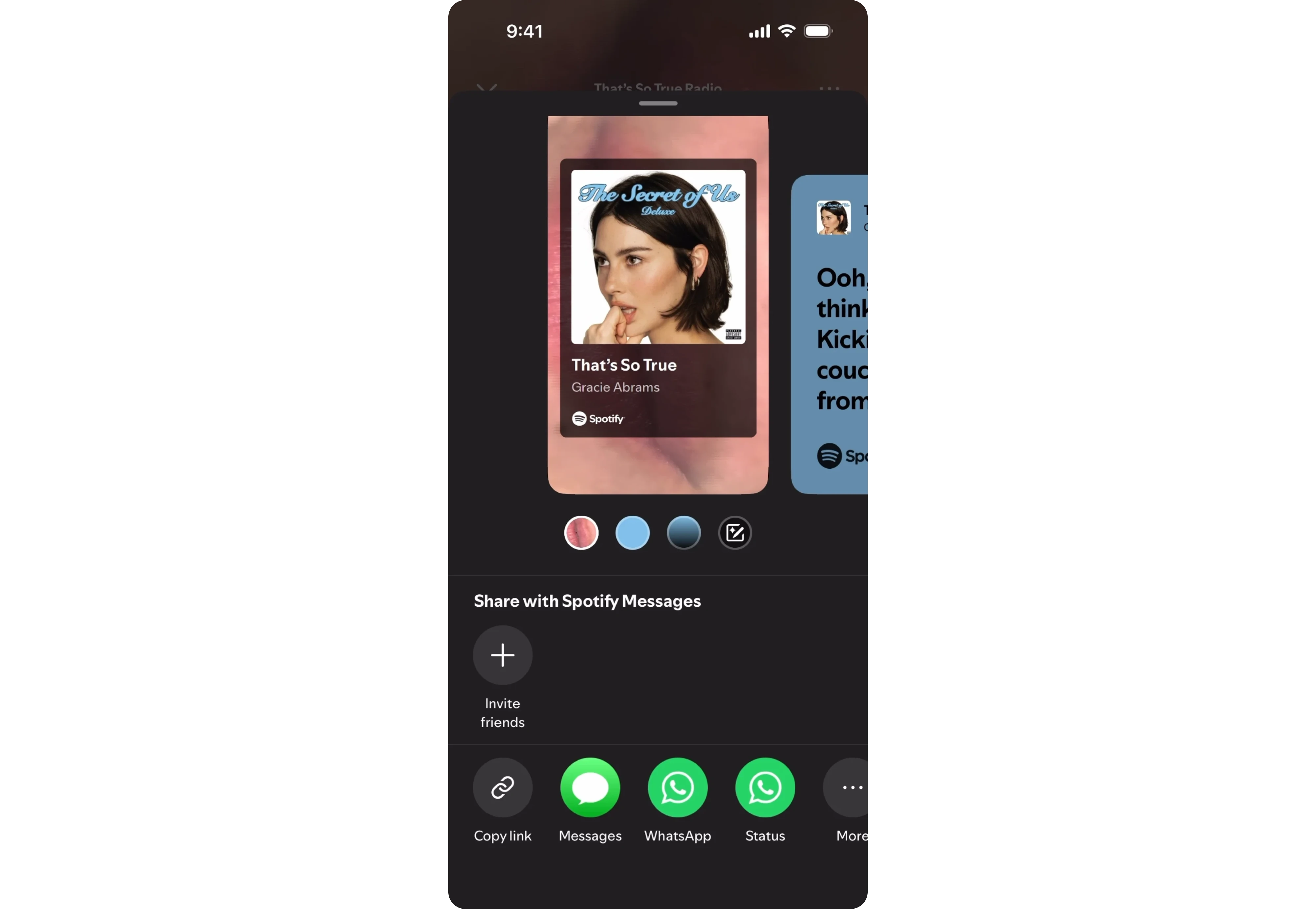
Tap Share on Instagram, X, LinkedIn, or almost any social app, and a modal bottom sheet appears with sharing options. Instead of navigating to a new screen, users can send a post to a friend, copy the link, save it, or share it elsewhere while keeping the original content visible in the background.
This works because sharing is a short, self-contained task. The dimmed background directs attention to the available actions without making users feel like they've left the post they're interacting with.
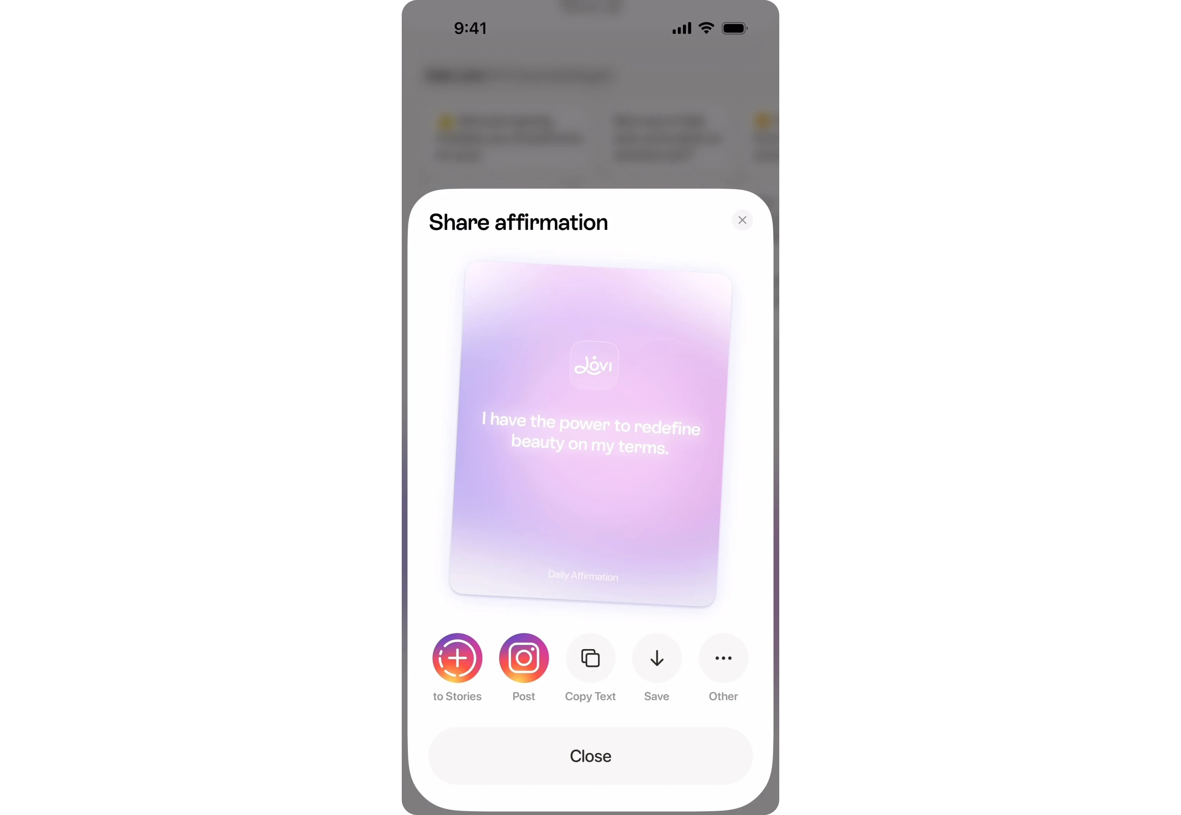
Share sheets also demonstrate an important UX principle: prioritize the most likely actions. Instagram places high-frequency actions like Stories, Post, Copy Text, and Save front and center, while less common options remain available but don't compete for attention. Users complete the common task in one tap, while power users can still access everything else.
The takeaway: Bottom sheets are ideal for quick actions that support the current task. They keep users in context, reduce navigation, and make the most important actions immediately accessible.
Mobile filters: the filter sheet
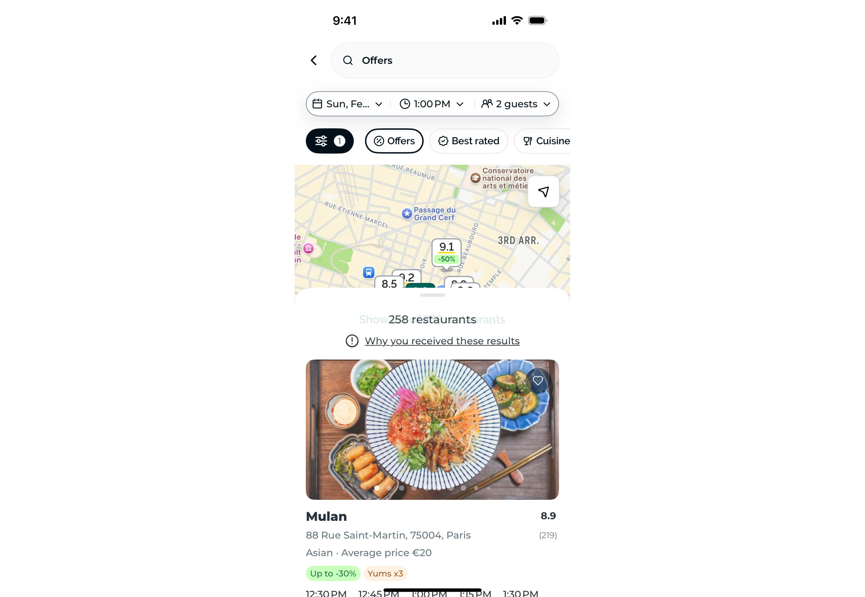
Filtering is one of the best use cases for a modal bottom sheet mobile UI. In shopping, banking, and travel apps, tapping Filters opens a temporary workspace where users can adjust multiple options without leaving the results they're browsing.
The pattern works because filtering is a short, focused task. Users make a few selections, apply them, and immediately return to the updated results. A UI bottom sheet provides enough room for controls like checkboxes, sliders, and date pickers while keeping the interaction lightweight.
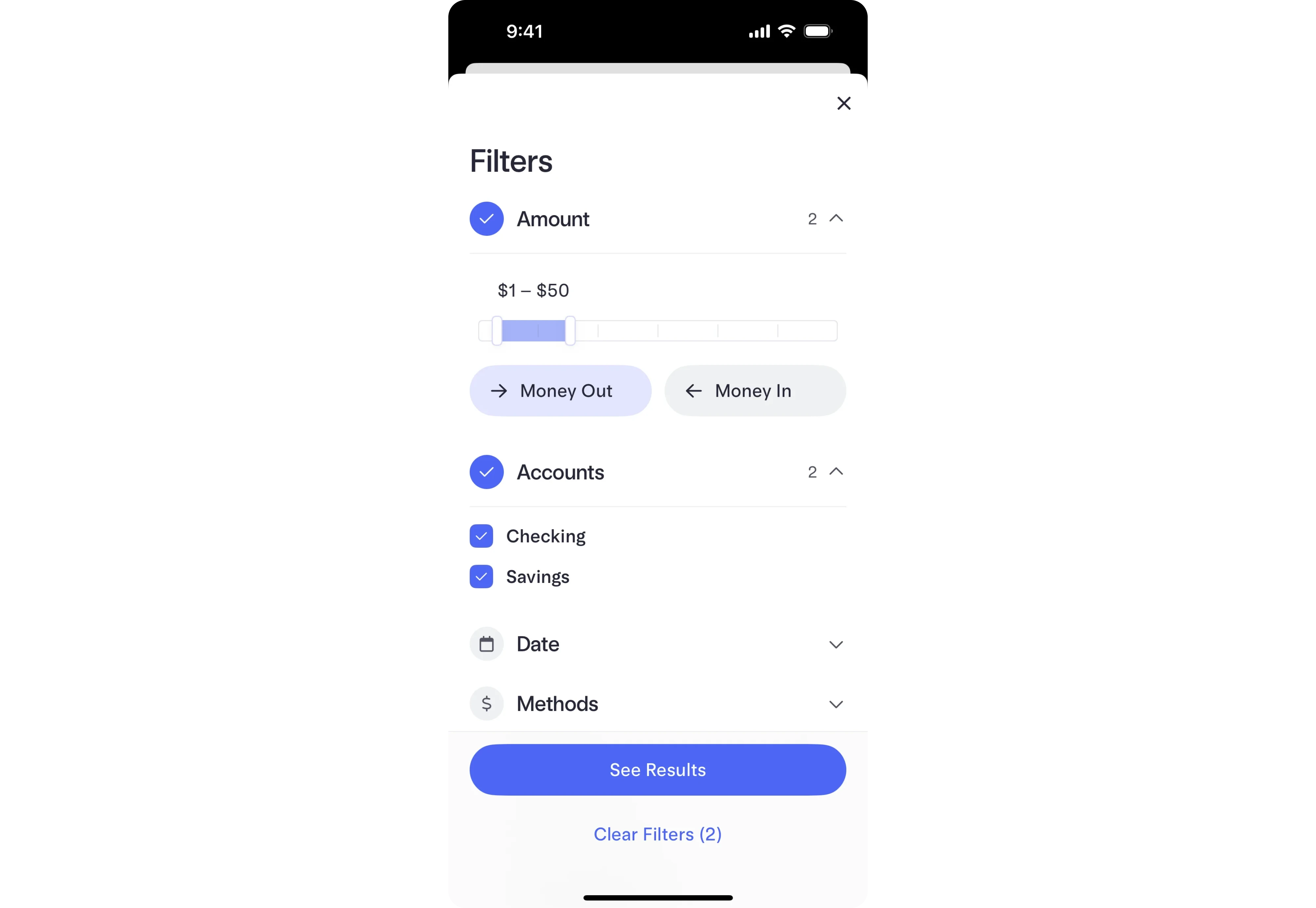
A well-designed mobile filter bottom sheet UI also makes smart use of space. Related filters are grouped into expandable sections, long lists scroll inside the sheet, and the primary action stays pinned to the bottom so it's always within reach.
One detail worth copying is live feedback. Instead of a generic Apply button, many apps update it dynamically, for example, "See 57 results." As users adjust filters, the result count changes instantly, giving immediate confidence that their selections are working before they close the sheet.
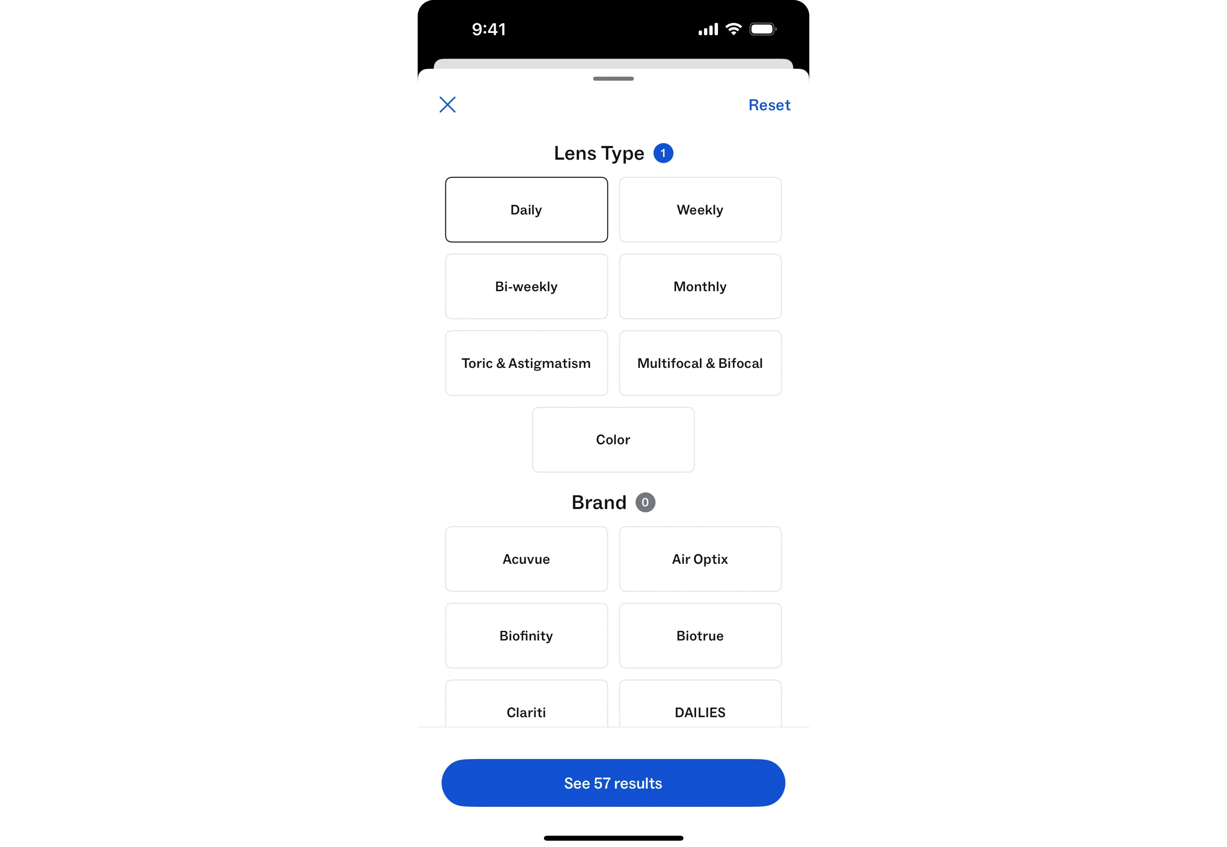
The takeaway: Bottom sheets are ideal for dense but temporary tasks like filtering. Keep the primary action fixed, organize controls into clear groups, and provide immediate feedback so users always understand the impact of their choices.
The iOS share sheet and system action menus
Here is the pattern you have copied without realizing it. The iOS share sheet, the one that appears from Safari, Photos, and nearly every app, is a mobile bottom sheet UI. So are most of the action menus that slide up when you long-press or tap a "more" button.
These have shaped user expectations so thoroughly that people now assume actions come from the bottom. That is a gift. When your action menu behaves like the system one, users know how to use it before they have read a single label. Familiarity is a feature.
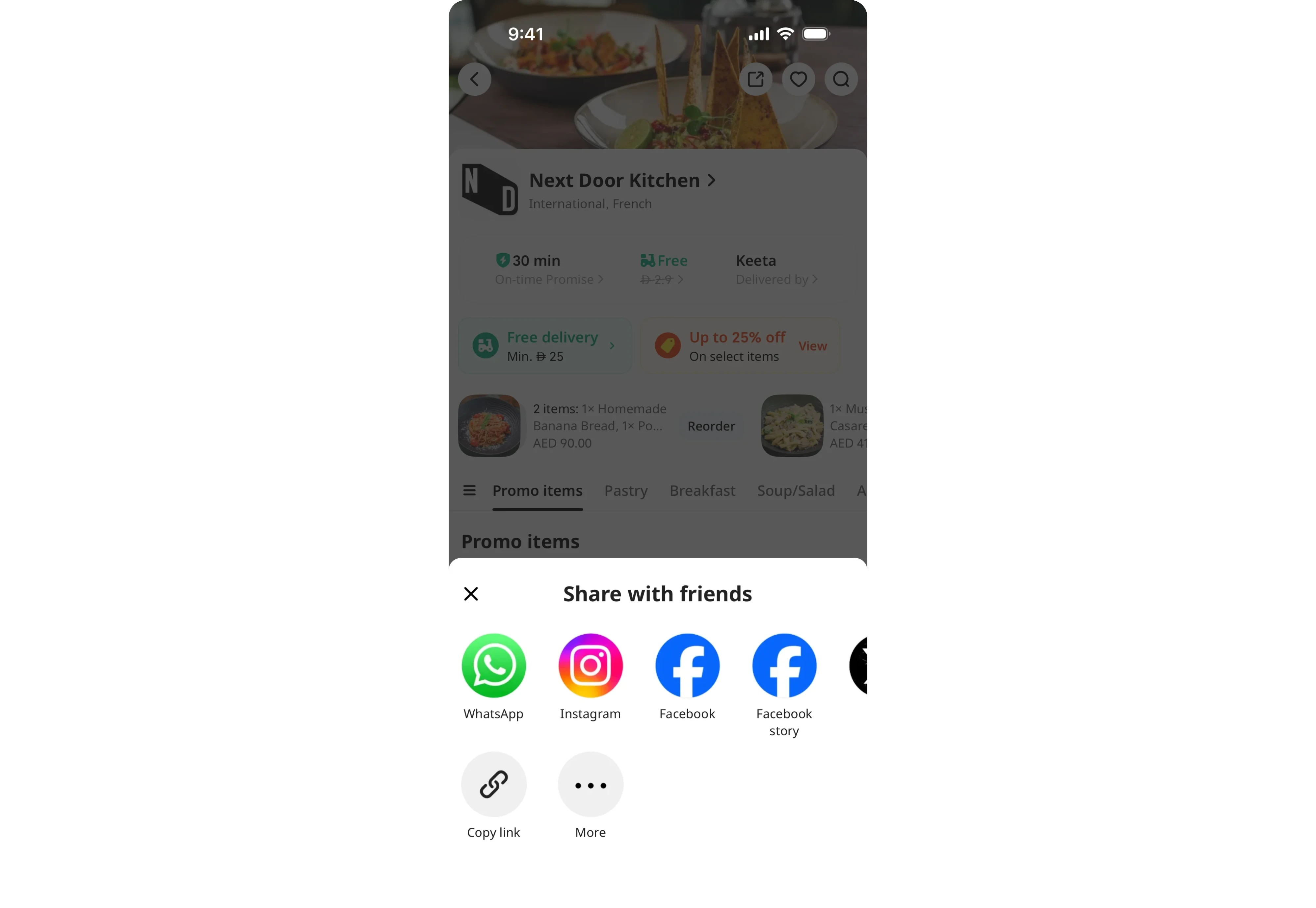
The takeaway: match the platform's native sheet behavior for menus and actions. You inherit a mental model your users already have, for free.
Ride-hailing and booking: the confirmation sheet
Open a ride or a food delivery app and the bottom sheet is often running the whole flow. Pick a destination and a sheet shows ride options and prices. Choose one and the sheet updates to confirm. Watch the driver arrive, and the sheet tracks their progress, all while the map fills the rest of the screen.
This is the non-modal sheet at its most ambitious. It is not one sheet with one job. It is a persistent surface that changes content as the user moves through steps, while the map stays visible the entire time. The context- where you are and where your ride is- never disappears.
The takeaway: a bottom sheet can carry a whole multi-step flow, as long as the content behind it (usually a map) stays relevant at every step. When context matters throughout, keep it visible and let the sheet do the talking.
Designing a bottom sheet that feels native
A well-designed bottom sheet appears at the right size, behaves predictably, and gives users exactly what they need without pulling them away from their current task.
Here's what to get right.
1. Choose the right type of bottom sheet
Different tasks call for different sheet behaviors.
- Standard sheet stays at a fixed partial height while keeping the underlying screen visible.
- Half-height sheet covers roughly half the screen, making it ideal for menus, filters, and short forms.
- Full-height sheet expands to fill the screen. At that point, ask whether it should simply become a new page.
- Expandable sheet starts compact and grows as users drag or scroll.
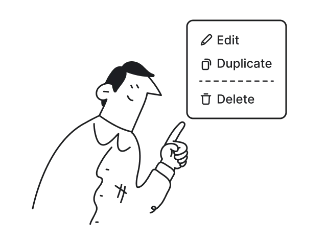
- Action sheet presents a short list of actions, such as Share or Delete, without complex interactions.
- Multi-tab sheet groups related content into tabs or segmented controls inside the same sheet.
Many apps also use a peek (collapsed) state, a partially visible sheet that hints additional content is available. Apple Maps is one of the best examples.
Regardless of the type, most bottom sheets follow the same principle: progressive expansion. Rather than opening at one fixed height, they move between predefined states. iOS calls them detents. Material UI bottom sheet design calls them snap points. Different terminology, but the same idea.
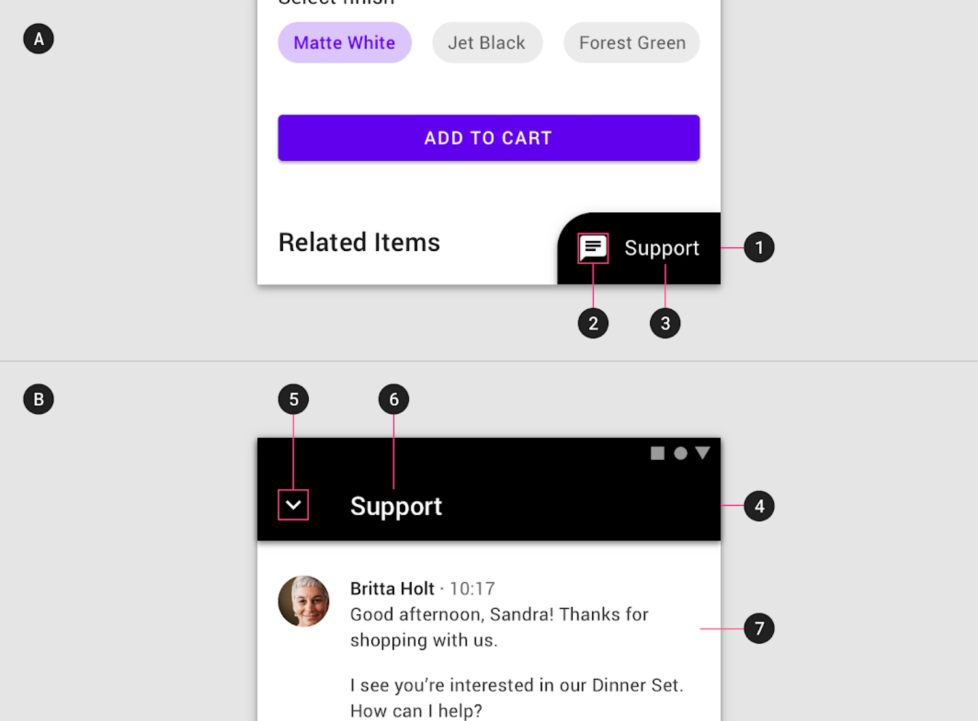
2. Design the container first
Before users read a single word, they recognize a bottom sheet UI design from its visual cues.
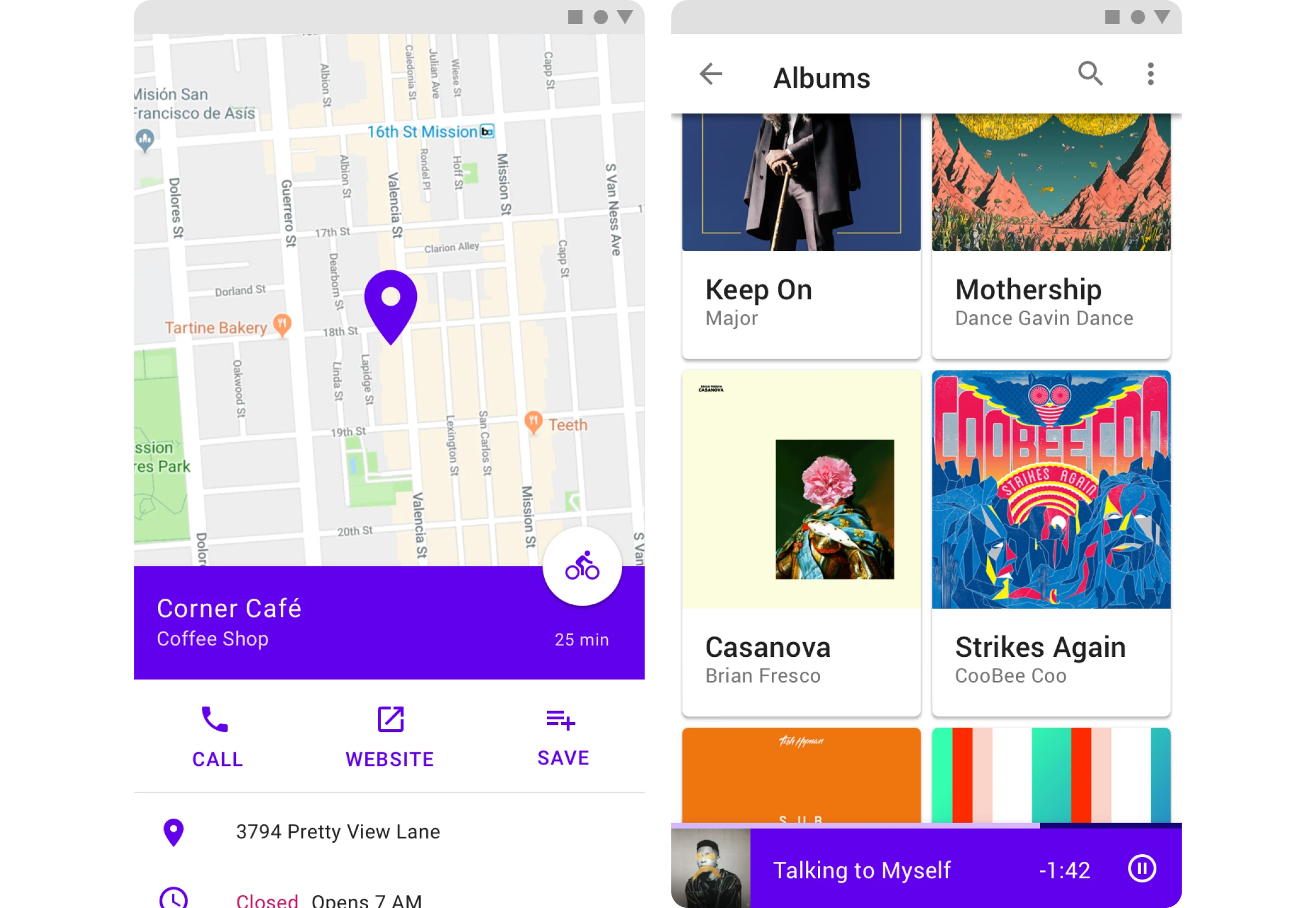
Rounded top corners, a visible drag handle, and a partially visible background communicate that this is a temporary layer, not a new screen.
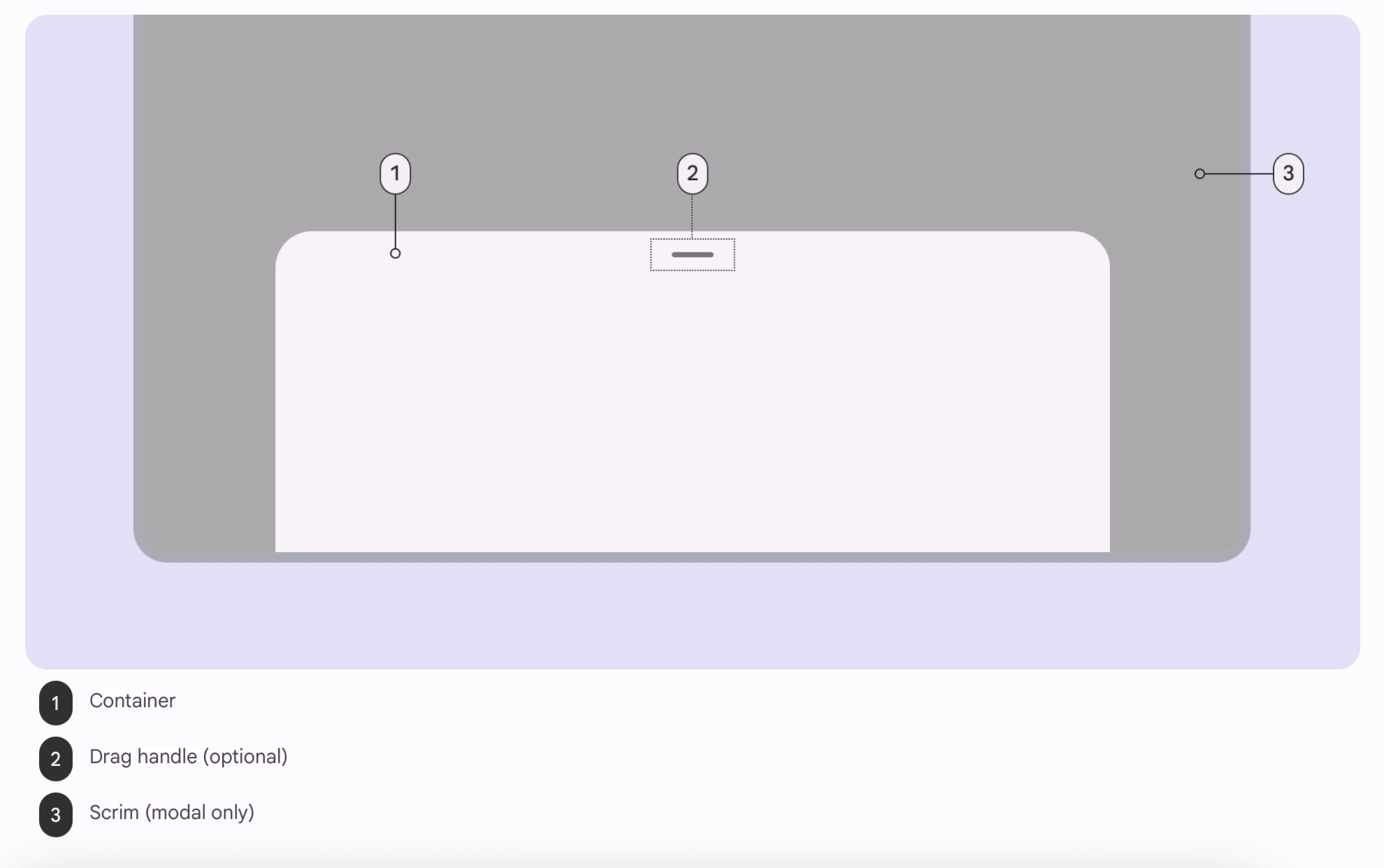
If your sheet supports dragging, include a drag handle.
If it doesn't, don't show one. A handle that doesn't move is a broken expectation.
A close button is equally important. Swipe-to-dismiss feels natural to experienced users, but many people never discover the gesture. Always provide an obvious exit.
3. Keep the content focused
Bottom sheets work best for short, focused tasks.
Inside the sheet:
- keep one clear primary action;
- separate destructive actions visually;
- use tabs or segmented controls only when switching between closely related content;
- avoid long forms whenever possible.
If content exceeds the available space, let the content scroll, not the entire sheet. Keep headers and primary actions pinned so users never have to scroll just to reach Apply or Save.
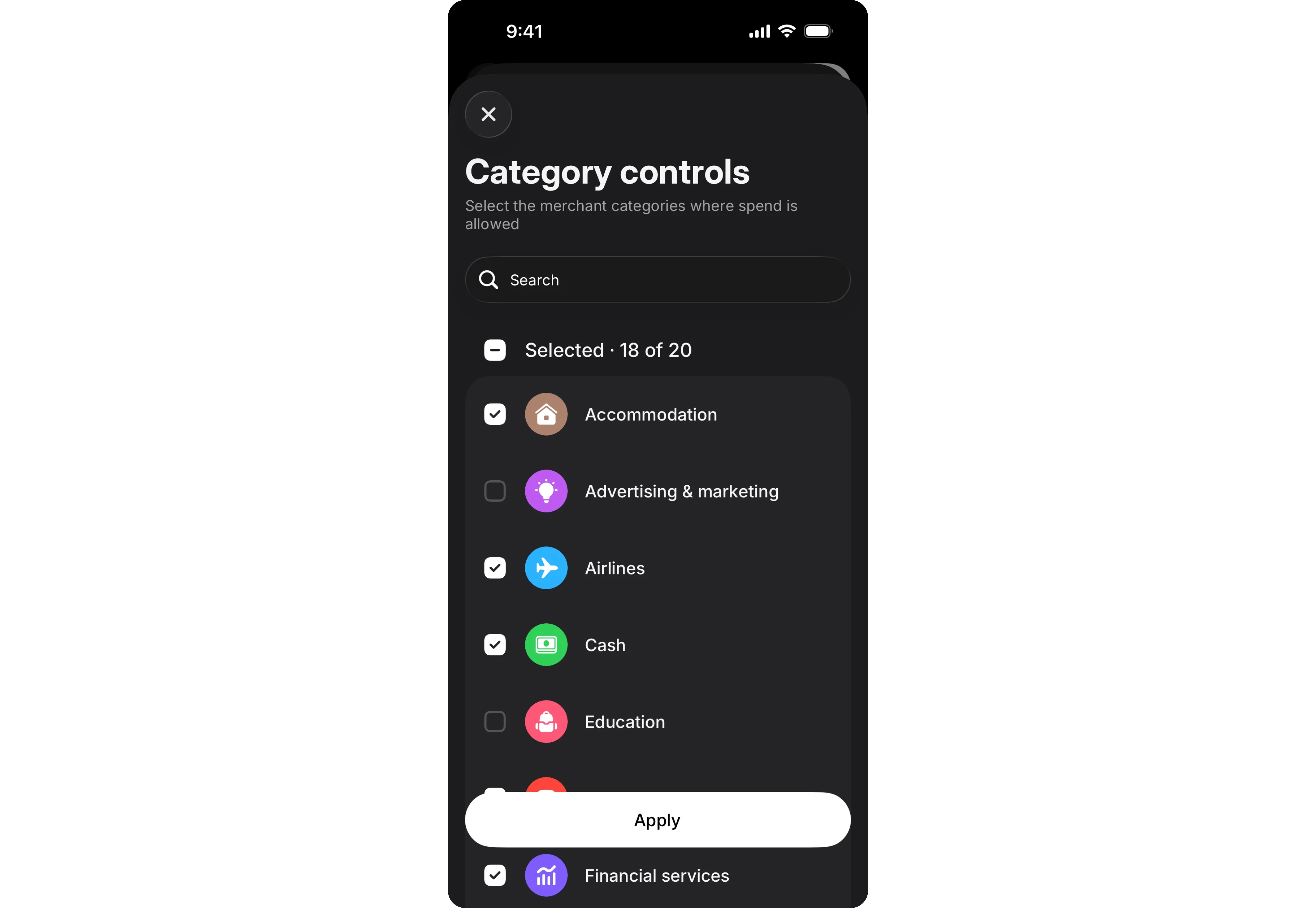
4. Design every state
A bottom sheet isn't just one screen.
Buttons, inputs, toggles, and other controls all need complete interaction states:
- default
- hover (where applicable)
- active
- disabled
- loading
- error
The sheet itself also needs consistent design tokens, such as spacing, corner radius, elevation, colors, and shadows, so it behaves like every other component in your design system instead of becoming a one-off exception.

5. Get the interaction details right
Small details make the difference between a sheet that feels native and one that feels awkward.
- Limit snap points to two or three (collapsed, medium, full).
- Make the collapsed state useful by showing a title or primary action, not just a thin strip.
- Support both swipe-to-dismiss and a visible close button.
- For modal sheets, let users dismiss by tapping the scrim.
Motion matters too. A good bottom sheet follows the user's finger, slows naturally, and settles into place. One that jumps abruptly or lags immediately feels off.
6. Don't forget accessibility
Bottom sheets should be just as usable with assistive technologies.
Make sure modal sheets:
- trap keyboard and screen-reader focus,
- announce themselves when opened,
- return focus to the triggering element when dismissed,
- maintain minimum tap targets (44×44 pt on iOS, 48×48 dp on Android).
Because bottom sheets sit near the bottom of the screen, they're naturally thumb-friendly, but always verify that important actions remain reachable on real devices.
Test on a real phone
A bottom sheet that feels perfect in Figma can feel completely different in your hand.
Thumb reach, drag sensitivity, keyboard behavior, and scrolling are difficult to judge in static mockups. Before shipping, test on real devices to make sure the interactions feel as natural as they look.
What developers wish designers knew
Many bottom sheet issues appear during implementation. Understanding a few common engineering challenges makes handoff much smoother.
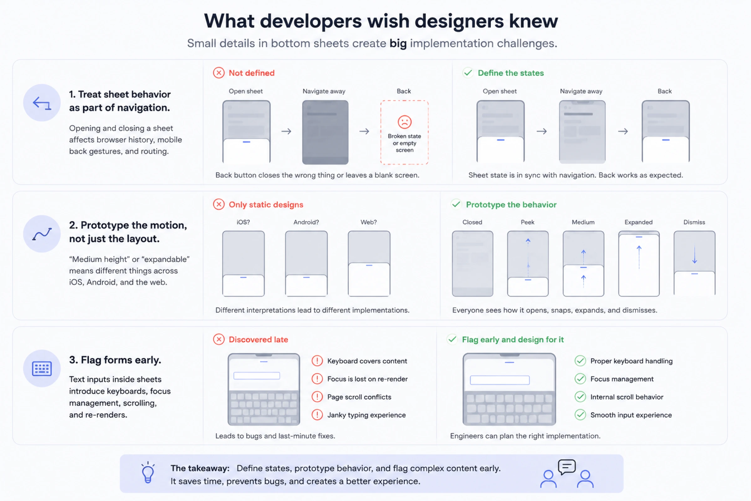
- Treat sheet behavior as part of navigation.
Opening and closing a sheet affects browser history, mobile back gestures, and routing. If these states aren't clearly defined, users can end up with broken back-button behavior or empty screens after navigating.
- Prototype the motion, not just the layout.
Specs like "medium height" or "expandable" mean different things across iOS, Android, and the web. Instead of describing motion in words, prototype how the sheet opens, snaps, expands, and dismisses.
- Flag forms early.
Bottom sheets containing text inputs are significantly more complex than they appear. Keyboards, focus management, scrolling, and re-rendering can all affect the interaction. Calling these cases out during design gives developers time to plan around them instead of discovering issues during implementation.
Implementing bottom sheet UI: Material, shadcn, and Expo
Most design systems and frameworks ship a bottom sheet, and it helps to know how each thinks about the component so your designs hand off cleanly.
Material
Material Design treats bottom sheets as first-class bottom sheet UI components, split into standard and modal (plus the expanding type in Material 3). The mental model matches everything above: standard sheets coexist with the screen and skip the scrim, modal sheets sit on top and block interaction.
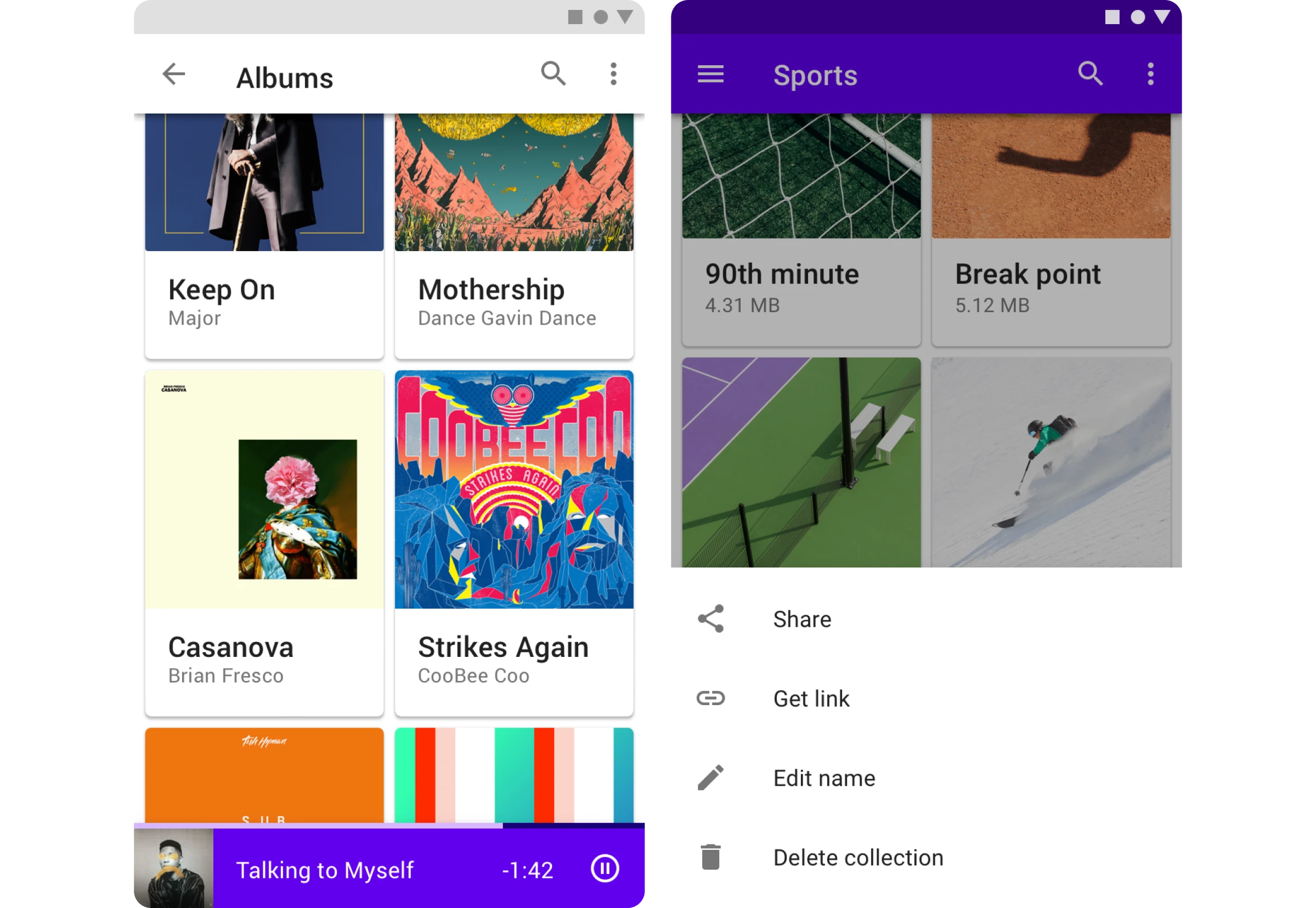
If your team is on Android with Jetpack Compose, the modal version is a ModalBottomSheet you show and hide with sheet state, and it behaves much like a dialog.
One detail worth knowing as a designer: Material caps the initial height of a modal bottom sheet at 50% of the screen, and content taller than that expands to full height and scrolls internally. So design your peek and your first snap point with that ceiling in mind. It is a constraint, but a sensible one.

Shadcn UI bottom sheet
On the web, the shadcn UI bottom sheet is the Drawer component, and it is built on top of Vaul, a lightweight drawer library by Emil Kowalski. It gives you touch-friendly dragging, swipe-to-dismiss, snap points, and background scaling out of the box, all styled with Tailwind so you are not fighting the component's own CSS.
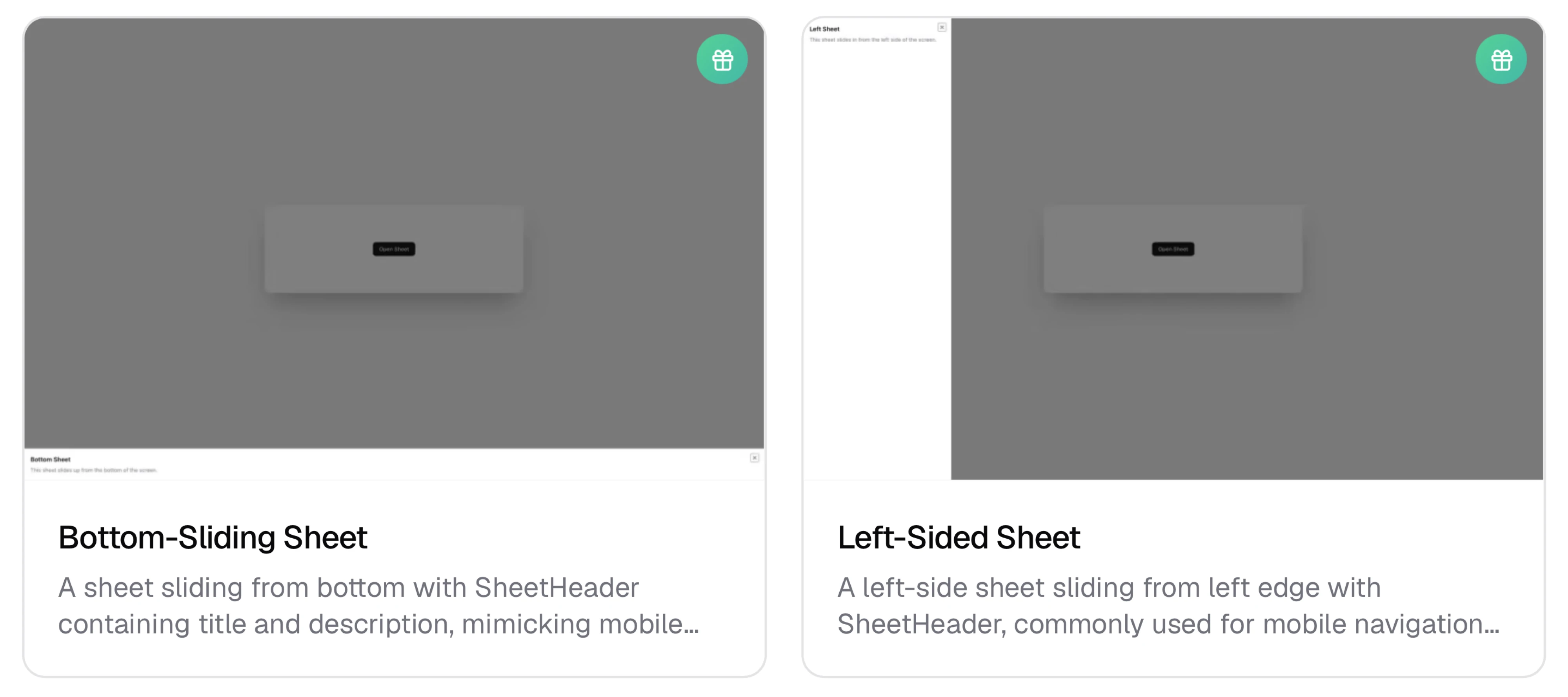
The pattern shadcn is best known for is the responsive one. You render a centered Dialog on desktop and a Drawer that slides up from the bottom on mobile, from essentially the same content. That is the cleanest answer to the "bottom sheets feel weird on desktop" problem: use a sheet where it fits and a modal where it does not. The Drawer also supports a direction prop, so the same primitive can slide from the bottom, top, or sides if you need it to.
Expo UI bottom sheet and React Native
For React Native and Expo, bottom sheets are gesture-driven and feel wonderfully native when done well. The Expo UI bottom sheet and popular libraries like gorhom's bottom-sheet handle the hard parts: the pan gestures, snap points, and smooth spring animations, so you can focus on content.
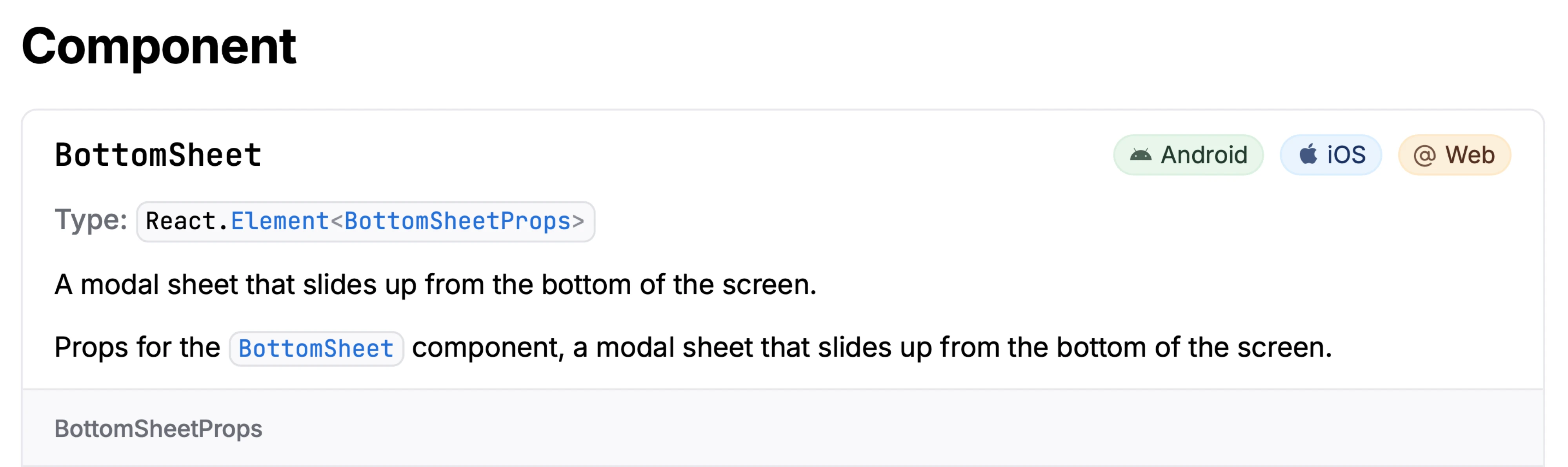
Because these are built on native gesture handling, they feel closer to the system share sheet than anything you would get from a web view. If your product is a real mobile app rather than a responsive site, this is usually where you want to be. Design with snap points and a clear peek height, same as everywhere else, and let the library do the physics.
Across all three, notice the shared vocabulary: snap points, peek height, drag handle, modal versus standard. Learn the concepts once, and they transfer between every framework you will touch.
The use-it-or-skip-it decision guide
For each common case, there's one clear reason tied to context, risk, or dismissal behavior.
The pattern across the whole table is this: the more the action costs to get wrong, the harder the sheet should be to dismiss, until eventually the sheet isn't the right container at all.
When a bottom sheet is the right call
A bottom sheet is an interaction pattern designed for one purpose: letting users complete a task without losing their place.
Use one when people need quick actions, lightweight forms, filters, or supporting information while staying connected to the screen they're already using. Choose a modal sheet when the task requires focus. Choose a non-modal sheet when users should keep interacting with the content behind it.
The details matter just as much as the pattern itself. Clear snap points, smooth gestures, pinned actions, accessible interactions, and thoughtful prototypes are what make a bottom sheet feel native instead of awkward.
If you're unsure which pattern fits your product or want to make sure it behaves as well as it looks, we can help. At Eleken, we help SaaS teams design interfaces that feel intuitive from the first tap, turning UI patterns into experiences users don't have to think about.


.webp)
.webp)

.png)