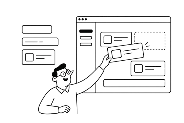


As SaaS products grow, so do their interfaces. New features bring new screens, and without shared design rules, buttons start looking different, developers rebuild the same elements, and small updates create unnecessary rework.
Component-driven design helps prevent this by building interfaces from reusable components rather than designing every screen from scratch.
In this guide, we'll explain how the approach works, how it connects design and code, and how SaaS teams can use it to scale without accumulating design debt.
Understanding component-based design
Component-driven design (CDD) is an approach to building interfaces from reusable, modular components, such as buttons, forms, navigation menus, and data tables.
Unlike page-based design, where teams create each screen separately, CDD starts with reusable components that work much like Lego bricks: teams can combine the same elements in different ways to create new interfaces. For example, a SaaS product can use one configurable data table across its analytics, billing, and customer management pages.
Why component-driven UI design matters

- Consistency: Shared components keep UI patterns uniform across screens.
- Scalability: New features can reuse existing elements.
- Efficiency: Teams spend less time designing and coding repeated patterns, helping them deliver new features faster.
- Easier maintenance: Updating one component can update every screen that uses it.
CDD also supports Agile, DevOps, and continuous design. Unlike traditional waterfall workflows, where design and software development happen in sequence, teams can integrate component testing and refinement into the development process alongside ongoing feature releases.
The approach works with React, Vue.js 3, Angular, Next.js, and Drupal 8. It also connects design systems, which define shared UI rules, with component-driven development, which implements reusable elements in code.
What happens without CDD?
Without reusable UI components, SaaS teams introduce inconsistent buttons, forms, and layouts sprint after sprint. This creates design debt: duplicated UI patterns that slow development, complicate maintenance, and increase rework as the product grows.
Why page-first design struggles to keep up with SaaS development
Page-first design made sense when products followed the waterfall model: define requirements, design complete screens, develop them, test, and release. But SaaS products rarely stay unchanged long enough for that process to work smoothly.
Agile and DevOps help teams release features quickly, but each new screen can introduce another variation of an existing UI element. Over time, even small design updates become harder to manage.
Modular UI design design addresses this by making UI elements reusable across releases. It changes how teams work:
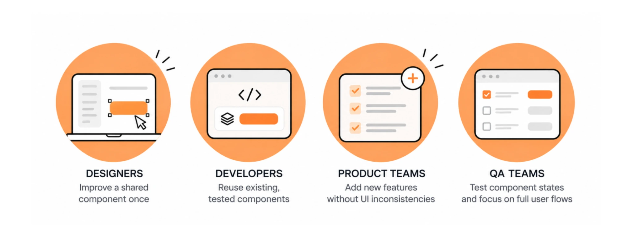
- Designers can improve a shared component once instead of updating it across dozens of screens.
- Developers can reuse existing components that have already been tested rather than rebuilding familiar patterns.
- Product teams can introduce new features without adding unnecessary UI inconsistencies.
- QA teams can test component states independently and focus more attention on complete user flows.
The practical advantage becomes clear when requirements change. If a SaaS team needs to update every form field after usability testing, a shared component makes that change far easier than editing each form separately.
Component-based UI design doesn't eliminate rework, but it helps prevent routine product changes from turning into large-scale interface cleanup.
Brief look into principles, structure, and rules of CDD
Reusing UI elements is a good start, but it doesn't guarantee a consistent interface. Components also need clear responsibilities, predictable behavior, and shared design rules.
The 6 principles behind component-driven design
Six principles help teams achieve this:
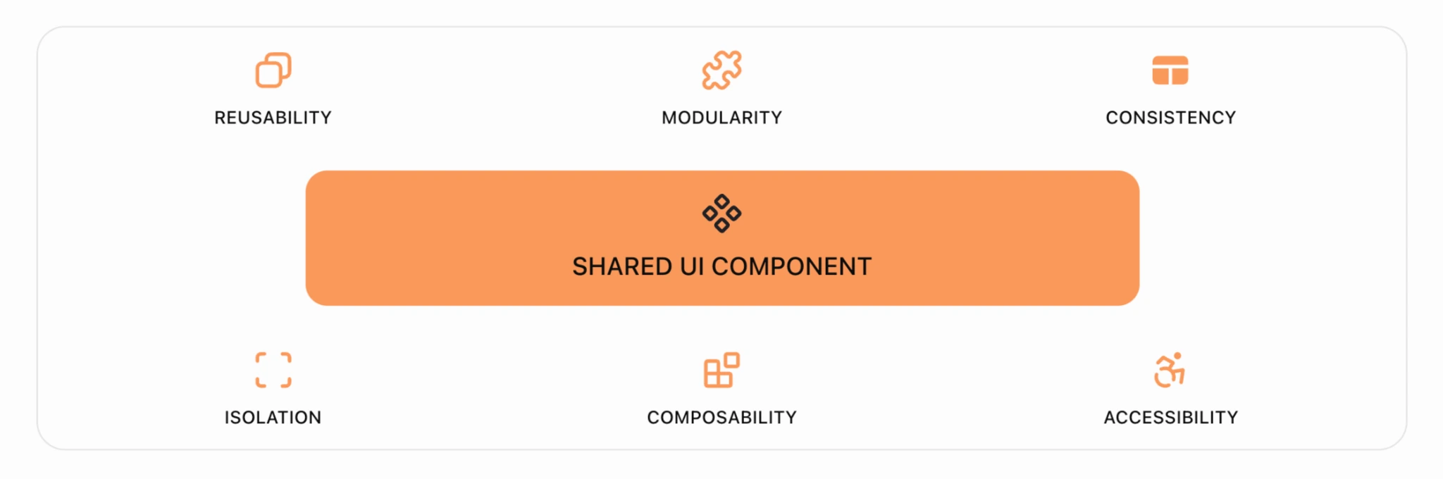
- Reusability: Use the same components across different screens instead of rebuilding them.
- Modularity: Give each component a clear purpose so it can be updated independently.
- Consistency: Apply shared styling and interaction rules across the product.
- Isolation: Design and test components before integrating them into complete screens.
- Composability: Combine smaller components into larger patterns, such as a filterable data table.
- Accessibility: Build keyboard navigation, focus states, and appropriate labels into reusable components.
These principles guide how components are built. But as the library grows, teams also need a way to organize them.
The structure: organizing components with atomic design
Web designer and design systems consultant Brad Frost introduced atomic design to help teams structure interfaces from small elements to complete pages. Inspired by chemistry, the methodology organizes interfaces into five levels, starting with base components and gradually combining them into complete pages:
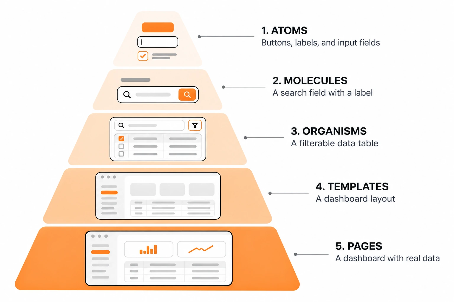
- Atoms: Buttons, labels, and input fields.
- Molecules: A search field with a label.
- Organisms: A filterable data table.
- Templates: A dashboard layout.
- Pages: A dashboard populated with real data.
This atomic design components structure helps teams organize UI elements into reusable building blocks and understand how they fit together. For example, adding a new reporting page becomes easier when its tables, filters, and inputs already exist as components.
However, organizing components doesn't automatically keep them consistent. They also need shared rules for styling and behavior.
The rules: design tokens, states, and responsive behavior
Once components are organized, teams need to define how they look and behave across different screens. Three things matter:
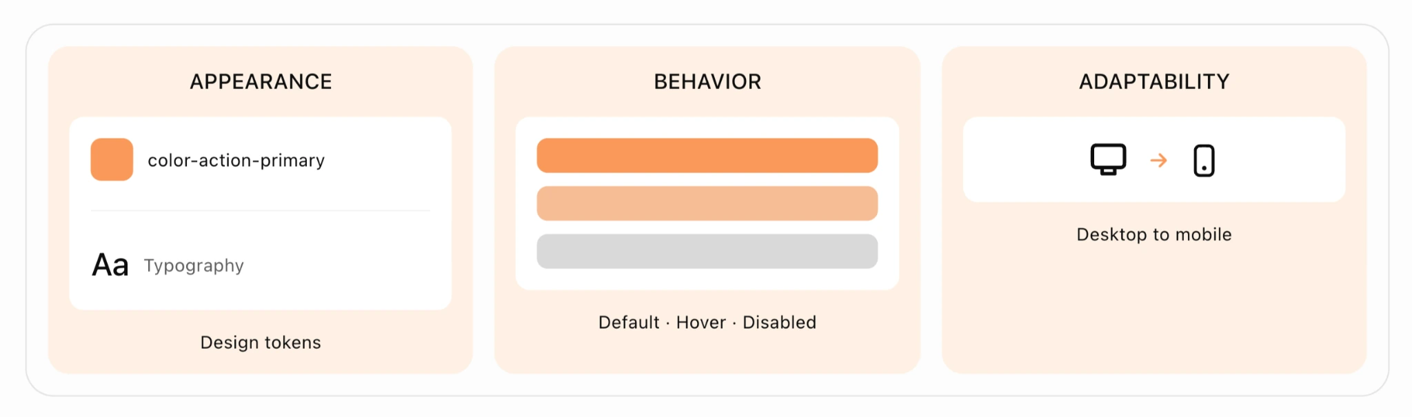
- Appearance through design tokens. Tokens define shared colors, spacing, typography, and other visual properties, helping maintain brand consistency across the product. For example, color-action-primary describes a color's purpose rather than its value. If the brand palette changes, teams can update the token instead of adjusting every component individually.
- Behavior through component states. Each interactive component needs documented states, such as default, hover, active, disabled, loading, and error. This prevents developers from implementing different behaviors for the same element across screens.
- Adaptability through responsive rules. Components should have defined behavior across screen sizes. For example, a data table might display all columns on desktop but use horizontal scrolling or fewer columns on mobile.
These rules also make broader design changes easier. When Eleken redesigned Newton360, a workforce management app for emergency medical services teams, the product had multiple user roles and no established SaaS design system.
Our designers created shared tokens for colors, typography, spacing, and borders, making it easier to update components across the interface.
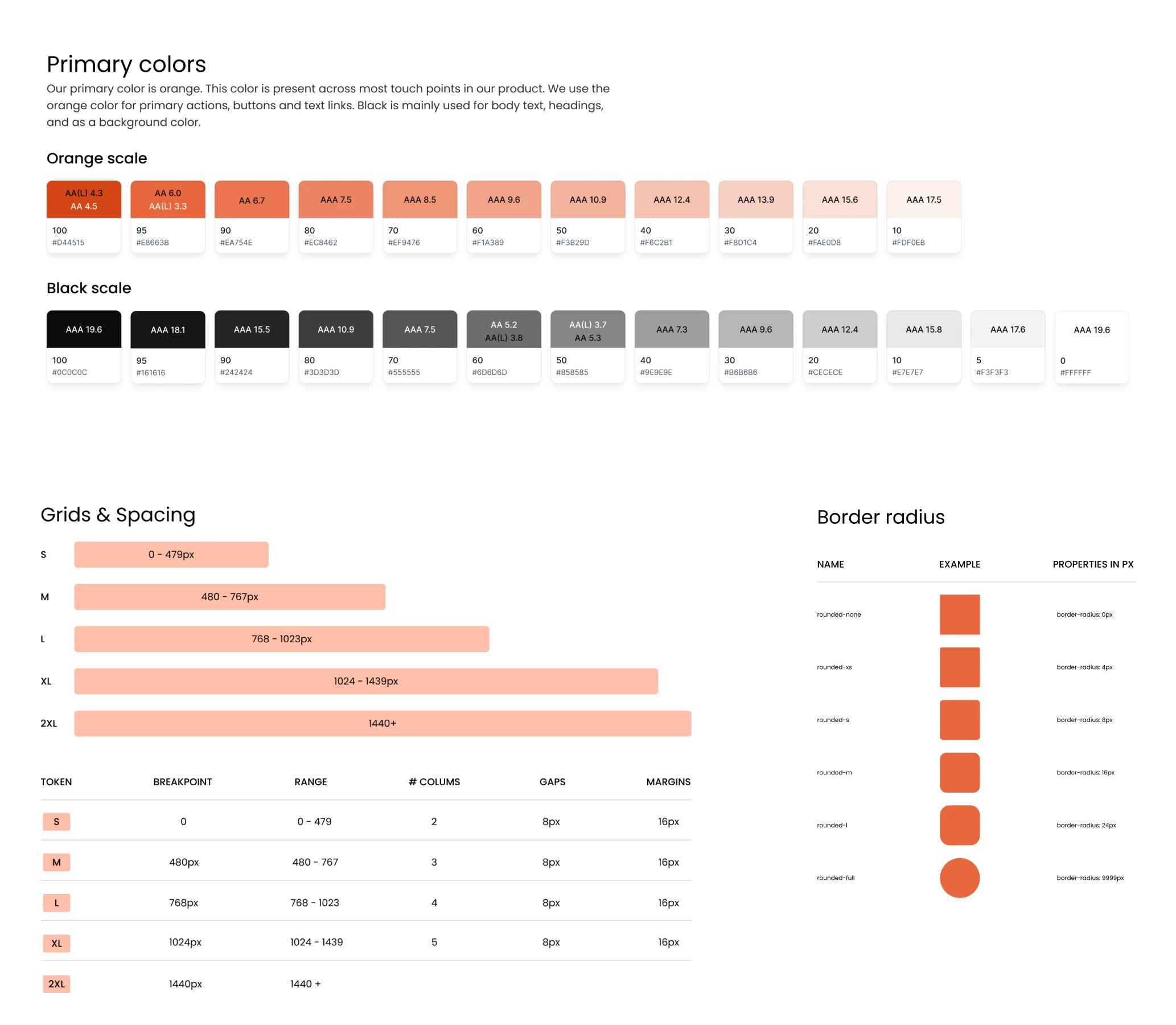
When the client later requested a light theme alongside the dark one, the team used Figma variable modes to assign new color values instead of redesigning every screen. Switching between themes then took one click.
With shared design foundations already in place, adding another theme simply required updating variables instead of rebuilding the interface.
How to implement and maintain component-driven design
You don't need a complete component design system to start using CDD. Teams can begin with recurring UI patterns, build reusable design components around them, and expand the library as the product grows.
Here's what that process looks like, including the tools and practices that support each stage.
1. Understand the product and audit existing design system components
Before building or updating components, assess the product's needs and existing UI. Focus on four key areas:
- Understand the product context. Interview stakeholders to clarify business goals, user needs, and technical constraints. Review the content inventory, sitemap, and key user flows to understand how the product is structured.
- Define success metrics. Identify relevant KPIs, such as user activation, task completion rates, or feature delivery speed, to guide priorities and measure improvements.
- Audit existing UI components. Review buttons, forms, tables, navigation, and other recurring elements. Look for duplicates, inconsistent styling, and components that serve the same purpose but behave differently.
- Establish shared design rules. Use the audit findings to define naming conventions, design tokens, component states, and usage guidelines before implementation begins.
This groundwork helps teams identify which components can be reused, which need improvement, and where new components are necessary.
2. Build reusable components and coordinate development
Designers can use Figma to create reusable UI component designs and document their variants. Developers can then implement those patterns using an existing UI library or custom components.
Different tools support different parts of the workflow:
Teams don't need every tool from the start. A small SaaS team might begin with Figma, an existing UI library, and GitHub, then add Storybook or Chromatic as its component library becomes more complex.
Meanwhile, frontend and backend developers can work in parallel. Clients can review and approve interface components before backend development is complete, allowing design feedback to be addressed without waiting for the entire application.
3. Test accessibility, usability, and performance
Test components individually and within complete user flows before releasing them.
Focus on three areas:
- Accessibility: Aim for WCAG 2.1 AA compliance, including keyboard navigation, visible focus indicators, and properly labeled controls.
- UI quality: Check responsive layouts, component states, and visual regressions.
- Performance: Use Lighthouse and Core Web Vitals to identify loading and interaction issues.
Google's recommended Core Web Vitals thresholds for a good user experience are:
Performance budgets can help teams catch regressions before release. Older tools such as grunt-pagespeed and gulp-sitespeedio supported automated checks, while maintained Lighthouse-based CI workflows are another option.
4. Keep the component library manageable
As the system grows, maintaining components becomes as important as creating them.
Large Figma libraries with deeply nested elements and extensive variants can become difficult to edit and publish. In a Reddit industry discussion about design systems, one practitioner reported that complex form controls could exhaust Figma's 2 GB memory allocation per file.

On a small team or project it won’t matter, but on a larger design system you can very quickly get to a point where a couple form controls can max out the 2 gigs of memory Figma allocates per file.

To keep the library usable:
- Limit unnecessary variants. Create variants for meaningful differences in appearance or behavior.
- Manage dependencies. Avoid excessive nesting that makes updates difficult to track.
- Split libraries when necessary. Some teams maintain individual components in separate Figma libraries to simplify updates, although this approach isn't suitable for every system.
After release, monitor errors, performance, and user behavior. When a shared component changes, review its impact across the product and remove outdated variants.
5. Validate the approach before a full redesign
For SaaS teams considering external design support, a smaller engagement can help validate the direction before committing to a larger project.
For example, at Eleken, we offer a three-day free trial where our designers work on one or two real product screens. This gives SaaS teams a chance to see how we approach their specific design challenges, explore potential improvements, and experience our collaboration process firsthand before committing to a larger project.
How to keep Figma and production code from drifting apart
A shared component library doesn't help much if designers and developers use different versions of it. A designer might update a form field in Figma while developers continue using the old component in production. After several releases, the design files no longer reflect what users actually see.
Preventing this requires more than a detailed handoff. Teams need a process for keeping design decisions and code aligned as components evolve.
Create a shared reference for design and development
The goal isn't to make Figma and code identical. It's to ensure both follow the same component specifications.
A practical setup includes:
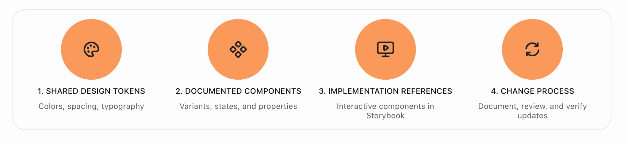
- Shared design tokens. Define colors, spacing, typography, and other values centrally. Tools like Tokens Studio and Style Dictionary can help teams transfer these decisions into code.
- Documented components. Keep Figma variants aligned with coded component properties, including states, responsive behavior, and accessibility requirements.
- Accessible implementation references. Use Storybook to show how components actually behave in the browser, rather than relying on static mockups.
- A process for changes. When a component is updated, document what changed, review the implementation, and check which screens might be affected.
This gives designers and developers a common language for UI decisions, reducing the need to manually compare every screen after each release.
Use tools to reduce handoff guesswork
Different tools address different parts of the workflow:
- Figma Dev Mode helps developers inspect designs, measurements, and component details.
- UXPin Merge allows teams to design with components connected to a code library.
- Zeplin organizes design specifications and handoff documentation.
- Storybook shows the implemented components and their supported variations.
These tools don't automatically solve design-to-code mismatches. They work best when teams agree on component ownership, naming conventions, and how updates are communicated.
How component-driven design supports real SaaS products
Although the implementation process may be similar across products, but the challenges it addresses differ.
At Eleken UI/UX design agency, we've worked with SaaS companies facing a wide range of product design challenges, from managing complex user interfaces to improving critical user flows. Our work on different products shows how component-driven design can be adapted to address specific needs and support broader product goals.
Webcrumbs: building a reusable foundation for a complex product
Webcrumbs is an AI-powered frontend development product that lets users generate and work with UI components.
Eleken developed a unified visual identity and reusable UI kit, bringing design consistency and clarity to the interface while establishing patterns that support future development.
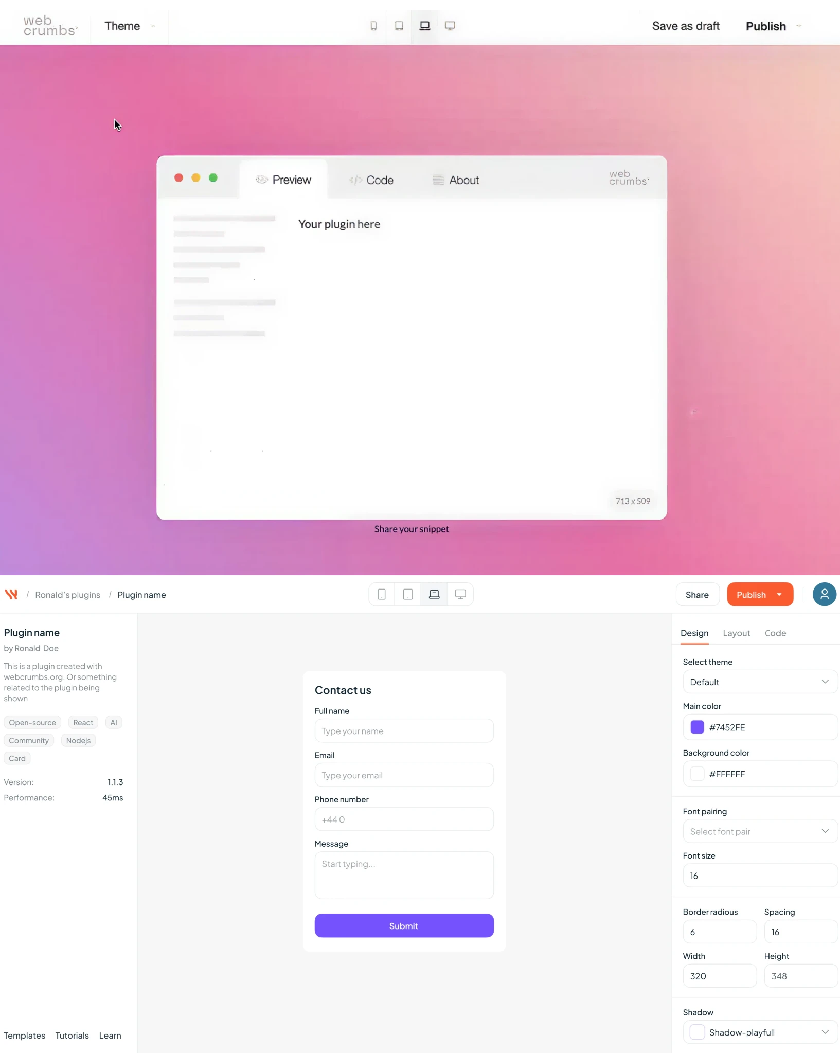
The design work also helped Webcrumbs present a polished, cohesive product at launch. Webcrumbs later earned Product of the Day and Product of the Week recognition on Product Hunt, attracting over 1,200 organic upvotes without advertising spend.

While design wasn't the only factor behind this reception, it contributed to how the product was presented and experienced. By creating a reusable UI kit, Eleken helped Webcrumbs deliver a polished, consistent experience at launch while laying the groundwork for more efficient development as the product grows.
MyInterview: improving a critical user flow
MyInterview, a video interviewing platform, was struggling with a 90% mid-interview candidate dropout rate, making usability a critical concern.
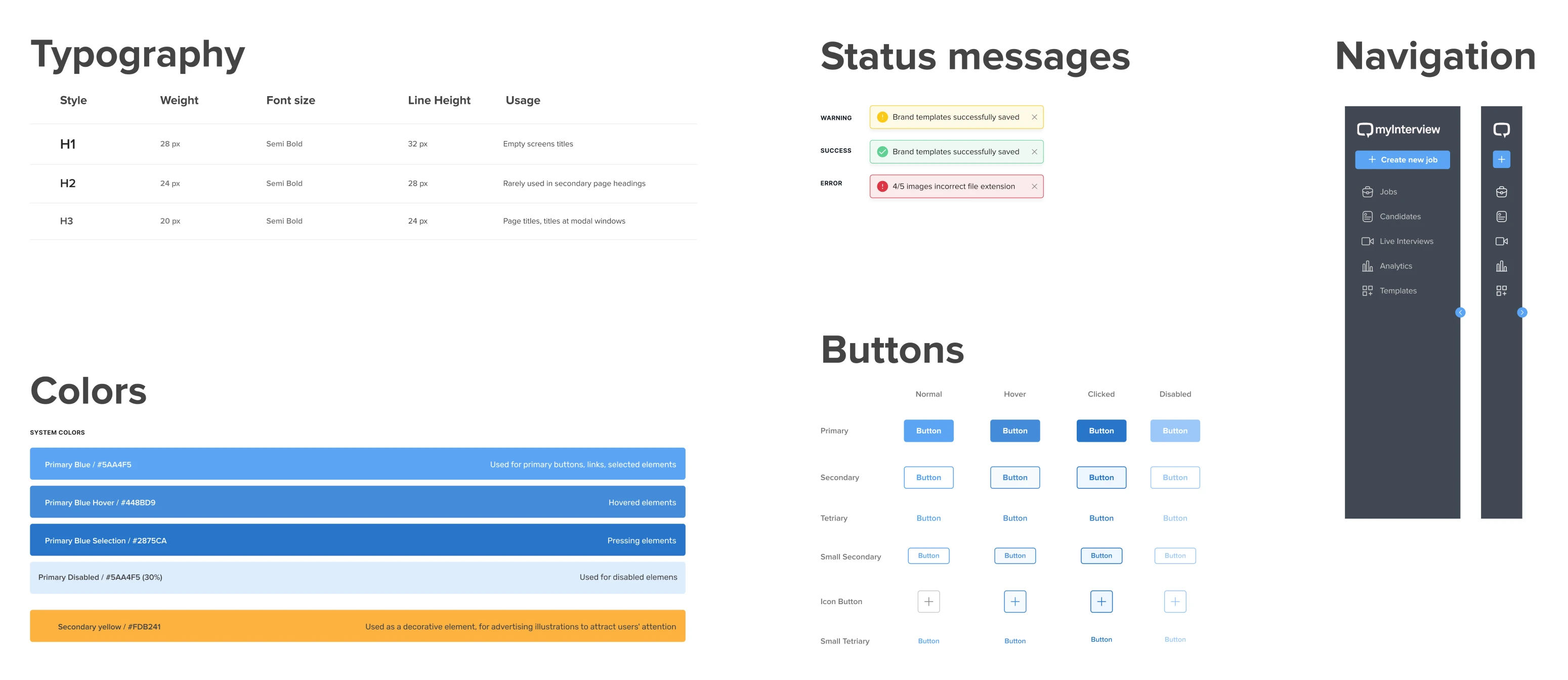
To address issues in the interview flow, Eleken redesigned input patterns and created a component-based design system that brought greater consistency to the candidate experience.
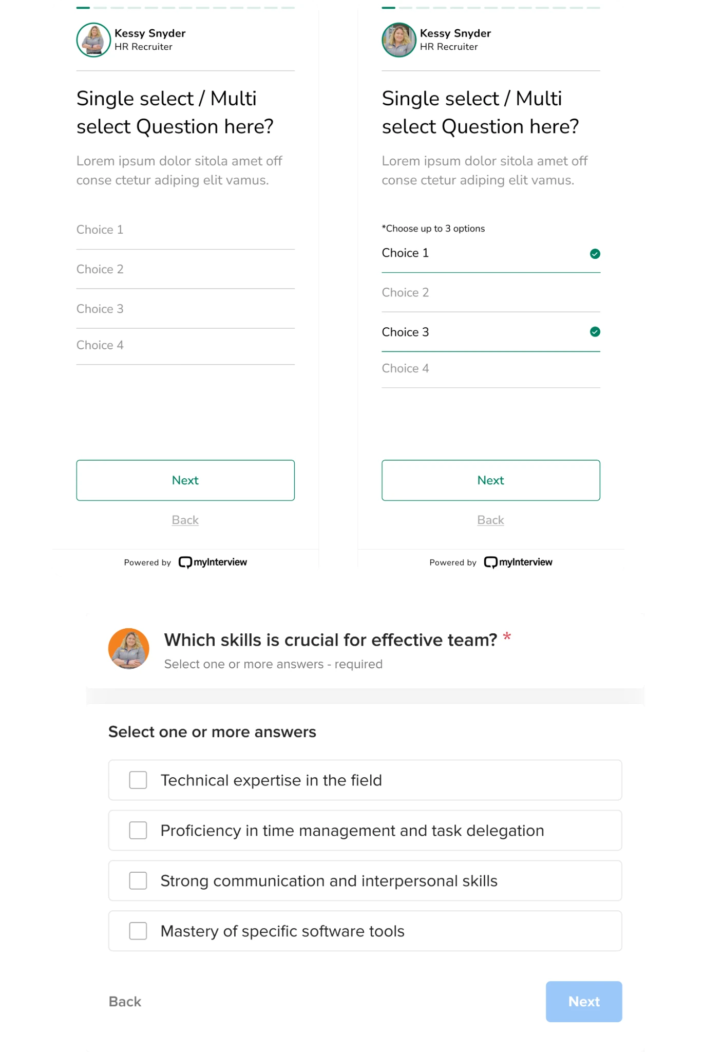
The component library supported the broader UX redesign, providing reusable interface elements that made the interview flow more consistent and easier to maintain.
PayUp: building a design system for faster scaling
PayUp needed a flexible design system that would help the team scale the product and introduce new features without slowing down development.
Eleken created a well-structured system of reusable UI components, giving the team consistent design patterns they could apply across the platform. This reduced the need to design familiar elements from scratch and made it easier to update the interface as product requirements changed.
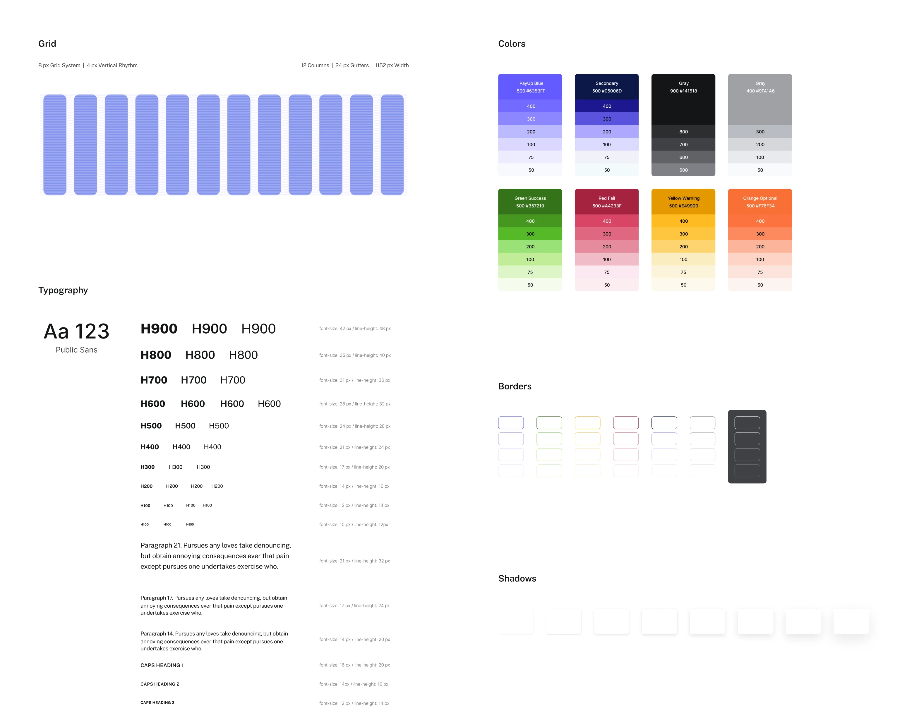
As a result, PayUp gained a scalable design foundation that supports faster iterations, more consistent user experiences, and smoother development as the product grows.
Across these projects, reusable components served different purposes, from establishing a consistent UI foundation to improving critical user flows. Their value comes from how they're applied to each product's needs.
Is component-driven design the future?
As SaaS products grow, keeping interfaces consistent while releasing new features becomes increasingly challenging. Component-driven design helps teams manage that complexity by making UI elements easier to reuse, update, and maintain.
New tools and techniques are making this approach even more practical:
- UI kits and design tokens give teams a shared foundation, so changes to colors, styles, or components don't require updating every screen manually.
- CSS container queries let components adapt to different layouts, making it easier to reuse the same elements across dashboards, settings pages, and other parts of a product.
For SaaS businesses, the value goes beyond a consistent interface:
- Developers spend less time rebuilding familiar elements
- Designers can make changes across multiple screens more efficiently
- Teams can launch new features without creating unnecessary design debt.
When paired with semantic HTML and server-side rendering, component-based interfaces can also support accessibility and SEO.
The biggest advantage is that the work teams put into their UI today continues to pay off as the product grows. Instead of repeatedly solving the same design problems, they can focus on improving the experience and delivering new functionality.
Want to make your SaaS product easier to scale? Work with Eleken's product designers to build a reusable UI foundation that supports faster development and a more consistent user experience.