.webp)


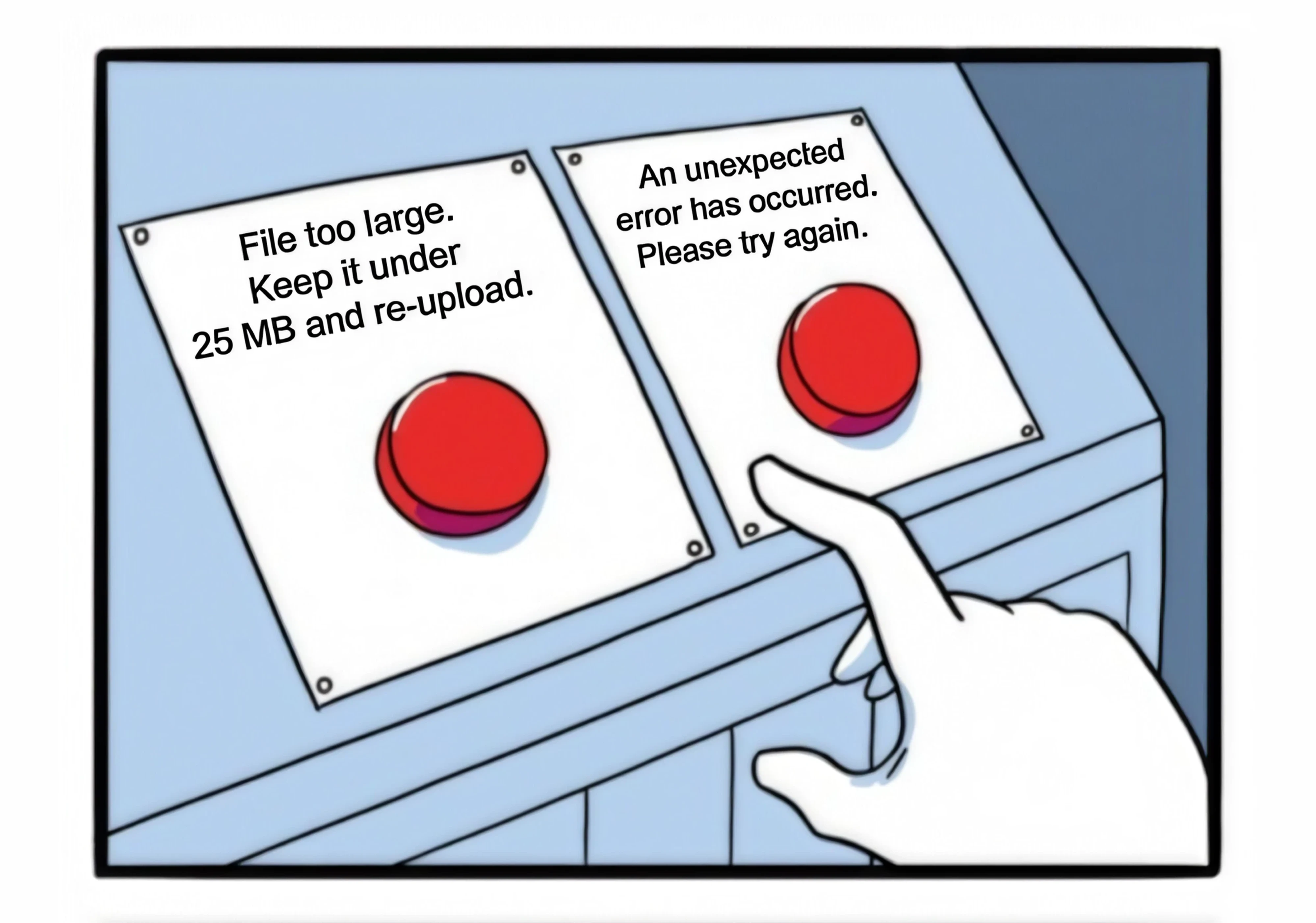
We have all met the second button. A message pops up, stops what you were doing, and tells you nothing you can act on. You click OK because there is nothing else to click, and you are left guessing what actually went wrong.
That is bad error message UI design. Creating error messages usually falls to whoever was closest to the code, and the person reading it is left to sort out the rest alone. However, the first button is not much harder to build. It tells people what broke, why, and what to do next, shown in the right place at the right time.
This article walks you through how to get there, with practical tips, real-world examples, and our own experience of designing SaaS products you can borrow from.
What is error message UI?
An error message is a short piece of text a product shows when an action cannot be completed. Someone tries to do something, the product cannot do it, and the message is how the product communicates that.
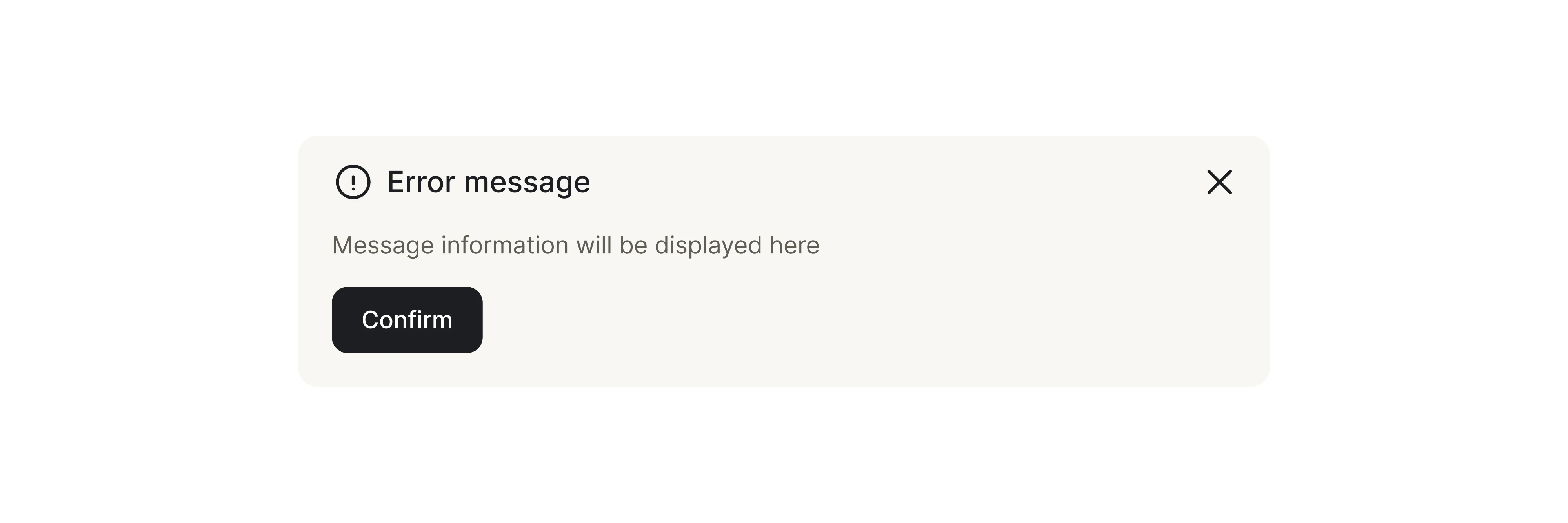
That action can be almost anything. Submitting a form with a missing field, entering the wrong password, or opening a page that no longer exists. Whenever the expected result does not happen, an error message steps in to explain the gap between what the user tried to do and what the product could actually do.
It shows up everywhere, across iOS, Android, and the web, and it comes in many shapes. You will hear it called error screens, alert messages, or failure states, but the job is always the same. Something failed, and the interface is responsible for informing users about it.
Why do bad error messages quietly cost you users?
Bad error messages rarely get blamed for the damage they do. A user hits one, gives up, and leaves, and the team later sees a dip in a funnel without ever connecting it to the message that caused it. That is what makes them so expensive.
The numbers are hard to ignore. Zuko Analytics found that 55% of people who start a form never finish it, and unclear error handling is a big part of why they walk away.
Part of the reason is that the fix keeps getting pushed down the list. Designing error messages takes time and effort, so teams treat it as a detail to tidy up later, and later rarely arrives. Companies are reluctant to spend on work like this, since it tends to eat effort, time, and budget for something that feels invisible when it works.

Proper error handling also take a lot of effort = lot of time = lot of money = lots of companies hate spending money on things like this.

The cost shows up as more than lost conversions. It becomes support tickets for problems the product could have solved on its own, repeated attempts at the same broken action, and churn no one can trace back to a single screen. The message that stays vague today is the metric no one can explain next quarter.
The anatomy of a good error message
The most helpful error messages do three things at once.
- It confirms that something went wrong, so the user is not left guessing.
- It names what went wrong, so the problem feels specific.
- It points to what to do next, so the user has a way forward.
Miss any one of them and the user is left filling the gap themselves, which is exactly the moment most people give up.
For a practical example, let’s compare a message “Error 500” with “We couldn’t save your file. Check your connection and try again.” The first is a status code aimed at a developer. The second names the problem, hints at the likely cause, and hands the user a next step they can act on. Same failure, handled for two completely different experiences.
The reason so many messages sound like the first one is that they get written from the system’s point of view. A developer knows precisely what broke, so the message describes the break. The user does not care what broke. They care about what to do now. Good error copy can replace generic error messages with ones that actually help, and we’ll touch on that later in the article.
The worst messages just say something failed without helping even. A good error message should clearly say what went wrong and what to do next.
The right component for every error
Not every error deserves the same treatment. A typo in an email field and a failed payment are both errors, but stopping someone with a full-screen dialog over a missing @ sign is wrong. Choosing a component is a decision about how much to interrupt, and that follows directly from how severe the problem is.
The rule of thumb is simple. The more a failure blocks the user, the more the interface should stop them, and the less it blocks them, the more it should stay out of the way. That idea maps onto the five components below.
Inline validation
Inline validation lets you display error messages inline, right next to the field they refer to, as the user moves through the form. Inline error message UI is the best choice for forms, since correcting an error immediately costs the user far less effort than fixing it later.
Toast
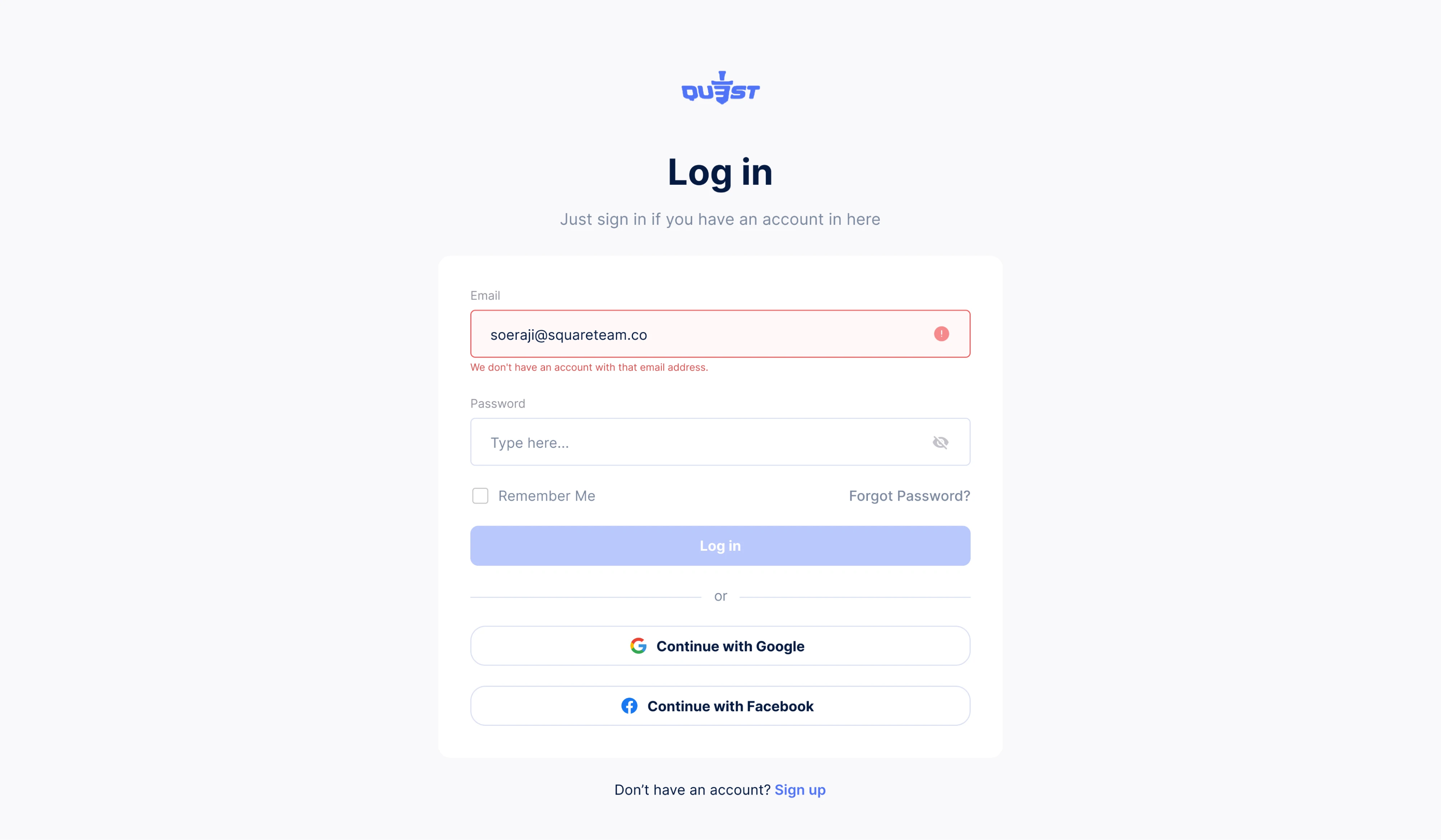
A toast is the small notification that slides in at the edge of the screen and disappears on its own. It suits lightweight, non-blocking feedback like a saved change. When designing, keep toasts for confirmations and minor updates, and keep real errors close to where they happened.
Modal and popup
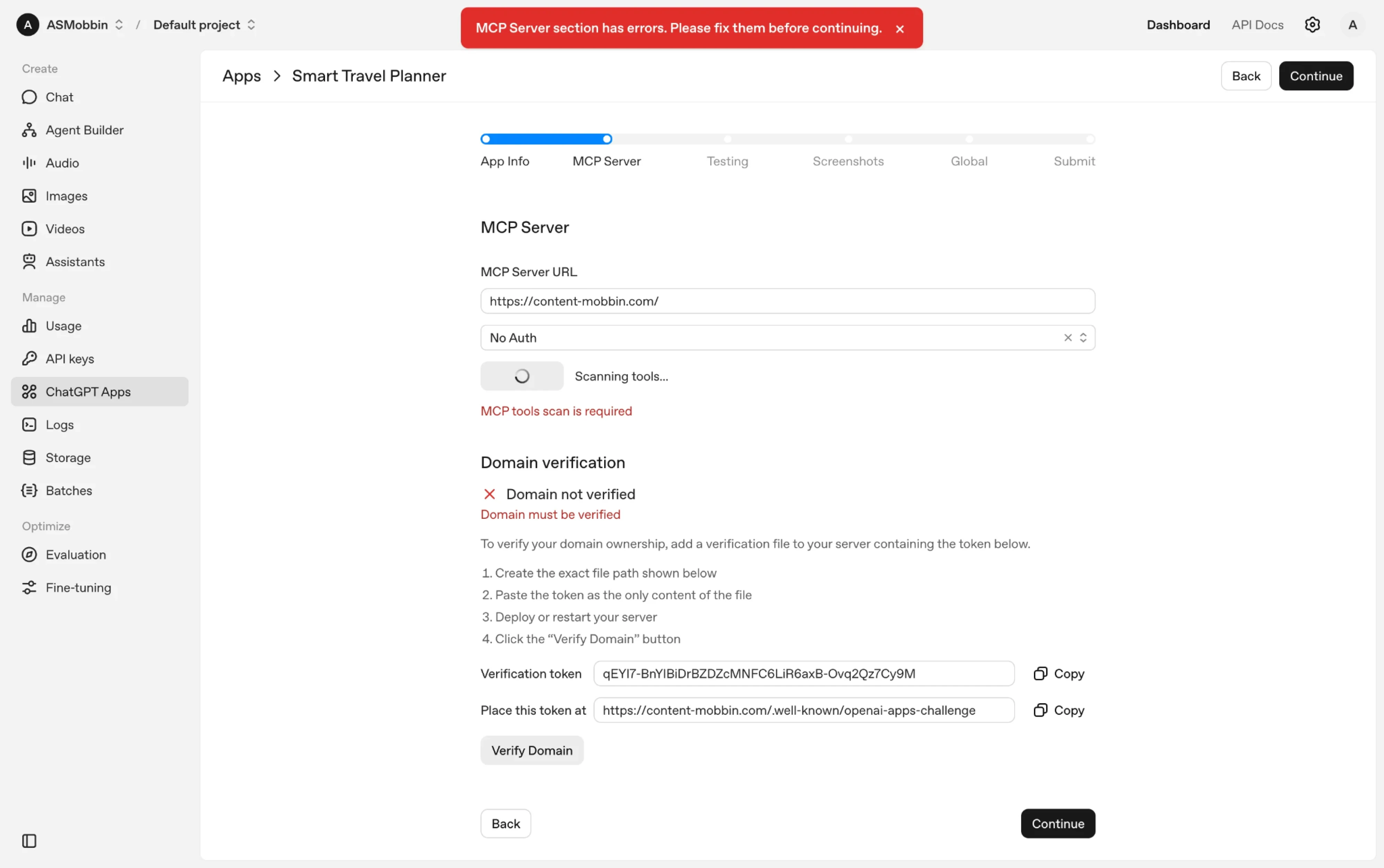
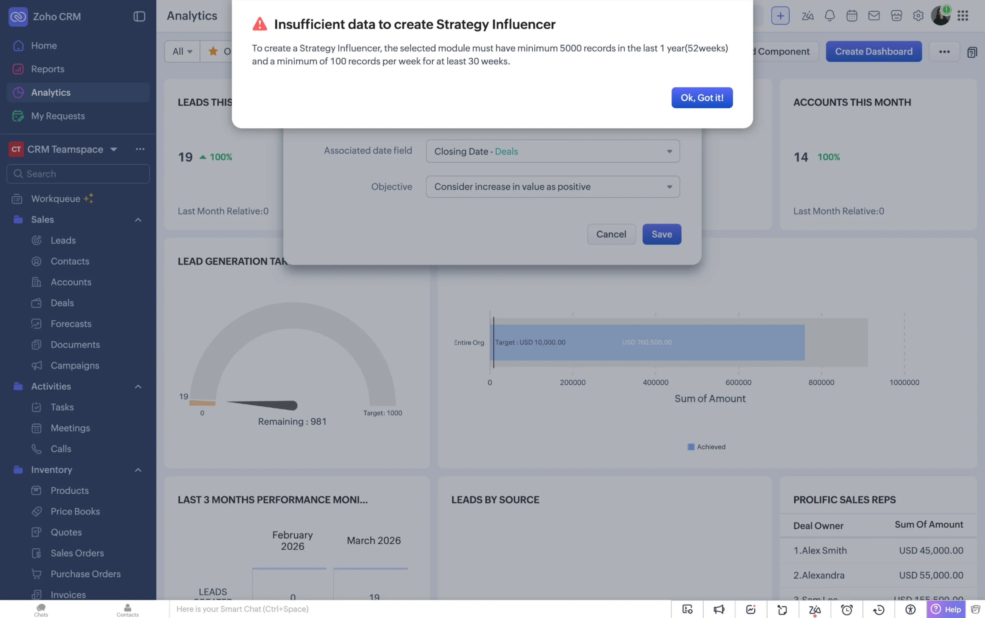
A modal stops everything. It sits on top of the interface and forces a choice before the user can continue. Reserve it for critical errors, such as a payment that failed and needs the user to choose what to do next. When you do reach for one, state the problem in a sentence, then give the user a clear way to act on it.
Banner
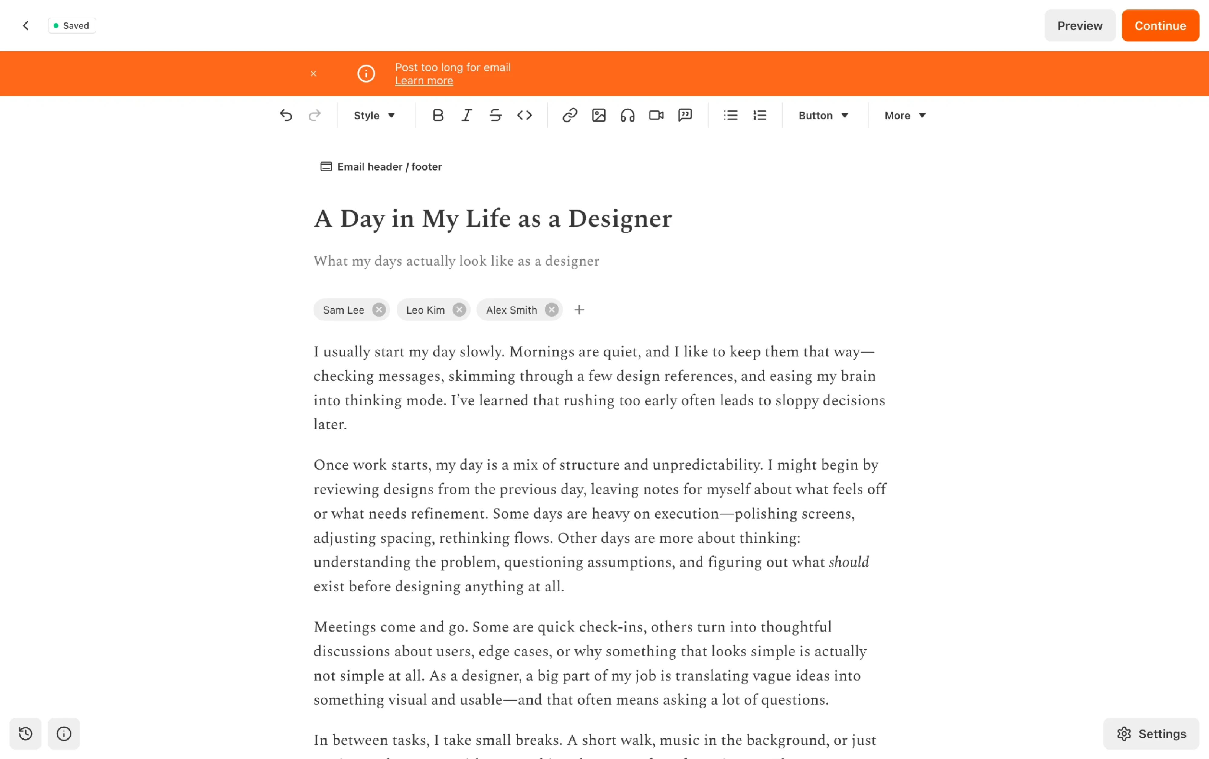
A banner spans the top of a page and stays put until the situation changes. It fits problems that affect the whole page or account, and that need attention without halting everything. Because it holds its place instead of interrupting, it stays visible without breaking the user’s workflow.
Full-page error
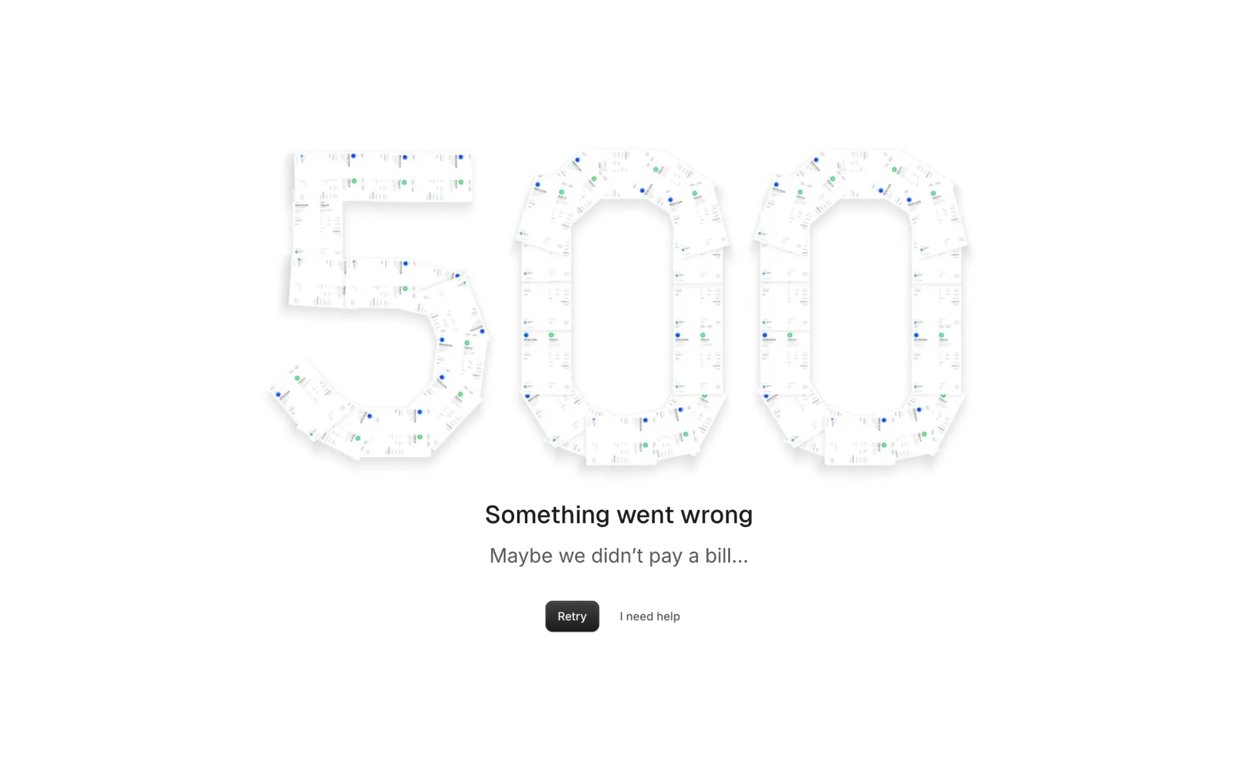
Sometimes there is nothing left to show. A route fails, the server returns a 500, or the connection drops, and a full-page error becomes the honest option. The job here is to confirm that the request failed, say whether trying again might help, and offer a next step or a route to support.
Error message UI best practices
An error is the moment a user is closest to quitting, and how you handle it decides whether they stay. The practices below are the ones that separate an error state people move past without thinking from one that sends them directly to support.
Write copy that guides users to a fix
The biggest mistake in error copy is describing the system. A message like “Authentication failed due to invalid credentials” is accurate from the server’s point of view, but to the person reading it, credentials is jargon and failed is a dead end.
The fix is a shift in perspective. Instead of narrating what the system did, tell the user what happened in their terms and what they can do about it right now. That shift usually comes down to a few practical moves.
- Name the problem in plain language. “That password doesn’t match” is clearer than “Invalid password.” Drop status codes, technical jargon, and anything a non-developer would have to look up.
- Point to a specific next step. “Check the format and try again” beats “Please try again” because it tells the user what to try differently.
- Avoid lengthy error messages. Error states are high-stress moments, and long explanations add to the load. Say what broke and how to fix it, then stop.
- Never blame the user. “You entered your email incorrectly” puts the fault on the reader. “That email doesn’t look right. Check the format and resend,” says the same thing without pointing a finger.
- Match the tone to the moment. A failed payment needs a calm, reassuring voice. A minor validation issue can afford to be lighter.
One test that helps is reading the message out loud. If it sounds like something a helpful person at a desk would say, it is probably close. If it sounds like a log file, it needs rewriting. And if you find yourself defaulting to “Something went wrong” across your product, that is a sign no one stopped to write error messages at all.
Reduce friction in high-stakes flows
Login, password recovery, and checkout are where errors cost the most. These are the moments a user is either trying to get into a product they already chose or trying to give you money, and any friction here has a direct line to lost revenue.
If someone hits a password recovery wall during checkout, most of them will not finish the purchase. The stakes are too high for generic error messages.
Start with what happens when a login fails. The error should never reveal whether the email exists in your system, since that is a security risk, but it should make the next step obvious. “That email or password doesn’t match our records. Try again or reset your password.” gives the user two paths forward.
You can also place the reset link inside the UI error message. If the same user fails repeatedly, surface a “Reset password” or “Contact support” option in the error area.
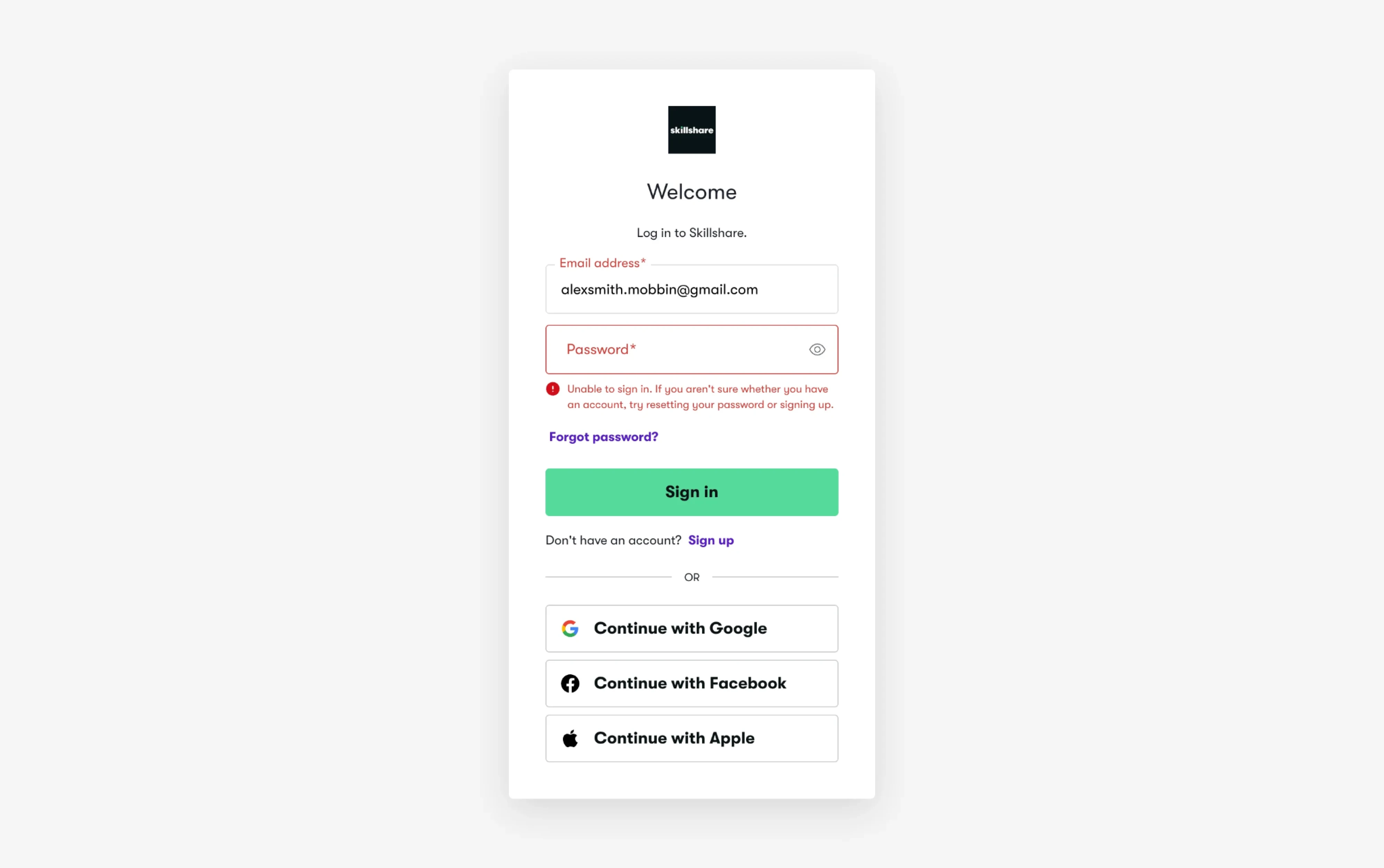
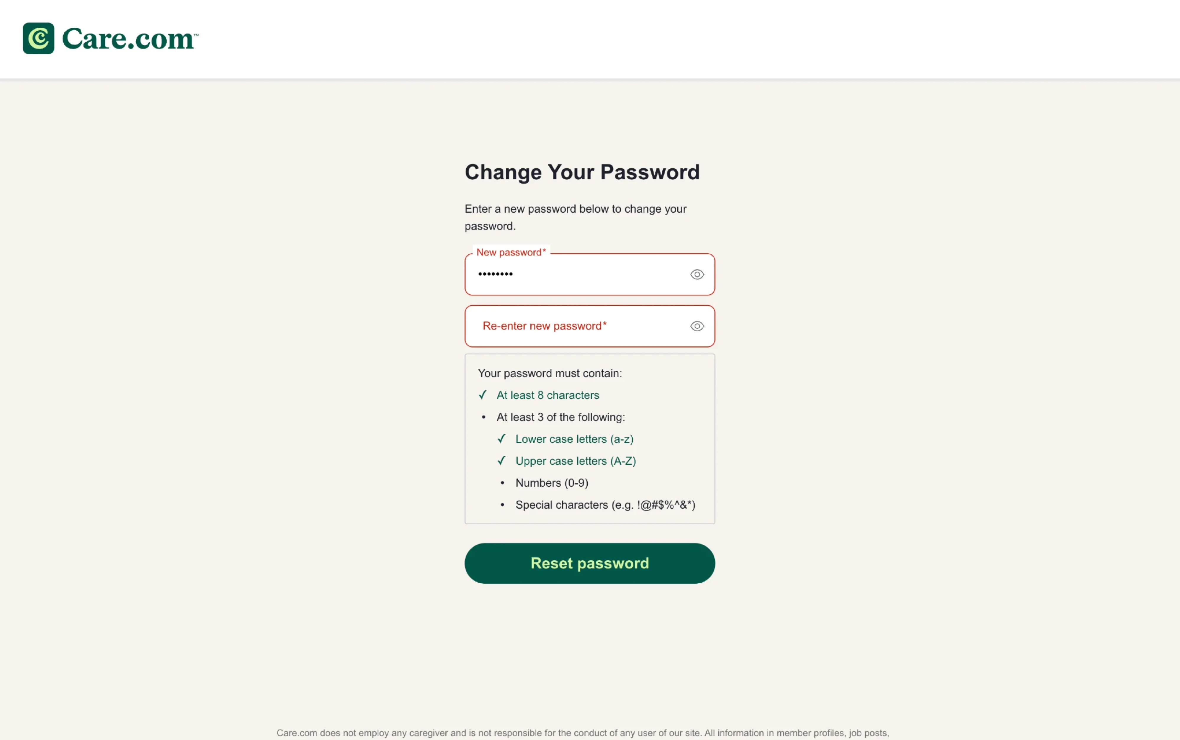
Password recovery itself is where most of the friction hides. In fact, a large percentage of people have forgotten a password at some point. When that happens, show the requirements upfront. Use a live strength meter or a checklist that ticks off each rule as they go, so creating a new password feels like progress.
Include a show/hide toggle on the field, because masked input on a small screen turns every character into a gamble. And when the user moves from the login screen to recovery, pre-fill their email address. That one detail alone removes a step that feels pointless and signals that the product is working with them.
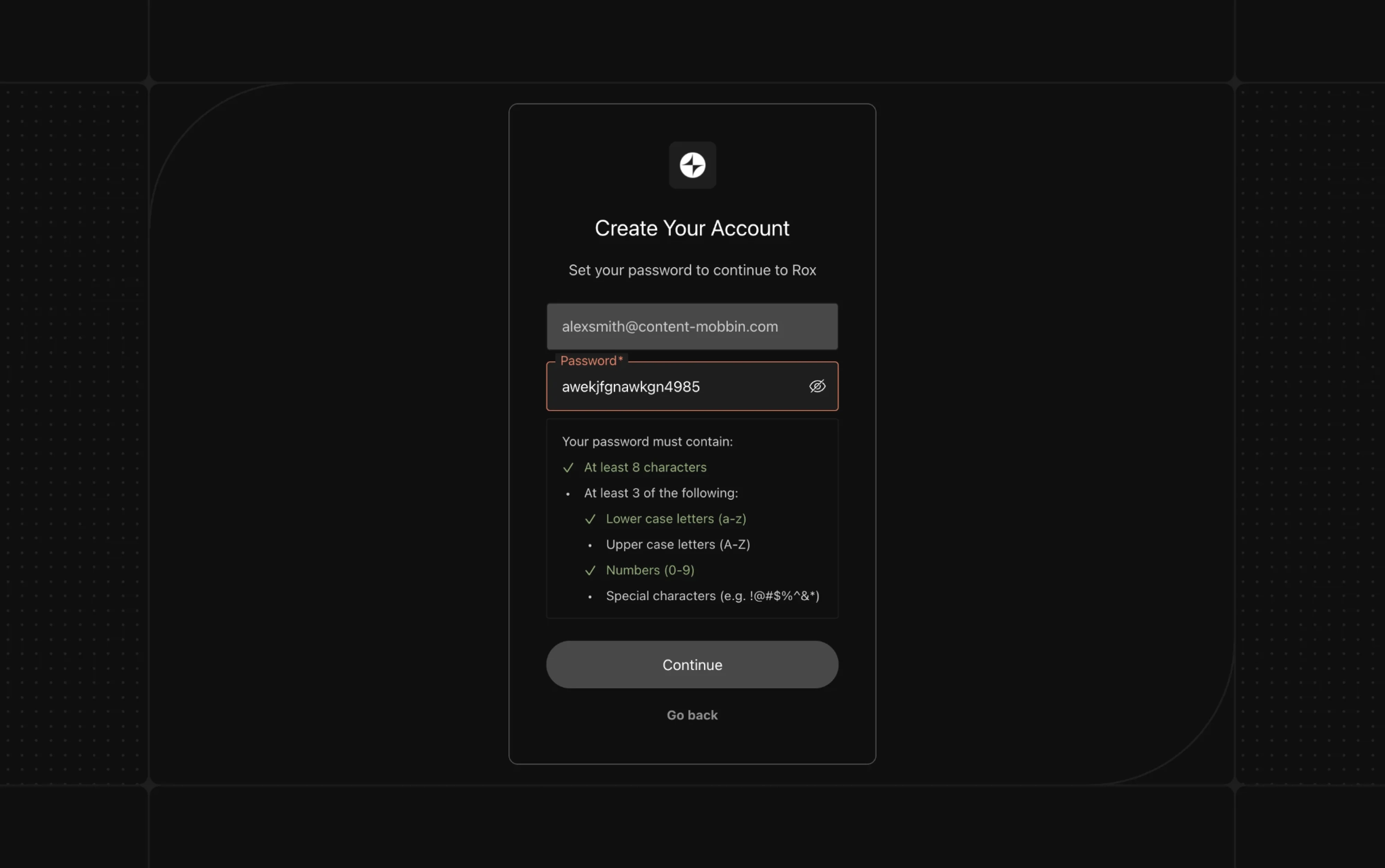
Checkout follows similar principles but adds a layer of anxiety around money.
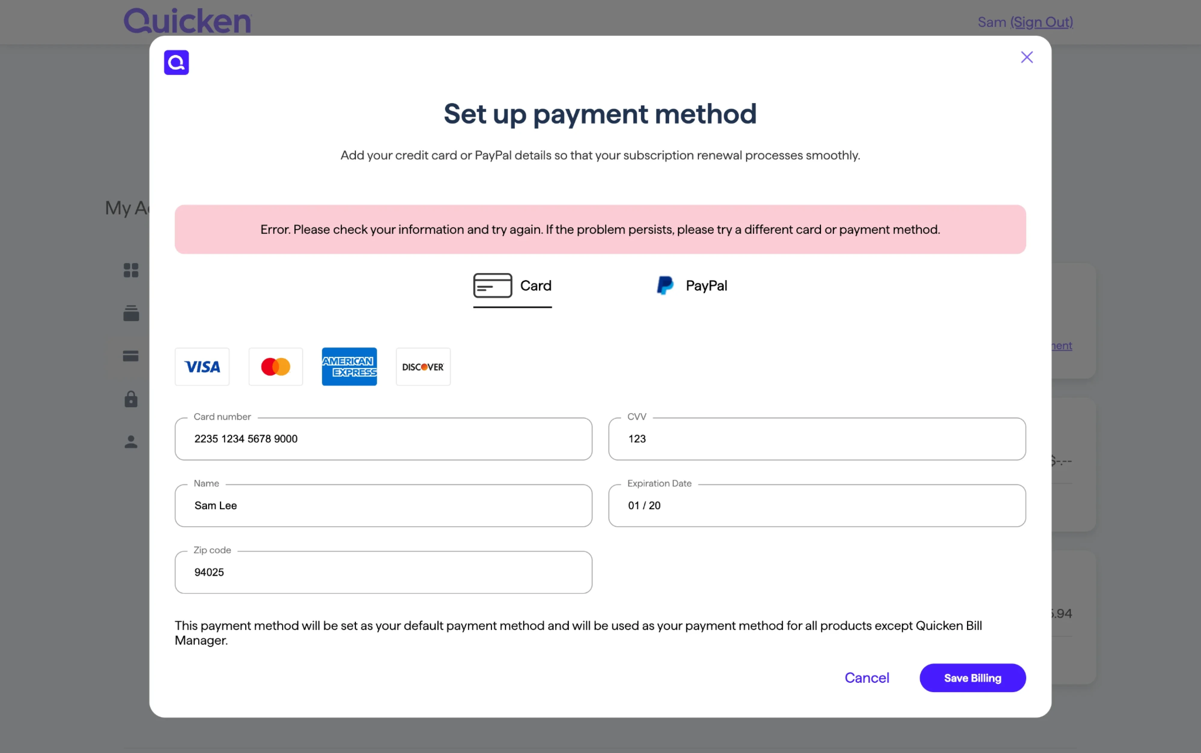
If a payment fails, name the reason and the fix. “Your card expired last month. Add a new card to continue.” is far more useful than “Payment could not be processed.” Keep the rest of the form intact so the user only has to correct the one thing that broke, and never force a page reload that wipes their shipping details.
Validate at the right moment
When an error appears matters just as much as what it says. Show it too early, and the user feels nagged before they have finished thinking. Show it too late, and they have to scroll back through a submitted form trying to find what went wrong.
There are really only three moments you can fire a validation check:
- Real-time validation runs on every keystroke.
- On-blur validation runs when the user leaves a field.
- On-submit validation waits until the user clicks the button.
Each has a place, but they are not interchangeable.
On-blur validation works best as the default for most fields. The user has finished typing, moved on, and the form checks what they left behind. If the email is missing an @, the error message appears right there while the field is still fresh in their mind.
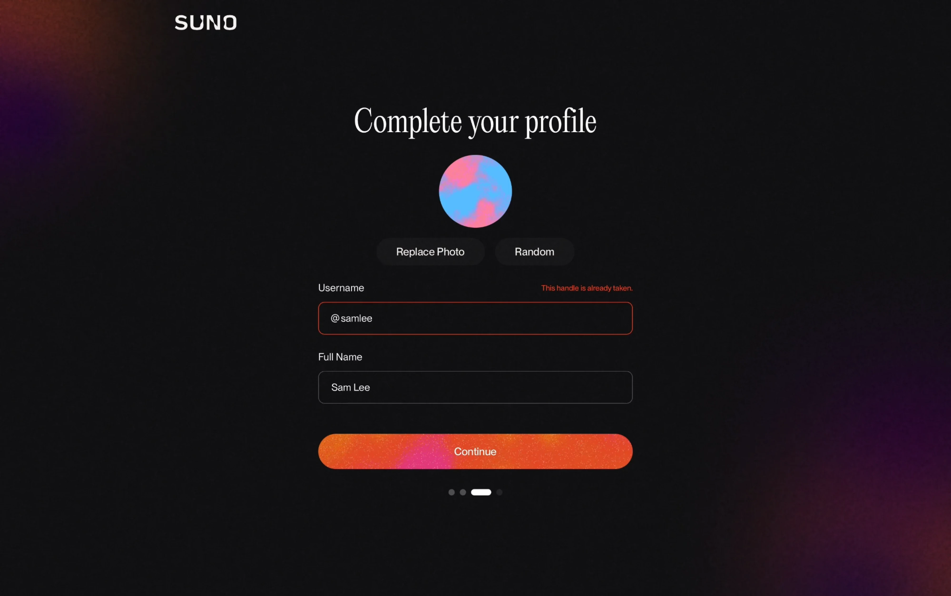
Real-time validation fits a narrower set of cases. It’s a great option for password creation, but for a regular text field, it creates constant interruptions. Inline validation forces users to switch between completion mode and revision mode, and when that switching happens on every keystroke, it splits their focus and increases mistakes.
On-submit validation still has a role for fields that depend on each other or require a server round-trip. Using this approach, show an error summary with anchor links to each problem field so the user is not left scanning the page.
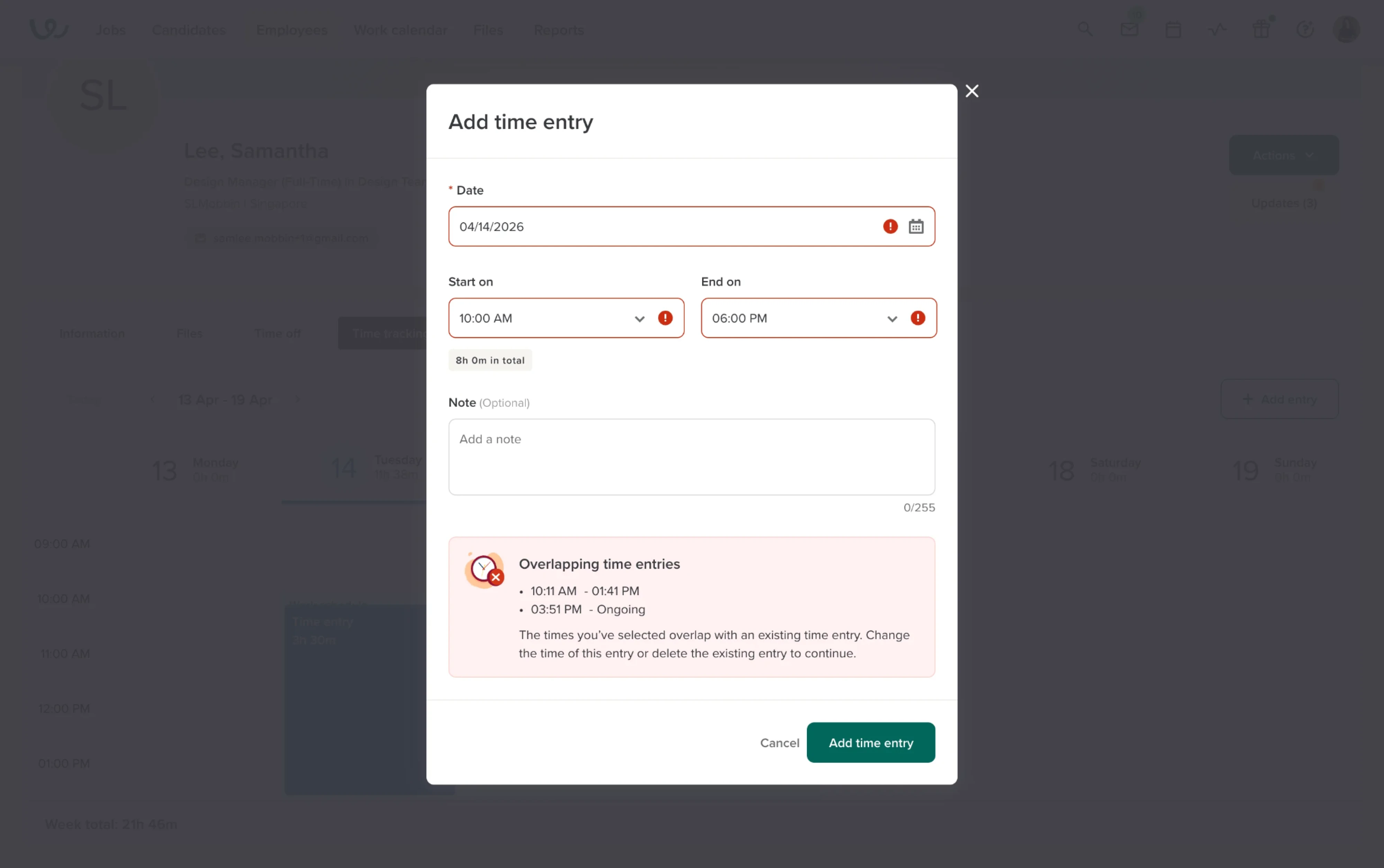
A good rule of thumb is to show a green checkmark the moment a field is valid, but hold the error message until the user has clearly moved on from it.
Preserve the user’s input
Few things frustrate a user faster than fixing one mistake and discovering that everything else they typed is gone. It sounds obvious, but it still happens.
When an error occurs, keep everything the user entered and only ask them to correct what actually broke. That means the interface has to treat the error as a small, local problem rather than a reason to reset the whole page.
In practice, the most common ways input gets lost are:
- Full page reloads on server-side validation. The form submits, the server finds a problem, and the page returns with empty fields. If you validate server-side, echo back every value the user sent.
- Client-side resets after a failed action. A payment fails, and the front end clears the entire form instead of just the card field. Scope the reset to the field that caused the error and leave the rest untouched.
- Multi-step forms that lose progress. The user fills out three steps, hits an error on step four, and gets sent back to step one with nothing saved. Save partial data and mark which fields need attention when the user comes back.
The goal in every case is the same — let the user edit. The less work they have to redo, the more likely they are to finish.
Handle multiple and repeated errors
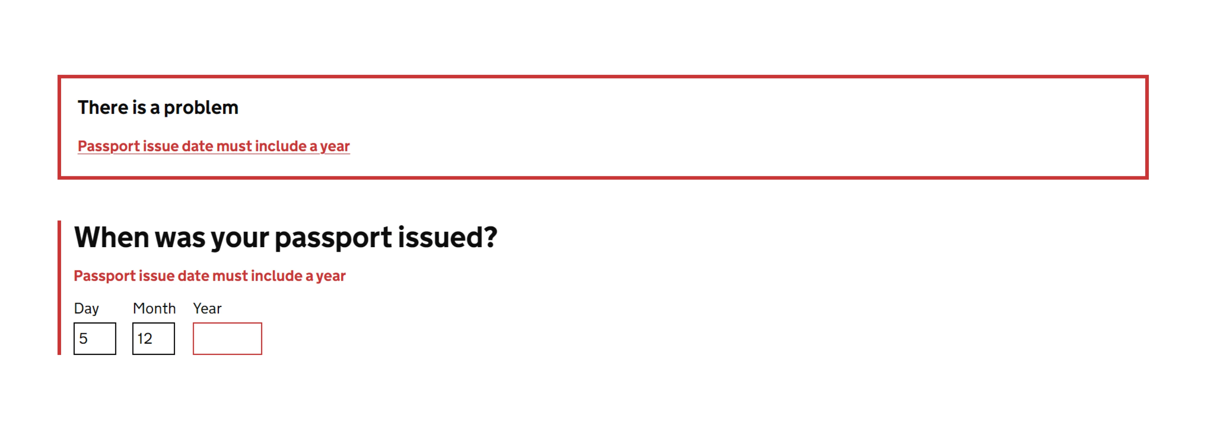
When multiple fields fail at once, the user needs two things at the same time: a clear picture of everything that went wrong and a way to jump straight to each problem. Neither inline messages alone nor a top-level summary alone gives them both.
The strongest pattern is to combine the two.
Display error messages in a validation summary at the top of the form, and keep the inline messages next to each affected field. The summary gives the user an overview, and each item in it should link directly to the field it refers to so the user can see both the error message and the problem field, fix it, and move on.
The GOV.UK Design System has tested this dual-display approach extensively across government services, and it works because it respects how people actually move through a form. They scan first, then fix.
Tables and data-heavy interfaces need a different approach. If the same error affects multiple rows, showing identical messages on every row buries the user in noise. Highlight the affected rows and display the error message popup UI that explains the problem and what to do about it.
That keeps the screen readable and the fix clear.
Then there is the repeated-error case. A user submits, gets three errors, fixes two of them, submits again, and hits a new error that was hidden behind the first round of validation. This is one of the fastest ways to lose someone.
Where possible, validate everything in a single pass and show all the problems at once so the user is not caught in a loop of submit, fix, submit, discover more. If server-side constraints make a single pass impossible, at minimum tell the user how many issues remain so they know the finish line is moving closer.
Give 404 pages a way forward
In a SaaS product, a 404 means someone followed a stale link, bookmarked a page that was moved during a redesign, or tried to access a non-existent feature. The user was trying to get somewhere inside the product, and the interface needs to help them find it.
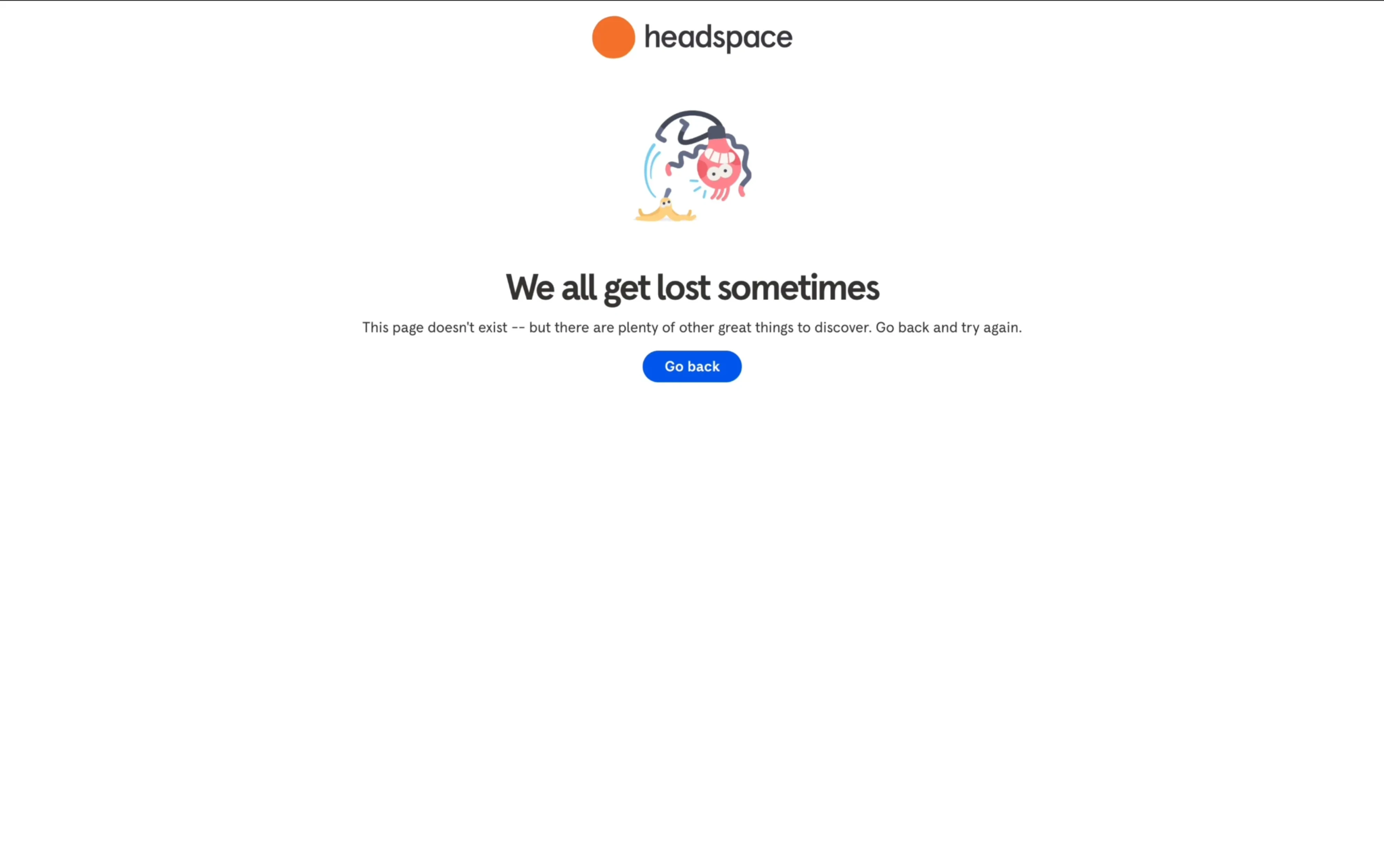
The default server-generated 404 is a dead end with no navigation, search, context, and reason to stay. A custom 404 page fixes that by keeping users inside the product instead of pushing them toward the back button.
A functional 404 page needs four things.
- First, a plain-language message that tells the user the page does not exist without leaning on technical codes.
- Second, your product’s main navigation, so the user can get back to their dashboard or workspace without being stranded.
- Third, a search bar or a quick link to the feature they most likely wanted, because in a product context people are usually mid-task.
- Fourth, a link to your help center or support, in case the missing page is actually a bug they should report.
Personality is fine on top of that foundation, but in a SaaS product, utility matters more than charm. A playful illustration can soften the moment, but if the page has no way to get back to the user’s work, the tone will not save it.
When designing, remember that the navigation comes first, the brand personality sits on top of it, and neither one replaces the other.
One thing worth checking after launch is whether your 404 page returns a 404 status code. Some setups serve a custom page with a 200 (OK) status, which tells search engines the page exists when it does not. That quiet misconfiguration can create indexing problems that are hard to trace later.
Build accessibility into every error state
Around 16% of the global population lives with some form of disability, and accessibility laws like the ADA and the European Accessibility Act are catching up with that reality. WCAG 2.2 Level AA is the standard SaaS products are expected to meet, and error states are a place where compliance breaks down most often.
The most common mistake is using color alone to signal an error. A red border means nothing to someone who cannot see red. Every visual error signal needs a text message alongside it, and adding an icon gives users a second cue.
I wouldn’t rely on color since it’s not accessible for people who see color differently.
Focus order is a design decision too. When a form returns errors, decide where the user’s attention should land. Should the page scroll to an error summary at the top, or to the first field that failed? That choice belongs in the design spec, because if it is left to implementation, it usually does not happen at all.
Placement also matters for screen reader users. An error appearing dynamically far from its field, or inside a toast, is hard to connect to the thing that went wrong. Keep the message directly below the field it refers to, and make sure the design accounts for the space so the message does not push content around when it appears.
A quick checklist for accessible error states:
- Every error has a visible text message.
- An icon accompanies the color shift so the signal is redundant.
- Error text meets 4.5:1 contrast against its background.
- The design spec defines where focus lands when errors are returned.
- Error messages sit directly below the field they refer to.
- Layout reserves enough space for error messages.
Error message UI examples worth studying
At Eleken, we’ve been designing SaaS products since 2015, and nearly every one of them has needed error states at some point. We have seen what works and what does not, and the examples below are the ones we think are worth a closer look.
Ricochet360
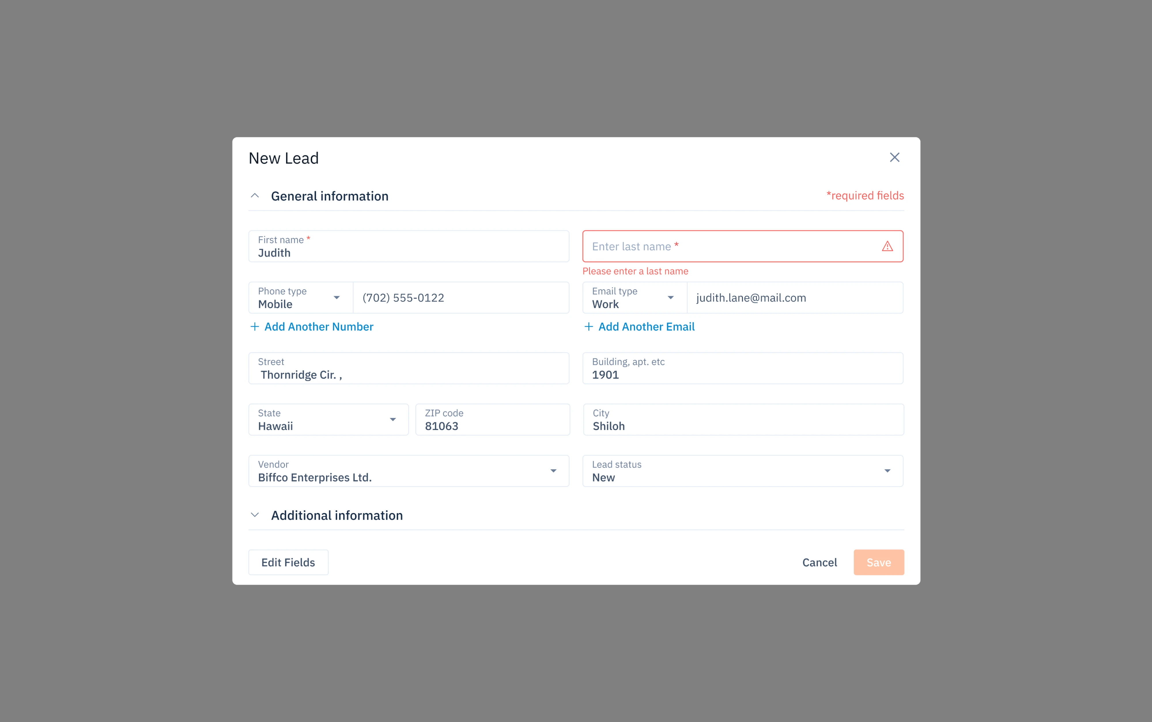
Ricochet360 is a CRM and cloud phone platform for sales teams, where lead creation happens dozens of times a day. When designing this flow, we kept the “New Lead” modal error handling tight and marked required fields with red asterisks.
When a required field is left empty, the error appears inline right below it with a clear message, while every other field the user already filled stays untouched. Only the problem is flagged, and only the fix is asked for.
Panjaya
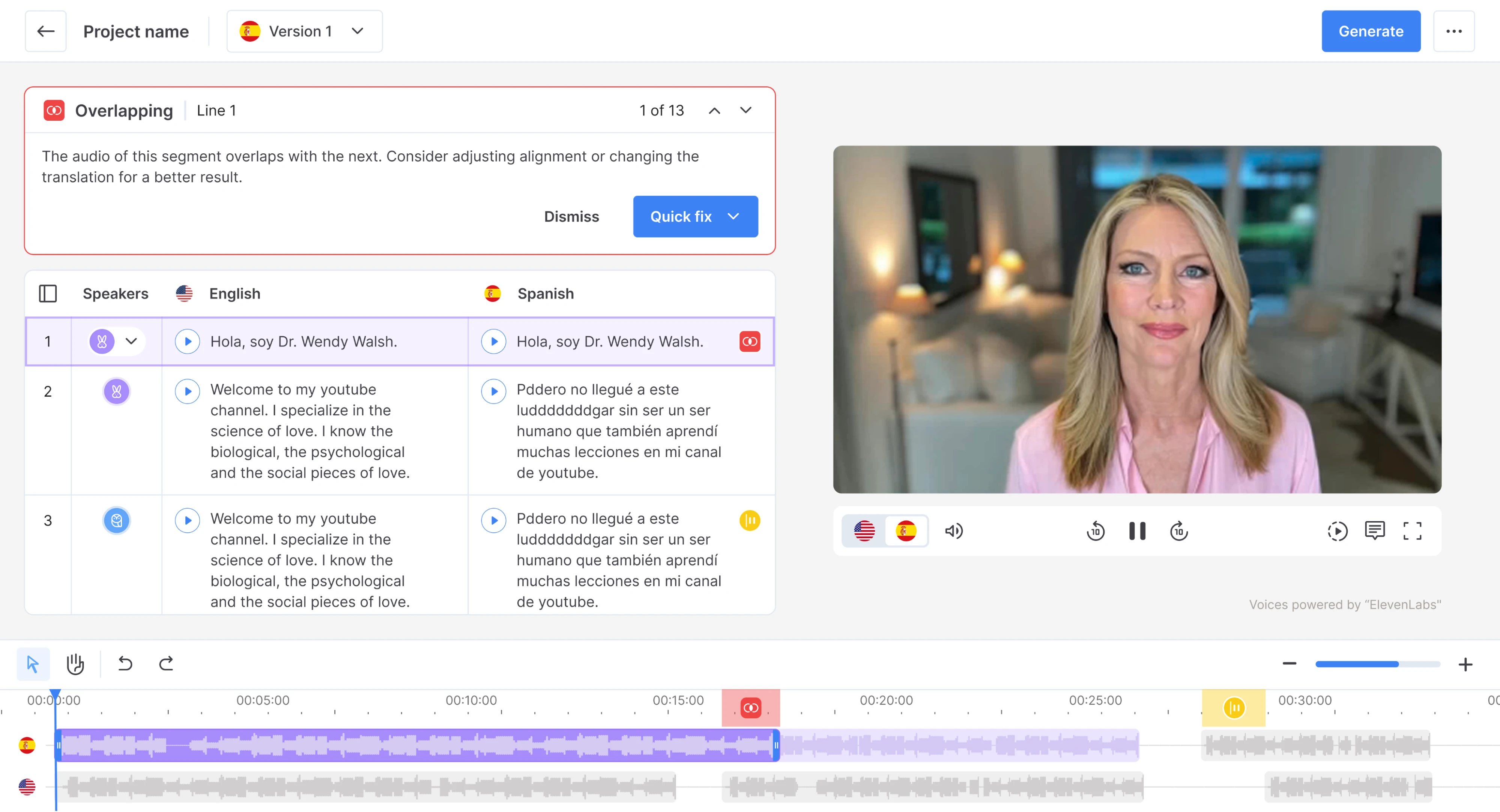
Panjaya is an AI-powered dubbing platform where users work with multilingual audio segments on a timeline, and mistakes happen from time to time. To handle that right, we’ve placed a persistent banner at the top of the workspace.
It names the problem, suggests what to do about it, and offers a fix button inside the message. Navigation arrows let the user step through all issues one by one, so they can work through the list without scrolling the timeline to hunt for each one.
Kipsi
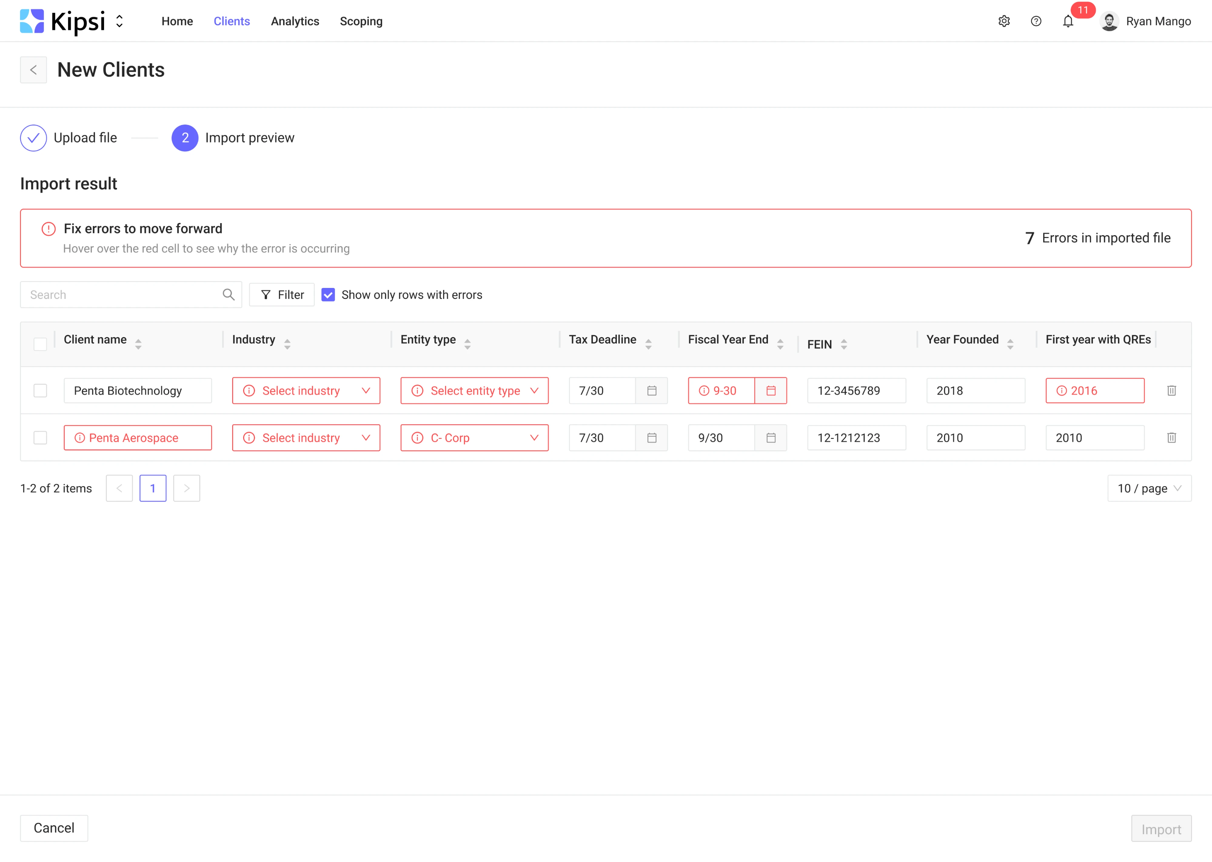
Kipsi is a tax automation platform where accountants import client data in bulk. A single import can contain dozens of rows, and when the source file has bad data, the errors need to surface without overwhelming the user.
We designed the import preview to handle this. A banner states the problem, and a filter lets users show only the rows with problems. Inside the table, each invalid cell is highlighted with an “i” icon that reveals the reason on hover.
OptiFlow
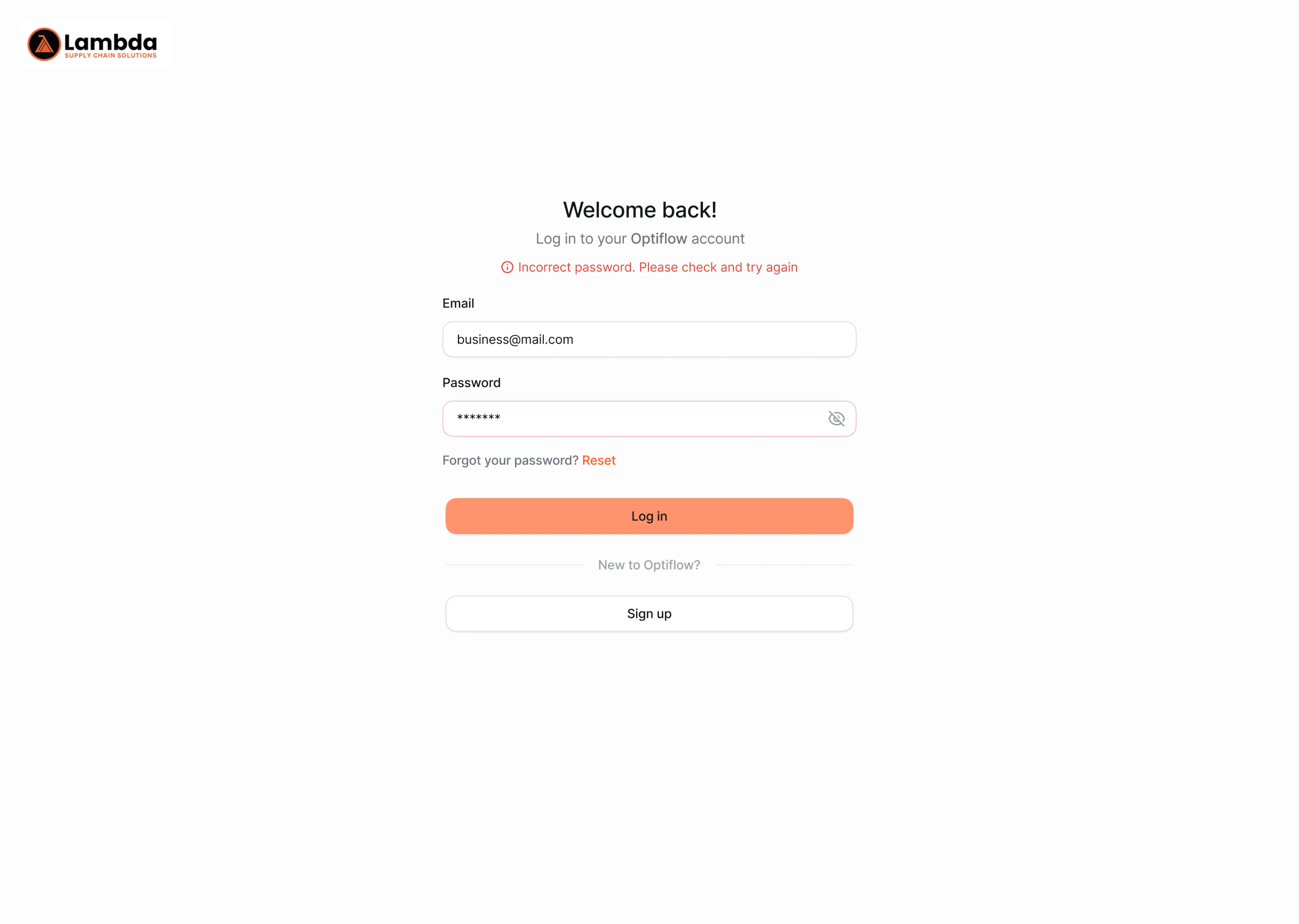
Optiflow is a supply chain platform where users log in frequently throughout the day. We kept the login screen to a single centered column so there is nothing competing for attention, and designed the error handling to match that simplicity.
When a password does not match, an inline message appears above the fields with a prompt to check and try again. The email stays filled in, a show/hide toggle lets the user verify what they typed, and there is a reset link directly below the field.
DarkWave
Dark Wave is a cybersecurity platform that connects to third-party tools. Setting up those connections means entering access keys and secrets, which are long strings that are easy to mistype and impossible to validate by looking at them.
We designed the integration modal with two layers of feedback. When an access key is invalid, an inline message explains what went wrong and suggests where to copy the key. A warning banner confirms the connection failed.

Bering Lab
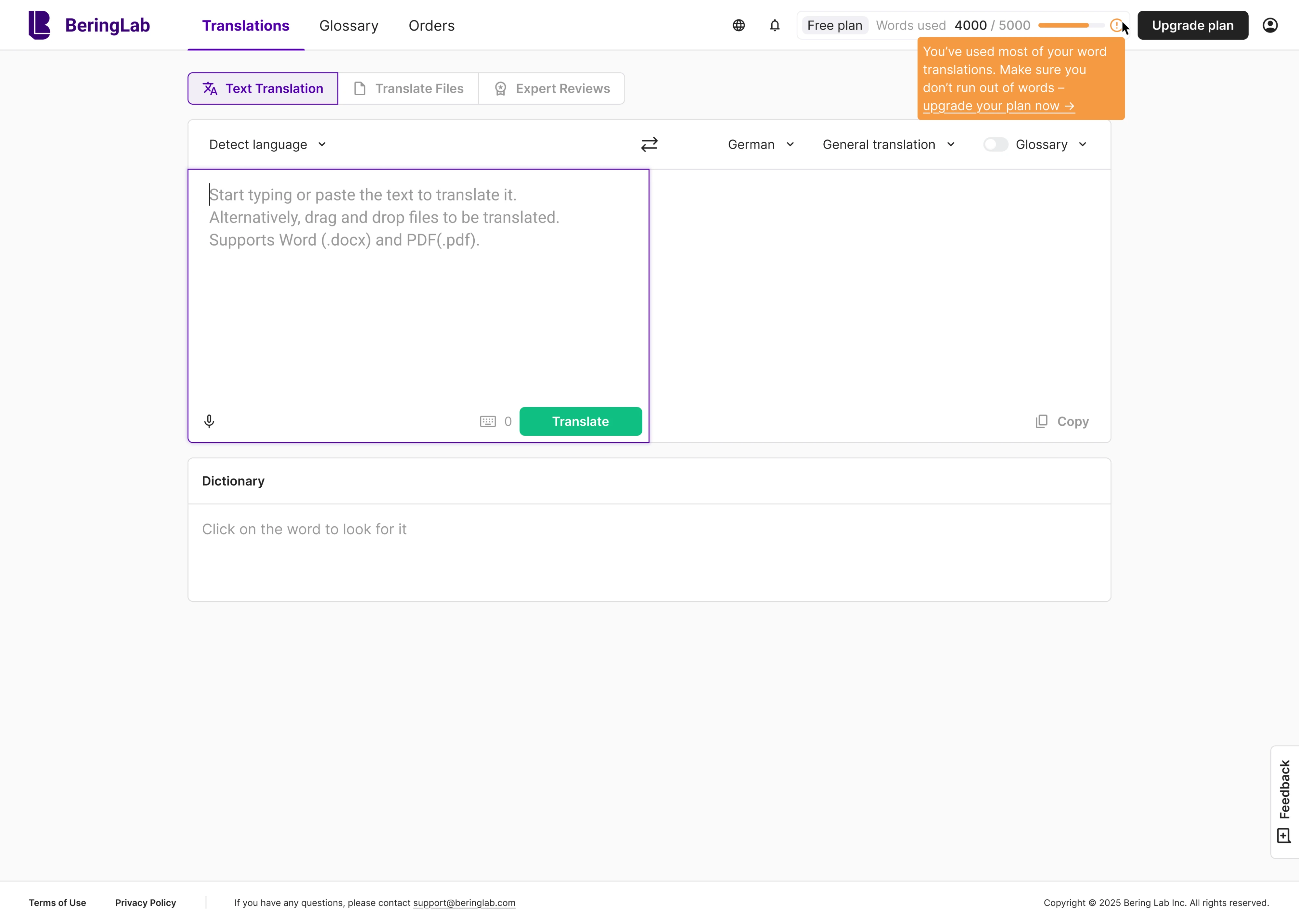
BeringLab is an AI-powered translation platform with a free plan capped at 5,000 words. Running into that limit mid-task would be frustrating, so we designed the error handling to start before the limit is reached.
A progress bar in the header shows usage in real time. At 4,000 words, it turns orange and a tooltip warns the user they are running low. At 5,000 words, the bar fills completely, the message shifts, and the upgrade link stays right there.
Wrapping up
Error states are one of the few moments in a product where the user has already hit a wall. Everything else in the interface is designed to move them forward, but an error message meets them at the point where something stopped working. That is exactly why it deserves the same attention as the features that get people excited.
At Eleken, we treat error message UX as part of the design process and follow all the best practices to get them right. If you need a product that handles errors well, our team is just a few lines away.




.webp)

.png)