/
Product design

Product Development vs Product Management: Visual Guide

0

mins to read

When we talk about building a digital product I can’t help but think of parallels with construction, as creating a digital product is similar to building a house in many ways. And such parallels seem especially obvious when we talk about product management and product development. Product management is close to planning and managing construction while product development is similar to the construction process itself.

But enough metaphors! As a product design company, we at Eleken work directly with both product management and product development. So in this article, we will break down and visualize these concepts, talk about their differences, product management, and product development responsibilities and roles.  

What is product management?

Image source: https://www.residencestyle.com/

Product management is a strategic process of managing the creation of a product. 

It's a holistic process that encompasses all aspects of a product, from conception to delivery and post-launch support. In other words, product management is responsible for ensuring that a product is successfully built and launched and meets the needs of its target market.

Product management role is often defined as the intersection of business, user experience, and tech. Its main goal is maximizing the potential of a product. This means that the product nager is responsible for overseeing the entire life cycle of the product, from ideation to post-launch analysis and refinement. 

To achieve this goal product managers work with teams of engineers, designers, and marketers to ensure that all aspects of the product are considered and that the final product will be of high quality, meets customer needs, and delivers good business results.

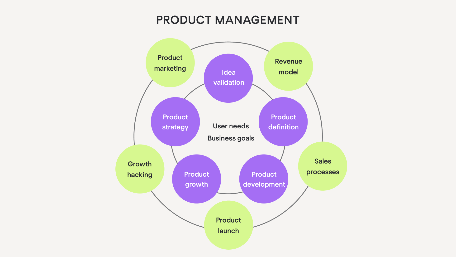
As we can see in the visual model above, the product management process is multifunctional and keeps an eye on different aspects of product creation and performance at the same time. It is the ongoing management of the product and its life cycle. Product management’s responsibility is seeing the big picture, making strategic decisions, and aligning the product team toward the main goal: a stunning product.

Some people may wonder: is product management a part of product development? Let’s explore product development to answer this question.  

What is product development?

Image source: https://www.letsbuild.com/

Product development takes the product from idea to final solution step by step. The process is focused on designing, building, and testing the solution. 

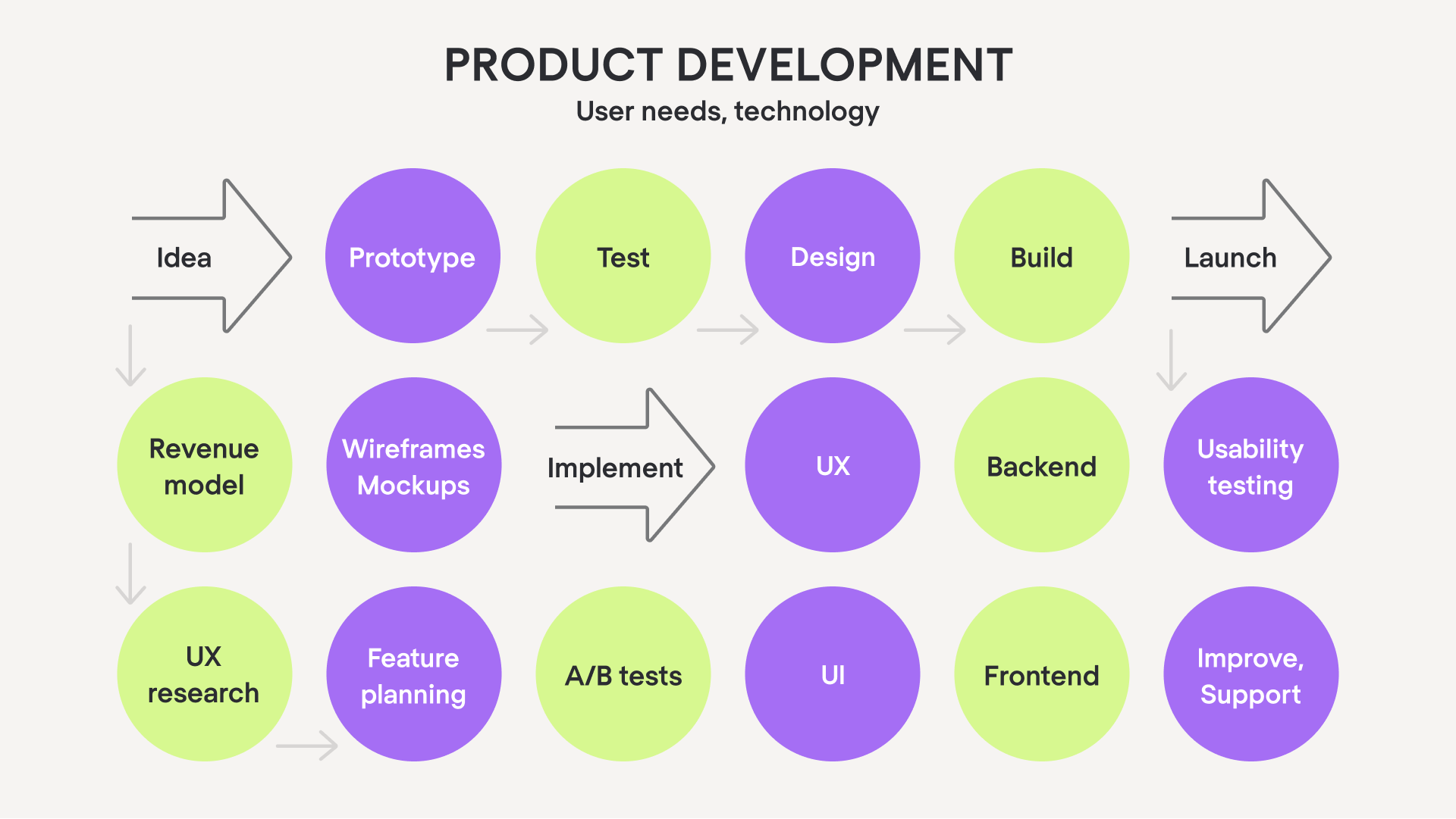
Simply put, product development is the process of creating a new product or service. It begins with an idea and then moves on to research, prototyping, design, execution, and testing. 

Once the product is finalized, it goes into production and then deployed. The product development role is crucial for creating a product that meets customer needs and exceeds their expectations. 

Goals and main deliverables of product management and development define their main responsibilities.

Product management vs product development: main responsibilities

As you already know, product management is a highly strategic process. That’s why its responsibilities are analytical and strategic by nature: creating product roadmap, strategy, defining product requirements, analyzing product performance and aligning the team around product goals.  

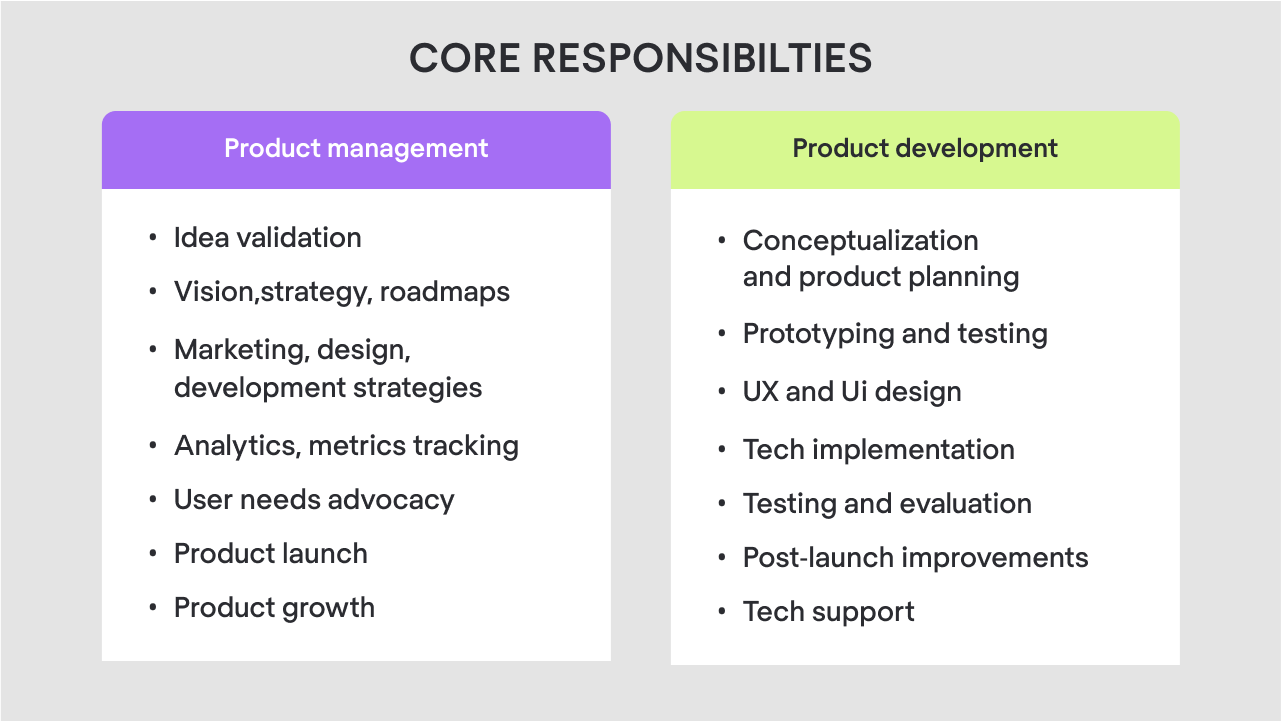
Product development is on the contrary, a structured step-by-step process that takes the product from point A (idea) to point (B) launch. So its main responsibilities are focused on creating the working product. That includes defining the product, creating and testing its prototype, UX and UI design, building and launching a working version of the product. 

Such differences between product development and product management responsibilities lead to very different approaches to tasks. Product managers focus on strategizing, prioritizing, planning, setting goals, and product knowledge base. So, in their work they rely on roadmapping templates, product management tools, brainstorming strategies and documentation tools.

Product development team builds a product itself from creating a concept to working version, organizing the creative process and execution into iterations. They break down the scope into clear steps and test the results. That’s why, apart from design and prototype and code editors, designers and developers rely on task trackers and user testing tools.   

Different responsibilities and approach to work of both processes determine the setup of the product team. 

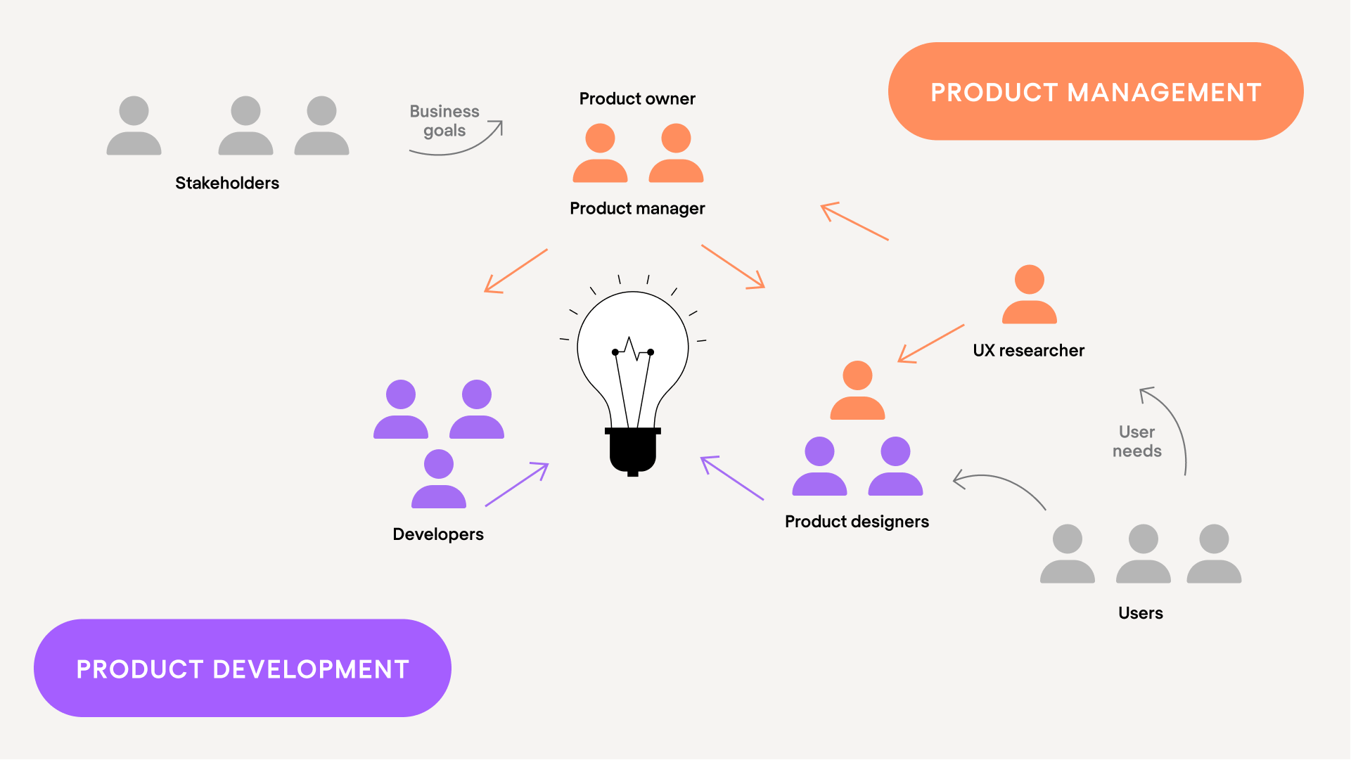
Product management and product development roles

Product management roles typically include product owner or product manager. On the bigger projects, it’s both. Some teams have dedicated UX researchers or several product managers. Regardless the set-up, the product management team works closely with the product development team.

The product development team, depending on the size of the company or the product the team is building, can be bigger or smaller. In general, a product development team should consist of a product or UX/UI designer and developer plus a product manager. But usually, product development team consists of several designers and software developers. 

What makes effective product management and product development


There are many factors that determine the success of both processes: setting the right goals and deadlines, size and skill level of your product team, other resources.

You should also keep an eye on various metrics that allow you to measure the effectiveness of your product management and product development processes.

Effective product management lies on three pillars:

1) Ensures that your product meets customer needs
2) Pursues the product’s business goals
3) Allows the team to develop and deliver the product efficiently

An effective product development process allows:

1) To efficiently build a high-quality product.
2) Create the look and feel of the product
3) Deliver tech implementation of the idea, which is a ready-made product

In the software world, product development and product management are two essential concepts that work together and create products that solve users’ pains.

I’m sure that by this point you noticed that design is a big part of product development and product management concepts. 

Product management vs product development: the role of design

No doubt that by now you see that design is deeply incorporated into both product management and product development. Both concepts do interact with the design, but from different perspectives. Product management is responsible for the overall product strategy, defining user needs, and setting goals for the product design. Product development focuses on solution delivery which implies prototyping, designing, and testing a product.

Product management, design, and engineering are the three main pillars of the product. 

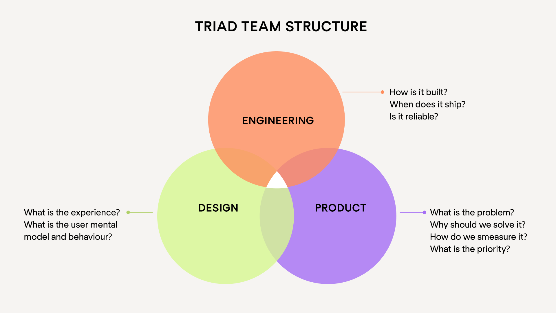
In the software world, this triad model is the most effective when it comes to delivering outstanding digital products. At Eleken we rely on the same model and work hand in hand with product managers and lead developers throughout the whole product design process

If you want to enrich your product team with a designer experienced in close collaboration of product management and product development, drop us a line.

Mariia Kasym

Author

Table of contents

Top Stories

Product design
/
0
min read

How to Design a Dashboard That Helps People Make Decisions

A dashboard is the first screen a user sees after signing in. It’s like a compressed quintessence of all the app’s pages or an overview of a product that should allow you, as a user, to instantly scan the essential information, understand the current state of your business at a glance, and give you fast access to the needed app functions.

Well, that’s what a good dashboard should be like, but how to design a dashboard that promotes quick decision-making?

As we at Eleken provide UI/UX design services for SaaS products, we had a chance to create more than a dozen of dashboards for a variety of different industries. We know that designing a nice dashboard may be challenging, so we've compiled a list of practical recommendations for you, based on our experience. You will undoubtedly find something useful here.

The way we start our dashboard design

Dashboard is an important analytical tool and to make it useful, you have to display only the most essential data to viewers. So, despite the desire to jump straight into the design, at Eleken we always take some time to understand why we are creating a dashboard, who is going to use it, and what information we need to put there. And that’s what we recommend before opening a design tool when creating dashboards.

So, below are four essential steps to create a dashboard.

Step 1. Define how the dashboard is going to be used

First of all, identify what your customers need a dashboard for (its purpose), and how they will use it.

Depending on the goal, there are three main types of dashboards: analytical, strategic, and operational.

Analytical

Using analytical dashboards the viewer may examine large volumes of data and identify trends. These dashboards often consist of complex charts that help find data insights. Analytical dashboards can be used to make forecasts, find answers to “why” and “what if” questions, highlight how trends change over time, and the like.

We can choose this type of dashboard to track the progress of ad campaigns, monitor a product's income throughout its lifespan, or see the country's population patterns over time.

Below is an example of an analytical dashboard we designed for Haven Diagnostics. It depicts contagion graphs with future projections and allows making forecasts.

Strategic

Strategic dashboards help executives to check the progress of KPIs. Data on these boards allows making long-term decisions.

Strategic dashboards frequently provide a timeline of performance (month, quarter, year).

For example, below you can see a strategic dashboard we designed for Enroly, a student engagement app. It shows the data on CAS (Confirmation of Acceptance for Studies), like how many students applied, from which countries, how they cope with their arrival milestones, and so on.

Operational

Operational dashboards usually help to carry out tasks connected to monitoring. They often include current data presented in several simple graphics. This type of dashboard updates very often and is mostly used to monitor the progress and performance of a system in real-time.

Here’s an operational dashboard with real-time information that we created for a customer experience platform. Its purpose is to help managers analyze chat performance and customer satisfaction.

To sum up

  • Use analytical dashboards for analysts and executives to identify weekly performance issues, spot trends, establish analytics targets and gain an in-depth understanding of key processes.
  • Use strategic dashboards for executives to analyze organizational KPIs, track monthly performance, and meet KPI objectives.
  • Use operational dashboards for managers and their teams to track daily performance, and raise employee awareness and goal-tracking.

Step 2. Consider the users

In fact, this step is tightly connected with the previous one, but we decided to put it separately to emphasize its importance.

Whatever the purpose of your dashboard is, it should encourage the viewer to take action. So you need to know who your audience is to make them turn to your dashboard for insights.

Answer the following questions: 

  • Who are the people that will view my dashboard?
  • What data do they need to make decisions?
  • What are their existing understandings of the metrics?
  • Do they have experience working with data?
  • What misconceptions may they have about visuals and color?

Keep in mind that the way you perceive your data is different from the way your audience does. Try to explore what your users are seeking for, and put their goals first.

Step 3. Define what metrics to monitor

Effective dashboards help users make better decisions by providing the right data and context. That’s why, if you learn what decisions they need to make, you’ll know what metrics to include. 

  • Interview direct dashboard users to learn what decisions they want to be more informed on.
  • Learn how they currently inform themselves on these decisions, so that you can understand users' goals and motivation. 
  • Taking into account users' goals, think of all the decisions they need to make to reach them, and then single out those that need to be supported with data.
  • Talk with the user to pinpoint the metrics that will inform their decisions and provide answers to their concerns.

Step 4. Choose the proper visualization for each metric

A chart makes it far simpler for a user to identify trends than countless spreadsheets do. To create a useful dashboard, you need to know which chart to use to depict a certain dataset.

Here’s a short dashboard guide that we use at Eleken to choose one chart over another.

Displaying a single value

  • Single value chart to show a highly significant metric and help the audience quickly notice it.
  • Single value with an indicator to show a highly significant metric that’s changed.
  • Bullet chart to show a highly significant indicator in comparison to a goal.

Displaying several datasets

  • Table to showcase two-dimensional data sets that may be categorized or break up big data sets that have a natural drill path. Include no more than ten rows in your table.
  • Line chart to express continuous data, identify general trends and patterns, compare how they change over time, or make forecasts. Don’t compare more than four values on your line chart.
  • Bar/column chart to show change over time, compare values that fall in the same category and express how partial values relate to a whole value. The starting value on the y-axis should always be zero.
bar chart design example in a dashboard
  • Pie/donut chart to provide information quickly and in digestible chunks. Beware that users usually find it difficult to compare sections, so use this chart type for a small number of slices. Also, show more detailed info about each segment as the user hovers over each slice with the mouse.
the use of pie charts in dashboard design
  • Scatter plot/bubble chart to show how several quantitative variables relate to each other. Choose this chart for your dashboard if you have no other options, because they demand a lot of mental effort to process, even when the depicted information is simple and has additional context.
the use of scatter charts in dashboard design
Image credit: ppcexpo.com

Step 5. Organize the dashboard

Now, with all metrics defined, your task is to properly locate them on a screen. Here are several dashboard design tips on how you can do it. 

  • Start creating your dashboard prototype with paper sketches or using low-fidelity tools. Firstly try to visualize individual metrics, then try to group multiple charts together.
designing a dashboard layout with the help of a grid
  • To arrange charts together, try to start with a grid that will help you create a basic structure for your dashboard.
designing a dashboard layout with the help of a grid

Image credit: designer-daily.com

  • Place the most important indicators in the top left corner (as most people read from left to right).
  • Make sure related metrics are grouped together so that users don’t have to search them across your dashboard.
  • Mind the way you use the white space (the area between elements on your dashboard) - there should be enough of it to make the design light and not cluttered, but not so much that it becomes difficult to understand which charts belong together.
  • To keep the dashboard consistent, reuse design elements in different charts over your dashboard.

The way we make dashboards simple and easy to comprehend

At Eleken, we’re the supporters of minimalistic dashboards. We believe it’s not a place where you can distract users with graphics, so everything has to be clean and clear (you can make sure it’s true by looking at some of our dashboard examples). And we know, you can make data easier to grasp at a glance with the help of the right use of color, typography, and layout. 

Here are several rules to keep the design simple.

Choose colors wisely

  • Remember about consistency. If you chose a certain color scheme, use it for every chart on your dashboard. As a result, it’ll be easier to find relationships between data in graphs, tables, and charts.
  • To prevent one set of colors from standing out too much from other groups, keep all of the colors in the same range of lightness and saturation.
  • Use up to six colors in the layout, as using too many in one chart can hinder the user’s focus. 
  • To generate contrast and emphasize some data, use color accents for the information you want to draw attention to, and neutral colors for other data.
  • To show amounts or numbers of continuous data, it's better to use various saturations of one color, not different colors.
  • Keep in mind that certain colors can evoke strong associations (like green for positive changes and red for problem areas), so don’t flip their meaning.
  • Use additional visual clues, such as icons or labels, to further explain the significance of the chart colors.

Mind labels and typography

  • Choose the appropriate fonts (Roboto, Inter, or SF Pro can be your safe choice).
  • You can show how important certain information on your dashboard is with the help of headings and font weight. Yet, select a few typographic styles.
  • Add a description or a formula to metrics that may be difficult to understand - this will help viewers correctly interpret a chart.
  • Don’t use icons alone, accompany them with a label to clearly represent key information.
  • To keep the chart legible, avoid over-stuffing it with axis labels.
  • To make the labels on the chart easier to read, they should be positioned horizontally. Don’t rotate or put labels vertically.
  • Put a legend under a chart on a desktop, and above the chart on mobile to keep it visible.

Put the information in hierarchical order with the help of layout

  • Divide all charts you want to include in the dashboard into three groups depending on the importance and arrange them in descending order. Put the most critical data first, then trends that explain the previous insights, and then add details that help comprehend the issue better. This will make the board easier to read. 
  • Focus the viewer's attention on important indicators with the help of color, size, and visual weight. 
  • To make it possible for users to compare charts, make sure they don’t have to scroll through the dashboard. If there is some data below the bottom of the screen, your dashboard probably contains too much information and you should consider removing irrelevant charts.
  • Eliminate anything that doesn’t communicate data.

Final recommendations

As with everything in your app, the dashboard should change and evolve over time to continue being useful for the audience.

  • Gather user feedback to keep the dashboard up-to-date and find faults more rapidly.
  • Schedule time to analyze the feedback so that you can identify trends and set work priorities.
  • Check the dashboard's functionality frequently to determine if people still use it, if the data is still correct, and if there is a need for improvement.

And if you feel like your journey to a perfect dashboard will be much easier with a dedicated UI/UX designer in your team, we specialize in creating SaaS dashboards

Schedule a call to learn more about how we work.

Product design
/
0
min read

5 Common Hiring Problems and How a Well-Designed ATS Can Fix Them

99% of Fortune 500 companies and a growing number of small and mid-sized businesses filter resumes through application tracking systems – from large corporations like Starbucks, Nike, and U.S. Bank to startups like Airbnb, Venmo, and Squarespace.

There’s a huge amount of ATS solutions (applicant tracking systems) available on the market today. But as our experience of creating UI/UX design for the recruitment industry shows, not every ATS is equally effective in solving hiring issues. And the reason is often improper design.

Recruiters are busy people with very intense routine tasks and lots of deadlines, so to be helpful, ATS software should make the hiring process feel effortless. And that is possible to achieve with a quality user experience (UX) design. In this article, we will discuss what problems ATS software deal with and how good UX/UI design can help you cope with them.

But first of all, let’s define what a good ATS design is.

How to distinguish a good ATS UX/UI design

Proper applicant tracking system design will help recruitment teams use the tool easily without a lengthy and difficult onboarding process and focus on the thing that matters: recruitment.

Here’s a list of what to pay attention to when evaluating ATS products.

  • Appealing tool with intuitive details.

According to the aesthetic-usability effect, if a person finds the user interface of a certain app aesthetically pleasing, this app will automatically seem more user-friendly. That is, the software will look more organized, well-designed, and professional for users if they find it visually appealing.

Although you shouldn’t judge a book by its cover, when it comes to evaluating ATS software solutions, pay attention to their user interface. If you like the way the tool looks, it will be much easier for you and your team to work with it on a daily basis

  • ATS is easy to learn.

When you’re growing your recruitment team, it probably means that you want a more productive hiring process that would quickly give you new high-quality employees. But it also means, that your new hiring managers will have to learn to use the recruitment tool. That’s why ATS with good design should have simple learning and onboarding processes

  • You can reach each product’s feature quickly and easily. 

Often recruiters have to manage several open positions and dozens of potential candidates at a time. As they can’t keep all the information in their heads and need to quickly find and access the needed data on each applicant, it’s essential for them to be able to quickly navigate through the app. 

Applicant tracking systems with a well-thought-out UX design are intuitive and make each feature accessible in few clicks. So, if an ATS you evaluate allows users to complete tasks within one window, while attached files are easy to notice and access, this software has a good design.

  • The tool is accessible on any device.

On average, top candidates stay available on the market for up to ten days only. This means hiring managers should be able to react quickly to applicants’ responses and close offers not only when they are in the office in front of their computer.

A user-friendly mobile version of your ATS software lets your hiring team stay flexible and is essential for your hiring success. 

Now you see that applicant tracking system design matters. Next, let's focus on problems that usually occur during the hiring process and define how good UX/UI ATS design can help in solving them.

5 common problems that recruiters often face

HRs are busy people with loads of responsibilities they have to deal with every day. Such amount of duties causes certain problems. Luckily, there are many ways a good ATS UX design can make their lives easier.

Problem 1. Resume hoarding is a very real phenomenon. It’s hard to keep track of them.

As recruiters receive a lot of incoming resumes from places like LinkedIn, Dice, Entelo, TalentBin, Github, Dribbble, and more, it becomes impossible to keep them organized. Now imagine, a hiring team has over 6000 resumes from the last half of the year only, and they can’t accurately search through them. It’s more than frustrating.

Solution: With such a problem, an advanced search feature is a must for an ATS. 

Let’s look at CEIPAL ATS which has a simple design that helps to organize the hiring process and keep track of resumes. 

CEIPAL has an integrated search functionality that allows recruiters to search through their own database and all major job boards from within the application. As well, to help HRs identify the best matches, the software provides multiple filters, like employment status, location, and length of employment. Finally, CEIPAL has a feature to set the percentage of relevance between the job title and desired skills, so that recruiters can easily find a perfect fit among numerous resumes.

Problem 2: It's difficult to build a talent pool in advance and grow faster because recruiters get a lot of requests and can't order them properly.

Often the only thing that sets one hiring manager apart from another is access to the company’s resume database, or their talent pool. And people who may have applied earlier may become a perfect fit for the new position later. However, to manage the talent pool properly and not get lost in all the resumes, hiring managers need to somehow organize potential candidates.

Solution: SmartRecruiters offers personalized tags feature to manage and coordinate talent pools more efficiently. A clean interface of SmartRecruiters adds the needed transparency to the hiring process and lets its users grow faster.

The process of tagging applicants is easy. To quickly build a talent pool, recruiters can tag their candidates with roles (like UX​ designer, Project Manager), or with skills (User Experience, Management, and so on). ​The candidates in that talent pool will then be visible when you filter the applicant list by a certain tag. The collection of tags is automatically updated whenever the user creates a new tag.

SmartRecruiters ATS tagging feature design to work with a talent pool

Problem 3. Recruiters need to hire as fast as possible, as an unfilled position costs the company money and delays in operations. 

Hiring is usually a multi-step and lengthy process that involves posting open positions, examining the job requirements, reviewing applications, screening, shortlisting candidates, selecting the right fit, and more. So, being a recruiter means that you can spend about eight hours a day working in an ATS system, and by the middle of the day, even the simplest need to click here or there can become tedious. And remember, they need to hire fast.

Solution: The appropriate applicant tracking system design can help hiring teams cope with this issue. The UI can impact how quickly and efficiently recruiters are able to manage the applicant process.

The BambooHR ATS system is known for being user-friendly and easy to learn. The visual layout of the tool allows for simple reading and a comprehensive understanding of each feature. It has an easy-to-access mobile app, customizable email templates, an attendance tracking feature, streamlined hiring procedures for applicants, and simple onboarding. So, BambooHR’s simple design saves HRs a lot of time and effort.

Problem 4. Collecting metrics and recruitment data allows companies to continuously refine their hiring process and make informed decisions. However, gathering and analyzing data is difficult.

Even if a candidate tracking system offers an in-built analytics reports feature, there’s little use if those reports come in a form of incomprehensible graphs and unclear spreadsheets.

In such a case, the analysis of the information would take too long, recruiters won’t be able to correctly spot hiring trends, and, as a result, they may miss out on business opportunities. 

Solution: The correct data visualization and good dashboard design can make the work with data easy and promote quick decision-making.

A popular ATS system Comeet offers easy-to-comprehend custom dashboards and reports features. Customizing the data output is a no-brainer with its help. Users may change values (such as time, source, department, and location) to view any kind of information to then easily compare the data with clean charts.

Problem 5. Hiring requires the involvement of people from various departments to properly evaluate the candidate. Maintaining a seamless feedback-sharing process is complex though.

Recruiters work really hard to find the right candidate, and convince them that you’re the best company to work for and it’s worse to fly across the country for a 2-hour interview. And after the interview is finally held, a hiring manager has to wait few more days until the representative from another department gives their feedback on the candidate, so that the HR can make their final hiring decision (sometimes, there is more than one representative).

This makes the process of sharing feedback complex and confusing.

Solution: Based on our experience with the Hirerise ATS recruitment tool,  such a problem can be addressed with the help of UI/UX design.

To make communication between recruiters and experts from other departments seamless and coherent, we made it possible for Hirerise users to create “teams” and add the needed team members there. Inside a team, users can communicate, comment on candidates, tag each other, and set tasks. To make the comment feature easy to access, we put it on one screen with the applicant’s info, so users don’t have to switch between tabs.

Want to make the lives of recruiters easier? Do it with Eleken!

About fifty percent of businesses that use applicant tracking systems aren’t happy with their choice. And it’s understandable, after all, not every company has the same hiring procedure, thus not every ATS can satisfy all their needs. 

There are still problems that recruiters face on a daily basis and that are not resolved by the tools they use. So, in case you have the resources to create an ATS that exactly meets every stage of the recruitment process, doing it can greatly improve the efficiency of your hiring team. And Eleken can help you build a quality HRM design solution.

Don't want to miss anything?

Get weekly updates on the newest design stories, case studies and tips right in your mailbox.

Success!

Your email has been submitted successfully. Check your email for first article we’ve sent you.

Oops! Something went wrong while submitting the form.
Don't want to miss anything?

Get weekly updates on the newest design stories, case studies and tips right in your mailbox.

Success!

Your email has been submitted successfully. Check your email for first article we’ve sent you.

Oops! Something went wrong while submitting the form.