/
SaaS business

UX ROI Case Studies: How Effective Design Can Boost Your Business Performance

0

mins to read

Having a robust and efficient solution doesn't always mean customers will choose it over competitors. It is user experience (UX) design that ensures users seamlessly interact with your product, which, in turn, contributes to higher retention and engagement. 

Studies also prove the value of UX design. For example, according to McKinsey, companies prioritizing design have a 32% higher revenue growth and a 56% higher total return to shareholders than their competitors. Another research by Forrester revealed that UX design ROI is $100 for every invested $1. Overall, design unicorns (businesses that invest more in UX) usually see a significant 75% sales increase. In our recent article, you can find more UX statistics that prove the value of great design, from user engagement to conversions.

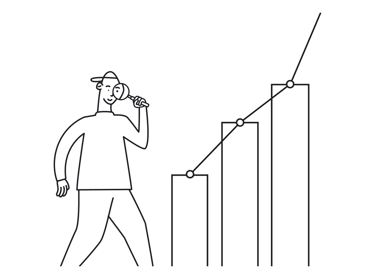
Being a design agency focused on SaaS products, our clients often ask us about the financial value of UX design. For them, user experience can seem like an elusive thing that is impossible to measure. But it is not so. There are UX metrics to evaluate the success of a design that also allow business owners to see how UX design can impact business results. And in this article, we are going to talk about them while also covering some real-life examples of companies for which investments in UX made a significant difference in their business.

So, let’s start with ways you can evaluate the success of your design.

Key UX metrics to measure the impact of UX design on your business

As UX designers, we are strong supporters of the idea that good design equals good business. And many companies tend to agree with us. Still, more than 50% of them don’t know how to assess the results of their design teams. So talking about a good old ROI would be great for starters.

The traditional ROI index shows the likelihood of a return on investment and is presented as a percentage. The ROI formula looks as follows:

ROI formula

For example, if you invest $300 and your sales go up by $600, your ROI is 100%, according to the formula: 

ROI formula

As for design projects, to assess the impact of UX design, you should focus on usability, satisfaction, and user engagement. Let’s take a closer look at them.

Usability

Most usability metrics are based on the data collected during usability testing. Through this type of testing, researchers observe the user behavior when they complete tasks trying to identify how easy it was to achieve a specific goal. As a rule, about 5 users have to participate in such tests to get clear results. 

Here are metrics to measure usability:

  • Task completion rate, or success score, shows the percentage of users who have successfully completed a specific task like creating an account, finding the right product from the list, or filling in the request form. To get your success score, you should calculate the number of completed tasks and divide it by the number of attempts.
Success score formula
  • Time on task lets you learn how much time (minutes, seconds, hours, days, or else) it takes a user to complete a task. As a rule, the shorter it takes, the better.
Task time forula
  • Error rate measures all wrong actions, such as slips (accidental behavior) and mistakes (incorrect non-accidental intentions) performed while completing a task. You may need to evaluate all of them, so you will need an error rate formula: 
Error rate formula

When focusing on one error, you have to find an error occurrence rate by calculating the total number of errors and dividing it by the number of attempts:

Error occurence rate formula

Engagement

User engagement metrics show how users will interact with a digital product helping to determine areas that need to be improved. Here are the key metrics:

  • Time spent on site measures the average amount of time users spend on specific product pages. To calculate the average time on a page, you should divide the total time users spend on a page by the total number of page views, then subtract the number of page exits. 
Average time on page

There are also a number of analytics tools like Google Analytics that can provide you with valuable numbers.

  • Pageviews show the number of pages the user has viewed over a period so that you can identify pages your users are interested in, and those that cause user friction. 
Pageviews
semrush.com

Satisfaction

User satisfaction is a crucial metric when you want to define the design's success. It shows how well your solution meets or exceeds users’ expectations and goals. This metric evaluates your users’ trust and loyalty. 

User satisfaction can be measured using the following metrics: 

  • Net Promoter Score (NPS) represents the percentage of users who would recommend your product. To determine the NPS, consider asking your existing customers how likely they are to recommend the solution to their friends and colleagues. Users should give a score of 1 to 10.  One means “not at all likely”, and ten - “very likely”. Based on the results, users are divided into three categories: 
Net Promoter Score

Now you can calculate the NPS by subtracting the percentage of detractors from promoters. 

Net Promoter Score

For example, if 70% of customers are promoters and 10% are detractors, then your NPS score is 60.

Net Promoter Score

Generally, the score is considered positive when it is above 0, meaning that you have more promoters than detractors. But leading companies often have an NPS score of 50 and above. For example, Apple has an NPS score of 68, while Amazon’s NPS is 51

  • Customer Satisfaction Score (CSAT) lets you understand ​​how users feel about your product or its specific functionality. You need to ask users to rate their satisfaction with your product from 1 (very unsatisfied) to 5 (very satisfied). 
Customer Satisfaction Score (CSAT)

To calculate a CSAT score, you’ll need to know the number of satisfied customers and the total number of received answers. You can use the following formula to identify a percentage score:

Customer Satisfaction Score (CSAT)
  • System Usability Scale (SUS). Here, your users will have to answer 10 questions, giving a score from 1, meaning “strongly disagree,” to 5, which stands for “strongly agree”. After gathering feedback, you add each score and multiply it by 2 to get from 0 to 100 points. If the score is 68 and above, for example, then everything is fine with the usability. If the score is lower than 68, then your product requires improvement.
System Usability Scale (SUS)
researchgate.net

So, as you can see, UX design is not just a superficial product or service aspect but an essential business driver. And with the list of UX metrics we shared in this article, you can easily evaluate the success of your design and its overall business value. 

But looking at specific examples where companies already did that and benefited from it is no less interesting, so let’s do it. 

UX ROI case studies that show why investing in design is worth it

Here are some examples to demonstrate how good design decisions can result in a great benefit for both your users and your business.

How changing one button led to a $300 million revenue boost 

For the book “Web Form Design: Filling in the Blanks”, Jared M. Spool shares how a small change in a form’s design let an e-commerce website increase its revenue by $300 million. 

The website was losing a significant amount of revenue due to a poorly designed checkout process. But the problem was, nobody on the team knew what the problem was.   

That’s why the company decided to conduct usability testing. After testing the website, the team discovered that customers resisted registering. Users just wanted to make a purchase and leave the website.

Registration redesign
Registration redesign resulted in an extra $300 million

The design team offered to replace the Register button with a Continue button. They also added a message informing users that they don’t have to create an account to make purchases on the website and just click Continue to proceed to checkout. 

The results of this simple change were impressive: the sales grew by 45% to an extra $15 million in the first month, leading to an overall revenue increase of $300 million.

How usability testing allowed HubSpot to improve user retention

When HubSpot was working on the record page redesign, the team discovered that excessive usage patterns were slowing down sales and support workflows. To improve usability, HubSpot decided to start by calculating user satisfaction metrics, such as CSAT and NPS scores, to then continue with usability testing.  

By testing nearly 40 activity types on the record timeline, the team identified significant issues, such as unresponsiveness and limited functionality, leading to an 11% decline in users. The team also measured the time it took to respond to an email after opening a record, which averaged around 8 minutes.

To decrease the time spent on email responding, HubSpot conducted live experiments and iterated based on user feedback, consistently prioritizing users’ needs. They eliminated unnecessary white space, reduced the load time by taking out unnecessary information, and simplified data scanning and actions on the record. 

Hubspot record page before and after redesign

When talking about numbers, the company managed to achieve great results. Their total revenue grew by 33% to $1.731 billion compared to 2021.

How SEOcrawl grew 2X after a complete UX redesign

SEOcrawl was looking to expand their existing platform to cover every aspect of the SEO needs. The company partnered with Eleken to redesign the product and improve its usability.   

We started the redesign with the competitor analysis and reviewed the existing visual design trends. Throughout the whole redesign process, each and every design decision was guided by user feedback. The SEOcrawl team shared new screens with its customers and asked them what improvements could be made. The entire redesign process was completed in under four months and then successfully implemented by developers.

As the redesign progressed, SEOcrawl's team recognized the growing expectations of their customers and decided to extend their product's functionality. To meet users’ needs, our team designed the Crawler tool for detailed SEO analysis of product web pages, and the SEO Monitor tool to detect and point out product problem areas. 

SEOcrawl's SEO Monitor tool
SEO Monitor tool to detect and point out product problem areas

After our fruitful collaboration, SEOcrawl fully revamped its solution and doubled its user base. What’s more, the new functionality allowed them to gain new paid customers, and the platform continues to grow.

Final thoughts

If you're still in doubt about whether to invest in UX, just remember that fixing UX design mistakes during development can cost 10X more, while a post-release fix can cost you up to 100X. And from the examples we covered, it’s easy to see that investing in user experience delivers a strong ROI and is definitely worth your attention.

And if you decide that excellent user experience will be your priority, hire Eleken UI/UX designers.

Natalia Yanchiy

Author

Table of contents

Top Stories

SaaS business
/
0
min read

The Pitfalls of SaaS Redesign: How to Avoid Common Mistakes

Just so you know, your redesign might not get all the applause you're expecting.

There’s a particular tiny little part of the human brain called the amygdala that is responsible for resisting redesigns. It reacts to unexpected changes as a danger and releases stress hormones into your body. So unless your redesign makes your Facebook feed chronological by default or introduces something that makes people say "FINALLY", they will hate it.

But we are here to help. At Eleken, we have redesigned dozens of SaaS apps over the last seven years. We’ve watched how other companies, big and small, implement redesigns, learned from their mistakes and now are willing to share this knowledge with you so you can avoid such pitfalls in the future.

Mistake #1: focusing on competitors

The tech market can be quite intimidating with all these startups popping up like mushrooms after rain and quickly becoming unicorns. In 2022, there were almost 900 unicorn startups worldwide and their total value exceeded $3.5 trillion. So even if you have a strong and steadily growing SaaS product, the competition still might feel a bit disturbing. 

Still, it doesn’t mean that you have to turn your product into a Frankenstein, adding as many features from your competitors as possible. This is exactly what happened with Skype in 2017 when Microsoft decided to make the app more “competitive” and appealing to the audience. 

Skype 2017 redesign

The new redesign made Skype much more colorful and introduced Stories, making the app look and feel more like Snapchat. Other new features included bots and add-ins and were obviously inspired by Facebook Messenger. 

Did the audience like it? Not really. A year after, Microsoft had to roll back the redesign, ditching most of the updates. Turned out that people valued their good old Skype for free chats, phone, and video calls, and didn’t use new features much. 

What can we learn from this? Focusing too much on competitors might result and implementing unnecessary features instead of improving what can become better is not the best strategy to follow. So even if you find a feature everyone likes in Snapchat, Instagram, whatever, it doesn’t necessarily mean your audience could use it in your app. 

Furthermore, sometimes being different can become one of your biggest advantages. This is just the case of one of our clients, Gridle — a CRM system for freelancers and small agencies. Instead of copying what their competitors do, they decided to focus on what helps them stand out, which was targeting small businesses and offering a very simple CRM user experience. In collaboration with Eleken Gridle managed to redesign their system and find their loyal audience that didn’t like complicated CRM systems.

Gridle's redesign in collaboration with Eleken

Mistake #2: lack of communication during the redesign

Remember that part when we told you people dislike changes? Well, it’s still possible to soften the blow of audience reaction by:

  • introducing new features to end users before implementing them;
  • explaining why you decide to implement them;
  • telling how these features would improve the user experience. 

On the other hand, lack of communication can result in misunderstanding, user disappointment, and, consequently, decreased engagement. One of the most prominent examples of that is Twitter and its infamous design updates

Instead of presenting the long-awaited editing button, Twitter decided to surprise users with a new custom font, a high contrast color scheme, and new button colors. High contrast was probably the worst idea, since the high contrast is quite harmful for users, especially the ones who suffer from chronic migraines. This is a clear example of what can happen when you don’t talk to end-users and think you know what they want better.

Twitter users react to a poor design update

After learning from Twitter's mistake, we at Eleken focused on communication when introducing a brand new feature to the student engagement app Enroly. While the app itself was a great solution, its workspace lacked navigation tips. Introducing a new feature, a complex dashboard, could potentially add to the user confusion, so we decided to use tooltips to explain the updates to the audience – and it worked well!

How Enroly's tooltips look

Mistake #3: not planning for scalability

It’s hard to predict if your SaaS product will succeed when you launch it. Still, you have to plan it with success in mind to know what to add to your MVP once your project starts growing. 

When you don’t plan for scalability right from the start, it could become difficult to add new features, optimize user flows, and improve UI, especially if you don’t have the budget for that in the near future. For instance, Instagram wasn’t prepared to face such rapid growth, crossing the mark of 100,000 users after only six days after release. This resulted in performance issues that could potentially be avoided.

At Eleken, we faced the same issue when working with Acadeum, an eLearning app for students and educational institutions. When Acadeum turned to us, they already had two versions of the app, one for students, and one for the college admins. As they were focusing on two target audiences at once and were scaling quickly, the number of support tickets kept increasing, and so the improvements in the design had to be made.

The student app has been already fixed and updated by the company in-house designer. However, they needed someone from the outside to redesign the admin app while maintaining the same look and feel the student app had, improve the questionable user flows and deliver an updated app within three months. This was a challenge that we were willing to take and the result left both us and our client deeply satisfied.

Acadeum's redesign in collaboration with Eleken

Mistake #4: not aligning the redesign with existing resources

Sometimes it’s simply impossible to resist the temptation to make your solution more modern and add some bells and whistles during the redesign to make the solution look more impressive. After all, developers can implement it in any case, right?

Not quite. Most often developers have to write custom code to implement certain design decisions. Depending on the decisions, this could be quite easy and affordable in some cases, and complex and costly in others.

Designers and developers clash

While this might not seem like a problem to companies with enough financial and technical resources to spare, it might become a burden to startups and small companies that don’t have such big budgets and teams. 

But even in this case, a smart redesign approach can save the day. When we faced a similar situation with Gamaya’s redesign, we decided to give up custom elements to make the solution more budget-friendly for the client. Instead, we used ready-made components. This didn’t make Gamaya less appealing to the target audience, but helped the client to optimize resources.

Gamaya's redesign in collaboration with Eleken

Mistake #5: not testing with end users

What is the simplest way to find out if people like your redesign? Ask them to try it. Testing not only helps to identify issues and bugs before the improved version is released but also helps understand if your users will find it easy to use.

This is what Dropbox neglected when they were updating their Plans page. Here how it looked after the update:

How Dropbox updated its Plans page

As you can see, Dropbox added some color and a cute illustration. It seemed that nothing could go wrong. But users’ reaction proved different. After a short period of time Dropbox noticed that several of its performance metrics dropped and changes in design were behind this drop.

Dropbox team reaction to key metrics drop caused by the redesign

In the end, it seems that the color choice negatively affected the page’s performance, so the team had to redesign.

And here’s an example that proves that user testing is worth it. One of our clients, SEO Crawl, treated testing very seriously and showed each redesigned screen to their customers. This helped validate the improvements and ensure user satisfaction. Although people usually dislike massive redesigns that make a product less familiar, in this case SEO Crawl gained a fresh, more modern look that received very good feedback from users.

How SEO Crawl looked before the redesign
How SEO Crawl looks after the redesign

Don't forget who you're redesigning for

Even though people are biologically wired to resist changes, there still are ways to overcome this phenomenon. All the mistakes described above lead to one clear conclusion: if you redesign without talking to end users, it's not worth it. So, find out what irritates your audience in the existing version of a product. What is okay but not good enough? Do they want these brand new features that you plan on introducing or not?

Addressing users' triggers and pains will help you overcome the initial redesign resistance. Because while people dislike changes, they also like when their problems are solved.

Eleken can make your redesign experience more productive and definitely less intimidating. Contact us for a free consultation and let’s make people's lives better together!

SaaS business
/
0
min read

Adobe Buys Figma for $20B, and Pisses Off an Entire Profession

Figma CEO Dylan Field: “Figma to be acquired by Adobe.”

UX designers everywhere: “God damn it!”

A bit of background

A design software juggernaut with a bad reputation that runs a dozen apps nobody really likes buys the most beloved tool in the design community for an insane $20 billion. 

Since 2016, Figma has boomed thanks to its collaborative innovation, free access for beginners and attention to user experience. Eleken UI/UX designers are huge fans of Figma — the app tops our list of best UI/UX tools. You can see how we praised the app here, here, and also here

Now we all are a bit… concerned about the future of a platform we rely on every day.

Adobe buys Figma meme
Source: telegraf.design

We are concerned because Adobe is making a monopoly

Our experiences on the internet are now dominated by a steadily declining handful of giants like Google, Apple and Microsoft. Adobe is following their footsteps — now it controls four out of five UI design tools. The only competitor left is Stripe with a market share of about 10%.

Do you remember when was the last time monopoly spawned something good for end-users?

which soft do you use for UI design
Source: uxtools.co

Adobe’s $20 billion deal for Figma is more than 50 times the startup’s revenue. That sounds crazy unless they are just trying to ruin the product that undermines the success of their cash cows called Photoshop and Illustrator.

Something similar Facebook did to Instagram ten years ago, paying way too much. But retroactively we can see it as a successful attempt to preserve Facebook's monopoly.

Adobe buys Figma meme
Source: telegraf.design

We are concerned because previous Adobe takeovers ended badly

Dylan Field says Adobe doesn’t want to break anything.

But we know that this line belongs to the top 5 things they say about every single tech acquisition. It's never been true before, so why would it be now? 

At the beginning of any corporate takeover, they promise you nothing will change. And then — voila — “you have to pay more, but you get a useless new feature in return.”

Maksym, Design Director at Eleken

You won’t have any illusions about Adobe’s acquisitions if you question the fate of products it merged before. 

  • Many years ago, Adobe bought Macromedia’s Fireworks, a cheap and powerful graphic editor that was hugely ahead of its time. Adobe cut off its resources, left major bugs and eventually closed the product.
  • Adobe acquired portfolio service Behance, which worked as LinkedIn for designers. Now there are hardly any interactions on Behance.
  • Adobe dropped $1.3 billion on the video collaboration app Frame.io. Since then, Frame.io has had constant problems with usability.

We want to believe Adobe’s promises, but deep down we know this merge is going to harm Figma. High chances are that the app will get progressively harder to use, buggier, and more expensive. The pricing concern deserves special attention.

Adobe buys Figma meme
Source: telegraf.design

 We are concerned due to Adobe’s monetization strategy 

One of Figma’s advantages is freemium pricing. That's awesome — you have all you need to start with design freelancing for free till the point you make a decent living through it. Many successful designers I’m following on Twitter say they owe their careers to cracked Photoshop. Because you can’t afford to pay for Adobe subscriptions as a beginner.

Maksym, Design Director at Eleken

Sure, you can’t. Adobe charges over $30 per month. That is quite an investment for a person that only learns how to design. Figma makes professionals pay $12 per month, and for beginners, it’s completely free. 

Dylan Field says that “currently they have no plan to alter Figma’s pricing”. Of course, not for the next 2 months, then things will change, right? Because Figma’s “making design accessible to all” motto is an antithesis to Adobe’s pricing strategy. 

We are concerned due to Adobe’s Suite management strategy

Another thing Dylan Field says is that Figma plans to incorporate Adobe’s expertise in illustration, video, 3D, and other fields.

Sounds like they are going to promote Adobe products through Figma, integrating them into the app. That’s Adobe’s standard strategy, but does it make apps easier to learn and use? Definitely not.

But the worst thing is that acquisition feels like a betrayal

From the moment of its birth, Figma declared war on Adobe. Where the design giant was too pricey, Figma decided to be accessible to everyone. Where Adobe’s tools denied teamwork, Figma built its business around collaboration. Where Photoshop was sluggish, Figma worked in real time. 

Figma started with a definite goal of taking on Adobe, and gained its significant market share thanks to massive user frustration with their previous experiences. It was a success story of David and Goliath, where we all rooted for an innovative and humane underdog. 

And then, one fateful day, our underdog took the side of its ideological enemy. If you were tired of things, why not sell your claim to someone on your team? Instead, you passed it to the corporation you were competing against. 

Adobe buys Figma meme
Source: forum.figma.com

 Legend has it that Dylan Field once bet a bunch of fellows he could make them cry with a short story 280 characters long. He won the bet.

Few moments later: 

Don't want to miss anything?

Get weekly updates on the newest design stories, case studies and tips right in your mailbox.

Success!

Your email has been submitted successfully. Check your email for first article we’ve sent you.

Oops! Something went wrong while submitting the form.
Don't want to miss anything?

Get weekly updates on the newest design stories, case studies and tips right in your mailbox.

Success!

Your email has been submitted successfully. Check your email for first article we’ve sent you.

Oops! Something went wrong while submitting the form.