
Enterprise UX is a whole different ball game. These tools aren’t optional, the workflows are complex, and users rely on them to do their jobs – not just get things done, but get them right.
That makes the design process more demanding. Time-saving shortcuts, error prevention, and mental clarity often matter more than delight or visual polish. Add in legacy systems, role-based permissions, and slow development cycles, and it’s clear that enterprise UX design calls for a different mindset.
As a UI/UX design agency specializing in SaaS, we have solid experience working with enterprise tools that need to be both powerful and practical. We’ve worked firsthand with the unique challenges of enterprise complexity – and know how the right design makes user experience smoother and brings overload back under control.
In this article, we’ll unpack what sets enterprise UX apart, what it should focus on, and which design patterns actually help users stay productive and confident in complex systems.
What is enterprise UX and why it demands a different approach
Enterprise UX is all about designing experiences for tools that must support repeatable, mission-critical, complex tasks without overwhelming end users — especially if workflows evolve, roles multiply, and legacy issues go unaddressed.
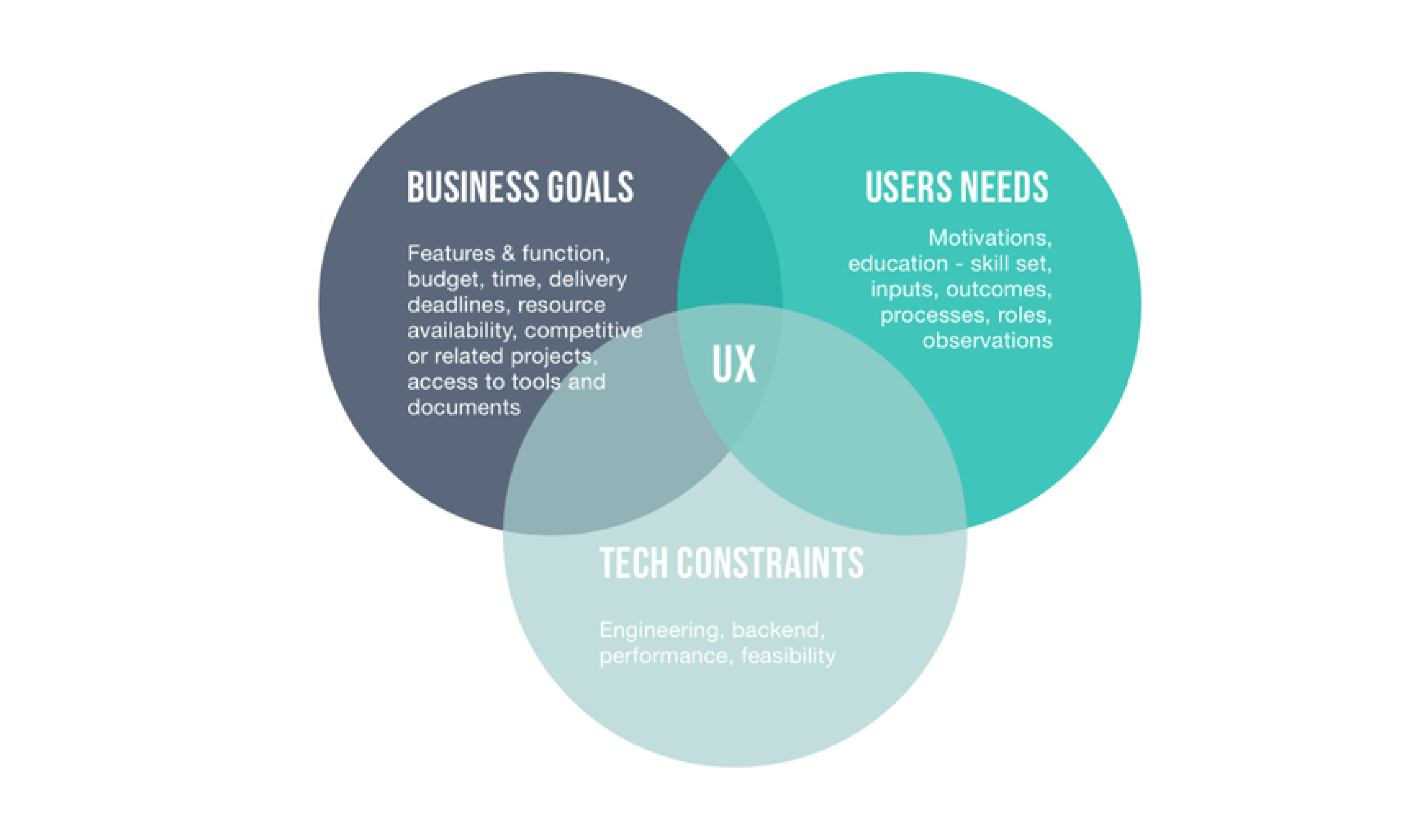
Designing UX for enterprise applications requires a hard-to-earn balance between organizational goals, user needs, and technical constraints.
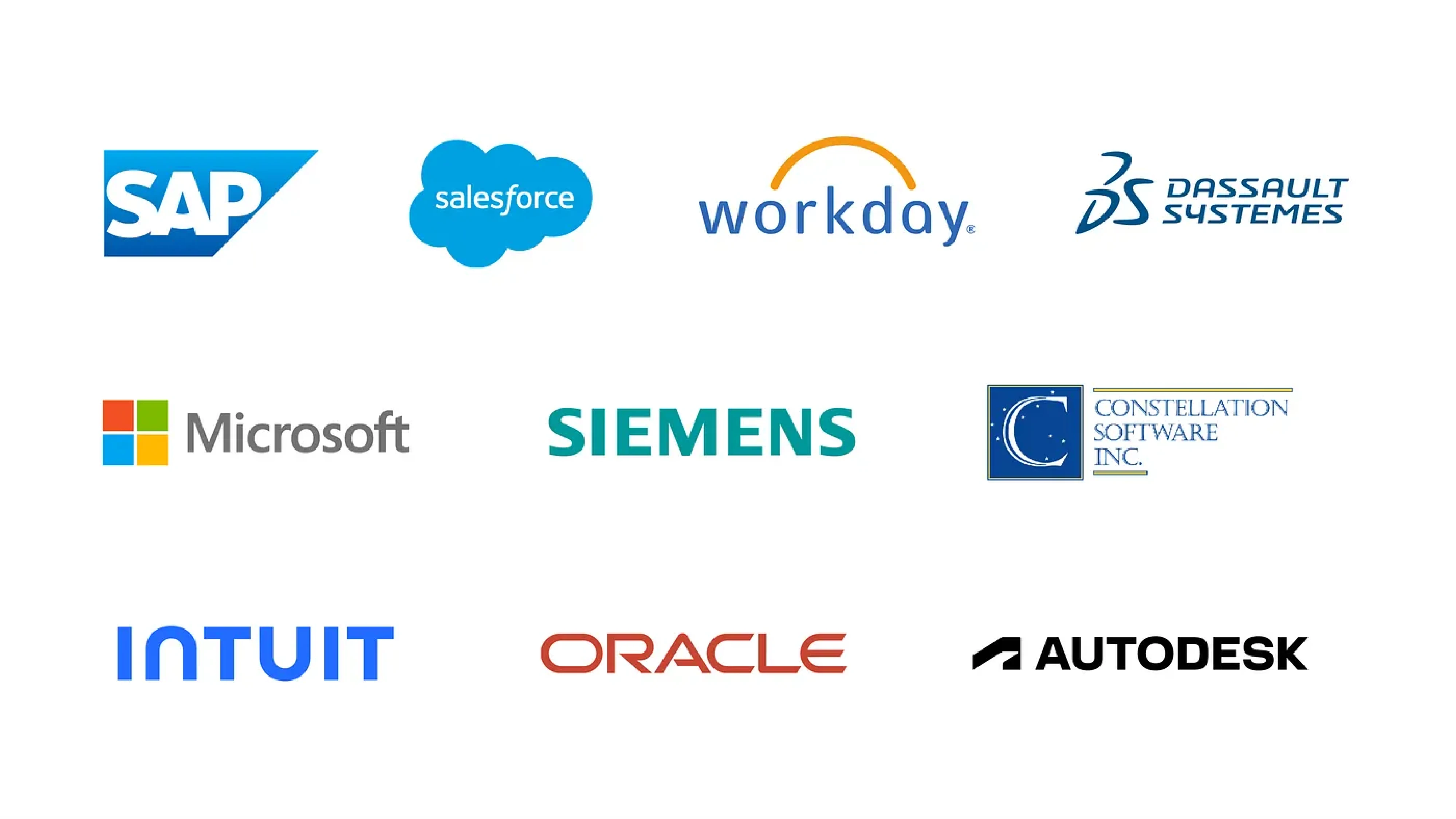
Some typical examples of enterprise products include Salesforce for managing customer relationships, Workday for HR operations, or SAP for enterprise resource planning. These tools aren’t casual consumer software people download on a whim — they’re large operational systems, deeply embedded in how large companies run.
To better understand what sets enterprise software UX design apart, it’s also helpful to compare it to consumer apps. While both share some basic principles, lots of things are fundamentally different there.
Why enterprise UX creates friction that consumer products rarely face
Enterprise user experience creates friction that consumer apps rarely face — not because the software is inherently worse, but because the surrounding context limits what good design can solve.
The buyer isn’t the user — and design lives in the gap
In enterprise systems, the people who buy the product aren’t the ones who use it. Leadership, procurement, IT, and compliance drive the decision-making process.
On the one hand, their focus is logical: risk mitigation, integrations, reporting capabilities, pricing, vendor stability, and feature completeness. But everyday workflows rarely sit at the center of those conversations.
And that’s where the gap begins.
Imagine a hospital selecting a new EHR system. Executives evaluate compliance, integrations, and vendor reputation. The platform looks powerful in demos and checks every requirement box. After rollout, doctors discover that documenting a visit takes multiple screens, prescribing medication requires excessive clicks, and alerts prioritize billing logic over clinical clarity.
On paper, the system is powerful and “enterprise-ready”, but in practice, it slows down care and increases burnout.
And yet, the software isn’t “bad.” It does exactly what leadership prioritized. But the context — compliance pressure, procurement constraints, enterprise sales — shaped the product around institutional needs rather than daily workflows.
So by the time enterprise UX designers are then brought in to “improve usability,” but the architecture, data structure, and workflow logic are already locked in — too late to shape the foundation.
A good counterexample is Favorably, an enterprise MVP of a referral-based platform designed to support relationship-driven sales teams. From the outset, we involved potential users to validate key assumptions, building and testing early prototypes before committing to the product direction in an enterprise space without direct competitors. The final result was worth the effort: a convenient, data-driven platform that helps businesses grow revenue and build customer trust — designed in under three months due to design-driven development.
When users can’t churn, their behavior changes
Unlike consumer apps, enterprise tools aren’t optional. People can’t walk away from bad UX – they’re expected to work through it. And when the interface doesn’t match how people work, they fill the gaps themselves.
Some workarounds can be small but telling:
- duplicating records to trigger workflows
- entering dummy data to get past required fields
- copy-pasting across disconnected modules
Others can be harder to spot — and even riskier — as enterprise software users either repurpose existing features for unsupported daily tasks, or partially move workflows into third-party tools, and store sensitive data outside IT oversight.
All in all, the more users compensate for broken flows, the harder it becomes to see what’s broken — until the workarounds cause even more damage than the UX itself.
At scale, issues grow — including the frustration
Enterprise software supports thousands of users across many roles, workflows, and permissions. What starts as a minor issue can quickly snowball into a system-wide issue at scale.
At such points, designing clear, reliable flows becomes harder. Small UX decisions — like label, dropdown, or default state — can create ripple effects across hundreds of workflows.
But even when problems are visible, fixes are slow. Legacy systems, approval layers, and stretched dev cycles often delay change. That gap between pain and resolution is where all that immense frustration grows — not because the solution is broken, but because it can’t evolve fast enough.
Minimize enterprise UX friction by getting the basics right
Reducing enterprise UX friction starts with two fundamentals: designing for scalability from day one, and genuinely involving end users so their real needs shape how the system works — and continues to grow. That means doing deep, meaningful user research that captures how people in different roles actually use the product.
Starting with a proper UX audit is the smartest way to approach a system – especially when it’s already in active use. It helps you understand what’s completely broken, what still works, and how to prioritize fixes strategically – so you can allocate budget wisely and deliver real value faster without disrupting critical operations.
Btw, here’s a great UX audit case study article on how Eleken approaches audits in real-world projects — with takeaways and examples from SaaS products we’ve helped improve.
For example, in our work with Panjaya, an AI-powered localization platform, we helped adapt a product originally built for creators and small teams to enterprise-grade workflows. During our free 3-day trial, we tackled Panjaya’s most critical UX issue, after which a deeper UX audit helped us uncover and address additional usability challenges. Throughout the collaboration, we redesigned the UX around enterprise needs, including multi-stage reviews, client-side corrections, and team collaboration. The result was an enterprise-ready UX that supports complex workflows and has helped clients like TED report up to a 115% increase in views from localized content.
What good enterprise UX actually optimizes for
Enterprise software design isn’t about delight or conversion. It’s about making work smoother, faster, and more reliable — at scale, under pressure, and across teams. To get there, you need to optimize for the outcomes that matter — the ones that go far beyond engagement metrics.
Focus on what moves work forward
Traditional UX metrics like engagement or session length don’t reveal much in an enterprise setting. Instead, focus on indicators that show whether the product helps multiple people get their work done — accurately, efficiently, and with less friction.
- Time on task: users should complete core workflows quickly without unnecessary clicks, detours, or confusion.
- Error rates: UX should make the next steps obvious, reducing confusion, and preventing missteps and costly errors.
- Task completion: workers should be able to finish their tasks confidently on a first try without second-guessing.
- Support volume: designed UI and flows should minimize support tickets by making core actions clear and self-explanatory.
- Cognitive load: the interface should make it easy to focus by keeping information architecture clear, structured, and relevant to the task.
Design for long-term efficiency, not just quick wins
In enterprise tools, usability isn’t just about making things easy at first glance — it’s about helping users become faster and more effective over time. Good UX supports the long game, where depth and efficiency matter more than instant simplicity.
Here are five ways design can support that kind of mastery — without sacrificing speed or control.
1. Support learning curves with thoughtful onboarding
Enterprise product design often comes with necessary complexity — and that’s not a flaw. The key is to guide users through that complexity gradually. Thoughtful onboarding flows, contextual cues, and role-specific interfaces can help teams ramp up without feeling overwhelmed. A good learning curve is designed to build confidence instead of resistance.
2. Give experienced users speed with shortcuts and bulk actions
Not every user needs keyboard shortcuts or multi-select workflows — but for the ones who do, these features are essential. Enterprise users often deal with high volumes of repetitive tasks, and shaving off seconds per action adds up fast. Smart UX anticipates this by offering fast lanes for those who need them most.
3. Structure dense UIs with clarity and intent
Enterprise UI design is rarely minimal, and that’s okay. What matters is that dense layouts are organized logically, grouped by task, and visually prioritized. When done right, showing more — not less — helps users move faster and make decisions with confidence. Clarity is more important than whitespace.
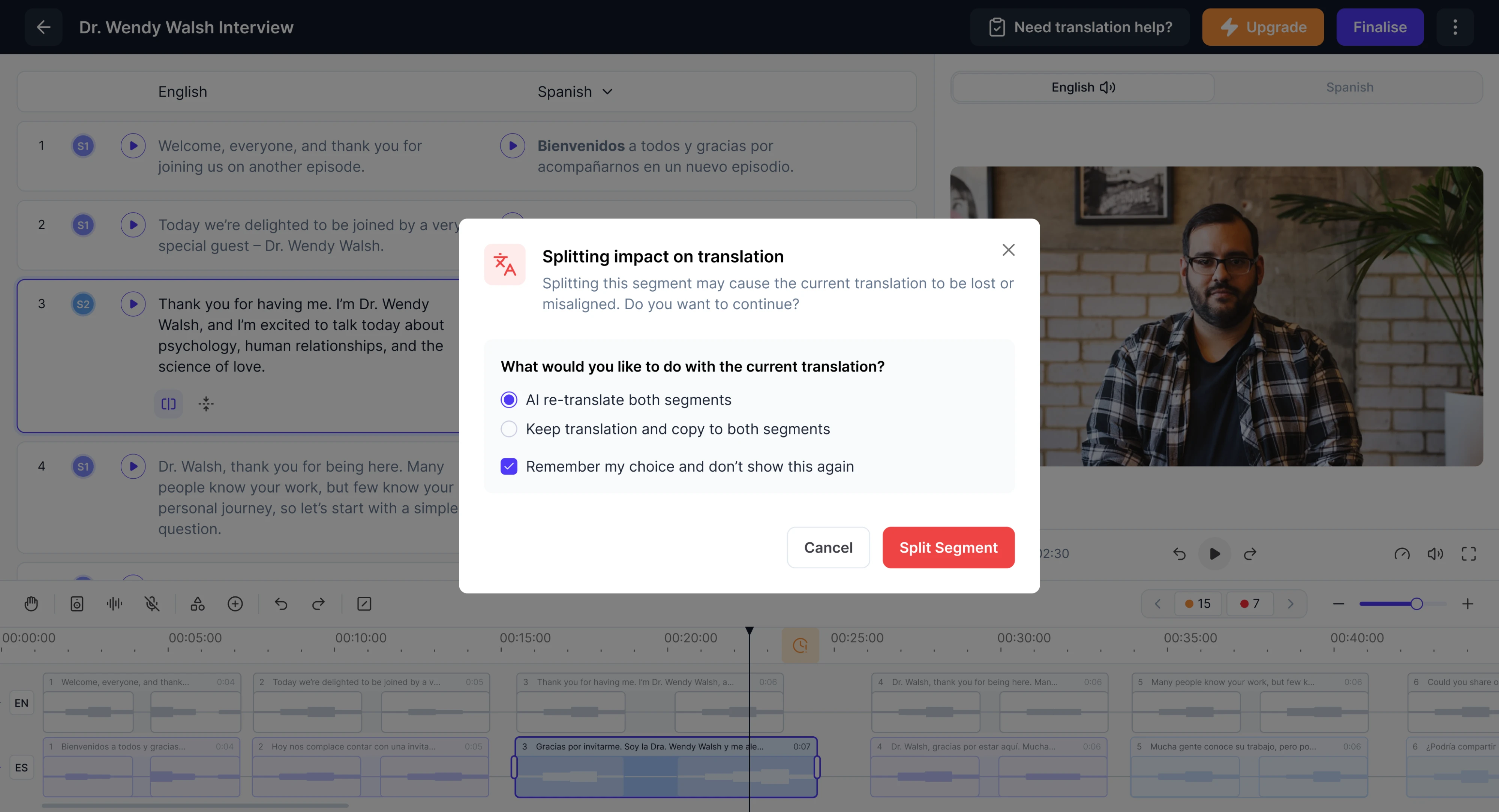
4. Add safety nets like undo, previews, and warnings
Even experienced users make mistakes, especially when moving fast. That's why systems should offer gentle guardrails: undo options, preview screens, validation checks, and inline warnings.
A good confirmation step should clearly state what the action will do, what can’t be undone, and what the user should double-check before continuing. These elements give transparency into what will happen next and help users work without fear of breaking something.
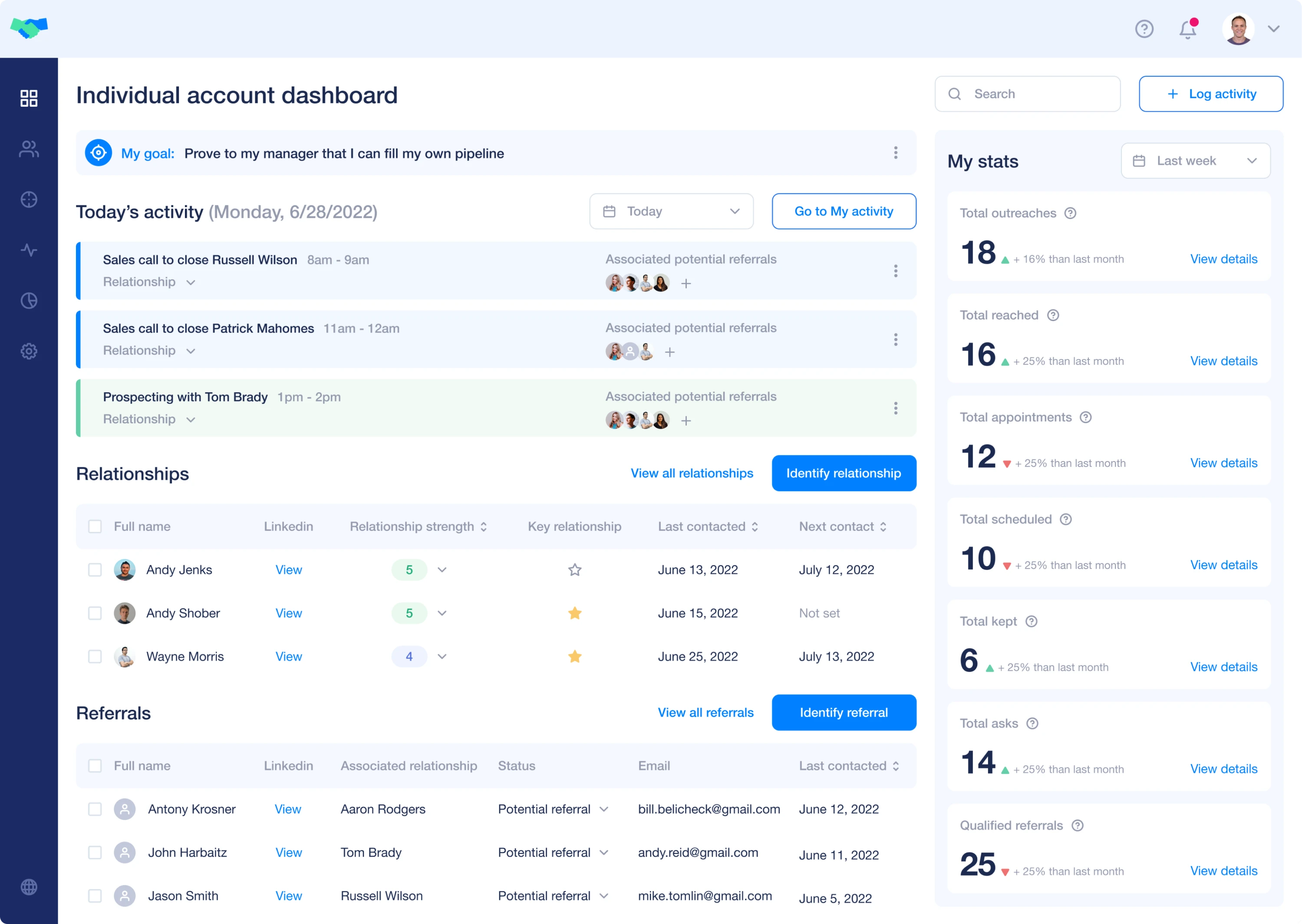
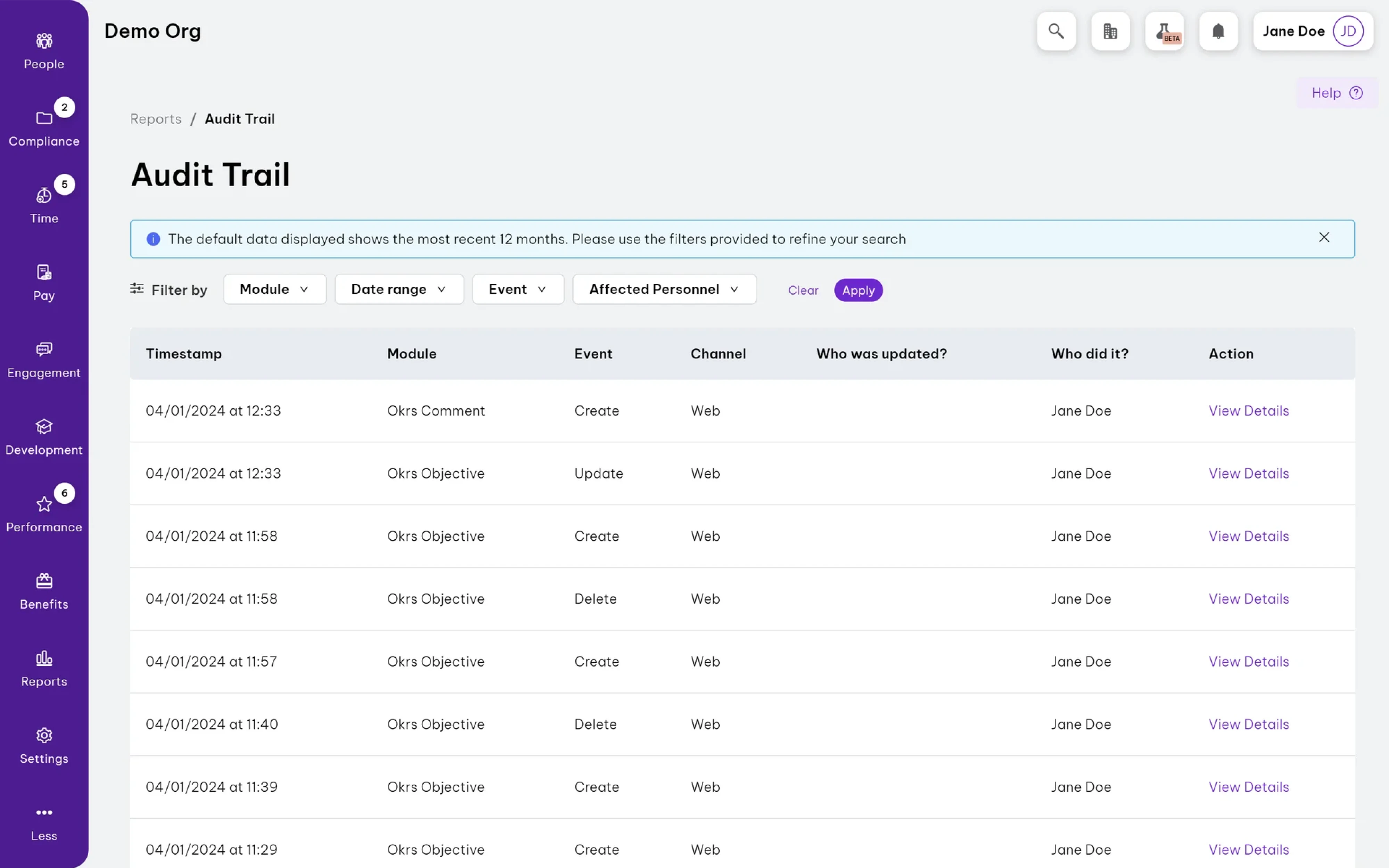
5. Offer audit trails to create transparency and accountability
Enterprise users often need to answer a simple question: “Who did what, and when?” A well-designed audit trail makes it easy to trace actions across teams and systems — whether for internal oversight, troubleshooting, or keeping work aligned. It replaces uncertainty with visibility, helping teams stay on the same page making actions traceable, and easy to follow.
Enterprise UX patterns worth stealing (with real examples)
Effective enterprise UX relies on smart, repeatable UX design patterns — not endless reinvention. The ones below work especially well in enterprise settings, where scale and precision matter. You’ve probably seen them in tools you use — without realizing they form a pattern. Let’s break down a few worth borrowing.
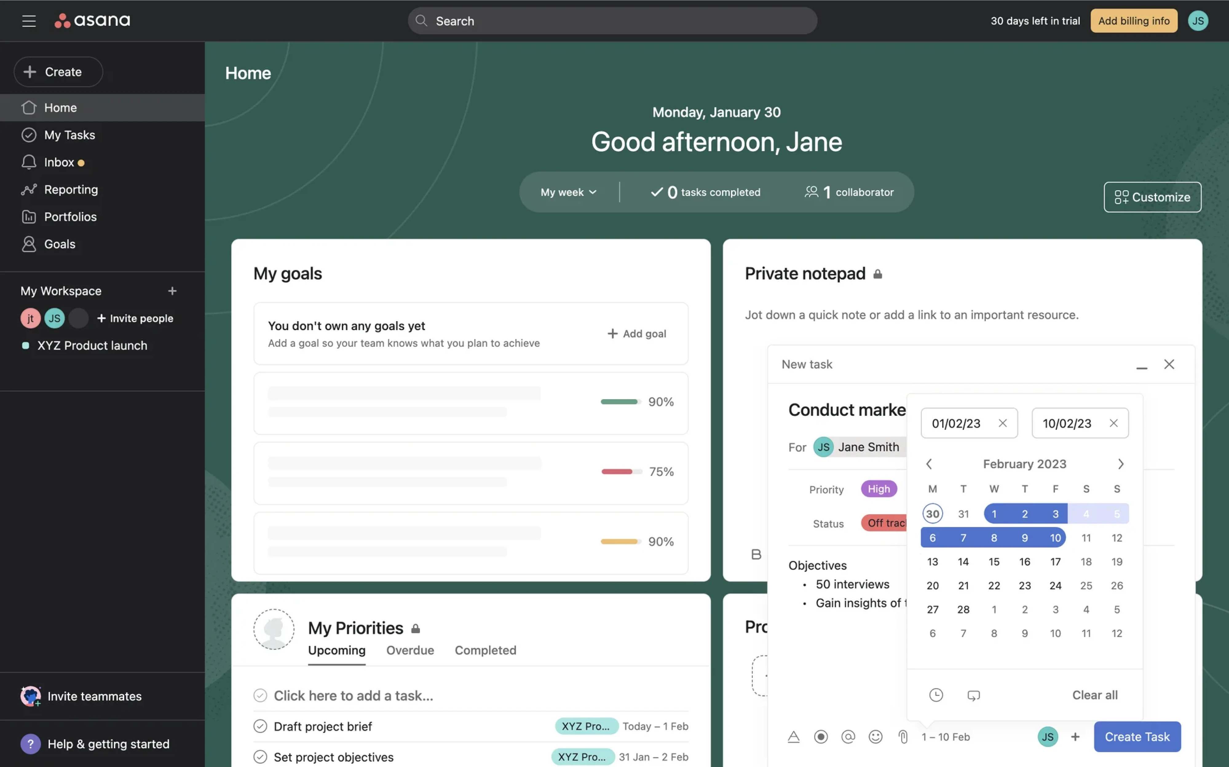
Progressive disclosure for complex workflows
Enterprise tools often involve long, multi-step processes with lots of options — but showing everything at once can overwhelm users. Progressive disclosure solves this by revealing essential information first, and presenting secondary or advanced options only per user request. It helps maintain enterprise UI clean and keep users focused on what matters most, especially early on.
You’ll see this in tools like Asana and Linear, where advanced filters and settings stay tucked away until needed — keeping workflows clear without sacrificing power.
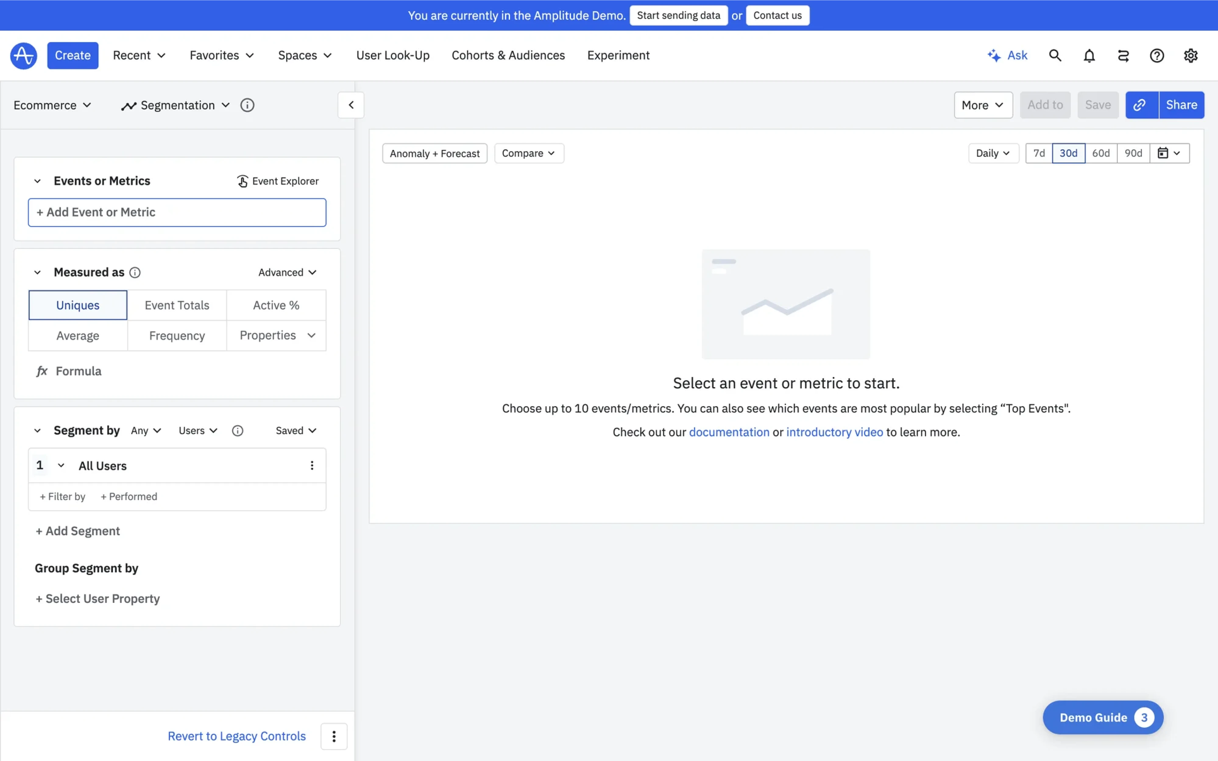
Visual query builders for data-heavy interfaces
In data-heavy SaaS tools, users often need to extract insights — but writing queries manually can be slow and error-prone. Visual query builders simplify this by turning logic into guided inputs, so users can filter and explore data without needing technical skills.
You’ll see this in tools like Amplitude and Google Analytics, where non-technical users build queries visually to analyze behavior, define funnels, or segment audiences. It turns UX enterprise complexity into clarity — and helps more teams use data to make decisions.
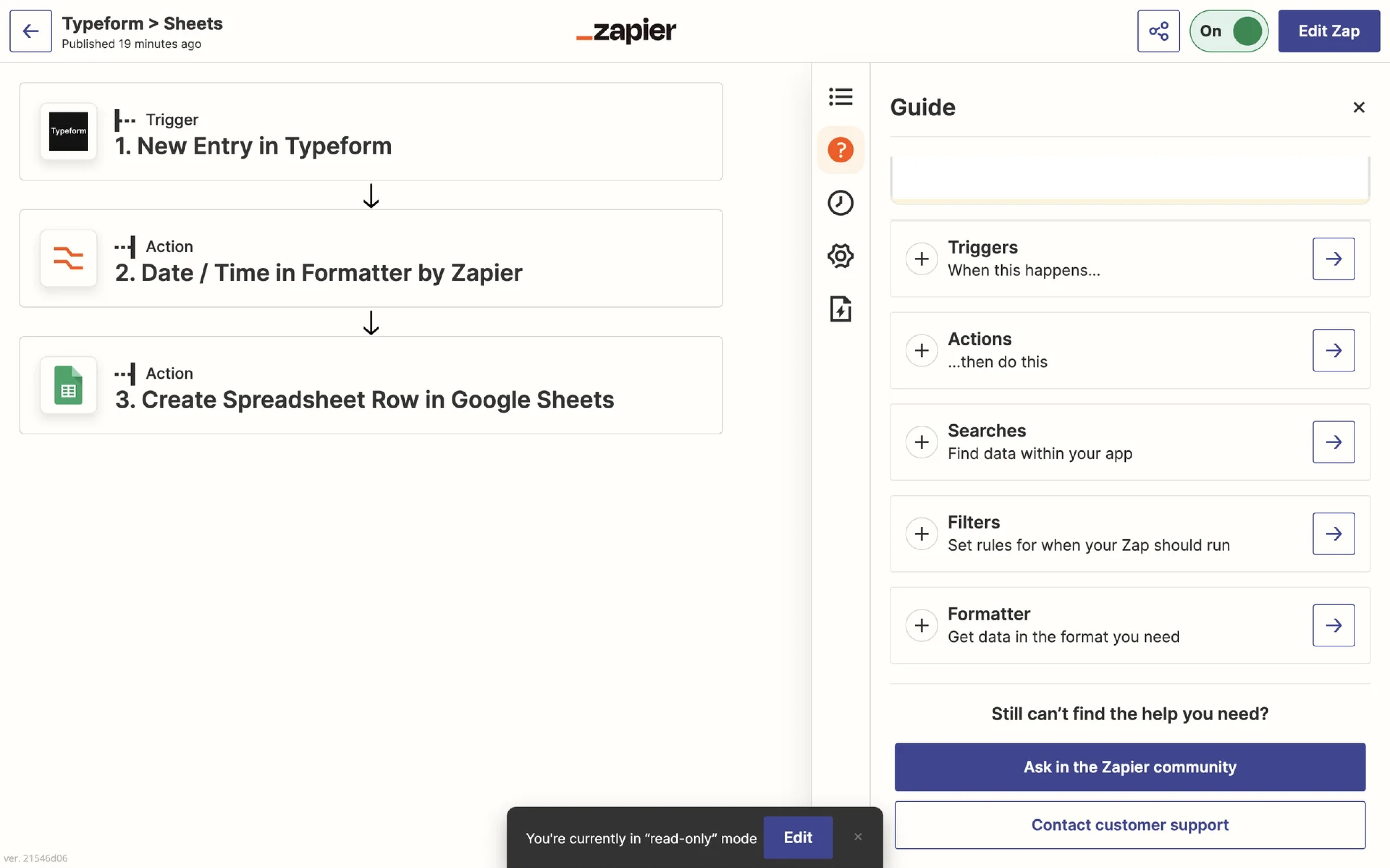
Transparent automation logic for user trust
When your product automates tasks across tools, users need to understand what’s happening — and why. If automation happens invisibly, it creates confusion and breaks trust.
Transparent automation logic solves this by surfacing triggers, conditions, and outcomes in a visual, editable format. If your workflows span multiple systems or require user oversight, this pattern helps users stay in control.
That’s a common pattern in tools like Zapier and Workato, where step-by-step logic mapping reduces surprises and helps teams run automations more smoothly and confidently.
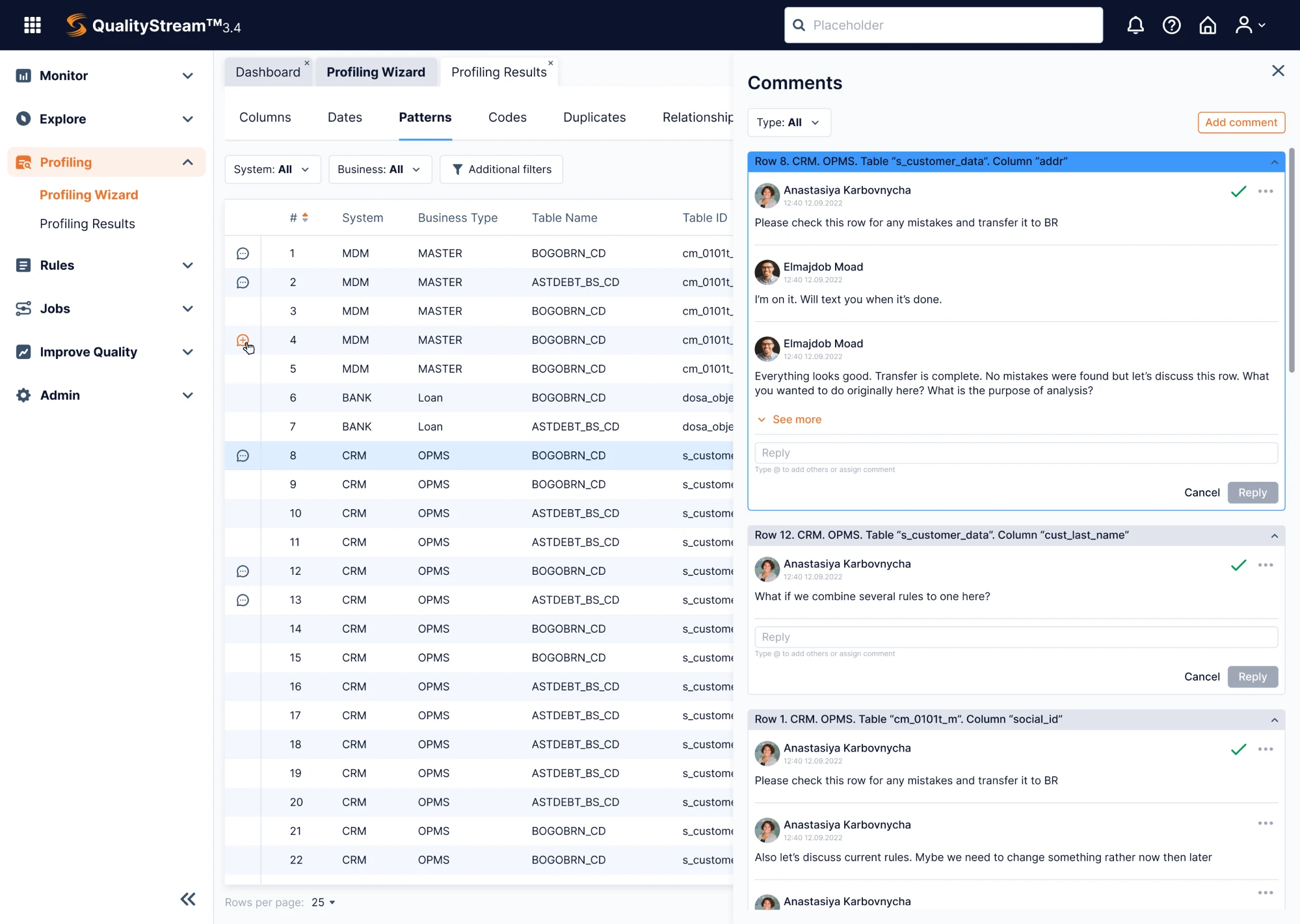
Dense, efficient interfaces for expert users
While many enterprise users follow structured workflows, some must orchestrate complex operations where speed and precision are essential. For them, dense interfaces aren’t a flaw — they’re what make expert performance possible.
Some parts of the interface may prioritize depth over simplicity. Features are tightly organized and layered to support fast, high-stakes decisions. Yes, the learning curve can be steep, but once mastered, these screens enable high-efficiency workflows that simpler layouts can’t support.
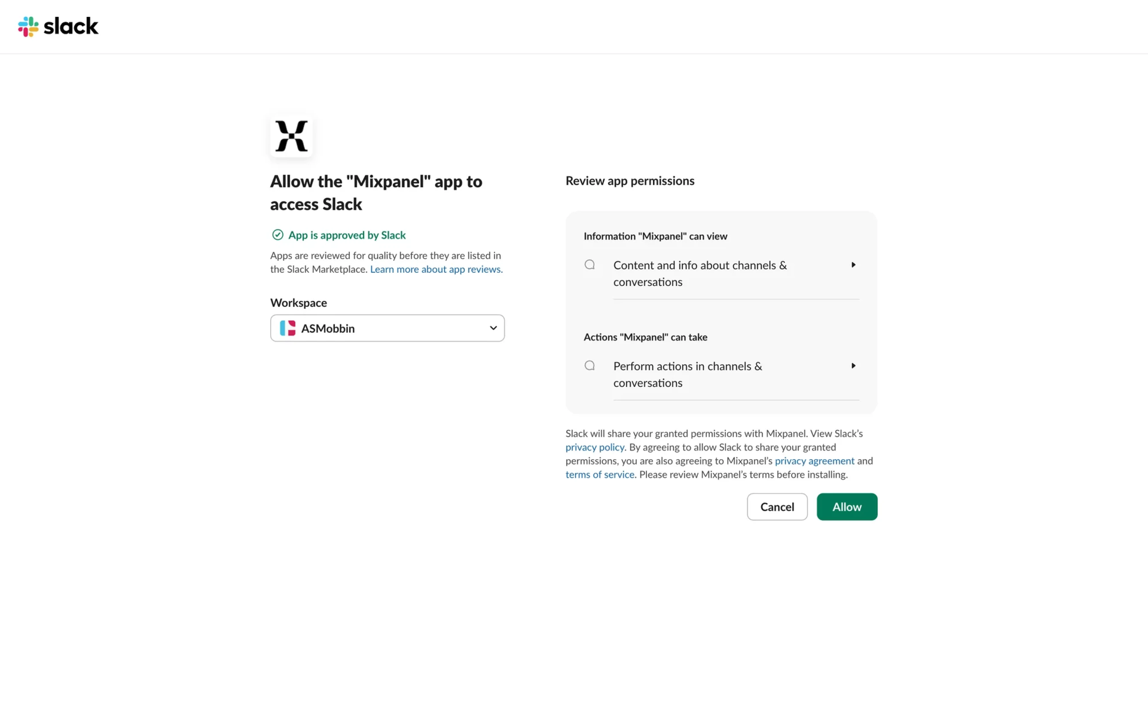
Protective guardrails for high-stakes decisions
In enterprise apps where a single action can trigger major workflows or make irreversible changes to data, users need a safety net. When the stakes are high, your enterprise design should help people pause, review, and correct before committing. Patterns like confirmation flows, preview states, permission checks, and undo options reduce costly mistakes and build confidence.
When enterprise UX works, the product does too
Enterprise application UX feels different because it is different. It’s not about delight or aesthetics, though those help. It’s about making complex, critical systems usable, reliable, and scalable – even when the constraints fight you.
From managing customer pipelines to processing payroll or coordinating logistics, these tools are designed to support mission-critical work. And in that context, thoughtful UX strategy isn’t a luxury here — it’s a responsibility.
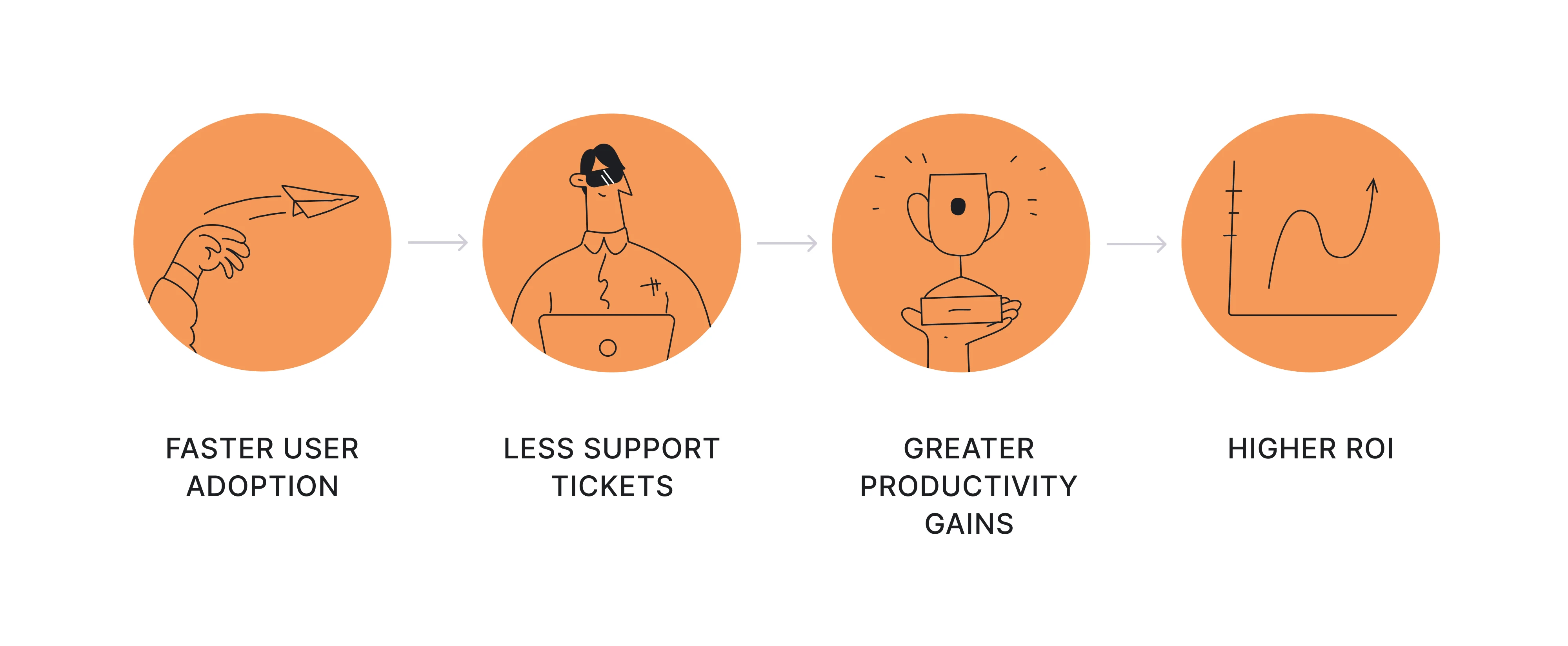
Get it right, and the results speak for themselves: faster user adoption, lower training costs, fewer support tickets, user satisfaction, and better productivity across roles. In the long run, great UX means higher ROI — not just for the product team, but for the entire organization.
Whether you're building from zero or improving an existing system, Eleken can support you with UX/UI design for enterprise software — helping you create tools that work at scale and serve real user goals and needs.