

Do websites in 2026 even need footers anymore?
It's a question that comes up regularly in design discussions, and the answers aren't always consistent. On one side, advocates argue footers are essential, as they give users a second chance to find what they missed, offer key legal and accessibility links, and even help with SEO.
But others push back. Footers often turn into cluttered design elements filled with redundant links. On infinite scroll pages, they’re practically unreachable. And on mobile, heavy sticky footers can eat up screen space and frustrate users.
So, how do you design a footer that actually adds value? That’s what this article aims to uncover. We’ll break down all the essentials so you can stop guessing what to put at the bottom of the page and design footers that work.
Modern footer design patterns
There’s no such thing as the perfect footer. What works for a focused landing page might completely fail on a content-heavy website design. That’s why most teams either skip the footer section entirely or throw in every possible link just to be safe.
To help you avoid the same trap, we’re breaking down the most relevant footer UI design patterns in 2026.
Utility-only footer
A utility‑only footer is the most minimal kind of footer UI that carries only essential company links and leaves out additional navigation, CTAs, or branding flourishes. Its goal is to provide user safety rails and compliance essentials.

This type of footer works best for landing pages, simple one-pagers, and checkout flows where you don’t want anything distracting from the main action. If your primary navigation is already handled up top, the footer doesn’t need to repeat it.
Must-have elements:
- Legal / compliance links: privacy policy, terms of service, cookie settings;
- Copyright notice and site ownership info;
- Possibly “contact details” or “support” link, depending on site context.
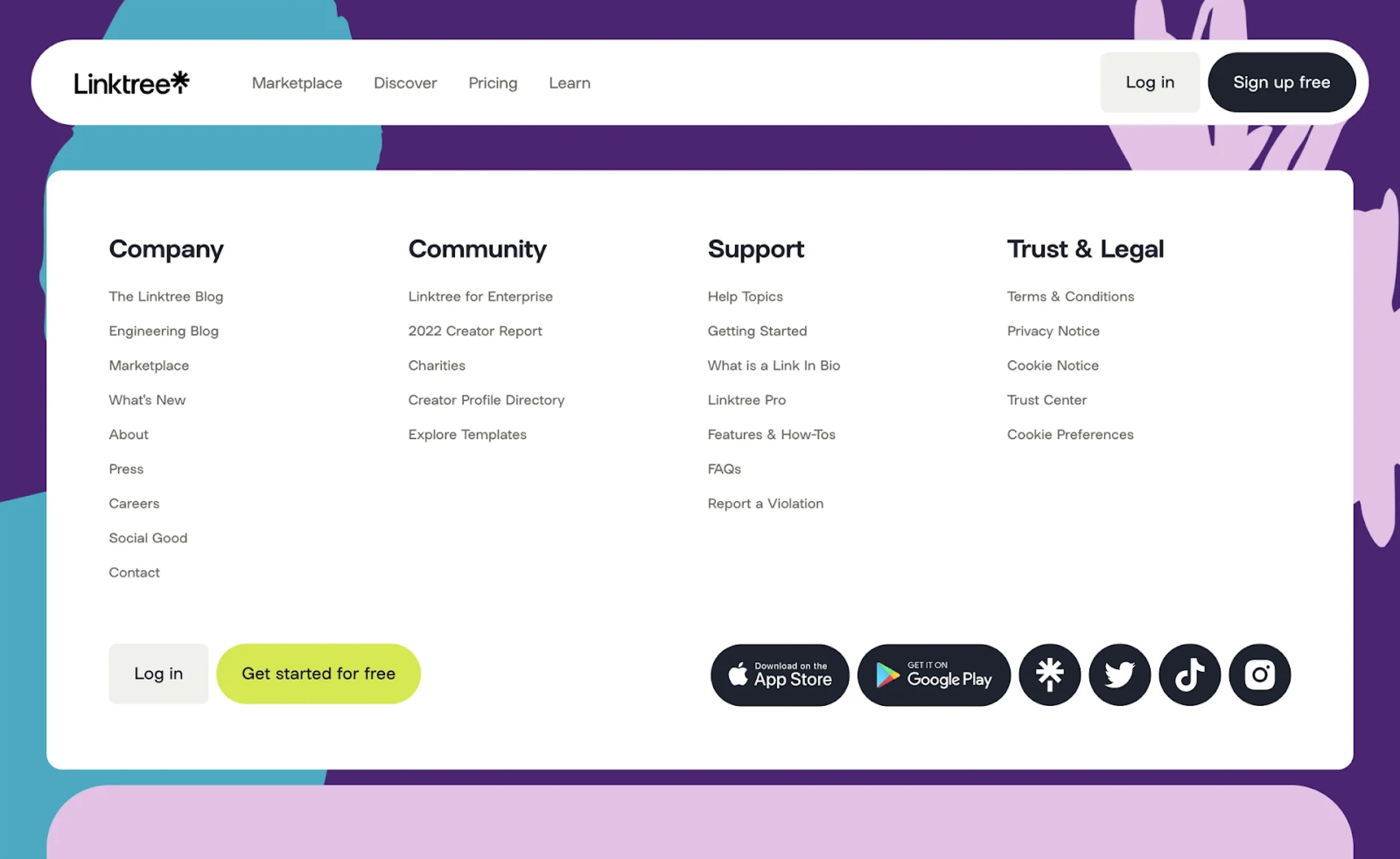
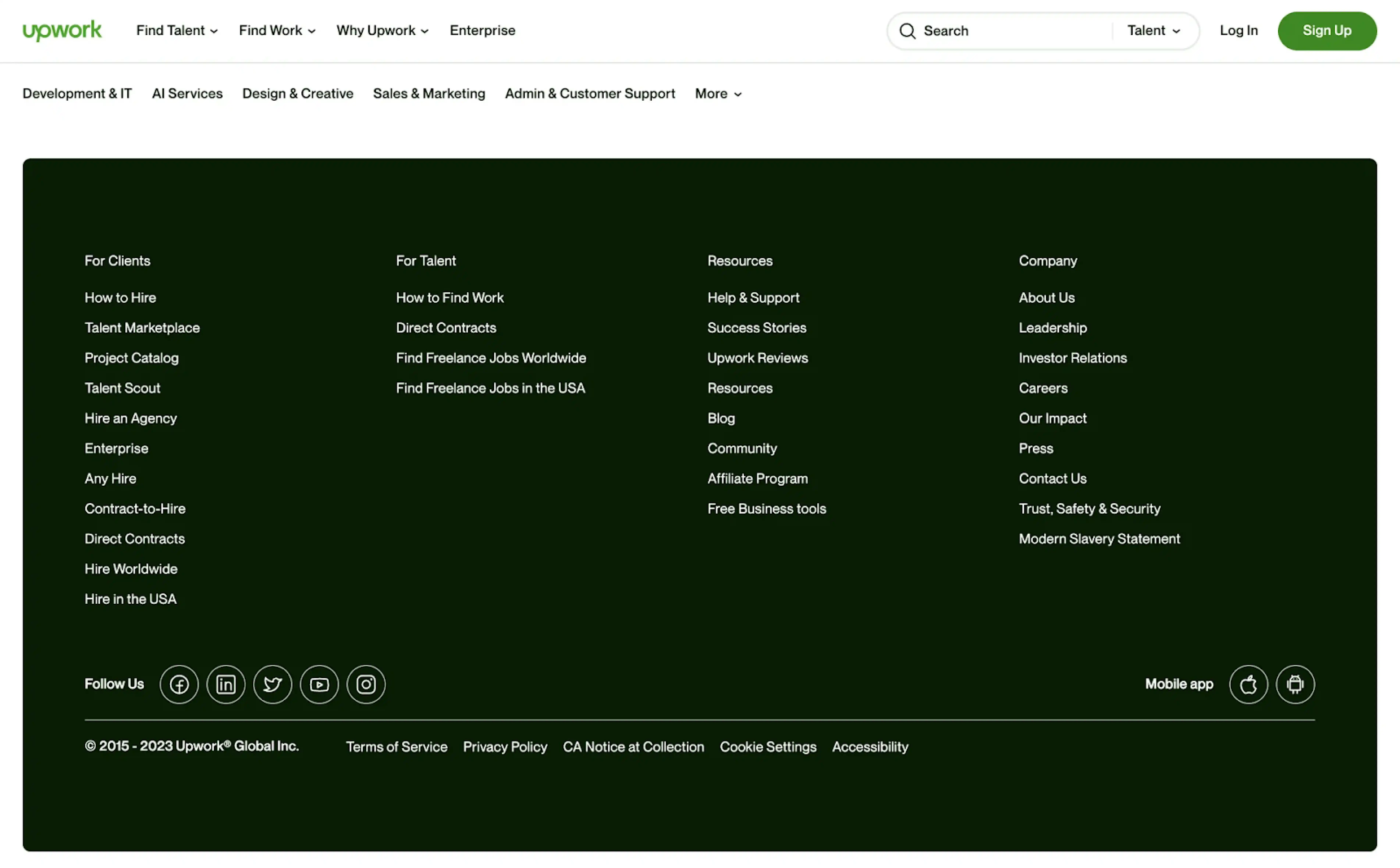
Doormat footer
A doormat footer mirrors key navigation links at the bottom of a page, often alongside legal or utility content. This layout footer design is called a “doormat” for a reason — it’s the last chance to guide someone before they leave.
This footer navigation works well on long pages, where users might scroll deep into the content and reach a dead end. It also helps when your header isn’t sticky, or when you want to reinforce your information architecture.
Must-have elements:
- A subset or full list of primary navigation links;
- Supporting links like “About,” “Blog,” “Support,” or “Careers”;
- Legal and compliance links (Privacy Policy, Terms).
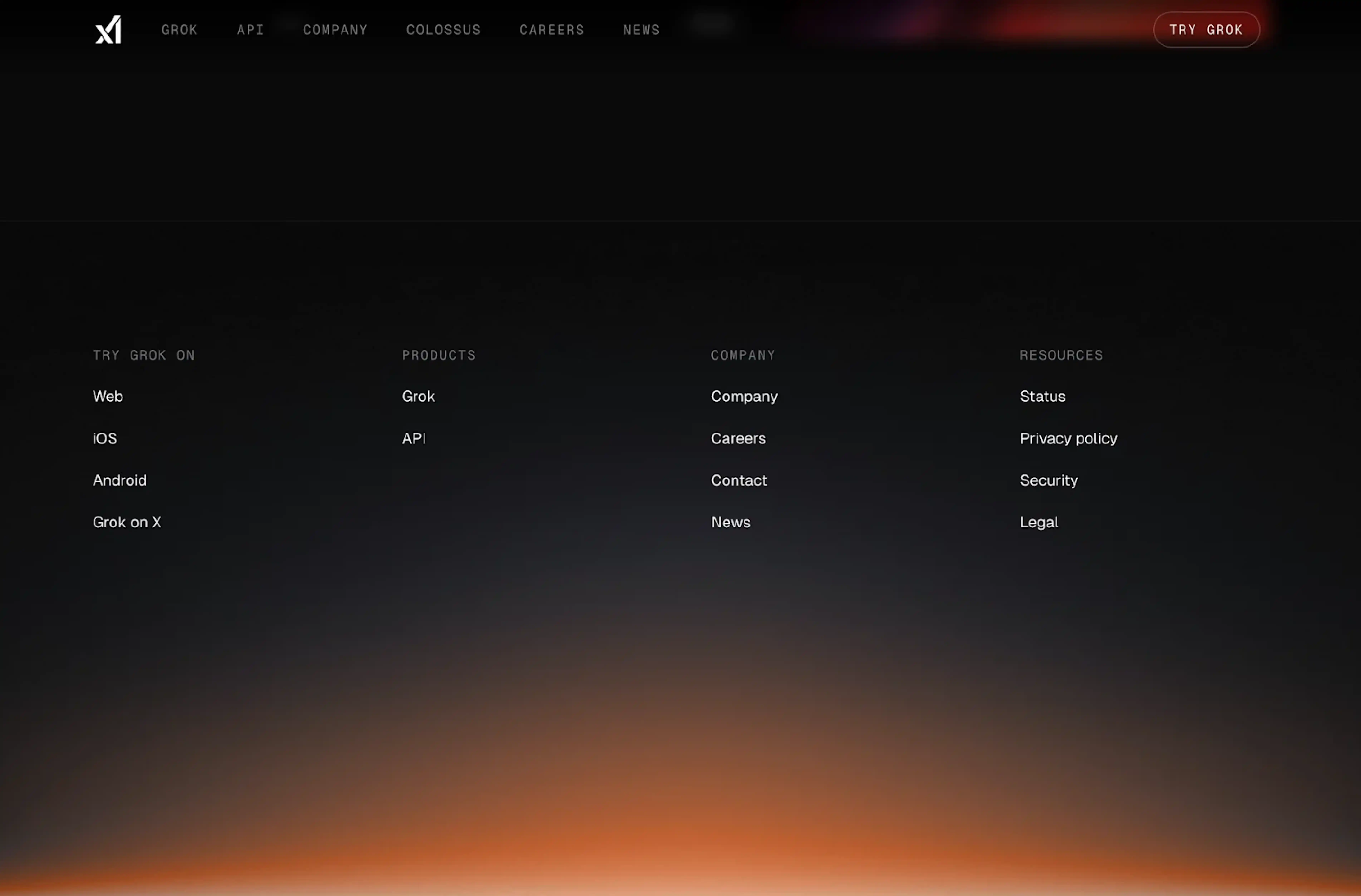
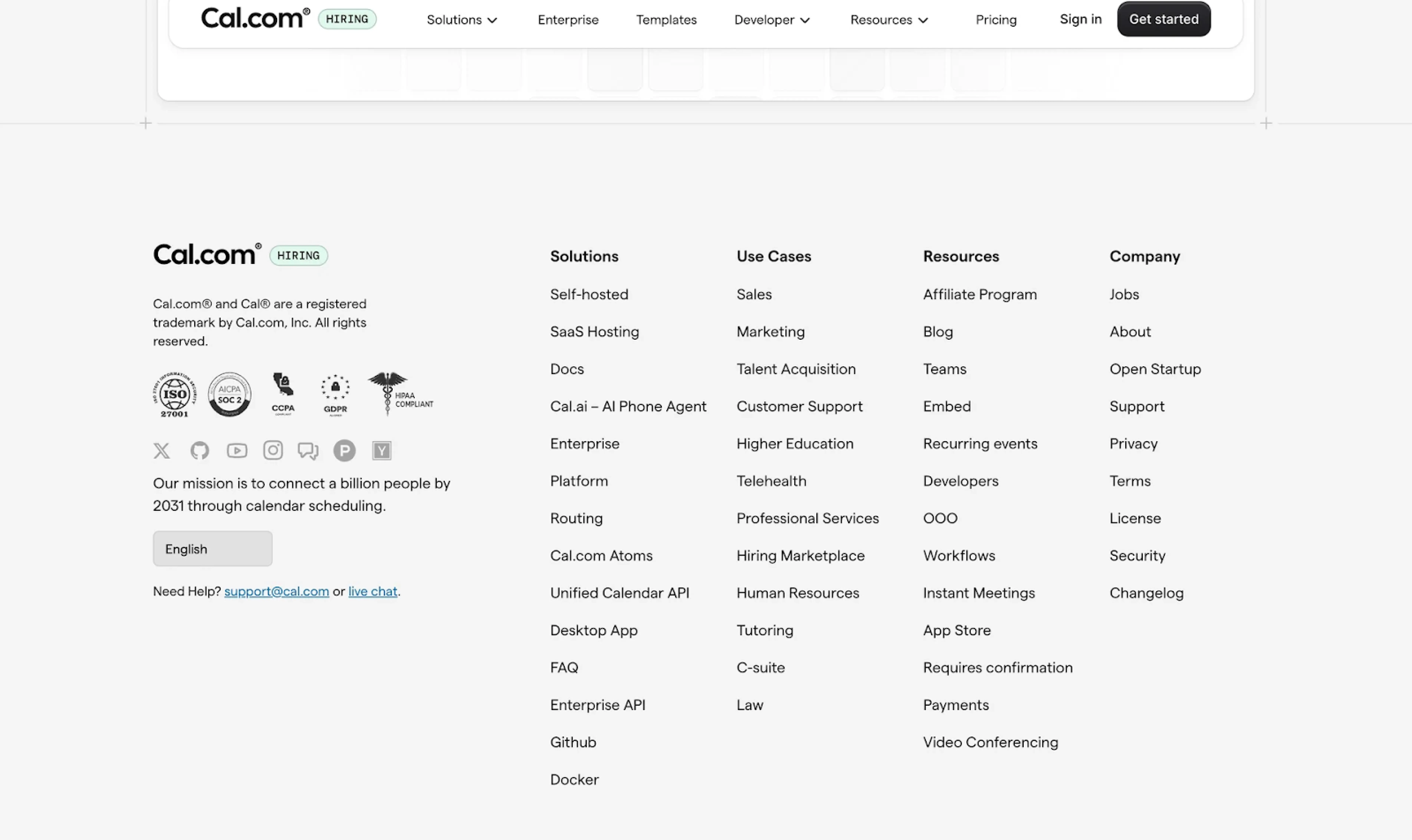
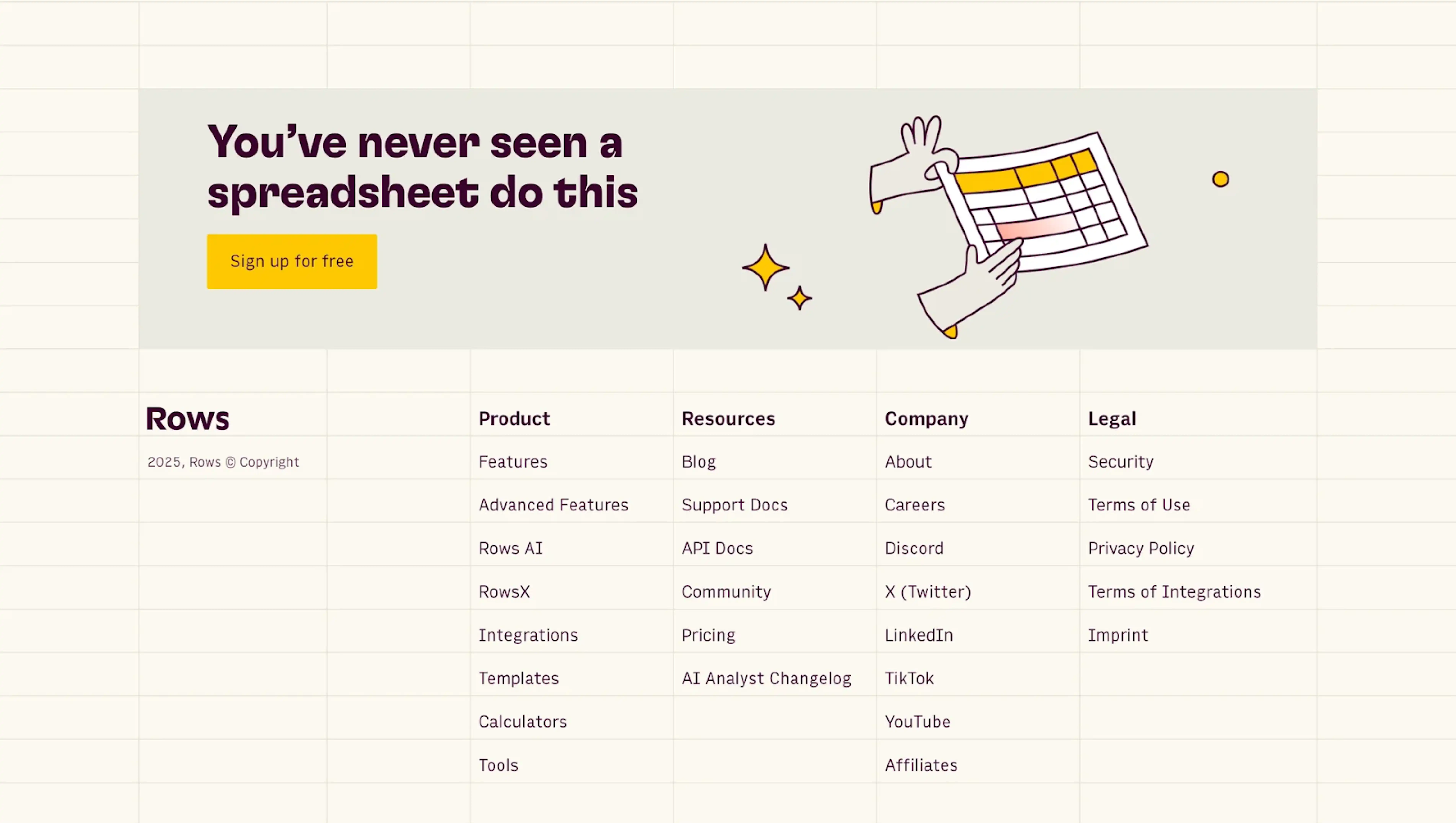
Sitemap-lite footer
A sitemap‑lite footer (sometimes called a “mini sitemap” or “fat footer”) offers a structured collection of links that reflect your site’s architecture. It’s like a navigational snapshot, providing context and choice for the user.
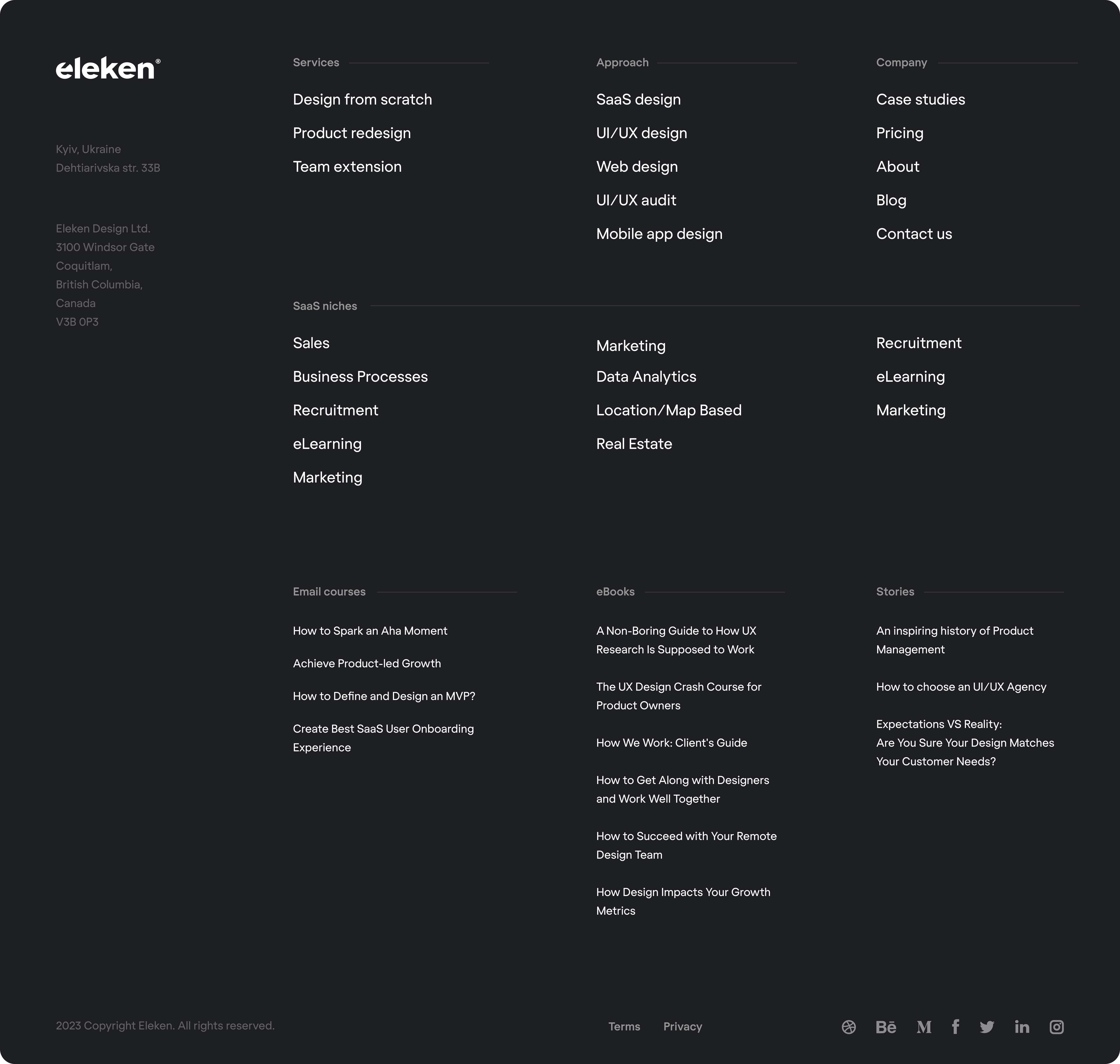
You’ll often spot this business footer pattern on medium- to large websites, where users might need alternative paths after finishing a page. Plus, linking to key pages helps crawlers discover content more easily and reinforces the site’s visual hierarchy.
Must‑have elements:
- A clear set of grouped links reflecting your key site categories;
- Legal / compliance links;
- Copyright and ownership information.
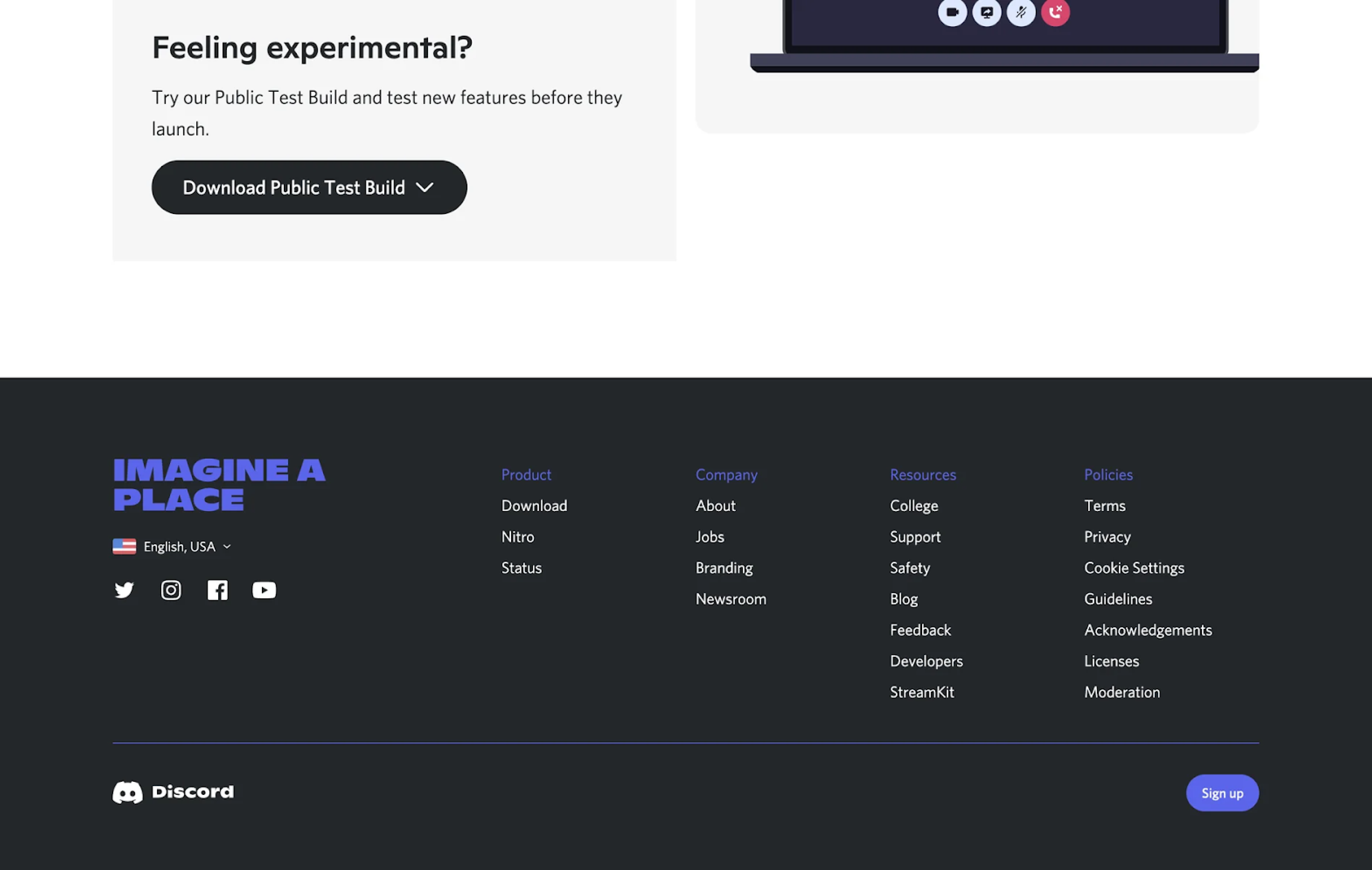
Secondary-task hub
A secondary-task hub footer gives pages like Careers, Press, Investors, or Legal a clear home without cluttering the main nav. This is common on corporate sites, B2B companies, or SaaS platforms with distinct stakeholders.
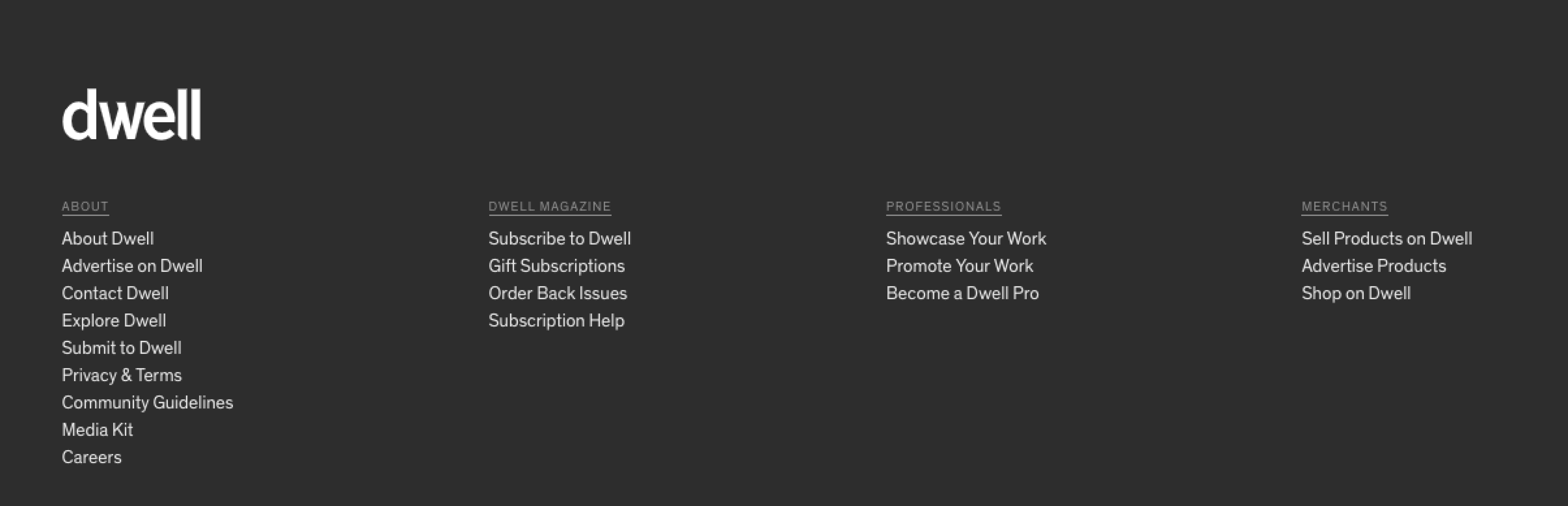
Rather than hiding important links behind vague labels or placing them in the header, this simple footer design groups them logically at the bottom of the page. It’s respectful of users’ attention and a great way to address different intent paths.
Must‑have elements:
- Links like “Careers,” “Press,” “Investors,” “Media,” “Docs,” “Legal”;
- A clear heading such as “Company,” “More,” or another task-specific label;
- Social media links, brand guidelines, or newsletter CTA if relevant.
Marketing CTA footer
A marketing CTA footer puts a clear CTA front and center: start a trial, book a demo, subscribe, or download something. It’s common on SaaS marketing pages, when the page has done the heavy lifting, and the footer is your final chance to convert.
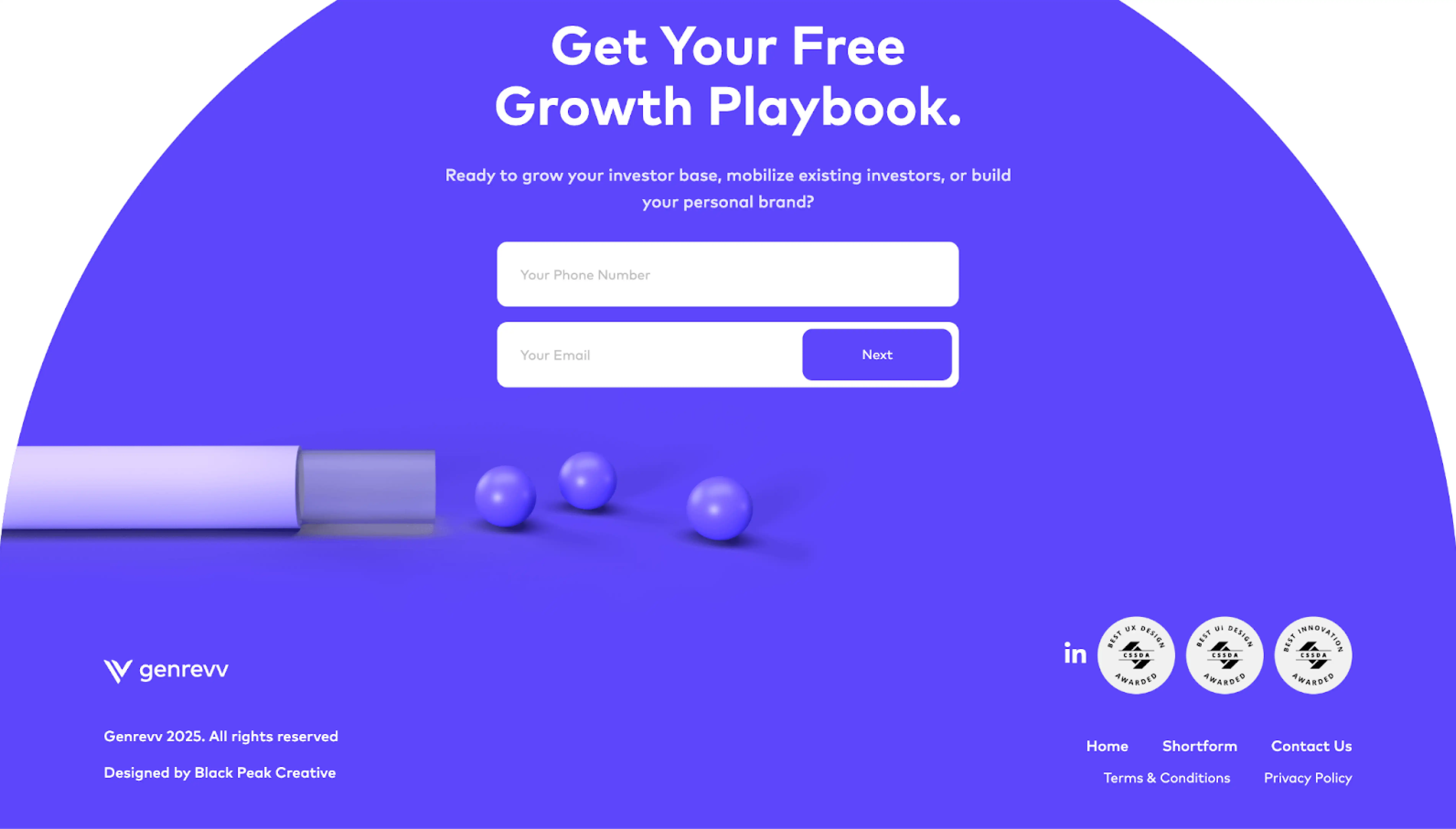
One of the strengths of this footer layout is that it catches users who aren’t quite ready to act mid-page but might decide at the end. It can also reinforce trust by keeping the action visible even after other elements fade out of view.
Must‑have elements:
- One clear, high-priority CTA;
- A short line of supporting context that reinforces the benefit;
- Visual contrast to make the CTA stand out.
Consent-aware footer
A consent-aware footer examples integrate privacy controls and legal acknowledgments directly into the footer space. This pattern has become increasingly common due to regulations like GDPR, CCPA, and others.
Beyond legal checkboxes, it’s also about transparency and building trust. Users now expect to find privacy settings that are easy to access and understand. And the footer is often the most predictable place.
Must‑have elements:
- Persistent links to Privacy Policy, Terms of Service, and cookie preferences
- Clear language that explains the user’s rights or choices
- Optional inline consent components
Region-aware / store switcher
For global brands, localization means surfacing the right store, pricing, currency, or legal terms based on the user’s region. A region-aware footer handles this by giving users direct control over their country or language settings.
This pattern is common in eCommerce, travel platforms, and multi-national SaaS products. Even if auto-detection is in place, giving users a manual override helps avoid confusion, especially when pricing or features differ by market.
Must-have elements:
- A dropdown or link to select a country, language, or storefront;
- Clear, visible placement — often in the bottom-right corner;
- Optional geolocation defaults, but always with a manual override.
Role-aware / contextual
A role-aware or contextual footer adapts its content based on who the user is or what part of the product they’re in. These footer design examples are useful in SaaS products, dashboards, or platforms with multiple user roles.
Instead of showing every possible link to everyone, this pattern keeps the experience focused. Logged-out users might see pricing and company info, while logged-in users see account links, support, and relevant docs.
Must‑have elements:
- Dynamic sections based on user role or login state;
- Links that match the current context;
- A fallback state for anonymous users.
Sticky mini-footer (mobile)
On mobile, users rarely scroll all the way to the bottom, and when they do, oversized footers can eat up valuable screen space. A sticky mini-footer solves this by offering access to one or two key actions without overwhelming the interface.
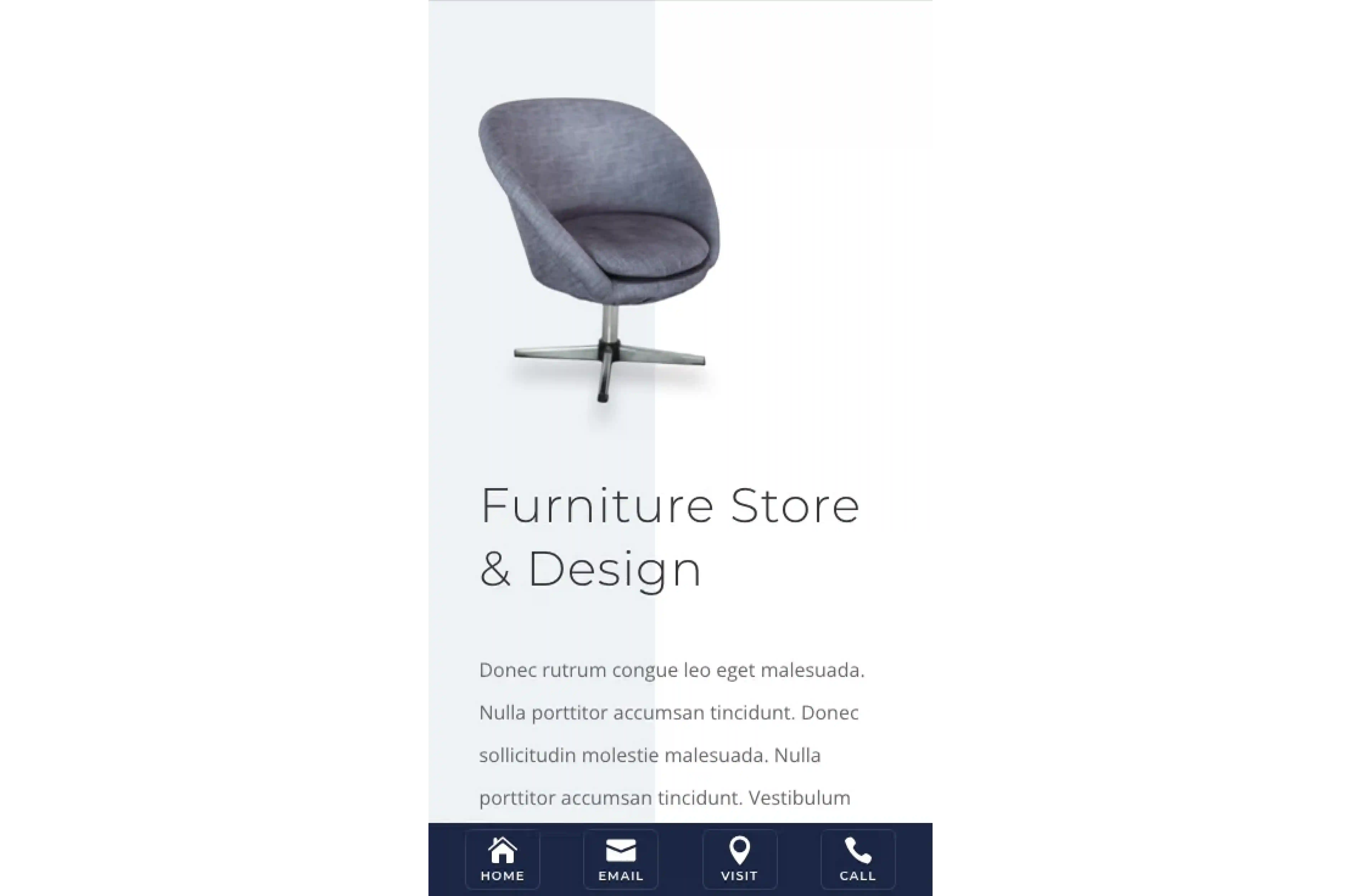
This pattern is popular in SaaS apps, eCommerce, and onboarding flows, where a user’s next step needs to stay within reach. It’s also useful on pages where the main CTA is up top but should stay accessible further down.
Must-have elements:
- One or two high-priority actions — clearly labeled and tappable;
- Fixed positioning that doesn’t interfere with native browser elements;
- Responsive styling to ensure comfort across device sizes.
Infinite scroll companion
On pages that continuously load content (such as social feeds, product grids, or UGC-heavy platforms), the footer is technically there, but practically unreachable. That’s where the infinite scroll companion comes in.
Instead of waiting for users to hit bottom, this pattern introduces context-aware elements that appear mid-flow. It could be a floating CTA, a contextual menu, or a “You’ve reached the end” block that acts as a pseudo-footer.
Must-have elements:
- Scroll-triggered component (bar, card, or modal);
- Essential links or actions, such as CTAs, legal links, or support access;
- Dismiss or collapse functionality to avoid intrusiveness.
When to use a footer
A footer is your final opportunity to support users who scrolled down and still haven’t found what they needed. But it’s not right everywhere. You only bring it in when it adds clear value. And here are some cases when you should include a footer:
→ Your page is exploration-heavy or content-rich.
If users move through layers of content (blog archives, resource hubs, docs), a footer helps them find what they missed or jump to a related section. As Nielsen Norman Group notes, footers act as a 'safety net' for users who reach the end of a page without finding what they needed.
→ Your site structure has depth.
When you have multiple IA levels (category > subcategory > article), users benefit from a bottom-of-page map (sitemap-lite) or navigation redundancy. Good footers help reinforce site hierarchy without sending the user to scroll up.
→ Legal, compliance, or region complexity demands it.
If GDPR, CCPA, or region-specific terms are relevant — or you support multiple countries/currencies — a footer is a predictable place to surface links and settings. Users expect to find privacy, terms, language, or store switchers there.
→ Your header/navigation is non‑persistent or hidden.
If your header disappears on scroll or isn’t always visible, users might lose track of how to go elsewhere. In that case, the footer becomes their fallback. Many good footer examples mirror the global nav to rescue users who’ve scrolled past the top.
→ SEO and internal linking are priorities.
Footers are an easy way to inject internal links to important pages, improving crawlability and reinforcing site structure. Sources like Moz and Ahrefs highlight internal linking — including footer links — as a way to improve crawlability and help search engines discover deeper pages.
→ You want to reinforce conversion or engagement at “end of scroll.”
Users who scroll all the way often need a gentle nudge. If your goal is capturing sign-ups, directing to help, or pushing a final CTA, a well-placed footer call to action can act as that last, relevant touchpoint.
→ You operate in multiple markets or languages.
When you serve audiences across countries, a footer gives a consistent place to drop a region selector, legal variants, or store switches. It’s predictable and familiar, which is ideal for trust and usability.
When to skip a footer
It’s important to note that footer patterns mostly apply to web pages. In SaaS products, the needs shift. At Eleken, we often skip the footer in product UIs and redistribute key links like legal, help, or docs into settings menus or support flyouts.
You should consider skipping a footer when:
→ You’re in a logged‑in or dashboard interface.
Users in an app environment have clear navigation patterns. Adding a footer here often duplicates links they’ve seen or distracts from the task flow.
→ The page is extremely focused or transactional.
Think of checkout flows, payment confirmations, or onboarding steps. These pages are built around a single action, which often eliminates the need for a footer.
→ The header is sticky and comprehensive.
If your header offers deep navigation and remains visible during scroll, the footer adds little incremental value. It may just become redundant.
→ The experience is immersive.
In tools like Figma, TurboTax, or Harvest, users are engaged in full-screen workflows. Dropping a footer into these contexts breaks immersion.
→ You already provide persistent access to help and settings.
If the user can reach help, account settings, or documentation from anywhere in the product, a footer may compete for attention at the wrong time.
Footer best practices
Even though users scroll past them, many footers still do a surprising amount of heavy lifting. And that makes them harder to design than they look.
As Eleken designer Dasha states, the same principles apply when you’re designing a website footer or structuring utility navigation inside a SaaS app. Either way, prioritize clarity, accessibility, and don’t overload users with links they’ll never click.
Accessibility & semantics
A footer might live at the very bottom of a page visually, but for many users, especially those using assistive technologies, it’s one of the most important structural markers. As a designer, your goal is to get this layer right.
Always wrap your content in a semantic <footer> element. This creates a recognizable landmark (contentinfo) for screen readers and improves overall navigation. If your footer includes navigational links, it’s best to nest a <nav> inside.
Make sure your link groups have <h2> or <h3> instead of styled <div>s. This allows screen reader users to skip between sections, not tab through every single link.
Keyboard navigation should mirror your visual layout. If links are grouped visually, they should be grouped in the DOM and tab order as well. Jumpy tab behavior is disorienting, especially when scanning through large footers.
As for usability:
- Touch targets should be at least 44×44px for easy tapping;
- Focus states must be clearly visible (use outlines, shadows, or underlines);
- Contrast ratios should meet WCAG: 4.5:1 for regular text, 3:1 for bold or large text.
Finally, if your footer includes dynamic components (like collapsible menus or cookie banners), use ARIA roles only when native HTML can’t cover the behavior.
Content design
Your footer’s content should be a curated extension of your site’s information hierarchy and user goals. Done well, it acts as a place where users go when nothing else clicks, and they need an escape hatch or alternative path.
First, avoid duplicating your entire header. Many sites fall into the trap of copying their top navigation wholesale, which often offers no new value. A smarter footer selectively surfaces links users might have missed or can’t reach easily.
Instead of broad buckets like “Miscellaneous” or “Resources,” use intent‑based categories, for example, “Explore,” “Support,” “Company,” and “Legal.” These labels help users scan quickly and decide where to go next.
Within each group, keep the list shallow so it stays digestible even on mobile.
If your chosen pattern includes a CTA, make sure it flows naturally from the rest of the page. Use a supporting line to reinforce why that action matters in this context.
Also think about social proof or trust cues, such as partner logos, awards, or press mentions. Use them sparingly, and never let them push important navigation or legal links further down.
Performance & stability
A beautiful website footer design can still feel broken if it slows your page or causes layout jumps. In practice, footers are last in the load order, which means they’re vulnerable to performance pitfalls.
To keep your footer fast and stable, you need to treat it with the same care you’d give any high‑priority component.
Heavy social links (for instance, Facebook like boxes or Instagram feeds) are among the biggest performance traps in footers. Rather than embedding, link out or lazy‑load them only when needed.
A major issue is Cumulative Layout Shift (CLS): if your footer content appears late and pushes existing content downward, it feels janky. To prevent this, reserve space in advance (via CSS or static containers) and use sprites or inline essential icons instead of external icon loads.
And watch your DOM depth. Deeply nested structures, excessive columns, or hidden wrappers can slow rendering. On mobile, especially, cap the number of footer columns. Where space is limited, fall back to stacking or collapsing into accordions.
Compliance & trust
At the core, your footer should treat privacy, legal, and region‑specific rules as first-class citizens. That means persistent access to privacy choices, clear legal disclosures, and trust cues that are scannable and high quality.
To make this happen, here are some key behaviors and principles to follow:
- Provide privacy choices or cookie preferences in a location users can access. This respects user agency and aligns with regulations like GDPR/CCPA.
- For legal pages that vary by region (terms, privacy, consumer rights pages), make sure your footer links map to the correct local version.
- Show “last updated” dates for your policies (privacy, terms) when possible. It reminds users that these documents are maintained.
- Display trust badges or security seals (“SSL secured,” “PCI compliant,” “Verified by X”) sparingly and only when they add genuine credibility.
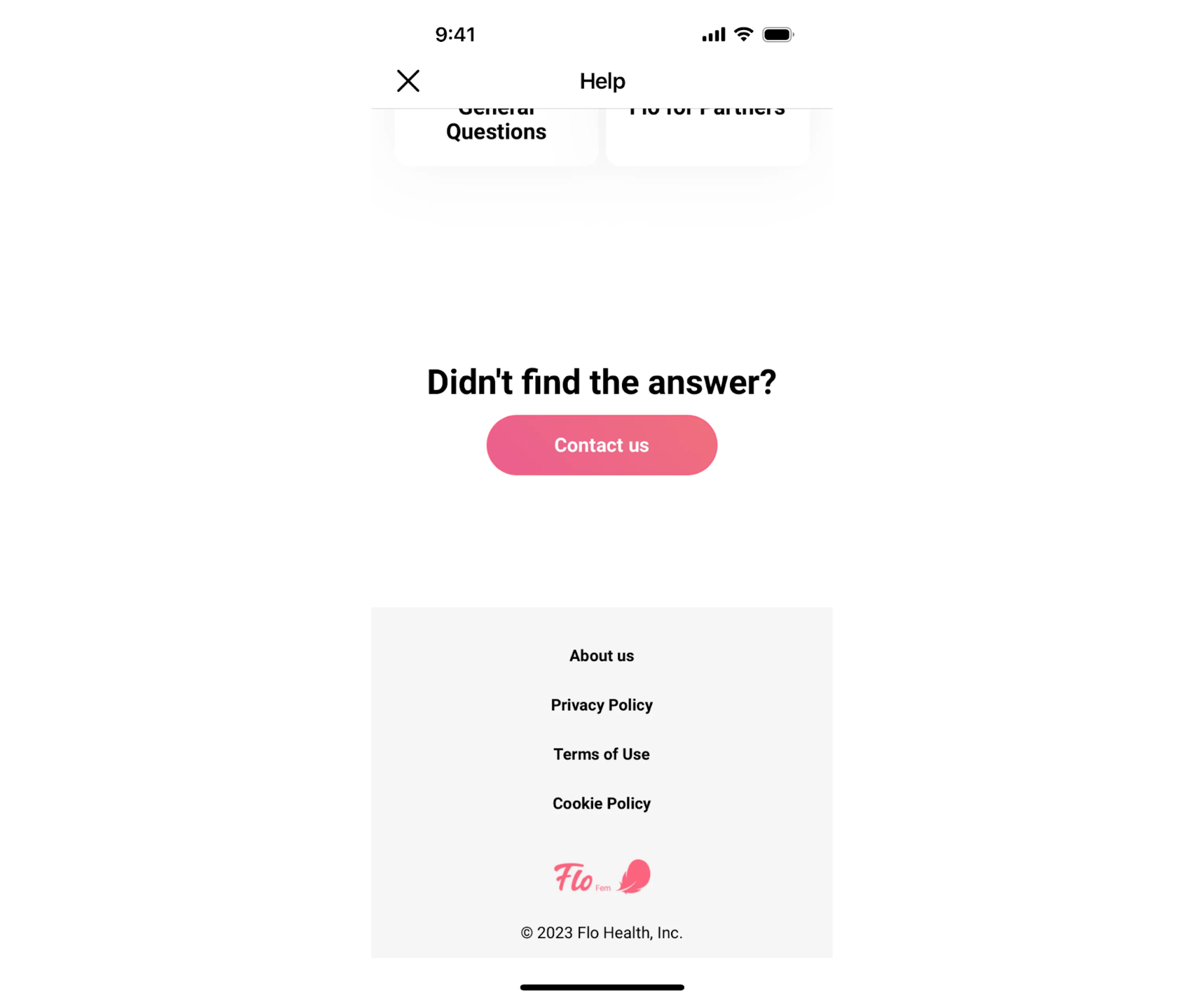
All in all, when users see transparent disclosures and clear pathways to manage their data, it reinforces that the company pays attention to detail, respects its users, and has nothing to hide. Even in the quiet corner of a footer, that message matters.
Governance
Without governance — clear ownership, ongoing review, and quality control — footers degrade, links break, and trust erodes. A governance strategy makes the footer resilient, manageable, and aligned with brand identity and legal changes.
To govern them responsibly, start by assigning a dedicated owner — someone who’s accountable for the footer’s links, labels, and structure.
This person (or team) should lead a quarterly review cycle to examine all links for relevance, dead or broken paths, and stale content. Use automated crawlers to detect broken links and initiate fixes early. Many organizations adopt a de-duplication policy to avoid multiple links to the same resource under different labels.
For external or marketing links, enforce UTM conventions or tracking parameters so you can measure footer-driven traffic separately. Likewise, maintain a change log for legal and branding label updates.
Over time, these footer best practices ensure your interface evolves gracefully rather than decays silently.
Footers on mobile and infinite scroll
Footers have always lived at the bottom, but in modern UX, that bottom keeps disappearing.
On mobile, users are far less likely to scroll all the way down, especially when screen space is limited and key actions float elsewhere. In infinite scroll interfaces, the footer can become unreachable altogether.
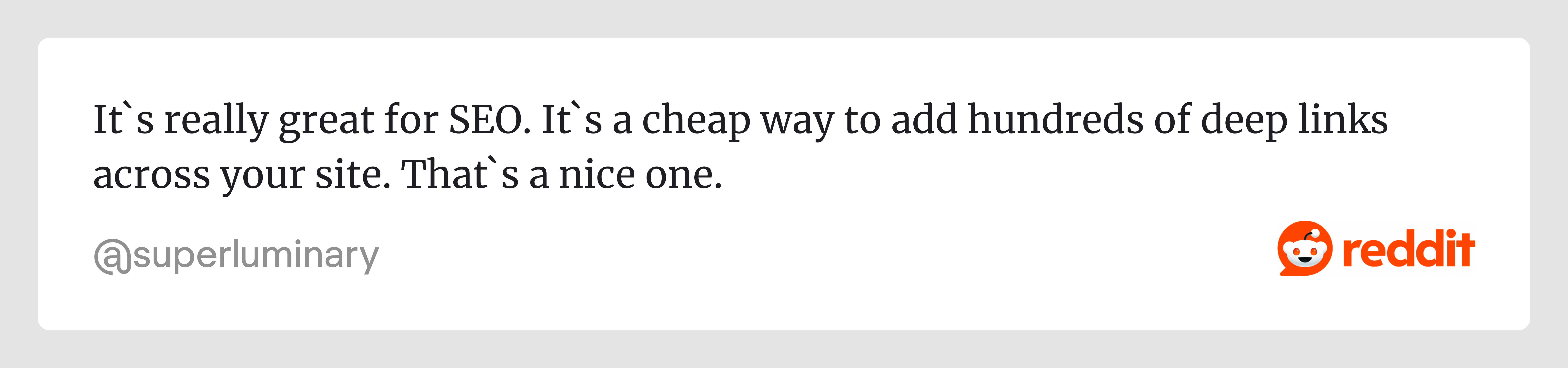
As one Reddit user put it:
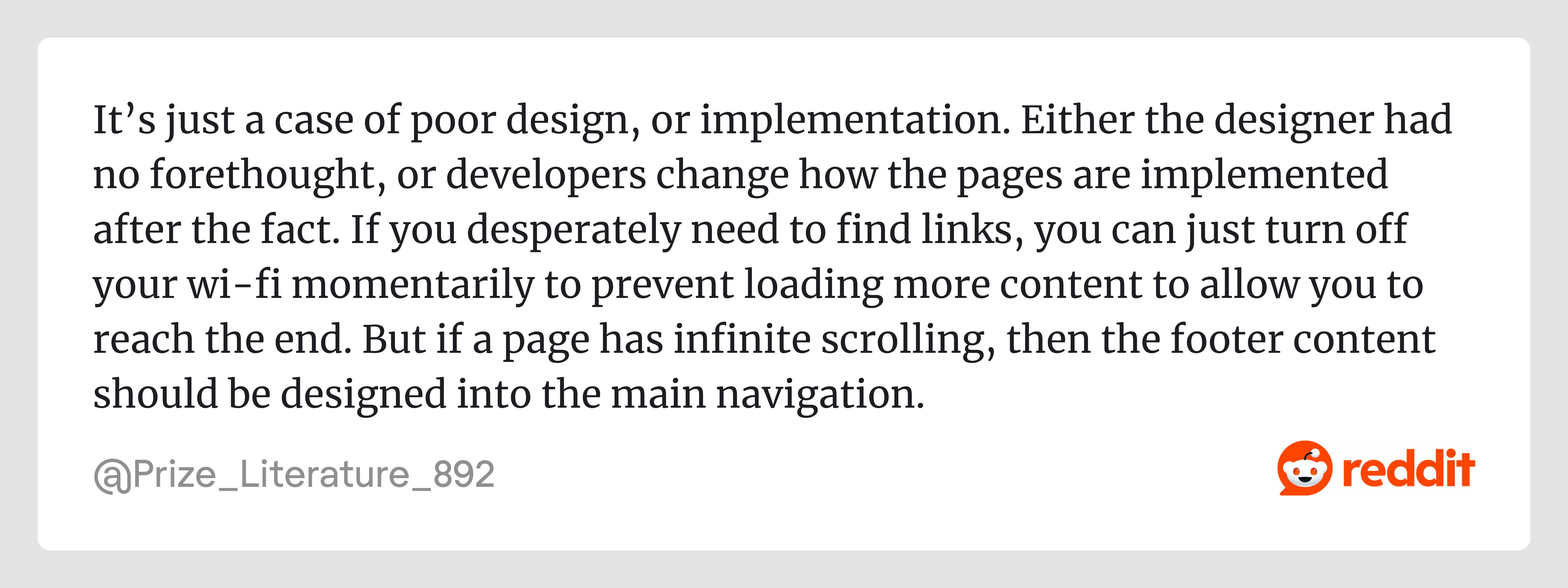
It’s a harsh take, but a fair one. The real problem often is a lack of foresight in how footer content gets restructured (or forgotten) in dynamic layouts.
In the next three sections, we’ll look at practical ways to adapt footer behavior for mobile and infinite scroll.
Infinite scroll-safe solutions
Infinite scroll is great for immersion, but it’s brutal on footer visibility. The deeper the scroll, the more unreachable the footer becomes, and that breaks navigation, compliance, and user trust. One Reddit user put it plainly:
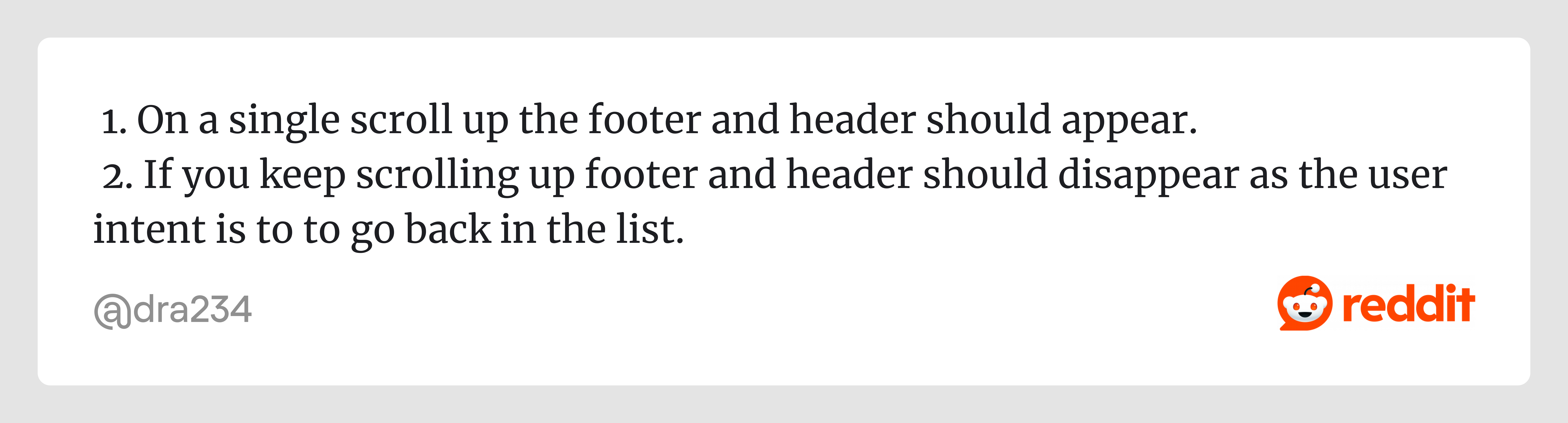
That insight captures a key principle — footer content needs to be surfaced contextually, not buried at the bottom. Below are patterns that make footer-like functionality safe in infinite scroll environments.
→ Utility drawer
Instead of relying on a traditional footer, hide your footer links in a drawer (slide-out panel) that’s accessible via a floating icon (help, privacy, careers). This keeps the interface clean while still giving users access to the resources they expect.
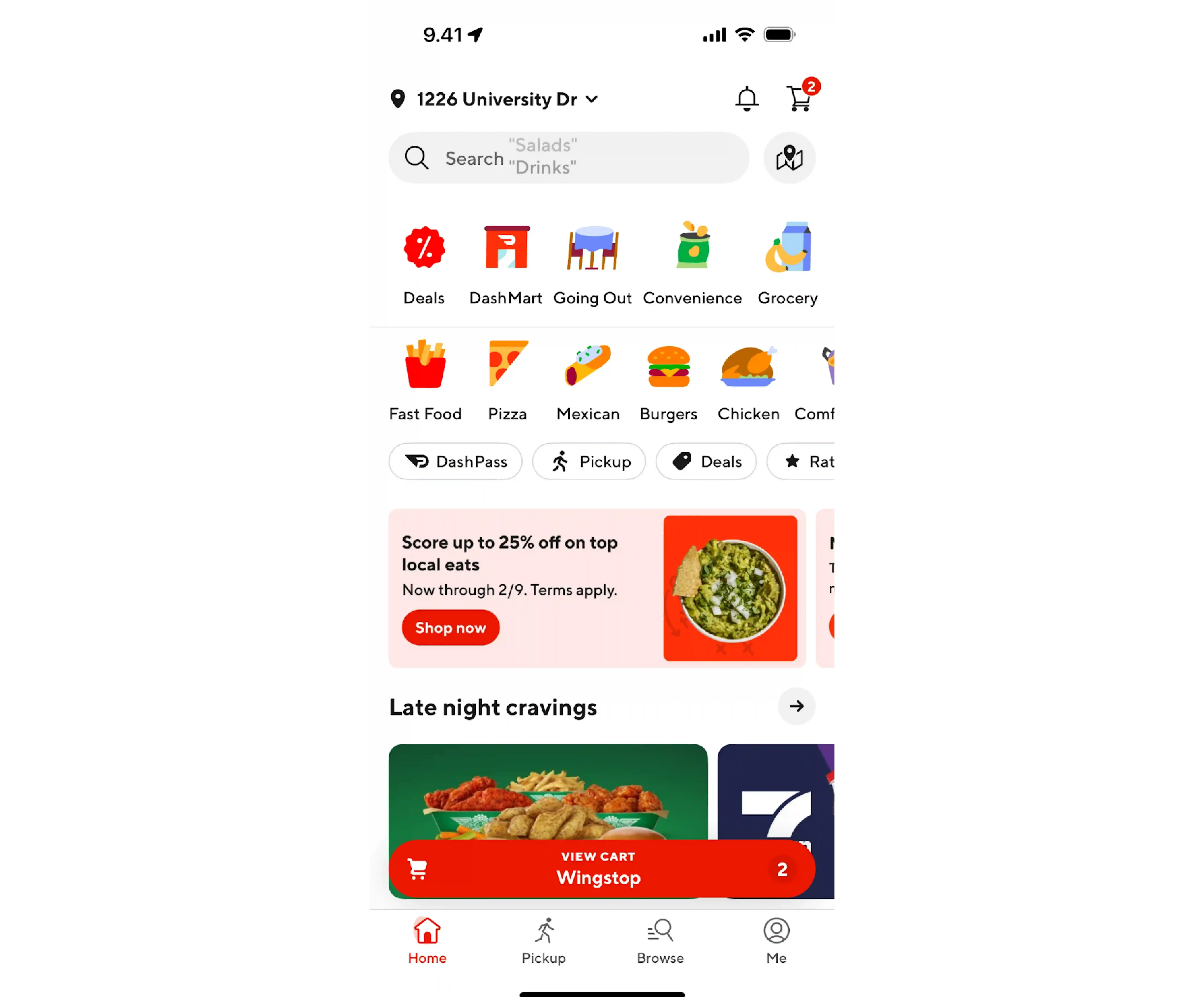
→ Reveal-on-scroll-up
Use scroll direction detection: when the user scrolls slightly upward, reveal the footer (or header) briefly. If they scroll down again, hide it. This matches natural reading behavior.
.webp)
→ Quick Nav FAB
A Floating Action Button (FAB) tied to the footer or support links can open a mini-menu of grouped footer content. It’s compact, always reachable, and gives users quick access to essentials without relying on reaching the bottom.
→ Load cap + hybrid footer
After a fixed number of content batches (say N loads), temporarily cap infinite scroll and present a “Load more + show real footer” block. This hybrid gives users a stopping point and ensures the footer becomes reachable.
Mobile reading mode
On mobile, the screen is a precious real estate. Users are focused, their attention is limited, and distractions weigh more. That’s why footer UX must play differently in mobile reading contexts.
Instead of large, multi-column doormats, mobile footer examples should act like quiet companions, offering just one persistent utility row or CTA, auto-hiding until needed, and staying compact enough not to steal screen space.
One crucial thing: the footer bar (or utility row) must respect safe-area insets (especially on modern phones with notches or home indicator bars). A good target height is 56–64px, enough to stay tappable but not obtrusive.
To make this work:
- Only include one persistent action or utility row — a core CTA, help icon, or minimal nav.
- Use auto-hide + reveal-on-intent behaviour (when the user swipes up slightly or pauses).
- Keep the height within the 56–64px range, and ensure it’s compatible with safe-area margins.
- Avoid overloading this compact footer: every element needs a purpose.
Fallback marker
When infinite scroll continues indefinitely, users may never technically reach the “end,” but often, content eventually stalls (because there’s nothing new to load). In such situations, a fallback marker becomes useful. It offers a signal that “yes, you are at the bottom now” — plus, it gives a last chance to surface essential links.
A good fallback marker usually includes a message like “You’re at the end” along with a few high‑priority links (Help, Contact, Legal, Home). It acts as a gentle boundary and brings closure to the scrolling journey.
Consider combining this with a load cap strategy: after a certain number of content batches, stop auto-loading and show the fallback marker (plus the real footer) with a “Load more” button or link. As Smashing Magazine's guide on infinite scroll recommends, surfacing footer content through a reveal or load cap — rather than letting it chase the user endlessly — produces a cleaner and more controlled experience.
Because users may have already scrolled a long way, the fallback marker should be concise, visually distinct, and not force a full page jump. It’s the gentle “rest stop” before they decide what to do next.
The bottom line (literally)
The footer might be the last thing on the page, but it can be a quiet indicator of a team's UX maturity. A cluttered, bloated footer can be a symptom of an overloaded information architecture — a sign that navigation decisions were deferred rather than made. A thoughtful one, on the other hand, shows restraint, clarity, and an understanding of user context.
If your footer is doing too much, it might be a sign that your navigation or sitemap UX needs attention. We explored that in more detail here.
In the end, a great footer simply appears when the user needs it most.

