


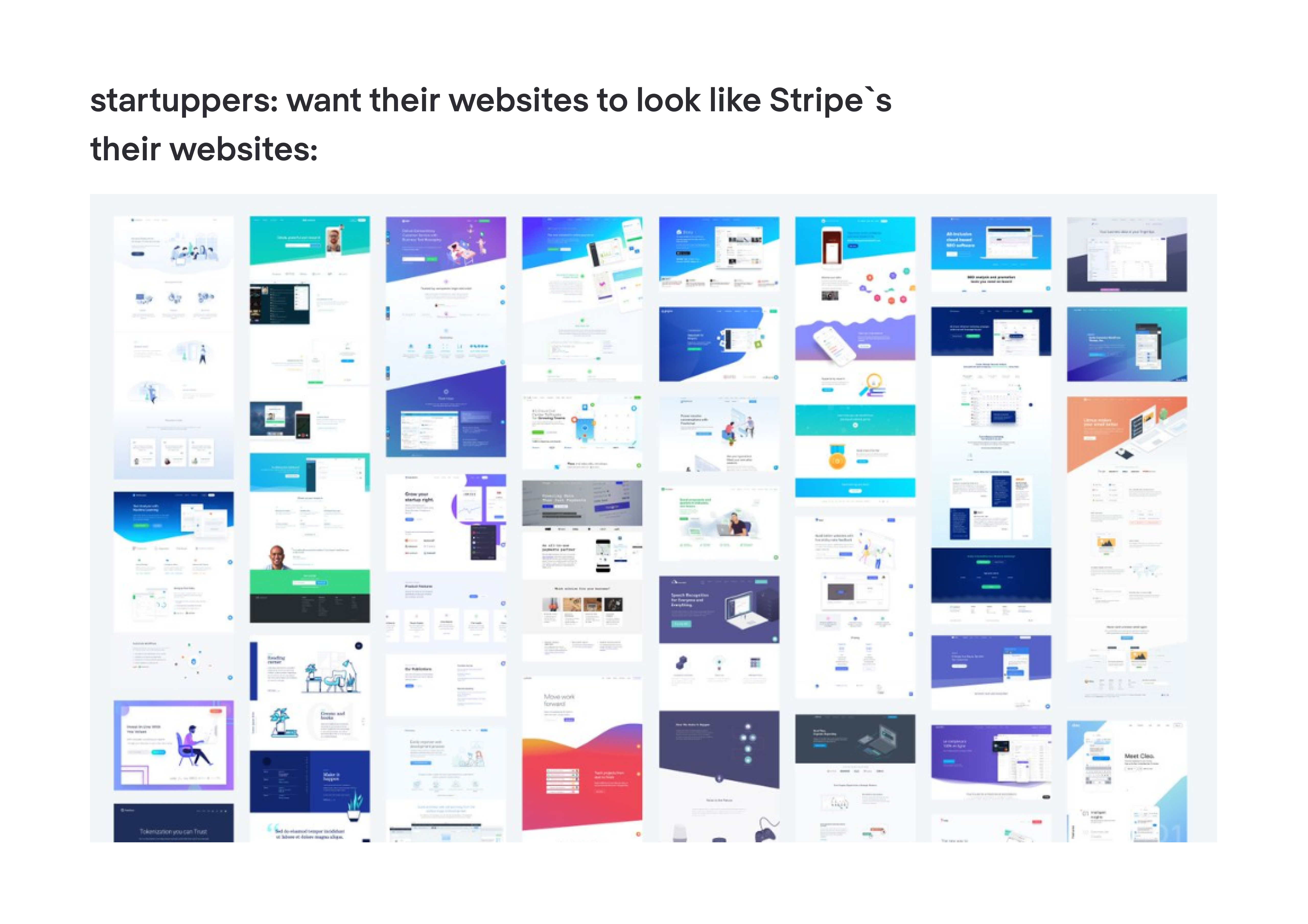
Eleken’s clients are very, very different. We’ve designed for all SaaS industries you can imagine, from agriculture to data analytics. And even though the companies are very different, their design references are often the same. Our clients want their apps and websites to mimic Intercom, Apple, and, most frequently — Stripe.
When someone asks us to “make it like Stripe,” we explain to our clients why mirroring even the best design is a trap. But if you browse Dribbble for a couple of minutes, you’ll see how many companies walk straight into this trap.
In this article, we’ll figure out:
- Why we all like Stripe’s design so much;
- Why imitation is the sincerest form of failure;
- What actually makes Stripe's design work;
- The best Stripe alternatives for online payment processing;
- How to learn from Stripe without copying it.
Why do we all like Stripe’s design so much
Stripe has built a cult around a piece of code. It has turned its users into fans. It has made gradients that look so good you want to lick them. Stripe is the rock star in the world of SaaS, so you’d hardly find a startup owner who has never thought “I want my startup to be like Stripe when it grows up.”
Pretty understandable. You just look at Stripe’s website next to its competitor, Braintree.
Braintree is a near-perfect good UI bad UX case study: functional, technically capable, but forgettable in a way that Stripe never is. Stripe proves that bad UX examples don't have to be broken to cost you users — sometimes being merely adequate is enough to lose to something that genuinely delights.
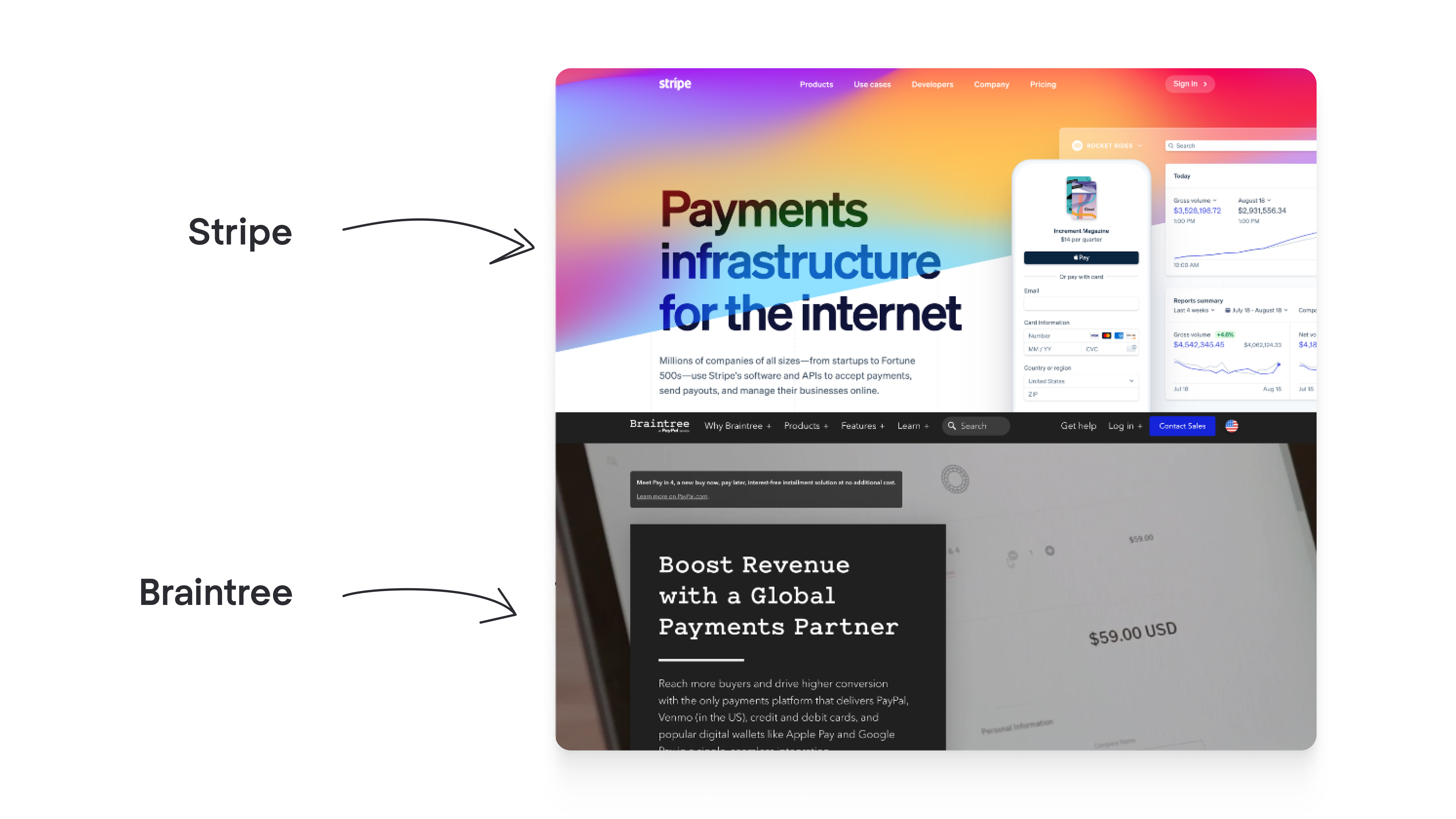
Both sites sell payment APIs for online businesses of all sizes. Is there anything more boring to sell than payment rails for online commerce? Yet Stripe's site presents its product with clarity, professionalism, and somehow even a sense of inspiration.
As designers, we confirm that Stripe’s website is an example of good design. It belongs in the same conversation as the best good UX examples in SaaS: products that make complex things feel simple without dumbing them down.
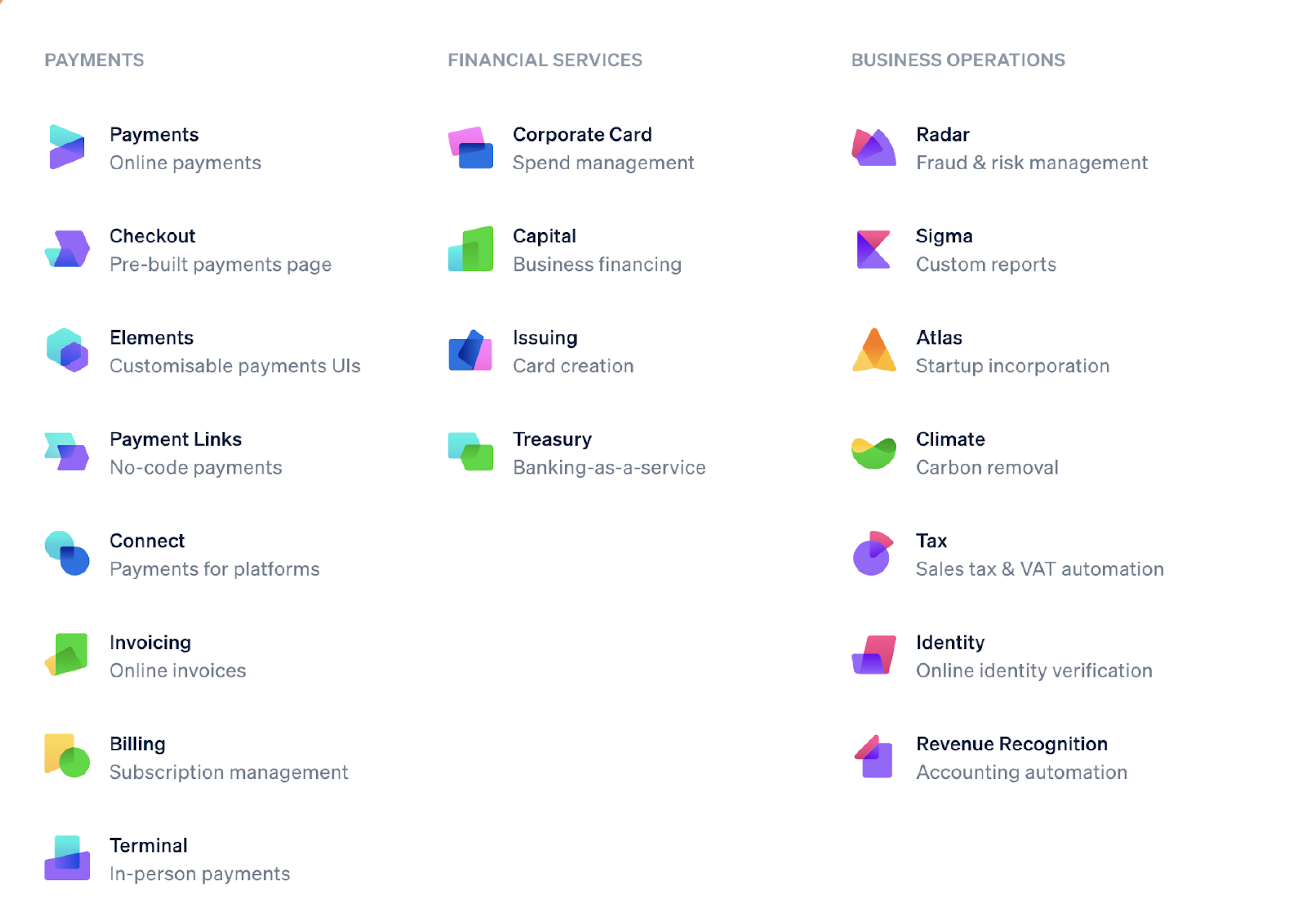
Our UI/UX designer Maksym compliments Stripe for its clarity. Even though the company offers dozens of products, you can always find what you need. All options are conveniently grouped in a dropdown list and differentiated thanks to their unique icons and color schemes. That's the power of UX at work: not a single flashy feature, just relentless attention to how real people navigate real complexity.
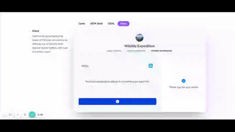
Stripe’s copy is sharp and clear, illustrated by telling animations. Animations tell so much that you don’t even need to read the copy to understand how the product works.
Dasha, another designer at Eleken, notes that Stripe presents a unique case when a website is restrained, with no irritating frills, yet it feels fresh and playful.
As you can tell, we at Eleken don’t mind when startups choose Stripe design as a reference. Problems start when inspiration turns into imitation, and clients say something like “make my startup’s website look like Stripe’s.”
Why imitation is the sincerest form of failure
Making your website look like Stripe’s would work if UI/UX design was about making things pretty. But it’s a bit more difficult than that.
Design is a relationship between form and content. The moment you separate Stripe's form from Stripe's content — payment processing, developer tooling, global payments infrastructure, and paste that form onto your product, the magic evaporates.
Any Cron app review makes this point implicitly: Cron's design works because every visual decision was shaped around how people actually use a calendar, not borrowed from a product built around something else entirely.
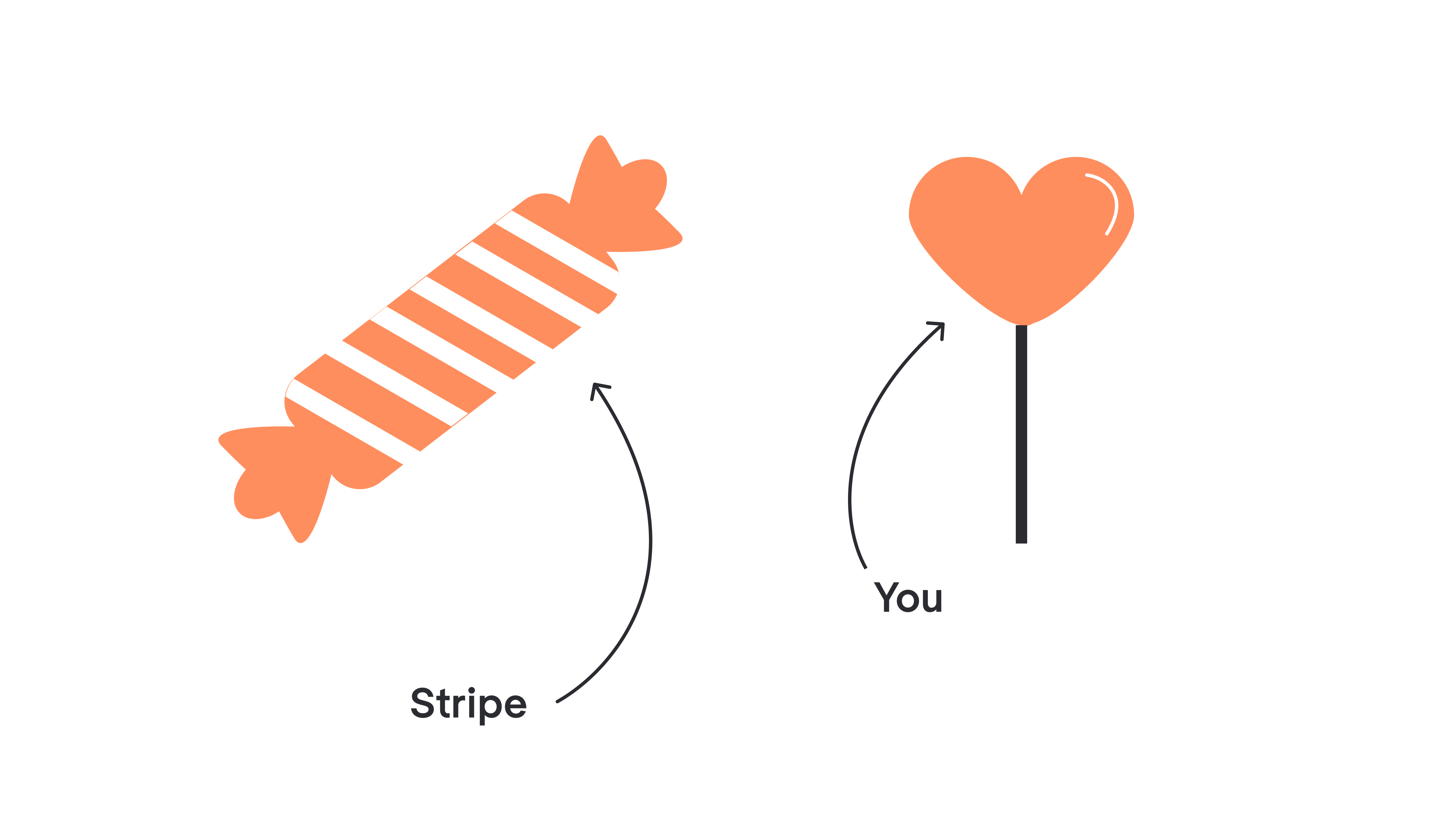
Think of content as candy and design as its wrapper. The wrapper makes eating candies a better experience; it prevents the sugar from melting in our hands. It also draws customers’ attention.
But if we rip the cover off the best-selling chocolates and pull it on our lollypop, we won’t get a best-selling lollypop. Because it’s not the wrapping that makes candies popular, but a mix of the product and the wrapping. Not to mention the packaging simply won’t fit. The Gmail redesign understood this well: Google didn't try to make Gmail look like something else, it evolved the design language that already belonged to Gmail, which is why the changes felt natural rather than jarring.
To learn from Stripe’s success it’s not enough to imitate its web design. We need to figure out what’s behind colorful gradients and dynamic diagonals.
Key features: What really makes Stripe’s design so attractive?
That’s a good question to ask yourself right after you’ve chosen Stripe as your role model. We believe Stripe’s success is based on three pillars: a valuable product, a human-centered approach to design, and a hard-working approach to the business.
Let’s break them down one by one.
Stripe solved a real pain point better than any competitor
Payment processing is complex as hell. Before Stripe, businesses had to build compliant payment systems from scratch — risky, expensive, and for small businesses, often impossible.
This is precisely why products fail when they ignore the real source of user frustration: they build around their own capabilities rather than around the pain they're supposed to solve.
Stripe collapsed that process to seven lines of code. What a relief for developers building anything from simple online payments to complex multi-currency subscription billing.
The Linear app case study echoes this: Linear didn't win by being feature-rich, it won by making the most painful parts of project management disappear. The Twitter redesign, by contrast, moved controls around without meaningfully reducing any of the friction users had been complaining about for years — a reminder that change and improvement are not the same thing.
Stripe made users’ lives better and earned their love.
Stripe is obsessed with their customers
Customer obsession is like good posture. Everyone knows it’s important but only a few stick with it. Stripe belongs to the minority that builds the business around their customers.
When Stripe had just launched, its CEO, Patrick Collison, went to customers’ houses to see how they installed Stripe. Ten years later, he's still publicly asking for feedback. Knowing your users this intimately is one of the most reliable ways to avoid the secrets of bad design: you simply can't build something confusing for people whose frustrations you've witnessed firsthand.
Stripe uses gathered insights to constantly improve user experience.
For example, many API products suffer from poor and confusing documentation. Stripe’s documentation, by contrast, is so clear and well-written that it’s easy for developers to get things up and running. What is more, if developers are digging through documents while being logged into their Stripe accounts, they can see personalized code snippets pulled from their actual payment data. The Google Meet redesign applied a similar insight-driven approach: by studying how teams actually used video calls during the pandemic, Google was able to prioritize the features that genuinely mattered rather than the ones that looked impressive in a feature list.
Such a user-centered approach earns more love for Stripe.
Stripe always runs an extra mile
If you ask somebody from Stripe’s design team about how they make amazing products and sites, they’d reply they simply spend 20x more time on this than anyone else would. And refuse to cut corners along the way.
Here’s a telling example of this from one of Stripe’s designers. Once he was working on a website animation that showed a payment form being filled and submitted. To fake the typing, he made a new character appear every 100 milliseconds and called it a day.
But the CEO didn’t like the result because typing felt too automatic. He not only suggested making the delay before each new character random but also wrote the needed code by himself. This is design and friction at its most subtle: the original animation worked perfectly, but it didn't feel human, and that gap between functional and felt is exactly what separates good from exceptional. Running a product design trial with real users would have surfaced this instinctively — people notice when something feels off even when they can't articulate why.
Such serious attention to the smallest detail makes an impression. It inspires all the team to push until the result is not just good or great, but exceptional.
For little details that show that Stripe really cares, users love the company even more.
While Stripe is widely regarded as one of the best payment platforms on the market, it's still worth exploring its alternatives and competitors.
Alternatives to Stripe: The best options for online payment processing
Stripe is a great payment processor. But it's not the right fit for every business. High transaction fees, limited support for certain local payment methods, or a need for a merchant of record service can make exploring Stripe competitors worthwhile. Here are the most serious options.
PayPal
The most recognized name in online payment space. PayPal supports credit card payments, bank transfers, and its own wallet, making it a familiar option for customers globally. Its merchant account setup is straightforward, and it handles multiple currencies reasonably well.
Where it wins: Brand trust, consumer adoption, built-in buyer protection, bank account linking, and simple payment links.
Where it falls short: Transaction fees are often higher than Stripe, the dashboard feels dated, and custom payment flows are limited compared to Stripe's API.
Best for: Small businesses, major ecommerce platforms, and marketplaces where customer trust matters more than developer flexibility.
Braintree
Braintree is owned by PayPal but operates as a separate payment gateway with a more developer-friendly API. It supports credit card processing, Apple Pay, Google Pay, and different payment methods, with competitive pricing for higher transaction volumes.
Where it wins: Custom pricing at scale, strong fraud detection, supports most payment processors in one integration.
Where it falls short: Less polished documentation than Stripe, and the product has been slower to evolve.
Best for: Established businesses processing high transaction volumes who want to negotiate custom pricing.
Adyen
Adyen is the payment infrastructure platform of choice for large enterprises; Spotify, Uber, and Microsoft are customers. It supports global payments across card payments, local payment methods, and in-person transactions through a single integration. It also offers interchange-plus pricing, making it a cheaper alternative to Stripe at high transaction volumes.
Where it wins: True global reach, exceptional support for international payments and multiple currencies, unified commerce across online and in-person.
Where it falls short: Not designed for small businesses. The pricing model requires significant transaction volume to make sense, and the integration is complex.
Best for: Enterprise SaaS companies and global businesses that need serious payment infrastructure.
Paddle
Paddle functions as a merchant of record, meaning it handles not just payment processing but also sales tax management, VAT compliance, and tax liability on your behalf. For SaaS companies selling internationally, this removes an enormous compliance burden.
Where it wins: Built-in tax compliance, recurring billing, subscription management, merchant services, and global sales without requiring you to register for VAT in every country.
Where it falls short: Less control over the checkout experience, and transaction fees are higher than raw payment processors like Stripe.
Best for: Software companies and SaaS businesses selling subscriptions internationally who want to outsource tax compliance entirely.
Lemon Squeezy
A newer merchant of record payment service targeting indie developers and small software businesses. Like Paddle, Lemon Squeezy handles tax liability and sales tax so you don't have to.
Where it wins: Simple setup, modern UI, strong for digital products and subscription billing, no monthly fee.
Where it falls short: Smaller ecosystem, fewer integrations, and less proven at scale than Paddle or Stripe.
Best for: Solo developers and early-stage software companies who want to accept online payments globally without dealing with tax infrastructure.
Square
Square started in in-person transactions and has expanded into online payment processing solution. It's a solid all-in-one solution for businesses that sell both physically and online.
Where it wins: Seamless bridge between in-person and online, easy merchant account setup, transparent fixed fee pricing, no hidden fees.
Where it falls short: Not designed for complex API integrations or custom payment flows. International payments support is limited compared to Stripe or Adyen.
Best for: Retail businesses and restaurants that need both point-of-sale and online payment processing in one place.
Chargebee
Chargebee isn't a billing solution that sits on top of processors like Stripe. It specializes in recurring payments, subscription management, and recurring billing workflows that would otherwise require significant custom development.
Where it wins: Sophisticated subscription billing logic, dunning management, revenue recognition, and multi-currency support without building it yourself.
Where it falls short: Adds a layer of cost and complexity on top of your existing payment processor.
Best for: SaaS companies with complex subscription models that have outgrown Stripe's native billing capabilities.
Which Stripe Alternative Should You Choose?
The right choice depends on your business model, online transaction volume, and where you sell. Here are the most serious payment solutions worth considering.
How to learn from best Stripe in a healthy way
The wise lorry from the picture below formulates the moral of our story beautifully: on the road to success, there are no shortcuts.

Maksym from Eleken extends the moral a bit: “People visit Stripe’s site not to enjoy its gradients, but to get their job done. Thus, not an appearance makes a good site, but its ability to give people what they came for in a comfortable and cozy way.”
You can imitate gradients, but that comfortable and cozy assistance is inimitable. To replicate it, you need to figure out who your users are, what their goals are, and how they interact with your product. The deeper you understand it all, the better. This is exactly why Skype failed: not because it looked outdated, but because it stopped understanding what its users actually came for and started optimizing for everything else instead.
Learning your customers is a great deal of work. If you are ready to get started, our UX maturity article will come in handy. It provides a 6-step algorithm of how an organization can improve their UX processes. The Adobe Figma acquisition put this question front and center for the design community: will Adobe take the time to understand what Figma's users actually came for, or will it optimize for its own priorities instead?
And by the way, did you know that ten years ago Stripe’s CEO wanted his little startup to be like Amazon? He researched things like, what Amazon was doing in 1999, and how they thought about their software and services. That’s a nice little twist of fate, isn’t it?
So if in ten years you’ll be a new SaaS star, recall this article and send some kudos to Eleken design agency.


