.webp)


Waiting is unavoidable in digital products. Loading, processing, saving, submitting — users hit these moments constantly. What separates a frustrating experience from a smooth one often is whether users know something is actually happening.
Progress indicators can help with that. Yet many designers are constantly wondering which type of indicator is best suited for their context, what best practices to apply when designing it, and where to find examples for inspiration.
We see this demand and have prepared this article. Here, we’ll cover everything you need so that by the end, you walk away with practical advice.
What is a progress indicator in UX?
A progress indicator is a UI element that communicates system status to the user, letting them know that something is happening, how far along it is, or what to expect next. It can be as simple as a spinning icon or as structured as a multi-step checkout flow with labeled stages, depending on what interface you’re working on.
What problem they solve
The core UX problem is uncertainty. When users can't tell whether a system is working, frozen, or waiting on them, anxiety kicks in. They click again, refresh the page, or leave altogether. Progress indicators inform users about what’s happening, making the wait feel shorter and the product feel more reliable.
In practice, this element solves three specific problems:
- they prevent users from taking duplicate actions (submitting a form twice);
- reduce abandonment during longer waits (file uploads, payment processing);
- build trust by making a product feel responsive and in control.
Types of progress indicators and when to use each one
As we’ve already touched on, there are different types of progress indicators, and choosing the right one depends on the context you’re designing for. To make this choice easier, let’s look at what you can apply in every situation.
Indeterminate indicators
Indeterminate indicators are used when a system is working, but the exact duration of the task or loading process is unknown. The message they send is “something is happening, please wait,” which sets no expectations about time.
However, indeterminate indicators come with a trade-off. While they provide immediate feedback, they don’t help users estimate how long they’ll need to wait. That’s why they work best for quick actions or background processes.
Common examples of indeterminate indicators include:
- spinners;
- looping progress bars;
- pulsing dots;
- branded loaders.
Determinate indicators
Determinate indicators are used when the system can actually measure progress. That information changes everything for the user. It shows current progress, how much has already been accomplished, and how much is left.
From a design perspective, a determinate indicator should always fill from 0% to 100% and never decrease in value. When users can see that something is moving forward, even slowly, they are more likely to stay engaged and patient.
Common examples of determinate indicators include:
- linear progress bars;
- circular progress indicators;
- percentage indicators;
- step-based indicators.
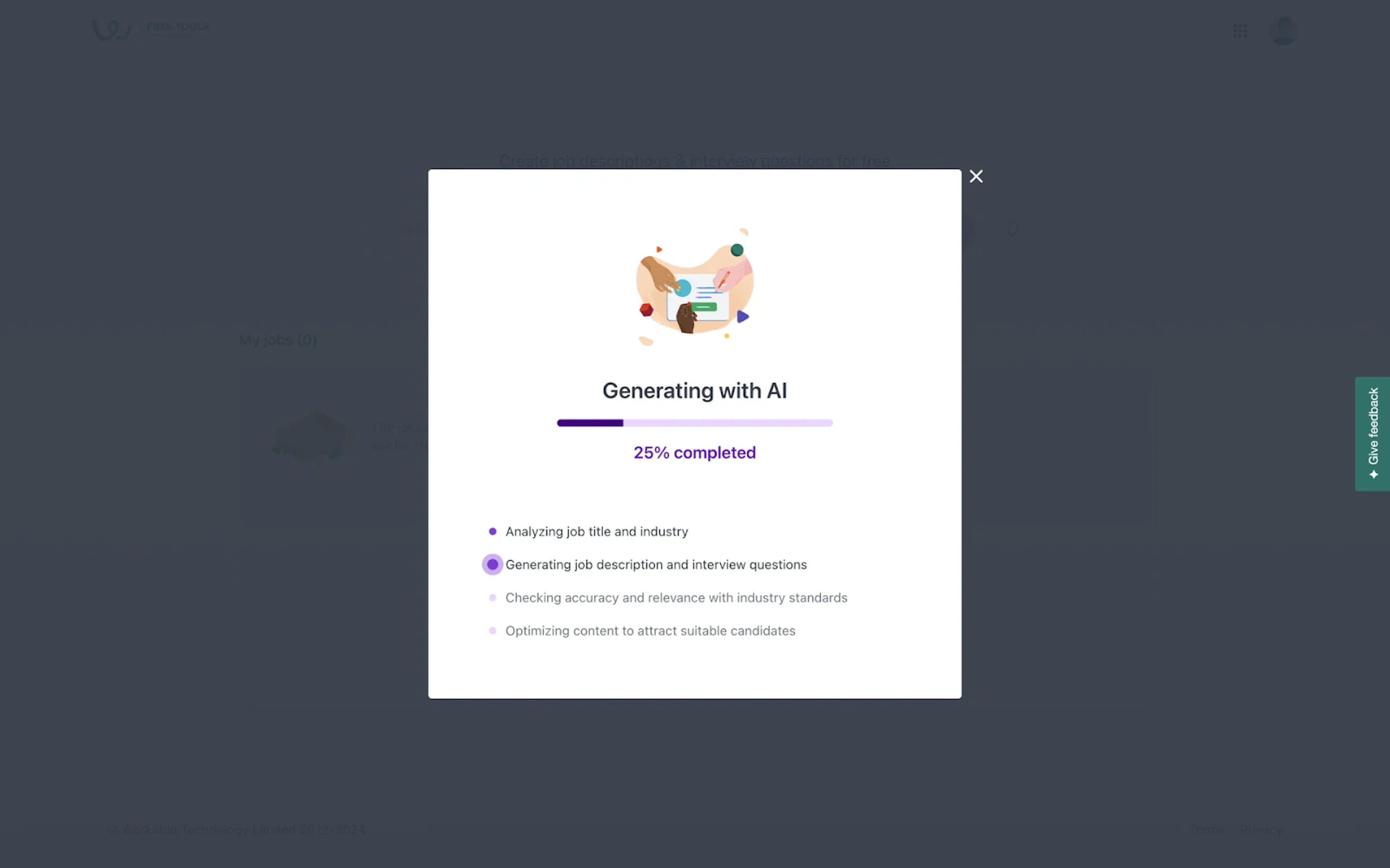
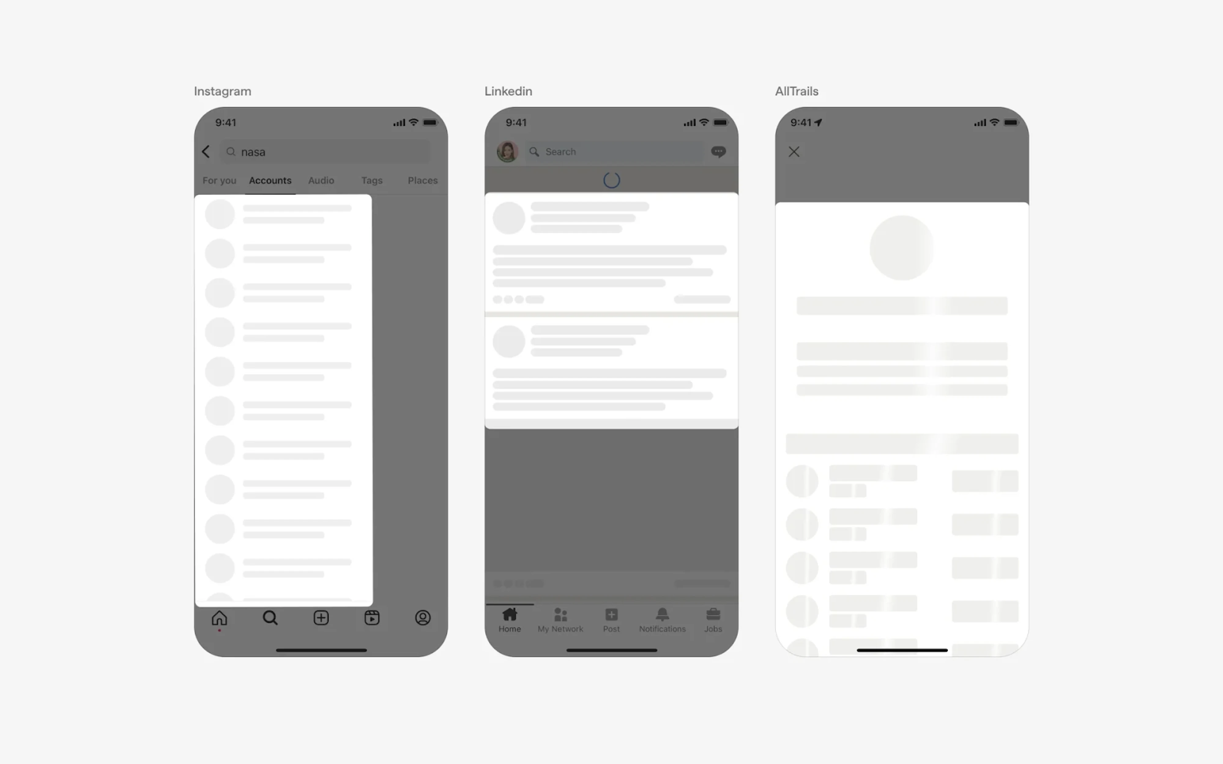
Skeleton screens
Skeleton screens are a type of progress indicator UI that shows a rough visual outline of the content while it’s loading. They present placeholder layouts that mimic the structure of the final interface, which gives users a sense of what’s coming next.
This approach works particularly well for content-heavy interfaces like dashboards, feeds, or search results, where data can load progressively. By setting expectations early, skeleton screens reduce uncertainty and improve loading UX.
Common examples of skeleton screens include:
- placeholder cards;
- grey blocks representing text and images;
- shimmering or animated placeholders;
- list layouts that gradually fill in with real data.
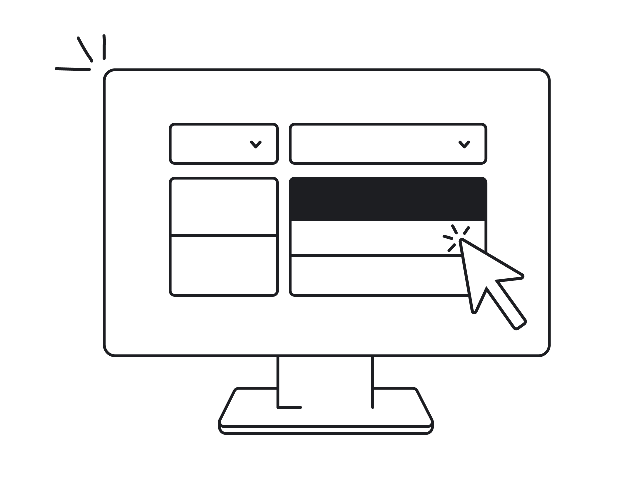
Multi-step progress trackers
Multi-step progress trackers are used when users move through a sequence of steps rather than wait for a system-driven loading process. With their help, you can indicate where the user is, what has already been completed, and what comes next.
This element is especially useful for structured experiences like onboarding, checkout, forms, or setup flows. In situations like these, people tend to think in steps, so labels like “Step 2 of 5” or clearly defined stages are easier to understand.
Common examples of multi-step progress trackers include:
- step indicators with labels;
- numbered steps;
- horizontal steppers;
- vertical progress trackers.
Best practices for designing effective progress indicators
Most progress indicator mistakes happen in the moment between a user clicking submit and the system responding. The indicator might be there, but it’s often the wrong one or poorly designed. Closing that gap is what the following practices are about.
Show meaningful progress
If you can measure progress, show it. Vague loading indicators might confirm that something is happening, but they don’t help users understand how much progress has been made or how much waiting time remains.
Meaningful progress does exactly that. That kind of clear progress feedback helps users decide whether to wait or walk away, and it reduces perceived wait time because uncertainty is the thing that makes waiting feel long.
A few specific things to get right here:
- Don't let the bar lie. A UX progress bar that races to 80% and then stalls for the final stretch destroys trust faster than no indicator at all.
- Add a text label. “Uploading 4 of 10 files” or “Linking your bank account” is far more reassuring than a percentage floating in silence.
- Credit completed work. In multi-step flows, start users with at least one step already marked done where possible.
- Show the whole journey. Users who can see where they started, where they are, and where they're going feel more oriented.
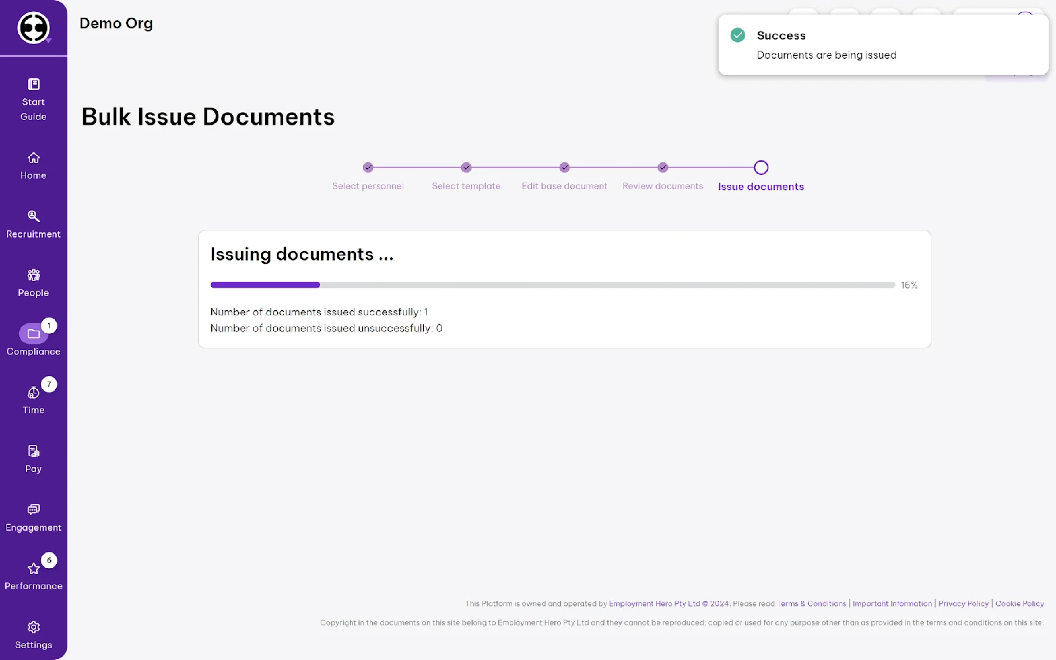
At Eleken, we applied this approach when designing Panjaya. Here, users upload multiple files at once, and we used a determinate UI progress indicator with status labels and percentages to clearly communicate each project’s progress.

Let users stay in control
A progress indicator that gives users information but no agency only solves half the problem. Knowing how long something takes is useful, but knowing you can pause, cancel, or return later is what makes the experience feel respectful.
When users feel locked into a process with no exit, anxiety compounds, and a single bad experience (a cancelled flight booking that ate the session, a form that timed out mid-completion) can permanently damage confidence in a product.
The practical implementation of this breaks into three distinct scenarios:
- Cancel. Where interrupting a process has no negative side effects, always include a cancel button.
- Pause and resume. If cancelling would cause data loss, offer a pause button alongside cancel.
- Warn before consequences. When cancelling a process results in lost progress, surface an alert to confirm or resume.
In multi-step flows, specifically, “stay in control” also means being able to go backwards. A step tracker that locks users into forward-only navigation is a friction point that directly drives abandonment.
Match the indicator to the task
Not every task needs the same type of progress indicator, and using the wrong one can create confusion. A spinner, for example, might be a great fit for a quick, unpredictable action, but it becomes frustrating during longer tasks.
The key is to match the indicator to the task and user expectations. If the duration is unknown, an indeterminate indicator is enough. If progress can be measured and the task takes time, a determinate indicator gives users a clearer sense of control.
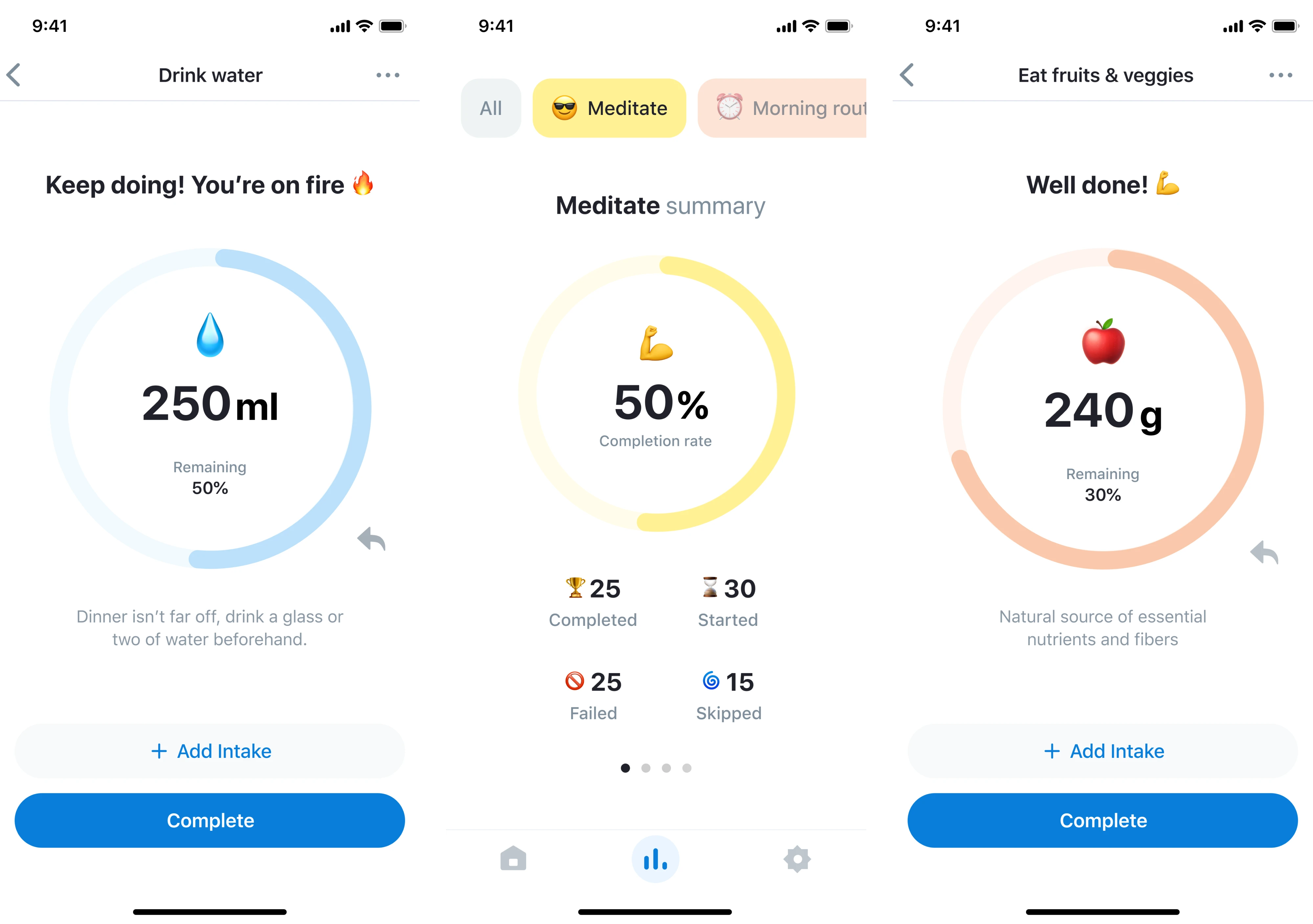
This principle came in handy when we designed HabitSpace. Since users needed to monitor habit progress, we used circular indicators to visualize completion rates. This matched the nature of the task and made progress easy to grasp at a glance.
Explain what is happening
A progress indicator without context still leaves users guessing. Even if they can see that something is moving, they don’t necessarily understand what the system is doing or why it takes time. That gap creates uncertainty and leaves users frustrated.
In situations like this, a well-written label makes a big difference. “Linking your bank account” or “Checking your details” gives users real context. For longer waits, the label should update as the process moves through different stages.
Use a clear state design
Progress indicators are just one moment in a sequence of UI states. A well-designed indicator accounts for what the interface looks like before the process starts, while it’s running, when it completes successfully, and when it fails.
Designing only the “in progress” state and leaving the rest unresolved is where user trust breaks down. We need to design not only ideal and error states, but also partial states and loading state UX. Each one requires a deliberate decision.
The four states every progress indicator flow should account for:
- Idle/initial state — what users see before the action is triggered.
- In-progress state — the active indicator itself.
- Success state — the successful completion of the task.
- Error state — the indicator of the failed process.
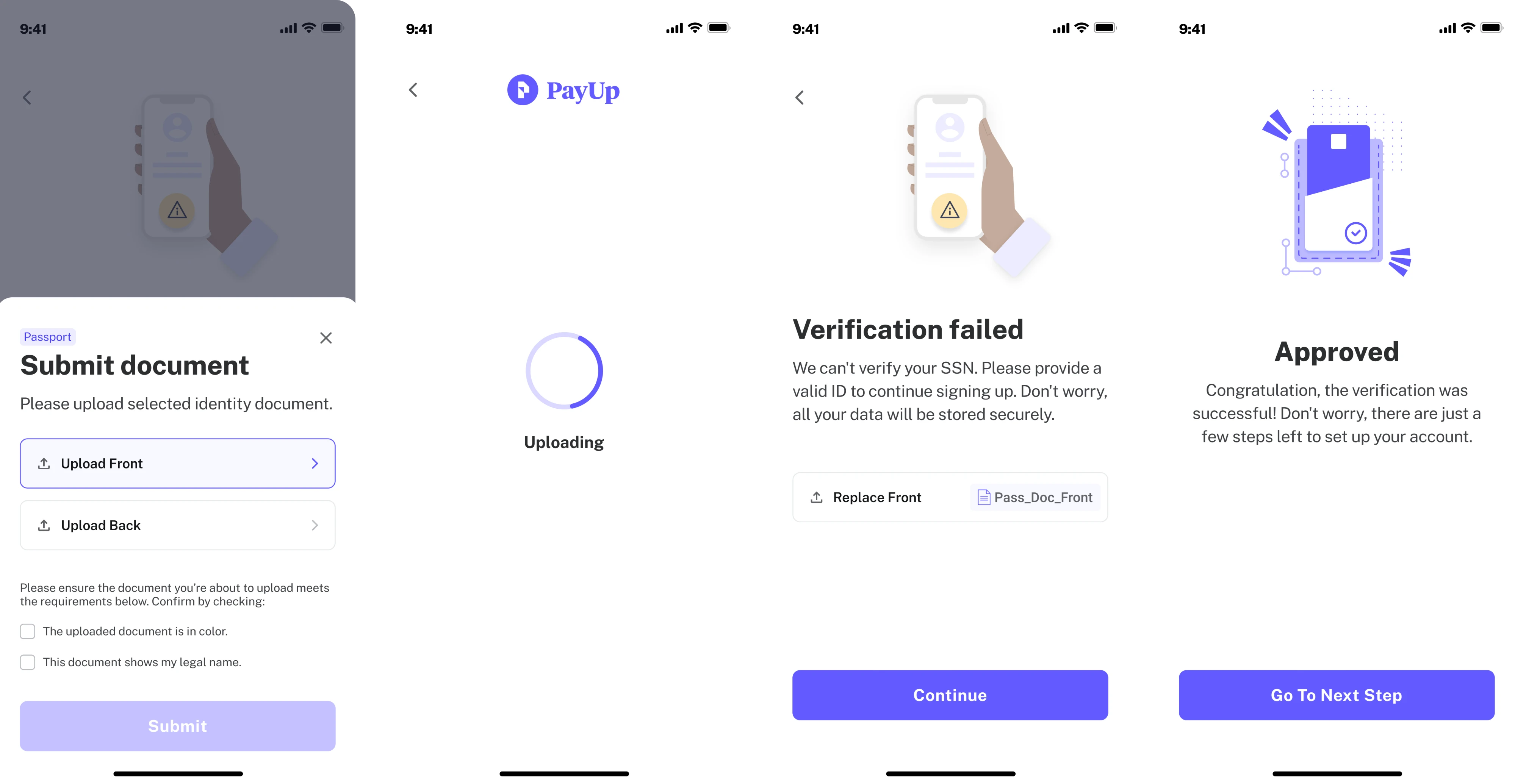
You can see this approach in action in our PayUp case. In the document verification flow, we clearly defined each state, helping users understand where they were in the process and what to do next without second-guessing the system.
Avoid visual clutter
Overusing visual cues can distract users and reduce the effectiveness of the very indicators meant to reassure them. To avoid this, use a single progress indicator for multiple simultaneous elements, and skip it for anything that takes under a second.
Avoid redundant layering as well. A progress bar UX design paired with a percentage label is a purposeful combination, but adding a spinner, a status message, and an animation creates hierarchy collapse.
Be careful with motion
Animation in progress indicators earns its place when it serves a clear purpose. However, it becomes a problem when it's decorative, excessive, or applied without considering who's on the other side of the screen.
What feels polished and dynamic to one user can cause real discomfort to another. In fact, vestibular disorders affect millions of people worldwide, and for those users, unexpected or persistent motion can trigger dizziness, nausea, or migraines.
In practice, this leads to a few key principles:
- Keep motion subtle and predictable. Avoid fast, looping, or erratic animations that demand attention.
- Use appropriate timing. Keep most UI animations between 200–500ms and use easing functions.
- Avoid competing animations. Don’t place multiple moving elements in the same area.
- Respect user preferences. Motion should be reducible or disabled, especially for users who prefer reduced motion.
Maintain accessibility
Progress indicators are a visual feedback mechanism, and if that feedback only reaches sighted users, it’s only doing part of its job. A static progress indicator may look clear, but without proper support, it can be invisible to users relying on assistive technologies.
Accessible progress indicators rely on color, motion, and shape, supported by text labels or status messages that explain what’s happening. This ensures that users can understand progress regardless of how they interact with the interface.
In practice, this comes down to a few key principles:
- Describe progress in words, not just shown visually.
- Always pair color changes with text, icons, or other visual cues.
- Ensure a minimum 3:1 color contrast for the indicator against its background.
- Animations should be optional and not essential to understanding progress.
- Keep users informed when progress changes, completes, or fails.
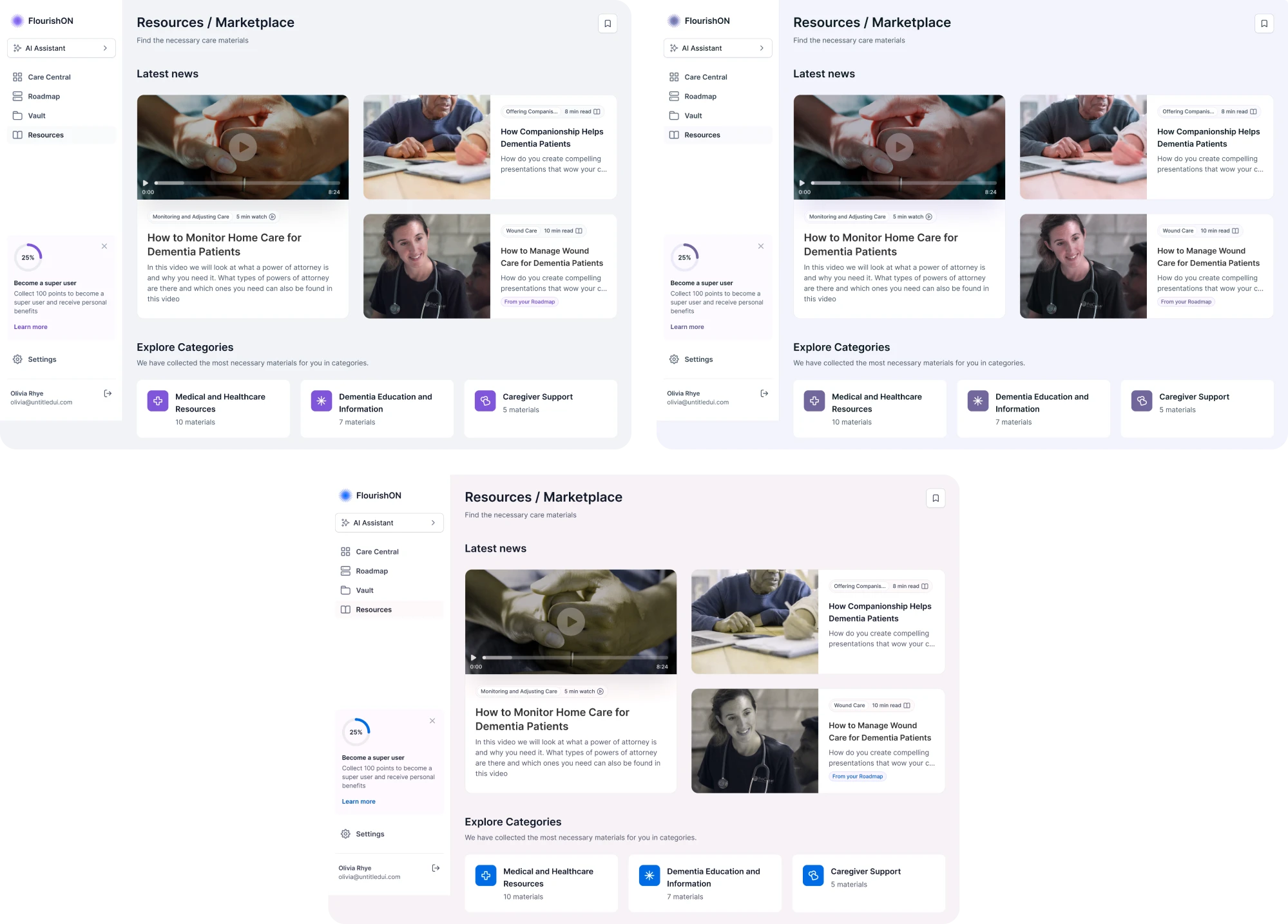
At Eleken, we applied this approach in FlourishON. By following WCAG standards and testing progress indicators across different vision conditions, we ensured progress remained clear even when color perception was limited.
Progress indicator examples in real products
Progress indicators are part of UX flows, constraints, and product decisions that shape how they appear and behave. Looking at real examples helps connect the principles we’ve covered above to actual use cases.
Bering Lab
For translation orders in the Bering Lab, our Eleken team introduced a four-stage progress indicator visible in a single detail view. Each row pairs a plain-language status label with a segmented progress bar UX that fills proportionally.
.webp)
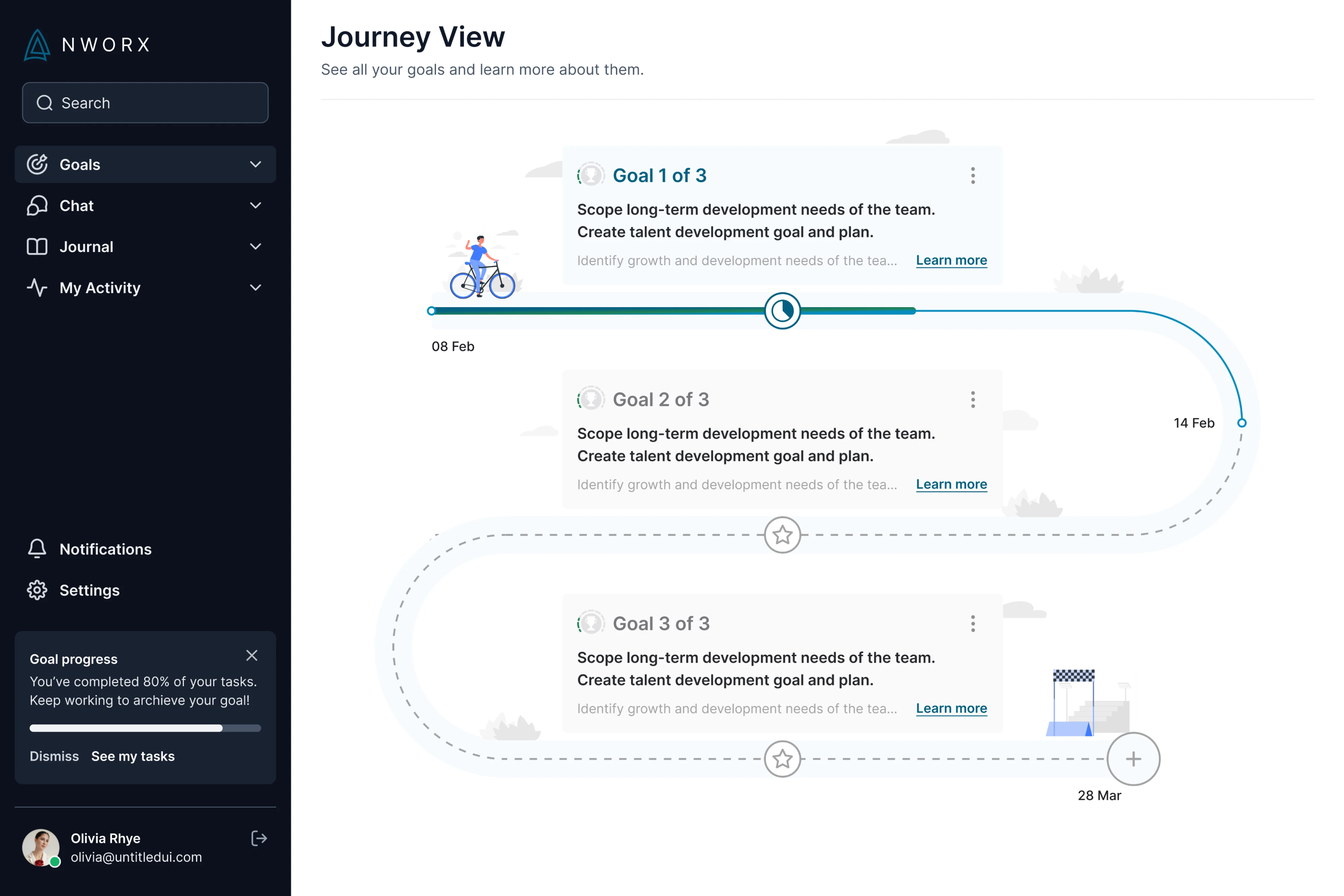
NWORX
In NWORX's Journey View, we designed progress as a winding path connecting learning goals. A filled teal track shows how far the user has advanced, while a dashed line marks the road ahead, making long-term progress easy to grasp.
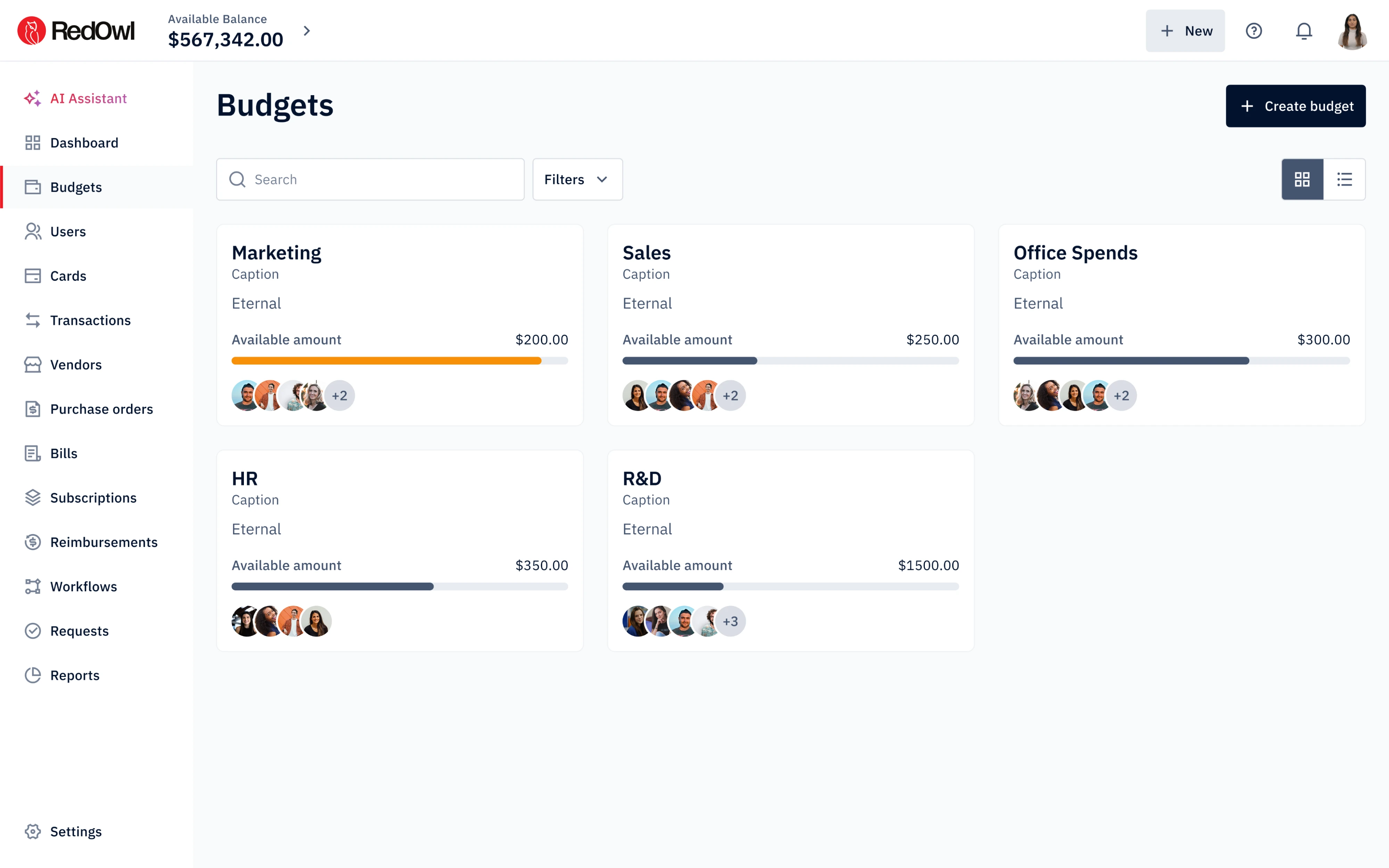
RedOwl
Each budget card in RedOwl uses a progress bar to show how much of the available amount has been spent. We made it effective through color variation: the bar turns orange as a budget runs low, while dark navy signals healthy headroom.
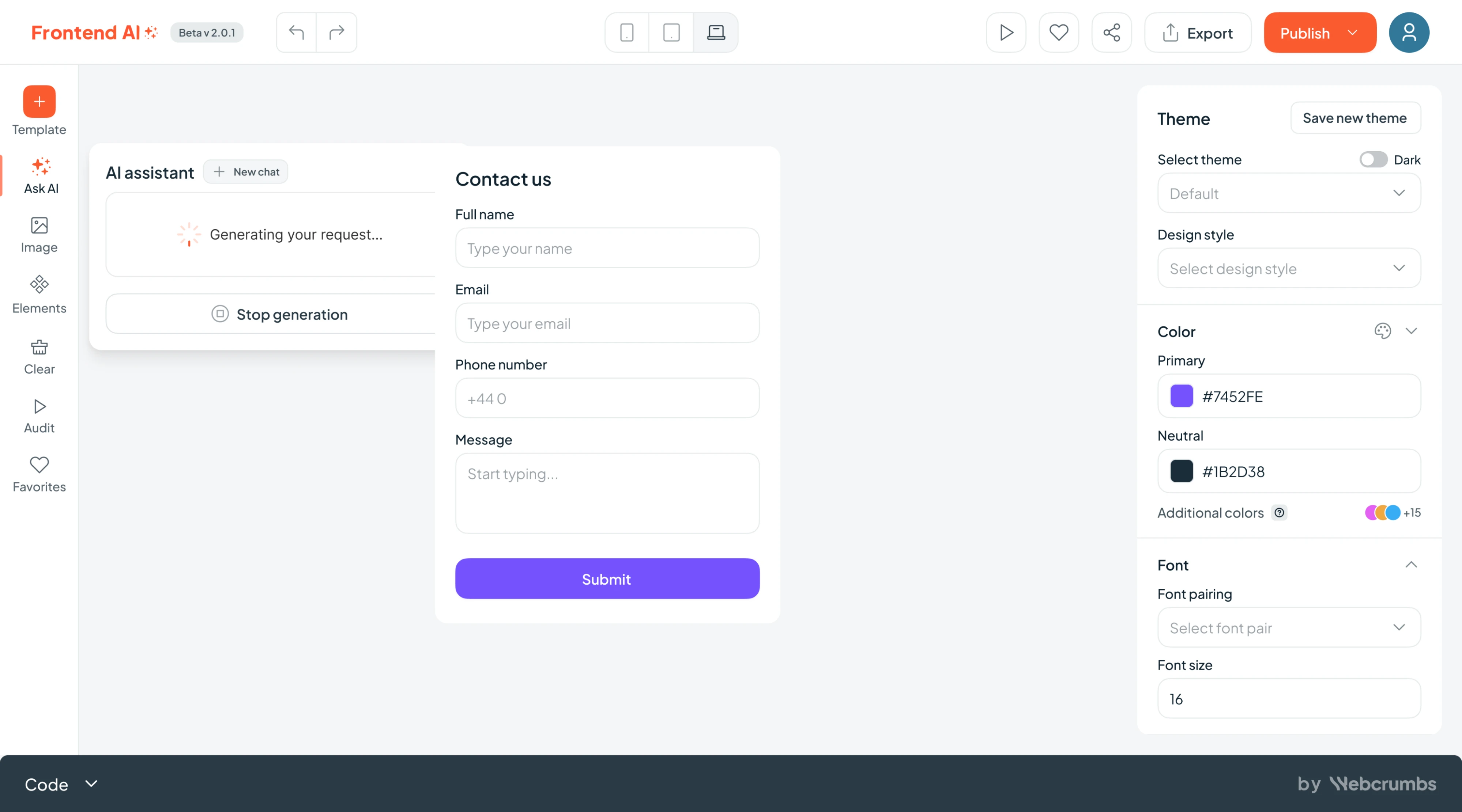
Frontend AI
“Generating your request…” paired with a spinner is a strong choice for Frontend AI, an AI-powered builder. What completes the pattern is the “Stop generation” button placed directly below, giving users control over the process.
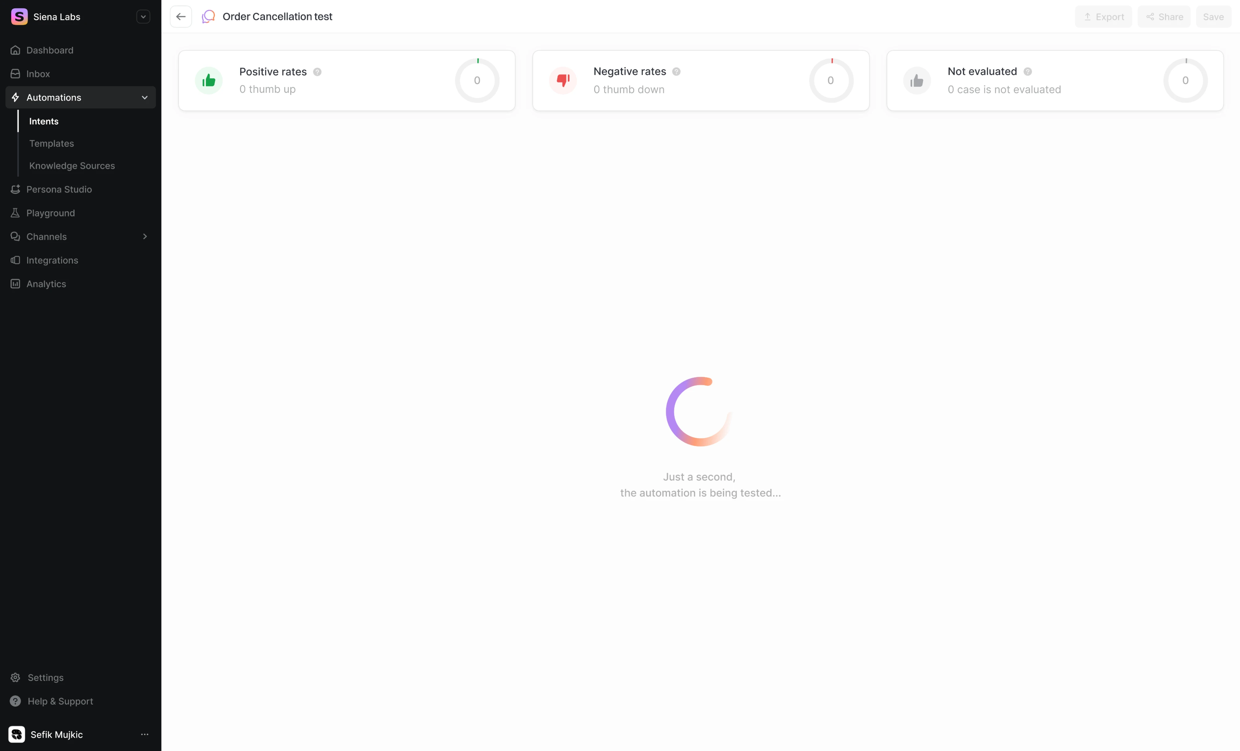
Siena
Working with Siena, we used a large gradient spinner paired with a clear label to explain to users what the system is doing and why results aren’t visible yet. The process can’t be measured, but it still feels responsive.
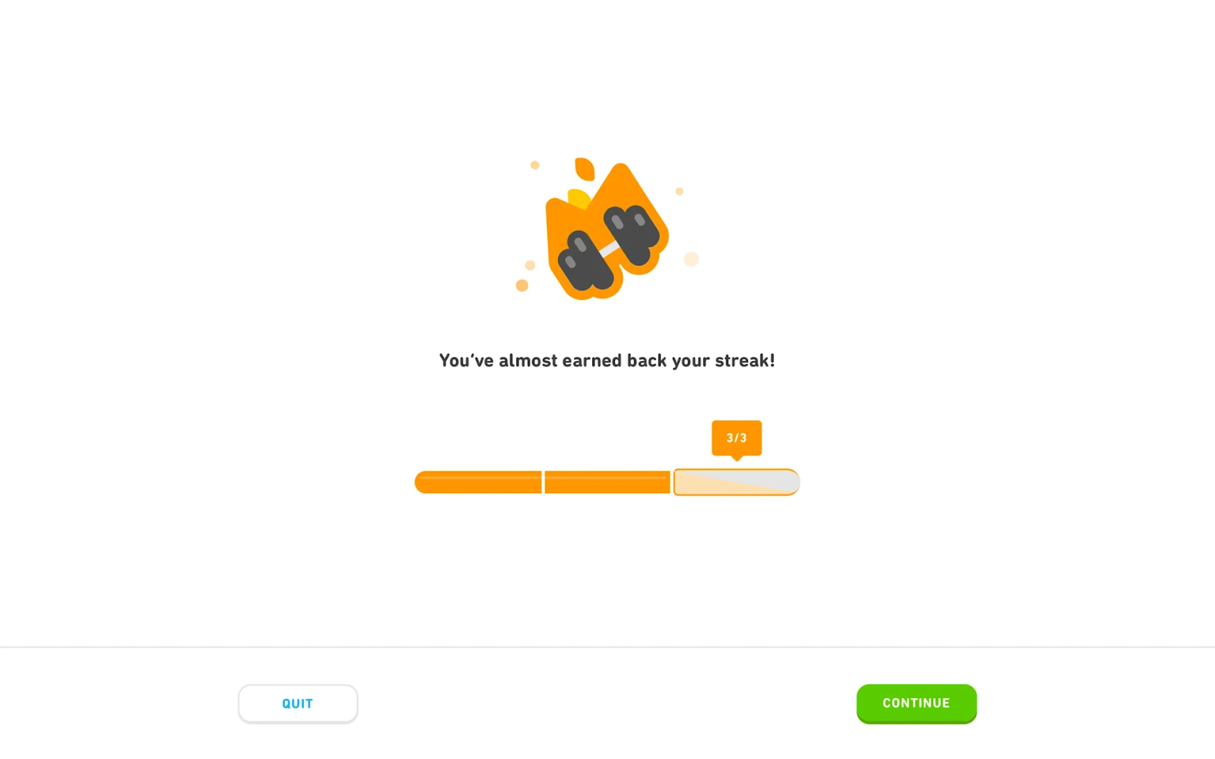
Duolingo
Duolingo backed motivation directly into the indicator. A segmented three-part bar shows “3/3,” with a tooltip pinned to the current position that frames progress as streak recovery. The copy does the emotional heavy lifting here.
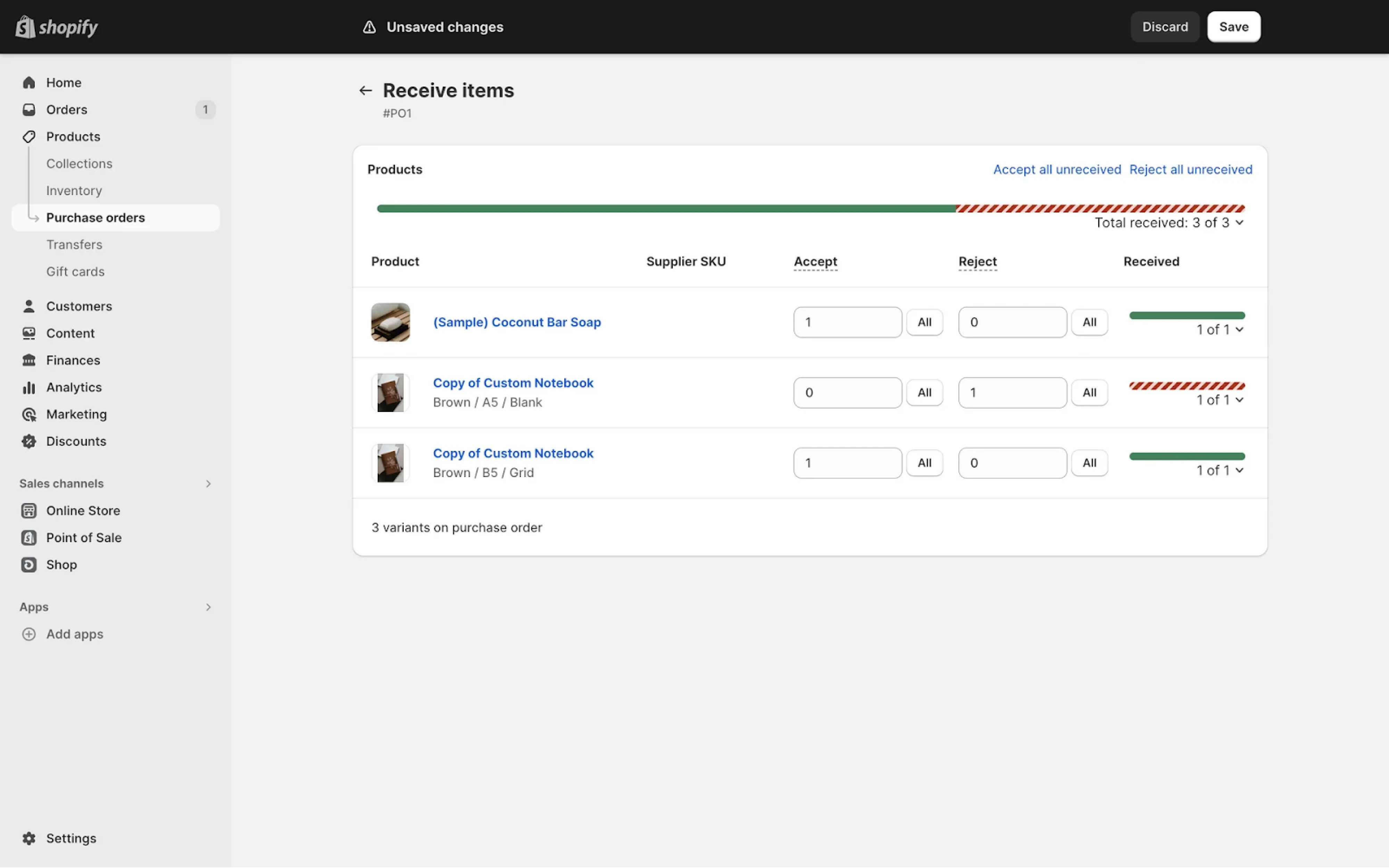
Shopify
Two colors do a lot of work on the Shopify purchase order screen. Green fills mark accepted items per row, while a red diagonal stripe pattern flags rejections, making the status of each line item instantly distinguishable.
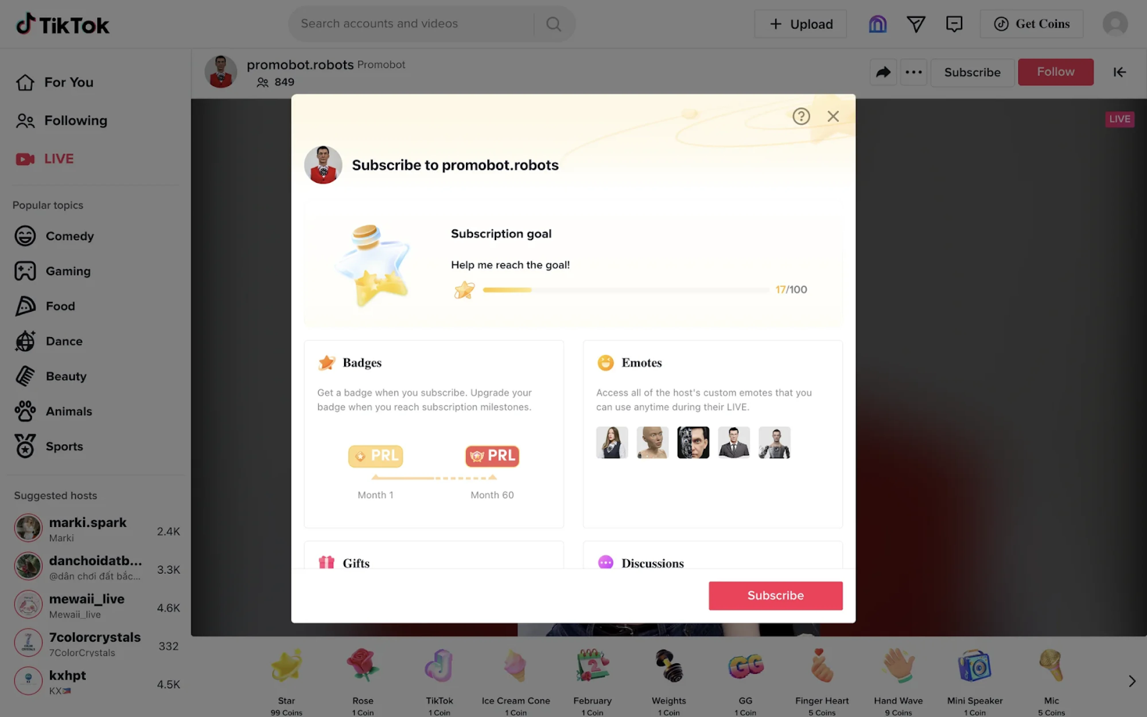
TikTok
TikTok frames progress as a social goal, using a thin gold bar to show how close a creator is to reaching a subscription milestone. The numeric indicator adds clarity, while the surrounding visuals and copy make the progress feel aspirational.
What to keep in mind
Progress indicators sit in a small space but carry a disproportionate amount of responsibility. They shape how users interpret time, effort, and system behavior, often in moments when patience is already thin. When done well, they remove doubt and let people stay focused on their task.
In practice, the strongest solutions come from understanding context. That’s something our team at Eleken has seen across different interfaces. So, if you’re working on a product where progress feels unclear or inconsistent, we’re always happy to help think through.


.webp)
.png)

.png)