

Breadcrumbs are one of those UI patterns designers love to debate – and often get wrong.
Some consider them outdated. Others slap them onto every interface “just in case.” In reality, breadcrumbs are neither decorative nor obsolete. When designed intentionally, they reduce cognitive load, support wayfinding, improve SEO, and help users understand where they are – especially when they land deep inside a product from search results, bookmarks, or shared links.
Yet breadcrumbs UX are frequently misused – not because the pattern itself is flawed, but because it’s often applied without understanding why and when it works.
In this guide, we’ll break down how breadcrumbs work, when they’re worth adding, which type fits your product, and the breadcrumb best practices that keep them useful instead of noisy – including mobile patterns, truncation, and modern examples that show it in action. Stay tuned.
What breadcrumbs are – and the 3 types you should know
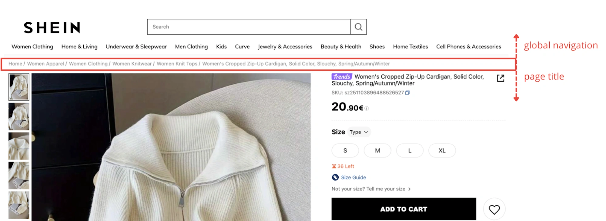
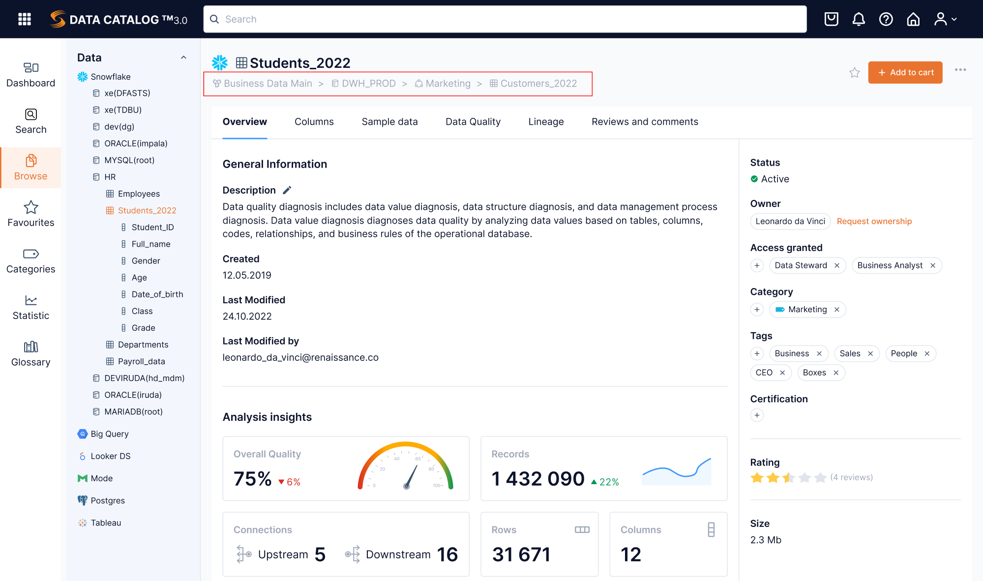
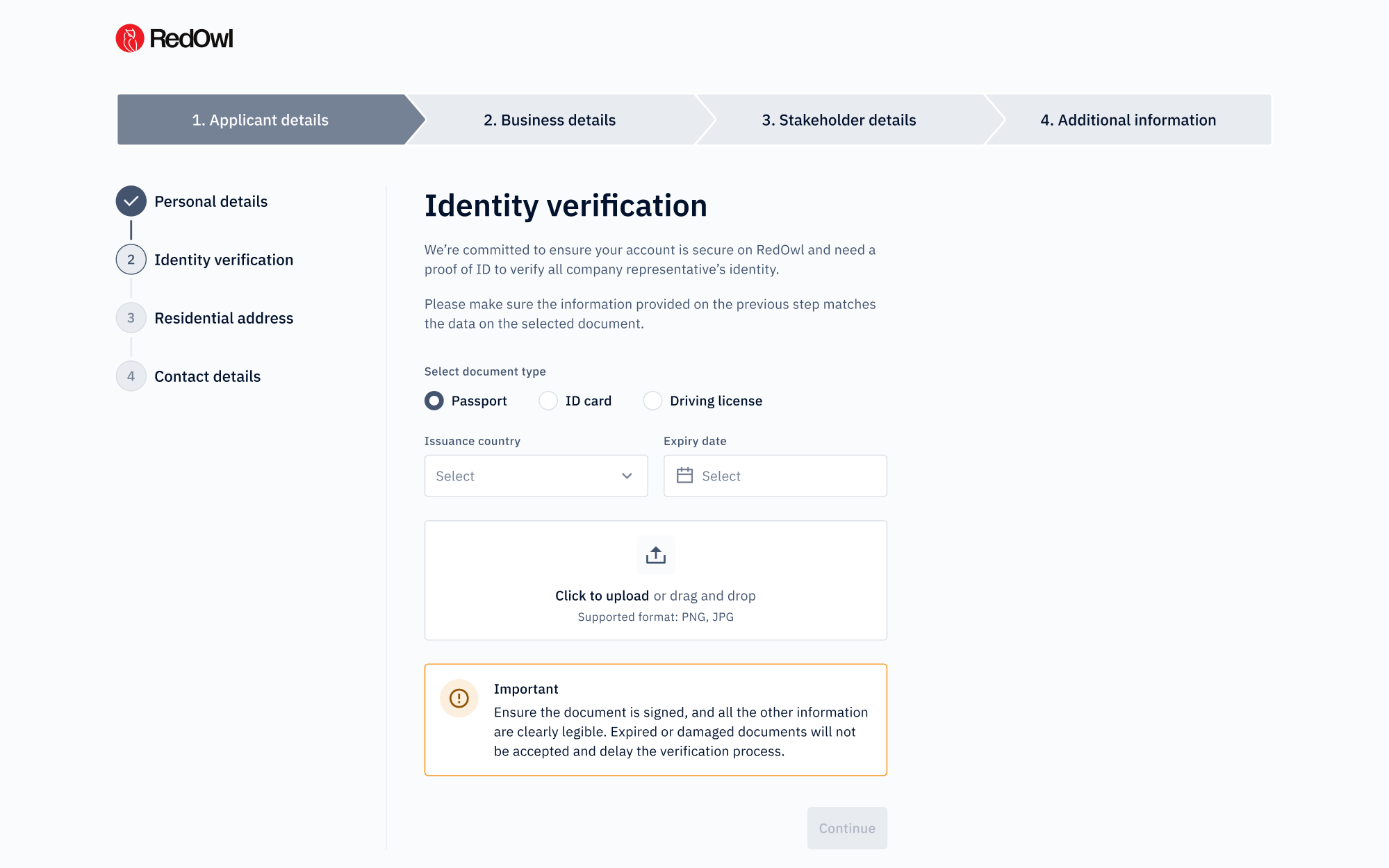
Breadcrumbs are a secondary navigation pattern that usually shows users where they are inside a product or website, and how that location relates to the bigger structure. A typical breadcrumb UI trail looks like this: Home → Category → Subcategory → Current page.
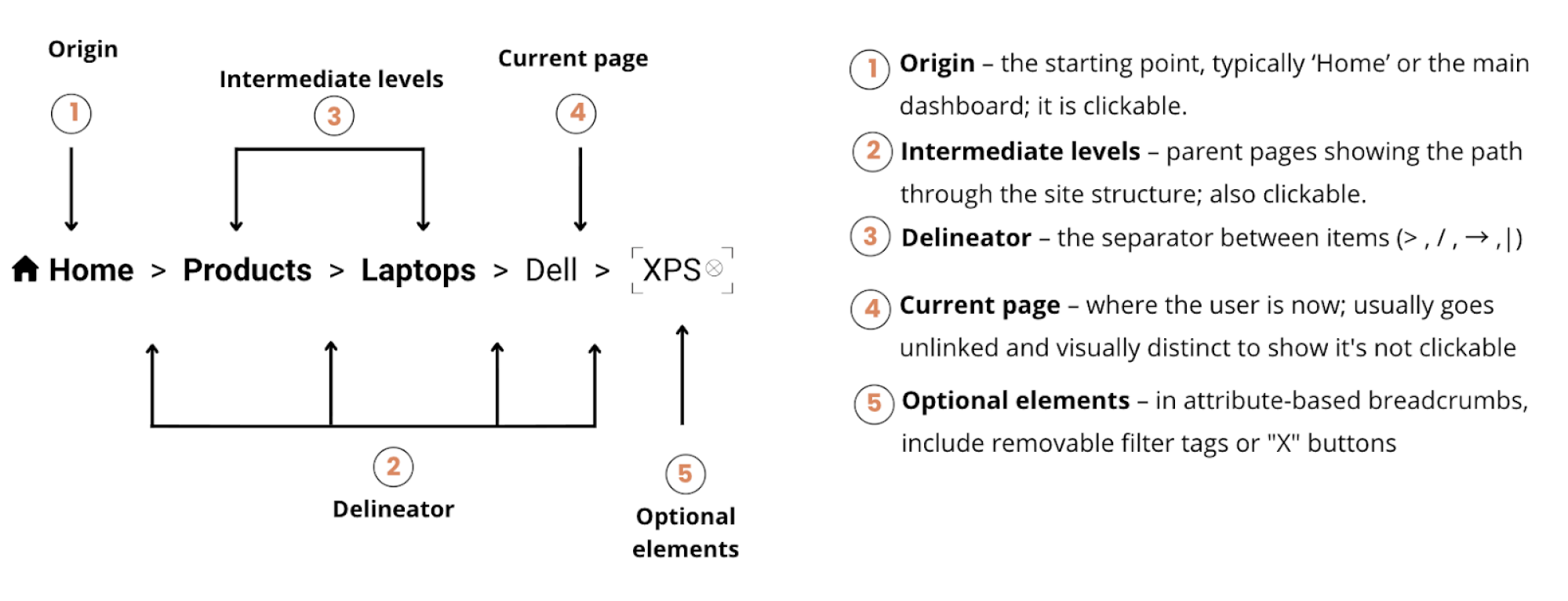
Each item is usually clickable except the last one, which represents the current page.
Breadcrumb navigation works best when:
- content is organized into clear levels
- users often need to move “up” the hierarchy
- a product has enough depth that orientation matters.
When used correctly, they help users feel grounded inside complex SaaS systems by supporting quick orientation and predictability – qualities that define good UX.
But not all breadcrumbs UI design are the same. Depending on what your interface needs to communicate, navigation breadcrumbs usually fall into one of three patterns – let’s briefly overview each.
1. Location-based breadcrumbs (classic, hierarchical)
Location-based breadcrumbs show where a page sits in the information architecture (IA). They reflect the site's hierarchical structure, not the user's browsing history.

Best for: Content-heavy sites, ecommerce platforms, knowledge bases, documentation sites, educational platforms
Key principle: This is NOT a history trail. If a user navigates from Home > About > Contact, then clicks a link to a product page, the breadcrumbs in UI should still show the product's actual location in the information architecture (Home > Electronics > Laptops), not the path they took to get there.
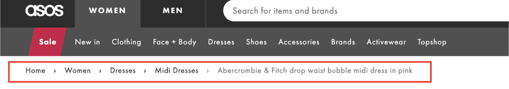
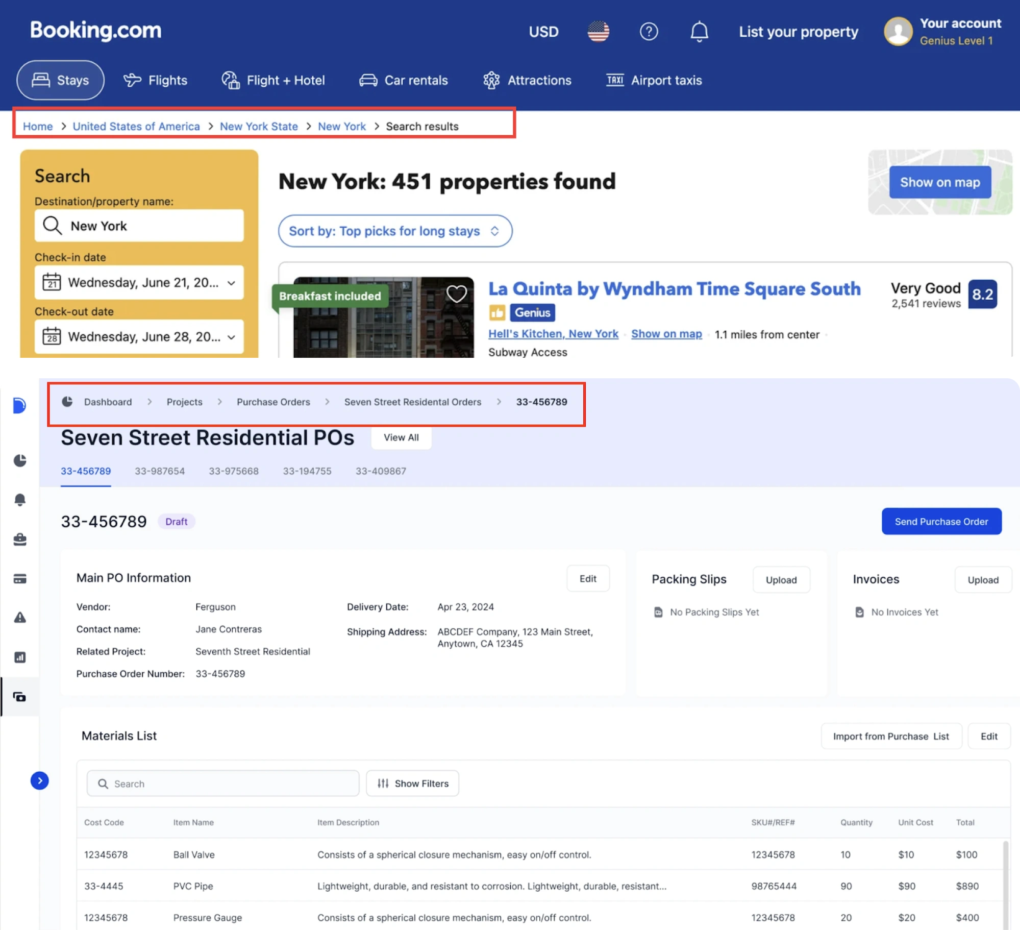
This is the most common breadcrumb UX type, and the one most people think of when they hear "breadcrumbs."
2. Attribute-based breadcrumbs
Attribute-based breadcrumbs show applied filters or attributes a user has selected, not the app's navigational structure. They're common on e-commerce sites and search interfaces with multiple filters.

Best for: E-commerce product catalogs, multi-filter search systems, and inventory management tools
Key principle: Attribute breadcrumbs can get long quickly, so design for truncation and consider whether all selected filters need to be visible, or if a "3 filters applied" summary with a dropdown makes more sense.
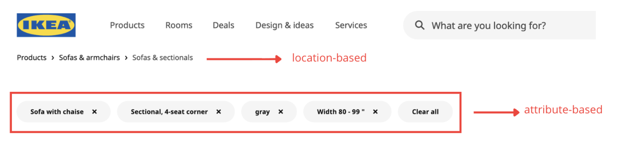
This breadcrumb type is essential for any interface where users search for something specific and need to understand and modify their current filter state.
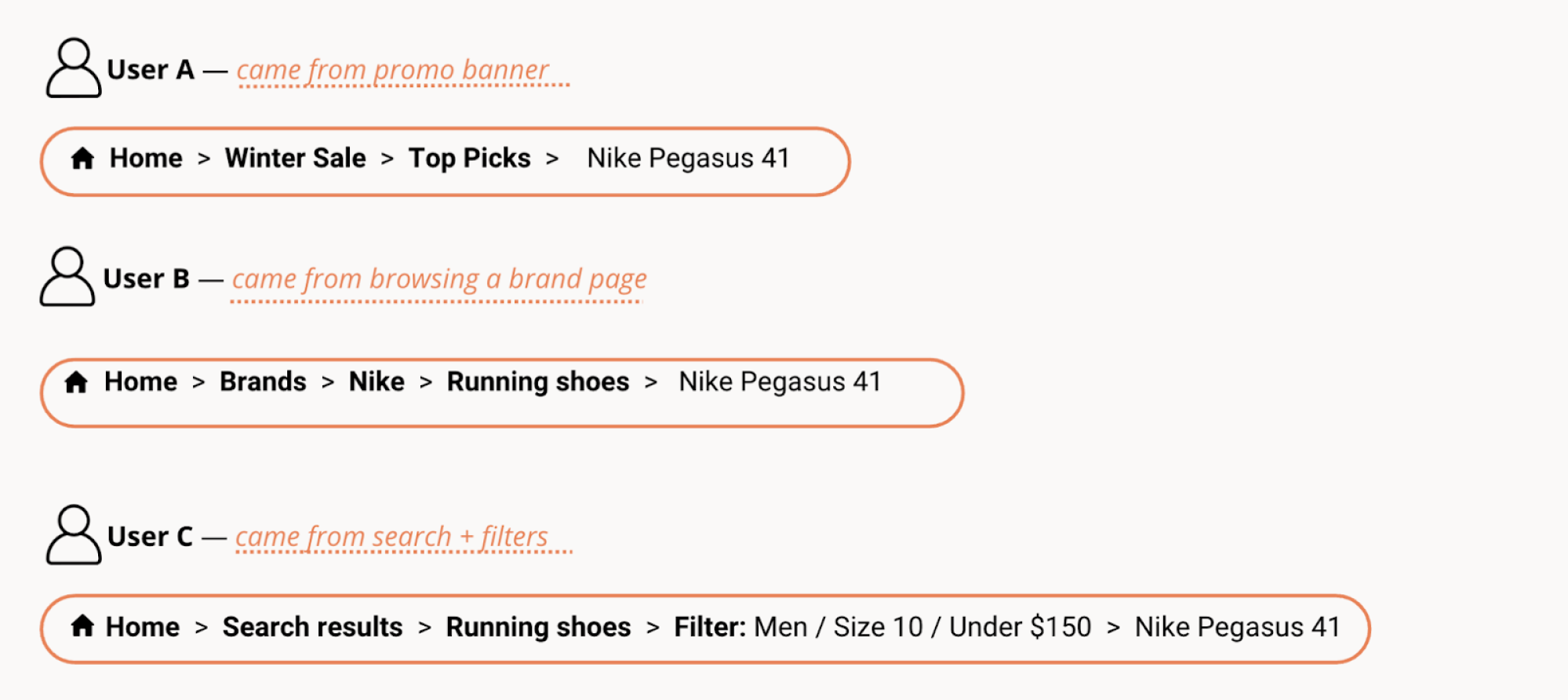
3. Path-based breadcrumbs (user's journey)
Path-based breadcrumbs track the actual route a user took through a site or application. They show browsing history, not hierarchical structure – meaning two users on the same page may see completely different trails depending on how they arrived.
Good for:
- specialized research tools and deep analytical workflows where retracing exact steps matters;
- AI conversation interfaces, where showing the entire path of reasoning adds transparency (a future-facing use case);
- "rabbit hole" exploration tools, where users need to backtrack through their unique discovery path.
Key principle: If you're considering path-based breadcrumbs, ask yourself if a well-designed "Back" button or browser history would serve the same purpose more predictably.
Now that you understand what breadcrumbs are and the types available, let's determine if you need them at all.
Decision framework: do you even need breadcrumbs?
Before adding them, first make sure your product has a real hierarchy users need to navigate — and that UX breadcrumbs will actually help them move back through it.
Here’s a quick practical framework to help you decide when breadcrumbs really make sense – and when they do not.
If you’ve checked and it happens that breadcrumbs don’t fit your case, here’s what to do instead:
- Use highlighted navigation states in your global or sidebar navigation
- Add a “Back to [Parent]” link when there’s a single clear path upward
- Consider tabs or local navigation for moving between related pages
- Switch to steppers or progress bars for linear workflows
The key principle is simple: breadcrumbs should serve a genuine navigation need. If you can't explain why users need them, they are probably not the right choice for UX.
Breadcrumbs best practices: the complete rulebook (2026 edition)
Once you've determined breadcrumbs fit your product, the challenge is designing them correctly. In this section, we’ll cover the rules that keep breadcrumbs UX design functional as intended.
1. Show the full hierarchical path – but only meaningful nodes
Breadcrumbs should reflect actual information architecture, not invented categories or empty containers. Users should be able to click any breadcrumb navigation item and land somewhere useful.
Do:
- show real, navigable pages that users can click to access
- include only levels that add meaningful context
- ensure every parent category contains useful content
Don't:
- Add fake categories just to create depth
- Include empty container pages that serve no purpose
- Make non-clickable parent pages (except the final current page item)
If a level in your info architecture exists purely for organizational purposes but has no landing page – consider skipping it in the breadcrumb trail.
2. Decide on the current page display
This is one of the most debated breadcrumb questions. There's no single right answer – it all depends on context.
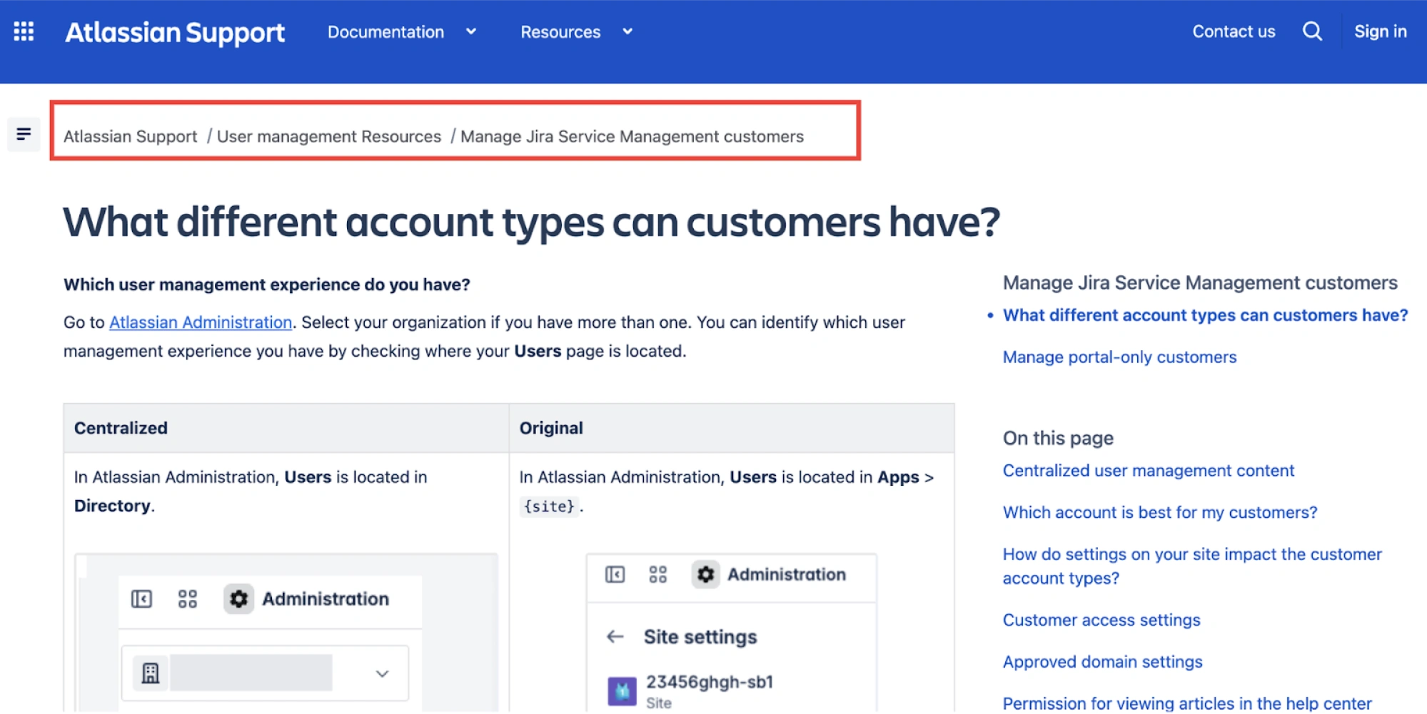
Include the current page when:
- Depth is 3+ levels, and users need strong orientation
- The page title is positioned far below the breadcrumb
- You're designing for content-heavy sites where reinforcing location adds clarity
- Accessibility is a priority, and you want explicit current-page markup
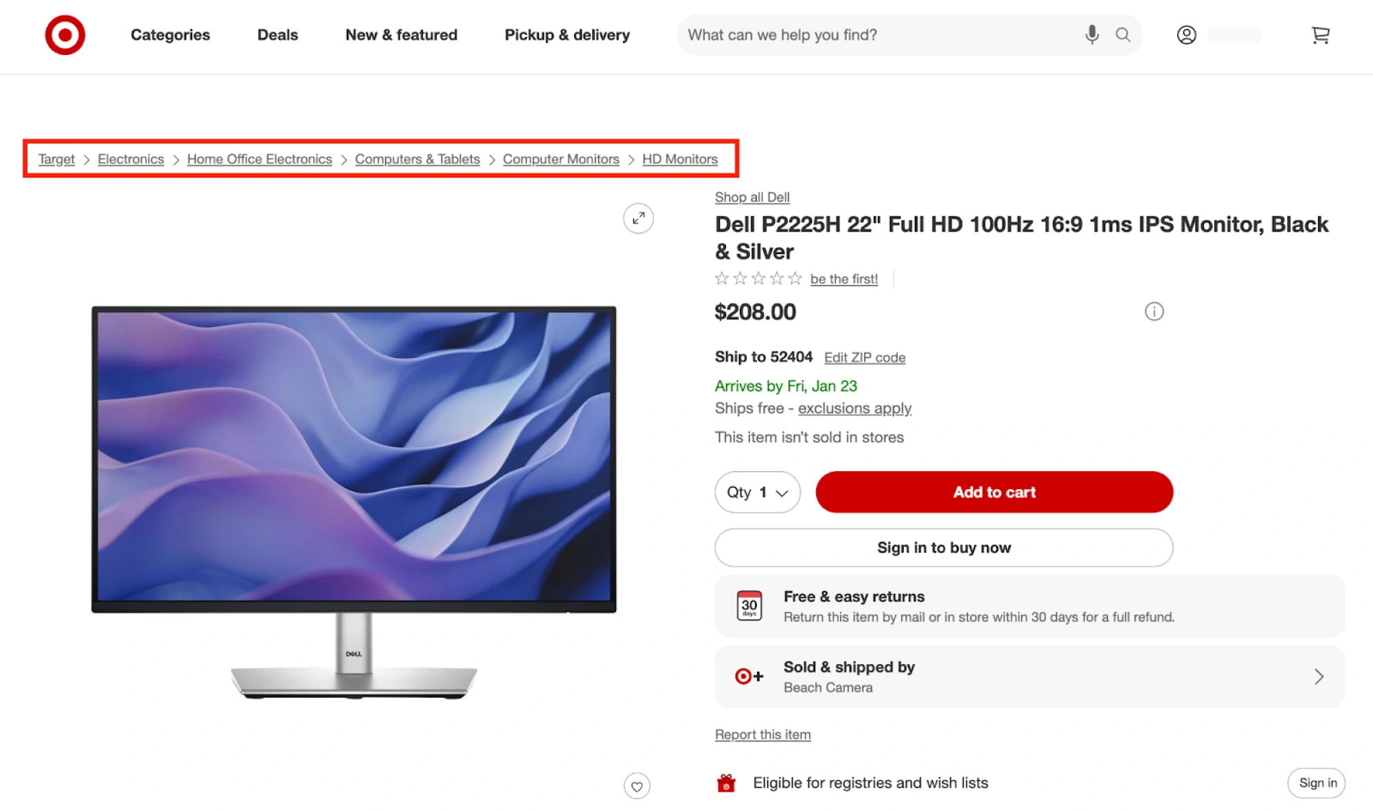
Omit the current page when:
- It creates visual redundancy (breadcrumb sits directly above an identical page title)
- Mobile screen space where the user taps is tight, and every pixel matters
- Breadcrumbs risk becoming visually noisy
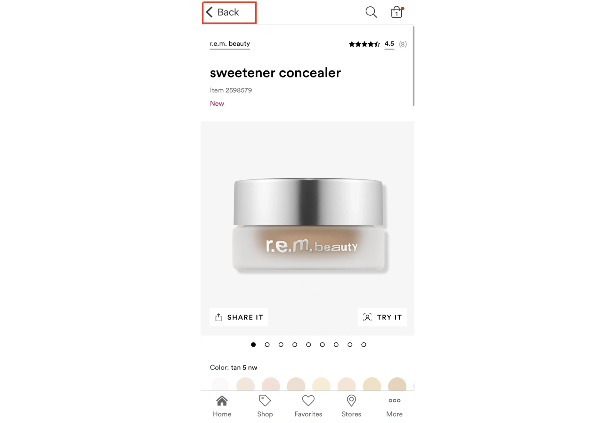
- You're designing for e-commerce patterns (e.g., Amazon, Target omit it)
The deciding factor: does including the current page reduce confusion or increase redundancy? Test with your users if uncertain.
3. Handle length with truncation
Long breadcrumbs cause user interface problems fast: they wrap into multiple lines, squeeze layouts, make labels hard to scan, and create poor touch targets on smaller screens.
To avoid this, consider applying truncation patterns:
If a breadcrumb label is truncated, make the full title easy to access via a tooltip on hover for desktop or tap for mobile. Where applicable, use acronyms or icons instead of truncating text – especially for product names and commonly recognized features.
4. Use separators that imply direction
Breadcrumb separators aren’t purely decorative — they guide scanning.
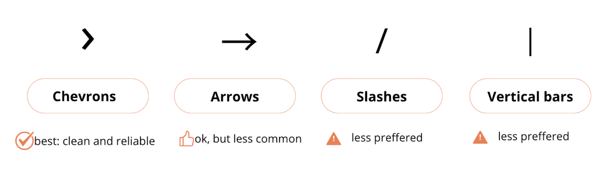
Most modern interfaces prefer chevrons (›) because they clearly indicate forward movement and hierarchical progression. They're visually lighter than arrows (→) and more directional than slashes (/).
Avoid:
- Slashes (/) on mobile devices – they often look cramped and unclear at small sizes
- Arrows (→) in attribute-based breadcrumbs – they imply progression rather than filters
- Vertical bars (|) – they suggest separation without hierarchy
Keep separators visually lighter than the links, so they don’t compete with actual labels. And remember – consistency is key. Pick one separator and use it across your entire product.
5. Maintain visual hierarchy and sound placement
While breadcrumbs are helpful, they should never compete with primary elements like page titles or CTAs. Keep them secondary in visual weight with smaller font sizes, muted colors, and lighter typography compared to particular page headings.
As for placement, it largely depends on your layout. Here are some best practices to consider:
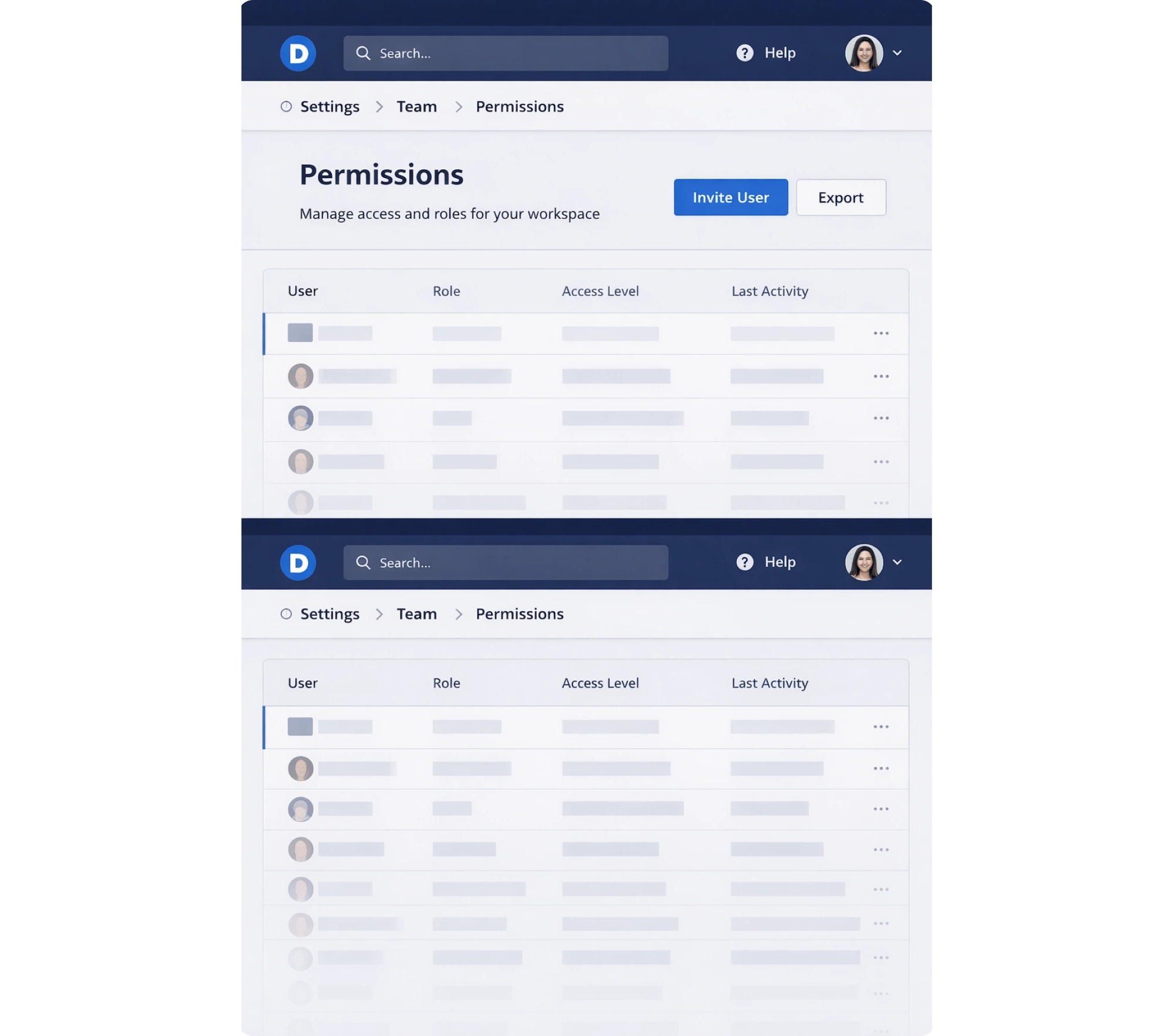
- below global navigation bar, above page title (most common)
- inside the header but above the page’s content (common in SaaS dashboards)
- sticky positioning for long pages where users might scroll and lose context
Mind that breadcrumbs should always feel like a quiet helper, not a dominant UI feature.
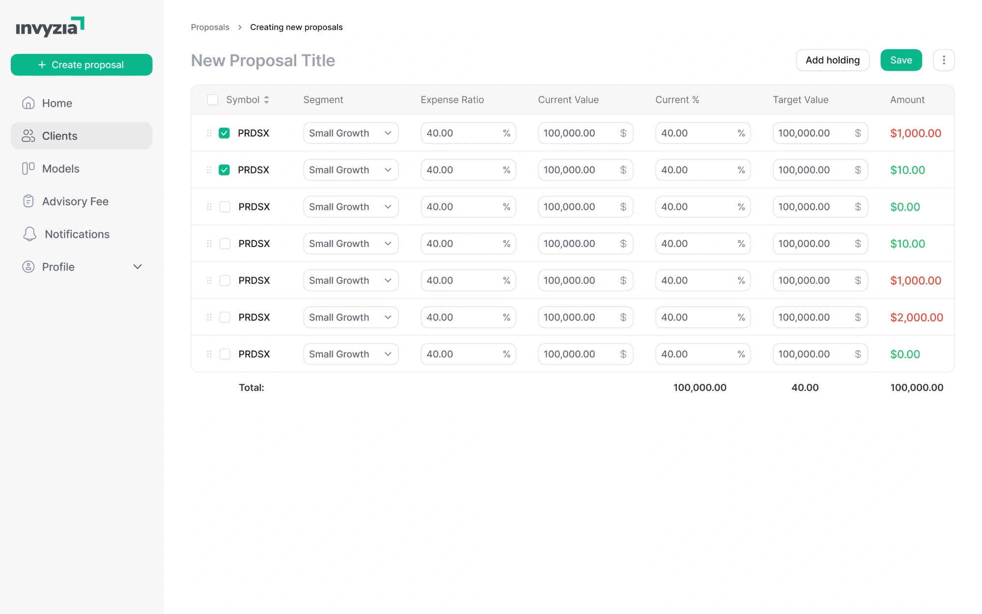
In our work with Invyzia Solutions, we utilized both breadcrumbs as subtle visual cues to help users better navigate within the platform and reduce friction. Collectively with other thoughtful design moves, our efforts improved usability, giving the platform a more modern look and a logical structure.
6. Don’t force breadcrumbs to flat navigation
If your site’s structure has only two levels (Home > Page), breadcrumbs are redundant. Users already know where they are from the page title and navigation.
Instead, use simpler alternatives that work better:
- clear headings that establish context,
- local navigation, like tabs for moving between related pages
- a "Back to [parent page]" link for quick upward navigation
- active states in your sidebar or top navigation that show the current location.
Breadcrumbs are most valuable when there’s real depth — so don’t treat them as default UI chrome.
Breadcrumbs on mobile: practical patterns & anti-patterns
Breadcrumbs can work on mobile – but they’re easy to get wrong. Here are the most common bad ux examples to watch out for:
- wrapping resulting in multiple lines — kills scannability
- tiny, cramped breadcrumb links — leads to mis-taps
- redundancy with headings — extra noise, no value
- breadcrumbs pushing content down — reduces focus on the page
When not adapted, mobile breadcrumbs turn into absolute clutter – hard to scan, hard to tap, and crowding the page title.
Mobile-friendly breadcrumb patterns
Luckily, there are reliable patterns that help keep them usable. Pay attention to these:
Parent-only breadcrumb
Instead of the full breadcrumb trail, the cleanest mobile solution is often a single link back to the parent level.
This saves space while still providing upward navigation. Best for e-commerce and content sites with clear hierarchies.
Horizontal scrollable breadcrumb bar
If hierarchy matters, keep the trail on a single line and allow horizontal scroll. This keeps the structure without turning the header into a clumsy paragraph.

Pro tip: make it obvious it’s scrollable (subtle fade/overflow cue), and keep spacing generous so each crumb remains tappable.
Collapsed trail with ellipsis and dropdown
When space is tight, compress the middle of the breadcrumb path into an expandable element. Tapping the ellipsis should reveal the hidden levels (as a dropdown/menu).
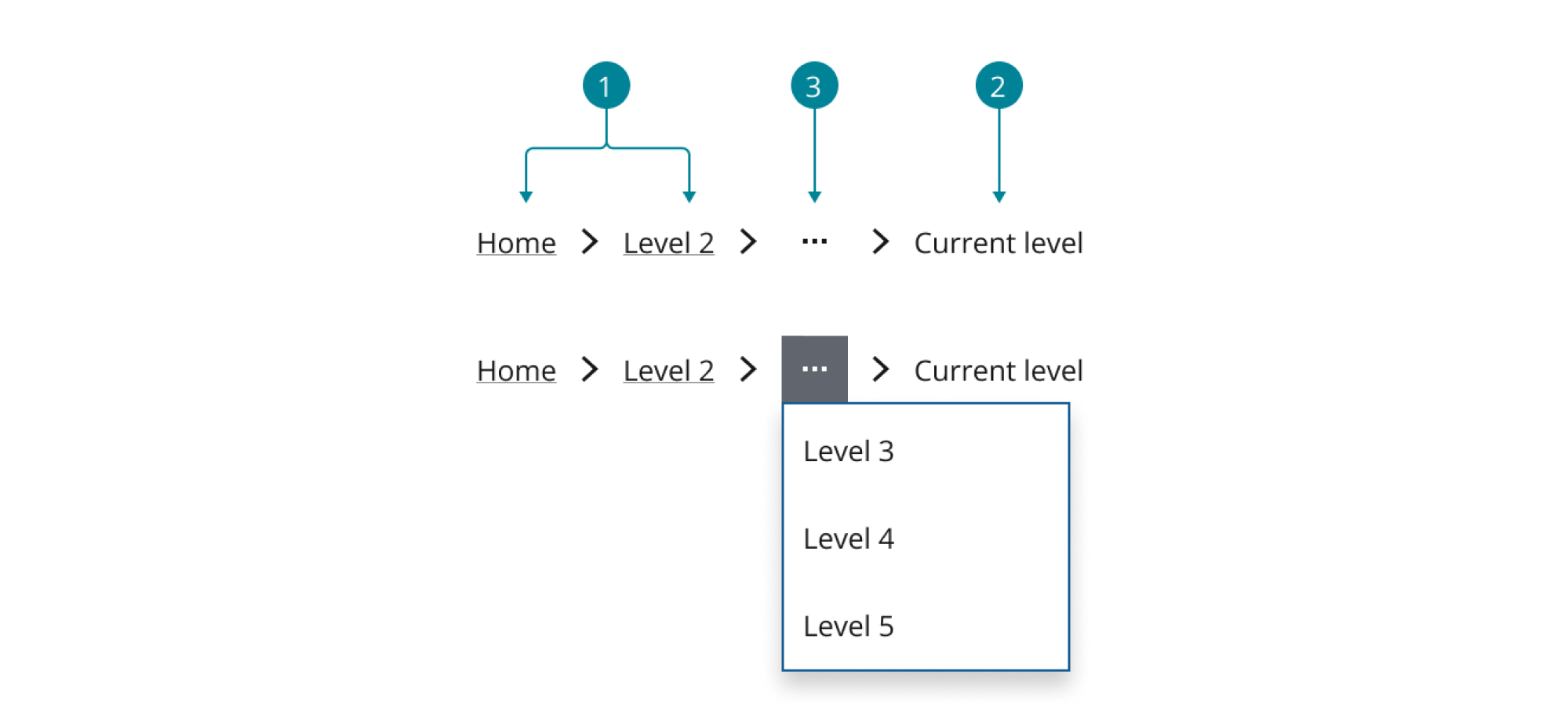
This works when users occasionally need full context but don't always require it. Great for deep hierarchies,
Switch to steppers for workflows
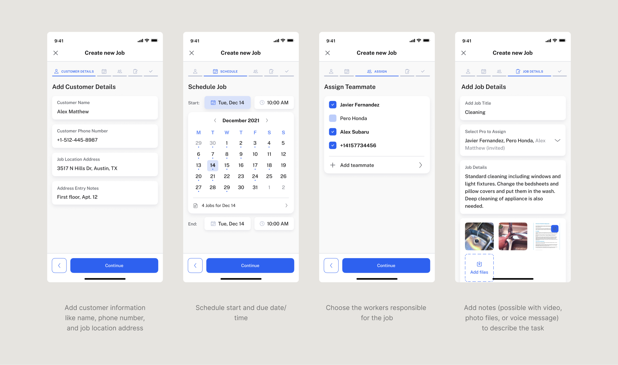
On mobile, where space is tight, and users need clear, focused guidance, traditional breadcrumbs can easily get in the way. For multi-step mobile flows stepper is mostly a better fit – helping users understand where they are and what’s next, without overwhelming the screen.
That’s exactly what we did in PrimePro, a mobile app for managing field service jobs. The original job creation flow was a single, scroll-heavy form – difficult to complete on a phone and easy to get lost in. We redesigned it as a 5-step wizard UI pattern, tailored specifically for mobile.
When to hide breadcrumbs entirely on mobile
Sometimes the best mobile breadcrumb is no breadcrumb at all. Consider removing them in these cases:
Essentially, mobile users navigate differently than desktop users – and if breadcrumbs don't serve to improve mobile navigation, it’s best to remove them.
Breadcrumbs need purpose, not just placement
Thoughtful breadcrumb design starts with a simple question: are they solving the specific navigation problem they're meant for?
Breadcrumbs help users understand where they are in deep site structures and navigate efficiently between pages. Apply them outside this context – to simple flat architecture, linear workflows, or interfaces where location is already obvious – and they become visual noise.
In complex products, breadcrumbs turn navigation into usable context. They reveal structure at a glance, put users in context, and let them grasp your product’s value faster.
The key is intentional use:
- recognize when breadcrumbs solve real navigation problems.
- choose patterns that match your product's structure.
- keep them visually secondary and adapt thoughtfully for mobile.
Because if breadcrumbs can't justify their space, what's the point then?
At Eleken, we’ve already helped 200+ B2B SaaS products turn complexity into clarity – removing friction through meaningful navigation and workflows where users orient quickly and adopt features confidently. If that's what your product needs, let's talk.


.webp)


.png)
