
Among many design components, the segmented control is deceptively simple. It's a horizontal set of two to five mutually exclusive options that immediately affect the current view. Users tap or click, and something changes right in front of them.
That immediacy is exactly what makes it useful, and exactly what makes it easy to reach for when a different component would actually serve better.
In this guide, we'll clear that up. You'll learn when a segmented control earns its place in a UI, when it breaks UX, and how to design it well. Along the way, you’ll see real examples and learn how to apply this component correctly.

When to use segmented controls
Knowing what a segmented control is doesn’t automatically mean knowing when to use it. In fact, this is where most design decisions go wrong. The component feels so lightweight and convenient that it often gets applied by instinct rather than intent.
To avoid this, let's break down the situations where this pattern makes sense.
When switching between views
A segmented control works best when users stay in the same context, interacting with the same underlying data, but viewing it in different ways. The options form a linear set that represents different perspectives on the same content.
A useful way to think about it: if removing one segment would make the other segments lose meaning, you're looking at the right component.
When you have a small number of options
Segmented control is a visibility-first component, and it works best with two to five options. Within that range, users can quickly scan all available choices, understand the differences between them, and make a decision without effort, which helps reduce cognitive load.
The more options you add, the more horizontal space the control consumes, and at some point, the layout simply breaks.
When users need fast switching
Speed is built into the segmented control's design. All options are visible at once, the tap target is large, and the result appears immediately. For users who need to move between views quickly and repeatedly, this makes a real difference.
A segmented control should never require a save or apply action to take effect. The moment a user selects a segment or presses Enter, the content responds.
When options are mutually exclusive
Mutual exclusivity is what gives the segmented control its visual logic. The connected track, the single active tile, the way selecting one segment automatically clears the previous one: all of it communicates a single idea to the user.
There's no way to have two or more segments active. If your use case allows for multiple selections, toggle buttons or other selection controls will work better.
Segmented control UI design best practices
Once you start designing segmented control UI, the details begin to matter. What looks like a simple component can become confusing if it’s not handled carefully. That’s why it’s worth going through the best practices that make it work well.
Limit the number of segments
Most major design systems, including the iOS segmented control guidelines, converge on 2–5 segment control elements for text labels, with some allowance for up to 6 when using icons only. Within that range, users can process different options at a glance and make a choice without hesitation.
Here's how the range breaks down in practice:
- 2 segments — the minimum;
- 3–4 segments — the sweet spot for most use cases;
- 5 segments — acceptable on desktop and tablet;
- 6 segments (icon-only) — possible on wider layouts;
- 6+ segments — switch to a dropdown, radio buttons, or other selection controls.
If you find yourself at the limit and debating whether to squeeze in one more option, that's usually a signal to reconsider the information architecture. Adding just one more text segment rarely solves the underlying problem.
Keep labels short and clear
Because multiple segments sit side by side within the same button group with no additional context, each label has to carry its full meaning on its own.
The starting point is word count. Most design systems recommend keeping labels to one or two words, which makes them short, specific, and immediately understandable.
Longer labels create several issues at once. They stretch the layout, reduce spacing between segments, and make options harder to compare. On smaller screens, they often get truncated, which introduces ambiguity and forces users to guess.
A few principles that hold across design systems:
- Use nouns or noun phrases, not verbs.
- Keep it to 1–2 words.
- Match grammatical structure across all segments.
- Use sentence case consistently.
- Avoid articles.
Make the selected state obvious
A segmented control only works if users can instantly tell which option is active. Without that clarity, the interaction becomes uncertain and increases cognitive load.
The problem is amplified with two-segment controls, which are often used for binary options. With three or more options, context does some of the work — if two segments look inactive, the third is probably selected.
In this case, the user is entirely dependent on the visual treatment to tell them which state they're in, and subtle cues like a slightly lighter background or a thin border often don't hold up in practice, especially in dark mode.
What “obvious” actually requires is a layered approach:
- Background fill — the primary indicator that is clearly distinct.
- Typography weight — slightly bolder text reinforces the active state.
- Contrast — text should meet at least 4.5:1 against its background (WCAG).
- Depth (optional) — a subtle shadow or elevation can add clarity.
Ensure one option is always pre-selected
A segmented control visual logic is built around the idea that one option is always active. Without it, users land on a view that doesn’t tell them where they are, and the content beneath the control has no defined state.
In many cases, the first segment becomes the default, but that’s not a rule. A better approach is to default to whatever represents the most common or most useful starting state for the majority of users.
There are two situations where this decision requires more care:
- When user preferences are known — if the product tracks prior selections, restoring the last-used segment usually creates a smoother experience than resetting every time.
- When all options have roughly equal weight — if all choices seem equally important, defaulting to the first is still valid, but it’s worth checking whether the order reflects actual usage priority.
If no segment is pre-selected, some users will interact with the content first and only reach for the control when something seems off. Pre-selecting the right option by default eliminates this entire class of confusion before it can happen.
Use consistent visual cues across segments
Every segment in a control needs to speak the same visual language. That means using either all text labels, all icons, or a consistent combination of both.
Mixing visual cues across segments creates an uneven scanning experience, forcing users to process different types of information within a single control.
Each of the three valid approaches has its own appropriate context:
- Text only — the default and safest choice;
- Icons + text — useful when icons add meaning and help users orient;
- Icons only — acceptable in space-constrained layouts.
That last option requires caution. Icon-only segments carry a real comprehension risk. Icons must be clear, familiar, and visually distinct. What feels obvious during design often isn’t obvious to users encountering it for the first time.
Maintain equal segment sizing
When all segments share the same width, the control communicates something important to users: these options are equivalent. None is more prominent, none is more important, and none is harder to tap than another.
The width of each segment should be based on the longest label. For example, with “Day,” “Week,” and “Month,” all segments should match the width of “Month.” This directly impacts how labels need to be written, as discussed in the previous section.
There are a few specific sizing considerations to keep in mind:
- Touch targets — make segments wide enough for comfortable tapping, especially on mobile.
- Container width — let the control span the full width of its container in tight layouts.
- Margins — leave enough spacing around the control to maintain visual balance.
Some platforms allow unequal segment widths when label lengths differ significantly. While this can work, it introduces differences in visual weight and may unintentionally suggest that some options are more important than others.
Provide immediate interaction feedback
Feedback in a segmented control operates at two levels. The first is the change that happens in the content after a segment is selected. The second is the change that happens on the component itself during the interaction, which is especially relevant when implementing a SwiftUI segmented control.
Every interactive state should:
- Include a hover state to signal interactivity before action.
- Respond instantly on press (within 100–150ms) to confirm input.
- Show a clear focus state for keyboard navigation.
- Animate transitions between segments to reinforce movement.
The pressed state timing is worth singling out. If feedback on press takes longer than 150ms to appear, users will often tap or click a second time under the assumption that nothing happened, which can cause unexpected behavior downstream.
Ensure accessibility and contrast
Accessibility in a segmented control is a set of overlapping requirements that span visual contrast, keyboard behavior, and screen reader support. Skipping any of these means some users won’t be able to understand or operate the component.
The most common issue is relying on subtle color differences to indicate selection. If the contrast between states is too low, many users won’t be able to tell which option is active — particularly in bright environments or for those with visual impairments.
To make the control accessible, each state should:
- Meet contrast requirements of at least 4.5:1 for text against background.
- Avoid color-only indicators and combine color with shape, fill, or typography.
- Ensure clear differences between selected, hover, and disabled states.
- Support keyboard navigation with visible focus states and logical tab order.
Once done, conduct accessibility testing. Tab through it with a keyboard. Run it through a screen reader. Check contrast ratios with a tool. These steps take minutes and catch the failures that design reviews almost always miss.
Place it above the content it controls
A segmented control should always be placed directly above the content it affects. This creates a clear connection between the user’s action and the result, making the interaction feel immediate and predictable.
When the control is positioned too far away or separated by other UI elements, that connection weakens. Users may not immediately understand what the control is changing, especially if the update happens elsewhere on the screen.
There are two placement cases to consider:
- Navigation bars — placing a segmented control in an app's top navigation bar is a common and legitimate pattern, particularly on mobile, where it provides fast in-context switching.
- Bottom toolbars — this is a placement to avoid. A control at the bottom of the screen has no clear spatial relationship to the content above it, which is the opposite of the component's visual logic.
If you’re unsure about placement, cover the content area below the control and check whether its position still makes sense. If it feels disconnected, the layout needs adjustment.
Modern segmented control UI examples
By this point, the rules are clear, but segmented controls are best understood in context. The way they behave in real products often reveals nuances that guidelines alone can’t capture. Let’s take a look at how they’re used in real SaaS interfaces.
Graph mode switcher
For Cylynx, we placed the segmented control right at the center of the top navigation bar. Since dark mode was the default interface for graph switching, our designer made the active segment immediately distinguishable with a clearly filled treatment.
Design note: when a segmented control lives in a top navigation bar, it needs to own that zone clearly.
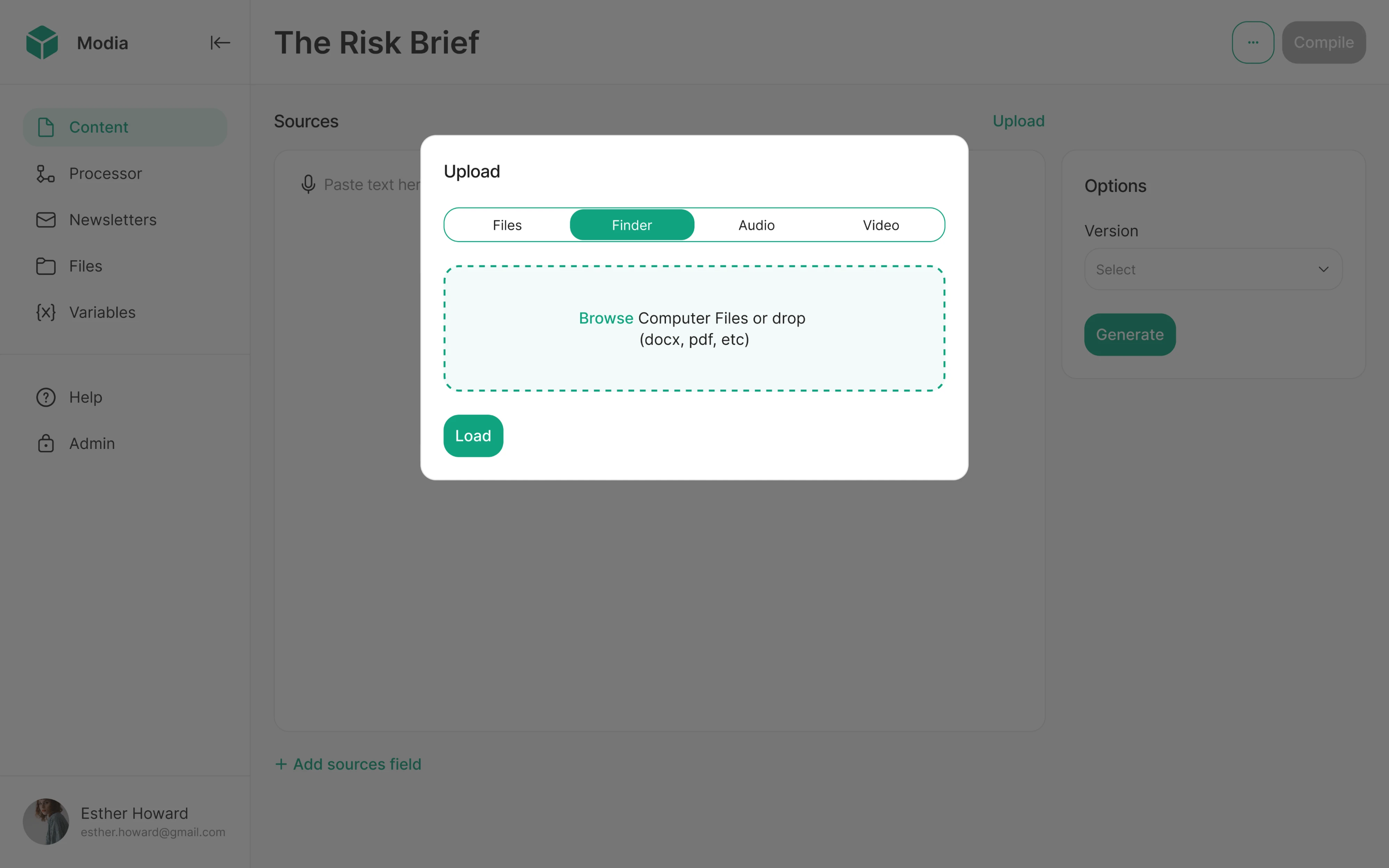
Upload method selection
Working with Modia, we used a segmented control inside an upload modal to let users switch between upload methods. The modal context made compactness essential, and we made the control immediately readable without taking up space.
Design note: a segmented control inside a modal works well when the options are single-word labels.
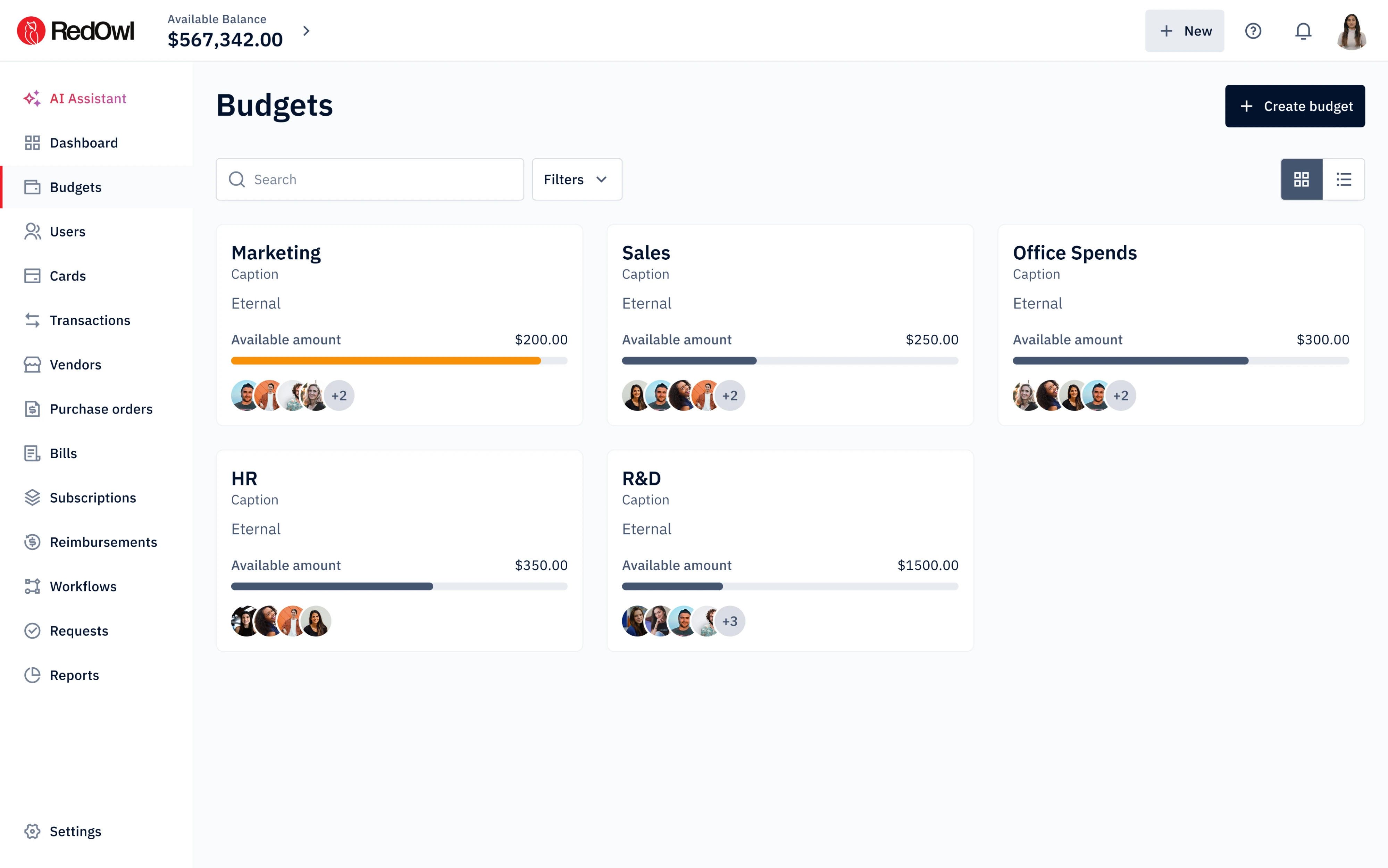
List vs grid toggle
Grid and list icons are among the few cases where icon segments are genuinely safe, and we used exactly that approach when designing RedOwl. We dropped a two-segment control right-aligned in the toolbar, giving the layout a clean hierarchy.
Design note: icon-only segments are only justifiable when the icons are truly universal and immediately familiar to first-time users.
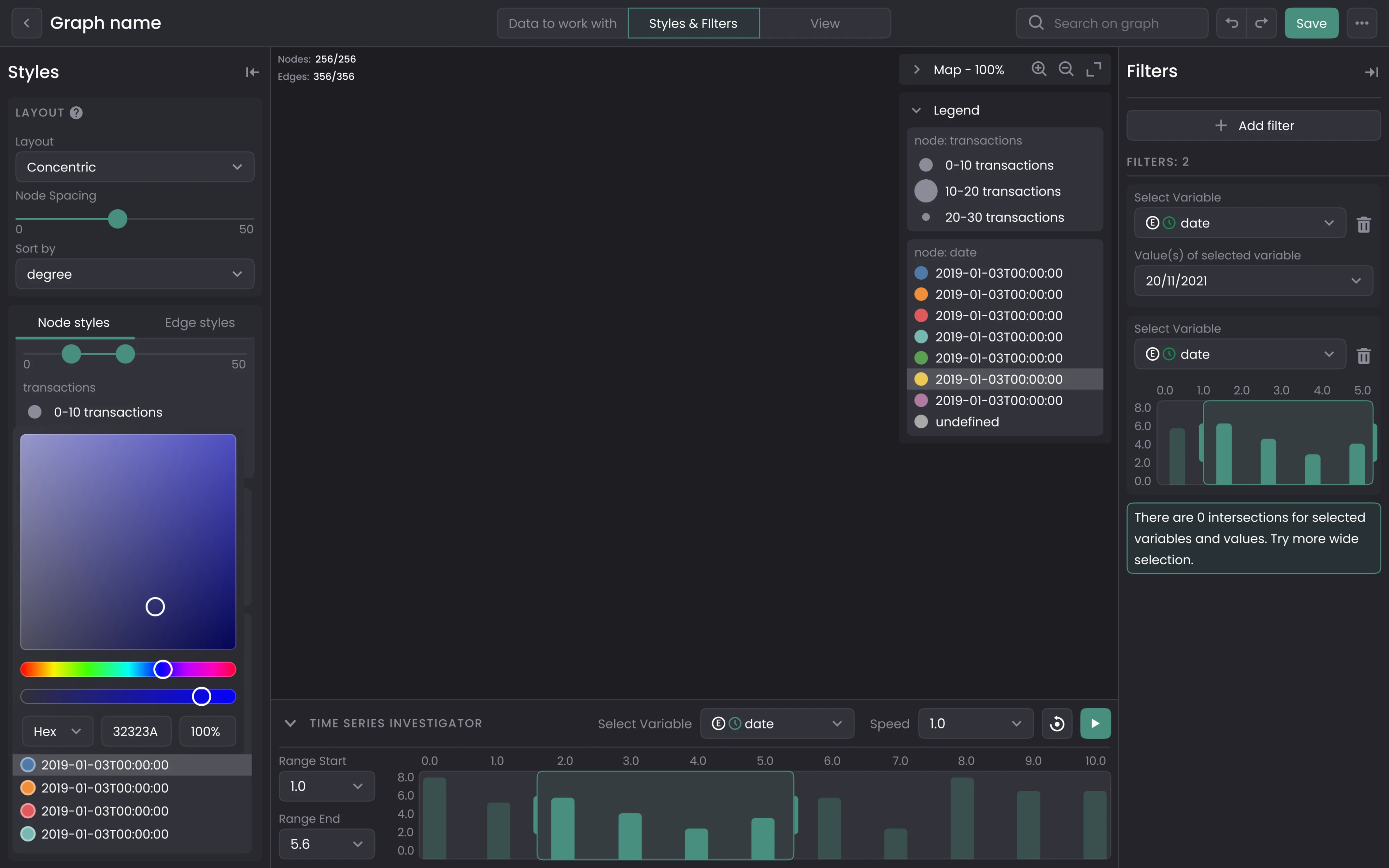
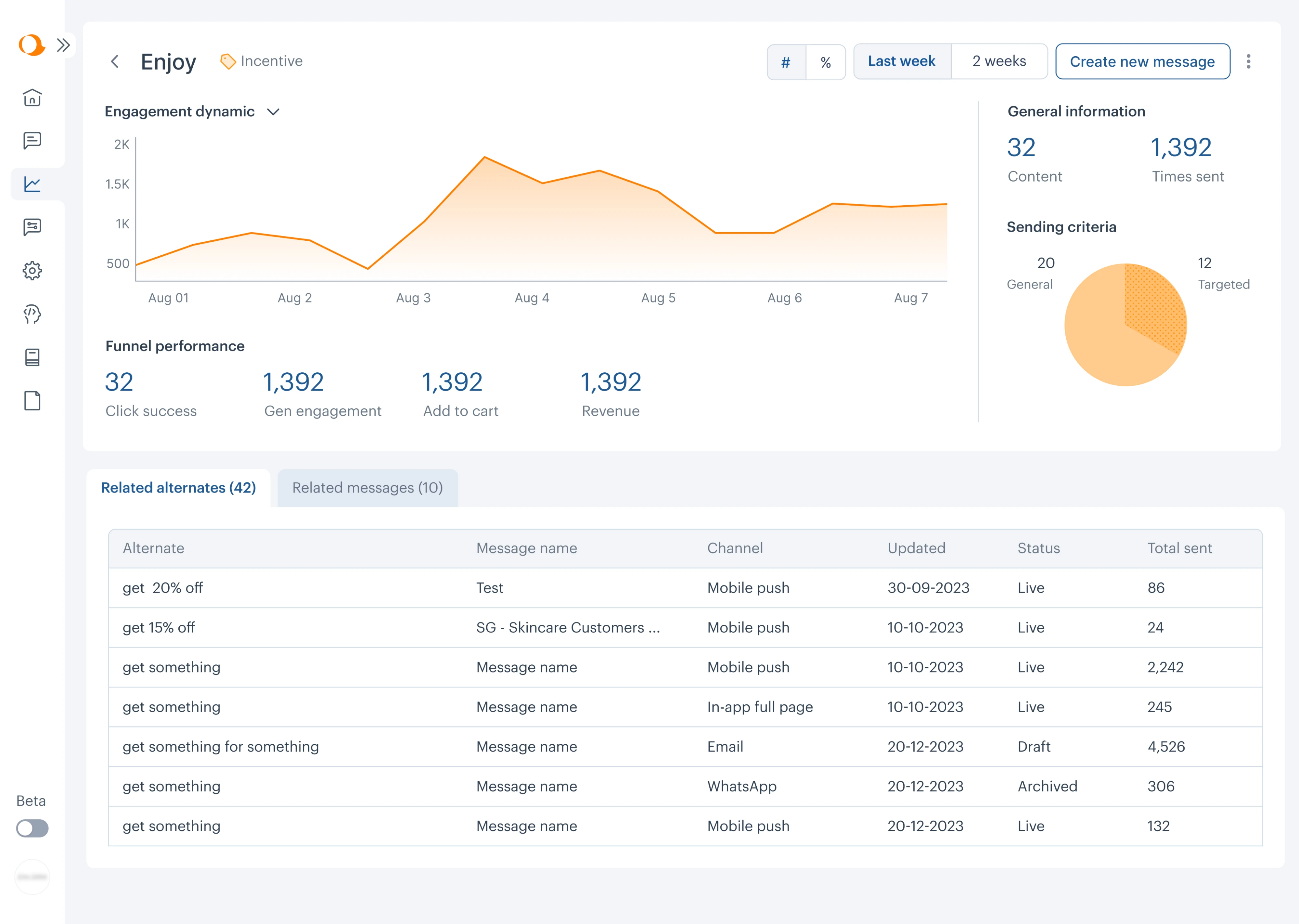
Time period comparison
In the case of Aampe, we placed two segmented controls side by side in the top toolbar. They govern different dimensions of the same chart: one switches the data format, while the other toggles the time range.
Design note: two segmented controls can coexist on the same screen when they govern genuinely independent dimensions of the same content.
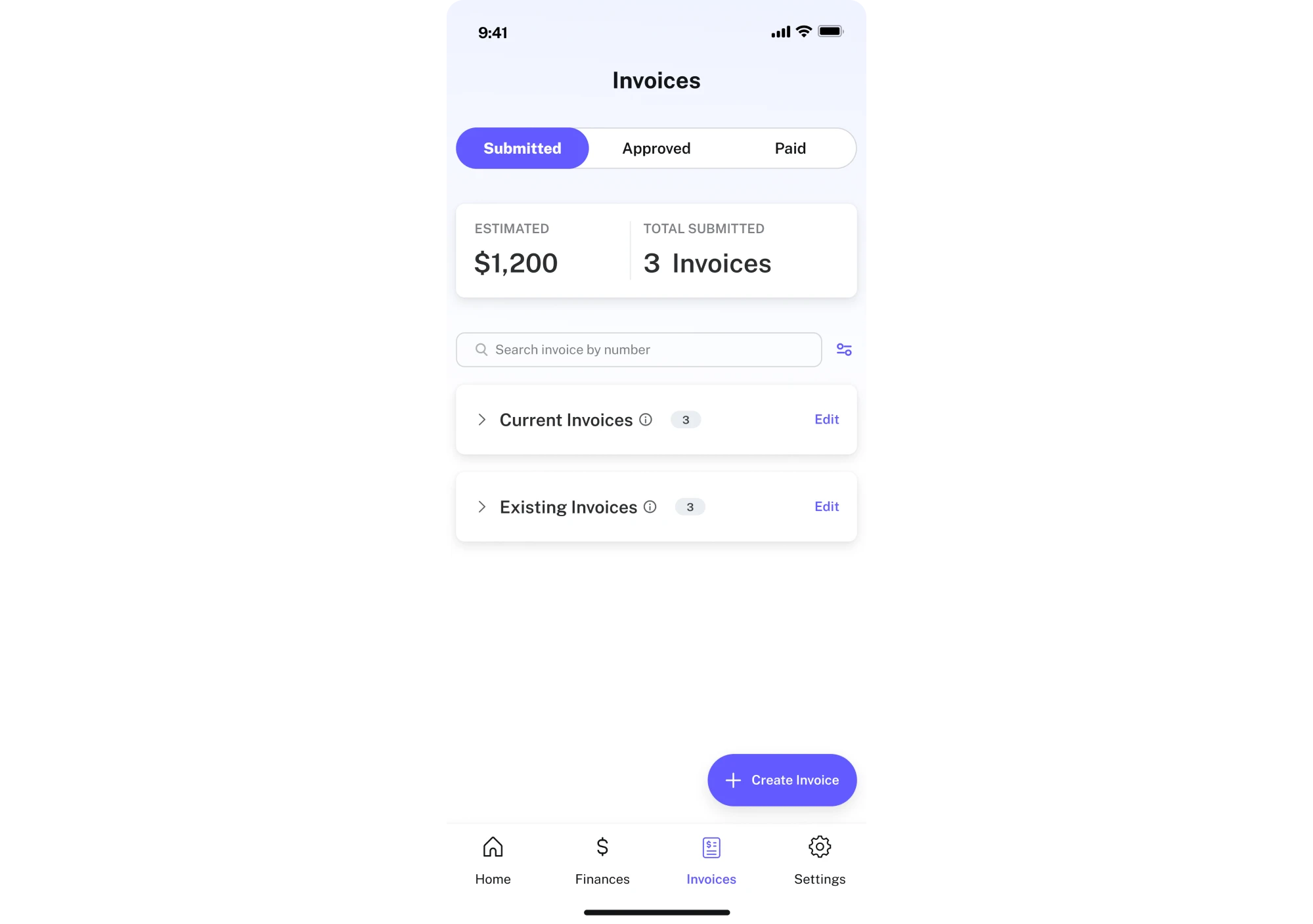
Invoice status filtering
Designing PayUp's mobile app, we understood that tight space meant using the segmented control wisely. We kept it to three segments maximum with single-word labels, so users always know exactly where they are.
Design note: on mobile, every extra segment costs you tap target size and label legibility.
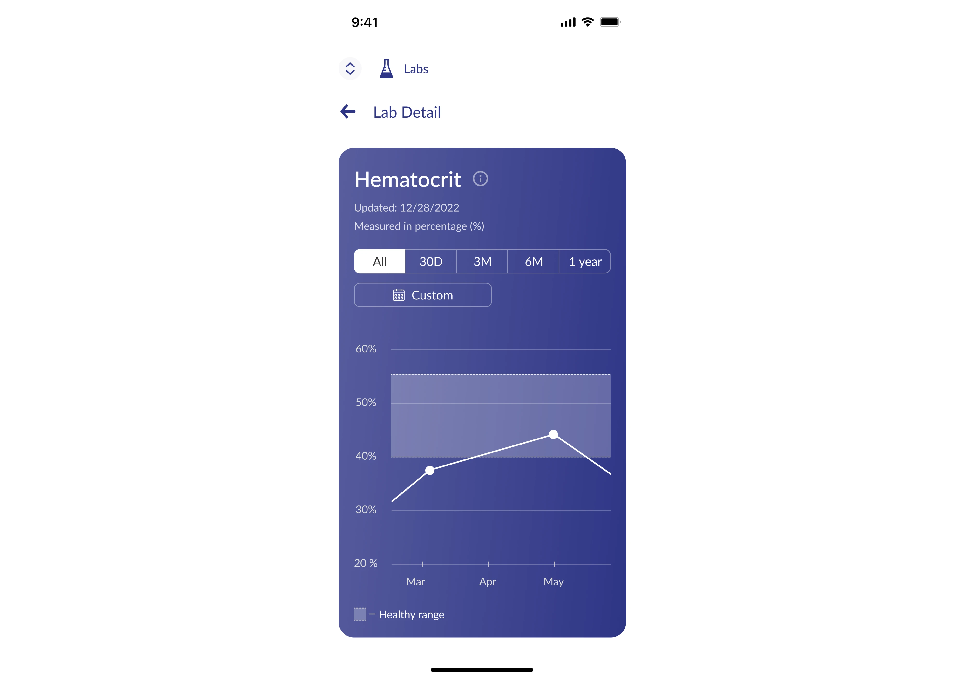
Health metrics switching
For b.well, we used a time range control inside the metric detail card. Five segments are the practical ceiling on mobile, and we stayed within it by keeping every label as short as possible, with no segment exceeding two characters except “1 year.”
Design note: when you have a legitimate option that doesn't fit cleanly into the segmented control without breaking it, don't force it in.
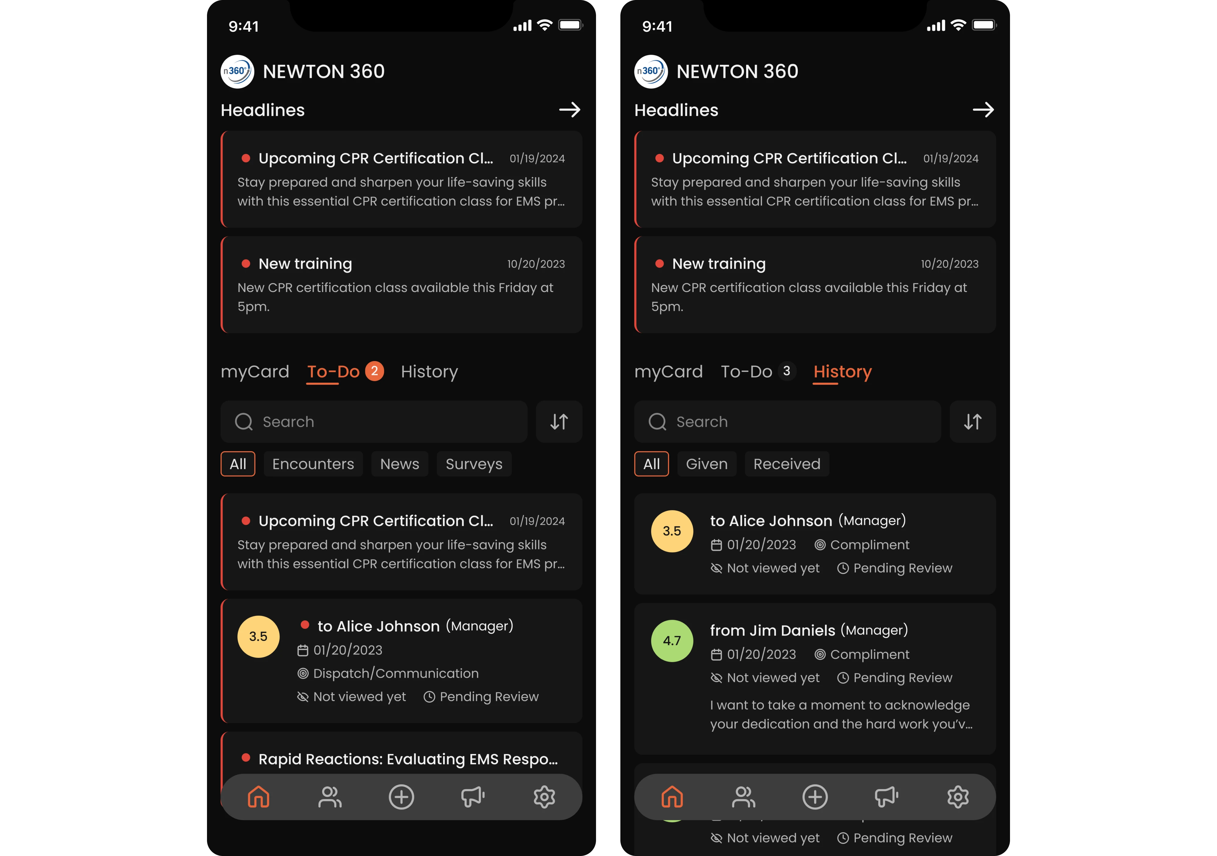
In-tab content filtering
Our Eleken team was approached to design Newton 360, where we used segmented controls as a secondary filtering layer. The top-level tabs handle section switching, while the segmented controls handle filtering within each tab's content.
Design note: segmented controls and tabs can coexist cleanly when they operate at genuinely different levels.
In summary
By now, you have everything you need to design a segmented control. But if you’re working on a product and need a team that can handle these decisions in practice, Eleken is here to help. We’ve designed SaaS products across fintech, healthcare, and beyond, solving exactly these kinds of challenges. The segmented controls in this article come from our work, and so do the decisions behind them. If you want the same level of clarity and precision in your product, let’s talk.


.webp)

.png)


