

The healthcare industry has historically been slow in adopting technology, even in the realm of digital healthcare. The Nuffield research states that there are at least 10 years of distance between healthcare and other industries in digitizing their processes.
So it’s no surprise that healthcare SaaS is trending now, driven by an increased demand for digital solutions. But the opportunity didn't just start recently; healthcare tech had enormous potential even before.
Investor Kevin Ryan, whose investment activity focuses on healthcare tech, says that the certain backwardness of the industry creates a big pool of opportunities for startups and investors:
…starting two or three years ago, I just felt like both in New York and in healthcare in general, there were huge opportunities because there are so many aspects of the healthcare system that just don’t work well. It’s incredibly expensive, the electronic records are not great, it’s super inefficient. Most of us are very frustrated by this whole healthcare system, which means opportunities.
Ryan hired a team of nine medicine professionals, “doctorpreneurs” so to say, to select the projects to fund. And he’s not alone: other investors turn their attention to healthcare, too.
The pandemic accelerated this shift dramatically. Digital health adoption, from telehealth to remote monitoring, expanded rapidly, and healthcare organizations began investing more heavily in technology infrastructure. According to McKinsey research, the industry is now entering a new phase where AI, automation, and remote care-model innovation could unlock value equal to 9–15% of total national health expenditure.
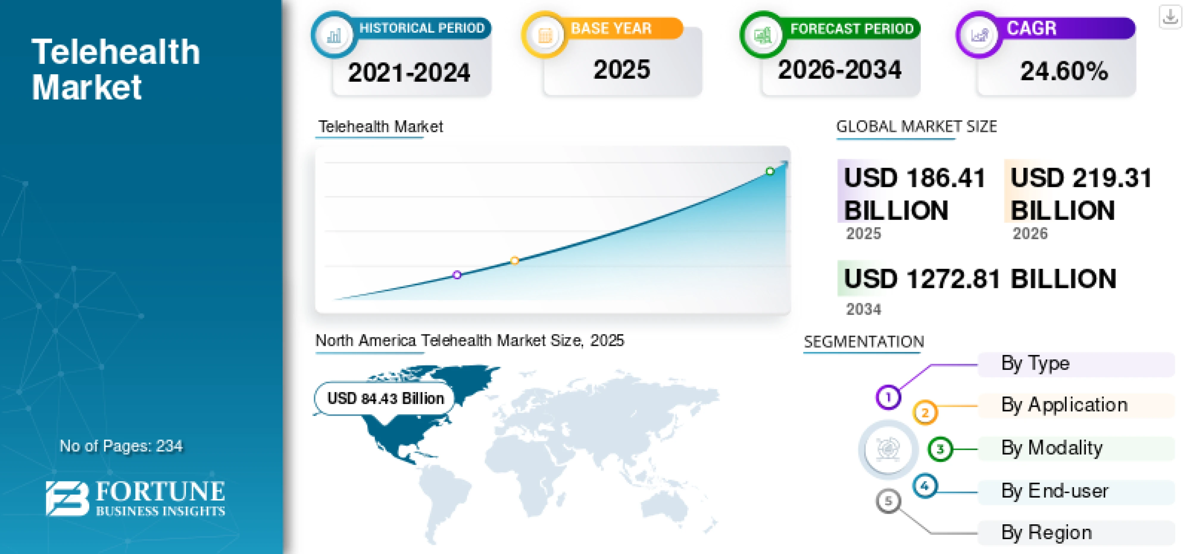
Telehealth alone shows a striking revenue growth: according to the report by Fortune Business Insights, total annual revenues is expected to grow from $219 billion in 2026 to over 1,273 billion by 2034, significantly driven by real time health monitoring. This graph shows that telemedicine has taken on a completely different volume of operation compared to pre-pandemic times.
There is no doubt that the market is growing fast. But what about user experience? In healthcare, it is quite complicated, to say the least. As healthcare continues to evolve, improving UX becomes even more critical to meet the demands of patients and their diverse needs.
Understanding UX design in healthcare
UX design in healthcare goes beyond aesthetics and usability; it's about trust, safety, and empowering users in life-changing contexts.
Unlike consumer apps, healthcare software deals directly with people's wellbeing and often involves high-stakes decision-making. Every design choice impacts patient outcomes, clinician efficiency, and overall healthcare quality.
Typical UX challenges in healthcare sector
Healthcare UX faces complex, specific challenges. Here are critical areas that every healthcare product designer must address:
- Complexity: Simplifying intricate medical processes without losing critical details. This is essential in UI/UX design for healthcare, where data density can be overwhelming.
- Doctor burnout: Reducing unnecessary workload and streamlining digital tasks to prevent physician exhaustion.
- Accessibility and inclusivity: Designing for diverse, sometimes vulnerable users.
- Privacy and data security: Managing sensitive patient data.
- Innovation: Turning advanced healthcare technologies into easy-to-use products.
- Testing and research: Conducting effective usability testing despite the challenge of recruiting busy healthcare professionals.
- Long development cycles: Balancing thorough the urgency and constraints typical of healthcare projects.
- Metrics: Carefully using quantitative metrics without causing unintended negative impacts on patient care and clinician effectiveness. In UI design for healthcare apps, focusing on "time to task completion" must be balanced against accuracy and patient safety.

1. Complexity: Simplifying Information Overload in Healthcare SaaS
Healthcare software deals with vast amounts of medical data—far more than any single specialist can realistically handle. Originally, digital tools were meant to help by centralizing patient information and eliminating tedious paperwork. But often, the outcome was the opposite. Healthcare providers feeling overwhelmed by too much complex medical information, easily missing the most critical insights.
Better UX design for healthcare can tackle this overload directly. Clear interfaces and intuitive navigation help doctors quickly find the information they actually need. At Eleken, simplifying complex software is something we've worked on firsthand.
For example, when designing Refera, a dentist referral app, our main goal was to reduce the overwhelming clutter common in medical software, enhancing data visualization . We created a clear visual hierarchy using accent colors and introduced intuitive interfaces, such as an interactive oral cavity diagram, letting dentists easily select which tooth needed treatment.

But UX improvements alone can't solve everything. Healthcare startups are also addressing complexity by advancing technology itself—especially artificial intelligence. As AI becomes smarter and more reliable, it can handle increasingly complicated tasks like diagnostics, which helps to improve diagnostic accuracy . For instance, companies like Kheiron Medical Technologies use AI-powered software to detect breast cancer at early stages. Similarly, DiA Imaging Analysis automates ultrasound scan reviews, improving both speed and accuracy.

Still, AI isn't fully trusted to provide professional medical decisions on its own. Healthcare applications will continue to need human input for now, meaning UX designers must focus on making software simple, intuitive, and fast to use—giving doctors more time to focus directly on patients.
2. Doctor burnout: Reducing frustration by prioritizing UX
With all the delay in technology advancement of the industry, UX is even more behind, about 10 years or more. Developers of healthcare tech do not pay much attention to user experience as there is often no competition, so no need to do “extra” work when there is enough demand anyway.
One of the biggest problems for healthcare providers used to be a large amount of paperwork. They had to dedicate enormous amounts of time just to write down the symptoms, diagnosis, prescriptions, and many more. There is no surprise that doctors’ illegible handwriting has become a meme.
Addressing these inefficiencies is not just about comfort; it's a financial imperative. Efficient workflows help companies maintain the rule of 40 by keeping operational costs low while scaling growth through high practitioner adoption.
Furthermore, as these systems transition from paper to digital, hipaa design becomes the critical guardrail. Designers must ensure that reducing "clicks" to fight burnout doesn't come at the cost of data security or compliance, keeping patient information protected in every digital interaction.

Healthcare system digitization was supposed to free a bunch of time for doctors to do their direct work: interacting with patients. However, it turned out that working with software and medical devices still occupies a large chunk of their time.
By 2016, physicians came to spend about two hours doing computer work for every hour spent face-to-face with a patient. Their working hours increased and it led to a large number of burnout and depression cases among medical specialists. To better understand the level of frustration that doctors experience with those new systems, read Atul Gawande’s article Why Doctors Hate Their Computers
Eleken experienced this problem firsthand when designing Populate, a patient portal aimed specifically at healthcare providers. Doctors were drowning in complicated, outdated software that added even more friction to their daily work.

To simplify the user experience, we directly involved medical professionals in the design process, iteratively testing each interface with real users. The result was a clean, intuitive solution that cut down on administrative tasks dramatically, enabling healthcare providers to focus more on improving patient care and less on cumbersome technology.
3. Accessibility and inclusivity: Healthcare UX that works for everyone
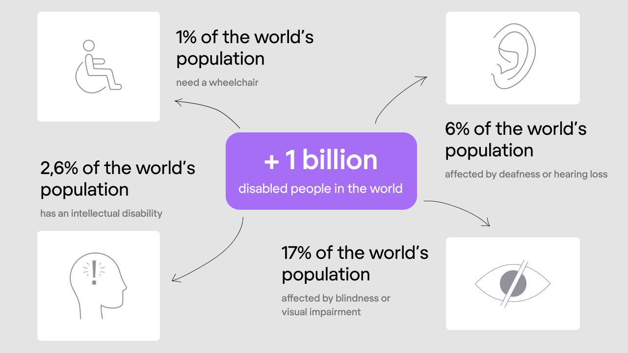
Healthcare apps serve a broad spectrum of users—aging adults, people with disabilities, those in stressful conditions. So inclusive design isn’t optional—it’s essential.
Here are some quick UX suggestions to make your healthcare tools accessible:
- Large tap targets & clear layouts — Avoid tiny buttons or crammed options. Use space and size wisely.
- High-contrast fonts and readable text — Ensure text is legible under all lighting conditions and visible to low-vision users.
- Screen reader support & voice commands — Let visually impaired users navigate and complete tasks hands-free.
- Regular testing with diverse users — Recruit older adults or those with disabilities to test and give feedback—it’s worth it. For more on making your product senior-friendly, see UX design examples for seniors.
Inclusive UX goes beyond ticking WCAG boxes. It’s about designing with empathy—understanding real-life limitations and ensuring every user feels the app was made just for them. These principles are especially vital in UX for medical devices, where hardware and software must work in harmony to accommodate the physical constraints of a patient or clinician.
A great example of this in action is the healthstream UX case study, where complex training and compliance data were restructured into an accessible, user-friendly format that scales across different devices and user needs without compromising clarity.
4. Privacy and security: Protecting sensitive health data
Handling health data isn’t just another UX challenge—it’s a responsibility. Healthcare applications deal with deeply personal and sensitive patient information, so building trust is essential. Users need to feel safe and in control of their sensitive data without being bogged down by overly complicated data security measures.
Privacy is non-negotiable in healthcare UX because regulations like HIPAA and GDPR set strict rules. But strong privacy shouldn’t make life harder for your users. Good design is about creating a secure environment that’s still easy and intuitive.
At Eleken, we faced this challenge designing b.well’s Health Information Network, a feature allowing users to securely connect medical records from multiple providers.
Collecting sensitive data required a secure, user-friendly authorization process. To build trust, we designed intuitive user flows for different authorization scenarios, from simple verification steps for pre-authorized users to robust identity checks involving ID scans and facial recognition for new users. Testing showed our approach kept users engaged and comfortable, validating our emphasis on clear, transparent communication about data use.

When designing for privacy, here are a few simple UX recommendations:
- Clearly explain how data is used: Users shouldn’t wonder what’s happening with their information. Provide simple, readable explanations about data collection and use.
- Make security seamless: Use intuitive logins like biometrics or secure tokens to avoid frustration from overly complex password management.
- Limit data visibility based on user roles: Doctors should easily access necessary patient records, while patients see only what's relevant to them. Clear role-based permissions keep information secure without extra friction.
- Allow easy patient data management: Users should have straightforward ways to access, update, or even delete their data.
Getting patient privacy and security right doesn’t just keep you compliant; it builds lasting trust with your users. It’s about helping people feel safe and confident that their most personal information is in good hands.
5. Innovation: Making complex healthcare tech easy to use
In healthcare SaaS, innovation often means cutting edge technology that people haven't encountered before—like advanced diagnostics, sophisticated telehealth platforms, or AI-driven digital health tools.
These technologies usually offer unique, powerful capabilities that can easily become overwhelming or confusing if the UX isn't clear. Complex technologies require thoughtful design to become genuinely useful and approachable for the people who rely on them.
Remember Populate, a medical care platform aimed at streamlining medical records and patient management? Populate’s underlying technology was advanced and innovative, but also unfamiliar and challenging for busy healthcare providers.
Our goal was to turn complex tech into something straightforward and intuitive. We worked closely with medical professionals to simplify every interaction, from patient data input to managing complex records. Through iterative testing and user feedback, we created a user-friendly interface that allowed for seamless integration of innovative features, making them feel easy and approachable.

6. Testing: Why healthcare apps often skip UX research (and why they shouldn’t)
Testing healthcare applications isn't easy—especially when your users are busy medical professionals. When a company invests little in design, UX research is usually even lower on the priority list. Less UX research means fewer tests, fewer tests mean more guesswork, and guesswork almost always leads to poor user experiences. Learn how to make the most of usability tests with limited resources.
In healthcare sector, usability testing faces unique hurdles. Doctors have packed schedules and deal with strict hospital regulations and bureaucratic red tape, making it harder to involve them in research sessions. That’s why healthcare teams typically focus heavily on functionality testing, leaving usability testing as an afterthought.
But skipping UX tests is risky. Without input from real users healthcare services can quickly become frustrating or unusable in high-pressure medical environments.

Prioritize lightweight, doctor-friendly UX testing methods. Even quick feedback sessions or remote usability tests can drastically improve your UX, making your app a trusted partner rather than a source of frustration.
7. Managing long development cycles in healthcare apps
In healthcare SaaS, product development cycles naturally take longer than in most industries. First, there's the long checklist of regulatory compliance, privacy and security measures, and hospital bureaucracy. Add in the pressure that these apps directly impact human health, and the push to launch quickly becomes intense.
When designing for b.well, our team had to navigate tight timelines and strict regulatory demands while increasing patient engagement. We streamlined the design process through close collaboration with b.well’s product team, running targeted and efficient UX feedback loops that provided actionable insights without slowing development down.

Proper UX research and testing require time. In many cases, after a round of testing, the product needs to be modified and tested again. With high in-demand products, nobody wants to waste time on those parts of the design process that don’t relate directly to functionality.
8. The dark side of metrics: Why numbers can hurt healthcare UX
When digital products enter healthcare industry, the urge to measure their effectiveness through metrics like response time or number of patients served is natural. But healthcare is different. Here, overly strict metrics can actually harm the quality of care.
As Chris Keiss, healthcare UX designer, states, strict metrics always bring Goodhart's law to play. Once a measure becomes a target, people change their behavior—and not always for the better. For example, if you rate doctors based on how many patients they see per day, doctors naturally speed up their consultations. The result? Less attention per patient, lower care quality, and ultimately worse health outcomes.

The need for quantitative metrics can be argued upon, but in healthcare, the price of introducing such metrics can be too high. We may think that the only metric that matters is the patient health, but it is very hard to calculate objectives, especially given the relatively short product design cycles.
We discussed more on why both quantitative and qualitative metrics are important in our article about UX design KPIs. In Eleken, we think that user experience specialists have to adjust their measuring principles to the industry specifics.
Designing for doctors, patient care, companies
The situation in healthtech looks similar to the classical “good-fast-cheap” rule: you can’t have all three at the same time. UX designers have a hard time balancing the needs of healthcare providers, patients, and companies.
To achieve true inclusivity, it is essential to design accessible healthcare products and technology that cater to a diverse range of users, including those with disabilities, non-native speakers, and varying levels of digital literacy, as well as ensuring clarity on medical terminology .
While digital products and services are making healthcare more accessible to a wider audience, the role of medical professionals remains crucial in ensuring quality care. Often they have to prioritize one group over the others.
As the market grows and the competition increases as well, there are more and more digital health solutions aimed at providing the best user experience to patients. It is paramount in the world where patients can choose between different software providers. To ensure inclusivity, it is important to accommodate users who speak different languages and provide language accessibility features.
One of the modern healthcare solutions, Lively, a startup for patient health savings accounts, is applying a consumer-first approach. The founders Alex Cyriac and Shobin Uralil tell that the idea came from their personal experience. Naturally, the product that they build puts user experience in the center.

Best Practices for Healthcare UX
Designing healthcare SaaS comes with its unique challenges, but keeping a few core principles in mind helps create products that genuinely improve lives and support healthcare professionals. Here’s a quick recap of best UX practices for healthcare services:
- Simplify complexity: Make interfaces clean, intuitive, and manageable—reduce cognitive overload for users.
- Design to reduce doctor burnout: Streamline digital workflows and eliminate unnecessary tasks to reduce physician exhaustion.
- Ensure accessibility and inclusivity: Design for all abilities, using clear fonts, high-contrast visuals, and straightforward navigation.
- Embed privacy and security early: Provide transparent data management, clear consent processes, and frictionless secure logins.
- Balance innovation with usability: Turn complex technologies into approachable user experiences through intuitive, user-centered design.
- Run targeted UX research: Conduct efficient, targeted usability testing—even under tight deadlines—using quick and focused feedback loops.
- Manage long development cycles effectively: Collaborate closely and use efficient UX processes to ensure thorough design without delaying launches.
- Use metrics carefully: Combine quantitative metrics with qualitative insights to avoid negative impacts on patient care and clinician effectiveness.
.png)
Conclusion
Healthcare is becoming more digital, but better technology alone doesn’t guarantee better care. As healthcare SaaS, AI tools, and telehealth platforms grow, the real challenge is turning complex systems into experiences that clinicians can rely on and patients can easily navigate.
Great healthcare UX simplifies overwhelming data, reduces doctor burnout, protects sensitive information, and makes innovation actually usable. If you're building a healthcare product, focusing on thoughtful, human-centered design is what determines whether your solution truly improves care.
If you want to simplify complex healthcare workflows and build software that doctors and patients want to use, we can help.


.webp)