Well, just make something different, hello? Why do we even write an article to answer this simple question? Because there’s more to it. If making something novel was that simple, there wouldn’t be so many similar projects around.
For years of experience in product design, the question of “how to make a product stand out” has been one of the most interesting challenges to date (and we have lots of interesting challenges). This article is dedicated to summing up our experience and showing some ways of how to make an original product.
Why do products look the same?
Let’s look at the very beginning of work on the product. As UI/UX designers, we know well that competitive research is a very important stage in the design process. Knowing the market is essential to build a successful product. The downside that this knowledge brings is the rush to match competitors.
When a founder sees that other products have something that their product doesn’t have, they hurry to get the same feature. So instead of focusing on their strengths, they try to race on many tracks at the same time. Where does it lead them?
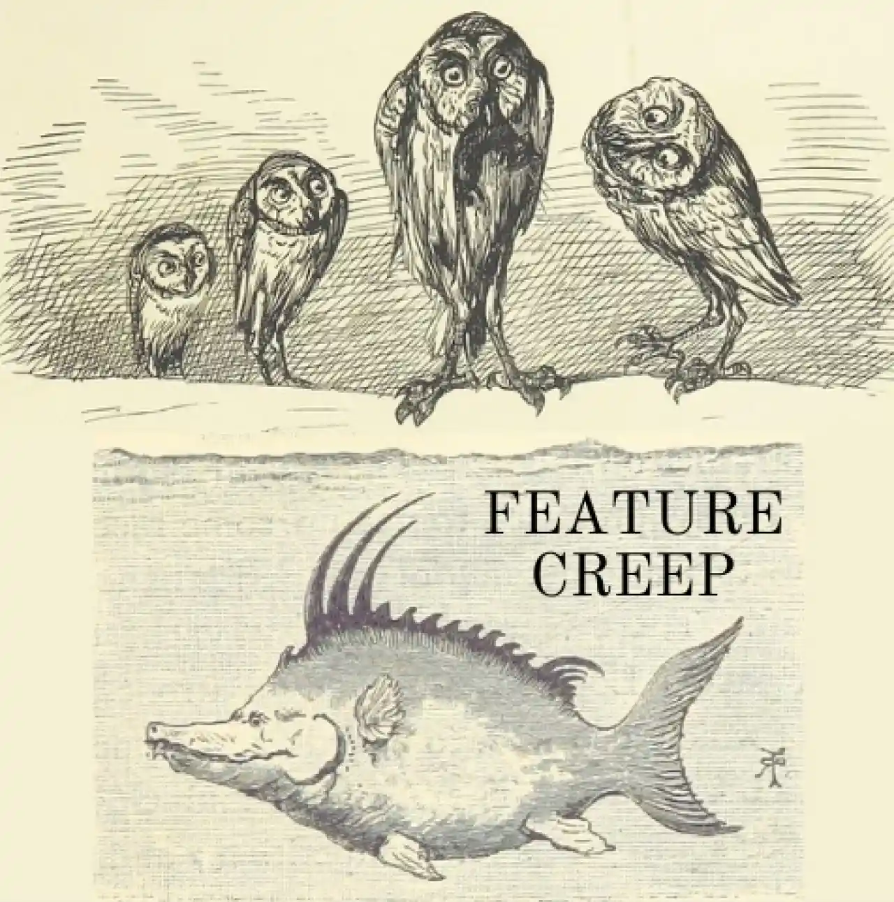
Creeping featurism
The term “featurism” appeared in the 1960s to describe weird architecture, and later made its way into racism studies and, finally, product design, known as featuritis or creeping featurism.
It describes a situation when a product grows by adding new features constantly to keep up with the competitors. On one hand, it often comes from active listening to users requests (which is highly praised in the field of user experience). One the other hand, it may end up in a bloated software where numerous features overwhelm users and negatively affect the overall product design. As a result, a feature creep is born.
If you haven’t got enough weird terms in this paragraph, here is one more: feeping creaturism that is used to describe the feelings that developers have when they are tasked with creeping another feature into an already bloated product.
And now, the last weird term: feature karma. It is a rule: when you add a new feature that makes the product more complex, you have to take away one of the previous ones. Easier said than done, though. Later we will give you some tips on how to avoid creeping featurism.
Here is an example from Victor Papanek book, “Design for the real world”. Back in the 60s and 70s when people used slide projectors, Kodak was leading the market with a new invention: slide projectors with gravity feed systems.
It was produced by both Kodak USA and Kodak Germany, but with some differences. US projector had several models ranging from $60 to $1,500. Each one had various features added, like remote control or extra lenses. Also, each one had an advanced version for professional use, called Ektagraphic (+$10 to 20). They were more resistant to short circuits due to special insulated wiring (why wasn’t it a default feature for all the models?).
At the same time, projectors produced in Germany had just one simple model, Kodak Carousel ‘S’ which included the safety feature and sold for $75. All the additional features could be bought separately and attached to the basic model. The difference in approach was so big, that some people in the US ended up buying their projectors from German Kodak (although back then the shipping wasn’t as easy as it is now). Long story short, US projectors were feature creeps.

Modularity is one of the ways of addressing the issue. When talking about software products, it means making a basic product with the essential set of features and adding the new ones that can be downloaded and used by those who need them.
Another familiar case of a feature creep is Facebook. They have been trying to redesign the main page to make it less cluttered, but there is still a much work to do. To learn more on design for simplicity, we have some tips from our UI/UX experts in the related article.

When less is more
If you think of two products working in the same niche, one of them has way more features that the other, which one has more competitive advantage? The former one. But what if the second one is much easier to use and is cheaper? Now it’s more complicated.
An example can be Canva. For graphic editors, it’s hard to compete with Adobe in terms of features. So, Canva did the opposite. They provided very basic features that allow for lower quality graphic editing. Yet they have a clear competitive advantage: price and ease of using.

To use Canva, there is no need to pass a learning course like with some Adobe products. Plus it saves time with numerous royalty free images and templates. And the quality is good enough for social media materials. By the way, many images on this blog are created with Canva — and it works great for this purpose.
Users who need less features than a product is offering are called “overserved”, and they might as well switch to a more basic alternative.
How to deal with creeping featurism?
First two methods are modularity and targeting overserved users, as described above. Another one is making the simple features visible and understandable for users who use the product on the basic level, while “hiding” more complex features further in navigation. Advanced users will find them with one click, while newbies will not be scared off with a complicated look.
Here’s an example. One of our clients, AdvanResearch, had a product for foot tracking analytics. It was used mostly by professional analysts who usually dealt with complex features set. At some point, the company decided to widen their pool of users and include business owners who were new to this kind of tool.
The objective of redesign was to make a product more accessible to the new audience. Here is what we did to address this:
- added tips behind question marks
- simplified navigation with fewer sections
- split the reports into “standard” (presets for new users) and “custom” (for those who know well what pieces of data they need and can assemble report to fit their needs).

When more is necessary
As designers, we often prioritize simplicity, clean visuals, and minimalism. But we also understand product managers who have to satisfy the users and can’t prioritize “clean design look”.
“Some things just have to be complex”, says our lead designer Maksym. If you scroll through the list of our case studies, you’ll see that we often work on sophisticated tools for professionals in such fields as code security, geo-mapping data analysis, and others. It’s not the same as creating niche lifestyle apps. There has to be many things on the screen and it’s not always possible to just put away some of them.
And whenever you see a product that looks and feels simple, remember that you don’t know the amount of work behind this simplicity. To have a glimpse on the secrets behind minimal-looking products, read our article “Complexity of simplicity”.
References trap
When clients come to us and explain what they want to get, they often give references. Often it sounds like “we want something like Stripe”. When designers go through initial research and start working on visual style, they also show some of the references to client. It allows the team to align their image of visual direction to make sure the final result will match the expectations.
We like Stripe design, too, and we understand why product owners want their products to look like Stripe. Yet our designers don’t just copy-paste their style. There are some ways of responding to clients’ wishes and avoid copycats.
For example, when our designer Alexandra was working on Spoonfed, a food logistics product, she created icons inspired by the ones that Stripe uses. This subtle detail added a little spark to otherwise minimal and classic design.

It’s hard to draw the lines between copying references and syncing the visual mood of the team. Experienced designers have a sense of it, so the basic advice we can give here is “pick a good designer and trust them”.
How to experiment with design
Product owners often prefer to play safe and go for neutral design. They say, “it is a B2B product, our clients are serious analysts, we don’t want it to be acid purple”. That’s the position that we always respect.
Behind the fear of experiments is often a fear of lost time and money in case the users don’t appreciate an “out-of-the-crowd” design. We argue, however, that the risk can be minimized.
What is the smart way of experimenting with design? Ask a designer to make a few versions of visual styles and ask users what they think of it. We often do this task for our trial (which lasts for three days), and then it’s up to the client whether they want to dare or play safe.
Once they do dare, their product won’t look like “everyone else’s”. Is it your objective? Then let’s schedule a call and start a trial one week from today.