

The average app loses 77% of its daily active users within just three days of installation, and by day 30, the retention rate drops to around 5%. Most teams respond by rethinking features, redesigning the UI, or increasing acquisition budget. What they rarely question is whether the onboarding experience is designed well.
When that path is unclear, too long, or asks too much too soon, users do not debug the experience the way a product team would. They just leave.
The good news is that onboarding is one of the few levers in mobile product design where relatively small changes produce outsized results. Effective onboarding can increase customer retention, and your task is to get those first few minutes right.
This guide covers what makes onboarding work, what types exist, and best practices for mobile app onboarding that reduce drop-off. Use it to build something new, or to find and fix the step where your current flow breaks down.
What is mobile app onboarding?
Mobile app onboarding is the process of guiding new users from their first app open to the moment they understand its value and know how to act on it. It includes the welcome flow, the signup steps, the first actions you ask them to take, and the way the app communicates what it does and why it matters.
It is also worth separating onboarding from the signup process, because teams often conflate the two. Signup is the technical step of creating an account. Onboarding is the experience that follows and shows users what the product can do for them.
Types of mobile app onboarding experience
If you look at several apps, you will notice that onboarding rarely looks the same twice. Some rely on a brief pack of screens, others drop users straight into the product, and some reveal guidance gradually. That is because there are different types of mobile app onboarding, each suited to a different kind of audience.
- Quickstart onboarding drops users directly into the app with minimal guidance. It works well for simple, familiar apps where the core action is obvious, and users do not need hand-holding to get started.
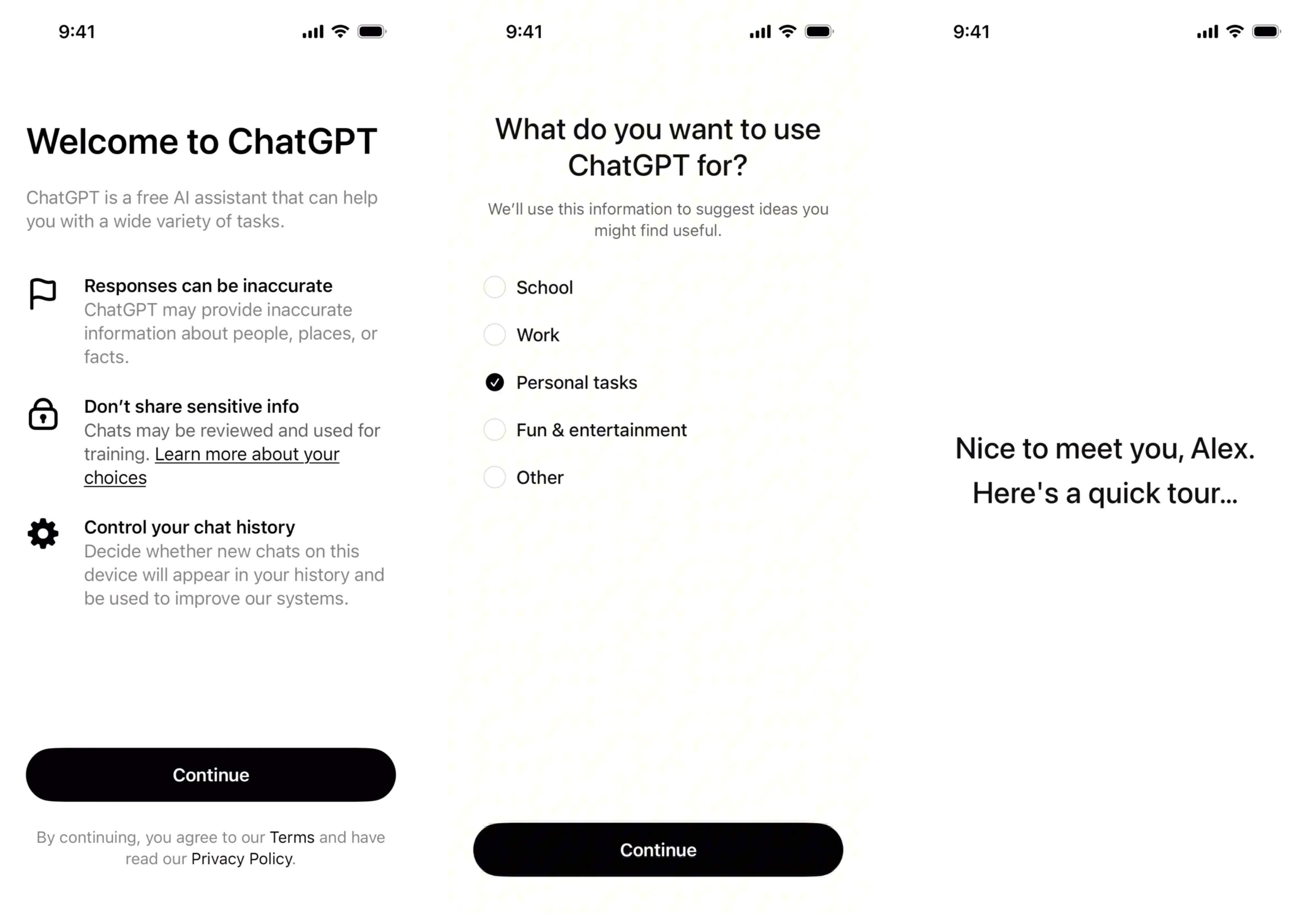
- Benefits-oriented onboarding leads with value. A sequence of screens explains what the app does and why it matters. It’s good for new products where users need a reason to commit before they set anything up.
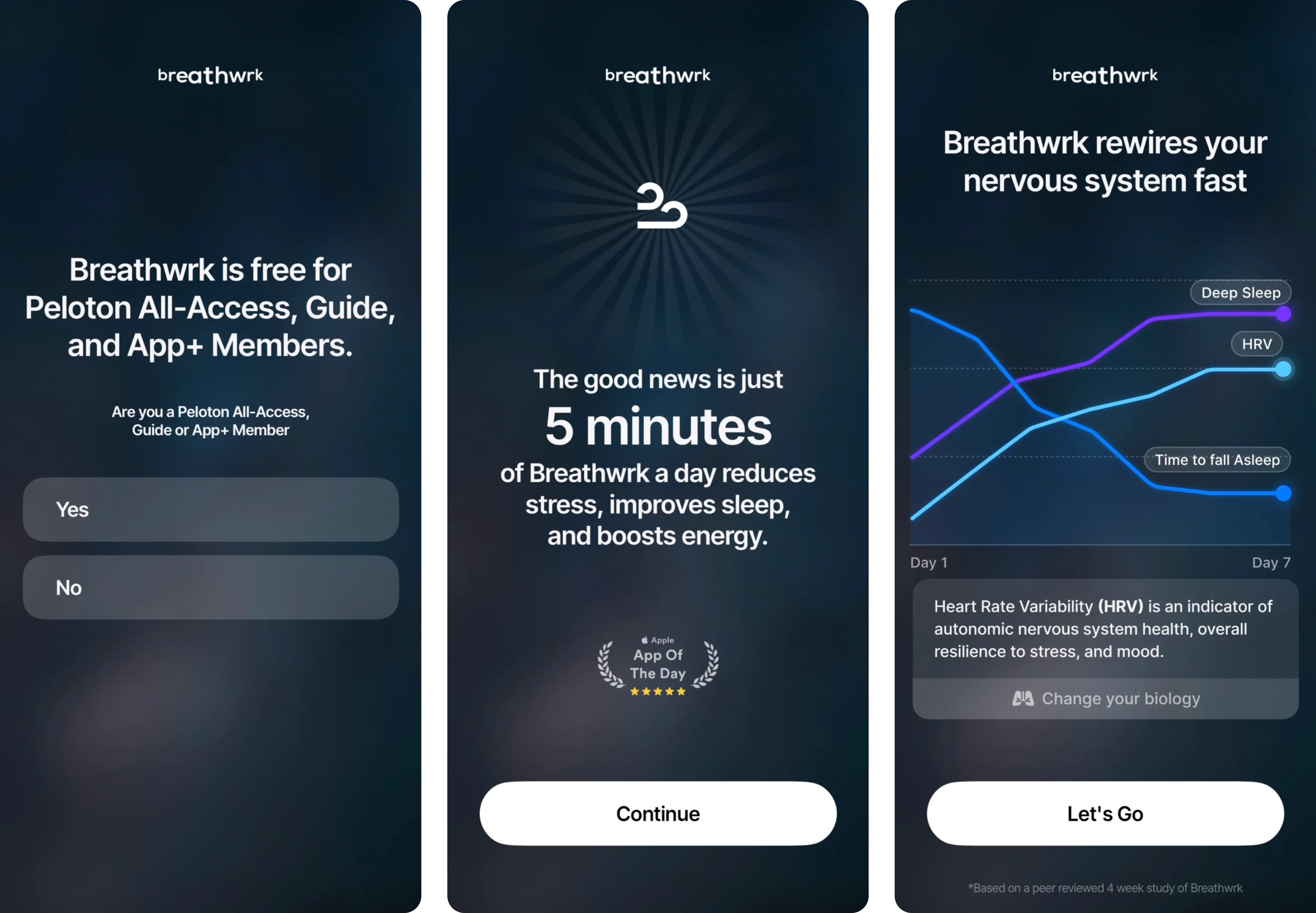
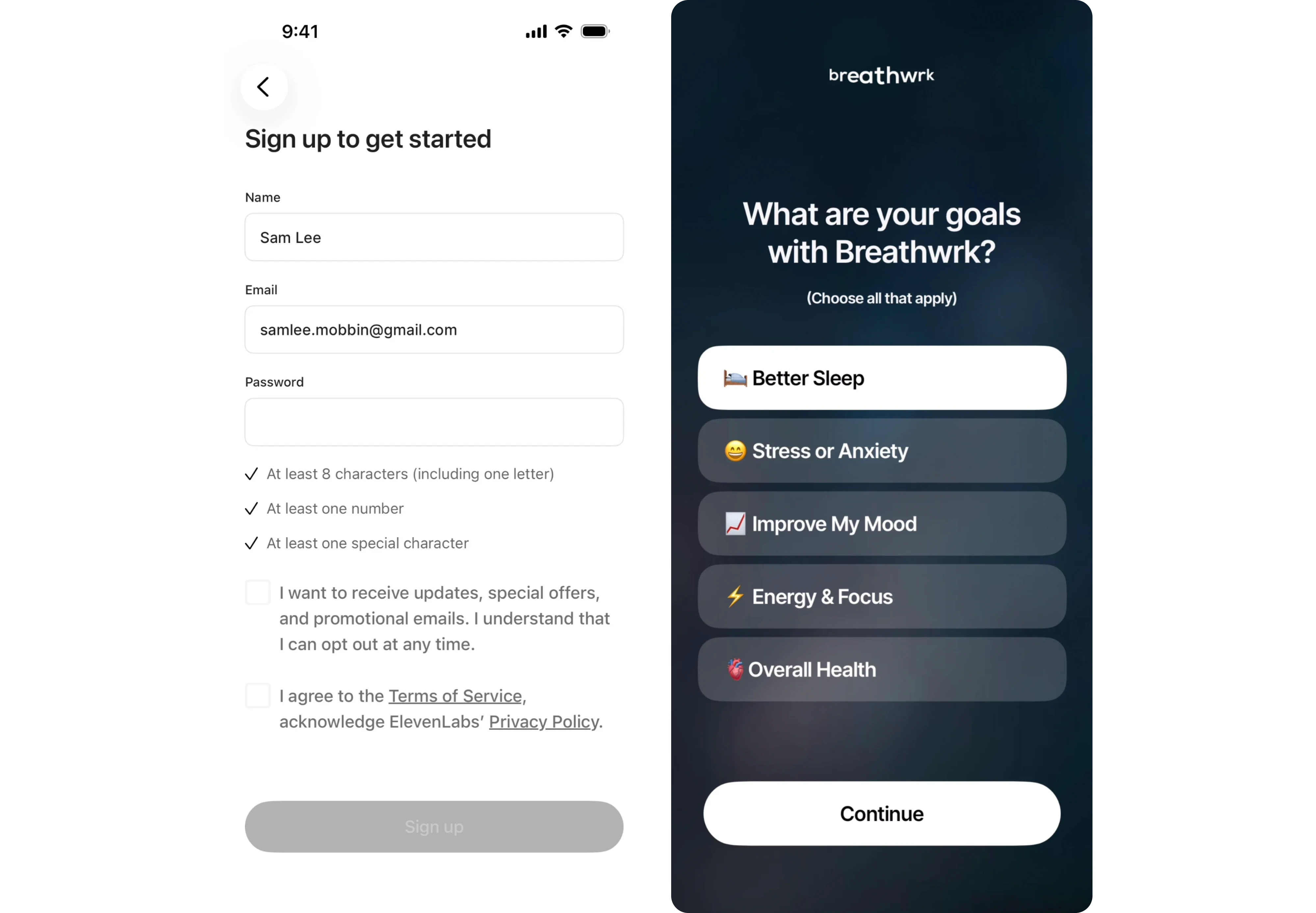
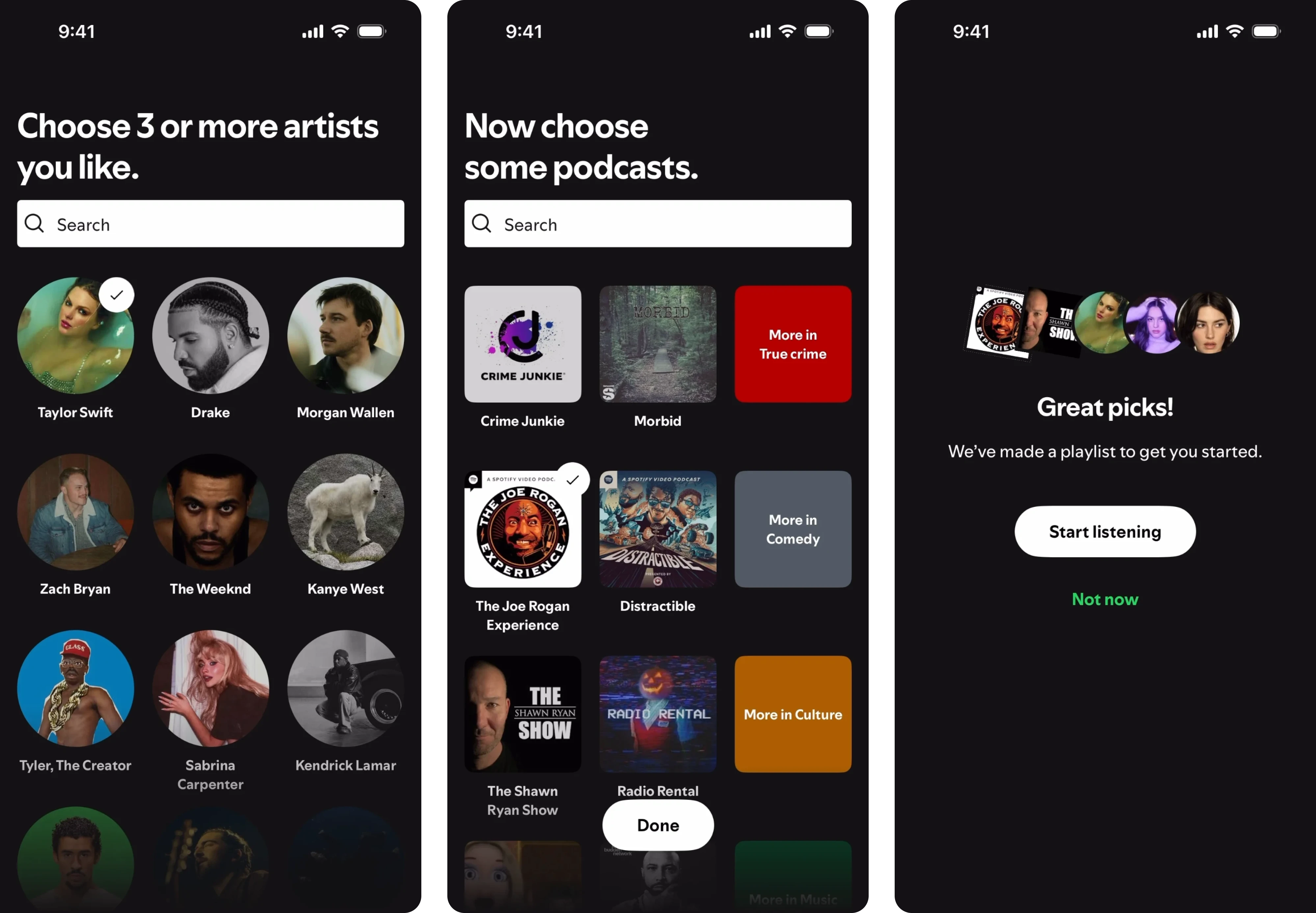
- Self-select onboarding asks users to choose their goal, role, or use case at the start, then routes them into a flow built around that choice. Spotify asking you to pick three favorite artists is a clean example of this.
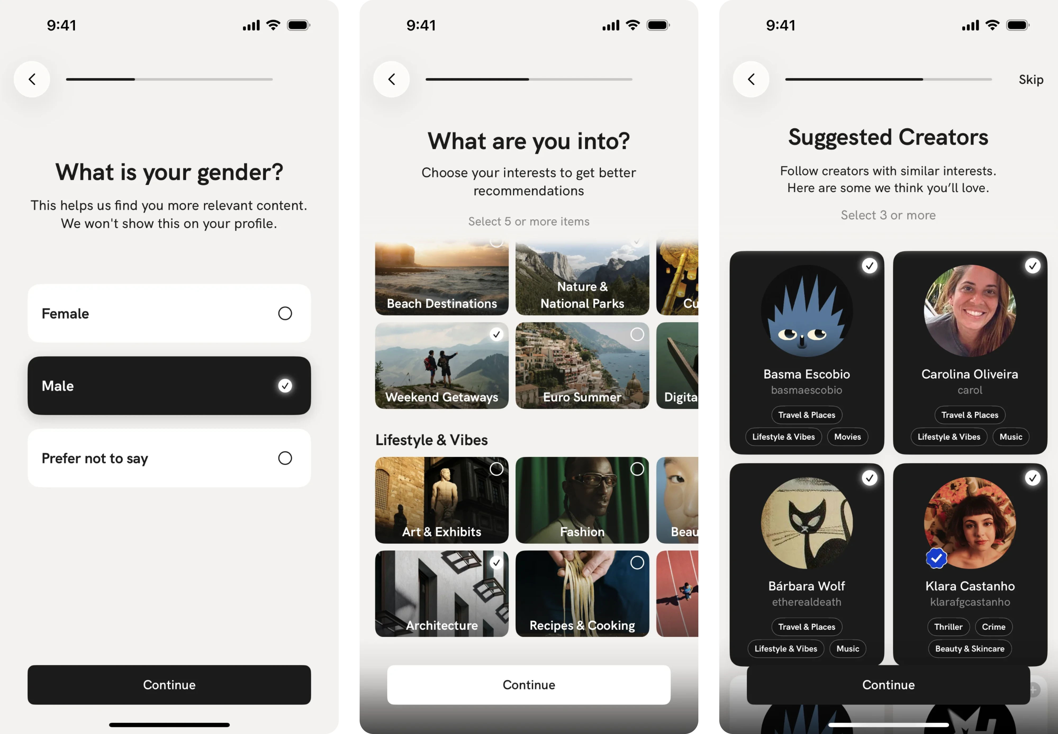
- Progressive onboarding skips the tutorial and surfaces guidance through tooltips, coach marks, and action-triggered prompts. Slack does this well, introducing the app’s features only after a user is comfortable with the basics.
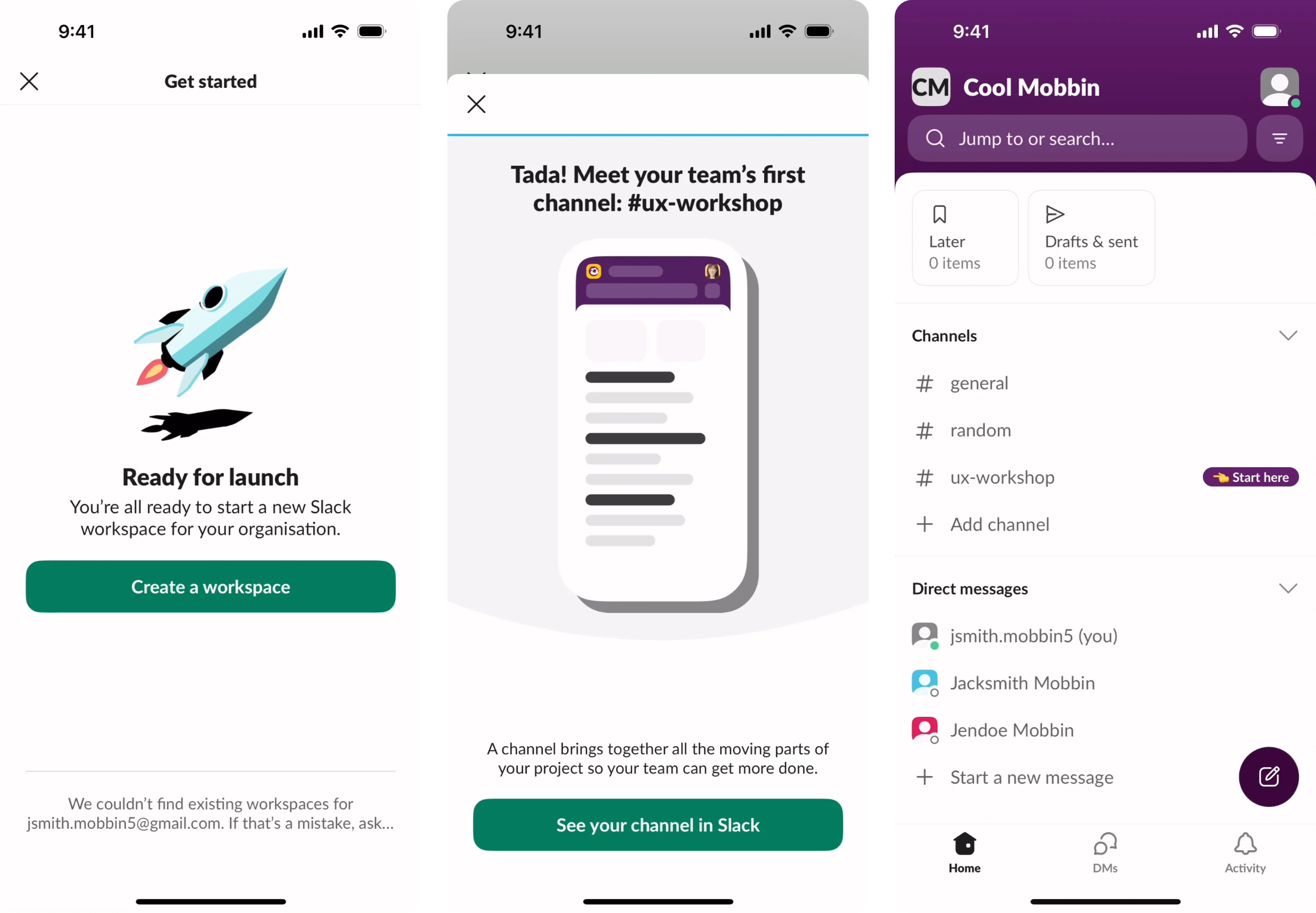
- Function-oriented onboarding walks users through the app’s core functionalities in a single structured tour. It works best for complex B2B tools where users need a solid mental model before they can act independently.
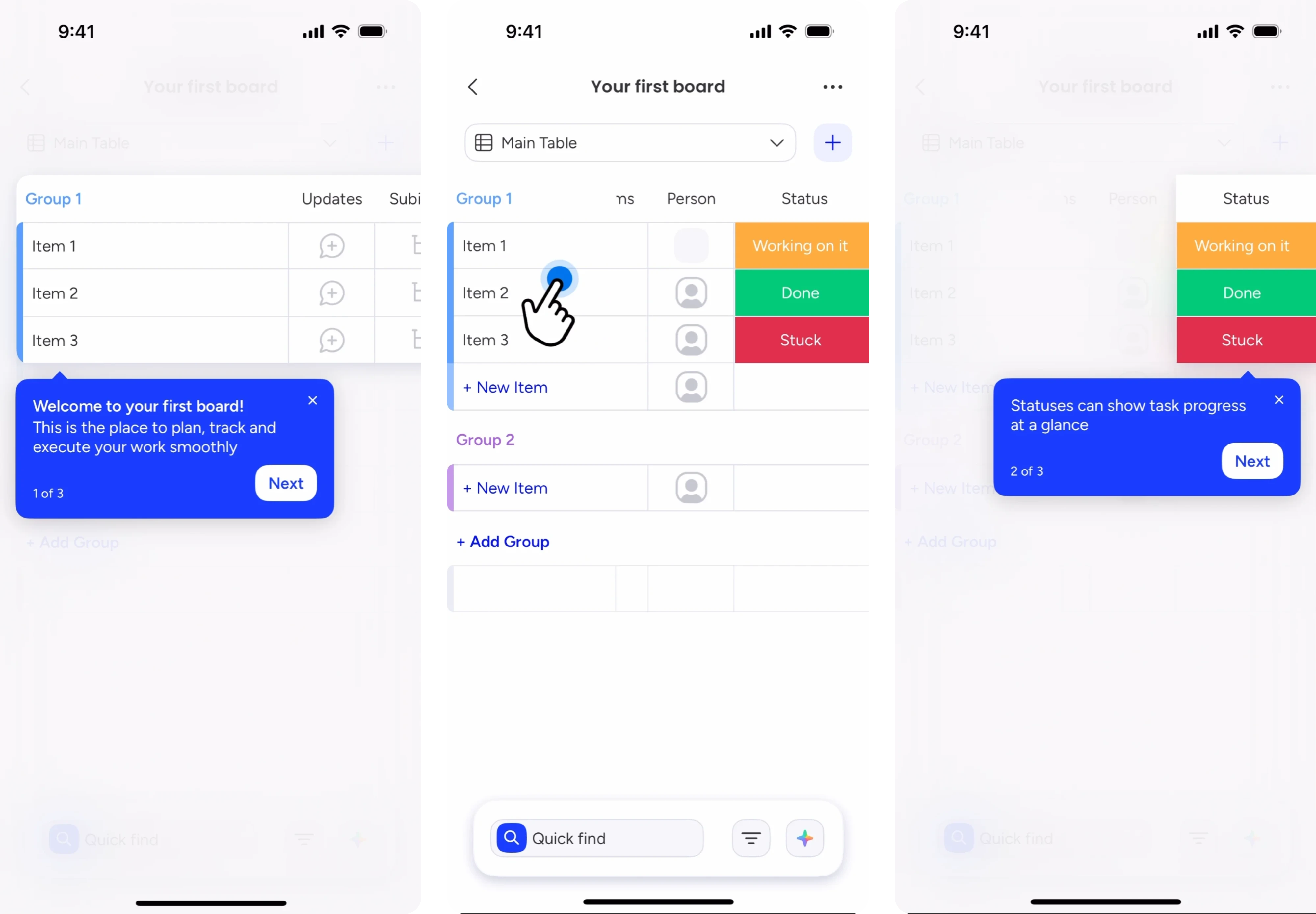
One important thing to note is that the right choice is rarely obvious at first. Think about how complex your app is and how familiar your audience is with this product. Sometimes, a combination of two types is the right call.
To see how strategic onboarding decisions can take a product from 0 to 33k MRR, read our SaaS onboarding case study.
Mobile app onboarding best practices 2026
With the right onboarding design, you have a real chance to retain users from the very first session. Below are mobile app user onboarding best practices backed by real examples from our work at Eleken.
Start with the aha moment
The aha moment is the point where a user first experiences the real value of your product. It is when a user thinks, “This is exactly what I needed.” Everything in your onboarding should be designed to get people there as fast as possible.
This matters a lot. Amplitude's benchmark data found that over 98% of new users churn within two weeks when they never hit a value milestone. They completed the signup, maybe even finished the tour, but never experienced anything that felt worth coming back for. That is an onboarding design problem.
The practical starting point is to work backward. Identify the single action that most strongly predicts long-term retention in your app, then design the entire flow around getting users to that action first. For a project management tool, for example, that moment might be creating and assigning the first task.
The specifics depend entirely on your product, but the principle is to find the action, then remove every obstacle between the user and that action.
To help users reach the aha moment faster, follow these practices:
- Remove any step that does not directly move the user toward the first value. Profile completion, notification setup, and feature tours can all come later.
- Use empty state design to guide users. Pre-filled templates, sample data, or a clear first-action prompt all reduce the empty interface paralysis.
- Celebrate the first meaningful action with a micro-interaction, like a short animation, a congratulatory message, or a completion screen.
One thing worth tracking alongside is time to value, the time from signup to that first meaningful outcome. Top-performing products lose nearly half their activated users between day one and day seven, which means every unnecessary step in your flow is costing you users who would have stayed.
Reduce signup friction
Many teams treat signup as a solved problem. They build a form, add a password field, throw in an email confirmation step, and move on to designing the product. But for many users, the signup screen is the last thing they see before they leave.
The core issue is cognitive load. On mobile, typing a strong password, switching keyboard modes, and then waiting for a verification email adds up fast.
The most effective starting point is social login. By letting users authenticate with credentials they already have, social login eliminates an entire category of friction. On iOS, offering Sign in with Apple is mandatory for any app. On Android, Google sign-in covers the vast majority of users and gets them through the door.
Beyond that, the principle is the same — ask for as little as possible, as late as possible. Collect only what is needed to create an account. Defer everything else to a moment when the user is already inside the product. If your app allows it, skip the email verification gate and let users in, prompting confirmation in the background.
That said, not every product can go fully frictionless. Financial services and healthcare apps often have regulatory requirements that add friction by design. In those cases, the goal is to make each step feel necessary and trustworthy.
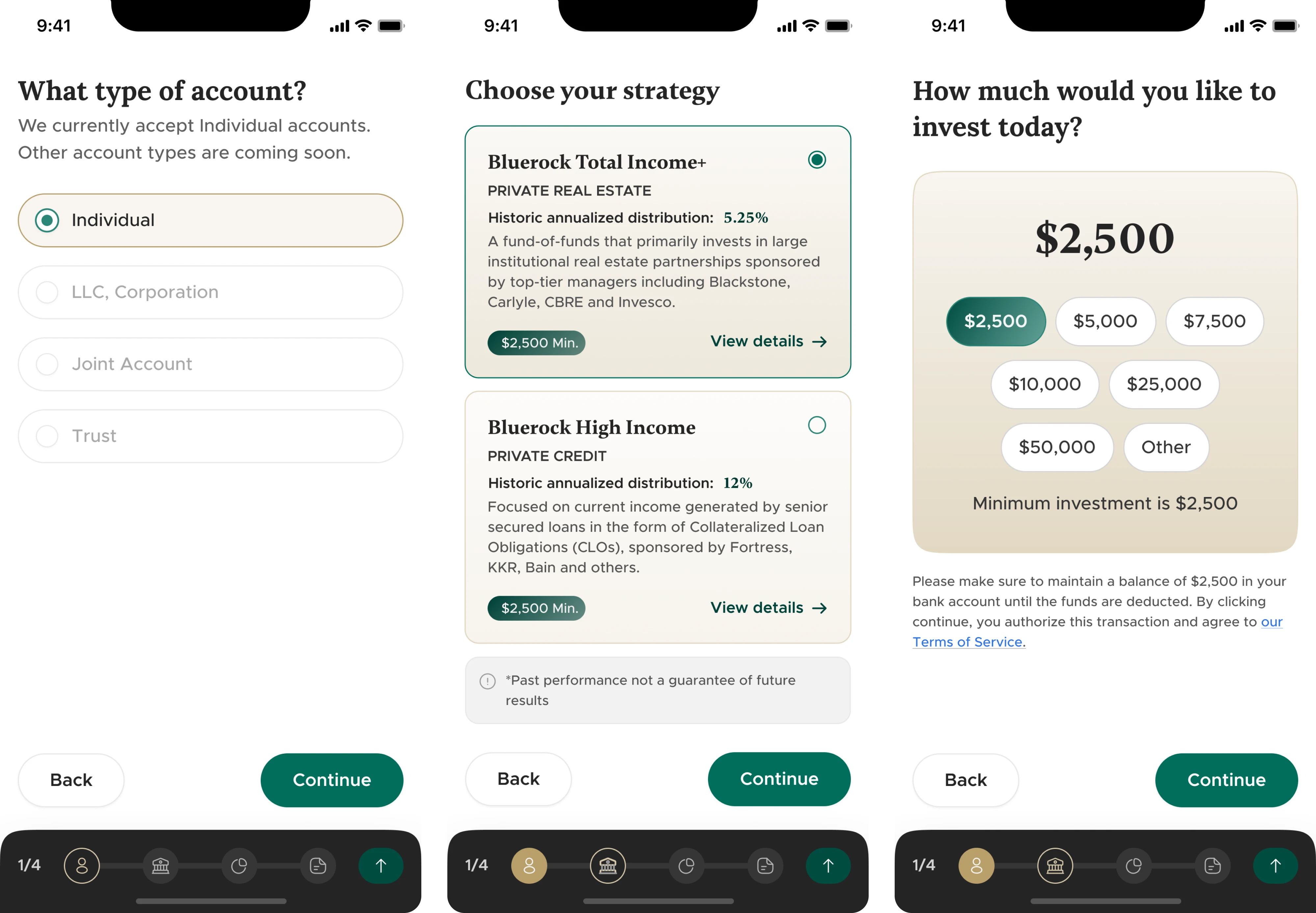
This is the exact tension we worked through when designing the SaaS onboarding for Alture Funds, an investment platform. The audience was mature, risk-aware, and had high expectations for how a financial product should feel.
Rather than stripping the flow down to the bare minimum, we restructured it to chunk required information into smaller steps and lead each screen with trust signals. The onboarding still asked for what it needed to, but it no longer felt like a gate.
Personalize for different users
A generic mobile app onboarding process treats every user the same. But people come to your app from different starting points, with their own goals, levels of experience, and reasons for being there.
The most common way to solve this is a welcome questionnaire at the start of the flow that shapes everything that follows. Spotify, for example, asks users about their music taste before showing them anything else. The principle is to learn enough about the user to make the next step feel personal.
A few things to keep in mind when designing this:
- Keep it to two or three questions. Beyond that, a questionnaire starts to feel like homework, and users begin dropping off.
- Make the personalization visible. If a user's answers never appear to influence anything, they notice.
- Use branching logic for apps with genuinely diverse user groups. Route users into meaningfully different paths based on their situation.
Guide users one step at a time
The instinct to show everything up front is understandable. You have built a product with a lot of value, and you want users to see it. However, in onboarding, more information is always overwhelming users before they have seen any value.
There is a well-established UX principle behind this. Hick's Law states that the more choices a user is presented with at once, the longer it takes them to decide, and the more likely they are to do nothing at all.
Slack applies this directly in its onboarding by hiding all features except the messaging input when a user first opens the app. Once users have learned the core action, key features are progressively revealed. The product has enormous complexity, but none of it is visible until the user is ready for it.
The design pattern that makes this possible is progressive disclosure. It means surfacing what is relevant to the user's current step, and deferring everything else.
Two other things reinforce forward momentum at the screen level.
- First, always include a skip option. Users who feel trapped by a mandatory step are more likely to abandon the flow entirely.
- Second, keep CTAs singular and direct. A screen with three choices makes users stop and think about which path is right.
Use progress indicators and gamification
Users are more likely to complete a process when they can see how far they have come. This is a well-documented psychological principle called the Zeigarnik effect, which describes our tendency to fixate on unfinished tasks and feel compelled to see them through. Progress indicators work precisely because they activate this effect.
The simplest implementation is a step counter or progress bar at the top of each onboarding screen. It does not need to be elaborate. Even a plain “Step 3 of 5” reduces anxiety about how much is left and keeps users moving forward.
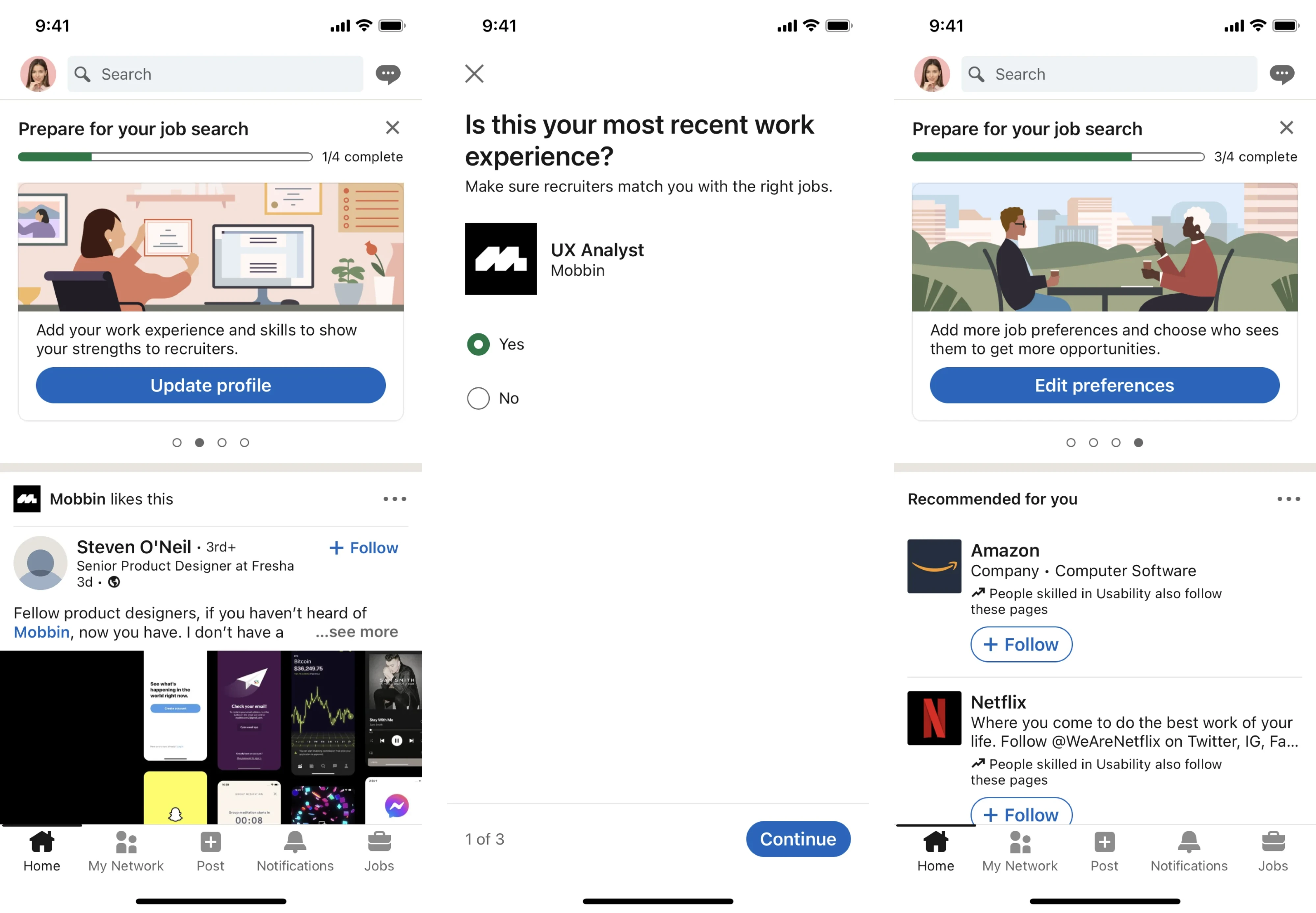
The more sophisticated version is the endowed progress effect that starts the progress bar slightly filled. LinkedIn applies this in its profile completion flow by showing a bar that is already partially filled, prompting users to take small actions to push it further. The bar acts as the psychological pull to complete the sign-up.
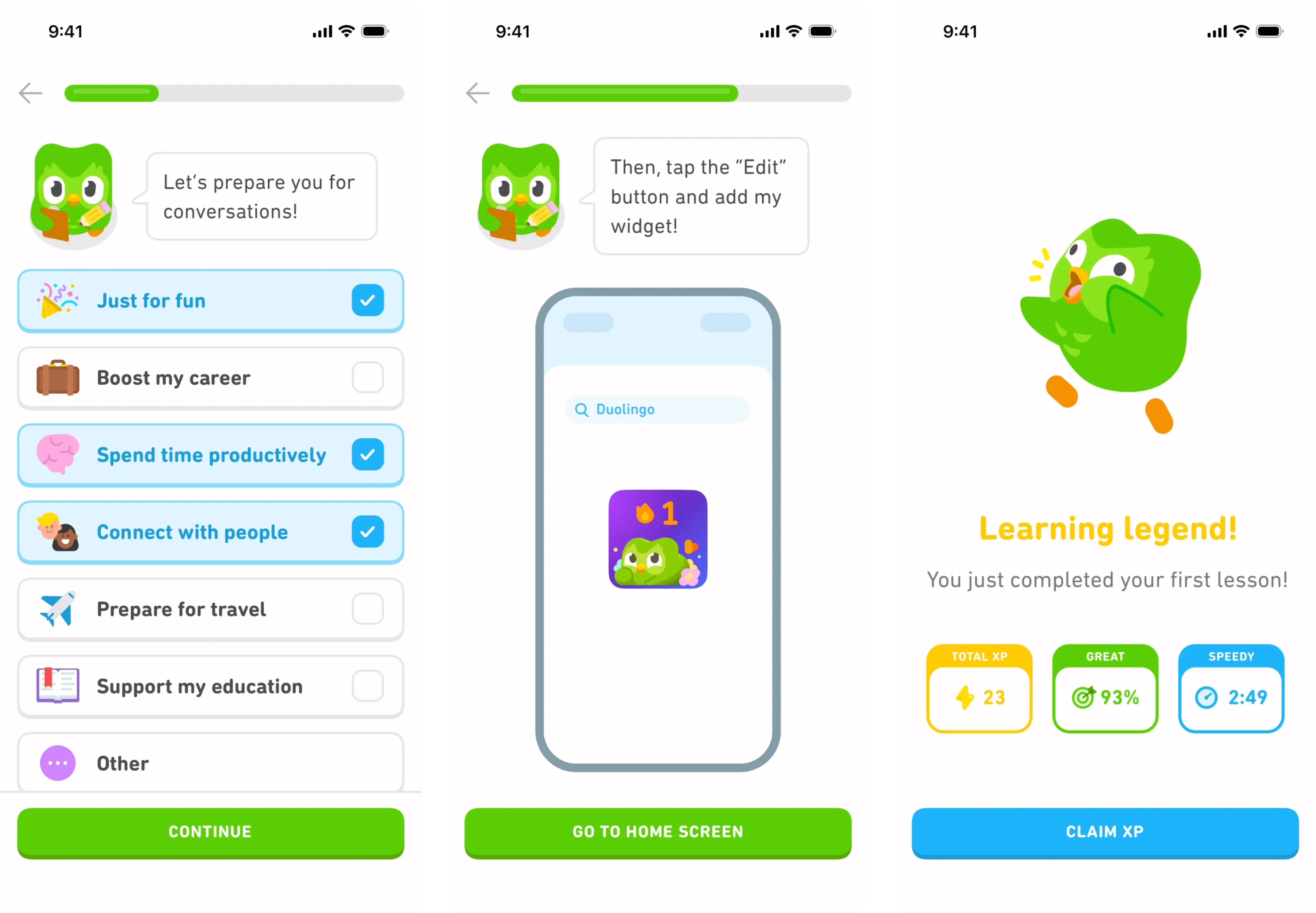
Gamification takes this further by attaching meaning and reward to the progress. Duolingo is the clearest example in mobile — streak counters, XP points, and level indicators all contribute to strong user engagement.
For most apps, full gamification is not necessary or appropriate. A few lightweight mechanics almost always improve completion:
- A milestone moment when a key setup step is finished, like a short animation, a checkmark, or a congratulatory screen.
- An onboarding checklist for complex products, where users can see all remaining tasks at a glance and return to them.
- Visual feedback on each completed action, even something as simple as a filled circle or a color change on a step indicator.

Write microcopy that reduces anxiety
Microcopy is the small instructional text that lives inside your interface in the form of field labels, helper text, button labels, error messages, and confirmation screens. It is the emotional layer of onboarding that shapes how a user feels about each step.
The most important rule is to explain the why behind any request. Asking for a phone number, a government ID, or a social security number without context creates friction. Providing a short reason, like “Your SSN helps us verify your identity and protect your account. We encrypt it immediately and never share it,” removes it.
The same principle applies to buttons and CTAs. “Verify identity” or “Continue to your dashboard” gives users a clear picture of where they are going and what the action means.
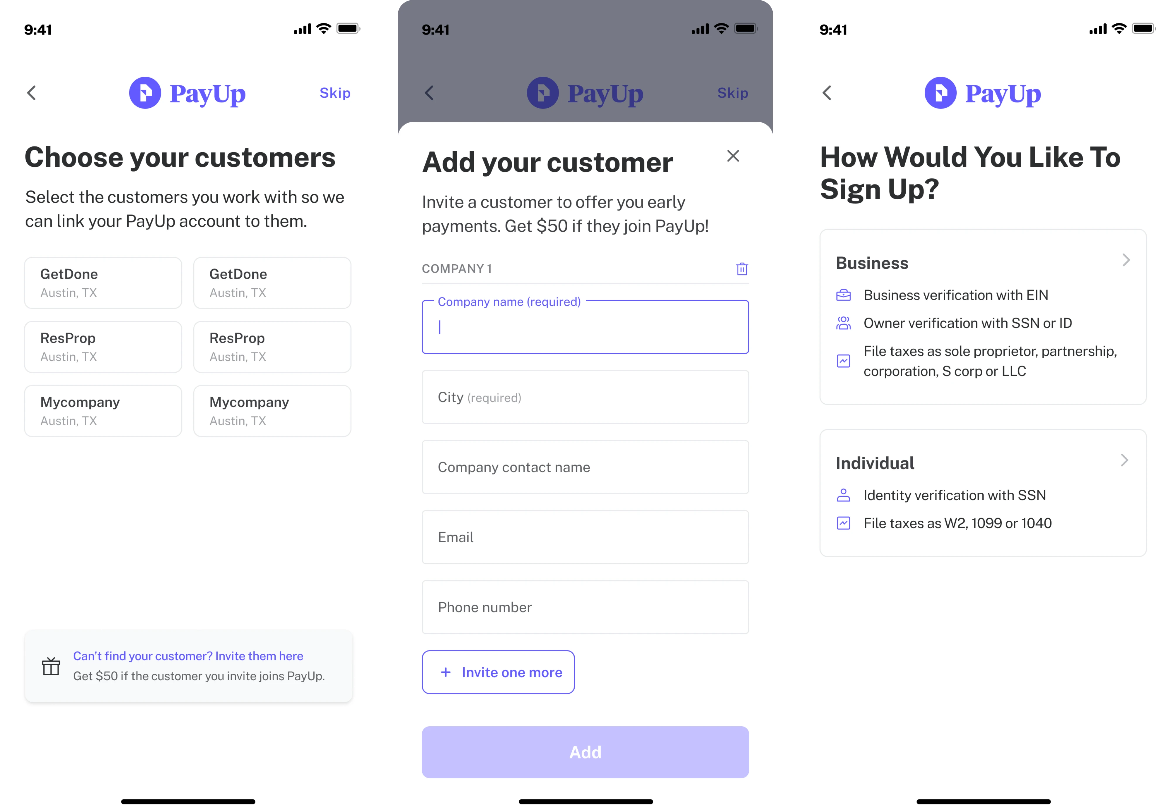
This was a live concern in our work on PayUp, a financial platform where users were asked to share sensitive data as part of the signup flow. We addressed it through copy that explained the purpose of each request. A single sentence was enough to acknowledge the ask, name the reason, and keep the user moving without alarm.
Handle the first screen, permissions, and opt-ins
The first screen a user sees after downloading your app sets the tone.
It should do one thing well: give the user a reason to continue. That means leading with a clear value statement. The welcome screen is the one moment in product onboarding where you can still lose someone who was genuinely interested.
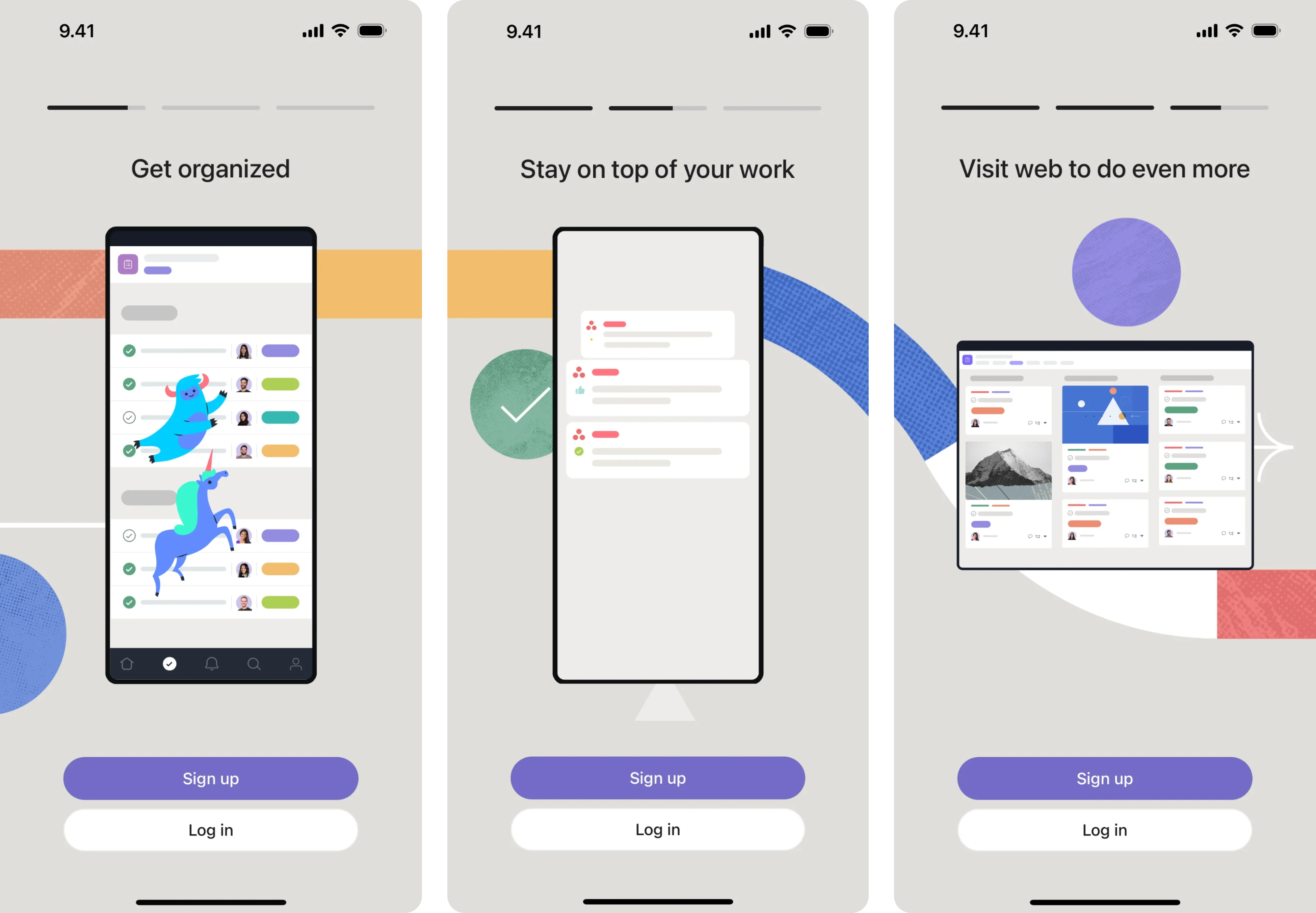
Permissions are where many apps make their early mistake. Both iOS and Android surface system-level permission dialogs that users can only accept or decline. The first time users interact with a permission request, they decide in seconds whether to trust the product or close the dialog.
The fix is a pre-permission prompt screen that appears before the system dialog, explains why the permission is needed, and gives the user context.
A few principles that consistently improve permission acceptance:
- Ask for permissions in context. Wait until the user is about to use the feature that needs it. That is when the request feels logical.
- Explain the benefit. A short reason why you need access goes a long way toward making the ask feel fair.
- Make denial graceful. If a user declines, explain what they will miss and make it easy to change their mind later.
Push notification opt-ins deserve the same care. Asking for notification access on the first screen almost guarantees a decline. The right moment is after the user has experienced something worth being notified about, like completing a first task, reaching a milestone, or finishing the core onboarding flow.
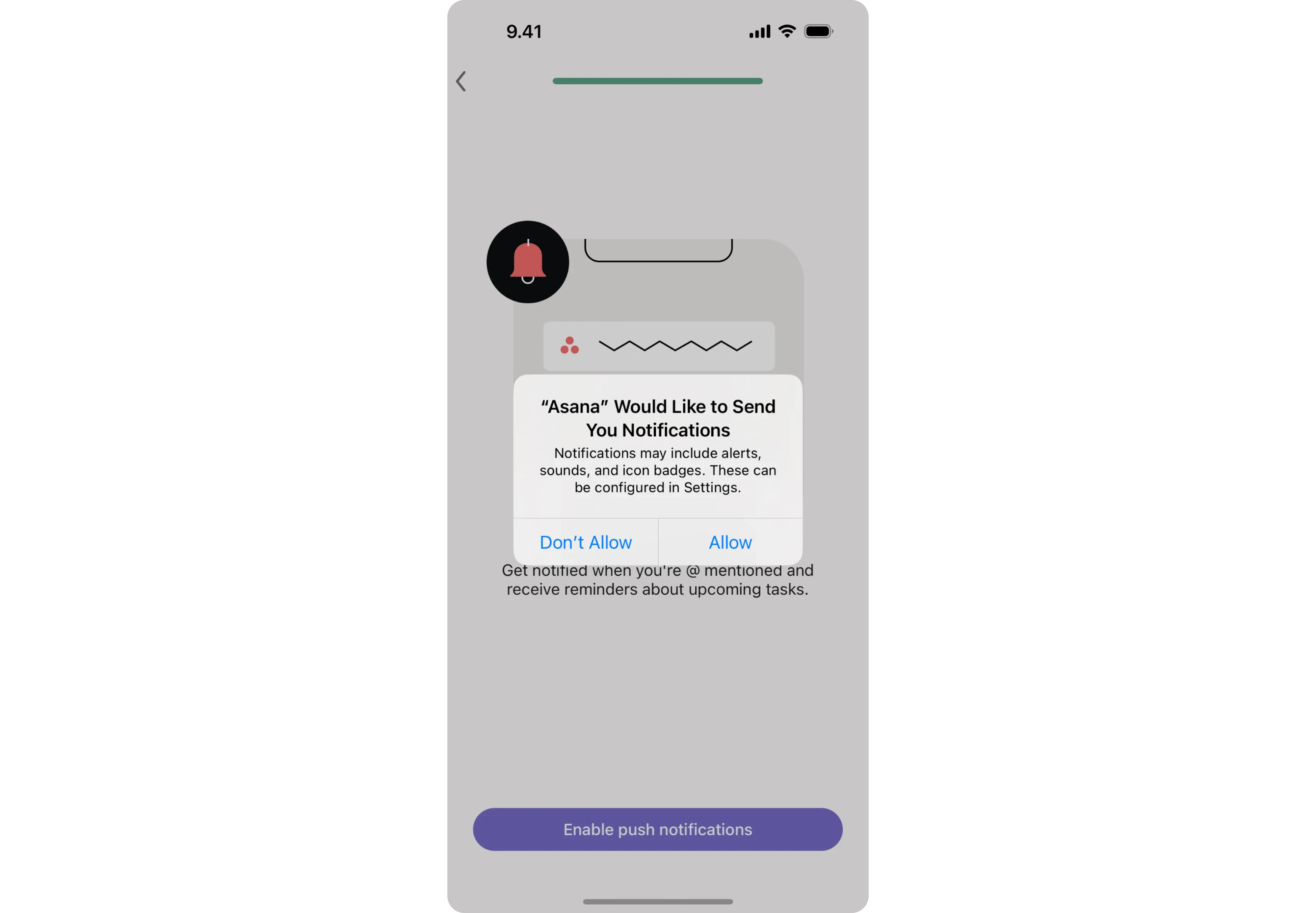
At that point, the value of staying connected to the product is visible, and the opt-in feels like a natural next step.
Collect feedback and keep improving
Onboarding is a live part of your product that degrades quietly over time as your user base grows, your feature set changes, and new audiences arrive.
To maintain strong activation rates, the starting point is knowing where users leave. Funnel analysis helps turn vague onboarding problems into insights. When you know where users drop off, you can make targeted fixes and measure what changes.
Quantitative data tells you where users leave. It rarely tells you why. That is where qualitative research earns its place. A few methods worth building into your process:
- User interviews to understand the drop-off reasoning, the assumptions that turned out to be wrong, and the onboarding pattern that failed with real users.
- In-app micro-surveys triggered at specific moments in the flow, asking one focused question at the point of friction rather than after the fact.
- Session recordings to watch user behavior through the flow — where they pause, what they re-read, and where they give up.
If you are looking for a broader set of tips that go beyond mobile, we cover more ground in our guide to user onboarding best practices.
Does your app need onboarding at all?
It is a fair question, and one that more product teams should ask before defaulting to a standard app onboarding flow. The honest answer is that it depends on how complex your product is, how familiar your audience is with the category, and how much context a user needs before they can do something meaningful.
Some apps genuinely do not need onboarding. A single-function utility, a simple tool with a self-evident interface, or anything where the core action is visible the moment the app opens is enough. Forcing a welcome flow onto a product that does not need one creates friction where there was none.
But the opposite assumption is just as common and just as costly. Teams skip onboarding because they assume users will figure it out, only to watch activation rates stay flat, and churn happen in the first session.
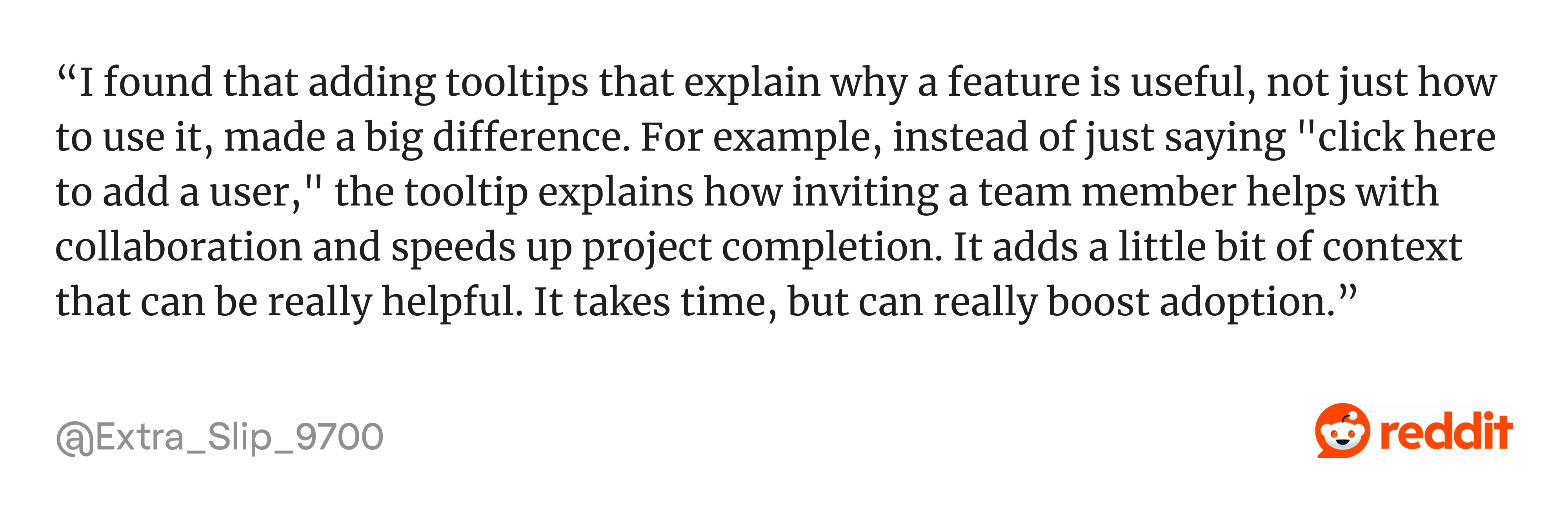
As one product builder put it in a community discussion on the topic:

Reddit threads on this topic tend to surface a useful tension. On one side, users are vocal about impatience:
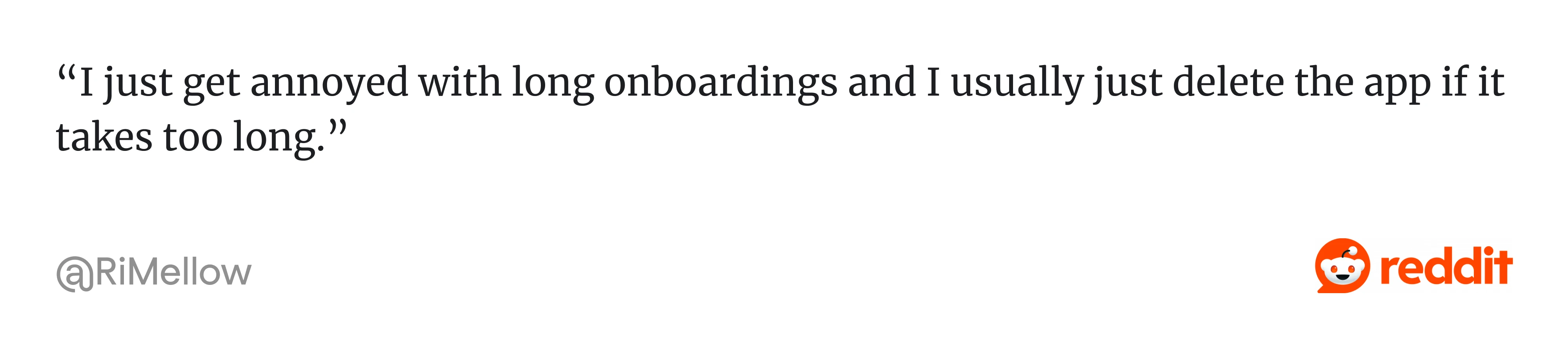
On the other hand, experienced builders push back on the idea that shorter always means better:
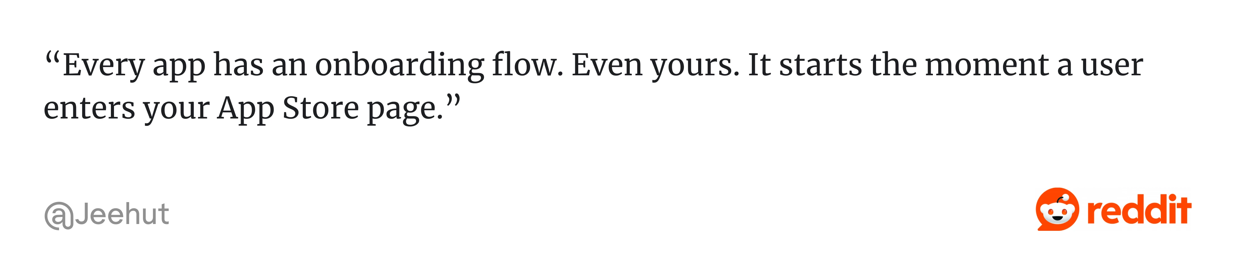
Both things are true. Users do not want to be walked through something they already understand, but they are always being onboarded. The question is whether that experience is designed or accidental.
A practical way to think about it is through two lenses.
- The first is product complexity — does a new user need context to take their first meaningful action, or is that action immediately obvious?
- The second is audience familiarity — are your users experienced with this type of product, or are they encountering the category for the first time?
One thought that holds across both cases is the importance of user control. As one developer noted:
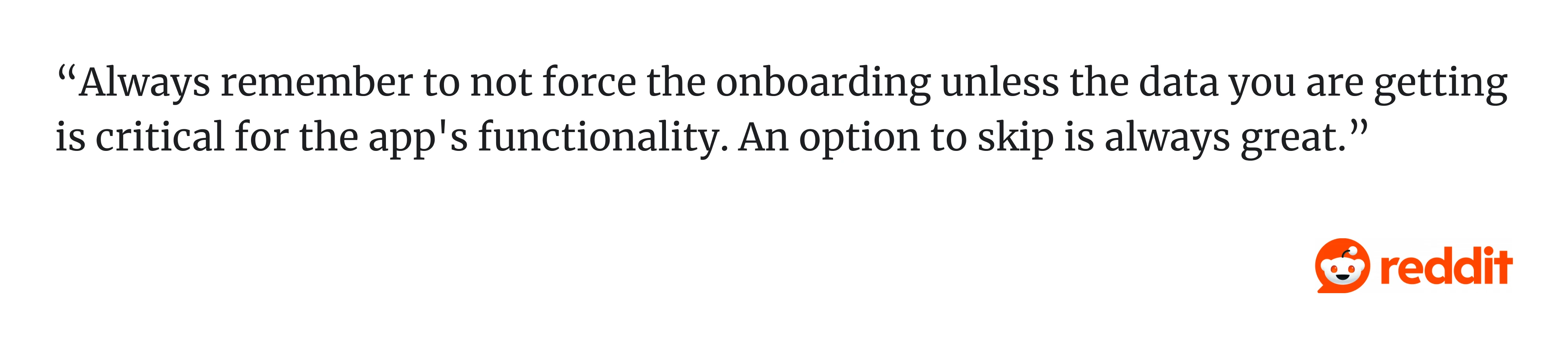
Giving users a way out is a signal that the product respects their time and confidence enough to let them choose their own pace.
At Eleken, we treat onboarding as one of the most consequential parts of the product experience. In our agency, the underlying question is always the same — what does this specific user need to understand or do in order to reach value as fast as possible? That question, asked early and honestly, tends to produce better onboarding than any best practice list.
To wrap up
The teams that get onboarding right design it as a promise to keep. The user showed up because something in your app store listing told them this product was worth their time. Onboarding is where that promise is either honored or broken.
The mobile app onboarding UX best practices covered in this guide are drawn from our work at Eleken. What holds across all of them is that good design is knowing which step matters, which question to ask, and which moment of friction is costing you valuable users.
If you are rethinking your onboarding flow and are not sure where to start, let’s talk.